HEALING WHOLE ARTS
Brand Guide
Healing Whole Arts is the creative world of Beth Anne Booth, a visual artist, writer, and double-lung transplant recipient. Her work emerges from a deeply personal journey through addiction, chronic illness, and the profound gift of organ donation. Every painting, reflection, and written word is an exploration of resilience, transformation, and renewal.
Healing Whole Arts offers a window into Beth Anne’s evolving practice — a living record of how creativity can hold space for recovery, remembrance, and hope. Through abstract canvases, writings, and community-rooted reflections, she shares not only her art but also the stories and truths that shape it.
At its heart, Healing Whole Arts is an invitation to witness recovery through the lens of creativity: brushstrokes that carry memory, words that anchor resilience, and a body of work that reflects life reclaimed.
Healing Whole Arts is the creative practice of Beth Anne Booth, a visual artist, writer, and double-lung transplant recipient. Her work reflects a lived journey through recovery, illness, and renewal, where creativity became both refuge and revelation. Through abstract painting and reflective writing, Beth Anne shares stories of resilience and transformation — inviting others to witness healing not as a destination, but as an ongoing process of becoming whole.
Visual artist and writer whose work reflects recovery, resilience, and renewal through creativity.
Artist and writer illuminating recovery and resilience through brushstrokes and words.
Visual artist and writer whose practice reflects a journey of recovery and renewal.
Through art and writing, Beth Anne shares a lived story of resilience, transformation, and hope.
Description:
This logo features an elegant serif font paired with a butterfly icon above the name. The butterfly is abstracted with gentle curves forming symmetrical wings, subtly resembling a heart or lungs.
This design speaks directly to transformation, healing, and softness—a visual metaphor for Beth Anne’s journey through recovery and rebirth. The butterfly symbolizes emergence, freedom, and new breath—echoing the brand’s focus on breathwork, creative rebirth, and nature-based healing. The clean serif font lends a sense of professionalism and calm structure, which balances the emotional and spiritual tone.
Main Logo: This logo works as your primary logo, use for official documents, branded advertisements, emails, and when color contrast suffices.
Black Logo: Use this logo on light backgrounds or when a black and white logo option is requested.
Cream Logo: Use this logo as a white logo option. The cream color presents a warm alternative to white. Use on dark backgrounds.
Indigo Logo: Use this logo as one-color alternative on light or medium backgrounds.
Description:
The Brandmark represents "Bethie Breathes" and is two B's mirrored. The butterfly is abstracted with gentle curves forming symmetrical wings, subtly resembling a heart or lungs.
Brandmark Usage:
The Brandmark can be used as a watermark, icon or stamp as an extension of the logo.
Description:
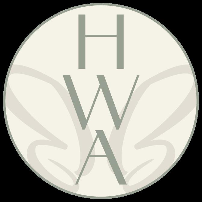
The Logomark is a condensed version of the Logo. It consists of the acronym HWA for Healing Whole Arts and utilizes the Brandmark.
The Logomark can be used as a substitue for the Logo when the logo needs to be placed at a smaller scale like a social media profile image for example.
Description:
This color pallete is earthy, grounded spiritual ideal for healing, nature, and breath.
Usage:
Main Colors: The main brand colors are Indigo, Stone Gray, and Cream. These colors should be used most on branded materials. Additionally, cream is a warm alternative for white.
Accent Colors: The two accent colors for the brand are Blush Rose and Warm Gold. These two colors complement the main colors and can be used to provide an additional color for branded materials.
Toned Colors: The toned colors are Light Indigo, Deep Stone Gray, and Deep Cream. The toned colors provide a greater level of contrast and can be used as needed when pairing main colors or accent colors together. Usage can be seen in the Logomark.
INDIGO
Hex #4D4F69
RGB 77, 79, 105
HSB 236, 27%, 41%
CMYK 75, 68, 38, 21
LIGHT INDIGO
Hex #5F667A
RGB 95, 102, 122
HSB 224, 22%, 48%
CMYK 67, 57, 37, 13
STONE GRAY
Hex #A8B1A3
RGB 168, 177, 163
HSB 99, 8%, 69%
CMYK 36, 23, 36, 0
DEEP STONE GRAY
Hex #96A091
RGB 151, 160, 145
HSB 100, 9%, 63%
CMYK 44, 29, 43, 1
Hex #F6F2E8
RGB 246, 242, 232
HSB 43, 6%, 96%
CMYK 3, 3, 8, 0
DEEP CREAM
Hex #E2DED3
RGB 226, 222, 211
HSB 44, 7%, 89%
CMYK 11, 9, 15, 0
Hex #B0837C
RFB 176, 131, 124
HSB 8, 30%, 69%
CMYK 31, 50, 46, 3
WARM GOLD
Hex #D5A25A
RGB 213, 162, 90
HSB 35, 58%, 84%
CMYK 16, 37, 75, 0
Balance of Softness & Strength: Amandine brings in the artistic and healing qualities, while Acumin provides the structure and grounding needed for clear communication. The combination reflects Healing Whole Arts’ mission—a space that is both gentle and restorative, yet strong and empowering.
Brand Personality: Together, they project a brand that is creative, approachable, and professional—artful without being overly ornate, and grounded without being heavy.
Primary Typeface: Amandine Regular
Look & Feel: Elegant, modern, and slightly whimsical. The thin strokes and soft curves give it a graceful, human touch.
Use Case: Use in all caps. Best suited for headlines, titles, or key phrases where you want to draw attention with a sense of beauty and sophistication.
Secondary Typeface: Acumin Pro Extra Condensed Bold
Look & Feel: Strong, bold, and structured. The condensed form allows for a lot of impact while taking up minimal space.
Use Case: Ideal for subheadings, supporting information, or calls to action where clarity and emphasis are needed.
Body Typeface: Acumin Pro Light
Use Case: Ideal for body copy where long-format text is used.