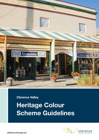
Clarence Valley
Heritage Colour Scheme Guidelines clarence.nsw.gov.au
Clarence Valley Heritage Colour Scheme Guidelines
The Argyle Hotel, Maclean.
Acknowledgment of Country Clarence Valley Council acknowledges the Bundjalung, Gumbaynggirr and Yaegl People as the Traditional Owners of the land on which we live and work. We honour the First Nations peoples culture and connection to land, sea and community and pay respect to their Elders past, present and emerging.
About this guide The Clarence Valley Heritage Colour Scheme Guidelines has been prepared by Clarence Valley Council. Images by Clarence Valley Council unless otherwise credited. Council wishes to acknowledge owners of the properties featured in this guide for their contribution to the conservation and maintenance of these heritage buildings in the Clarence Valley.
2
Version
Date
Prepared by
Approved by
1A
October 2026
Deborah Wray Senior Strategic Planner Clarence Valley Council
Murray Lane Manager Development and Land Use Planning Clarence Valley Council
|
Clarence Valley Heritage Colour Scheme Guidelines
www.clarence.nsw.gov.au
Clarence Valley Heritage Colour Scheme Guidelines
Contents 01. Introduction
04
02. Before you start, research your property
07
03. Building features reference guide
09
04. Repainting principles
10
05. Colour selection
11
06. Period colour schemes
13
Victorian (c.1840–c.1890) Federation (c.1890–c.1915)
14
20
Interwar (c.1915–c.1940)
26
Post-War and mid-20th century (c.1940–c.1970) Late 20th century (c.1970–present)
3
|
31 36
07. Commercial buildings
38
08. Heritage colour palette
39
19. Summary
46
10. References
47
Clarence Valley Heritage Colour Scheme Guidelines
www.clarence.nsw.gov.au
Clarence Valley Heritage Colour Scheme Guidelines
Victorian Filigree, colour scheme 1D.
01 Introduction 4
|
Clarence Valley Heritage Colour Scheme Guidelines
www.clarence.nsw.gov.au
Clarence Valley Heritage Colour Scheme Guidelines
Heritage colour schemes in the Clarence Valley The Clarence Valley retains a high proportion of historic buildings that contribute strongly to the character and identity of its towns, villages and rural places. More than 1,100 Heritage Items and 13 Heritage Conservation Areas are legally protected under the Clarence Valley Local Environmental Plan 2011 (LEP). These guidelines have been prepared to inform and assist owners and building managers in selecting a sympathetic heritage colour scheme for Heritage Items and buildings within Heritage Conservation Areas. The information can also be applied to historic properties that do not have a formal heritage status. The cost of repainting can be substantial and a long-term approach should be taken when selecting a colour scheme as it can have a lasting impact on the authenticity of a building and its setting. The use of appropriate colours is important to conserve the significance of buildings of different periods and to ensure new development is sympathetic to the heritage context. Heritage colours have a timeless quality that endures beyond current trends and a well-considered colour scheme is an investment that adds lasting value to a building and its streetscape.
Consent requirements There is a legal requirement to obtain consent under Clause 5.10 of the LEP before painting or repainting the exterior of a Heritage Item or any building within a Heritage Conservation Area. Repainting schemes consistent with these guidelines may be considered under the heritage exemptions of Clause 5.10(3) as work which would not have an adverse impact on the significance or setting of the Heritage Item or Heritage Conservation Area. A "Minor Works or Maintenance under the Heritage Exemptions" application will be required to be submitted to Council for approval of the colour scheme prior to any works being undertaken. For all other proposed painting schemes a Development Application would need to be submitted for consideration for approval by Council.
How to apply for consent under the heritage exemptions clause 5.10(3)
Complete the free ‘Apply for Minor Works or Maintenance under the Heritage Exemptions’ form on Council’s website. Approval must be obtained before work commences. Find the form at: www.clarence.nsw.gov.au/forms For assistance with your application, contact Council on 02 6643 0200 or email the details of your application to council@clarence.nsw.gov.au For more information, visit www.clarence.nsw.gov.au/heritage
5
|
Clarence Valley Heritage Colour Scheme Guidelines
www.clarence.nsw.gov.au
Clarence Valley Heritage Colour Scheme Guidelines
Traditional paint colours Historically paints were made by hand with earth and mineral pigments.
Traditional
Traditional colour palettes included a predominance of stone and earth
heritage colours
colours with trims in dark reds, greens, creams and browns. Off white was
have a timeless
the traditional white used for trims and joinery, unlike the bright whites
quality that
commonly used today. These colours gave historic buildings a warmth
endures beyond
and depth that reflect the natural materials of the period.
current trends, and a well-
Non-traditional paint colours
considered colour
Many colours commonly used today were not available or durable for
scheme is an
exterior use until the second half of the twentieth century. Inappropriate
investment that
paint schemes can substantially change the character of buildings and
adds lasting value
streetscapes by introducing colours and textures which could not have
to a building and
been produced over 100 years ago. Schemes using black, white and grey
its streetscape.
are not authentic to historic buildings or heritage conservation settings. Although some modern heritage paint ranges include these shades, they reflect current demand or styles from industrial or Hamptons aesthetics rather than Australia’s authentic historic palettes.
Traditional colours include:
Non-traditional colours include:
y
Warm earthy shades
y
Cool shades
y
Creams
y
Vivid and bright whites
y
Off-white
y
Dark greys
y
Stone and mid browns
y
Blues
y
Greens, light and dark
y
Black
y
Deep red and deep brown
y
Vibrant and primary colours
y
Blue-grey and blue-green
y
Monochrome schemes of black,
shades*.
white, grey or a single colour.
* Use of these colours emerged more during the Interwar period.
6
Off White Y35
Buff X41
Venetian Red R62
Cobalt Blue
Dark greys
Primary colours
Opaline G32
Dark Grey Blue B53
Black Olive Y61
Bright white
Bright Yellow
Vibrant colours
|
Clarence Valley Heritage Colour Scheme Guidelines
www.clarence.nsw.gov.au
Clarence Valley Heritage Colour Scheme Guidelines
02 Before you start, research your property Find out if your property is listed as a Heritage Item or located in a Heritage Conservation Area before selecting a colour scheme or commencing any work.
Heritage Conservation Areas Clarence Valley Heritage Conservation Areas are located in Brushgrove, Chatsworth Island, Diggers Camp, Glenreagh, Grafton, Harwood, Lawrence, Maclean, Minnie Water, Sandon, South Grafton, Ulmarra and Yamba. Maps showing Heritage Conservation Area boundaries are available on Council’s website. Check your area: www.clarence.nsw.gov.au/heritage
Clarence Valley Local Environmental Plan 2011 (LEP) Heritage Items and properties located within Heritage Conservation Areas are listed on Schedule 5 of the LEP, which legally recognises and protects the heritage values of these places. View the LEP: www.legislation.nsw.gov.au/view/html/inforce/current/epi-2011-0701
State Heritage Inventory For more detail on a specific Heritage Item or Heritage Conservation Area you can search the State Heritage Inventory. For more information visit: www.environment.nsw.gov.au/state-heritage-inventory
A building's original colour scheme can be investigated by taking paint scrapes in concealed locations in combination with historical research and early photographs. This image of Prince Street, Grafton in 1939 shows historic paint schemes on buildings from different periods. Old black and white photographs are useful as they show the relative tonality of light, medium and dark elements. Image courtesy of Mitchell Library, State Library of New South Wales. 7
|
Clarence Valley Heritage Colour Scheme Guidelines
www.clarence.nsw.gov.au
Clarence Valley Heritage Colour Scheme Guidelines
Take time to research the history of your building to help identify the most appropriate colours for its period and style. Q
Visit your local historical society; there are eight local historical societies and museums in the Clarence Valley. Details are on Council’s website.
Q
Seek out historic photographs, which can provide useful information on early paint schemes and the relative tones used on walls, posts, trims and balustrades.
Q
Carry out paint scrapes, in concealed locations such as behind a downpipe.
Q
Use the information in this guide to help you identify the period and style of your home.
Q
For substantial projects you may wish to seek advice from a heritage specialist.
Paint scrapes can reveal evidence of early layers and original finishes. The interior colour scheme of the Grafton Saraton Theatre, pictured below, was reinstated based on evidence uncovered through paint scrapes. This process revealed the original colours of the 1940 interior, allowing for an authentic restoration in 2009.
8
|
Clarence Valley Heritage Colour Scheme Guidelines
www.clarence.nsw.gov.au
Clarence Valley Heritage Colour Scheme Guidelines
03 Building features reference guide The following diagram identifies the main building features to be considered when preparing a colour scheme. Familiarising yourself with these terms will help when selecting and applying your colour scheme.
C
B
N
A O D V
F
K
J
E L
G
P
M H
Q
I
R
V S
Y T
X W Z
U
A B C D E F G H I
9
|
Eave Barge board Barge roll Window hood brackets
J K L M
Window frames Architraves Window sills Wall weatherboard Face brick
Gutter Verandah beam Handrail Verandah infill panels/ balustrades
N O P Q
Clarence Valley Heritage Colour Scheme Guidelines
Exposed rafters Brackets Soffit Verandah posts
R S T U V W X Y Z
Verandah post trim Gable screen Fretwork Cast iron lacework Finial Wall face brick/stucco Gable wall Battens Decorative moulding
www.clarence.nsw.gov.au
Clarence Valley Heritage Colour Scheme Guidelines
04 Repainting principles To maintain your building and avoid unintended damage or costly repair follow these principles for repainting. Q
Do not paint brick, stonework or tiles – only paint surfaces originally intended for painting.
Q
Never sandblast to remove paint, this can damage the surface of timber, brick and mortar, making it more vulnerable to weathering and deterioration. Use gentle, low abrasive methods, such as poultice and low pressure washing.
Q
Seek expert advice to remove paint from historic masonry surfaces.
Q
Retain and record evidence of early paint layers and do not remove all historic evidence.
Q
Cover stable historic paint layers with an isolating coat before painting over them.
Q
Use permeable type paint for painted masonry, matte or low-sheen finish for exterior wall surfaces, and a gloss finish for timber joinery, posts, windows and doors.
Only paint surfaces originally intended for painting – do not paint brickwork, stonework or tiles.
Typical unpainted materials
Stonework
10
|
Brickwork
Tile roof
Clarence Valley Heritage Colour Scheme Guidelines
Unpainted iron
Paving or tiles
www.clarence.nsw.gov.au
Clarence Valley Heritage Colour Scheme Guidelines
05 Colour selection To help you choose a colour scheme that is suitable for your building’s period and style, refer to the period colour scheme examples and the Heritage Colour Palette in this guide, and follow the principles below. Colour palette range A heritage colour scheme typically uses three to four colours; one wall colour and two or three trim colours to highlight architectural details. Maintain consistency Use a consistent colour scheme across a building that includes several premises or adjoining residences under one parapet. Contemporary and infill buildings For contemporary and infill buildings use a colour scheme that complements the setting of the Heritage Conservation Area and nearby Heritage Items.
Light to mid-tone walls Use light to mid-tone colours on walls. Natural, warm earthy colours complement original unpainted building materials such as face brick or sandstone. Light and mid-tone trim Use light to mid-tone colours that contrast with the main wall colour to highlight doors, windows, trim brackets and decorative mouldings. Dark trim Use dark trim colours sparingly for decorative or architectural details, such as guttering, decorative cast iron balustrades, friezes and front entry doors. Downpipes Paint downpipes to match the surrounding surface, i.e. wall, gutter or post colour. Fences Use light to mid-tone colours for fences. They were commonly painted off-white or cream.
Do not use vivid, bold or primary colours. Do not use bright whites, greys or black. Do not use monochrome colour schemes, i.e. painting the building in one colour.
11
|
Clarence Valley Heritage Colour Scheme Guidelines
www.clarence.nsw.gov.au
Clarence Valley Heritage Colour Scheme Guidelines
Special purpose colours Dark browns Dark browns are characteristic of 1930s–1950s buildings and were used for weatherboards and to highlight timber battens on fibre cement sheets and gable ends. Blue and blue-green shades The use of blue and blue-green colours emerged more during the Interwar period, particularly in Art Deco facades, and were typically used as trim colours. Blue and mauve colours featured in heritage palettes were typically used for interiors because blue pigments fade and paint surfaces become chalky with sun exposure. Signal Red Signal Red was limited in its application to specific items such as Fire Brigade or Railway signage and not traditionally used in heritage colour schemes. Blacks Black is best reserved for signage, lettering and Art Deco tiling, not as a general scheme colour. There are alternative dark colours in the heritage palette in this guide that may be used for dark trims. Light greens Light greens were traditionally used for the underside of eaves, awnings and verandah soffits to reduce glare, in the same way that the green underside of a cricket hat brim reduces glare for the wearer.
Light green can be used under eaves, awnings and verandah soffits to create an authentic heritage colour scheme.
12
|
Clarence Valley Heritage Colour Scheme Guidelines
www.clarence.nsw.gov.au
Clarence Valley Heritage Colour Scheme Guidelines
06 Period colour schemes This section outlines traditional colour schemes and examples of buildings for the main historic style periods represented in the Clarence Valley. Each period includes a description of common local architectural styles and images to help identify your building.
The key historic style periods in the Clarence Valley The key historic style periods in the Clarence Valley are based upon the recognised classification of Australian buildings by Apperly, Irving and Reynolds in A Pictorial Guide to Identifying Australian Architecture.
1. Victorian (c.1840-c.1890) 2. Federation (c.1890-c.1915) 3. Interwar (c.1915-c.1940) 4. Post-War and mid-20th century (c.1940-c.1970) 5. Late 20th century (c.1970-present) The colours in this guideline are referenced against selected colours from the AS 2700-2011 Colour standards for general purposes which are shown on the Heritage Colour Palette from page 39 of this guide. British Standard references were in common use in Australia until AS 2700 was introduced in 1985. The AS 2700 standard incorporated many of the original British colours and remains the current reference for heritage paint colours in Australia. Comparative toned colours from commercial paint companies palettes may also be nominated in a proposed colour scheme. Colour reproductions in these guidelines may not accurately represent the actual paint colour. For accuracy, always refer to the given colour number and name. Colours may look different when painted on a building surface compared to a sample on a brochure or on a computer screen. Natural light and surrounding materials will affect their appearance. This is particularly true for lighter shades.
Federation Queen Anne, colour scheme 2M.
13
|
Clarence Valley Heritage Colour Scheme Guidelines
www.clarence.nsw.gov.au
Clarence Valley Heritage Colour Scheme Guidelines
Victorian Gothic, colour scheme 1B.
c.1840-c.1890 Victorian colour schemes 14
|
Clarence Valley Heritage Colour Scheme Guidelines
www.clarence.nsw.gov.au
Clarence Valley Heritage Colour Scheme Guidelines
Victorian period overview The Victorian period spanned 60 years, during which architectural styles and detailing changed from restrained colonial designs to the elaborate styles of the late 1800s boom years. Local examples of Victorian buildings include surviving stone and timber farm buildings, small scale workers' cottages, larger elaborate dwellings, and fine sandstone buildings such as the Grafton Post Office and Grafton Court House.
Typical colour schemes
Common styles Georgian Symmetrical facades with the door centred and windows placed evenly either side. Gothic Steeply pitched gables, pointed arch windows and decorative bargeboards. Filigree Cast iron or timber lacework to verandahs and balconies. Classical Revival Rendered or stone facades with columns, pediments and moulded cornices.
The late Victorian period was characterised by intricate decoration. Architectural trims were picked out in contrasting colours to highlight decorative details, and subtle shades and tones were used to highlight mouldings. Paint effects of marbling, stencilling and wood graining were popular for interiors. Schemes were typically grounded in a warm, earthy palette. Victorian styles spilled over into the early twentieth century, especially in regional areas. ●
Walls in mid-toned buffs, biscuits, dark buffs and browns, and light beiges, providing a base for contrasting joinery.
●
Window sashes, doors and other joinery were typically dark red or dark green, however sometimes windows were highlighted in a lighter contrasting tone, such as beige or offwhite.
●
On more elaborate or later Victorian buildings, verandah brackets, mouldings and cast-iron lacework were typically painted in dark green or dark red, in a colour opposite the verandah
Victorian Free Classical, colour scheme 1F.
posts.
15
|
Clarence Valley Heritage Colour Scheme Guidelines
www.clarence.nsw.gov.au
Clarence Valley Heritage Colour Scheme Guidelines
Local architectural features ●
Vertical timber board and batten cladding on early buildings.
●
Beaded weatherboards and chamferboards.
●
Steeply pitched galvanised iron roofs in short sheets.
●
Tall brick chimneys.
●
Twelve-paned sash windows.
●
Bullnose verandahs painted in contrasting stripes.
●
Half round and ogee guttering.
●
Bracketed valances.
●
Sandstone dressings on civic buildings.
●
Two storey timber residences in the
Victorian Georgian Style, colour scheme 1G.
later years.
Victorian Georgian, colour scheme 1J.
Victorian Gothic, colour scheme 1A.
16
|
Clarence Valley Heritage Colour Scheme Guidelines
Late Victorian, colour scheme 1K.
www.clarence.nsw.gov.au
Clarence Valley Heritage Colour Scheme Guidelines
Victorian colour scheme examples Main
Details or trim
Walls, fence, some trim.
Gable ends, windows/doors and surrounds, verandah, fence, gutters.
Victorian 1A
Driftwood X34
Red Oxide R63
Off White Y35
Cinnamon X45
Deep Indian Red R64
Traffic Green G16
Off White Y35
Red Oxide R63
Off White Y35
Holly G12
Cream Y43
Deep Indian Red R64
Cream Y43
Victorian 1B
Shell Pink R41
Victorian 1C
Cream Y34
Victorian 1D
Pale Ochre X21
Victorian 1E
Sandstone (unpainted)
17
|
Clarence Valley Heritage Colour Scheme Guidelines
www.clarence.nsw.gov.au
Clarence Valley Heritage Colour Scheme Guidelines
Main
Details or trim
Walls, fence, some trim
Gable ends, windows/doors and surrounds, verandah, fence, gutters.
Victorian 1F
Buff X41
Straw Y24
Deep Indian Red R64
Off White Y35
Palm Green G44
Traffic Green G16
Apple Blossom R32
Red Oxide R63
Off White Y35
Biscuit X42
Zucchini G67
Warm White X33
Glacier G42
Deep Indian Red R64
Off White Y35
Biscuit X42
Victorian 1G
Rose Pink R25
Victorian 1H
Straw Y24
Victorian 1I
Shell Pink R41
Victorian 1J
Venetian Red R62
18
|
Clarence Valley Heritage Colour Scheme Guidelines
www.clarence.nsw.gov.au
Clarence Valley Heritage Colour Scheme Guidelines
Main
Details or trim
Walls, fence, some trim
Gable ends, windows/doors and surrounds, verandah, fence, gutters.
Victorian 1K
Buff X41
Coffee X52
Dark Brown X65
Magnolia X32
Bottle Green G11
Deep Stone Y55
Zucchini G67
Off White Y35
Cream Y43
Off White Y35
Green Ice T35
Victorian 1L
Manilla Y45
Victorian 1M
Sandstone Y53
Victorian Georgian, colour scheme 1B.
19
|
Clarence Valley Heritage Colour Scheme Guidelines
Blue Jade T24
Victorian Georgian Style, colour scheme 1M.
www.clarence.nsw.gov.au
Clarence Valley Heritage Colour Scheme Guidelines
Federation Filigree, colour scheme 2D.
c.1890-c.1915 Federation colour schemes 20
|
Clarence Valley Heritage Colour Scheme Guidelines
www.clarence.nsw.gov.au
Clarence Valley Heritage Colour Scheme Guidelines
Federation period overview Buildings constructed during the period 1890 to 1915 are referred to as Federation era, coinciding with the formation of the Commonwealth of Australia, although many Victorian design elements endured, especially in regional and country areas.
Typical colour schemes
Common local styles Weatherboard Bungalow Single storey timber cottages with a front verandah. Queen Anne Asymmetrical plan with a prominent front gable, decorative timber work and often a corner verandah.
Federation colour schemes moved away from
Filigree Cast iron or timber lacework to verandahs
the darker Victorian tones. Walls typically shifted
and balconies.
to creams and yellows as the more common base, paired with either green or buff, producing a noticeably lighter palette overall. Doors and frames continued to carry strong accent colours,
Free Classical Pediments and pilasters applied loosely rather than to formal rules.
maintaining the contrast between walls and trims despite the lighter overall scheme. ●
Main wall colours were in either cream to buff shades or in shades of green.
●
Painted rendered walls and weatherboards were typically painted in shades of cream to buff.
●
Window frames contrasted with light cream or greens.
●
Lighter tones were used to highlight exposed timbers such as rafter tails.
●
Doors and door frames highlighted in darker trims of Red Oxide or Forest Green.
●
Darker tones were used for smaller framing timber such as gutters, sills, barge rolls and trim.
●
Blue grey tones emerged in small amounts for trim.
●
Fences generally matched the colour and finish of the main building material.
Federation Queen Anne, colour scheme 2C.
21
|
Clarence Valley Heritage Colour Scheme Guidelines
www.clarence.nsw.gov.au
Clarence Valley Heritage Colour Scheme Guidelines
Local architectural features Timber was the predominant building material in this region, with galvanised roofs being more common than terracotta tiles. The colour palette moved away from the darker Victorian tones. ● ● ● ● ● ● ● ●
Decorative gables and fretwork. Tall brick and roughcast chimneys. Roughcast and half-timbered gable ends. Double-hung and casement windows. Bay windows. Multi-paned windows. Leadlight windows. Verandahs featuring decorative balustrading.
Federation Queen Anne, colour scheme 2B.
Federation Weatherboard, colour scheme 2F.
Federation Filigree, colour scheme 2H.
22
|
Clarence Valley Heritage Colour Scheme Guidelines
Federation Weatherboard Bungalow, colour scheme 2I.
www.clarence.nsw.gov.au
Clarence Valley Heritage Colour Scheme Guidelines
Federation colour scheme examples Main
Details or trim
Walls, fence, some trim.
Gable ends, windows/doors and surrounds, verandah, fence, gutters.
Federation 2A
Glacier G42
Opaline G32
Deep Indian Red R64
Zucchini G67
Off White Y35
Blue Jade T24
Red Oxide R63
Off White Y35
Deep Stone Y55
Deep Indian Red R64
Off White Y35
Deep Indian Red R64
Dark Green G61
Red Oxide R63
Federation 2B
Merino Y56
Federation 2C
Straw Y35
Federation 2D
Cream Y34
Federation 2E
Ivory Dulux 23
|
Clarence Valley Heritage Colour Scheme Guidelines
www.clarence.nsw.gov.au
Clarence Valley Heritage Colour Scheme Guidelines
Main
Details or trim
Walls, fence, some trim.
Gable ends, windows/doors and surrounds, verandah, fence, gutters.
Federation 2F
Glacier G42
Off White Y35
Holly G12
Off White Y35
Cream Y43
Venetian Red R62
Dark Green G61
Serpentine G22
Deep Indian Red R64
Off White Y35
Deep Green G63
Venetian Red R62
Manilla Y45
Off White Y35
Venetian Red R62
Federation 2G
Oatmeal Y54
Federation 2H
Cream Y34
Federation 2I
Lily Green Y31
Federation 2J
Face brick (unpainted)
24
|
Clarence Valley Heritage Colour Scheme Guidelines
www.clarence.nsw.gov.au
Clarence Valley Heritage Colour Scheme Guidelines
Federation 2J Main
Details or trim
Walls, fence, some trim.
Gable ends, windows/doors and surrounds, verandah, fence, gutters.
Federation 2K
Driftwood X34
Off White Y35
Cinnamon X45
Dark Grey Blue B53
Off White Y35
Deep Indian Red R64
Cream Y34
Driftwood X34
Deep Indian Red R64
Dark Grey Blue B53
Federation 2L
Coffee X52
Federation 2M
Warm White X33
Federation Free Classical, colour scheme 2K.
25
|
Clarence Valley Heritage Colour Scheme Guidelines
Federation Classical Free colour scheme 2J.
www.clarence.nsw.gov.au
Clarence Valley Heritage Colour Scheme Guidelines
Interwar-Californian Bungalow, colour scheme 3C.
c.1915-c.1940 Interwar colour schemes 26
|
Clarence Valley Heritage Colour Scheme Guidelines
www.clarence.nsw.gov.au
Clarence Valley Heritage Colour Scheme Guidelines
Interwar period overview This period covered a range of architectural styles, from a continuation of Federation styles to the Art Deco designs of the period and Californian Bungalow designs for residential development. From the 1930s, colour schemes shifted from the Federation and Victorian palettes to include greater variety, with the development of readymade paint and a wider range of colour choices.
Common local styles Weatherboard Bungalow Single storey timber cottages with a front verandah. Californian Bungalow Low slung form with a wide front gable, heavy tapered verandah piers and exposed rafter tails. Spanish Mission Rough cast rendered walls, arched openings and terracotta tiled roofs.
Typical colour schemes Walls remained light throughout the Interwar period, typically off-white, cream, beige or stone, but the palette diversified considerably by style. Some styles introduced colours not seen in earlier periods, while
Art Deco Flat or parapeted facades with horizontal and vertical mouldings and geometric detailing. Free Classical Pediments and pilasters on commercial facades.
others moved toward dark timber highlights. ●
Doors and frames contrasted in a darker, stronger accent colour.
●
Californian Bungalow schemes were typically limited to two colours: a dominant tone (midgreen, red oxide or rich brown) paired with pale cream while some Californian Bungalows were painted dark brown with cream trims.
●
Spanish Mission, Mediterranean and similar styles introduced terracotta tones, soft pinks, apricots, blues and deeper greens.
●
Old English and Tudor style timber battens and shingles were typically painted in a dark brown.
●
Art Deco buildings used subtle variations and the effect of natural shade and light to highlight the detail of mouldings rather than using highly contrasting colours.
Interwar Weatherboard Bungalow, colour scheme 3A.
27
|
Clarence Valley Heritage Colour Scheme Guidelines
www.clarence.nsw.gov.au
Clarence Valley Heritage Colour Scheme Guidelines
Local architectural features ● ● ● ● ● ●
● ●
●
Lower pitched, wide gables and sweeping roofs with wide eaves. Flat topped chimneys. Exposed roof timbers. Tapered pylons with multiple grouped posts. Projecting window frames and geometric pattern leadlight glazing. Rough cast render, terracotta tiles and arched porch entrances on Spanish Mission style residences. Horizontal and vertical mouldings on rendered facades of Art Deco buildings. Cement sheet (fibro) cladding, often combined with timber weatherboards below the window line. Garages, fences and gardens treated as integral design elements.
Interwar Californian Bungalow, colour scheme 3H.
28
|
Clarence Valley Heritage Colour Scheme Guidelines
Interwar Californian Bungalow, colour scheme 3B.
Interwar Free Classical, colour scheme 3G.
www.clarence.nsw.gov.au
Clarence Valley Heritage Colour Scheme Guidelines
Interwar colour scheme examples Main
Details or trim
Walls, fence, some trim.
Gable ends, windows/doors and surrounds, verandah, fence, gutters.
Interwar 3A
Cream Y43
Off White Y35
Venetian Red R62
Peacock Blue T53
Cream Y43
Coffee X52
Lichen G55
Off White Y35
Deep Green G63
Dark Grey Blue B53
Off White Y35
Mountain Blue T51
Off White Y35
Interwar 3B
Dusty Pink P31
Interwar 3C
Brick work (unpainted)
Interwar 3D
Driftwood X34
Interwar 3E
Parchment Y43
29
|
Clarence Valley Heritage Colour Scheme Guidelines
Green Ice T35
www.clarence.nsw.gov.au
Clarence Valley Heritage Colour Scheme Guidelines
Main
Details or trim
Walls, fence, some trim.
Gable ends, windows/doors and surrounds, verandah, fence, gutters.
Interwar 3F
Off White Y35
Driftwood X34
Dark Grey Blue B53 Oatmeal Y54
Parchment Y43
Dark Grey Blue B53 Golden Tan X53
Off White Y35
Bottle Green G11
Interwar 3G
Off White Y35
Interwar 3H
Parchment Y43
Interwar Art-Deco, colour scheme 3E.
30
|
Clarence Valley Heritage Colour Scheme Guidelines
www.clarence.nsw.gov.au
Clarence Valley Heritage Colour Scheme Guidelines
Post-War Functionalist, colour scheme 4A.
c.1940-c.1970 Post-War and mid-20th century colour schemes 31
|
Clarence Valley Heritage Colour Scheme Guidelines
www.clarence.nsw.gov.au
Clarence Valley Heritage Colour Scheme Guidelines
Post-War and mid-20th century period The Post-War period from the 1940s through to the 1960s was a time of change, optimism and new growth which marked a shift in building materials, design and colour schemes. Reconstruction after World War II saw some austerity and brought new construction methods, fibrous cement sheeting, brick veneer and a move away from the elaborate detailing of earlier eras. Buildings of this era range from modest cottages and brick bungalows to Spanish Mission style dwellings and commercial facades. The colour palette of the period reflected the wider availability of manufactured paint, with a broader range of ready mixed colours in use than in earlier eras.
Common colour schemes Wall colour remained similar to the Federation and Interwar periods, typically off-white or cream,
Common local styles Weatherboard Bungalow Single storey timber cottages with a front verandah, often with curved features. Fibro Cottage Compact dwelling clad in fibrous cement sheeting with cover strips. Spanish Mission Rendered walls and arched openings, continuing from the Interwar period. Brick Bungalow Single storey dwelling in face brick, often cream or red. Commercial Streamlined shopfronts with slender chrome framing. Functionalist Plain, undecorated forms determined by the building's use.
however, the overall palette narrowed considerably. Decorative colour use became less common, reflecting both Post-War material shortages and a broader shift toward plainer building styles. ●
Walls were typically off-white or cream, with the introduction of apple greens and green blue tones.
●
Brickwork was unpainted, including matching low brick fences.
●
The narrower palette reflected the reduced detailing and the use of brick, cladding and aluminium windows.
●
Brighter, vibrant highlight colours were used during the 1960s and 1970s, especially for interiors.
Post-War Weatherboard Cottage, colour scheme 4F.
32
|
Clarence Valley Heritage Colour Scheme Guidelines
www.clarence.nsw.gov.au
Clarence Valley Heritage Colour Scheme Guidelines
Local architectural features ●
Fibrous cement (fibro) sheet cladding.
●
Brick Veneer construction from the 1950s
●
Dry-pressed brick in cream and red.
●
Concrete blockwork.
●
Two-storey architect-designed brick residences.
●
Curved porch walls, rounded corner windows and curved awnings.
●
Timber sash windows with horizontal glazing bar divisions.
●
Simplified detailing, with less ornate and decorative timberwork than earlier periods.
●
Aluminium-framed windows from the 1960s.
Post-War Brick Bungalow, colour scheme 4E.
Post-War Spanish Mission, colour scheme 4C.
Post-War commercial, colour scheme 4H.
33
|
Clarence Valley Heritage Colour Scheme Guidelines
Post-War Spanish Mission, colour scheme 4B.
www.clarence.nsw.gov.au
Clarence Valley Heritage Colour Scheme Guidelines
Post-War and mid-20th century colour scheme examples Main
Details or trim
Walls, fence, some trim.
Gable ends, windows/doors and surrounds, verandah, fence, gutters.
Post-War and mid-20th century 4A
Brickwork (unpainted)
Cream Y43
Deep Green G63
Off White Y35
Buff X41
Off White Y35
Deep Green G63
Mint Green G17
Off White Y35
Dark Blue Grey B53
Off White Y35
Post-War and mid-20th century 4B
Warm White X33
Post-War and mid-20th century 4C
Glacier G42
Post-War and mid-20th century 4D
Serpentine G22
Post-War and mid-20th century 4E
Brickwork (unpainted)
34
|
Clarence Valley Heritage Colour Scheme Guidelines
www.clarence.nsw.gov.au
Clarence Valley Heritage Colour Scheme Guidelines
Main
Details or trim
Walls, fence, some trim.
Gable ends, windows/doors and surrounds, verandah, fence, gutters.
Post-War and mid-20th century 4F
Brickwork (unpainted)
Off White Y35
Holly G12
Off White Y35
Dark Grey Blue B53
Cream Y43
Bottle Green G11
Manilla Y45
Post-War and mid-20th century 4G
Terracotta tile
Post-War and mid-20th century 4H
Sandstone tile
Post-War Weatherboard Bungalow, colour scheme 4D.
35
|
Clarence Valley Heritage Colour Scheme Guidelines
www.clarence.nsw.gov.au
Clarence Valley Heritage Colour Scheme Guidelines
Contemporary Infill, colour scheme 5A.
c.1970-present Late-20th century to present day colour schemes 36
|
Clarence Valley Heritage Colour Scheme Guidelines
www.clarence.nsw.gov.au
Clarence Valley Heritage Colour Scheme Guidelines
New buildings constructed within a Heritage Conservation Area or in the vicinity of a Heritage Item should use a colour scheme drawn from the heritage palette in these guidelines or comparative colours that are sympathetic to the surrounding streetscape. This applies to all new residential and commercial buildings, including alterations and repairs to existing buildings. Refer to the Period Colour Schemes relevant to the adjoining or nearby historic buildings as a guide. Sympathetic variations are acceptable where they complement the setting and follow the principles outlined in this guide. Contemporary Infill, colour scheme 5B.
Late-20th century to present day colour schemes Main
Details or trim
Walls, fence, some trim.
Gable ends, windows/doors and surrounds, verandah, fence, gutters.
Late-20th century to present day 5A
Parchment Y43
Teal T63
Off White Y35
Stained Timber (unpainted)
Off White Y35
Blue Jade T24
Red Oxide R63
Late-20th century to present day 5B
Merino Y56
37
|
Clarence Valley Heritage Colour Scheme Guidelines
www.clarence.nsw.gov.au
Clarence Valley Heritage Colour Scheme Guidelines
07 Commercial buildings Guidelines for choosing a colour scheme for commercial buildings Q
Commercial buildings within a Heritage Conservation Area or listed as a Heritage Item must follow the heritage colour scheme guidelines applicable to the building’s period and style.
Q
Where a building includes multiple tenancies, a consistent colour scheme must be applied across the whole facade. Individual tenancies or business owners are not exempt from these requirements.
Q
Business branding and corporate colours that utilise primary, vivid, bold or intense colours are not an acceptable basis for selecting an exterior colour scheme. Council may consider complementary, subtle versions of corporate colour schemes.
Q
Business identification signage must be contained within designated sign panels, awning fascias or windows and comply with permitted signage requirements.
This building facade is an example that follows the heritage colour scheme and signage principles, and avoids bold corporate branding and colours.
38
|
Clarence Valley Heritage Colour Scheme Guidelines
www.clarence.nsw.gov.au
Clarence Valley Heritage Colour Scheme Guidelines
08 Heritage colour palette The colours referenced throughout these guidelines are drawn from the AS 2700-2011 Colour standards for general purposes (Note that AS 2700 also includes a wider range of other nonheritage colours). The following is a selection of AS 2700 heritage colours referred to in these guidelines for different historic style periods buildings in the Clarence Valley, organised by colour placement, walls, dark trims, light and mid trims and special use colours. Blue and green tones were introduced during the Interwar and Post-War periods for particular styles and are shown as special purpose colours. Paint stores can match and produce the AS 2700 colours based on the AS 2700 colour code. Many paint companies also offer heritage colour palettes that are sympathetic to the selected AS 2700 colours shown in this guide.
Main Walls, fence, some trim.
Straw Y24
Sand Y44
Manilla Y45
Raffia X31
Sandstone Y53
Oatmeal Y54
Deep Stone Y55
Sugar Cane Y62
Khaki Y63
39
|
Clarence Valley Heritage Colour Scheme Guidelines
www.clarence.nsw.gov.au
Clarence Valley Heritage Colour Scheme Guidelines
Main Walls, fence, some trim.
Chamois Y52
Buff X41
Biscuit X42
Cream Y34
Off White Y35
Parchment Y43
Beige X43
Cinnamon X45
Burnt Pink R51
Rose Pink R24
Dusty Pink P31
Mushroom Pink R34
Shell Pink R41
Pale Ochre X21
Tan X51
40
|
Clarence Valley Heritage Colour Scheme Guidelines
www.clarence.nsw.gov.au
Clarence Valley Heritage Colour Scheme Guidelines
Main Walls, fence, some trim.
Coffee X52
Golden Tan X53
Mushroom Y65
Merino Y56
Birch Grey N25
Cloud Grey N22
Lichen G55
Surf Green G43
Glacier G42
Trim Gable ends, windows/doors and surrounds, verandah, fence, gutters.
Bottle Green G11
41
|
Holly G12
Clarence Valley Heritage Colour Scheme Guidelines
Rainforest Green G15
www.clarence.nsw.gov.au
Clarence Valley Heritage Colour Scheme Guidelines
Trim Gable ends, windows/doors and surrounds, verandah, fence, gutters.
Dark Green G61
Deep Bronze Green G63
Zucchini G67
Black Olive Y61
Venetian Red R62
Red Oxide R63
Deep Indian Red R64
Maroon R65
Dark Earth X62
Ironbark X63
Chocolate X64
Dark Brown X65
Charcoal B64
Dark Grey Blue B53
42
|
Clarence Valley Heritage Colour Scheme Guidelines
www.clarence.nsw.gov.au
Clarence Valley Heritage Colour Scheme Guidelines
Trim Gable ends, windows/doors and surrounds, verandah, fence, gutters.
Cream Y34
Off White Y35
Parchment Y43
Sand Y44
Manilla Y45
Chamois Y52
Sandstone Y53
Oatmeal Y54
Raffia X31
Magnolia X32
Warm White X33
Driftwood X34
Merino Y56
Biscuit X42
Shell Pink R41
43
|
Clarence Valley Heritage Colour Scheme Guidelines
www.clarence.nsw.gov.au
Clarence Valley Heritage Colour Scheme Guidelines
Trim Gable ends, windows/doors and surrounds, verandah, fence, gutters.
Dusty Pink P31
Mushroom Pink R34
Apple Blossom R32
Special purpose trim Verandahs and soffits Light green can be used for the underside of verandahs and soffits.
Surf Green G43
Palm Green G44
Glacier G42
Crystal Green G47
44
|
Clarence Valley Heritage Colour Scheme Guidelines
Opaline G32
www.clarence.nsw.gov.au
Clarence Valley Heritage Colour Scheme Guidelines
Special purpose trim Interwar Art Deco and Post-War Gable ends, windows/doors and surrounds, verandah, fence, gutters.
Oriental Blue T22
Blue Jade T24
Smoke Blue T33
Green Ice T35
Mountain Blue T51
Peacock Blue T53
Teal T63
Grey Blue B43
Dark Blue Grey B53
45
|
Clarence Valley Heritage Colour Scheme Guidelines
www.clarence.nsw.gov.au
Clarence Valley Heritage Colour Scheme Guidelines
Summary
9
Use the following checklist to guide you through the process Research your property Confirm whether your property is a Heritage Item or within a Heritage Conservation Area Identify the period and style of your building Research your property’s history
Use these Guidelines to choose a colour scheme Refer to the Period Colour Schemes section for examples appropriate to your building’s era and style Refer to the Heritage Colour Palettes section for AS 2700 colours organised by placement Select your preferred colour scheme using the example provided: e.g. Colour scheme 1A, 2B, or Custom using AS 2700 colour codes, or comparable commericial colour using company, paint name
Apply for approval Submit a Minor Works or Maintenance under the Heritage Exemptions to Council, including proposed colour schemes and placement Obtain written approval before commencing work
46
|
Clarence Valley Heritage Colour Scheme Guidelines
www.clarence.nsw.gov.au
Clarence Valley Heritage Colour Scheme Guidelines
10 References For more information on these traditional colour schemes, see the key references used for these guidelines.
1.
Clarence Valley Local Environmental Plan 2011, available on the Clarence Valley Council website.
2.
Clarence Valley Development Control Plan 2011, available on the Clarence Valley Council website.
3.
Colour Schemes for Old Australian Houses, by Ian Evans, Clive Lucas and Ian Stapleton (1984).
4.
More Colour Schemes for Old Australian Houses, by Ian Evans, Clive Lucas and Ian Stapleton (1992).
5.
Australian Houses of the Twenties and Thirties, by Peter Cuffley (1993).
6.
Australian Houses of the Forties and Fifties, by Peter Cuffley (1993).
7.
How to Restore the Old Aussie House, by Ian Stapleton (1983).
8.
Paint Finishes Information Sheet 7.2, NSW Heritage Office, available from the Heritage NSW website, https://www.environment.nsw.gov.au/topics/heritage. Direct link: https://www. environment.nsw.gov.au/sites/default/files/paint-finishes-information-sheet.pdf
9.
The Burra Charter, The Australia ICOMOS Charter for Places of Cultural Significance 2013, and the associated series of Practice Notes provide a best practice standard for managing cultural heritage places in Australia. Direct link: https://australia.icomos.org/publications/burra-charterpractice-notes/
10. Heritage Items and Heritage Conservation Areas; a guide for owners Clarence Valley Council 2020, available on the Heritage webpage on Clarence Valley Council website, https://www.clarence. nsw.gov.au/Building-and-planning/Design-and-construction-information/Heritage
11. 1996 Conservation Areas Guidelines for Managing Change in Heritage Conservation Areas, Heritage Office and Department of Urban Affairs and Planning, ISBN 0 7310 6224 8
12. Suters Architects, Tenterfield Main Street Heritage Study 1997, available from Tenterfield Shire Council website, https://www.tenterfield.nsw.gov.au/about-tenterfield/heritage/heritage-studies/ tenterfield-main-street-heritage-study accessed 29/8/22
13. Going to Town: An investment in your towns future’: The Glen Innes Experience, Painting Traditional Timber Houses, Brisbane City Council Department of Planning, Design Board of the Australian Council. By Robert Moore, ISBN 0 7305 4330.
14. A Pictorial Guide to Identifying Australian Architecture, by Apperley, Richard and Robert Irving and Peter Reynolds, published by Angus and Robertson, Sydney, 1989.
47
|
Clarence Valley Heritage Colour Scheme Guidelines
www.clarence.nsw.gov.au
Clarence Valley Heritage Colour Scheme Guidelines
Clarence Valley Council 2 Prince Street Grafton Phone 02 6643 0200 council@clarence.nsw.gov.au www.clarence.nsw.gov.au
48
|
Clarence Valley Heritage Colour Scheme Guidelines
www.clarence.nsw.gov.au