1 minute read
logo breakdown


logo breakdown
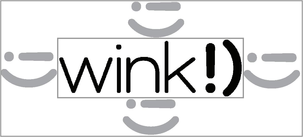
primary logo
claire.hawker
Advertisement
primary logo
wink!) ‘s primary logo is the perfect mix of personality and simplistic design. using a combination of typographic and symbolic communication enhances the personality within the logo design. this logo is used on the majority of the marketing materials (business cards, packaging, website etc.)

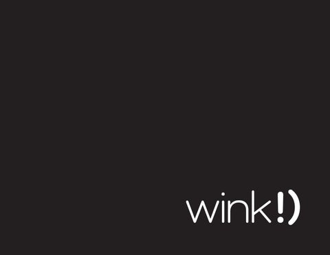
secondary logo
claire.hawker
secondary logo
wink!) ‘s primary logo is reduced to the simple and playful wink graphic. this logo is ideally used on packaging, bedsheets, and tags.
brand colours
black: c0m0y0k100 | r35g31b32 | #231f20
white: c0m0y0k0 | r255g255b255 | #ffffff
grey: c0m0y0k27 | r194g196b198 | #c2c4c6
typography
when used consistently, typography is a powerful brand tool. Como is used across all print and web applications because it best represents the playful yet modern and classy aesthetic of wink!).
Como (light):
use for body copy (lowercase with exceptions; names, titles, places, etc.)
Como (semibold):
use for headings (lowercase) | used in logo