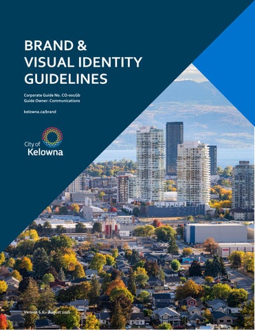
BRAND & VISUAL IDENTITY GUIDELINES Corporate Guide No. CO-001Gb Guide Owner: Communications kelowna.ca/brand
Version 6.6 – August 2026
CITY OF KELOWNA
ABOUT THIS GUIDE This guide explains how to use the City of Kelowna brand consistently across documents, presentations, digital communications, videos, signage, vehicles and promotional materials. Contact Communications if your application isn't covered in this guide or if you need assistance: email media@kelowna.ca.
Table of Contents ABOUT THIS GUIDE ..................................................2 IMPORTANCE OF IDENTITY ...................................... 3 Our Story ..................................................................... 3 OFFICIAL SYMBOLS ..................................................4 City of Kelowna Logo....................................................4 Sub-Brand Logos ..........................................................4 Coat of Arms & Motto ...................................................5 Floral Emblem ..............................................................5 COLOURS ............................................................... 6 Base Colours ................................................................6 Accent Colours ..............................................................6 FONTS ..................................................................... 7 Corbel .......................................................................... 7 Priva ............................................................................ 7 LOGO LAYOUTS ...................................................... 8 City of Kelowna ............................................................8 Kelowna Community Theatre .......................................8 Kelowna Memorial Park Cemetery ................................8 Kelowna International Airport.......................................9 Kelowna Fire Department .............................................9 LOGO TREATMENT................................................. 10 Colour Variations ........................................................ 10 Protected Space ......................................................... 11 Minimum Size ............................................................ 12 Logo Use .................................................................... 14 SUPPORTING GRAPHICS ........................................ 16 Dynamic Icon ............................................................. 16 Mosaic Element .......................................................... 16 Tile Element ............................................................... 16 Branded Templates .................................................... 16 ELECTRONIC COMMUNICATIONS ........................... 17 Email Signature .......................................................... 17 Websites .................................................................... 17 VIDEO PRODUCTION.............................................. 18 Distribution Channels ................................................. 18 Video Styles ............................................................... 18 Visual Guidelines ........................................................ 18 CREDITING SPONSORS & PARTNERS...................... 21 City Programs ............................................................ 21
BRAND & VISUAL IDENTITY GUIDELINES
Equal Partnership Sponsored Programs ..................... 21 City Sponsored Programs ........................................... 21 TRI-LEVEL GOVERNMENT AGREEMENTS ............... 22 Primary Funding ........................................................ 22 Equal Funding............................................................ 22 THIRD PARTY CONTRACTORS ................................ 23 Primary Logo ............................................................. 23 Secondary Reference.................................................. 23 PROMOTIONAL ITEMS ........................................... 24 General Items ............................................................ 24 Clothing .................................................................... 24 Coins ......................................................................... 25 SIGNAGE ................................................................ 26 Types of Signage......................................................... 26 Sign Installation & Placement .................................... 26 Sign Sizing .................................................................27 FACILITY SIGNAGE ................................................. 28 Signage Hierarchy ..................................................... 28 Level 1 – Site Entrance Signage .................................. 29 Level 2 – Parking Lot Signage .................................... 30 Level 3 – Directional Map ............................................31 Level 4 – Exterior Instructional Signage ...................... 32 Level 5 – Building Name ............................................. 32 Level 6 – Entrance Window ........................................ 34 Level 7 – Entrance Lobby .............................................35 Level 8 – Main Directory ..............................................35 Level 9 – Hallway Wayfinding .....................................35 Level 10 – Stairwell Directory ..................................... 36 Level 11 – Room/Staff Name ....................................... 37 Level 12 – Safety or Regulatory Signage ..................... 38 Level 13 – Interior Instructional Signage...................... 39 Custom Signage ........................................................ 40 PARK & PATHWAY SIGNAGE .................................. 41 Level 1A – Site Entrance Signage................................ 41 Level 3 – Directional Signage ...................................... 42 PROGRAM SIGNAGE .............................................. 43 PROJECT SIGNAGE ................................................. 44 VEHICLE WRAPS .................................................... 45 Types of Vehicles ....................................................... 45 Protective Services Vehicles ......................................... 46 Fleet Vehicles ............................................................ 49 UTILITY CABINET WRAPS ....................................... 51 Wrap Designs .............................................................51 Design Requirements ..................................................51 Installation .................................................................51 FOR MORE INFORMATION ..................................... 52
2
CITY OF KELOWNA
BRAND & VISUAL IDENTITY GUIDELINES
IMPORTANCE OF IDENTITY
Our Story
A consistent visual identity helps people recognise City programs, services, facilities and information. It also makes communications more accessible, professional and efficient to produce.
The City of Kelowna’s brand was shaped through conversations with employees, residents and community partners. It reflects the values, character and aspirations that define our community and support the vision outlined in Imagine Kelowna.
Everything funded, delivered or owned by the City should be clearly identified using the appropriate City or approved sub-brand identity.
We call this Our story, and these attributes guide how we communicate, design and deliver services.
We are open We value transparency, accessibility and meaningful engagement. We communicate clearly, share information openly and create opportunities for people to participate in decisions that shape our community. We strive to make services, facilities and information easy to access for everyone.
We are active We embrace a lifestyle that balances recreation, culture, business and community connection. Our natural environment, recreation opportunities and vibrant urban spaces inspire active living, wellbeing and year-round participation in community life.
We are connected We connect people, places and opportunities. Strong neighbourhoods, transportation networks, digital infrastructure and community partnerships help people access services, build relationships and participate in a growing city.
We are innovative We are forward-thinking and adaptable. Building on the ingenuity of those who came before us, we continuously look for new ways to improve services, respond to challenges and create a safe, sustainable and resilient future.
We are leaders We lead with responsibility, collaboration and long-term thinking. Through thoughtful decision-making, strong partnerships and responsible stewardship of resources, we work to enhance quality of life for current and future generations.
3
CITY OF KELOWNA
OFFICIAL SYMBOLS City of Kelowna Logo The City of Kelowna logo is the primary visual identifier for the organization. It represents the City, its services, facilities and programs, and helps create a consistent and recognizable presence across all communications.
BRAND & VISUAL IDENTITY GUIDELINES
Sub-Brand Logos Approved sub-brand logos are used to identify specific City services and facilities, including the Kelowna International Airport, Kelowna Community Theatre, Kelowna Memorial Park Cemetery, and the Kelowna Fire Department.
The logo was adopted by City Council in 2009. Its colours are inspired by Kelowna's natural landscape and seasons, while the icon reflects the sun above Okanagan Lake.
Usage The logo cannot be used for commercial purposes, as per Council Policy No. 281, City of Kelowna Corporate Logo, Coat of Arms or Sails. No City department or external vendor may create or use a separate logo or visual identifier to represent a City service without written approval from the Communications Director. Third parties must receive written permission from Communications before using the City logo or any approved sub-brand logo.
Usage Use the sub-brand logo when communicating on behalf of that service, facility or operation. Sub-brand logos replace the City of Kelowna logo on buildings, sites, vehicles, equipment and communications associated with those services. All other logo usage rules apply.
4
CITY OF KELOWNA
Coat of Arms & Motto The City of Kelowna Coat of Arms is the City's formal symbol of civic authority. It is reserved for official and ceremonial uses, including documents requiring the official seal, flags, Council Chambers, and communications from Mayor and Council. The Coat of Arms is also used to identify Bylaw Services.
BRAND & VISUAL IDENTITY GUIDELINES
Usage The Coat of Arms cannot be used for commercial purposes or reproduced without approval from Communications, as outlined in Council Policy No. 71, Kelowna Coat of Arms/Armorial Bearings and Council Policy No. 281, City of Kelowna Corporate Logo, Coat of Arms or Sails.
Floral Emblem The Okanagan Sunflower (Arrowleaf Balsamroot) is the official floral emblem of the City of Kelowna.
The City of Kelowna's Armorial Bearings were officially adopted by Council on January 3, 1955 as granted in a Letter Patent by the College of Heralds in England. The design reflects important elements of Kelowna's history and identity: The shield, with wavy blue lines on white at the base, depicts Okanagan Lake from which rise three white piles, representing mountains; above these are two apples of gold.
Native to the Okanagan Valley, this resilient wildflower is known for its bright yellow blooms that cover local hillsides each spring. Its ability to thrive in dry conditions reflects the character of the Okanagan landscape. Historically, the plant was an important food source for Indigenous Peoples in the region. Today, it remains a recognizable symbol of Kelowna's natural environment and connection to place.
Astride the shield, knightly armour surrounded by a wreath, supports an apple tree bearing apples. At the base of the tree, the crosscut saw is emblematic of the lumber industry and early pioneers. The supporters are, on the dexter side, a grizzly bear, indicating the derivation of the City’s name, and, on the sinister side, a seahorse, which in heraldry is the closest approximation of our Ogopogo. The Motto, “Fruitful in Unity” alludes to Kelowna’s steady progress, largely attributable to its fruit industry and the community mindset and cooperation of its citizens.
5
CITY OF KELOWNA
COLOURS The City of Kelowna's colour palette is inspired by the natural landscape and seasons of the Okanagan. Consistent use of these colours helps create a recognizable and unified visual identity across all City communications The palette includes: Base colours for primary design elements such as headers, backgrounds and navigation. Accent colours for highlights, calls to action and visual emphasis
Usage Always use the approved colour values provided in this guide. Colour appearance may vary between screens, printers and materials. For production work, use the appropriate colour specifications rather than relying on visual appearance alone Format Pantone CMYK RGB HEX Vinyl
Use Spot-colour professional printing Full-colour commercial printing: cyan, magenta, yellow and black Screens, presentations and video: red, green and blue Websites and digital applications Signage and banner production
BRAND & VISUAL IDENTITY GUIDELINES
Base Colours Use base colours as the foundation of your design.
WINTER
ROCK
Pantone 302 C100 M74 Y40 K32 R0 G61 B91 Vinyl N/A HTML #003A5D
Pantone Cool Gray 11 C65 M57 Y52 K29 R85 G86 B90 Vinyl N/A HTML #55565A
LAKE
NIGHT
Pantone 285 C90 M48 Y0 K0 R000 G115 B207 Vinyl A4555-O HTML #0073CF
Pantone Process Black C0 M0 Y0 K100 R30 G30 B30 Vinyl A4090-O HTML #1E1E1E
POWDER C0 M0 Y0 K0 R255 G255 B255 Vinyl A4001-O HTML #FFFFFF
Accent Colours Use accent colours sparingly to create contrast, emphasize information and add visual interest.
SKY
SPRING
Pantone 284 C58 M17 Y0 K0 R106 G173 B228 Vinyl N/A HTML #6AADE4
Pantone 390 C24 M0 Y100 K8 R182 G191 B0 Vinyl N/A HTML #B6BF00
SUN
SUNSET
Pantone 7408 C0 M30 Y100 K0 R242 G175 B0 Vinyl A6135-O HTML #F2AF00
Pantone 138 C0 M50 Y100 K0 R223 G122 B0 Vinyl N/A HTML #DF7A00
FALL
SUMMER
Pantone 166 C0 M74 Y100 K0 R224 G82 B6 Vinyl A4179-O HTML #E05206
Pantone 200 C3 M100 Y66 K12 R183 G18 B52 Vinyl A9305-O HTML #B71234 6
CITY OF KELOWNA
BRAND & VISUAL IDENTITY GUIDELINES
FONTS
Corbel
Consistent use of typography helps create a clear, professional and recognizable visual identity across all City communications.
Corbel is the City's primary corporate typeface and should be used for most print and digital communications. It is the standard font for reports, presentations, letters, email signatures and public-facing material.
The City of Kelowna uses two approved font families: Corbel and PrivaPro.
Usage Always use approved font files and maintain the original typeface proportions. Do not condense, extend, or distort the fonts in any way.
ABCDEFGHIJKLMNOPQRSTUVWXYZ abcdefghijklmnopqrstuvwxyz 0123456789 ABCDEFGHIJKLMNOPQRSTUVWXYZ abcdefghijklmnopqrstuvwxyz 0123456789 Aligning Numbers in Word When working with tables, budgets or financial information, Corbel numbers can be aligned for improved readability, from 0123456789 to 0123456789. In Microsoft Word: select text > Home > Font > Advanced tab > Number Forms: Lining. If number lining is too difficult, the alternate font for financial tables and documents is Calibri.
Priva PrivaPro is used for signage and wayfinding applications and supports consistency between the City's facilities and visual identity. The italic versions of PrivaPro must not be used.
PrivaOnePro PRIVAONEPRO 123 PrivaTwoPro PRIVATWOPRO 123 PrivaThreePro PRIVATHREEPRO 123 PrivaFourPro PRIVAFOURPRO 123
7
CITY OF KELOWNA
LOGO LAYOUTS The City of Kelowna logo and approved sub-brand logos are made up of two elements Icon: the graphical symbol, and Wordmark: the text portion of the logo. The relationship between the icon and wordmark must not be altered.
BRAND & VISUAL IDENTITY GUIDELINES
Kelowna Community Theatre The Kelowna Community Theatre logo is available in two approved layouts: stacked logo and wordmark. Note: Separate brand guidelines exist for the Kelowna Community Theatre and the Box Office, which operate independently of the City.
Stacked Logo
City of Kelowna The City of Kelowna logo is available in three approved layouts: stacked, horizontal, and wordmark.
Stacked Logo Use the stacked logo whenever space allows. This layout should be used by default in most applications.
Wordmark
Kelowna Memorial Park Cemetery Horizontal Logo
The Memorial Park Cemetery logo has a single layout.
Use the horizontal logo only when the stacked logo will not fit because of space limitations
Wordmark The wordmark may only be used: With the Dynamic Icon graphic element, or As a secondary identifier on multi-page documents where the stacked logo appears on the first page.
8
CITY OF KELOWNA
BRAND & VISUAL IDENTITY GUIDELINES
Kelowna International Airport
Kelowna Fire Department
The Kelowna International Airport logo is available in multiple layouts: stacked, horizontal, vertical, and several wordmark versions.
The Kelowna Fire Department uses two approved logos: The current KFD logo The historical KFD crest
Stacked Logo
Horizontal and Vertical Logo
Vertical Logo The historical crest dates to the 1930s and has been retained for specific applications on fire trucks and commemorative items. Use of either logo should be coordinated with Communications to ensure appropriate application.
Wordmarks
9
CITY OF KELOWNA
LOGO TREATMENT Colour Variations
BRAND & VISUAL IDENTITY GUIDELINES
Single Colour Use the all-black logo when required by the application or when photocopying. The logo may also appear in any one single colour of any hue as part of a design.
Use the logo version that provides the best contrast and legibility for the application.
Full Colour Use the full-colour logo whenever possible.
Full Colour Reverse Use the full-colour reverse logo on dark backgrounds. The wordmark must appear in white.
Single Colour Reverse Use the reverse single-colour logo on dark backgrounds. The entire logo must appear in white.
10
CITY OF KELOWNA
Protected Space To ensure the logo remains clear, recognizable and visually distinct, maintain a minimum amount of clear space around all sides of the logo. No text, images, borders or other graphic elements may enter this space.
BRAND & VISUAL IDENTITY GUIDELINES
Kelowna International Airport (YLW) The required clear space is based on one-half the height of the capitalize wordmark in the YLW logo. Maintain a minimum clear space of this size on all sides of the logo, as shown below.
City & Sub-Brand Logos The required clear space is based on the height of the capital K in the logo wordmark. Maintain a minimum clear space of one K unit on all sides of the logo, as shown below
Locked or Contractor Logos When the City logo appears alongside a contractor, operator or partner logo, maintain a minimum clear space of one K unit around the City logo.
Partner, contractor and operator logos should follow their own clear-space requirements.
11
CITY OF KELOWNA
BRAND & VISUAL IDENTITY GUIDELINES
Minimum Size
Fire Department / Community Theatre
To maintain legibility and ensure consistent reproduction, never use a logo smaller than the minimum sizes listed below.
Logo Version Full-colour logo Single-colour logo
Minimum Size 0.5 in. wide 0.5 in. wide
City of Kelowna Logo Version Stacked logo (full colour) Stacked logo (single colour) Horizontal logo (full colour) Horizontal logo (single colour)
Minimum Size 1.0 in. wide 0.75 in. wide 2.0 in. wide 1.5 in. wide
.
12
CITY OF KELOWNA
BRAND & VISUAL IDENTITY GUIDELINES
Kelowna International Airport (YLW) Logo Version Stacked logo (full or single colour) Horizontal logo (full or single colour) Vertical logo (full colour) Horizontal wordmark Stacked wordmark Text-only wordmark
Minimum Size 1.6 in. wide 2.0 in. wide 1.5 in. high 1.5 in. wide 0.85 in. wide 0.125 in. high
13
CITY OF KELOWNA
Logo Use Always use approved logo files provided by Communications. To ensure the highest reproduction quality, use vector artwork whenever possible. Highresolution raster files may be used when vector artwork is unavailable.
BRAND & VISUAL IDENTITY GUIDELINES
Layout Never customize the logo by adding or deleting text.
Colour Never change the colour designations assigned to each component of the logo. Even if the colours are correct, they must not be reassigned to different components.
Do not skew, stretch, rotate, tilt or compress the logo.
Never make the logo a two-colour design. The logo appears as one solid colour, either as 100% black or using a single predetermined colour at 100% of that colour.
Do not create outlines around the wordmark to create contrast.
Do not screen any part of a single colour logo or use gray tones to try to simulate the effect of a full colour logo.
14
CITY OF KELOWNA
BRAND & VISUAL IDENTITY GUIDELINES
Background To maintain legibility, always ensure there is enough contrast between the logo and the background colour. 10% black
20% black
Do not print the logo on a background colour that does not permit enough contrast to the logo or text colour. Do not place the logo on a complex background such as a busy photo or illustration.
60% black
70% black
30% black
80% black
40% black
90% black
50% black
100% black
If using the logo on an image, place it in an area that has little or no detail to allow enough contrast.
15
CITY OF KELOWNA
BRAND & VISUAL IDENTITY GUIDELINES
SUPPORTING GRAPHICS
Mosaic Element
Supporting brand elements help reinforce the City of Kelowna visual identity, but they do not replace the logo.
The mosaic element can be used to highlight content or create visual separation within a design. Use sparingly and consistently throughout a design. The element may be resized or repeated as needed
Always include the full logo or approved wordmark when using a supporting brand graphic. Supporting graphics must never appear as the sole identifier.
Dynamic Icon The dynamic icon can be used as a supporting graphic element across print, digital and environmental applications. The dynamic icon must be: • Scaled proportionally (do not distort) • Cropped for visual interest (do not display whole) • Used as a subtle background at 30% white opacity, especially when paired with wordmark • Avery Etchmark Frosted on vinyl applications
Tile Element The tile element is primarily used as a background treatment to help anchor a layout and create visual structure. When used as a background, reduce the opacity as needed to maintain readability. Whenever possible, use colours from the City's base colour palette
Branded Templates The easiest way to use brand graphics correctly is to start with an approved template. The City maintains branded Word and PowerPoint templates for Council, internal and public-facing materials. Templates are pre-formatted with approved logos, colours and fonts and are available on InSites.
16
CITY OF KELOWNA
BRAND & VISUAL IDENTITY GUIDELINES
ELECTRONIC COMMUNICATIONS
Land Acknowledgement
All electronic communication from the City of Kelowna should reflect the organization in a professional, positive way.
Kelowna is located on the traditional, ancestral, unceded territory of the syilx Okanagan people.
Email Signature Email correspondence falls under the City of Kelowna brand umbrella. All external business emails should follow the City of Kelowna email signature guidelines. Email signatures should be in the City’s font and use colours only from the City’s colour palette. A standardized email signature helps identify emails as official City correspondence and supports our cyber security measures.
Standard Signature Template First name Last name (she/her), A.B.C. Job title | City of Kelowna 250-000-0000 | name@kelowna.ca Connect with the City | kelowna.ca Kelowna is located on the traditional, ancestral, unceded territory of the syilx Okanagan people.
Reply Signature Template
Staff may select a land acknowledgement from the two options below:
I acknowledge that my workplace is located on the traditional, ancestral, unceded territory of the syilx Okanagan people.
Optional Taglines Optional one-line taglines can be added below the land acknowledgement to share holiday hours or other important information. See sample below: City Hall will be closed Dec. 25 - Jan. 1, online services are available 24/7 at kelowna.ca/onlineservices.
Other Signature Considerations Pronouns: Gender identification (pronouns) can be included on the same line as your name, with professional designations following. Designations: A maximum of two designations can be included in the email signature. The designations cannot include professional associations, logos, or certifications. Use the acronym, not the full title. Phone Number: Only one phone number can be included in the signature: desk or cell phone.
First name Last name (she/her), A.B.C. Job title | City of Kelowna 250-000-0000 | name@kelowna.ca Kelowna is located on the traditional, ancestral, unceded territory of the syilx Okanagan people.
Websites The City of Kelowna website is always referenced as “kelowna.ca” spelled with a lowercase “k”. Do not include “http://” or “www”. Note: No new websites or external-facing software portals will be created without the permission of Communications.
17
CITY OF KELOWNA
VIDEO PRODUCTION Video guidelines provide support and resources to video producers creating content about the airport. By following these guidelines, we can ensure consistency and effectively brand our video content. Note: videos intended for public distribution must be produced in collaboration with Communications.
Distribution Channels Videos may be distributed through various City channels controlled solely by Communications. Channels will be chosen based on audience reach and campaign goals. City channels include: YouTube Instagram Facebook X/Twitter LinkedIn Website
BRAND & VISUAL IDENTITY GUIDELINES
Visual Guidelines Videos, whether produced internally or by an outside vendor, must meet the City’s visual identity concerning brand colours, fonts, and logo treatment. The look and feel of videos should take inspiration from the corporate photography library, which includes clean, professional and stunning images of our community that tell or compliment a story. Videos that use hard-coded text overlays as part of the storytelling should use our corporate web font, Corbel.
Opening Sequence The opening sequence of the video, also known as the top, should use engaging visuals and narration to grab the viewer’s attention within the first 10 seconds. This sequence serves to engage viewers and set the tone and subject of the video.
Video Styles The City uses various video styles depending on the tone, messaging, and audience. See the City’s Youtube channel for inspiration.
A title or text overlay can be used to strengthen the hook. As each case may be slightly different, contact Communications for guidance.
18
CITY OF KELOWNA
BRAND & VISUAL IDENTITY GUIDELINES
Closing Sequence
Lower Thirds
Videos over eight seconds must include a closing sequence, also known as a tail. The tail is comprised of the full colour City of Kelowna logo (and partner logos if applicable) and marketing URL (if applicable) on a solid brand colour background or semi-transparent image overlay.
A lower third is a graphic overlay that identifies a subject featured in a video. It includes the individual’s name and title in the lower left of right of the screen where it won’t be affected by closed captioning.
The logo and URL should appear on screen in a dynamic way, as per this sample animation. City staff should consult the City’s marketing URLs for common web links.
The name should appear in Corbel Bold, 75px. The title should appear in Corbel Regular, 32px. The graphics should reflect brand colours and the visual aesthetic of the video. Common examples of lower thirds:
Examples of closing sequences:
The closing sequence should never include the production company or copyright information.
19
CITY OF KELOWNA
BRAND & VISUAL IDENTITY GUIDELINES
Text Overlays
Tagline Message
Text can be applied on images, colour transparencies, solid colours, or in padded text boxes.
A tagline message is a specific use of text overlay that reinforces the message of the video shortly before the closing sequence.
Examples of text overlays: While the tagline message must be included in the scripted narration, the use of text overlay is optional but recommended for longer videos. Examples of tagline message text overlays:
Transitions Frame transitions can vary but should remain professional and consistent throughout the video. Preferred transitions include dissolve, slide, wipe, and stack. Text must appear on the screen long enough to be read, generally measured as twice the time needed to read aloud. Staff should consult the City’s writing style guide on InSites for spelling, punctuation, and common language used in public communication materials.
20
CITY OF KELOWNA
CREDITING SPONSORS & PARTNERS When the City enters into sponsorships as per Council Policy No. 376, Corporate Sponsorship and Advertising, City and partner logos must appear jointly. The City’s role will dictate the prominence of the City logo, however, always maintain the standards of size, colour, and protected space.
BRAND & VISUAL IDENTITY GUIDELINES
City Sponsored Programs When the City is a sponsor or supporter of an external program, it is to be credited. The City logo may be used in a secondary position. As each case is slightly different, please consult Communications for guidance on the application of the City logo.
City Programs When a City program or service is sponsored or supported by an external partner, the partner’s logo may be used in publicity materials in a secondary position.
Never use both the City of Kelowna logo and a sub-brand logos together. In a case where both are sponsoring the same event, use the City of Kelowna logo only.
The City logo and program must take the lead position in all marketing and communication support materials. Partner logos are to be no more than one half the height of the City logo. Publicity material for City programs or services should follow the established templates. As each case is slightly different, please consult Communications for guidance on the application of the City logo.
Equal Partnership Sponsored Programs When the City is an equal partner in a joint venture, the City’s logo should be used in any publicity materials, along with that of the partner organization(s). The City logo should appear equal in size, weight and colour as other partner organizations. As each case is slightly different, please consult Communications for guidance on the application of the City logo.
21
CITY OF KELOWNA
TRI-LEVEL GOVERNMENT AGREEMENTS Primary Funding When the City is the primary funder, the City logo should have the prominent position.
BRAND & VISUAL IDENTITY GUIDELINES
Equal Funding When used in tri-level agreements, always place the City of Kelowna logo to the far left of the grouping. Equal visual prominence must be shared with all three logos.
Horizontal Layout
In City produced materials, the City logo should be placed at the top or to the left of the partner logos. The City of Kelowna logo must be twice the size of partnership logos. As each case is slightly different, please consult Communications for guidance on the application of the City logo.
Note: As each case is slightly different, please consult Communications for guidance on the application of the City logo.
Horizontal Layout (primary)
Stacked Layout
22
CITY OF KELOWNA
BRAND & VISUAL IDENTITY GUIDELINES
THIRD PARTY CONTRACTORS When a City program or service is being provided by a third-party contractor on the City’s behalf, one logo (either the City’s or the Contractors) will appear primary to the other. The secondary logo will appear at least 50 per cent smaller, while maintaining standards of size, colour, and protected space. Logos will not appear equal (indicating an equal finding agreement/partnership).
Primary Logo The primary logo is determined by the ownership and responsibility for the asset branded. This will likely be detained in the contract with the City. For instance, if the physical asset being branded (buildings, technology or customers) belongs to the City, these would be primarily branded City. Vehicles or employees that are the responsibility of the contractor would be branded with the contractor’s logo first.
Secondary Reference Where appropriate, the phrase; “Authorized contractor for [City of Kelowna logo/ name]” will accompany the contractor’s logo in a secondary position. Similarly, where the City’s logo appears as the primary, the contractor may be referenced in a secondary position by “operated by [contractor’s logo/name]”.
23
CITY OF KELOWNA
PROMOTIONAL ITEMS General Items
BRAND & VISUAL IDENTITY GUIDELINES
Contractor Logo Placement The City of Kelowna wordmark may be added on the sleeve with the phrase “Contractor for” logo.
All promotional items purchased by the City of Kelowna must display the City logo or sub-brand logo. Where applicable, a relevant web address should also be included. Non-approved sub-brands, taglines, or other elements are discouraged.
Clothing Clothing can be branded for both City employees and contactors.
Department Logo Placement The logo and the department or branch name can be placed in one of two layouts: 1. Logo on the left chest with the department or branch name on the right sleeve, or 2. Logo on the right sleeve and the department or branch name on the left chest.
To meet detailed stitching requirements: Do not put the logo and department name together; the primary logo must appear on its own. Department names are to appear in title case letters set in PrivaTwo.
Logo Size Recommendations Golf shirts & T-shirts: 2.5 inches wide. Jackets /outerwear: 3 inches wide. Back of garments: 4 inches wide. Full colour embroidery: 4 inches wide. One colour embroidery: 2 inches wide.
Embroidery Thread Colours A special City of Kelowna logo has been developed specifically for embroidery. Contact Communications for the final artwork. The City of Kelowna logo is comprised of specific thread colours specified below. Gunold & Stickma threads Red 561 Dark Orange 1078 Light Orange 1065 Yellow 1124 Green 1282 Light Blue 1222 Dark Blue 1253 Black 1005 Isacord threads Red 1805 Dark Orange 1300 Light Orange 1100 Yellow 0506 Green 5912 Light Blue 3820 Dark Blue 3900 Black 0020
24
CITY OF KELOWNA
BRAND & VISUAL IDENTITY GUIDELINES
Coins Challenge coins must be branded on one side with a standard City of Kelowna face design from the variations below. Variations include a coloured icon with Winter blue ring, a raised metal icon with Winter blue ring, or a full black or full white design. The silver metal is for illustrative purposes only. The coin can be made from any substrate and colour.
25
CITY OF KELOWNA
SIGNAGE Effective signage helps identify City-funded facilities, outdoor spaces, and projects, and serves an important wayfinding function. In the event that these guidelines do not clearly resolve a signage placement issue, please consult the Communications department for guidance and final approval.
Types of Signage Facility Signage Provides information identifying City-operated facilities involving buildings. Signage follows a hierarchy.
Park & Pathways Signage Provides information identifying City-maintained urban park and recreation spaces.
Program & Project Signage Provides information identifying City-operated programs or infrastructure projects.
Custom Signage Signage that is used at unique locations can be branded using a custom design following the logo usage guidelines.
BRAND & VISUAL IDENTITY GUIDELINES
Sign Installation & Placement Installation All signage installations are to be coordinated by a City representative and performed by a qualified person. The design and installation must also abide by the City of Kelowna Sign Bylaw No. 11530 and use the Sign Permit Application if applicable. Installation requirements (e.g. what is the scale of sign to the site, is it to be free standing or wall mounted, etc.) are unique to each placement and must be resolved before the sign is designed to avoid damage or unintentional disfiguration. Additional installation requirements might be identified.
Location The positioning of signs is important, and care is taken to ensure they do not cause an obstruction and will not be obscured (by plants, parked vehicles, etc.) The primary signage types provide sufficient flexibility to suit various environments — for instance, it may be more appropriate to position a free- standing sign to one side of a building of historical and/or architectural merit than to affix the sign to the building itself.
Ordering Signage Select signage may be designed and constructed by the City’s Sign Shop. Custom signage or that needing significant capacity or installation is contracted to outside vendors like Manchester SPG or SignCraft.
26
CITY OF KELOWNA
Sign Sizing Letter Height Chart This chart at right helps to define the optimum size of lettering in signage applications. Height is based on a capital letter. Sample: a .50" capital letter can be seen at a maximum distance of 4.25 m / 14'.
Letter Visibility Diagram This diagram below helps to define the optimum size of the YLW logo for various signage applications. The figures along the top line define the best size for the logo when viewed from the distance along the bottom line.
BRAND & VISUAL IDENTITY GUIDELINES
Letter Height 0.50" 0.75" 1.00" 1.25" 1.50" 1.75" 2.00" 2.50" 3.00" 3.50" 4.00" 4.50" 5.00" 6.00" 8.00" 10" 12" 16" 18" 20" 24" 30" 36" 48"
Max Distance Metres Feet 4.25 m 14' 6.70 m 22' 8.83 m 29' 10.97 m 36' 13.10 m 43' 15.54 m 51' 17.67 m 58' 21.95 m 72' 26.52 m 87' 30.78 m 101' 35.36 m 116' 39.62 m 130' 44.20 m 145' 35.04 m 174' 70.71 m 232' 88.39 m 290' 106.07 m 348' 141.43 m 464' 159.11 m 522' 176.78 m 580' 212.14 m 696' 265.18 m 870' 318.21 m 1044' 424.28 m 1392'
27
CITY OF KELOWNA
BRAND & VISUAL IDENTITY GUIDELINES
FACILITY SIGNAGE
Level 6 – Entrance Window Identifies buildings operated or owned by the City; placed at main public entrances; includes City logo.
Facility signage provides information identifying Cityoperated facilities involving buildings.
Level 7 – Entrance Lobby Marks the main entry of a building; identifies key areas; hung from ceiling.
Signage Hierarchy The City uses a coordinated signage system with thirteen distinct levels to help visitors recognize City-funded facilities and move confidently through both outdoor and indoor spaces. This structured approach ensures clear wayfinding—from the initial arrival at a site to locating a specific room inside a building. Letter size is always based on the height of a capital letter.
Level 1 – Site Entrance Marks the main entry to a site (e.g. parks); highly visible from a distance; often placed roadside; no detailed information; includes City logo.
Level 8 – Main Directory Provides detailed building information and directions, often near the reception area; includes City logo.
Level 9 – Hallway Wayfinding Directs visitors within building hallways.
Level 10 – Stairwell Directory Provides detailed building information and directions on each floor of a stairwell; includes City logo.
Level 11 – Room/Staff Name
Level 2 – Parking Lot Shares key details like lot name and hours; includes City logo.
Labels rooms with names or roles (e.g. staff titles).
Level 3 – Directional Map
Provides safety information or facility policy; placed in visible areas; includes City logo.
Indicates specific locations (buildings, departments); placed inside the site; includes City logo.
Level 12 – Safety or Regulatory Signage
Level 13 – Interior Instructional Signage Icon graphics identify key areas like washrooms and safety equipment.
Level 4 – Exterior Instructional Signage Displays site-specific rules or hours, with text and/or icons.
Custom Signage
Level 5 – Building Name Identifies the building name on the exterior; visible from a distance; may include City logo.
Unique signage is branded using a custom design that follows these guidelines.
3 2
4 4
3
1
5 2 5 1
5
28
CITY OF KELOWNA
BRAND & VISUAL IDENTITY GUIDELINES
Level 1 – Site Entrance Signage Primary level information specifying name, location, and City of Kelowna brand. Visible from a long distance. Placed typically on the roadside. Guidelines: Title: white text on Lake blue (Pantone 285) background, PrivaFour, upper/lower case. Address: Night black (Pantone Process Black) text on white background, PrivaOne, upper/lower case. Yellow strip: Sun yellow (Pantone 7408), 1/6 the width of the base grid square unit. Dynamic icon: 30% white. City of Kelowna logo on white background. Base grid is for design only and is not visible on final sign.
29
CITY OF KELOWNA
Provides information specifying parking lot site name, location, and City of Kelowna logo. Visible from a short distance. Placed at the entrance of the parking lot. Provides relevant information (name, hours, rates, payment methods, contact telephone number). Guidelines: Lot name: White text on Lake blue (Pantone 285) background, PrivaFour, upper/lower case. Primary text: Summer red (Pantone 200) on white back- ground, PrivaFour, upper/lower case. Secondary text: Night black (Pantone Process Black) on white background, PrivaFour, upper/lower case. Yellow strip: Sun yellow (Pantone 7408), 1/6 the width of the base grid square unit. City of Kelowna logo on white background. Dynamic icon: 30% white. Base grid is for design only and is not visible on final sign.
City Hall Lot
Level 2 – Parking Lot Signage
BRAND & VISUAL IDENTITY GUIDELINES
Pay Parking 6am – 6pm $.75 per hour Pay Metre Free Parking evenings after 6pm & weekends and holidays No overnight camping 250 862-8585
Mission Lot
Free Parking 6am – 6pm No overnight camping 250 862-8585
30
CITY OF KELOWNA
BRAND & VISUAL IDENTITY GUIDELINES
Level 3 – Directional Map Provides directional information on site. Secondary to Level 1 signage. Visible from close proximity. Placed within the site boundaries. Provides direction to buildings, departments, and other amenities. Guidelines: Title: White text on Lake blue (Pantone 285) background, PrivaFour, upper/lower case. Site information: Night black (Pantone Process Black) and white type, PrivaOne and PrivaThree. Yellow strip: Sun yellow (Pantone 7408), 1/6 the width of the base grid square unit. City of Kelowna logo on white background. Base grid is for design only and is not visible on final sign.
31
CITY OF KELOWNA
BRAND & VISUAL IDENTITY GUIDELINES
Level 4 – Exterior Instructional Signage
Level 5 – Building Name
Provides site-specific information by text and/or icons.
Primary level information for highly visible public facilities specifying site facility name. This signage works in conjunction with entrance window signage that has the City of Kelowna logo.
Visible from close proximity. Placed close to described amenities. Icons preferred over text. Guidelines: White text or icons on Lake blue (Pantone 285) background. Font: PrivaThree, upper/lower case. Red slash: Summer red (Pantone 200). Note: consult the City’s Sign Shop for a full list of instructional signage.
Lettering
Visible from a long distance. Placed directly on building. Building name. Guidelines: White or Night black (Pantone Process Black) lettering on contrast background. Font: PrivaThree or PrivaFour font at designer discretion, upper/lower case.
Open 6am to 11pm
32
CITY OF KELOWNA
BRAND & VISUAL IDENTITY GUIDELINES
Plaque (2025)
Plaque (2010)
Primary level information for non-public City facilities specifying site facility name, location, and City of Kelowna logo.
Primary level information for outdoor recreation facilities specifying site facility name, location, and City of Kelowna logo.
Visible from a long distance. Placed on front of or directly on key building. Building name, address and City logo.
Visible from a long distance. Placed on front of or directly on key building. Building name, address and City logo.
Guidelines: Title: Night black (Pantone Process Black) text; PrivaFour font in upper/lower case; font size equal to double-K; padding equal to double-K height on sides and single-K between lines. Address: night black (Pantone Process Black) text; PrivaTwo font in upper/lower case; font size equal to single-K height; padding equal to double-K height on all sides. City logo: cutout on night black background (Pantone Process Black); padding equal to double-K height. Alupanel substrate with low sheen or matte finish, commons sizes: • Single-line: • Double-line: 2.5’ or 4’ height. Sizes at minimum 35’ distance: • Single-line: 2.15’ high substrate, 1’ logo height. • Double-line: 2.35’ high substrate, 1’ logo height. Sizes at maximum 200’ distance: • Single-line: 12.9’ high substrate, 6’ logo height. • Maximum: 13.9’ high substrate, 6’ logo height.
Guidelines: Title: White text on Lake blue (Pantone 285) background, PrivaFour upper/lower case. Address: Night black (Pantone Process Black) text on white background, PrivaOne upper/lower case. Yellow strip: Sun yellow (Pantone 7408), 1/6 the width of the base grid square unit. City logo on white background. Dynamic icon: 30% white.
Park Services 1359 KLO Rd.
Kinsmen Media Centre 3975 Gordon Dr.
33
CITY OF KELOWNA
BRAND & VISUAL IDENTITY GUIDELINES
Level 6 – Entrance Window Signage placed directly on the unit or building window identifying it as City of Kelowna owned and/or operated. Operated By – when City if the tenant. Owned By – when City is the owner but not the operator. Logo – when City is the owner and operator. Guidelines: Department/Branch name: PrivaThree .75" letter height, upper case, 1.25" space between baselines. Hours and contact information: PrivaOne .75" letter height, upper case, 1.25" space between baselines. City logo: 11" wide, produced in white vinyl. Bounding box optional: Avery Etchmark Frosted Vinyl. Size and installation: Top of City of Kelowna logo and primary tenant text starts 60" above grade. Signage size is unique to each placement and must be resolved before the sign is de- signed to avoid unintentional sizing errors. Consult Communications for unusual placements.
Operated by
Owned by
34
CITY OF KELOWNA
BRAND & VISUAL IDENTITY GUIDELINES
Level 7 – Entrance Lobby
Level 8 – Main Directory
Signage hung from ceiling near main building entrances providing the first wayfinding directions.
Signage affixed to wall near reception area or focus point in building lobby, providing detailed building information and directions and identifying the building as a City facility.
Visible from close proximity. Hung from ceiling near main building entrances. Provides direction to reception or key areas. Guidelines: White text on Rock gray (Pantone Cool Gray 11) background OR Night black (Pantone Process Black) text on silver Alupanel substrate. Font: PrivaTwo, upper/lower case, 2” letter height. Size: Standard 34” wide x 19” height can be customized. Note: Design files are available from Communications.
Visible from close proximity. Affixed to wall near reception area or main lobby. Provides direction to floors and rooms. Guidelines: White text on Rock gray (Pantone Cool Gray 11) background OR Night black (Pantone Process Black) text on silver Alupanel substrate. Title: PrivaTwo, upper case, 2.5” letter height. Floors: PrivaTwo, upper/lower case, 1.5” letter height Areas: PrivaTwo, upper/lower case, 1” letter height Logo: bottom right, remove if alternate logo needed. Size: Standard 24” wide, height can be customized. Note: Design files are available from Communications.
35
CITY OF KELOWNA
BRAND & VISUAL IDENTITY GUIDELINES
Level 9 – Hallway Wayfinding
Level 10 – Stairwell Directory
Signage hung from ceiling near hallway entrances providing the second wayfinding directions.
Signage affixed to wall on every floor inside stairwell, providing detailed building information and directions and identifying the building as a City facility.
Visible from close proximity. Hung from ceiling near building hallways. Provides direction to rooms on floor. Guidelines: White text on Rock gray (Pantone Cool Gray 11) background OR Night black (Pantone Process Black) text on silver Alupanel substrate. Title: PrivaTwo, upper case, 1.5” letter height. Areas: PrivaTwo, upper/lower case, 1” letter height. Logo: bottom right, remove if alternate logo needed. Size: Standard 14.5” wide, height can be customized. Note: Design files are available from Communications.
Visible from close proximity. Affixed to wall inside stairwell on every floor. Provides direction to floors and rooms. Guidelines: White text on Rock gray (Pantone Cool Gray 11) background OR Night black (Pantone Process Black) text on silver substrate. Title: PrivaTwo, upper case, 1.5” letter height. Floors: PrivaTwo, upper/lower case, 1” letter height. Areas: PrivaTwo, upper/lower case, 0.5” letter height. Logo: bottom right, remove if alternate logo needed. Size: Standard 14” wide, height can be customized.
Guidelines for Floor Number Sign: White text on Rock gray (Pantone Cool Gray 11) background OR Night black (Pantone Process Black) text on substrate. Title: PrivaTwo, upper case, 2.5” letter height. Size: Standard 14” x 4” size.
36
CITY OF KELOWNA
BRAND & VISUAL IDENTITY GUIDELINES
Level 11 – Room/Staff Name Signage affixed near doorways providing the room name or its regular occupant. Visible from close proximity. Concise detailed information. Guidelines: Night black (Pantone Process Black) text on silver Alupanel substrate or Avery Etchmark Frosted Vinyl. Name: PrivaTwo upper case, 1” letter height. Secondary: PrivaTwo upper case, .5” letter height. Dynamic Icon at right, remove if alternate needed. Size: 14” wide x 2.8” height. Note: Design files are available from Communications.
Name
37
CITY OF KELOWNA
BRAND & VISUAL IDENTITY GUIDELINES
Level 12 – Safety or Regulatory Signage Signage affixed to wall near reception area or focus point in building lobby, providing detailed building information and directions and identifying the building as a City facility. Visible from close proximity. Affixed to wall in visible areas. Provides information about facility rules or safety. Guidelines: Safety: White text on non-brand red (Pantone 186 C) Regulatory: White text on Rock gray (Pantone Cool Gray 11) background OR Night black (Pantone Process Black) text on silver Alupanel substrate. Title: PrivaTwo, upper case, 2” letter height. Text: PrivaTwo, upper/lower case, 0.85” letter height. Logo at bottom right. Bounding box with rounded corners. Size: Standard 24” wide x 34” height can be customized. Note: Design files are available from Communications.
38
CITY OF KELOWNA
BRAND & VISUAL IDENTITY GUIDELINES
Level 13 – Interior Instructional Signage Signage with icons identify key areas like washrooms, stairwells, and safety equipment. Visible from close proximity. Placed close to described amenities. Affixed directly to wall or attached perpendicularly. Icons preferred over text. Guidelines: White on Rock gray (Pantone Cool Gray 11) background OR Night black (Pantone Process Black) on silver Alupanel substrate. Size: standard 14” wide x 14” height Note: Design files are available from Communications. Installation: Mounted directly on or perpendicularly to wall.
39
CITY OF KELOWNA
BRAND & VISUAL IDENTITY GUIDELINES
Custom Signage Signage that is used at unique locations can be branded using a custom design following the logo usage guidelines. Example shown here uses frosted vinyl for the Dynamic Icon. White vinyl is used for the logo, office hours, and department name. No department or branch of the City of Kelowna will develop a customized special signage design without the written permission of Communications. Specific guidelines: Department/Branch: PrivaThree .75” (capital letters) with 1.25” space between baselines, upper- and lower-case text. Hours and contact information: PrivaOne .75” (capital letters) with 1.25” space between baselines, upper- and lower-case text. City of Kelowna logo: 11” wide. Note: Letter size is based on the height of a capital letter.
40
CITY OF KELOWNA
PARK & PATHWAY SIGNAGE Provides information identifying City-maintained urban park and recreation spaces. Signage follows a hierarchy.
Level 1A – Site Entrance Signage
BRAND & VISUAL IDENTITY GUIDELINES
Multi-use Corridors Address
Oblong Signage Primary level information specifying name, location, and City of Kelowna brand. Visible from a long distance. Placed typically near a pedestrian pathway. Guidelines: In development.
Urban/Linear Pathways Address
Neighbourhood Parks Address
Community Parks Address
Beach Access Address
41
CITY OF KELOWNA
BRAND & VISUAL IDENTITY GUIDELINES
Level 3 – Directional Signage
Size: 360mm x 5mm
Shared Use Path Posts
Header Panel
Provides directional information to City landmarks.
Size: 360mm x 110mm
Visible from close proximity. Placed at important pedestrian pathway intersections.
Directional Panel Size: 360mm x 1110mm
Guidelines: Header and directional panel: Powercoated aluminium (or similar) tray. Match City of Kelowna Spring brand colour - PMS 390. Lettering and icons screen-printed or high performance vinyl (or similar) in PMS process black. Lower panel: Powercoated aluminium (or similar) tray. RAIL colour 7047. Lettering, icons and logo screenprinted or high performance vinyl (or similar) in PMS process black. Footer: Light polish gray concrete block. Top Cap: panted steel (or similar) top cap to prevent moisture running down inside of unit. External Frame: shot peened stainless steel (or similar matte finish), acid etched (or similar) lettering. Lower Panel Size: 360mm x 850mm
Footer Size: 360mm x 150mm
External Frame: 75mm wide
Top Cap 42
CITY OF KELOWNA
BRAND & VISUAL IDENTITY GUIDELINES
PROGRAM SIGNAGE Provides information identifying City of Kelowna operated programs, includes City of Kelowna logo and sponsor name. Partially visible from a long distance. Detailed information. Guidelines: Program title: PrivaFour white text on Lake blue (Pantone 285) background. Sponsor title: PrivaThree white text on Lake blue (Pantone 285) background. Contact information: PrivaOne, Night black (Pantone Process Black) text on white background. Yellow strip is Sun yellow (Pantone 7408). Yellow strip is 1/6 the width of the base grid square unit. City of Kelowna logo on white back- ground. Base grid is for design only, and is not visible on final sign.
Adopt -ARoad Transportation Services 250 469-8600
Sponsor Name
43
CITY OF KELOWNA
BRAND & VISUAL IDENTITY GUIDELINES
PROJECT SIGNAGE Provides project specific information, City Logo and contact information. May include value, completion date, and partner names and logos. Partially visible from a long distance. Detailed information. Broad Guidelines: White text on Winter blue mosaic background. Night black text on white background. Priva font preferred. City logo on white background. Partner logos must be sized as per guidelines. Note: the City’s Sign Shop has templates.
44
CITY OF KELOWNA
BRAND & VISUAL IDENTITY GUIDELINES
VEHICLE WRAPS The City of Kelowna applies separate branding styles to protective services vehicles versus other types of vehicles.
Types of Vehicles Protective Services Vehicles Vehicles for the Kelowna Fire Department, Bylaw Services, and Traffic Bylaw Enforcement identify both the department name and the City logo, as well as the City Coat of Arms or historical logos in select cases.
Fleet vehicles Vehicles for City operations feature the City of Kelowna logo alone, allowing the City to repurpose fleet vehicles between departments.
Electric Vehicles Electric vehicles will be marked with this icon:
For future consideration, other possible icons include:
45
CITY OF KELOWNA
BRAND & VISUAL IDENTITY GUIDELINES
Protective Services Vehicles Fire Services Kelowna Fire Department vehicles display the historical department logo and sub-brand logo. Decorative Reflective striping elements increase vehicle visibility. Historical logo on front doors. Vehicle name on rear doors. Sub-brand logo on rear of truck Note: The original Kelowna Fire Department logo crest was created in the 1930s and has been grandfathered into the visual identity guidelines. Guidelines: Historical logo: Gold, width to suit equipment City logo: 8 inches wide min, Historical Yellow. Bands in Historical Yellow. Fleet ID number: PrivaThree font, 1.5 inches in height.
GOLD C21 M40 Y88 K2 Hex C99841
HISTORICAL YELLOW C5 M43 Y87 K0 R237 G158 B61 HTML ED9E3D
NIGHT Pantone Process Black C0 M0 Y0 K100 Vinyl A4090-O R30 G30 B30
46
CITY OF KELOWNA
BRAND & VISUAL IDENTITY GUIDELINES
Bylaw Services Bylaw Services vehicles display the Coat of Arms and City logo to project authority. Decorative wrapping elements increase vehicle visibility. City logo and service name on front doors. Graphic band and vehicle number on sides and back. Coat of Arms and service name on graphic band. Service name on front. Vehicle number and electric vehicle icon on back. Guidelines: Service name on front door: Night black, PrivaFour font, upper case, 8 inches in height (or smaller to fit door frame). City logo: 17 inches in width. Coat of Arms: 2.5 inches in width. Graphic band in Lake blue, 1.25 inches in height. Service name on graphic band and front: PrivaThree font, 1.25 inches in height. Vehicle number: PrivaThree font, 1.75 inches in height. Reflective band (back) in Lake blue and white, 2 inches in height. Electric vehicle icon: 4 inches in height.
47
CITY OF KELOWNA
BRAND & VISUAL IDENTITY GUIDELINES
Traffic Bylaw Enforcement Traffic Bylaw Enforcement vehicles display the City logo and service name. Decorative wrapping elements increase vehicle visibility. City logo on front doors. Contractor logo on rear passenger doors (if applicable). Service name on side and back strips. Electric vehicle icon on back. Guidelines: Service name: Lake blue, PrivaFour font, upper case, 2 inches in height. City logo: 17 inches in width. Contractor logo: 10 inches in width. Graphic band (side) in Lake blue, 1.25 inches in height. Vehicle number: PrivaThree font, 1.25 inches in height. Electric vehicle icon: 4 inches in height. Reflective band (back) in Lake blue and white, 2 inches in height.
48
CITY OF KELOWNA
BRAND & VISUAL IDENTITY GUIDELINES
Fleet Vehicles General-Use Vehicles used by departments other than protective services display the City logo. Most vehicles are white. City logo on front doors, colour icon. Provincial Electric vehicle icon on back. Guidelines: City logo: 15 inches in width, full colour icon, black text. Vehicles other than white may use solid black icon or other suitable contrasting colour. Vehicle number: PrivaThree font, 1.5 inches in height. Standard is black vinyl lettering, or best contrasting colour if vehicle not white. Electric vehicle icon: 5 inches in width.
49
CITY OF KELOWNA
BRAND & VISUAL IDENTITY GUIDELINES
Non-White Vehicles Use the solid white or black logo on City vehicles and equipment that are painted a colour that will conflict with the coloured logo.
50
CITY OF KELOWNA
UTILITY CABINET WRAPS
BRAND & VISUAL IDENTITY GUIDELINES
Landscape photography
The City of Kelowna wraps utility cabinets to improve their appearance and help deter graffiti.
Wrap Designs Recommended wrap designs include: •
Landscape photography without people, sourced from the City's photo library. Images should be suitable for application across multiple cabinet surfaces without requiring precise alignment.
•
Textures and detailed imagery, such as apples, hedges, brickwork or other repeating patterns that can be applied easily without precise alignment across panels. These may be sourced from licensed stock photography.
•
Textured or detailed imagery
Graphic designs that incorporate historical images of Kelowna paired with complementary backgrounds, such as wood grain or other heritage-inspired textures. A graphic designer is often required.
Where appropriate, utility cabinet wrap designs should reflect the character of the neighbourhood or be mindful of the cabinet location.
Design Requirements •
• •
•
Designs should be selected and scaled to minimize the need for precise image alignment across cabinet faces. DO NOT cover vents or prevent access panels from opening. Use lighter colours whenever possible to reduce heat absorption and help keep cabinets cooler. Avoid black and other very dark colours. The top surface of the utility cabinet should remain uncovered.
Graphic design
Installation Utility cabinet wraps may be installed by the City's Sign Shop or by external vendors.
51
CITY OF KELOWNA
BRAND & VISUAL IDENTITY GUIDELINES
FOR MORE INFORMATION This guide covers a wide range of predictable applications but cannot include all possibilities. For applications not covered in the guide or for advice about any application, please contact Communications. To maintain quality standards, it is important to work from original files. Versions of the logo are available from Communications. Written permission to use City of Kelowna logos or subbrands by a third party must be provided by Communications.
Document History Effective Date
Description of Action
Approver
2025-2-X
Reflects Changes: video styles, facility and vehicle signage.
L. Corcoran, Director, Communications
2025-1-27
Reflects Changes: new video production & promotional items.
L. Corcoran, Director, Communications
52
City Hall 1435 Water Street Kelowna, BC V1Y 1J4 TEL 250-469-8500
media@kelowna.ca kelowna.ca/brand