Chinati Foundation newsletter vol 8
friendship with you and Emilia. I remember that Don was very impressed by the installation and soon asked you to come to Marfa. He was particularly taken with your ability to think about entire rooms, and to choreograph your installations very precisely with an underlying narrative. He also liked your use of sound in several of the works, which spoke to his interest in bringing together many different modes of artistic expression. I know your conversations were difficult because Don only spoke English, and at that time you didn’t. That you came together at all was thanks in large part to Paul and Erna Jolles, who knew both of you independently and arranged some memorable evenings
Un mensaje
A Message from the Director
de la directora
Dear Ilya,
Querido Ilya,
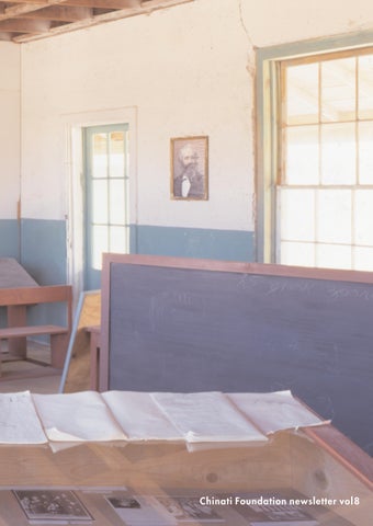
Soon it will be your 70 th birthday, the second big one that we’ll celebrate together. It was exactly ten years ago that you and Emilia were in Marfa for two weeks to install School No.6, which was inaugurated at the Open House that October. We celebrated your 60 th birthday among friends with Don at the Arena. Don showed signs of not being well, but at the time we couldn’t imagine how serious it was. Only four months later he succumbed to cancer. Since 1993, School No.6 has been an integral part of Chinati’s collection. It is your only permanent work in the United States, always on view for the public. Thousands of visitors first learned about you and your work here in Marfa, where they read your texts and study the installation’s careful disarray. Most are moved by the experience—the sight of the schoolrooms is hard to forget. But many also wonder about your presence here, in Judd territory. Your work seems so different that most people have a hard time believing that Don could have been interested in it. How did he come across Kabakov, they ask. What prompted him to invite you to Marfa? Your friendship with Don was brief, because you only met in 1991. More specifically, you met that February in Vienna, when the MAK (Museum of Applied Arts) was showing a large exhibition of Don’s architecture at the same time as your installation of the work Die Zielscheiben (The Targets) at the Peter Pakesch Gallery. But Don was already familiar with your work by then. He saw your first exhibition outside of the USSR in 1986 in Bern, Switzerland, then the Ten Characters in 1989 in Zurich, and The Bridge two years later in MoMA’s Dislocations exhibit in New York. In early 1992 I invited you to create the installation Life of Flies at the Kunstverein Cologne, which marked the beginning of my own
Pronto cumplirás los 70 años, el segundo gran cumpleaños que celebraremos juntos. Hace exactamente diez años estuvieron tú y Emilia aquí en Marfa durante dos semanas para instalar Escue-
estar interesado en ella. Preguntaban cómo se había topado Judd con Kabakov. ¿Qué lo indujo a invitarte a Marfa? Tu amistad con Don fue breve, porque se conocieron apenas en 1991, concretamente en febrero de ese año en Viena, cuando en el MAK (Museo de Artes Aplicadas) había una gran exhibición de la arquitectura de Don al mismo tiempo que tu instalación de la obra Die Zielscheiben (The Targets) estaba en la Galería Peter Pakesch. Pero Don ya conocía tu obra. Había visto tu primera exhibición fuera de la Unión Soviética en 1986 en Bern, Suiza, luego los Diez Personajes en 1989 en Zurich, y dos años después El puente en la exhibición Dislocations en el MoMA en Nueva York. A principios de 1992 yo te invité a crear la instalación Vida de las moscas en el Kunstverein Cologne, y fue entonces cuando comenzó mi amistad contigo y con Emilia. Me acuerdo que un día Don quedó bastante impresionado por esa instalación y pronto te invitó a Marfa. Le fascinaba tu habilidad para concebir habitaciones completas y para coreografiar tus instalaciones con mucha precisión, creando un subtexto para ellas. También le agradó el uso que hacías del sonido en algunas varias de tus obras, que despertó su interés en juntar muchas formas diferentes de expresión artística. Sé que las conversaciones entre ustedes fueron difíciles porque Don sólo hablaba inglés, y en ese tiempo tú todavía no lo hablabas. Que tú y Don se hayan juntado se debe en gran parte a
I LYA K A B A K O V
Paul y Erna Jolles, que conocían a cada uno de ustedes por separado y que ofrecieron unos memorables convites en su casa en Berne y Wengen. Tú y Emilia hicieron su primer viaje al
at their home in Bern and Wengen. You and Emilia made your first trip to West Texas and Chinati in August of 1992. You instantly knew which building you wanted to use during your very first walk around. It was one of the former barracks—at the time entirely derelict—and you immediately developed the idea of transforming it into a Russian schoolhouse. It suited you just fine that the building was completely run down, which meant that you didn’t have to create this state artificially. During the following twelve months you undertook the preparations for the school—ending us drawings that showed the arrangements of individual rooms and their functions, as well as long lists of objects and props that we would gather from all over the world. The furniture was to be built in Marfa, your texts would
la No. 6, que se inauguró en el Open House aquel octubre. Cuando cumpliste 60 años festejamos entre amigos con Don en la Arena. Don daba visos de no estar muy bien, pero en ese momento no reconocíamos la gravedad de su estado. Cuatro meses más tarde sucumbió al cáncer. Desde 1993, Escuela No. 6 ha formado parte integral de la colección de Chinati. Es tu única obra permanente in Estados Unidos, siempre en exhibición al público. Miles de visitantes te conocieron a ti y a tu obra aquí en Marfa, donde leyeron tus textos y estudian el cuidadoso desorden de esta instalación. La mayoría se sienten conmovidos por la experiencia—la vista de los salones de clase es difícil de olvidar. Pero muchos también recapacitan sobre tu presencia aquí, en el territorio de Judd. Tu obra parece tan diferente que la gente encuentra difícil creer que Don pudiera 2
Oeste de Texas y a Chinati en agosto de 1992. Supiste inmediatamente, durante tu primer paseo por Chinati, cuál de los edificios querías usar. Fue uno de los antiguos cuarteles—en aquel momento totalmente abandonado—y al instante se te ocurrió la idea de transformarlo en una escuela rusa. Te parecía muy bien que el edificio estuviera totalmente dilapidado, lo que significaba que no tendrías que crear este estado en forma artificial. Durante los siguientes doce meses emprendiste los preparativos, enviándonos dibujos de la manera como se debían arreglar los salones individuales y sus funciones, junto con largas listas de objetos y artículos provenientes de todo el mundo que debíamos reunir. Los muebles tenían que construirse en Marfa, tus textos tenían que traducirse, y tú pronto estarías pintando las paredes con los colores apagados de la burocracia soviéti-
be translated, and you would soon be painting the walls with the drab colors of Soviet bureaucracy. When you returned to Marfa with Emilia in September 1993, all of the ingredients were ready to be arranged by your masterful hand. Of course you made quite a few changes to the initial plans, as you formed new impressions of the building and the site. While one wing of the building was divided into a sequence of rooms, you left the other one nearly empty as a direct and metaphoric contrast to the chaotic density across the way. The task was to maintain the balance of decadeold decay and artistic precision— not to create a realistic artifact of an abandoned school, but the poetic sense of one. School No.6 celebrates its 10-year anniversary this fall. During the past decade, it has posed difficult conservation questions that surprised us at first, but which we are now able to address with your help. Chinati’s conservator, Francesca Esmay, reports on some of these issues in her essay on page ___. Installations like yours are a challenge to museums because it’s hard to capture and then maintain the specific aging process you depict. I do feel that we’re producing some pioneering work in this regard, and with your help we’re now creating the parameters that will be indispensable for the future care and maintenance of your art. We hope that our progress will also be helpful to other institutions confronting similar questions. This ongoing dialogue about the authentic preservation of your work is certainly the most reliable way for us to better understand not only this installation, but also your approach to your work in general. Of course our collaboration with you also gives us the special treat of having you and Emilia in Marfa for occasional visits. We remain committed to your work. In the winter of 1999 we showed Six Small Albums along with drawings from the early 1970s, and last year we curated an exhibition of over sixty children’s books that you illustrated between 1956 and 1987 in Moscow. Being an illustrator was the official way to become an artist, and it allowed you to pursue your own work secretly. Last year Boris Groys, a long-time friend who has followed your career closely, spoke about the relationship between these two bodies of work. With the publication of his lecture on page ___ of this newsletter, we hope to show a
ca. Cuando regresaste a Marfa con Emilia en septiembre de 1993, todos los ingredientes estaban listos para ser combinados por tu mano maestra. Por supuesto hiciste varios cambios a los planes iniciales, mientras formabas nuevas impresiones de los edificios y el lugar. Mientras que una ala del edificio estaba dividida en una serie de salones, dejaste la obra casi vacía como contraste directo y metafórico con la caótica densidad de enfrente. La tarea consistía en mantener el equilibrio entre la descomposición de una década y la precisión artística—no crear una réplica realista de una escuela abandonada, sino el sentido poético de una escuela así. Escuela No. 6 celebra este otoño su décimo aniversario. Durante esta pasada década, ha suscitado, durante las con-
larger western audience under what extraordinary circumstances you lived and worked. It is a situation that is hard to imagine from our comfortable perspective. School No.6 is now well settled in Marfa, with pictures and texts that tell the story of a very different time and place. But of course your ghostwritten comments in the school make light of this history as well as its conclusions. Your playful seriousness, your loving irony, steadfast storytelling, and obsessive attention to detail will occupy us for many years to come. In the meantime, Ilya, I send you the very best wishes for your birthday on behalf of everyone at Chinati, and am looking forward to more projects together and a long-lasting friendship.
extraordinarias circunstancias bajo las
Yours, Marianne
Un abrazo, Marianne
cuales has vivido y trabajado. Es una situación difícil de imaginar desde nuestra cómoda perspectiva. Escuela No. 6 está bien acomodada ya en Marfa, con fotografías y textos que narran la historia de un tiempo y un lugar muy distintos. Pero desde luego los comentarios que tú escribiste anónimamente en la escuela se burlan un poco de esta historia y de sus conclusiones. Tu juguetona seriedad, tu amorosa ironía, tus perdurables narraciones y tu obsesiva atención al detalle nos embelesarán durante muchos años por venir. Entretanto, Ilya, te mando los mejores deseos en la ocasión de tu cumpleaños a nombre de todos aquí en Chinati, y preveo con ilusión nuestra colaboración en muchos proyectos más y una amistad duradera.
versaciones, preguntas difíciles que al principio nos sorprendieron, pero las cuales ahora podemos contestar con tu ayuda. La conser vadora de Chinati, Francesca Esmay, hace comentarios so-
Contents
bre este asunto en su ensayo en la página. Instalaciones como las tuyas representan un reto para los museos
2
porque es difícil captar y luego conser-
Message from the Director
Un mensaje de directora
MARIANNE STOCKBRAND
var el proceso específico de envejeci-
4
miento que tú describes. Creo que
Ilya Kabakov: A Birthday Tribute
nuestro trabajo en este sentido es de
Ilya Kabakov: Homenaje en la ocasión de su cumpleaños
pioneros, y con tu ayuda estamos desa-
VARIOUS CONTRIBUTORS
rrollando algunos de los lineamientos
15
que serán indispensables en el cuidado
Kabakov as Illustrator
Kabakov como ilustrador
BORIS GROYS
y mantenimiento de tu arte a futuro. Esperamos que nuestro progreso también
28
ayude a otras instituciones que enfren-
Conserving an Impermanent Permanent Installation Conservando una instalación permanente no permanente
tan situaciones similares. Este continuo
FRANCESCA ESMAY
diálogo acerca de la conser vación au-
32
téntica de tu obra es seguramente la
Kazimir Malevich and the Zero of Form Kazimir Malevich y el cero de la forma
mejor manera para que comprenda-
JOHN E. BOWLT
mos mejor no sólo esta instalación, sino también el enfoque general que tienes en toda tu obra. Naturalmente, nuestra colaboración contigo nos ofre-
41
Local History
Historia local
47
Lee Bontecou
Lee Bontecou
DONALD JUDD
ce asimismo el gran gusto de tenerlos a ambos, a ti y a Emilia, en Marfa de vez
50
en cuando en sus visitas.
A Eulogy for Fred Sandback
Panegírico para Fred Sandback
LYNNE COOKE
Seguimos comprometidos con tu obra. En el invierno de 1999 exhibimos Seis pequeños álbums con dibujos de principios de los años setenta, y el año pa-
53
Judd Foundation Report
54
Impressions of Judi Werthein’s Marfa Installations
Informe de la Fundación Judd
sado montamos una exhibición de más
Impresiones sobre las instalaciones de Judi Werthein en Marfa
de 60 libros infantiles que tú ilustraste
EMILY LIEBERT
entre 1956 y 1987 en Moscú. El ser ilus-
57 58 59 60 61 62 63 67 67
trador fue la manera oficial en que llegaste a ser artista, y te permitió cultivar tu propia obra en secreto. El año pasado Boris Groys, un amigo mío de hace mucho tiempo y que ha seguido de cerca tu carrera, habló sobre la relación entre estas dos vertientes de la obra tuya. Con la publicación del ensayo de Groys, en la página de este boletín, esperamos revelar a un público occidental
más
amplio
las 3
Staff Changes Cambios de personal Internship Program Programa de Internados Artist in Residence Program Programa para artistas en residencia Summer Art Classes 2003 Clases de arte en el verano de 2003 Open House 2003 Open House 2003 Chinati Editions Ediciones Chinati Membership & Funding Membresía y financiamiento Friends of Chinati Amigos de Chinati Acknowledgements Reconocimientos
Ilya Kabakov: An Appreciation Dear Ilya: Your mind is more alive than other minds to the nuance of uncertainty that exists among people. The world you describe is perilously unstable, and acutely painful. In it live lost people whose suffering is more infinite than they themselves can know. But even in their pain, you find the lightness, and it is this more than anything else that makes your work so different from that of your peers. There is always humor; you do not suffer from the idea that profundity requires perfect solemnity. This humor is a form of redemption, that makes our own lives bearable. It is a humor that caresses us. There is also always an overflow of wild imagination, an imagination that evokes the stories of childhood and the fantasies of our hearts, the secret lyricism people carry inside themselves, though they often cannot see it. We enter another world with you, one where extravagant and implausible actions make perfect sense and feel as familiar as though we were all always flying into space or sitting in the closet or being tiny white people or placing our projects in palaces. What you make seems at once impossible and true, and makes us feel that all human enterprise is both impossible and true. I characterize whole lovely experiences as Kabakov moments: a particular sensation of being able to tolerate myself, and of knowing I am not alone in the world of my strange self. When I talk about you and your work, I feel a serenity descend on me. How can such sad work make us so happy? The Soviet man you once lampooned has become in recent years a version of everyman. Looking into your work, we recognize ourselves, and feel seen, and loved, and refreshingly absurd in our own minds and we don’t mind who we are as much as we usually do. You and Emilia are also such dear friends and such kind people. Genius often goes with self-importance, but your geniality crackles like fire and warms the hearts of those who approach it. I feel immensely lucky to be of that number.
B I R T H D AY D R AW I N G S B Y PAV E L P E P P E R S T E I N , 2 0 0 3
Ilya Kabakov: A Birthday Tribute
BIRTHPLACE IN DNEPROPETROVSK
I . K . ( R I G H T ) S K I I N G 19 3 8
I . K . I N K I N D E R G A R D E N ( F R O N T R O W, S E C O N D F R O M R I G H T ) , 19 3 9
W I T H H I S M O T H E R , C A . 19 5 0
W I T H H I S FAT H E R , C A 19 5 0
With love, Andrew Andrew Solomon, New York City
4
M O S C O W, C A 19 5 5
tonishing as the events recorded in his art which emerge from an everyday, another very distant everyday, to become remarkable. The stories, the pictures at once familiar and unfamiliar, the tableaux were both documenting a mythological era and very present in the objects, the books, and drawings—the very paper redolent of lives lived in hope and loss—and in the overwhelming possibility of imagination filled with longing. It is a curious fact that Ilya alone managed the translation between apparently alien worlds, through a time that spanned the crisis of ideologies, the end of an epoch and the hesitant, sometimes fearful, start of our new world. In many ways, Ilya may have seemed
7/4/03
Dear Ilya,
4/7/03
I will never forget our first visit with you. We had to traverse the loose boards before reaching the small wooden door on the fifth floor. You greeted us with open arms and an open heart, as though we were old friends. Inside we looked around your spacious studio and saw the three colossal pictures Am Rande (Along the Margins) for the first time. We were completely overwhelmed. In all of our art-related trips, we had never seen anything like it. Under a low table were forty albums, and you performed some of them for us during the following days. We were in a constant state of bewilderment. And during every subsequent visit, we were able to see a new installation of yours. Later we were regular guests with you, and every time was a lasting experience. You told us of a golden subterranean river, and we had the feeling of belonging to a group of people who found themselves gathered around you at this river’s bank. In your most beautiful letter, which describes the way in which the three colossal pictures Along the Margins float down through your studio’s roof-top windows, you say that you could never have dreamt that these pictures would ever leave your studio. Since then, you are at home in a world with your pictures , and I am able to live with these many beautiful memories. I am so grateful for the precious thoughts with which you infinitely enriched Paul‘s life and mine, and send you a hug with my warmest birthday wishes.
Lieber Ilya, Nie vergesse ich unseren ersten Besuch bei Dir. Wir kamen über die wackeligen Bretter in den fünften Stock und erreichten die kleine Holztüre. Du hast uns mit offenen Armen und Herz empfangen wie alte Freunde. Als wir dann herumschauten, erblickten wir zuerst in deinem geräumigen Atelier die drei riesig grossen Bilder Am Rande. Wir waren überwältigt. So etwas hatten wir auf unseren vielen Kunstexpeditionen noch nie gesehen. Unter einem niedrigen Tisch lagen vierzig Alben, von denen du uns in den
G R A D U AT I O N , M O S C O W 19 5 7
nächsten Tagen einige vorgeführt hast. Wir kamen nicht aus dem Staunen heraus. Und bei unseren nächsten Besuchen konnten wir jedes mal eine neue Installation besichtigen. Später waren wir regelmässig bei dir zu Gast, und jedesmal war es ein bleibendes Erlebnis. Du hast uns von einem goldenen unterirdischen Fluss erzählt und wir hatten das Gefühl, wir gehören zu den Menschen, die sich an dessen Ufer gefunden und um dich versammelt haben. In deinem schönsten Brief, welcher das Herunterschweben der drei riesigen Bilder Am Rande aus dem Dachfenster deines Ateliers beschreibt, sagst du, du hättest nie geträumt, dass diese Bilder je dein Atelier verlassen würden. Seither bist du mit deinen Bildern in der ganzen Welt zuhause und ich lebe mit den vielen schönen Erinnerungen. Für diese kostbaren Gedanken mit denen du das Leben von Paul und mir auf unschätzbare Weise bereichert hast, dan-
an unlikely hero concerned with the details of a life almost unimaginable to many of his audience and possessed of a similarly opaque personal history. Even so, for many of us, this artist has been a figure rather like Gogol in another age, wholly a part of his world and askew, as though looking sideways and noticing that which was before overlooked. I first came across Ilya’s wonderful work in the late 1980s as others in the West were also beginning to discover it. A few months later we worked together on a project to be realized in the Academy of Fine Arts in Kortrijk, a small town in Belgium where I ran the Kanaal Art Foundation. As always, Ilya’s installation “Illustration as a Way to Survive” grew beyond its initial proportions to encompass a fascinating history
ke ich Dir und umarme dich mit den herzlichsten
wärmsten
Geburtstags-
wünschen,
With love, Erna
Alles Liebe
Erna Jolles, Bern Switzerland
Erna Jolles, Bern Switzerland
Erna
Ilya Kabakov 70 years In retrospect, and as we celebrate his seventieth birthday, Ilya Kabakov’s achievement seems even more extraordinary than it did at the time. While history consumes us in a universe that has become so very different, the amazing journey made by Ilya, as the world turned, appears quite as magical, quite as as5
I N H I S R O O M AT A R T A C A D E M Y, 19 5 9
C E L E B R AT I N G G R A D U AT I O N , M O S C O W 19 5 7
of the artistic activities of young artists in a 1960s Soviet-Union through the personal trajectories of two protagonists: Ulo Sooster and Ilya Kabakov himself. During the preparations, I traveled to Moscow and Tallinn with Emilia Kabakov and Elizabeth Macgregor to research the project and assemble the children’s books illustrations that formed the core of the exhibition. I remember those days often with great fondness. Ilya’s enthusiastic contribution and his extraordinary hard work are a part of his genuine and big hearted personality. Both generous and critical towards the surrounding world his reactions have always been marked by an extremely astute analysis of social reality and a strong engagement in the arts. Fusing intellectual concepts with his incredible skills as a draftsman and a painter, Ilya’s work reaches us such as to never leave us.
For this I thank you, revere and admire you, and send you my very best wishes.
sten Glückwünsche
Your Joachim
Von Deinem Joachim
Joachim Sartorius, Berlin
Joachim Sartorius, Berlin
Most artists celebrating their 70th birthday would be revisiting successes of their youth, or brooding over the difficulty of forging a late body of work. Not you. You are in the middle of a creative eruption that has not abated in the decade and a half that I have known you. In fact, it seems only to feed on itself and grow. You are even more fecund and astonishing in art and life now than you were in that autumn of 1987 when you were about to take your first alarming steps into the West. I remember the doubts you voiced then, under the lamp, at the table in the corner of the studio you had constructed on the top of 6/1 Sretensky Boulevard. It was afternoon, and the meager Moscow sun just grazed the layers of large panels and paintings that leaned against the walls. We’d kind of peeked at them earlier, as best we could. You’d unburied this or that element of the Ten Characters installation that you had never yet had the space — public or private — to spread out and look at all at once. Less than two years later, Ten Characters would make a legendary U.S. debut, at the Feldman gallery in New York and in a touring exhibition organized by the Hirshhorn Museum. But that afternoon in Moscow, you were uncertain of your reception in the West, too isolated to fully appreciate your own worth and sufficiently sophisticated to distrust the complexities of the larger art world. You needn’t have worried. You gained the international art world, though you lost the community of three generations of Moscow Conceptualists at whose center you lived and worked. As you have traveled further and further from the circle you nurtured and that nourished you, the strategies you evolved in Moscow have continued to stimulate extraordinary work. The vocabulary of the mad, “untalented” ZhEK artist proved nearly as infinitely elastic as recombinant DNA. Your critique of
C E L E B R AT I N G G R A D U AT I O N , 19 5 7
D U R I N G E X A M S , 19 5 7
Berlin, June 2003 Dear Ilya, Lieber Ilya,
Artists are without age. Their energy and imagination allows them to turn time upside down. Therefore it is hard for me to believe that you are turning seventy. My meetings with you have left their mark on my life— my first visit to your Moscow studio at Stretenski Boulevard 6/1 in 1986; your arrival in Berlin for Ausstellung Eines Buches at the Daadgalerie, the clang of your 270 Sentences of Fear installed in 1990 in the claustrophobic wooden hallways at the Potsdamer Platz—then still devoid of humans as well as buildings; and the highly symbolic fly installation at the Galerie Barbara Weiss that we are fortunate enough to be able to rediscover in the large exhibition Berlin-Moscow/ Moscow-Berlin 1950-2000, which will open three days before your birthday. You were always—and you continue to be—concerned with the historic meanings of a simple human being who suffers under the catastrophies of the system and of world history. Your work leads to a different, more humane understanding of universality.
und Bewunderung, und die herzlich-
Dear Ilya,
All best wishes, Catherine Catherine de Zegher, New York
Dafür heißen Dank, meine Verehrung
Künstler sind ohne Alter. Mit ihrer Energie, ihrer Phantasie stellen sie die Zeit auf den Kopf. So kann ich auch nicht glauben, dass Du siebzig wirst. Die Begegnungen mit Dir haben mein Leben mitgeprägt: Der erste Besuch in Deinem Atelier in Moskau am Stretenski Boulevard 6/1 im Jahre 1986, Deine Ankunft in Berlin und die „Ausstellung eines Buches“ in der daad-Galerie, die klirrenden „270 Sätze der Angst“ in den klaustrophopischen
Holzkorridoren
(„Zwei Erinnerungen an die Angst“) auf dem 1990 noch menschen- und gebäudeleerem Potsdamer Platz, die hochsymbolische Fliegen-Installation in der Galerie Barbara Weiss, die wir jetzt wunderbarerweise in der großen Ausstellung „Berlin-Moskau/Moskau-Berlin 1950-2000 wieder entdecken können, welche drei Tage vor Deinem Geburtstag eröffnet wird. Es ging und geht dir immer um die geschichtliche Bedeutung eines einfachen Menschen, der die großen Systeme, die Weltgeschichte als Katastrophe erleidet. Deine Arbeiten führen zu einem anderen, menschlicheren Begriff von Universalität. 6
AT G R A D U AT I O N , M O S C O W, 19 5 7
I N H I S M O S C O W S T U D I O , 19 7 9
I N H I S M O S C O W S T U D I O , 19 81
S H O W I N G H I S A L B U M S , M O S C O W 19 81
Malevich’s metaphysical geometry and Socialist Realism’s blighted narratives braided with the ironic humor of an ambivalent seeker after spiritual truth to transmit the psychological horrors of everyday Soviet life to those of us who could otherwise never imagine it. And once that life disappeared into history, the same vocabulary proved as brilliant at delineating the dark night of Everyman’s soul and the shifting currents of taste, power and longing in life and art. You make art magical and you make it urgent. You are of no school but your own and it transcends all schools. Donald Judd saw that, though it was his practice to exclude all the world that you include in your
you and Emilia at your impish best that beguiled them, as you yourself always do with that smile of yours. But it was the column-sized skirt and the angel’s eye view of a miniature landscape below that awoke them to the multifarious meanings of this paradoxical world you had created. Venice, and particularly the Venice of the Biennale, was the apt place in which to rub our noses into the inadequacies of the present in plain sight of a lost, larger past. And how much you have lost. We have all lost the possibility of dreams and utopias, or believe we have. You keep trying to reinvent them for us, though you yourself have lost more than your history. You have lost friends, and home, and country and context. With Emilia, you have made yourself a new home on a green bank overlooking a blue bay on Long Island. But though you rise early each morning to swim in the shallow waters, and spend the day in paint-dripped carpet slippers doing the only thing you want to do, which is to make art, the phantoms of your losses accompany you. Sometimes you draw those phantoms, your back to the view out the south-facing window. You create worlds in which we can find ourselves, though they are never world enough for you.
W I T H PA I N T I N G “ T E S T E D ’ ” , M O S C O W 19 81
JOLLES IMAGE
W I T H PA U L J O L L E S , 19 8 4
installations. The October that your School No. 6 opened at the Chinati Foundation in Marfa, in 1993, he was still alive. In that sere landscape you could see it was immanence he was after in the art. The two of you had that in common, though you both hid it well. He said it was the literature in your work he admired, your mind at play, and the formal elements by which you made “me or another viewer interested in it.” In particular he admired your disparate uses of scale, from the infinitesimal detail to the all-encompassing environment. Less perceptive people haven’t always paid much attention to what you do with scale. At the Fondazione Querini Stampalia in Venice this summer of 2003, they couldn’t help but notice. In the installation, Where Is Our Place? it was
And so I will hold in my mind on this birthday, the vision of you painting in your studio, as you have been painting so much of the time during the past three years. You had to invent a character – a Rosenthal – to give you a cogent conceptual excuse to make painting after lush painting in his name. The paintings kept revisiting the issues that have goaded you from the first: abstraction and socialist realism, East and West, light and darkness, truth and fiction, sense and nonsense, art and the art world, life and death. This year, you have added a new character-as-painter. He claims he is Rosenthal’s disciple. His name is Kabakov. His paintings are always electrifying and always new. Your friendship is one of the great joys of my personal life, and Bill would say the same; your work is the miracle of all our lives in art. Happy Birthday,
I N S TA L L AT I O N V I E W O F “ T E N C H A R A C T E R S ” , WA S H I N G T O N D . C . 19 8 8
W I T H C L A U D I A J O L L E S , B E R N 19 8 8
W I T H B A R T D E B A E R E , G E N T 19 91
BRUCE NAUMAN, ROBERT STORR, I.K., NEW Y O R K 19 91
W I T H J A N H O E T, K A S S E L 19 8 2
I LYA A N D E M I L I A K A B A K O V W I T H E R N A J O L L E S , 19 9 2
W I M B E E R E N , D O R I N E M I G N O T, I . & E . K A B A K O V, A M S T E R D A M 19 9 3
Love, Amei Amei Wallach, Mattituck, New York W I T H J E A N T I N G U E LY, PA R I S 19 8 8
7
I . K . , PA U L J O L L E S , D O N A L D J U D D , W E N G E N 19 9 2
Dear Ilya; Liebe Ilya, Käre Ilya -
Where the Twain Shall Meet
Twelve years have passed since you declared Malmö – this small industrial town in the south of Sweden – “Absolute Paradise”. It had nothing to do with the fact that the vodka with the same name, the vodka that contested and stole the global vodka throne from the great Russian names, was produced nearby. It just reflected, besides our multilingual and hybrid mode of communication, an immensely lucky moment in the life of the Rooseum, were you created one of your most intense and dense installations ever. Your – and Emilia’s – warmth and amazing spirit made the whole institution fly. I just wanted, now on your big day, to take the opportunity to tell you that this warmth and this spirit, which I also have felt every time since, when our paths have crossed, made an absolute and ever lasting impression on everybody you worked with, on the institution itself and on the city of Malmö. This battered city truly became a little bit more of Absolute Paradise thanks to you! My warmest and most heartfelt congratulations!
I have often wondered how it came about that Ilya Kabakov was invited by Donald Judd to create an installation for the Chinati Foundation. Someday I will ask Kabakov directly, but it is a great pity that we cannot hear the story from Judd’s side as well. Or, going beyond what is known about the practicalities involved, explore the nature of the American artist’s affinity for the Russian artist’s work. After all, on the face of it, they would not seem to have been the most obvious of aesthetic allies. The differences between them were not, of couarse, a matter of the conventional polarities of EastWest orientation, although one can-
I . K . A N D D O N A L D J U D D , M A R FA 19 9 3
I N M A R FA , 19 9 3 I . K . C E L E B R AT I N G H I S 6 O T H B I R T H D AY, M A R FA 19 9 3
Yours, Lars Nittve Lars Nittve, Stockholm, Sweden
W O R K I N G AT M A R FA I N S TA L L AT I O N , 19 9 3
Dear Ilya, I’ve heard from Primakov who read that in France everyone gets amnesty from their parking tickets when a new president is elected and he wants to know if you’ll declare an amnesty for your birthday and let him out of the closet! I won’t say what the flies asked for! But we all wish you a very happy birthday.
not stress enough how necessary it is to read Kabakov’s work as the material expression of real deprivations and imaginary compensations that were the “ready-made” condition of Soviet art, a condition no Bohemian poverty or aesthetic constraint in this country has ever equaled. As art history gets streamlined by generalizations and polemics, the gap separating Judd the reductive geometric sculptor and Kabakov the pack-rat filler-upper of desolate spaces grows. But then Judd was never a “minimalist” to which one might oppose Kabakov the “maximalist” of the least of things, of paltry bits and pieces of life left-over or leftbehind. Instead, to use Judd’s own terminology, he was the champion of “specific objects,” by which he famously meant those forms of art that assumed a place – and emphati-
Jonathan and Marianne Fineberg (and our beautiful young pilot) Champaign-Urbana, Illinios
A M A R FA R E S I D E N T W I T H M A R FA N E W S PA P E R , 19 9 3
T H E K A B A K O V S A N D D O N A L D J U D D , M A R FA 19 9 3
8
N S TA L L AT I O N V I E W O F T H E B I G A R C H I V E , S T E D E L I J K M U S E U M , A M S T E R D A M 19 9 3
W I T H R U D I F U C H S , M A R FA 19 9 3
A . WA L L A C H , I . M O E S S I N G E R , I . K . , P E T E R N O E V E R , M A R FA 19 9 3
cally occupied it – between painting and sculpture. Now Kabakov’s installation are nothing if not accumulations of very specific objects, but the more important fact about them is that they too exist in the zone bracketed on the one hand by painting and on the other hand by sculpture. From Kabakov’s perspective they pointedly contest the historical primacy, even the historical survival of the former – in particular the pictorialism of the Renaissance paradigm of painting as an illusionistic window on the world – while refusing in their aggressively diffuse and meager way to resemble sculpture in the traditional sense, especially in the very academic sense that officially sanctioned sculpture too on after the Soviet’s disowned their avant-gardes of the 1920s. As two men more comfortable in the still-to-be defined interstial categories of art than in the established medium-based categories, Judd and Kabakov had ample grounds for recognizing each other. On Judd’s end of the bargain, meanwhile, there was the flip side of the critic-scrounge of the 1980s who summarily dismissed the new trends and newly minted art stars of that oddly remote moment, and that was the avid though though-minded art reviewer of the 1960s, who, despite the opportunity that his position afforded him to lay down the law in the service of his personal commitment to hard, high modernism, nevertheless enthusiastically championed the work of a host of mavericks otherwise ignored or given short-shrift by his formalist colleagues. The list of these artists is impressive, particularly from today’s vantage point when the missing-in-action of mid-century art is widely being reconsidered. Among those Judd singled out for advocacy number Lee Bontecou, Yayoi Kusama, H.C. Westermann, and John Wesley. Kabakov is the last of the independent candidates for major art world status for whom Judd thus cast his vote. Maybe he recognized in him some of the melancholy whimsy of Judd’s New York contemporary Claes Oldenburg, whom Judd was also one of the first to back in the early 1960s. Or maybe, as in the case of Oldenburg, Westermann and Wesley, it was that Kabakov dealt so inventively and so rigorously with all the material Judd excluded from his own work that in effect Judd delegated that task to him and them with a vested interest in their success. Undeniably, though, Judd was selectively
generous to artists who practices might superficially seem to have been almost antithetical to his own. And, among many qualities – not least his curmudgeonly defense of artist’s interests against those institutions – it was that appetite for the unexpected and that lack of dogmatism with regard to things that did not accord with the consensus of “advanced opinion” which distinguished him from so many of the artists with whom he has been critically associated, not to mention the distinction it gives him in relation to so many of the critics currently constructing the cannon of his generation with Judd “in” and the mavericks he favored “out.” But what of Kabakov’s affinity for
T H E K A B A K O V S I N G R E N O B L E 19 9 4
E M I L I A A N D I LYA K A B A K O V, M A D R I D 19 9 8
F R O M L . : Z A H K A R O V, M I C H A I L O V, S O R O K I N , P R I G O V, E . & I . K . , M O N A S T I R S K I , A L B E R T, B E R L I N 19 9 7
I. K. AND BORIS GROYS
“ T H E L I F E O F T H E F L I E S ” , I N S TA L L AT I O N V I E W, C O L O G N E 19 9 2
W I T H J O S E P H K O S U T H I N WA R S AW, 19 9 4
“ T H E L I F E O F T H E F L I E S ” , I N S TA L L AT I O N V I E W
Judd? As an artist raised at two removes from the heroic chapter of modernism that gave the world Suprematism, Constructivism and their off-shoots, Kabakov’s responsiveness to the maker of machined boxes may seem strange, even contradictory. Perhaps the “two removes” explain how this happened. First of all, Kabakov did not come to Judd by way of the American teleologies of modernism; he did not encounter him as an exponent the “next step” in the evolution of art toward a preordained kind of abstraction. Instead, Kabakov discovered Judd when both were fully developed artists in a period of general confusion about which way history was going. For better or worse what they shared was their distance from “mainstream” – in this instance predominately market-driven – taste
WITH JEAN CHRISTOPHE AMMANN, D A R M S TA D T 19 9 5
KLAUS BUSSMANN, I.K., KASPER KOENIG, M U E N S T E R 19 9 7
W I T H S T U D E N T S I N L E I P Z I G 19 9 7
9
E M I L I A A N D I LYA K A B A K O V, PA L E R M O 19 9 8
W O R K I N G O N I N S TA L L AT I O N I N F R A N K F U R T 2 0 01
during the 1980s. They were both mid-career artists at odds with fashion. (Incidentally, it is worth noting that despite the discrepancy in their respective appearances on the international scene, the two artists were of an age with Judd having been born in 1928 and Kabakov in 1933.) Second, despite the effort made to align American reductionist art with the utopian programs of its Soviet antecedents, Judd eschewed such “progress-oriented” historicism. And that is a plus so far as Kabakov is concerned in that it was precisely the Russian avant-garde’s desperate alliance with or acquiescence to the Soviet power structure that made their example so problematic for innovative Russians of the postwar era. These holes in the unified field of modernist theory are the sites in which Judd and Kabakov saw opportunity, and the sense that the dialectics of holistic or totalizing concept of art was always open to inspired exceptions set the terms for a rapprochement between them. But the common ground they shared is nonetheless fertilized by the backwaters of utopia. Or so one may speculate in the case of someone like Kabakov who is obsessed by the individual efforts of people to make heaven on earth, or at least to get as far away from infernal actuality as possible. From 10 Characters, the labyrinthine environment that introduced him to Americans in 1988 and incorporated installations devoted to men who vaulted to the heavens by one means or another, to the 1998 Palace of Projects, an omnibus work modeled after Tatlin’s Monument to the Third International that brought together the idealistic schemes of dozens of anonymous inventors bent on saving the world or at least themselves, Kabakov has been drawn to loners with big plans. Well, Judd’s dream of a perfect place to make and see art in one of the most sparsely populated parts of one of the least assimilated of the United States, is, in spirit, a Kabakovian “project” writ large and brought to life. From that angle, which cuts through barriers of time and space and culture, it is not just reasonable, but fitting that Judd should have found Kabakov, and Kabakov should have made himself at home in Marfa.
70 year is total liberty! Do not look back! Only forward! Ever ything is start only now! Vadim Zakharov Cologne, Germany
Dear Ilya,
30 September 2003
We wish you a ver y happy birthday!
Dear Ilya,
Lieber Ilya, Wir kommen aus dem Westen, du aus
We are from the West, and you from the East. Before we got to know you, almost nobody really knew what this meant. Of course we had our opinions about Lenin, Stalin, and Gorbachev, we listened to Tchaikovsky and Profokiev, and had read Tolstoy and Gorky. Personally, I thought of the Russians as great story-tellers and of the Soviets as strangely unscrupulous revolutionaries, tough even against themselves. Therefore, I imagined you to be something of a blend between all of that—a good tale-spinner and a cool strategist. Since I first met you at the restaurant of the Kunsthalle Basel in 1989 at a reading of one of your albums, I have experienced how your magical strategy was transforming piece by piece, room by room, place by place. I saw Ten Characters at the Ronald Feldman Gallery, and was impressed—even shocked—by the oppressive atmosphere and the texts that seemed so authentic. At that time, and again later when looking at many more installations, I wondered how it was possible that someone could carry such a vast archive with him and imagine so many voices, fates, and memories all at once. Later, along with many of my colleagues, I realized that these fates and props did not seem to run out. I never asked myself if there might be a large container where everything came from—a container that is continuously refilled and sent on a new journey every few months is from the East to the West. After three or four years, one would have expected that you or your wife Emilia would
Melissa and Robert Soros and Family New York City
W O R K I N G I N F R A N K F U R T, 2 0 01
Robert Storr New York City
10
dem Osten. Bevor wir dich kannten, wussten wir fast alle nicht, was das bedeutet. Natürlich haben wir unsere Meinung zu Lenin, Stalin und Gorbatschow gehabt, haben Tschaikowsky und Prokofiew gehört, Tolstoi und Gorky gelesen. Ich persönlich habe die Russen für große Erzähler und die Sowjets für seltsam skrupellose, auch gegen sich selbst harte Revolutionäre gehalten. Also dachte ich, dass du so etwas wie eine Mischung aus allem bist – ein guter Märchenonkel und ein kühler Stratege. Seit ich dich 1989 im Restaurant der Kunsthalle Basel mit einem deiner Alben kennen lernte, habe ich erlebt, wie du Stück für Stück, Raum für Raum, Ort für Ort mit deiner märchenhaften Strategie verwandelt hast. Ich habe die Kommunale Wohnung in der Galerie Feldman gesehen und war von der beklemmenden Stimmung und den authentisch
wirkenden
Texten
beein-
druckt, ja schockiert. Wie, dachte ich, auch bei vielen späteren Installationen, kann jemand so ein großes Archiv mit sich tragen und sich so viele Stimmen, Schicksale und Erinnerungen auf einmal vorstellen? Später merkte ich wie viele meiner Kolleginnen und Kollegen, dass diese Schicksale und Requisiten nicht auszugehen scheinen. Ich habe mich nie gefragt, ob es wohl einen großen Container gibt, aus dem alles stammt, einen Container, der immer wieder nachgefüllt und alle paar Monate vom Osten in den Westen neu auf die Reise geschickt wird. Man hätte eigentlich erwartet, dass nach etwa drei oder vier Jahren anstelle der alten, verbraucht und muffig wirkenden Materialien bei dir oder durch deine Frau Emilia neue Stoffe, et-
neously closely aligned but very different layers fused in your work— namely authenticity and precision alongside a dream-like and fleeting quality—can be neither tied down nor let go. In the middle ages, there was an art with layered interpretations. Like artists of that time, perhaps you—a former underground artist—are submitting some hidden messages within the official script. What I find intriguing about your work is that all these questions don’t have to be resolved. In fact, it isn’t even clear if you spent your 70 years making children’s books, albums, underground art, installations, or architecture. Recently you told me that you would like to produce work that involves several dif-
was mehr Lack und Glanz in die Installationen eindringen könnten. Aber, das wurde spätestens nach der Installation der Öffentlichen Toilette in Kassel 1992 klar, wir haben alle weit gefehlt. Wir wissen, dass ihr beide unbeeinflussbar seid. Deine jungen Kollegen haben im Westen seit der Perestroijka eine Zeitlang ebenfalls reüssiert, und es war Mode, ein paar Zeitungsausschnitte, Fotos und Textfragmente aus der Sowjetunion in einem nostalgischen Sinn zu rahmen oder zu ver vielfältigen, so dass man Anteil nahm an Phänomenen, die man deutlicher sehen wollte. Das alles aber nutzte sich ab. Die westlichen Kuratoren, die dich länger kannten, wussten, dass Nostalgie deine Sache niemals war – und wenn, dann ist es bei
nis zurück, sobald man einen deiner Räume sieht, ein Ereignis jedenfalls, das es niemals wirklich gegeben hat. Ich habe durch weitere Ausstellungen, Bücher und schließlich Gespräche mit dir gelernt, dass du den Planeten Erde nicht für einen Ort hältst, der für die Menschen geeignet ist. So kann man deine Arbeit auch verstehen. Es sind aus dieser Sicht Hoffnungsschreie, dass im Leben und im jeweiligen Augenblick etwas nicht stimmt und schier unerträglich ist. Es sind zugleich Dokumentationen, die etwas Überirdisches an sich haben, als ob ein übermenschlicher Betrachter auf dem Planeten etwas sieht, bei dem er Beweise findet, dass dieser Ort für Menschen tatsächlich unmöglich ist. Der Mensch selbst hat sich ja aus deinen Installationen meistens entfernt. Wir verdanken vor allem deinen Gesprächen mit Boris Groys und ebenso seinen Aufsätzen, dass wir die einander sehr nahen, aber höchst unterschiedlichen Ebenen deiner Kunst, die Authentizität und Perfektion neben dem Traumhaften und dem Entschwindenden, nicht dingfest machen und auch nicht aufheben können. Es gab im Mittelalter einen mehrfachen Schriftsinn in der Kunst. Auch das habe ich mir überlegt, denn vielleicht gibst du als ehemaliger Untergrundkünstler ne-
?????????????????????????????????????????
have integrated new materials with more varnish and sheen to seep into the old, used-up, and stuffy ingredients of your installations. But it certainly became clear by the time of your 1992 installation The Toilet in Kassel that we were all very wrong. We now know that the two of you cannot be influenced. Since the time of Perestroika, your young colleagues have also shown for some time in the West. It became fashionable to nostalgically frame or duplicate a few newspaper clippings, photographs, or text fragments from the Soviet Union in order to participate in phenomena that one wanted to see more clearly. All of this quickly got old. Those Western curators who had been familiar with you for a while knew that you were not interested in nostalgia— and if you were, it was a cool, almost gruesome nostalgia for this entire thing called life. It was in Marfa, Texas, where I realized that your work goes beyond any historic categorization, although one does have the impression of being in a very specific historical moment and place. But there in the desert, I felt unlike ever before just how fictional, how thoroughly silly, invented, and certainly funny your work could be. A school, a classroom that was left to deteriorate would be conceivable almost anywhere except here. More than any other installation prior to it, the Marfa work made the surreal quality of your work as well as your surreal perspective on life apparent. I realized at the time that when one looks into your rooms, one looks as though in a daydream back onto a certain event—but an event that never actually took place. Further exhibitions, books, and ultimately my conversations with you, have taught me that you don’t think of the planet earth as a place that is suited for human beings. One can also look at your works in this way. From this point of view, the works are cries to say that something in life and in a particular moment is not right and is almost unbearable. They are documents with an unearthly quality, as though someone observing the earth from above had seen something to prove that this place is in fact impossible for humans. As it turns out, human beings are already absent from most of your installations. Thanks to your conversations with Boris Groys as well as to his essays, we can understand that the simulta-
ben einer offiziellen Lesart einige verschlüsselte Botschaften weiter. Mir gefällt an deiner Arbeit, dass das alles nicht entschieden zu werden braucht. Es ist ja nicht einmal klar, ob du nun im Verlauf deiner siebzig Jahre Kinderbücher, Alben, Untergrundkunst, Installationen
oder
Architektur
ge-
macht hast. Unlängst hast du mir erzählt, dass du noch an Werken arbeiten möchtest, bei denen mehrere Genera-
ferent generations, including artists who are completely unknown. All of this is you—even the artists that don’t yet have names become your alter egos. For some time now, we’ve had too much of your work. But it is just fine that we’ve had too much—because especially in America, less has always been too little. That a man from the East would shower us with such gifts—with crazy ideas, displacement, bafflement, and bewilderment, while everything appears to be clearly ordered—this is what we celebrate with you today. May you live another 70 years, we’ll still never be as old and wise as you.
dir eine kühle, fast grausame Nostalgie für die gesamte Sache namens Leben gewesen. Es war in Marfa, Texas, dass ich merkte, wie sehr deine Arbeit über jegliche historische
Kategorisierung
hinaus
geht, obwohl man immer unter dem Eindruck steht, es mit einem ganz bestimmten geschichtlichen Augenblick und einem echten Raum zu tun zu haben. Aber hier in der Wüste spürte ich wie niemals sonst, wie fiktiv, wie schier blödsinnig, ausgedacht und vor allem komisch deine Werke sein können. Eine Schule, ein Klassenzimmer, der Zerstörung anheim gegeben, das wäre fast überall denkbar gewesen – gerade hier aber eigentlich nicht. In Marfa ist
tionen im Spiel sind, darunter namentlich solche Künstler, die man gar nicht kennt. Das alles bist du, und natürlich werden vor allem die Künstler, die noch keinen Namen haben, auch dein alter Ego sein. Es ist uns eigentlich längst zu viel mit deiner Kunst, aber es ist gut, dass es zu viel ist. Denn insbesondere in Amerika ist wenig immer zu wenig gewesen. Dass wir aber von einem Mann aus dem Osten so sehr beschenkt werden, mit verrückten Ideen, Verrückungen, Wirrungen und Irrungen, obwohl doch alles klar geordnet erscheint, das feiern wir heute mit dir. Mögest du nochmals siebzig Jahre leben, wir werden ohnehin niemals so alt und weise sein wie du.
dadurch mehr denn je für mich die surreale Qualität deiner Arbeit als auch
Thomas Kellein
Thomas Kellein
deine surreale Sicht auf das Leben her-
Bielefeld, Germany
Bielefeld, Deutschland
vor getreten. Man blickt, merkte ich damals, wie im Wachtraum auf ein Ereig11
We also have to add to this that Kabakov has been working on his art ceaselessly and with the highest energy every day for several decades. By now the number of his works seems immeasurable—even for an artist his age. Their range and scale alone cause awe, never mind their artistic quality and spiritual maturity. On the other hand, we can also think of Kabakov as a young artist, because he only arrived in the West 15 years ago—emigrating from Russia, and known to few at the time. In this sense his aesthetic is young and contemporary in a way that isn’t seen in the older, well-established Western artists of his generation. Aesthetically, Kabakov therefore belongs to a much younger generation. Perhaps that is also the reason he is still so vital, so tireless, so present, so passionate, so full of new ideas that seem impossible— even utopian—although they might well be realized one day. I first visited Ilya Kabakov’s studio in the winter of 1976/77, when I still lived in Moscow. The banality and dreariness of Soviet life at the time seemed depressing and frustrating to me as much as it did to most Soviet citizens—we all wanted to escape, and dreamt of a different, unknown life. It wasn’t until I saw the work of Ilya Kabakov, that I unexpectedly realized how my daily life could seem to be bizarre, interesting, absurd, even exotic, certainly funny, and exciting. Suddenly this different perspective that Kabakov’s work had given me made my daily life seem aesthetically highly interesting. Suddenly I knew that I had
I . K . A N D P E T E R N O E V E R , M AT T I T U C K 2 0 0 3
Ilya Kabakov Ilya Kabakov zum 70. Geburtstag
The utopian dreamer. He dreams himself out of the unsatisfactory Present into a paradisiacal Future; he flees from reality into a beautiful dream, the realists say. – He just goes on ahead, he himself says. The utopian dreamer has taken the plunge. Without him, the realists would never find their goal. Without him, the art world would have no fire.
Der utopische Träumer. Er träumt sich aus dem schlechten Jetzt in eine paradiesische Zukunft; er flüchtet aus der Wirklichkeit in einen schönen Traum, sagen die Realisten. – Er gehe schon mal vor, sagt er selber. Der utopische Träumer hat die Flucht nach vorne angetreten. Ohne ihn fänden die Realisten nie ihr Ziel. Ohne ihn fehlte dem Kunstbetrieb das Feuer.
Peter Noever
Peter Noever
Vienna, Austria
Wien, ö sterreich
Lob des Kunstsystems Das heutige Kunstsystem sucht ständig nach jungen Künstlern, die dieses System mit frischem Blut versorgen sollen. Nun wird aber dieses frische Blut der künstlerischen Imagination in der Regel
Praise of the Art System
schnell aufgebraucht – und dann sagt man sich, dass der jeweilige junge
Today’s art system is constantly searching for young artists that are supposed to pump fresh blood into the system. But this new blood of artistic imagination is often too quickly exhausted, and then one realizes that this particular artist must have been too young after all, that he didn’t yet have enough blood in him. The true wish of the art system is to have an artist who is simultaneously very young and age-old. While this seems like an impossible dream, it becomes reality more often than we think. And that’s how it is in this case: Ilya Kabakov is a living embodiment of this impossible dream. Soon he will be 70 years old. In biological terms, this seems like a lot.
Künstler doch noch zu jung ist und zu wenig Blut angesammelt hat. Der eigentliche Traum des Kunstsystems ist ein Künstler, der gleichzeitig absolut jung und uralt ist. Dieser Traum scheint ein unmöglicher Traum zu sein – aber es passiert öfter als man denkt, dass sich gerade das Unmögliche verwirklicht. Und so ist es auch in diesem Fall: Ilya Kabakov ist eine lebendige Verkörperung dieses unmöglichen Traums. Bald wird er 70 Jahre sein. Als biologisches Alter scheint das viel zu sein. Doch hinzu kommt: Seit vielen Jahrzehnten arbeitet Kabakov jeden Tag ununterbrochen und mit höchster Intensität an seiner Kunst. Die Zahl seiner Werke erscheint heute beinahe unermesslich – auch für einen Künstler diesen Alters. Allein ihre Vielfalt und 12
Grösse versetzen einen in Erstaunen – ganz zu schweigen von ihrer künsterlischen Qualität und geistigen Reife. Andererseits kann Kabakov durchaus als ein junger Künstler gelten, denn er kam erst vor etwa 15 Jahren in den Westen – als Emigrant aus Russland, der damals nur sehr wenigen bekannt war. Seine Ästhetik ist daher auf eine Weise jung und zeitgemäss, wie man sie bei anderen,
westlichen,
längst
etablierten
Künstlern seiner Generation nicht findet. Ästhetisch gehört Kabakov also einer viel jüngeren Generation an. Vielleicht auch deswegen ist er auch heute so vital, so unermüdlich, so präsent, so leidenschaftlich, so voller neuer Pläne, die wiederum unmöglich, ja utopisch zu sein scheinen – und doch vielleicht eines Tages realisiert werden. Es war im Winter 1976-77, als ich noch in Moskau lebte und zum ersten Mal das Atelier von Ilya Kabakov besuchte. Banalität und Tristesse des damaligen sowjetischen Lebens wirkten auf mich in dieser Zeit, wie auch auf die meisten sowjetischen Bürger, deprimierend und frustrierend – wir alle wollten ihr entfliehen und haben vom einem anderen, unbekannten Leben geträumt. Erst als ich die Arbeiten von Ilya Kabakov damals erblickte, ist mir schlagartig klar geworden, wie merkwürdig, interessant, absurdistisch, sogar exotisch, und auf jeden Fall witzig, spannend meine eigene Alltäglichkeit aussehen konnte. Plötzlich schien mir mein eigener Alltag durch diese Änderung des Blicks, die die Kabakovsche Kunst in mir produziert hatte, aesthetisch hoch interessant. Plötzlich wußte ich, daß ich einen verborgenen Schatz, nach dem ich früher gesucht hatte, immer schon besass. Für diese Blickänderung war
Karlsruhe/Cologne, Germany
Dear Ilya, The first exhibition with which you landed right in the center of the
heit des Kabakovschen Ateliers eine notwendige Voraussetzung – des Ateliers, das in Moskau schon damals eine Institution war und in anderer Form noch immer eine Kunstinstitution ist, denn in diesem Atelier ist jetzt das Moskauer Zentum für Gegenwartskunst untergebracht. Erst in der Abgeschiedenheit seines Ateliers konnte Kabakov den sowjetischen Alltag anders zeigen und die entsprechende Veränderung des Blicks beim Betrachter erreichen – was Kabakov genauso im Westen tut, unter Benutzung der Räume, die ihm das heutige Kunstsystem für diesen Zweck zur Verfügung stellt. Er ist ein Teil dieses Systems und hält sich zugleich in nötiger Distanz zu diesem System. Er liebt dieses System mit jugend-
licher Liebe und betrachtet es zugleich aus der Perspektive seines Alters und seiner Erfahrung anderer Kunsträume und anderer sozialer Konventionen. Es handelt sich hier um das Privileg eines Emigranten, unabhängig von seinem biologischen Alter kulturell jung zu bleiben – das Privileg, das Kabakov vielleicht wie niemand anderes für sich in Anspruch genommen hat und hoffentlich auch viele weitere Jahre in Anspruch nehmen wird. Boris Groys Karlsruhe/Köln, Deutschland
Lieber Ilya Die erste Ausstellung, mit welcher du dich ins Zentrum der westlichen Kunstszene und mitten in unsere Herzen gesetzt hast, hiess “Am Rande”. Sie fand 1985 in der Kunsthalle Bern statt, und du hattest sie aus Distanz aufs Feinste inszeniert. Aufgrund der Pläne, welche wir dir von der Kunsthalle nach Moskau zugeschickt hatten, hast du einen höchst differenzierten Ausstellungsparcours entworfen, welcher dein damaliges Lebensgefühl für uns nachvollziehbar werden liess: Die zentralen Räume waren mit riesigen niedrigen Tischen besetzt, so dass man sich nur den Wänden entlang fortbewegen konnte. Das zentrale Werk war ein Triptychon, auf welchem
sich
ein
endloser
Men-
schenzug den Bildkanten entlang schob – meist schwer beladene Bauern, die immer in derselben unüberwindbaren Distanz zur metaphysisch leuchtenden
D O N A L D J U D D A N D I . K . O U T S I D E O F M A R FA , 19 9 3
Boris Groys
Western art world as well as in the middle of our hearts was called Am Rande (Along the Margins). It took place at the Kunsthalle Bern in 1985, and you were able to direct its every detail from the distance. Based on the plans we sent you from the Kunsthalle to Moscow, you designed an extremely complicated exhibition plan that allowed us insight into the nature of your life at the time. The central exhibition spaces were occupied by giant, low tables that forced the viewers against the walls. The central work was a triptych that showed an infinite stream of humans moving along its edges. They were mostly heavily-laden farmers who carried their loads throughout their lives
aber die Abgeschiedenheit, die Isoliert-
“ T H E T O I L E T ” , I N S TA L L AT I O N V I E W, D O C U M E N TA K A S S E L 19 9 2
always held this hidden treasure, the treasure for which I had been searching. But a prerequisite for this new perspective was the seclusion and isolation of Kabakov’s studio. The Moscow studio was already an institution at that time, and continues to be an artistic institution in a different form—it now is the home of the Moscow Contemporary Art Center. Only in the seclusion of his studio could Kabakov represent daily Soviet life in a different way, changing the viewer’s perspective accordingly. Kabakov similarly achieves this in the West, now using the spaces made available for this purpose by the art system. He is a part of this artworld while simultaneously maintaining the necessary distance to the system. He loves the system with a youthful passion, but simultaneously views it from the vantage point of age and his experience with different art spaces and different social conventions. It is the emigrant’s privilege to remain culturally young despite of biological age. This is a privilege that Kabakov has claimed as his own unlike anyone else, and he will hopefully keep it for many years to come.
13
I.K. IN HIS STUDIO ON LONG ISLAND, 2002
towards the metaphysically lit center of the painting, an insurmountable distance. This central light caused a fine reflection on the backpack of a single farmer heading the opposite direction—it was a delicate, bright glimmer that made this little man stand out again and again. Of course you are this carrier of light. Since this first appearance in Bern,
Bildmitte ihre Lasten durchs Leben schleppten. Dieses zentrale Licht hinterliess einen feinen Abglanz auf dem
you have strapped on your backpack repeatedly in order to set up camp and let your magic work in new places. Whenever I asked you how you were doing, I would always receive the same answer: Like a locomotive, I’m working from morning to night. And so we have crossed paths in the various corners of the world, and I was always curious to see what magic you had pulled out of your backpack. This sack seemed bottomless—you always made new pictures and stories sparkle. The quiet, steady light was your identifying trademark throughout, and it certainly hasn’t extinguished since. You always wanted to be a sailor— of course you never were the sailor, but always the captain. Since the first time that you dropped your cast in the West, the light that is so particular to your work and to your character has become one of my most important guiding stars. I hope that I will never lose sight of it, and that the energy that gives flight to your fantasy will continue to pulsate so mysteriously. From the bottom my heart I wish you, dear Ilya, all the best for your birthday, many more spirited flights assisted by the tireless Emilia, and I hope that your brilliant smile will accompany us forever.
du immer wieder deinen Rucksack ge-
Much love, Claudia
Alles Liebe
schultert, um an einem neuen Ort dein Lager aufzuschlagen und deine Magie walten zu lassen. Wenn ich dich jeweils gefragt habe, wie es dir geht, erhielt ich immer dieselbe Antwort: Wie eine Lokomotive, ich arbeite von früh bis spät. So bin ich dir seither in den verschiedensten Winkeln der Welt begegnet und war immer gespannt, was du jeweils aus deinem Rucksack gezaubert hast. Dieser Sack scheint bodenlos, es waren immer wieder neue Bilder und Geschichten, welche du zum Funkeln gebracht hast. Das stille stete Leuchten war dabei dein Markenzeichen und ist jedenfalls seither nie erloschen. Du wolltest immer der Matrose sein, aber natürlich warst du nie der Matrose, sondern immer der Kapitän. Seit du das erste mal mit deiner Fracht im Westen die Taue ausgeworfen hast, ist dieses, deinen Werken und deinem Wesen so eigene Leuchten, zu einem meiner wichtigsten Fixsterne geworden. Ich hoffe, dass ich diesen nie aus den Augen verliere und dass die Energie, welche deine Phantasie beflügelt, weiterhin so geheimnisvoll weiterpulsiert. Ich
wünsche
Dir,
burtstag,
hellen Schimmer, welcher das Männchen im Strom der Vorbeiziehenden im-
noch
manchen
geistigen
lisches Schmunzeln auf immer begleitet.
Claudia
mer wieder neu aufscheinen liess. Dieser Lichtträger bist natürlich du. Seit diesem ersten Auftritt in Bern hast
W I T H V O L K E R R AT T E M E Y E R I N W I E S B A D E N 19 9 9
B I R T H D AY C A R D F R O M K A S P E R K O E N I G
von
lichen Emilia, und dass uns dein genia-
bdjhfhsdkhfklshkfhksh
WITH GERARD MORTIER IN BOCHUM, 2002
14
Ilya,
Höhenflug, assistiert von der unermüd-
Rucksack, welcher ein einzelner, wiederkehrender Bauer trug, einen feinen
lieber
ganzem Herzen alles Gute zum Ge-
BORIS GROYS
especially important in the text, what should be stressed by an illustration, and what can be neglected? On the other hand, what is possibly missing in the text and what should be additionally explained, commented on, compensated by the image? This kind of reflection immediately brings one to the conclusion that there is a fundamental gap, a fundamental discrepancy between text and image—a gap that actually cannot be bridged. Every image can be explained in a thousand different ways, and every text can be illustrated in a thousand different ways. Of course, this gap between image and text is not news. Philosophers, as well as art and literary critics, have written about this gap extensively, at least since the Greek antiquities. The general insight of the discrepancies is one thing; a completely separate thing is the rich experience of these discrepancies that an illustrator accumulates during years of practice as Kabakov did during his Soviet years. This experience afforded him the possibility not only to identify or to deplore this gap between text and image, but to work with this gap productively, analyzing and demonstrating again and again how an artist makes choices, how he or she tries again and again to bridge the gap, to coordinate between image and text, even if, at last, the artist has to admit that every such coordination remains a temporary compromise. In a certain sense, the whole work of Kabakov can be interpreted as a catalogue of all the misunderstandings, failures, and absurdities that emerge out of the attempt to coordinate image and text; also as a catalogue of all the artistic devices that one applies in an attempt to achieve such a coordination: selecting, combining, reducing, shifting, simplifying, creating, and placing into the context. In the Kabakov installation, this unending interplay between image and text is immediately found, but, sadly, the artist does not believe that this interplay can be unpleasantly interrupted by possible success. The unofficial analytical, ironic, and critical adult works of Kabakov somehow keep the atmosphere of story-telling, even if a fairytale—the pleasure of playing with the nonsensical, absurd, and infinite. That is the real pleasure which can be felt in the works of Kabakov. He really enjoyed repeating the interplay, the absurd, nonsensical interplay in the discrepancies between image and text.
Kabakov as Illustrator A lecture given on October 12, 2002 on the occasion of Ilya Kabakov’s exhibition Children’s Books and Related Drawings, 1956 – 1987 at the Chinati Foundation.
It’s a great pleasure and honor for me to be here, and to be able to speak at Chinati. Ilya Kabakov is mostly known in the West as an artist of large-scale installations. These installations have some specific qualities that make them immediately recognizable and identifiable: they are narrative; they are full of text, object, and drawing; and their authorship is almost always ascribed to an imaginary person or institution. Now, it seems to me that it is difficult to understand and rightly appreciate the specific qualities of Kabakov’s installations without being informed about his long experience as a children’s book illustrator in the Soviet Union, and, actually, a very successful and well-known children’s book illustrator. He illustrated about 150 books that were widely distributed in the country. That is why the small exhibition of Kabakov’s children’s books from the Soviet time that you can see now in Marfa seems to me to be so important: it shows the culture and professional background of Kabakov’s later, much better known work, and it helps to understand his work better. I think it is really a wonderful initiative by Marianne Stockebrand to break the silence for the first time in an exhibition of his early work right here. First of all, it shows the origin of Kabakov’s main concern as an artist. Indeed, one can safely say that the whole birth of Kabakov is informed by this concern. The central problem of Kabakov’s art can be formulated in the following way: How does the coordination between image and text work? This question has, obviously, two sides: Firstly, what does it mean to illustrate a fairy-tale, a story, and, generally, a text? And secondly, what does it mean to tell, to explain, to interpret a picture? An illustrator is a mediator between image and text. By illustrating a text he or she has to make a lot of choices relating to what is
BORIS GROYS
Kabakov como ilustrador Conferencia dada el 12 de octubre de 2002 con motivo de la exhibición de Ilya Kabakov Libros infantiles y dibujos relacionados, 1956-1987 en la Fundación Chinati.
Es un gran placer y honor para mí estar aquí y poder dirigirles la palabra en Chinati. Ilya Kabakov es conocido mayormente en Occidente como un artista que produce instalaciones a gran escala. Estas obras poseen características que las distinguen inmediatamente: son narrativas; están llenas de texto, objeto y dibujo; y su autoría se atribuye casi siempre a una persona o institución imaginarias. Ahora bien, me parece
difícil
comprender
y
apreciar
debidamente las cualidades específicas de las instalaciones de Kabakov sin antes informarse acerca de su larga experiencia como ilustrador de libros infantiles en la Unión Soviética, y de hecho fue un ilustrador muy exitoso y reconocido de este tipo de libros. Ilustró unos 150 libros que tuvieron amplia difusión en el país. Es por eso que la pequeña exhibición de libros infantiles de Kabo15
kov que ustedes pueden apreciar ahora en Marfa me parece tan importante, pues revela la cultura y antecedentes profesionales de la obra tardía del artista, la cual es mucho más conocida, y nos ayuda a comprender mejor su obra. Creo que es una magnífica iniciativa ésta de Marianne Stockebrand al romper el silencio por primera vez y exhibir aquí algunas de las primeras obras de Kabakov. Antes que nada, en esta exhibición se trasluce el origen de la preocupación central de Kabakov como artista, una preocupación que informa la totalidad de su obra. El problema central del arte de Kabakov puede formularse de la siguiente manera: ¿Cómo funciona la coordinación entre imagen y texto? Esta pregunta tiene, claro está, dos aspectos. Primero, ¿qué implica el ilustrar un cuento de hadas, una historia o un texto general? Y segundo, ¿qué significa narrar, explicar, interpretar una imagen? El ilustrador es el mediador entre texto e imagen. Al ilustrar un texto, debe tiene que tomar varias decisiones relacionadas con lo que es realmente importante en el texto, lo que debe ser enfatizado por una ilustración y lo que puede omitirse. Por otro lado, ¿qué es lo que tal vez falte en el texto y debe ser explicado, comentado o compensado por la imagen? Este tipo de reflexión nos lleva inmediatamente a la conclusión de que existe una brecha, una discrepancia fundamental entre texto e imagen—una brecha que en realidad no puede ser unida. Cada imagen puede ser explicada de mil maneras diversas, y cada texto puede ser ilustrado de mil maneras diversas. Por supuesto, esta brecha entre imagen y texto no es nada nuevo. Los filósofos, al igual que los críticos de arte y literatura, han estudiado el fenómeno con detenimiento desde la antigüedad clásica griega o aun antes. La comprensión de estas discrepancias es una cosa; otra cosa muy diferente es la rica experiencia de estas discrepancias que el ilustrador acumula a lo largo de sus años de práctica, como lo hizo Kabakov durante su tiempo en la Unión Soviética. Esta experiencia le deparó la oportunidad no sólo de identificarse con esta distancia entre texto e imagen o deplorarla, sino también de trabajar con ella en forma productiva, analizando y demostrando una y otra vez cómo el artista hace elecciones, cómo intenta una y otra vez unir esa brecha, coordinar texto con imagen, aun cuando, en última instancia, tenga que reconocer que cada una de dichas coordinaciones es una transigencia a corto plazo. En cierto sentido la obra completa de Kabakov puede ser interpretada como un
which the heroes of the albums are obsessed refer in many cases to the glorious history of modern art in this century. But the artistic execution of the albums themselves refers, in contrast, to the particular aesthetic of the production of the Soviet children’s book illustrations that Kabakov practiced in his official role as a book illustrator. The avant–garde or modernist visions of the heroes are subverted by the trivial visual language in which they are manifested. The history of modern art is told here as a kind of fairytale for children. Modern art famously protested against the story, against the narrative, against the telling of a story, the telling of history. But the understanding of modern
catálogo de todos los malentendidos, fracasos y absurdos que surgen del esfuerzo de coordinar texto e imagen, y también como un catálogo de todos los recursos artísticos a los que uno recurre al procurar lograr tal coordinación: seleccionar, combinar, reducir, desplazar, simplificar, crear y contextuar. En las instalaciones de Kabakov, este juego de nunca acabar entre texto e imagen se percibe de inmediato, pero desgraciadamente el artista no cree que el juego pueda ser interrumpido en forma desagradable por el éxito posible. Las obras analíticas, irónicas y críticas del Kabakov adulto conser van la atmósfera de la narración, aunque sea un cuento de hadas, es decir, el placer de jugar con el sin sentido, el absurdo, lo infinito. Ese es el verdadero placer que
Las imágenes del álbum deben entenderse como visiones interiores u obras de arte de los héroes del artista. Todas estas imágenes se acompañan de titulillos en que los amigos y parientes del artista comentan la obra. El álbum cuenta una historia, la historia de la vida de los héroes. La imagen final de cada álbum es una página blanca que anuncia la muerte del héroe. Se les ha llamado la biografía de este héroe desconocido, ficticio. Cada álbum concluye con un comentario general sobre todas las obras del artista. Los comentarios se escriben desde el punto de vista de los comentadores ficticios, los cuales, se debe suponer, representan las opiniones de la clase culta que ha tenido control póstumo sobre la obra del artista y la evalúa en definitiva. También es una
I LYA K A B A K O V: C H I L D R E N ’ S B O O K S A N D R E L AT E D D R AW I N G S 1 9 5 6 – 1 9 8 7 , A N E X H I B I T I O N H E L D AT T H E C H I N AT I F O U N D AT I O N , M A R FA , T E X A S , O C T O B E R 2 0 0 2 – A P R I L 2 0 0 3 .
The actual discovery of his own artistic problem is quite dramatic. It came to Kabakov at the beginning of the 1970s, with a series of albums entitled 10 Characters, which he created between 1971 and 1976. Three of these albums are also shown as a complement to the present exhibition; so we can compare his children’s books and the way he uses the illustrations of his children’s books to do something completely different. Each of these ten albums looks like a book with loose pages which tells in words and images the history of an artist who lives on the margins of society, and whose work is neither understood nor recognized nor fully preserved. The images in the albums
are to be understood as inner-visions or artworks of the artist’s heroes. All these images have captions in which friends and relatives of the artist comment on the work. The whole album tells a story, a life story, of the respective heroes. The final image in each album is a white page which announces the death of the hero. They have been called the biography of this unknown, fictional hero. Each album concludes with a general commentary on all the works of the artist. The commentaries are written from the perspective of fictitious commentators who, one should assume, represent the opinions of the educated class that has posthumous control of the artist’s work and definitively evaluates it. It’s also irony directed towards art historians and critics and philosophers of art like myself. The private visions with
art is very dependent on the knowledge of the history of modern art and of the biographies of its main protagonists. If you don’t know its biographies and history it is difficult to understand what is going on. So we have here the same problem— the poor coordination between image and text, between actual artistic production and historical, as well as theoretical, explanation. Kabakov uses in his albums all the skills that he has developed as a book illustrator to initiate a fascinating and mostly absurd play between modernist image and its scientific or historical textual interpretation. The commentaries on the visions of heroes bear witness to all possible misunderstandings that artists can expose. And for example, very long remarks about the style of this painting is combined with sentences like,
puede sentirse en las obras de Kabakov, quien de veras disfrutaba al repetir el juego, el absurdo e ilógico juego de las discrepancias entre texto e imagen. El descubrimiento mismo de su propio problema artístico resulta bastante dramático. Ocurre a principios de los años setenta, con una serie de álbumes intitulada 10 Personajes, creada entre 1971 y 1976. Tres de estos álbumes se exhiben también como complemento a la exhibición actual, así que podemos comparar sus libros infantiles con la manera como usa las ilustraciones de sus libros infantiles para lograr algo completamente diferente. Cada uno de estos álbumes parece un libro con páginas sueltas que relatan con palabras e imágenes la historia de un artista que vive al margen de la sociedad y cuya obra no se entiende ni se aprecia debidamente ni se conser va en su totalidad. 16
ironía dirigida hacia los historiadores del arte y los críticos y filósofos del arte como yo. Las visiones privadas con las que los héroes de los álbumes se obsesionan se refieren en muchos casos a la gloriosa historia del arte moderno en este siglo. Pero la ejecución artística de los álbumes mismos se refiere, en cambio, a la estética particular de la producción de las ilustraciones para libros infantiles soviéticos que Kabakov creaba en su papel oficial como ilustrador de libros. Las visiones avant garde o modernista de los héroes se encuentran desvirtuadas por la trivialidad del lenguaje visual en que se manifiestan. La historia del arte moderno se narra aquí como una especie de cuento de hadas para niños. El arte moderno protestó enérgicamente contra el relato, contra la narración, contra la relación del relato, contra la relación de la historia. Pero la
comprensión
del
arte
moderno
“enough of this stupid stuff, lets go to see a movie.” There are all kinds of reactions that are included, possible reactions of the audience placing them on the same level, intellectual and interpretative, as the images themselves. At the same time, these albums are wonderfully poetic, and full of earnest artistic pathos. The minute and precise execution of the illustrations is impressive; one immediately feels that Kabakov deeply identified with his heroes, while at the same time, he identified himself with their claim to be exclusive and immortal. In this way, the albums visualize the limitations and failures of the heroes, so that their stories acquire a seductive aura. It is an apt and fascinating, as
depende mucho del conocimiento de la
well as ironic, depiction of the unofficial Moscow art scene in the 1960s and 1970s. Kabakov created an imaginary audience for his artistheroes through the accompanying commentary. This imaginary audience compensated him for the absence of the real audience for unofficial Russian art. Of course, unofficial Russian art could survive under the sort of regime of that time, but it was almost completely excluded from the general public attention. These albums also bear witness to a difficult situation for Kabakov and for his art as it was situated in Moscow during the era of late communism. As a book illustrator, Kabakov was a part of an official Soviet art and culture industry of that time; but at the same time, he was also deeply engaged in the activities of the unofficial, alternative
ejemplo, obser vaciones muy largas
Moscow art scene. It was a kind of schizophrenic position in which he was situated. His art at that time can be read not only as an attempt to bridge the gap between text and image, but as an attempt to bridge a more dangerous gap between official and unofficial art practices of that time, between official cultural context and oppositional context which was a much more serious problem, it was a life problem. As a book illustrator, Kabakov operated less in the context of so called high Soviet art, but more in the context of the Soviet mass culture. I think that this mass cultural aspect of his work is often overlooked in the West because the West is not acquainted with the Soviet mass culture of the
historia del arte moderno y de las biografías de sus protagonistas. Si uno no conoce las biografías y la historia, es difícil comprender lo que está sucediendo. De modo que estamos aquí ante el mismo problema: la mala coordinación entre texto e imagen, entre la auténtica producción histórica y la explicación tanto histórica como teórica. En sus álbumes Kabakov emplea toda la habilidad que había desarrollado como ilustrador de libros para iniciar un juego fascinante y absurdo entre la imagen modernista y su interpretación textual científica u histórica. Los comentarios sobre todos los diversos héroes dan testimonio de todos los posibles malentendidos que los artistas
creó un público imaginario para sus artistas-héroes mediante el comentario acompañante. Este público imaginario lo compensaba por la ausencia del verdadero público para el arte ruso no oficial. Por supuesto, el arte ruso no oficial podía sobrevivir bajo el tipo de régimen que había entonces, pero no llegaba casi a la atención del público general. Estos álbumes también reflejan una situación difícil para Kabakov y para su arte según se situaba en Moscú durante las postrimerías del comunismo. Como ilustrador de libros Kabakov formaba parte de la industria soviética oficial del arte y la cultura de la época; pero al mismo tiempo se involucraba en las actividades del mundo no oficial, alter-
I LYA K A B A K O V: C H I L D R E N ’ S B O O K S A N D R E L AT E D D R AW I N G S 1 9 5 6 – 1 9 8 7 .
pueden poner en evidencia. Y por
rante los sesentas y setentas. Kabakov
time. When speaking about mass culture, we mostly mean the American and Americanized mass culture which today dominates the global mass media. Not accidentally, people in Europe and even Russia are speaking about the mass culture—as if mass culture is something unique and homogeneous. But the mass culture of the Soviet time was very unlike American mass culture. Today, we have, for example, Indian mass culture, not only Hollywood, but so called Bollywood, and Islamic mass culture. We know many mass cultures. A Russian spectator can immediately recognize this Soviet mass culture quality in the work of Ilya Kabakov. The aesthetics of the book illustrations to which he is referring in his work has little to do with the aesthetics of Disney’s comics and movies which are associated in the
acerca del estilo de esta pintura se combinan con oraciones como “basta de estas estupideces; vamos al cine”. Hay toda clase de reacciones incluidas, las del público que lo coloca en el mismo nivel intelectual e interpretativa como las imágenes mismas. Al mismo tiempo, estos álbumes son maravillosamente poéticos y llenos de genuino pathos artístico. La ejecución precisa y minuciosa
de
las
ilustraciones
es
impresionante: da la sensación de que Kabakov se identificaba profundamente con sus héroes, mientras que al mismo tiempo se identificaba con el deseo de ellos de ser huidizos e inmortales. Así, los álbumes visualizan las limitaciones y los fracasos de los héroes, por lo que sus historias se revisten de un aura seductora. Es una representación eficaz, fascinadora, y al mismo tiempo irónica del arte no oficial de Moscú du17
nativo del arte moscovita. Era una posición esquizofrénica en la que él se encontraba. Su arte en ese momento puede verse no sólo como un intento de unir la brecha entre texto e imagen, sino como un esfuerzo por unir una brecha aun más peligrosa entre las prácticas oficiales y no oficiales del arte de aquel tiempo, entre el contexto cultural oficial y el contexto de oposición, que constituía un problema mucho más serio, un problema vital. Como ilustrador de libros, Kabakov se movía menos dentro del contexto del llamado arte alto soviético y más en el contexto de la cultura soviética de masas. Creo que, en Occidente, con frecuencia no se toma en cuenta suficientemente este aspecto de cultura de masas, y es por falta de conocimiento de esta cultura. Al hablar de cultura de masas, nos referimos generalmente a la norteamericana o a la parecida a ésta, que hoy domina
D R AW I N G B Y I LYA K A B A K O V, G R A P H I C D E S I G N B Y R U T G E R F U C H S , P R I N T E D I N B I G B E N D S E N T I N E L ( O C T O B E R 19 9 3 ) O N T H E O C C A S I O N O F T H E I N A U G U R AT I O N O F S C H O O L N O . 6 AT T H E C H I N AT I F O U N D AT I O N , M A R FA , T E X A S .
los medios de comunicación global. No es de extrañar que los europeos y hasta los rusos hablen de la cultura de masas, como si fuera una sola cosa homogénea. Pero la cultura de masas de la época soviética era muy distinta a la de Estados Unidos. Hoy, por ejemplo, tenemos la cultura de masas india, no sólo Hollywood sino el llamado Bollywood, y la cultura de masas islámica. Hay muchas. Un espectador ruso reconoce de inmediato la calidad de cultura de masas que tiene la obra de Ilya Kabakov. La estética de las ilustraciones de libros a la que él se refiere en su obra tiene poco que ver con la estética de las historietas cómicas y películas de Disney, que se asocian en Occidente con el nacimiento de la imaginación de un niño. Exhibe el mismo grado de neutralidad e impersonalidad que el lenguaje de las películas e historietas de Disney, y hasta inyecta un poquito de sátira. La ilustración de libros en la Unión Soviética en ese momento estaba basada en las ilustraciones popularizadas durante la primera mitad del siglo XIX. También ha desarrollado un lenguaje visual simplificado y muy flexible que la distingue y que es muy diferente de la
ing the death of Stalin in 1953, and, from then on, developed a parallel to the official culture industry. The artists belonging to that scene turned away from the official art of socialist realism, attempting to linkup with different traditions of Western and Russian modernism. No longer as ruthlessly oppressed as they had been under Stalin, these artists were assured of both physical survival and the possibility of continuing to pursue artistic work; yet they were almost completely cut-off from the official art system: the official museum, exhibition, and publication system, as well as the possibility of traveling abroad and establishing connections with Western art institutions. As a result, the unofficial artists built their own scene in major cities such as Moscow and Leningrad, existing in semi-legality at the margins of Soviet normality. They could earn a living by turning to applied art, as Kabakov did, by taking up another profession, or by selling their works to a handful of private collectors. Due to the precariousness of their social status, they felt their health and security were threatened, but alongside this anxiety, their social isolation also generated a kind of euphoria: they could practice a relatively independent and often extremely bohemian lifestyle in a country where such a thing was unimaginable for most of
ilustración tradicional en dicho siglo. Se trata de una especie bastante específica de imagen visual. Kabakov ocupa un lugar muy específico dentro del arte ruso neomodernista no oficial de los sesentas y setentas, precisamente a causa de la experiencia que el artista acumuló trabajando en el contexto de la cultura de masas soviética—la expe-
I LYA K A B A K O V D U R I N G F I R S T V I S I T AT C H I N AT I , A U G U S T 19 9 2 ; D R AW I N G F O R S C H O O L’ S C A F E T E R I A - D I N I N G R O O M .
West with the birth of a child’s imagination. It does display the same degree of neutrality and impersonality as the language of Disney movies and comics, and even inflicts a little bit of satire. Soviet book illustration at that time was very much based on the book illustrations popularized in the first half of the 19th century. It has also developed this simplified and very flexible visual language which is distinctive and quite different from the traditional 19th century illustration. It is a very specific kind of visual language. Kabakov takes a very specific place inside the Russian unofficial neo-modernist art scene of the 1960s and ’70s precisely because of the experience he accumulated by working in the context of the Soviet mass culture—the experience of art-making as an anonymous, standardized practice, though a practice that, at the same time, takes the audience seriously, that tries to make itself accessible and understandable, that seeks and finds an immediate response for all kinds of possible spectators. It’s a strange comparison, but it seems to me that there has always been a certain affinity between Kabakov and people like, let’s say, Andy Warhol, using mass cultural images in the context of high art, even if they did it in an absolutely different way. The unofficial art scene in the Soviet Union formed as early as the mid1950s, almost immediately follow-
18
riencia de hacer arte como una práctica estandarizada y anónima que sin embargo tomar en serio a su público, que procura hacerse accesible y comprensible, que busca y encuentra una respuesta inmediata en todo tipo de espectadores. La comparación es extraña, pero me parece que siempre ha habido cierta afinidad entre Kabakov y personas como, digamos, Andy Warhol, que utilizan imágenes de la cultura de masas en el contexto del arte alto, aunque lo hayan realizado de maneras totalmente distintas. El arte no oficial en la Unión Soviética había cuajado ya para mediados de los años cincuenta, casi inmediatamente después de la muerte de Stalin en 1953, y de ahí en adelante su desarrollo se dio paralelamente al de la industria de la cultura oficial. Los artistas del grupo no oficial rechazaron el arte oficial del realismo socialista, procurando enlazarse con diversas tradiciones del modernismo ruso y occidental. Estos artistas, que no sufrían la despiadada opresión a la que eran sometidos bajo Stalin, podían contar ya con la seguridad de su super vivencia física y con la posibilidad de seguir cultivando su obra artística. Y sin embargo, estaban casi totalmente divorciados del sistema de arte oficial, el sistema oficial de los museos, exhibiciones y publicaciones, además de la posibilidad de viajar al extranjero y entablar relaciones con las instituciones de arte occidentales. Por consecuencia, los artistas no oficia-
les crearon su propia “escena” en ciudades como Moscú y Leningrado, existiendo en la semilegalidad al margen de la normalidad soviética. Podían ganarse la vida recurriendo al arte aplicado, como lo hizo Kabakov, o dedicándose a otra profesión o vendiendo sus obras a un puñado de coleccionistas privados. Dada lo precario de su
ción, no necesariamente por su arte, sino por el papel distinto que jugaban en la sociedad. Los círculos artísticos no oficiales también incluían a los autores, poetas y músicos independientes, los cuales disponían de todavía menos oportunidad que los artistas visuales de sobrevivir al margen del sistema soviético. Se celebraban con regularidad pequeñas exhibiciones, lecturas de poesía y conciertos principalmente en los estudios de los artistas, en un ambiente social informal e íntimo, como lo estábamos haciendo en Occidente. Durante los años en que Kabakov vivía en Moscú, hubo discusiones, conferencias y lecturas públicas más o menos frecuentes en su estudio. Resulta interesante que su estudio es todavía un lugar así, aun después de su emigración. Se organizó allí un pequeño centro de arte contemporáneo financiado ahora por la ciudad de Moscú y también por la Fundación Soros. El constante temor a la posible represión forjó la solidaridad entre artistas que seguían líneas artísticas diferentes y hasta opuestas. Y cierto es que el mundillo no oficial del arte de los cincuentas y sesentas era pluralista y heterogéneo, reflejando la pluralidad de los estilos que estaban siendo reprimidos por el realismo social que predominaba oficialmente. Los artistas no oficiales adaptaron y conformaban al contexto cultural ruso todo tipo de prácticas artísticas excluidas por la censura soviética. Así es que encontramos en el arte no oficial mosco-
rango social, sentían que su salud y su I LYA K A B A K O V I N T H E F O R M E R B A R R A C K S B U I L D I N G B E F O R E R E N O VAT I O N , A U G U S T 19 9 2 ; D R AW I N G F O R R O O M F O R CHILDREN’S COLLECTIONS
the population. Despite lack of official recognition, their lifestyle was secretly envied, and during the three decades of the unofficial art scene’s existence, until the dissolution of the Soviet Union, from the mid-1950s until the opening of the Soviet system in the mid-1980s many people in Moscow and Leningrad thought it a great and exciting adventure to have an unofficial artist as a friend. The word didn’t exist at that time, but to be an unofficial artist was cool, and very obviously so. I am told it was a very privileged situation because Soviet life was kind of gray, or was experienced as something gray and boring and monotonous. Inside this life were small circles where some lived differently: a completely different lifestyle that was attractive to people’s imagination, not necessarily because of their art, but because of the different social role they represented in society. Unofficial artistic circles also included independent authors, poets, and musicians who had even less opportunity than visual artists to survive on the margins of the Soviet system. Small exhibitions, poetry readings, and concerts were held regularly in artists’ studios in an informal, closely-knit, social environment, mainly, as we were doing it in the West. During the years that Ilya Kabakov was living in Moscow, more or less, regular discussions, lectures, and
poetic readings took place in his studio. It is interesting that Kabakov’s studio is still now such a place even after his emigration. A small center of contemporary art was organized there that is now supported by the city of Moscow and also by the Soros foundation. The constant fear of possible repression forged solidarity among artists following very different and even opposing artistic programs. And, indeed, the unofficial art scene of the 1950s and 1960s was pluralistic and heterogeneous, reflecting the plurality of the styles being oppressed by the officially dominating social realism. The unofficial artists adapted and brought into the Russian cultural context all kinds of artistic practices which were excluded by Soviet censorship. So we can find in the Muscovite unofficial art everything from icon painting to cubism, as well as expressionism, surrealism, abstract expressionism, folk art, minimalism, conceptual art—everything that was more or less represented internationally was represented on a small scale. It was a circus. Behind the plurality of styles and techniques was a shared understanding of the role of the artist in society: to manifest his or her individual truth in the midst of the official, public lie. Most unofficial artists at this time saw their art in terms of a higher mission, a way of bringing important truths and deep insights into the profane
seguridad estaban en peligro, pero junto con esta ansiedad, su aislamiento social también generaba una especie de euforia: podían llevar una vida relativamente independiente y a menudo sumamente bohemia en un país era inimaginable para la mayoría de la población. A pesar de su falta de reconocimiento oficial, la vida que llevaban producía una envidia secreta en los demás, y durante las tres décadas de la existencia del arte no oficial, hasta la disolución de la Unión Soviética, desde mediados de los cincuentas hasta la apertura del sistema soviético a mediados de los ochentas, mucha gente en Moscú y Leningrado consideraba que era una gran aventura tener como amigo un artista no oficial. La expresión no existía todavía, pero ser un artista no oficial era a todo dar. Me dicen que era una situación muy privilegiada porque la vida soviética era bastante gris, o se vivía como algo gris y aburrido y monótono. Dentro de esta vida había pequeños círculos donde algunos vivían de manera distinta: una vida totalmente diferente que seducía a la imagina19
ture in its contempt for all manifestations of contemporary mass culture. They believed that the authenticity of their art was enough to make them great artists, but, of course, what was lacking was the comparison with the art of the West a comparison that was impossible at that time. By the end of the 1960s/ beginning of the ’70s, several unofficial Russian artists had already begun to engage critically and ironically with characteristically Soviet mass culture. They tried to subvert the clearcut opposition between official and unofficial, Soviet and anti-Soviet, high culture and mass culture. These artists tried to describe the specific Soviet ideological and visual context as neutrally and objectively as possi-
vita todo desde la pintura de íconos hasta el cubismo, además del expresionismo, el surrealismo, el expresionismo abstracto, el arte folklórico, al minimalismo y el arte conceptual. Todo lo que se representaba de manera más o menos internacional se representaba en pequeña escala. Era un circo. Detrás de la pluralidad de estilos y técnicas había la comprensión compartida del papel del artista en la sociedad: manifestar su verdad individual en medio de la mentira pública, oficial. la mayoría de los artistas de esta época consideraban que su arte era una misión superior, una manera de importar verdades esenciales y penetraciones profundas al mundo soviético profano que los rodeaba. Intentaban exhumar los reclamos radicales del arte modernista en
que no podían producir un arte innovador que apoyara la pretensión de que su arte era genuinamente individual y auténtico. Después de que la Unión Soviética se abriera al mundo externo en los ochentas, la mayoría de estos artistas tuvieron que aprender que si la obra no parece innovador u original en el contexto internacional, no puede ser considerada como proveniente de un auténtico impulso interno. Este fue un descubrimiento doloroso para muchos de los artistas no oficiales, quienes habían tendido a apoderarse de la retórica radicalmente individualista del modernismo en lugar de hacer inversión en ella, y sobre todo en postura radicalmente opuesta de desdén por todas las manifestaciones de la cultura contemporánea de masas. Creían que la
V I E W O F T H E E M P T Y B A R R A C K S B U I L D I N G B E F O R E R E N O VAT I O N ; D R AW I N G O F T H E V I E W I N T H E D I R E C T I O N O F T H E “ T E A C H E R ’ S R O O M , ” 19 9 2 .
I LYA K A B A K O V A N D R O B W E I N E R I N T H E B U I L D I N G B E F O R E R E N O VAT I O N , A U G U S T 19 9 2 ; D R AW I N G F O R R O O M F O R ” M I L I TA R Y E D U C AT I O N . ”
Soviet world that surrounded them. They tried to exhume the radical claims of modernist art in a culture which had forgotten them. The single utopia of Communism was suddenly replaced by a myriad of private, individual utopias, each of which became thoroughly intolerant of all the others, even if the artists themselves remained on friendly terms. It was a very strange situation. Everybody was friends even if they were working in completely different ways. The situation at that time for unofficial art circles in Moscow was actually very much enjoyed, analyzed, and ironically commented on in Kabakov’s albums. This claim to the individual truth, advanced by most of the Russian unof-
ficial artists at the time, appears to be somewhat problematic retrospectively. Their almost complete isolation from the international art scene meant that they could not produce an innovative art that would give an objective art-historical credibility to their claims of genuine individuality and authenticity. After the Soviet system had opened itself in the 1980s to the outside world; most of these artists had to learn that if the artwork does not appear innovative or original in the international art context, it cannot be regarded as being developed out of an authentic inner impulse. This discovery was a painful realization for many of the unofficial artists, who had tended to appropriate, and rather naively invest in, the radically individualist rhetoric of modernism, and above all, in its radically oppositional pos-
ble. They began to arrange into themes the Soviet cultural codes and visual clichés which were completely ignored by most of the unofficial Russian artists who were searching for a reality hidden behind them. This attempt to stop looking behind the façade of official Soviet culture and to open the people’s eyes to the structure of the façade itself was undertaken by a small group of artists that became known as Moscow conceptualists. Ilya Kabakov participated in this circle and was actually its leading figure. The artistic practice of Moscow conceptualism was strongly influenced by the various trends in western art at that time, from minimalism to conceptual art to pop art, which dealt in diverse ways with the cultural codes and visual clichés of Western commercialized mass culture. But highly
una cultura que los había olvidado. La utopía única del comunismo había sido sustituido de repente por una multiplicidad de utopías individuales, privadas, cada una de las cuales, sin embargo, era intolerante de las demás, aun cuando los artistas mismos siguieran tratándose amistosamente. Era una situación muy extraña. Todos eran amigos y estaban en la misma situación aunque trabajaran en forma completamente diferente. Y en realidad esa situación se disfrutó, se analizó y se comentó irónicamente en los álbumes de Kabakov, es decir, la situación de los círculos artísticos no oficiales en el Moscú de aquella época. Visto retrospectivamente, el ideal de la verdad individual, reclamado por la mayoría de los artistas rusos no oficiales de la época, resulta algo problemático. Su aislamiento casi total del mundo artístico internacional significaba 20
autenticidad de su arte bastaba para hacerlos grandes artistas, pero lo que faltaba, por supuesto, era la comparación con el arte de Occidente, una comparación que a la sazón resultaba imposible. Ya para finales de los años sesenta y principios de los setenta, varios artistas rusos no oficiales habían comenzado a relacionarse en forma crítica e irónica
con
la
cultura
de
masas
típicamente soviética. Intentaron subvertir la clara oposición entre oficial y no oficial, soviético y antisoviético, cultura alta y cultura de masas. Estos artistas procuraron describir el contexto ideológico y visual soviético específico con la mayor neutralidad y objetividad posible. Comenzaron a agrupar en temas los códigos culturales y lugares comunes visuales soviéticos de los cuales hacían caso omiso los artistas rusos no oficiales en su mayor parte, los cuales
T H E P L A N O F T H E I N S TA L L AT I O N S C H O O L N O . 6 , 19 9 6 .
buscaban una realidad escondida detrás de ellos. Este intento de dejar de buscar detrás de la fachada de la cultura soviética oficial y de abrirles los ojos a la gente para que vieran la estructura de esa misma fachada fue realizado por un pequeño grupo de artistas que llegaron a conocerse como los conceptualistas de Moscú. Ilya Kabakov participó en este círculo y de hecho fue su figura principal. La práctica del conceptualismo moscovita fue influida sensiblemente por las diversas tendencias del arte occidental, desde el minimalismo hasta el arte conceptual hasta el arte pop, que trataba de diversas maneras con los códigos culturales y lugares comunes visuales de la cultura de masas comercializada de Occidente. Pero la cultura de masas soviética, altamente idealizada, fue sumamente idiosincrásica. Vender ideologías es muy distinto de vender CocaCola, aunque también hay semejanzas obvias. La experiencia del arte occidental al tratar la cultura de masas no podía ser transferida simplemente a la Unión Soviética de los años setenta. Los artistas tuvieron que idear nuevos mecanismos para representar una cultura soviética que estaba basada más en la narrativa que en las imágenes. La ideología soviética era narrativa. Una narrativa acerca de la autoliberación, el control de la sociedad, la aparición del nuevo hombre. Un relato. Una historia. Una visión del futuro que sólo podía contarse; no podía representarse como un objeto, como lo hace el arte occidental comercializada y objetivo en rela-
I LYA K A B A K O V, S C H O O L N O . 6 , 19 9 3 .
idealized Soviet mass culture was extremely idiosyncratic. Selling ideology is different than selling CocaCola, even if there are some obvious similarities. The western artistic experience in dealing with mass culture could not simply be transposed onto the Soviet Union of the 1970s. Artists had to develop new means to deal with a Soviet culture which was based more on narrative than on image. Soviet ideology was a narrative. It was a narrative about self-liberation, about controlling the society, about the emerging of the new man. It was a story. It was a history. It was a vision of the future which could be only told; it could not be represented as an object, as commercialized Western objective art does in relation to consumers of western culture. So the reflection of this narrative ideology also could only take a form a storytelling of a certain kind. Kabakov began as a specific storyteller of 10 Characters, in which he tried to deal precisely with the idea of a new man, of somebody emerging out of the grayness of Soviet life and trying to formulate a greater plan. At the same time, he felt himself very isolated from the outer world. I would like to quote a passage from Kabakov’s text, written as a preface to a book of memories by Paul Jolles about his Moscow experiences: For almost thirty years the life of an unofficial artist was spent inside a locked and sealed world. All this time unofficial artists and authors were barred by strict political, ideological, and aesthetic censorship from exhibiting or publishing their work. Caught in this virtually ‘cosmic’ isolation, artists in these circles had to be entirely self-reliant and dependant upon one another to perform the roles that others should
ción con los consumidores de la cultura occidental. Así que el reflejo de esta ideología narrativa podía cobrar únicamente la forma una narración de cierto tipo. Kabakov comenzó como un narrador específico de 10 personajes, donde trató de manejar la idea del nuevo hombre, de alguien que surgía de la grisura 21
I LYA K A B A K O V, S C H O O L N O . 6 , 19 9 3 . P E R M A N E N T C O L L E C T I O N T H E C H I N AT I F O U N D AT I O N , M A R FA , T E X A S .
have played: viewers, critics, experts, historians, and even collectors. It was inevitable that such a situation would lead to a deformation of the criteria defining the quality of a work. What did these pictures or concepts signify to the disinterested world outside; what did they signify to artists and inventors, but also to other people? This agonizing question hung like the Sword of Damocles over all those who for years had worked in the absence of objective criticism or, perhaps worse, encountered nothing but the well-meaning approval of friends and family. It is interesting that, for Kabakov, approval of friends and family is something terrible, something he was to escape from, to go outside his small circle of friends and family, beyond the borders that are drawn by the system he was living in and this kind
of ambivalence regarding his own situation between the official Soviet culture and the unofficial circle, between his being enclosed in the Soviet Union and the vision of the world. He renders that very aptly, I believe, in his installations that are presented as a communal apartment. Even his 10 Characters described in the albums were living in a communal apartment. The communal apartment is for Ilya Kabakov a kind of fundamental dimension of human existence which has only become obvious, become demonstrated, by the state communist order. Because the communal apartment was an apartment where different families were living at the same time, they shared communal spaces like the kitchen or the toilet, but every family was given their own room. Living with foreign people, living
de la vida soviética e intentaba formular un mejor plan. Al mismo tiempo, se sintió muy aislado del mundo exterior. Quisiera citar un extracto del texto de Kabakov que él escribió como prefacio a un libro de memorias de Paul Jolles que versaba sobre las experiencias de este autor en Moscú: Durante casi treinta años la vida de un artista no oficial se desenvolvía en un mundo herméticamente cerrado. Durante todo este tiempo la estricta censura política, ideológica y estética les prohibía a los artistas y autores no oficiales exhibir o publicar su obra. Víctimas de este aislamiento casi “cósmico”, estos artistas tenían que depender casi exclusivamente de sí mismos y unos de otros para hacer los papeles que otros debían hacer: espectadores, críticos, expertos, historiadores y aun coleccionistas. Era inevitable que una situación tal condujera a la deforma22
ción de los criterios que definían la calidad de una obra. ¿Qué significaban estos cuadros o conceptos para el mundo desinteresado de afuera; qué significaban para los artistas e inventores y también a la demás gente? Esta angustiosa pregunta pendía como la espada de Damocles sobre las cabezas de todos aquellos que durante años habían trabajado en ausencia de la crítica objetiva o, lo que es tal vez peor, aquellos que no encontraron sino la bien intencionada aprobación por parte de amigos y familiares. Resulta interesante que, para Kabakov, la aprobación de sus amigos y familiares es algo horrible, algo de lo que debía escapar, salirse del pequeño círculo de sus amigos y familia, ir más allá de las fronteras trazadas por el sistema en que vivía y esta especia de ambivalencia relativa a su propia situación entre la cultura soviética oficial y el círculo
I LYA K A B A K O V, S C H O O L N O . 6 , 19 9 3 .
with others in the same intimate space, is meant to be an art because it meant to be exclusive of the gaze of the others. This is something which is described by Ilya Kabakov again and again. If you are living in a system, a totalitarian system of surveillance like the Soviet Union was, not only a total system of surveillance on a state level, but a total system of surveillance on the level of the communal existence, you are all the time exposed to the gaze of the other. This is something which only artists are characterized by because an artist is somebody who in a very manipulated, maybe strategic, way escapes and renounces his or her privacy which is a basic norm of human existence. In a certain sense, we can say that the whole Soviet Union at every level of its existence was an art institution, and maybe an
art installation. Everybody was a picture, everybody was an image, everybody was looked at, everybody was commented on, everybody was interpreted, maybe by party, maybe by KGB, maybe by a friend. It is very interesting now after this dissolution of the state art-worker, state as art-worker, artwork as state, what people are actually lacking most is this keen interest that was invested in them and their work as an artist. Everybody was an artist indeed in the Soviet time. Now they are left alone. They are not watched at home any more; they are not interesting for anyone; they are not interesting for their neighbors; they are not interesting for the state; nobody is interested in them. It reminds me of Nietzsche. Nietzsche remarked in one of his writings about what the death of God
no oficial, entre estar encerrado en la Unión Soviética y tener visión del mundo. Todo eso lo representa muy bien, me parece, en sus instalaciones que se presentan como un apartamento comunal. Hasta los 10 personajes descritos en los álbumes vivían en un apartamento comunal, el cual, para Kabakov, es algo así como la dimensión fundamental de la existencia humana que sólo se ha manifestado claramente mediante el orden del estado comunista. El apartamento comunal era un espacio en que diferentes familias vivían al mismo tiempo, compartiendo lugares como la cocina o el baño, pero cada familia tenía su propio cuarto. Vivir con gente extranjera, vivir con otros en el mismo espacio íntimo, debe ser un arte porque significaba excluir la mirada de los demás. Esto lo describe Kabakov una y otra vez. Si uno vive en un sistema totalitario de vigilancia, no sólo en 23
el nivel de estado sino también en el nivel de las existencia comunal, uno está expuesta constantemente a la mirada del otro. Esto es algo que caracteriza únicamente a los artistas, porque el artista es alguien que, de una manera muy manipulada y tal vez estratégica, escapa y renuncia a su privacidad, que es una norma básica de la existencia humana. En cierto modo, podemos decir que toda la Unión Soviética, en todos los niveles de su existencia, era una institución de arte, y tal vez una instalación. Todo el mundo era un cuadro, una imagen, todos eran mirados y comentados e interpretados, tal vez por el partido, tal vez por el KGB, tal vez por un amigo. Resulta muy interesante ahora, después de esta disolución del trabajador artístico del estado, el estado como trabajador artístico, el trabajador artístico como estado, que lo que le falta más a la gente es este ge-
I LYA K A B A K O V, S C H O O L N O . 6 , 19 9 3 .
meant. It means, first of all, that after the death of God the individual feels himself without an observer that would be able to observe his soul, so that he wastes his thought if only he thinks them. If he doesn’t write them down they are just wasted (footnote). The death of God is the death of an observer who is interested in your soul, who is interested in your thoughts. As artistic as it was, the artists of the state actually filled the role of the divine observer, and the absence of this divine observer is very much innerly deplored by the individual who became fundamentally uninterested for his own state and for the rest as well. In many of his works, Kabakov explicitly engages the vanquished dreams of socialism and coarsely summarized the breeched transition between construction and decline,
the moment between genesis out of garbage—historical garbage—and the dissolution into garbage. Civilization as such reveals itself to be a ruin: the transition between one kind of garbage and another as a temporary installation which doesn’t guarantee longevity and can vanish without a trace at any moment. All of Kabakov’s installations are based on this insecurity, ambiguity, about the status of the exhibit of work as if it were something in construction. This ambivalence is very much an ambivalence of the figurative transition between socialist Soviet state and its resolution in the 1980’s. The Soviet civilization is the first thoroughly modern civilization which died before our eyes. All other famous dead civilizations were premodern. The Soviet Union dissolved so completely it landed on the
nuino interés que se invirtió en ellos y en su obra como artistas. En el tiempo soviético, todos eran artistas de hecho. Ahora se los deja solos. No se vigilan ya en su domicilio, no le interesan a nadie, no les interesan a sus vecinos, no les interesan al estado, no les interesan a nadie. Todo esto me recuerda a Nietzsche, que comentó en una de sus obras acerca del significado de la muerte de Dios. Significa, antes que nada, que después de la muerte de Dios el individuo se siente como sin obser vador que pudiera discernir su alma, así que desperdicia sus pensamientos si sólo los piensa. Si no los apunta, se desperdician. La muerte de Dios es la muerte de un obser vador que se interesa en el alma de uno, en sus pensamientos. Por muy artístico que fuera, los artistas del estado hacían en realidad el papel del obser vador divino, y la ausencia de este obser va24
dor divino lo lamente hondamente el individuo que se desinteresó fundamentalmente por su propio estado y también por los demás. En varias de sus obras Kabakov aborda explícitamente los sueños vencidos del socialismo y resume burdamente la transición interrumpida entre construcción y declinación, el momento entre la génesis desde la basura—la basura histórica—y la disolución otra vez en basura. La civilización como tal se revela como una ruina: la transición entre un tipo de basura y otro como instalación temporal que no garantiza la longevidad y puede desvanecerse totalmente en cualquier momento. Todas las instalaciones de Kabakov están basadas en esta inseguridad y ambigüedad acerca de la situación de la exhibición de obras artísticas que si fuera algo bajo construcción. Lo ambivalente es la transición metafórica entre el estado
I LYA K A B A K O V, S C H O O L N O . 6 , 19 9 3 .
garbage heap of history so irretrievably, because it left behind no unmistakable monuments comparable to Egyptian pyramids or Greek temples. This civilization simply fell apart and became the same modern garbage out of which it, like any modern readymade civilizations, was made. It is very interesting that after the dissolution of the Soviet Union you cannot find anything from it now. What is from it? Marxism? Marxism is Western idea. Industrialization? Industrialization doesn’t work. The only thing that brought all the things together and organized them artistically was an installation, an assemblage of different elements that existed as a whole. It made a very interesting and unusual impression. But after this installation dissolved and all the people, all the things, went back to their native
place, there was nothing left beyond them. There is only a void. It is as if you took a Coca-Cola bottle from Warhol and put it back in the supermarket; you wouldn’t recognize it as a work of art. If you put all these elements back in their place, the whole just disappears. Again and again, Kabakov stages the dissolution of the Soviet civilization into historical garbage. Again and again, he shapes this sight as painful, cheap, repulsive, and at the same time, sublime. The more radical and inexorable this decline is, the more exalted the image of this decline appears to be. The communist utopia announced at its beginning the highest possible historical claims, it undertook the greatest possible exertion in order to save humanity from its historical needs, only to collapse in poverty, squalor and chaos. Its histo-
soviético socialista y su resolución en los años ochenta. La soviética es la primera
civilización
absolutamente
moderna que murió ante nuestros ojos. Todas las demás célebres civilizaciones muertas fueron premodernas. La Unión Soviética se disolvió tan completamente y fue a dar al muladar de la historia tan irremediablemente porque no dejó atrás monumentos inconfundibles como las pirámides egipcias o los templos griegos. Esta civilización simplemente se desintegró y se convirtió en la misma basura moderna de la cual estaba hecha. Resulta interesante que después de la disolución de la Unión Soviética no se puede encontrar ahora nada que venga de allí. ¿Qué viene de allí? ¿El marxismo? El marxismo es una idea occidental. ¿La industrialización? La industrialización no funciona. Lo único que reunía a todos estos elementos y los organizaba en forma artística fue 25
una instalación, un conjunto de elementos dispares que existían como un todo. Daba una impresión muy interesante y poco común. Pero después de desintegrarse esta instalación y de regresar toda la gente y las cosas a su lugar de origen, no quedaba nada. Sólo el vacío. Es como si tomáramos una botella de Coca-Cola de Warhol y la devolviéramos al supermercado: no se le reconocería como una obra de arte. Si reponemos todos estos elementos en su lugar, el conjunto simplemente desaparece. Una y otra vez Kabakov representa la disolución de la Unión Soviética y su conversión en basura histórica. Una y otra vez presenta este fenómeno como algo doloroso, barato, repugnante y al mismo tiempo sublime. Cuanto más radical e inexorable sea el deterioro, más exaltada parece la imagen del mismo. La utopía comunista hacía en sus principios las más altas reclamacio-
I LYA K A B A K O V, S C H O O L N O . 6 , 19 9 3 .
ry offers the most extreme case of historical defeat; therefore, it may also offer an exalted historical image. Decay, destruction, and dissolution are thereby given their own special signature and assume authorial status. They are also involved by Kabakov in his theatre of authorship as his installation School No. 6. demonstrates. This installation is actually a very good contrast to the exhibition of Kabakov’s children’s books. School No. 6 has also the Soviet childhood as its main topic. The visual material that Kabakov uses in his installation is fundamentally of the same type and of the same style as his own children’s books. The images are positive, optimistic, joyous; but this optimistic Soviet childhood is now deserted and their images are in decay. The installation
evokes the paradise lost. Of course, childhood is often seen retrospectively as a paradise. But the Soviet childhood was a very specific kind of paradise. It was maybe shabby and lacking in consumer goods but it was designed in an extremely optimistic and idealized way—even in a more optimistic and idealized way than in the West. It is enough to say that the Soviet childhood was still a childhood before Freud. It was not supposed to be a time of sexual anxiety. It was not even recognized as a specific period of the development of an individual human being— maybe that is why it was so paradisiacal. The Soviet childhood was collective. A child was seen by the Soviet ideology as a member of the future, better communist society. The Soviet childhood was experienced as a happy childhood because the
nes históricas, emprendía los mayores esfuerzos para salvar a la humanidad de sus necesidades históricas, sólo para desplomarse en la pobreza y el caos. Es el caso más extremo de la derrota histórica; por ende, puede ofrecer una imagen histórica exaltada. El decaimiento, la destrucción y la disolución cobran así su propia identidad y asumen un estatus de autor. Los involucra Kabakov en su teatro de la autoría, según notamos en su instalación Escuela No. 6. Esta instalación es en realidad un muy buen contraste con la exhibición de los libros infantiles de Kabakov. Escuela No. 6 tiene como su tema principal la infancia soviética. El material visual que el artista usa en su instalación es fundamentalmente del mismo tipo y el mismo estilo que sus propios libros para niños. Las imágenes son positivas, optimistas, alegres; pero esta optimista infancia soviética ahora está 26
desierta y sus imágenes están en descomposición. La instalación evoca el paraíso perdido. Desde luego, la infancia a menudo se ve como el paraíso perdido. Pero la infancia soviética fue un paraíso muy específico. Tal vez muy ordinaria y le faltaban los bienes de consumo, pero estaba estructurada de una manera optimista e idealizada, aun más que en Occidente. Basta con decir que la infancia soviética era todavía infancia antes de Freud. No debía ser un tiempo de ansiedad sexual. No se reconocía siquiera como un periodo específico del desarrollo de un ser humano individual, y por eso quizá fue tan paradisiaca. Fue una infancia colectiva. La ideología soviética veía en el niño al miembro de la sociedad del futuro, una sociedad mejorada gracias al comunismo. Se vivía como una infancia alegre porque los niños debían vivir en una sociedad comunista mejor que la
I LYA K A B A K O V, S C H O O L N O . 6 , 19 9 3 .
children were supposed to live in a better communist society than their parents. The Soviet childhood was not so much a paradise, but a utopia. It was futuristic. Not accidentally, the writers and artists who were working for the children were allowed to have more artistic freedoms than the majority of Russian artists of the time. The second generation of the Russian avant-garde of the 1920s—poets like Charms or Vvedensky—were writing poems and stories—very absurd ones—for children. If you look at the Malevich books currently exhibited at Chinati, the style only survived through the children’s books of the second generation Russian avant-garde. There is a kind of continuity between 1920s and ’60s. In the ’60s and ’70s some new avant-garde writers made their living by writing chil-
dren’s books in cooperation with the artists. Kabakov participated in the designing of this idealized image of the childhood at the same time he created the most striking images of its destruction. The project to build a better society was abandoned by the Soviets of the time, and the Soviet school was deserted by teachers and students. So now we look at this abandoned School No. 6 and at the children’s books that the children of our own time would not read anymore with nostalgia that is related not only to the childhood as an individual past, but to the childhood as a Utopian, Futurist, Modernists project—although we actually don’t know if we have become so much grown-up, so much adult after we have left this project behind us.
de sus padres. La infancia soviética no era tanto un paraíso como una utopía. Se enfocaba en el futuro. No por nada se les permitía a los escritores y artistas que trabajan por los niños una mayor libertad artística que a la mayoría de los artistas rusos de la época. La segunda generación avant garde rusa de los años veintes—poetas como Charms o Vvedensky—escribían poemas y relatos muy absurdos para niños. Si echamos una mirada a los libros de Malevich exhibidos en estos momentos en Chinati, comprobamos que el estilo sobrevivió sólo a través de los libros infantiles de la segunda generación rusa avant-garde. Existe una especie de continuidad entre la década de los veintes y la de los sesentas. En los sesentas y setentas algunos nuevos escritores de vanguardia se ganaban la vida escribiendo libros infantiles en colaboración con los artistas. Kabakov 27
participaba en el diseño de esta imagen idealizada de la infancia al mismo tiempo que creaba las imágenes más impresionantes de su destrucción. El proyecto de construir una mejor sociedad fue abandonado por los soviéticos de la época, y la escuela soviética fue abandonada por sus maestros y alumnos. Ahora contemplamos esta escuela abandonada. la Escuela No. 6, y los libros infantiles que los niños de nuestro propio tiempo ya no leerían con una nostalgia relacionada no sólo con la infancia como un pasado individual, sino a la infancia como un proyecto utópico, enfocado en el futuro, un proyecto de los modernistas. Lo cierto es que en realidad no sabemos si hemos crecido tanto, si hemos llegado a ser tan adultos, después de haber dejado atrás este proyecto.
F R A N C E S C A E S M AY
This fall marks the tenth anniversary of Ilya Kabakov’s School No. 6. This young work of art has undergone several changes and adaptations over the past decade as it reacts to the relatively harsh environmental conditions of West Texas, and as the challenging reality of maintaining School No. 6 comes to light. In 1992, Kabakov was invited to create a permanent installation at Chinati and selected one of the dilapidated, u-shaped, former army barracks on Chinati’s grounds for the location of his project. This provided the first opportunity for Kabakov to realize one of his installations in an existing, free-standing building and has therefore posed a new set of conservation related considerations for the artist. Some of the conditions observed in the original installation include an absence of windows and doors facing the inner courtyard, causing the work of art to be completely exposed to the outdoor environment. As a result, animals, birds and bats were regularly present inside the installation, as were severe dust levels and misplaced or missing objects due to high winds. Lack of accurate documentation of the original state of the installation made these conditions even more concerning, since it was unclear in some cases where objects belonged. While the objects and materials in the installation react to the environment, Kabakov and Chinati have reacted to a different set of criteria about the intended experience of the work and how to develop an appropriate and effective long-term preservation and maintenance scheme for the entire installation. Beyond the visual narrative of School No. 6, there is an inherent irony to Kabakov’s installation. It is a work of art that Kabakov and Judd envisioned being ‘permanently installed,’ yet it consists of materials that are not long-lasting, and these materials are housed in a building
FRANCESCA ESMAY
Los retos de conser var una instalación
rrollar un programa de mantenimiento y conser vación eficaz a largo plazo para la instalación entera. Por encima de la narrativa visual de Escuela No. 6, existe una ironía inherente en la instalación. Se trata de una obra de arte que Kabakov y Judd habían concebido como “instalada en forma permanente”, y a pesar de ello consiste en materiales no duraderos incluidos en un edificio expuesto a la intemperie. Por ende, el reto de la conser vación es de lograr el delicado equilibrio entre mantener el aspecto de la obra que sugiere decadencia y abandono, y al mismo tiempo impedir que se produzca efectivamente dicho deterioro. Colaborando en forma directa con Kabakov, la Fundación Chinati ha comenzado a abordar estos retos. La lista si-
permanente no permanente Este otoño cumple diez años la exhibición Escuela No. 6, de Ilya Kabakov. Esta joven obra de arte ha sido modificada y adaptada en varias ocasiones durante la pasada década, mientras se adapta a las asperezas del medioambiente en el oeste de Texas y mientras se manifiesta cada vez más claramente
I LYA K A B A K O V, S C H O O L N O . 6 , 19 9 3 .
Challenges of Conserving an Impermanent Permanent Installation
that is essentially exposed to the outside elements. This creates a contrasting potential short life for an installation that is intended to be ‘permanent.’ Thus, the conservation challenge is to achieve a delicate balance between maintaining an environment that evokes a sense of decay and abandonment, while preventing actual decay and deterioration from taking place. Through direct collaboration with Kabakov, the Chinati Foundation has begun to address these challenges. The following list outlines the changes that have taken place and correspondence regarding issues of preservation since 1993. All of these changes have attempted to mitigate the effects of the harsh envi-
la dificultad de mantener la exhibición. En 1992, se invitó a Kabakov a crear una instalación permanente en Chinati. El artista escogió uno de los antiguos cuarteles militares abandonados, en forma de U, que se encontraban en los predios de Chinati. Así tuvo Kabakov su primera oportunidad de crear una instalación en un edificio existente e in-
ronment on materials within the installation while adhering to Kabakov’s original intent.
dependiente, lo que le formula al artista una serie de desafíos para la conservación de su obra. Entre las condiciones presentes en la
guiente
sintetiza
los
cambios
realizados desde 1993 y la correspondencia pertinente. Todas estas modificaciones tienen por propósito mitigar
1992 – Kabakov is invited to create a permanent installation for the Chinati Foundation. 1993 – Installation is completed and inaugurated on October 9th, during the annual Open House celebrations. 1995 – Kabakov visits and sees condition of the installation with heavy dust and soiling due to exposure and the regular presence of animals. Kabakov states that the installation is “too dirty” and that it must have a sense of dilapidation, but not be dilapidated. Makes decision to add windows
instalación original estaba la ausencia de ventanas y puertas que dieran al patio interior, con lo que la obra quedaba completamente expuesta al ambiente exterior. En consecuencia, entraban animales, pájaros y murciélagos, había mucho polvo, y el viento cambiaba de posición varios objetos. Debido a la falta de documentación sobre el estado original de la instalación, no estaba claro en algunos casos dónde debían colocarse estos artículos. Del mismo modo que los objetos y materiales han reaccionado en cierta forma ante el medioambiente, Kabakov y Chinati han reaccionado también, ante un conjunto diferente de criterios, con respecto a la experiencia que se supone que la obra debe representar y cómo desa28
los efectos del clima y el ambiente sobre los materiales contenidos en la instalación, respetando al mismo tiempo la intención original del artista. 1992 –
A Kabakov se le invita a crear una instalación permanente para la Fundación Chinati.
1993 –
La instalación se termina y es inaugurada el 9 de octubre, durante el Open House anual.
1995 –
Kabakov visita la instalación y obser va que tiene mucho polvo y suciedad por su exposición a la intemperie
y
la
presencia
de
animales. Kabakov declara que es-
along courtyard walls. – Thorough inventory of objects and a photo documentation of the installation are completed. 1996 – Windows are salvaged from another historic Fort D.A. Russell building and are added along the interior courtyard walls and east elevation. Kabakov is asked about issues of long-term preservation for the installation. 1997 – Kabakov is asked about adding doors to the empty door frames and is alerted to high winds, animals, and birds that are causing damage and change to the objects and materials in the installation.
2000 – Condition report states that many objects and materials have shifted from their original position, are faded, or are missing entirely. – Kabakov visits in the summer and considers adding doors to the remaining openings. Drawings for doors are developed by the artist during the winter. – Cottonwood tree in front of installation dies suddenly. 2001 – Nine doors are constructed in the spring following instructions from Kabakov. – Dead cottonwood tree is removed due to threat of collapse; artist requests another tree be planted in the same location. 2002 – Display cases are modified to al-
low for access and cleaning (they previously had been nailed shut). Rubber gaskets are added to the inside rim of the display cases to help prevent build up of dust and pest infiltration. Additional bracing is added to the underside of display cases to add structural support. – Display case contents are cleaned; extensive before and after photo documentation is done. – Building envelope is sealed during the winter months in an attempt to prevent bat colony from returning in the spring. – Installation remains bat-free during the spring and summer; an extensive cleaning treatment is conducted. – Kabakov attends Open House in October, selects new cotton wood tree, repaints exterior signs, paints front door installed in 2001 a different color, states that installation is “too clean,” places dirt and gravel throughout installation and on display cases. A discussion takes place regarding guidelines of future preservation with Kabakov’s input. 2003 – Bats return in limited numbers. Guano is present on many surfaces. – Patterns of water infiltration are examined; photo documentation is done as follow up to heavy rains and partial flooding. For the future – Construct a bat house as an alternative roosting location. – Attempt to further ‘seal’ the building envelope without creating any visible change to the exterior. – Clean all accumulated guano. – Conduct a video-recorded interview with Kabakov about questions, both specific and general, related to the long-term preservation of the installation. – Begin a collection of suitable replacement materials and obtain approval from the artist regarding a replacement scheme.
tá “demasiado sucia” y que debe dar la impresión de estar dilapidada sin estarlo efectivamente. Toma la decisión de agregar ventanas en la pared que da al patio. –
Se hace un cuidadoso inventario de los objetos y se documenta fotográficamente de la instalación.
1996 –
Se rescatan ventanas de otro histórico edificio del Fuerte D.A. Russell, las cuales se incorporan al lado este de Escuela No. 6. A Kabakov se le pregunta en cuanto a la preservación de la instalación a largo plazo.
1997 –
A Kabakov se le pregunta acerca de agregar puertas a los marcos de puerta vacíos y se le advierte con
respecto a los fuertes vientos, los animales y pájaros que producen daño y cambios a la instalación. 2000 –
El informe de condición indica que muchos artículos y materiales se han cambiado de su posición original, están desteñidos o faltan del todo.
–
Kabakov acude para visitar la instalación en el verano y piensa en la
Many questions are raised in the effort to devise a long-term maintenance scheme for this installation. To what extent is it appropriate to control the rate of deterioration when an element of decay and a sense of abandonment is a necessary part of the experience of the piece? How do you control and retard deterioration in a harsh museum environment, without provisions
las aberturas que quedan. El artista hace dibujos para las puertas durante el invierno. El álamo de Virginia que se encuentra enfrente de la instalación muere repentinamente. 2001 –
Se construyen nueve puertas en la primavera según instrucciones de Kabakov.
–
se plante otro árbol en el mismo sitio. 2002 –
Se quita el álamo muerto para evi29
Se modifican las vitrinas para permitir el acceso y la limpieza (antes estaban cerradas con clavos). Se agregan empaques de hule al interior de las vitrinas para ayudar a prevenir que se acumule el polvo y entren los insectos. Se agregan más soportes a la parte inferior de la vitrina.
–
Se limpia el contenido de las vitrinas; se realiza una rigurosa documentación antes y después de la limpieza.
–
El edificio es sellado durante el invierno en un intento de evitar que regrese la colonia de murciélagos.
–
La instalación sigue sin murciélagos durante la primavera y verano; se lleva a cabo una limpieza completa.
–
Kabakov asiste al Open House en octubre, escoge un nuevo álamo, vuelve a pintar los letreros del exterior, pinta de otro color la puerta de entrada instalada en 2001, dictamina que la instalación está “demasiado limpia”, coloca tierra y grava en toda la instalación y en las vitrinas. Se discuten los lineamientos de preser vación para el futuro, con la participación del artista.
2003 –
Regresan los murciélagos en pequeñas cantidades. Se nota la presencia de guano en varias de las superficies.
–
Se examinan los patrones de infiltración de agua y se efectúa una documentación fotográfica después de fuertes lluvias e inundaciones parciales.
A futuro –
Construir una vivienda para los
–
Procurar sellar mejor el edificio sin
–
Limpiar todo el guano acumulado.
–
Grabar en video una entrevista con
murciélagos. crear cambios visibles al exterior.
Kabakov sobre métodos de conservación de la instalación a largo plazo. –
posibilidad de agregar puertas a
–
tar que se caiga; el artista pide que
Iniciar una colección de materiales de repuesto y obtener la aprobación del artista con respecto a un plan para ir remplazando estos objetos.
Surgen varias preguntas relacionadas con el plan de preser vación a largo plazo. ¿Hasta qué punto es lícito control el ritmo de la deterioración cuando un sentido de decadencia y abandono forman parte de la experiencia artísti-
for climate control or ultra violet light filtration? What does the artist define as dirty? What does the museum define as dirty? When objects and paper elements in the installation become illegible due to fading or soiling, who will decide when to replace them and what to replace them with? As ephemera and objects from the former Soviet Union become more scarce and expensive to obtain, how will the museum fund the continuing need to replace materials in the installation? How much maintenance can the museum provide for one installation, with limited staff and funding resources? How do you get rid of a bat colony? Since the installation has changed considerably over the past ten years, how will it be documented? At what point will the installation be finished? If too much replacement
takes place in the future, will the work of art lose its integrity? If the artist is not living, who makes the decision that the piece can no longer be shown? Art conservators typically attempt to clean and conserve the original materials of a work of art. But the approach is not as simple when dealing with contemporary art, which is often made of impermanent or even perishable materials. Many art works are meant to change over time, and attempting to control or stall this process may contradict an artist’s intentions. Determining and documenting those intentions has become a priority for conservators of modern and contemporary art who must balance them against the long-term interests and resources of museums. Thankfully, Chinati can look towards
ca? ¿Cómo se controla y retarda el deterioro en un ambiente extremado, sin que se pueda regular ni el clima ni la filtración de luz ultravioleta? ¿Qué constituye “suciedad” para el artista? ¿Qué constituye “suciedad” para el museo? Cuando los objetos y papeles de la instalación sean ilegibles, debido al desteñimiento o suciedad, ¿quién decidirá cuándo remplazarlos y con qué? Dado que los artículos soviéticos con valor nostálgico son cada vez más caros y difíciles de obtener, ¿cómo financiará el museo su adquisición cuando sea necesario remplazar los materiales de la instalación? ¿Hasta que punto puede Chinati mantener la instalación, en vista de su personal y recursos limitados? ¿Cómo se elimina una colonia de murciélagos? Como la instalación ha cambiado bastante durante los últimos diez años, ¿de qué manera se va a documentar? ¿Cuándo estará 30
terminada la instalación? Si se remplazan muchos elementos, ¿la instalación perderá su integridad artística? Si el artista ya no vive, ¿quién tomará la decisión de que en determinado momento la obra ya no se va a exhibir? Los conser vadores de arte suelen hacer intentos de limpiar y conser var los materiales originales de una obra. Pero la cuestión se complica tratándose del arte contemporáneo, que muchas veces está hecho de materiales poco duraderos. Se supone que muchas obras de arte deben cambiar con el transcurso del tiempo, y cualquier intento de retardar o control este proceso podría anular la intención del artista. Determinar y documentar dichas intenciones se ha convertido en una prioridad de los conser vadores del arte moderno y contemporáneo, quienes deben valorar estos factores dentro del contexto de los intereses y recursos de los museos a
other museums and conservators who have begun to examine this issue. There are two major studies underway that address these questions, the Artist Documentation Project, at Harvard University’s Center for the Technical Study of Modern Art and the Variable Media Initiative, sponsored by the Solomon R. Guggenheim Museum. The Harvard program is overseen by Carol Mancusi-Ungaro and seeks to gather information from modern artists about their methods, intentions and motives for specific works. There are also plans to collect samples of artist’s materials and paints, photographs of their studios, and fragments of their discarded or de-
stroyed works. The study being conducted at the Guggenheim focuses on works of art that incorporate electronic media, Web-based art, performances and installations. This project aims to ask artists how their ephemeral art works should be preserved and how they can be transferred to new media when the original media have worn out or become obsolete. School No. 6 does not face all of the conservation issues being addressed in these studies. For example, it will never be put into storage or reinstalled in another building, nor does it depend on a piece of audio/visual equipment that will one day become obsolete. Kabakov’s installation does include a process of change, however, and that is the point at which its preservation becomes a cooperative process between the artist and the museum. Through a documented discussion, Kabakov and Chinati must establish an acceptance of aging and maintenance that is first and foremost true to the intention of the installation, but also true to the realistic life span of the materials, and the limits of the museum’s resources.
largo plazo. Por fortuna, Chinati puede beneficiarse del trabajo hecho por otros museos y conser vadores en este sentido. Se realizan actualmente dos importantes estudios que se ocupan de estas cuestiones: el Proyecto de Documentación Artística, en el Centro para el Estudio Técnico del Arte Moderno de la Universidad Har vard, y la Iniciativa de Medios Variables, patrocinada por el Museo
Solomon
R.
Guggenheim.
El
programa de Har vard es dirigido por Carol Mancusi-Ungaro y busca solicitar información a los artistas modernos en cuanto a sus métodos, intenciones y motivos para ciertas obras específicas. También se planea recoger muestras de los materiales y pinturas de los artis-
31
tas, fotografías de sus estudios y fragmentos de las obras que ellos desechan o destruyen. El estudio que se lleva a cabo en el Guggenheim se concreta a las obras de arte que incorporan medios electrónicos, arte basado en el web, el arte de ejecución y las instalaciones. Este proyecto les pregunta a los artistas cómo sus efímeras obras deben preser varse y cómo pueden ser transferidas a nuevos medios cuando el medio original se desgaste o se vuelva obsoleto. Escuela No. 6 no enfrenta toda esta problemática. Por ejemplo, nunca será almacenada ni reinstalada en otro espacio, ni depende de ningún equipo audiovisual que pueda llegar a ser obsoleto. Sin embargo, la instalación de Kabakov sí involucra cambio, y por lo tanto su preser vación viene a ser un proceso cooperativo entre el artista y el museo. Mediante una discusión documentada, Kabakov y Chinati deben establecer su aceptación del envejecimiento y el mantenimiento, respetando primordialmente la intención de la obra, pero reconociendo también, en forma realista, la vida útil limitada que tienen los materiales y las posibilidades que tiene el museo dados los recursos de que dispone.
Square seems to have borne an uncanny prediction of both American Minimalism and Italian Arte Povera. What more appropriate locus than the steppes of West Texas to appreciate the eerie coincidence between Malevich and modern American art: as we look at his squares, circles and trapezoids, at Donald Judd’s metal and concrete structures and at Dan Flavin’s neon semaphores, we understand that theirs is a common vocabulary of essence, elementalness and something close to zero, and that the relevance of Malevich to Marfa is strong, enticing, and magical. First, a few remarks about the artistic melting-pot whence came the revolutionary Malevich — the Russian avant-garde. How difficult it is to talk about the subject, for it was a constellation of complex, contradictory personalities and movements that constantly shifted allegiances, territories, and commitments, while transforming the face of Russian culture in the 1910s and 1920s. Moreover, to try and encapsulate the genesis, development, and destiny of the Russian avant-garde (let alone the achievement of Malevich) within the space of an hour is a daunting, if not, impossible task and, for this reason, whatever I say this evening will, inevitably, be equivocal, approximate, and confusing. The simple phrase, the “Russian avant-garde”, is one that has achieved great resonance and is now associated with an astounding variety of names, styles, and even nationalities, despite the fact that some of these have little to do with the actual experiments that upset cultural procedures in Moscow, St. Petersburg, and other cities during the first decades of the last century. A major problem that now besets our understanding of the Russian avantgarde in general and of Malevich’s exploit in particular is that so many people are talking about it that we don’t know what we’re talking about any more. The perimeters of the subject have become so blurred that it has been invaded by all kinds of alien microbes: even apologists of nineteenth century Realism, pedantic enemies of the avant-garde, and artists of Armenian, Baltic, Georgian, Jewish, Polish and Ukrainian origin — all these disparate elements are now assembled under the umbrella of the Russian avant-garde, pushed into exhibitions, and promoted at specialist auctions. Indeed, in the process of recognition, the sub-
J O H N E . B O W LT
Kazimir Malevich and the Zero of Form1 A lecture given on February 15, 2003 to mark the closing of the exhibition Prints and Printed Matter by Kazimir Malevich and Other Artists from the Russian Avant-Garde, shown at the Chinati Foundation from October, 2002 to February, 2003.
I am delighted to be here in Marfa to talk to you about the painter, poet, designer and theorist, Kazimir Severinovich Malevich (1878-1935) and the Russian avant-garde. Obviously, we are fortunate, indeed, to be able to discuss his artistic career against the backdrop of the remarkable exhibition, “Prints and Printed Matter by Kazimir Malevich and Other Members of the Russian Avant-Garde”, and our thanks and appreciation should go to the Chinati Foundation for hosting such an exciting celebration of the artist’s graphic œuvre. Although we do not have the time this evening to discuss the many facets of Malevich’s life and work, I would like to focus on an idea or concept that seems to be central to his worldview and to the drawings and lithographs on display, minimal in their means, luminous in their effect — and that is the notion of zero, nothing, absence. After all, Malevich’s most celebrated painting, the Black Square of 1915 [S-116, p.205], is in some respects a metaphor for absence: for Malevich Suprematism represented the “white beyond”,2 for his antagonists it was part of a “cult of emptiness, darkness, and niothingness” 3 — but for us now, with the advantage of hindsight, the starkness of the Black
JOHN E. BOWLT
Kazimir Malevich y el cero de la forma 1 Conferencia dada el 15 de febrero de 2003 en la ocasión del cierre de la exhibición Grabados e impresos de Kazimir Malevich y otros artistas de la vanguardia rusa, celebrada en la Fundación Chinati de octubre de 2002 a febrero de 2003.
Me complace sobremanera estar aquí en Marfa para conversar con ustedes sobre el pintor, poeta, diseñador y teórico Kazimir Severinovich Malevich (1878-1935) y la vanguardia rusa. Evidentemente, tenemos la buena fortuna de poder discutir la carrera de Malevich a la luz de la extraordinaria exhibición “Grabados e impresos de Kazimir Malevich y otros miembros de la vanguardia rusa”, y agradecemos a la Fundación Chinati por patrocinar esta celebración tan especial de la obra gráfica de este artista. Aunque no disponemos de tiempo esta noche para comentar las múltiples facetas de la vida y obra de Malevich, quiero enfocarme en una idea o concepto que me parece central dentro de su cosmovisión y en los dibujos y litografías que están en exhibición, que son mínimos en sus medios y luminosos en el efecto que producen. Se trata de la noción del cero, la nada, la ausencia. Después de todo, la pintura más célebre de Malevich, el Cuadro negro de 1915, es un algún sentido una metáfora por la ausencia: para Malevich el suprematismo representaba el “más 32
allá blanco” 2, mientras que para sus antagonistas era parte de un “culto al vacío, la oscuridad y la nada”. 3 Pero para nosotros hoy en día, con la ventaja de la perspectiva histórica, la parquedad del Cuadro negro parece haber augurado tanto el minimalismo americano como el arte povera italiana. Qué lugar más apropiado para apreciar la rara coincidencia entre Malevich y el arte americano moderno: mientras apreciamos sus cuadros, círculos y trapezoides, las estructuras de metal y concreto de Donald Judd y los semáforos de neón de Dan Flavin, comprendemos que el suyo es un vocabulario común de la esencia, de lo elemental, de algo cercano al cero, y que la relación entre Malevich y Marfa es fuerte, intrigante y mágica. Primero, unas cuantas obser vaciones en cuanto al crisol artístico de donde surge el revolucionario Malevich: la vanguardia rusa. Es un tema difícil de abordar, ya que abarca una constelación de personalidades y movimientos complejos y contradictorios en constante desplazamiento de sus alianzas, territorios y compromisos al mismo tiempo que cambiaba la índole de la cultura rusa entre 1910 y 1930. Intentar, dentro del espacio de una hora, resumir la génesis, el desarrollo y el destino de la vanguardia rusa (y mucho menos los logros de Malevich mismo) es una tarea prácticamente imposible, y por consiguiente, lo que yo acierte a decir esta noche revestirá un carácter equívoco, aproximado, confuso. La simple frase “la vanguardia rusa” ha cobrado bastante resonancia y se asocia hoy en día con una asombrosa variedad de nombres, estilos y hasta nacionalidades, a pesar de que algunos de éstos tienen poco que ver con los experimentos que en realidad trastornaron la rutina cultural en Moscú, San Petersburgo y otras ciudades durante los primeros decenios del siglo pasado. Un problema importante que dificulta nuestra comprensión de la vanguardia rusa en general, y de la hazaña malevichiana en particular, es que tanta gente habla de ella que ya no sabemos de qué estamos hablando. Los límites que configuran el tema se han borrado hasta tal grado que el asunto se ha visto invadido por toda clase de microbios ajenos: hasta los apologistas del realismo del siglo diecinueve, pedantes enemigos de la vanguardia, y los artistas de origen armenio, báltico, georgiano, judío, polaco y ucraniano—todos estos elementos dispares están ahora reunidos bajo el rótulo de la vanguardia rusa, incluidos a la fuerza en exhibiciones y promovidos en subastas para especialistas. De hecho, en el proceso
establishments that the avant-garde wished to ridicule and destroy — as is also proven by the current fashion for applying the principles and motifs of Soviet Constructivist design to upscale Capitalist advertising. Obviously, in spite of our tendency to standardize and package, there remain certain artistic highpoints in the 1910s and 1920s which cannot be denied or belittled and which bear a direct relation to Malevich’s career as painter and theorist: Larionov’s establishment of the Jack of Diamonds group in 1910 with its active integration of French Cubism, German Expressionism, and indigenous Russian culture to produce what these artists called Neo-Primitivism; the 1913 production of the
del reconocimiento, el tema de la vanguardia rusa ha acumulado tantas identidades que ahora abarca artistas ficticios y un número cada vez mayor de obras falsificadas, las cuales podrían llamarse “obras maestras póstumas”, sobre todo por Malevich. Tanta vaguedad y falta de coherencia nos obliga a volver a definir los principios básicos de la vanguardia rusa enfocándonos en lo que, después de todo, constituyó una extraordinaria revolución de la forma y el contenido, realizada por artistas del Imperio Ruso hace casi cien años. La exhibición de la obra gráfica de Malevich en la Fundación Chinati nos ayuda a conseguir nuestro propósito, puesto que es el microcosmos de la historia del modernismo ruso y constituye un sólido cimiento sobre el
y rebeldes políticos que apoyaban la causa comunista, etc. Bueno, cuando nuestra anfitriona en Dallas o Beverly Hills nos recibe en un elegante vestido de Popova, nos presenta a su marido que lleva un traje de Rodchenko, nos sienta en una cómoda silla orgánica de Tatlin y nos sir ve té de una tetera de Malevich en una taza de Kandinsky, entonces nos preguntas hasta qué punto era revolucionaria la vanguardia rusa. Tales actitudes tal vez sean resultado tanto de una celebración indiscriminada y posmoderna de la uniformidad como de un juicio bien informado, pero sea cual sea la interpretación, la vanguardia rusa se ha convertido en parte intrínseca del léxico artístico y, como lo comprueba
nuestra
anfitriona,
las
obras mismas tienden a ser disfrutadas precisamente por las clases y los establecimientos que la vanguardia deseaba poner en ridículo y destruir—lo que queda demostrado también por la moda actual de aplicar los principios y motivos del diseño constructivista so-
K A Z I M I R M A L E V I C H , D R AW I N G R E L AT E D T O H O U S E U N D E R C O N S R U C T I O N
ject of the Russian avant-garde has gathered such varied accretions that it now encompasses fictitious artists and an ever increasing number of fakes or what might be called “posthumous masterpieces”, especially by Malevich. Such vagueness and inconsistency oblige us to try and recapture the basic principles of the Russian avant-garde by focusing on what, after all, was an extraordinary revolution in form and content made by artists in the Russian Empire almost a hundred years ago. The exhibition of Malevich’s graphic work at the Chinati Foundation helps us to do this, for it represents in microcosm the history of Russian Modernism and provides a solid foundation upon which a critical argument and assessment can be built. At the same time, neither that exhibition, nor my lecture tonight can provide an exhaustive definition or redefinition of the epithet “Russian avant-garde” — and for the following reasons: the Russian avant-garde did not exist as a cohesive, titled movement; its primary members — Alexandra Exter, Pavel Filonov, Natal’ia Goncharova, Vasilii Kandinsky, Mikhail Larionov, Malevich, Liubov’ Popova, Ivan Puni, Aleksandr Rodchenko, Ol’ga Rozanova, and Vladimir Tatlin — did not use the term, and even their supporters, while referring to progressive, leftist or very new art, rarely used the word avant-garde. In any case, a common reaction to the Russian avant-garde today is still that “My three-year old daughter paints the same way” or that the avant-gardists were all Marxists and political radicals who supported the Communist cause, etc. Well, when your hostess in her Dallas or Beverly Hills home, clearly inspired by Russian Constructivist architecture, greets you in a chic Popova dress, introduces you to her husband wearing a snazzy Rodchenko jumpsuit, bids you make yourself comfortable in an organic Tatlin chair, and pours you tea from a Malevich teapot into a Kandinsky tea-cup — you wonder just how revolutionary the avantgarde was. Such attitudes may be as much the result of an indiscriminate Post-Modernist celebration of uniformity as of misguided judgment, but whatever the interpretation, the Russian avantgarde has become an intrinsic part of the contemporary artistic lexicon and, as our hostess demonstrates, the works themselves now tend to be enjoyed by those very classes and
viético a la publicidad capitalista para consumidores adinerados. Obviamente, a pesar de nuestra tendencia a estandarizar y categorizar, quedan ciertos rasgos artísticos del periodo 1910-1930 que no pueden negarse o hacerse menos y que ejercen una relación directa sobre la carrera de Malevich como pintor y teórico del arte: el establecimiento por Larionov del grupo de la Sota de Diamantes en 1910, con su dosis de cubismo francés, expresionismo alemán y cultura indígena rusa, que desembocaban en lo que estos artistas llamaban el neoprimitivismo; la producción en 1913 de la ópera “dadá” Victoria sobre el sol en San Petersburgo, cuya escenografía se
“Dada” opera Victory over the Sun in St. Petersburg, the scenography of which anticipated Malevich’s Black Square of 1915; Tatlin’s meeting with Picasso in Paris in 1914 and his elaboration of the concept of the abstract relief; Filonov and his physiology of painting; the artistic response to the October Revolution and the call for an agitational or ideological art; and the Constructivists’ replacement of art by design. No history of modern Russian culture or of Malevich’s career can ignore these milestones and however much historical distance now causes the diffraction of esthetic outlines, confuses stylistic progression, and leads us to apply modern prejudice to the past, events such as these remain central to the calendar and welfare of the Russian avant-garde. Still, this evening it would be tedious
cual se puede construir un argumento y una evaluación críticos. Al mismo tiempo, ni esta exhibición ni mi conferencia de esta noche pueden proporcionar una definición o redefinición exhaustiva del epíteto “vanguardia rusa” por las siguientes razones: la vanguardia rusa no existió como un movimiento cohesivo con etiqueta propia; sus miembros principales (Alexandra Exter, Pavel
Filonov,
Natalia
Goncharova,
Vasilii Kandinsky, Mikhail Larionov, Malevich, Liubov Popova, Ivan Puni, Aleksandr Rodchenko, Olga Rozanova y Vladimir Tatlin) no manejaron este término, e incluso sus partidarios, al referirse al arte de izquierda o muy novedoso, rara vez empleaban el término vanguardia. De cualquier manera, una reacción común ante la vanguardia rusa hoy sigue siendo que “Mi nieta de tres años pinta precisamente así” o que los vanguardistas eran todos marxistas 33
anticipaba al Cuadro negro de 1915 de Malevich; el encuentro de Tatlin con Picasso en París en 1914 y su elaboración del concepto del relieve abstracto; Filonov y su fisiología de la pintura; la respuesta artística a la Revolución de Octubre y el llamado por un arte de agitación o ideología; y la sustitución por parte de los constructivistas del arte por el diseño. Ninguna historia de la cultura rusa moderna ni de la carrera de Malevich podría hacer caso omiso de estos tres hitos fundamentales, y por mucho que la distancia histórica distorsione los contornos estéticos, confunde la progresión estilística y nos conduce a aplicar los prejuicios modernos al pasado, los acontecimientos como éstos sigue ocupando un lugar central dentro de la calendarización y la prosperidad de la vanguardia rusa. Con todo, sería tedioso repasar esta noche la biografía institucional o doc-
it is a story about censorship, disregard, and cancellation, conditions to which all alternative culture fell victim in Stalin’s Russia. Maybe it’s sheer coincidence that one of Malevich’s post-Suprematist paintings is actually the portrait of a man with red hair.5 There are five moments or chapters in this story: 1) There was once a red-haired man; 2) He was called red-haired only in a manner of speaking; 3) He wasn’t able to talk, because he didn’t have a mouth. He had no nose either; arms...leg...stomach....back....insides; 4) He didn’t have anything. So it’s hard to understand whom we’re
trinal de Malevich o la cronología general de la vanguardia rusa, grupo por grupo, ismo por ismo; eso se ha hecho en numerosas ocasiones. Más bien quisiera abordar el tema mediante la descripción de lo que yo veo como su misión esencial, el camino que recorrió Malevich al lograr esa misión—y el difícil viaje que emprendieron él y sus colegas de derecha a izquierda y luego de izquierda a derecha o, si se quiere, de la presencia a la ausencia y de vuelta a la aparente presencia, con el realismo socialista de Stalin en los años treintas y cuarentas. Para trazar el mapa de este itinerario les quiero relatar un cuento del escritor Daniil Kharms. Amigo
y
admirador
de
Malevich,
Kharms veía el mundo como un montaje de casualidades absurdas, como la
blar más de él. 4 Este es un caso ejemplar que nos ilumina la naturaleza de la vanguardia rusa, la transmutación de su apariencia, su ruptura, su forzosa reducción a cero mediante la distorsión y el eclipse (que es el logro supremo del suprematismo). La historia también tiene que ver con la desaparición de personas y cosas, e implícito en el final infeliz es el destino del mismo Kharms, que también salió un día y nunca regresó, arrestado y fusilado por el régimen que inspiró estas grotescas historias. Por último, es una historia acerca de la censura, la indiferencia y la cancelación, condiciones a las cuales toda cultura alternativa sucumbió en la Rusia stalinista. Tal vez sea casualidad absoluta que una de las pinturas postsuprematistas de Male-
P R I N T S B Y K A Z I M I R M A L E V I C H A N D O T H E R A R T I S T S O F T H E R U S S I A N AVA N T- G A R D E , A N E X H I B I T I O N H E L D AT T H E C H I N AT I F O U N D AT I O N , M A R FA , T E X A S , O C T O B E R 2 0 0 2 – F E B R U A R Y, 2 0 0 3 .
indeed, to retell the institutional or doctrinal biography of Malevich or to recount the standard chronology of the Russian avant-garde, group by group, ism by ism; that has been done many times before. Rather, I would like to try and grapple with the issue by describing what I see as its essential mission, the path whereby Malevich accomplished that mission — and the difficult voyage upon which he and his colleagues embarked from right to left and then from left to right or, if you like, from presence to absence and then back again to ostensible presence with Stalin’s replete Socialist Realism of the 1930s-40s; and in order to map this itinerary I would like to tell you a short story by the writer, Daniil Kharms. A friend and admirer of Malevich, Kharms regarded the world as a montage of absurd coincidences, as an outlandish façade over a yawning void, and wrote his stories and plays to extend that idea. For me his story of the late 1920s entitled “Blue Notebook No. 10” contains the key to the mystery of the Russian avant-garde, of Suprematism, and of the Black Square, so I beg your indulgence as I abuse an esthetic substance and narrate the sorry tale: There was once a red-haired man who had no eyes and no ears. He also had no hair, so he was red-haired only in a manner of speaking. He wasn’t able to talk, because he didn’t have a mouth. He had no nose, either. He didn’t even have any arms or legs. He also didn’t have a stomach, and he didn’t have a back, and he didn’t have a spine, and he also didn’t have any other insides. He didn’t have anything. So it’s hard to understand whom we’re talking about. So we’d better not talk about him any more.4 A cool incident, and one that tells us a lot about the salient features of the Russian avant-garde — about its transmutation of appearances, about its disruption and shock, and about its relentless reduction to zero via distortion and eclipse (which is the supreme accomplishment of Suprematism). The story is also about the disappearance of people and things and implicit in the unhappy ending is the destiny of Kharms himself, who also went out one day and never came back — arrested and then shot by the régime that inspired his gruesome stories. Finally,
talking about. 5) So we’d better not talk about him any more. — and they encapsulate what could be regarded as the principal moving forces of the Russian avant-garde as a whole and of Malevich in particular, i.e. Chapter 1 the questioning of the 19th century Positivist and Materialist acceptance of the world when things were things and people were people (the “red-haired man”); this was an attitude shared by the Realists of the later 19th century such as the great writer Lev Tolstoi and his friend the painter Il’ia Repin who depicted the world in terms of photographic likeness and tactile solidity — as we sense in Repin’s portraits and interiors where people seem to live palpably and emphatically, unconcerned by the fact that the here and now may be mere illusion.
estrafalaria fachada de un vacío tedioso, y escribió sus cuentos y obras de teatro para desarrollar esta idea. Para mí, su cuento intitulado “Cuaderno azul número 10”, de finales de la década de los veintes, es la clave del misterio de la vanguardia rusa, del suprematismo y del Cuadro negro, así que les pido su indulgencia mientras abuso de la sustancia estética y les refiero esta triste historia: Érase una vez un hombre pelirrojo que no tenía ni ojos ni orejas. Tampoco tenía pelo, así que el llamarlo pelirrojo era sólo un decir. No podía hablar porque no tenía boca. Y tampoco tenía nariz. No tenía brazos ni piernas, ni tampoco estómago, espalda ni columna vertebral. No tenía entrañas. No tenía nada. Por eso es difícil comprender de quién estamos hablando, y por lo tanto conviene no ha34
vich sea la de un hombre pelirrojo. 5 Hay cinco momentos, o capítulos, en esta historia: 1) Érase una vez un hombre pelirrojo; 2) El llamarlo pelirrojo era sólo un decir; 3) No podía hablar porque no tenía boca. Tampoco tenía nariz, brazos, piernas, estómago, espalda ni entrañas. 4) No tenía nada. Por ende, es difícil comprender de quién estamos hablando. 5) Y por eso es preferible no hablar más de él. Estos momentos sintetizan lo que podrían considerarse las fuerzas motrices de la vanguardia rusa en su conjunto y de Malevich en lo particular: es decir, el cuestionamiento de la aceptación positivista y materialista del mundo en el siglo XIX, cuando las cosas eran cosas y las personas eran personas (el hom-
At this juncture what concerns us is the strong reaction against this kind of material presentation — and the avant-garde really begins with Chapter 2 of the story, i.e. with the phrase “only in a manner of speaking” — because what can be identified as the first generation of the avant-garde, the Symbolists just before and after 1900, were guided precisely by that phrase in their philosophy, literature, and art. Like Kharms, they were convinced that the surrounding world was one of mere appearance that disguised the higher and more essential reality and they aspired to evoke the “other” by an intense visual distortion, by applying a restrained and celestial palette of blue and violet, silver and gold, and by concentrating on transient states such as dawn and twilight, fable and fact, sobriety and inebriation, beings half-man, halfbeast. The results — such as the De(1902, State mon Downcast Tret’iakov Gallery, Moscow) by Mikhail Vrubel’ (Russia’s premier artist of the fin de siècle and a major influence on Malevich) — tells us of the Symbolists’ fanatical search for the distant shore and of their self-immolation in what the Symbolist poet, Aleksandr Blok, once described as the “inferno of art”.6 The shadow of Vrubel’ loomed large over the nascent avant-garde and artists as diverse as Naum Gabo, Nikolai Kul’bin, Malevich, and Rodchenko acknowledged the energy and force of his discoveries. For them he was the Russian Cézanne and even the Russian Picasso, and Malevich’s first mature paintings of ca. 1907 betray a profound debt to the metaphysical, some might say, lunatic impulse of Vrubel’s gift. Vrubel’, like the mysterious Malevich, undermined the solidity and ostentatiousness of Victorian reality, called so “only in a manner of speaking”. He raced in where others feared to tread and, in some sense, the bravest experiments of the avant-garde, including Malevich’s Suprematism, owe their strength to Vrubel’s unearthly visions, for he prompted both the eclipse of objects that Malevich would signal in his Cubo-Futurist canvases of 1913-14 (e.g. Composition with Mona Lisa, State Russian Museum, St. Petersburg [F-453, p.163 – different title]) and the exposition of internal structures that Suprematism promoted as a formal methodology. Vrubel’ also pointed to the next chapters in our story, (i.e. 3) “He
wasn’t able to talk, because he didn’t have a mouth. He had no either; arms...leg...stomnose ach....back....insides;” and 4) “He didn’t have anything.” Vrubel’ perceived the intangibility of matter and the pulsating resonance of the universe that can be expressed ultimately only in total silence and invisibility — the kind of hiatus that Malevich expressed with his White on White [eg. S-477, S-478, p.282; S-492, p.286] paintings of 1917-18 and with his evocations of silent, invisible states such as energy, the fifth dimension of economy, and outer space. Chapter 3 of Kharms’ story also confronts us with the large and baggy movement known as Cubo-Futurism, assembled and defined above all by Malevich. While Malevich and many of his colleagues such as Larionov and Tatlin arrived at various forms of abstract art, they did so only after recomposing reality, i.e. they took the phenomenal world and deformed its surfaces not in concert with the Symbolists’ lofty desire to approach the divine source, but rather as a simple pretext for putting Humpty Dumpty back together again and in a totally new way. In paintings such as Englishman in Moscow (1914, Stedelijk Museum, Amsterdam [F-440, p.160]) we are still here, but it’s a different “here” in which backbones and stomachs, arms and legs, assume dimensions and proportions that have nothing in common with anatomical atlases or a pictorial space that has nothing to do with our everyday three dimensions. We can identify this operation of re-composing with Malevich’s Cubo-Futurist peasant figures, in particular. Dismissing the facile Realism of the 19th century and the strained sensibility of Decadence, artists such as Malevich, Goncharova, and Larionov argued that Moscow was now the axis of modern art. By 1910 they were bringing a freshness and energy to what they viewed as the tired artistic routine of Western Europe, even though they acknowledged an immediate debt to Cézanne, Gauguin, Matisse, and Picasso. But in their rush to cripple and deform, painters such as Goncharova and Malevich gave pride of place to the traditions of their local arts and crafts such as the icon, the toy, and graffiti, borrowing motifs and devices that they then transferred to their own artistic repertoire. This seems clear from the penetrating
bre “pelirrojo”). Esta actitud la compartieron los realistas de finales del siglo XIX, entre ellos el gran escritor Lev Tolstoi y su amigo, el pintor Ilia Repin, quien representaba al mundo en función de imágenes fotográficas y solidez táctil, como intuimos en los retratos e interiores de Repin, donde la gente parece vivir palpable y enfáticamente, sin preocuparse por el hecho de que el aquí y el ahora pueden ser una mera ilusión. En este punto lo que nos concierne es la fuerte reacción en contra de este tipo de presentación material—y la vanguardia comienza realmente con el Capítulo 2 del cuento, o sea con la frase “es sólo un decir”, porque la que puede identificarse como la primera generación vanguardista, los simbolistas justo antes y después de 1900, se guiaban precisamente por esa frase en su filosofía, su literatura y su arte. Como Kharms, estaban convencidos de que el mundo a su alrededor era más bien una apariencia que disfrazaba la realidad esencial superior, y aspiraban a evocar lo “otro” mediante una intensa distorsión visual, manejando una gama de colores discreta y celestial de azul y violeta, oro y plata, y concentrándose en los estados fugaces tales como el alba y el crepúsculo, la fábula y la realidad, la sobriedad y la embriaguez, los entes mitad hombre y mitad bestia. Los resultados—como el Demonio abatido (1902, Galería Estatal Tretiakov, Moscú) de Mikhail Vrubel (el más destacado artista ruso del fin de siècle y una fuerte influencia sobre Malevich)—nos hablan de la fanática búsqueda por parte de los simbolistas de la orilla lejana y de su autoinmolación en lo que el poeta simbolista Aleksandr Blok describió como el “infierno del arte”. 6 La sombra de Vrubel enseñoreaba el naciente movimiento vanguardista, artistas tan diversos como Naum Gabo, Nikolai Kulbin, Malevich y Rodchenko reconocían la fuerza y el ímpetu de sus descubrimientos. Para ellos, él era el Cézanne ruso y hasta el Picasso ruso, y las primeras pinturas del Malevich maduro, hacia 1907, revelan su profunda deuda con Vrubel y su impulso metafísico, que algunos llamarían lunático. Vrubel, como el misterioso Malevich, socavaba la solidez y la pompa de la realidad victoriana, apelativo que era “sólo un decir”. Vrubel se atrevía donde otros sentían temor y, de alguna manera, los experimentos más audaces de la vanguardia, incluyendo el suprematismo de Malevich, deben su virtud a las visiones alucinantes de Vrubel, ya que éste impulsaba tanto el eclipse de los objetos que Malevich reflejaría en 35
sus lienzos cubo-futuristas de 1913-14 (por ejemplo, Composición con la Gioconda, Museo Estatal Ruso, San Petersburgo) como la exposición de estructuras
internas
que
el
suprematismo
promovía como metodología formal. Vrubel también apuntaba hacia los próximos capítulos de nuestro cuento, a saber, el 3), “No podía hablar, porque no tenía boca. Tampoco tenía nariz, brazos, piernas, estómago, espalda ni entrañas” y el 4), “No tenía nada”. Vrubel percibía la intangibilidad de la materia y la palpitante resonancia del universo que puede expresarse en última instancia sólo en medio del silencio y la invisibilidad absolutos—el tipo de hiato al que Malevich dio expresión con sus pinturas Blanco sobre blanco de 1917-18 y con sus evocaciones de estados de silencio e invisibilidad tales como la energía, la quinta dimensión de la economía y el espacio exterior. El Capítulo 3 del cuento de Kharms también hace que nos enfrentemos con el extenso y difuso movimiento llamado cubo-futurismo, ensamblado y definido sobre todo por Malevich. Mientras que Malevich y muchos de sus colegas como Larionov y Tatlin pudieron producir varias modalidades del arte abstracto, sólo lo alcanzaron tras recomponer la realidad, o sea que partían del mundo de los fenómenos y le deformaban las superficies, no en consonancia con el encumbrado deseo simbolista de acerca a la fuente de la divinidad, sino como simple pretexto para armar el rompecabezas nuevamente de una manera totalmente nueva. En pinturas como Un inglés en Moscú (1914, Museo Stedelijk, Amsterdam), estamos todavía aquí, pero es un “aquí en el que las columnas vertebrales, los estómagos, los brazos y las piernas asumen dimensiones y proporciones que nada tienen en común con nuestras tres dimensiones acostumbradas. Podemos identificar esta operación de re-componer con las figuras cubo-futuristas de Malevich de campesinos, sobre todo. Pasando por alto el fácil realismo del siglo XIX y la exagerada sensibilidad de la Decadencia, artistas como Malevich, Goncharova y Larionov sostenían que Moscú era ahora el eje del arte moderno. Para 1910 traían ya nueva frescura y energía a lo que veían como la fallida rutina artística de la Europa Occidental, aunque reconocían su deuda inmediata con Cézanne, Gauguin, Matisse y Picasso. Pero en su prisa por tullir y deformar, los pintores como Goncharova y Malevich dotaban de orgullo de lugar a sus artesanías locales, tales como el ícono, el juguete y el graffiti, pidiendo prestados motivos y recursos
Futurist pictures of 1913-14, sometimes subtitled “transrational painting”. In works such as Aviator (1914, State Russian Museum, St. Petersburg [F-444, p.161]) and Lady at an Advertisement Column (1914, Stedelijk Museum, Amsterdam [? F455, p.164]), Malevich also borrows freely from Braque and Picasso in the use of lettrisme, the facetting of forms, and the interfusion of planes, except that Malevich now exercises an illogicality, displacing sequences and rupturing conventional connections so as to produce corporeal deconstructions. The results are intended to place ordinary objects and concepts (church, scissors, saw) in extraordinary contexts and, therefore, to imbue them with a new
que luego incorporaban a su propio repertorio artístico. Esto parece claro desde la mirada penetrante del Hombre en el bulevar de Malevich (1910), que trae recuerdos el hierático e icónico Salvador no hecho por manos, una casualidad que nos recuerda que en sus fragmentos autobiográficos Malevich definía la pintura de íconos como una influencia formativa en su desarrollo, 7 mientras trasladaba estos colores, resoluciones formales y condiciones emocionales a sus propias pinturas de caballete. Tales paralelos, claro está, entre lo sagrado y lo profano no se encuentran sólo en Malevich: podríamos comparar el San Jorge y el dragón de Kandinsky (1911, Galería Estatal Tretiakov, Moscú) con los numerosos íconos sobre este
mensiones.” 9 Cuando pensamos en tales encarnaciones, sea el Cuadro rojo de Malevich como campesina o su Retrato de Ivan Kliun (1913, Museo Estatal Ruso, San Petersburgo), reconocemos ilustraciones del hombre que no tenía brazos ni piernas. He aquí unas re-constituciones fisiológicas que los artistas rusos desarrollaron según un ritual casi dogmático; he aquí los unos anticuerpos, a veces jocosos e irónicos como en el Cuadro rojo, otras veces serios y pedantes como con El bañista de Malevich (1911 Museo Stedelijk, Amsterdam)— una cita directa de las figuras desnudas de Braque y Picasso de 1908-09. Muy literalmente, Malevich parece estar ilustrando el Capítulo 3 del cuento de Kharms (“No tenía brazos ni piernas”) en sus pinturas cubo-futuristas de 1913-1914, a veces subtituladas “pintura transracional”. En obras como Aviador (1914, Museo Estatal Ruso, San Petersburgo) y Dama en un anuncio clasificado
(1914,
Museo
Stedelijk,
Amsterdam), Malevich toma elementos de Braque y Picasso en su uso del letK A Z I M I R M A L E V I C H , B AT H E R , 1911. S T E D E L I J K M U S E U M , A M S T E R D A M .
gaze of Malevich’s Man on the Boulevard (1910) [? F-158, p.91; F215, p.102], bringing to mind the hieratic iconic rendering of the 16th century Saviour Not Made by Hands — a coincidence reminding us that in his autobiographical fragments Malevich identified icon-painting as a formative influence on his development,7 as he transferred their colors, formal resolutions, and emotional conditions to his own easel paintings. Of course, such parallels between the sacred and the profane are not confined to Malevich: suffice it to compare Kandinsky’s St. George and the Dragon (1911, State Tret’iakov Gallery, Moscow) with the numerous icons of the subject; or Marc Chagall’s Fire in the Village (1913, Solomon R. Guggenheim Museum, New York) with the icons of Elijah in His Fiery Chariot. Actually, this fascination with the Russian icon, i.e. with the highest tradition of Russian culture, with the antique and the highly conventionalized, should prompt us to qualify the widespread assumption that an avantgarde must, by its very nature, be in disagreement with the past. The Russian experience and the very example of Malevich’s painting demonstrate that a radical culture can often find its vitality and potentiality by analyzing, assimilating, and paraphrasing the past. After all, Malevich associated his Black Square (1915, State Tret’iakov Gallery, Moscow) with an iconic purpose8 and subtitled his Red Square (1915, State Russian Museum, St. Petersburg [? S-127, p.209]) “Painterly Realism of a peasant Woman in Two Dimensions.” 9 When we think about such embodiments, whether Malevich’s Red Square as a peasant woman or his Portrait of Ivan Kliun (1913, State Russian Museum. St. Petersburg [F393, p.144]), we recognize aveneristic illustrations of the man who had no arms or legs. Here are physiological re-constitutions that the Russian artists developed according to an almost dogmatic ritual; here are antibodies, sometimes ironic and jocular as with the Red Square, sometimes serious and pedantic as with Malevich’s Bather (1911, Stedelijk Museum, Amsterdam [F193, p.98]) — a direct quotation from Braque’s and Picassos’ nudes of 1908-09. Quite literally, Malevich seems to be illustrating Chapter 3 of the Kharms story (“He didn’t have any arms or legs”) in his Cubo-
trisme, las facetas de las formas y la interfusión de planos, excepto que Malevich ejerce ahora una falta de lógica, rompiendo secuencias y deshaciendo conexiones convencionales para producir deconstrucciones corporales. El resultado pretende colocar los objetos y conceptos ordinarios (iglesia, tijeras, sierra) dentro de contextos extraordinarios y, por ende, imbuirlos de una nueva velocidad, dimensión y destino “más allá del sentido” o “fuera de la razón”. El efecto es doble. Por una parte, Malevich seguía afirmando su creencia en el mundo de los fenómenos mediante una representación más cruda y menos es-
velocity, dimension, and destination “beyond sense” or “outside of reason”. The effect is twofold. On the one hand, Malevich was still reasserting a belief in the phenomenal world through a cruder, looser rendering of figures and objects; on the other hand, he was threatening the very substance of that world as he reduced it to a mere play of device. He simplified, removed, extrapolated — preparing the way for the climax of Kharms’ story, i.e. Chapter 4 (“He didn’t have anything. So it’s hard to understand whom we’re talking about”). Here and now we are faced with the concepts of incomprehensibility and nothing, two conditions that, throughout the 1910s, haunted the Russian avant-garde, especially Malevich and his friend, the “Dada” poet Aleksei Kruchenykh.
asunto; o el Incendio en el pueblo, de Marc Chagall (1913, Museo Solomon R. Guggenheim, Nueva York) con los íconos de Eliseo* y su carro ardiente.* En realidad, esta fascinación con el ícono ruso, es decir, con la más alta tradición de la cultura rusa, con lo anticuado y lo altamente convencionalizado, nos debe advertir que la suposición generalizada de que el vanguardista debe estar forzosamente en desacuerdo con el pasado no es del todo cierta. La experiencia rusa y el ejemplo de la pintura de Malevich demuestran que una cultura radical puede encontrar con frecuencia su vitalidad y potencialidad al analizar, asimilar y parafrasear el pasado. Al cabo, Malevich asociaba su Cuadro negro (1915, Galería Estatal Tretiakov, Moscú) con un propósito icónico 8 y subtituló su Cuadro rojo (1915, Museo Estatal Ruso, San Petersburgo) “Realismo de pintura de una campesina en dos di36
tricta de las figuras y los objetos; por otra, amenazaba la misma esencia del mundo mientras la reducía a un simple juego ingenioso. Simplificaba, quitaba y extrapolaba, preparando el camino para el clímax del cuento de Kharms, o sea, el Capítulo 4 (“No tenía nada. Así que es difícil comprender de quién hablamos.”). Aquí y ahora nos enfrentamos con los conceptos de la incomprensibilidad y la nada, dos condiciones que, a través de la década de 1910 a 1920, fascinaban a la vanguardia rusa, sobre todo a Malevich y a su amigo, el poeta dadaísta Aleksei Kruchenykh. Para poder entrar en esa zona crepuscular, consideremos por un momento una fotografía bastante rara de Malevich y de Kruchenykh y el compositor Mikhail Matiushin en San Petersburgo en 1913. 10 Estaban posando aquí de la misma manera como estaban colaborando en la producción de la ópera (o
So as to enter that twilight zone, let us turn our attention to a rather bizarre photograph of Malevich taken together with Kruchenykh and the composer Mikhail Matiushin in St. Petersburg in 1913.10 They were posing here just as they were collaborating on the production of the transrational opera (or anti-opera) called Victory over the Sun. The plot — a group of Futurist strongmen set off to capture the sun — is distinguished by raw sounds, invented words, and neologistic language (often incomprehensible), carrying inflexions of pure poetry such as:
A detailed analysis of Victory over the Sun falls beyond the scope of this lecture, but what does need to be emphasized in this context is the express concern with sound (verbal and musical) and with the undermining of the notion of sound as a sequential, narrative medium. The upside-down grand piano in the photograph reinforces this assumption. On one level, Malevich and his colleagues were echoing the Italian Futurists’ parole in libertà, but they were also moving beyond, extrapolating, as it were, the sound “tree” from the icon “tree” or the painting from the frame or the gesture from the emotion. So we should not be surprised to see or, rather, hear Malevich himself composing similar transrational poetry in the 1910s, e.g. Kor re rezh zh me kon Ikanon si re duel Milo12 In emphasizing this acoustic element, I would like to suggest that a fundamental impulse propelling Malevich towards the Suprematist “nothing” was music or anti-music, dissonance and linguistic magic. Malevich was fascinated by sound, made copious references to music in his pictures (e.g. Musical Instrument/Lamp, 1913, Stedelijk Museum, Amsterdam [F-417, p.153]), was close to Russia’s primary avantNikolai composer, garde Roslavets,13 and studied the benefits of sound preservation and phonographic recording especially in the 1920s.14 After all, music is the most
grupo de superhombres futuristas se proponen capturar el sol—se caracteriza por sonidos crudos, palabras inventadas y lenguaje neologista (a menudo incomprensible), con inflexiones de pura poesía tales como: Yu yu yuk Yu yu yuk Gr gr gr pm pm Dr dr dr dr U u u 11 Hacer en esta conferencia un análisis detallado de Victoria sobre el sol sería imposible, pero lo que hay que enfati-
vich hacia la “nada” suprematista era la música o antimúsica, la disonancia y la magia lingüística. A Malevich le fascinaba el sonido. Hacía múltiples referencias a la música en sus pinturas (por ejemplo, Instrumento musical/ lámpara, 1913, Museo Stedelijk, Amsterdam), estaba cerca del compositor vanguardista ruso Nikolai Roslavets 13 y estudió los beneficios de la preser vación del sonido y la grabación fonográfica, sobre todo desde 1920 a 1930. 14 Después de todo, la música es la más abstracta de las artes, ya que prescinde de lo narrativo y rara vez se asocia con un mensaje didáctico o ideológico claro. Sin duda, la pureza, la artesanía y la inmediatez de la música también influyeron en Malevich para que inventara su equivalente visual hacia principios de 1915, es decir, el suprematismo, el sistema de pintura geométrica
K A Z I M I R M A L E V I C H , L A M P ( M U S I C A L I N S T R U M E N T ) , 1913 -14 . S T E D E L I J K M U S E U M , A M S T E R D A M .
Yu yu yuk Yu yu yuk Gr gr gr pm pm Dr dr dr dr U u u11
abstract of the arts, skips the narrative and can rarely be allied with a clear didactic or ideological message. No doubt, the purity, artistry and immediacy of music also prompted Malevich to invent his visual equivalent early in 1915, i.e. Suprematism, the system of geometric painting that must be regarded as a pinnacle in the evolution of avant-garde reduction, non-communication, and absence. In December, 1915, Malevich contributed thirty eight abstract and so called transrational paintings to the exhibition “0.10” in Petrograd. Instead of everyday reality, here a bewildered public confronted geometric compositions dominated by the Black Square (designated at No. 39
antiópera) transracional llamada Victoria sobre el sol. El argumento—un
que debe considerarse como un hito en la evolución de la reducción, la no comunicación y la ausencia vanguardistas. En diciembre de 1915, Malevich aportó 38 pinturas abstractas de las llamadas transracionales a la exhibición “0.10” en Petrogrado. Aquí el público perplejo se encontró no con una realidad cotidiana, sino con composiciones geométricas dominadas por el Cuadro negro (designado en el lugar número 39 en el catálogo como chetyreugol’nik, o “cuadrángulo”). Mucho se ha dicho sobre este ícono del credo suprematista y, sean las que sean sus connotaciones (la cuarta dimensión, la matemática superior, Nir vana), El Cuadro negro sigue siendo una de las imágenes más poderosas y proféticas del arte del siglo veinte. Pero ¿de dónde procede? Hay muchas respuestas; tal vez la más sencilla sea que el Cuadro negro es simple-
in the catalog as chetyreugol’nik or “quadrangle”). Much has been said about this icon of the Suprematist credo and whatever its connotations (the fourth dimension, higher mathematics, Nirvana), the Black Square remains one of the most powerful and prescient images of twentieth century art. But whence did it come? There are many answers to that question, perhaps the simplest being that the Black Square is merely a window looking out into the night, evoking the mystery of darkness by an eloquent silence. There may also be a military interpretation, for 1915 is the time of the First World War when the army of light (Holy Russia) has surrounded (or, rather, would have liked to surround) the evil Prussian enemy (black). A more plausible source is Synthetic Cubism, for many of Picasso’s works of
zar es la preocupación explícita con el sonido (verbal y musical) y con el cuestionamiento del sonido como un medio secuencial y narrativo. El piano de cola invertido en la fotografía confirma esta suposición. En un nivel, Malevich y sus colegas hacían eco de las parole in libertà de los futuristas italianos, pero también iban un paso más allá, extrapolando, como si dijéramos, el sonido “flor” del ícono “flor” o la pintura del marco o el gesto de la emoción. Así, no nos debe sorprender el ver, o mejor dicho oír, a Malevich
mismo
componiendo
poesía
transracional parecida en la década de 1910, por ejemplo: Kor re rezh zh me kon Ikanon si re duel Milo 12 Al hacer hincapié en este elemento acústico, quisiera sugerir que un impulso fundamental que empujaba a Male37
mente una ventana que da a la noche y evoca el misterio de la oscuridad con la elocuencia de su silencio. Puede haber también una interpretación militar, ya que en 1915, durante la Primera Guerra Mundial, cuando el ejército de la luz (Rusia Sagrada) tiene rodeada (o quisiera rodear) el enemigo pruso (negro). Una fuente más plausible es el cubismo sintético, ya que muchas de las obras de Picasso hacia 1913 contenían rectángulos y cuadros negros como parte de su composición básica, y Malevich lo sabía muy bien, incluyendo sus referencias visuales en sus pinturas cubo-futuristas de 1913-14. Todavía otra fuente de las configuraciones geométricas podría ser las vestimentas de los santos icónicos, como en las versiones de San Gregorio y San Nicolás del siglo XVI, una asociación que Malevich reforzó al colocar su Cuadro negro en “0.10” en el rincón de una habitación
of the 1910s-20s is riddled with such nihilistic gestures. For example, contemporaries recall how in 1913 the poet Vasilisk Gnedov, recited his so called “Poem of the End” (a blank page): he came on stage in a tuxedo, adjusted his spectacles, opened a book on the lectern, brushed an imaginary speck of dust from his lapel, took out his pocket watch, raised his right arm slightly, adopted an inspired facial expression, his eyes lifted heavenward — and remained silent until the audience’s forbearance gave way to fidgeting and then hissing and booing. 19 John Cage would do the same kind of thing almost half a century later with his five minutes of silence. But perhaps the most absurd consequence
reser vada tradicionalmente para el ícono sagrado. Que el suprematismo tenga una dimensión “divina” o “cósmica” es innegable, puesto que su liberación espacial es tanto físico como metafísica. Física, por ejemplo, por la promoción de la fotografía aérea durante la Primera Guerra Mundial. Malevich se interesó en esta fotografía y parece haberla adaptado a algunas de sus composiciones a “ojo de pájaro” del mismo periodo, como Casa en construcción (1915, Museo Stedelijk, Amsterdam). Que el vuelo le interesaba a Malevich resulta claro de su pintura, sus litografías y la placa intitulada Avión en vuelo. A su vez, otra fascinación igualmente sugestiva con la Vía Láctea y la conquista del espacio se identifica con el motivo del eclipse
artistas de Petrogrado de todas las direcciones, 1918-23” en Petrogrado 17, como para presagiar la transformación y liquidación total del hombre pelirrojo. Los lenguajes universales de la reducción que empleaba Malevich, tanto visual como sónica, no son experimentos aislados en el experimento de la “forma cero”, 18 y la actividad vanguardista de la época 1910-30 está atiborrada de gestos nihilistas. por ejemplo, sus contemporáneos
recuerdan
cómo,
en
1913, el poeta Vasilisk Gnedov recitaba su obra “Poesía del fin” (una página en blanco): salía al escenario vistiendo esmoquin, se acomodaba los espejuelos, abría un libro sobre el atril, se limpiaba una mota de polvo imaginario de su solapa, sacaba su reloj de bolsillo,
P R I N T S B Y K A Z I M I R M A L E V I C H A N D O T H E R A R T I S T S O F T H E R U S S I A N AVA N T- G A R D E .
ca. 1913 contain black rectangles and squares as part of their basic composition and Malevich was well aware of this, including visual references in his own Cubo-Futurist paintings of 1913-14. Yet another source for the geometric configurations of black and white may be from the patterned vestments of iconic saints as in early 16th century renderings of St. Gregory and St. Nicholas, an association that Malevich reinforced by placing the Black Square at “0.10” in the corner of the room traditionally reserved for the holy icon. That Suprematism holds a “divine” or “cosmic” dimension is undeniable, for its spatial liberation is as much physical as metaphysical. Physical, for example, because of the promotion of aerial photography during the First World War which Malevich appreciated and seems to have adapted to some of his “bird’s eye view” compositions of the same period such as House under Construction (1915, Stedelijk Museum, Amsterdam [? S-67, p.194; S-68, p.195]). That flight interested Malevich is clear from his numerous references to aviation, sky, satellites and from his painting, lithograph, and plate called Airplane Flying. In turn, an equally powerful fascination with the Milky Way and the conquest of outer space is identifiable with Malevich’s motif of the eclipse (the “partial eclipse” of Englishman in Moscow seems to be documenting the partial eclipse visible in Moscow in 1912) and later of satellites, space, architecture and Suprematist rocket fuel.15 “Follow me, comrade aviators”, Malevich exhorted in 1919, “Sail on into the depths”. 16 After 1915 Malevich continued to develop his Suprematist system and to investigate more fully his metaphors of silence, absence and eternity. However, he painted not only free floating, geometric units, but also, in 1917-18, the cycle of White on White paintings, translucent bodies hovering in some brilliant and infinite ether. According to one source, in 1919 and 1923 respectively Malevich even contributed bare, unpainted canvases to his one-man show in Moscow and the “Exhibition of Paintings by Petrograd Artists of All Directions, 191823” in Petrograd17, as if prefiguring the total transformation and liquidation of the red-haired man. Malevich’s universal languages of reduction, visual and sonic, are not isolated experiments in the “zero of form”18 and the avant-garde activity
of this fascination with absence was the establishment of the group called the Nothingists (nicheviokli) who, in their 1921 manifesto, went so far as to exclaim “Write nothing! Read nothing! Say nothing! Print nothing!”20 It cannot be fortuitous that Malevich arrived at his monochromatic canvases during the Apocalyptic year of 1917. Certainly, the White on White series can be regarded as a tabula rasa just as the October Revolution was also a form of social cleansing, and those extreme paintings marked both the climax to the formal researches of the avant-garde and, at the same time, the end of the search for reduction and abstraction; and the history of early Soviet culture is a history of an inexorable, if spasmodic, impulse away from the nothing of Suprematism to the fullness of a new
empleado por Malevich (el “eclipse parcial” de Un inglés en Moscú parece documentar el eclipse parcial visible en Moscú en 1912) y más adelante de satélites, el espacio, la arquitectura y el combustible de naves espaciales. 15 “Síganme a mí, camaradas aviadores”, exclamó Malevich en 1919. “Naveguen hacia las profundidades.”. 16 Después de 1915 Malevich siguió desarrollando su sistema suprematista e investigando más plenamente sus metáforas del silencio, la ausencia y la eternidad. Sin embargo, pintaba no sólo unidades geométricas flotantes, sino también, en 1917-18, el ciclo de Blanco sobre blanco, cuerpos translúcidos que se cernían en algún éter brillante e infinito. Según una fuente, en 1919 y 1923, respectivamente, Malevich aportó lienzos en blanco, sin pintar, a su exhibición en Moscú y la “Exhibición de pinturas de 38
levantaba un poco su brazo derecho, asumía una actitud de inspiración, los ojos viendo para los cielos, y se quedaba en silencio hasta que la paciencia del público cedía al ner viosismo y luego a los siseos y abucheos. 19 John Cage hacía lo propio casi medio siglo después con sus cinco minutos de silencio. Pero tal vez la consecuencia más absurda de esta fascinación con la ausencia fue el establecimiento del grupo llamado los nadaístas (nicheviokli), los cuales, en su manifiesto del año 1921, tuvieron la audacia de proclamar: “¡No escriban nada! ¡No lean nada! ¡No digan nada! ¡No impriman nada!”. 20 No puede ser casualidad que Malevich haya llegado a sus lienzos monocromáticos durante el apocalíptico año de 1917. Ciertamente, la serie Blanco sobre blanco puede considerarse como una tabula rasa, de la misma manera que la Revolución de Octubre fue una
heroic Realism with established order and narrative purpose, a trend that would culminate in the codification of Socialist Realism, the antithesis of Suprematism. The contradiction between presence and absence, nothing and all, is inherent in the response by many radical artists to the Bolshevik coup of 1917, especially on the part of the Constructivists, now remembered for their pioneering designs in architecture, textiles, books, and posters. On the one hand, prominent Constructivists such as Varvara Stepanova and Aleksandr Vesnin advocated maximum effect through minimum material, function instead of decoratransparency instead of tion, façade, space instead of surface — identifiable with projects such as Stepanova’s design for sports clothes in 1923 and Vesnin’s for the glass Leningrad Pravda building in 1924. On the other hand, their art was rooted in a firm belief in the solidity of reality and in the truth of scientific elucidation born of the Marxist order. Although the term Constructivism was first used only in 1921, its emphasis on utilitarian value was a principle that also informed the later experiments in Suprematism, especially at Vitebsk in Belarus. Malevich went there in 1919 to replace Chagall as director of the local art school and he proceeded to develop and promote his ideas among a group of young and eager students. Under his guidance they envisaged a Suprematist universe in which everything and everyone were to be the bearers of the Suprematist spirit and iconography. In Vitebsk, for example, there was Il’ia Chashnik who designed an orator’s podium for Lenin, Nikolai Suetin who designed Suprematist store-signs, and, of course, El Lissitzky who designed his spectacular children’s story, About Two Squares, which starts off, incidentally, with the paradoxical admonition “Don’t read!”. 21 The fifth and final chapter in Kharms’ story is “So we’d better not talk about him any more”. The underlying sense here can be interpreted as being a semantic inability to conceptualize an absence, i.e. words fail, so nothing more can be said about the issue. But the sentence can also be received as an implied instruction or command, i.e. we had better not talk about him any more — and it is this dimension of censorship and exclusion that at first countered and controlled the avant-
garde and then excised it, including Malevich himself, from the annals of Soviet culture. The closer we come to 1930 and Stalin’s rise to total power, the less scrupulous becomes the jurisdiction of Soviet art and literature and the more insistent the removal of things about which we cannot — and should not — talk any more. The pressures that guided Soviet art back from the brink of nothing to smooth illusion were many and complex — Party directives for a tendentious style, the political association of abstract painting with bourgeois decadence, the demand by the masses for accessible forms, the emergence of a younger generation nurtured on the principles of Marxism, to mention but a few. However, in spite of the steady return to Realism, the late 1920s still boasted a measure of plurality. As late as 1929, for example, the State Tret’iakov Gallery awarded Malevich a large one-man exhibition which encompassed all stages of his stylistic evolution. For Malevich this was a happy moment, but also a perverse one, because, with a dire shortage of early paintings (by then lost, mislaid, in fragile condition or scattered), he executed a number of reprises such as Female Bathers [? F149, p.88] and Flower Girl [?] (both State Russian Museum, St. Petersburg), dating them 1908, 1909, etc. Later on, this antedating bewildered historians of Malevich’s oeuvre, some accepting the dates at face value, others pointing to apparent discrepancies in paint consistency and deposition.22 No doubt, the good-humored and wily Malevich, true to his unconventional self, took pleasure in duping and confusing the critical establishment and his antedating might be regarded as yet another gesture towards absence and zero. But Malevich was also serious in his last years, continuing to explore Suprematism in a magic mix of luminous colors, geometric schemes, and hieratic gesture: here are Suprematist inhabitants of a Suprematist planet and Florentine codes announcing a new Renaissance that did not, however, come to pass.23 It was a losing battle. The elderly and frail Malevich, with his dream of a Suprematist universe, was no match for the totalitarian culture and its eulogy of festival and abundance. Malevich died in 1935 at the moment of Socialist Realism and Stalin’s omnipotence — and as if to
especie de limpieza social. Aquellas pinturas extremas eran tanto el clímax de las investigaciones formales de la vanguardia como el final de la búsqueda de la reducción y la abstracción. La historia de la primera cultura soviética es la de un impulso inexorable pero espasmódico que rechazaba la nada del suprematismo y llevaba hacia la plenitud de un nuevo realismo heroico con un orden establecido y un propósito narrativo, una tendencia que culminaría en la codificación del realismo socialista, la antítesis del suprematismo. La contradicción entre presencia y ausencia, nada y todo, es inherente en la respuesta de muchos artistas radicales ante el golpe bolchevique de 1917, especialmente por parte de los constructivistas, ahora recordados por sus diseños
innovadores
en
arquitectura,
textiles, libros y posters. Por una parte, prominentes constructivistas como Varvara Stepanova y Aleksandr Vesnin abogaban por un efecto máximo mediante un material mínimo, la función en lugar de la decoración, la transparencia en lugar de la fachada, el espacio en lugar de la superficie—características identificables con proyectos como el diseño de Stepanova para ropa deportiva en 1923 y el de Vesnin para el edificio de vidrio de Pravda en Leningrado en 1924. En cambio, su arte estaba arraigado en una firma creencia en la solidez de la realidad y en la verdad de la elucidación científica surgida del orden marxista. Aunque el término constructivismo se empleó por primera vez en 1921, su énfasis en los valores utilitarios también influyó en el suprematismo, sobre todo en Vitebsk en Belarús. Malevich visitó este lugar en 1919 para remplazar a Chagall como director de la escuela de arte local, y se entregó a la tarea de desarrollar y promover sus ideas entre un grupo de estudiantes jóvenes y entusiasmados. Bajo su tutela, ellos imaginaban un universo suprematista en que todo y todos debían ser los abanderados del espíritu y la iconografía suprematistas. En Vitebsk, por ejemplo, estaba Ilia Chashnik, que diseñó un podio de orador para Lenin; Nikolai Suetin, que diseñó letreros suprematistas para tiendas; y por supuesto El Lissitzky, quien diseño su espectacular cuento infantil, “Acerca de dos cuadros”, el cual inicia, por cierto, con la paradójica admonición “¡No lean!” 21 El quinto y último capítulo del cuento de Kharms es “Así que no debemos hablar más sobre él”. El sentido profundo de estas palabras puede ser interpretada como la incapacidad semántica de concebir la ausencia (las palabras no lo permiten), de manera que no hay más 39
que decir sobre el asunto. Pero la oración puede interpretarse como un mandato indirecto o implícito (más vale no comentarlo más) y es esta dimensión de la censura y la exclusión que en un principio combatía y controlaba la vanguardia y luego la extirpó, y extirpó a Malevich mismo, de los anales de la cultura soviética. Cuanto más nos acerquemos a 1930 y el ascenso de Stalin al poder total, menos escrupulosa se hace la jurisdicción del arte y la literatura soviéticos más insistente llega a ser la eliminación de las cosas sobre las cuales no podemos y no debemos hablar ya. Las presiones que rescataron al arte soviético del precipicio de la nada y lo devolvieron a la ilusión fácil fueron muchas y complejas: órdenes del partido, la asociación política de la pintura abstracta con la decadencia burguesa, la demanda de las masas por formas accesibles, la aparición de una generación más joven formada dentro del marxismo, para citar sólo unas cuantas. Sin embargo, pese al constante regreso al realismo, el final de la década de los veintes todavía preciarse de cierta pluralidad. En 1929, por ejemplo, la Galería Estatal Tretiakov le concedió a Malevich una exhibición grande como expositor única que abarcaba todas las etapas de su trayectoria estilística. Para Malevich este era un momento feliz pero también per verso, ya que contaba con pocas pinturas (muchas se habían perdido o diseminado o estaban en malas condiciones), y pintó algunas, como Las bañistas y La florera (ambas en el Museo Estatal Ruso, San Petersburgo), poniéndoles fechas de 1908, 1909, etc. Más tarde, estas fechas falsas dejaron perplejos a los historiadores de Malevich y su obra. Algunos aceptaban las fechas, mientras que otros señalaban las aparentes discrepancias. 22 Sin duda, el bienhumorado y astuto Malevich, fiel a su naturaleza rebelde, derivó cierto placer al confundir a los críticos profesionales, y sus fechas cambiadas pueden considerarse como otro gesto hacia la ausencia y el cero. Pero Malevich también fue serio en sus últimos años, y siguió explorando el suprematismo con una mágica mezcla de colores luminosos, esquemas geométricos y gestos hieráticos: he ahí los habitantes suprematistas de un planeta suprematista y códices florentinos que anunciaban un nuevo Renacimiento que, sin embargo, no llegó a ser realidad. 23 En esta batalla llevaba las de perder. El Malevich anciano y débil, con su sueño de un universo suprematista, no podía contra la cultura totalitaria y su apolo-
counter that false fullness, Malevich’s students placed the body of their mentor in a Suprematist coffin and his ashes beneath a black square. Immediately thereafter the name of Malevich fell into oblivion: he was removed from the histories of art, his pictures from museum walls, his writings from libraries; even his grave was lost. Branded by the regime as “alien”, “reclusive”, and “incomprehensible”, the Suprematist Malevich himself became a zero, someone “who didn’t have anything”, and he vaporized just like Kharms’ redhaired man. Well, at this point it’s hard to understand what we’re talking about. So we’d better not talk about it any more.
gía de la pompa y la abundancia. Ma-
venues, 1990=91, p. 174.
levich murió en el punto álgido del rea-
8
8
rather, Suprematism in general, as a “di-
o mejor dicho, el suprematismo en general
Stalin. En un esfuerzo por contrarrestar
vine reordering of the crystals”. See K.
era una reordenación divina de los crista-
aquella plenitud ficticia, los alumnos
Malevich: From Cubism and Futurism to
les”. Véase K. Malevich: From Cubism and
de Malevich colocaron el cadáver de su
Surpematism. The New Painterly Realism
Futurism to Surpematism. The New Painterly
mentor en un ataúd suprematista y pu-
(1916). Translation in Bowlt, op. cit., p.
Realism (1916). Traducción en Bowlt, op.
sieron sus cenizas debajo de un cuadro
128.
negro.
9
Poco después, el nombre de Malevich
cit., p. 128.
Listed as such in entry No. 43 in the cata-
9
log of the exhibition “0.10”, Petrograd,
pasó al olvido: se borró de las historias
1915-16.
10 There are several versions of the photo-
paredes de los museos y sus escritos de
graph. See, for example, the one repro-
10
duced in D’Andrea, op. cit., p. 179,
dió. El régimen lo acusaba de ser “ena-
11 A. Kruchenykh and V. Khlebnikov: Pobeda
jenado”, “recluido”, “incomprensible”.
nad solntsem, St. Petersburg: Svet, 1913,
solntsem, San Petersburgo: Svet, 1913, pág.
El mismo Malevich suprematista se re-
p. 20.
20.
D’Andrea, op. cit., p. 179, 11
12 K. Malevich: “Kor re rezh” (ca. 1915) in T.
da”, y se vaporizó como el hombre pe-
Andersen: K.S. Malevich. Essays on Art,
Andersen: K.S. Malevich. Essays on Art, Co-
lirrojo de Kharms. Y bien, en esta
Copenhagen: Borgen, 1978, Vol. 4, p.
penhague: Borgen, 1978, Vol. 4, pág. 27.
27.
12
13
Regained: Nikolai Khardzhiev and the Russian Avant-Garde, San Petersburgo: Palace Editions, 2002, p. 163. 14
auspices of the Chinati Foundation in Mar-
Pronuncié esta conferencia con ilustraciones
ings (1920). Translation in Andersen, op.
auspiciado por la Fundación Chinati el 15
cit., Vol. 1 (1968), p. 126.
improvisational nature of the presentation,
de febrero de 2003. Aunque en esta trans-
16 Malevich, Statement in catalog of “X State
I have added footnotes so as to document
cripción he conservado el tono algo infor-
Exhibition: Non-Objective Creativity and
prematismo”. Traducción en Bowlt, Russian
and supplement the more important refer-
mal e improvisado de la misma, he agrega-
Suprematism”. Translation in Bowlt, Russ-
Art of the Avant-Garde: Theory and Criti-
ences.
do notas para documentar y precisar
ian Art of the Avant-Garde: Theory and
K. Malevich: Statement in catalog of “X
algunas de las referencias más importantes.
Criticism, 1902-34, op. cit., p.. 145.
the
somewhat
informal
1
Estatal: La creatividad no objetiva y el su-
cism, 1902-34, op. cit., pág. 145. 17
Aleksandra Shatskikh informó esto en su
17 Aleksandra Shatskikh reported this in her
conferencia sobre Malevich en el Institute of
ción Estatal X: La creatividad no objetiva y
lecture on Malevich at the Institute of Mod-
Cultura Rusa Moderna en Los Angeles, el 16
lation in J. Bowlt, ed.: Russian Art of the
el suprematismo” (Moscú, 1919). Traducción
ern Russian Culture, Los Angeles, on 16
Avant-Garde: Theory and Criticism, 1902-
en in J. Bowlt, ed.: Russian Art of the Avant-
April, 1993.
34, London: Thames and Hudson, 1988,
Garde: Theory and Criticism, 1902-34, Lon-
p. 145.
dres: Thames and Hudson, 1988, pág. 145.
de abril de 1993. 18
Malevich, From Cubism and Futurism to Su-
19
Según me fue referido por el crítico y perio-
18 Malevich, From Cubism and Futurism to Suprematism, op cit., p. 1
prematism, op cit., pág. 1.
A. Benois, en su reseña de la exhibición
19 As related to me by the critic and journal-
bition, i.e., “Posledniaia futuristicheskaia
“0.10”, “Posledniaia futuristicheskaia vys-
ist, Viktor Lobanov, in Moscow, fall, 1968.
vystavka” in Rech’, Petrograd, 1916, No.
tavka” in Rech’, Petrograd, 1916, No. 8, 9
20 Anon.: “Dekret o nichevokakh poezii” in
20 Anon.: “Dekret o nichevokakh poezii” en S.
January, pág. HHH
S. Sadikov, ed.: Sobachii yashchik ili
Sadikov, ed.: Sobachii yashchik ili Trudy
D. Kharms: “Golubaia tetrad’ No. 10”
Trudy tvorcheskogo biuro nichevokov v
tvorcheskogo biuro nichevokov v techenie
(1927?). Translated by George Gibian in
(1927?). Traducido por George Gibian en G.
techenie
Moscow:
1920-1921 gg., Moscow: Khobo, 1921,
G. Gibian, ed.: Russia’s Lost Literature of
Gibian, ed.: Russia’s Lost Literature of the
Khobo, 1921, p. 8.
the Absurd, Ithaca: Cornell University
Absurd, Ithaca: Cornell University Press,
A. Benois in his review of the “0.10” exhi-
3
D. Kharms: “Golubaia tetrad’ No. 10”
4
Press, 1971, p. 53.
1920-1921
gg.,
dista Viktor Lobanov,en Moscú, otoño de 1968.
pág. 8.
21 E. Lisitsky: Pro dva kvadrata, Berlin: Skify, 1922, unpaginated.
1971, pág. 53.
Peasant in the Field, 1928-32, State Russ-
21
E. Lisitsky: Pro dva kvadrata, Berlin: Skify, 1922, sin paginación.
Campesino en su trabajo, 1928-32, Museo
22 Among the first to analyze the dating of
22 Entre los primeros en analizar la cronología
ian Museum, St. Petersburg. The work is
Estatal Ruso, San Petersburgo. La obra se
Malevich’s work was Charlotte Douglas.
de las obras de Malevich está Charlotte
reproduced in color in, for example, Yu.
reproduce a color en, por ejemplo, Yu. Ko-
See, for example, her article “Malevich’s
Douglas. Véase, por ejemplo, su artículo
Korolev et al.: Kazimir Malevich 1878-
rolev et al.: Kazimir Malevich 1878-1935.
Painting. Some Problems of Chronology”
“Malevich’s Painting. Some Problems of Ch-
1935. Catalog of exhibition at State Russ-
Catálogo de exhibición del Museo Estatal
in J. Bowlt and C. Douglas, eds.: Soviet
ronology” en J. Bowlt y C. Douglas, eds.:
ian Museum, St. Petersburg, and other
Ruso, San Petersburgo, y otros lugares,
Union/Union Soviètique: Special Issue:
Soviet Union/Union Soviètique: Special Is-
1988-89, No. 75.
Kazimir
sue: Kazimir Malevich, 1878-1935-1978,
A. Blok: “O sovremennom sostoianii russko-
Tempe: Schlacks, 1978, pp. 301-10.
Tempe: Schlacks, 1978, págs. 301-10.
go simvolizma” en V. Orlov, ed.: Aleksandr
23 The “Florentine” aspect of Malevich’s late
23 El aspecto “florentino” de los últimos retra-
Aleksandr Blok. Sochineniia v odnom
Blok. Sochineniia v odnom tome, Moscow-
portraits is discussed by Nicoletta Misler.
tos de Malevich es comentada por Nicoletta
tome, Moscow-Leningrad: Khudozhestven-
Leningrad: Khudozhestvennaia literatura,
See her article, “L’ozio come autentica
Misler. Véase su artículo, “L’ozio come au-
naia literatura, 1946, p. 407.
1946, pág. 407.
vertià. Autoritratto d’autore”, in N. Misler
tentica verità. Autoritratto d’autore”, en N.
Véase K. Malevich: “Chapters from an Ar-
et al.: Kazimir Malevic, una retrospettiva.
Misler et al.: Kazimir Malevic, una retros-
Artist’s Autobiography” (1933). Transla-
tist’s Autobiography” (1933). Traducción en
Catalog of exhibition at the Palazzo
pettiva. Catálogo de exhibición en el Palaz-
tion in J. D’Andrea, ed.: Kazimir Male-
J. D’Andrea, ed.: Kazimir Malevich. Catálo-
Medici-Riccardi, 1993, pp. 229-43.
zo Medici-Riccardi, 1993, págs. 229-43.
vich. Catalog of exhibition at the National
go de exhibición en la Galería Nacional de
Gallery, Washington, D.C., and other
Washington, D.C., y otros lugares, 1990-91,
5
venues, 1988-89, No. 75. A.
Blok:
“O
sovremennom
sostoianii
6
russkogo simvolizma” in V. Orlov, ed.:
7
Malevich, en el catálogo de la “X Exhibición
K. Malevich: Cita en el catálogo de “Exhibi-
2
8, 9 January, p. HHH
6
cit., Vol. 1 (1968), pág. 126. 16
and Suprematism” (Moscow, 1919). Trans-
State Exhibition: Non-Objective Creativity
5
Véase K. Malevich: Suprematism. 34 Drawings (1920). Traducción en Andersen, op.
and
tained
4
p. 185. 15
15 See K. Malevich: Suprematism. 34 Draw-
Al-
though in the transcription below I have re-
3
cit., p. 185.
NOTAS
Véase J. Bowlt: “Kazimir Malevich and the Energy of Language” en D’Andrea, op. cit.,
Energy of Language” in D’Andrea, op.
I delivered this illustrated lecture under the
Véase J. Bowlt y M. Konecny, eds.: A Legacy
Legacy Regained: Nikolai Khardzhiev and Palace Editions, 2002, p. 163.
Marfa, Texas, 15 de febrero de 2003
K. Malevich: “Kor re rezh” (c. 1915) en T.
13 See J. Bowlt and M. Konecny, eds.: A
14 See J. Bowlt: “”Kazimir Malevich and the
2
A. Kruchenykh y V. Khlebnikov: Pobeda nad
dujo al cero, alguien que “no tenía na-
the Russian Avant-Garde, St. Petersburg:
fa, Texas, on 15 February, 2003.
Existen varias versiones de la fotografía. Véase, por ejemplo, la reproducide en
las bibliotecas. Hasta su tumba se per-
mos más.
1
Registrado así en el artículo No. 43 del catálogo de la exhibición “0.10”, Petrogrado,
1915-16.
del arte, sus pinturas se quitaron de las
estamos hablando, y mejor no habla-
NOTES
Malevich consideraba que el Cuadro negro,
lismo socialista y la omnipotencia de
coyuntura es difícil comprender de qué Marfa, Texas, 15 February, 2003
pág. 174.
Malevich regarded the Black Square or,
See K. Malevich: “Chapters from an
7
40
Malevich,
1878-1935-1978,
much compared to the latest work by Michael Goldberg or Grace Hartigan; and anyway, anything more or less geometric was thought a dead end. Josef Albers’ paintings had recently become very good. Quite a few artists, well known now, such as Bontecou, Chamberlain and Jensen, had a good start on their present work. More – Oldenburg, for example- had a beginning. In 1960 there were several unpredicted shows, and things began to be complicated again. In another year, the opinions of the New York School, which had constituted general public opinion in 1959, contracted to just the opinions of the New York School. Some of the shows which progressively changed the situation, either through an advance or simply a change, were Yayoi Kusama’s exhibition of white paintings at the Brata in October, 1959; Noland’s exhibition at French and Co. that October; Al Jensen’s paintings at Jackson in November, 1959; Chamberlain’s sculpture at Jackson in January, 1960; Edward Higgins’ sculpture at Castelli in May, 1960; Mark di Suvero’s enormous sculpture at Green in October, 1960; Frank Stella’s aluminum-colored paintings at Castelli that October (universally absurdly reviewed); Lee Bontecou’s reliefs at Castelli in November, 1960. Oldenburg opened his Store in December, 1961; Rosenquist showed at Green, and Lichtenstein at Castelli, in February, 1962. With these, and of course other shows, things were wide open again – as they were, though with less people, in the late forties and early fifties. Right now, things are fairly closed for Abstract Expressionism: that’s an exception to the openness. There is a vague pervasive assumption, like that about geometric art around 1959, that Abstract Expressionism is dead, that nothing new is to be expected from its original practitioners and that nothing will be developed from it, nothing that would be identifiable as deriving from it and that would also be new. It sure looks dead. Frankenthaler is about the only one not showing weak and boring paintings. A lot of the artists and some of their favourite reviewers feel persecuted. It is very obvious, though, that Abstract Expressionism and Impressionism just collapsed. Brooks, De Kooning, Guston, and Motherwell are adding poor paintings to their earlier good ones, and the loss of the good ones they aren’t
DONALD JUDD
Local History Four years ago almost all of the applauded and selling art was “New York School” painting. It was preponderant in most galleries, which were uninclined to sell anything new. The publications which praised it praised it indiscriminately and were uninterested in new developments. Much of the painting was by the “second generation”, many of them epigones. Pollock was dead. Kline and Brooks had painted their last good paintings in 1956 and 1957. Guston’s paintings had become soft and gray – his best ones are those around 1954 and 1955. Motherwell’s and De Kooning’s paintings were somewhat vague. None of these artists were criticized. In 1959 Newman’s work was all right, and Rothko’s was even better than before. Presumably, though none were shown in New York. Clyfford Still’s paintings were all right. This lackadaisical situation was thought perfect. The lesser lights and some of their admirers were incongruously dogmatic: this painting was not doing well but was the only art for the time. They thought it was a style. By now, it is. This painting, failed or failing in various ways, overshadowed and excluded everything else. Actually, unregarded, quite a bit was happening. Rauschenberg had been doing what he does since 1954. Public opinion, which is a pretty unhandy thing to attribute opinions to, granted him talent but also thought his work fairly irrelevant, something of an aberrant art. Rauschenberg is somewhat over praised now, but he was under praised then. Jasper Johns had already completed his flags and targets in 1959. The interest in them still seems the first public fissure in the orthodoxy. George Ortman was doing his best reliefs and had been working along that line for some time. Their worth has never been adequately acknowledged. Ad Reinhardt had developed his black paintings around 1955 and was gradually developing them further. They were some of the best and most original paintings being done, and by 1959 they were better than most of those being made by the decelerating Expressionists. One got the impression, though, that they weren’t
DONALD JUDD
Historia local Hace cuatro años, casi todo el arte que se aplaudía y se vendía era pintura de la “Escuela de Nueva York”. Estas obras predominaban en la mayoría de las galerías, las cuales tendían a exhibir cualquier cosa nueva. Las publicaciones que elogiaban este arte lo hacían en forma indiscriminada y no se interesaban en las verdaderas novedades. Muchas de estas pinturas eran de la “segunda generación”, de quienes muchos eran epígonos. Pollock se había muerto, y Kline y Brooks habían pintado ya sus últimas obras de calidad en 1956 y 1957. Las pinturas de Guston se habían vuelto blandas y grises—las mejores pertenecen a los años 1954 y 1955 aproximadamente. Las de Motherwell and De Kooning eran algo vagas. No se criticaba a ninguno de estos artistas. En 1959 la obra de Newman estaba bien, y la de Rothko estaba aun mejor que antes. Por lo visto, aunque no se exhibían en Nueva York, las pinturas de Clyfford Still eran buenas. Se creía que este estancamiento era perfecto. Los artistas de menos renombre y sus admiradores adoptaron un dogmatismo incongruente: esta pintura no triunfaba, pero por el momento era el único arte. Pensaron que constituía un estilo. Y hoy sí lo constituye. Esta pintura, fracasada ya o a punto de fracasar, eclipsaba y excluía a todo lo demás. En realidad estaban sucediendo muchas cosas que pasaban inadvertidas. Rauschenberg estaba haciendo lo que ha venido haciendo desde 1954. La opinión pública, a la que tan erróneamente se atribuyen las opiniones, le reconocía talento, pero también consideraba que su obra era poco pertinente y algo aberrante. A Rauschenberg lo elogian quizá demasiado ahora, pero en aquel entonces era subestimado. Para 1595 Jasper Johns había acabado ya con sus banderas y sus blancos, y el interés en ellos todavía parece la primera fisura pública en la ortodoxia. George Ortman realizaba sus mejores relieves y llevaba trabajando en ellos bastante tiempo. El verdadero valor de éstos no 41
ha sido reconocido nunca. Ad Reinhardt desarrollaba sus pinturas negras alrededor de 1955 y los seguía desarrollando paulatinamente. Se contaban entre las mejores y más originales pinturas que se producían, y para 1959 superaban en calidad a la mayoría de las obras hechas por los Expresionistas, quienes perdían ímpetu. Se quedaban cortas, se podía pensar, en comparación con la última obra de Michael Goldberg o Grace Hartigan y, de todas maneras, todo lo que era más o menos geométrico era un callejón sin salida. Las pinturas de Josef Albers habían llegado repentinamente a ser muy buenas. Varios artistas, ahora bien conocidos, como Bontecou, Chamberlain y Jensen, iban bien encaminados, y otros—Oldenburg, por ejemplo—habían comenzado al menos. En 1960 hubo varias exhibiciones imprevistas, y las cosas empezaron a complicarse nuevamente. En un año más, las opiniones de la Escuela de Nueva York, que habían representado la opinión pública general en 1959, constituían sólo las opiniones de la Escuela de Nueva York. Algunas de las exhibiciones que cambiaron la situación fueron las de Yayoi Kusama de pinturas blancas en la Brata en octubre de 1959, la de Noland en French y Cía. ese mismo mes, las pinturas de Al Jensen en Jackson en noviembre de ese año, las esculturas de Chamberlain en enero de 1960 y las pinturas color de aluminio de Frank Stella en Castelli. Oldenburg abrió su Tienda en diciembre de 1961; Rosenquist exhibió en Green y Lichtenstein en Castelli, en febrero de 1962. Con estas y por supuesto otras exhibiciones, el horizonte se abría ampliamente de nuevo, viéndose como había estado a finales de los años cuarenta y principios de los cincuenta, aunque con menos gente. Ahora, el Expresionismo Abstracto encuentra ciertos obstáculos, lo que viene a constituir una excepción dentro del cuadro general abierto. Existe una vaga pero bien difundida presunción, parecida a la que hubo sobre el arte geométrico alrededor de 1959, de que el Expresionismo Abstracto está muerto, que no hay que esperar nada nuevo de sus pioneros y que no derivará en nada reconocible que también sea original. Ciertamente tiene el aspecto de estar muerto. Frankenthaler es prácticamente el único que no exhibe pinturas débiles y aburridas. Muchos de los artistas, y algunos de sus comentaristas favoritos, se sienten perseguidos. Resulta muy obvio, sin embargo, que el Expresionismo Abstracto y el Impresionismo simplemente se vinieron abajo. Brooks, De Kooning, Guston y Motherwell es-
painting is a major loss for American art. It is also a loss that the younger and secondary ones haven’t improved or even stayed even. Joan Mitchell’s work, for example, should have improved. So should Grillo’s. Francis, Pace, Dugmore, McNeil, Briggs and Leslie should not have declined and should be better. They had, in contrast to Goldberg and Hartigan, for instance, enough ability to imply improvement. The ordinary chances of art history make it unlikely, though, that this kind of painting will remain moribund. As a general style –in itself death- it will stay dead, but the chances are good that a few of the artists will revive. It is easy to imagine de Kooning going strong again or Joan Mitchell improving. It is likely that someone will derive something new from Abstract Expressionism. If Ellsworth Kelly can do something novel with a geometric art more or less from the thirties, or Rauschenberg with Schwitters and found objects generally –which is a twenty-year jump or more- then someone is going to do something surprising with Abstract Expressionism, with loose paintings. It isn’t necessary for an artist who was once fairly original and current to abandon his first way of working in favour of a new way. The degree of his originality determines whether he should use a new situation or not. This, of course, is the complicated
problem of artistic progress. A new form of art usually appears more logical, expressive, free and strong than the form it succeeds. There is a kind of necessity and coherent, progressive continuity to changes in art. It makes sense now to call the shallow depth of Abstract Expressionism old-fashioned. The statement, though, is a criticism only in regard to art developing with or after the art, such as Frank Stella’s unspatial aluminum paintings, which made Abstract Expressionism appear less coherent and expressive than possible. It is pretty obvious that a lot of art has become strong and lucid after the point at which it was the most advanced way of thinking. Stuart Davis’ paintings, for instance, became much better after 1945. Also, incidentally, the dry, hot quality of the surface and the color and the kind of shapes and other things have probably exerted a steady influence. The paintings are good and have been around for quite a while, and Davis is still doing them. This has a quiet effect, unlike the abrupt changes that have been influential. Albers’ work has been quietly influential too, and probably Calder’s, Avery’s and maybe Hopper’s as well. Although it is true that one form may be better, more advanced than another, it is also true that art isn’t so neat as to be simply linear. There isn’t even one line anyway, since the kinds of art are so various. At any time there is always someone
tán agregando obras malas a sus buenas obras anteriores, y la pérdida de la buena pintura que no están produciendo es un infortunio para el arte norteamericano. Es también una pérdida que no se subsana con la producción de los artistas más jóvenes y de segundo rango: la obra de Joan Mitchell, por ejemplo, debió haber mejorado. Asimismo la de Grillo. Francis, Pace, Dugmore, McNeil, Briggs y Leslie no debieron haber claudicado, y su obra debe ser mejor. Contaban, a diferencia de Goldberg y Hartigan, con la suficiente habilidad para mejorar. Dadas las probabilidades habituales de la historia del arte, sin embargo, es poco probable que este tipo de pintura permanezca moribundo. Como estilo general—en sí mismo la muerte—permanecerá muerto, pero es probable que algunos de los artistas sobrevivan. Es fácil imaginar que De Kooning vuelva a triunfar o que Joan Mitchell mejore. Es probable que alguien derive algo nuevo del Expresionismo Abstracto. Si Ellsworth Kelly puede hacer algo novedoso con un arte geométrico que tiene sus raíces en los años treintas, o Rauschenberg puede lograrlo con Schwitters y los objetos encontrados en general—un salto de veinte años o más—, entonces alguien va a hacer una cosa sorprendente con el Expresionismo Abstracto, con este arte flojo. No es necesario que un artista que en un principio era bastante original y actualizado rechace su primera forma de trabajar y adopte otra distinta. El grado de su originalidad determina si de-
be usar o no una situación nueva. He aquí, por supuesto, el complicado problema del progreso artístico. Una nueva forma de arte suele parecer más lógica, expresiva, libre y expresiva que la forma que la precede. Los cambios en el arte se caracterizan por una especie de necesidad y continuidad coherente y progresiva. Ahora tiene sentido llamar anticuada a la exigua profundidad del Expresionismo Abstracto. Pero esta afirmación constituye una crítica sólo con respecto al arte que se desarrolla con o después del arte, como las pinturas no espaciales de aluminio de Frank Stella, las cuales hacían que el Expresionismo Abstracto pareciera poco coherente y expresivo y bastante posible. Resulta obvio que mucho arte se ha vuelto sólido y lúcido después del momento cuando reflejaba el pensamiento más avanzado. Las pinturas de Stuart Davis, por ejemplo, fueron mucho mejores después de 1945. También, a propósito, la cualidad seca y calurosa de la superficie y el color y el tipo de formas y otras cosas han ejercido probablemente una influencia constante. Las pinturas tienen tiempo y son buenas, y Davis las sigue haciendo. Esto surte un efecto discreto, a diferencia de los cambios bruscos que han influido. La obra de Albers ha tenido su influjo discreto, y probablemente la de Calder, Aver y e incluso Hopper también. Aunque es cierto que una forma puede ser mejor, más avanzada, que otra, también es verdad que el arte no se comporta de forma simplemente lineal. No existe una sola línea, ya que los tipos de arte son tan diferentes entre sí. En un momento dado hay siempre alguien que procura organizar la situación actual. Algunos de los problemas que aquejan al Expresionismo Abstracto provienen de este esfuerzo. El llamar a obras tan diversas “Expresionismo Abstracto”, o darle cualquier otro nombre, fue un intento de crear un estilo, o al menos una categoría. Las palabras “crisis”, “revolucionario”, etc. se manejaron para simplificar la situación, pero con base en su ubicación histórica en lugar de su naturaleza misma. El concepto de estilo se deriva de la tradi-
R O B E R T R A U S C H E N B E R G , M O N O G R A M , 19 5 4 .
ción europea, donde se supone que consiste en variaciones dentro de una misma apariencia general que pueden compartir un grupo de artistas, una “escuela”, y tal vez hasta un periodo. Evidentemente, el Expresionismo Abstracto no fue un estilo. Seguramente poseía ciertas características, sobre todo la poca profundidad frontal y el tema relativamente único, un campo o formas sencillas, pero éstos de ninguna manera compartían una apariencia en 42
común. Los artistas acabaron por lograr que todo se pareciera, pero lo que se escribía sobre este arte no definía suficientemente bien sus diferencias, y éstas pasaban inadvertidas. No se criticaba ni se evaluaba a los artistas, y esto fue aun más grave. Una “primera generación” justifica a una “segunda generación”, y esto puede suceder sólo mediante un concepto de un estilo, pero el crecimiento de un estilo no es lo que estaba sucediendo. Se debió enfatizar el papel epigónico de la “segunda generación” en lugar de verla como la heredera de la “primera generación”. Hay que desconfiar de los seguidores. (La existencia de muchos seguidores se usa, cínicamente, para comprobar la importancia de los líderes.) El deseo de unirse a una tendencia, tratándose del arte en Nueva York, también surge del prurito de crear categorías y movimientos. Esta mentalidad implica una aceptación ciega de todo lo que cabe
H . C . W E S T E R M A N N , U N T I T L E D , 19 6 2 .
trying to organize the current situation. Some of the troubles afflicting Abstract Expressionism come from that effort. Calling diverse work “Abstract Expressionism” or any of its other labels was an attempt to make a style, at least a category. “Crisis”, “revolutionary” and the like were similar attempts to simplify the situation, but through its historical location instead of its nature. The prevailing notion of style comes from the European tradition, where it is supposed to be variations within a general appearance, which a number of artists, a “school”, supposedly even a period, may share. (Actually things weren’t that simple then, either). Obviously, Abstract Expressionism wasn’t a style. It certainly had a few common characteristics, especially the shallow and frontal depth and the relatively single scheme, a field or simple forms, but these certainly did not have a common appearance. The artists were responsible for eventually making it all look pretty much alike, but the writing about it, which failed to differentiate it sufficiently, helped this along. The failure to criticize and evaluate the various artists was more serious. A “first generation” justifies a “second generation”. That could happen only through an idea of a style, but the growth of a style wasn’t what was happening. The epigonous role of the “second generation” should have been stressed rather than its role as the inheritor of the “first generation”. One should be skeptical about followers. (There is also the funny practice of using the fact of numerous followers to prove the importance of the leaders). The bandwagon nature of art in New York also comes out of the urge to make categories and movements. The bandwagon entails a simpleminded acceptance of everything in the lauded category –as happened with Abstract Expressionism- and a simple-minded rejection of everything else. Pop art is discussed and shown in this way, too – leave it alone. The history of art and art’s condition at any time are pretty messy. They should stay that way. One can think about them as much as one likes, but they won’t become neater; neatness isn’t even a good reason for thinking about them. A lot of things just can’t be connected. The several complaints of confusion, lack of common goals, uncertainty and rapid change are naïve. Like style, they are meaningless now. Things can only be di-
en la categoría elogiada—como ocurrió con el Expresionismo Abstracto—y un rechazo ciego de todo lo demás. El arte pop también se comenta y se exhibe de esta manera—pero dejémoslo por la paz. La historia y la condición del arte en un momento determinado son asuntos bastante embrollados. Se puede pensar en ellas todo lo que se quiera, pero
verse and should be diverse. Styles, schools, common goals and longterm stability are not credible goals. And the idea of pop art as the successor to Abstract Expressionism is ridiculous. The change from the relatively uniform situation of 1959 to the present diverse one did not suddenly occur with pop art in the 1961-1962 season. The list of exhibitions a while back shows that it didn’t. The change certainly wasn’t from one movement to the next. A lot of new artists were already showing. Almost all of them had developed their work as simply their own work. There were almost no groups and there were no movements. The few groups were hardly groups, being only two or three artists rather distantly influencing one another, such as Noland, Louis and, as it turns out, Gene Davis, all working in Washington. It is one of the famous facts of pop that most of the artists were unaware of one another. But that fact has been turned to prove the grassrootedness of the so-called movement. Obviously movements are handy for publicity, as the accidents of inclusion and exclusion show, but the more serious need for them seems again to lie in the simi-
no se aclara la cuestión: la claridad ni siquiera es una buena razón para pensar en ellas. Hay muchas cosas que simplemente no se pueden conectar. Las diversas quejas sobre los objetivos en común, la incertidumbre y los cambios rápidos son ingenuas. Al igual que el estilo, éstas carecen ahora de sentido. Las cosas tienen que ser diversas y deben ser diversas. Los estilos, las escuelas, los objetivos en común y la estabilidad a largo plazo no son conceptos prácticos. Y la idea del arte pop como sucesor del Expresionismo Abstracto es ridícula. El paso desde la situación relativamente uniforme de 1959 a la diversidad del momento presente no se dio repentinamente con el arte pop en la temporada de 1961-62. La lista de exhibiciones recientes confirma este hecho. El cambio ciertamente no fue de un movimiento al siguiente. Muchos artistas nuevos estaban ya en crecimiento, y casi todos ellos habían desarrollado su obra como una obra propia y personal. No había casi grupos, y no hubo ningún movimiento. Los pocos grupos que había apenas lo eran, componiéndose de sólo dos o tres artistas que ejercían ligeras influencias el uno sobre los otros, como era el caso de Noland, Louis y, como más adelante se supo, Gene Davis, todos trabajando en Washington. Uno de 43
los hechos notorios del arte pop es que la mayoría de los artistas desconocían a los otros. Pero este hecho se ha utilizado para demostrar el origen popular del llamado movimiento. Es bien sabido que los movimientos favorecen la publicidad, pero la necesidad más fundamental de ellos parece residir de nuevo en la similitud del arte anterior. Este arte, sin embargo, provenía de sociedades bastante pequeñas, íntimas y coercitivas. La creencia y la no creencia han cambiado mucho. Otra obser vación en cuanto al momento presente es que no representa una caída del Expresionismo Abstracto; no es un interregno; no es un arte inferior. Aunque el presente carece de figuras de la profundidad de un Pollock—los artistas son muy jóvenes todavía—, sí cuenta con mayor número de buenos artistas. La cantidad de buenas obras es asombrosa. Existe bastante arte mediocre, pero esto es siempre cierto. Otra observación es que los esquemas y cualidades del Expresionismo Abstracto han ejercido un marcado influjo sobre la mayoría de los artistas nuevos. Las invenciones de los diversos artistas no han encontrado oposición; más bien se han fortalecido. El esquema y cualidad principal del Expresionismo Abstracto ha sido la unicidad del formato y, por ende, de la calidad. A los aspectos más
larity of earlier art. This art, though, came from fairly small, close and coercive societies. Belief and disbelief are much changed. Another point about the present period is that it is not a decline from Abstract Expressionism; it is not an interregnum; it does not have inferior art. Although the present does not have anyone of Pollock’s profundity – too many of the artists are too young- there are more good artists. The amount of good work is amazing. There is plenty of mediocre art, but there always is. Another point is that Abstract Expressionist qualities and schemes have had a large influence on most of the new artists. The inventions of the several artists have not been opposed; usually they have
especiales y personales del arte, que
been strengthened. The paramount quality and scheme of Abstract Expressionism was the singleness of the format and so of the quality. The more unique and personal aspects of art, which had been subservient before, were stated alone, large and singly. This was developed further by almost all of the new artists. The supposed “second generation”, in contrast, weakened this quality, most often with archaic composition and naturalistic color. Three-dimensional work, approximating objects, and more or less geometric formats with color and optical phenomena are a couple of the wider categories of new and interesting work. These categories are categories only by the common presence of a single very general aspect. A person could select other common elements which would
mayor que el de los que se tienen en co-
antes estaban subordinados, se les daba expresión plena y exclusiva. Esta técnica fue desarrollada todavía más por casi todos los artistas nuevos. La supuesta “segunda generación”, en cambio, debilitó este aspecto, las más veces por medio de la composición arcaica y el color naturalista. Entre las categorías más amplias de obras nuevas e interesantes están las tridimensionales que semejan objetos y los formatos más o menos geométricos con fenómenos de color y óptica. Estas forman categorías por el simple hecho de la presencia común de un solo aspecto y muy general. Se podría escoger otros elementos en común que constituirían otros grupos. El número de ele-
se está convirtiendo en una categoría
relation of subject matter joins them. And anyway the two kinds of subject matter are very different. Wideopen, constructed, more or less composed sculpture is becoming a crowded category. Mark di Suvero and Chuck Ginnever originated it. This does approach a real category, almost a style, having a particular reference to nature, defined by Kline’s paintings, and a general similarity of appearance. However the resemblance came about, and it has been increasing rather than decreasing, the sculpture suffers. Yet, most of the artists working in this way, Tony Magar and Tom Doyle, for instance, are accomplished. These divisions, as wide as they are, certainly don’t comprise everything being done in New York. Many more people painted paintings than made sculptures a few
ra se impone la escultura. Pero con fre-
muy amplia. Mark di Suvero y Chuck Ginnever la originaron. Esto sí se acerca a una categoría verdadera, casi un estilo, con referencias concretas a la naturaleza, definida por la pintura de Kline, y por el parecido general de apariencia. Sea el que fuere el origen de este parecido, y va aumentando más que decreciendo, la escultura sufre por ello. No obstante, la mayoría de los artistas que trabajan de esta manera— Tony Magar y Tom Doyle, por ejemplo—son talentosos. Estas divisiones, por muy grandes que sean, no abarcan todo lo que se está haciendo en Nueva York. Hace algunos años, mucha más gente hacía pinturas que esculturas, y la pintura era la forma más avanzada. Aho-
L U C A S S A M A R A S , B O X # 1 0 , 19 6 3 , I N T E R I O R .
L U C A S S A M A R A S , B O X # 1 0 , 19 6 3 , E X T E R I O R .
mentos que no se comparten es mucho
make other groups. The proportion of things not in common far exceeds the things that are. The things in common are, again, very general and inspecific. They certainly don’t form a style. They occur in contradictory or unrelated contexts. Pop art subject matter is new of course, and interesting, but since it has been used carelessly to lump the various artists together, it is better for the time being to mention aspects that split up pop. Roy Lichtenstein and John Wesley, for example, have something in common in their metavisual schemes; none of the other pop artists are involved. That Oldenburg’s pieces are objects differentiates them from Rosenquist’s paintings, for instance, more than the
mún. Las cosas compartidas son, de nuevo, muy generales y poco específicas. Desde luego no hacen un estilo, porque ocurren en contextos que se contradicen o carecen de relación entre sí. Los temas del arte pop son nuevos, por supuesto, e interesantes, pero como se han empleado descuidadamente para agrupar juntos a los diversos artistas, es preferible por ahora mencionar aspectos que los dividen. Roy Lichtenstein y John Wesley, por ejemplo, tienen algo en común en sus esquemas metavisuales; ninguno de los demás artistas los utiliza. Las obras de Oldenburg, puesto que son objetos, son diferentes de las pinturas de Rosenquist, y la diferencia es mayor que la semejanza que los une porque tratan temas relacionados. Y hasta sus temas son de diversa índole. La escultura muy abierta, construida, más o menos compuesta 44
cuencia no es escultura, si esto quiere decir que se esculpe un material. Muchos pintores, por supuesto, son más raros que muchos escultores. La parte más rara de la obra tridimensional es lo que se aproxima a “ser un objeto”. La unicidad de los objetos está relacionada con la unicidad de las mejores pinturas de principios de los cincuentas. Al igual que las pinturas, esta obra es sumamente distinta e intensa. Suele valerse de menos recursos tomados del arte anterior y más de los suyos propios. Unas cuantas obras de Rauschenberg son más o menos objetos: la cabra con la llanta, la caja con el pollo y el carrito con el ventilador. Las primeras dos tienen mucho de pintura composicional, pero las partes parecen escogidas al azar y a primera vista simplemente yuxtapuestas. El ventilador es bastante
redundant, voluminous beyond its structure, obscured by other chances and possibilities; or simply expressive, through its structure and details and oblique imagery. The appearance of a mass of colored automobile metal is obviously essential. Frank Stella says that he is doing paintings, and his work could be considered as painting. Most of the works, though, suggest slabs, since they project more than usual, and since some are notched and some are shaped like letters. Some new ones, painted purple, are triangles and hexagons with the centers open. The notches in the aluminum paintings determine the patterns of the stripes within. The projection, the absence of spatial effects and
escueto. La calidad de objeto que tienen estas cosas es obviamente la de los objetos reales en combinaciones sencillas. Algunos de los relieves de George Ortman son lo bastante tridimensionales para ser objetos. Parecen ser juegos o modelos de alguna actividad y sugieren el azar, desde lo mucho a través de lo poco, con y sin control, operando sobre cosas tanto relacionadas como no relacionadas. Sugieren la teoría de la probabilidad. Son uno de los pocos ejemplos del arte totalmente no naturalista, ya que se enfocan a un área nueva de la experiencia, donde importan tanto la filosofía como la emoción. Todas las obras de H.C. Westermann son objetos. En obras como Un árbol de soga y un signo de interrogación hecho de mármol, Westermann también ha
so más allá de su estructura, ofuscada por otras oportunidades y posibilidades; o simplemente expresiva a través de su estructura y detalles y sus imágenes oblicuas. La apariencia de una masa de metal de automóvil a color es obviamente esencial. Frank Stella dice que está haciendo pinturas, y su obra puede considerarse pintura. La mayoría de éstas, sin embargo, parecen tablas, ya que se proyectan más de lo acostumbrado y algunas tienen muescas y algunas tienen la forma de letras. Algunas de las nuevas, pintadas de color púrpura, son triángulos y hexágonos con el centro abierto. Las muescas de las pinturas de aluminio determinan los patrones de las rayas en el interior. La proyección, la falta de efectos espaciales, y la estrecha
YAY O I K U S A M A , U N T I T L E D S T U D I O I M A G E , C . E A R LY 19 6 0 S .
years ago. Also, painting was the more advanced form. Now sculpture is becoming dominant. It isn’t often sculpture though, in the sense that a material is sculpted. Quite a few painters, of course, are more unusual than a lot of the sculptors. The most unusual part of three-dimensional work is that which approaches “being an object”. The singleness of objects is related to the singleness of the best paintings of the early fifties. Like the paintings, such work is unusually distinct and intense. Generally it has fewer of the devices of earlier art and more of its own. A few of Rauschenberg’s pieces are more or less objects: the goat with the tire, the box with the chicken and the dolly with the ventilator. The first two have a good deal of compositional painting, but it is fairly adventitious to the few parts, which are composed simply enough to appear at first only juxtaposed. The ventilator is pretty bare. The objectness of these things is obviously that of real objects in simple combinations. Some of George Ortman’s reliefs are three-dimensional enough to be objects. They seem to be games or models for some activity and suggest chance, from much through little, controlled and uncontrolled, operating on things both related and unrelated. They suggest probability theory. They are one of the few instances of completely unnaturalistic art. They are concerned with a new area of experience, one which is relevant philosophically as well as emotionally. All of H.C. Westermann’s works are objects. In pieces like A Rope Tree and a marbled question mark, Westermann also has something new and philosophical. The enlargement and purposeful construction of the twist of rope and the punctuation mark emphasize, though problematically, their identities and so suggest the strangeness of the identity of anything. The power of Lee Bontecou’s reliefs is caused by their being objects. The reliefs are a single image. The structure and the total shape are coincident with the image. The bellicose detail and the formidable holes are experienced as one would experience a minatory object. The quality of the reliefs is exceptionally explicit or specific or single and obsessive. The quality of John Chamberlain’s sculpture, in contrast, involves a three-way polarity of appearance and meaning, successive states of the same form and material. A piece may appear normal, just junk, casually objective: or
the close relation between the periphery and the stripes make the paintings seem like objects, and that does a lot to cause their amplified intensity. Oldenburg’s objects involve an analogy between psychological, erotic and otherwise profound forms, on the one hand, and pieces of food and clothing on the other. The two kinds of form are coexistensive, but with different references. Most of Lucas Samaras’ works are objects. These are open books completely covered with pins, points out: glasses flanged with razor blades and filled with bits of reliquiae; a small chest covered with a spiral of colored yarn into which pins are stuck; and other hermetic, defended, offending objects. John Anderson’s sculptures are carved from wood and suggest large implements out of the West. The large
producido algo nuevo y filosófico. La ampliación y construcción deliberada de la soga torcida y el signo de puntuación subrayan, aunque problemáticamente, sus propias identidades y así implican que cualquier identidad es rara. El poder de los relieves de Lee Bontecou reside en el hecho de ser objetos. Son relieves de una sola imagen. Su estructure y forma total coinciden con la imagen. El belicoso detalle y los formidables agujeros se perciben como se percibiría cualquier objeto amenazador. La cualidad de los relieves es extraordinariamente explícita o específica o única y obsesiva. La cualidad de la escultura de John Chamberlain, en cambio, involucra una polaridad tripartita de apariencias y significados, estados sucesivos de la misma forma y material. Una pieza puede parecer neutral, pura basura, objetivo y sin pretensiones; o redundante, volumino45
relación entre la periferia y las rayas hacen que las pinturas parezcan objetos, y eso les amplifica la intensidad. Los objetos de Oldenburg implican una analogía entre formas sicológicas, eróticas y profundas de otras maneras, por un lado, y pedazos de comida y ropa, por el otro. Los dos tipos de forma coexisten, pero tienen referentes distintos. La mayoría de las obras de Lucas Samaras son objetos: libros abiertos
completamente
cubiertos
de
alfileres con las puntas orientadas hacia afuera; vasos rodeados de hojas de afeitar, llenos de reliquias; una pequeña cómoda cubierta de una espiral de estambre de color en el cual se han colocado alfileres; y otros objetos herméticos, defendidos y ofensivos. Las esculturas de John Anderson son talladas en madera y sugieren grandes implementos de los que se usaban en el Oeste. Las partes grandes son las más expre-
parts are the expressive ones; there is little subsidiary composition. The wholeness of a piece is primary, is experienced first and directly. It is not something understood through the contemplation of parts. The figures by Ed Kienholz are also objects in a way, not represented but existing on their own. The color, for example, is in the various materials and so exists casually and independently. George Segal’s plaster figures are life-size and are usually accompanied by some piece of furniture. They seem both dead and alive, and the specificity of both aspects comes from the real space they occupy, their real size, their real appearance, their artificial material and the real furniture.
sivas: hay poca composición subsidia-
Sven Lukin, Ronald Bladen and Scarpitta make reliefs which approach being objects. Dan Flavin has shown some boxes with lights attached. These hang on a wall. Richard Navin exhibited some open pieces, rather like racks for internal organs. Yayoi Kusama has done a couch, a chair and a boat obsessively covered in erect bags painted white. Robert Watts has cast pencils, suckers, and other objects in aluminum. Arakawa exhibited coffins holding Surreal devilfish. George Brecht in extreme understatement, just exhibits something, in one case a blue stool upon which a white glove is lying. Robert Morris exhibited a gray column, a gray slab and a suspended gray slab, all also understated. Other pieces of his produce an idea. Yoshimura does tough columns and boxes set with plaster
hacen relieves que son casi objetos.
ria. La integridad de una pieza es lo primario y se percibe primero, de manera directa. No es algo que se comprenda por la contemplación de sus partes. Las figuras de Ed Kienholz son también objetos en cierto modo, no representados, sino existentes en solos. El color, por ejemplo, está en los diversos materiales, y así existe de forma casual e independiente. Las figuras de yeso de George Segal son de tamaño natural y se acompañan generalmente por algún mueble. Parecen al mismo tiempo vivas y muertas, y la especificidad de ambos aspectos proviene del espacio real que ocupan, su tamaño real, su apariencia real, su material artificial y los muebles reales.
han Raisen hace relieve compacto de
depth of the space considerably; there is less space than in Rothko’s or Pollock’s paintings. Most of Frank Stella’s paintings are nearly flat. Olitsky’s and Gene Davis’ paintings have the minimal amount that Noland’s have. Albers and Reinhardt, having formed their work earlier, have somewhat more space, especially Albers. The most illusionistic of the best painting generally is the work by Lichtenstein, Wesley and especially Rosenquist – since they deal with subject matter. Lichtenstein’s and Wesley’s paintings, being imitations, are not spatial in the same way as Rosenquist’s. Because of this flatness, because it is restrictive (in another way it is unrestrictive), and because the apparent alternative of space has been rejected in arriving at the flatness, there is a need for something complicated and ambigu-
espacio que en las pinturas de Rothko o
las formas de columna, simétricas que a veces se intersecan intersección, usualmente en negro y blanco y a veces con siena. John Willenbecher hace cajas negras y grises poco profundas, colgadas como relieves, con letras de oro, concavidades y bolas. La mayoría de la mejor pintura ha llegado a ser casi plana y casi sin espacio ilusionista. La mayor parte de las pinturas de Al Jensen son completamente planas. Dependen del todo en la textura, el color y la complejidad de los patrones. Las pinturas de Noland tienen un poco de espacio. La posición y los colores de las bandas, el esquema centrado y la calidad plana de la lona sin primar reducen considerablemente la profundidad del espacio; hay menos
J E N S E N - C O L O R I N D U C T I O N , 19 6 2 .
K E N N E T H N O L A N D , E A R T H E N B O U N D , 19 6 0 .
Svan Lukin, Ronald Bladen y Scarpitta
hemispheres and shapes cast from jello moulds. Nathan Raisen makes compact reliefs of columnar forms, symmetrical, sometimes intersecting usually black and white and occasionally with sienna. John Willenbecher does black and gray shallow boxes, hung as reliefs, with gold letters, concavities and balls. Most of the best painting has got to the point where it is nearly flat and nearly without illusionistic space. The majority of Al Jensen’s paintings are completely flat. They depend entirely on the texture, the color and the complex patterning. Noland’s paintings have a little space. The positions and the colors of the bands, the centered scheme and the flatness of the unprimed canvas reduce the
Dan Flavin ha exhibido cajas con luces incorporadas, las cuales cuelgan de la pared. Richard Navin exhibió algunas piezas abiertas algo parecidas a estantes para órganos internos. Yayoi Kusama ha hecho un sofá, una silla y un barco cubiertos obsesivamente con bolsas erectas pintadas de blanco. Robert Watts ha hecho lápices, paletas y otros objetos en aluminio. Arakawa exhibió sosteniendo peces surreales; George Brecht resta importancia a su obra exhibiendo cualquier cosa: por ejemplo, un taburete azul con un guante blanco encima. Robert Morris recurre a la misma atenuación, exhibiendo una columna gris, un bloque gris y un bloque gris suspendido. Otras obras suyas producen una idea. Yoshimura hace difíciles columnas y cajas incrustadas de hemisferios de yeso y formas sacadas de moldes para gelatina. Nat46
Pollock. La mayoría de las pinturas de Frank Stella son casi planas. Las de Olitsky y Gene Davis tienen el espacio mínimo que tienen las de Noland. Albers y Reinhardt, habiendo madurado su obra anteriormente, tienen más espacio, en particular Albers. Entre la mejor pintura, la que tiene más espacio ilusionista es la de Lichtenstein, Wesley y especialmente Rosenquist, ya que tratan temas concretos. Las pinturas de Lichtenstein y Wesley, siendo imitaciones, no son espaciales de la misma manera que las de Rosenquist. Debido a esta cualidad de plano, debido a que es restrictiva (aunque de otra manera no es restrictiva) y debido a que la alternativa aparente del espacio ha sido rechazada al lograrla, existe la necesidad de algo complicado y ambiguo, pero, a diferencia del espacio imitado, real y definido. El color y los fenóme-
ous but, unlike imitated space, actual and definite. Color and optical phenomena have this character. They have been used to some extent all along in modern painting, but never in the scale and with the simplicity that they possess now. Albers’ teaching and work have undoubtedly made color and optical phenomena familiar. However, his use of these is very different from their use by the younger painters. When Stella’s concentric lines change direction the extent of the area around them changes. The rows of angles make ambiguous, lively bands across the fairly impassive fields of parallel lines. Stella also uses value sequences and groups of colors. Larry Poons paints polka dots on stained grounds, maroon in one case, yellow ochre in another. The small circles on the maroon are light blue and a medium red. The circles produce an afterimage alongside themselves. This is both definite and transitory. The spacing of the polka dots is interesting, being sparse and somewhat casual and accidental, and yet seemingly controlled by some plan. The whole pattern of afterimages is another effect. Neil Williams paints fields of slanted, round-cornered parallelograms. These alternate with a ground, each row being staggered in regard to the rows above and below it. The parallelograms usually don’t quite touch, so that the ground is tenuously linked, though it becomes equivalent or even reversed. The fields tend to flow vertically, horizontally or diagonally, depending on which effect one looks at. The emphasis varies with each painting. One painting has parallelograms of somewhat ultramarine blue on what appears to be plain white, but is really white tinted with orange. The tint reinforces the afterimages of the blue oblongs, producing an orange glow after a while. Ad Reinhardt, of course, has made a great thing of close value. He has separated value and color. The paintings seem black at first, and then they divide into a few colors. They are unified through a single value, made absolute and negative, or absolutely negative, and are disunited through several colors, and thus made changeable and ambiguous. Incidentally, Reinhardt’s following Poons and Williams here doesn’t mean that he shares their fairly direct relationship to the Abstract Expressionists. Also, pigeonholing Reinhardt under optical phenomena only shows how ar-
bitrary pigeonholes are. The two categories, objects and optical art, have been made from what is happening, are due to the two things selected and are far from being all of what is happening – and are hardly definitive. A whole new category could be made by connecting artists whose work expresses some of the concerns of more or less contemporary philosophy, such as Ortman and Westermann. Jasper Johns to some extent and Lichtenstein and Wesley do work that suggests comment on the comment of meta-linguistics. These are all categories after the fact, ones for discussion; they are not enclosing, working categories.
nos ópticos tienen este carácter. Se han utilizado hasta cierto punto constantemente en la pintura moderna, pero nunca en la medida y con la sencillez que poseen ahora. La obra y la enseñanza de Albers indudablemente han convertido el color y los fenómenos ópticos en algo familiar. Mas su uso de estos elementos es muy diferente del de los pintores más jóvenes. Cuando las líneas concéntricas de Stella cambian de dirección, el tamaño del área que las rodea también cambia. Las hileras de ángulos forman bandas ambiguas y vivaces que atraviesan los campos bastante impasivos de líneas paralelas. Stella también emplea secuencias de valor y grupos de colores. Larr y Poons pinta lunares sobre fondos
clasificación fácil. Las dos categorías, objetos y arte óptico, se han definido con base en lo que está sucediendo, se deben a las dos cosas seleccionadas y distan mucho de constituir todo lo que está sucediendo. Se podría crear una categoría totalmente nueva al vincular a artistas cuya obra expresa algunas de las preocupaciones de la filosofía más o menos contemporánea, como Ortman y Westermann. Hasta cierto punto Jasper Johns y Wesley hacen un trabajo que sugiere un comentario sobre el comentario de la metalingüística. Estas son todas categorías establecidas después del fenómeno mismo y se pueden debatir; no son categorías envolventes, funcionales.
manchados, morado en un caso, ocre
arts yearbook etc etc etc etc etc etc
amarillo en otro. Los pequeños círculos sobre lo morado son de un azul claro y
arts yearbook etc etc etc etcetcetcetc
un rojo medio. Los círculos producen una imagen tardía al lado de sí mismos. Esto es algo al mismo tiempo defi-
DONALD JUDD
nido y transitorio. Los espacios entre los lunares son interesantes, ya que éstos son escasos y algo accidentales, y a
Lee Bontecou
pesar de ello dan la impresión de someterse a algún plan. El patrón de las imágenes tardías es todo un efecto dis-
Lee Bontecou was one of the first to use a three-dimensional form that was neither painting nor sculpture. Her work is explicit and powerful.
tinto. Neil Williams pinta campos de paralelogramos inclinados con ángulos redondeados, los cuales se alternan con el fondo, encontrándose cada fila escalonada con respecto a las que es-
Bontecou was born in Providence, Rhode Island, in 1931, and lived, more or less alternately, in Westchester and Nova Scotia. In New York she studied sculpture at the Art Students League from 1952 through 1955 with Zorach and John Hovannes. In 1957-58 she had a Fulbright in Rome, where she did birds and animals made by attaching terra-cotta sections to an armature. These are good, but, as she says, they could have been done at any time. The sections do not quite meet, as in loricate animals, and are blackened along the edges – all of which relates to the present sections and rods. The intention then was to float the sections somewhat. The present canvas forms around a cavity continue the flotation. The color then, as it still is, was gray. Some of the birds and animals were cement These works and some bronze. were shown at the G Gallery in 1959. Bontecou did drawings for pieces using canvas in 1958 and made some in 1959. The early reliefs are simple: a few trapezoidal pieces of canvas are attached to rods which extend from a rectangle of angle iron to the edge of a central
tán arriba o debajo de ella. Los paralelogramos generalmente no se tocan, así que el fondo está apenas vinculado, aunque se hace evidente o aun revertido. Los campos tienden a fluir en forma vertical, horizontal o diagonal, según el efecto en que se fija el obser vador. El énfasis es distinto en cada obra. Una pintura tiene paralelogramos color azul ultramarino claro sobre un fondo aparentemente blanco pero que en realidad está tenido de anaranjado. El tinte refuerza las imágenes tardías de los oblongos azules, produciendo una luminosidad anaranjada al poco rato. Ad Reinhardt, por supuesto, ha dado mucha importancia al valor cercano. Ha separado el valor y el color. Al principio sus pinturas parecen negras, y luego se dividen en algunos colores. Se unifican mediante un valor único hecho absoluto y negativo, o absolutamente negativo, y se desunen mediante varios colores, y así se vuelven cambiables y ambiguas. Por cierto, el hecho de que Reinhardt sigue a Poons y Williams no significa que comparta la relación bastante directa de éstos con el Expresionismo Abstracto. También, clasificar fácilmente a Reinhardt dentro de los fenómenos ópticos sólo sir ve para demostrar lo arbitraria que puede ser la 47
DONALD JUDD
Lee Bontecou Lee Bontecou fue una de los primeros en emplear una forma tridimensional que no era ni pintura ni escultura. La obra de esta artista es explícita y muy expresiva. Bontecou nació en Providence, estado de Rhode Island, en 1931, y alternó su residencia entre Westchester y Nueva Escocia. En Nueva York estudió escultura en la Liga de Estudiantes del Arte de 1952 a 1955 con Zorach y John Hovaness. En 1957-58, con una beca Fulbright, estuvo en Roma, donde hizo pájaros
y
animales
cubriendo
con
secciones de terra cotta una armadura. Esta obra es buena, pero, como ella reconoce, se pudo haber hecho en cualquier momento. Las secciones no hacen contacto, como en los animales seg-
cavity. The idea was unique. The fist show at Castelli came in 1960 and the second in 1962. Bontecou will have a show at the Sonnabend Gallery in Paris in April. Last year a large relief was installed in the New York State Theater at Lincoln Center. This and some other recent pieces have areas of epoxy and plexiglass as well as canvas. Often power lies in a polarization of elements and qualities, or at least in a combination of dissimilar ones. The power of Bontecou’s reliefs is remarkably single. The three primary aspects, the scale, the structure and the image, are simple, definite and powerful. They combine exponentially. They do not contrast much; they have nearly the same quality
sive. Rather than inducing idealization and generalization and being allusive, it excludes. The work asserts its own existence, form and power. It becomes an object in its own right. Bontecou was one of the first to make the structure of a three-dimensional work co-extensive with its total shape. If a work is to assert its own values and existence, it is necessary that its essential part be alone. The essential parts must then occupy all the space available – which is why the greater scale and economy are mandatory. Ordinarily the structural parts lie within a field formed by the rectangle of the painting. They are portrayed; the field is the greater world. The slits in
mentados, y están ennegrecidas por los bordes, todo lo cual se relaciona con sus actuales secciones y varillas. La intención, por ende, era de separar las secciones, flotarlas. Las obras actuales, formadas con lona alrededor de una cavidad, continúan la flotación. El color en aquel momento, como sigue siendo ahora, era gris. Algunos de los pájaros y animales eran de cemento y algunos de bronce. Estas obras fueron exhibidas en la Galería G en 1959. Los primeros relieves son sencillos: unas cuantas piezas de lona trapezoidales se sujetan a varas que se extienden desde un rectángulo de hierro hasta el borde de una cavidad central. La idea era única. La primera exhibición en Castelli fue en 1960, y la segunda en 1962. Bontecou exhibirá su obra en la Galería Sonna-
En los últimos 15 años, más o menos, unos cuantos artistas estadounidenses han desarrollado una nueva escala. Hasta hace poco, la pintura y la escultura abstractas habían mantenido la escala y el tipo de unificación necesarios para representar los objetos en el espacio. La nueva obra tiene una escala interna más grande y menos partes. La gran escala y las diversas formas inusuales donde ocurre han sido intercausativas. La escala y la economía son esenciales a la expresividad explícita y amenazadora de los relieves de Bontecou. La escala, aun cuando se le considera por separado, es pragmática, inmediata y exclusiva. En lugar de inducir a la idealización, la generalización y la alusión, es excluyente. La obra afirma su propia existencia, forma y fuerza expresiva. Se convierte en un objeto con su propio derecho a existir. Bontecou fue una de los primeros en hacer que la estructura de una obra tridimensional fuera coextensiva con la forma total. Si una obra va a afirmar sus propios valores y existencia, es necesario que sus partes esenciales estén solas. Las partes esenciales deben luego ocupar todo el espacio disponible, y es por esto que la mayor escala y economía son obligatorias. De ordinario, las partes estructurales se encuentran dentro de un campo formado por el
L E E B O N T E C O U , U N T I T L E D , 19 5 9 - 6 0 .
rectángulo del cuadro. Son representados; el campo es el mundo más grande. Los cortes en las lonas de Fontana, por ejemplo, son así. El agujero central en uno de los relieves de Bontecou está formado por formas de lona que se extienden hacia los bordes de la pieza. La periferia es tanto parte de la estructura única como lo es el centro de ella. La posición y el número de los agujeros y
and are nearly the same form. The scale, structure and image are most nearly identical in the simpler reliefs. Bontecou’s complex ones are less powerful and less interesting. In the last fifteen years or so a small number of American artist have developed a new scale. Until recently abstract painting and sculpture retained the scale and the type of unification necessary for the representation of objects in space. The new work has a larger internal scale and has fewer parts. The large scale and the several unusual forms in which it occurs have been intercausative. The scale and the economy are integral to the explicit, minatory power of Bontecou’s reliefs. The scale, even considered separately and even more so as it occurs with the other aspects of the reliefs, is pragmatic, immediate and exclu-
Fontana’s canvases, for example, are this way. The central hole in one of Bontecou’s reliefs is formed by canvas shapes which extend to the edges of the piece. The periphery is as much a part of the single structure as the center. The position and the number of the holes and their one or more directions inward are the primary and determining structure. A hole may be decidedly off center and at an angle to the general plane of the piece; or there may be several contradictory terraces around a single hole; or two holes may conflict. The entire piece, the structure and the image are co-extensive. The image is an object, a grim, abyssal one. The use of an image is infrequent among younger artists. Only Bontecou has tripled its identity. Usually an image is a form which primarily suggests something else;
bend en París en abril. El año pasado se instaló un relieve de tamaño grande en el Teatro del Estado de Nueva York, en el Lincoln Center. Esta y algunas otras piezas recientes tienen áreas de epoxy y plexiglás, además de la lona. Con frecuencia la fuerza artística reside en la polarización de elementos y cualidades, o al menos en la combinación de éstos, disímiles entre sí. La fuerza expresiva de los relieves de Bontecou es asombrosamente única. Los tres aspectos primarios—la escala, la estructura y la imagen, son sencillos, bien definidos y expresivos. Se combinan en forma exponencial. No hay mucho contraste entre ellos, pues tienen casi la misma cualidad y son casi la misma forma. La escala, estructura e imagen se parecen más en los relieves más sencillos. Los más complejos son menos expresivos y menos interesantes. 48
la dirección o direcciones en que apuntan hacia adentro constituyen la estructura primaria y determinante. Un agujero puede estar bastante alejando del centro, formando ángulo con el plano general de la pieza, o puede haber varias terrazas contradictorias alrededor de un solo agujero, o dos agujeros pueden estar en conflicto. La pieza entera, la estructura y la imagen son coextensivas. La imagen es un objeto tor vo y abismal. El uso de una imagen no es frecuente entre los artistas más jóvenes. Sólo Bontecou ha logrado triplicar la identidad de la imagen. Por lo común, una imagen es una forma que sugiere principalmente otra cosa; hasta ahora la imagen ha sido ambiguamente descriptiva; ha sido interdependiente e intermedia. Bontecou no ha cambiado la naturaleza de la imagen pero sí ha cambiado totalmente su énfasis. La imagen dominante, el
so far an image has been ambiguously descriptive; it has been dependent and intermediate. Bontecou hasn’t changed the nature of the image but has extremely changed its emphasis. The dominant image, the central hole surrounding canvas, is not primarily allusive and descriptive. The black hole does not allude to a black hole; it is one. The image does suggest other things, but by analogy; the image is one thing among similar things. A large relief done in 1961, six feet wide, seven high and three deep, has a single central hole backed by black velvet, which in shadow as it is, becomes a black void. The formation of the hole, a squared oval, is complex, not being just a single edge. The top half of the delimiting surface is three canvas sections thrust far forward; the hole runs in straight under their narrow beetling edges. The lower periphery of the hole is ambiguous. Considered exactly, it is the sharp edge of the void curving considerably within the upper half. But there is a slope from this to a wide, rounded lip more or less on a plane with the upper edge. The slope and the lip are partitioned, concentrically and transversely, by canvas strips of several light values. The upper and lower edges turn deeply inward on the outside. From the consequent crevasse, and concentric to it, three large forms flare. They extend outward beyond the inner edges. Some smaller forms are concentric as well. All of the forms are arranged on a conic scheme at a right angle to the wall. The upward slope to the void establishes a second direction inward. The effect of the primary image and of its structure is specific before each relief, but, since the two aspects are the general basis for all of the pieces, all are remembered as more similar to one another than they really are. Each is less particular remembered than seen. The difficulty is in the secondary imagery and its structure, which causes much of the subtlety and the particularity of the work. The dominant aspects, which are general, overpower the lesser ones, which are particular. The immediacy and the complexity tend to separate. In the work described, one of the great flaring forms arcs across an upper corner, suggesting a crest. This is an older, less formidable kind of image. Most of the partitions and transverse cuts,
both obliquely cubistic, are involved in carrying the secondary elements across the primary ones. If the secondary elements are numerous and too complex, as in a relief done in 1962 which is ferocious in too literal a way, the work nearly lapses into ordinary imagery. Bontecou’s works get steadily more complex. The reliefs were simple at first. Some reduction should be next. The tripled existence of the image makes it an object. This threatening and possibly functioning object is at eye level. The image cannot be contemplated; it has to be dealt with as an object, at least viewed with puzzlement and wariness, as would be any strange object, and at most seen with terror, as would be a beached mine or a well hidden in the grass. The images extends from something as social as war to something as private as sex, making one an aspect of the other. The objects are loricate; fragments of old tarpaulins are attached to the black rods with twisted wire. Black orificial washers are attached to some pieces; some have bandsaw blades within the mouth. This redoubt is a mons Veneris. “The warhead will be mated at the firing position.” The image also extends from bellicosity, both martial and psychological – aspects which do not equate-to invitation, erotic and psychological, and deathly as well. It is one kind of skepticism to make the work so strong and material that it can only assert itself. This assertion ignores all the forms of solipsism, natural, moral, social, and the other generalizations which exceed their basis. Bontecou is obviously unimpressed, for example, by artistic generalizations. Skepticism toward ideas of art equates to skepticism about the social attitudes with which those ideas are involved. Bontecou’s reliefs are an assertion of herself, of what she feels and knows. Their primitive, oppressive and unmitigated individuality excludes grand interpretations. The explicit power which displaces generalizations is a new and stronger form of individuality. Bontecou’s work has an individuality equaled in the work of only a few artists. These are mostly Americans. The various American hierarchies are bad enough but apparently those elsewhere are worse.
agujero central rodeado de lona, no es primariamente alusiva y descriptiva. El agujero negro no alude a un agujero negro: es un agujero negro. La imagen no sugiere otras cosas, sino por analogía; la imagen es una cosa entre otras cosas similares. Un relieve de tamaño grande, de 1961, que mide 6 pies de ancho por 7 de alto y 3 de profundidad, tiene un solo agujero central con un fondo de terciopelo negro, que por estar en la sombra se convierte en un vacío negro. La formación del agujero, un óvalo cuadrado, es compleja, ya que no tiene un solo borde. La mitad superior de la superficie consiste en 3 secciones de lona colocadas muy adelante; el agujero se encuentra justo debajo de sus estrechos bordes. La periferia inferior del agujero es ambigua. Considerada en rigor, es el borde filoso del vacío que cur vea bastante dentro de la mitad superior. Pero hay una superficie inclinada desde aquí hasta un reborde ancho y redondeado, más o menos paralelo al borde superior. La superficie inclinada y el reborde están divididos en particiones, concéntrica y transversalmente, por tiras de lona de diversos valores luminosos. Los bordes superior e inferior se vuelven hacia adentro por el lado exterior. Desde el abismo así producido, y concéntricas a él, surgen tres grandes formas, que se extienden hacia afuera, más allá de los bordes interiores. Hay otras formas concéntricas más pequeñas también. Todas las formas se colocan en forma cónica y perpendicular a la pared. La superficie inclinada hacia arriba, hacia el vacío, establece otra dirección hacia adentro. El efecto de la imagen primaria y de su estructura es específico en cada relieve, pero, como los dos aspectos forman la base general de todas las piezas, uno tiende a recordarlas como más parecidas entre sí de lo que realmente son. Cada una es menos particular cuando se recuerda que cuando se contempla. La dificultad está en las imágenes secundarias y su estructura, la cual genera en gran parte la sutileza y la particularidad de la obra. Los aspectos dominantes, que son los generales, enseñorean a los menores, que son los particulares. La inmediatez y la complejidad tienden a separarse. En la obra descrita, una de las grandes formas surgidas desde abajo hace arco en una esquina superior, dando la impresión de una cresta. Esta es una imagen más vieja, menos imponente. La mayo-
elementos secundarios son numerosos y demasiado complejos, como en un relieve hecho en 1962, que es feroz en un sentido demasiado literal, la obra casi degenera en la ordinariez La obra de Bontecou se hace cada vez más compleja. Los relieves eran sencillos al principio; el próximo paso debe ser alguna reducción. La existencia triplicada de la imagen la convierte en objeto. Este objeto amenazador y posiblemente funcional está al nivel del ojo. La imagen no puede ser contemplada; hay que manejarla como un objeto, verla al menos con extrañeza y prudencia, como veríamos a cualquier objeto desconocido, y verla incluso con terror, como a una mina dejada en la playa o un pozo escondido entre la hierba. La imagen se extiende desde algo tan social como la guerra hasta algo tan privado como el sexo, convirtiendo al uno en aspecto del otro. Los objetos están segmentados: fragmentos de viejas lonas se sujetan a las varas negras con alambres torcidos. Hay negras rondanas orificiales pegadas en algunas piezas; algunas tienen en su boca hojas de sierras de cinta. Este reducto es un mons veneris. “La ojiva será apareada en la posición de disparar. La imagen también se extiende desde la belicosidad, tanto marcial como sicológica—aspectos que no se compaginan—hasta la invitación, erótica y sicológica, y también sepulcral. Es una especie de escepticismo hacer que la obra sea tan fuerte y material que sólo puede afirmarse a sí misma. Esta afirmación hace caso omiso de todas las formas de solipsismo, natural, moral, social y las demás generalizaciones que llegan más allá de su base. A Bontecou, evidentemente, no le impresionan las generalizaciones artísticas. El escepticismo hacia las ideas del arte equivale al escepticismo en cuanto a las actitudes sociales con las cuales aquellas ideas están asociadas. Los relieves de Bontecou son una afirmación de ella misma, de lo que sabe y siente. La individualidad primitiva, opresiva e incontrovertible de estas obras excluye las grandes interpretaciones. La fuerza expresiva explícita que desplaza a las generalizaciones es una forma nueva y más fuerte de la individualidad. La obra de Bontecou posee una individualidad que sólo han logrado unos cuantos artistas, la mayoría de ellos norteamericanos.
Las
diversas
jerarquías
estadounidenses son lo suficientemente malas en sí, pero por lo visto las que existen en otros lugares son peores.
ría de las particiones y cortes transver-
Arts Magazine, April 1965
sales, ambos oblicuamente cubistas, ayudan a llevar a los elementos secundarios a través de los primarios. Si los 49
Arts Magazine, abril de 1965
LY N N E C O O K E
he apparently abandoned metaphysics for art making, he retained a deep interest in philosophy which, I believe, contributed to the acuity and rigor with which he analyzed his work, and that break-through piece in particular. Typical too is the clarity with which he grasped the significance of what he had done, and its potential for future endeavor. Quite remarkable in any art student, it indicates an extraordinary sophistication and maturity in a first year student, even one who had had the benefit of occasional tutorials from Donald Judd and Robert Morris. Indeed so impressed was Judd with this precocious student that he offered his studio in New York as a venue for Fred to show some of his work, in what proved to be his debut as a professional artist. By the time he graduated in 1969 Fred’s career was well launched. By the end of that year he had had solo shows with the three leading galleries then showing cutting edge contemporary art: Konrad Fisher in Dusseldorf; Heiner Friedrich in Munich and Virginia Dwan in New York. It’s hard to think of a more propitious beginning to an artist’s career, then or since. The steadiness and stringency with which Fred mined what proved a highly fertile and flexible sculptural language is attested in the numerous exhibitions he subsequently had throughout the world, beginning with a solo show at the beautiful and prestigious Haus Lange in Krefeld in 1968, the year before he left Yale. I didn’t see that show but I did see the last museum show he made, at the Tamayo in Mexico City, last summer. Like the Haus Lange, which was designed by Mies van der Rohe, the Tamayo Museum is a modernist building, albeit a late modernist one. Made from poured concrete slabs, its exquisite galleries are light filled. And its open plan permits spaces to flow fluidly into each other. This is an exhilarating venue, but a difficult one for most artists. It doesn’t seem to need much art: it’s almost self-sufficient. It was perfect for Fred, or rather, Fred made it perfect, both for his art and as the locus of an unforgettable experience offered to a largely uninitiated audience. Fred had never shown in Mexico, and Minimal art is little seen there. The Museum is set in one of the few public parks in the teeming metropolis, a park that draws huge crowds seeking release from the chaotic pol-
A Eulogy for Fred Sandback LYNNE COOKE The following was presented at a gathering in memroy of Fred Sandback on Wednesday, July 23, 2003 at the Dia Art Foundation in New
Panegírico para
York City.
“The first sculpture that I made with a piece of string and a little wire was the outline of a rectangular solid…lying on the floor. It was a casual act, but it seemed to open up a lot of possibilities for me.” Limpid, succinct and precise, Fred’s statement made in 1986, recalls a formative moment that took place twenty years earlier. It is exemplary in many ways: for modesty and an understated eloquence were characteristic both of the art he made and the artist himself. Using acrylic yarn he created a sculptural lexicon of linear trajectories and geometric shapes that he deployed over a period of almost forty years. With a simple line he could galvanize a vast space, or create transparent planes that cantilever vertiginously from the wall or slice rapier-like through a cavernous corridor, molding it into precisely calibrated areas. With a vocabulary that was seemingly quite restricted but in fact enormously and subtly varied Fred offered his audience a chance to refine, rethink and renegotiate their experience of a particular space and site. That short statement described a momentous event, namely the creation of the first sculpture that he considered his own. It was made in response to a challenge by his tutor, George Sugarman, when Fred was grousing about painting. The directness with which he discusses that founding gesture is disarmingly lowkey. Incisive yet reticent, it is hardly what one would expect of an account of a break-through, of something like an epiphany. But this transforming understanding provided him with the foundation from which he would make his art for the remainder of his life. At that moment, 1966, Fred was a first year student on the MFA program in Art and Architecture at Yale University. It was the first year that he had studied art formally, the first year that he had committed to becoming an artist. Prior to that he had been a philosophy major. Although
Fred Sandback Las palabras siguientes fueron presentadas en la ocasión de una reunión en memoria de Fred Sandback el miércoles 23 de julio de 2003 en la Fundación de Arte Dia en Nueva York.
“La primera escultura que hice con hilo y
alambre
fue
un
sólido
rectangular...que coloqué en el piso. Fue un acto casual, pero parece haberme abierto muchas posibilidades.” Clara, sucinta y precisa es esta declaración hecha por Fred Sandback en 1986, al recordar un acontecimiento ocurrido 20 años antes. La afirmación es en muchos sentidos ejemplar, ya tanto el artista que el arte que hacía se caracterizaban por esta misma modestia y sencilla elegancia. Utilizando hilo acrílico Sandback creó un léxico escultural de trayectorias lineales y formas geométricas que lanzó a lo largo de casi cuarenta años. Con una simple línea podía galvanizar un espacio enorme; creaba planos transparentes que se proyectaban vertiginosamente desde una pared o rebanaban el aire de un enorme corredor como una espada, dividiendo el espacio en zonas perfectamente calibradas. Con un vocabulario al parecer muy limitado, pero de hecho asombrosamente sutil y variado, Fred le ofrecía a su público la oportunidad de refinar, repensar y renegociar su percepción de un sitio o espacio determinado. La breve declaración citada arriba venía a caracterizar un notable acontecimiento: la creación de la primera escultura que él consideraba como suya propia. La hizo en respuesta a un reto que le había planteado su mentor, George Sugarman, cuando Fred se quejaba de la pintura. Al referirse a este gesto
fundador
de
su
nueva
obra,
Sandback habla con una reticencia casi desconcertante, lejos de lo que uno se imaginaría tratándose de un evento revolucionario, casi una epifanía. Pero esta comprensión transformadora fue para Sandback el cimiento sobre el cual construiría su arte durante el resto de su vida. En
aquel
entonces—corría
el
año 50
1966—Fred acababa de iniciar sus estudios de Maestría en Arte y Arquitectura en la Universidad Yale. Fue el primer año que estudiaba arte de manera formal, el primer año en que se había comprometido a convertirse en artista. Antes estudiaba la carrere de filosofía. Aunque en apariencia abandonó la metafísica para cultivar el arte, conservó su profundo interés por la filosofía, lo cual, para mí, contribuyó a la agudeza y el rigor con los que analizaba su obra, y en especial aquella pieza que fue el germen de su obra posterior. También es típica la claridad con que captó la significación de lo que había logrado y su potencial para el futuro. Una hazaña notable para cualquier estudiante arte, en este caso el hecho delataba una extraordinaria sofisticación y madurez por parte del estudiante de arte de primer año, incluso considerando que disfrutaba ocasionalmente de la tutoría de Donald Judd y Robert Morris. Tan impresionado había quedado Judd con su precoz alumno que le ofreció su estudio en Nueva York para que Sandback exhibiera algunas de sus obras, en lo que resultó su debut como artista profesional. Cuando se graduó en 1969, Sandback ya era un artista conocido con un futuro prometedor. A finales de ese año exhibió su obra en tres importantes galerías que se especializaban en el arte contemporáneo de mayor actualidad: Konrad Fisher en Dusseldorf; Heiner Friedrich en Munich, y Virginia Dwan en Nueva York. Es difícil imaginar que una carrera artística pudiera comenzar de manera más propicia. La constancia y la exigencia con que Fred explotaba su lenguaje escultural tan fértil y flexible se confirman con las numerosas exhibiciones que tuvo en todo el mundo, empezando con la del prestigioso Haus Lange en Krefeld en 1968, un año antes de que se despidiera de Yale. Yo no vi esa exhibición, pero sí presencié su última exhibición de museo en el Tamayo de la Ciudad de México el verano pasado. Al igual que el Haus Lange, que fue diseñado por Mies van der Rohe, el Museo Tamayo es un edificio modernista, aunque del modernismo tardío. Está hecho de bloques de concreto, y sus exquisitas galerías se llenan de luz y sus espacios se conectan de manera fluida. Se trata de un espacio emocionante pero difícil para la mayoría de los artistas. No parece que le hace falta mucho arte; es casi autosuficiente. Era el lugar perfecto para Fred, o mejor dicho, fue Fred quien lo hizo perfecto, tanto para su arte como para un público para quien el artista era prácticamente desconocido. Fred nunca había exhibido en México,
y el arte minimalista se ve poco en este país. El Museo se encuentra en uno de los pocos parques públicos de esta gran metrópoli, un parque adonde acuden grandes masas en busca de refugio de la enorme y contaminada ciudad. La exhibición atrajo grandes cantidades de personas, que se asombraron y deleitaron ante lo nunca visto. Me imagino que esta gente se maravillaba, como yo, ante la magia de su arte, que con tan pocos materiales lograba resultados tan espectaculares. Cuando Fred llegó al museo para comenzar a instalar sus obras, portaba una maleta maltratada de color café como las que se ven en las películas de los años cuarenta. La escena me recordó el día, seis años antes, cuando comenzamos sus instalaciones aquí en
want out of them only after many reworkings. Though the same substructure may be used many times, it appears each time in a new light. It is the measure of the relative success of a piece, not necessarily that a new structure emerges, but that a familiar one attains, in its present manifestation, a particular vibrancy or actuality.” As with all his shows, this exhibition too proposed a way of inhabiting space that, literally and metaphorically, was light: it was at once luminous and light-footed. Open, clear, expansive and calm, it became a place to explore actively not only with one’s body but with the mind and spirit as well. Fred made one completely new piece for the Tamayo museum. It was
explicó. “Yo sigo trabajando con mis
situated at the end of the exhibition, in the only enclosed space in that wing of the building. Exceptionally, he gave it a title, and a vividly evocative one at that. It was called El Bano, the Swimming Pool. Made with sea-blue yarn it was comprised of horizontal lines drawn along each of the walls in this small gallery which you entered by going down a couple of steps from the main floor, as you might enter a pool. Poised at slightly different levels – shoulder, breast and eye height – the lines read as the edges of an undulating translucent plane, like a rippling sheet of water. When I asked him about the uniquely specific nature of the title, Fred alluded to the character of the space, to its location within the ensemble, to the fact that it provided a kind of terminus to the exhibition. It was a place to linger, to re-
Sandback elaboró una obra totalmente
viejos esquemas y formatos, y con frecuencia encuentro que sólo logro lo que estoy buscando después de varias versiones. Aunque la misma estructura se use en repetidas ocasiones, cada vez aparece en una nueva luz. La medida del éxito de una obra no es necesariamente que emerja una estructura nueva, sino que una estructura conocida logre, en su manifestación actual, una especial vitalidad o actualidad.” Como todas sus exhibiciones, ésta también proponía una forma de habitar el espacio que, literal y metafóricamente, era la luz, un espacio abierto, transparente, amplio y quieto, un lugar que había que explorar activamente no sólo con el cuerpo sino también con el intelecto y el espíritu.
L E F T T O R I G H T: G I A N F R A N C O V E R N A , M A R I A N N E S T O C K E B R A N D , F R E D S A N D B A C K , A N D M I C H E L G O VA N AT T H E C H I N AT I F O U N D AT I O N , M A R FA , T E X A S , O C T O B E R 2 0 01.
luted city. His exhibition attracted an enormous number of delighted and amazed people who literally had never seen anything like it. I imagine they were as entranced as I always am by what seems almost a kind of magic in his art; that with so little he could do so much. When he arrived at the museum to begin installing he was carrying a small battered brown suitcase, like those you see in movies from the forties. I was immediately reminded of the day that we began installing here in Chelsea some six years previously, when he had arrived with that same suitcase and opened it to reveal the show: several neat rows of balls of wool, their rainbow hues mapping the spectrum. Hand-lug-
gage! No crating, shipping and insurance to worry about, no danger of works being lost in transit or held up in customs. What a delight for a curator.* At the Tamayo, as at Dia:Chelsea and now in Beacon, Fred integrated older pieces with newer ones in order to ground and orientate the spectator in each space, to create an experience particular to that place, dependent on it and in dialogue with it, while yet maintaining a certain autonomy and independence from it. Fred’s practice of reworking individual pieces meant that he could draw on the full repertoire of his work from its inception in the late sixties. “I don’t feel that once a piece is made, then it’s done with”, he explained. “I continue to work with older schema and formats, and often begin to get what I
Chelsea y llegó con la misma maleta. La abrió para revelar su exhibición: varias hileras de bolitas de lana bien ordenaditas, en todos los colores del arco iris. ¡Equipaje de mano! Nada de cajas cuidadosamente empacadas, con cobertura de seguro, ningún peligro de perder la obra durante el transporte o de demoras en la aduana. Qué gusto para el curador.* En el Tamayo, al igual que en Dia, Chelsea y ahora en Beacon, Fred integraba piezas más viejas con las nuevas para orientar al espectador en cada espacio, para crear una experiencia única en su lugar, que dependía de él y dialogaba de él, al mismo tiempo que conser vaba cierta autonomía e independencia. La costumbre de Fred de retrabajar sus piezas significaba que podía recurrir a todo su repertorio desde sus inicios a finales de los años sesenta. “No creo que una vez hecha la obra, se acaba,” 51
nueva para el Museo Tamayo. La situó en un extremo de la exhibición, en el único espacio encerrado en esa parte del edificio. Contra su costumbre, le dio un título, un título muy evocador por cierto: El baño. Hecha de hilo de color azul marino, esta obra se componía de líneas horizontales sobre cada una de las paredes de esta pequeña galería a la que se entraba bajando un par de escalones desde la galería principal, como si una fuera introduciéndose en una piscina. Situadas en niveles ligeramente diferentes—pecho, hombre y ojo—las líneas se veían como los bordes de un plano translúcido como agua ondulada. Cuando le pregunté sobre el título tan específico, Fred aludió al carácter del espacio, a su ubicación dentro del conjunto, al hecho de que creaba una especie de punto final para la exhibición. Era un espacio donde uno
group before either exiting or retracing one’s steps back through the exhibition, to reencounter the works from different angles and so in new configurations. El Bano thus offered a kind of sanctuary within the larger whole. When I referred to Matisse, Fred remarked that the great, late papier decoupe, La Piscine, that has long been in the collection of the Museum of Modern Art, was a particular favorite of his. This easy engagement with the art of the past informed all his practice, though usually in less overt ways. By easy, I don’t mean superficial, but the opposite. It evidenced an absorption in, and a deep knowledge, of tradition, which was for him an essential ingredient, a prerequisite, of what it meant to be an artist working today. It was integral to the discipline and responsibility of any contemporary artistic practice. As the last details were being finalized before the bilingual catalogue went to press, I wondered whether we should translate the title of El Bano into English. Fred said no. The identity of the sculpture was forged there, in that place at that moment: its eloquence and vitality were generated in that context, for that audience. El Bano was unprecedented and yet directly and intimately tied to works from his earliest years, such as the untitled four part sculpture in blue and green currently on view in Beacon, which was first proposed for a show at the Virginia Dwan gallery in 1970. Fred spoke of installing a work relating to El Bano, a sibling, if you like, in the very spot now occupied by the blue and green work. Although planning it for some later date, in the future, he did in fact make a trial run there last spring while installing the other works now in the Beacon galleries. More often than not, at least in the last years when I knew him, Fred politely but firmly declined invitations to exhibit in major museums and galleries in some of the most important cities on the art circuit. What mattered to him, as I observed at the Tamayo and elsewhere, was to ensure that he had the necessary conditions, that he would have the appropriate time, opportunity and concentration required to produce work at that very high standard he had set himself with his extraordinarily prescient and radical beginning in 1966. The integrity, clarity and focus that this demanded admitted of
no compromise: it was an ethics as well as an aesthetics. From that first sculpture in 1966 to the last, his inimitable body of work is informed by a vision whose hallmark is a limpid grace, refinement and eloquence. It is a great gift.
podía estarse un rato y reacomodar su estado de ánimo antes de salir de la exhibición o volver a contemplar partes de ella. Así, El baño ofrecía un tipo de refugio dentro de la misma exhibición de que formaba parte. Cuando yo aludí a Matisse, Fred comentó que la obra La Piscine, en papier
mera escultura de 1966 hasta su última, su obra inimitable se caracteriza por una visión llena de gracia, refinamiento y elocuencia. Este es el gran legado de Fred Sandback.
*
Las dos exhibiciones en las que yo trabajé como curadora con Fred fueron Fred Sand-
découpé, incluida en la colección del
The two shows I curated with Fred were
back: Escultura, Centro de las Artes Dia,
Museo de Arte Moderno, siempre ha si-
*
Fred Sandback: Sculpture, Dia Center of
Nueva York, del 12 de septiembre de 1996
do una de sus piezas predilectas. Esta
the Arts, New York, September 12, 1996
al 29 de junio de 1997, y Fred Sandback:
fácil conexión con el arte del pasado
– June 29, 1997, and Fred Sandback: Es-
Escultura, Museo Tamayo, Ciudad de Méxi-
define casi todos los aspectos de su
cultura, Museo Tamayo, Mexico City, May
co, del 7 de mayo al 18 de agosto de 2002.
obra, aunque generalmente de manera
7, – 18 August, 2002.
Inaugurated in
Inaugurado en 1981, el Museo Tamayo, di-
menos obvia. Por “fácil” no quiero de-
1981, the Museo Tamayo, designed by the
señado por los arquitectos mexicanos Teo-
cir superficial, sino todo lo contrario:
Mexican architects Teodoro Gonzalez de
doro González de León y Abraham Zablu-
más bien delata una profundización en
Leon and Abraham Zabludovsky, won the
dovsky, fue ganador del Premio Nacional
la tradición, ser absorbida por ella, lo
National Architecture Prize in Mexico. In
de Arquitectura en México. En la primavera
que para él es un elemento esencial, un
spring
incollaboration
de 2003, trabajando en colaboración con el
prerrequisito para ser un artista hoy y
with Dia’s Director Michael Govan and
Director del Centro Dia, Michael Goven, y
comprender lo que esto significa, algo
myself, Fred installed a body of his work
yo, Fred instaló una selección de sus obras
inherente a la disciplina y a la respon-
for long-term presentation at Dia:Beacon,
para su exhibición a largo plazo en Dia:Be-
sabilidad del ejercicio del arte contem-
in Beacon, New York.
acon, en Beacon, Nueva York.
2003,
working
poráneo. Mientras se finalizaban los últimos detalles antes de mandar a la imprenta el catálogo bilingüe, me preguntaba si debíamos traducir el título El baño al inglés. Fred dijo que no. La identidad de la escultura se forjó allí, en aquel lugar y en aquel momento. Su elocuencia y vitalidad se generaron en ese contexto y para ese público. El baño no tenía precedentes, pero estaba ligado directa e íntimamente con las primeras obras del artista, como por ejemplo la escultura cuatripartita en azul y verde que se puede apreciar actualmente en Beaon, propuesta originalmente para una exhibición en la galería Virginia Dwan en 1970. Fred habló de instalar una obra relacionada con El baño, un hermanito, si se quiere, en el mismo lugar que ahora ocupa la obra azul y verde. Aunque planeaba hacerlo en el futuro, de hecho hizo un primer intento la primavera pasada mientras instalaba otras obras que ahora figuran en la galería Beacon. Con mucha frecuencia, al menos durante sus últimos años cuando yo lo conocía, Fred rechazaba con cortesía pero con firmeza las invitaciones que le llegaban para exhibir en museos importantes y galerías en algunas de las ciu-
Judd Foundation Report
dades más destacadas del mundo artístico. Lo que a él le importaba, según comprobé en el Tamayo y en otras partes, era la seguridad de contar con las condiciones necesarias, el tiempo adecuado, la oportunidad y la concentración que hacían falta para producir
The Judd Foundation is dedicated to the preservation and presentation of Donald Judd’s life work (1928 – 1994), including the artist’s living and work spaces in Marfa and New York City, art collections, archives,
obras de tan alta calidad como las anunciadas desde su radical comienzo en 1966. La integridad, la claridad y el enfoque que esto exigía no permitían transigir: era una cuestión tanto de ética como de estética. Desde aquella pri52
designs, and copyrights. Tours of Donald Judd’s Texas residence, La Mansana de Chinati, or as it was commonly called “the Block,” are now being offered in conjunction with the Chinati tour (a supplementary fee of $10 is suggested). The Block is a complex of buildings in the center of Marfa where the installation of Judd’s work is combined with areas for living, entertaining, work, and study. It houses an impressive permanent collection of the artist’s wall and floor pieces with works dating from 1962 – 1978, including examples of his first freestanding floor pieces as well as other work in wood, sheet metal, aluminum, and Plexiglas. During 2003 and in the planning stages for 2004, the Judd Foundation supported a number of exhibitions of the artist’s work including a large show that focused on Judd’s early development. This exhibition, entitled Donald Judd: Early Work 1955 – 1968, was curated by Thomas Kellein and originated at the Kunsthalle Bielefeld and was coorganized by the Kunsthalle Bielefeld and the Menil Collection in Houston. A catalogue with an essay by Kellein accompanied the exhibition. The show was on view at the Menil Collection from January 31 through April 27, 2004. Exhibitions featuring Judd’s work were the inaugural shows at two new gallery spaces in London this past spring: in March/April Judd’s sculpture was shown at Sprüth Magers Lee, and in May the Louisa Guinness Gallery opened an exhibition of the artist’s
furniture, where it remained on view through September 20. At the Tate Modern in London, an exhibition of Donald Judd’s work will open on February 5, 2004. This will be the first retrospective of Judd’s work since the Whitney Museum survey of 1988. This show, which will remain on view at the Tate through April 25, 2003 is scheduled to travel to three other European venues. It is being curated by Nicholas Serota, and will be accompanied by a catalogue with essays by Serota, Richard Shiff, and David Raskin, as well as an extended Judd biography by Jeffrey Kopie. Chinati’s Director Marianne Stockebrand has written the catalogue entries for the publication. Other Judd books recently published or in production include the reprinting of a catalogue that accompanied an exhibition of Judd’s furniture, design, and architecture at Vienna’s Museum of Applied Arts (MAK) in 1991, and the upcoming re-publication Donald Judd Complete Writings 1959-1975, originally published by the Press of the Nova Scotia College of Art and Design in conjunction with New York University Press. The MAK catalogue is currently available (distributed by DAP), and the Judd writings are expected to be available in early 2004. For more information about the Judd Foundation, or rights and reproduction requests please call 432 729 4406, or email info@juddfoundation.org.
Repor te de la Fundación Judd La Fundación Judd se dedica a la conser vación y presentación de la obra que Donald Judd desarrolló a lo largo de su vida (1928-1994), incluyendo los espacios donde vivió y trabajó en Marfa y Nueva York, sus colecciones de arte, archivos, diseños y marcas registradas. Se ofrecen actualmente recorridos de la residencia de Judd, la Mansana de Chinati, conjuntamente con los tours del museo Chinati (se sugiere una cuota suplemental de $10). La Mansana es un conjunto de edificios en el centro de Marfa donde la instalación de las obras de Judd se combina con áreas para vivir, divertirse, trabajar y estu-
de Judd para piso y pared, que datan desde 1962 hasta 1979, incluyendo ejemplos de sus primeras piezas de piso, juntamente con otras obras en madera, lámina de metal, aluminio y plexiglás. Durante 2003, y en la etapa de planeación para 2004, la Fundación Judd dio su apoyo a una serie de exhibiciones de las obras del artista, incluyendo una exhibición grande dedicada a las obras de la primera etapa del artista. Esta
exhibición,
intitulada
Donald
Judd: Sus primeras obras 1955-1968, fue curada por Thomas Kellein. Se originó en el Kunsthalle Bielefeld y fue coorganizada por esta misma entidad y la Colección Menil de Houston. Un catálogo con un ensayo escrito por Kellein acompañaban a la exhibición, que se podía apreciar en la Colección Menil del 31 de enero al 27 de abril de 2003. Las obras de Judd fueron exhibidas en dos nuevas galerías de Londres esta primavera: en marzo/abril en Sprüth Magers Lee, y en mayo en la Galería Louisa Guinness, donde se exhibieron muebles del artista hasta el 20 de septiembre. En el Museo Tate de Londres, se inaugurará una exhibición de la obra de Judd el 5 de febrero de 2004, la primera retrospectiva de su obra desde 1988 en el Museo Whitney. Esta exhibición, que durará hasta el 25 de abril de 2003, será trasladada luego a tres lugares distintos de Europa. Está siendo curada por Nicholas Serota e irá acompañada de un catálogo con ensayos de Serota, Richard Shiff y David Raskin, así como una extensa biografía por Jeffrey Ko-
diar. Aquí se encuentra la impresionan-
pie. La Directora de la Fundación Chi-
te colección permanente de las obras
nati, Marianne Stockebrand, ha escrito los artículos para esta publicación. Otros libros sobre Judd publicados últimamente o que están en producción incluyen la reimpresión del catálogo que acompañó a la exhibición de muebles, diseños y arquitectura de Judd en el Museo de Artes Aplicadas de Viena (MAK) en 1991, y la próxima reimpresión de las Obras completas de Donald Judd 1959-1975, publicadas por la Imprenta del Colegio de Arte y Diseño de Nueva Escocia en colaboración con la Editorial de New York University. El catálogo de MAK está disponible (distribuido por DPA), y los escritos de Judd se podrán conseguir a partir de principios del año 2004. Para mayores informes acerca de la Fundación Judd, o derechos o permisos para reproducción, favor de llamar al 432-729-4406 o comunicarse por co-
TO COME…
rreo electrónico a info@juddfoundation.org.
53
New York where they had been cut, and Werthein spent several weeks assembling the piece in the Ice Plant. Thoughts Come to Mind was constructed with meticulous craftsmanship, rendering the interior space seamless—a pristine stage on which the fireworks could dance. Designed to admit only a few people at a time, Thoughts Come to Mind was ten feet tall and ten feet wide between any two points on the diamond’s octagonal floor. The private display of a phenomenon that we are accustomed to beholding in vast areas amidst great crowds, granted each visitor a gift of space and time. In the context of the West Texas landscape, with its limitless open stretches that dwarf the individual, the intimate scale of Thoughts Come to Mind was a startling luxury. Indeed, the piece was planned specifically for installation at Chinati. Werthein had visited Marfa the summer before her residency and was struck by the colors and light of the region, and the space for reflection afforded by the stillness of the terrain. Judi Werthein was born in Buenos Aires. She grew up and studied there, receiving a Master’s degree in architecture from the Universidad de Buenos Aires in 1993. In 1997, she was invited to New York, where her solo show, entitled Judi Werthein: Paintings debuted at the Consulado General de la Republica Argentina. As her career progressed in New York, Werthein settled in Brooklyn, where she currently lives and works. She has exhibited in New York, Houston, and internationally, most frequently in Argentina. The experience of Thoughts Come to Mind began immediately upon entrance to the Ice Plant. The door of the exhibition space led to a dimly lit carpeted corridor that Werthein had constructed for the piece and painted dark red and black. Once inside, Werthein’s guests were asked to remove their shoes in order to protect the mirrors inside the work. Barefoot, we walked down the hallway, which grew darker with every step, until a black door emerged, hinged at an outward-leaning angle, flush with the sloping wall of the diamond. When the heavy door was opened, we caught our first glimpse of the leaping color that was soon to engulf us. Describing the impetus for creating Thoughts Come to Mind, Werthein explained, “I wanted to make a
E M I LY L I E B E R T
Impressions of Judi Werthein’s Marfa Installations From April through June, 2003, Judi Werthein was an artist in residence at the Chinati Foun-
EMILY LIEBERT
Impresiones
dation.
Judi Werthein is generous to her viewers—or in many cases, her projects’ participants. At the Bronx Museum of the Arts in 2002, visitors to her show Manicurated left the museum with perfectly replicated images of works from the museum’s permanent collection applied to their fingernails. In Turismo, part of the 2000 Havana Bienale, Werthein and her collaborator for the project, Leandro Ehrlich, created snowy backdrops for visitors to pose in, then gave them polaroids recording the moment—for many Cubans, the first time they had ever inhabited a snowscape. During her artist residency in Marfa, Werthein created and installed Thoughts Come to Mind in the town’s former ice plant. The piece was constructed of faceted mirrors, which were attached to one another to create an upright diamond chamber. The diamond was sealed at the top by a large screen on which a DVD player projected a soundless film that Werthein had made of Fourth of July fireworks exploding over the East River in New York City. Starting slowly and gaining momentum, splashes of white, pink, blue, red, green, and yellow bounced rhythmically from wall to wall, drenching and then vanishing from the reflective space in an ongoing cycle. With AutoCAD architectural drawings, Werthein composed the structure of the diamond and determined the dimensions of each of the thirtytwo facets of mirror, which were the piece’s building blocks. These mirror segments arrived in Marfa from
sobre las instalaciones de Judi Wer thein en Marfa De abril a junio de 2003, Judi Werthein fue artista en residencia en la Fundación Chinati.
Judi Werthein es generosa con sus espectadores—o en muchos casos, con los participantes en sus proyectos. En el Museo de las Artes del Bronx, en 2002, los visitantes a su exhibición Manicurated salieron del museo con imágenes perfectamente reproducidas de obras de la colección permanente del museo aplicadas a las uñas de sus manos. En Turismo, parte del Bienale de La Habana 2000, Werthein y su colaborador en este proyecto, Leandro Ehrlich, crearon fondos nevados delante de los cuales los visitantes podían posar, luego les daban fotografías Polaroid que documentaban el momento—para muchos cubanos, la primera vez que habitan un paisaje nevado. Durante su residencia artística en Marfa, Werthein creó e instaló Thoughts Come to Mind (Pensamientos que vienen a la mente) en la antigua fábrica de hielo de la ciudad. La obra estaba construida de espejos con facetas, sujetos unos a otros para crear una cámara vertical en forma de diamante. El diamante estaba sellado por arriba por una pantalla grande en la que un tocador de DVD proyectaba una película sin sonido que Werthein había hecho de fuegos artificiales explotando sobre el 54
río Este en la ciudad de Nueva York. Comenzando lentamente y cobrando ímpetu, imágenes salpicadas de color blanco, rosa, azul, rojo, verde y amarillo rebotaban rítmicamente de pared en pared, empapando la superficie reflectora y luego desapareciendo de ella en un ciclo sin terminar. Con dibujos arquitectónicos generados por AutoCAD, Werthein ideó la estructura del diamante y calculó las dimensiones de cada una de las 32 facetas del espejo. Estos segmentos llegaron a Marfa desde Nueva York, donde habían sido fabricados, y Werthein pasó varias semanas montando la obra en la fábrica de hielo. Pensamientos que vienen a la mente fue construido con un esmero meticuloso, para que las junturas del espacio interior fueran invisibles—un escenario prístino donde los fuegos artificiales podían bailar a su albedrío. Diseñado para admitir sólo unas cuantas personas a la vez, Pensamientos que vienen a la mente medía 10 pies de alto por 10 de ancho entre cualesquier dos puntos en el piso octagonal del diamante. La obser vación en privado de un fenómeno que solemos contemplar en áreas mucho más grandes, con la muchedumbre, permitía a cada visitante valorar el don del espacio y el tiempo. En el contexto del paisaje del oeste de Texas, con sus ilimitadas extensiones de terreno abierto que empequeñecen al individuo, la escala íntima de Pensamientos que vienen a la mente resultaba un lujo. En efecto, la obra fue planeada específicamente para ser instalada en Chinati. Werthein había visitado Marfa el verano antes de su residencia y quedó impresionada por los colores y la luz de esta región la oportunidad para reflexionar brindada por la quietud de esta tierra. Judi Werthein nació en Buenos Aires, donde se crió e hizo sus estudios, obteniendo su Maestría en arquitectura de la Universidad de Buenos Aires en 1993. En 1997 fue invitada a Nueva York, donde su exhibición intitulada Judi Werthein: Pinturas debutó en el Consulado General de la República Argentina. A medida que su carrera prosperaba en Nueva York, Werthein se trasladó a Brooklyn, donde actualmente vive y trabaja. Ha exhibido su obra en Nueva York, Houston y fuera de Estados Unidos, principalmente en Argentina. La experiencia de Pensamientos que vienen a la mente comenzaba inmediatamente al entrar en la fábrica de hielo de Marfa. La puerta del espacio de exhibición conducía a un corredor alfombrado y escasamente iluminado que la artista había construido y había pinta-
al voice of bangs, cracks, and booms, the fireworks spoke a local language, the ever-changing lexicon of street sounds. As our interior experience is infused by the objective reality that surrounds us, the fireworks we watched in this piece were filtered through the Marfa beyond the work’s mirrored walls. Explosions of color whistled like the Union Pacific train passing through, thunked like semis making their deliveries, and chattered like birds perched on power lines. By inviting the visitor into its visual composition, and by acquiring an unpredictable soundtrack from its environs, Thoughts Come to Mind changed for each new visitor to the work, and shifted with every fluctua-
do de negro y rojo oscuro. Una vez en el interior, los visitantes debían quitarse los zapatos para proteger los espejos. Descalzos, caminamos por el corredor, que se oscurecía a cada paso, hasta que apareció una puerta negra, cuyas bisagras estaban dispuestas de manera que se proyectaba la puerta hacia adelante, paralela a la pared inclinada del diamante. Cuando esta pesada puerta se abrió, vislumbramos por primera vez el color exuberante que pronto nos inundaría. Al describir la inspiración que la llevó a crear Pensamientos que vienen a la mente, Werthein explica: “Quería hacer una obra que representara visualmente la experiencia de los pensamientos activos en nuestra mente.” En el interior de esta obra, los visitantes se
mientos que vienen a la mente evolucionaron a partir de la función fundamental del espejo—el reflejo de la luz. Cada faceta del espejo revelaba un conjunto único de reflejos que se percibían desde esa perspectiva particular dentro del diamante. En cada conjunto estaban los fuegos artificiales, el visitante y todas las facetas que se reflejaban dentro de una sola faceta. Así, cada conjunto de reflejos abarcaba todos los conjuntos de reflejos. El espacio autogenerado para parecer infinito—flujos de color, con el obser vador siempre al centro—se extendía indefinidamente en todas las direcciones. El DVD en Pensamientos que vienen a la mente era silencioso. En lugar de su voz tradicional de estallidos y explosiones, los fuegos artificiales hablaban
J U D I W E R T H E I N , T H O U G H T S C O M E T O M I N D , 2 0 0 3 . T H E C H I N AT I F O U N D AT I O N , M A R FA , T E X A S , M AY – J U N E 2 0 0 3 .
piece that would visually represent the experience of thoughts busy in our minds.” Inside the piece, visitors were immersed in flairs, drips, and shards of this sparkling colored light, layered with their own multiple reflections. The point of origin of each streak, flash, or burst was virtually impossible to discern, since the moment it appeared, it was snatched up and displayed on each reflective surface inside the diamond—which was every surface inside the diamond. Sheaths of moving color scurried over our heads, meandered around us, and slipped beneath our bare feet. Gravity seemed displaced because the floor—where we are accustomed to feeling rooted—was suddenly fickle,
in constant motion. With spatial reference dissolved, it was easy to feel dislodged, pleasantly disoriented. Seemingly complex, the intricacies of Thoughts Come to Mind evolved from the fundamental function of mirrored glass—refraction of light. Each facet of mirror revealed a unique set of reflections from its particular position, its point of view within the diamond. Each set contained the fireworks, the visitor, and all the facets of mirror within each facet’s reflective scope. And so each set of reflections encompassed all sets of reflections. The space selfgenerated to seem boundless— washes of color, with the visitor always at the center grounding the composition, extended infinitely in every direction. The DVD in Thoughts Come to Mind was silent. In place of their tradition-
tion on the street outside of it. With a malleable essence, the piece was not a fixed experience. A temporary inhabitant of Marfa, Thoughts Come to Mind was disassembled at the conclusion of Werthein’s residency, and its fragments driven in a Penske truck back to New York. Perhaps in the future, new audiences in different settings will engage with the piece in its graceful state of flux. Throughout her work, Werthein awakens us to our circumstances and situation, so that even if her projects originate within a museum context, they can function without it. Werthein explains, “Really you don’t know something until you experience it. You know gravity when you fall. Reading is mere information. We’re used to confusing knowledge and information, but they are two
sumergían en llamas, gotas y añicos de esta luz centelleante de colores, junto con la multiplicidad de sus propias reflexiones. El punto de origen de cada destello era casi imposible de discernir, ya que en el instante cuando nacía era arrebatada y proyectada en todas y cada una de las superficies reflectoras dentro del diamante. Haces de colores en movimiento pasaban como relámpagos por encima de nuestras cabezas, se demoraban dando la vuelta alrededor nuestro, y pasaban por entre nuestros pies descalzos. La gravedad parecía haber sido cancelada, porque el piso—donde estamos acostumbrados a sentirnos arraigados—estaba de repente indeciso, en constante movimiento. Esfumadas las referencias espaciales,
resultaba
desgajados,
fácil
sentirnos
agradablemente
deso-
rientados. Las aparentes complejidades de Pensa55
un lenguaje local, empleando el léxico de los ruidos callejeros. Mientras nuestra experiencia interior se ve compenetrada de la realidad objetiva que nos rodea, los fuegos artificiales que contemplábamos en esta obra se filtraban a través del Marfa que quedaba más allá de las paredes de espejos. Explosiones de color silbaban como el tren que pasaba por la ciudad, traqueteaban como trailers entregando sus mercancías, y parloteaban como pájaros posados en los alambres del alumbrado público. Al invitar al visitante a que entre en su composición visual, y al adquirir una banda sonora imprevisible de su entorno, Pensamientos que vienen a la mente cambiaba para cada nuevo visitante y se metamorfoseaba con cada variación en la calle al exterior. Con su esencia maleable, la obra no era una experiencia fija.
separate things.” The second piece that Werthein installed in downtown Marfa, Word Garland, conveyed this skepticism in one succinct provocation. Alluding to the shiny garlands of cardboard letters that traditionally state “Happy Birthday” and other festive sentiments, Word Garland used mirrored Plexiglas letters to issue the following challenge, borrowed from Nicoll’s Psychological Maurice Commentaries: “Imagine the state of a man who cannot see that his minute knowledge compared with his ignorance is incommensurable.” As in the garlands they refer to, small bows punctuated the phrase, separating each word from the one next to it. Like the gleaming letters
to grant a voice to the West Texas landscape. Out here, the sense of scale, longevity, and atmospheric unpredictability, chastens the individual. Word Garland and Thoughts Come to Mind worked in tandem. The former posed a challenge, triggering us to reflect on our own limitations, and the latter offered a place where we could contemplate limitless possibilities. Word Garland pointed to our lack of experience, and Thoughts Come to Mind alerted us to the abundant sensory experience accessible in any single moment. One was a rebuke, attempting to deflate, the other was an invitation that rejuvenated the visitor. On the night that Thoughts come to
Un habitante temporal de Marfa, Pensamientos que vienen a la mente fue desmontado al terminar Werthein su residencia, y sus fragmentos fueron transportados en un camión Penske de regreso a Nueva York. Tal vez en el futuro nuevos públicos en diferentes lugares se relacionen de manera distinta con esta obra en constante proceso de cambio. En todas sus obras, Werthein agudiza la percepción que tenemos de nuestra circunstancia y situación, y así, aunque sus proyectos se originen dentro del contexto de los museos, funcionan muy bien sin ese contexto. Werthein explica: “No se conoce nada de veras hasta no experimentarlo. Conocemos la gravedad cuando nos caemos. La lectura es pura información. Solemos confun-
tes letras que deletreaban la declaración de la obra, estos adornos eran irónicos por la severidad de su contexto, matizando la gravedad de la frase con una nota de humor. Guirnalda de palabras se podía ver desde la calle a través de las ventanas del Locker Plant donde se exhibió. El contenido de la pieza es poderoso, pero su presentación era sutil. Colgaba en un espacio vacío, iluminado tan sólo por la luz solar que entraba por los ventanales del edificio. Así, la obra quedaba más o menos prominente—y su mensaje más o menos evidente—según la hora del día y las condiciones del cielo en un momento dado. Guirnalda de palabras era cambiadizo, emitiendo su mensaje a varias velocidades intermitentes, según se contemplaba caminando, montando en bicicleta o paseando en automóvil. Aunque no se
J U D I W E R T H E I N , W O R D G A R L A N D , 2 0 0 2 . T H E C H I N AT I F O U N D AT I O N , M A R FA , T E X A S , J U N E – A U G U S T, 2 0 0 3 .
creó específicamente para Marfa, Guirnalda de palabras parecía darle voz al paisaje del oeste de Texas. Aquí, el sentido de proporción, de longevidad, de lo impredecible de las condiciones atmosféricas, es aleccionador. Guirnalda de palabras y Pensamientos que vienen a la mente funcionaron en conjunto. Aquél presentaba un desafío, incitándonos a reflexionar sobre nuestras propias limitaciones, mientras que éste nos ofrecía un lugar donde podíamos contemplar posibilidades sin límite. Guirnalda de palabras subrayaba nuestra falta de experiencia, al tiempo que Pensamientos que vienen a la mente comprobaba la disponibilidad, en un instante dado, de lograr una experiencia sensorial apoteósica. El uno era una reprimenda, que pretendía desinflar, y el otro era una invitación, que rejuvenecía al visitante. En la noche de apertura de Pensamien-
that spelled out the declaration of the piece, these frills were ironic in their severe context, tempering the weight of the phrase with humor. Word Garland was visible from the street through the windows of the former locker plant where it was shown. The content of the piece is forceful, but its presentation was subtle. It hung in an empty space, illuminated only by the sunlight it seized through the building’s storefront windows. And so the piece was more or less prominent—its message growing louder or softer— depending on the time of day and conditions of the sky at a given moment. Word Garland was supple, flickering its message at varying speeds depending on whether it was passed it on foot, bike, or car. Although it was not created specifically for Marfa, Word Garland seemed
Mind opened in Marfa, the exuberant show of colors within the art continued outside the piece in the sky. Throughout the evening, a heavy steel blue mass of clouds promised rain, and then in an instant, a syrupy golden light sliced through the cloud cover, coating the telephone poles and power lines. As this effect faded, it was replaced by a rainbow in full spectrum, which grew increasingly vivid until it appeared to be charged by the electric wires running beneath it. In a final display, the rainbow multiplied, and a second colored arch traced the outline of the original. This bath of unpredictable color, shifting, growing, and subsiding with every passing moment, seemed in elegant sync with the mood of the evening.
dir el conocimiento y la información, pero son dos cosas diferentes.” La segunda pieza que Werthein instaló en el centro de Marfa, Word Garland (Guirnalda de palabras), comunicaba este escepticismo de manera provocativa en una sola manifestación sucinta. En una alusión a las brillosas guirnaldas de letras de cartón que tradicionalmente dicen “Feliz cumpleaños” y expresan
otros
sentimientos
festivos,
Guirnalda de palabras empleaba letras reflejadas en plexiglás para formular el siguiente desafío, tomado de los Comentarios sicológicos de Maurice Nicoll: “Imaginaos el estado de un hombre que no puede ver que su minúsculo conocimiento, en comparación con su ignorancia, es incomensurable.” Como en las guirnaldas a las cuales se refieren, moños pequeñitos puntuaban la frase, separando cada palabra de la que le seguía. Como las resplandecien56
tos que vienen a la mente en Marfa, el exuberante y colorido espectáculo se continuó al exterior, en el cielo. Durante toda la tarde, una pesada masa de nubes azul acero anunciaba lluvia, y luego, en un instante, una meliflua luz dorada penetró la cerrazón, cubriendo los postes de teléfono y los alambres de la luz. Mientras este efecto se desvanecía, lo iba remplazando un arco iris con todo el espectro, el cual creció en intensidad hasta que parecía estar electrizado por los alambres que se dibujaban en su parte inferior. En un último gesto, el arco iris se multiplicó, y un segundo arco de color, trasunto del primer, se dejó ver. Este baño de colores imprevisibles, crecientes y decrecientes a cada instante, parecía estar en elegante sincronicidad con el ambiente que se respiraba aquella tarde en Marfa.
Staff Changes
de nuestro personal Al final del año 2002, Chinati se despidió de sus estimados empleados Steffen Boddeker y Lora Sheldon, quienes habían trabajado por más de seis años en el museo. Steffen Boddeker, que llegó a Chinati por primera vez como un interno en 1995, había sido Coordinador de Asuntos Públicos desde 1998. Se fue con su esposa, la pintora Emi Winter, para aceptar el cargo de Director de Comunicaciones en el Museo Hammer de Los Angeles.
joined the museum’s fulltime staff in Marfa earlier this year. Dolores Johnson is serving as Chinati’s Administrator and Emily Liebert has taken the position of Coordinator for Education and Public Affairs. Johnson began working with Chinati as a consultant in 1996, and has been instrumental in helping to shape the museum’s fund-raising activities and overall financial management. She has continued in this capacity while also supervising the day to day administration of the museum. Johnson is from Nebraska and was previously the Managing Director of the Houston Grand Opera, and Director of Development for the Walker Art Center in Minneapolis. Emily Liebert holds a bachelor’s deg-
le desea lo mejor en su carrera universita-
ree in art history from Yale University. She was born in New York City and has worked at New York’s Museum of Modern Art, the Peggy Guggenheim Collection in Venice, and Creative Time, a New York-based organization that presents public art projects throughout the city. Liebert moved to Marfa from New York in February. For 2003, Chinati’s Associate Director, Rob Weiner, is serving as Acting Director, while Director Marianne Stockebrand pursues the writing and publication of a Chinati Foundation handbook that will focus on the museum’s history and permanent collection. This publication has been generously supported by a grant from the Andy Warhol Foundation for the Visual Arts, and the LLWW Foundation.
Houston y Directora de Desarrollo del
ria. Chinati se complace en anunciar que Dolores Johnson y Emily Liebert se han unido al personal del museo en Marfa desde principios de este año. Dolores Johnson se desempeña cono Administradora de Chinati, y Emily Liebert ocupa el cargo de Coordinadora de Educación y Asuntos Públicos. Johnson empezó a trabajar con Chinati en calidad de consultora en 1996 y ha jugado un papel importante en el manejo financiero de la Fundación y en desarrollar nuestras actividades destinadas a recaudar fondos. Ha seguido ejerciendo estas funciones al mismo tiempo que supervisa la administración cotidiana del museo. Johnson, quien es de Nebraska, había sido anteriormente Directora de la Gran Ópera de
Administrator for six years. She and her husband Troy plan a move to Portland, Oregon later this year. Chinati would like to recognize and thank both Steffen and Lora for their dedication and great contributions to Chinati. Chinati would like to thank Ruben Madrid who has worked part-time at the museum since 2000, while he attended Marfa High School. In fall, 2003, Ruben will leave Marfa for Providence, Rhode Island where he will start his freshman year at Brown University. At Chinati, Madrid gave tours of the collection, assisted with the children’s summer art classes, and provided administrative assistance in the office. Chinati is grateful for his work at the museum and wishes him the best of luck at Brown. Chinati is pleased to announce that Dolores Johnson and Emily Liebert
Boddeker y Winter se conocieron en Marfa cuando ella era artista en residencia en la Fundación Chinati. Lora Sheldon había sido la administradora de Chinati durante seis años. Ella y su esposo, Troy, piensan mudarse a Portland, Oregon al final de este año. La Fundación Chinati desea reconocer y agradecer tanto a Steffen como a Lora por su dedicación y sus grandes aportes. Chinati
desea
agradecer
a
Rubén
Madrid, quien ha trabajado a tiempo parcial en el museo desde el año 2000, mientras asistía a la Escuela Preparatoria Marfa. Este otoño Rubén se irá de Marfa con destino a Providence, Rhode Island, donde iniciará sus estudios superiores en la Universidad Brown. Aquí en Chinati, Rubén conducía tours de la colección, ayudaba con las clases de arte para niños en los veranos y prestaba servicio
E M I LY L I E B E R T
RUBEN MADRID
LORA SHELDON AND STEFFEN BÖDDEKER
At the end of 2002, Chinati said goodbye to two valued employees, Steffen Böddeker and Lora Sheldon, who had been with the museum for over six years. Steffen Böddeker, who first came to Chinati as an intern in 1995, had served as Chinati Public Affairs Coordinator since 1998. He left Marfa with his wife, painter Emi Winter, to assume the position of Communications Director at the Hammer Museum in Los Angeles. Böddeker and Winter met in Marfa when Winter was an Artist in Residence at the Chinati Foundation. Lora Sheldon had been Chinati’s
Noticias
Walker Art Center en Minneapolis. Emily Liebert tiene su Licenciatura en Historia del Arte de la Universidad Yale. Nació en Nueva York, donde trabajó luego en el Museo de Arte Moderno, la Colección Peggy Guggenheim en Venecia, y Creative Time, una organización neoyorquina que presenta proyectos de arte público en toda la ciudad. Liebert se trasladó a Marfa desde Nueva York en febrero. Para el año 2003, el Director Adjunto de Chinati, Rob Weiner, ha ocupado el puesto de Director Interino mientras la Directora Marianne Stockebrand se dedica a escribir y editar un manual sobre la historia de la Fundación Chinati y su colección permanente. Esta publicación ha recibido el generoso apoyo de un subsidio otorgado por la Fundación Andy Warhol para
administrativo en nuestras oficinas. Chinati le agradece su trabajo en el museo y 57
please edit to fit >>>>>
las Artes Visuales y la Fundación LLWW.
dan por periodos de hasta tres meses.
the collection and library, and to interact with resident artists, visiting scholars, architects, museum professionals, and the local community. The museum provides each intern with a furnished apartment and a modest weekly stipend. Course credit can be arranged as well. Although the internships are geared toward college and university students pursuing degrees in art, art history, or museum studies, Chinati welcomes applicants of all ages and backgrounds. To apply for an internship, please send a statement of interest, resume, and requested months for the internship to Emily Liebert, Coordinator for Education and Public Affairs, at P.O. Box 1135/Marfa, TX 79843,
Desde que comenzó el programa, han
or email eliebert@chinati.org.
Internship Program
Programa de internados Durante más de diez años, el programa de internados de la Fundación Chinati les ha proporcionado experiencia directa a estudiantes y graduados recientes especializados en diversas áreas. Los internos trabajan asiduamente con nuestro personal, visitantes y los Artistas en Residencia y así hacen un aporte valiosísimo al funcionamiento de la Fundación. Aproximadamente diez a quince internos llegan cada año a Marfa y se que-
arquitectos, profesionales en museología y la comunidad local. El museo provee a cada interno un apartamento amueblado y una módica mensualidad. Se pueden ganar créditos académicos también mediante el internado. Aunque los internados están diseñados para estudiantes universitarios cuya carrera es arte, historia del arte o museología, Chinati solicita la participación de personas de todas las edades y disciplinas. Para solicitar un internado, favor de mandar una carta de presentación en la que mencione los meses que desea estar en Chinati, junto con su currículum, a Emily Liebert, Public Affairs Coordinator, P.O. Box 1135, Marfa, TX 79843 o a eliebert@chinati.org.
T O P : L E F T T O R I G H T: R I C A R D O G O M E S , K AT H R I N E S E G E L , A N D J O A C H I M K R E T Z E R I N T E R N M E G A N M E E C E L E A D I N G A T O U R AT T H E C H I N AT I F O U N D AT I O N
T O P, L E F T: A L E X R O B I N S O N A N D R A H A TA L E B I ; T O P, R I G H T: B R E N D A N M C C A R T H Y; B O T T O M , L E F T: L U K E S M Y T H E ; B O T T O M , R I G H T: P H A E D R A W E N D L E R , J A S O N M I E R S , A N D T I M O T H Y S T R AV E L E R
For over ten years, the Chinati Foundation’s internship program has provided hands–on museum experience for students and recent graduates from a variety of backgrounds and disciplines. Through their dedication in working with the staff, visitors, and Artists in Residence, interns make an invaluable contribution to the operation of the Chinati Foundation. Approximately ten to fifteen interns come to Marfa each year for periods of up to three months each.
residencia, investigadores visitantes,
Since the program began, Chinati has hosted nearly one hundred participants from around the world, including all parts of the United States, as well as Austria, Belgium, Denmark, England, Germany, Holland, Portugal, Scotland, Sweden, Israel, and New Zealand. During their time at Chinati, interns give tours of the collection to the diverse range of visitors that comes through Marfa, and work closely with members of the staff. Additional responsibilities may include assistance with office administration, preparation of exhibition spaces, assistance with the installation of art, building and grounds maintenance, archiving and research, and production assistance on museum publications. A rewarding aspect of spending an extended period of time at Chinati is the opportunity to explore
acudido a Chinati casi cien participan-
ANNUAL APPLICATION
tes de países de todo el mundo, inclu-
ANNUAL APPLICATION DEADLINES
DEADLINES
yendo todas las regiones de Estados
March 1 for internships beginning August – November July 1 for internships beginning December – March November 1 for internships beginning April – July Museum internships are generously supported by the H A M M A N F O U N D A T I O N and the T E X A S C O M M I S S I O N O N THE ARTS.
March 1 for internships beginning August – November July 1 for internships beginning December – March November 1 for internships beginning April – July
Unidos y también Austria, Bélgica, Dinamarca, Inglaterra, Alemania, Holanda, Portugal, Escocia, Suecia, Israel y Nueva Zelandia. Durante el tiempo que permanecen en Chinati, los internos sir ven de guías a los visitantes a Marfa en recorridos por la colección y trabajan en estrecha colaboración con nuestro personal. Sus
Nuestros internados reciben en generoso apoyo de la F U N D A C I O N H A M M A N y la T E X A S C O M M I S S I O N O N T H E A RT S .
otras responsabilidades pueden incluir asistencia con el quehacer administra-
INTERNS 2003
INTERNOS EN EL AÑO 2003
tivo de la oficina, preparación de espa-
Mirjana Beneta
Mirjana Benete
cios de exhibición, ayuda para montar
Cologne, Germany
Colonia, Alemania
las instalaciones, mantenimiento de los
Ricardo Gomes
Ricardo Gomes
predios y edificios y asistencia editorial
Lisbon, Portugal
Lisboa, Portugal
con nuestras publicaciones. Un aspecto
Joachim Kretzer
Joachim Kretzer
muy positivo es la oportunidad de ex-
Berlin, Germany
Berlín, Alemania
plorar la colección y la biblioteca y de
Brendan McCarthy
Brendan McCarthy
entrar en contacto con los artistas en
Washington DC, USA
Washington, D.C., EE.UU.
58
Megan Meece
Megan Meece
Texas, USA
Texas, EE.UU.
Jason Miers
Jason Miers
Texas, USA
Texas, EE.UU.
Luis Edú Nieto Cabral
Luis Edú Nieto Cabral
Oaxaca, Mexico
Oaxaca, México
Quintín Rivera-Toro
Quintín Rivera-Toro
Caguas, Puerto Rico
Caguas, Puerto Rico
Alexandra Robinson
Alexandra Robinson
Missouri, USA
Missouri, EE.UU.
Emily Seale
Emily Seale
Texas, USA
Texas, EE.UU.
Katherine Segal
Katherine Segal
Copenhagen, Denmark
Copenhague, Dinamarca
Luke Smythe
Luke Smythe
Auckland, New Zealand
Auckland, Nueva Zelandia
Jessica Sowls
Jessica Sowls
Minnesota, USA
Minnesota, EE.UU.
Timothy Straveler
Timothy Straveler
Wisconsin, USA
Wisconsin, EE.UU.
Raha Talebi
Raha Talebi
Texas, USA
Texas, EE.UU.
Phaedra Wendler
Phaedra Wendler
Texas, USA
Texas, EE.UU.
Artists in Residence The Chinati Foundation’s Artist in Residence program has been active since the late 1980’s, and provides a vital counterpoint to the permanent collection. Artists from all backgrounds and ages, working in all media and disciplines are encouraged to apply for residencies that can last from one to three months. Over the years, Chinati has welcomed over seventy artists from all over the world. Each artist is offered a furnished apartment on the museum grounds, as well as a workspace/studio in downtown Marfa. Chinati hosts approximately six
artists each year. Artists are given access to the museum’s collection, archive, and library as well as a print studio and space to exhibit work. No expectations are placed on the Artists in Residence, and they are invited to use their time in the ways they deem most appropriate or necessary – making and exhibiting art, contemplation, study, or purely as time off. The Chinati Foundation maintains a casual environment, and it is up to the artist to develop his or her own work schedule. Marfa is a small rural town in a sparsely populated area of Far West Texas, and artists may spend a great deal of time on their own. A residency at Chinati is ideal for those artists that are seeking a quiet and sympathetic environment with few distractions. Resident artists often conclude their time in Marfa by mounting a temporary exhibition of their work that is open to the public. These exhibitions have become an important aspect of the museum’s program. A stipend of $1,000 is provided to assist with travel and art materials. Chinati’s staff reviews applications for residencies each April for openings in the following year. To apply for a 2005 residency, please send a cover letter, resume/CV and photographic documentation of recent work to the Chinati Foundation office before April 1, 2004. To ensure the return of photographic material as well as other materials, please provide sufficient return postage.
tes, los cuales tienen acceso a la colección, archivo y biblioteca del museo, así como un estudio para imprimir y un espacio para exhibir su obra. No se les exigen requisitos especiales, y pueden dedicar su tiempo a las actividades que consideren más relevantes: la elaboración y exhibición de obras de arte, la contemplación, el estudio o el descanso. La Fundación Chinati mantiene un ambiente informal, y a cada artista le incumbe definir su propio horario de trabajo. Marfa es una pequeña ciudad rural localizada en una zona escasamente poblada del extremo oeste de Texas, y los artistas pueden dedicar bastante tiempo a sus propias actividades. Una residencia en Chinati es idónea para aquellos artistas que buscan un ambiente calmado y receptivo, con pocas distracciones. Con frecuencia, su permanencia en Chinati culmina con una exhibición temporal de su obra, abierta al público. Dichas exhibiciones han llegado a constituir un aspecto importante del programa. Un estipendio de mil dólares ayuda a los participantes a sufragar sus gastos de viaje y materiales. El personal de Chinati revisa las solicitudes de los aspirantes a residencias cada año en abril para vacantes del año siguiente. Para solicitar una residencia durante 2005, favor de mandar una carta de presentación, currículum vitae y documentación fotográfica de su obra reciente a la oficina de la Fundación Chinati antes del 1 de abril de 2004. Para que podamos devolverle los materiales enviados, favor de incluir el suficiente porte postal.
2003
2003
Ariane Epars
Ariane Epars
Switzerland
Suiza
Thomas Müller
Thomas Müller
Germany
Alemania
Avery Preesman
Aver y Preesman
The Netherlands
Holanda
Eric Redl
Eric Redl
Austria/United States
Austria/EE.UU.
Judi Werthein
Judi Werthein
Argentina/United States
Argentina/EE.UU.
El programa de Artistas en Residencia
2004
2004
de la Fundación Chinati ha sido activo
Gail Borden
Gail Borden
desde finales de los años ochentas y
United States
EE.UU.
constituye un vital contrapunto para
Christian Freudenberger
Christian Freudenberger
nuestra colección permanente. Se ani-
Germany
Alemania
ma a artistas de todas las edades y dis-
Corinna Schnitt
Corinna Schnitt
ciplinas a que soliciten residencias, que
Germany
Alemania
pueden durar de uno a tres meses. Con
Monique van Genderen
Monique van Genderen
el transcurso de los años, más de 70 ar-
Germany/United States
Alemania/EE.UU.
tistas han acudido a Chinati para parti-
Heike Weber
Heike Weber
cipar en este programa. A cada uno se
Germany
Alemania
le proporciona un apartamento amue-
Michael Yoder
Michael Yoder
blado y un estudio o espacio de trabajo
United States
EE.UU.
Ar tistas en Residencia
en el centro de Marfa. Cada año tenemos aproximadamente seis participan59
Clases de ar te en el
Summer Art Classes 2003
verano 2003 Desde finales de los años ochentas, la
Since the late 1980s, the Chinati Foundation has hosted free summer art classes for local elementary and middle school students. Chinati’s art classes foster a creative approach to seeing and making art. Throughout the course of the program, students visit the museum’s permanent collection, and following each visit, work-
Fundación Chinati ha ofrecido clases
shops are held at which they are encouraged to use a variety of materials and techniques to create their own unique art projects. Held in the former Ice Plant, a large industrial building located in the center of Marfa, the art classes meet twice a week for two-hour sessions during a six- to eight-week period every summer. By engaging local children on a regular basis, Chinati has been able to establish and maintain a close relationship to the surrounding community, encouraging families to visit the museum and participate in the museum’s other educational programs throughout the year. While the focus of the art classes is to introduce students to the process of creating and appreciating art at an early age, students also learn to work closely with other class members in a challenging and fun atmosphere.
sita, se celebran talleres en los que los
de arte en el verano gratuitamente a estudiantes de las escuelas primarias e intermedias de la localidad. Dichas clases fomentan la creatividad de los jóvenes participantes en la percepción y la creación del arte. A lo largo del curso, los alumnos visitan la colección perma-
Por segundo año consecutivo, estas
board, taking into account the way each slight variation among the pieces affected the experience of being in and around them. Placed all together in the Ice Plant, the works formed an exuberant group of sculptures. Examining artificial light, students visited Dan Flavin’s Marfa Project (1996) and addressed the way Flavin’s fluorescent tubes of light affect the installation space and the silhouettes inside it. Following this visit, they used color to create atmosphere, creating a work out of painted water hoses, whose reflections colored the walls and corner of the Ice Plant where the whimsical piece was installed. Continuing their investigation of art’s impact on vast spaces, in Ilya Kabakov’s School No. 6 (1993), students considered the way a room’s
de cartón a gran escala, tomando en
clases veraniegas fueron impartidas por Francis Berden, una instructora de la Academia de Bellas Artes en Hasselt, Bélgica. La profesora Berden ha diseñado un plan de estudios que incorpora la colección de Chinati, invitando a los estudiantes a familiarizarse con estas obras y desarrollar al mismo tiempo su propia capacidad para la invención. Un proyecto comenzó con una visita a las instalaciones de aluminio de Donald Judd (1982-1986) y sus piezas para pared (1979-1981), donde los estudiantes analizaron el uso por parte de Judd de las líneas, los materiales la repetición formal y la relación de las obras a la luz natural y el espacio. Luego construyeron formas geométricas
STUDENTS MAKING PROJECTS INSPIRED BY CARL A N D R E ’ S P O E M S (19 5 8 -19 7 2 ) .
S T U D E N T S V I S I T I N G D A N F L AV I N ’ S U N T I T L E D ( M A R FA P R O J E C T ) (19 9 6 ) .
INSTRUCTOR FRANCIS BERDEN WORKING WITH S T U D E N T S AT C H I N AT I ’ S I C E P L A N T.
nente del museo y, después de cada vi-
For the second consecutive year, Chinati’s 2003 Summer Art Classes were taught by Francis Berden, an art instructor from the Academy of Fine Arts in Hasselt, Belgium. Berden designed a curriculum that incorporated Chinati’s collection, by inviting students to consider the works and develop their own capacity for invention. One project began with a visit to Donald Judd’s 100 mill aluminum works (1982-1986) and wall pieces (1979-1981) where students discussed Judd’s use of line, material, formal repetition, and his works’ relationship to natural light and space. Following this conversation, they constructed large-scale 3-dimensional geometric shapes out of card-
jóvenes usan una variedad de materiales y técnicas para crear sus propios proyectos artísticos especiales. Las clases se imparten todos los veranos por seis a ocho semanas, dos veces por semana, en sesiones de dos horas de duración en la antigua fábrica de hielo, un edificio industrial de gran tamaño ubicado en el centro de Marfa. Tomando en cuenta de esta manera a la juventud local, Chinati ha podido establecer
y
mantener
una
estrecha
relación con la comunidad, animando a las familias a visitar el museo y participar en sus programas educativos durante todo el año. El propósito de las clases es que los alumnos conozcan el proceso de crear y apreciar el arte desde temprana edad, pero los jóvenes también aprenden a colaborar con sus compañeros en un ambiente divertido y lleno de desafíos. 60
cuenta la manera como cada ligera variación entre las piezas afectaba la manera de percibir el conjunto de las mismas. Reunidas en la fábrica de hielo, estas obras formaban un emocionante grupo de esculturas. Examinando el uso artificial de la luz, los estudiantes visitaron el Proyecto Marfa de Dan Flavin (1996) y consideraron cómo los tubos fluorescentes de Flavin afectan el espacio donde están instalados y las siluetas interiores. Después de esta visita, los muchachos usaron el color para crear ambientes, elaborando
una
obra
hecha
de
mangueras pintadas, cuyos reflejos coloreaban las paredes y el rincón de la fábrica de hielo donde la curiosa pieza fue instalada. Los alumnos continuaron su investigación del impacto del arte en los espacios grandes con el estudio de la Escue-
la No. 6 (1993), de Ilya Kabakov, anali-
Open House 2003
zando la manera en que los objetos específicos y las características de un cuarto afectan su ambiente. Discutieron el papel que juega la memoria en nuestra percepción de los lugares fami-
The Chinati Foundation’s annual Open House celebration is being held this year on October 11 and 12, 2003. The Columbus Day weekend event is co-hosted by the Judd Foundation. Open House 2003 is two days of art, music, lectures, and meals – all free to the public. It attracts over one thousand international guests to Marfa, Texas. An annual tradition for the past sixteen years, the Open House is an opportunity for local and distant friends to enjoy the museum in a relaxed and high-spirited atmosphere. Throughout the weekend there is open viewing of the museum’s collection in addition to the other events. During the Open House weekend the public also has the opportunity to visit the Judd Foundation’s La Mansana de Chinati also known as “The Block,” Donald Judd’s former residence that is installed with an impressive collection of the artist’s work dating from 1962 – 1978. These spaces feature Judd’s first freestanding floor pieces as well as other works in wood, sheet metal, aluminum, and Plexiglas. A highlight of Open House 2003 is an exhibition of drawings by Claes Oldenburg and Coosje van Bruggen entitled Notebook Pages: A Dialogue. The exhibition includes over 100 works on paper, covering the years 1976 – 2003, many documenting the development of largescale outdoor works, including Chinati’s Monument to the Last Horse (1991). The artists are discussing their work in a talk entitled Caviar Mousse and Other Specials, on Saturday afternoon at the Marfa Theatre. An additional exhibition featured during the Open House weekend is a show of textiles by Trine Ellitsgaard. Ellitsgaard has been making hand-loomed textiles for the past 20 years. She was born in Denmark and currently lives and works in Oaxaca, Mexico. Chinati’s exhibition includes large abstract geometric weavings installed in the Arena, and smaller works shown in a separate exhibition space. Two Artists in Residence, Thomas Müller and Erwin Redl are also exhibiting work during Chinati’s Open House 2003. Müller, who lives and works in Stuttgart, will show a selec-
liares que ya no ocupamos. Poniendo en práctica estas ideas, los estudiantes escogieron una habitación que conocen e hicieron una lista de objetos que pudieran encontrarse allí. En la próxima clase, llevaron artefactos que asociaban con ese lugar y colaboraron para crear su propio espacio idiosincrásico y personal. Para estudiar las obras en dos dimensiones, los alumnos contemplaron los Poemas de Carl Andre (1958-1972) y discutieron cómo las palabras mecanografiadas sobre las páginas de esta
E X H I B I T I O N O F S T U D E N T S ’ W O R K AT. . . . . . . . . . . . . .
particular objects and characteristics determine not only its use, but also its mood. They discussed the role memory plays in our perception of familiar places we no longer occupy. Putting these ideas into practice, the students chose a room they are familiar with and made a list of objects that might be found there. At the next class, they each brought artifacts that they associated with this place, and collaborated to create their own idiosyncratic and personal space. To study 2-dimensional work, students looked at Carl Andre’s Poems (1958-1972), and discussed the way the typewritten words on Andre’s pages shift from bearers of meaning to pure pattern. After this visit, the
students arranged their own words on large pieces of paper, creating designs where shade and texture form the building blocks of composition. An annual closing tradition, Chinati’s Art Classes concluded with a festive exhibition that featured the many student projects made during the program. This popular group show provides an opportunity for the students to share their work with their families, friends, and members of the local community. Francis Berden was assisted by Ruben Madrid, Megan Meece, and Alex Robinson. The summer classes are supported by the M I D - A M E R I C A A R T S A L L I A N C E , the T E X A S C O M M I S S I O N O N T H E A R T S , and the N A T I O N A L E N DOWMENT FOR THE ARTS.
obra cambian de ser portadoras de significado a ser puro patrón espacial. Después de esta visita, los chicos dispusieron sus propias palabras sobre grandes hojas de papel, creando diseños en que la sombra y la textura forman la base de la composición. Las clases de arte de verano, una tradición que cierra cada año, concluyeron con una festiva exhibición en que se exhibieron los muchos proyectos creados por los estudiantes, una oportunidad para que los alumnos compartan sus obras con sus familias, amigos y miembros de la comunidad local. A Francis Berden la ayudaron Rubén Madrid, Megan Meece y Alex Robinson. Las clases de verano son apoyadas por la M I D - A M E R I C A A R T S A L L I A N C E , la T E X A S C O M M I S S I O N O N T H E A R T S y el N AT I O N A L ENDOWMENT FOR THE ARTS.
61
Open House 2003 La Open House, o “Casa Abierta”, de la Fundación Chinati tendrá verificativo este año los días 11 y 12 de octubre, durante el fin de semana del Día de la Raza. Copatrocinada por la Fundación Judd, este evento, que atrae más de mil personas a Marfa, consistirá en dos días de arte, música, conferencias y comidas, todas abiertas al público y gratuitas. Se trata de una tradición que viene celebrándose durante 16 años, durante la cual nuestros amigos de lejos y de cerca disfrutan del museo en un ambiente informal y lleno de entusiasmo. Durante todo el fin de semana se puede visitar la colección del museo, y hay otros eventos también. En esta oportunidad, el público podrá conocer además La Mansana de Chinati, la antigua residencia de Donald Judd, que pertenece ahora a la Fundación Judd y cuenta con una impresionante colección de las obras del artista que datan de 1962 a 1978. Aquí se pueden apreciar las primeras piezas de piso que produjo Judd, junto con obras en madera, lámina de metal, aluminio y plexiglás. Un aspecto especial este año será la exhibición de dibujos por Claes Oldenburg y Coosje van Bruggen, intitulada Páginas de cuaderno: Un diálogo. La exhibición incluye más de 100 obras en papel, que abarcan los años 19762003, muchas de las cuales documentan el desarrollo de las grandes instalaciones al aire libre, entre éstas el Monumento
al
último
caballo
(1991).Los artistas conversarán sobre sus obras en una plática intitulada Mousse de caviar y otras especialidades, el sábado por la tarde en el Teatro Marfa. Otra exhibición importante durante este fin de semana es la de textiles por Trine Ellitsgaard, una artista que lleva 20 años haciendo este tipo de trabajo. Nació en Dinamarca y en la actualidad vive y trabaja en Oaxaca, México. La exhibición de Chinati incluye grandes obras tejidas con diseños geométricos abstractos, instaladas en la Arena, y obras menores que pueden apreciarse en un espacio aparte.
tion of drawings and paintings on paper in the former Locker Plant, one of Chinati’s exhibition spaces. His work has been exhibited at numerous galleries in Germany and at the Drawing Center in New York. Erwin Redl, whose transparent curtain wall of LED lights flanked the facade of the Whitney Museum for its 2002 Biennial, will create a large-scale work in light for the former Ice Plant, a Chinati warehouse space. Redl was born in Austria and lives and works in New York City. Breaking with tradition and adding to the festive atmosphere of the weekend, the annual Saturday night dinner, normally held at Chinati’s Arena is being hosted for the first time in downtown Marfa on High-
bración bienal en 2002, creará una
Ana Castillo has published three novels including The Mixquiahuala Letters, and So Far from God, as well as Loverboys, a collection of stories, and several volumes of poetry. The Los Angeles Times Book Review called Castillo’s novel Peel My Love Like an Onion one of the Best Books of the Year in 1999. All Open House events, activities, exhibitions, and meals are free to the public. The Open House weekend is sponsored in part by contributions from
obra luminosa a gran escala para la
UNION PACIFIC RAILROAD, PABLO
gratuitos al público.
antigua Planta de Hielo, un espacio de
ALVARADO,
Este fin de semana es patrocinado en
almacén de Chinati. Redl nació en Aus-
ELLIOTT,
DE-
parte por contribuciones de U N I O N
tria y vive y trabaja en la ciudad de
GUERIN, CHARLES MARY KUBRICHT
PA C I F I C R A I L R O A D , PA B L O A L VA R A D O ,
Nueva York.
AND
RON
SOMMERS,
SUZANNE
RAND
Romperemos este año con la tradición
AND
TOM
DUNGAN,
MARION
JANIE DEGUERIN, CHARLES MARY KU-
BARTHELME AND JEFF FORT, DAVID
BRICHT Y RON SOMMERS, SUZANNE Y
EGELAND AND ANDREW FRIEDMAN,
TOM DUNGAN, MARION BARTHELME Y
THE HOTEL PAISANO, HARRY AND
J E F F F O R T, D AV I D E G E L A N D Y A N D R E W
SHELLEY HUDSON, BETTY MACGUI-
F R I E D M A N , E L H O T E L PA I S A N O , H A R R Y
RE, AND MICHAEL WARD STOUT.
Y SHELLEY HUDSON, BETTY MACGUIRE
Exhibition support has been proviROBERT BROWNLEE, ded by
Y M I C H A E L WA R D S T O U T .
Dos artistas en residencia, Thomas Müller y Erwin Redl también exhibirán sus obras durante la Open House. Müller, quien vive y trabaja en Stuttgart, exhibirá una selección de dibujos y pinturas en papel en el antiguo Locker Plant, uno de los espacios de exhibición de Chinati. Müller ha exhibido sus obras en numerosas galerías de Alemania y en el Drawing Center de Nueva York. Erwin Redl, cuya pared cortinera de luces transparentes LED decoró la fachada del Museo Whitney durante su cele-
ANTHONY
RAND
DICK
AND
AND
JEANETTE
JANIE
publicada por Mariner Books/Houghton Mifflin. Ana Castillo ha publicado tres novelas, incluyendo The Mixquiahuala Letters y So Far from God, además de la colección de cuentos Loverboys y varios tomos de poesía. Su libro Peel My Love Like an Onion fue calificado por el Los Angeles Times como uno de los mejores libros del año en 1999. Todos los eventos, actividades, exhibiciones y comidas de la Open House son
Y
JEANETTE
E L L I O T T,
DICK
Y
Apoyo para las exhibiciones ha sido
FLOOR
proporcionado por R O B E R T B R O W N L E E ,
FOUNDATION, PACE/WILDENSTEIN,
A N T H O N Y G R A N T, F I F T H F L O O R F O U N -
PAULA COOPER, AND THE JON AND
D AT I O N ,
GRANT,
FIFTH
The Chinati Foundation is deeply grateful for this support. MARY
T R I N E E L L I T S G A A R D , U L D TA E P P E , Y E A R .
es autora de Red Ant House [El hormiguero rojo], una colección de cuentos
SHIRLEY
FOUNDATION.
PA C E / W I L D E N S T E I N ,
PA U L A
COOPER Y LA FUNDACION JON Y MARY S H I R L E Y . La Fundación Chinati agrade-
ce profundamente este apoyo.
Membership
land Avenue with the historic Presidio County Courthouse as a picturesque backdrop to the event. On Sunday morning breakfast is being served in Chinati’s Arena, followed by a barbecue lunch hosted by the Judd Foundation at Casa Perez, a ranch formerly owned by Judd, situated near the Chinati Mountains, approximately an hour outside of Marfa. On Saturday afternoon, the Marfa Book Company is hosting readings by Lannan Foundation Writers in Residence Ann Cummins and Ana Castillo. Ann Cummins has published stories in The New Yorker, McSweeney’s and other publications. She teaches at Northern Arizona University and is the author of Red Ant House, a collection of short stories published by Mariner Books/Houghton Mifflin last year.
The Chinati Foundation is deeply grateful for the support of its members, who now total over six hundred local, national, and international individuals who help the museum through their annual membership contributions. This patronage accounts for a substantial portion of revenue that ensures Chinati’s financial stability, continued growth, and capacity to share its unique collection with the public. Basic membership for individuals and families starts at $100 ($50 for students and senior citizens). Member benefits include free museum admission throughout the year; advance notice of Chinati programs; free or reduced admission to special events and symposia; the annual museum newsletter; and discounts on selected publications, posters, and Chinati Editions. Please see the membership form on page [ ] for a complete benefit listing. As an extra incentive for membership giving at higher levels, each
y celebraremos la cena anual del sábado, que se ha dado siempre en la Arena de Chinati, en el centro de Marfa en la Avenida Highland, con el histórico edificio del Tribunal del Condado de Presidio como fondo pintoresco. El desayuno del domingo se ser virá en la Arena de Chinati, seguido de una comida de barbacoa patrocinada por la Fundación Judd en la Casa Pérez, un rancho que antes pertenecía a Donald Judd, localizado cerca de las montañas Chinati a aproximadamente una hora de distancia de Marfa. El sábado por la tarde, la Marfa Book Company patrocinará lecturas por los escritores en residencia Ana Cummins y Ana Castillo, cuya permanencia en Chinati es apoyada por la Fundación Lannan. Ana Cummins ha publicado sus cuentos en The New Yorker, McSweeney’s y otras publicaciones. Enseña en la Universidad del Norte de Arizona y 62
Membresía La Fundación Chinati agradece profundamente el apoyo de sus miembros, los cuales suman actualmente más de 600 a nivel regional, nacional e internacional y asisten al museo a través de sus contribuciones anuales. Este apoyo representa una porción considerable de los ingresos que aseguran la estabilidad financiera de Chinati, su continuo crecimiento y capacidad de compartir con el público su magnífica colección. La membresía básica para individuos y familias inicia al nivel de 100 dólares ($50 para estudiantes y personas de edad mayor). Los beneficios de la membresía incluyen ingreso gratuito al museo durante todo el año; aviso anticipado
de
nuestros
programas;
descuentos en muchas publicaciones, posters y Ediciones Chinati; entrada gratuita o con descuento a eventos especiales y simposios; y el boletín anual del museo. Para ver la lista completa de beneficios, consulte el formulario de
year an internationally recognized artist creates a limited edition multiple exclusively for Chinati members who contribute $1000 or more. Past editions in this series were created and donated by J A C K P I E R S O N , KARIN
SANDER,
JEFF
Para incentivar la membresía a nivel superior, cada año un artista de renombre internacional crea una edición limitada de una obra exclusivamente para aquellos socios de Chinati que contri-
ELROD,
buyen con $1,000 o más. Anteriores
and C H R I S T I A N M A R C L A Y . The Chinati Foundation would like to once again thank these artists for their generous contributions. Chinati is honored to announce that acclaimed artist C A T H E R I N E O P I E will create the benefit edition for the museum’s upper-level members for 2003. With her images of abandoned Wall Street caverns, colorful icehouses set amidst vast snow-filled landscapes, formal scenes and portraits of lesbian domestic life, and the looping, arching freeways and mini-malls of Los Angeles, Opie’s photographs present a valuable and personal portrait of America. She has shown her work most recently at the Walker Art Center, Minneapolis, and the Saint Louis Art Museum. This year, Opie was given the prestigious Alpert Award for the Visual Arts by the California Institute of the Arts. We would like to thank our members and donors for their support of our work here in Marfa, and look forward to welcoming new friends and members of the foundation.
ediciones de esta serie han sido crea-
CORNELIA PARKER,
$2500+ Guiseppe Panza di Biumo Brian and Lavinia Snyder $ 10 0 0 + Thomas Bechtler John and Frances Bowes Melva Bucksbaum Veronica Callaghan Douglas S. Cramer John W. and Arlene J. Dayton Stephen Di Carmine Larry A. and Laura R. Doll Suzanne and Tom Dungan David Egeland and Andrew Friedman Phyllis and George Finley Dana Friis-Hansen and Mark Holzbach Jennifer Gibbs Elvira González Tim and Nancy Hanley Sarah Harte and John Gutzler Julianna Hawn and Peter Holt Emerson Head Susi and Jochen Holy Dolores D. Johnson Mr. and Mrs. I.H. Kempner III Bert Lies and Rosina Lee Yue Linda and Harry Macklowe Mary Maher Laub Andrew McFarland Lorenz M. Moser
Thomas Dittmer and Sandy Hill Rackstraw Downes Arline and Norman Feinberg Frederick Fisher and Jennie Prebor J. F. Fort and Marion Barthelme Fort Mack and Cece Fowler Franck Giraud Arne Glimcher Robert Gober Eric and Liane Janovsky James Kelly Peter Kelly and Mary Lawler Marley Lott Ben and Jan Maiden Gerda Maise and Daniel Göttin Matthew Marks Katie and Bob Maxfield Gaye and Edward P. McCullough Michael McKeogh Michael Metz and Clare Casademont Markus Michalke Mollie Middleton Britton D. Monts Tim Mott Kate and Stuart Nielsen James and Petersen Ellen B. Randall Stuart and Robin Ray J.A. Robins Carl E. Ryan and Suzi Davidoff Catherine Vare Schembre Horst Schmitter David R. Stevenson Nancy B. Tieken Patricia Troncoso and William Pugh Gen Umezu Reynold Veselka Harriet and Laurence Weiss Ner Wesley Mr. and Mrs. William Wetsman Emi Winter and Steffen Boddeker Alice and James Wittenberg Charles B. and Barbara S. Wright
membresía en la página [ ].
das y donadas por J A C K P I E R S O N , K A RIN SANDER, JEFF ELROD, CORNELIA PA R K E R
y C H R I S T I A N M A R C L AY . La
Fundación Chinati desea agradecerles nuevamente a estos artistas sus generosos aportes. Chinati se complace en anunciar que la acreditada artista Catherine Opie creará este año la edición exclusiva para miembros de nivel superior. Con sus imágenes de las cavernas desiertas de Wall Street, depósitos de hielo en medio de paisajes cubiertos de nieve, escenas formales y retratos de la vida doméstica lesbiana, y los freeways y centros comerciales de Los Angeles, las fotografías de Opie ofrecen una vista panorámica de la vida norteamericana. Ha exhibido su obra más recientemente en el Walker Art Center de Minneapolis y el Museo de Arte de San Luis, Missouri. Este año, Opie ganó el prestigioso premio Alpert para las Artes Visuales, otorgado por el Instituto de las Artes de California. Agradecemos a nuestros miembros y donantes por el apoyo que nos brindan y esperamos contar con nuevos socios y amigos de la Fundación.
$250+ Suzanne Aron Ronald D. Bentley Deborah Berke John Broaddus William Butler Carole Carden Aubrey Carter Maude L. Carter Ms. Isa Catto Jan and Kaayk Dibbets Charles, Tedi and Kim Ellison John G. Fairey David Gockley Roni Horn Arthur B. Johnson Leila C. Kempner and James E. McWilliams David W. Kiehl David Leclerc Mr. and Mrs. Richard Levitt Mr. and Mrs. David Lummis Sherry and Joel Mallin Joseph and Mary Merz Laurence Miller David Rawle Nicole Rosenthal and Michael Hartnett Emily Todd Wally Weisman Ken and Shere Whitley Brady Wilcox
Nancy Brown Negley Steven H. and Nancy K. Oliver Linda M. Pace Marsha and Jeffrey Perelman Glen A. Rosenbaum Lisa and John Runyon Michael and Joan Salke Sara Shackleton Ms. Lea Simonds Åke Skeppner Ann Stack Karen D. Stein William F. Stern Mr. and Mrs. Alexander Stuart Lois Stulberg Steve and Ellen Susman Annemarie and Gianfranco Verna Laurie Vogel Joanne and Phil Von Blon Hans and Hedi Zwimpfer $500+ Nancy Allen Claire and Douglas Ankenman Adelheid and Thomas Astfalk Michael Booth Brian Boylan Susan Chadwick Renato Danese Paula T. and Joseph G. Denton Anne Ponder Dickson 63
$ 10 0 + Brave/Architecture Robin Abrams and Simon Atkinson Mark P. Addison William C. and Elita T. Agee Missy and Rich Allen Mary Ann Allen Sissy Alsabrook Elizabeth Anton Carolyn M. Appleton Jarratt and Diana Applewhite Robert and Valerie Arber Richard Armstrong Roland Augustine Liz Axford and Patrick Johnson Charles and Michele Baldonado Mr. and Mrs. John T. Ballantine Robert Barnett Fabian Baron Reuben and Joan Baron Chuck Barron Frank N. and Susan F. Bash Polly W. Beal Bodil J. Beanland Toni and Jeff Beauchamp Kaye Beeston John and Brenda Bell Tom Benson Jane E. Benson Stephanie Bergeron and Rick Perdue Sue and Joe Berland Walter and Rosalind Bernheimer Ben and Marianna Berryhill Dagmar and Christopher Binsted Judith Birdsong Christine Bisetto Bonnie Bishop Rick and Cindy Black Ross Bleckner Carol Bobo Ingrid and Theodor Boeddeker Kate Bonansinga and David Taylor Pam Bonavita Brian Bowers Udo Brandhorst Jake and Cookie Brisbin John and Joyce Briscoe Michelle K. Brock Mary Ann Brow Susan and Steve Brown David Brown Anne Brown Nancy D. Brown Holly Brubach Jennifer Brugelmann Stephen V. Bucchieri Tom Buffaloe Gerd Bulthaup W.T. Burns John and Yasuko Bush Mr. and Mrs. Preston Butcher David Cabrera and Alexander Gray Mr. and Mrs. Robert Cadwallader Paula and Frank Kell Cahoon Johnny and Gloria Calderon Peter C. Caldwell Mollie R. and William T. Cannady Marty Carden Chris Carson Mary Kay and Bob Casey
Judy Chapman Diane Cheatham Pamela and Jeffrey Clapp Jim and Carolyn Clark Ishan E. Clemenco William M. Coats Rachel Cobb Professor Claudio Cobelli Andrea Cochran Madelin Coit Robert Colaciello Frances Colpitt and Don Walton Susan Combs Ralph Copeland Elsian Cozens Mr. and Mrs. Allen B. Craig III Douglas S. Cramer Susan and Sanford Criner Rob Crowley Don Culbertson and Valerie Breuvart Molly E. Cumming David and Susan Curtis Pud Cusack and Kristen Cliburn Mr. and Mrs. Louis B. Cushman Giovanna D'Andrea Chris Dack and Gail Merel Katherine Dalsimer and Peter R. Pouncey Brenda and Sorrel Danilowitz James David Hugh Davies Rupert and Helen Deese Martha and Rupert Deese Dirk Denison David Deutsch Dennis Dickinson Karl Dietz and Katharina Ehrhardt Sarah Dinnick Louis Dobay Vincent Doogan Richard Douglass and Julie Yamamoto Mr. and Mrs. R. Stephen Doyle Monique Dubois Karen and Robert Duncan Fred and Char Durham Dan Edge Susan Emmons Mike and Dalia Engler Dwain Erwin Marita and J.B. Fairbanks Kaywin Feldman and Jim Lutz Stacy Ferguson Tom Ferguson, M.D. and Meredith Dreiss Claus Feucht Jonathan Fineberg Jan A. Fischer Ann and Robert Fisher Jim Fissel and Jim Martinez Urs Peter Flueckiger Carter Frank Druscilla French Rebecca L. Frenkel Karen T. Freund Anna Friebe - Reininghaus Yoko Fukuda Pete P. Gallego Mona Garcia Suzanne M. Garrigues Jill Giles Sally and James Gill Luke Gilcrease Glen and Kirsten Gillman Sarah Glasscock Richard Gluckman and Tiffany Bell Ann Goldstein and Christopher Williams
Louis F. Good John Good William Allen Goode Gayle Gordon David and Maggi Gordon Patrick and Suzanne Grabill Louis Grachos Luiza Grandchamp Anthony Grant Bert and Jane L. Gray Ruth Greene Jay Grimm Paul F. Groepler Mrs. Lucy Grossmann Hensel Harry Gugger W. Mark Gunderson Kevin Guyer Mr. and Mrs. Peter E. Haas Earl and Janet Hale Kenneth J. Hale Christopher and Sherrie Hall Evan Hall Janet L. Hamilton Bill Hamilton Margaret Hamilton and Jennifer Chaiken Vincent Hauser Charles W. Haxthausen and Linda Schwalen Walter Hebeisen Birgitta Heid and Robert Mantel Riha and Mikko Heikkinen Mary Heilmann Deborah Hermer Dorene and Frank Herzog Christopher Hill Katharina Hinsberg and Oswald Egger Julia Hoerner Rhona L. Hoffman Brigitte and Sigismund Huck Douglas Humble and Kristin Bonkemeyer Hilre Hunt Kate Hunt Akihiko Inoue David Interrante Christine Irwin Lila Jacob Louise Jamail Jeff and Deborah Jamieson John and Alice Jennings Randy and Cacki Jewart Michael and Suzanne Johnson Sharon Johnston and Mark Lee Glory Jones and Ken Flowers Conway Jordan and David Chickey Mike and Fawzia Kane Al and Elayne Karickhoff Maiya Keck and Joey Benton Michael T. Keller Karl Kilian Frazier King Michael Kinler Yoshihiko Kitano Ben and Margaret Kitchen Len Klekner Dr. Ellen D. Klutznick Daniel and Magie Knott Walther Koenig Barbara Krakow Kumiko Kurachi George and Linda Kurz Robin and Steve Ladik Jeffrey and Florence Laird Liz Lambert
Bettina and Moritz Landgrebe John R. Lane and Inge–Lise Eckmann Maryellen Latas Peter Lattu and Janine Huebner Lisa Laughlin Boyd Roy and Dorothy Lavine Tim Leach Raymond J. Learsy Mark Wai-Tak Lee Ann and John Leonardo Katharina Leuenberger and Peter Vetter Rick Lewis Victoria and Marshal Lightman Anne Lind James Linville Massimiliano Locatelli Richard Long Miner B. Long Linda Lorenzetti Sarah and Bill Loving Beverly Lowry Jennifer Luce Dr. Ulrich Luhmann Lawrence Luhring Isabel and Ransom Lummis Alessandro Giraldi Lunardi Anstis and Victor Lundy Prof. Dr. Dierk and Claudia Maass Stephen Maharam Michael Maloney Patricia Mares and Luke P. Zimmerman Billy, Crawford, Charles, Catching and Brooks Marginot Adair Margo Paula Marincola Nina Martin and Paul Hunt June Mattingly Marti Mayo Hondey and George McAlmon Lisa McAlmon Brown Bill McCutcheon William and Janet McDonald Jane McFadden Brant McGregor Marianne McKenna Mrs. Elaine McKeon John McLaren Miles McManus Dan McNamara Donald McNeil and Emily Galusha Dr. Elizabeth Mealy Monica and Bram Meehan Marsha and Jim Meehan Daniel and Dagmar Meister Nancy-Jo Merritt 64
John and Tania Messina Anita Meyer Marianne Meyer Victoria Meyers Alicia and Bill Miller Joan B. Miller Janet Miller Marilyn Miller and Bob Huntley Angela Moench Donald Moffett Olivier Mosset and Elizabeth Cherry Nancy Moran Bryan Morgan William B. Moser Don R. Mullins, Jr. Fecia Mulry Jay and Celia Munisteri Helene Nagy Teann Nash Carol and Steven Nash Andrea Nasher Nancy A. Nasher and David J. Haemisegger Lat Naylor Ruzar Nichols Giles Nicholson Robert Nicolais Suzanna Niederer Dr. Horst and Rebecca Niehues Paass Karen G. Noble Thomas M. O'Connor Molly O'Connor Kemp Don O'Toole and Elizabeth Carney Reiko Oda Kikuo Ohkouchi Christine Olejniczak Ilene Ordower Sachiko Osaki Duncan and Elizabeth Osborne Jon Otis and Diane Barnes Mina Oya Aaron Parazette and Sharon Engelstein John M. Parker John E. Parkerson Angela Patterson John Pawson David Pearson Hilton Clay Peres Dr. Werner Peters Nelson Petrovich Carina Plath Tim Prentice Sandra Preston
Carol and Dan Price Esthella Provas David Quadrini Joel and Alicia Quintans Andy Raeber David Raskin Rob Reasoner David Reed and Lillian Ball Stephen Reily and Emily Bingham Steven Reuther Jody Rhone and Tom Pritchard Jim Rhotenberry Robert C. Richter, Jr. Rolf Ricke Jill Ridder Grant and Sheri Roane Mary Robbins Kadee Robbins Margarete Roeder Liz Rogers and Andrew Rosen Mark and Laura Rosenthal Autry Ross James Ross Richard Roth Bill Runyon James and Frances K. Sage Hardy and Betty Sanders Margo Sawyer Anja Schaefer Steven Scharath Edmund W. Schenecker II, Mark Schlesinger and Elizabeth Smith Wagner and Annalee Schorr Chara Schreyer Martha Schwartz and Markus Jatsch Susan Schwarzwald Fabrizio Sclari Janet and Dave Scott Carolyn Seale Sir Nicholas Serota Beverly Serrell Marie Shannon Douglas R. Sharps and Susan M. Griffin Kate Sheerin Adam Sheffer James and Renee Shelton Kate Shepherd Mahala Sibley Stephanie Sick Hak Sik Son Amy Sillman Stephen Sills and James Huniford Mr. and Mrs. Louis H. Skidmore, Jr. Ann and Richard C. Slack II
Obbie Weiner Lawrence and Alice Weiner Mathew and Ann Weir Mark T. Wellen Marion Wesson Michael Westheimer Barry Whistler Jeff White Summer Whitley David and Joan Wicks Elizabeth Williams Donna Williams Ed Wilmsen and Anne Griffiths Carol A. Wilson Mr. and Mrs. Walter C. Wilson Mr. and Mrs. William Wilson III Simon Winchester Elizabeth Winston Jones Bill Wisdom Bill Wisener Carol Wolkow and Stan Price Richard Wortham III David Worthington Bill and Alice Wright Erin Wright Frances C. Wright Genie Wright Jurek Wybraniec Charles Wylie Alexander and Verena Zbinden Dieter and Barbara Zimmermann Hans and Hedi Zwimpfer
Diane S. Smith Joanne Smith Joan Sonnabend Peter Soriano Ellen Phillips Soroka Polly Lanning Sparrow and Bat Sparrow Marlene Spector Nelson H. Spencer Michael Spillane Mark Stankevich George Stark Mr. and Mrs. Alan L. Stein Judith Stein Irving Stenn, Jr. John L. Stewart Gail and Harold Straus Christian Strenger Tom Strickler Barbara Swift Gong Szeto John Tevis Michael E. Thomas Judy Thomas Bette P. and Ralph Thomas Charlotte L. Thorp Zane Ann Tigett Dr. J. Tillapaugh Marlys Tokerud Cynthia Toles John Evers Tripp Anne Tucker Elinor Turner Will Tynan Max Underwood Leslie van Duzer Philip Van Keuren Karien Vandekerkhove Dianne Vanderlip Carlisle Vandervoort John W. Vinson and Martha Vogel Gerhard and Claudia von Velsen Hank Waddell Keith Wagner David B. Walek Pamela Walker Peter Walker Jim and Mary Lee Wallace Delise Ward and Craig Lidji Martha Koock Ward Liz Ward and Rob Ziebell Jim Warren Sara Waters James Way Judy C. Webb
$50+ Grace F. Amborski, Ph.D. Katie and Gordon Angerman Allison Arieff and Bryan Burkhart Karl H. Becker Mirjana Beneta Betsy Berger Dianne Berman William Bernhard Russell and Mary Brignano Linda Broiles Landon Brown Kenneth Capps Albert Chung and Wanjoo Park Frances Ayers Cooper Mary Crowley Margaret Curlet David DeLong John and Ann Dietrich Dea Ecker and Robert Piotrowski Kate Robinson Edwards James Evans Sally and Greg Fellerhoff - Olberding Patricia and Keene Ferguson Beverly Fisher Charles and Susan Fitts Denise Fitzgerald Barbara Fix Melinda Gándara
Sharon Gara Lew and Gloria Garling John Glew Jenny and Vaughn Grisham Mary Hamilton Hall S. Hammond William P. Harrington Rachel Harrison Dale Henry Barbara Hilliard Dolores Hopewood Joy and Jim Howell Marianna S. Humphreys Phillis Ideal Chido Johnson Jim Jordan Lorena Ann Kelly Colin Kennedy Jim and Anné Kruse Tigie Lancaster Helen and Robert Latas Richard C. Levi and Betty Hiller Jane Levine Bernard L. Lifshutz Roger Livingston Austin Lowrey Betty MacGuire Laura Matzer Marion McCollam Nancy F. McNee John Miller Mauricio Mora Mildred B. Nored Bob Nurock Herb and Jerre Paseur Sue Rowan Pittman Hallie Radcliffe Ely Raman Eddie Rodriguez Teel Sale Robert Schmitt Beverly Serrell John P. Shaw Lynn Shermerhorn-Friedman and Lawrence Friedman David K. Smith Mark Sofield and Kelly Feeney Mark Steisel Frank L. Stieber Thomas H. Stoner James M. Syler Charles Talbot Alta Tingle Anna and Harold Tseklenis Edmond van Hoorick C. Renee Weekly Adam and Lorraine Weinberg Hans Werner Otto K. Wetzel Joseph R. Williams William S. Wilson Andrew Witkin Anne Witmer Judy Youens Mickey Zeppelin
WESLEY GALLERY CONTRIBUTORS McCullough Fund of the F O U N D AT I O N S Greater Houston Community The Andy Warhol Foundation Foundation for the Visual Arts The Ruth Stanton Family FounFifth Floor Foundation dation LEF Foundation Ryan and Sanders Fund of LLWW Foundation El Paso Community FoundaMaxine and Stuart Frankel tion Foundation The Wetsman Foundation 65
Friends of Chinati
INDIVIDUALS Pablo Alvarado Robert and Valerie Arber Adelheid and Thomas Astfalk Charles and Christine Aubrey Douglas Baxter Daphne Beal and Sean Ronald D. Bentley Sue and Joe Berland William Bernhard Christine Bisetto Jake and Cookie Brisbin John and Joyce Briscoe William Butler Mollie R. and William T. Cannady Pamela and Jeffrey Clapp Robert Colaciello Frances Ayers Cooper Mr. and Mrs. Louis B. Cushman Tim and Lynn Crowley Hugh Davies John W. and Arlene J. Dayton Martha and Rupert Deese David Deutsch Jan and Kaayk Dibbets Larry A. and Laura R. Doll Rackstraw Downes Fred and Char Durham David Egeland and Andrew Friedman Tom Ferguson, M.D. and Meredith Dreiss Jan A. Fischer Urs Peter Flueckiger J.F. Fort Mack and Cece Fowler Rebecca L. Frenkel Yoko Fukuda Franck Giraud Sarah Glasscock Richard Gluckman and Tiffany Bell Louis Grachos Earl and Janet Hale Sarah Harte and John Gutzler Dorene and Frank Herzog Susi and Jochen Holy Dolores Hopewood Brigitte and Sigismund Huck Fredericka Hunter Christine Irwin John and Alice Jennings Elizabeth Winston Jones William B. Jordan Peter Kelly and Mary Lawler Barbara Krakow
As an institution located far from the urban communities that nurture most museums, the Chinati Foundation depends on the support of members and donors throughout the world who share its ideals. The Friends of Chinati is the museum’s major support group, and through their annual patronage, Friends are crucial in sustaining the foundation and its programs. The Friends of Chinati was inaugurated as an international council of donors committed to maintain and further Donald Judd’s unique vision for Marfa, Texas. Friends of Chinati make an annual contribution of $5000+ and receive special recognition, and invitations to artistic, social, and educational events at the museum, as well as all the benefits of upper-level membership. To become a Friend of Chinati, please contact Rob Weiner at 432 729 4362, fax 432 729 4597, or email rweiner@chinati.org
Jim and Anné Kruse Maryellen Latas David Leclerc Bert Lies and Rosina Lee Yue Richard Long Miner B. Long Austin Lowrey Gerda Maise and Daniel Göttin Sherry and Joel Mallin Matthew Marks Andrew McFarland Michael McKeogh Michael Metz and Clare Casademont Franz Meyer Markus Michalke Janet and Robert Miller Lorenz M. Moser Robert Nicolais Steven H. and Nancy K. Oliver Sachiko Osaki Jon Otis and Diane Barnes Aaron Parazette and Sharon Engelstein Esthella Provas David Reed and Lillian Ball Jody Rhone and Tom Pritchard Evelyn and Edward Rose Susan Schwarzwald Sara Shackleton Kate Shepherd Ake Skeppner Hak Sik Son David K. Smith Peter Soriano Karen D. Stein Donna and Howard Stone A.D. and Robin Stuart Nancy B. Tieken Dr. J. Tillapaugh John Evers Tripp Anna and Harold Tseklenis Gien Umezu Karien Vandekerkhove Annemarie and Gianfranco Verna John W. Vinson and Martha Vogel Hank Waddell John Wesley Emi Winter and Steffen Boddeker Andrew Witkin Erin Wright Genie Wright Hans and Hedi Zwimpfer
C O R P O R AT I O N S Hotel Paisano Pace Wildenstein Union Pacific Railroad F O U N D AT I O N S The Andy Warhol Foundation for the Visual Arts The Atlantic Philanthropies The Brown Foundation, Inc. Canyon Partners Conservation Fund of El Paso Community Foundation The Charles Engelhard Foundation Edward W. Rose III Family Fund of The Dallas Foundation The Eugene McDermott Foundation Fifth Floor Foundation George and Mary Josephine Hamman Foundation Houston Endowment, Inc. The Institute of Museum and Library Services Jon and Mary Shirley Foundation Lannan Foundation LEF Foundation LLWW Foundation Louisa Stude Sarofim Foundation The John and Pat McCutcheon Foundation The Nasher Foundation National Endowment for the Arts The Nightingale Code Foundation Patrick and Aimee Butler Family Foundation 66
Amigos de Chinati La Fundación Chinati, por ser una institución situada geográficamente lejos de las grandes urbes que son el sostén de la mayoría de los museos, depende del apoyo de sus miembros y donantes en todo el mundo, los cuales comparten los ideales de la Fundación. Los Amigos de Chinati (Friends of Chinati) es el principal grupo de apoyo del museo, y mediante su patrocinio anual, estos Amigos son de capital importancia para sostener a la Fundación y sus programas. Los Amigos de Chinati se inauguró como un consejo internacional integrado por donantes comprometidos con la visión que tenía Donald Judd para Marfa, Texas. Los Amigos reciben reconocimiento especial e invitaciones a eventos artísticos, sociales y educativos en el museo, junto con todos los beneficios de la membresía de alto nivel. Para hacerse Amigo de Chinati, favor de comunicarse con Rob Weiner al teléfono 432-729-4362, fax 432-7294597, o e-mail rweiner@chinati.org.
Prospect Creek Foundation The Ruth Stanton Family Foundation Ryan and Sanders Fund of El Paso Community Foundation The Sarofim Foundation Stuart Family Foundation Texas Commission on the Arts Susan Vaughan Foundation, Inc. INDIVIDUALS Brooke Alexander Pablo Alvarado Douglas Baxter Eugene Binder Robert Brownlee Andrew Cogan Paula Cooper Lynn and Tim Crowley John W. and Arlene J. Dayton Janie and Dick DeGuerin Suzanne and Tom Dungan Maxine and Stuart Frankel David Egeland and Andrew Friedman Rand and Jeanette Elliott J. F. Fort and Marion Barthelme Fort Maxine and Stuart Frankel Rudi Fuchs Anthony Grant Mr. and Mrs. Robert Hoffman
Harry and Shelley Hudson Fredericka Hunter Tommy Lee Jones and Dawn Laurel William B. Jordan Sissy and I. H. Kempner III Michael and Jeanne Klein Werner H. Kramarsky Charles Mary Kubricht and Ron Sommers Tigie Lancaster Betty MacGuire Henry S McNeil, Jr. Travis Mathis Andrea Nasher Jacqueline Northcut
Charles & Jessie Price Edmund P. Pillsbury Emily Rauh Pulitzer Howard E. Rachofsky Evelyn and Edward Rose Carl E. Ryan and Suzi Davidoff Sir Nicholas Serota ≈ke Skeppner Robert and Melissa Schiff Soros Marianne Stockebrand Michael Ward Stout Robert and Julia Taubman Isabel Brown Wilson Charles B. and Barbara S. Wright
Staff
Colophon
Personal
Colofón
Victorina Ceniceros
© 2003
Caretaker/Ujier
The Chinati Foundation/
Joseph Covarrubias
La Fundación Chinati,
Maintenance/Mantenimiento
the artists and authors/
Jo Landa Cruz
los artistas y autores.
Caretaker/Ujier
© Donald Judd Foundation/
Francesca Esmay
Por acuerdo con VAGA, Nueva York.
Sandra Guevara
Artwork by Robert Rauschenberg
Caretaker / Ujier
Alberto Halpern Tour Guide/Guía
Sandra Hinojos Administrative Assistant/ Asistente Administrativo
Dolores Johnson Acknowledgements
Administrator/Administradora
Reconicimentos
Emily Liebert Coordinator for Education and Public Affairs/
Robert Arber Big Bend Sentinel Eugene Binder Steffen Boddeker Lisa Brown, Artsource Sterry Butcher Julie Chiofolo, Regen Projects, Los Angeles Lynn and Tim Crowley Rob Crowley Lynne Cooke, Dia Art Foundation Kendra Curry Louis Dobay and the Marfa Book Company James Evans Michael Govan, Dia Center for the Arts Alberto Halpern Bob Hext, Sul Ross State University Florian Holzherr Jeff Jamieson Martha Jessup, Lannan Foundation Buck Johnston Amber Kappes Marfa AmVets Marfa Post Office Marfa Public Library Oscar Martinez, Mayor of Marfa Justine Pizzo, Dia Center for the Arts Laura Raicovich, Dia Center for the Arts Craig Rember, Judd Foundation Brian Salek Ellen Salpeter, Judd Foundation Randy Sanchez, Judd Foundation Curtis Schrader and the City of Marfa Allison Scott and Marfa High School Nick Terry David Tompkins David White and Robert Rauschenberg
Licensed by VAGA, New York/
Conservator/Conservadora
Board of Directors
Coordinadora de Educación y Relaciones
Consejo Directivo
Públicas
Rubén Madrid
© Robert Rauschenberg/ Licensed by VAGA, New York. Artwork by H.C. Westermann © Estate of H.C. Westermann/ Licensed by VAGA, New York. Artwork by Lucas Samaras © Lucas Samaras Artwork by Yayoi Kusama © Yayoi Kusama. Artwork by Alfred Jensen © Alfred Jensen/Licensed by ARS, New York.
Brooke Alexander
Tour Guide/Guía
Nueva York
Benjamín Núñez
Douglas Baxter
Maintenance/Mantenimiento
Nueva York
Ramón Núñez
Artwork by Lee Bontecou
Andrew Cogan
Foreman/Capataz
© Maxine and Stuart Frankel
Nueva York
Robert Schmitt
Foundation for Art, Bloomfield Hills,
Timothy Crowley
Visitor Services/Servicios al Visitante
Michigan.
Marfa
Mario Serrano
Maxine Frankel
Maintenance/Mantenimiento
$5.–
Detroit
Marianne Stockebrand
Volume 8/Volumen 8
Rudi Fuchs
Director/Directora
October 2003/Octubre de 2003
Amsterdam
Rob Weiner
ISSN ?
Frederika Hunter
Acting Director/Director Interino
Houston
Carol Wolkow
Tommy Lee Jones
Bookkeeper/Tenedora de Libros
San Saba
Artwork by Kenneth Noland © Kenneth Noland/Licensed by VAGA, New York.
Richard Ford, El Paso Spanish Translations/Traducciones al español Rutger Fuchs, Amsterdam Graphic
William B. Jordan
Design/ Diseño Gráfico
Dallas
Emily Liebert Production/Producción
Sissy Kempner
Rob Weiner, Marfa/Nueva York Editor
Houston
Michael Klein
Printed in the USA/Impreso en EE.UU.
Houston
Graphic Dimensions, San Antonio,
Andrea Nasher
Texas
Dallas
Edmund P. Pillsbury Fort Worth
Sir Nicholas Serota
Photo Credits
Londres
Creditos de fotografias
Marianne Stockebrand Marfa
Florian Holzherr (pp. 22 – 26); Courtesy of George Adams Gallery, New York (p. 40); Marianne Stockebrand (pp. 33, 36); Ellen
Honorary Directors
Page Wilson (p. 42); Courtesy Pace/Wilden-
Consejo Directivo Honorario
stein, New York (p. 42); Courtesy Robert Miller
Cover Image
Gallery, New York (p. 43); Courtesy of
Cover Image in Spanish
Franz Meyer
Pace/Wildenstein, New York (p. 44); Courtesy
Zürich
Knoedler & Company, New York (p. 46);
Annalee Newman
Judi Werthein (p. 52); Luke Smythe (p. 53);
(1909-2000)
Megan Meece (p. 54); John Jennings (p. 55);
Brydon Smith
Emily Liebert (p. 54 – 56, 57, 58); Simon
Otawa
Lautrop (p. 59).
67
Ilya Kabakov, School No. 6, 1993. Permanent collection the Chinati Foundation, Marfa, Texas. Photograph by Florian Holzherr, 2001.