
11 minute read
FINE PAIRINGS Combining antiques with modern pieces for an eclectic home.

FINE PAIRINGS
Some of the most exciting and unique English interiors combine antiques of different periods or with modern pieces to create a layered look. Discover the secrets of mastering a classic, chic and eclectic English home
Sometimes a harmonious blend, sometimes a dramatic juxtaposition, the combination of old and new is always appealing. There is a certain kind of magic that happens when pieces from different periods are put together, adding up to more than the sum of their parts.
“Older pieces create a sense of history, of belonging; newer ones stop somewhere feeling stuffy,” interior designer Nicola Harding says. “I like an unpredictable mix. The unexpected creates energy, makes for a talking point. If the ingredients and arrangement of a room are unpredictable, it means no one thing can feel out of place – which makes it relaxing, a key feature for a family home. Also, mixing pieces from different points in time makes a space hard to date, and therefore it feels timeless.”
Creating this wonderful mix can, however, seem daunting. Whilst decorating rules may be restrictive and are often tricky to apply generally, a few guidelines and some expert advice are most helpful. Perhaps the key insight, however, is simply to take one’s time.
“Do it slowly,” says antique dealer Lennox Cato. “It can take years to make a house into a home, and over the years it changes and you change. It’s about travelling and enjoying things. It doesn’t happen overnight. And be flexible. If you walk into a room and something doesn’t look right, take it out. Don’t be sentimental. When it works, the whole room sings.”
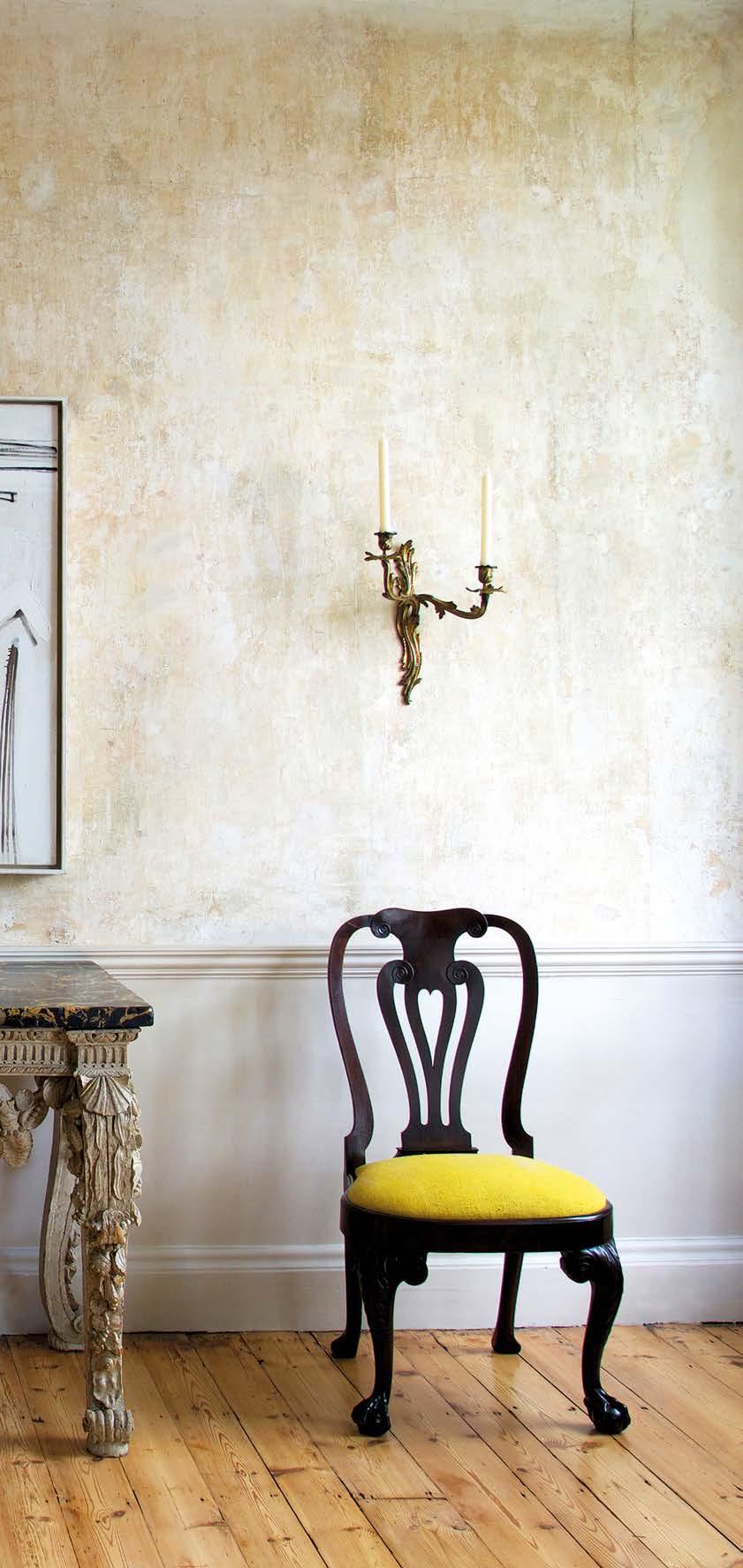
LEFT Here, Godson & Cole Fine Art & Antique Furniture has combined a carved, painted Kentian side table dating from around 1740 with Black, White and Ochre Figure, painted in 1959 by Sir Terry Frost, to create a dynamic that allows each piece to ‘breathe‘ on its own.
SURFACE MATTERS
“It’s all about having things that feel good together in terms of texture and colour,” says Marc Weaver of Guinevere Antiques. This means taking care in choosing materials, whether it be mahogany, velvet, Bakelite or resin. A varied selection of textures is always helpful to create pleasant acoustics, enhance a sense of comfort and ease, and give a welcoming impression. Beyond that, it can be aesthetically intriguing to contrast the materials and/or textures of bygone and modern times – a 21st-century lacquer table paired with a Lloyd Loom chair, a block-printed wallpaper with a velvet headboard, or a plastic table on a slate floor, for example.
Interior designer Pippa Paton advises that the key to a successful scheme is to identify the tonal palette from the fabric of the building and then introduce new and eclectic pieces in similar shades, adding textures to soften the look and add interest. “Authenticity is key, so avoid faux old pieces,” she says. “A very contemporary piece of furniture in the same colour or texture of the space can enhance the scheme, but a boldly coloured or patterned piece may feel at odds with its surroundings.”
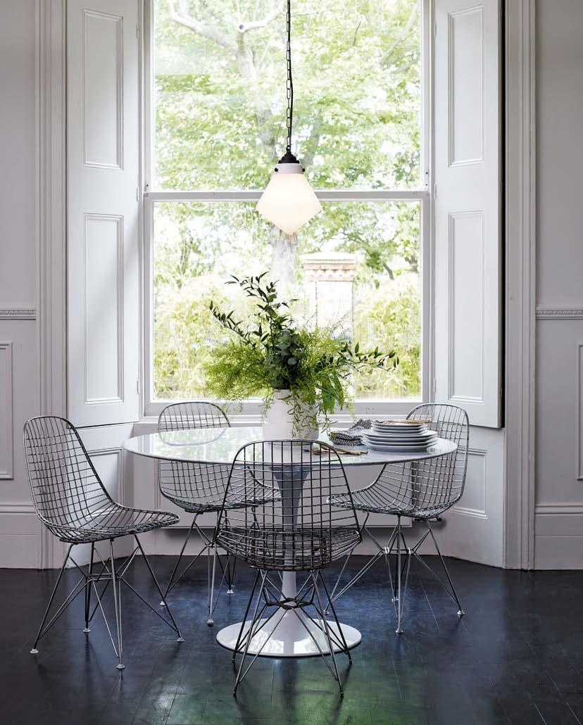
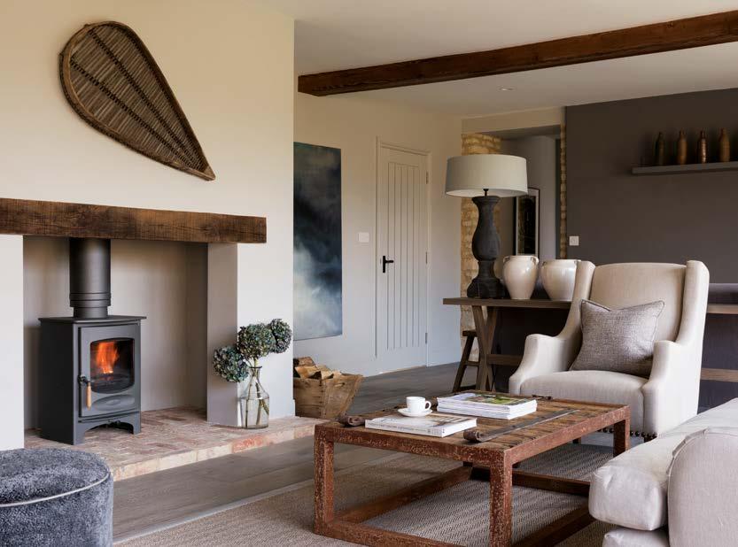
ABOVE RIGHT Despite limited colours, this room is intriguing, contrasting traditional panelling with mid-century modern furnishings, and a range of materials, including marble, steel and the opal glass and weathered brass of Original BTC’s Point pendant. RIGHT Original timber beams and exposed Cotswold stonework reveal the character of this barn, and a restrained colour palette by designer Pippa Paton showcases the structure, while old agricultural implements and paraphernalia complement upholstery in Belgian linen.
PERFECT BLEND
“The only rule is to include pieces that you love, that bring you joy,” says Harding. “Look at each item on its own and ask yourself whether you love it. Note how well made it is. Can you see the craftsmanship, the quality of the materials, the story behind it – where you found it, who made it, what it was used for in the past, what does the colour remind you of? The answers to those questions should make you smile, whether a piece is new or old.”
Apply this rule, says Weaver, and the common thread of the pieces you have chosen will be enough to unify the room. “If I want to mix things, I concentrate more on the colour, the texture and the scale of the pieces as opposed to the period,” he says. “It’s about having them feel good together.”
Interior designer Rachel Chudley seeks defining features in seemingly disparate items. “I love to see many styles and periods together in one home, pulled together to create a ‘lived-in’ interior.”
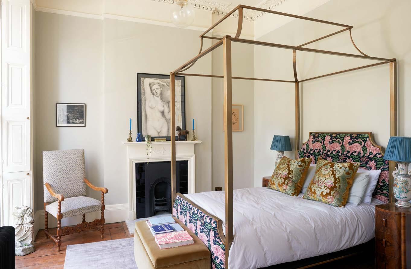
ABOVE A bespoke brass four-poster bed is the centrepiece of the master bedroom in this historic Bloomsbury house by interior designer Rachel Chudley. The mix of old and new includes walnut art deco bedside tables and upholstery in Clarence House’s Tibet fabric. RIGHT In the salon of interior designer Veere Grenney’s Palladian fishing lodge, eighteenth and nineteenthcentury antiques sit side by side with midcentury accents and pieces designed by Grenney himself.


OPPOSITES ATTRACT
Perhaps surprisingly, one of the best combinations for a beautifully layered home is of the very old with the highly contemporary. “What to me works really well is if you have things on the opposite end of the spectrum,” says Cato. “In a modern house, you could opt for medieval or early walnut pieces, for example, which are simple in their design and execution.”
Conversely, period homes can look marvellous with carefully chosen modern furnishings, the latter’s spare aesthetic echoing Georgian design principles particularly well. A minimalist walnuttopped desk with an upholstered wing-back chair; a sculptural lamp on an eighteenthcentury chest of drawers – big contrasts are exciting and full of character. “Antiques have patina and resonance, and they ground an interior, which is why they work so well with just a few contemporary pieces of furniture,” says Tara Craig of Ensemblier. “They bring calmness and continuity to an environment.”
To achieve a contemporary look, allow plenty of space between items of furniture, advises Weaver. “If you have one important-looking antique and give it a lot of space, it will become a focal point, and you can have some much more restrained, modern pieces in the same room.”
Another way to make a statement is to introduce works of art that diverge dramatically in style from their surroundings. A large, modern painting or photograph can look wonderful as the focal point of a room filled with much older pieces or, conversely, a classic oil painting will stand out in a room in which everything else is sleek and modern.
ABOVE LEFT Older pieces such as statues or carvings can possess an interesting patina and contrast wonderfully with mid-century modern or 21st-century furnishings. Here, an interesting range of antique and new items in a tone-on-tone scheme is given added depth and comfort by the layering of textiles from de Le Cuona. LEFT Interior designer Tara Craig of Ensemblier has employed a mix of antiques, bespoke and contemporary furniture in this warm, modern apartment, the standout piece being a chest on a stand that dates to the 1660s.
A sleek, modern desk is teamed with a classic wing-back armchair in this interesting and elegant room by interior designer Rebekah Caudwell. Known as the Parlour, it was restored to be redolent of the past with nods to vintage and contemporary worlds. It is painted in Farrow & Ball’s Hague Blue.

CONTRASTING LAYERS

Complementing a period property with furnishings from the same era can result in a sense of unity but it can end up museumlike. “I tend to choose furniture that’s in keeping with the period of a house, but create a sense of informality through textiles, flooring, wall finishes, objects and paintings,” says antique dealer and interior decorator Max Rollitt. “It’s about layering history through a scheme.”
An alternative route is to choose pieces that make a contrast with the architecture. “Unless you have very high ceilings, or big windows and doorways – both of which might affect the scale of the furnishings you choose – don’t worry about the period of the house,” says Weaver.
Cato reiterates the same point, adding: “If you have an older property with interesting features, let them stand out. Less is more: leave space around things. Good lighting really helps, too. In my opinion, a house always looks better when it’s mix and match, and the important thing is that it’s down to you as an individual. Don’t be bland!”
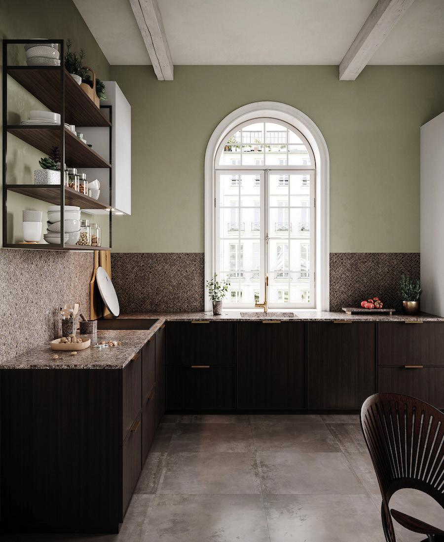
ABOVE Interior designer Sara Cosgrove has juxtaposed traditional furniture covered in a velvet by Rubelli with a contemporary rug, pendant light and artwork in this sitting room. RIGHT In contrast to the period quality of this room, with its beams and arched window, the kitchen is modern and minimal, with an emphasis on horizontal lines and flat-fronted cupboards, complemented by an Antique worktop, from Lundhs.
BACKGROUND ELEMENTS

Vivid colours and bold patterns can make superb backgrounds for antique and new furnishings alike; particularly so for schemes that include larger and more dramatic pieces. The drama and complexity of a classic pattern such as an eighteenthcentury chintz or an Arts and Crafts floral are ideal companions to strong, minimal, architectural lines, whether an old English milking stool or a modern console table.
Colour, similarly, should be balanced against furnishings, says Edward Bulmer, interior designer and founder of Edward Bulmer Natural Paint. “Antiques come in so many forms, sizes and strengths,” he points out. “Balance their weight and impact by the visual weight and tone of the colours you choose. When choosing colours, first and foremost consider tonality. Old pieces require colours that are well nuanced with earth pigment to settle them and respond to the patina of the antique.”
As for what colours work best, Bulmer recommends blues, stone colours and earthy off-whites to look particularly good with oak. “Yellow can work well with mahogany, but avoid using it with gilt frames, as you are in danger of creating a room of scrambled egg,” he says. “Greens, lilacs and pinks are also good with mahogany and gilt, and always make for good-looking rooms.”

ABOVE RIGHT Walls painted in Clove, a deep beige with an earthy red oxide in the mix, by Edward Bulmer Natural Paint, provide a versatile and elegant backdrop for both antique and contemporary pieces. RIGHT In this bedroom designed by Studio O & S, walls upholstered in fabric from the Wallace Collection add an enveloping feel, whilst the ornate antique Italian chest is offset by contemporary artwork by Derrick Velasquez above the bespoke four-poster beds.
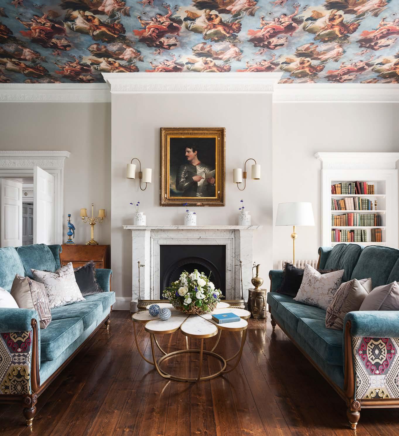
The crowning glory of this drawing room in a lateeighteenth-century house revitalised by Jeffreys Interiors is a ceiling covered with a Pierre Frey wallpaper that reproduces scenes adapted from the works of Francois Boucher and Giambattista Tiepolo. The antique sofas are covered in a striking Mulberry Home fabric on the back.
MASTERING THE UNEXPECTED
When mixing old and new it pays, sometimes, to go for broke. Just one fearless, eye-catching idea may be the thing that ‘lifts’ a room from conventional to remarkable. Floors and ceilings can be brought into use as areas on which to experiment, and it is possible to play with scale, proportion, colour and pattern, too, pushing the boundaries of how different furnishings work together.
Unusual placements of pieces can surprise and delight: an oil painting in the kitchen where one can enjoy it on a daily basis; a deep bath in front of a set of windows; a huge rug hung on an otherwise plain wall. A bold feature light – floor, wall or pendant – is very often a marvellous addition to a scheme. “Lighting is one of the most important elements in a room, as it has a profound effect on our emotional response to space,” states Ian Cameron, creative director of Cameron Design House. “A geometric pendant light suspended effortlessly from the ceiling makes for a wonderful centrepiece. Combine with antique furniture for a stylish scheme that transforms timeless interiors into spaces with the wow-factor.” ■

ABOVE With elaborate panelling and a pair of Baroque-style consoles, this period room has highceilinged grandeur in its own right. Adding a contemporary Haara Ten pendant light by Cameron Design House, which looks beautiful whether on or off, increases the drama. LEFT The clean, curving lines of the Breeze freestanding bath from Waters Baths of Ashbourne look all the better set against period architecture, whilst its dramatic positioning in front of fl oor-toceiling windows is an intriguing surprise.
