8 minute read
MANOR OF STYLE Zesty colour and playful patterns meet in joyful unison in a Victorian house in Suffolk


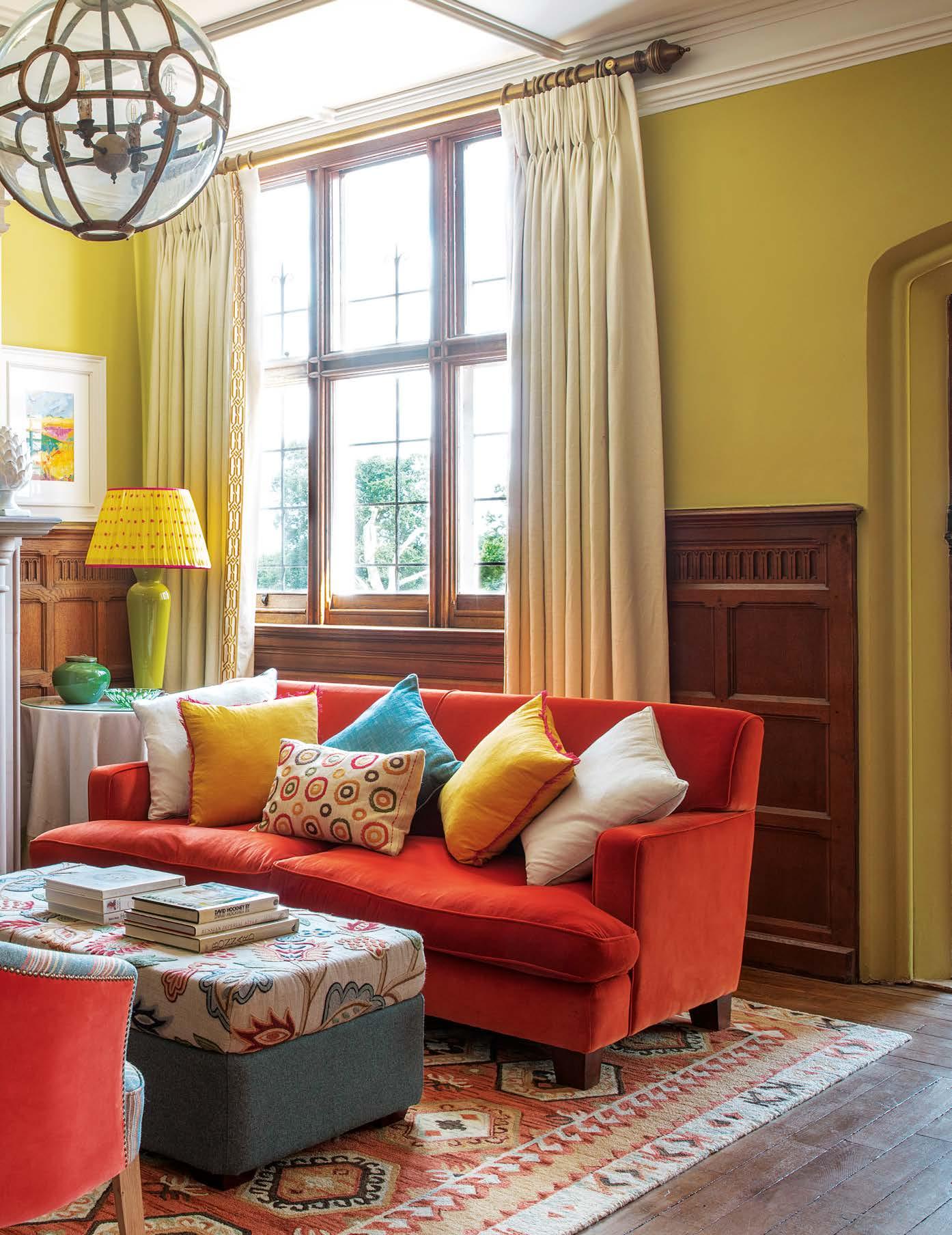
The large entrance hall doubles up as an elegant extra sitting room with chairs upholstered in Kelly Stripe by Tissus d’Hélène, and a sofa in Fine Fire by Pierre Frey. Sunburst Jewel from Marvic Textiles covers the top of the ottoman, whilst the sides are in Earth Seagrass by Moon. The Churlish Green lamp base from Rosanna Lonsdale is teamed with a limitededition shade from KD Loves.

Manor OF STYLE


Zesty new colour schemes and playful patterns have given this large Victorian house in Suffolk a new, vibrant personality
FEATURE MAGGIE COLVIN PHOTOGRAPHY ROBERT SANDERSON

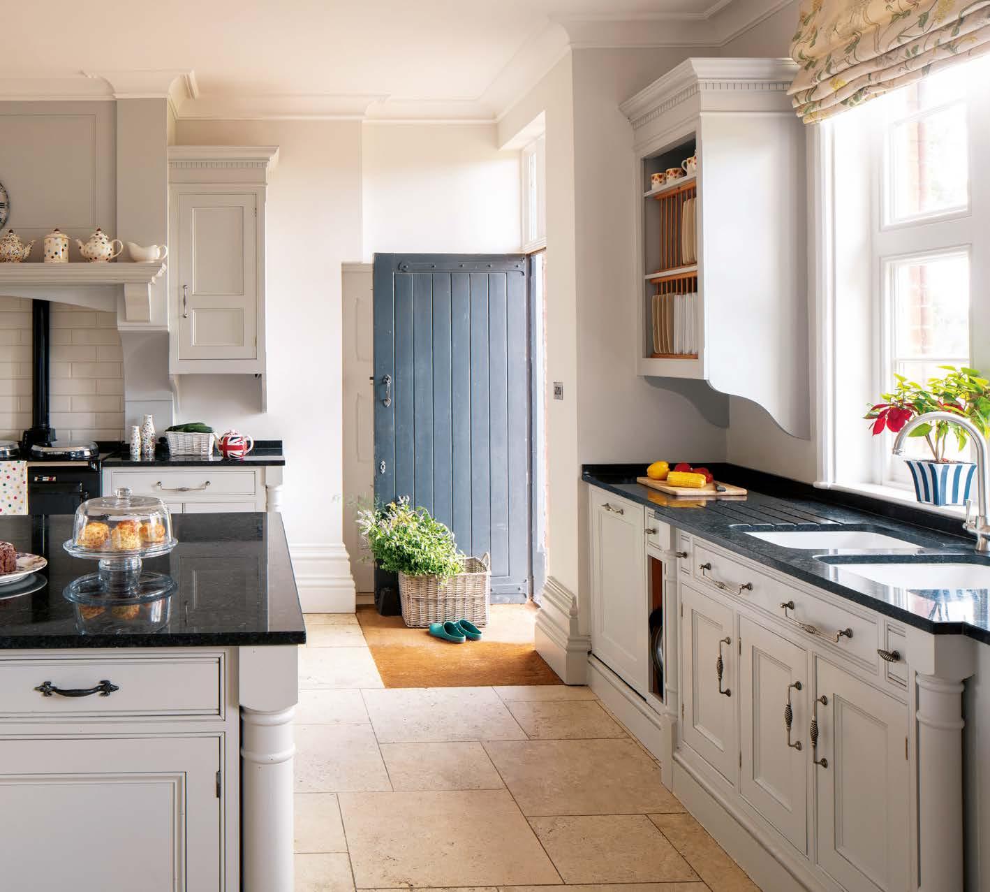
Inherited from the previous owners, the kitchen was simply freshened up with a lick of new paint – Little Greene’s Slaked Lime Mid on the walls and Slaked Lime Dark for the cabinetry. For a similar kitchen try Bryan Turner Kitchens.
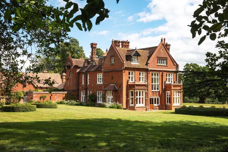
ABOVE Surrounded by a wide expanse of lawn and majestic trees, the Victorian manor house dates back to 1884. BELOW RIGHT The previously dark timbers lining the front hall have been painted in White Tie by Farrow & Ball and are contrasted by a radiator in Cape Red by Little Greene. BELOW FAR RIGHT Surrounded by low box hedges and shielded from the wind by the old walled garden, the heated pool is a magnet for all ages on summer days. P rovidential aptly describes the turn of events that led to Jane and David Smith-Brice acquiring their Suffolk home. Moving house had not been on the couple’s immediate agenda until they drove past the gates of a rather grand Victorian mansion one day and Jane made a remark that turned out to be prophetic. “I remember saying that this house could be ideal for us one day,” Jane recalls. “However, after then, I didn’t give it a second thought, as it’s the kind of property that tends to be passed down within a family. But then, by an absolute fluke, we discovered that the owners had just decided to sell, and within a year, we were the proud new owners. It was well worth the wait.”
Set in the Suffolk countryside surrounded by meadows dotted with sheep and ponies, the manor dates back to 1884 when it was built by a Londonbased aristocrat as a weekend retreat for his large family. Thick woodlands, carpeted with bluebells in spring, envelop a green area around its towering grey stone walls. Magnificent trees date back hundreds of years. Amongst its many assets is a stable block next to a walled garden, an orangery, a lake teeming with wildlife and covered with exotic water lilies, and a heated swimming pool. A big plus was the family kitchen, which had already been converted into a generously sized family living area. “Thankfully there was no need for builders,” says Jane reliving her feeling of relief. Compared to the restoration of their previous farmhouse, the task of putting their stamp on this distinguished, sizeable Victorian manor was fairly daunting even for a highly trained graphic designer like Jane. “It was tricky because we’ve always been conventional ‘neutrals’ people, and, by that, I mean we’ve liked natural colours in a soft monotone shades of cream and grey. Most of the main rooms in this house were already painted magnolia with sombre oak panels below dado height, which, whilst characterful, made the house feel quite dark and dingy.”
It was by another stroke of providence that Jane was put in touch with Emma Deterding of Kelling Designs, an interior designer well-known for her vibrant

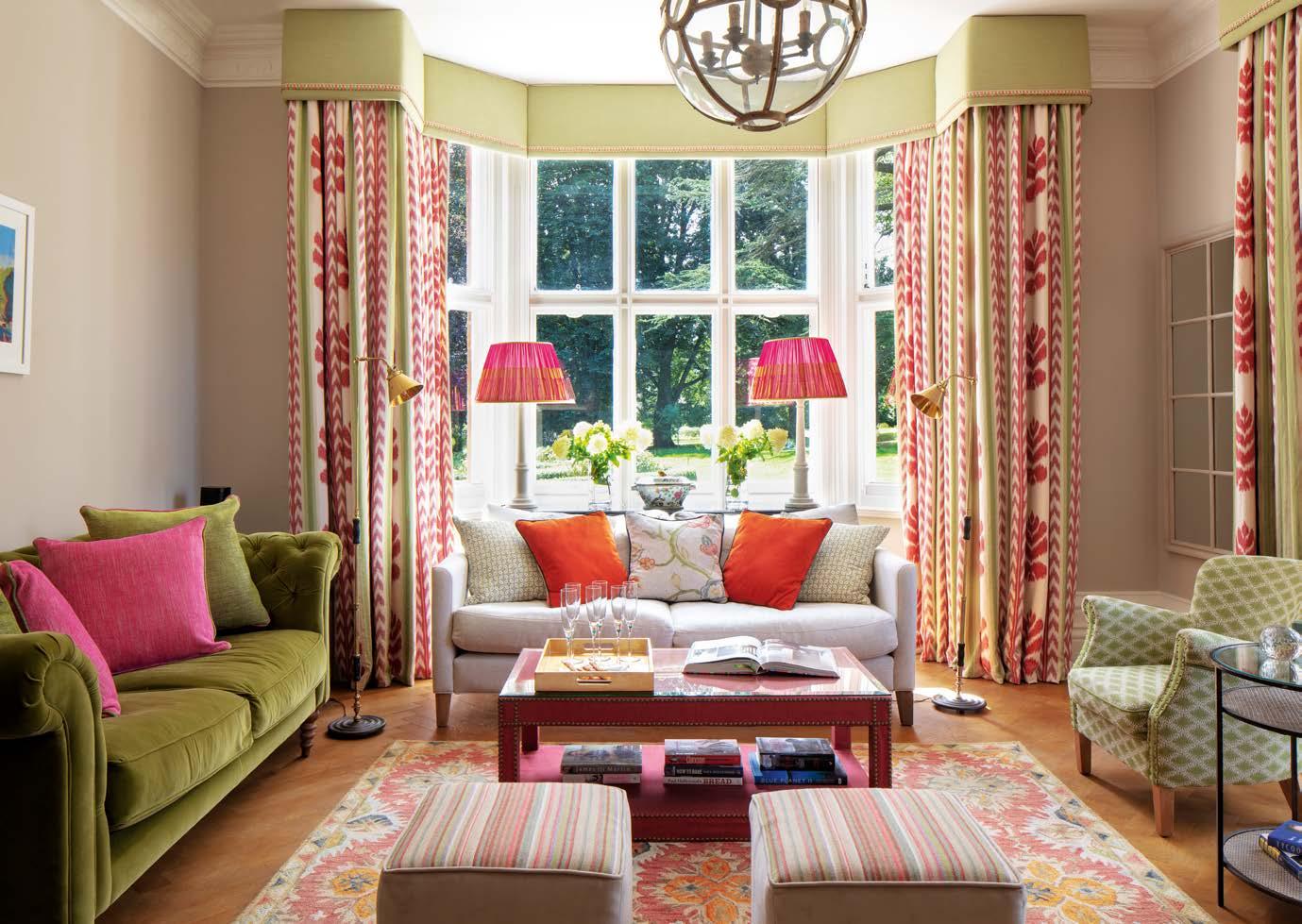
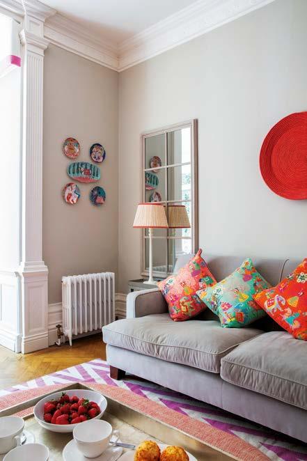
ABOVE Walls painted in Elephant’s Breath by Farrow & Ball provide a calm backdrop to the lively curtain fabric in the drawing room. For a similar fabric try Chenonceaux in Pink/ Kumquat from GP & J Baker. The Simon table lamps and vibrant pink shades are from KD Loves, whilst the Zamindar coffee table in blood orange is from Oka. Both sofas are from Sofa.com – the Izzy in Rustic Plain Linen 25 by Ian Mankin and the Oscar in green velvet.
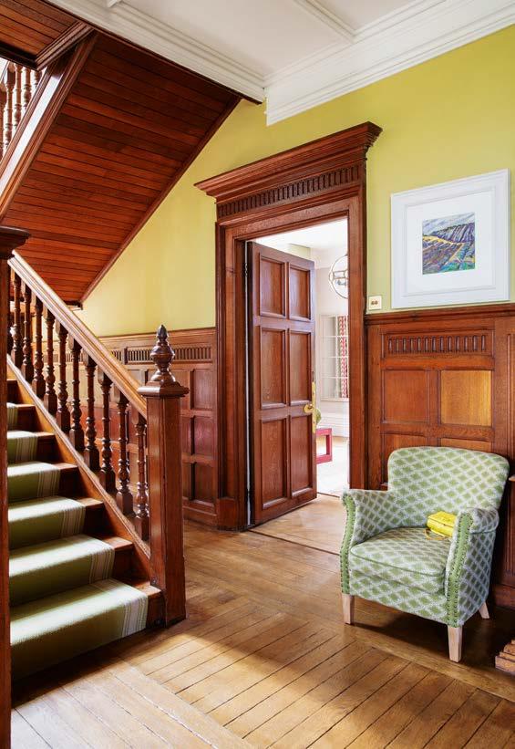
ABOVE & RIGHT Oak panelled doors and walls unite the ground floor and staircase, and are brought to life with an inspired, vibrant lime green wall colour called Green Ground from Farrow & Ball. The Avon Olive stair runner is by Roger Oates.
signature style and brave, confident use of colour. “We met through a mutual friend and I was sure Emma understood us right from the start,” says Jane.
Emma instantly identified the key problem and declared that they would need to make the abundance of dark wood in the house sing. “This really was a house in which you had to go bold or go home,” Emma says. “It needed character and energy, but, at the same time, schemes that would reference its history and old-fashioned charm.”
Emma’s enthusiasm allayed any fears Jane and David might have had of stepping out of their comfort zone, and when she and her team eventually presented their mood boards, the couple were delighted. “The colour schemes were a breath of fresh air,” Jane recalls. “They pushed us a lot further than we would have ventured on our own. I never in my wildest dreams would have thought to use wallpapers or mix patterns in the way Emma suggested, but, of course, in hindsight, she proved to be spot on. We made a few tweaks and then her professional team of decorators moved into the stable block to live and work.”
With the decorators living in the annexe next door, Jane and David were able to monitor the progress being made day by day. “It was fascinating watching the impact of the new paint and papers, and how quickly they brought life to the dark spaces,” Jane says. “These clever cosmetic changes masterfully energised the traditional spaces, giving them a dazzling new contemporary edge.”
Much of the furniture from the couple’s former house was too small to fit the scale of the large, high-ceilinged rooms of the manor. So bedside tables were replaced with chests of drawers, and although some of the old sofas worked well in the smaller rooms, re-covered in more cheerful fabrics in punchy colours, larger pieces such as the dining table were sourced from local auction houses.
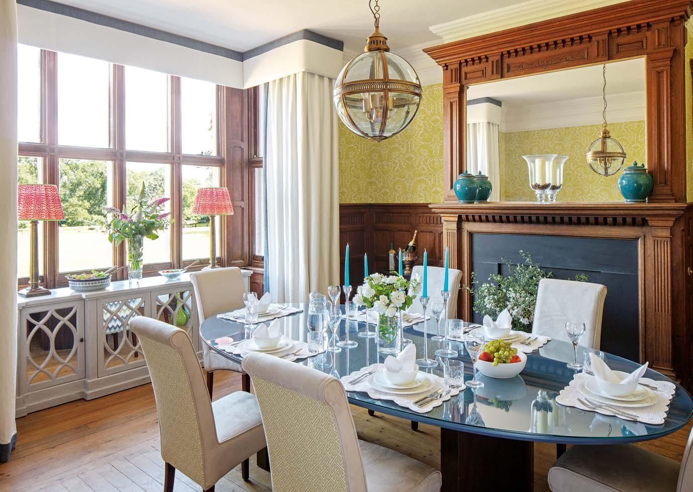
ABOVE Pomegranate wallpaper by Totty Lowther infuses the dining room with warmth. The table is painted in Stiffkey Blue by Farrow & Ball and the Echo dining chairs from Oka are upholstered in Fret Elderflower by Ian Sanderson on the backs and Pumice Macrosuede from Warwick on the seats. For a similar globe pendant lamp try Pure White Lines.
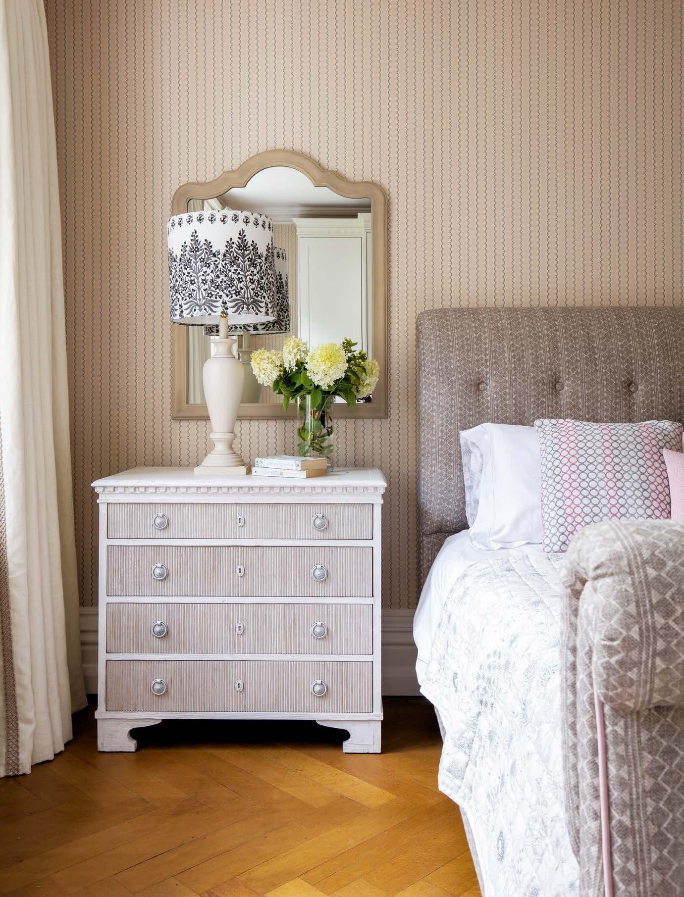
The master bedroom walls are papered in Centipede Stripe in Angel Pink by Neisha Crosland. The bed has been reupholstered in Quantock fabric by Fermoie. The Sarah table lamp in Ivory and bespoke shade is by KD Loves. For similar chest of drawers try the Bureau from Chelsea Textiles and for a similar mirror try the distressed grey Windsor wall mirror by The Farthing.
Emma’s trick with the dining table broke new ground for David and Jane, who were used to traditional oak tables. The base of the table has been left in the original natural wood, but the top has been painted in a rich intense blue, protected by a glass top, which reflects prisms of light. “It literally sparkles during candlelit dinner parties,” says Jane. “Many of our guests remark on it. Emma is a past master at cheering up traditional pieces.”
Making the most of their new home, Jane and David entertain friends and family most weekends, delighting in the sound of happy children’s voices. Parties abound by the pool in summer, and in winter, guests move inside for gatherings, musical evenings and dinner parties. Throughout the year, Jane’s exotic culinary feasts are arguably as extravagant as the intensity of the colours and patterns that surround her. Only David’s office stands out as a reminder of their former commitment to neutrals. “He is happy and finds it relaxing,” Jane says. “What matters at the end of the day, is that we live in a house that everyone loves.” n
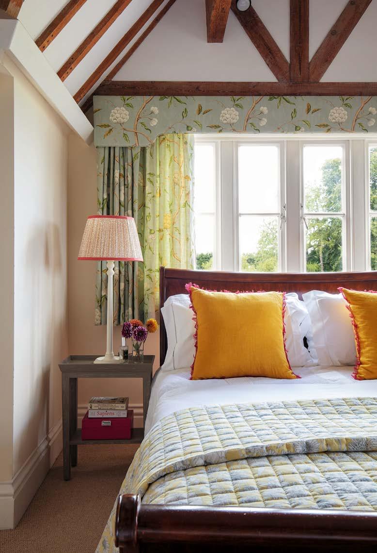
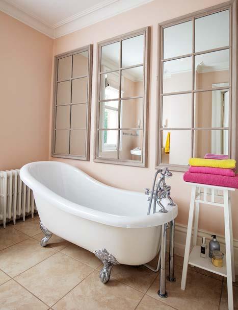
ABOVE A classic roll-top bath sits beneath a row of mirrored window frames that reflect light and exaggerate the space. A warm, feminine feel is introduced by the choice of wall colour, which is painted in a 50/50 mix of white and Setting Plaster by Farrow & Ball. ABOVE This guest bedroom is decorated in a bright sunny scheme of yellow and pale blue. For a similar floral fabric as is used for the curtains try Selena by Colefax and Fowler. LEFT A wall in the playroom is decorated with a fun collection of animal plates by Paige Gemmel. For a similar mirror try the Taupe Window Pane wall mirror from Graham and Green.