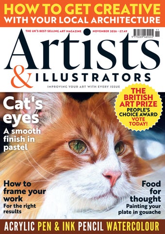
HOW TO GET CREATIVE WITH YOUR LOCAL ARCHITECTURE THE UK’S BEST- SELLING ART MAGAZINE
NOVEMBER 2026 • £7.49
I M P R OV I N G YO U R A R T W I T H E V E R Y I S S U E
THE BRITISH ART PRIZE
Cat's eyes
PEOPLE'S CHOICE AWARD VOTE TODAY!
How to frame your work
Food for thought
A smooth finish in pastel
For the right results
Painting your plate in gouache
ACRYLIC PEN & INK PENCIL WATERCOLOUR
H O W I WORK IN TH E STUDI O
Martin Grover This screen printer and painter tells Alfie Hoyle about his journey as an artist, and some of the interesting stops along the way ▸ Standing In The Shadows of Love (a Motown Bus Stop), acrylic on wood and board, 29x17cm
18 ARTISTS & ILLUSTRATORS
This Old Heart of Mine, acrylic on canvas, 105x105cm
Lydia Wood
Pencil artist LYDIA WOOD tells Douglas McPherson about her ongoing mission to draw every pub in London – more than 3000 of them – even if it takes a lifetime ▸
The Hope, A4
26 ARTISTS & ILLUSTRATORS
H O W I W O R K H O W I DR AW
The White Cross, A4
ARTISTS & ILLUSTRATORS 27
Bathers, Paul Cézanne, oil on canvas, 54.3x66cm
3 8 ARTISTS & ILLUSTRATORS
E X HI B I T I O N
Painting the French Riviera
For hundreds of years, artists have been drawn to the beauty and unique light of the South of France. Amanda Hodges learns how a new exhibition explores the role of the area in the development of modernism
PAUL CÉZANNE, BATHERS, 1890-92. SAINT LOUIS ART MUSEUM, FUNDS GIVEN BY MRS. MARK C. STEINBERG
I
n an article written in 1924, F. Scott Fitzgerald expressed it perfectly: “When your eyes first fall upon the Mediterranean, you know at once why it was here that man first… stretched out his arms toward the sun. It is a blue sea… the fairy blue of [illustrator] Maxfield Parrish’s pictures; blue like blue books or eyes. And in the shadow of the mountains, a green belt of land runs along the coast for a hundred miles and makes a playground for the world.” The French Riviera is an area with which Fitzgerald was indelibly associated, and he conveyed the sentiments of many, not least the legion of artists profoundly inspired by the South of France. Some enjoyed summer vacations here; others established firm regional roots. “I have just discovered happiness,” declared Paul Signac, after visiting Saint Tropez. A new exhibition at the Royal Academy (presented with the Cleveland Museum of Art) explores the source of this inspiration, tracing its artistic arc from the 19th Century through to the 1960s. Although the focus is on painting, the curators felt that, with such a rich subject, it would be more interesting to take a multi-disciplinary approach, so ▸ ARTISTS & ILLUSTRATORS 39
52 ARTISTS & ILLUSTRATORS
STEP-BY-STEP
A postcard from Provence Yorkshire artist JOHN HARRISON – a diehard pen and watercolour chap - tested out STAEDTLER’S pigment arts brush pens and was thrilled with the vibrant results JOHN ’S MATERIALS Pens STAEDTLER pigment arts pens: pigment brush pen set (colours used mentioned in the text) pigment big brush pen set pigment soft brush pen set Multi Ink blending pen STAEDTLER Mars Lumograph graphite pencils: 4B and 6B STAEDTLER pigment liners: 0.1, 0.3 and 0.5mm line widths in black Daniel Smith Watercolours (for the overlaid shadows in step 9) Posca PC 1 MR, 7mm white pen (used for lettering on signage) Support Saunders Waterford 100% 425g rough watercolour paper natural finish
W
hen I was invited to create this step-by-step demonstration using the range of pigment arts brush pens from STAEDTLER – featuring a really vibrant array of colours that are (ahem) much more dynamic than my usual watercolour washes – I knew instantly that I wanted to draw a scene from our family holiday in Aix en Provence earlier in the summer. The light and the colours there are literally larger than life, so I was really looking forward to utilising much more hues than I normally would. I decided to approach the illustration with the same process as I do for a pen and watercolour painting, by firstly creating an ink line illustration. I then added layers
of colour using the pigment brush pens. As the pens were new to me, I first tested them out on a variety of surfaces, from smooth hot press paper and cartridge drawing paper, to standard printing bond paper (on which all of the inks performed excellently), before finally settling on my all-time favourite paper: Saunders Waterford 100% cotton in a rough finish. As the illustration progressed, I quickly got used to the flexible brush tips on both sizes of pen, and also the way that the ink is laid down. Using markers – for the first time in years – really took me back to my early days as a graphic designer; this was pre-computers, so the practice then was to use coloured markers to create rough visuals, a part of the work that I really enjoyed. drawninyorkshire.com ▸ ARTISTS & ILLUSTRATORS 5 3
Winter Stillness, coloured pencil on paper, A3
Picture this
In every issue we ask an artist to tell us about a piece of work that means a lot to them. This month we speak to coloured pencil artist OLGA BABICH Winter is my favourite season to draw, which is why I chose this particular landscape. It has everything I love: atmosphere, simplicity, silence, stillness, quiet observation and a sense of being present in the moment. I love the changing seasons and the way they seem to renew our senses. Winter feels like a period of reset and rest, but also something magical - a time when you look ahead, expect the best and have hopes for what is to come. Childhood may be behind us, but there is nothing stopping us from seeing the magic in a moment like this and enjoying it now. This is what I try to convey to the viewer: what I see myself and what I want to draw their attention to. 98 ARTISTS & ILLUSTRATORS
There is also a certain melancholy here. It is simply part of me and not something I consciously control. It often finds its way into my field of vision, and so sometimes appears in my drawings too. This work came about unexpectedly. I started it as a demonstration for one of my students, but then decided to finish it. I put on some music and followed its rhythms with my pencils. It makes the process more enjoyable and helps me to work. I love it when I manage to relax and catch a particular kind of energy; it always shows in the final result. Instagram: olgababich_art ▫