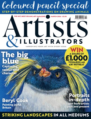
Coloured pencil special
S T E P - B Y - S T E P D E M O N S T R AT I O N S O N D R AW I N G A N I M A L S THE UK’S BEST- SELLING ART MAGAZINE
MARCH 2026 • £5.99
I M P ROV I N G YO U R A R T W ITH E V E RY I S S U E
The big blue Capturing colour and character
Beryl Cook Painting joyful Britain
WIN
£1,000 A SHARE OF
TOWARDS AN ART RETREAT T's & C's apply
Portraits in-depth
Learn from artists past and present
STRIKING LANDSCAPES IN ALL MEDIUMS
TH E BIG INTERVIEW
Beach People, watercolour on paper, 35.5x48.2cm
Geoff Allen This en plein air artist tells Sarah Edghill why he believes that adversity is necessary for artists to really experience nature ▸
ARTISTS & ILLUSTRATORS 31
Late bloomer
R E TROSP ECTIVE
COURTESY OF WWW.OURBERYLCOOK.COM © JOHN COOK 2025
IMAGE COURTESY OF WWW.OURBERYLCOOK.COM © JOHN COOK 2025
She was the painfully shy landlady whose cheeky paintings made her a household name. Now, the late BERYL COOK OBE is to be celebrated with a comprehensive show in her hometown, Plymouth, finds Martha Alexander ▸
A B OV E Feeding The Tortoise R I G H T The Lockyer Tavern 42 A R T I S T S & I L L U S T R A T O R S
Rockin’ Rockho Based in her Cotswold studios, PENEL KIRK creates animal portraits in mixed media. Here, she shows you how she painted this zany-looking Rockhopper penguin PENEL’S MATERIALS Coloured pencils Faber-Castell Albrecht Dürer watercolour pencil: Cadmium Yellow Lemon, Cadmium Yellow, Lemon Cadmium, Green Gold, Warm Grey V, Black, Paynes Grey, Orange, Cadmium Red, Middle Cadmium Red, Light Purple Pink, Purple Violet, Light Ultramarine, Ultramarine, Phthalo Blue, Light Phthalo Blue, Indanthrene Blue, Dark Indigo, Walnut Brown, Sanguine, White Support Fabriano Artistico Extra White Hot Pressed paper 640gsm Acrylic paint – Daler Rowney Cobalt Blue (hue) Schmincke Horadam gouache – Titanium white Foam/sponge brush 3” HB pencil Daler-Rowney System 3 Synthetic liner brush10/0 Watercolour brush size 4 Masking tape
62 A R T I S T S & I L L U S T R A T O R S
A
s part of my art practice, I create wildlife portraits, particularly of endangered species. Through my work, I aim to raise awareness of the thousands of animals threatened by climate change and habitat destruction. A percentage of all wildlife art sales supports vital conservation efforts, helping to protect the very species I depict. I often work in mixed media as I am not trying to create photo-realistic images, and sometimes the artwork just needs an extra something for me to feel it’s working. I like the viewer to see the marks I make with both pencil and paint, and this approach adds a sense of energy and presence to the subject. This charismatic young Northern Rockhopper penguin is a perfect example. Named for their distinctive hopping across rocky, high-altitude terrain, Rockhoppers are unable to slide on their bellies like many other penguins. One of the smallest penguin species, they only grow to about 50cm in height. Adults have red eyes, but younger ones have the paler but still intense eyes that I’ve shown here. They have bright orange beaks and distinctive yellow crest feathers, which they shake as part of their courtship displays. Currently, there are an estimated 1.5 million pairs of Rockhopper penguins. While still relatively numerous compared with some species, their population has declined by roughly 30% over the past three decades. Though the exact causes are not fully understood, commercial overfishing, pollution and oil exploitation are thought to have contributed significantly to their decline. Through this piece, I hope to celebrate the charm and character of the Rockhopper penguin while drawing attention to the conservation challenges they face. penelfineart.com ▸
STEP-BY-STEP
pper penguin
ARTISTS & ILLUSTRATORS 6 3
STEP-BY-STEP
Stone
cold JOHN HARRISON captures these cow
barns in the Yorkshire Dales using pen and watercolour wash
A lovely old cow field barn, set against snow-covered hills somewhere in upper Swaledale: how could I resist? I’ve lost count of the number of barns I’ve drawn and painted over the last few years, but this scene had some wonderful elements in the composition that really appealed to me. There’s a wonderful sense of peace and stillness imparted by the fallen snow; some fabulous textures to explore in the far-off hills, along with the strong, low winter sun on the face of the building. I always emphasise to folk attending my workshops that, when working from a reference photograph, there is no strict rule that says you have to reproduce faithfully every single element contained in it. This is where your artistic license comes to the fore: to omit those things you’re not comfortable with, to perhaps add something in (although this is something I very rarely do) and even alter the composition by adjusting the relationship of objects by moving things around. drawninyorkshire.com ▸
JOHN ’S MATERIALS
Paint Daniel Smith Fine Watercolours in my vintage Holbein palette, filled from tubes: Cobalt Blue, Payne’s Grey(Blue tint), Yellow Ochre, Quinacridone Gold, Ultramarine Blue, Ultramarine Violet Brushes Rosemary & Co Red Series Synthetic: sizes 10 & 12 round Etchr size 6 round Support Saunders Waterford 300g Rough, quarter imperial size sheet Koh-i Noor mechanical pencil, 2B 0.7mm lead Unipin 0.1 fineline pen in black Sustenance Copious amounts of Yorkshire Tea
ARTISTS & ILLUSTRATORS 69
Winding North, oil on canvas,48x48cm
Picture this
Every month, we invite an artist to share a painting that holds a special meaning for them. This month, American landscape artist PETER BATCHELDER tells us about this piece I often drive through the countryside, searching for inspiration in the old farms I find there. I came across this scene, and it reminded me of an old farm in New Hampshire once owned by my grandparents. I loved the winding dirt road that snaked past the barn and wondered where it led to. As this piece was coming together, I hoped to convey how the structure gave the sense that, despite it being in a very remote location, its strength and presence could suggest a sense of safety and protection, and that it was a place that has provided shelter for many decades. The piece is not entirely literal to the actual scene. Like most of my work, it is a combination of a real place and a reimagining of the landscape based on memory. 82 ARTISTS & ILLUSTRATORS
I’ve always loved rural areas, the countryside, and the landscape and architecture found there. The places I paint tend to be quiet, peaceful locations. They are places with long histories that have survived the forces of nature and still stand as they did, often for a century or more. I feel a need to capture them in paint before they’re gone. I feel colour is often more important than the subject or composition; it is usually the first thing a viewer notices. I want my pieces to create an emotional attachment, whether it is to find a piece calming, happy, somber, or mystical. My hope is always for a viewer to see in a piece some connection to their life, past or present, and that that remembrance connects with them emotionally. peterbatchelder.com ▫