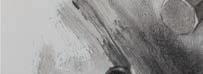

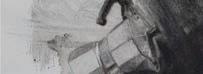
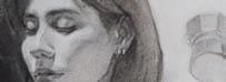
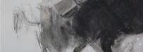
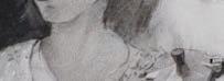
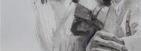
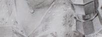
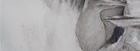
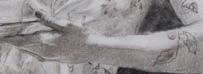





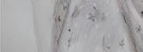
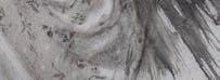











“Meditaciones de un Moka vespertino”, 50 x 70 cm, Nitram Charcoal on Gvarro 300 gsm paper

“’Meditaciones de un Moka vespertino’ is a work that captures the feeling of enjoying an afternoon coffee while those thoughts that often linger in our minds throughout the day seem to fade away for a moment, making way for tranquility.
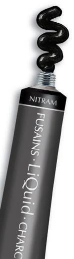
I really enjoy the versatility of Nitram products, particularly the ability to use wet media to create stains and free-flowing shapes with Liquid Charcoal. Likewise, I appreciate using charcoal sticks to add structure and detail to my drawings.”
~ Betzalel Maida Galicia




To watch a video of how Betzalel Maida Galicia created this drawing with Nitram Charcoal, please visit: https://nitramcharcoal.com/Betzalel or scan the QR code


Betzalel Maida Galicia, a Bolivian-Venezuelan figurative artist, began studying at an early age at the Art Academy of the Ateneo de Valencia, Venezuela, where he took drawing and painting classes from 2008 to 2010. He later pursued further education at the Universidad Nacional Experimental Rafael María Baralt in Zulia, Venezuela, graduating in 2015 while also participating in the university’s Culture Coordination program. His work has been exhibited in the USA, Spain, Venezuela, and Bolivia. Currently, he is a founding member of the Roca Gravato Foundation and serves as the pro-tempore director of the Academy of Figurative Arts in Santa Cruz, Bolivia.
SKETCHBOOK Quick tips, ideas and inspiration. Plus, this month’s exhibitions
PRIZE DRAW Win over £1,100 towards art memberships
WE PRESENT… British Art Club member Elaine Smith
HOW I MAKE IT WORK with Spanish artist Ale Casanova
YOU TELL US Write in and tell us what inspires you
PICTURE THIS Oil artist Fiona Carver tells us why her painting is special to her
IN THE STUDIO with cityscape artist Rob Adamson
HOW I PAINT Figurative painter Richard Kitson explains the process behind his emotive art
THE BIG INTERVIEW Mixed media artist Ollie Le Brocq’s journey from digital to fine art
RETROSPECTIVE A new exhibition at York Art Gallery sees internationally acclaimed Harland Miller paying homage to his roots THE BRITISH
Entries
EXHIBITION Light takes centre stage in Alison Watt’s new show
SERIES In the third instalment of our series with Alvaro Castagnet, he shares his approach to
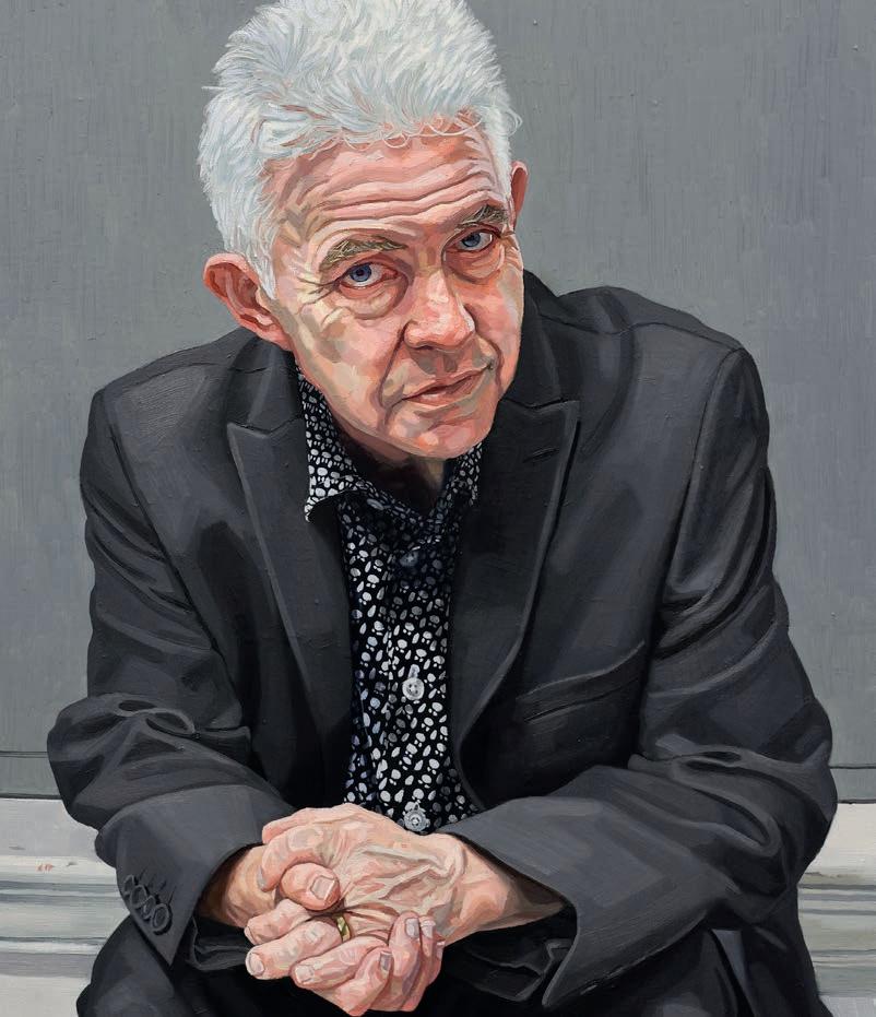
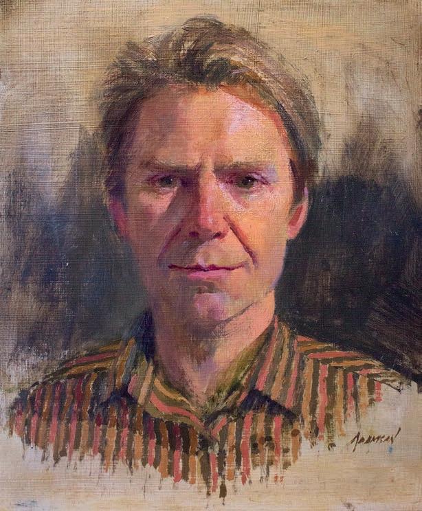
Haydn Jeanes captures a fellow artist’s portrait
ARTISTS & ILLUSTRATORS
Phone: +44 (0)1858 438789
Email:
artists@subscription.co.uk
Online:
subscription.co.uk/chelsea/solo
Post:
Artists & Illustrators, Subscriptions Department, Chelsea Magazines, Tower House, Sovereign Park, Lathkill Street, Market Harborough, LE16 9EF
Renew:
subscription.co.uk/chelsea/solo
Annual subscription rates
UK: £77.87, US: $105 , RoW: £144
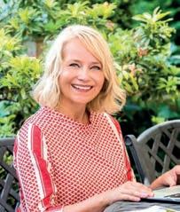
We have expert advice from two artists on the subject, including Bonny Snowdon, renowned coloured pencil specialist, who is also o ering free subscriptions to her Ignite art course membership in this month’s prize draw.
Meanwhile, inspiration can be right under your nose, as Matthew Jeanes found out when he visited his local art fair. He saw an opportunity to paint a fellow artist at work and jumped at the chance. You can see the results in our step-by-step section.
He is also joined by watercolour master Alvaro Castagnet, in his third instalment on mastering the techniques of the medium. In this issue, he explains his process behind creating values.
Short on time? A former British Art Prize nalist shows you how he drew his self-portrait in just 90 minutes. His words of advice are: don’t seek perfection. It’s a process that can be practised.
Harland Miller is an artist who masterfully combines words and painting on a large scale, with stunning results. We cover his exciting new exhibition, in his hometown of York.
We would also like to get you ready for British Art Prize 2025! We know paintings don’t happen overnight so why don’t you get your paint, pens and pencils ready now and get creating! This is your opportunity to get your work seen by our fabulous and in uential judges, including, Alvaro, Adebanji Alade, Ti any Hall, the co-founder of art gallery Panter & Hall (who are o ering the rst prize winner a week’s solo show) and yours truly.
Indulge and enjoy. We can’t wait to see you next month, where we’ll have even more to share and explore with you! Our fabulous website for showcasing and selling your art
ALE CASANOVA
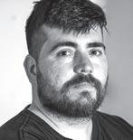
Ale is a Spanish painter known for his gurative work. A Fine Arts graduate, his paintings delve into physical and psychological narratives, featuring precise brushwork and balanced compositions. They invite viewers to contemplate the hidden narratives within our everyday lives.
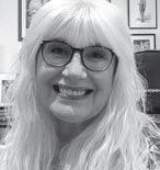
SUSAN MURRAY
Susan is an award-winning artist and illustrator from Lincolnshire, now based in southwest Scotland. She studied at Carlisle Art College in the 80s. In 2017, she discovered coloured pencils, sparking a passion for their vibrant possibilities. Ever since, she has pursued her own creative practice
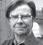
ROB ADAMSON
Rob is a passionate painter and teacher with 30 years of professional experience. He is a signature member of Oil Painters of America, the American Impressionist Society as well as the Plein Air Painters of Utah. His award-winning work is exhibited in galleries and museums across the US.
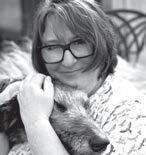
BONNY SNOWDON
Bonny is an award-winning coloured pencil artist and mentor from North Yorkshire. Founder of theBonny Snowdon Academy, she’s the art teacher you wish you had in school, teaching realism with coloured pencils. Bonny guides artists to create drawings they love, while discovering their potential.
EDITORIAL
Editor
Niki Browes
Art Editor
Stuart Selner
Assistant Editor
Ramsha Vistro
Contributors
Alvaro Castagent, Bianca Dumas, Sarah Edghill, Geo rey Harrison, Amanda Hodges, Matthew Jeanes, Susan Murray, Bonny Snowdon, Claire Yates
info@artistsandillustrators.co.uk
Acting Director of Commercial Revenue
Simon Temlett
Advertising Sales Team
Talk Media
Steve Pyatt
stevep@talk-media.uk 01732 445155
Advertising Production allpointsmedia.co.uk
MANAGEMENT & PUBLISHING
Managing Director
Marie Davies
Publisher
Greg Witham
Associate P ublisher
Annabelle Lee
Chief Financial O cer
Vicki Gavin
Subs Marketing Manager
Parveen Bhambra
Head of Marketing
Seema Bilimoria
BACK ISSUES
chelseamagazines.com/shop
GET IN TOUCH
Artists & Illustrators, © The Chelsea Magazine Company Ltd 2023, part of the Telegraph Media Group, 111 Buckingham Palace Road, London, SW1W ODT Phone: (020) 7349 3700 artistsandillustrators.co.uk
Artists & Illustrators (ISSN No: 1473 - 4729, USPS No: 0950) is published monthly by The Chelsea Magazine Company Limited, and distributed in the USA by Asendia USA, 701 Ashland Ave, Folcroft PA, POSTMASTER: send address changes to Artists & Illustrators, 701 Ashland Ave, Folcroft, PA. 19032. Printed by Walstead Roche Ltd


EDITED BY RAMSHA VISTRO
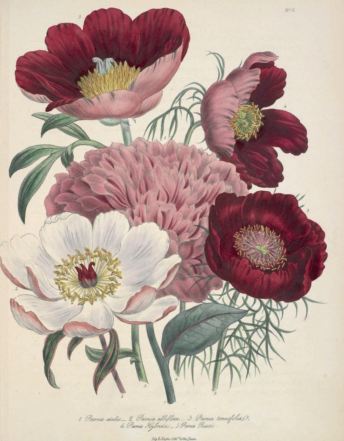
Unearthed: The Power of Gardening explores the transformative and sometimes radical impact of gardening in Britain. Featuring rare items, from an Anglo-Saxon herbal manuscript to the first gardening manual of 1564, the show reveals how gardening has driven social and political change. From allotments to windowsills, it examines how gardening heals, empowers communities and fosters activism. From 2 May to 10 August 2025, British Library, London NW1 2DB. ▫
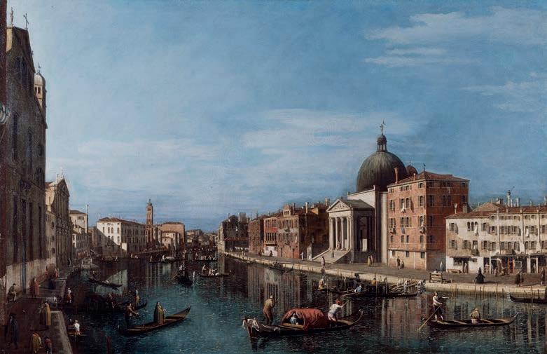
Among the renowned Old Master paintings at the Wallace Collection is a signi cant group of 18th-century Venetian views, or vedute, by Canaletto and his followers. Following years of conservation and research, the paintings have been restored and a new catalogue, Canaletto and Guardi: Views of Venice at the Wallace Collection, presents them in renewed splendour. This study has led to the exciting reattribution of The Grand Canal with San Simeone Piccolo to Bernardo Bellotto, painted when he was just 15 or 16. wallacecollection.org
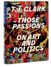
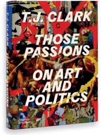
THOSE PASSIONS ON ART AND POLITICS
T J Clark
The careful distillation of a lifetime’s writing by the internationally renowned art historian T J Clark, who addresses key issues of art’s relationship with politics. ‘The decade’s most stimulating art book’ (Financial Times). Thames & Hudson, £40.00
30 APRIL
Enter The Homiens Art, Prize, an international, non-acquisitive art prize valued at $24,000 USD annually and open to all artists and art forms. Entry is $30. homiens.com Open calls, prizes and artist opportunities
30 APRIL
Showcase the connection between humans and animals with visual art, written word, video or photographyfor the Humanimal Trust Creative Awards. Free. humanimaltrust.org.uk
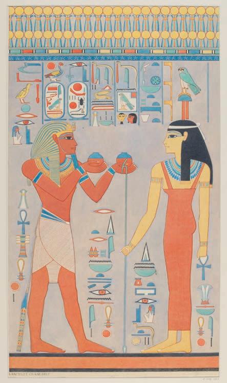
Young V&A’s second exhibition, Making Egypt, explores ancient Egypt’s creativity and its lasting in uence on art, design and pop culture. As the UK’s rst child-focused exhibition on Egypt, it showcases over 200 artefacts spanning 5,500 years alongside contemporary works. Visitors can decipher hieroglyphs, design amulets and explore hands-on making. The show o ers a fascinating journey through Egypt’s artistic legacy, inspiring the next generation of creators. vam.ac.uk/young
7 MAY
Calling all UK disabled young artists aged 7-21! Submit your 2D, 3D or digital art to win cash prizes. All nalists will be invited to a virtual presentation ceremony. uniqueartawards.uk

There's a ton of art inspiration amongst these pages. But if you're looking for more? Find it on the fabulous Artists & Illustrators website. It's one of the best digital resources for artists from every realm, whilst the refreshing redesign makes our practical guides, competitions and interviews even more insightful
See you there. artistsandillustrators. co.uk
31 MAY
If you’re a student in years 7-13, enter the YouCreate Competition by interpretting the theme 'Dreams' for a chance to win an iPad or Amazon vouchers. uca.ac.uk

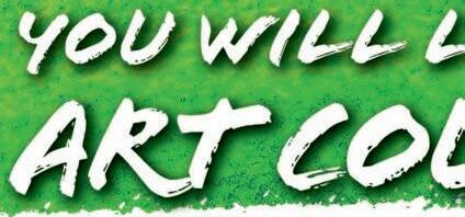





Our fun part time course runs over 3 months – plenty of time to master your new hobby!
• Fun part-time course
Over the 14 week course you will explore four di erent media: Drawing, Painting with Watercolour, Acrylics, and Oil Pastels, highlighting their individual characteristics, learning the basic techniques and secrets needed to create beautiful pieces of original art.
• 14 Week course, 3-hour classes, once a week
• Morning or afternoon sessions
• Beginners to improvers
• Fun, easy, social event
• You bring pencils and paper, we supply everything else



We are now taking






• Lots of cups of tea!




















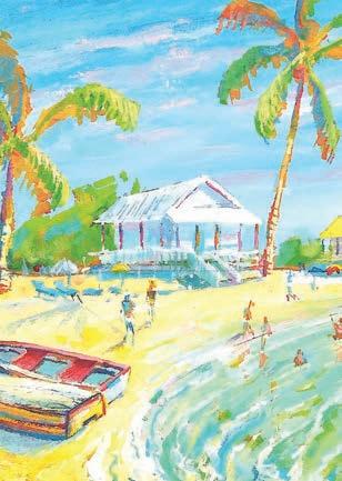
On completion of the course you will have 12 pieces of original art to cherish forever. From faces, figures, friends and family, to beautiful seaside vistas. Even if you have never picked up a brush before, we will guide you through to make it easy and fun!







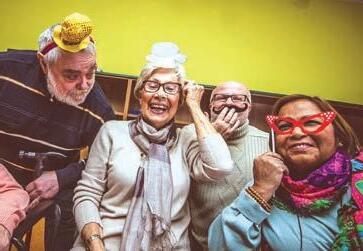
To maintain a high standard to our classes and the tuition you will receive, classes are kept to small numbers – so available places are strictly limited! enquiries for our New Art Classes. ENQUIRE NOW get started.
This is an extremely enjoyable way to develop your creative side, make new friends and really enjoy the next few months








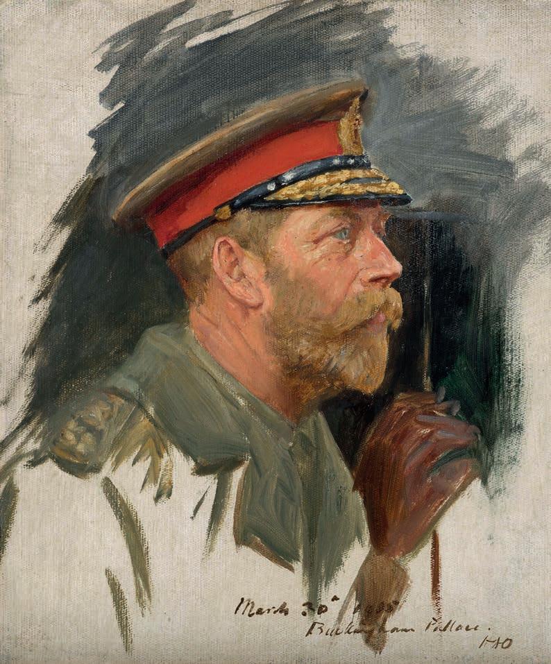
THE EDWARDIANS: AGE OF ELEGANCE
11 April to 23 November 2025
This show will exhibit the glamour and sophistication of the Edwardian age. Featuring over 300 objects, it highlights the lives of two royal couples – King Edward VII and Queen Alexandra, and King George V and Queen Mary – their personal collections and their lavish social circles. Visitors can explore dazzling jewellery, striking portraits and rare artefacts from their travels. Works by celebrated artists and designers of the era, including Fabergé, Sargent and Burne-Jones, will be on display. The exhibition captures a world on the brink of change, as Britain edged towards modernity.
The King’s Gallery, Buckingham Palace, London SW1A 1AA. rct.uk
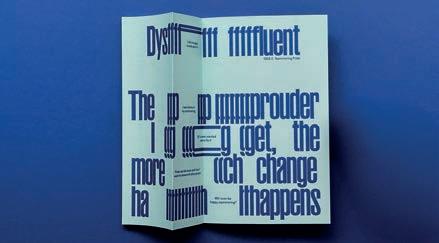
DESIGN AND DISABILITY
7 June 2025 to 15 February 2026
This exhibition will showcase the contributions of the disabled, deaf and neurodivergent people to contemporary design and culture. Featuring 170 objects spanning fashion, art and architecture, it highlights adaptive innovation. With accessibility fully integrated, the show challenges perceptions of disability in design, celebrating creativity while advocating for greater inclusivity. A call to action as much as a celebration, it affirms the importance of embedding Disabled expertise in design processes. Victoria and Albert Museum, Cromwell Rd, London SW7 2RL. vam.ac.uk
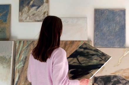
NURIA MARIA: Z I L V E R
24 April to 24 May 2025
This captures the fleeting beauty of light and movement in nature. Inspired by the silvery tones of willow leaves shifting in the wind, Nuria Maria’s layered compositions reflect change and depth. Balancing abstraction and figuration, she explores new materials, incorporating watermixable oils, raw linen and jute to create textured pieces. Her work evokes a sense of stillness, mirroring the ever-changing landscapes that inspire her. Cadogan Gallery, 7-9 Harriet Street, London SW1X 9JS. cadogangallery.com
28 June to 26 October 2025
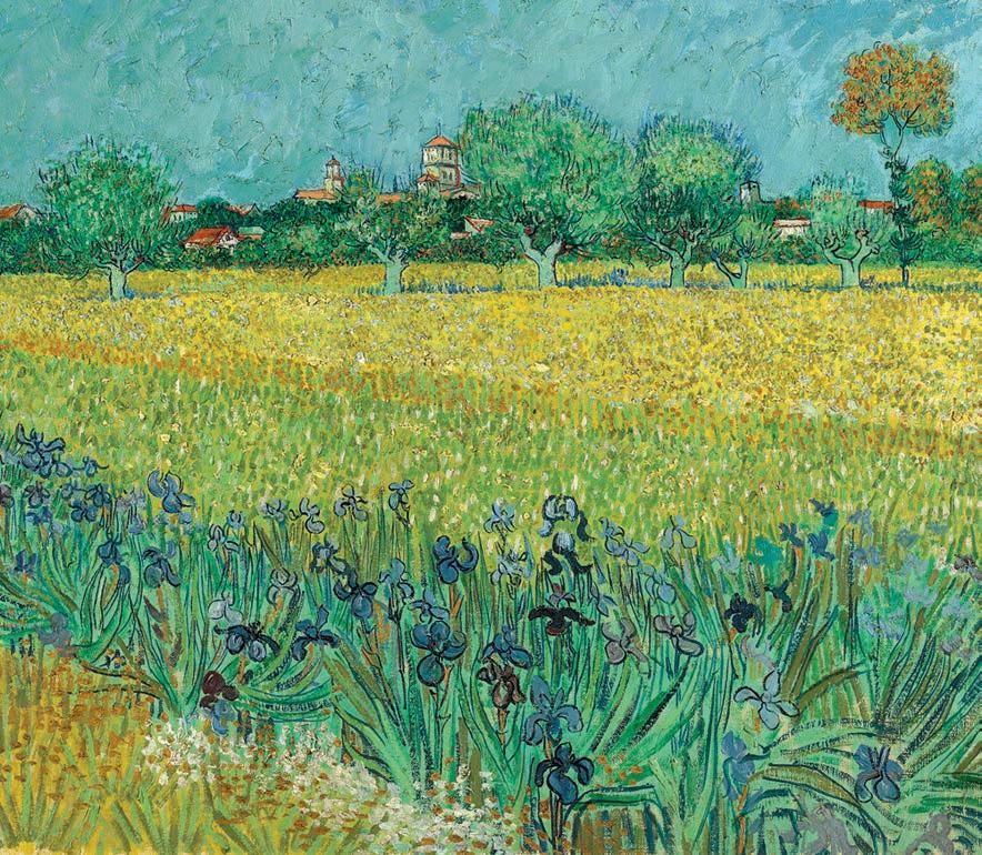
Vincent van Gogh’s work has profoundly influenced Anselm Kiefer Hon RA for nearly 60 years. In June 2025, paintings and drawings by Van Gogh from the Van Gogh Museum, Amsterdam, will be shown alongside Kiefer’s paintings, drawings and sculptures, including new, unseen pieces. The exhibition will explore their shared themes and techniques while highlighting their differences, offering fresh insight into both artists’ work and processes. Van Gogh’s compositions and structures have remained aninspiration throughout Kiefer’s career. The Gabrielle Jungels-Winkler Galleries, Royal Academy of Arts, Piccadilly, London W1J 0BD. royalacademy.org.uk
Until 21 September 2025
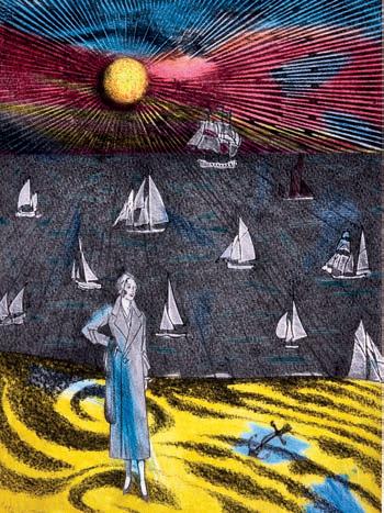
This is a major retrospective that celebrates the work of Colin Self, one of Britain’s most inventive and eclectic artists. Spanning six decades, the exhibition features 130 works, from his pop art of the 1960s to later experimental pieces. Visitors will discover his bold social commentary, playful wit and deep connection to Norfolk’s landscape. Highlights include rare loans from major collections and never-before-seen works. This landmark exhibition offers a fresh perspective on a unique creative force in British art. Norwich Castle Museum & Art Gallery, Norwich NR1 3JU. norwichcastle.norfolk.gov.uk
1 May to 22 June 2025
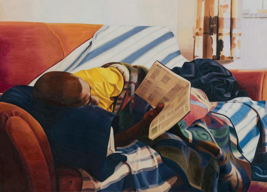
A major solo exhibition of Mike Silva’s work will showcase his intimate, light-filled paintings of interiors, landscapes and still lifes. Drawing from a personal archive of photographs, Silva (b. 1970) captures fleeting moments with sensitivity and atmosphere. Presented in collaboration with the De La Warr Pavilion, this exhibition marks Silva’s first solo show in a public institution, offering a unique insight into his evocative and deeply personal practice. Mead Gallery, Warwick Arts Centre, Coventry CV4 7AL. warwickartscentre.co.uk
































































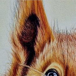























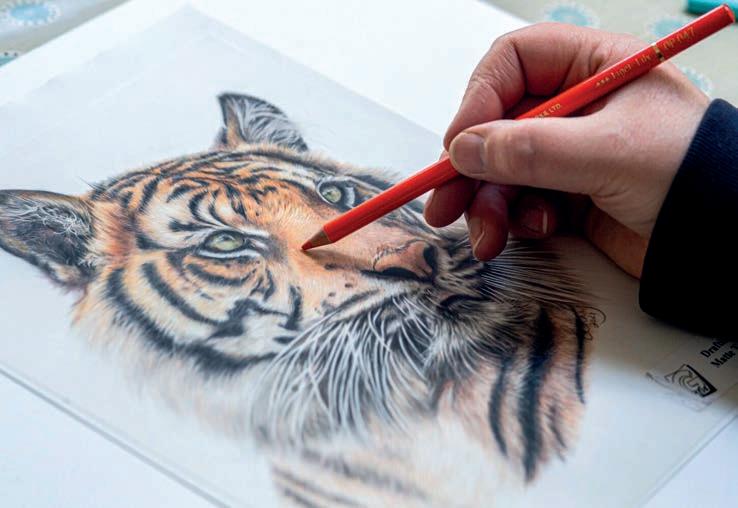
Coloured pencil expert Bonny Snowdon’s Academy is giving away its Ignite Membership. The ultimate programme for coloured pencil artists, it o ers expert guidance, structured learning and a vibrant creative community. Designed for all skill levels, it provides in-depth tutorials, step-bystep lessons and professional insights to help re ne your technique and develop your art
Members gain access to a thriving network of like-minded artists where support, encouragement and feedback are always available. Live coaching and Q&A sessions with Bonny Snowdon o er direct, personalised advice, while a growing library
of content ensures you can learn at your own pace. Monthly challenges and themed projects keep you motivated, pushing your creativity in new directions.
This is a rare opportunity to win a full membership and experience everything the Bonny Snowden Academy has to o er. From exclusive workshops to special events, winners will gain a wealth of resources designed to improve their art. Whether you’re looking to master coloured pencil techniques or take your work to the next level, Ignite Membership provides the tools and inspiration to get there. bonnysnowdonacademy.com ▫




THE PRIZE
Three winners, chosen at random, will each receive a Bonny Snowdon Ignite Membership worth £370.
HOW TO ENTER
Submit your entry by noon on 30 June 2025 at artistsandillustrators.co.uk/competitions or by mail to Bonny Snowdon, Artists & Illustrators, Chelsea Magazine Company Ltd, Telegraph Media Group, 111 Buckingham Palace Road, London SW1W 0SR.
TERMS & CONDITIONS
The prize is non-transferable. No cash alternatives are available. For full terms and conditions, visit chelseamagazines.com/terms
Name:
Address:
Postcode:
Email:
Telephone:
closing date for entries is 30 June 2025.
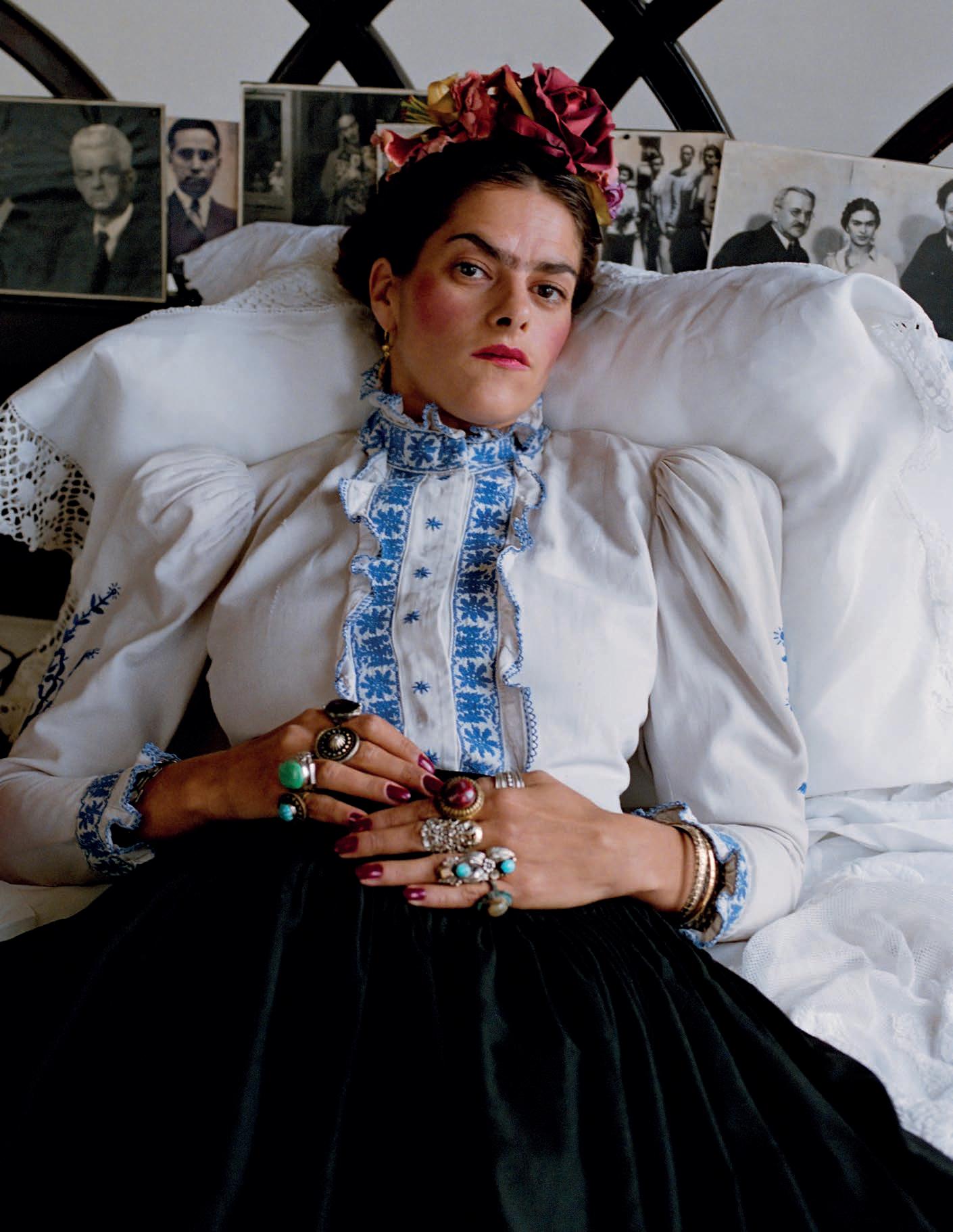
This month’s spotlight on a British Art Club member
This
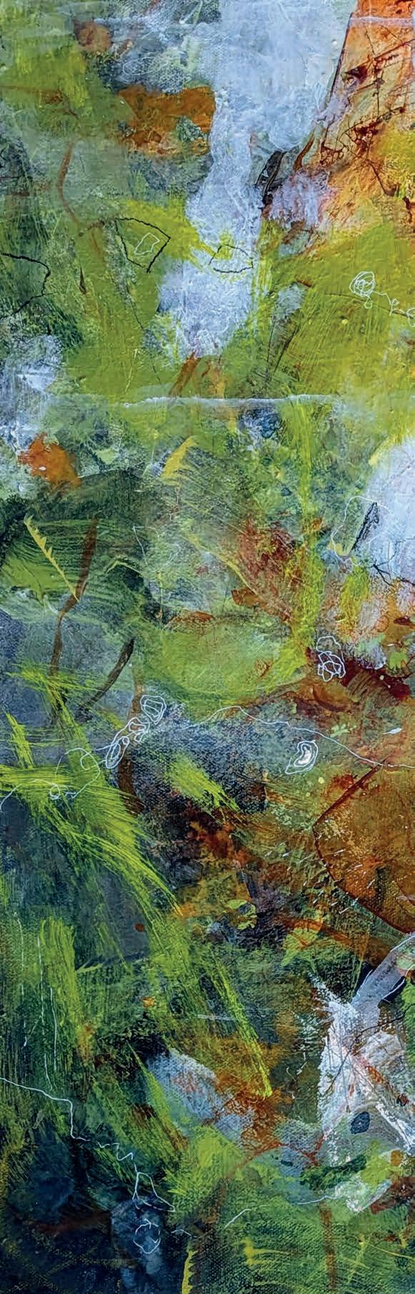
Canadian artist chases freedom in paint, layering translucence and texture to create art that intrigues, invites and refuses to be confined
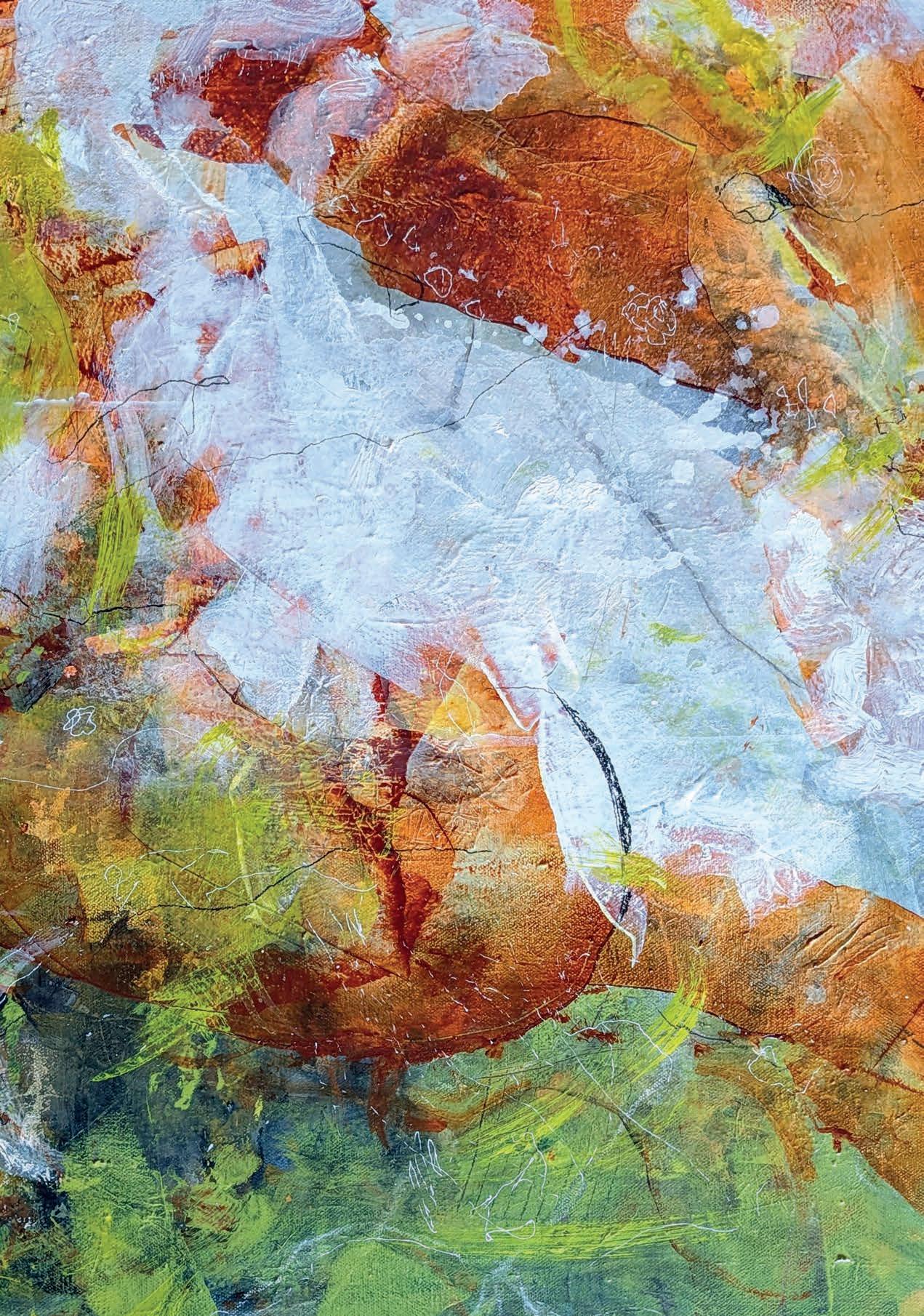
In a world often demanding precision and structure, Elaine Smith’s paintings offer a breath of expressive freedom. Ethereal and richly layered, her abstract works invite the viewer into a space where form is fluid, movement instinctive and interpretation personal. Yet, behind the apparent spontaneity lies a meticulous practice.
“I developed my style through many hours of painting; playing with materials, looking at others’ art and sorting through what I love,” Elaine explains. “Through this practice, I started to realise that I’m in love with translucence, layers and texture; wanting my images to have a sense of a visual story.”
Elaine’s journey into abstraction was not immediate. Initially drawn to realism, she once believed it was the only true form of art. That perception changed when she studied abstract expressionism. “From there I was hooked; the freedom of expression is so intriguing. I find it harder to paint a decent abstract in many ways.”
Creativity was always encouraged at home – her mother was an artist whose work was largely abstract. “My mum was an artist her entire life and always positive about art,” Elaine smiles. “I feel very lucky because many parents struggle to encourage their children to be creative.” Her formative years were filled with artistic exposure, from galleries to hands-on experimentation.
Composition plays a key role in her work, balancing intuition with structure. “I like to use some planning along with intuition. If a painting isn’t working, it’s usually composition that’s the problem.” Colour, too, is integral, setting the emotional tone of each piece. “When I want a more peaceful and quiet tone, I use more muted colours. I like a limited palette because it forces me to mix and creates a more harmonious image.”
The question of when a painting is finished is one that artists across time have wrestled with. For Elaine, the answer is a mix of instinct and patience. “I take my work to a place where I feel happy about it initially and then let it sit for a while. Sometimes I turn it upside down; it helps a lot. But I’ve learned to listen to my intuition. If I love it, then I’m pretty much finished.”
As for influences, she recalls a transformative moment at the Vancouver Art Gallery. “Many years ago, I saw an exhibition with Jack Shadbolt. His huge paintings made me cry. The beauty and depth were amazing.” A visit to the Museum of Modern Art in Paris also left a lasting impression, reinforcing her belief in risk-taking and artistic courage.
What does she hope people feel when they look at her work? “Mostly, I’d like people to feel intrigued, to want to look more deeply and respond in a personal way. Even if they don’t like it, I want them to feel something.” britishartclub.co.uk/profile/elainesspace ▫
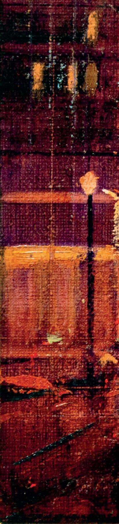
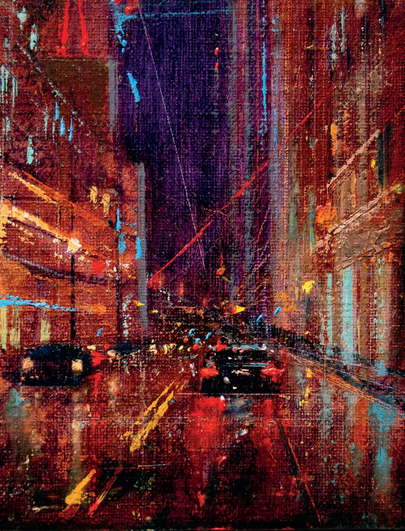
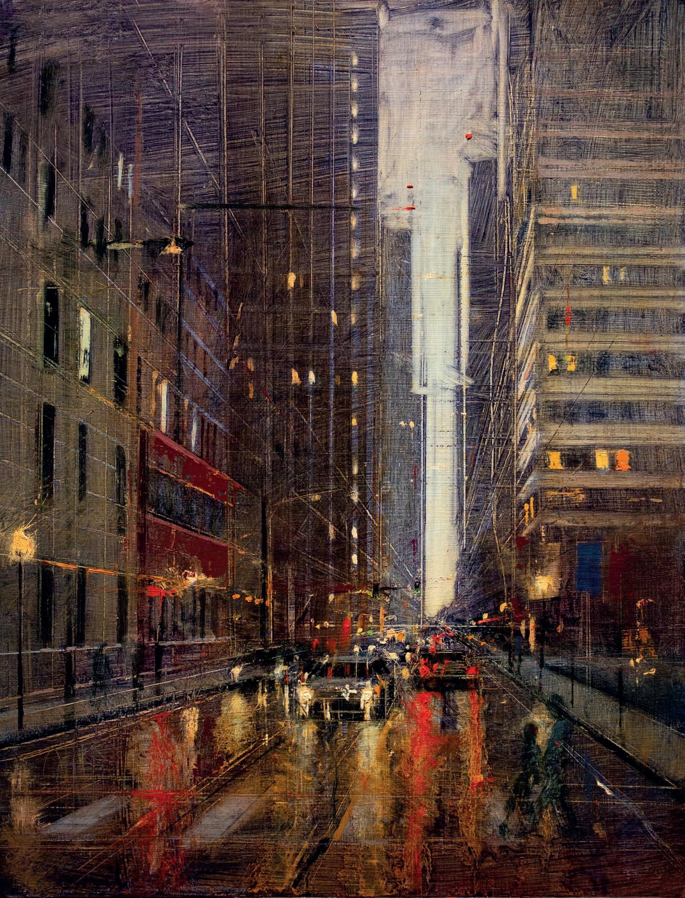
Captivated by the urban glow, this artist stumbled upon his niche by chance and now transforms everyday street corners into luminous architectural studies, finds Bianca Dumas
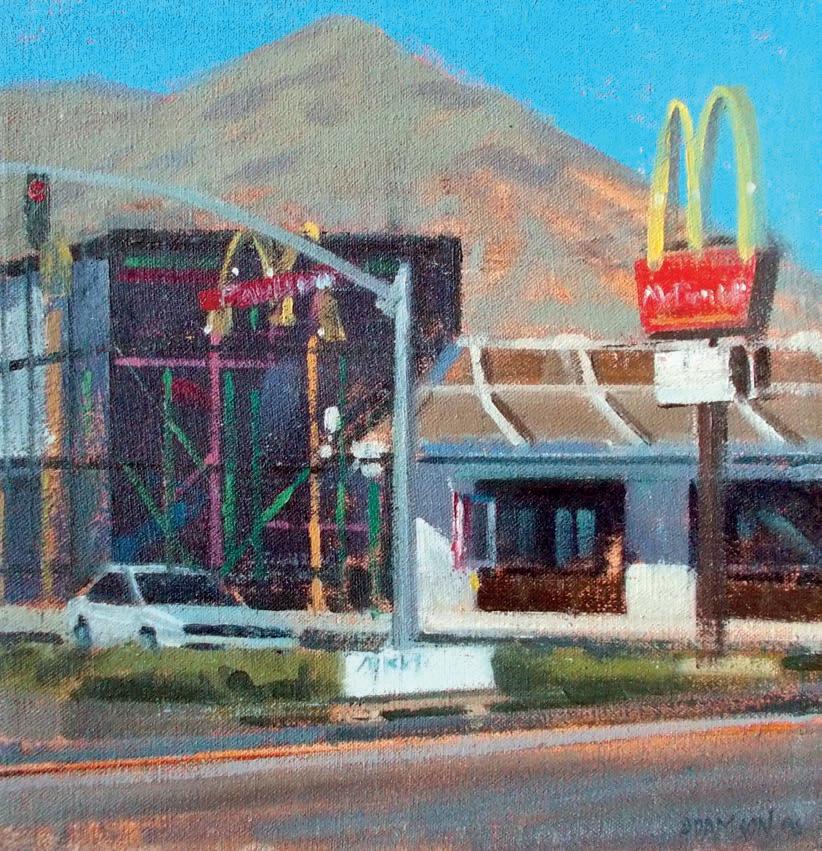
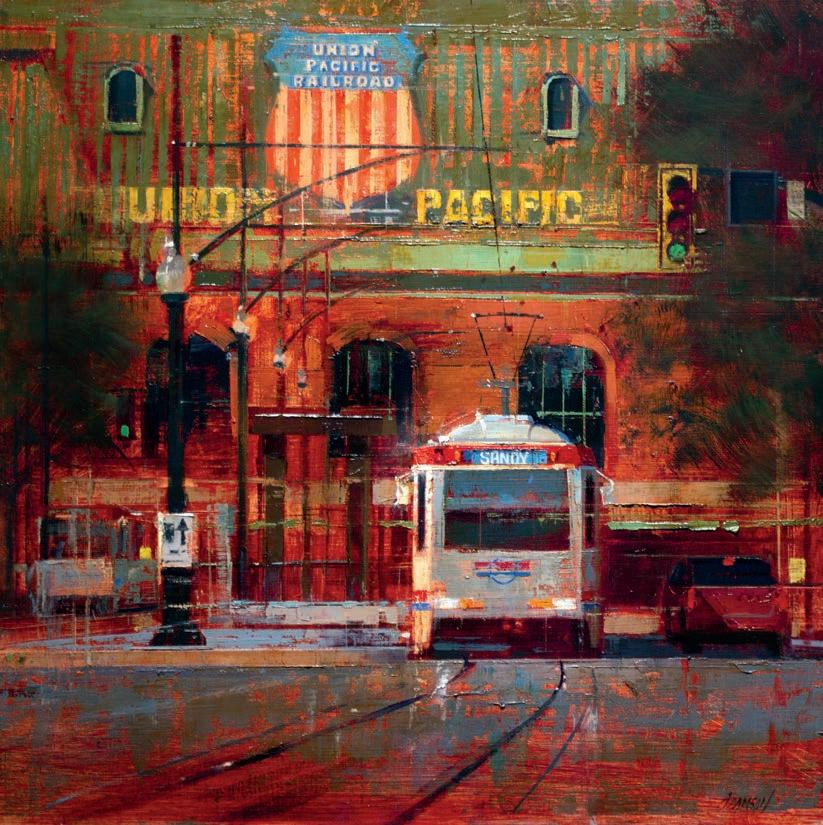
Rob Adamson’s home and studio lie near the foothills of Salt Lake City, Utah, at the outermost edge of a grid of busy streets. Rob stumbled into his niche one day when he drove up a nearby wooded canyon to paint and couldn’t find a scene that interested him. Disappointed, he drove down into the city and found his inspiration at a stoplight when he glimpsed a McDonald’s on the corner. “I looked at the afternoon light and was enamoured by all the colours and the
architectural elements popping out,” he says. Rob parked his car, sat at the intersection and painted the fast-food restaurant. “I had so much fun. The next day I went down on the other corner and painted the 7-11,” a gas station known for its striped red, green and orange branding. “Then, I went and painted the dry-cleaning store, and it kind of looked like an Edward Hopper.”
Rob traces his love for cityscapes to an early interest in architecture. In high school, his favourite class was technical drafting done ▸
by hand. “I loved the way we’d draw buildings with straight edges and would carry the line beyond the corners,” he says.
That day on the street corner, Rob may have noticed elements of Hopper, but he’d later find additional inspiration in the works of San Francisco cityscape painter James Stagg and in the Robert Henri Ashcan movement, which demonstrated that beauty can be found everywhere; that even a painting set in an alley can surprise the viewer with a beautiful mark.
In the moment he found his inspiration, Rob was able to contrast his artistic interest with that of landscape painters who focus on the bucolic and concluded, “My pastures with cows in the fields are concrete buildings and city, because that’s where I grew up.” He was amused that it all started on a day when he couldn’t find a place to paint.
As his career has developed, Rob has continued in the vein of abstract realism and is still inspired by scenes of daily urban life. “I don’t like to cover up my tracks,” he says, and bolsters that statement by quoting painter Richard Schmid, whose painting style aimed to capture the world as the human eye, and not as the camera, perceives it. “This is a human-made image with marks,” Rob adds. “Basic, old and archaic as that is, we’re creating this beautiful thing with coloured mud.”
Abstraction comes through in a good painting as it does in a good movie. It’s the director’s restraint which invites the viewer to be a participant, figuring out the story as it unfolds. “A good painting is not giving me all the answers,” Rob says, “It’s offering me questions, too.”
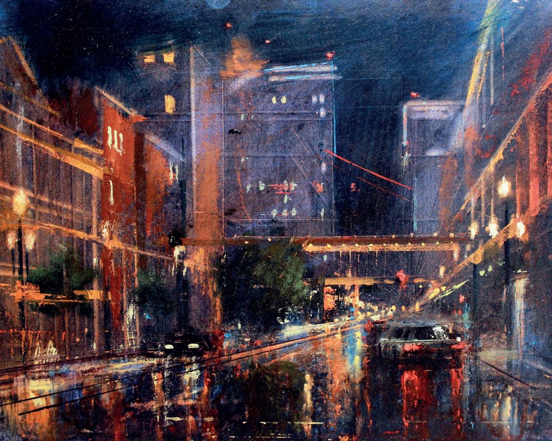
The artist’s “crust of bread,” as he puts it, comes from his well-selling paintings of cityscapes and nocturnes. In these, Rob’s carefully selected composition and colour again bring attention to otherwise dull, quotidian scenes. Reflective surfaces like wet streets add interest, and the lights on the cars become focal points.
“With night scenes, you have artificial light coming from all over the place which creates a dazzling dance of light,” he says. “There’s something beautiful and mysterious about a city at night.”
Rob doesn’t feel that he has to stick to one genre of painting though, and due to an innate sense of restlessness, he needs variety. “I can’t just sit in one place, physically or mentally,” he says, noting a desire to “bounce around” and paint according to feeling. He usually has several works in progress in his studio and can pull out another painting when he gets stuck. Rob also accepts portrait commissions and ▸
teaches at a local college. “The way I paint any genre, I’m not really changing my skill set or process. I’m looking for shape, for colour; trying to see it as line and value,” he says.
The artist was recently selected to paint the official portrait of the college president for her retirement. Although it’s not his main gig, he regularly takes portrait commissions. Rob is well aware of the potential pitfalls of commission work, such as the desire to see an idealised version of oneself on the canvas, but he feels that satisfying a portrait subject is well worth the effort it can take.
“To me, portrait painting is more like an illustration job,” he says. Rob likens it to a situation where an editor scrutinises a piece of work so it best goes along with the written subject matter, and the vision of the artist adapts to those needs.
He also takes commissions for landscape paintings, sometimes of nostalgic spots in the city. Rob says he’s painted a simple square ice cream parlour with its two-scoop marquee many times because so many people have a personal connection to the landmark. It’s their sense of nostalgia, combined with his painterly skill that helps them see a scene of beauty in city sprawl. Once, he was painting on a small town’s
“A good painting is not giving me all the answers, it’s offering me questions too.”
main street when the driver of a big truck rolled his window down while passing and hollered, ‘Get a real job you bum.’ “He wasn’t just being funny, he was serious. I named that painting Get a Real Job You Bum,” Rob says, laughing, but he thinks it points to something important. A person won’t understand why a scene is worth painting until the painter makes the scene feel interesting, important and well-crafted. Whether it’s an ice cream shop or a smalltown street scene, the artist wants to etch the nostalgia of the image on his canvas. “Beyond that,” he says, “viewers will see the beauty of the marks.”
The subject matter he selects also chips away at the sense of exclusivity fine art can engender, and Rob purposefully does further demolition to the idea in his college classes. “My teaching is about inclusivity,” he says. “I tell people: ‘If you have the desire,
you can learn this stuff.’” Both student and teacher himself, Rob knows the value of having a master teacher in your corner. He believes that even a self-taught artist ought to search out a guide to help them break up bad habits and offer morale.
He also wants his students to know that making a great painting takes time. Rob likes to use similes in his teaching, so he draws out another here. While viewing a painting should be like participating in the unfolding of a good story, making a painting should be like working backstage at a concert.
“I make a real big deal that concert roadies may spend two days setting up for a two-hour show, and why would anybody do that?” He wants the students to understand that preparation for a good show or a good painting takes a long time.
Part of this preparation lies in obtaining all the principles and elements of a fine arts education including good instruction and deep practice. The final element is inspiration, which can be found everywhere. It’s in that act of seeing with the human eye, in looking for design, colour and shape in everyday vistas. That, Rob says, is what “brings the interest to the non-interesting thing, the beauty to the non-beautiful.”
robadamsonstudio.blogspot.com ▫


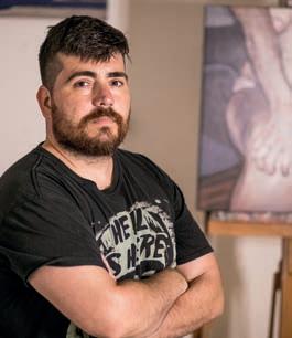
This Spanish artist balances painting, teaching and family, navigating both his work and personal life
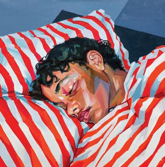
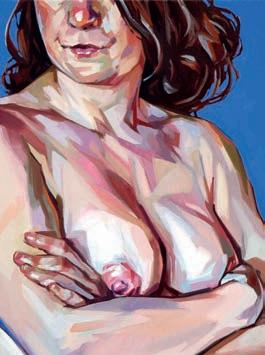
Iwas born in Valencia, where the light stretches endlessly. This shaped my understanding of colour and atmosphere in painting. I come from a working-class family, and despite difficult times, my parents prioritised education and encouraged our artistic interests. One of my biggest influences was my older brother, an illustrator and designer, who introduced me to comics, films and fantasy literature. It was through him that I started drawing by imitation.
A defining moment came in my teenage years. I was going through a turbulent phase and wasn’t the best student. Then, a teacher encouraged me to study Fine Arts; his advice changed my life.
My years at the Polytechnic University of Valencia were essential, not just in technique but in connecting with people who shared my artistic concerns. That was the real gift – growing as a painter and as a person. At the time, the university had a strong figurative focus. There was a mistaken belief that the best painters mastered portraiture and the human figure. That pressure shaped my path. Since then, the figure has remained central to my work.
I had aimed to become a professor but wasn’t willing to endure the required years, so I did not complete my doctorate. It remains one of my few regrets, but stepping away from academia let me fully dedicate myself to painting.
Social media has become essential, providing direct access to collectors, galleries and other artists, removing the
need for intermediaries and creating new opportunities.
The life of an artist involves painting, invoicing, organising exhibitions, handling logistics and making time for family, of course. The expectation to constantly produce online content can be exhausting, and
few artists can hire a team. We painters are “cultural labourers;” self-employed, multi-tasking workers trying to keep everything afloat.
I take my child to school every morning, then go straight to the atelier. That time is sacred. Whether working on my own pieces, commissions or testing products, I dedicate the same hours every week to painting. Admin work and emails eat into my afternoons, and on weekends, while my wife and child have their siesta, I tackle invoices, edit reels or send quotes. These “free hours” get swallowed up by logistics. But my weekends are dedicated entirely to my family.
I occasionally teach in-person and online across Spain and Europe. It is not a permanent part of my schedule but complements my sales.
Look for opportunities
Go out there, make connections, seek opportunities and learn how to market your work. Don’t feel frustrated if you can’t live solely from painting (yet) Having a job that pays your bills is a good thing! You are not less of an artist for having a side job. Don’t romanticise this profession – it is hard work, just like any other.
2
3 1
Discipline, consistency and treating your craft like a business is very important
If you want longevity in this field, you need seriousness. Talent alone is not enough.
As artists, we live with a constant sense of scarcity. You may sell well this month, but you never know what the next will bring. That uncertainty pushes us to diversify. Teaching and collaborations are not just financial support but sources of growth. They add to my journey rather than take away from it. alecasanova.com ▫
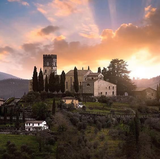
Vicolo del Duomo 19, Barga (LU), 55051 Italy
Quattro Archi Art Centre provides creative workshops and courses in Tuscany.
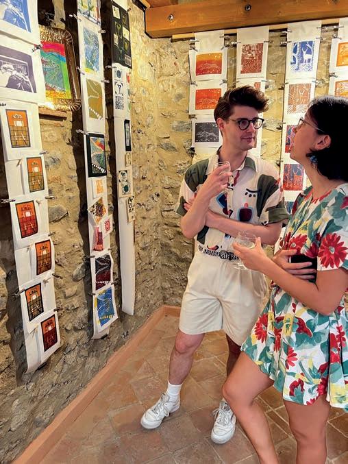
Set in the centre of the medieval town of Barga, comfortable accommodation, breakfast, self catering facilities, studio, gallery and fantastic views are all available on site. The building is a restored ancient building with spectacular gallery and architectural features.
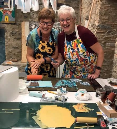
Registered as a charity in Italy, we provide free facilities to selected artists in residence and community art projects
• Studios
• Accommodation
• Materials
• Gallery
• Breakfast
• Tuition
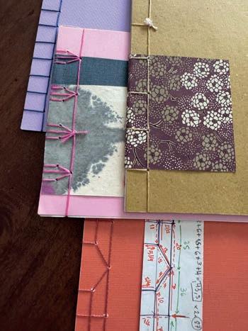
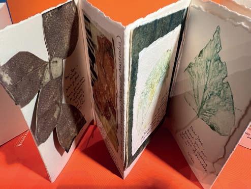
Learn 10 different types of binding with experienced bookbinder Victoria Bucca from Florence.
27 August –2 September 2025
• Restaurants short walk
• Self catering facilities
• Wonderful views
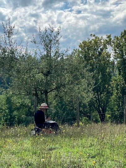
Painting techniques workshop. Outdoor sketching & painting Indoor studio time to try different techniques and produce a finished piece or two.
24-30 September 2025
Print, paint, sketch, collage your own papers and compile into your unique Artist Book. A collaboration between Victoria and Jane, expert bookbinder and printmaker.
3-9 September 2025
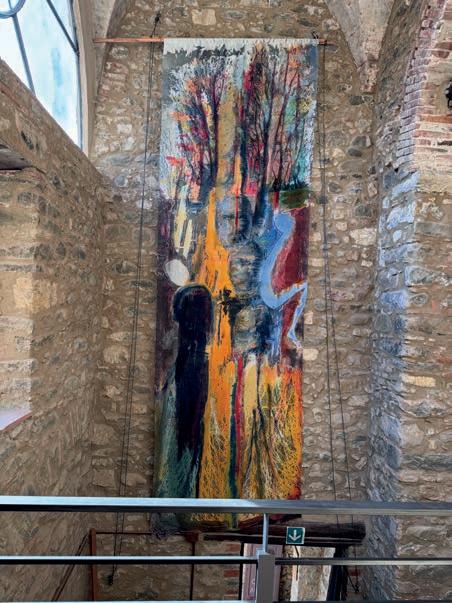
Carole Waller’s residency at Quattro Archi has yielded a new collection of wearable art and paintings.
Exhibition 6 June –30 July 2025
This artist paints emotive, lifelike portraits capturing raw, honest moments. Ramsha Vistro finds out more
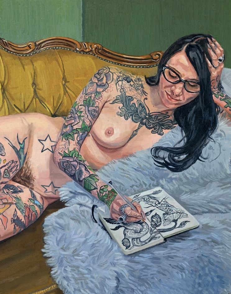
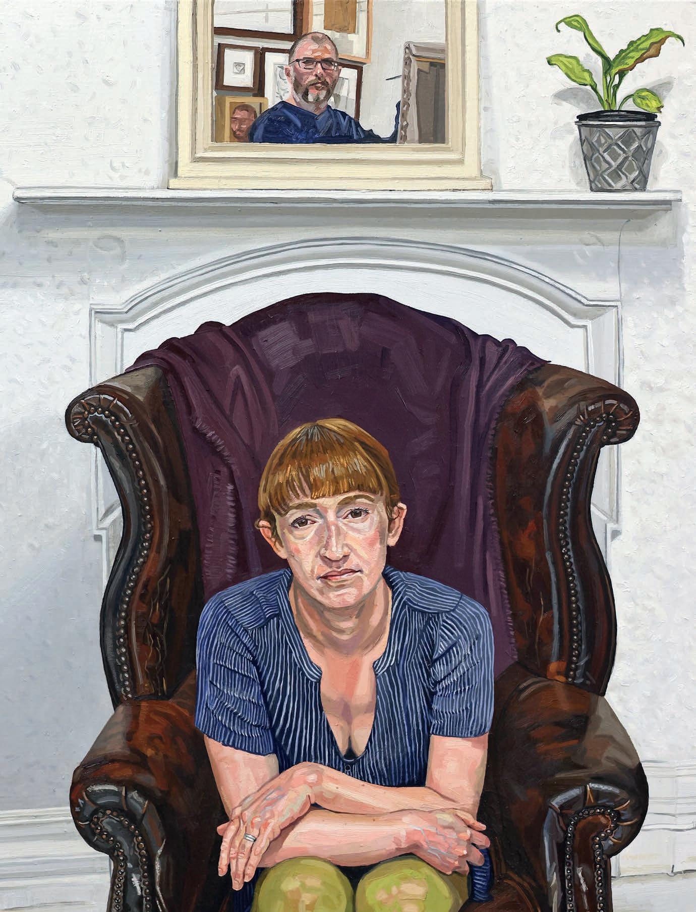
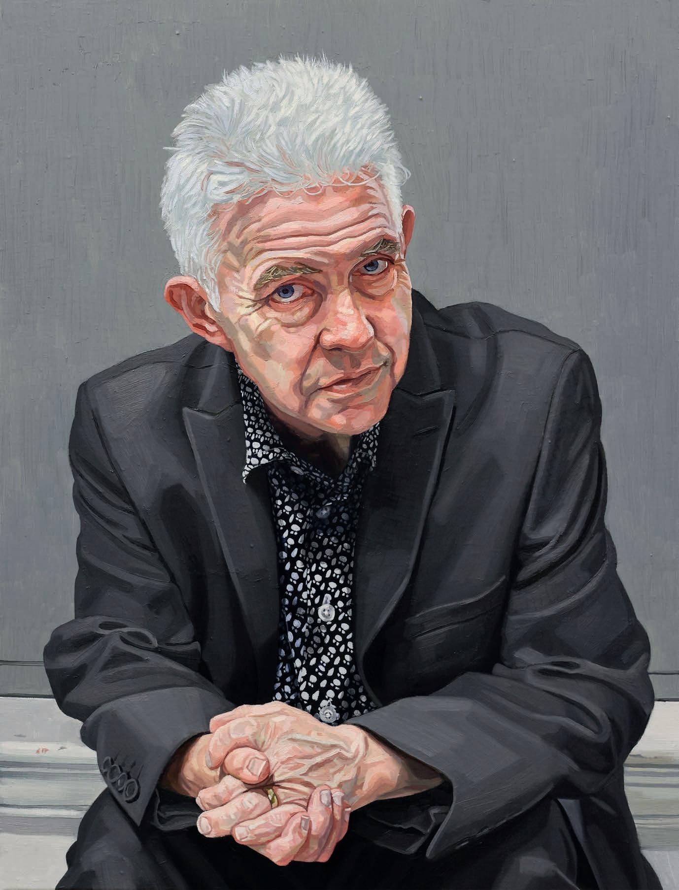
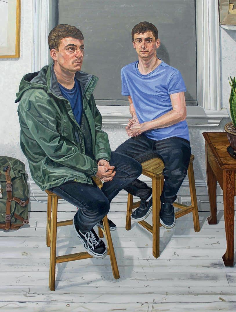
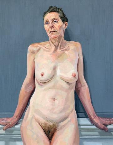
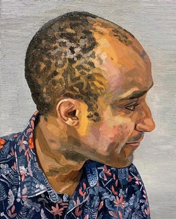
Richard Kitson is a portrait artist based in Barnsley, Yorkshire, whose work is deeply influenced by his northern roots. His studio, though small, is a space for focused, disciplined work, shaped by his experiences teaching art.
His art has gained wider recognition, with pieces selected for prestigious exhibitions like the Royal Society of Portrait Painters and the Herbert Smith Freehills Portrait Award at the National Portrait Gallery. “I’m on cloud nine, it certainly hasn’t sunk in yet. To finally have one of my paintings exhibited at the National Portrait Gallery after 22 years of trying is a huge honour,” he says.
Alongside his painting practice, he published From Life, a book showcasing his personal collection of works, and continues to connect with both clients and followers through exhibitions, workshops and social media. He has previously exhibited in the Ruth Borchard Self-Portrait Prize and Figurative Art Now. He was a contestant in Sky Arts Portrait Artist of the Year in 2018 and has held solo exhibitions in the UK and internationally. richardkitson.co.uk
To keep me quiet as a baby, my mum would plonk me on the floor with some paper and crayons.
I wasn’t particularly academic and hadn’t shown much promise in any of my subjects. My first real memory of being good at drawing was at primary school. I drew a comic strip of a weekend with my grandad. After handing in my homework, I noticed my teachers talking, looking at my drawing and then at me. I remember feeling uncomfortable. They quizzed me about my drawing, asking why I’d drawn certain things. I felt a bit offended when they asked if I had drawn it myself, ▸
replying with a stern ‘Yes, I did.’ To my relief, they believed me and were surprised to find I wasn’t a write-off after all.
My grandad almost got into art school but was told he was too old. He was 14!
I never saw him draw though. My dad is a whizz at joinery, mechanics and metalwork, his early jobs were in the steelworks in Sheffield. Art wasn’t something that ran in the family, not to my knowledge, anyway. As I began to show artistic promise, my great aunty Connie said that it must be encouraged, and she kindly bought me my first set of artists quality watercolours from Hibbert’s art shop in Sheffield. It’s not there now, but it’s a vivid memory for me; it’s where things really got started.
I’m from a working-class background, so had a comprehensive school education. From year nine, my art teacher Mr Martin recognised my passion for art. I went on to Barnsley College for A levels but didn’t settle,
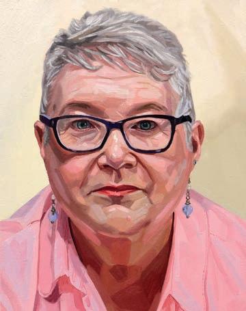
preferring to hang out with friends in the music department. A friend recommended Penistone Sixth Form, where I met Anne McPake. She told me, “You have natural talent, but no discipline.” Though initially offended, I knew she was right. Under her guidance, I learned academic drawing techniques and how to work from life, finishing with 100% in my art A level.
After A levels, I enrolled in Barnsley College’s art foundation course, where I met my future wife, Joanne. We have been together since 2002 (we got married in 2011). I have a collection of drawings and paintings of Joanne from when we first got together, she would have been 18 at the time. It’s such a privilege to be able to build up such a record of artworks just from one person.
I did my BA at the University of Leeds before it relocated.
I struggled at university. Only David Walker ▸
Barker saw my ability. I left Leeds with a 2:1, feeling like I never wanted to paint again. Though, thankfully, that feeling didn’t last. In 2023, I began my MA in Fine Art at Leeds Arts University. I was about to turn 42 and had one of the best years of my life, as far as my art education is concerned.
Up until completing my MA, I felt like I was an efficient practitioner but not so much an artist.
I had a good grasp of the what and how in my work but not the why. I taught in formal education for 10 years and as any teacher will tell you, you don’t get much time to focus on your own endeavours. A couple of years into my full-time artistic practice, I acknowledged that the gaps in my knowledge needed filling, so I applied to the MA Fine Art course at Leeds Arts University.
I’m approaching four years as a professional and I still feel lost a lot of the time.
You have to be incredibly self-motivated and that is where I fall down. I’m a prolific time waster, I’m ashamed to say, because I know how lucky I am to be doing this. When I’m locked into a painting, it can be hours before I come up for air. Those moments are what I enjoy the most, as it feels like all the years of practice coalesce with the part of me that still finds painting a complete mystery, those moments can feel very meditative.
I favour oil because it is a way of communing with the old masters. As a medium, it hasn’t really changed, except for the ways in which pigments can be manufactured. I also love the richness and different properties of oil paint, and the various finishes it can give you. I think it’s the closest you can get to making paint look and feel like the thing you are painting. In the end, a painting is a sort of illusion but also a reflection of reality, you can take what you see and interpret it in so many different ways.
Portraiture stops me from becoming too familiar with my medium and technique. All faces are different. Even identical twins will have some differences. As I go from one sitter to another I am faced (literally) with a totally different set of information. Yes, I can call upon some stock approaches to get me started but the journey towards capturing a likeness is always the main challenge. I’ve put the hours in to develop my ability to capture a likeness. It doesn’t have to be a carbon copy. I think it’s more about capturing something that is intrinsic. It might be the way they tilt their head, the corners of their mouth or the
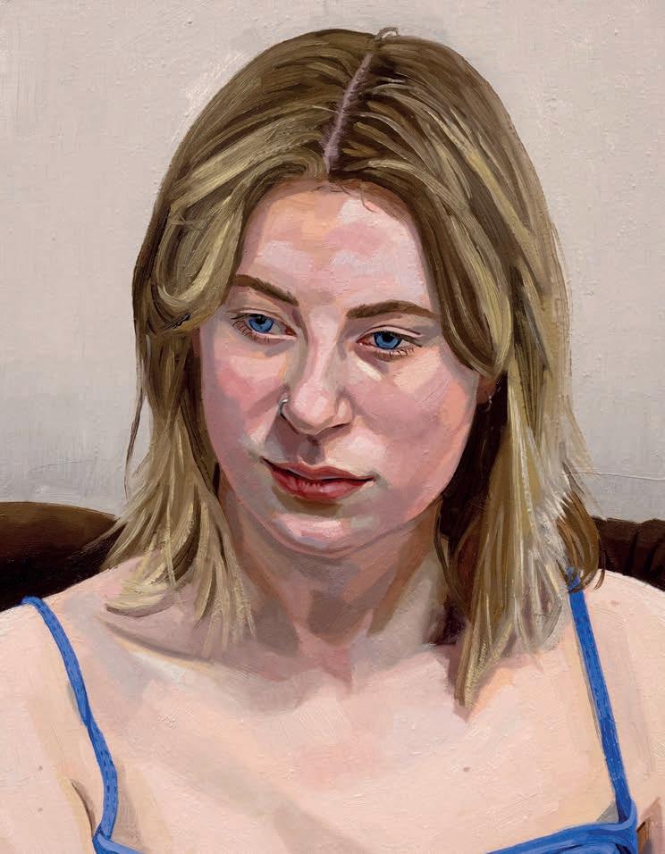
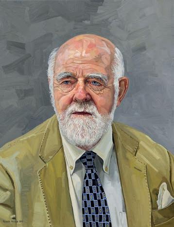
way they arrange themselves on a chair.
I try and avoid my own reflection if I can help it.
But it’s only fair that I subject myself to my own scrutiny from time to time. When I was doing my A levels, I had to use myself as a model to practice drawing. I was fairly skinny back then, so I had the vanity of youth on my side. As time has progressed, I have painted
fewer self-portraits, maybe one or two a year to see how my face has changed. From an artistic perspective, ageing is quite inspiring.
Selling paintings is probably the smallest part of my revenue.
Whilst my commissions are increasing, my main revenue stream is teaching workshops. In 2018, I was fortunate to be selected to participate in Sky Arts Portrait Artist of the Year where I painted Paralympian Kadeena Kox MBE. This was followed by my first solo exhibition. The timing was perfect, leading to requests for painting demos and workshops around South Yorkshire, eventually becoming a new revenue stream that forced me to choose between this and my teaching job.
I want people to feel a sense of familiarity with my art.
This might seem strange as people won’t know my sitters personally, but I want viewers to feel like they are wandering into a space where the person just happens to be. I am looking for a lack of curation in my work, not easy when the studio environment is in itself a kind of stage. I always aim to allow my sitters to be themselves and I think working from life allows this to happen. ▫


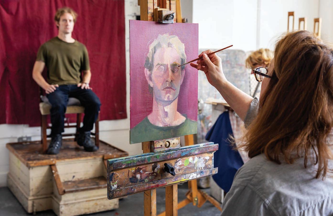
This artist distils light, form and colour, blending crisp geometry with quietly enigmatic figures, says Ramsha Vistro ▸
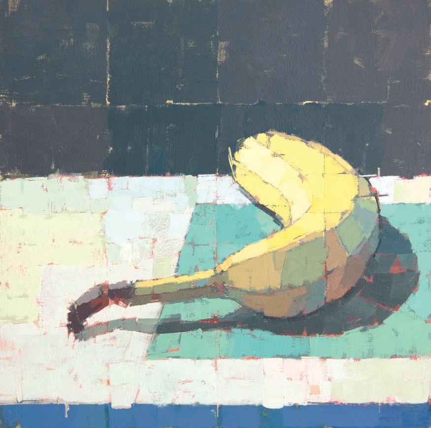

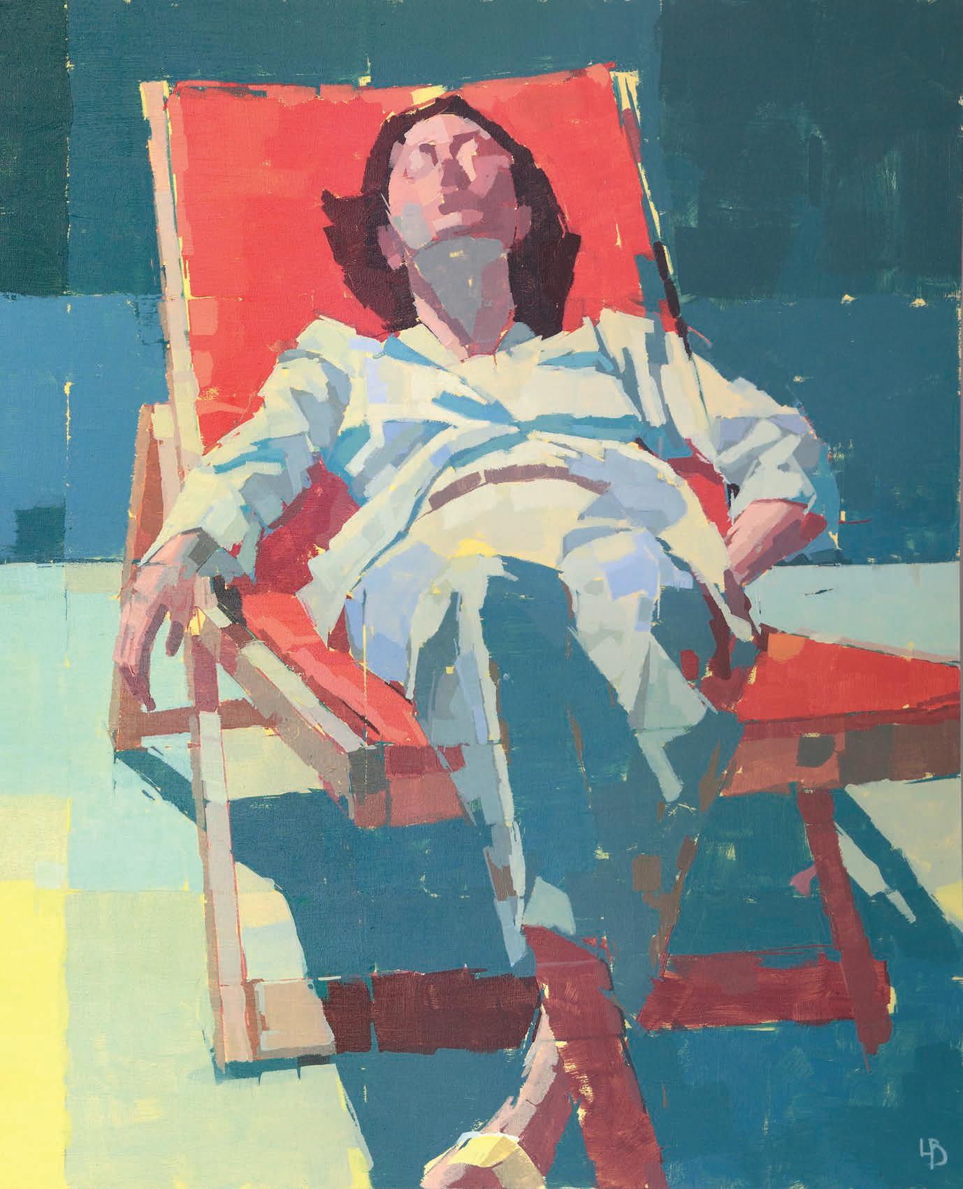
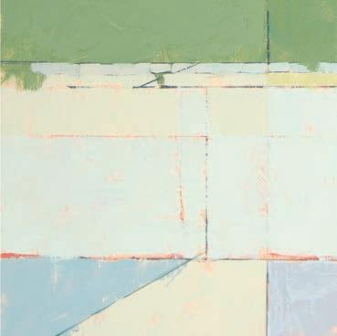
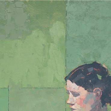
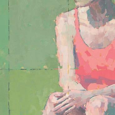
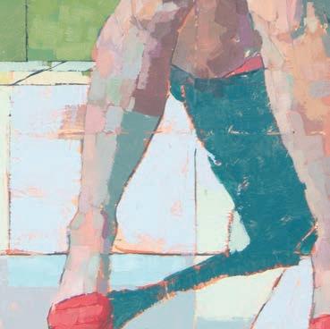
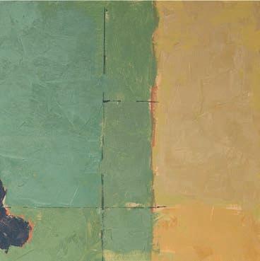
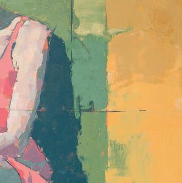
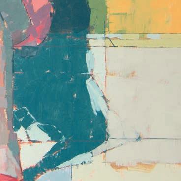
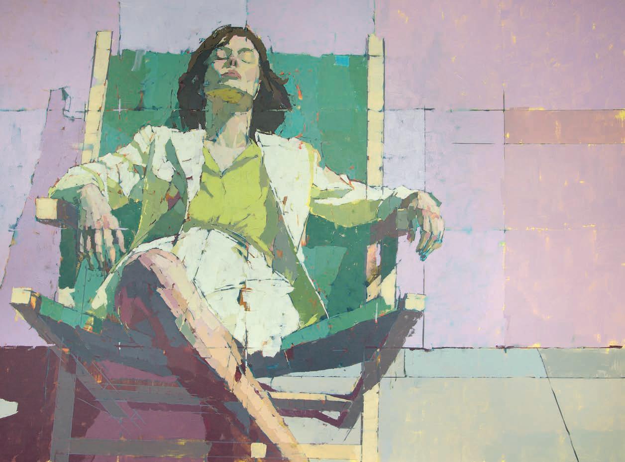
Ollie Le Brocq has spent over 20 years as a professional digital artist and animator, but in 2012, he swapped pixels for paint, seeking a creative counterbalance to his digital work. Now based on the Su olk coast, his practice revolves around still life and gurative subjects, with a strong emphasis on light, form and geometry. With a background in design and industrial design, his compositions are carefully structured, often favouring simplicity. Recent years, though, have seen a shift towards a more playful and expressive approach. Bold colours and graphic elements now take centre stage, adding energy and a sense of curiosity to his work. Rather than dictating meaning, he prefers to leave narratives open-ended, encouraging
viewers to bring their own interpretations. This balance of precision and spontaneity is what makes his paintings so compelling. His works may appear minimal at rst glance, but closer inspection reveals subtle layers of depth, whether through the way light interacts with form or the unexpected use of colour. His paintings o er a space for contemplation, inviting audiences to engage with the artwork on their own terms. Always evolving, Ollie continues to re ne his visual language, blending technical skill with creative freedom. His practice remains a constant exploration of colour, composition and the delicate tension between structure and play. ollielebrocq.com
After 20 years in the digital world, I was more than ready for a change. Not only is there a lot of screen time with
digital work, but that world often has fast-moving and hectic deadlines, which can be an exhausting way to live. Following the suggestion of a good friend, I bought some paints. I pursued painting initially as a hobby and an antidote to my digital work. Gradually, my work improved and ultimately took over. Did I make the right decision though? Hopefully, yes.
I drew from a young age but only painted occasionally.
I was born in Jersey, Channel Islands, but have lived in England from the age of seven. At school, I dropped art GCSE and opted for CDT (Craft, Design and Technology), with plans to be a designer or engineer. Later, I studied Industrial Design at degree level. Post-degree, I began a move into digital art and animation, and followed a career
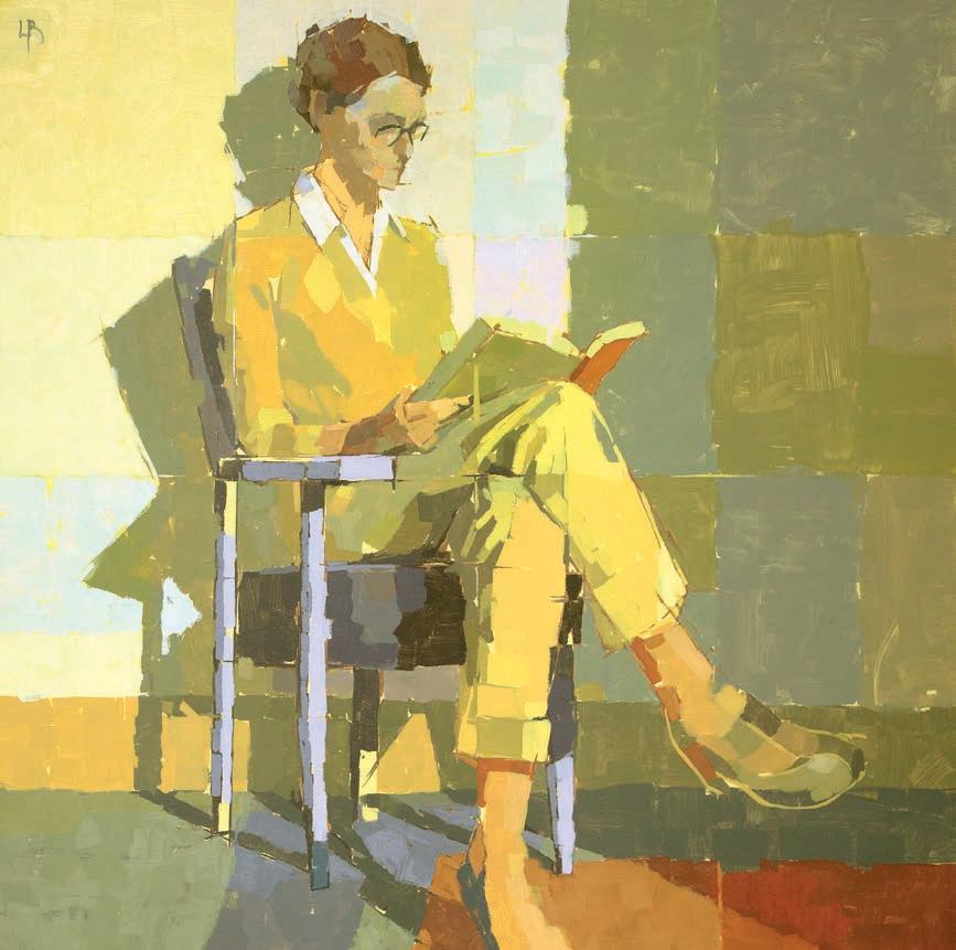
with these skills. I began painting much later, in 2012.
I tend to see creating art as a design problem, not a painting problem. Industrial Design – more commonly termed as Product Design – seemed like a fascinating world, where art or aesthetics and product function collide. In theory, the designer has the dual role of making visually appealing products that are functional as well as user-friendly. It was a useful experience and I really enjoyed learning. Developing design and problemsolving skills has proved useful throughout my practice, from digital work – and now –to creating paintings.
I’ve always wanted to convey form in my work.
Still life has been a great vehicle for that, especially while learning to paint. Over time, I started to explore the interplay between light, form and geometry, and how those elements relate to spaces too. It seemed a natural progression to add figures to my work. When I painted a lot of small ‘dailies,’ many sketchy figures turned up, all in everyday scenarios. I’ve painted a few portraits too, albeit not in an effort to ▸
realise some kind of likeness, but rather to explore people’s faces and the forms, and colours within.
My current figure work, and the spaces they inhabit, are a touch more idealised. They are imaginative and somewhat free from the constraints of traditional observational art. Now, I tend to make images that are somewhere between life and imagined. I do use various references from photos and drawings, and chop and edit them together as needed. Ultimately, I want free rein to take the image where I like, which is (hopefully) to some place interesting.
Before 2022, I had often felt there was a lack of clarity in my work.
Many earlier pieces involved quite elaborate – or perhaps intricate – mark-making, which I ultimately started to find a bit limiting; especially if I wanted to radically change all the colours, which was largely impossible without destroying the work. In the end, I’ve found colour to be much more interesting than focusing on mark-making, so my priorities have switched. I’m also curious to see how 2D elements can work within a 3D space, though I’ve barely touched that topic. Along the way, many things inspired me to change my work, the influence of Euan Uglow, some fantastic old railway posters and various contemporaries who had brilliant bold colour in their work.
My studio feels more of a retreat but it certainly could do with a seriously big declutter.
I live in Suffolk, on the Heritage Coast. My studio is my spare bedroom. It’s a good size, roughly 4.5m sq, with two very large windows and quite a few plants. The light is great in the morning, up and until about 1pm when, on a clear day, the sun will start streaming through. It would be ideal if the windows were north-facing, but you can’t have everything.
I don’t intentionally create messages or distinct narratives within my work. That said, I really hope there are aspects people can readily relate to, and in turn form their own stories around. If there was a message, I suppose, ultimately, it’s about light, colour and space, and often people –life stuff we can all relate to. Although, isn’t illusion and a degree of ‘the unknown’ part of the pleasure of experiencing art?
I often see something that catches my eye, which starts the process. This may lead to a sketch or two. I usually
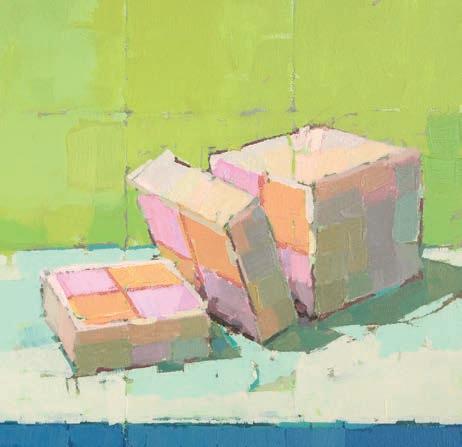
Battenberg, 2024, oil over acrylic, 30x22cm
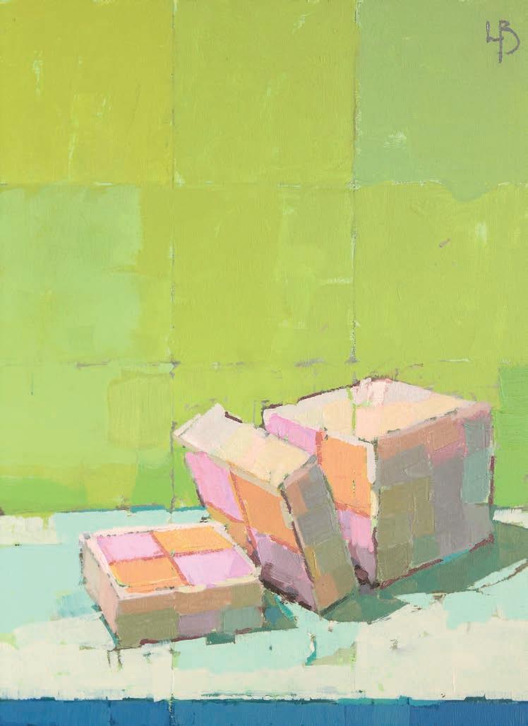
make little biro sketches, where I explore ideas further, and try to resolve layouts and compositions. Occasionally, an almost fully formed design pops into my head, but then trying to realise that idea can be a whole other matter – there’s often a yawning gap between the imagination and reality! Once I have an outline direction, I’ll start to flesh out ideas either in paint or digitally, through various studies. Those studies are my roadmaps for bigger pieces. That said, the bigger work evolves in its own merry way over time. While I might like to think my approach is quite structured, I suspect it’s more random than I fully appreciate. I regularly change colours and shift elements around, I’m adapting as the painting unfolds, trying to find a solution that works.
At times I have been a bit obsessed with Uglow’s work.
I’ve often studied his paintings and tried to make the odd artist’s copy, with varying results. His use of colour, clarity, marks –well, just everything – is good, or at least interesting. There are many other artists’
works I love though, and I’m sure they have all influenced me to varying degrees. There are too many to list, really.
I’m really enjoying my figure work at the moment and feel like there’s much more to say.
I certainly have plenty left to learn about colour and painting design, generally. I’ve been fortunate there’s been much more interest in my work in the last couple of years, but that doesn’t make me want to stand still. I do have a few ideas for abstracts rolling around my head, so perhaps they’ll be realised one day.
I encourage everyone trying to move forward with their work; to keep stretching themselves. Keep exploring and keep making mistakes. By doing so, your work will keep evolving and improving. The local tip and my studio are littered with my past ‘failures’ where I’ve been busy exploring one thing or another. I keep making failures. It’s proof that I am trying. ▫
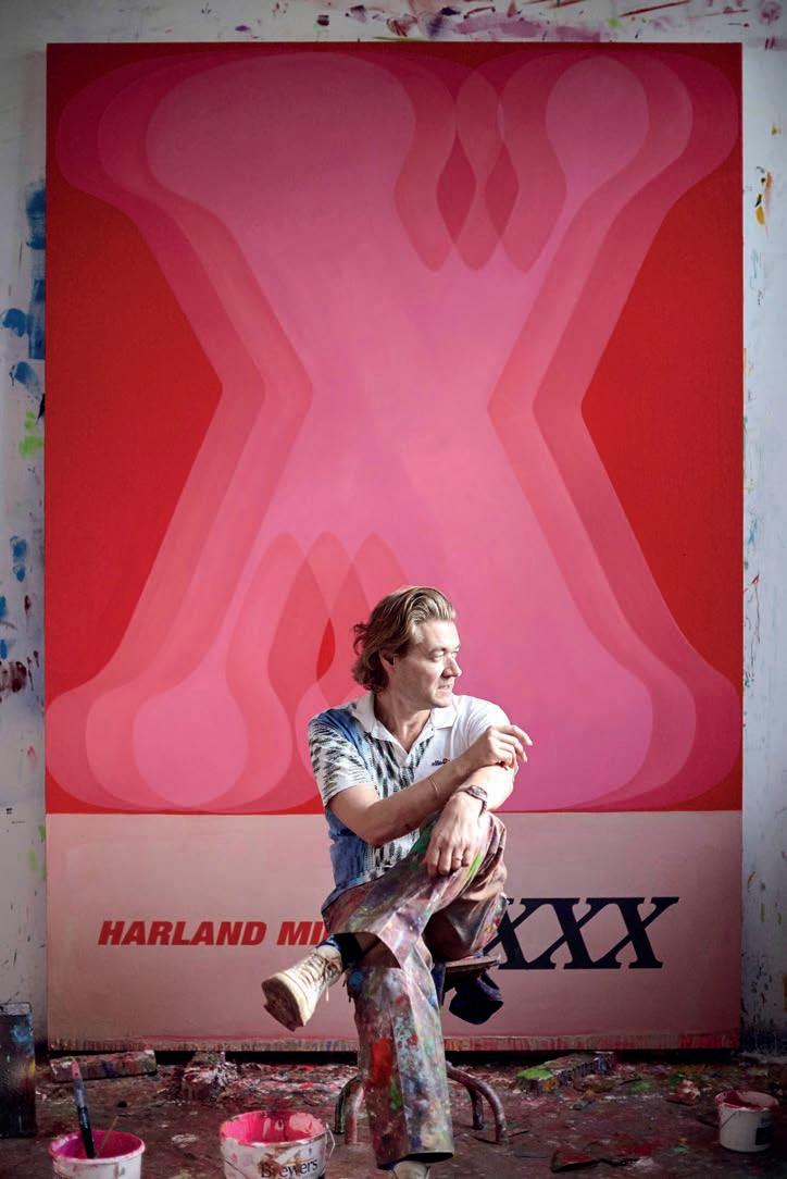
Internationally acclaimed artist and writer HARLAND MILLER returns to his Yorkshire roots with XXX , a new exhibition showcasing paintings and works on paper from his renowned Letter Paintings series.
Sarah Edghill reports in
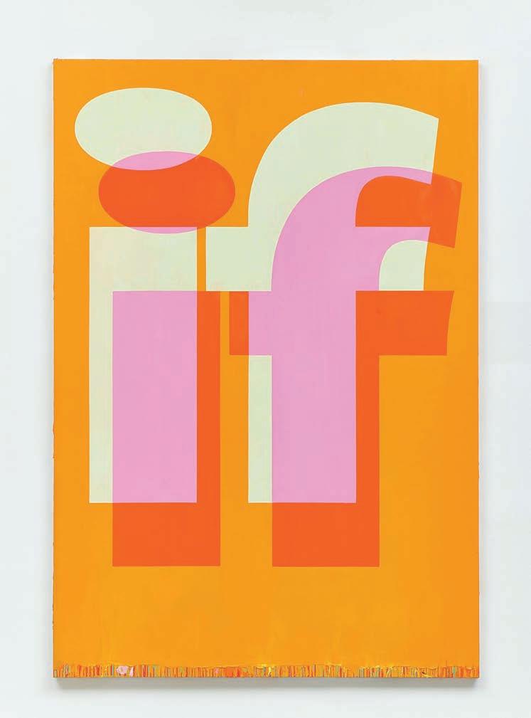
There are only 16 paintings on display in XXX, the new Harland Miller exhibition at the York Art Gallery. Considering that some of those pieces are three metres long, visitors won’t come away feeling short-changed.
The stunning exhibition features the paintings, alongside 25 graph paper drawings, by the critically acclaimed writer and artist, whose irreverent northern humour and love of language infuses everything he creates. Born in York in 1964, Miller was brought up in Yorkshire and then studied at the Chelsea School of Art before moving to New York, where his creativity was fuelled by Pop Art, Colour Field Painting and Abstract Expressionism. He spent a few years living what is best described as an itinerant lifestyle in New Orleans, Berlin and Paris, before moving to London, where he now lives and works. After publishing his first novel in ▸
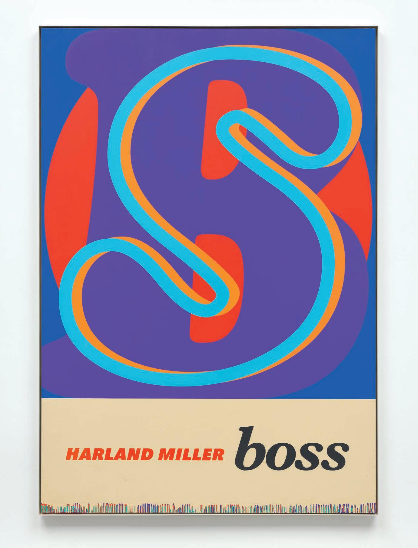
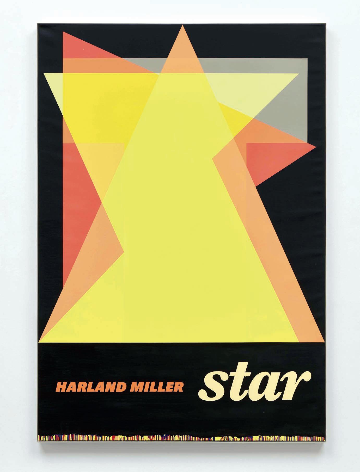
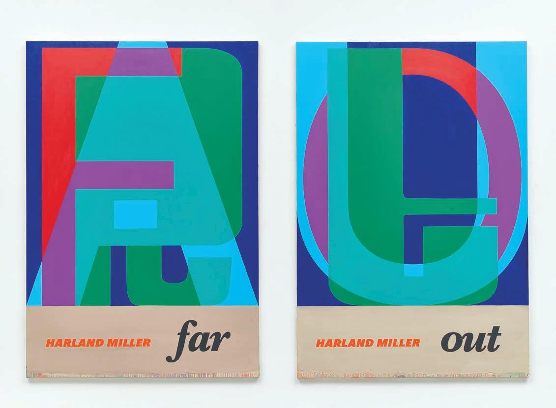
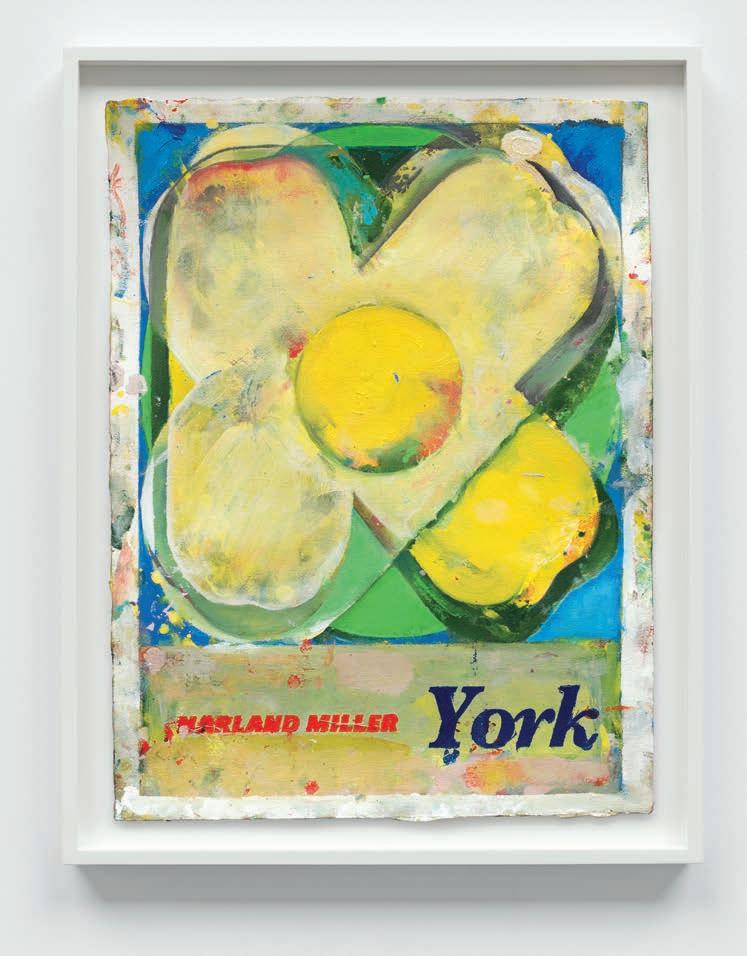
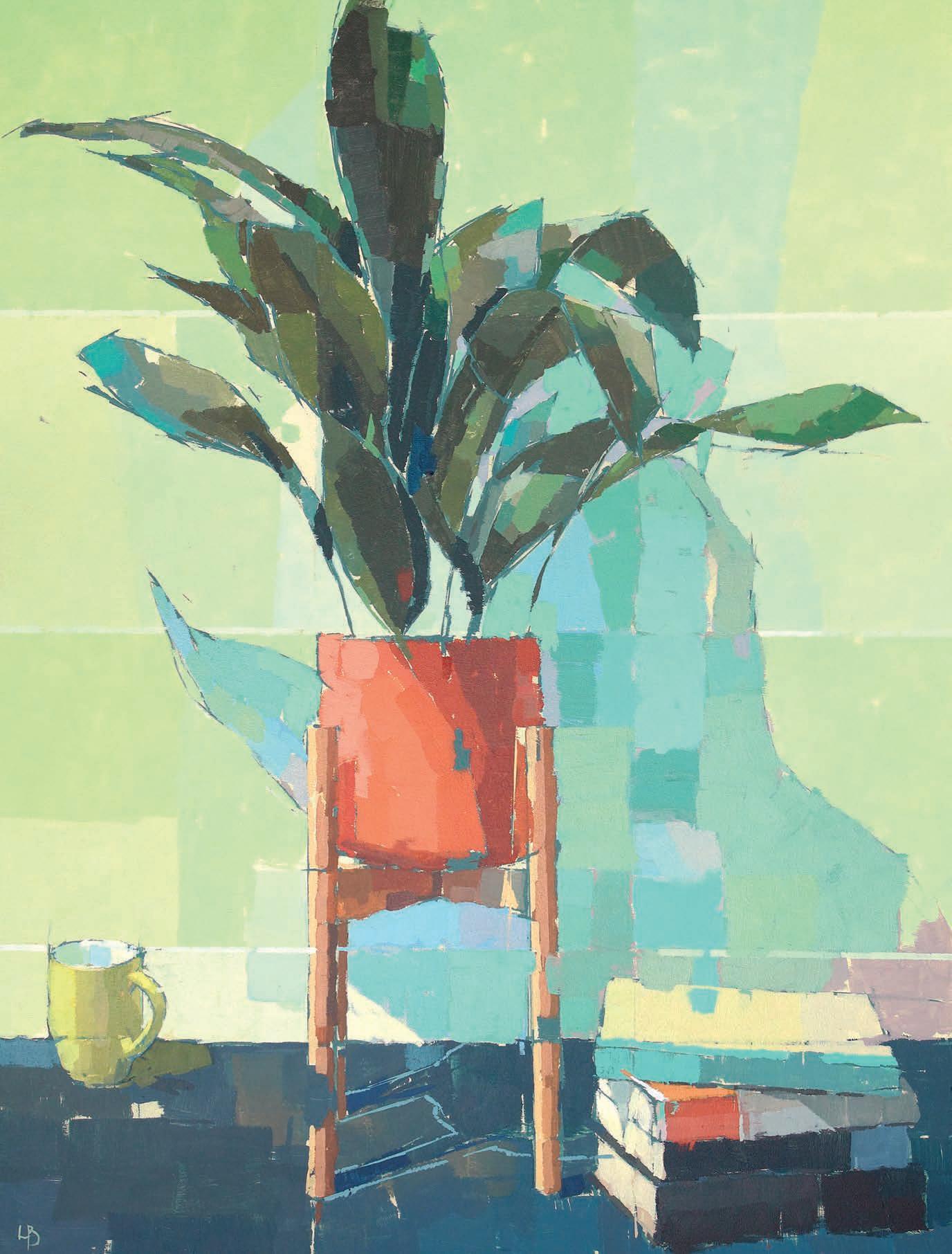
OPPOSITE PAGE Star, oil on canvas, 267x184cm ABOVE Far Out, oil on canvas, 264x182cm LEFT York, oil on watercolour, 51x38.5cm
2000, he went on to create art that garnered a devoted following. He’s particularly well known for his giant canvases based on Penguin paperback covers, with titles like, Whitby – the Self-Catering Years, Rags to Polyester – My Story, and most appropriately, York, So Good They Named it Once
“Harland is so fun to work with,” says Dr Beatrice Bertram, the curator of the new exhibition in York. ‘He’s someone who lightens your day and makes you laugh. He’s full of stories and anecdotes about things that have happened and it’s fascinating to hear how his works came about and how he views them. And because he’s from York and his family are here, there’s a lovely alignment with this exhibition and his feeling of homecoming.”
Bea first started working with Miller and his acclaimed London gallery, White Cube, in 2018, and a mid-career retrospective opened at the York Art Gallery in 2020, entitled York, So Good They Named it Once But just two weeks after opening, Covid struck, and the exhibition was forced to close. “It was a huge disappointment to everyone,” she remembers. “Following on from that, we reached out in 2023 to see if he’d work with us again.”
From the outset, Miller was keen that this ▸
new exhibition wouldn’t just be a repeat of the one in 2020. He suggested it should focus on his ongoing Letter Painting series of work, which is inspired by medieval manuscripts where monks laboured to produce illuminated letters at the beginnings of chapters. He started the project in 2017 but has also created several new works exclusively for this exhibition.
For Bea, working on XXX has been an enjoyable and rewarding experience.
“Harland has been very involved,” she says. “To have the artist there and curate with him, to walk around the spaces and ask him, what would you hang here? What do you want the audience to feel here? It’s a really exciting collaborative process to curate with an artist like this.”
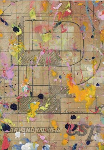
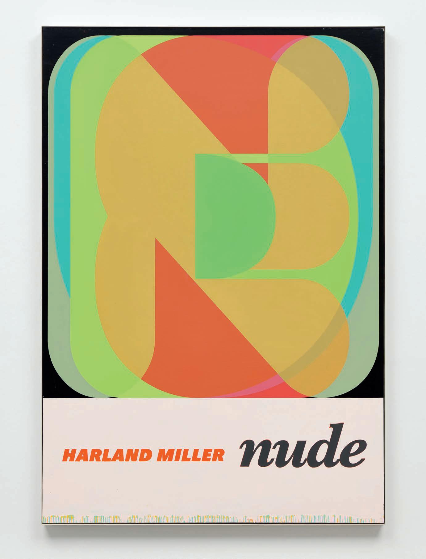
In his Letter Painting series, Harland Miller uses bold vibrant colour palettes and typefaces to show the versatility of words and acronyms such as ESP, STAR, IF, LUV and UP. By constructing a complex graphic layering of lettering and colour, the resulting images create a 3D effect and a sense of depth which almost suggests objects in motion. The exhibition also features 25 works of paper; some are newly created; others are graph papers showing his work in progress. “Some are first feelings,” explains Bea. “Then, as he paints, he makes more studies, and you get a really good idea of how the work develops.”
Miller has also donated three paintings from his Bad Weather Paintings series to the gallery, paying homage to three Yorkshire destinations close to his own heart: Whitby, Scarborough and York.
“It’s great to be coming back to York again with this show,” he says. “This time with a new body of work which has never been seen anywhere all together before, so it’s very exciting. York is a city of perpetual mystery and history, including my own, and it always draws me back. It’s especially exciting to be sharing this with everyone – not once, but twice.”
Bea says she would find it hard to choose a favourite work from those on display. “But if I was put on the spot, there’s one called NUDE which is a really interesting, pixelated image in unusual colours. There’s something forbidden about the painting and the barrier it creates with the pixelation. There’s also a painting called SHE, which relates to a personal story of Harland’s about his sister, who died of cancer 20 years ago, and that’s very moving.”
The exhibition will also be outside the
“York is a city of perpetual mystery and history, including my own”
gallery space, thanks to York Art Gallery’s Gardens Manager, Steve Williams, who has created two vast raised beds in the garden, planted with flowers which will bloom in the summer in the colours of Miller’s hard-edged diptych, FAR OUT. “Steve is an artist himself, and he has integrated the gardens and the gallery for each of our recent exhibitions,” says Bea. “He has come up with this incredible display in teals, blues and purples, representing the colours of the paintings. Visitors will be able to look down on it from the gallery’s balcony – a garden in motion.”
As well as a book signing event and a Q&A with Harland Miller on 14th May, there will be a series of ongoing events at the gallery to tie in with the exhibition, including Saturday art clubs working with local teenagers, print-making workshops and lectures. “This is such an exciting project to have curated,” says Bea. “It’s the first time these paintings are being shown together anywhere in the world. It’s a really important exhibition for York and we’re lucky to have it.”
Harland Miller’s XXX is on at the York Art Gallery until 31 August 2025. ▫
Our annual art competition attracts entries by the thousands every year. Whilst it may not yet be open, we wanted to raise a hand and encourage you to start putting paint to paper now…







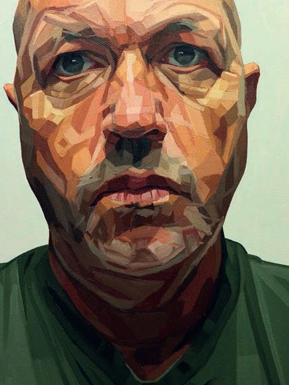
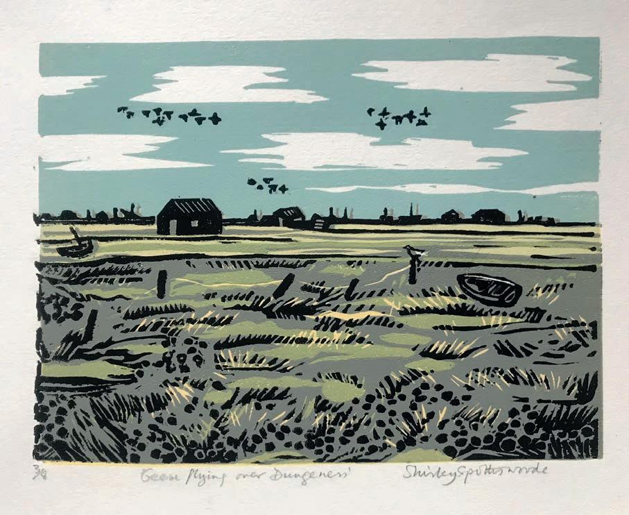










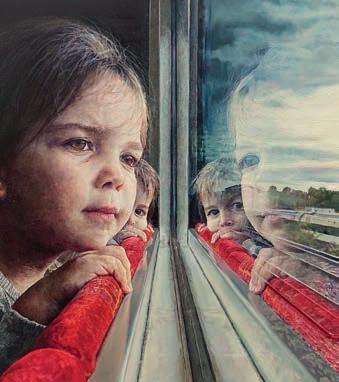



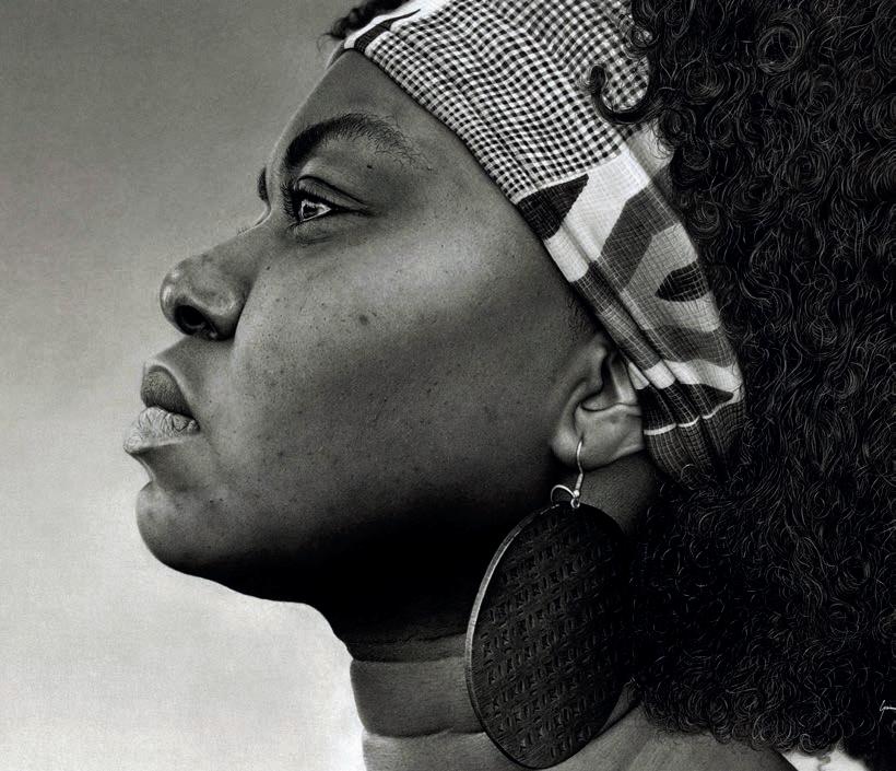

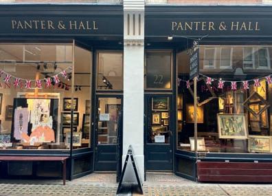

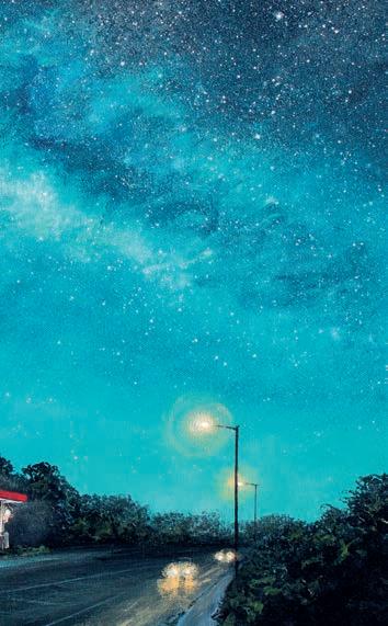





The British Art Prize, brought to you by Artists & Illustrators, continues to gain ground and becomes more soughtafter every year. With cash prizes, exclusive art materials and an exhibition at gallery@oxo for the 50 nalists, this year’s competition also o ers a standout opportunity for the rst prize winner.





This once-in-a-lifetime prize is a week-long solo exhibition at Panter & Hall, home to contemporary artists from across the globe. That’s two exhibitions in two esteemed London galleries, all packed within one competition. Your artwork will also be presented to the hugely in uential panel of judges, including world-renowned watercolour master Alvaro Castagnet; popular painter and television presenter, Adebanji Alade, who also serves as president of the Royal Institute of Oil Painters; Ti any Hall, co-founder of Panter & Hall; and Niki Browes, the editor of this magazine.



Then, the January 2026 British Art Prize winners’ special issue of Artists & Illustrators will feature an exclusive 10-page editorial with images of the shortlisted artworks and winners. The February 2026 issue will also showcase a standout six-page feature on the People’s Choice Award winner. Together, these o er unrivalled exposure for you and your work in the art world.
If you’re not already in front of the easel, now’s the time to start. The opportunities here, with this prize, are endless. awards.artistsandillustrators.co.uk
Light is the focal point of this new exhibition by ALISON WATT, along with the space it inhabits. Amanda Hodges finds out more ▸

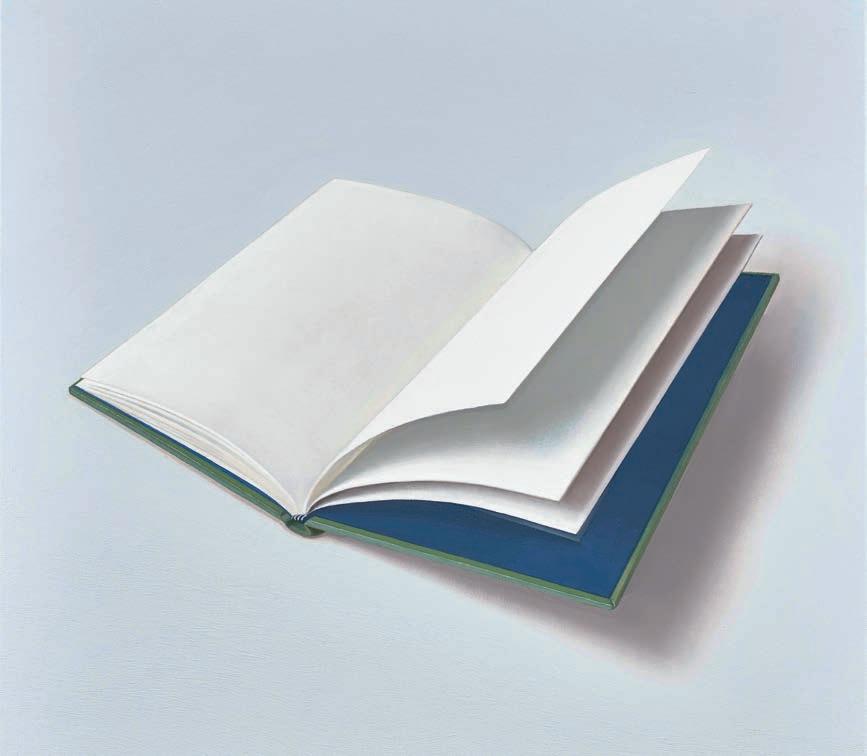
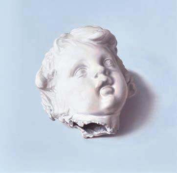
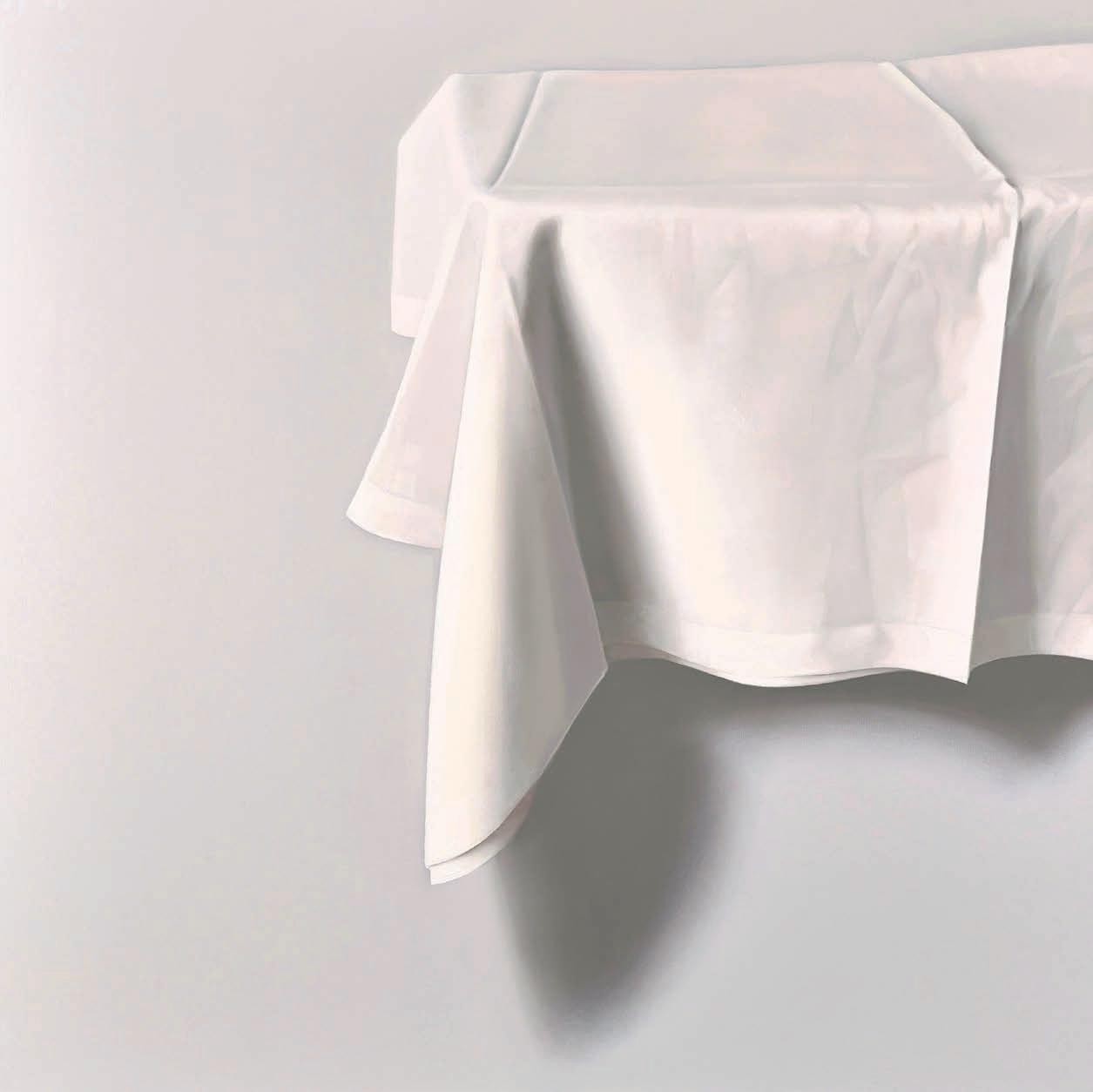
The 19th-century French painter Andre Derain, friend to Matisse, once commented that “the substance of painting is light,” and it’s a philosophy shared by contemporary artist Alison Watt, who, in 1987, memorably won the BP Portrait Award whilst still a student at Glasgow School of Art. “Light can transform something otherwise ordinary,” she says. “It can release the power of what we might consider commonplace. I often paint ordinary things: a piece of paper, a feather, a piece of cloth; but light has the ability to imbue simple objects with a life beyond their original purpose.”
Some of these very objects can be seen within an intriguing new exhibition, From Light, Alison’s first London-based show since 2008, all set within the beautiful surroundings of Pitzhanger Manor and Gallery in Ealing. Sir John Soane, architect of the Bank of England, designed and built Pitzhanger as his country residence. After initially acquiring the estate, he significantly renovated and finished it around 1804. Pitzhanger then becoming a magnificent showcase for his distinctive architectural style, with its neoclassical elements whilst all of the spaces are characterised by a clever and innovative use of light.
Richard Parry, Curator and Head of Public Programmes, explains the show’s genesis. “Alison was invited to undertake an exhibition at Pitzhanger by director Clare Gough. Clare’s long been a fan and recognised that she’s not had a major exhibition in London for over 15 years, and so it’s overdue. It was felt that the artist would respond well to the context here – architecturally – but also in terms of the artistic and intellectual currents that underpin its heritage.”
Alison says she encountered the Manor around the time of its reopening. “I first knew of Pitzhanger in 2019 following its wonderful restoration. I’m drawn to the fact that the house had great personal significance for Soane, so much so that in one of his Royal Academy lectures he described it as a self-portrait,” so closely did he identify with the place. “It’s a house that tells us something not only of his intellectual life, but also his emotional one, a place that once held his hopes and aspirations; in its own way a form of biography.”
“I think of light as being part of the very substance of a painting and am fascinated by light and how it’s determined by darkness,” continues Alison. “I refer to Soane’s collection in my paintings and wanted, in some way, to bring certain objects back to the house he’d created for them.” And the setting is surely
ideal, perfectly designed for symbiosis between a house and its contents. As Alison notes, “Soane was an artist who created an art object in which to display art,” so the two are in perfect alignment.
Richard Parry emphasises that there are two principal spaces on offer from an artist’s perspective, the manor and affiliated gallery.
“The gallery is a newer building, an adaptation of the 1930s library, whereas the manor house is a rare example of a restored, original Soane building in its entirety.” Aesthetically, “in the manor house the walls are all hand painted to recreate Soane’s trompe l’oeil (to deceive the eye) effects and we’re unable to hang on those as they’re protected and fragile. So options for exhibiting artwork there are limited but, when it happens, these moments are stunning.” For prospective visitors there’s much to savour. “You see not only a selection of new paintings by Watt but also treasured items selected from her studio, a nod to the fact that the house was once Soane’s active studio, but also a window into her imagination.”
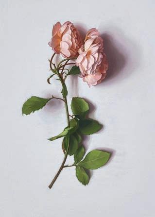
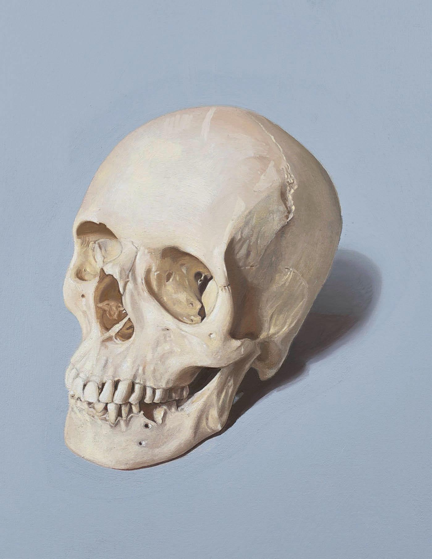
So, for example, in the Breakfast Room, Alison has placed items like a goat’s skull from her late father’s collection on a shelf, as well as her painting of Soane’s beloved pet dog, Fanny, on the wall nearby. In the gorgeous interior of the elegant Eating Room, hangs one of Alison’s new paintings entitled Le Ciel (the sky), depicting a white rose with some leaves diseased. This, the exhibition asserts, is ‘intended to reflect Soane’s vision of integrating nature into the house’s architectural detail.’ Its title is derived from the Breakfast Room whose domed ceiling shows the Italian sky in the form of a painted canopy, inspired by Soane’s life-changing Grand Tour which he acknowledged as sealing his architectural destiny.
The majority of artwork for the exhibition though is found within the Gallery’s beautifully light interior, where daylight pours into the main space; paintings here, all oils on
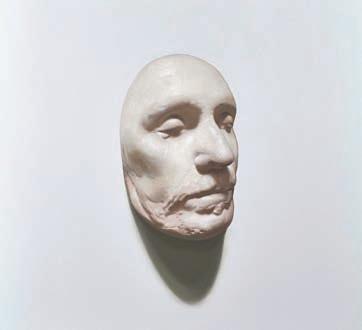
canvas, are given the space to make maximum impact. In a small adjoining room lit by spotlights, Alison’s three portraits showing Oliver Cromwell’s death mask (inspired by Soane’s own collection) are strikingly illuminated. Overall, “the gallery is a more versatile space,” says Richard Parry, “and in many respects is a white cube space, however, with Soanian architectural flourishes and details. The works exhibited there – all either new or recent paintings – give a further deep dive into the artist’s practice.”
Of Alison’s style, Parry says, “Alison in many respects paints objects in the style of portraiture, or a focused still life. Sat on a white background, in each case the fall of a shadow or the quality of light is central to the work.”
Visitors will see crisp pieces of paper, that deceptively appear monochrome but actually contain intonations of colour and light, linen folded, a teacup and saucer: simple, everyday objects. “For both Watt and Soane light creates mood and atmosphere. Whereas for Watt, light is a quality that is both imbued within how objects are seen and then depicted, for Soane light becomes a material to create that mood, used in combination with other materials such as coloured glass, mirrors and other surfaces.” These are works that repay patience. “I hope viewers might pause and allow time for slow looking,” says Alison. Richard Parry feels there’s opportunity for constant reappraisal. “Each time there’s new work here at Pitzhanger, it’s a chance to see the
building and gallery afresh. Different days and the quality of the light can also make a huge difference and create magical moments. These are meticulous paintings made in the main specifically for this exhibition and building in mind and I think there is plenty to enjoy both for those new or familiar to Watt’s work or, indeed, to Pitzhanger and Soane. Clare Gough, Pitzhanger’s Director, endorses this view concluding, “Watt’s exploration of light beautifully echoes Soane’s use of shadows and reflection as an architectural tool. The extraordinary body of new works demand quiet contemplation.”
Alison Watt: From Light. Until 15 June 2025 pitzhanger.org.uk ▫












★ Join a community of artists
★ Create your personalised gallery page
★ Showcase unlimited pieces of artwork













★ Sell your artwork commission-free Share, showcase and sell your artwork commission-free from your own personalised online art portfolio for as little as £2.99 per month
★ Appear in online exhibitions
★ Share your art with 1000s of website visitors
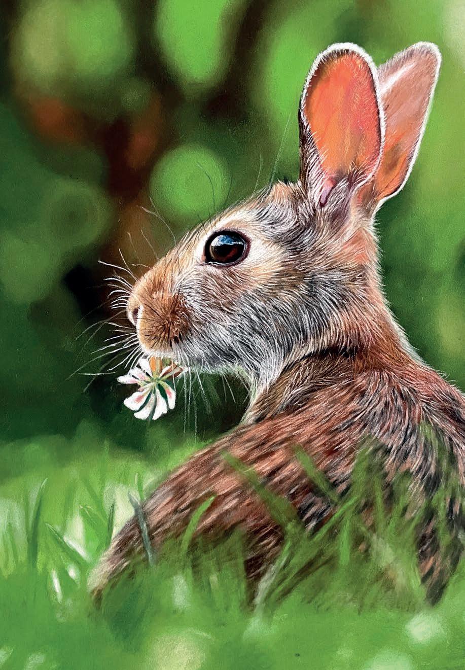
British Art Club member CLAIRE YATES is an award-winning contemporary animal artist who works with pastels in exquisite fine details. Here are her top tips for working with the medium
1
Choose the pastel colours that you will need for your artwork by studying your reference photo. I have found in the past that I will always add more to my selection as I go along, depending on what new colours I have seen in the photo. Applying a rough colour base, first on your subject using sticks, pencil or Pan Pastel will help.
2
The common rule for pastels is to work from dark to light. This is one of the many perks of pastel. The only drawback is when using black as a base colour, sometimes other colours will disappear. In this case, apply black gouache to your paper first. Once dry, other colours will sit on top.
3
Always follow the direction the fur is taking from the reference photo. This way you can achieve a realistic look. Again, layer each colour, starting with the darker one and ending with the highlights or lighter hair. A lot of artists will start with the background of the portrait first. I often break this rule by leaving it until last.
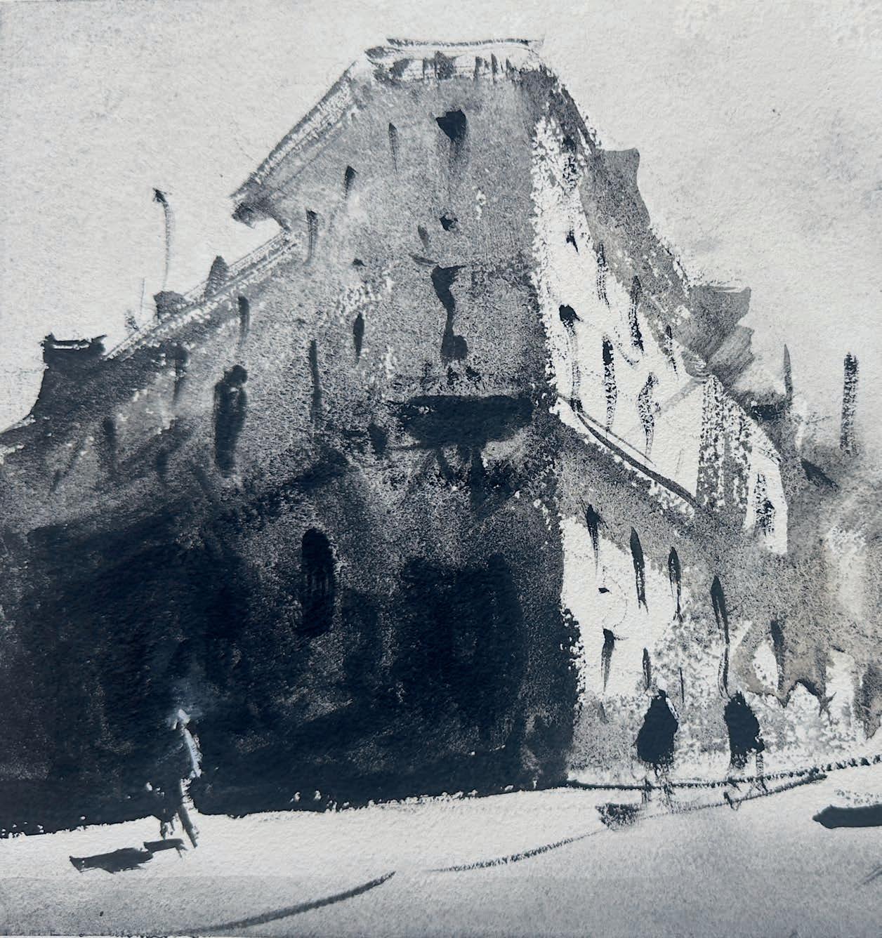
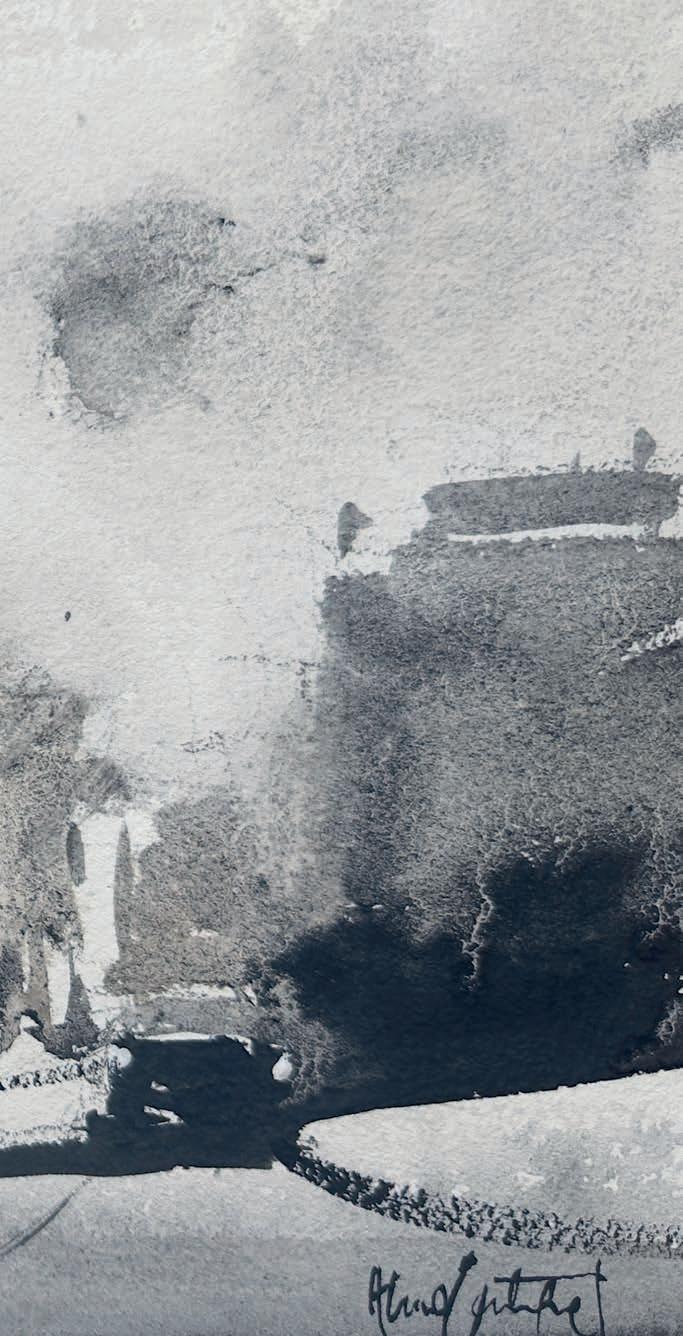
In the third part of this series, world-renowned watercolour master ALVARO CASTAGNET shows you his approach on values ORIGINAL
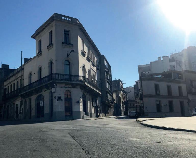
Values are the foundation of a successful painting, providing depth, contrast and mood. In this step-by-step demonstration, I showcases the interplay of light and dark in a monochromatic painting, transforming a simple scene into one with mood and vitality
This guide highlights how values work together to create balance and harmony in a painting. By using a range of values – from the lightest washes to the darkest accents – you can define shapes, suggest light direction and enhance contrast without relying on colour.
Watercolour paints Lunar Black Brushes Mop brush, fine round brush Support Arches
Strong tonal contrasts create focal points and guide the viewer’s eye, while subtle transitions add softness and dimension. Controlling tonal values allows you to build volume, establish perspective and add texture, resulting in a painting you can be proud of. alvarocastagnet.net ▸
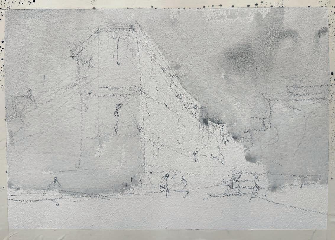
Always stretch the paper firmly onto a board to prevent buckling. I secured it with masking tape along all edges, making sure it was tight to create a clean, straight border and stop water from seeping through. Begin with a loose sketch using a soft 4B pencil, focusing on defining the large shape and the strong perspective created by the street corner. My vision for this painting is simple: a corner street scene with one side bathed in full light and the other in deep shadow. This contrast enhances the perspective, drawing the eye into the composition. The solitude of the place captivated me, but I added a couple of figures and, a car to provide a sense of scale and life.
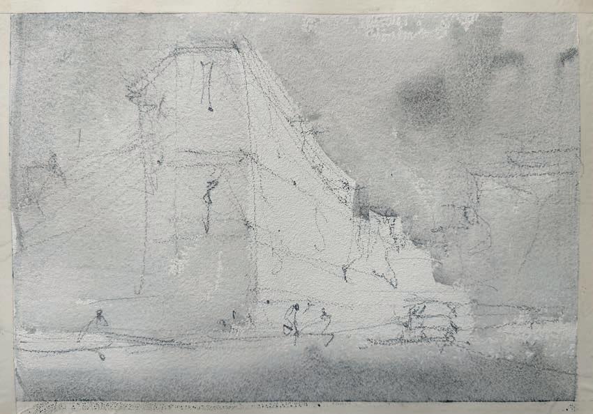
This step creates the foundation for the value structure, establishing the lightest lights and subtle mid-tones. Apply a light wash of Lunar Black around the edges of the buildings, fully covering the sky too. Leave the wall facing daylight as the white of the paper, preserving the brightest areas and add a bit more Lunar Black as you move across the road. Avoid making the washes too even; varying them adds depth and interest to the painting.
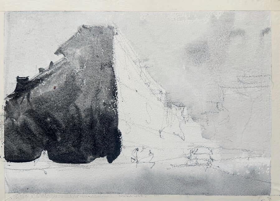
On the right side, use a strong wash of Lunar Black at the base of the buildings. Gradually lighten the wash as it moves upwards, creating a natural gradient that mimics the effect of light receding into the scene. Strengthen the wash in the foreground, the pavement to establish depth and a sense of proximity. This step begins to define the contrast and balance in the painting. It’s very important to let it dry thoroughly before the next step; otherwise, the washes may mix or create a wet-on-wet look.
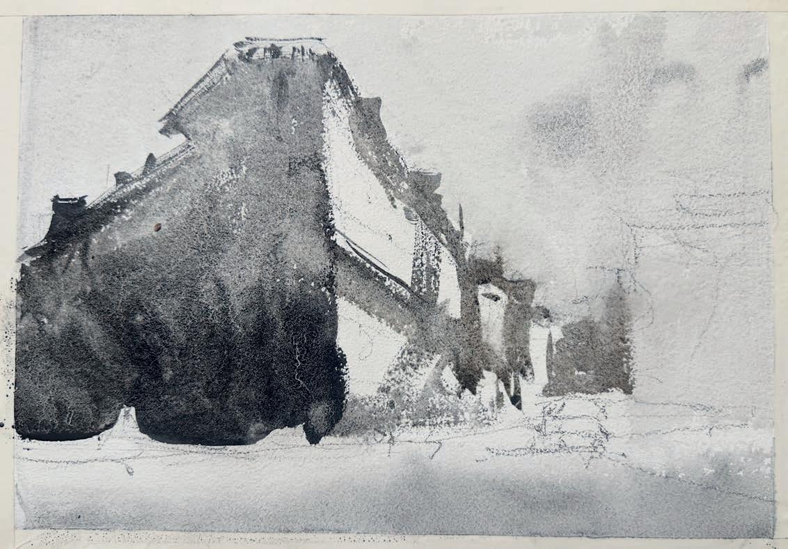
To create a strong light effect on the sunlit facade, apply a middle-value wash to the side wall, gradually deepening it toward the bottom. This contrast will enhance the sense of light within the shaded area and define the structure in shadow, making the illuminated side appear even brighter. Allow the paint to dry evenly to maintain a smooth, cohesive finish. This wash enhances the interplay of light and shadow, suggesting subtle details while keeping the shapes simple and bold. ▸
Here, the approach is to link the washes from one wall to the next one following the perspective of the street, making sure the left side connects smoothly with the lighter middle section. Use Lunar Black in a softer middle value to establish the roofs, corners and the building at the end of the street. This step starts revealing the buildings, ensuring the values flow seamlessly across the composition.
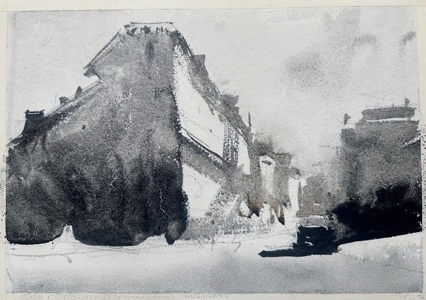
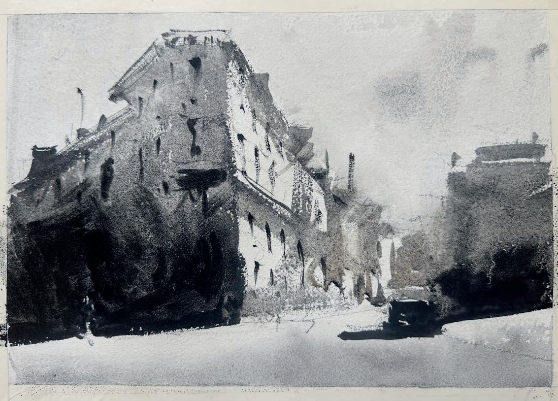
Introduce dry brushstrokes to add texture and variation to the buildings and road. Blurry edges and dry brush strokes create contrast and energy. The polarity between these two approaches adds dynamism and visual interest to the painting. Use Lunar Black to establish the darkest darks at the base of the buildings and the car, while keeping the upper portions in a softer middle value. Note: I have gone around the shape of the person crossing the street, as I will deal with it in a negative shape fashion. This stage brings character and a dynamic quality to the piece while maintaining the balance of values.
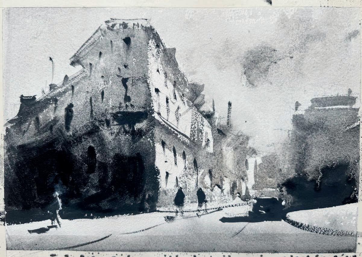
Paint the long car’s shadow stretching across the foreground to stress the direction of light. Keep these shadows slightly lighter than the darkest areas, allowing the contrast to remain harmonious. Using a small brush, paint with short free brushstrokes to depict windows, chimneys and doors. This step ties the composition together, giving it a sense of time and atmosphere.
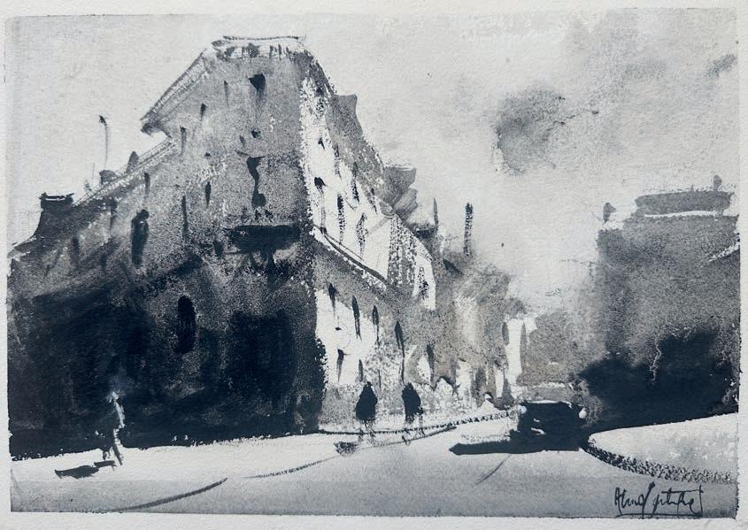
Add final accents with the darkest values, enriching the depth of windows, figures, and cars.These details build a fully dimensional composition, transforming the darkest areas into focal points that add depth and bring it to life. ▫
Values are the backbone of watercolour. By carefully painting light, mid-tones and darks you create a sense of depth and atmosphere that draws the viewer in. Trust your instincts, simplify your shapes and let the values tell the story. Value enhances the spirit of a painting. It helps to express emotion
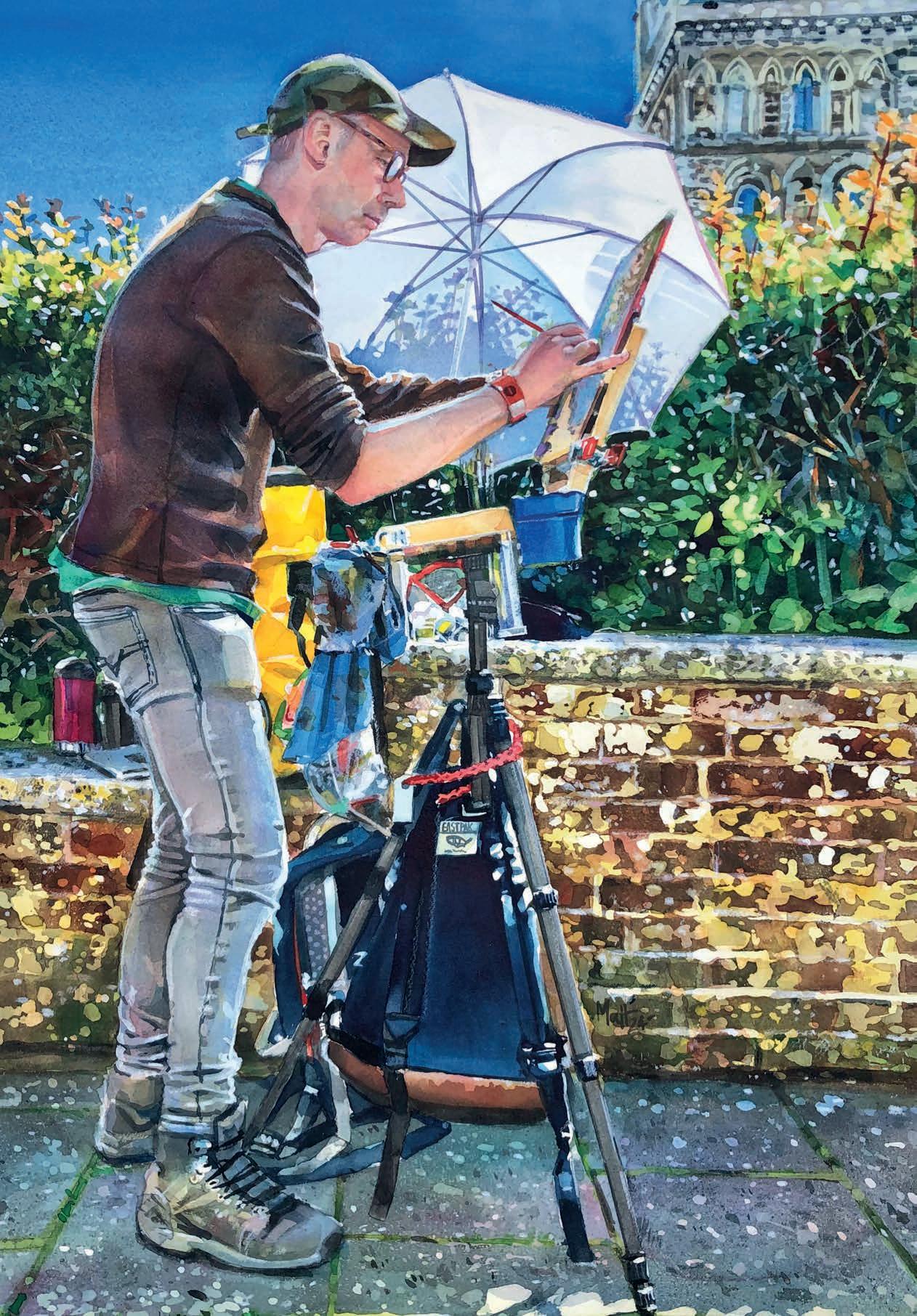
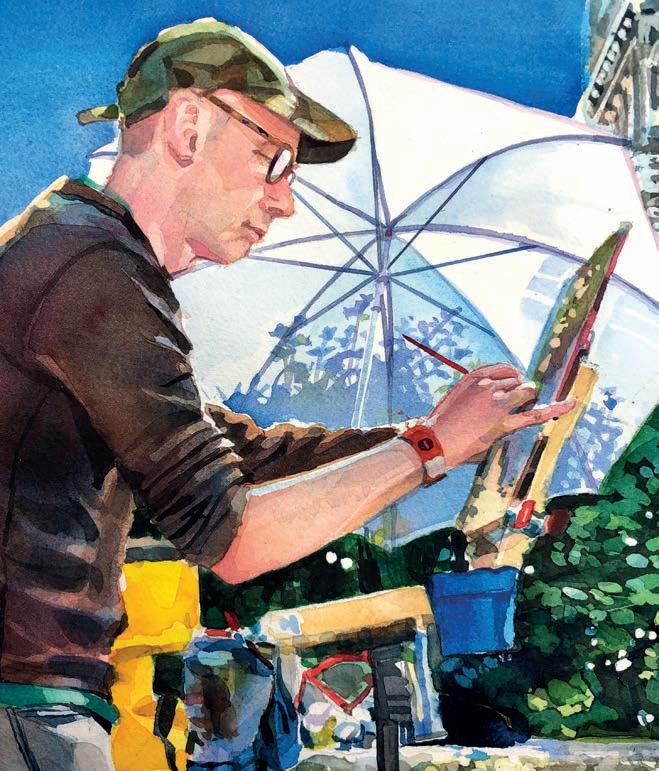
MATTHEW HAYDN JEANES went along to the Painting Fair in Wimborne, Dorset. Despite being unable to participate in a demonstration due to an injury, he still felt compelled to paint this portrait of a fellow artist in watercolour
Iwas asked to take part in a Painting Fair although, sadly, I had to decline as I had damaged my thumb. Additionally, my painting process takes longer than the time would allow. So, the project didn’t suit me, but I went along to support friends.
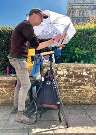
It was a glorious day, with over 100 artists taking part. Their works were judged the following day in different categories, with prizes for the winners that attracted well over a thousand visitors to the event. Walking around, my friends asked me what I would have painted. I thought hard, after taking it all in. I replied and said I would have liked to paint the artists themselves, at work. I saw various ideas for a subject and asked the painters if I could take photos. My piece here is based on a chap named Paul. He was happy to be my subject and was intrigued by the idea. What attracted me to this scene is its complexity. I liked that, as an artist, Paul had all of the painting kit (that all neatly fitted into multiple backpacks, bags and bottles). I also liked the contrast of the white parasol to deflect the light onto his work. With my painting, I felt that it was made up of many artistic characteristics, featuring primary and secondary colours. There was also a combination of great light and multiple textures that all came together really nicely on the final piece. matthewjeanes.co.uk
Paints
Winsor & Newton Pans: Burnt Umber, Raw Sienna, Burnt Sienna, Raw Umber, Naples Yellow, Naples Yellow Deep, Viridian, Hookers Green, Green Gold, Emerald Green, Yellow Ochre, Cerulean (Red shade), Vermillion, Alizarin Crimson, Scarlet Lake, Cadmium Red, Indian Red, Cerulean Blue, Antwerp Blue, Cobalt Blue (Red shade and Green shade), Manganese Blue, French Ultramarine, Winsor Violet, Paynes Grey, Potter’s Pink, Neutral Tint, Perylene Maroon, Indigo, Davey’s Grey, Mars Black, Ivory Black Winsor & Newton Designers GouacheTitanium White
Brushes
Pro-Arte Brushes Series 007, various sizes including 1, 3, 5, 10, 20 and a 1” Flat
Support
A selection of Artists’ coloured pencils to suit your painting HB pencil
White 18’x24- 140lb Artists’ Water Colour Paper by Fabriano
Winsor & Newton
Colourless Masking Fluid
Royal Sovereign Taper Point colour s haper No 2
A soft putty rubber
Tracing paper
Ramekin/Small dish
A3 piece of heavy grade
Tracing Paper ▸
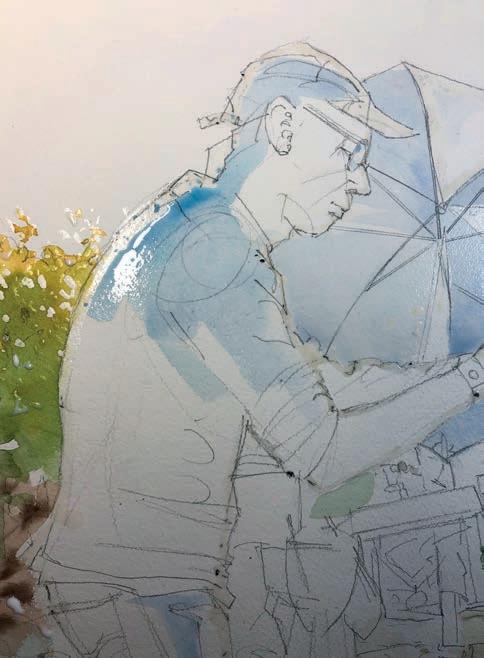
After sketching out my piece, I first apply a small amount of colourless and removable art masking fluid to any areas that are catching the light. Next, I start work on various areas that I can bleed colour into: the bush, the wall and the ground. Working wet-on-wet lets me establish a painted base for my later work. I then add a light wash of Cobalt Blue to lightly block in the shaded areas of the figure and parasol.
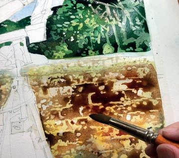
I was attracted to the light in this image, but also the various textures. The bushes, the building, the wall and the path. Once the groundwork is done, I mask out some of the many patterns. I also have to think from light to dark. It’s a bit of a jigsaw but I look hard for the colours, bleeding wet-on-wet washes with mixed colours as I go.
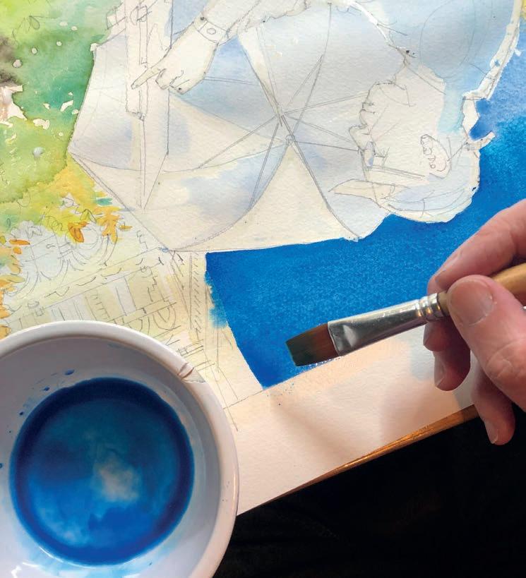
Once my preparatory washes are fully dry, I am getting straight to work on the bold, brilliant, blue sky. I am going to attempt to paint it in one go. I don’t need too much water. With that said, too little water will create brush strokes on the paper that I certainly don’t want. I have my palette handy, but I also mix up a strong blue base in a ramekin. I am using a mixture of Cobalt Blue, French Ultramarine and a little Antwerp Blue. At first glance, this blue of the sky looks easy, but on further inspection, it is not just a straightforward colour. I turn my painting upside down because the stronger tone is at the top, so my wash can run down and then not drip blue paint over the rest of my painting. I use a no 12 flat brush and quickly, but gently, start with a light Cobalt fade, bleeding into a stronger version by adding French Ultramarine and then a flash of Antwerp Blue. I work the colours in together and leave it alone.
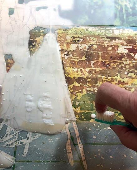
The lower part of the painting is predominantly brickwork and path. I am going to try and splatter masking fluid over the bricks and earth to try and achieve some of this texture. I create a mask to protect the figure and the top part of my painting using tracing paper. I then weigh it down (rather than sticking it). I then use an old toothbrush, dipping it in the masking fluid. Next, holding the toothbrush with the bristles facing upwards, I point it down towards my painting and draw back my finger over the bristles, lightly splattering the painting. Do not overload your brush with masking fluid or you can have large drips that will have to dry before you can remove it. Practice on other paper before your painting.
Always check that the masking fluid you are using is removable, not permanent and colourless. Yellow and g rey versions can stain your paper.
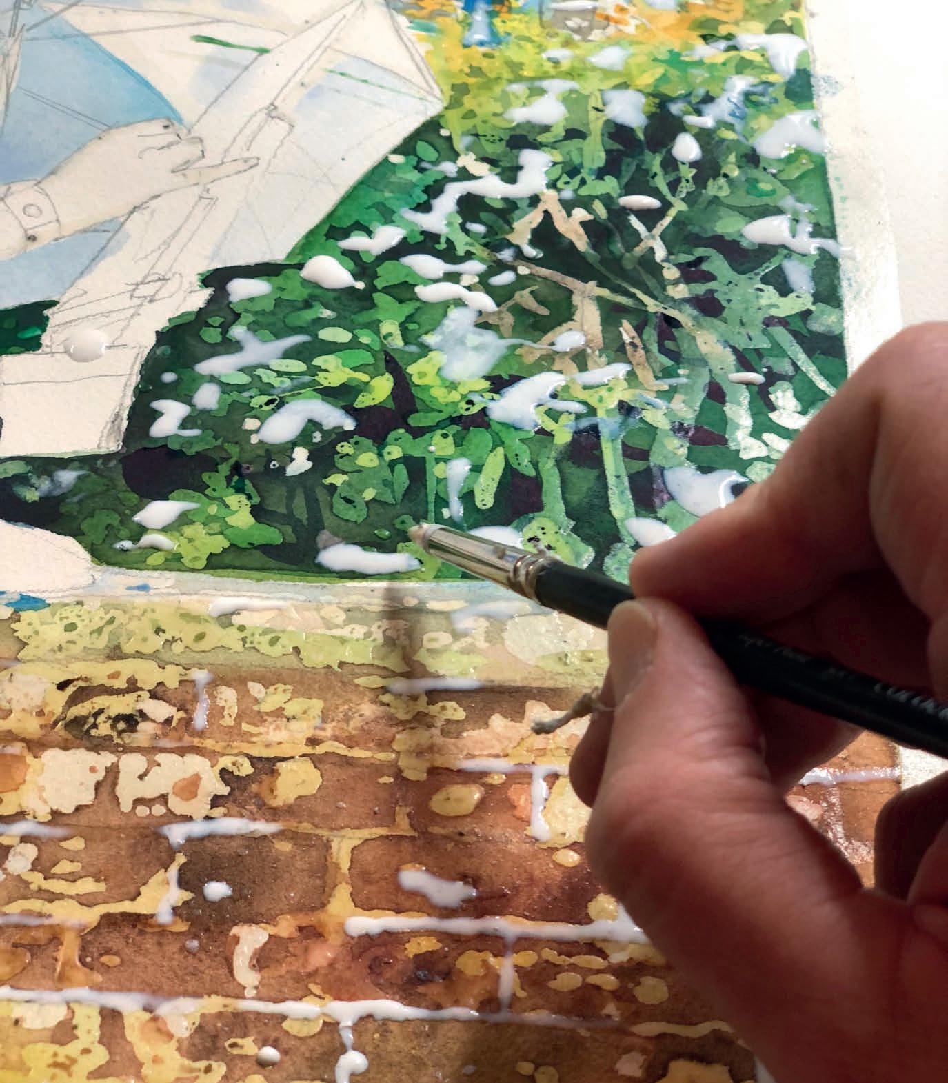
Once the splattering is done, I remove the tracing paper mask. Now, I can add some darker washes, I leave this to dry and then mask again, gradually building up the leaves and shapes. Once I am completely happy with the background, I wait untill the painting is thoroughly dry and carefully remove the masking fluid with my finger. I will have to over-paint areas next but, before I do, I re-mask anything that I still want to remain white. ▸
THE FIGURE
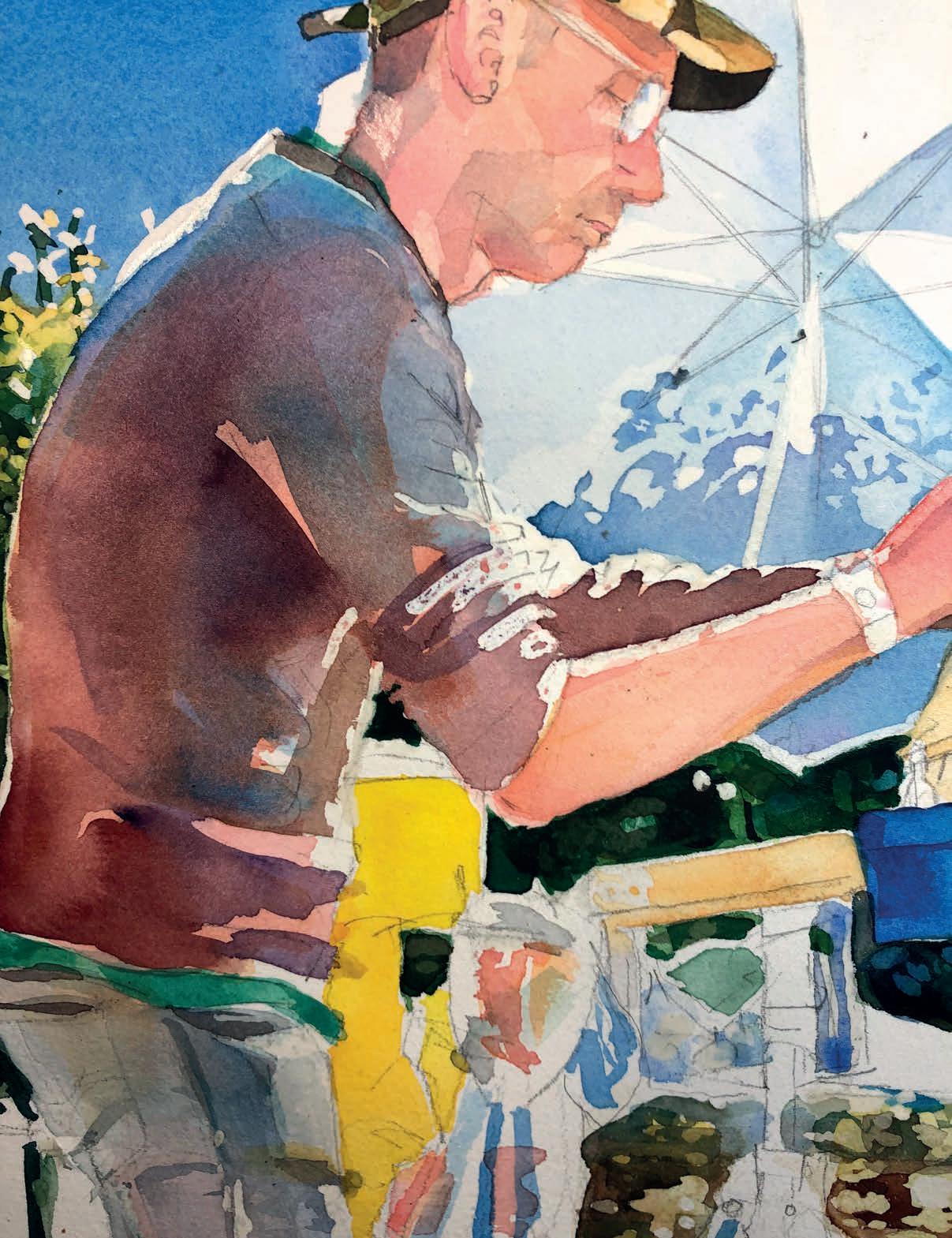
Next up: the artist! The reason I have worked so intensely on the background first and hardly touched him is simple. If the background doesn’t work, I haven’t wasted a long time painting him. Now I can start. I work up his skin tones using a mixture of Naples Yellow, Cadmium Red and Scarlett Lake. I am not going to even attempt a likeness at this stage and just look at the shapes of shadow and colour. If I have everything in the correct place, a likeness will follow. The same goes for all his bags and equipment.
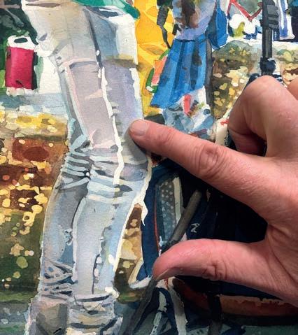
Like the background, there is a lot more focus work on the man himself. When I am happy that there is no more work to be done with the masking and washes, I remove the masking fluid and start to work on the detail. This is like starting again from the top. This time I used a fine brush (a number 2) and started to study the reference intently. Nothing here is going to look how you picture it in your mind. So attention to detail is key. Take your time and everything will make sense as you progress.
As I approach the finish line, the focus becomes more driven. It’s easy to over-paint at this stage, but I am going to paint for short periods of time, focusing on small areas. This will stop me from getting tired and making any mistakes. Gradually everything comes together.
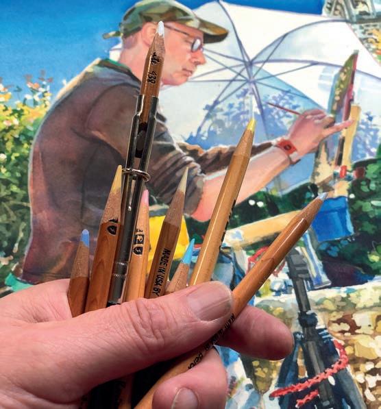
As I want this to be predominantly a watercolour painting, I tentatively add in some coloured pencil, purely to pull out highlights and carefully sharpen up any rough edges. I use waxy coloured pencils so as not to scratch the surface. Think sparingly about how you use coloured pencils in your painting. You can’t rub it out.
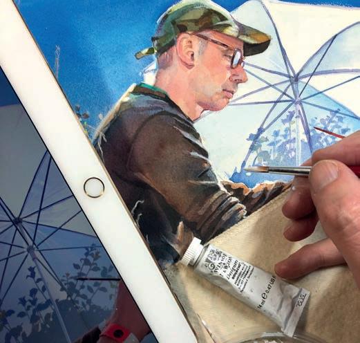
Finally, I use a touch of White Artists Permanent White Gouache to emphasise those bright sunny highlights. I also add a little yellow or green watercolour to the gouache to highlight some of the leaves. Now my painting is done. In this case, the artist becomes the painting. I’m pleased with it and how it was spurred on by a great event. Hopefully, It can be one of many, celebrating not only art, but also the artists of Wimborne.
SUSAN MURRAY shares her knowledge of drawing animals in coloured pencil with this glorious portrait of an inquisitive tabby cat, who found a hideaway in a cardboard box
Ilove details. As a pet portrait and wildlife artist, it’s the small intricacies that bring a drawing to life. Every highlight, every delicate texture; these elements capture the soul of an animal. With coloured pencils, I rely on their precision to achieve realism, ensuring that a beloved pet’s familiar expression sparks cherished memories for its owner.
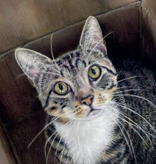
I’ve never met Lui in person, but I’ve seen him many times over Zoom. He belongs to my marketing mentor and friend, Martina. During our calls, Lui and his feline housemates often make unexpected appearances, an amusing and welcome distraction. I don’t often get the chance to draw cats, which is a shame because I love their striking eyes and the unique texture of their fur.
Cat fur presents many challenges. Shorthaired cats, like Lui, have fine, upright strands near the ears, requiring precise, controlled strokes. Meanwhile, the fur on their body is denser, longer and sits in a completely different manner. Capturing this variation is crucial Misjudging the fur’s direction can alter a portrait’s likeness.
When the opportunity arose to draw Lui, I couldn’t resist. His captivating gaze made for a beutiful subject.Look at that face! In this step-by-step guide, I’ll take you through my process for bringing Lui to life on paper. susanmurrayart.co.uk
PanPastels
Raw Umber Extra Dark, Neutral Grey Tint, Yellow Ochre Tint, Yellow Ochre Shade, Permanent Red Tint, Black, White, Hansa Yellow Shade (for eyes, optional)
Caran d’Ache Pablo Coloured Pencils
White
Derwent Lightfast Coloured Pencils
Black, Mars Black, Nightshade, Purple, Granite, Warm Grey, Chocolate, Van Dyke Brown, Sienna, Golden Sun, Foliage, Mid Ultra Marine, Champagne, Apricot, Moonstone, Platinum, Flesh Pink, Dusty Pink, Mars Violet
Support
A3 Pastelmat paper with 2cm squares drawn on A3 size tracing paper
Pencil
Tape if taping to the board
Sofft tools: small
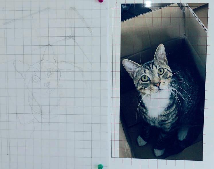
My paper of choice is Pastelmat, a surface I have a love-hate relationship with. I love its ability to take multiple layers, allowing for subtle refinements, but it doesn’t erase well, making drawing adjustments tricky. To work around this, I use a gridded sheet beneath tracing paper on my magnetic drawing board. This setup helps me position features accurately while allowing for easy corrections. Once satisfied with the sketch, I transfer it onto the Pastelmat. ▸
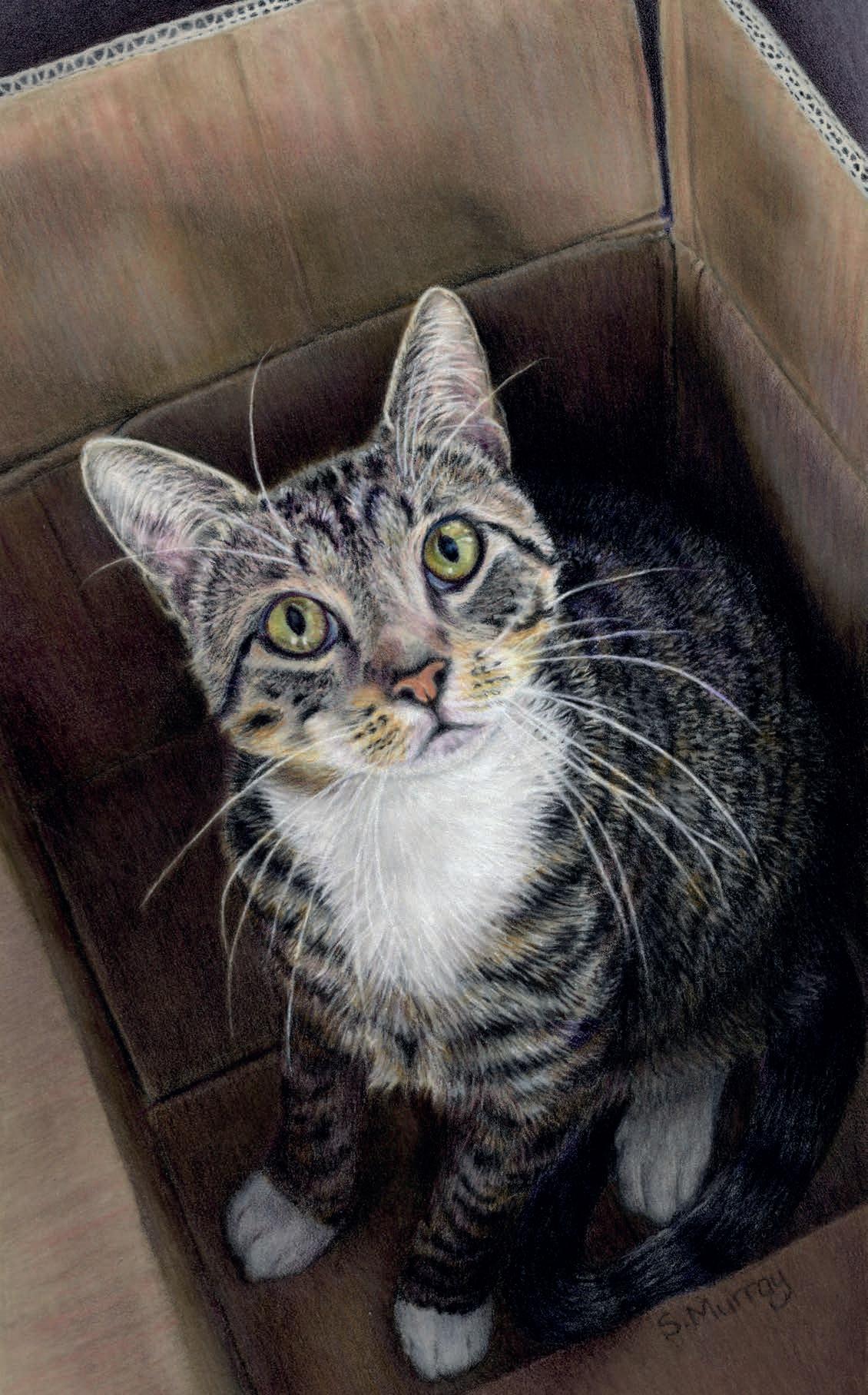
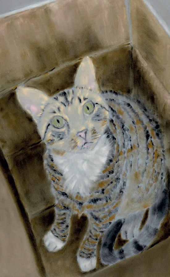
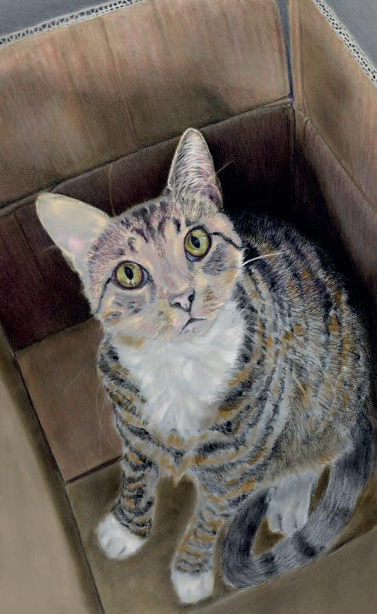
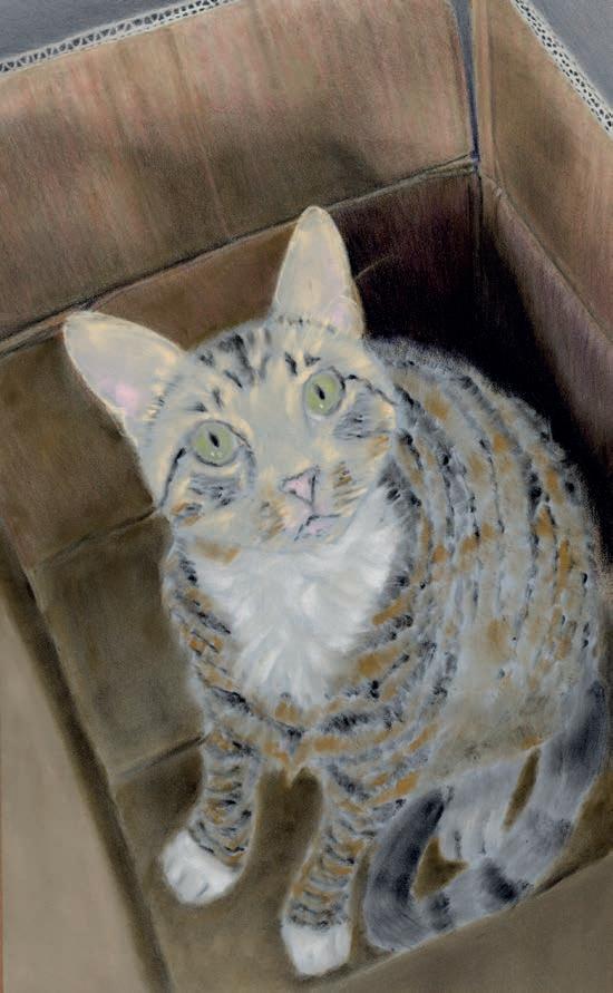
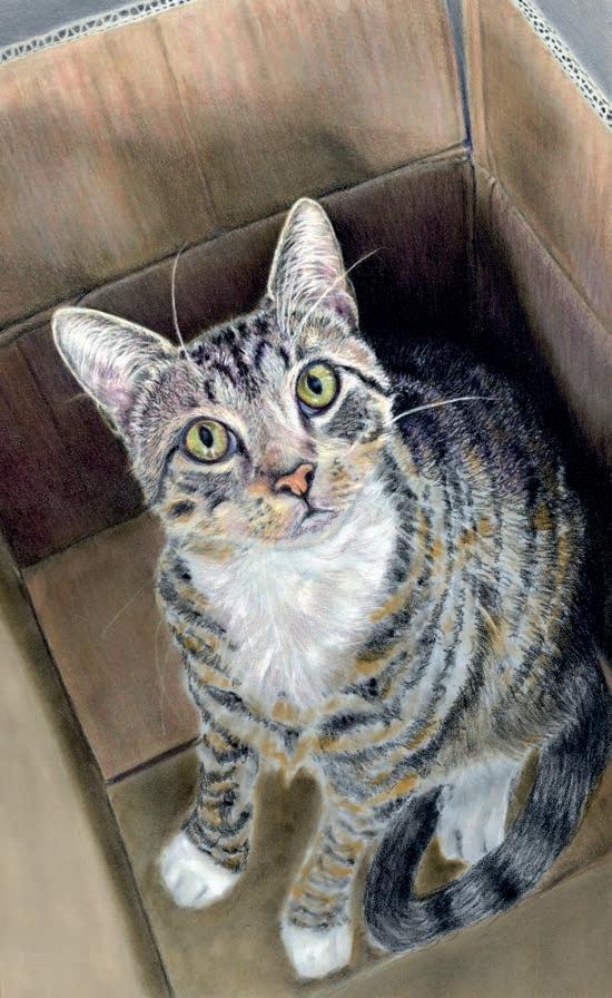
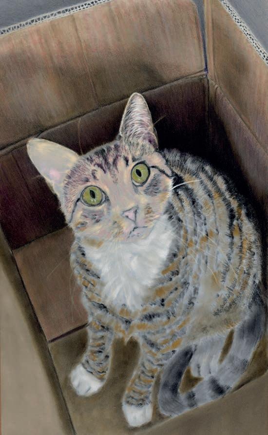
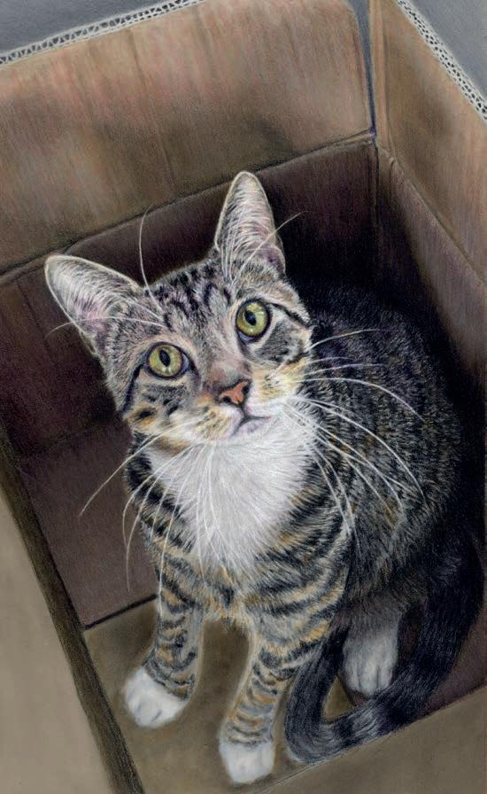
For this portrait, I’ve used PanPastels as an underpainting. A thin layer acts as a barrier between the Pastelmat and the coloured pencil pigment, preventing it from sinking too far into the surface. This reduces the number of pencil layers needed for full coverage. I apply the PanPastel with small Sofft applicators, keeping the layer as light as possible. Too much can severely limit the number of pencil layers that follow. It’s a balance found through trial and error.
Being left-handed, I work from the top right down to the bottom left to avoid smudging, always keeping a sheet of glassine under my hand. I began with the box, blending colours by using small circular motions for an even lay down of colour, then put light lines in for the ridges. For this portrait, I used Derwent Lightfast pencils. Their rich pigment and earthy tones are perfect for animal portraits. For deep shadows of the box, I do use black but layered additional dark colours to prevent a flat, unnatural look.
I typically start pet portraits with the right ear, always working in light layers to gradually build depth, again using small circles to cover the pink area and short strokes for the fine dark fur. For white whiskers and fine fur strands, my go-to pencil is Caran d’Ache Pablo White It provides excellent coverage and holds its point. Next, I apply a light layer of dusty pink across Lui’s face and nose, working from his undertones upward. I then also map out the whiskers with a really sharp point, as I will be drawing around them later on. While Pastelmat allows for layering light over dark, very pale colours such as white can lose vibrancy if put over really dark colours.
2 3 4 5
I love drawing eyes and take my time to get them just right; they truly are the windows to the soul. A key tip is to have a really sharp point and work on both eyes simultaneously. It’s easy to forget the exact colours used, and even a short break can result in subtle differences. I start with the black outline and pupils before adding white highlights. Then, I carefully layer yellows, greens, purples, blues and dark greys. Once satisfied, I refine the highlights and deepen the pupils for a lifelike finish.
6
At this stage, I lightly map out the dark fur on Lui’s face, paying close attention to fur direction and stroke length. On Pastelmat the initial layers go down with a softer point but as I build up the layers, I sharpen the pencil to a fine point, allowing for finer details. The fur in front of his ears is short and upright, so I use very short pencil strokes to reflect this texture. Once the dark areas are established, I layer Champagne and white, followed by subtle touches of purple, grey and sienna. I then repeat the process, refining and adjusting until I’m satisfied with the depth and realism. The fur length is fairly uniform on Lui’s face, it’s the direction that you have to watch.
7
After lightly mapping out Lui’s back with black and other dark colours, I use small strokes of varying lengths and directions. While following the fur’s natural flow, I avoid making the strokes too uniform This keeps the texture realistic. Next, I map out the lighter fur with various greys, Apricot and Champagne, using the same technique. I will keep going over the same steps until I have got the texture and depth that I’m after. I will then darken down the areas in shadow further. Once the back area is complete, I assess the box’s shadows behind Lui. If needed, I darken them with black, Mars black, nightshade, and purple, ensuring smooth blending and full coverage. ▸
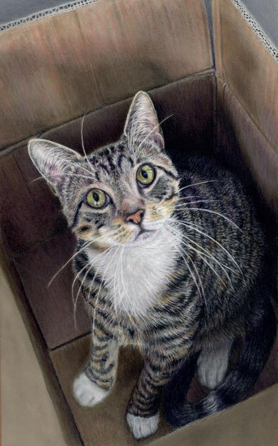
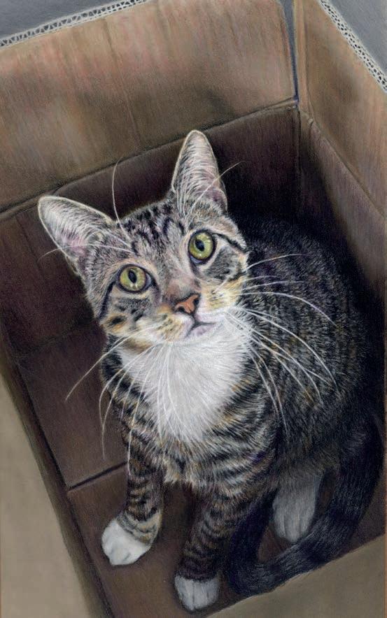
9
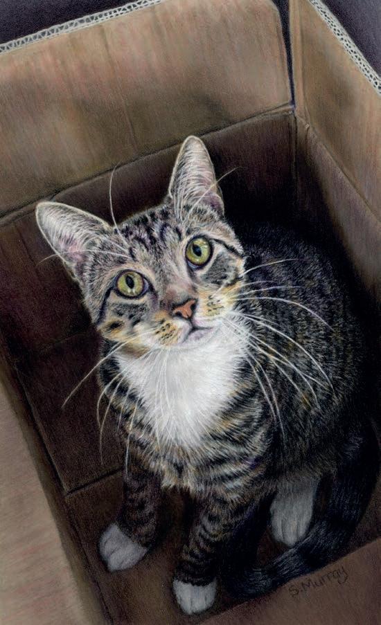
Lui’s tail and back foot are in deep shadow, so I use the same colours as the upper body. You can’t really see the fur texture; I will put a bit of this in using the same fur stokes as the body and then darken it. It can be daunting to go dark enough, but strong contrast enhances the 3D effect. For his white upper chest, I use Mars Violet in the darker areas that aren’t in deep shadow. I prefer violets, pinks or blues over grey, as grey can sometimes make white fur look dull. Finally, I draw the white fur around the chest and chin, carefully following the fur’s direction. At this stage, I review the lights and darks across the portrait, making final adjustments for cohesion. Always remember to refer back to your reference photo.
Lui’s lower chest has more defined stripes, so I continue as before; lightly mapping the black areas before adding the lighter fur. The fur direction changes frequently here, so I adjust my strokes accordingly. The front legs are in shadow, I draw them like the tail not too much fur definition, then gradually darken them until they are nearly black at the ankles. The box beneath his paws has multiple shadows, so I layer different browns, purples, and blacks, using small circular motions to create smooth transitions and realistic depth.
8 9 10
To enhance the fluffiness of Lui’s white chest fur, I apply white PanPastel with a Sofft tool in the densest areas. Then, using a white pencil, I blend the edges for a soft, realistic effect. Next, I complete the box, using small circular motions to smoothly blend the colours. Finally, I deepen the shadow behind the box at the top of the page using two blacks and granite, refining the contrast before making any final adjustments. ▫
Feeling worn out and not sure why? You’re not alone. Nearly half of us in the UK aren’t getting our recommended daily amount of magnesium, the essential mineral for energy.
Magnesium is the ultimate energy nutrient, essential for producing adenosine triphosphate (ATP), the molecule that powers your cells. Without enough ATP, you’ll feel fatigued.
It also plays a major role in everything from restful sleep to positive mood, metabolism, muscles and even our bones and teeth.
We get magnesium from foods like kale, spinach, black beans, nuts, bananas and whole grains – but it can be difficult for our bodies to absorb.
‘Many factors affect how well we absorb magnesium, so even a healthy diet may not get you enough,’ explains Dr Miriam Ferrer, PhD, Head of Product Development at FutureYou Cambridge.
A supplement can help, and many are made with magnesium oxide, rich in magnesium.
‘But there’s a drawback – magnesium oxide isn’t easily absorbed,’ says Dr Ferrer. ‘And taking more magnesium oxide to make up for it can lead to an upset stomach.’
That’s why FutureYou Cambridge developed Magnesium+, made with magnesium lactate—a natural salt that’s twice as absorbable as magnesium oxide and gentler on the stomach. It also stays in the body longer, giving it more time to work.
Magnesium+ includes vitamin B6, which helps reduce tiredness and supports energy metabolism.
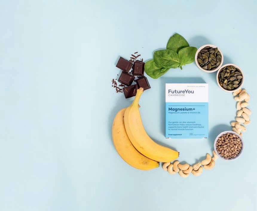
‘I started to feel much more perky’
Hundreds of Trustpilot reviewers now praise its effectiveness. Nicole Hylan says, ‘Within a couple of weeks, I felt much more perky – that’s the best word to describe it.’
Why choose Magnesium+?
• Reduces Tiredness & Fatigue: Scientifically proven to support energy levels
• Highly Absorbable Formula: Natural magnesium lactate for better absorption, easy on the stomach
• Trusted & Researched: Developed by experts, backed by science
• Includes vitamin B6: Reduces tiredness and fatigue and supports energy metabolism

*Magnesium contributes to a reduction of tiredness and fatigue, normal energy-yielding metabolism, muscle function and normal psychological
and the maintenance of normal bones. Magnesium+ also includes vitamin B6, which contributes to the regulation of hormonal activity. Introductory offer valid for new UK customers only. Offer expires 31st May 2025. See FutureYouHealth.com/MGF487 for full terms and conditions.


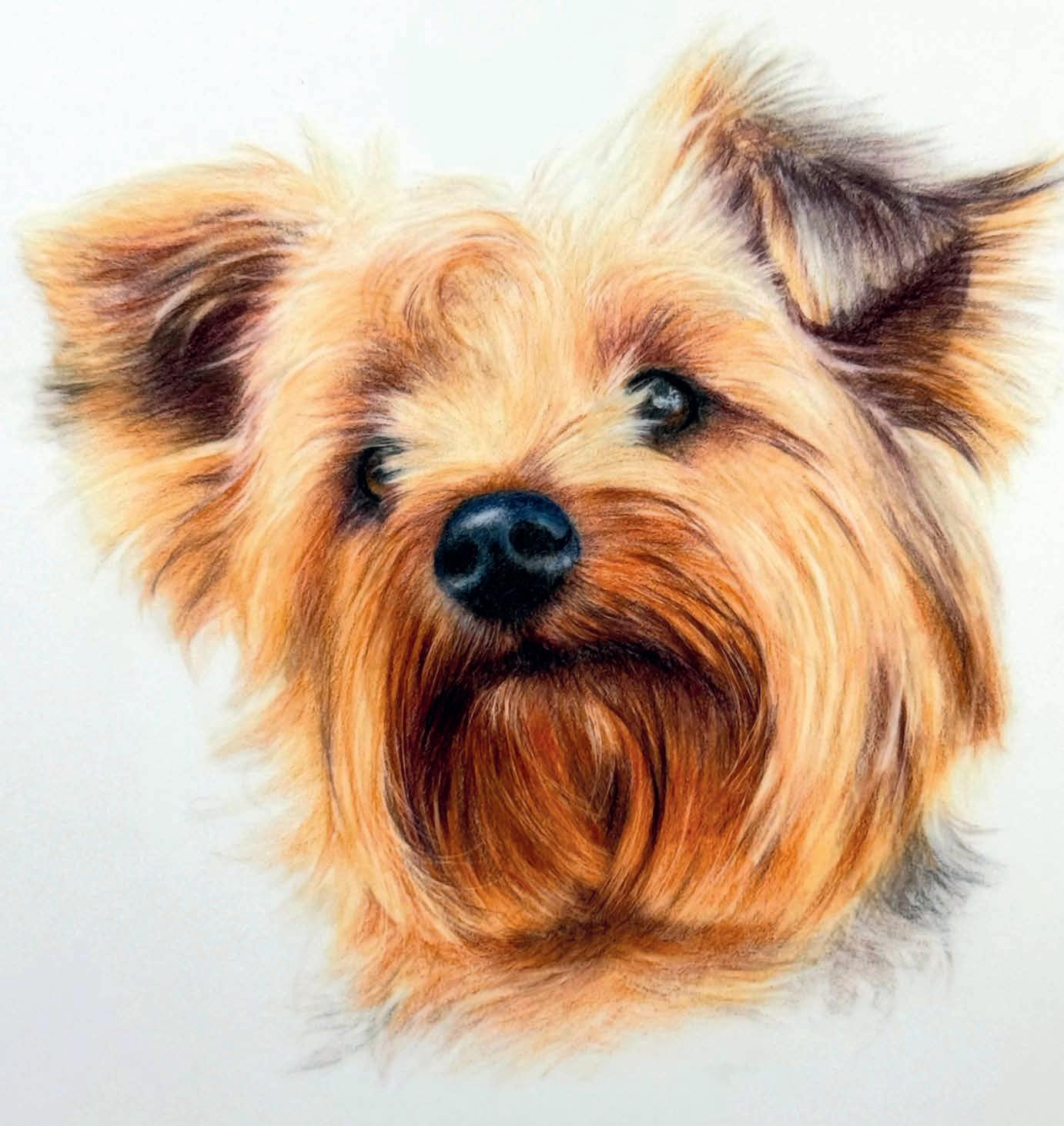
Award-winning coloured pencil artist, tutor and art coach based in North Yorkshire, BONNY SNOWDON specialises in animal portraits. Here, she draws a cute little Yorkie
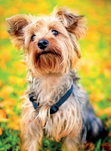
ORIGINAL IMAGE
Coloured pencil is a slow medium. Whilst I love this and it’s slow meditative, sometimes it’s nice to finish a drawing in a few hours rather than spending days and weeks creating something realistic. However, this drawing took me three-and-a-half hours from start to finish. Here. I’m going to show you how over the next few pages.
I chose to create this little Yorkie in a different style from how I usually draw and teach. Whilst it might not be as refined as my usual work, it’s still realistic and will be something that you can follow along with easily, even if you haven’t drawn with coloured pencils before.
I’m using Grafix Draft ing Film 0.005 double matt, a surface you may not have considered for your coloured pencil work, yet it’s one that’s so lovely to use. There is no tooth, and you use fewer layers, which makes it the perfect fit for this quicker method of drawing. I also chose to colour block rather than working in sections, which also made it a little quicker, leaving all the details until the end.
I printed my line art out and just popped it under the drafting film. I had another sheet of paper that I slid between when I’d got enough information down that I didn’t need my line art any more. The methods and tools I have used work particularly well for drafting film so if you swap your surface you may find you get a slightly different result. bonnysnowdonfineart.co.uk
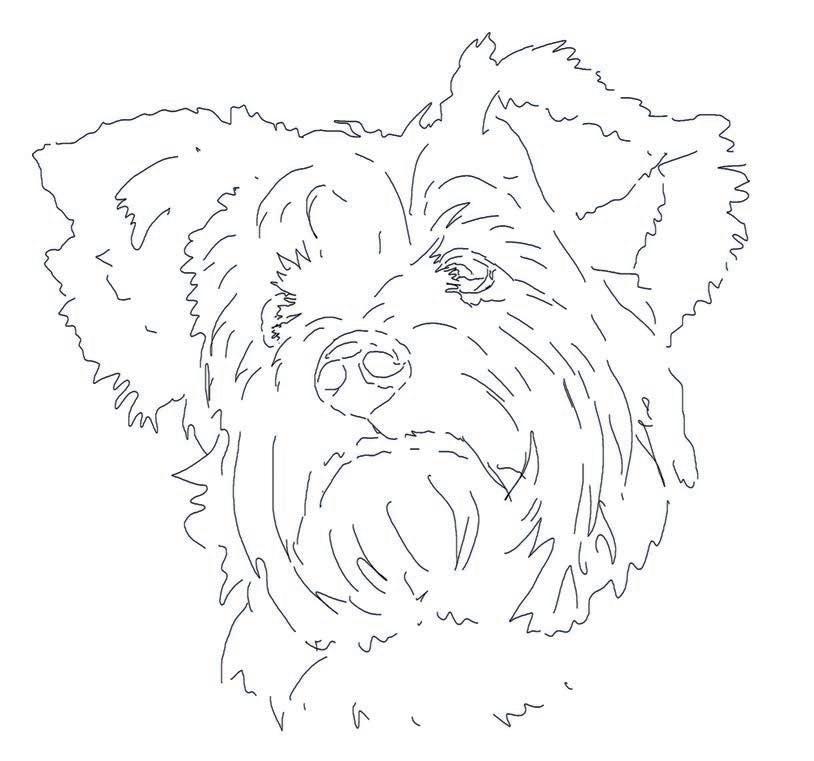
Coloured Pencils
Faber Castell
Polychromos: Black, Caput Mortuum Violet, Dark Indigo, Burnt Siena, Burnt Ochre, Terracotta, Sky Blue, Indanthrene Blue, Cinnamon, Warm Grey 4
Caran D’Ache: Pablo:
Apricot, Beige, Caran D’Ache Luminance, Sepia 10%
Derwent Lightfast: Dark Orange, Mars Black
Support
Tombow Mono
2.3mm Eraser
Slice Manual Pen Cutter with rounded blade
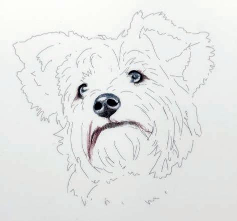
Starting with these, use Black, Dark Indigo and Caput Mortuum Violet, around the eyelids, the nose and across the mouthline. Use light pressure and, for the eyes and nose, apply small round pencil strokes, increasing your pressure for the very darkest parts like the eyelids and the nostrils. Use the Dark Indigo for the darker areas in the iris and the nose. ▸
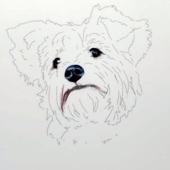
2
Use Burnt Siena and Terracotta to add the lighter orange parts of the eye in. Leave the catch lights in the right eye showing and use Dark Indigo and Black to darken the iris. Use Sky Blue to add colour to the highlights of the nose and darken the darkest areas with Dark Indigo and Black. I used Indanthrene Blue on top of the nose just to give it a little more vibrancy.
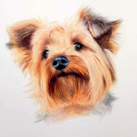
Keep saturating the colours. Use the Mars Black to add more details around the mouth, eyes and ears. Use the Dark Orange to keep creating more details. Add the little curl to the top of the head and use the Sepia 10% to input a little more shadow in the palest areas of the face. Use Warm Grey to create the bit of the neck on the right and add some orange to the neck area.
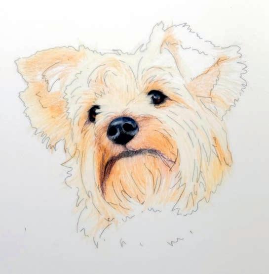
Use Ivory to block in all the lightest areas. Then, with medium pressure, follow the hair growth of the dog – this is really important. Next, use Burnt Ochre to block in the paler orange areas; you can also use the Apricot. Work across the dog’s face adding in Terracotta, Cinnamon and Pale Peach. Glaze over some of the darker areas like around the nose and eyes with the Caput Mortuum Violet and Burnt Siena.
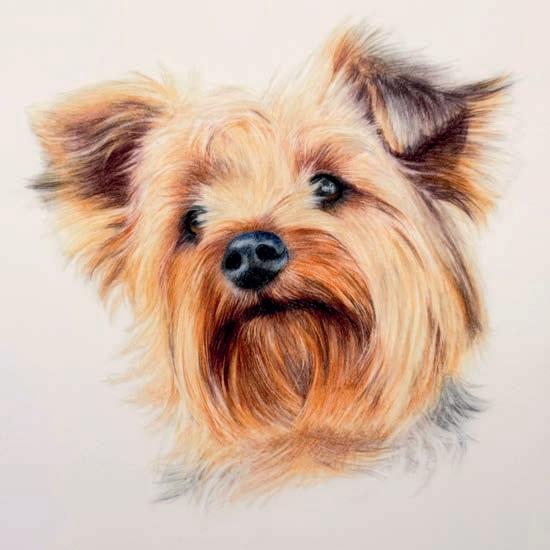
3 7
Using the Tombow Mono 2.3mm eraser, start by gently adding in some highlights in the fur. You may need to practice a little. Use it like a pencil and think of it as adding in highlights rather than erasing. Use your Slice tool to add in some of the finer hair details.
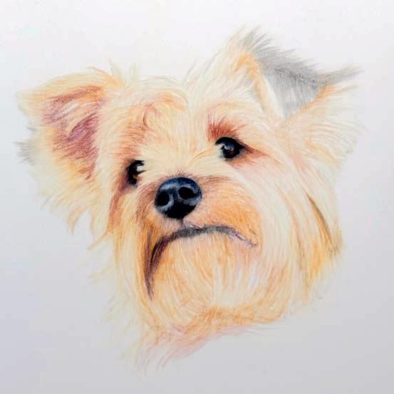
Use Caput Mortuum Violet to fill in the dark areas in the left ear, above the eyes and around the nose. Use light pressure to add colour gently. Increase the saturation of some of the orange areas with Terracotta and use the Warm Grey 4 and Beige to block in the right ear. Follow the direction of the fur at all times. Use the Cinnamon to add more colour under the nose.
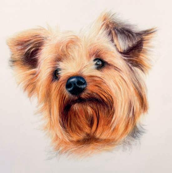
Once your details are in, darken up the fur and refine any details, darkening up along the mouth line, adding more colour to the neck area, using your Tombow to make sure you have some wispy bits of hair around the ears and refine the little curl on the top of the head. Use all the colours mentioned before to add further saturation to your drawing. You may need to darken up the nose now you have more colour around it and refine the whisps of hair falling over the eyes.
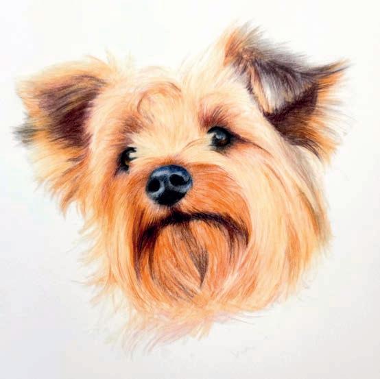
4 8 9 5
Darken the ears and around the mouth using Mars Black and Beige, and add the shadow into the right ear. Add more Terracotta and Cinnamon across the paler orange areas of the dog. Use Dark Orange to saturate the darker areas around the muzzle and under the chin. Create shadows in the fur on the right-hand side and saturate the orange in both ears. Use light pressure and follow the direction of the fur.
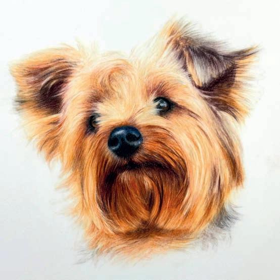
Once you’ve finished tweaking keep your film flat, cover it in glassine paper if you have some or slip it between the pages of a sketch book to keep it from getting damaged. If you would like to frame it, use a piece of tape to tape it at the top edge to a window mount, pop a piece of acid-free mount board behind and frame it as usual. ▫
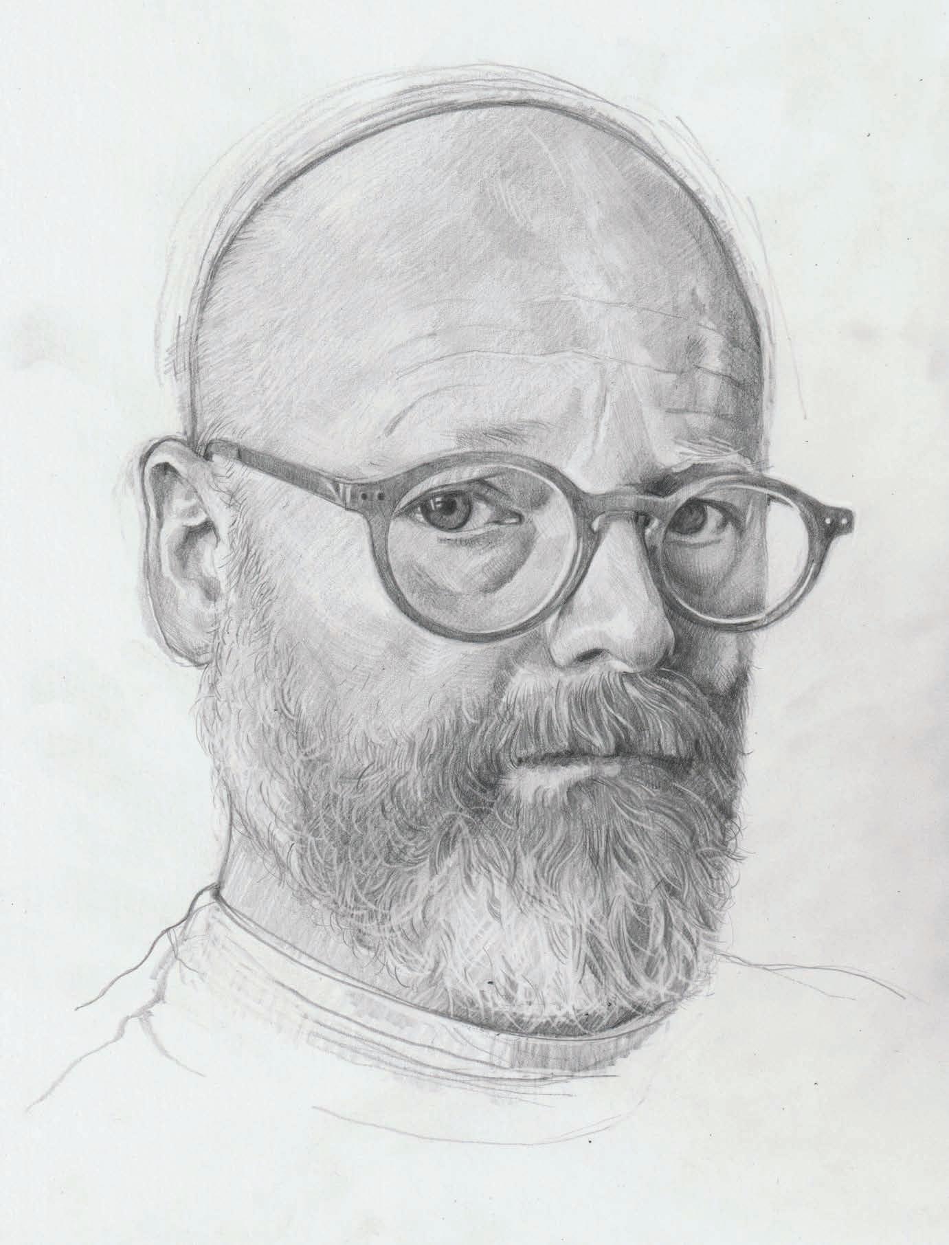
Former British Art Prize finalist GEOFFREY HARRISON
shows you how he completed this graphite pencil self-portrait in just an hour-and-a-half
One of the questions I get asked a lot as an artist is, “How long did that take?” I bristle a bit at this because it presumes a direct relationship between time and quality, but art doesn’t really work like that. However, I think this question really just comes from a desire to understand the process, which can admittedly seem opaque. It made me think about what develops at what stage in the hour or two when I do a portrait drawing. I set a timer and recorded progress at 10-minute intervals while doing this, so you can see my process over time. Whether drawing from life or from a reference image, I prefer to work by eye rather than measuring or tracing. I start with loose marks and feel out the shape. I build areas of tone with quick light hatching and keep things very freehand. I don’t worry about having everything correct at the start; I can rectify inevitable proportional errors as I go, so a nose is made thinner, or eyes brought closer together (both typical proportional mistakes of mine). Learning from these errors is important to me in developing my freehand drafting skill, but sometimes allowing a degree of mis-proportion can emphasise parts of the face or personality that are important, so long as the drawing doesn’t become a caricature. Similarly, while these edits can leave behind a lot of redundant marks, this messiness is a record of the process itself and I avoid erasing them. I hope you find this approach useful and learn that it’s possible to produce a good portrait in a single sitting, so long as you work quickly and don’t worry about a pristine finish.
I used Bristol Board because it has a very smooth surface and I prefer that. Other fine-toothed paper would be good for this kind of drawing too. I use a range of graphite pencils, usually 3B, 6B and 9B, saving the very soft one until later for the darker marks. I use a very small eraser only to add highlights or for small adjustments. Overerasing to sanitise an image can deaden the picture, create unintended smudging and damage the paper. Also, rubbing out can take ages and really gets in the way of the flow.
geoffreyharrison.co.uk
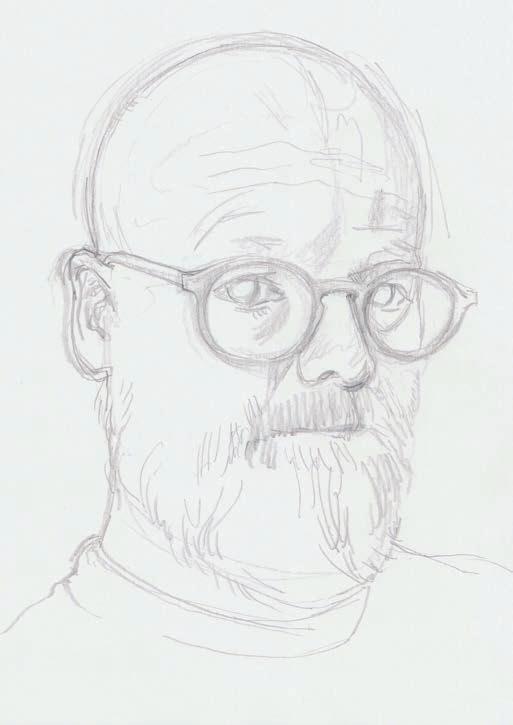
I begin with a very rapid, light outline of the head shape, smoothly circling around until the right shape emerges. I map out some of the features, but I always try to develop the drawing as a whole, moving from one part to the other, rather than concentrating on one feature at a time. I keep the marks light and try not to commit to anything yet because things may need to change. ▸ 1 MINUTES

2
Maintaining the light touch of the outline, I use diagonal loose hatched shading to add tone and build volume. I work quickly and broadly and don’t worry about how messy things look. What’s important at this stage is that the shading is applied overall, which gives a kind of early preview of the end result, making it easier to spot where I might need to make adjustments later.
3
I use the eraser like an inverse pencil at this stage to add highlights and tweak broad tonal areas. I can now make some other adjustments such as deciding to drop the top of the head, which felt a bit bulbous. The glasses’ position on the nose changed and the neckline. I also added some deeper tone, once I was happy with position of features. Notice I did very little ‘rubbing out’ here.
4
Hard edges are where shapes have a clearly defined edge, like a nostril or lip, rather than a visible contour. I sharpen these at this stage. If there are things that somehow, inexplicably, don’t seem right, I consider if there’s just one thing that’s throwing the rest off. For example, I tend to draw pupils too small at first, which affects how far apart the eyes feel and how large glasses look.
The hatching here is still quick but is more precise. It can also be used to define volumetric shape if the direction of the strokes is altered to reflect the facets of the face. This can be hard at first. I’m right-handed, so my hatching is naturally diagonal from bottom left to top right, but that might flatten an area like the right temple, so I switched direction to emphasise the curve away from our view. ▸
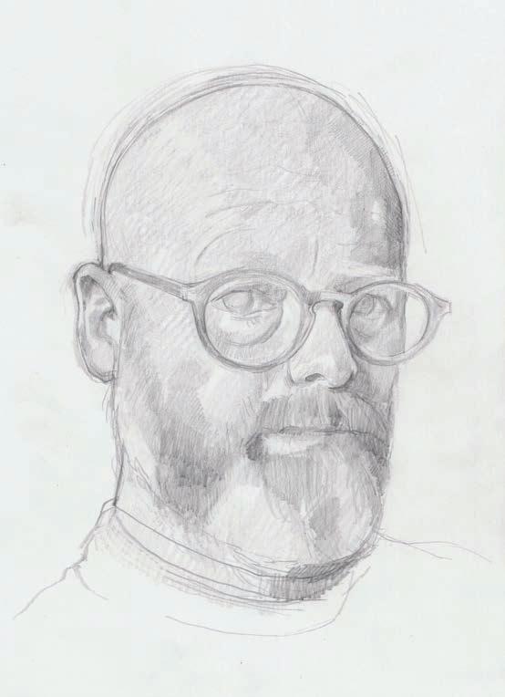
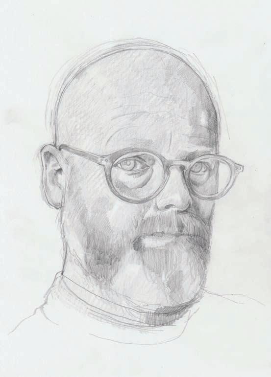
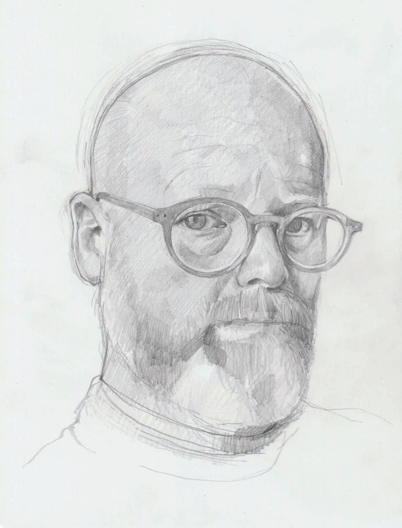
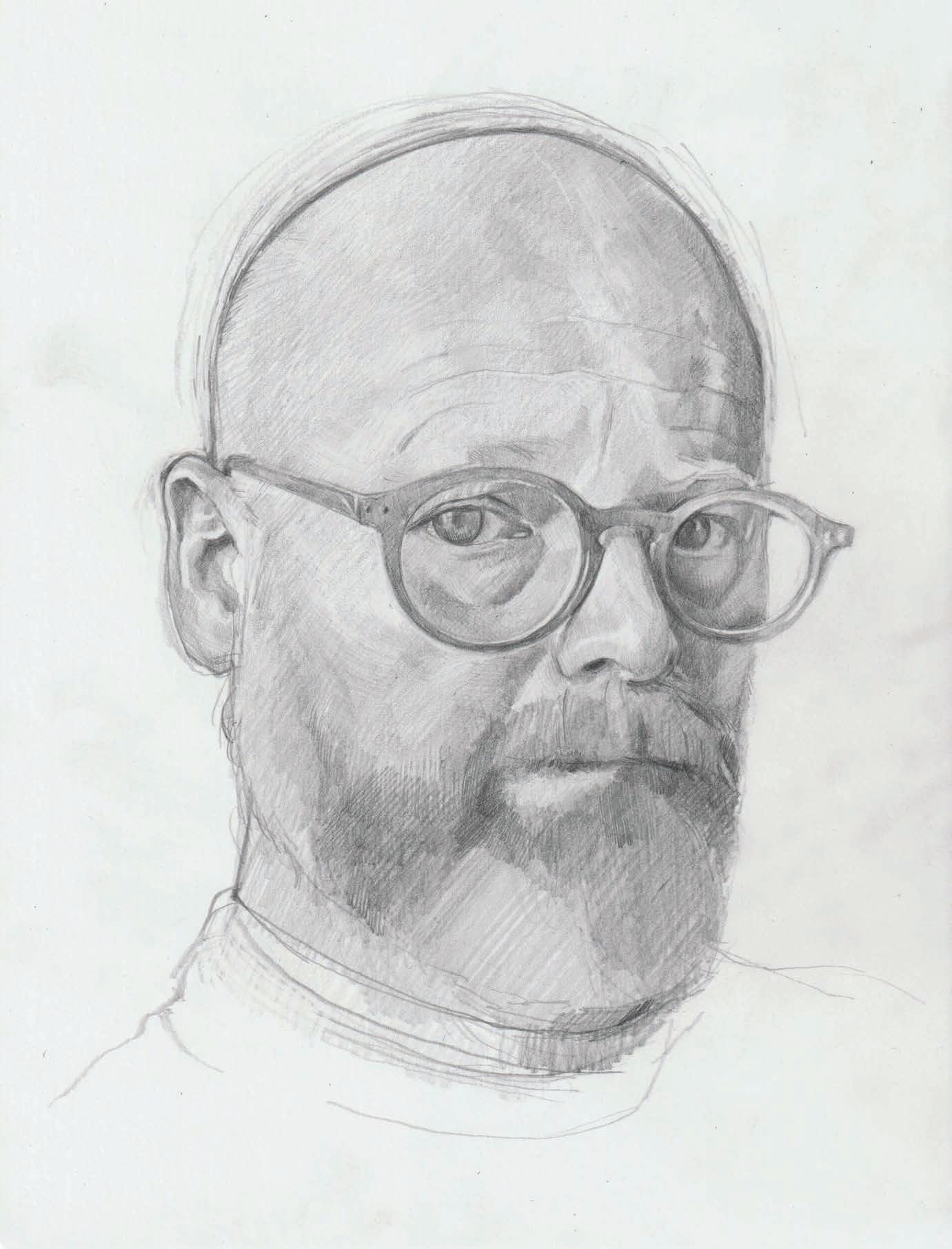
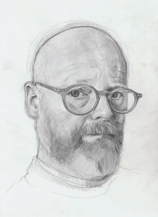
I use a softer, darker pencil (6B) here to add yet more tone and focus attention on specific areas, like the ear and the darker cheek areas, but also broad areas like the forehead and beard. At all stages, I prefer to flit from one thing to another, without ‘finishing’ one part before I move on. It helps me treat the picture as a whole and not just a series of features, and all areas progress at the same pace.
I’m happy with where everything is and commit to adding tone and depth with a yet softer and darker pencil (9B), particularly on the eye and nose shadows. I am still occasionally changing things though: the glasses are tightened up a bit. I have also begun to map out some of the beard details. I don’t want to draw in every hair, but I am keen to get a sense of movement and texture.
I don’t have hair, but most subjects will. I have a beard though and the challenges are pretty much the same. Some artists like to draw every strand, but that’s not in the spirit of this drawing. I want to aim at the impression and texture of hair rather than verisimilitude. It’s still an involved process and I want to avoid making this drawing stiff and lifeless which happens with overworking, so I need to judge when to stop.
There’s some more beard detail, enough to suggest growth direction and coarseness. I also scanned the broader drawing for areas to tidy up and emphasise with a highlight or a closer line here and there. I’m pretty happy with it at this stage and while a few more hours could yield a finer drawing, feel this drawing has life and freshness which could be lost with more work.
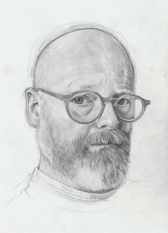
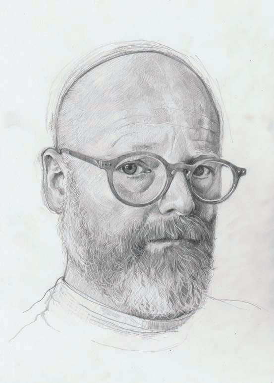









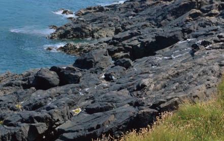





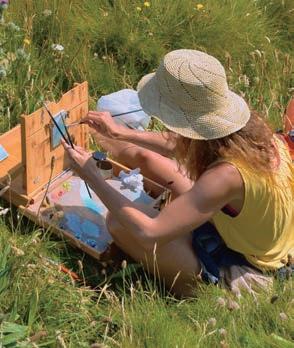
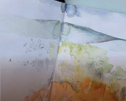



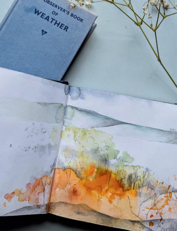
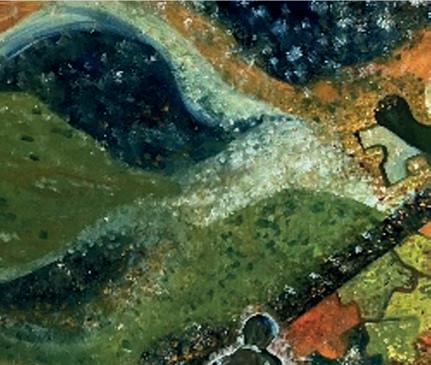
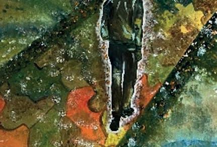
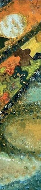
This is one of many prints I’ve produced while discovering the joy of lino printing. My dad was a printer by trade, so it’s in the blood. I love the smell of the ink, the carving process and the satisfaction when I peel away the paper, not knowing how it will look. These post-it notes were a gamble, and that’s why I like to try new media; and keep it fun! Artists & Illustrators is a wealth of information and inspiration. Thank you.
Born in Sri Lanka into a family-owned furniture business, I studied interior design in the UK and US, graduating from Parsons School of Design, New York. My career halted when my son, Steven, was diagnosed with severe autism in Dubai. With no facilities available, I home-educated him while navigating the stigma and lack of information in 1994. Returning to the UK, I fought for Steven’s education, taking the Local Authority to tribunal. Painting at night became my solace and a source of hope. After 24 years of care, Steven moved to a care home. Now, I have the freedom to rekindle my passion for art. A self-taught artist, I work mainly in oil on canvas, exploring nature, philosophy, and love. My latest collection, Poetic Melody, raises awareness of mental health challenges.
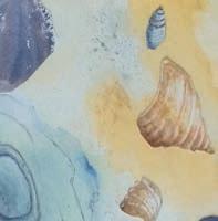

Here is my version of the collage technique that was in the April 2024 issue. I liked how the e ects of the waterlilies, in my case (trees, rocks and pebbles) turned out. I have always enjoyed painting and drawing, and collage made a good change. It was very inspiring. I like the variety of articles in Artists & Illustrators magazine. ▫
Send your letter or email to the addresses below:
Post: Your Letters, Artists & Illustrators, Chelsea Magazine Company Ltd, Telegraph Media Group, 111 Buckingham Palace Road, London SW1W ODT
Email: info@artists andillustrators.co.uk
Share your stories and get adaily doseof Artists & Illustrators tips, advice and inspiration by following us on our social media channels...






With thanks to our supporters at Trinity Buoy Wharf Trust.



Announcing this year’s Festival theme...
Registrations are officially open for The Big Draw Festival’s 25th anniversary year! The theme for 2025 is ‘Drawn Together’, celebrating how creativity unites us, how The Big Draw has brought people together over the past 25 years and how collaboration and connection are at the heart of making and creating.
As part of our ongoing commitment to removing barriers to creativity, we are offering Individual Organisers a free Festival subscription for the fi h year in a row. This includes artists, illustrators, and other creatives who are hosting events independently!
Be part of The Big Draw movement!
Whether you have an existing programme of events that you want to promote to a wider audience, or you’re new to hosting creative events, The Big Draw has got you covered. Head to our website to find
Find out more and sign up!

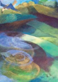
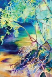
Friendly & Inspiring
Ilsington Hotel, Devon Tues 6th-Thurs 8th May ‘25
Oakhill Hotel, Derbyshire Tues 24th-Thurs 26th June ‘25
Dedham Hall, Essex Sat 23rd-Tues 26th August ‘25 annebarnham22@gmail.com www.annebarnhamsart.com 01526 320626 / 07895982441
•
•
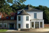

www.artistsandillustrators.co.uk
SOUTH WEST ART
Old Fore Street, Sidmouth EX10 8LP
Tel: 01395 514717
info@southwestartmaterials.co.uk www.southwestartmaterials.co.uk
Run by artists, for artists –extensive range of quality fine art materials & professional bespoke picture framing service. Friendly & knowledgeable service. Delivery or store collection of orders online or over the phone.
PEGASUS ART – suppliers of the finest art materials
Griffin Mill, London Road Thrupp, Stroud, Glos GL5 2AZ Tel: 01453 886560
info@pegasusart.co.uk www.pegasusart.co.uk
THE ART SHOP & CHAPEL
8 Cross Street, Abergavenny NP7 5EH
Tel: 01873852690
admin@artshopandchapel.co.uk www.artshopandchapel.co.uk
Wide range of fine art materials and papers. Programme of events - exhibitions, workshops, talks, concerts and creative dishes from our Chapel Café.
ATLANTIS ART MATERIALS
– UK’s largest and one of Europes biggest art stores
Bayford Street Industrial Centre Bayford Street, London E8 3SE Tel: 020 7377 8855
www.atlantisart.co.uk
Car parking, open 7 days.
50 Station Road, Sudbury, Suffolk C010 2SP
Tel: 01787 371932
A family run business specialising in Bespoke Picture Framing and Artist Materials
THE ART TRADING COMPANY
55 Earsham Street, Bungay NR35 1AF Tel: 01986 897939
TheArtTradingCo@btinternet.com www.thearttradingcompany.co.uk “...a truly excellent art materials shop” East Coast Net
THE ARTIST’S PALETTE
1 Millgate, Thirsk
North Yorkshire YO7 1AA
Tel: (01845) 574457
Independent stockists of fine art materials by Winsor & Newton, Sennelier, Golden, Faber Castell, Pro Arte, Caran d’Ache, Panpastels and more. A great range of specialist papers, crafts and kits. Friendly service from experienced art tutor.
CRAFT AND CANVAS
3 Carlton Street, Hebden Bridge HX7 8ER Tel 01422 648299
www.craftandcanvas.co.uk hello@craftandcanvas.co.uk
Purveyors of art and creative supplies including Jakar, Caran D’Ache, Wallace Seymour, Winsor Newton, Daler Rowney, Pro Arte, Fabriano, Sennelier. In store or online for nationwide delivery.
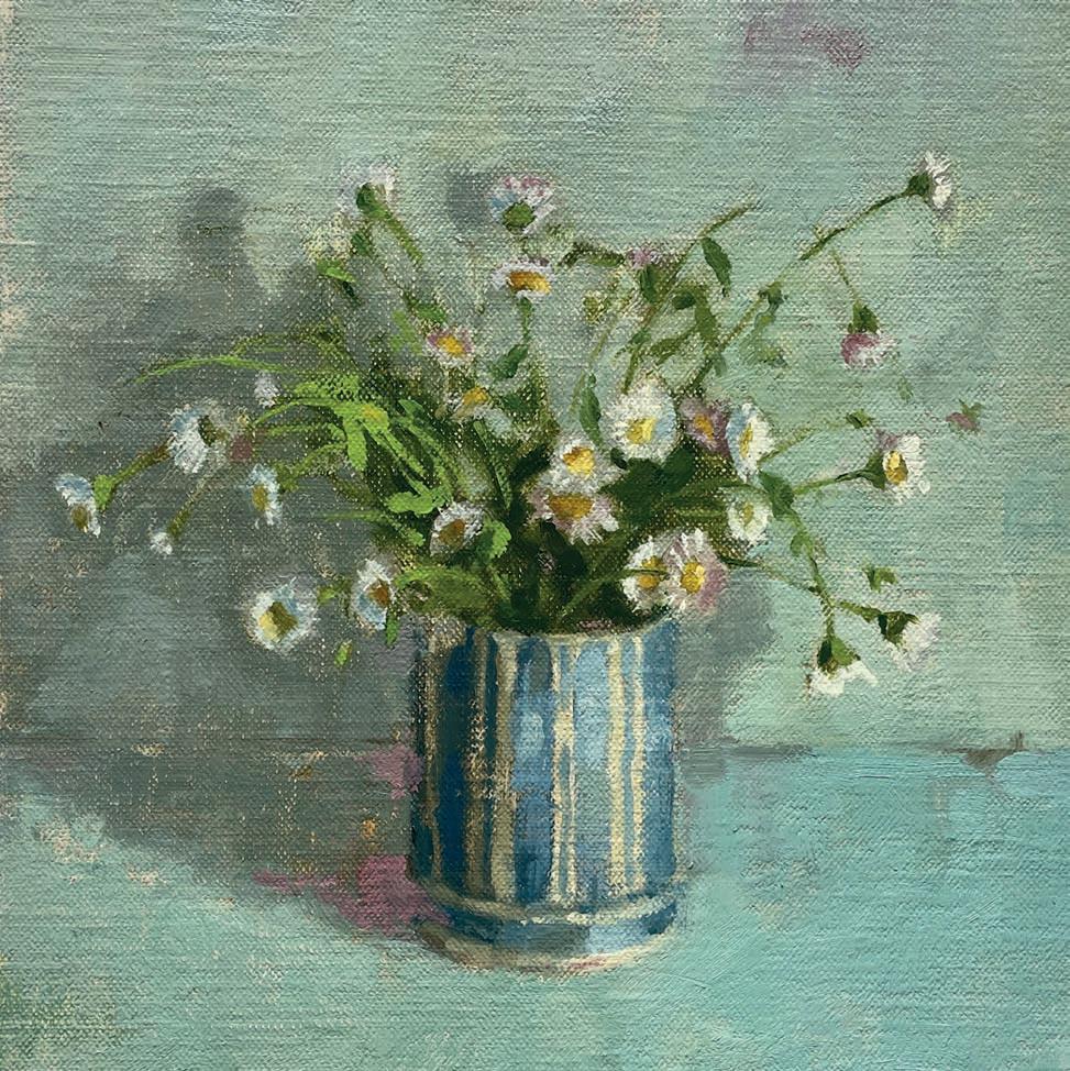
Every month, we ask an artist to tell us about a painting that is special to them. This month, we speak to Rutland-based oil painter FIONA CARVER about one of her favourite paintings
Fleabane in a Striped Pot was the final one of a collection of paintings I made last year depicting flowers from my garden in some of my favourite pots. I really enjoyed working on the series and getting to know each flower with its different colours, shapes and personalities. I’d been looking forward to the Fleabane coming out but had also been wondering how I was going to portray its delicate yet lively qualities. It was a challenge, but I was so happy with the outcome, and it became my favourite of the collection.
I planted the flowers in my garden several years ago and it always feels like the start of summer when they begin to flower. I love their haphazard nature and wanted to portray that in the painting. With a busy, young family things can often feel quite chaotic and
so, when I close my studio door ready to paint, it’s my chance to slow down. This is where I can feel calm, and I like to portray that quiet stillness in my work. I wanted the painting to have a restful soothing quality whilst keeping you engaged. The flowers are casually arranged but there is still balance; creating a calm, intimate mood.
As soon as I’d finished the painting it was bought by a collector in America who’d seen it on social media. She runs a plant nursery and already had another one from the series, so it is lovely that the two paintings are together. There is nothing like that feeling, knowing that someone appreciates and gets joy from your work. fionacarver.com ▫
CHARLES WEED

24-27 APRIL
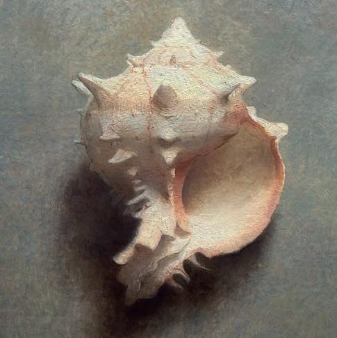
LEARN INDIRECT PAINTING AND ACHIEVE INCREDIBLE EFFECTS IN YOUR WORK
ANASTASIA POLLARD
DANNY FERLAND

30 APRIL - 3 MAY
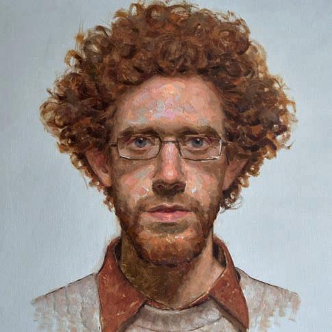
PAINT DYNAMIC PORTRAITS FROM LIFE

8-10 MAY
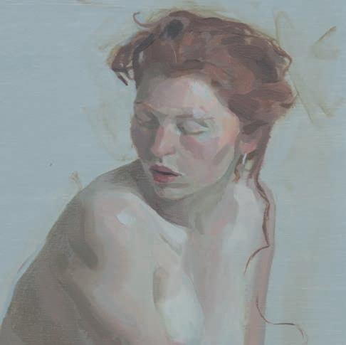
PAINT THE FIGURE, IN A COMBINATION OF QUICK AND SUSTAINED POSES

14-17 MAY
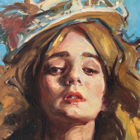
CREATE POWERFUL PORTRAITS WITH ADVANCED TECHNIQUES