11 minute read
In The Studio


1 Tangled Up In Blue II’s title references a Bob Dylan song
2 Michele relaxes in her home studio in Rehoboth, MA 1

2
IN THE STUDIO
Michele
Poirier-Mozzone
The American artist behind a series of mesmerising underwater paintings talks to REBECCA BRADBURY about the joy of finding the perfect subject and the perils of pool photography
Have you ever stopped to wonder what water means to you? Maybe it evokes memories of summers spent by the sea. Perhaps its unpredictable ebbs and flows induces a fearsome awe. Or an immense gratitude for its restorative powers could come to mind.
According to Michele Poirier-
Mozzone – for whom water represents life and the passing of time – the interest is universal, but the reasons are unique. And after nine years of depicting the element in pastel and oil for her in-demand Fractured Light series, the Massachusetts-based artist can be considered an authority on the element.
“Water means so many different things to different people,” she explains, putting the success of her underwater paintings down to the subject’s ubiquitous appeal.
Yet this modest reasoning gives little credit to her keen eye for colour, compositional finesse and expressive mark making, which balances wonderfully between abstraction and realism. With vivacious, joyful hues (including a seemingly never-ending spectrum of blues), iridescent clusters of bubbles, and ripples of water so magical they move, not to mention the hypnotic distortion of the human form, the resulting artworks are impossible to take your eyes off.
The idea for the series came about one summer afternoon, back in 2012, while Michele watched her youngest daughter play in the pool in their backyard. “It was late in the day
It’s worth taking the time to determine what I want to say... I can be freer to paint if I’ve done my homework first
and the sun was casting these ribbons of light down through the water onto her and she was all distorted,” recalls the artist. “It was one of those moments of realisation that she was growing and changing more quickly than I often notice.”
This would be a turning point for the artist. After graduating with a fi ne art degree from Boston’s Emmanuel College in 1986, Michele continued to paint as a hobby while raising her young family. Around 12 years ago, with more spare time on her hands, she began to take art more seriously again. The only problem was fi nding a subject matter that she could transform into a series – until that fateful afternoon in her garden.
Now Michele is a full-time artist, continuing to work on the Fractured Light series from her home studio in Rehoboth, a town located 50 miles south of Boston. The pool remains in place and her (now grown-up) children continue as her models, yet her method of acquiring the reference material has adapted over the years.
“I started off using a regular camera from above the water,” she explains. “Then I put my cell phone in a waterproof case and tried to take photos, but that was very disappointing. The results were not good at all. Then I got a GoPro [waterproof action camera], and I can actually put the camera underwater at all different angles.”
“I don’t know what I’m taking until I upload it onto my computer,” she adds. “It takes a lot of footage to get that one particular shot that can make a good composition and a powerful painting, but the GoPro has really opened up the world to me underwater.”
Once uploaded, Michele will sift through the footage frame by frame on the hunt for the perfect shot. After this, she tends to use the digital illustration app Procreate on her iPad to experiment with the layout and colour palette.
This is a key part of the process for Michele: “I feel it’s worth taking the time to determine what exactly I want to say and how I want to say it. I can be freer as I start to paint if I’ve done my homework fi rst.”
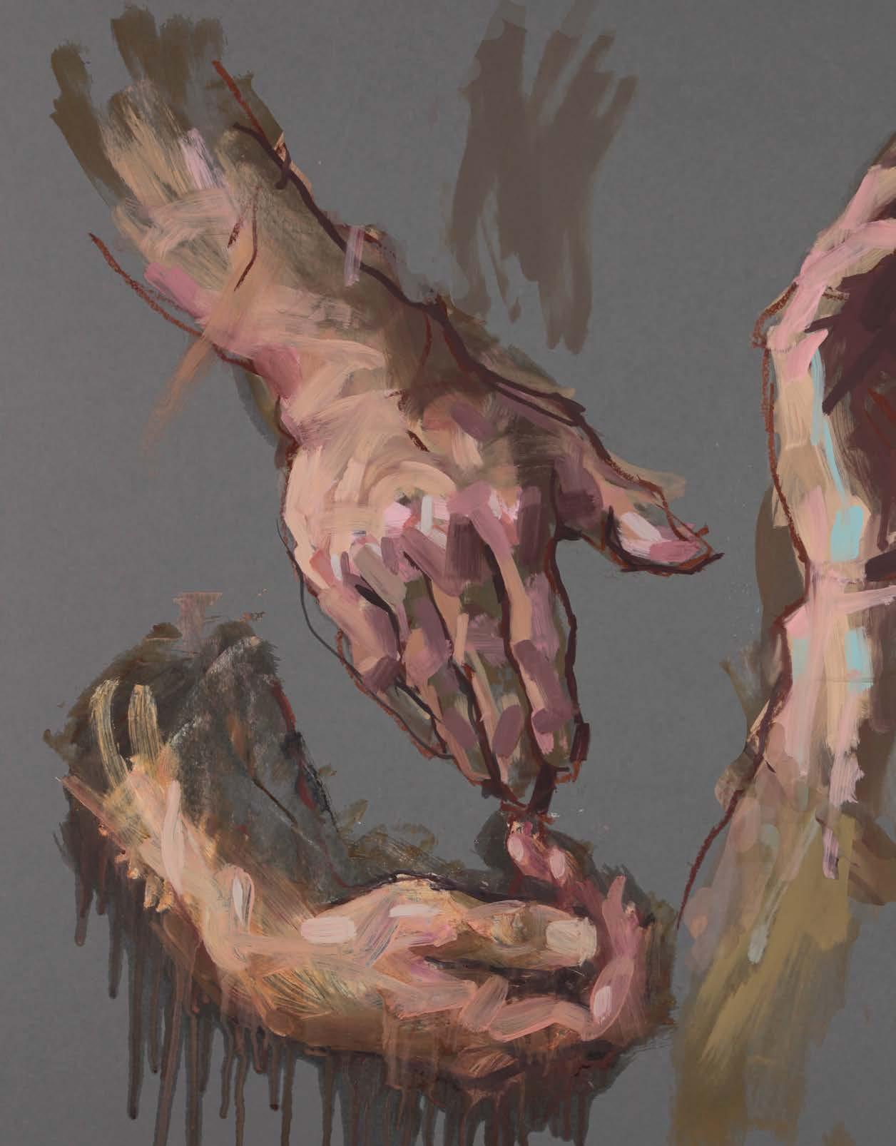
This inclination for a looser approach is, in fact, one of the main reasons the subject initially stood out. As light is refracted through the water, warping the way objects and their refl ections appear, there is a lot of scope for abandoning the rules of realism. “It’s part of that abstraction process I really enjoy,” she says of depicting these bodily distortions. “I like the fi gure, but I don’t like getting too tight, so the distorted part of the piece is the really fun, icing on the cake as I get to play with colour and shapes and manipulate the composition to move the eye around [the painting].”
The chance to experiment with colour is another major draw. No two paintings in the series contain the same combinations or mixes, as Michele strives to switch it up each time. And despite the multitude of blues in her fi nal works, the artist achieves this with just three go-to pigments – Phthalo, Ultramarine and Prussian Blues – as well as a much-loved Cobalt Turquoise.
There is, of course, the vibrant swimwear too – a colour choice the artist often delays: “I tend to hold off a little while before I decide what colour I pop into the swimsuit, as it’s whatever I need in that composition. Sometimes I’ll try three or four different colours for a swimsuit

3
3 The colours are planned on an iPad fi rst for work like Stretch
4 Cobalt Turquoise was a favourite for Purify

and then come upon something that really works.”
A similar trial-and-error approach is involved when depicting the play of light, whether it’s reflecting off the water’s mutating surface, illuminating the pool’s hidden depths, or casting otherworldly blue patterns. The ephemeral effect that ensues makes this probably the hardest element to replicate. Michele recommends laying down the darks first, the mid-tones second and leaving the lightest lights until the very end, although she admits that this process can’t always be relied upon.
“I don’t have a formula,” she says. “Sometimes I really struggle achieving that look of glow and light, and other times it just seems to evolve as the painting evolves and I don’t have to do much apart from lighten it up and then it’s done.”
The theme of transformation is always near, not least in how the series has developed since its inception. In line with Michele’s own goals, she’s now at ease with the looseness she once coveted, adding in lost edges and leaving parts of the underpainting showing through. The motivation – originally the
4

5 Michele takes reference photos on her GoPro camera
6 Sunfl ower is part of the Fractured Light series of works

5 6
depiction of her three girls – has also shifted. It’s now less about the personal, as she seeks to confront a more universal human experience. But the biggest change has to be swapping pastels for oil paints.
Working in a new medium for the past four years has added a whole other dimension – literally – as the artist can now work on a much larger scale. “If you’re holding a small pastel, you can’t get a big, wide swathe of colour as easily as you can with a big palette knife or brush,” she says. “I’ve been loving going bigger and just having fun with layering on the paint, like icing a cake. It’s just added a different element to the series for me.”
It wasn’t a totally smooth substitution, however. The aim was to achieve an element of continuity in the series but replicating the same effect in oil paint proved harder than anticipated. The best method was eventually discovered as simply copying her previous steps. So just as Michele begins a pastel artwork by laying down a red underpainting, she opts for the same hue when working in oil paint. The next step is to then put her chosen blue mix into action and so on, ensuring there is a harmony to the series and, at times, making it difficult to detect what medium has been used.
Having made these transitions, the burning question is where will Fractured Light go next? “I certainly don’t see myself getting more representational,” she replies. “If anything, I think I would go a little bit looser, a little bit more abstract.”
But the most pressing concern is that now her daughters have grown up and aren’t around so much, the artist is running extremely low on reference material. Let’s hope they return home soon for a photoshoot so we can enjoy more of Michele’s uplifting, optimistic and ever-engaging underwater artworks. www.poirier-mozzone.com

I don’t see myself getting more representational… If anything, I would go a bit more abstract
Zest-it Celebrating 25 years of safer solutions for artists

To celebrate our 25 years as fine art materials manufacturers, we at Zest-it decided to add 25 new products to our range. We have accomplished this, however, the main product of which we are very proud is our beautiful, handmade Zest-it Cold Wax Paint.
Many people had asked us about a Cold Wax Paint, or equivalent, which could be used with painting knives and brushes, making it suitable for painting traditional-style landscapes, instead of abstracts, using the oil painting tools and equipment they already owned. In the process, Cold Wax has clearly evolved from the traditional additive for oil painting to a media in its own right.
The development of this product started almost 10 years ago, more for my personal use in oil painting than as a retail product. Much experimentation and research, via trials and tests, has been carried out to achieve the final, elegant, new paint product.
Our paints are made by hand, using techniques and methods we have developed at Zest-It. The paint consists of a similar formula to our very popular Cold Wax Painting Medium with the addition of high-quality, pure, single pigment colours, many of which are natural pigments, chosen for their attributes and suitability for use with wax. All of the Cold Wax Paints are archival, have excellent lightfastness, and retain the inherent character of the wax. The translucent quality of the wax is maintained because there are no fillers or extenders to compromise the quality. All the paint colours are intermixable, and, like the rest of our Zest-it products, they are also non-toxic and non-flammable.
The colour chart opposite shows the 25 celebratory hues which are: Stone White, Primrose Yellow, Lemon Yellow, Yellow Ochre, Cadmium Yellow, Saffron Yellow, Cadmium Yellow Deep, Ruby Orange, Brick Red, Dark Red, Pillarbox Red, Rose Red, Peacock Blue, Ultramarine Blue, Indigo Blue, Racing Green, Cadmium Green, Ultramarine Violet, Burnt Umber, Natural Umber, Burnt Sienna, Paynes Grey, Graphite Black, Soot Black and Iron Black. These are the 25 colours to start the celebration, with a Silver as a limited-edition Anniversary colour and another 15 colours to come before the end of the year.
To facilitate the application of our Zest-it Cold Wax Paint with brushes and painting knives in a more traditional manner, we developed two wax mediums. These give far more versatility to the paint and benefit any artist who wishes to obtain a wider range of brush marks and a unique style. It also negates the use of any type of oil paint and reduces the need for solvents.
The new Zest-it Cold Wax Detail Medium, when mixed with the Cold Wax Paint, makes the paint easier to apply using typical oil painting brushes. This medium keeps the characteristics of the wax, allowing for more versatility and painterly brushstrokes.
The new Zest-it Cold Wax Liquifying Medium, when mixed with the Cold Wax Paint, makes the paint thin enough for line work, but retains body. This medium thins the paint enough for use with a rigger or liner brush.
The existing Zest-it Cold Wax Painting Medium, can be used to, in effect, “thicken” the paint for more pronounced knife work, thereby giving texture and a tactile finish to the surface. All three mediums therefore broaden the possibilities for the artist using Cold Wax Paint.
Historically, wax has been painted on many surfaces, both flexible and rigid; providing there is some absorbency and tooth to the surface, the wax can live a good life. We have sought expertise to produce our “Paper for Cold Wax” pads. The papers are acid free, wood free and available as a NOT surface 300gsm in black or white in A3 and A4 sizes – very suitable surfaces for painting with Cold Wax Paint.
The Cold Wax Paint, the new mediums, and the papers will be available from your normal retail shop or online. Enjoy the experience! Jacqui Blackman Director of Zest-it


PRODUCT INFORMATION: www.zest-it.com WAX INFORMATION: www.artywax.co.uk OUR FACEBOOK PAGE: www.facebook.com/ZestitArtProducts