16 minute read
Masterclass


MASTERCLASS Expressive
FIGURES
Royal Institute of Oil Painters member LUIS MORRIS shows how working from a sketch and mixing up a range of colours early can allow a more creative, painterly finish
Ifind drawing a figure from life exciting but intimidating. One is presented with such a wealth of visual information – and so little time in which to gather it. Success depends upon the ability to decide what is important, and to leave the rest out. I like taking sketches made in life sessions and using them as the basis for a painting.
The drawing is my only record of my subject.
With no tempting photo to copy, the studio painting is free to take on a life of its own.
As with a lot of my figure studies, I am looking to capture something of the essence of the form using a minimum of detail.
I do this by shedding bright light on a few selected areas and allowing the rest to be cloaked in shadows. I want my figure drawings and paintings to have a certain mystery about them. For all the abstraction and stylisation, the end result needs to have a sense of warmth and animation if it is to be successful.
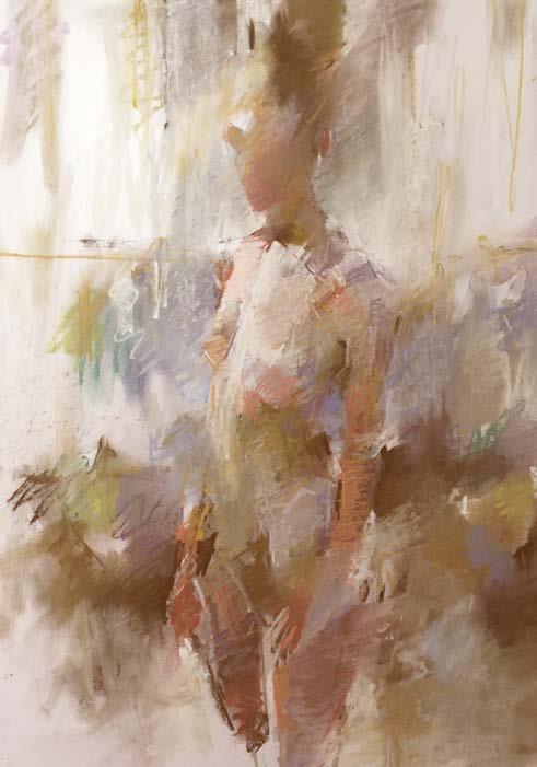
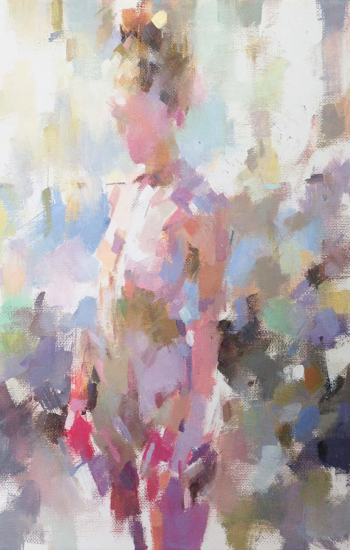
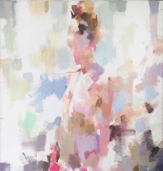
It is important that the reference sketch has an essential quality that can be brought out in the final painting. The challenge then is to make sure this chosen quality doesn’t get trampled on during the course of making the painting. In this case I felt my initial sketch [pictured left], made in pastels across a 90-minute session, had an overall sense of calmness and poise. I was also very happy with the colour relationships I’d found in the body and was keen to enrich those in the painting [pictured right] to create a more vibrant picture that celebrated the way natural light bounced off a human body.
Luis's materials
•Paints Cadmium Yellow, Cadmium Red, Alizarin Crimson, French Ultramarine, Viridian and Titanium White, all Winsor & Newton Artists’ Oil Colours •Brushes Pro Arte Sterling Series 201 short flat brush, size 4 •Support Colvin & Co stretched cotton canvas, 30x23cm •Low odour thinners •Palette knife •WypAll Industrial Wiping Paper

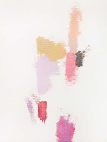
1Mix on the palette For me, the palette is the oil painting’s driving force. I started by mixing each of my colours with Titanium White to form bright, saturated tints. I then mixed a black from Ultramarine, Alizarin Crimson and Cadmium Yellow, which I then mixed with white to give shades of grey. These greys in turn helped create more subdued versions of the highly saturated colours.
My fi rst mark on the canvas was a patch of warm golden brown. This light vertical swipe was my fi rst guess at where the central axis at the front of the stomach belonged. 2 Let colours vibrate From here onwards, all other colours, shapes and marks must relate to that fi rst keynote. The next hue added was a pinkish lilac to represent light refl ected from the left hip and thigh. I chose a tone similar to the golden brown and felt these two initial colours vibrated together in a pleasing way.
I also used my fi ngernail to reiterate a line for the front central axis of the body, with its gentle backward slope, as well as a vague indication for the back of the ribcage.


Top tip
Try using a piece of blue WypAll Industrial Wiping Paper wrapped around your fi nger and dipped in turps or low-odour thinner to rub out or adjust the positions of shapes on the canvas

3Look for extremes With two mid-tone colours down, it was important to fi nd extremes. I traced the line of the left arm using a warm pink and a dull orange separated by a warmish grey for the lower bicep. The darkest colour then denoted where the arm ended and the background began. I also ran the left thigh to the bottom, anchoring the fi gure within the canvas. 4 Push the colours A tutor once described the process of painting as a search “for where one colour ended and another colour began”. When one sees a painting as a set of abstract marks jostling for position on a canvas, one doesn’t get so attached to an individual mark. This makes it a lot easier to rub them out and reposition them. Using a piece of blue WypAll paper dipped in low-odour thinner, I pushed back the line of the model’s left hip, allowing a new colour to be introduced.


5Broaden the spectrum I continued setting out extremes of colour by adding patches of fresh, clean hues of widely varying temperatures: a patch of French Ultramarine mixed with Titanium White to go behind the upper arm, and a hot pink transitioning into an orange for the model’s right arm.
Against these strong chromatic colours, I added a silvery ochre mix, made with a pale grey and Cadmium Yellow, to redefine the left hip bone. I also scraped and drew with my fingernail and the edge of the brush to find the collarbone and the angle of the right arm. 6 Find the head I had really started to find the figure on the canvas and needed to make a decision about the placement of the head. I drew a light line that sloped gently from below the ribcage to the collarbone, in order to continue that central axis up the front of the body.
I drew some of the essential angles of the head and neck using a combination of warm ochre, hot pink and cooler purple mixes. I also added more background colours in the bottom corners to further connect the figure with the edges of the canvas.

7Take it to the top Using the axis line as a guide, I added light orange for the right breast and a deeper salmon pink for her right shoulder. These shapes were given definition by a patch of blue similar to the one behind the figure.
Parts of the hair were made as dark as anything else on the painting and then wiped off the top edge of the canvas to complete a pleasing, symmetrical composition. I also drew some simple vertical shapes to hint at background pillars and window elements. 8 Make adjustments I realised the shoulders and upper torso were too narrow, so I began repositioning the basic shapes around the model’s left shoulder and ribcage to make her shoulders appear thrown back and her upper body more substantial.
I used a small tick of dark olive green to define the armpit, the front of the upper arm, and the shadow on the ribcage. Similarly, I used a vertical line of deep purple to define the front of her left forearm. A constant process of checking and readjustment is required so that the drawing and painting happen at the same time.

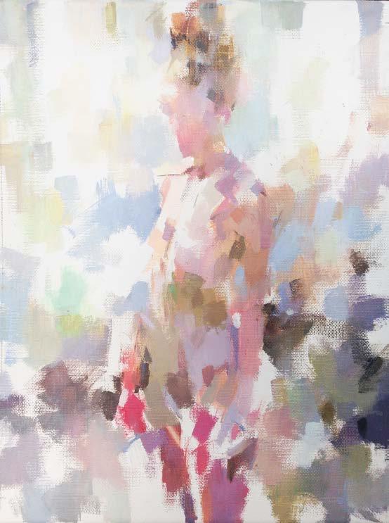
9Leave light and space I wanted to leave a lot of white canvas showing to create the feeling of daylight flooding through large windows behind the subject, illuminating the figure in some places and casting shadows in others. It was important to suggest this while keeping the background at least as abstract as the figure itself, so that the painting of the model could stay pleasingly abstract without looking unfinished. 10 Develop the drawing I made some basic adjustments to the overall shape of the figure here. For example, I moved the edge of her right hip slightly to the right, which helped to accentuate the overall curve of her body.
I also added a little more mass to the lower half of the painting, meaning that the majority of pure white canvas was now in the upper half of the picture.

11 Keep it suggestive I made a few refinements, including a little more work on the head. Although it needed to be convincing, I wanted the head to be painted as simply as possible so as not to be out of keeping with the rest of the figure.
I hoped that the figure as a whole might convey something of the personality and bearing of the model, without having to make a detailed study of her face. To this end it helped that the head was, for the most part, silhouetted against the light of the windows. 12 Know when to stop Knowing what you wanted to achieve – the statement you wanted to make or the feeling you wanted to convey – helps you to know when to stop painting. In this piece I had wanted to capture the light and space in the studio, and the calmness and poise of the model. I felt I’d achieved this economically so it was time to put down the brush.

IN-DEPTH
Sketchb k
STRATEGY
Although you only tend to see finished work, a sketchbook is often a key part of the process. We asked seven top artists to open their books and share their methods
Rose Dufton
ARTIST AND PRINT DESIGNER
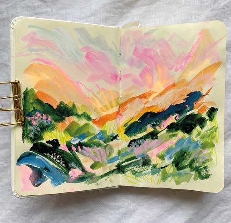
“I use my sketchbooks for a few different reasons, and I have several on the go at once. My favourite would have to be Moleskine’s watercolour sketchbooks, they come in varied sizes and are landscape in format. I have also just bought some Royal Talens’ Art Creation ones, which I am enjoying working in for a change as they are portrait format. I mainly use watercolour paints, as well as brush pens and gouache.
“I sometimes use sketchbooks to make thumbnail sketches for larger paintings. However, the main use would be to experiment in. I like to see them as mini journals of ideas, rather than curated places with pretty pages. Don’t be scared by a sketchbook. Try not to keep them precious and perfect as if you do you will never use them. In my opinion, sketchbooks should be played with and used as a place to let ideas fl ow, as that is when the best kind of accidents happen that can spark incredible ideas.” www.rosedufton.com


Jen Ru e -Smith
ILLUSTRATOR AND AUTHOR OF THE JOY OF SKETCH
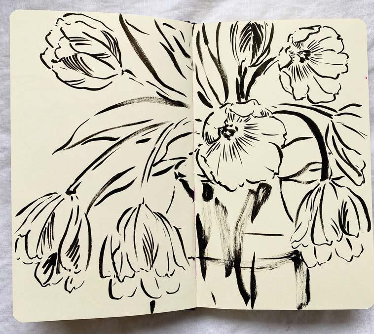
“How I use my sketchbook varies a lot. I aim to do a quick sketch – anything I’m thinking about or that has caught my eye – each morning before I start work, but that often doesn’t happen. Those daily sketches are always my favourites, though, because they turn into an illustrated diary that has captured that moment in time. And because they’re not themed or planned, I often end up with something a little different to my usual work. I also use my sketchbooks to test out colours and techniques that I’m planning to use on commissioned pieces. I primarily work in Moleskine or Pink Pig sketchbooks as both have good, robust watercolour paper options. I use waterproof black Platinum Carbon ink with watercolours for the most part.
“My book, The Joy of Sketch, has lots of tips for beginners but my primary tip would be to draw what you love – don’t force yourself to draw fl owers if you fi nd them boring. Use your sketchbook as a moodboard for noting decorating ideas, compiling outfi ts you want to wear, capturing quick sketches of your children or pets – whatever you like looking at and are excited by.” www.jenrussellsmith.co.uk
Robin Olsen
ABSTRACT ARTIST
“My sketchbooks are primarily a place for testing and exploration. I consider them a place to try out ‘what-ifs’. What if I mix ink and coloured pencil? What if I try stitching on top of paint? What if I cover most of my collage with white paint? They are a place where I can play with ideas and experiment fully.
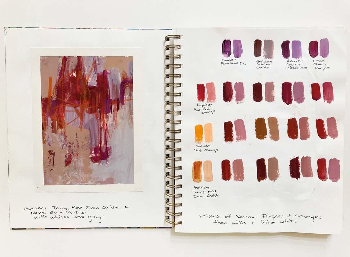
“As an abstract painter, I refer to my sketchbooks frequently as a source of ideas to try in paintings. They often are the impetus I need for a new series. They also serve as a reference. When I want to make the perfect shade of pale, ocean blue, I check my colour charts to see which colours to use. When I make a colour chart, I often do a small sample painting next to it to see how the colours relate. It’s a quick reference for future paintings.
“The important thing about sketchbooks is having everything in one place to refer to easily later, but that doesn’t mean it has to be created in that place. If you struggle to experiment freely in your actual sketchbook, or consider the pages too precious, work on separate sheets and glue or tape them in afterwards. The important thing is to record all your ideas, but it doesn’t really matter how they get there.” www.robinolsenart.com

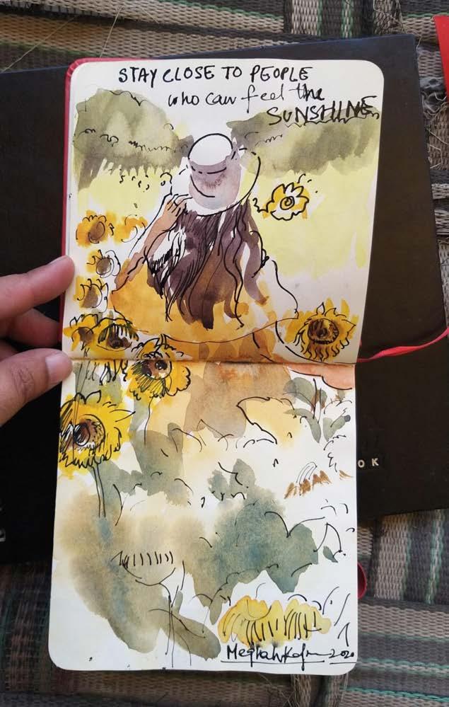
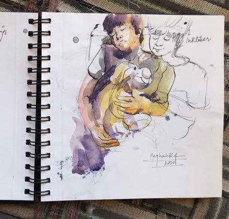
Megha Kap r
Ji Leman
VICE PRESIDENT OF THE WATERCOLOR SOCIETY OF INDIA
“My sketchbook is an important part of my life. Earlier they were only for practising anatomy, fi gure drawing and everyday sketches. But now they have become an integral part of my life’s journey. They are like a journal of my life. The moments I come across or everyday experiences.
“I love the Art Creation sketchbooks from Royal Talens. I bought a few of them from a store in Spain and I loved them. And now I buy them online through Amazon. I love to use watercolours and inks. I have a beautiful collection of nibs that are quick and handy for capturing the moment.
“My tip would be don’t try to make a perfect piece of artwork in your sketchbook. I think that's the best place where you can be yourself. Just be free and journal each moment of your life in them. They will become the bestest friends.” www.meghakapoorart.com
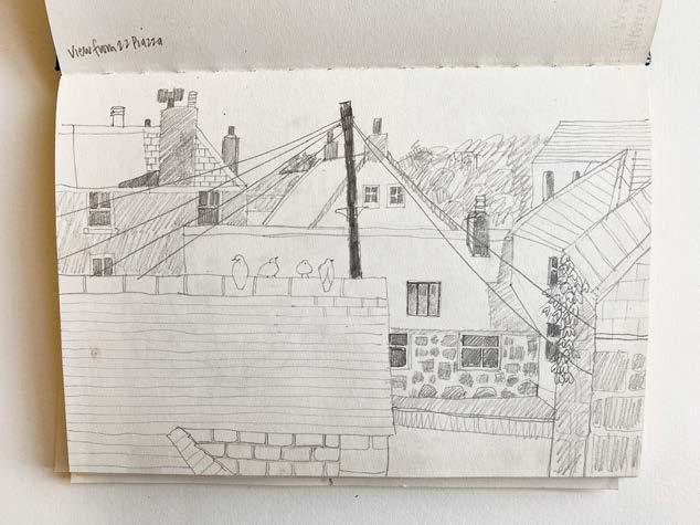
PRESIDENT OF THE ROYAL WATERCOLOUR SOCIETY, UK
“My sketchbooks are a visual diary – I enjoy drawing. I use sketchbooks for drawing something I might want to put in a painting later – this might be fl owers, china, a view through a window or in the garden, or other bits and pieces.
“I often use sketchbooks that are roughly A4, spiralbound ones can be useful if you are out and about as they are lighter. When I am working in them, I tend to use 2B or 4B pencils, pens, coloured pencils or paint – watercolour usually.
“The one piece of advice I’d give a fellow artist is this: don’t think your sketchbook has to look perfect!” Jill's work features in Chelsea Physic Garden, which runs 12-30 August at Bankside Gallery, London. www.jillleman.co.uk
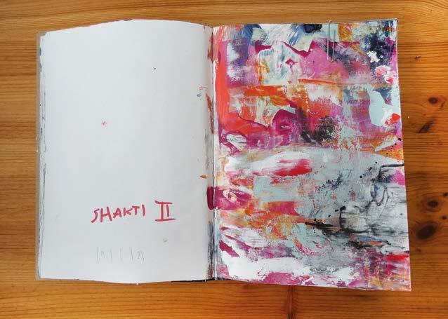
Andrea Hentze
ABSTRACT PAINTER
“My sketchbook is my sacred place to explore and let my art fl ow freely through me. When I started out, I felt like there was a friction within me: the longing to create abstract art and these niggling questions of what it will be all about. My sketchbook gave me the room to just explore without constantly wanting to answer this question. The white page of a sketchbook is less frightening than a blank canvas. Knowing this creates the freedom to explore art and listen to my heart’s desires instead of wanting to fi gure it all out with my mind.
“The key to fi nd this focus for me is daily practice. It’s like I write a story in my sketchbook every day. Over time I can see how themes emerge, created day by day, but discovered in refl ection afterwards. I refl ect a lot after my art sessions: what do I like? What was fun? What associations come to me? This refl ection ties everything together and over time, you look back and you see themes arise and threads are weaving together beautifully.
“Limiting the endless possibilities makes it so much easier to start. You might like to choose a special theme (such as ‘black and white’) or use new materials. Nevertheless, stay fl exible and change the limitation up if you feel like it. It’s your sketchbook and you are free to explore whatever comes to your heart so trust that.” www.andreahentze.com


Ro ie Wraith
MEMBER OF THE ROYAL SOCIETY OF PORTRAIT PAINTERS
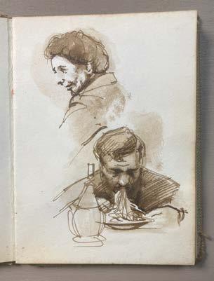
“My advice is to always have the habit of carrying a sketchbook, and never be afraid to try a subject, even if you think it might not work. My sketchbooks have been a constant companion for more than 50 years, I’ve had one in my pocket every single day.
“I always draw from life, never photographs – the essence of drawing, especially in a sketchbook, is your reaction to the moment. Your state of mind becomes part of the sketch: the changing light, the unpredictable and fast-moving subject. My sketchbooks are packed with these moments, from lunch with Nelson Mandela to dustbins in Dunstable.
“Every sketch is an experiment: your subject leaves the restaurant, the light changes, someone yells at you for staring at them across a crowded pub (that’s happened more than once...). It might well not work to your satisfaction, but even so it is an honest drawing.
“I have a huge variety of old sketchbooks, but nowadays I use a Moleskine book with watercolour paper, usually a couple of Schneider’s Slider Edge ballpoint pens, a fountain pen with Noodler’s ink, a tiny watercolour box (both for watercolour sketches and also more manageable monochrome washes), and a pencil or two. My jacket pockets are always loaded and ready.” www.robbiewraith.com


