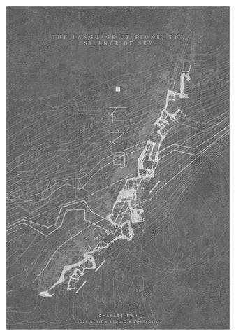
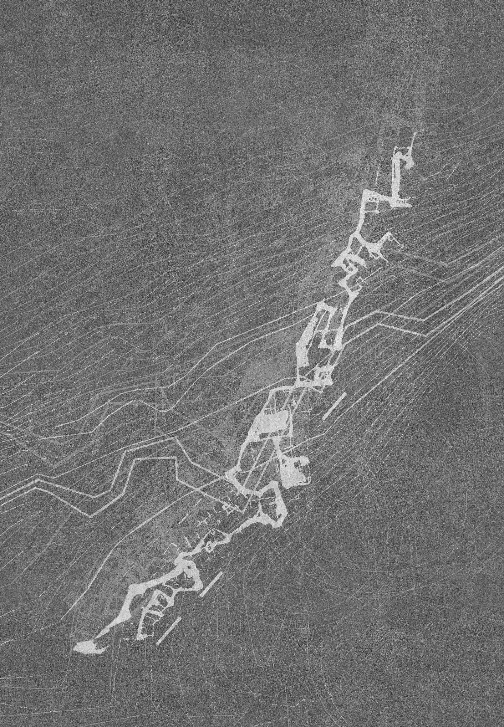
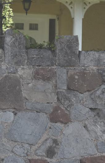
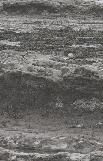
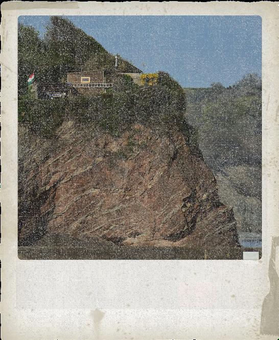
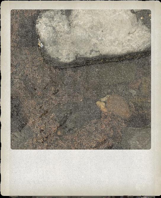
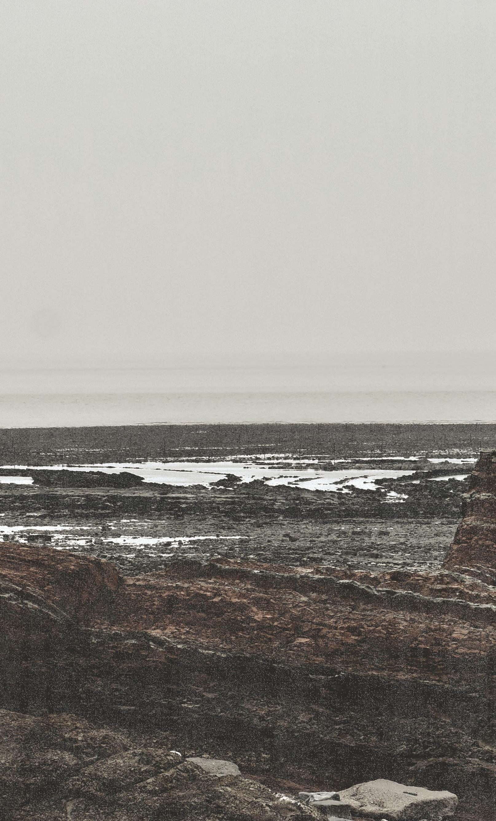
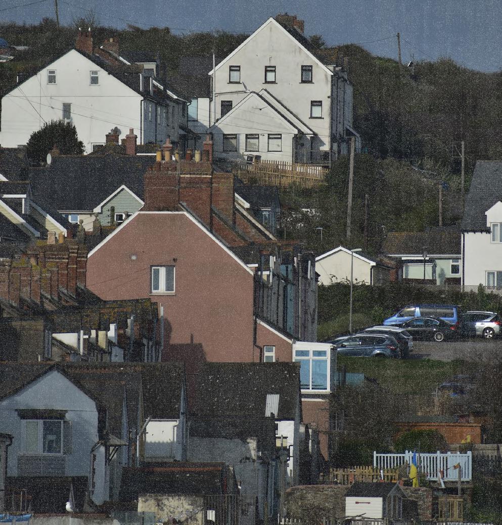
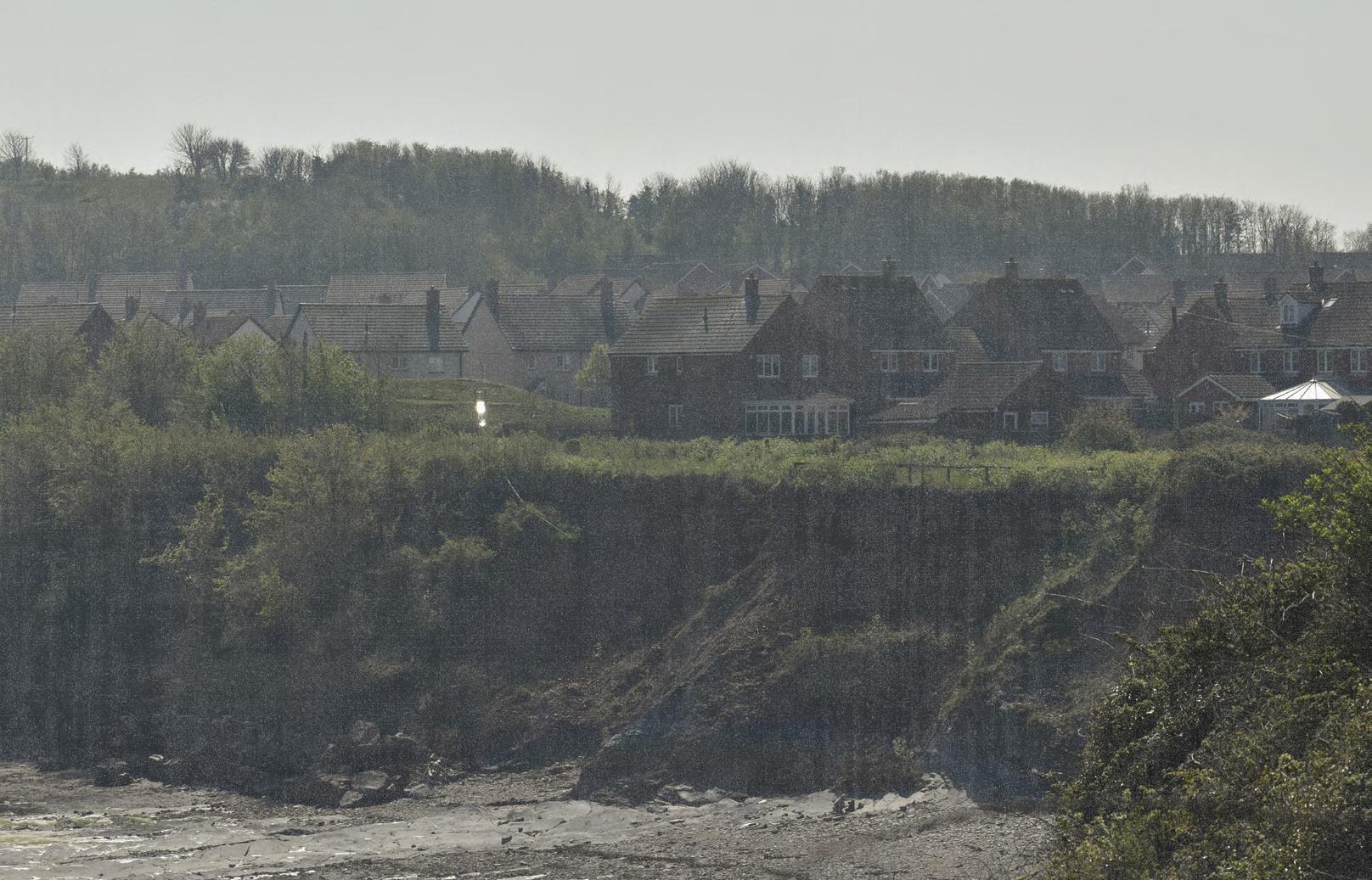
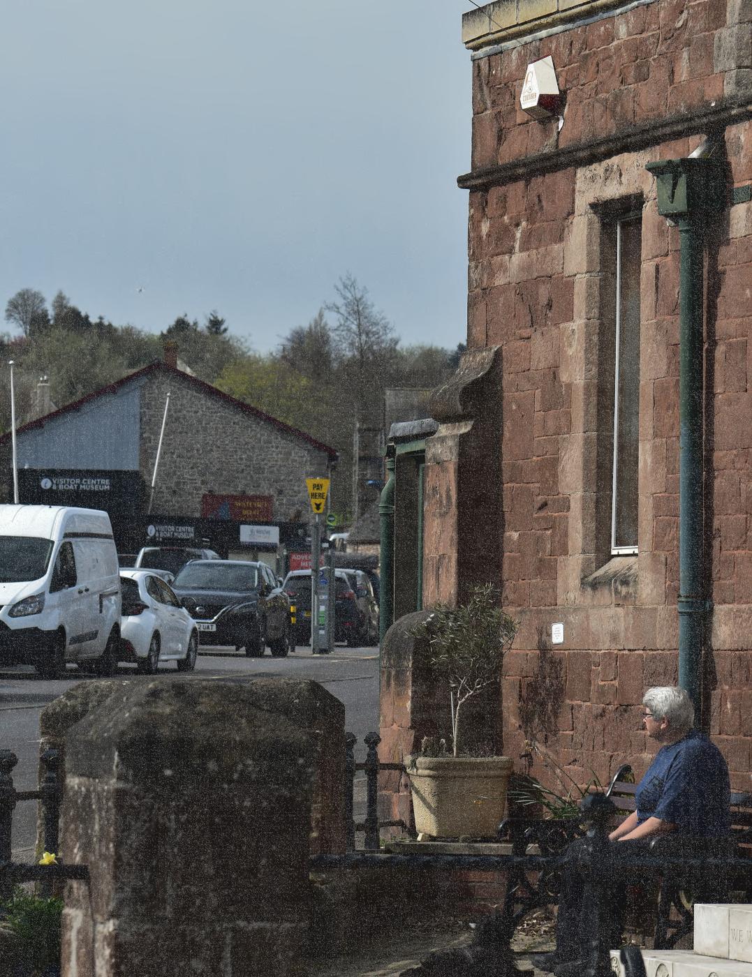
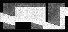
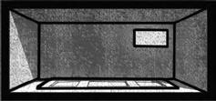
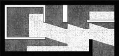
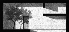
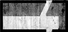
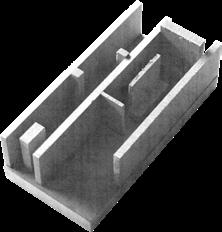
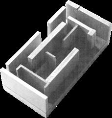
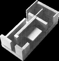
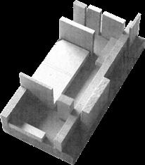
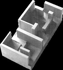
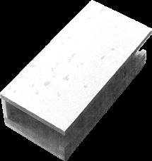
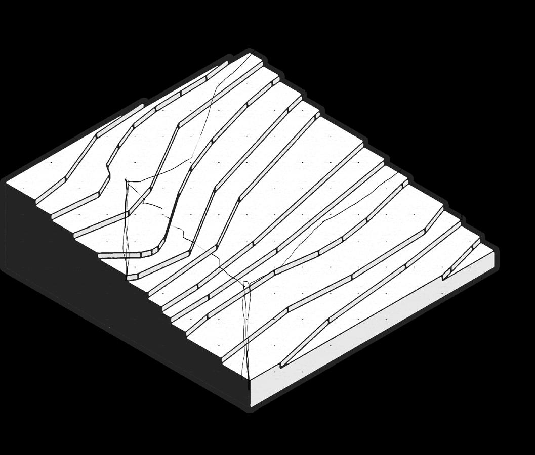
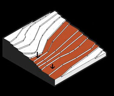
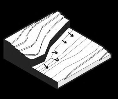
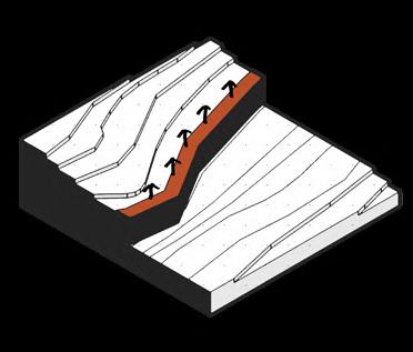
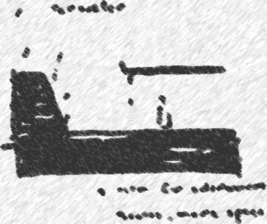
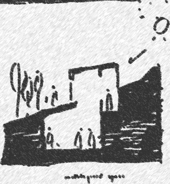
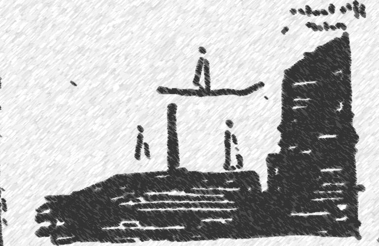
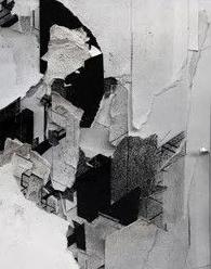
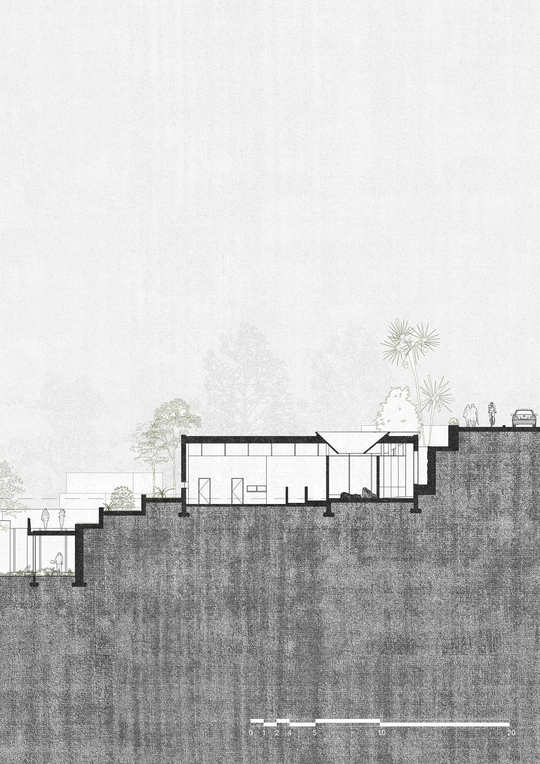
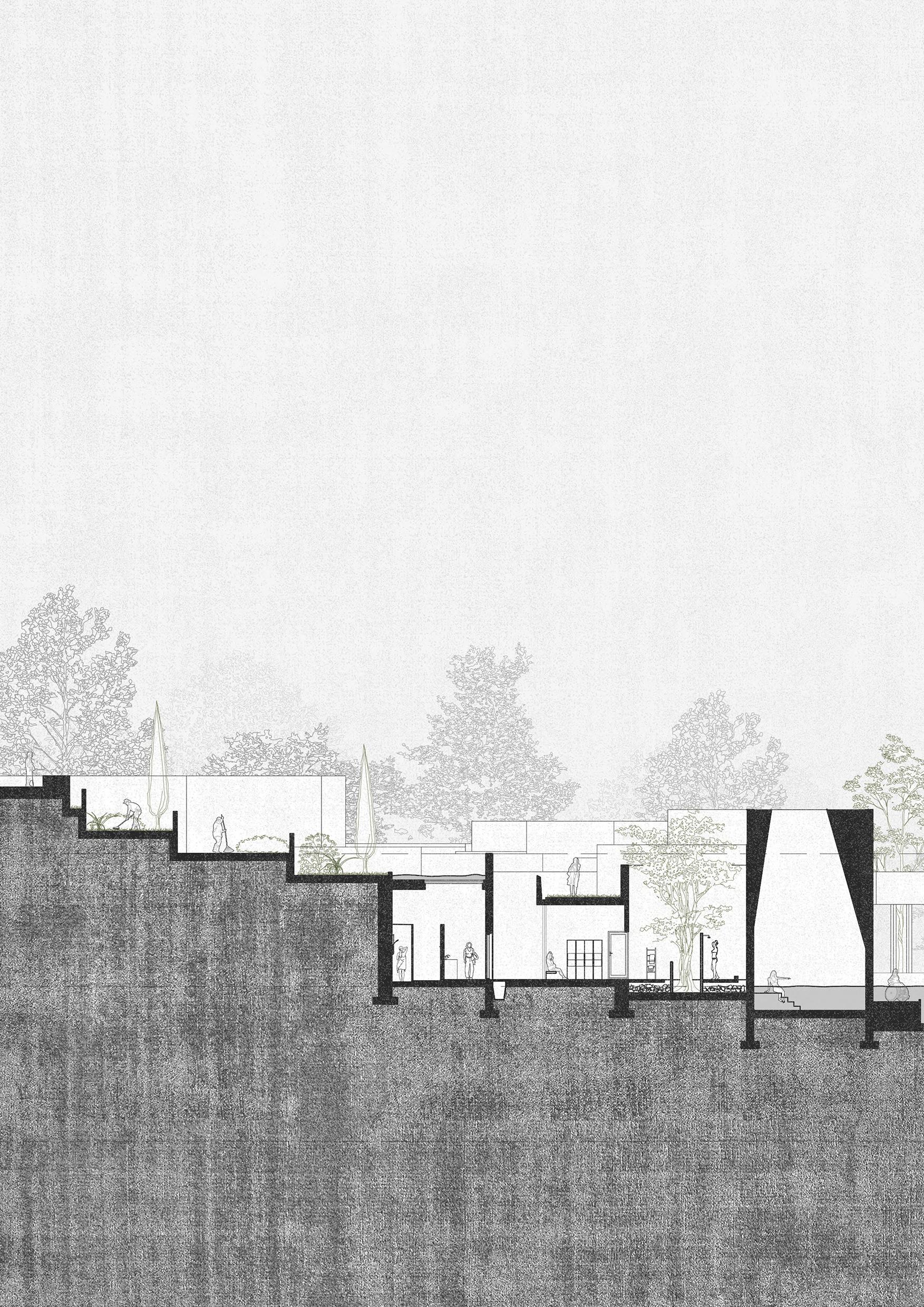
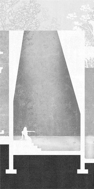
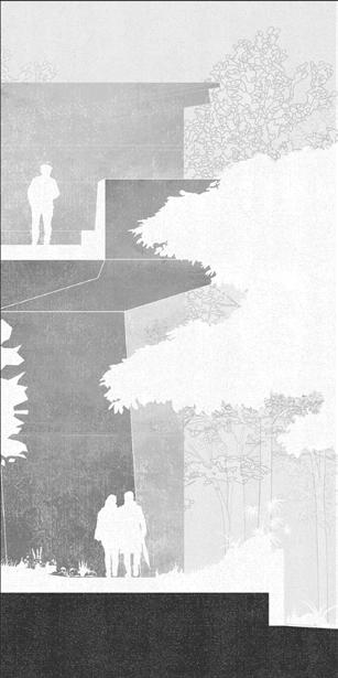
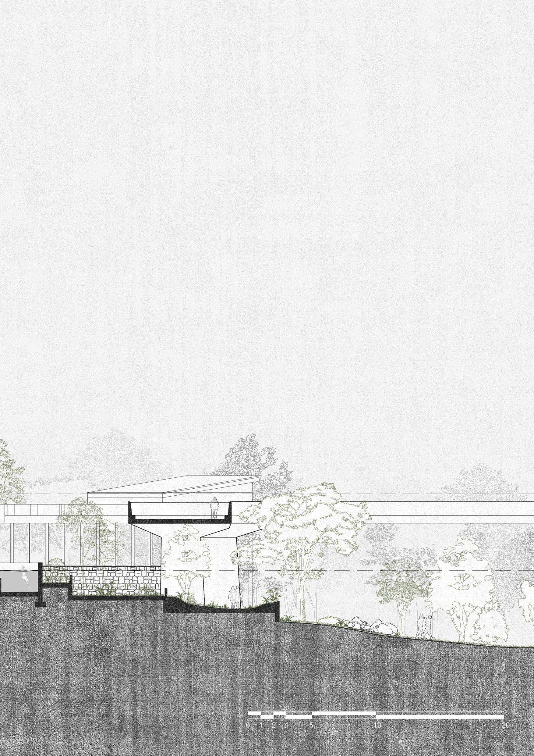
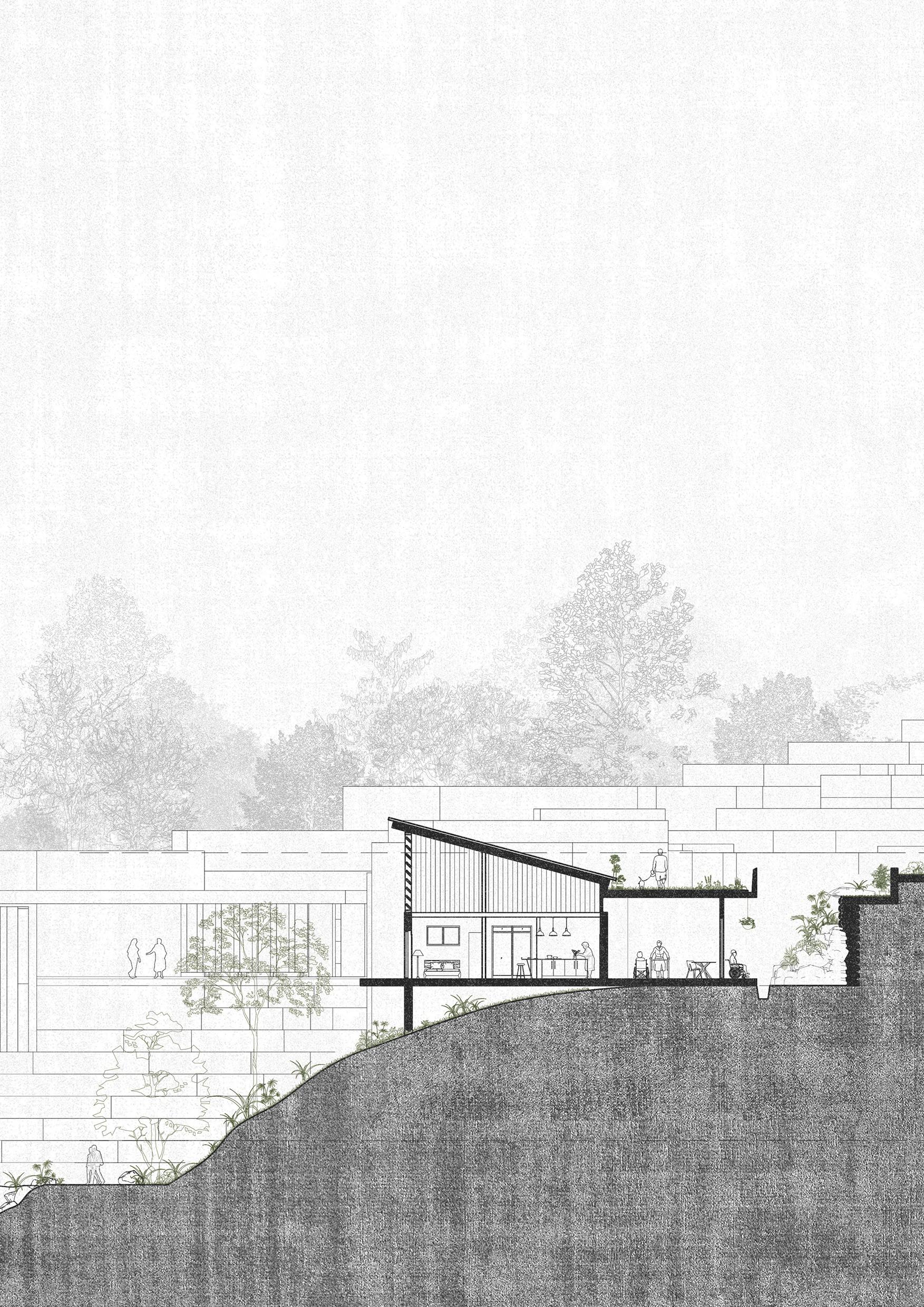
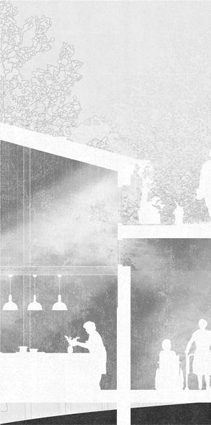
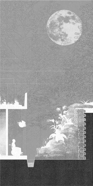
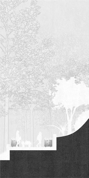
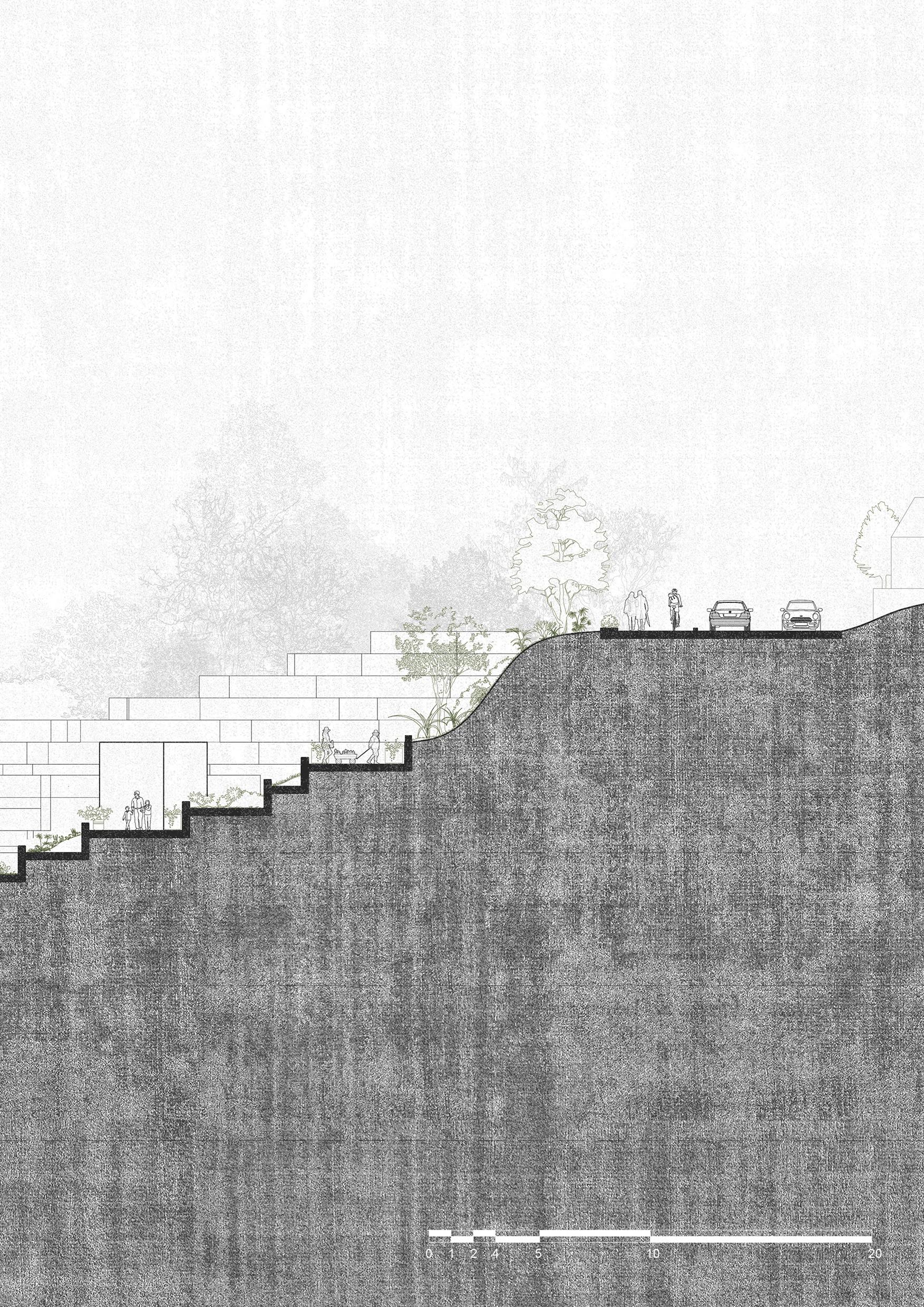
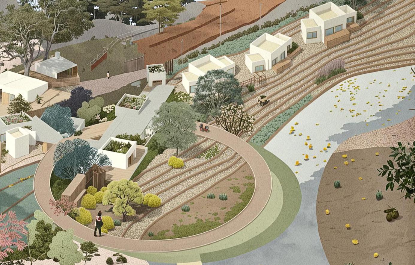
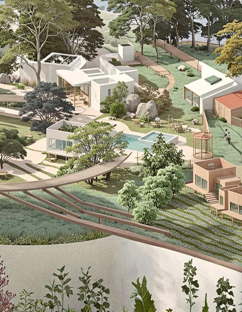
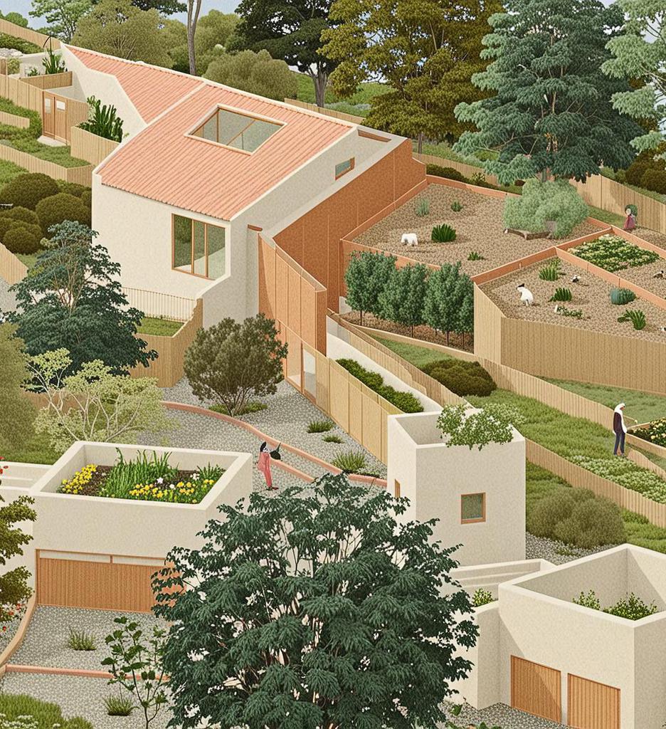
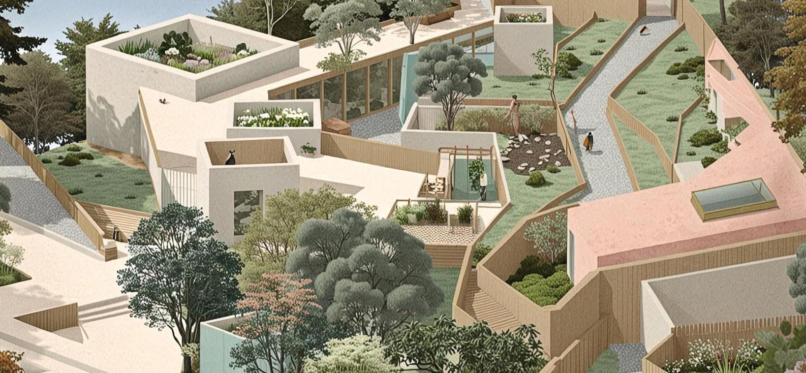
“Stone stands, unyielding, while sky drifts, never the same. We anchor the land with walls, fearing its collapse, yet was it ever ours to hold still? The cliffs crumble, the tides reshape the shore—not in ruin, but in rhythm. To build is to resist, to preserve is to impose. Yet, in our grasp to protect, do we not disturb? Perhaps it is not the earth that needs saving, but our certainty in how it should remain. The sky does not cling to its form, nor does the stone lament its erosion. Should we?.”
THE LANGUAGE OF STONE, THE SILENCE OF SKY
UBLM6X-60-M
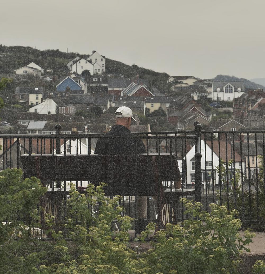
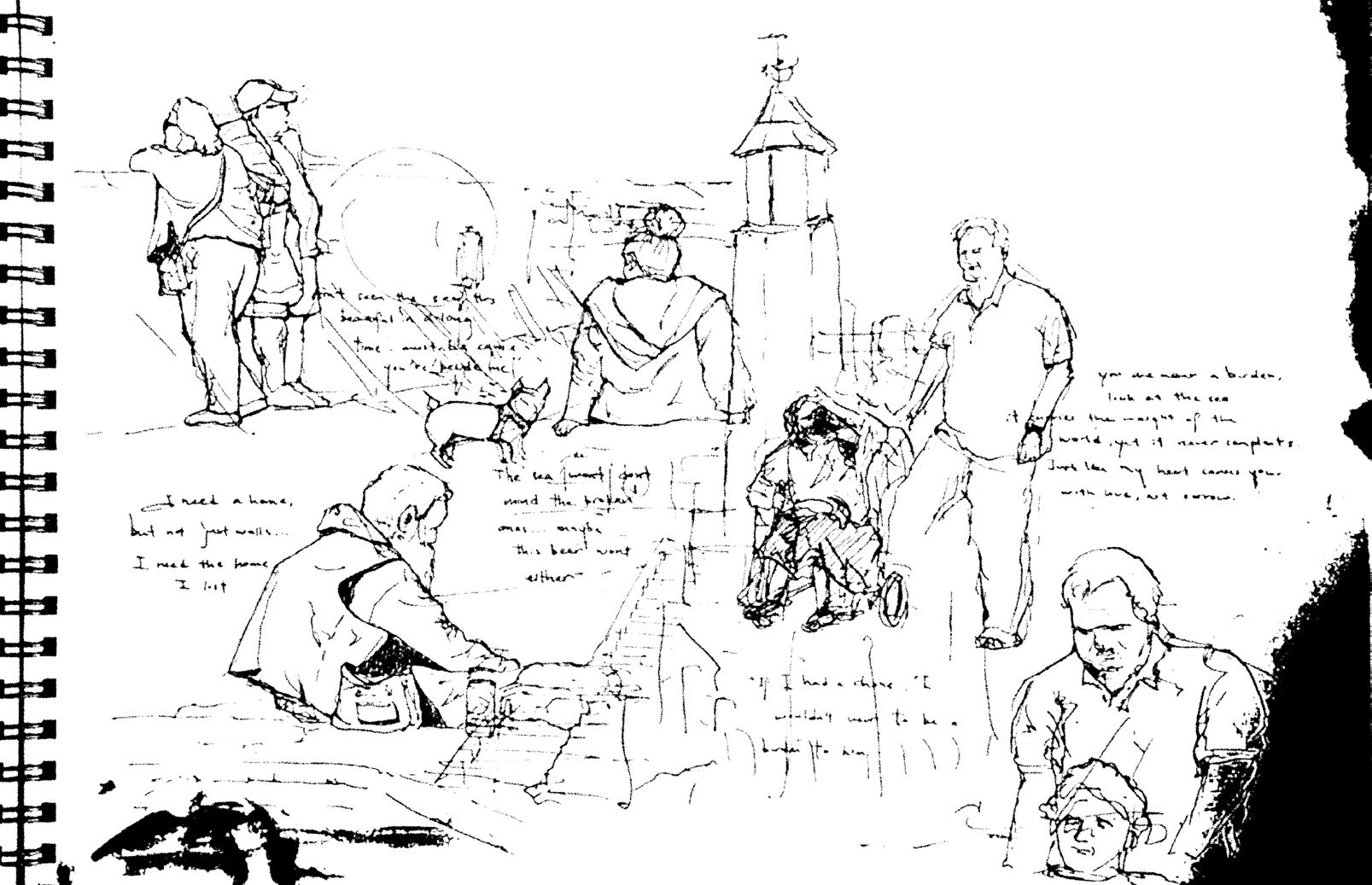
Framed against the pale line of the horizon, the elderly man stood still behind the fencing, where faded warning signs clung to rust • like paper-thin relics • once urgent, now simply holding on. For several long minutes, he faced the sea, unmoving. The wind played at his coat. Salt stirred in the air. He seemed less like someone standing and more like something remembered by the landscape • part of its weathered script.
I hesitated to interrupt. There was a hush between him and the world, as if they shared something too old for words. But the silence didn’t exclude me • it drew me in, gently, like tide drawing at a rock.
“It’s beautiful, isn’t it?” I offered, a quiet gesture.
He didn’t turn. His reply came like the end of a breath: “It was. But not now.”
Then, slowly, he moved uphill, not so much walking away as leaving something behind. The wind stayed. So did the rust, and the sea, and the question his voice left suspended in the air.
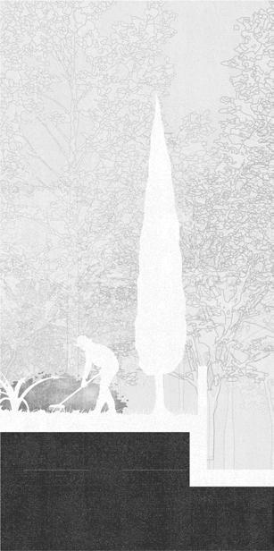
Descending the same hill, I passed a garden • small, quiet, opening toward the sea. An elderly woman tended it with the kind of rhythm that seems shaped more by memory than purpose. She watered her plants carefully, almost ceremonially. Nothing in her manner said waiting, yet everything in her stillness hinted at something just beyond arrival.
I didn’t speak. This moment didn’t ask for it. I let the path slope downward, toward the shore, following the curve of the land as one might trace a line already drawn.
At the bottom, I found a tide pool enclosed in concrete • clean lines cradling salt water, seaweed, and fish that shimmered like displaced thoughts. It resembled an aquarium, but not by design. More like containment arrived by accident. The structure stood quiet, indifferent, as if it had been placed there not to exhibit life but to quietly frame it.
I walked along its edge, and my shadow rippled across the surface. The fish darted away • then, slowly, returned. When I
crouched, the water stilled. My own face appeared, fragmented by soft movements beneath. In that quiet reflection, I wasn’t looking in, but across • a momentary dissolution of edges.
It came to me • not suddenly, but like something long-held rising through silence. Perhaps the man, the woman, the fish • they weren’t just parts of a scene, but echoes. Echoes of things once whole. Of things quietly resisting being unmade.
The tide pool stood like a sentence with no final word. Its four walls whispered intention, control. But the sea knew better. The tides rose and withdrew without asking. The fish moved not by design, but by instinct. The garden behind the house bloomed into the mist, as if trying not to notice how close the salt had come.
The people, too, were not waiting. They were keeping vigil. Bearing witness. Holding space for something they could no longer name.
Not all loss announces itself. Some arrives as stillness. As things continuing, just slightly less than before.
Later, when I learned the cliff had receded nearly forty meters over the years, the man’s words returned • not with sharpness, but with weight. What he saw wasn’t just beauty. It was the shape of what used to be. And memory, like coastline, rarely collapses all at once. It thins. It yields. It drifts, grain by grain, into the sea.
Perhaps I hadn’t interrupted a moment. Perhaps I’d entered its remains.
And still • there is a kind of hope in building here, in drawing new lines where others have faded. Not a hope that denies change, but one that meets it gently. To place stone against erosion is not to defy the sea, but to mark a kind of trust • that meaning can live even where permanence cannot.
Perhaps that is enough: to design with the knowledge that nothing will stay, but everything, for a time, might still be held.
wei5.teh@live.uwe.ac.uk
Charles Teh Wei Hong
CONTENTS INDEX
WHEN THE SHORE FORGOT ITS NAME
Introduction story, site, problems
THE LANGUAGE OF STONES
Intention values, emotion, position
Translating diagrams, drawings, early thinking
Precedent and Theoretical 25 Rules, references, framework
WHAT THE STONE BECAME
Masterplan overview, context, landscape
Strategies design moves, spatial logic
Project: L.I.F.E. programme, journey, users
Drawings plans, sections, details, technical
STONES LEFT UNFINISHED
Appendix sketches, models, rules
CHAPTER I
WHEN THE SHORE FORGOT ITS NAME
In the quiet gap between a stone born of tide and one shaped by hands, I saw a shell-less hermit crab and... wondered if belonging is just another word for surrender.
Life Between the Two Stones
INTRODUCTION
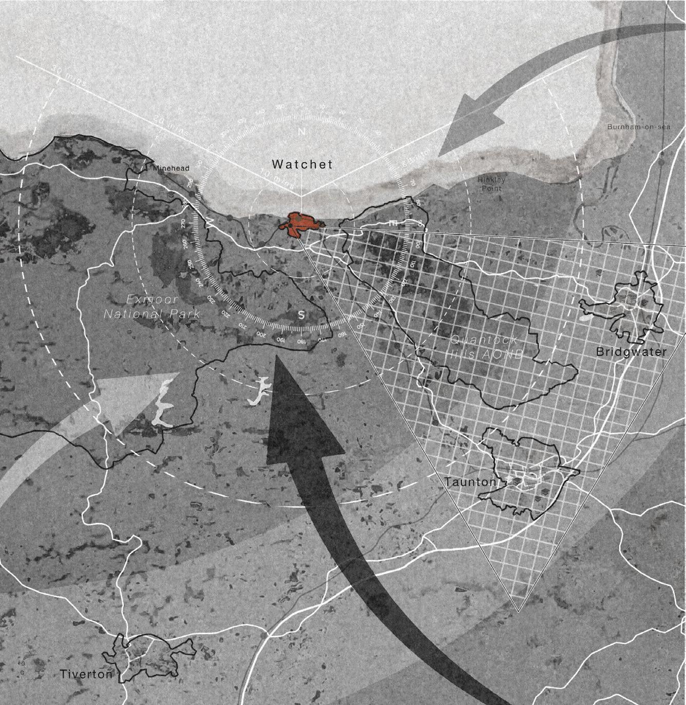
This thesis begins with a moment. On a quiet visit to Watchet, I saw an elderly woman standing at the edge of a cliff, calmly watering her plants. Just a few meters away, a sign read “unstable ground.” She was tending to life in the face of uncertainty, embracing the act of living in a place that many might consider unsafe. That image stayed with me. It sparked a question that has shaped this entire research: What does it mean to live fully and meaningfully between the forces we cannot control?
This thesis is titled Life Between the Two Stones. One stone is nature, represented by the cliff: vast, shifting, and unpredictable. The other is architecture, the artifact we construct to protect, define, and sometimes distance ourselves from nature. And between these two stones is life itself, the human inhabitant. This study seeks to understand how spatial design can mediate this relationship • not by controlling nature or overprotecting people, but by fostering coexistence.
My earlier design research focused on how people recover from trauma in confined or modest living conditions. That work made me more sensitive to the psychological dimensions of space: how layout, material, light, and openness can influence the mind. Now, building on that foundation, I turn to a specific demographic: the aging population in Watchet.
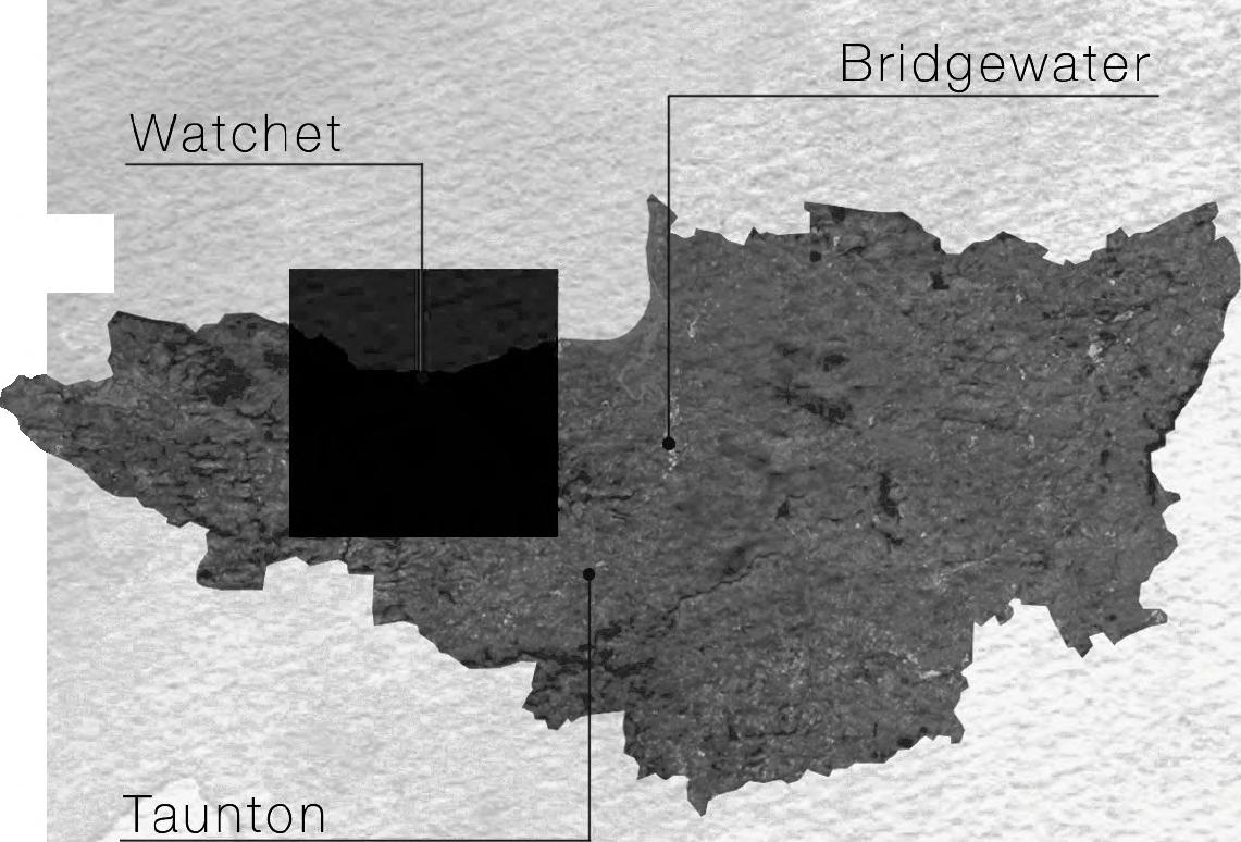
Watchet, Somerset
51°10’55.3”N 3°19’39.1”W
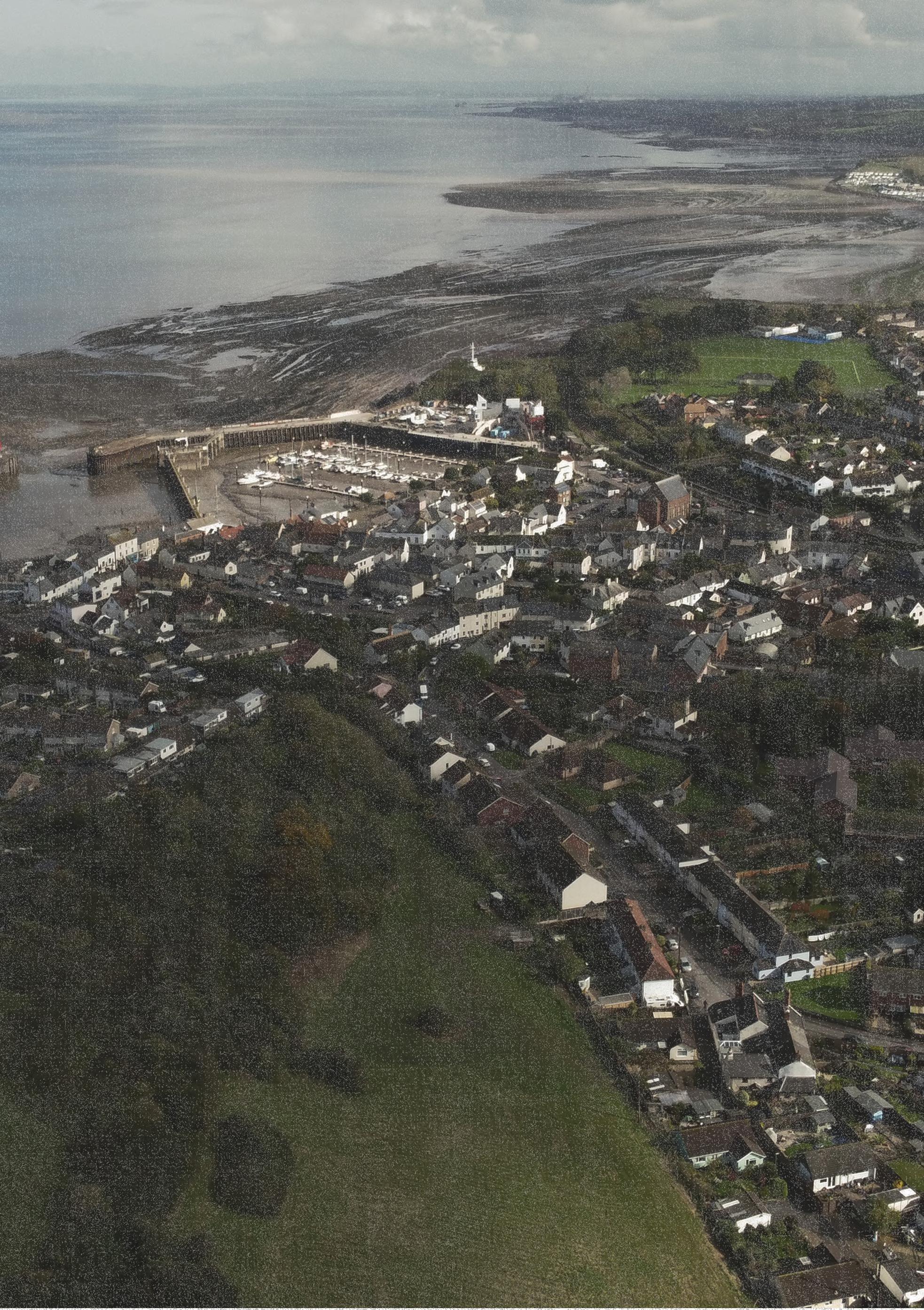
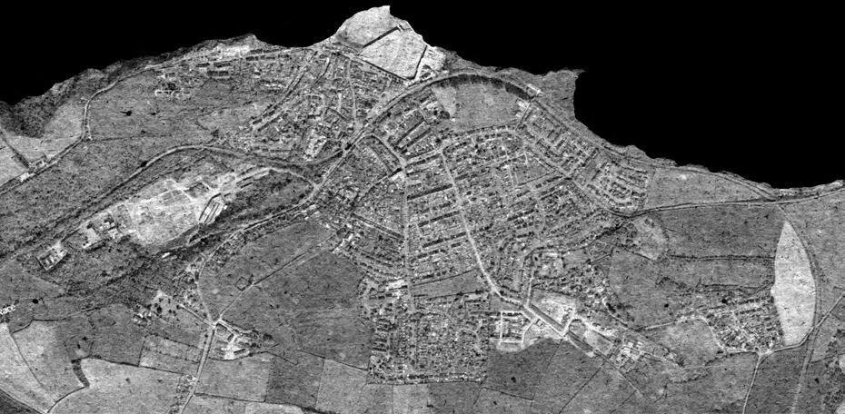
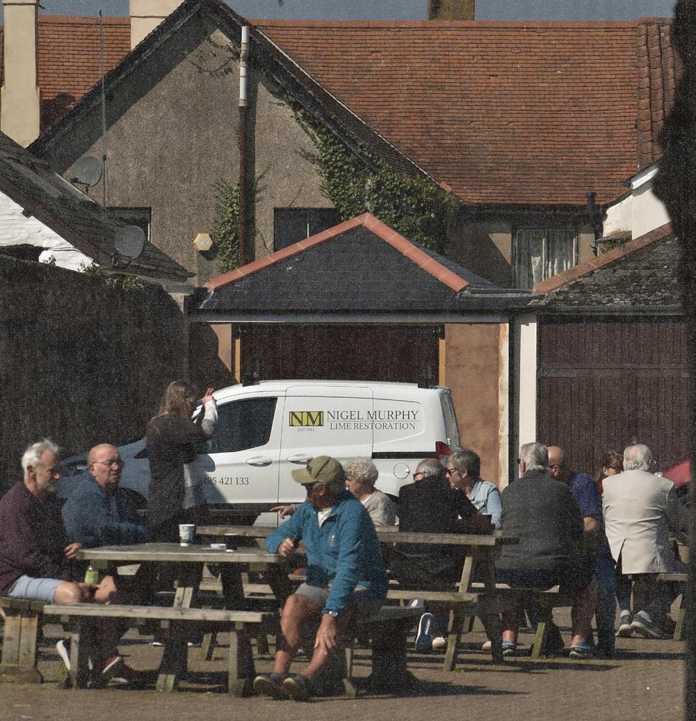
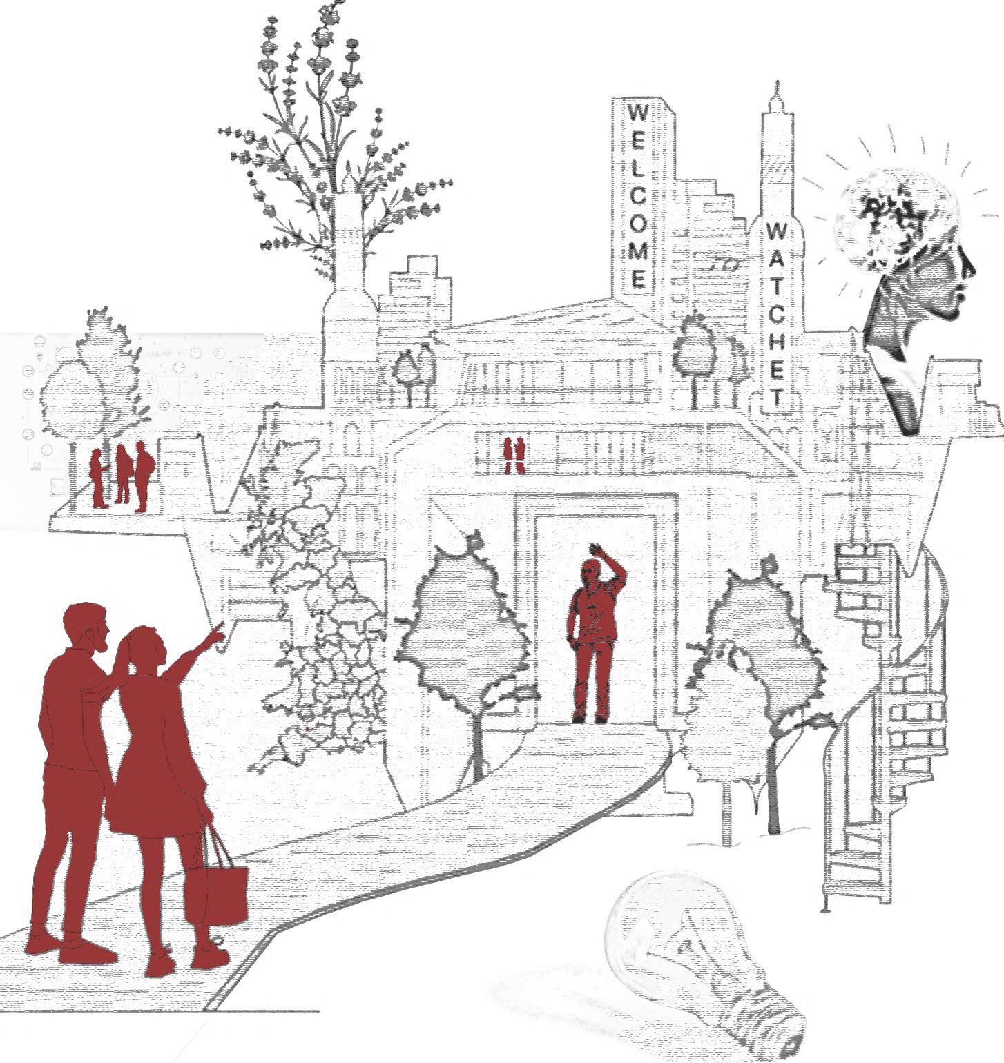
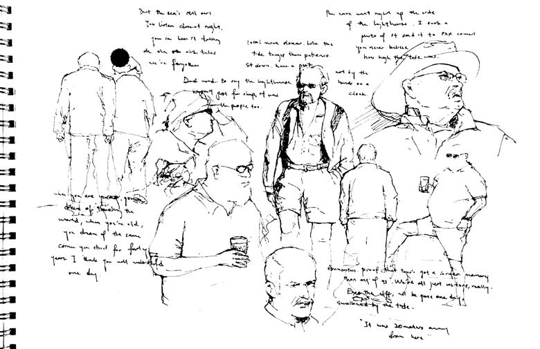
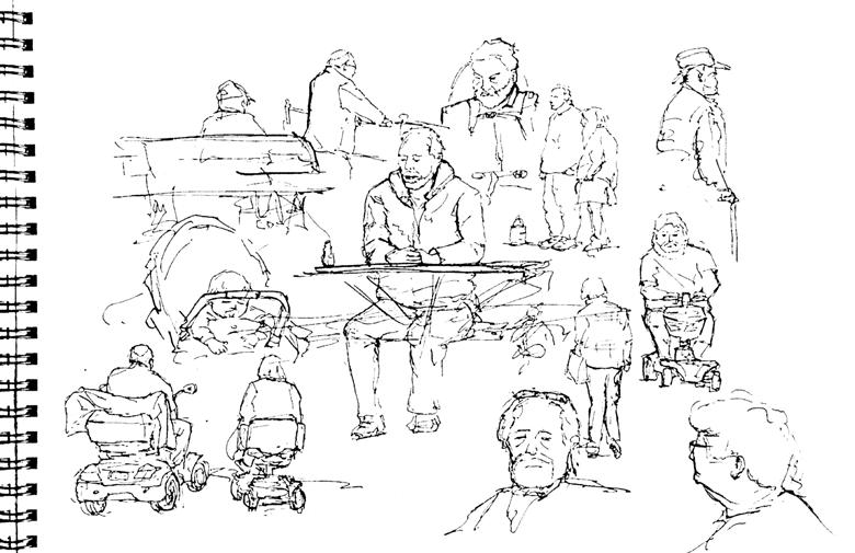
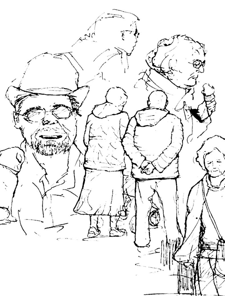
Watchet is a small coastal town in Somerset, quietly shaped by the slow work of time. Its harbour smells of salt and rust. The narrow lanes feel hollow, like they’ve been carrying stories for too long. Once stirred by the footsteps of youth, the town now moves to a slower rhythm, quieter, softer, marked by the spaces that absence leaves behind.
Georgie, from the Onion Collective, spoke of this shift. Many young people have gone elsewhere, chasing something wider. What’s left is a place that leans into memory, into stillness.
I had been here once before, a day trip, brief and passing. But something lingered. So I came back. I booked two nights at East Quay, hoping the town would speak more slowly this time. I walked the shoreline at different hours. Sketched textures. Watched how the light moved across stone. I listened, not just to voices, but to the gaps between them. I thought I was searching for the genius loci, the spirit of the place. But what I found was something quieter. Heavier.
This wasn’t the charm of a seaside town. It was a soft unraveling. Beneath the painted signs and gentle views, there was something more bare. Conversations didn’t just hold stories, they carried silences—long afternoons, partners gone, friendships thinned with time.
PAPERMILL EAST QUAY
One man, walking a dog, told me it had belonged to his best friend, now gone. A quiet inheritance. A companion passed on. That small detail stayed with me. A life doesn’t end all at once. It fades, gently, thread by thread.
The air in Watchet felt thick. Not nostalgic. Just full. Full of memory. Like the tide, always there, always pulling away.
Lines from The Rime of the Ancient Mariner, written not far from here, came to me again:
“Alone, alone, all, all alone, Alone on a wide, wide sea.”
I’m not yet at that stage of life, but the feeling touched something. As a student living abroad, I’ve left my parents behind. And sometimes I wonder what silence fills their days. Whether the same quiet has settled there too. Loneliness doesn’t always come with weight. Sometimes it comes lightly, in the missing voice at the table, in the unchanged routines, in the dog, still needing its walk, now led by someone else.
Watchet didn’t offer answers. But it offered something close to truth. A kind of recognition. Like a mirror, held up to something I hadn’t yet named. The quiet drift between people. The slow folding of life into waiting, not empty, but padded. Soft. A waiting filled with memory.
Where the Shore Stops Speaking Here, the world flattens. Even the sea forgets to answer.
Edge Habits
Where things grow simply because they were not told to stop.
Built Longing
We stack our hopes on hillsides, then wait for them to return home.
Stone Remembers Stone remembers better than people.
A Moment Longer
Nothing is waiting. But he stays a moment longer.
Shared Sun, Separate Shadows
The jokes ripple across the table Still, not every chair feels filled.
CHAPTER II
THE LANGUAGE OF THE STONE
Intention
ELEVATE NOT ELIMINATE
I was given a brief to propose a masterplan design as a group for the former paper mill site in Watchet, a town quietly shaped by the slow erosion of coast and time. From this shared foundation, I began to shape my own thesis project. Rooted in the site’s shifting demographic, I turned toward a quieter, more human concern: how might architecture respond to the growing presence of age without retreating into separation or containment?
My individual project proposes a supportive living environment for the aging community in Watchet, where architecture does not divide or isolate, but reconnects. The aim is to create a place that sees aging not as decline, but as a vital and meaningful chapter of life. Much like the changing coastline, aging is not something to resist, but something to live alongside with grace.
Drawing from blue zones such as Ogimi Village in Okinawa, the project explores how spatial design can support longevity, emotional resilience, and social connection. These ideas shape a proposal rooted in daily rituals, informal encounters, and a strong relationship with nature, offering space for both physical and mental well-being.
The architectural response is a hybrid typology that blends care facility, community hub, and therapeutic landscape. Guided by principles of neuroarchitecture, the design intended to support cognitive health, reduce stress, and foster a quiet sense of continuity. It envisions an environment where aging is not hidden away, but lived. A place where architecture becomes a companion, gently supporting rhythms, relationships, and the subtle transitions of everyday life.
The Language of Stones
Translating the emotional and psychological dimensions of aging into architectural form requires more than intuition. It asks for deep listening • to the site, to the stories of others, to how it feels to arrive somewhere with grief in your chest or uncertainty in your step. Architecture, in this context, is not self-expression. It is a quiet companion, a framework for empathy, memory, and care.
At the beginning of this process, I found myself overwhelmed. I had gathered ideas: environmental strategies, human-centred precedents, spatial rituals • but nothing held them together. They were fragments. Some were practical, some poetic, some pulled from research, others from experience. But how to thread them?
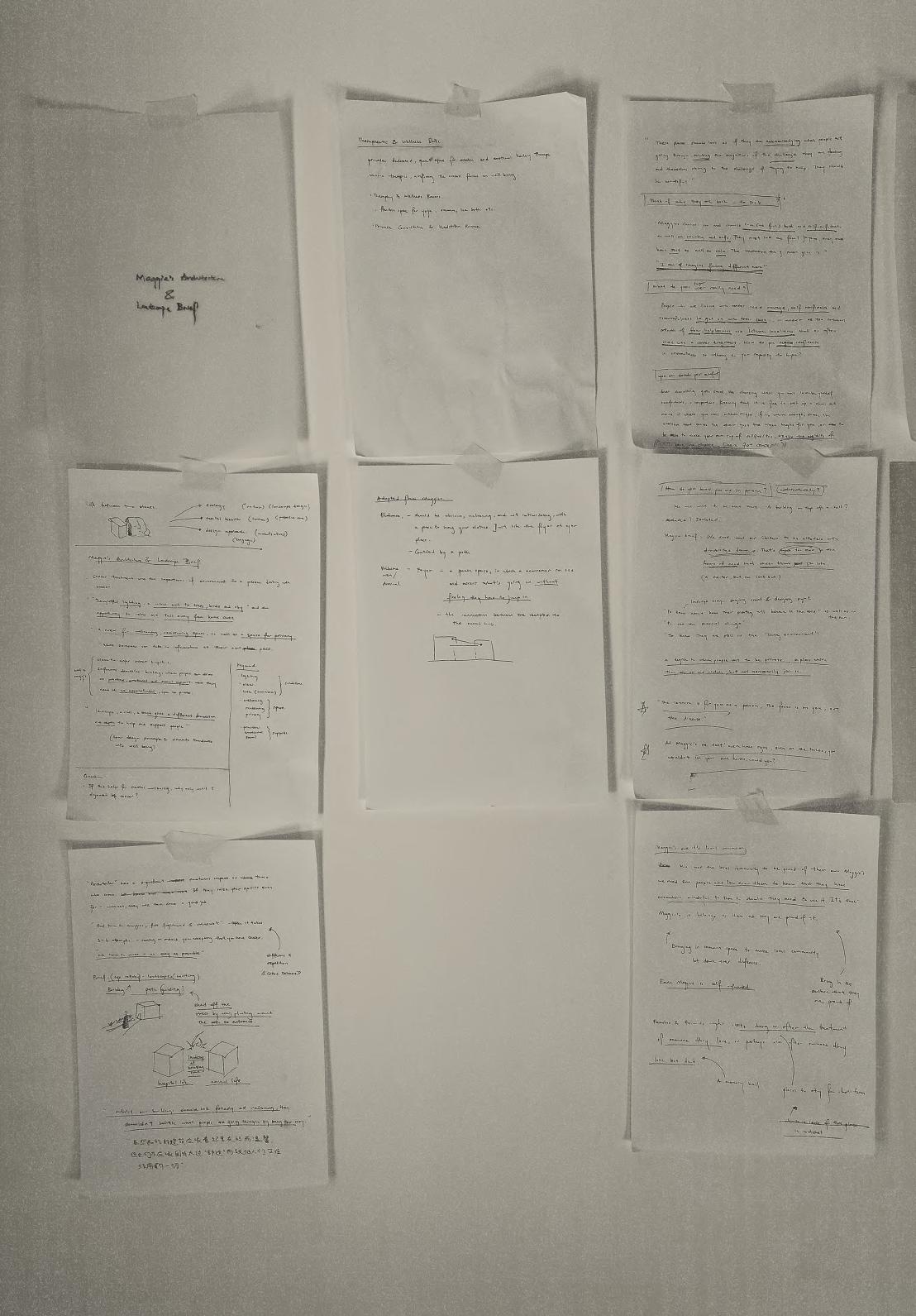
The shift came when I read Maggie’s Brief. Her words were not architectural theory. They were lived. She spoke not of “users,” but of people. Not of “form,” but of how it feels to walk into a room when you’re scared, or tired, or simply need a moment to cry. That changed everything.
From there, the process became clearer. I began working in three movements:
Research | I studied precedents that placed people first, where care was embedded in the layout, the materiality, the lighting. These buildings didn’t impress • they supported.
Interpretation | From those studies, I distilled recurring design principles into what became the 25 Rules. Not formal solutions, but spatial patterns that guide how a place might feel, not just how it looks.
Application | These rules shaped the project’s design strategies, informing decisions about plan, light, landscape, transitions, and thresholds • always through the lens of lived experience.
This process was not linear. It was layered, iterative, and reflective. Less about control, more about attention.
Precedents Studies
To begin designing, I first had to stop designing.
I paused to look outward, to buildings that had already learned how to care. I wasn’t seeking form or style. I was looking for spaces that responded to vulnerability, uncertainty, and quiet grief, buildings that knew how to listen.
Projects like the John Morden Centre, Alzhemier’s Respite Center, Maggie’s Centres, and Peter Zumthor’s senior housing became central references. Each offered something different, but what connected them was a sensitivity to the emotional experience of space. They understood that architecture begins before someone enters a building, and continues in how they feel when they pause, turn, sit, or hesitate.
In each case, I focused on five key themes:
• Human-centred programming that responds to emotional, social, and cultural needs.
• Circulation and spatial arrangement that allow for movement, choice, and gentle transitions.
• Landscape as sensory grounding, offering seasonal change, views, and a sense of time.
• Environmental strategies that use light, air, and texture to comfort and orient.
• Material and form that feel familiar, intimate, and non-institutional.
These projects were not about form or aesthetics, and neither was my response. What stayed with me were the quiet decisions, on how a corridor curved gently instead of ending, how a bench appeared where hesitation might happen, how light was allowed to linger. They showed me that architecture can comfort without announcing itself.
Further analysis of each precedent ( including plans, spatial diagrams, and annotated strategies ) is included in the appendix on page 117. STEP 1 :LEARNING FROM PLACES THAT CARE
J. A. M. P.
The full list of 25 Rules, with detailed descriptions and examples, begins on page 139.
i.
The 25 Rules
DESIGNING THE JOURNEY THROUGH SPATIAL LANGUAGE
As my research deepened, so did its weight. I collected insights from literature, precedents, and personal reflection, but they remained scattered. Each spoke in its own dialect, shaped by different users, climates, and intentions. When I tried to bring them together into one building, everything felt disjointed. I wasn’t designing; I was trying to hold too many voices at once.
That’s when I returned to Maggie’s Brief.
Unlike most architectural documents, her brief spoke from the view of someone living through illness. It wasn’t about form, but about feeling. It described what it means to arrive in a space with grief in your chest or fear in your step, and how architecture might respond not with grand gestures but with gentleness, warmth, and choice. It re-centered my thinking. It taught me to see through the eyes of the vulnerable.
From there, I stopped searching for perfect forms and started listening for patterns of care.
I began to distill the core values embedded within each precedent. What lingered were not diagrams or layouts, but moments. A softened corner. A bench placed where hesitation might happen. A window framing a tree in bloom. I collected these fragments not as features, but as emotional responses.
In doing so, I created my own brief. Not programmatic, but emotional. I called it The 25 Rules.
Much like Christopher Alexander’s A Pattern Language, each rule is a fragment. On its own, it might feel modest—a material choice, a pause point, a filtered light. But together, these parts form a coherent whole. A spatial language where care is not applied, but embedded.
The 25 Rules: Structured by Design Intent
I. Agency & Autonomy
Empowering users with control, dignity, and choice within space.
Rule 1: People need to feel in charge again
Rule 2: Let people pause before committing to interaction
Rule 11: You can decide your comfort, private and social space
Rule 16: Put the disease aside
Rule 21: Intuitive pathways
II. Atmosphere & Identity
Creating spaces that feel personal, humane, and emotionally resonant.
Rule 5: Beautiful, small, humane buildings
Rule 6: Domestic, not institutional
Rule 12: Let the bricks talk
Rule 17: Customised space for local
Rule 19: Local and local (Vernacular familiarity)
Rule 20: Memories
III. Sensory Design
Engaging the full range of senses to support orientation, comfort, and memory.
Rule 3: Let nature speak softly
Rule 7: Natural light is non-negotiable
Rule 8: Designing scent and designing sight
Rule 9: Quiet joy
Rule 10: Framing
Rule 22: Minimise sensory overload
Rule 23: Natural materials
IV. Privacy & Participation
Balancing solitude and connection through spatial layering.
Rule 4: Each room is an invitation, not an obligation
Rule 13: Not a prison
Rule 15: Layered privacy
Rule 18: Visual connection
V. Orientation & Wayfinding
Helping users understand and move through space with ease.
Rule 14: A sense of purpose
Rule 24: Spatial cues
Rule 25: Subtle guidance and wayfinding
VI. Cognitive Ease & Clarity
Reducing stress through clear design and simplicity of experience.
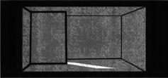
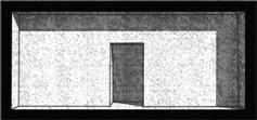
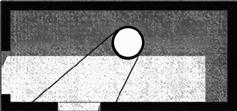
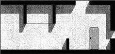
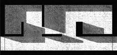
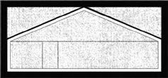
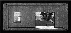
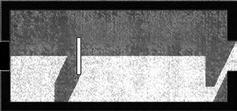
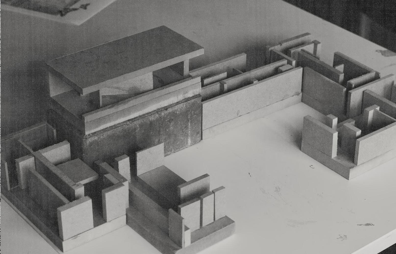
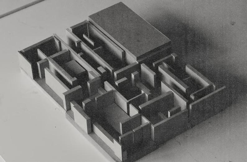
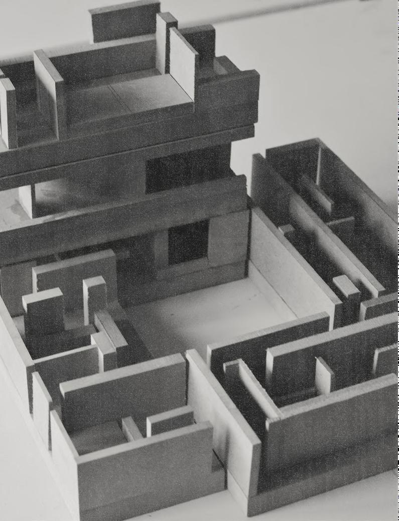
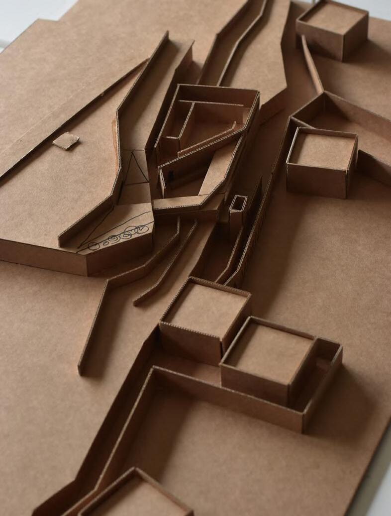
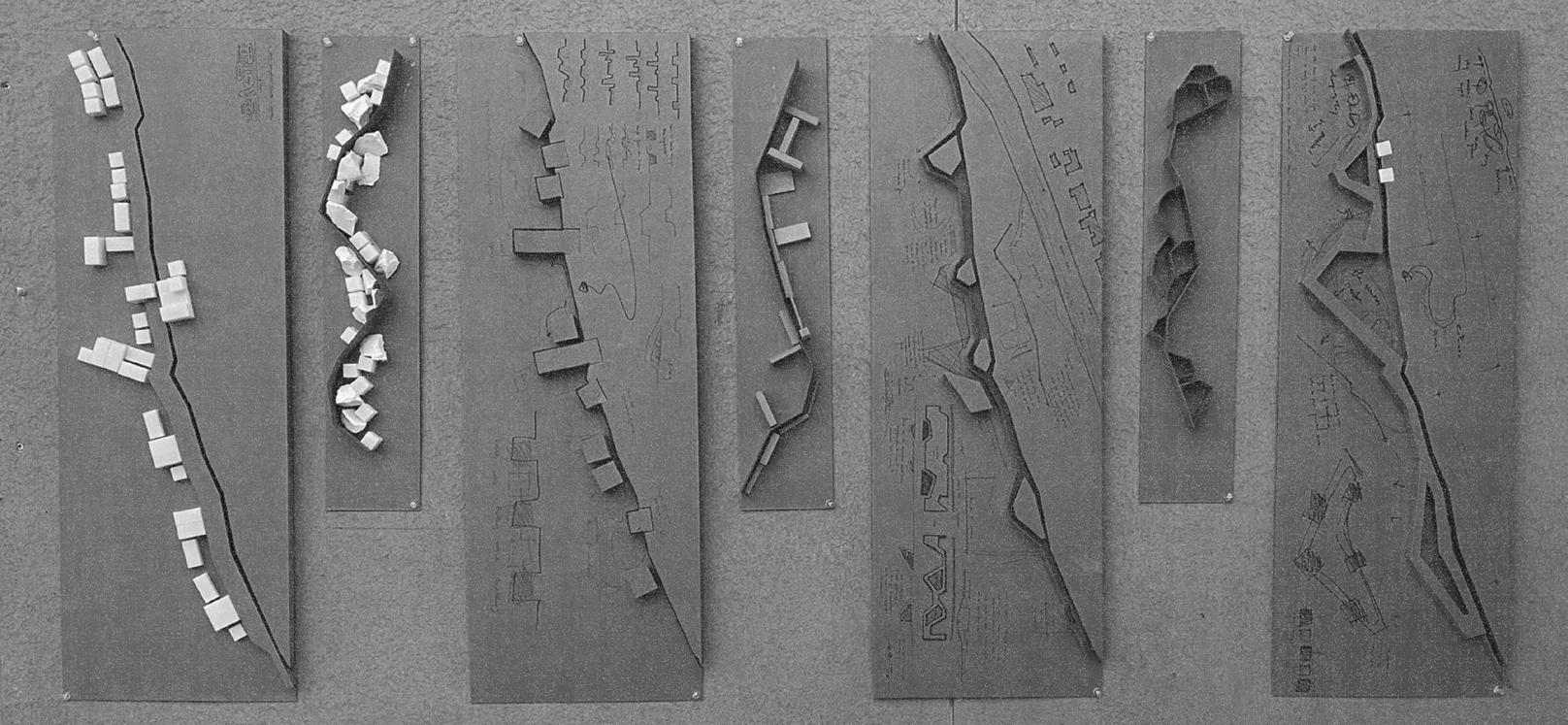
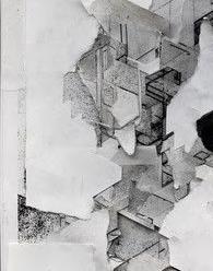
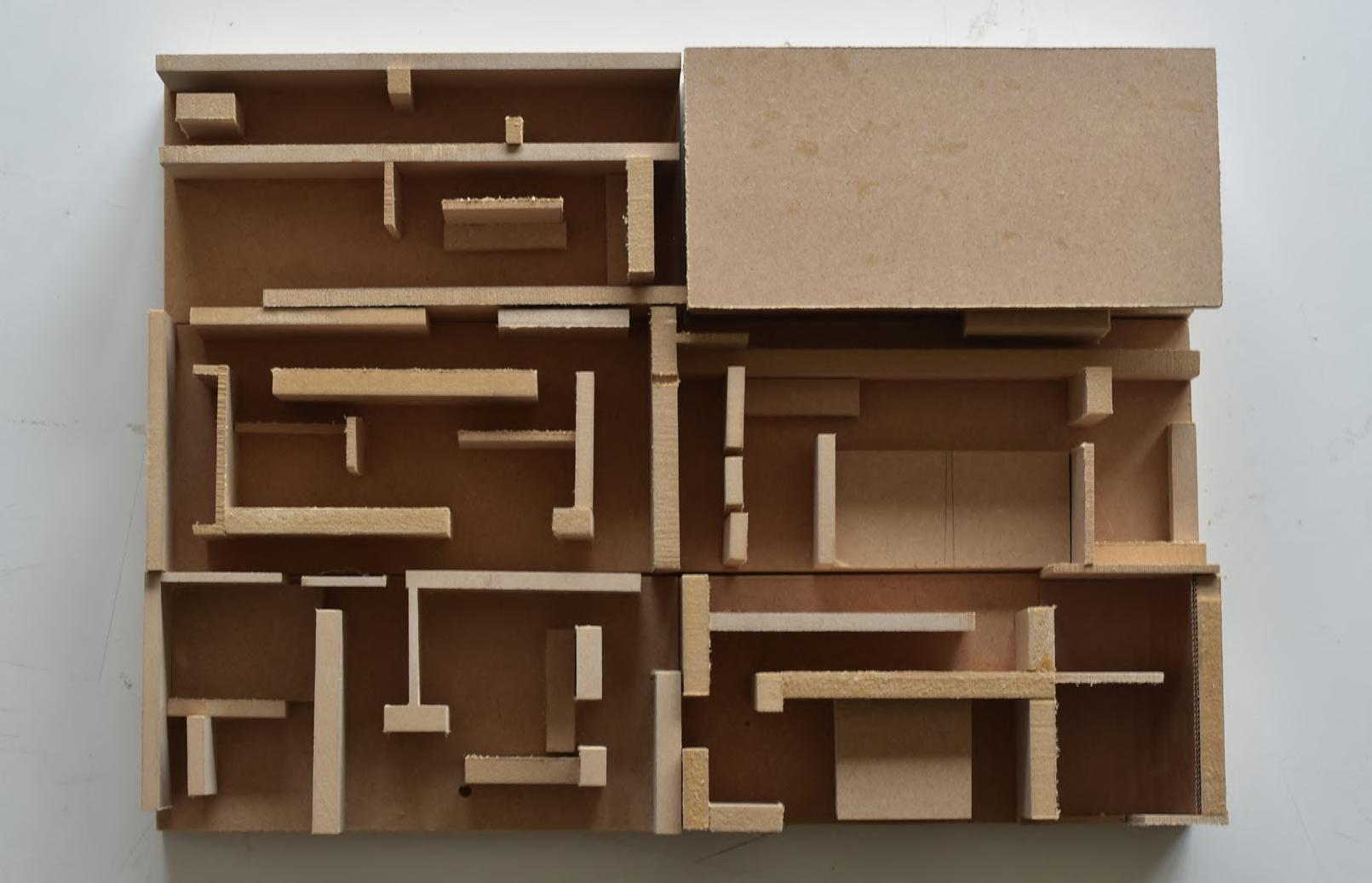
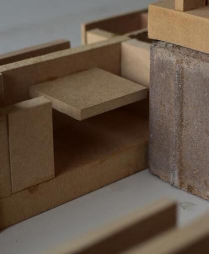
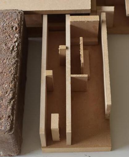
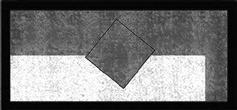
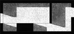
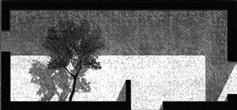
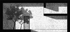
Concept models were crafted to explore how light and shadow shape the atmosphere and perception of space.
CHAPTER III
WHAT THE STONE BECAME
Masterplan Context
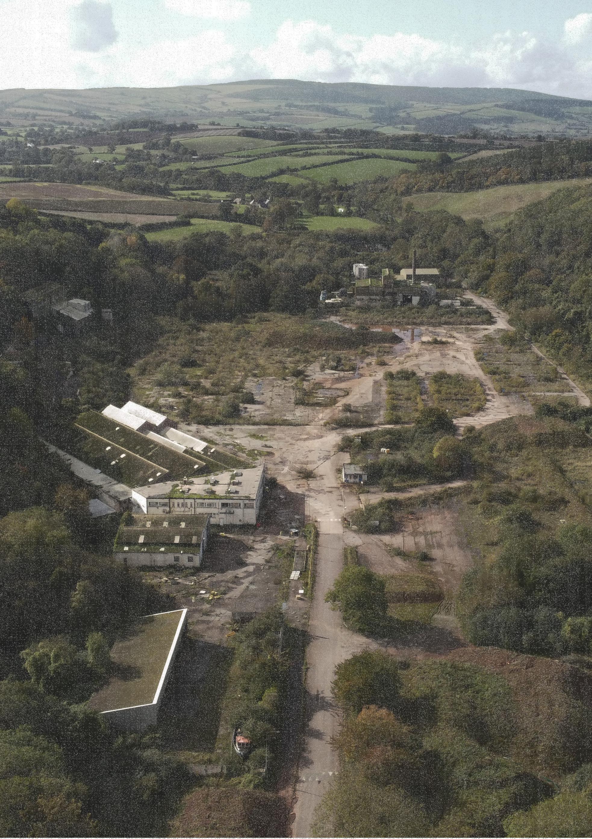
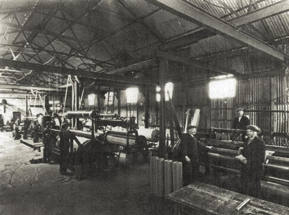
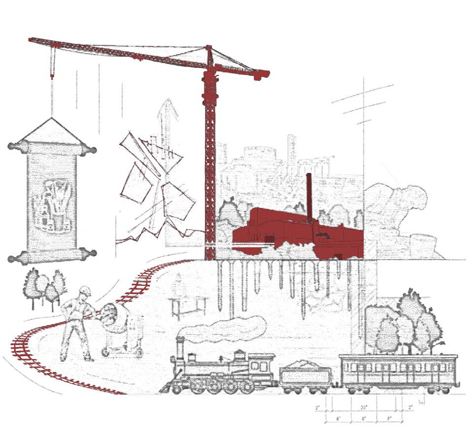
The Papermill site in Watchet was once an industrial anchor. When the mill closed, it left behind more than just disused buildings • it left behind a fractured identity. Our group masterplan began with a question: How do we repair what has been lost, not by rebuilding it, but by helping something new take root?
Our answer came through three intertwined ideas: Re-wild, Brain Gain, and Made in Watchet.
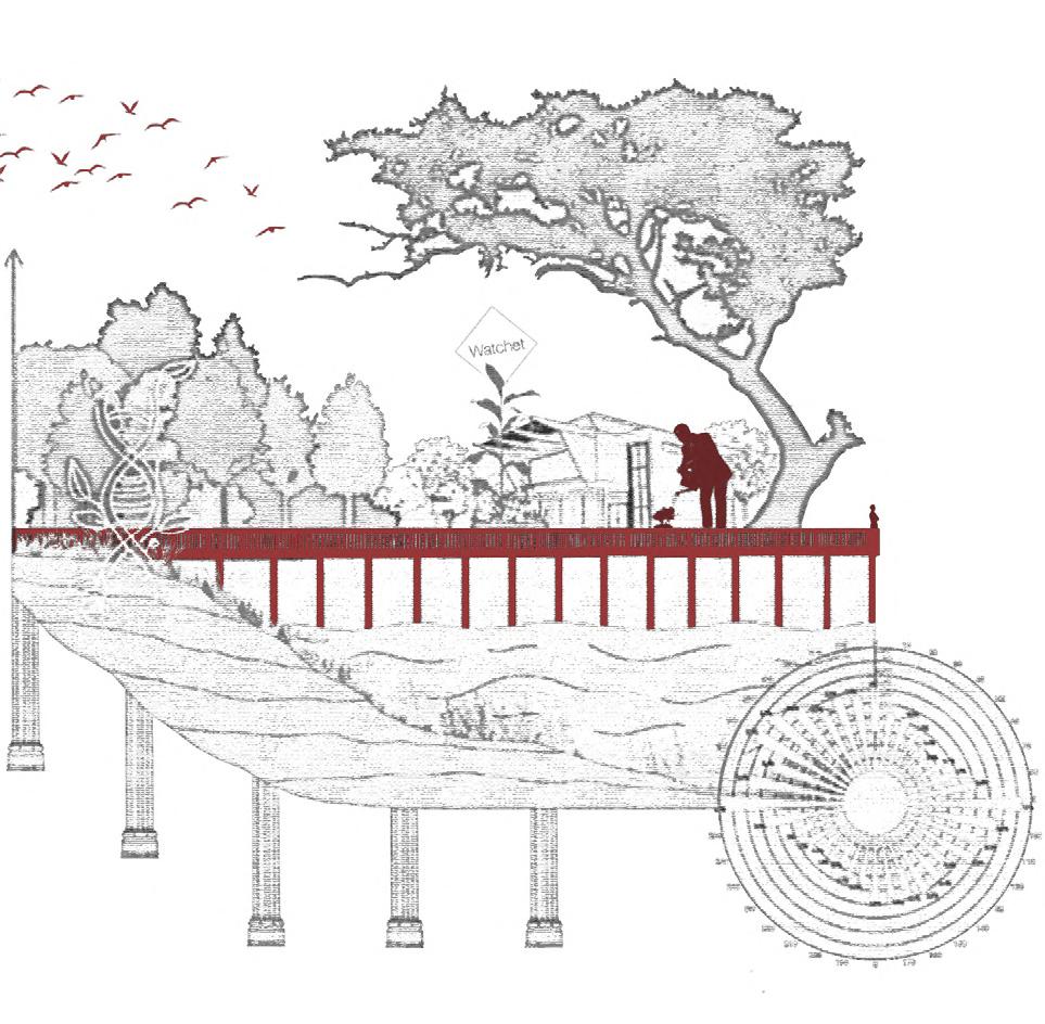
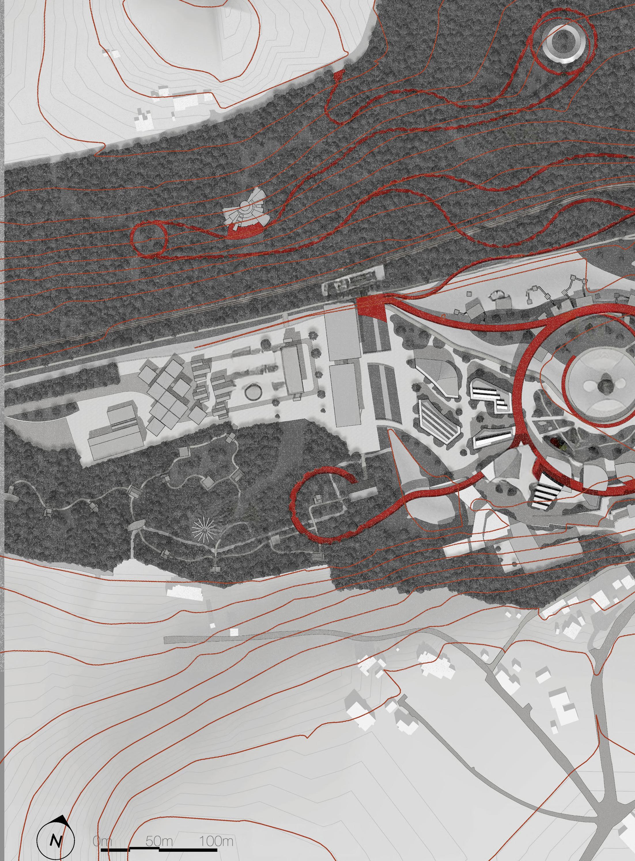
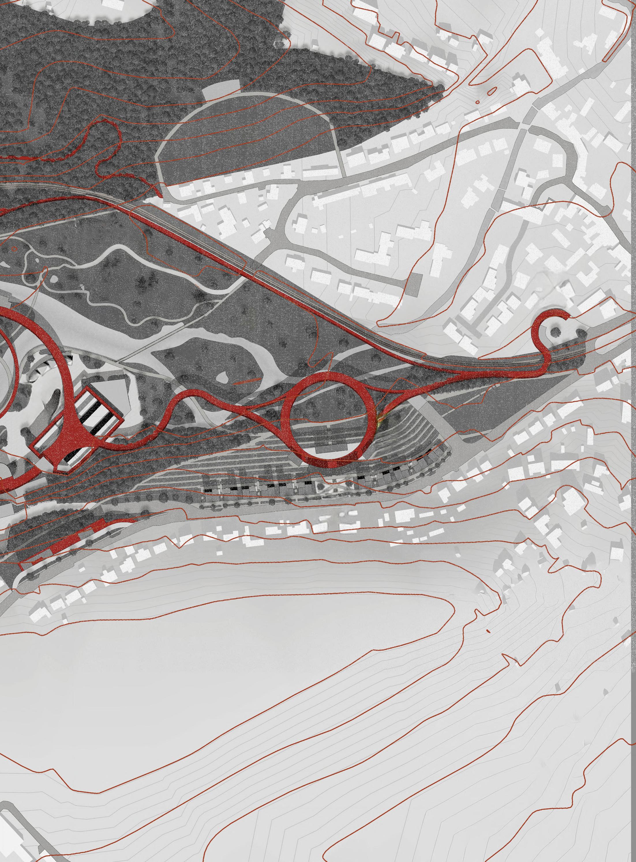
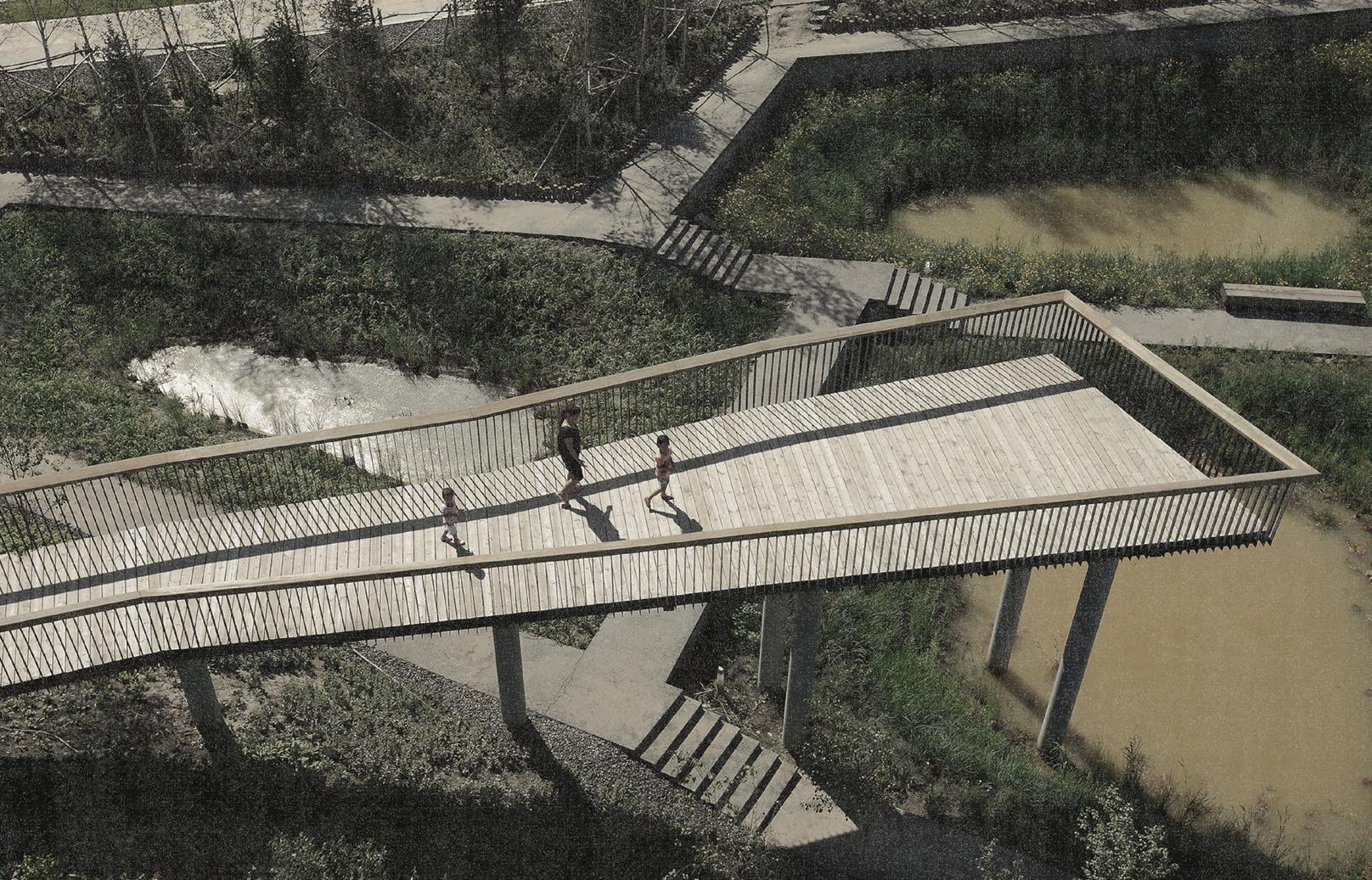
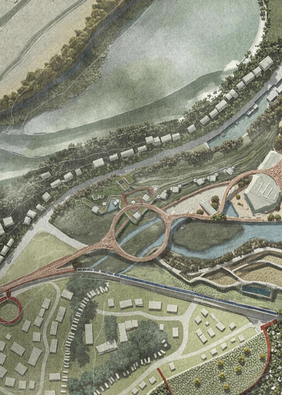
Re-wild was about ecology • not as background, but as central infrastructure. We reimagined the flood-prone site as a living wetland park, capable of holding water, restoring biodiversity, and inviting slow, elevated pedestrian movement through an elevated highline. This path became the structural spine of the plan • a walking loop that connects diverse programmes while letting nature thrive below.
Brain Gain responded to the demographic shift. As younger residents left for opportunity elsewhere, we proposed a researchdriven future focused on health, sustainability, and long-term wellbeing • turning Watchet into a testing ground for regenerative ageing and blue zone living.
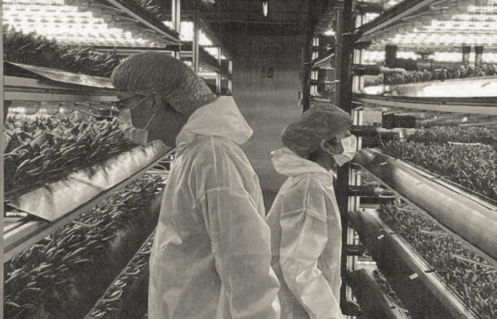
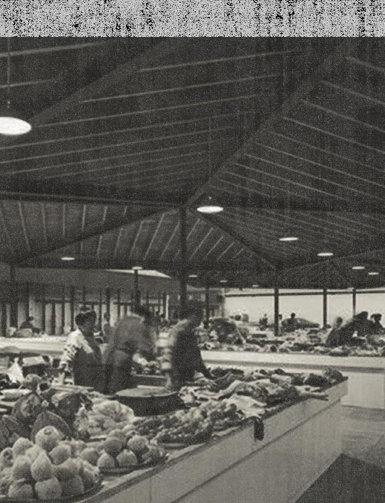
Made in Watchet celebrated production and making. We identified remaining industrial structures • a powerhouse, parts of the old mill • and proposed their adaptive reuse as an agricultural innovation hub. Inspired by Artisan Green in Singapore, this area would support hydroponics and indoor growing systems, creating food and research outputs that feed back into the local community.
Together, these three concepts formed an integrated framework • an ecological, social, and productive network. Every zone connects back to the others. The elderly aren’t isolated from research or food. Research isn’t abstracted from practice. Agriculture isn’t detached from the people who will eat it.
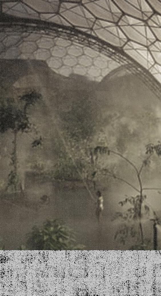
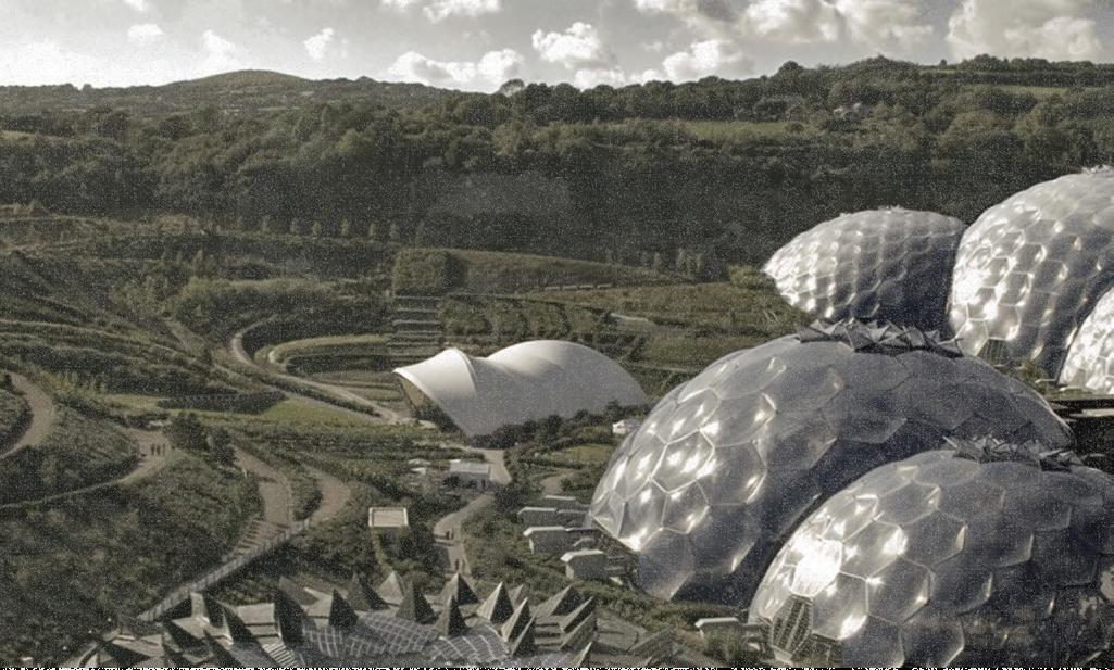
8. Neuro-Ecological Research Centre. Advancing research at the intersection of neuroscience, ecology, and human well-being. Inspired by the Eden Project.
13. Innovation+ Production Hub Indoor hydroponics farming integrated with research to advance sustainable agriculture, plant science, and food innovation. Inspired by the Artisan Green
As the masterplan evolved, the site was redefined not as a space to be replaced, but as one to be regenerated. Flooding was accepted as part of the site’s identity and leveraged as a strategy for ecological restoration. Elevated walkways were introduced as essential infrastructure, providing access while allowing the landscape to recover below. Existing structures were reconsidered as adaptable frameworks, capable of supporting new programmes rooted in local production and care. The former papermill became a site for continuity, a place to walk, grow, research, and reimagine the conditions for later life.
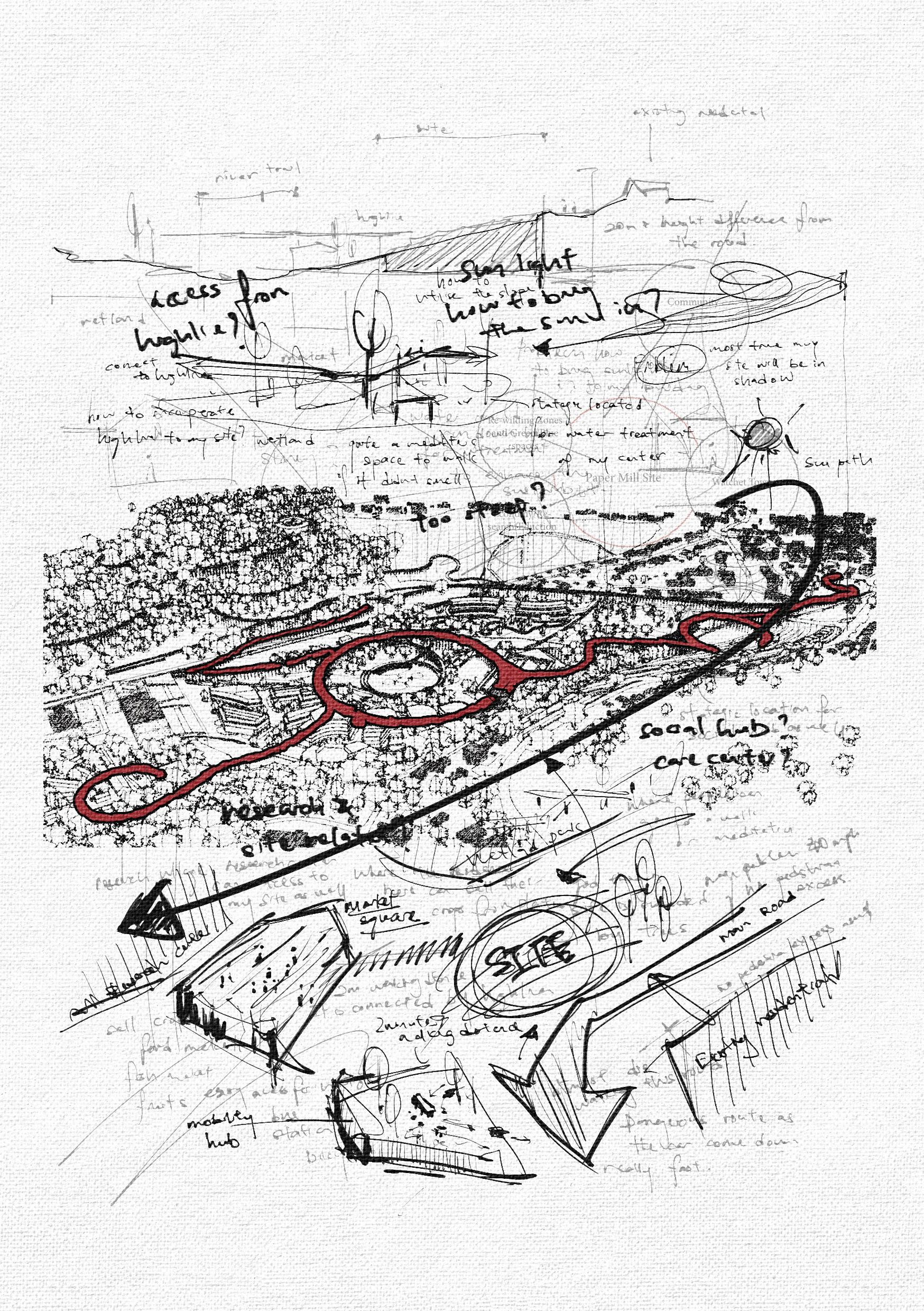
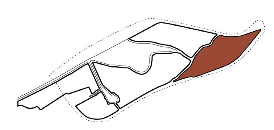
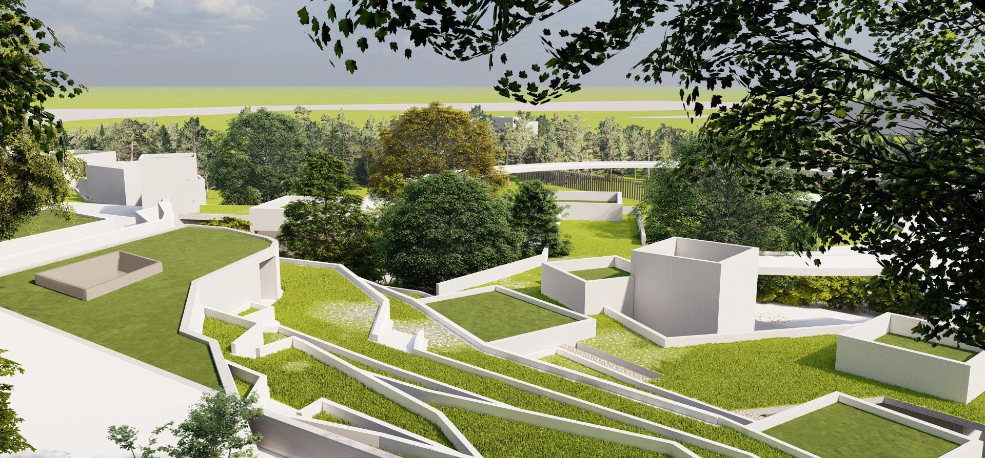
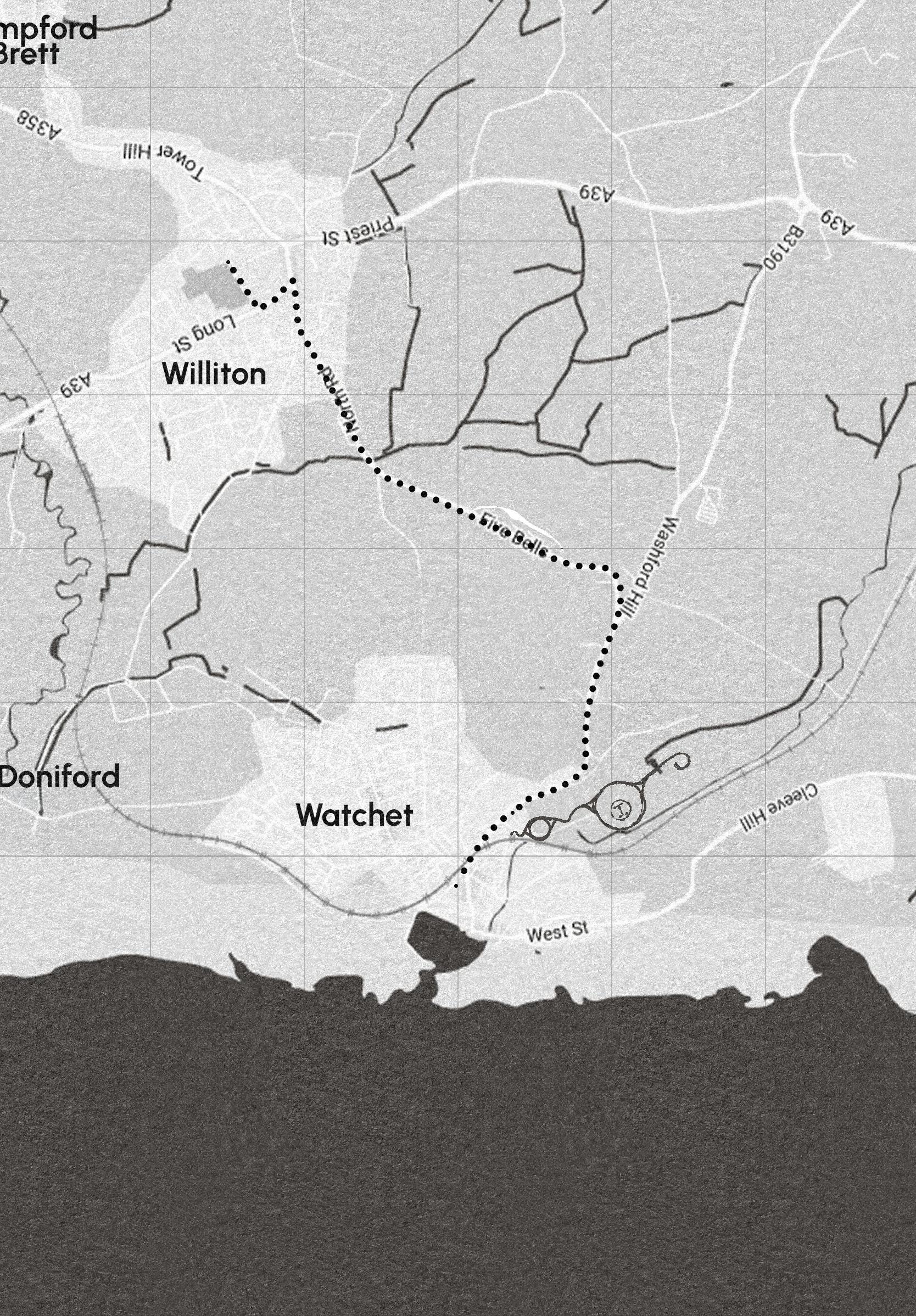
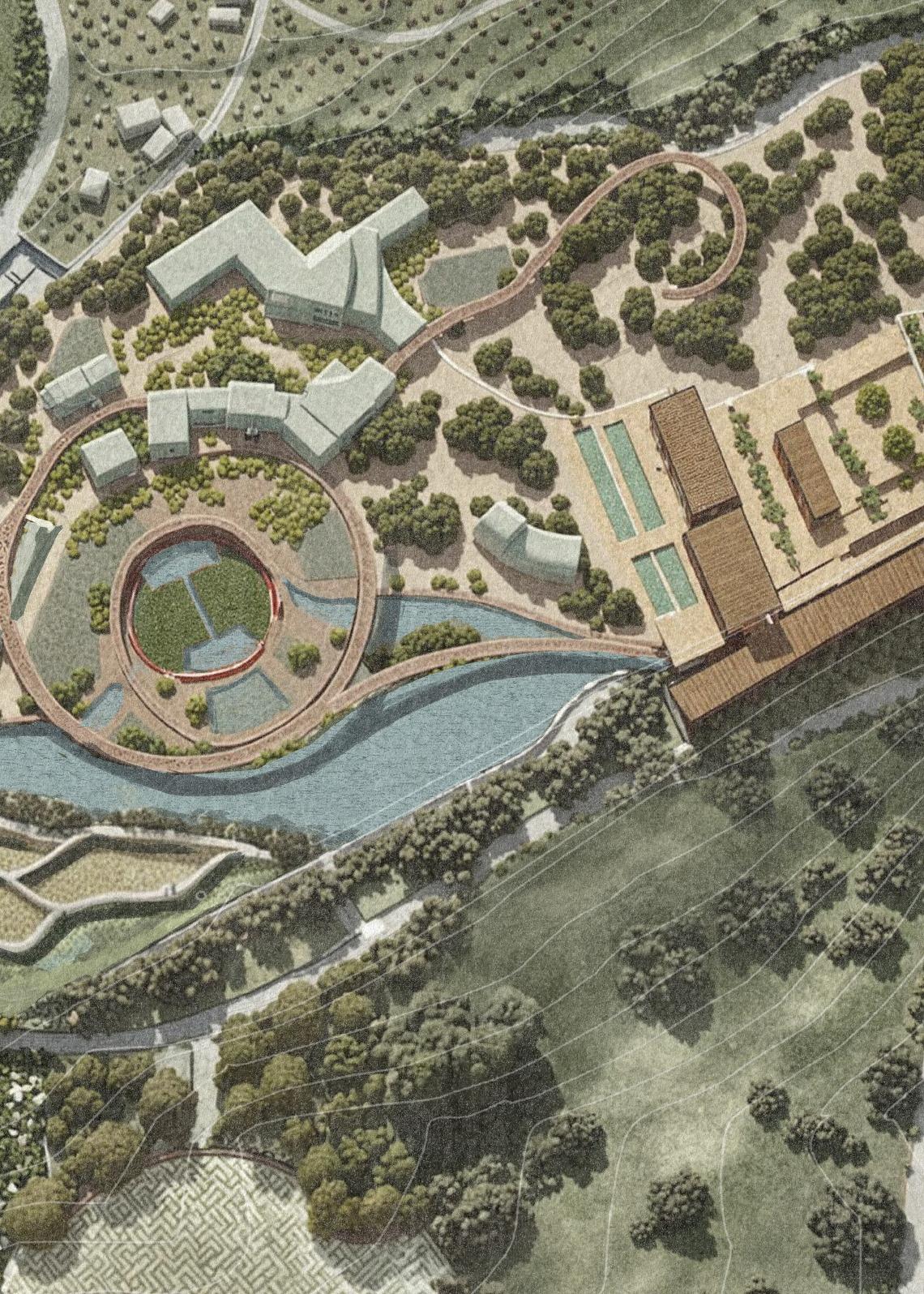
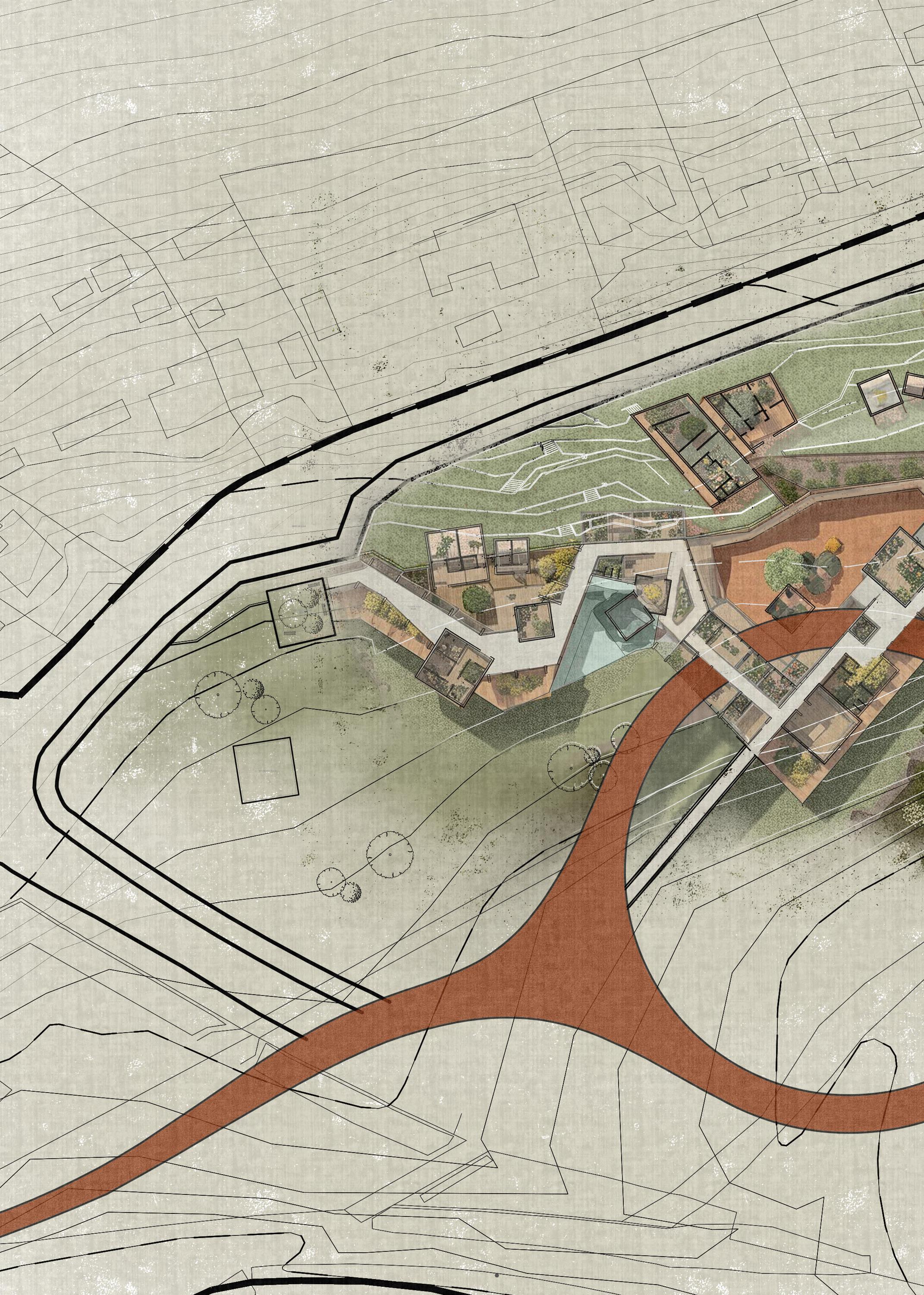
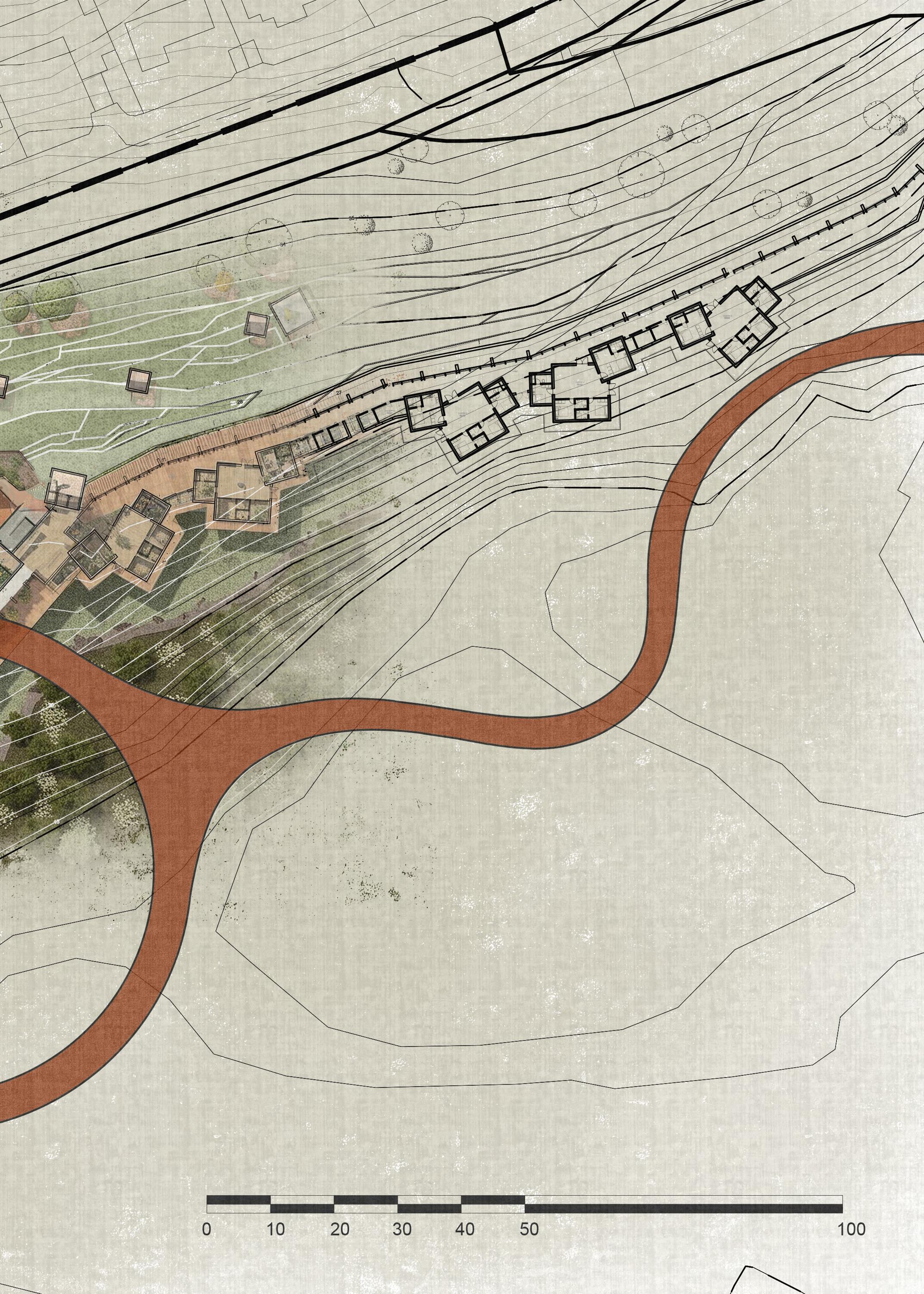
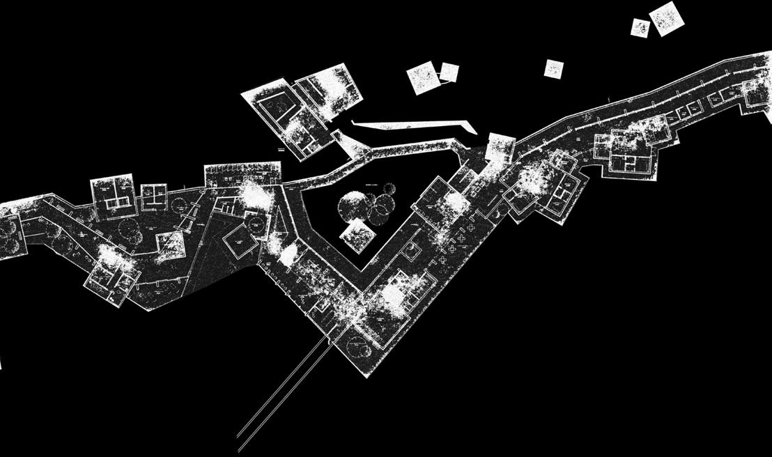
Based on my interest in aging and therapeutic environments, I selected the allotment site at the southeastern edge for my intervention. The programme focuses on later-life care, embedded within everyday routines and connected to the wider site network. Strategically positioned, it links directly to the market square and research centre, and is within walking distance of the wetland park via the highline. A longer pedestrian route ties it to the mobility hub. This location enables the project to function both as a connector and a caretaker, acting as a transition point where residents, researchers, and natural systems intersect. The site’s elevated topography, proximity to housing, and lack of pedestrian infrastructure presented both constraints and opportunities.
Recreate
Extend to protect Shading becomes part of form
Apply spatial rules Designing emotion and feeling
Designing Through the Rules
FROM FRAMEWORK TO FEELING
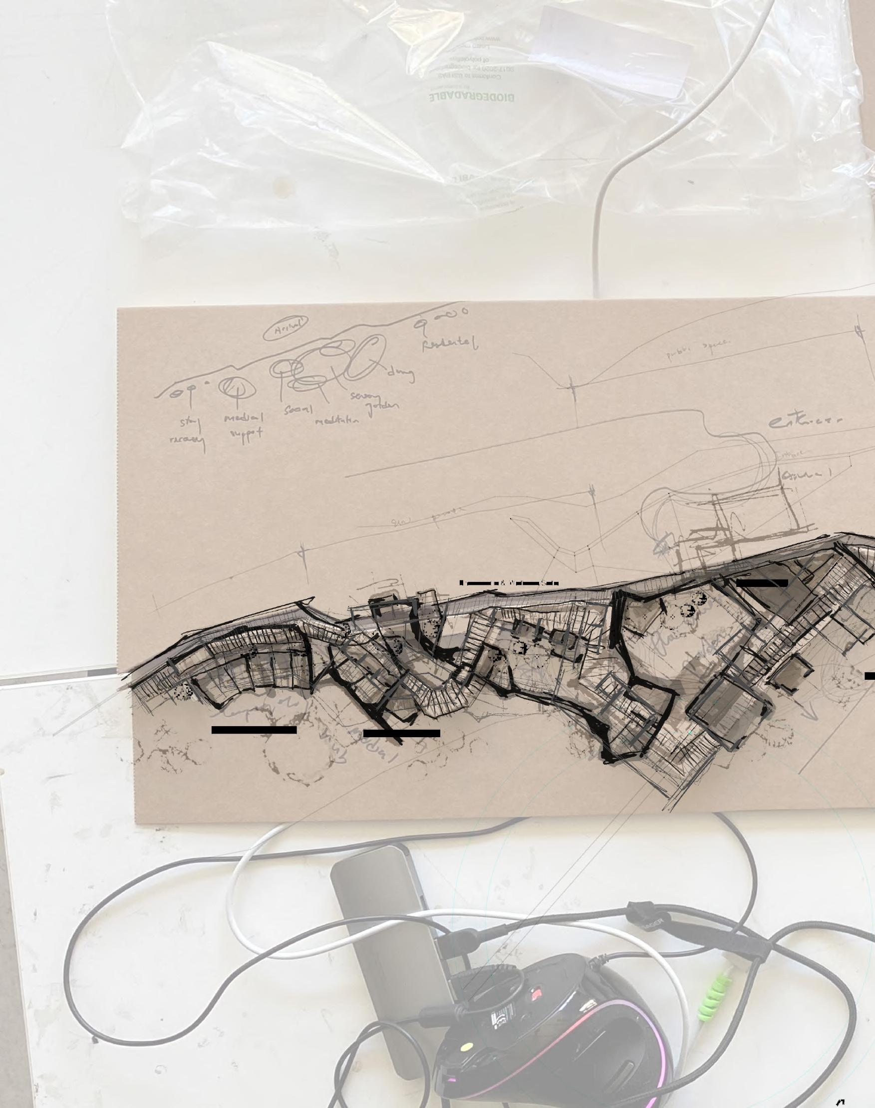
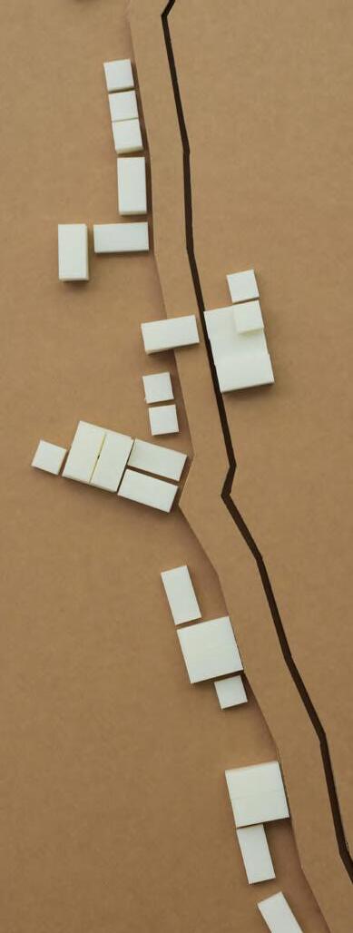
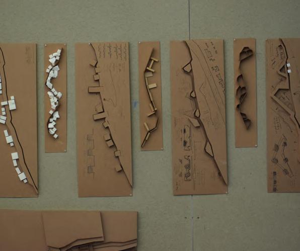
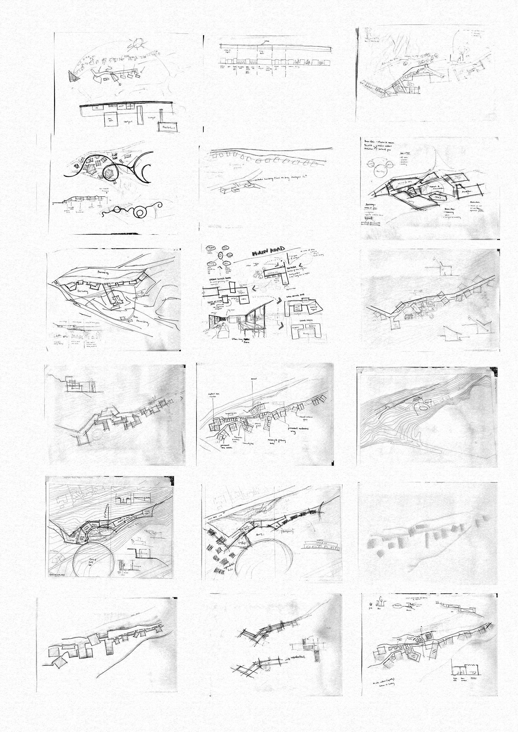
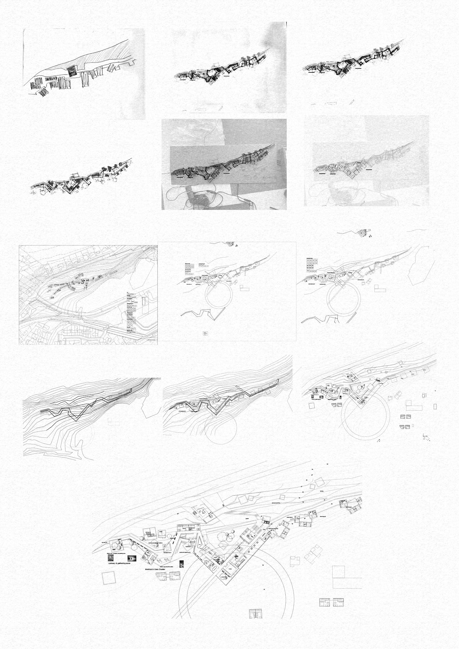
Following site selection and landscape strategy, the focus shifted toward inhabitable space. A working schedule of accommodation was drafted — not fixed, but fluid. It offered a framework to test relationships. Then came the breakdown. Smaller parts. Fragments. Each explored through sketches, sections, and physical models. Not to shape a form, but to sense a feeling.
The 25 Rules became a lens. A way to test how light might fall, how thresholds might slow the body, how materials might hold memory. Some fragments stood alone. Others leaned toward each other. Slowly, a rhythm began to surface.
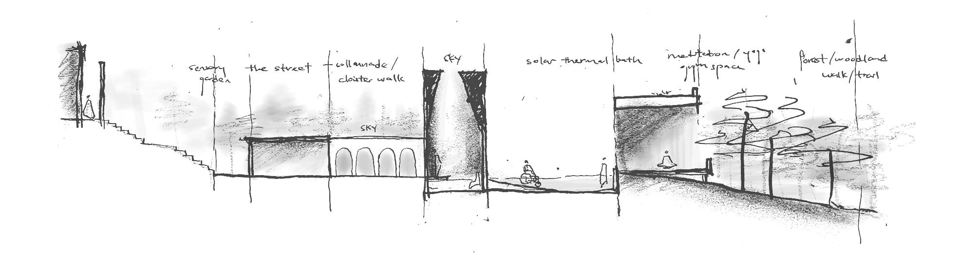
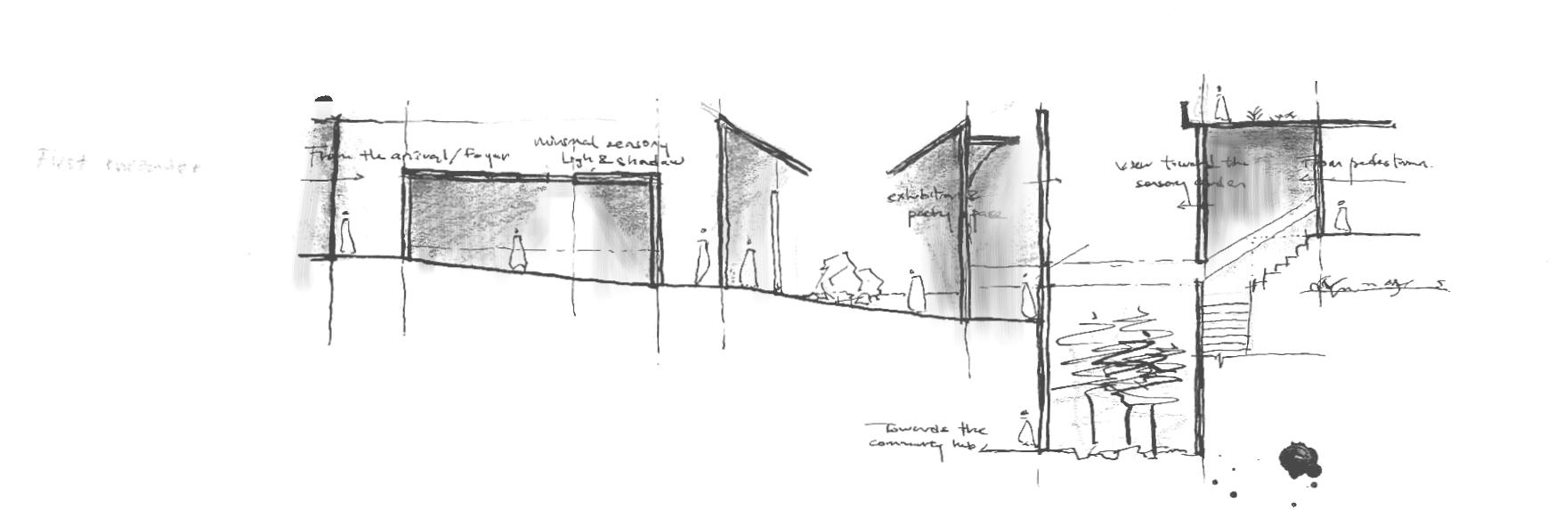
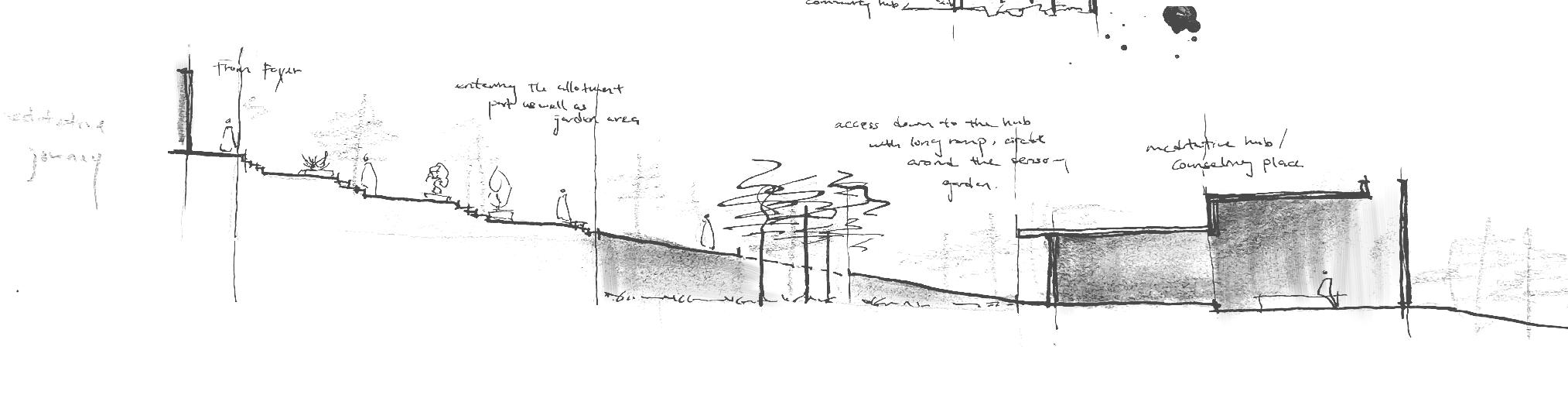
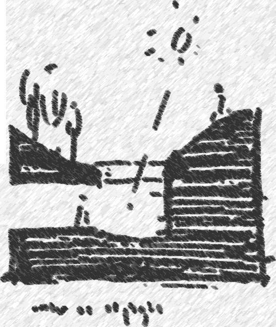
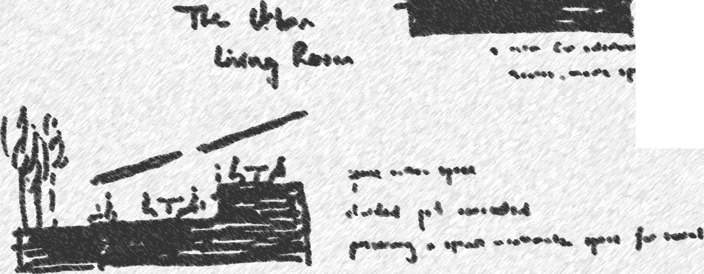
These pieces were then returned to the terrain. Arranged against slope, sun, and access. The journey of the user became the organising force. Where to enter. Where to turn. Where to wait. Sectional drawings became the medium — not as diagrams, but as tools for tuning space.
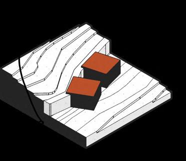
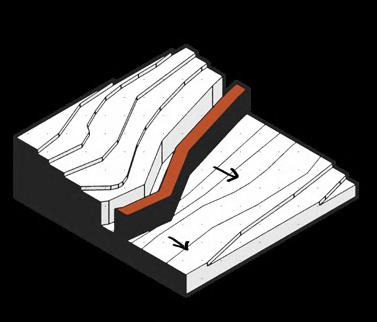
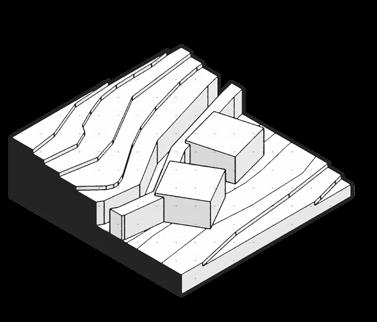
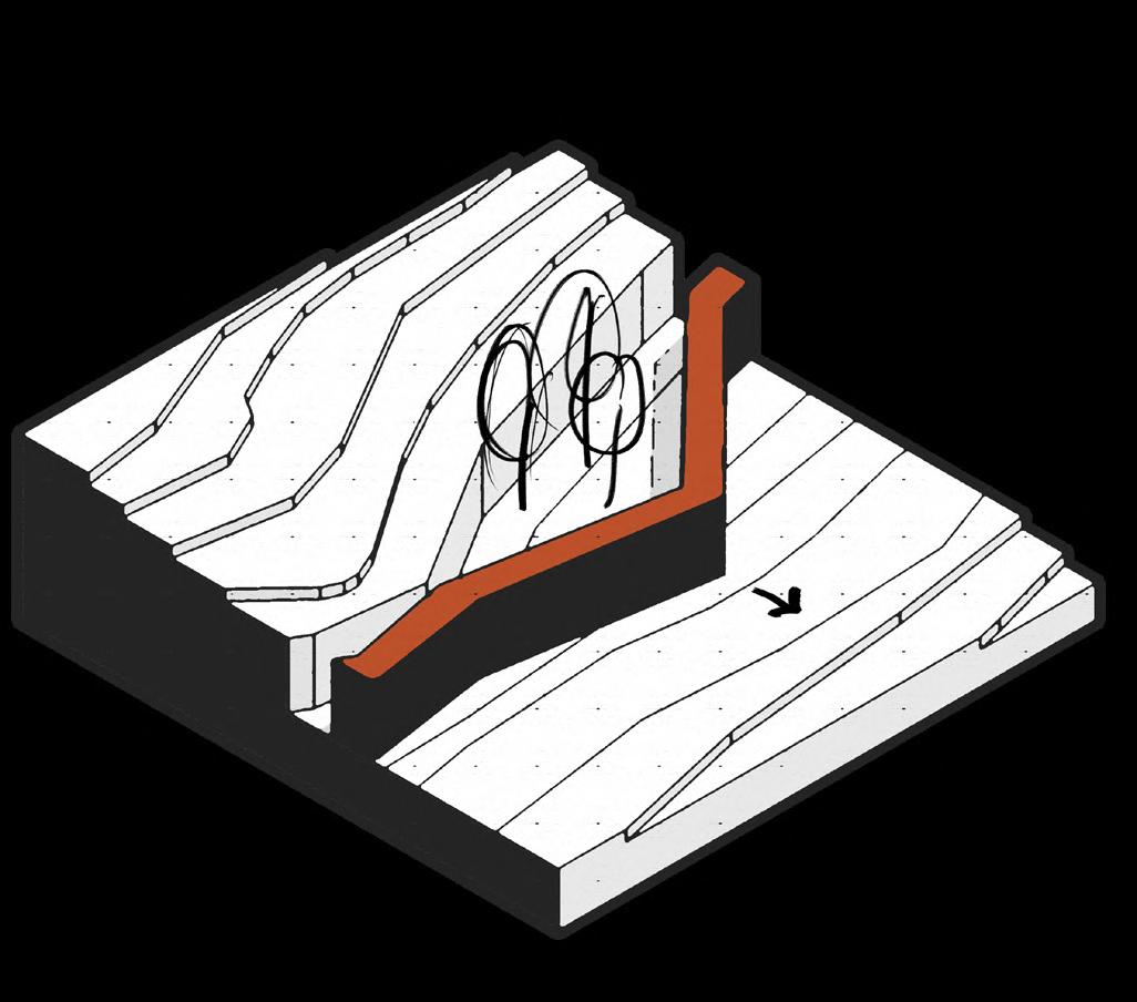
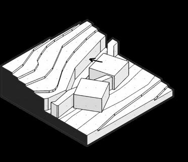
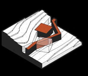
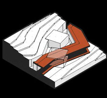
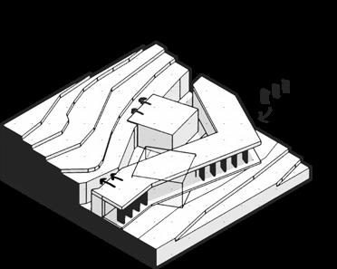
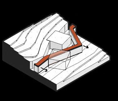
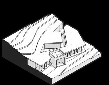
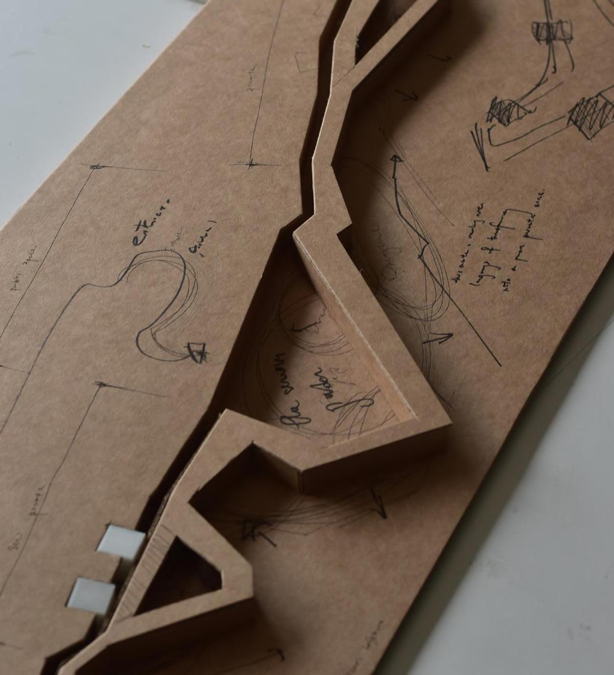
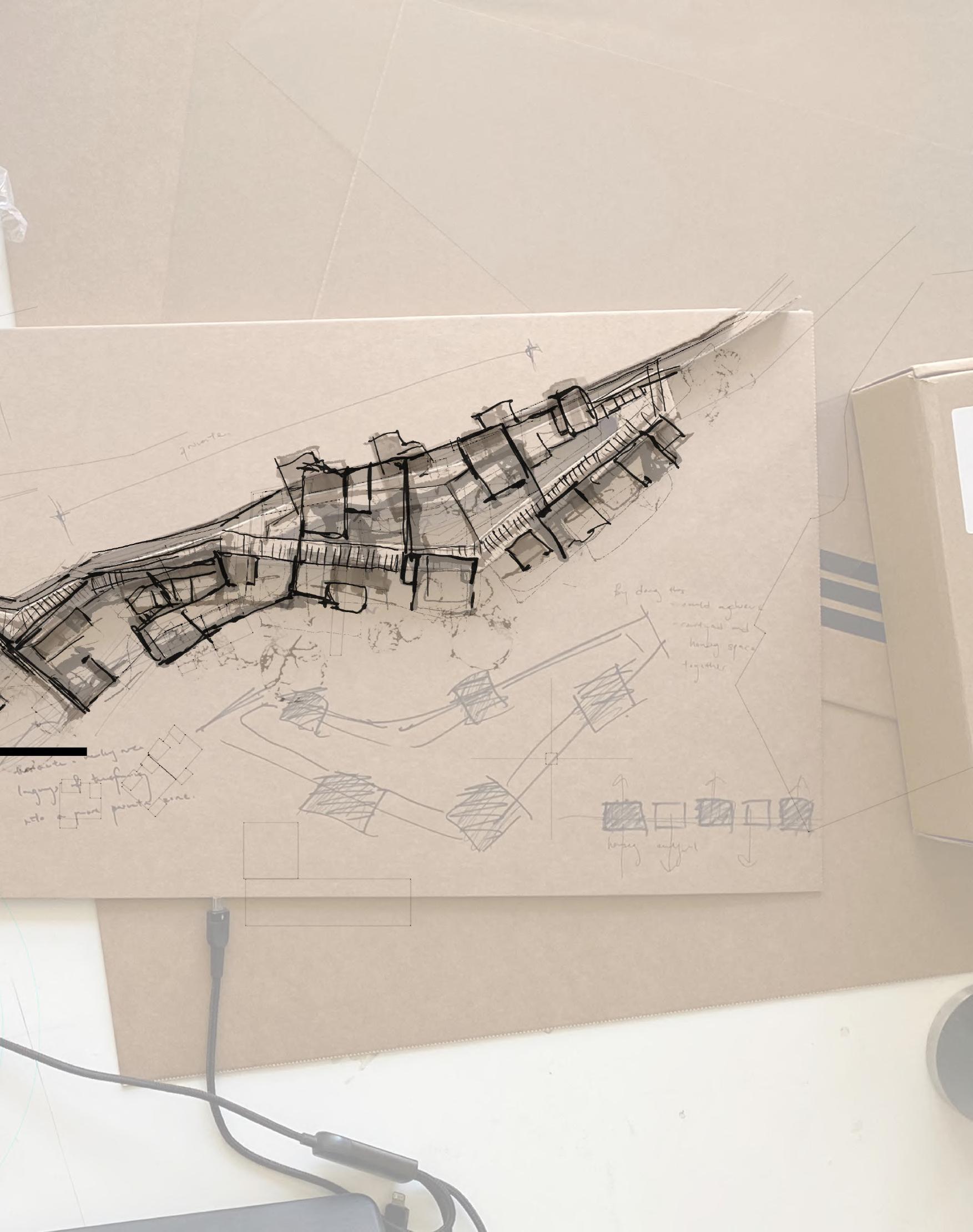
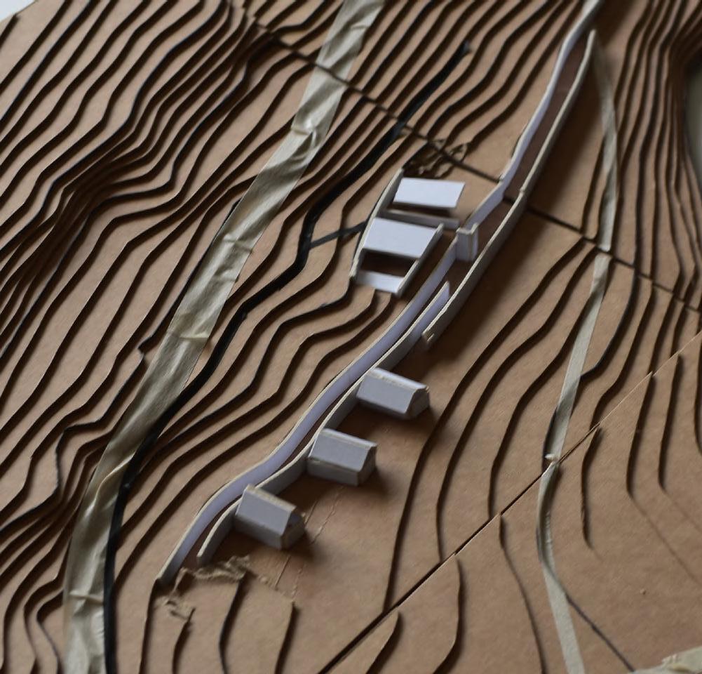
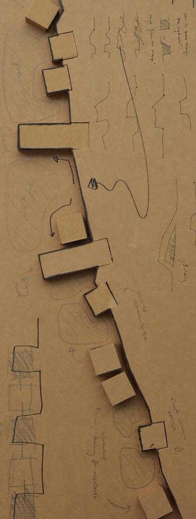
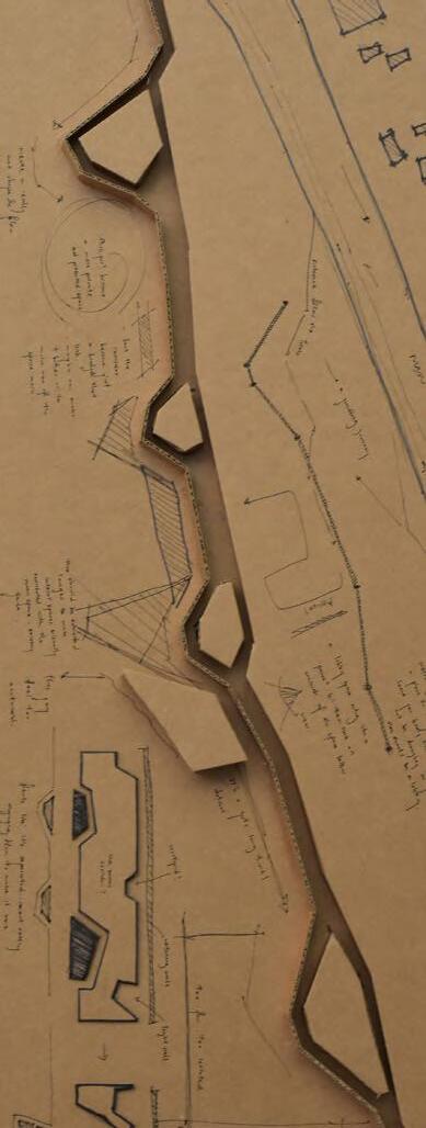
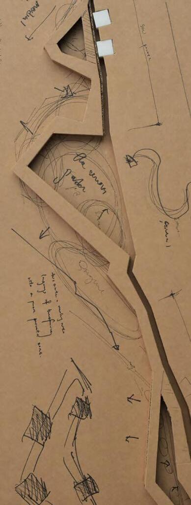
At first, the building unfolded as a single line. Predictable. Too rational. So I returned to the model and began to draw directly on its surface. A moment of play. Two lines crossed. And something shifted. Walls began to divide without closing. A space within a space. An outside wrapped in the inside. Tension returned.
From here, the fragments no longer assembled into a plan. They became moments. Each one shaped not just by function, but by the emotional clarity the rules had been asking for all along.
Conceptual Sketch
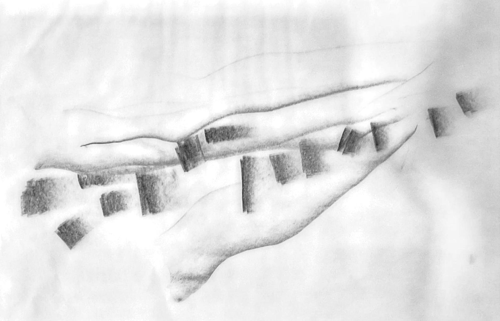
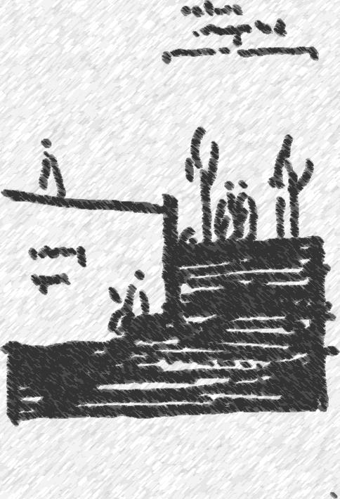
Charcoal and tracing paper to experiment the gaps between structure and retaining wall
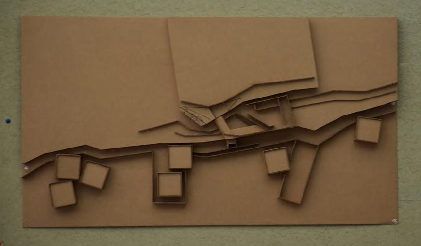
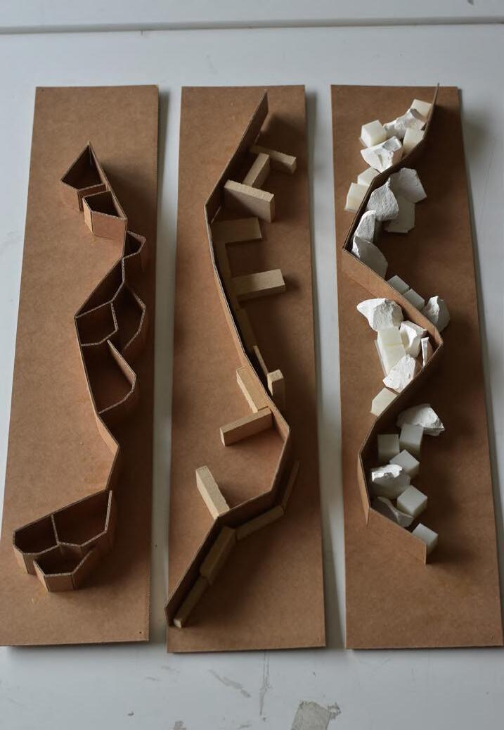
Designing the Arrival Material: Cardboards to experiment with the emotion triggered by every moves, with light and shadow, with textures, with rules.
Latest Iteration
Cardboards and Foams experimenting with the line to create more interesting space.
The
Process
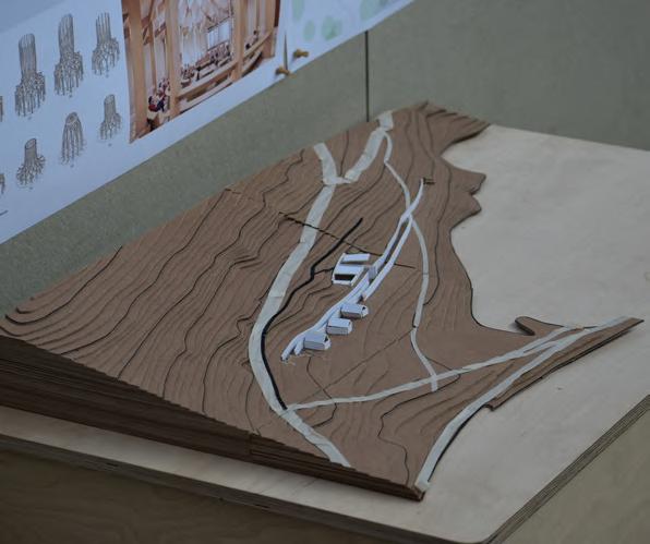
Full explorations process. To better understand the terrain and the intervention.
Project: L.I.F.E
LOVE. IDENTITY. FREEDOM. EMPATHY.
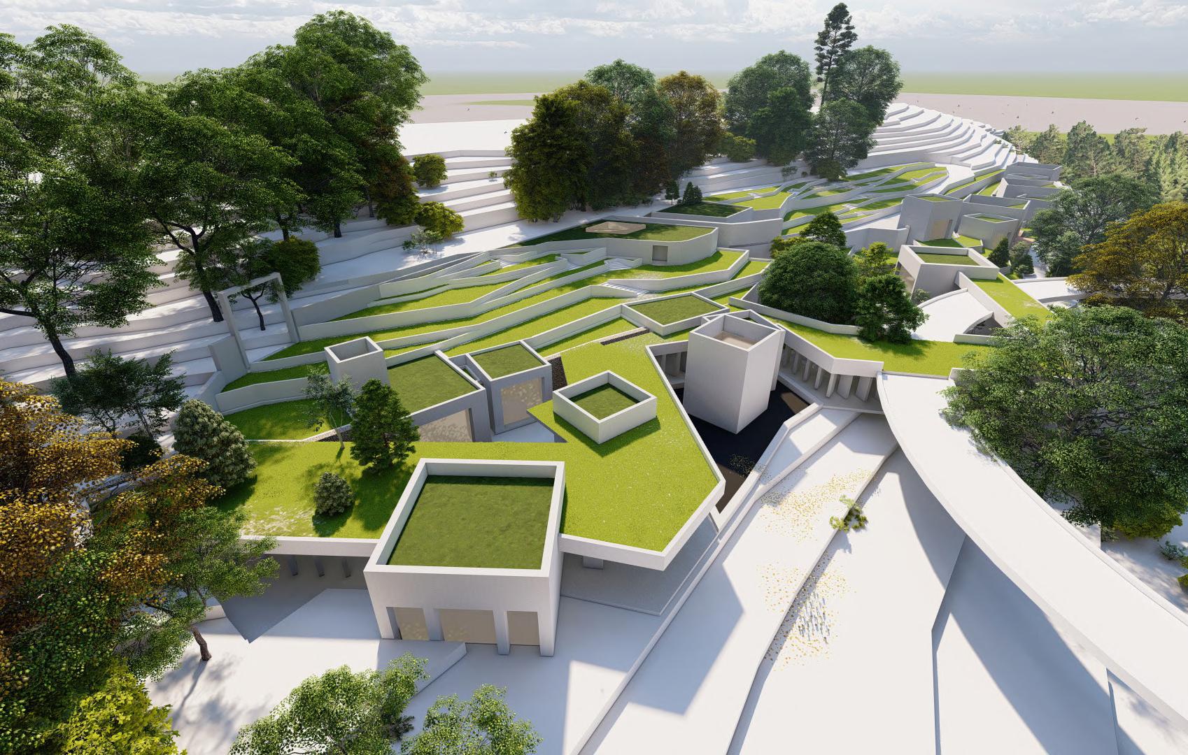
Positioned where land meets community, Project: L.I.F.E. reimagines aging not as withdrawal, but quiet belonging. Set within walking distance of local healthcare and deeply tied to the ecological masterplan, the building offers care that is present yet unobtrusive. It does not operate at a distance. It stays close, responsive, involved.
This building cares. Not through slogans or signs, but through the texture of its spaces and the timing of its thresholds. A tea room marks the gentle edge between being alone and being with others. The smell of bread from the kitchen drifts into the colonnade, drawing people toward one another without command. Children play in the open courtyards while older residents sit nearby, not separated, just still.
The layout allows movement to unfold naturally. Paths follow the shape of the land. Rooms open into each other without pressure. Places to rest appear where hesitation might arise. Farming terraces sit beside the kitchen so that meals are grown, chosen, and shared. These acts are not tasks. They are part of living.
Project: L.I.F.E. does not script how one should age. Instead, the building creates space for people to continue — to find rhythm in daily routines, to be seen, to take part, or to step back when needed. Every element holds the same quiet intent: to support life, just as it is, with care and without question.
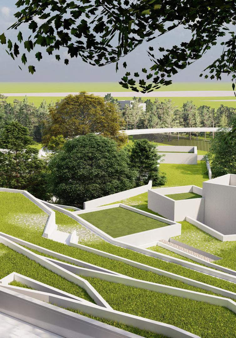
Outdated renders not the latest but showing the forms and scale
A View From Above no obstruction, its not what archicture usually do here.
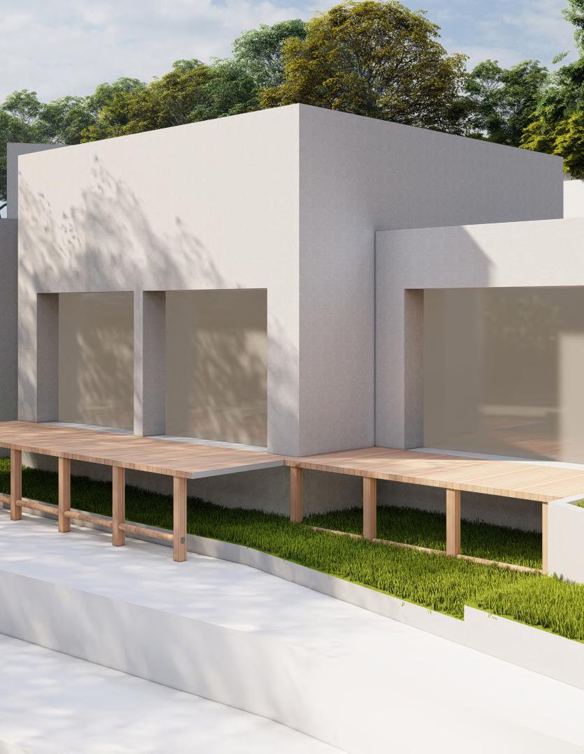
Cloister Walk connects to the terrain, forming inside out space
WILLITON SURGERY
WATCHET SURGERY x
Contextual Response
STRATEGIC POSITIONING
The site is strategically located just one minute’s drive from Watchet Surgery, enabling close collaboration with the GP and eliminating the need for on-site nursing facilities. Additional healthcare support is accessible within five minutes by car, with both West Somerset Healthcare and Williton Surgery in Willinton. Which makes the project ideal for temporary recovery stays referred by local practices.
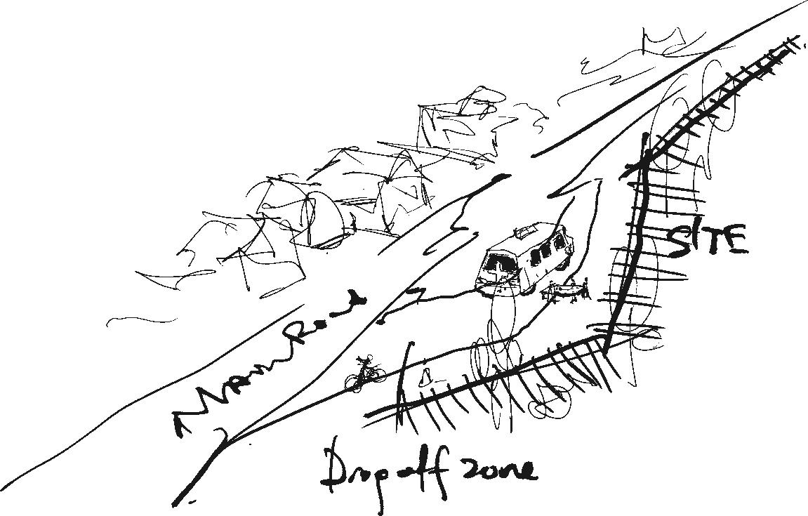
In response to this context, the site is designed as parking-free, prioritising sustainability while maintaining a designated dropoff zone for emergency access. With a mobility hub and train station embedded in the broader masterplan, and the proposal to improve adjacent pedestrian routes, the entire area supports walkability and reduced car dependency.
PROJECT: L.I.F.E
WETLAND PARK
RESEARCH HUB
INNOVATION HUB
TRAIN STATION
Conceptual visualisation – indicative and not intended as a precise representation.
ROOF PLAN
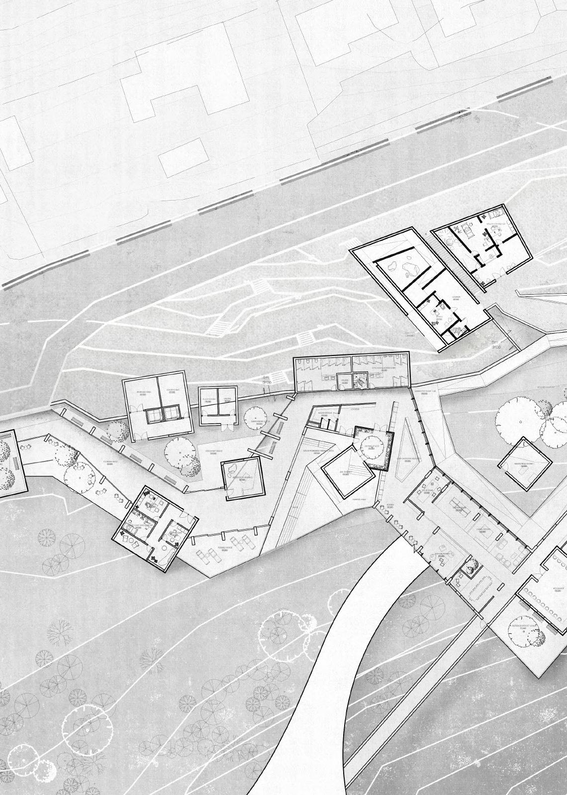
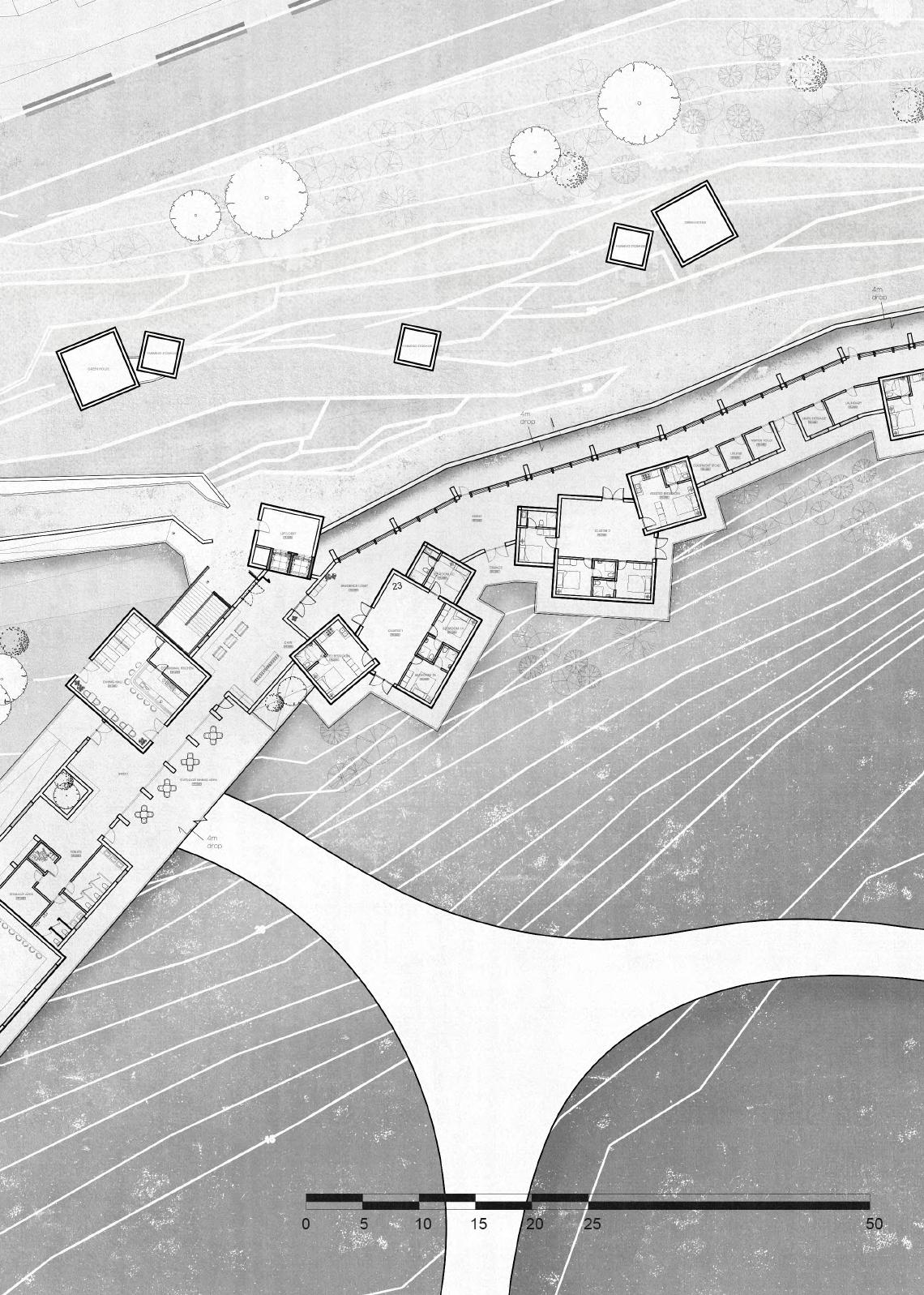
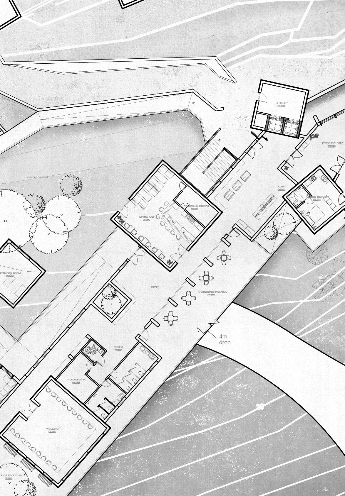
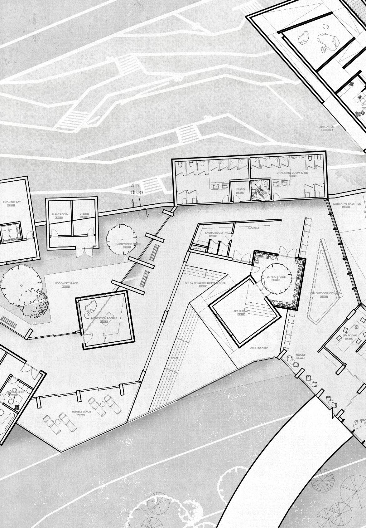
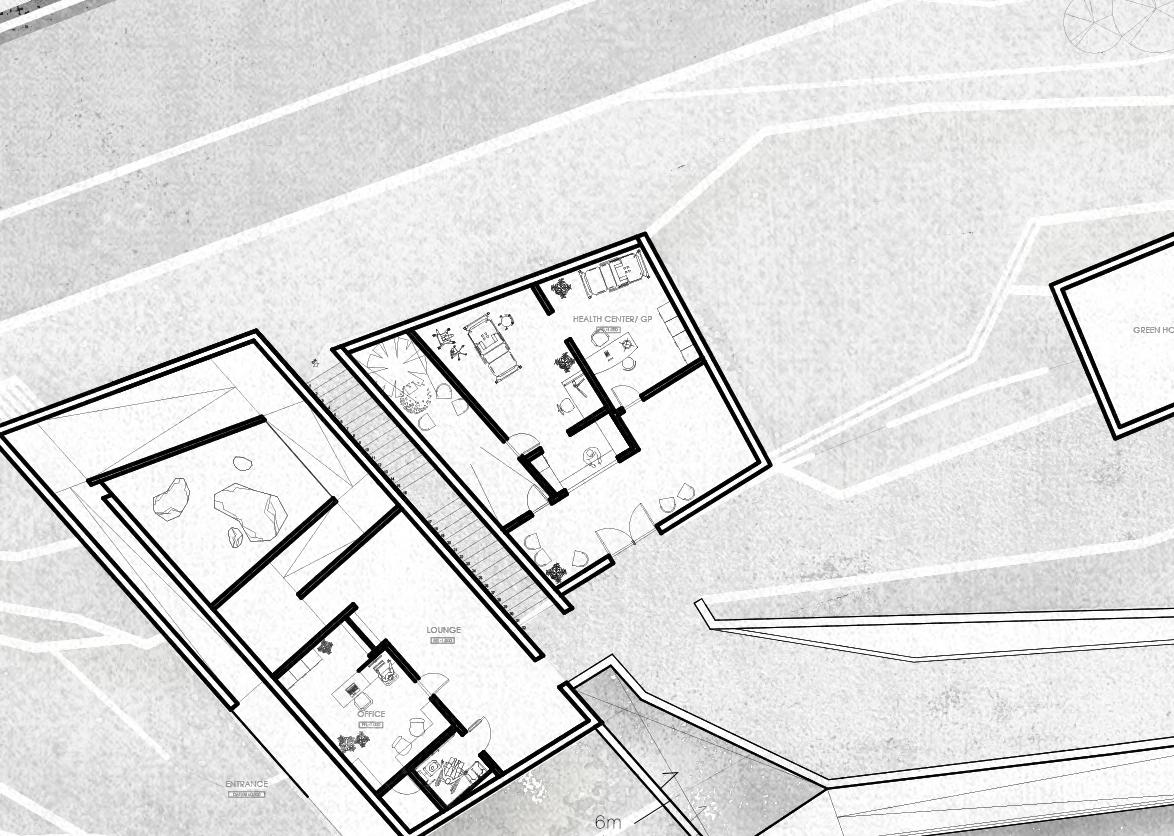
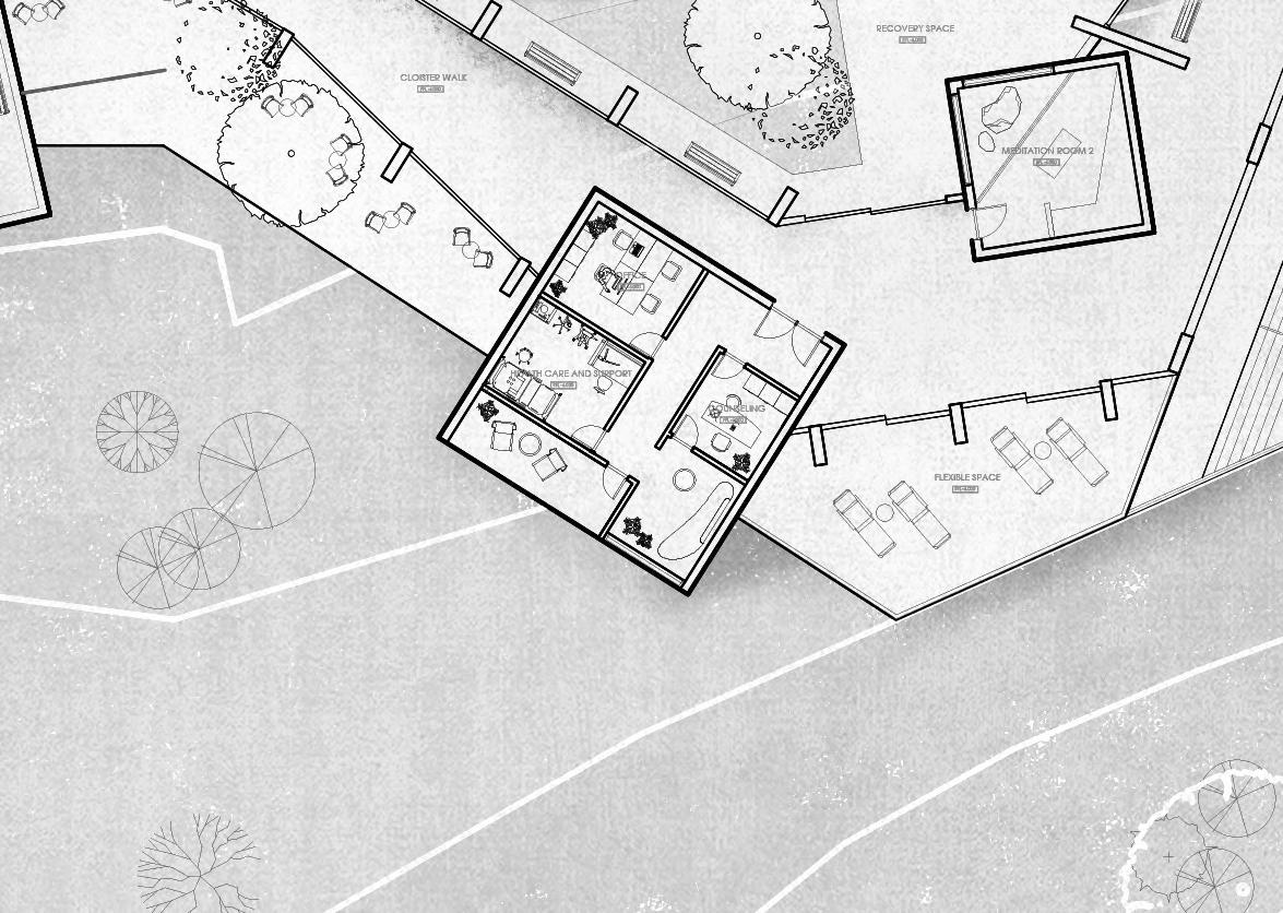
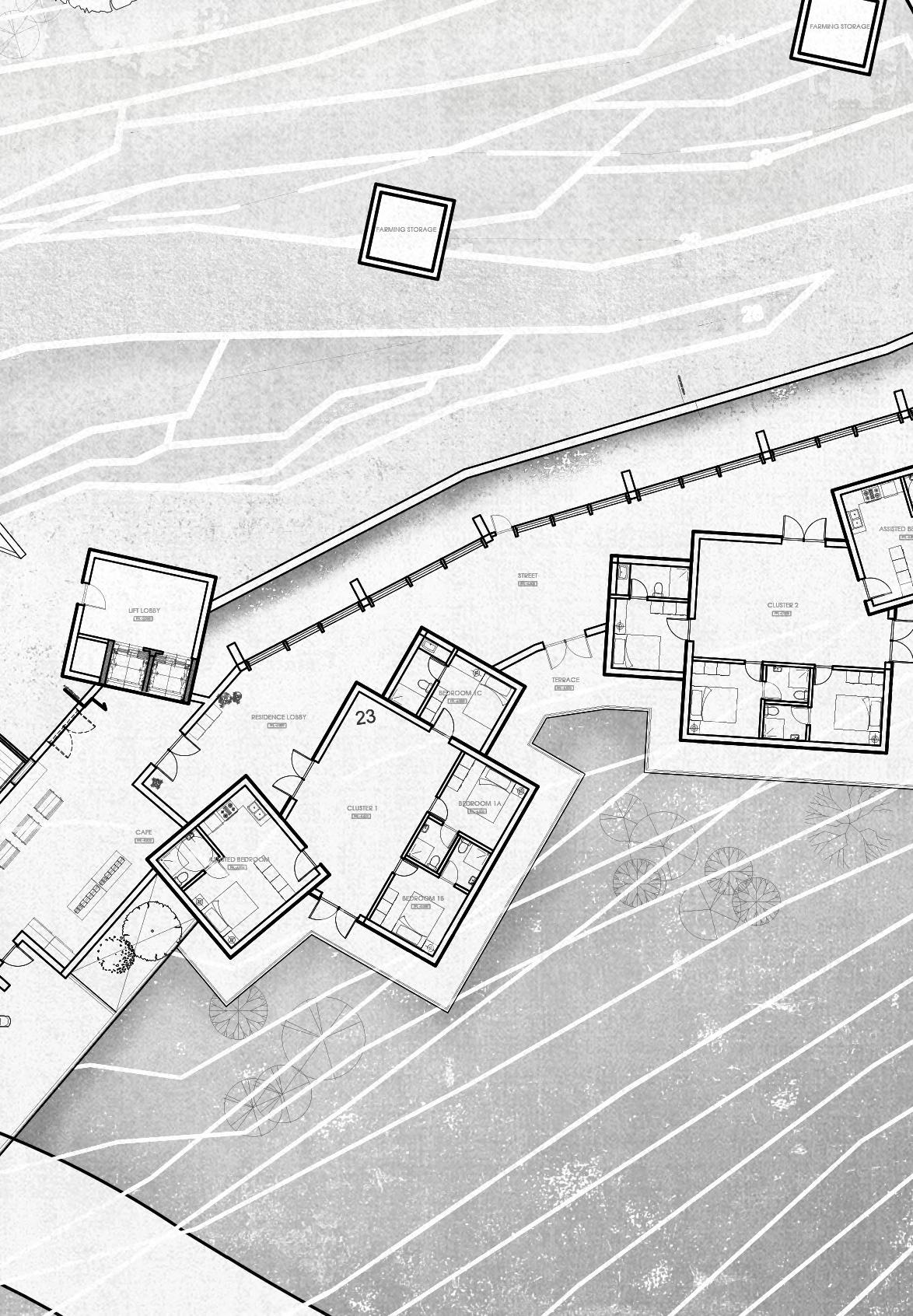
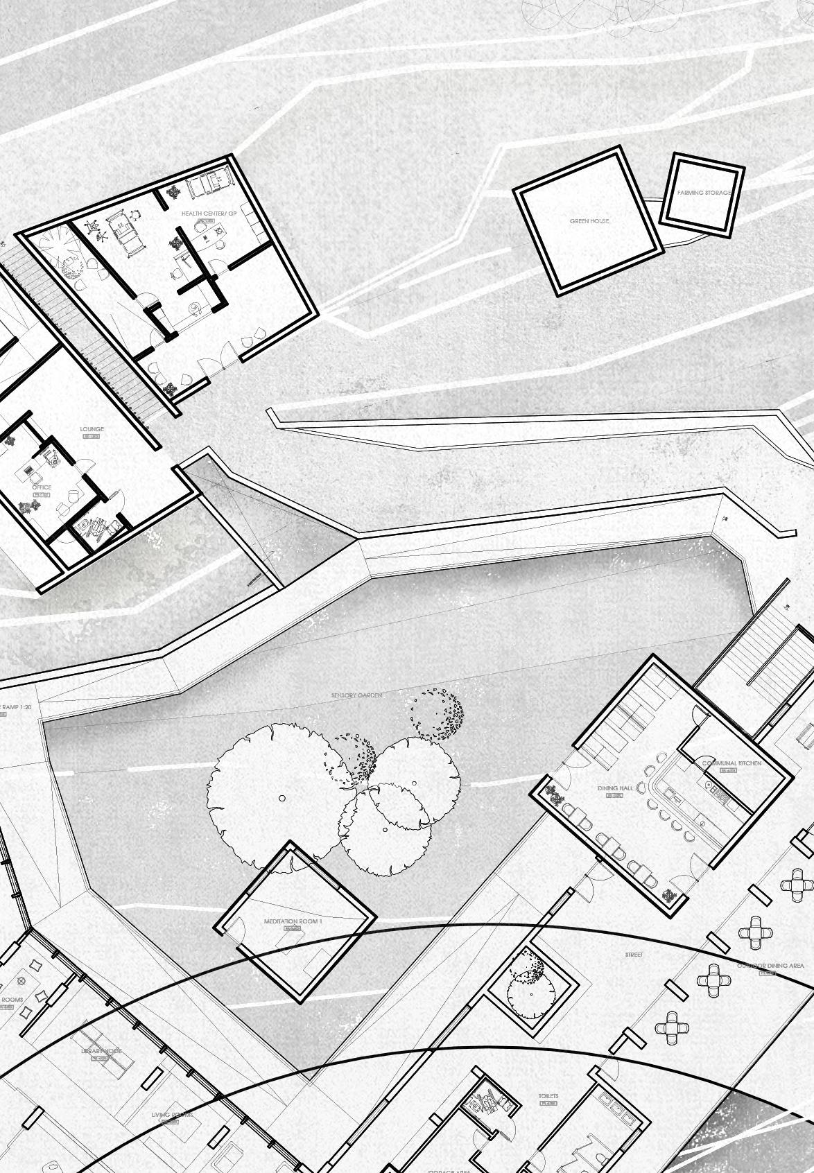
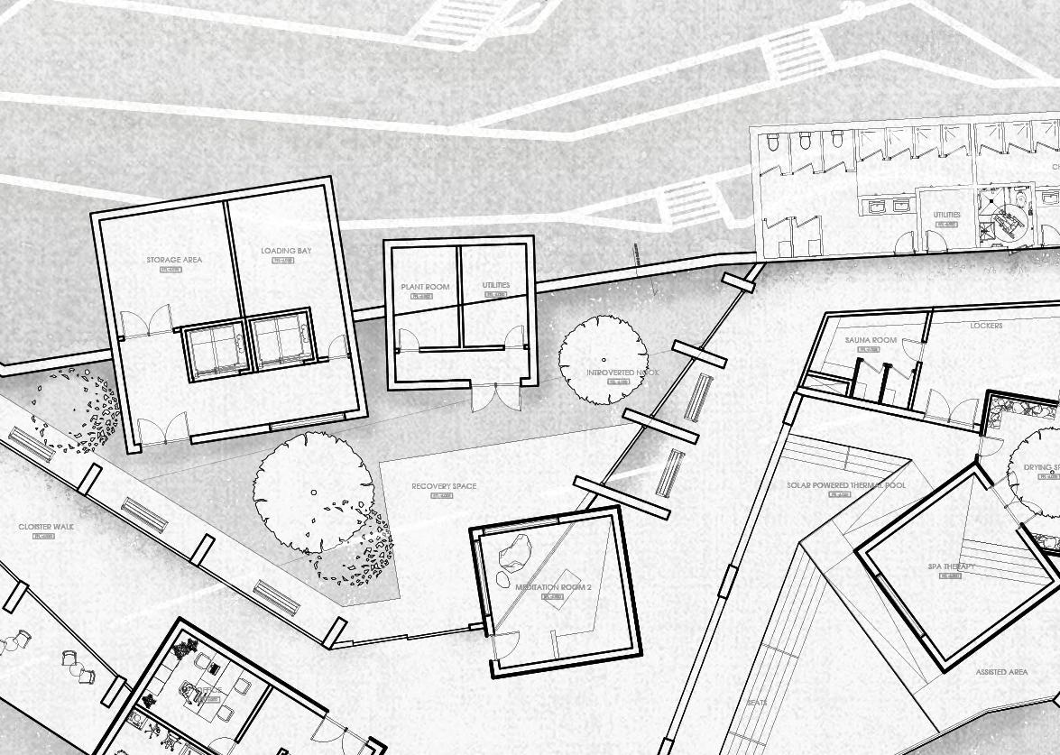
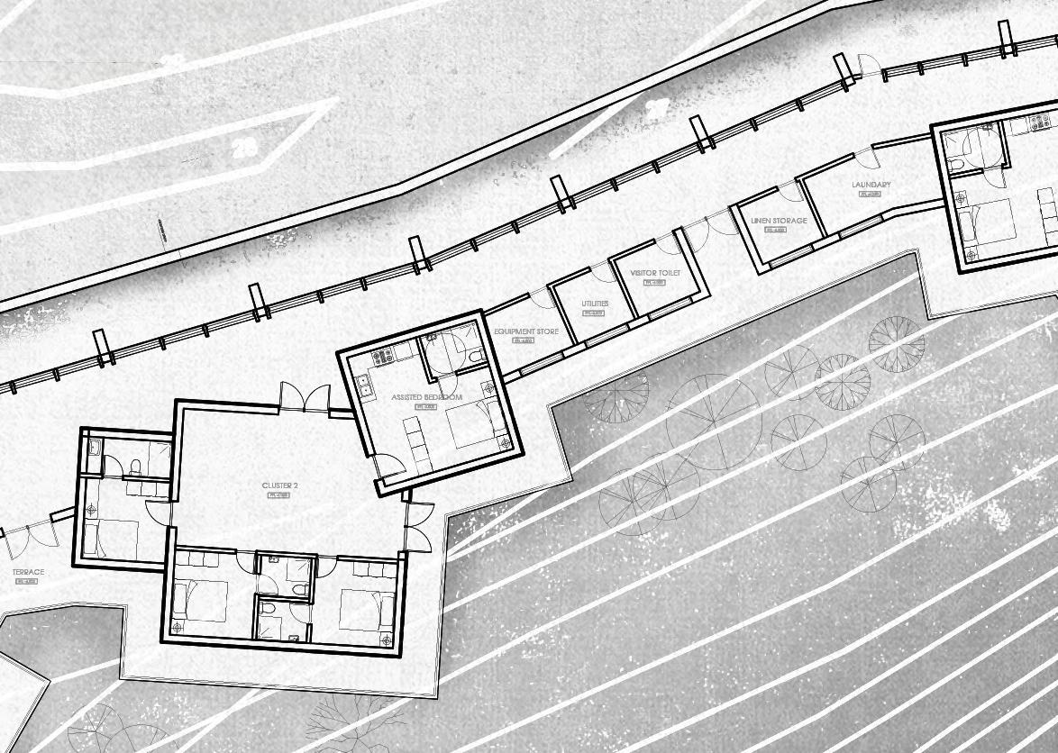
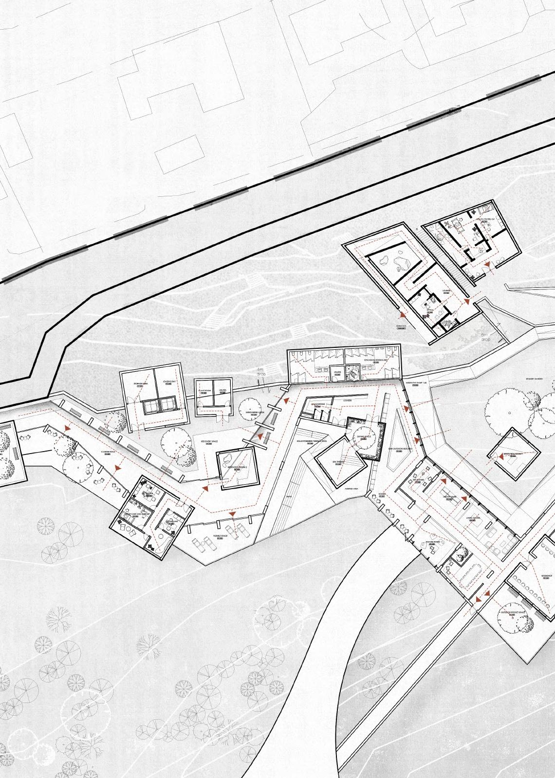
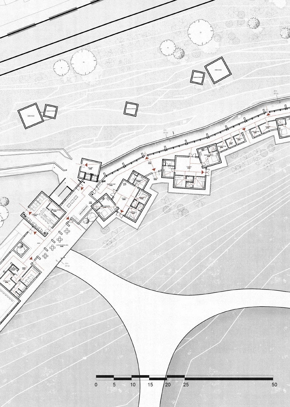
FLOOR PLAN
Reflective & Transitional Spaces
Spaces designed to create pause, slow arrival, and emotional grounding — before entering the life of the building.
1.
Entrance Forecourt
A quiet exterior space framed by landscape, creating a moment of stillness before the building begins. The pace slows, the noise recedes.
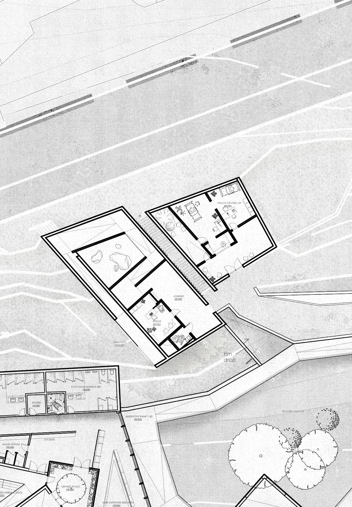
Foyer / Waiting Lounge
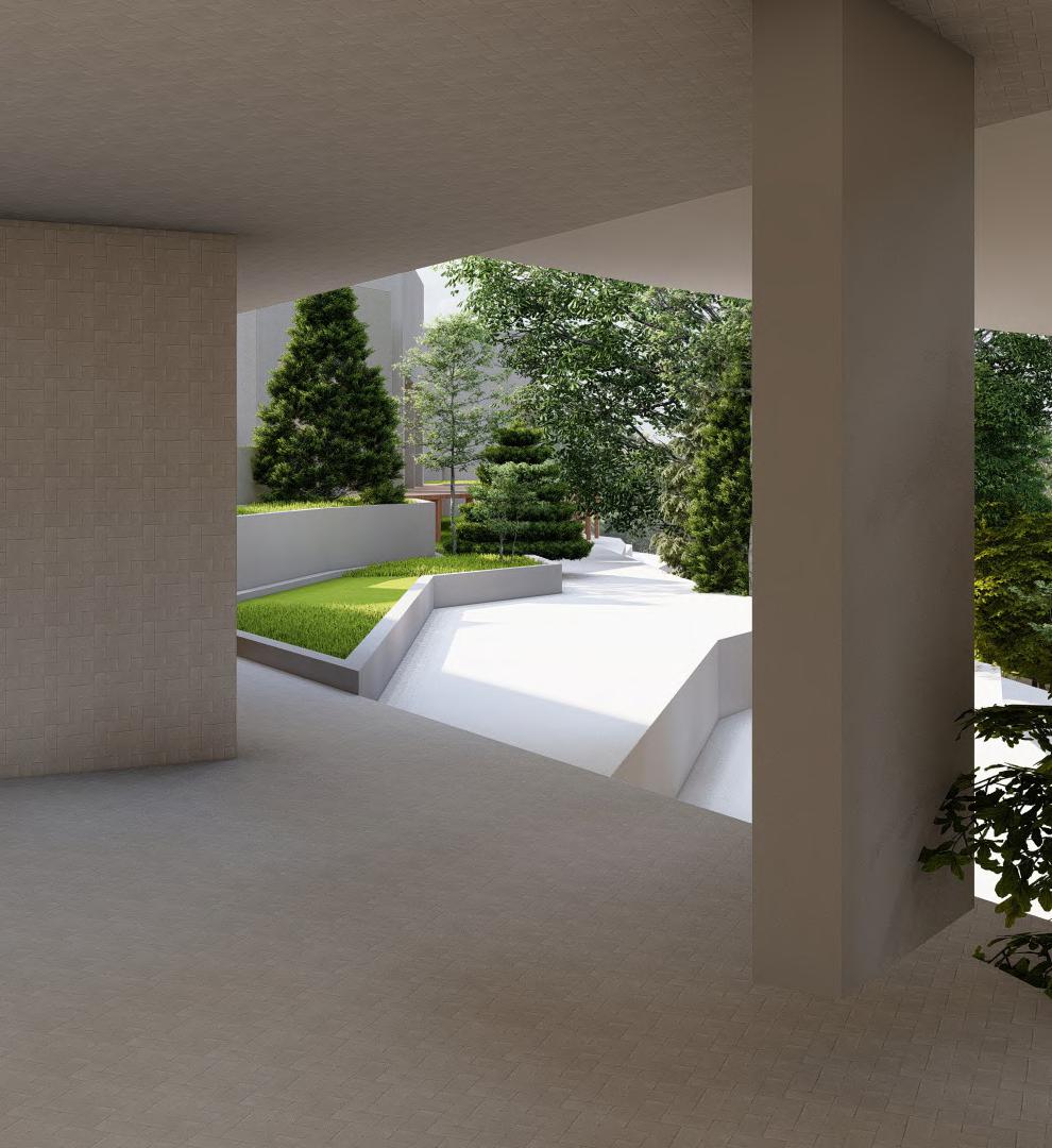
A soft sequence of thresholds. The arrival is designed not as a statement, but as an atmosphere — open, domestic, and unhurried. Seating is informal and flexible, allowing people to gather or separate with ease.
Meditative Passage
A transitional corridor lined with natural materials and filtered light. Views into the sensory garden and subtle acoustics create a sense of withdrawal from the outside world. Not just a hallway, but a place to breathe.
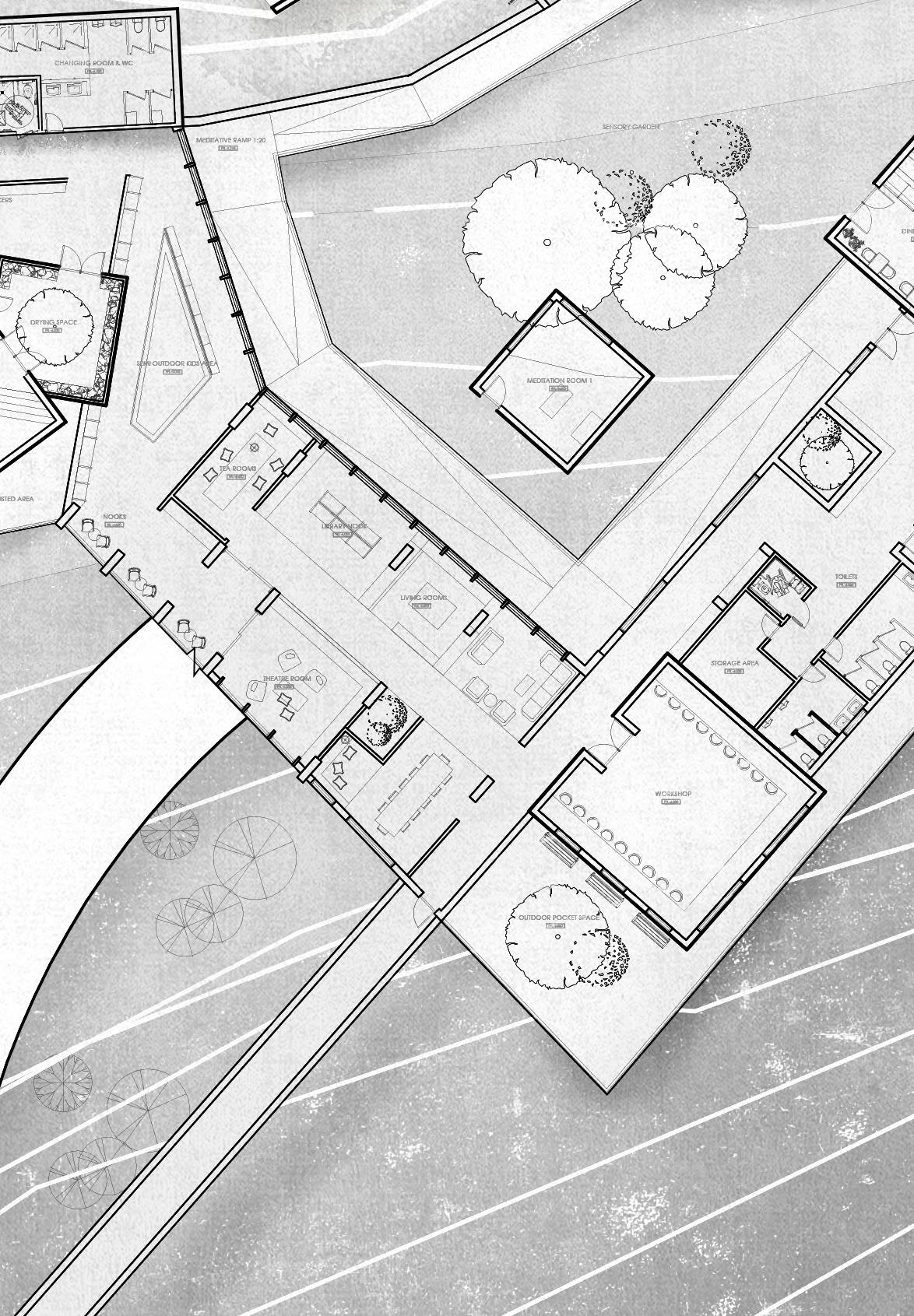
Cloister Walk
A semi-enclosed walkway facing the landscape, offering reflection without isolation — a sheltered spine that connects movement with serenity.
Local and local (Vernacular familiarity)
Intuitive pathways
Minimise sensory overload
Social & Community Spaces
Spaces designed to foster informal interaction, conversation, and chance encounters across generations.
Community Hub
A central, adaptable space for gatherings, celebrations, and everyday use. Configured to be as flexible as it is familiar — always available, never over-programmed.
Tea Room / Café
A light-filled communal zone where visitors, residents, and staff can mingle. More than a café — it’s a gentle interface between public and private, designed to spark casual exchange and shared rituals like morning tea or an afternoon treat.
Workshop Spaces
Rooms that invite making — from painting to planting. Not strictly programmed, these spaces evolve with the interests of those who use them.
Library Nook / Private Social Nooks
Small alcoves and reading corners tucked along the colonnade, inviting solitude within proximity. You may read alone but not feel alone.
Children’s Area
A playful, visible corner that allows children to occupy space without becoming a disruption. Moments of joy and movement pass gently through the building.
Spaces that bring people together around food — not as service, but as shared ritual.
Communal Kitchen
A central hearth, open to both residents and guests. Designed for participation, not performance — people cook together, learn together, or simply sit and smell something familiar.
Dining Hall
Configured like a long domestic table rather than an institutional canteen. Seats can shift, extend, or shrink depending on the day. Occasionally, residents choose the menu — deciding together what the community will cook and share.
Pantry & Storage
Efficient, accessible, and integrated — supporting both daily operations and spontaneous use by residents or staff.
Visitors Welcome
This is not a closed kitchen. People from outside — neighbours, family, or researchers from the nearby centre — may share a meal, connecting through food and conversation. The space is designed to soften the line between guest and host.
1. People need to feel in charge again
2. Let people pause before committing to interaction
17. Customised space for local
Visual connection 19. Local and local (Vernacular familiarity) 20. Memories 21. Intuitive pathways 22. Minimise sensory overload 23. Natural materials 24. Spatial cues 25. Subtle guidance and wayfinding
Therapeutic & Wellness Wing
Spaces dedicated to recovery, relaxation, and gentle movement of both body and mind.
Spa Therapy & Private Counselling Room
Intimate, acoustically protected rooms for massage, therapy, and conversation. Nothing clinical — just presence and care.
Yoga & Meditation Room
A quiet, warm-floored space with filtered daylight and natural textures. Windows frame trees and sky. Silence is the programme.
Public Bath & Sauna
Drawing from ancient Roman bathing culture, the space supports both hygiene and ritual. Designed as a moment of self-respect and renewal, not just function.
1. People need to feel in charge again
2. Let people pause before committing to interaction
3. Let nature speak softly 4. Each room is an invitation, not an obligation
Quiet joy
17. Customised space for local 18. Visual connection
Discreetly integrated, these rooms provide professional care without breaking the building’s emotional tone.
Staff Lounge & Break Rooms
Designed not just for function, but for staff wellbeing — supporting those who care for others, with places to rest, eat, and recharge.
Medical Office / GP
Calm and domestic in tone, with natural light and clear organisation. Not a cold white box, but a place where care feels human. Within alking distance.
Consultation & Treatment Room
Flexible in use and scale — from minor procedures to mental health check-ins. Accessed with privacy but not hidden from the main sequence. 1. People need to feel in charge again
Intuitive pathways
Subtle guidance and wayfinding
Residential Cluster
Private units designed around flexibility, dignity, and emotional continuity.
Shared Lounge
A hearth space for each cluster — not obligatory, but always open. A soft chair, a shared book, or just the smell of coffee in the morning
Clustered Living Units
Inspired by St Michael’s hospice, Residential area are clustered with four bedrooms, one assisted. Ranging from more independent to shared. Each has its own rhythm, and all connect to the outdoors.
Courtyard & Private Garden Access
Nature is always near. Whether planting herbs, watching the rain hit leaves, or checking how yesterday’s seeds are doing — the garden provides quiet purpose.
1. People need to feel in charge again
2. Let people pause before committing to interaction
3. Let nature speak softly 4. Each room is an invitation, not an obligation
17. Customised space for local
Visual connection 19. Local and local (Vernacular familiarity)
Memories
Intuitive pathways
Minimise sensory overload
Natural materials
Spatial cues
Subtle guidance and wayfinding
Outdoor & Garden Areas
Nature is not at the edge of the building. It is stitched into its core.
Natural Trail
A meandering loop for walking or wheelchairs, connecting key zones and giving residents a reason to move, alone or with company.
Therapeutic Gardening / Greenhouse
Designed for gentle participation — raised beds, shelter from wind, space for a stool. A place to plant, observe, and be reminded of growth.
Sensory Garden
The heart of the spatial plan. Fragrant plants, textured paths, changing colours — all visible from inside, reminding residents of the seasons and of time’s slow, beautiful passage.
Spatial cues
Subtle guidance and wayfinding
Support Services & Utilities
Quietly efficient, yet designed with clarity and dignity in mind.
Laundry Room & Utility Space
Clean, calm, and accessible. Natural ventilation, daylight, and domestic detailing prevent these spaces from feeling like backof-house.
Lockers, Changing, & Service Access
Separated from resident zones but thoughtfully connected — designed so that the building works quietly in the background, always supporting the experience of the people inside.
Quiet joy
Framing
You can decide your comfort, private and
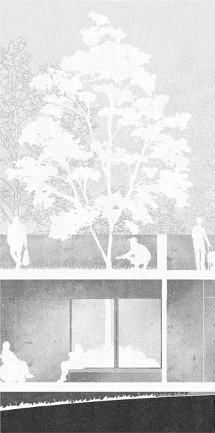
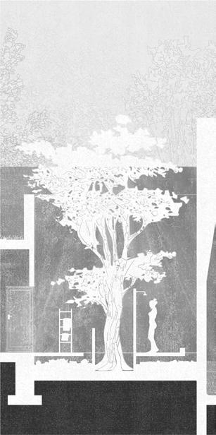
Life Around A Tree
From care to simple observe.
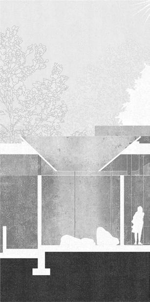
Rain On Rocks
Enclosed yet connected to the sky and trees, every corner is a clue.
Sensory Garden
Community Hub
Foyer / Waiting Lounge
Meditative Passage
A Sense Of Purpose
When your effort impacts, and being appreciated.
Drying Area
Walk above stone, around tree, lead the light guides after your public bath.
Allotment Farming
Spa Therapy
Light cuts in from above, creating stillness and focus in the space.
Highline & Trails
Walk along the wetland, or above, see how nature works.
Public Bath & Sauna
Spa Therapy
Natural Trail Highline
Sauna
Layered Space
Different activities in public, semi public, and private space.
Reconnect listen to the rainwater, look up to the moon, and accompany by nature.
They Know What To Do Architecture steps back, letting the landscape lead.
Rainwater Drainage
Clustered Living
Private Garden Street
Allotment farming
Warehouse
Extended Pathway
Collage Of Spaces for visualisation purpose only
Highline intergration with highline, which let visitor access, but not directly, only accessible to roof top, still need to go through lobby.
Farming
Grow your own food, share your crops, and memories.
Curtain Wall
All space have a view towards sensory garden.
Structural & Material Strategy
PRIMARY AND SECONDARY
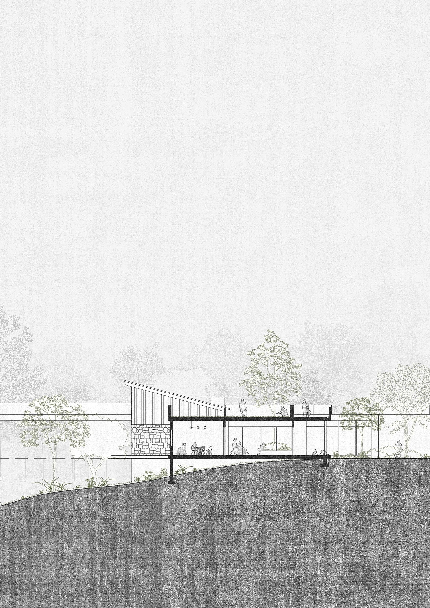
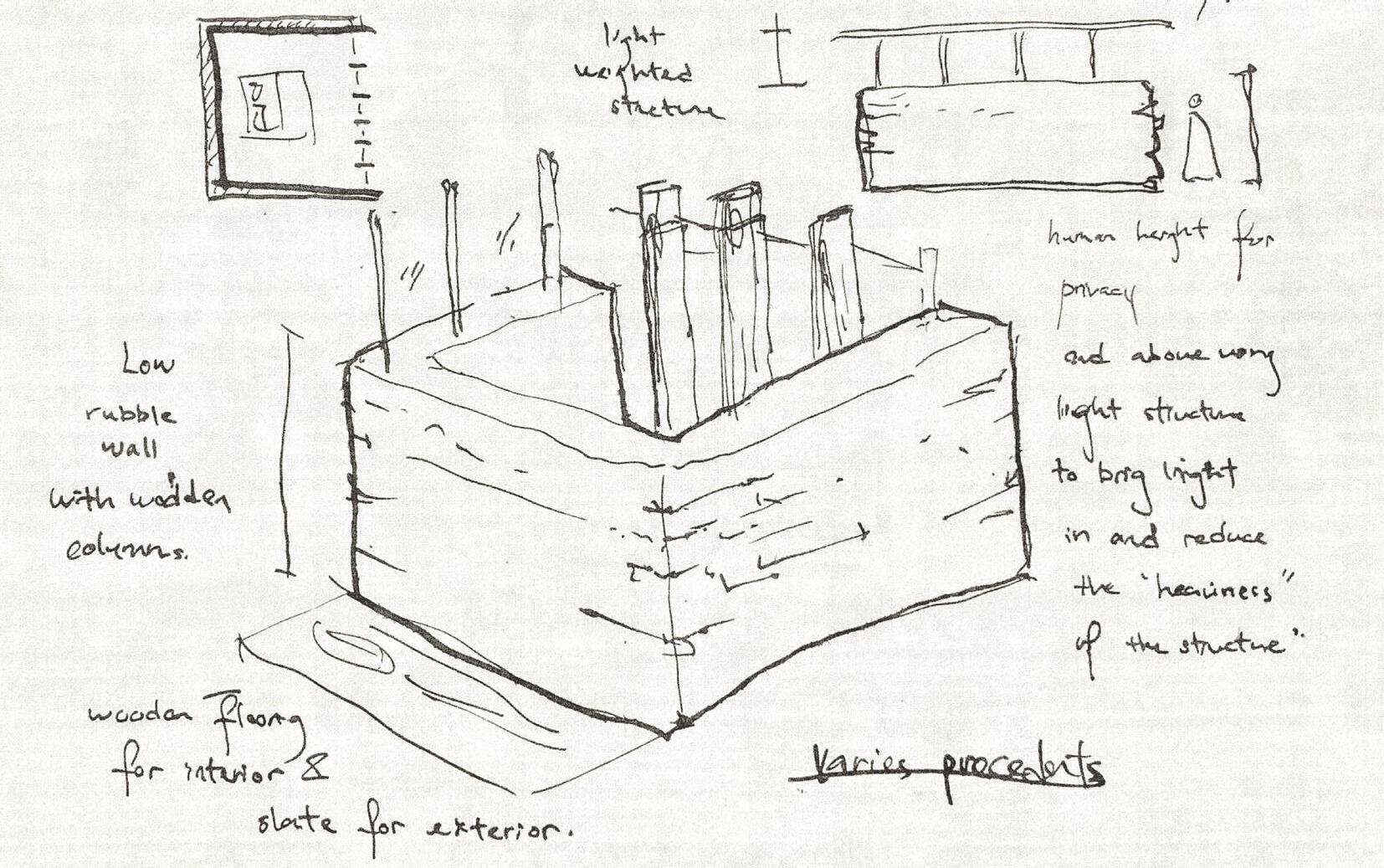
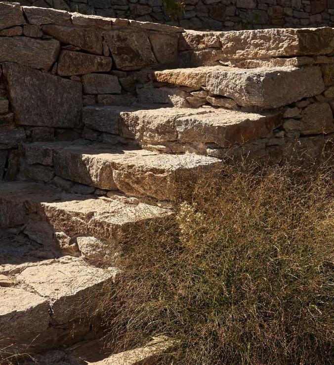
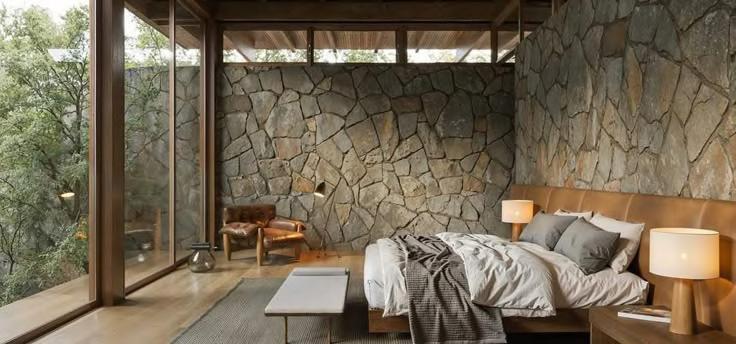
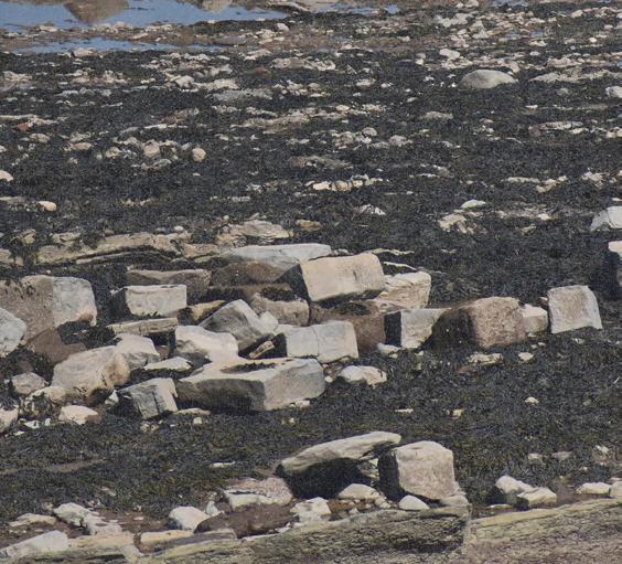
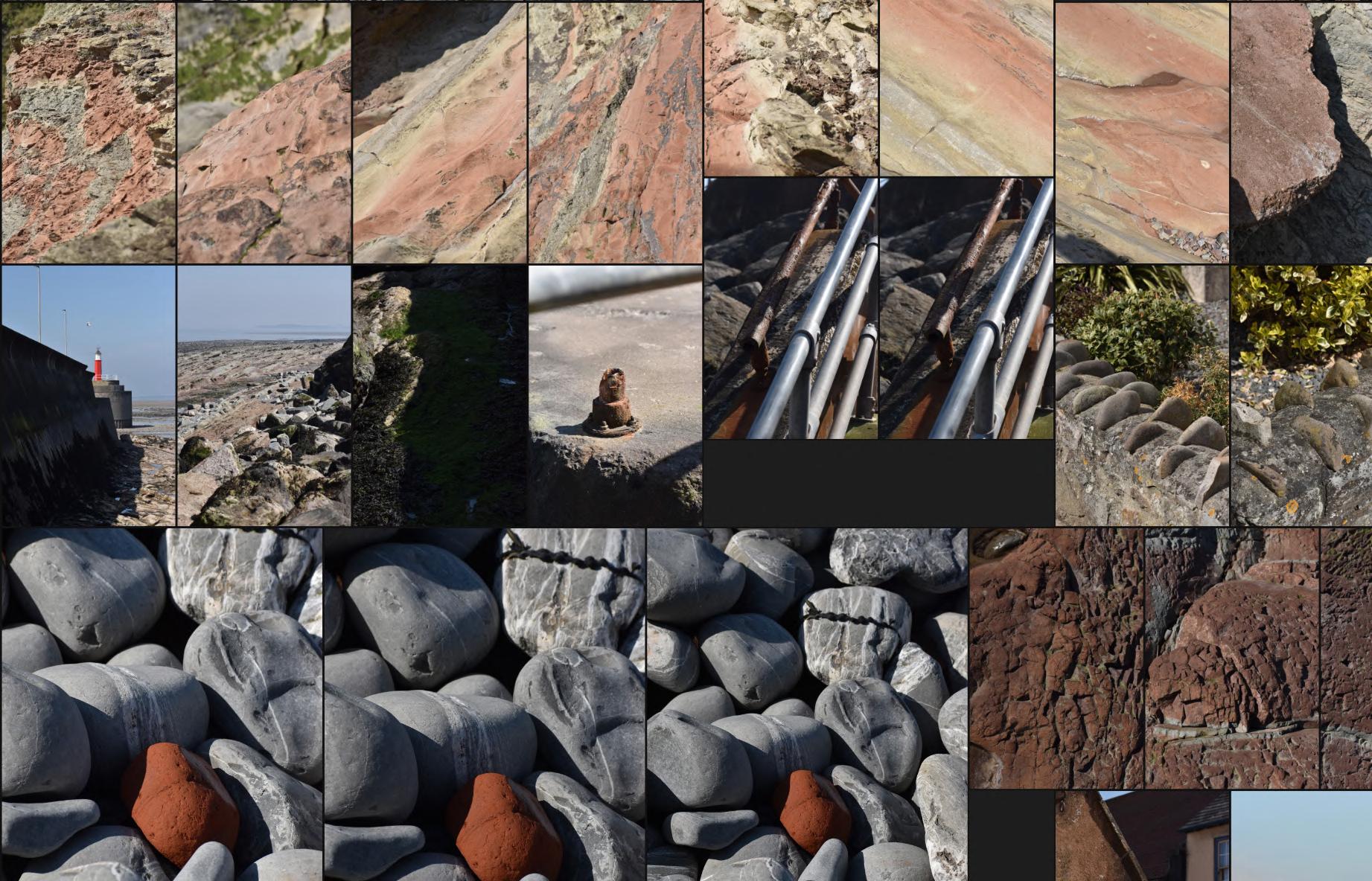
The structural and material strategy for this project responds directly to the local character, geological context, and design ethos of the scheme. The primary structure is formed using rubble stone masonry, referencing the layered mudstone and sandstone found along the coastline of Watchet. These materials, historically used in boundary walls and older buildings in the area, offer both visual continuity and environmental efficiency. The stone is laid with a lime-based mortar, allowing the structure to remain breathable and compatible with the fluctuating coastal climate.
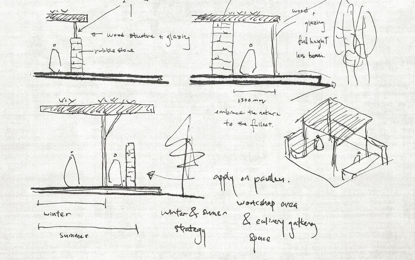
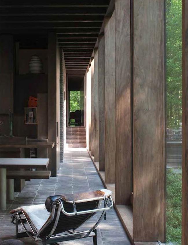
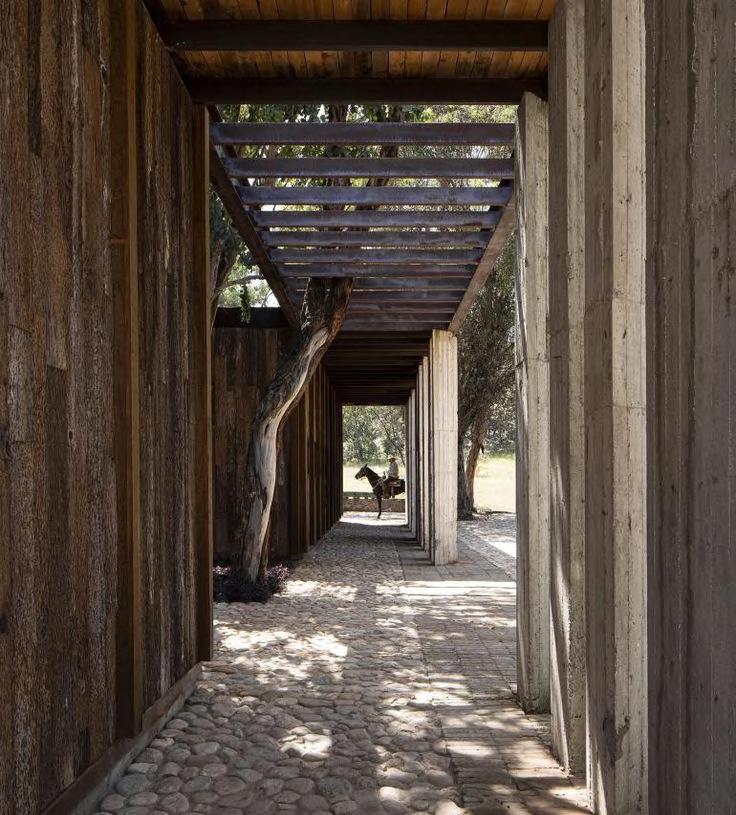
To reduce the visual and physical weight of the stone, the walls rise only to 2.5 meters, creating a grounded base without overwhelming the internal space. Above, a lightweight timber superstructure carries the roof, introducing a contrasting sense of warmth and openness. A secondary timber frame system runs parallel to the stone walls, offset by 1.5 meters to form a sheltered colonnade. This space supports thin-framed glazing and serves as a buffer zone that improves ventilation and light while offering framed views into the surrounding greenery.
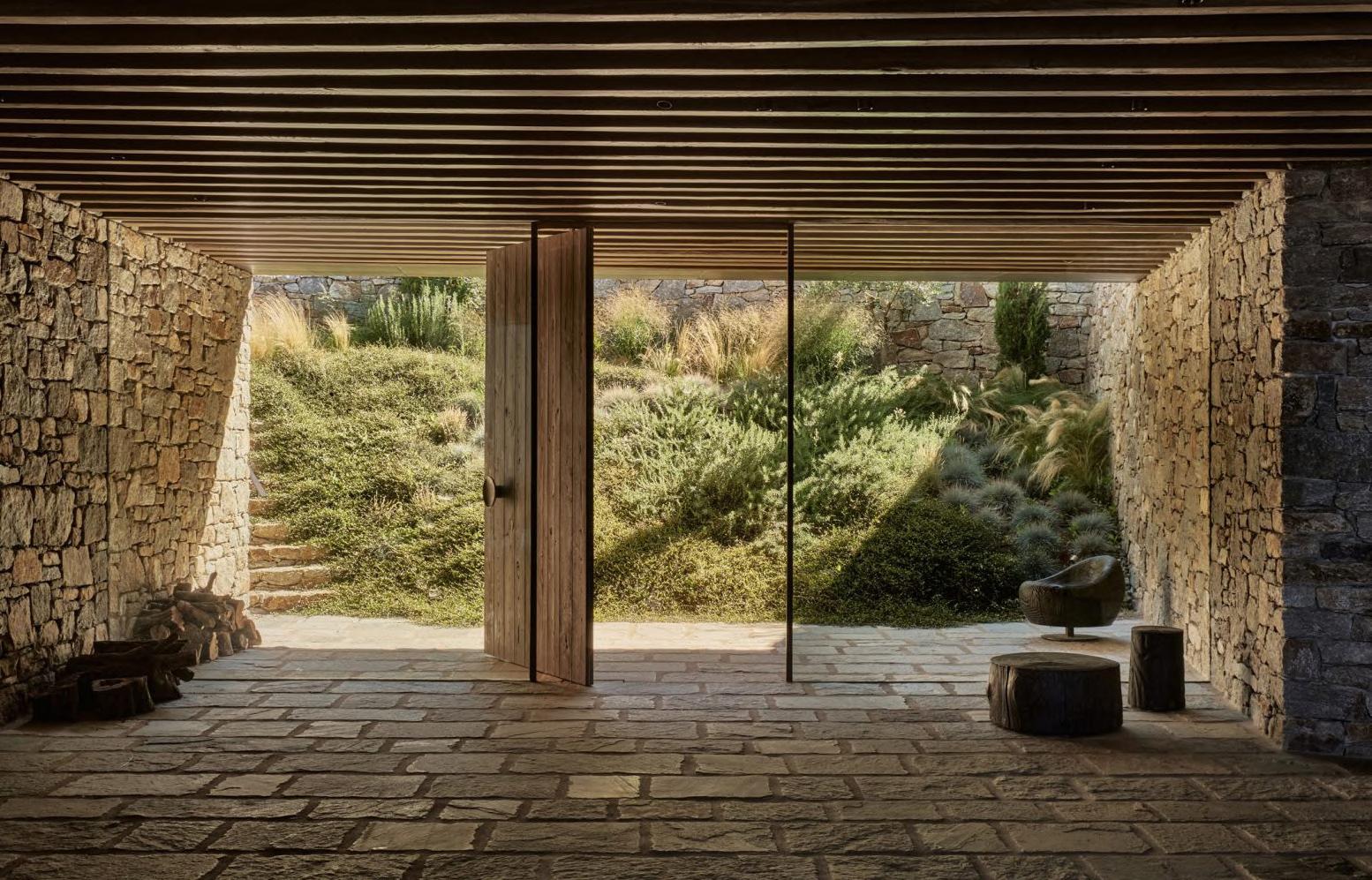
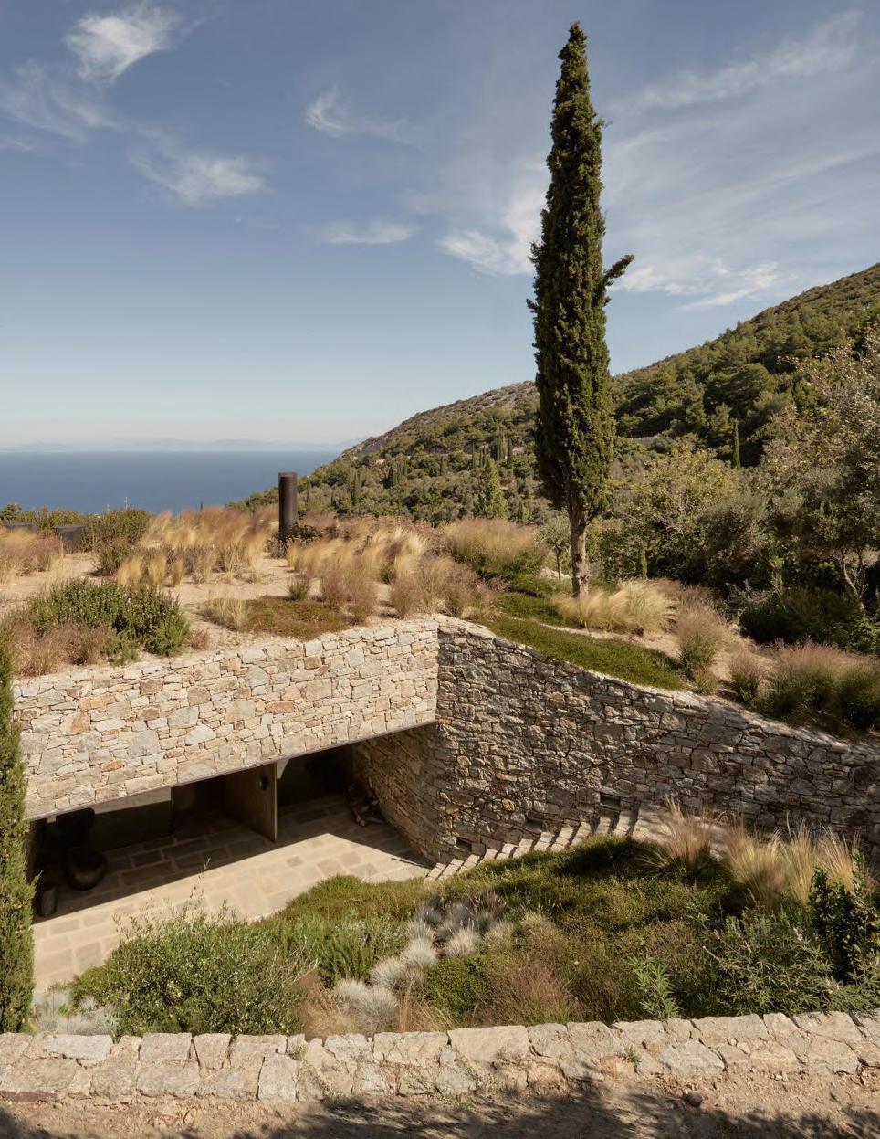
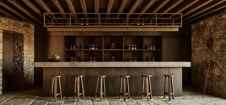
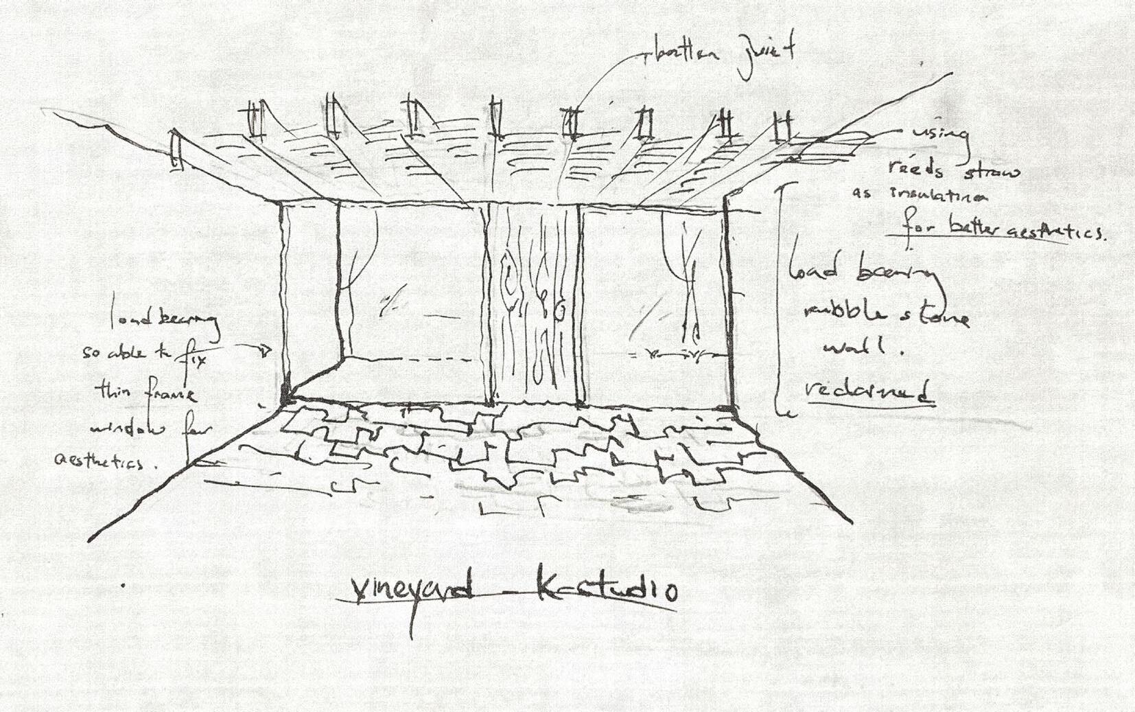
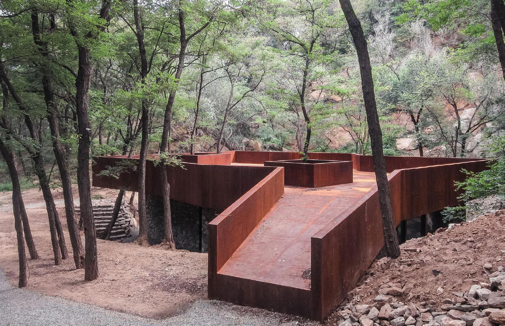
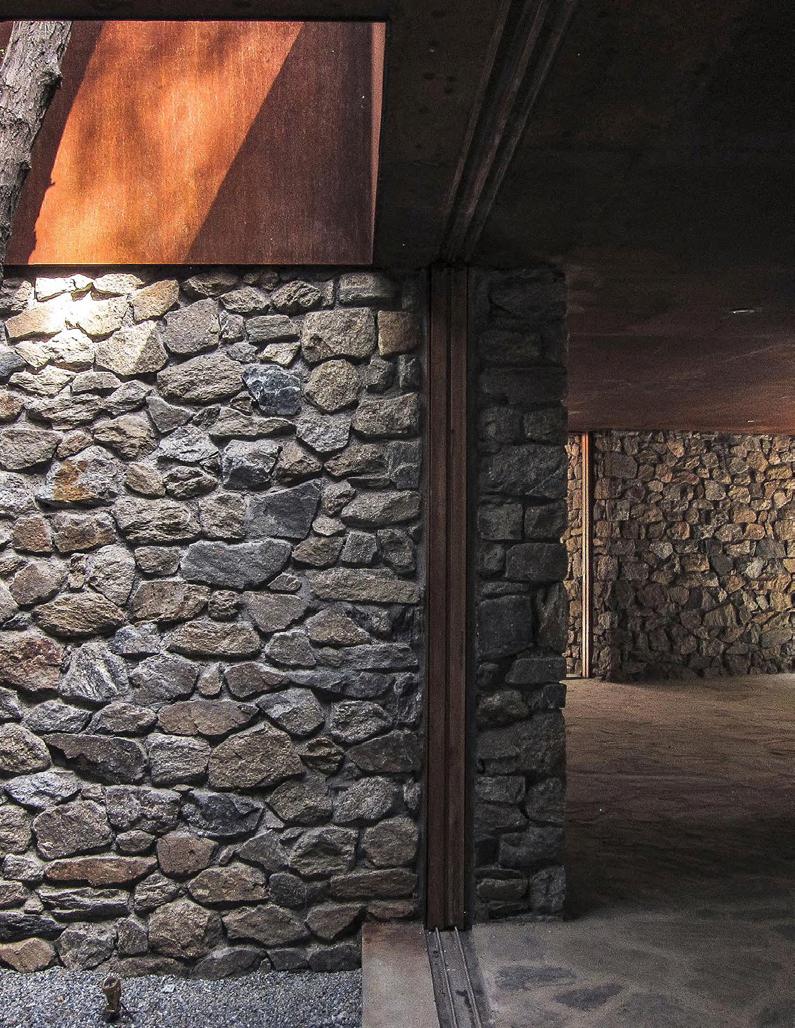
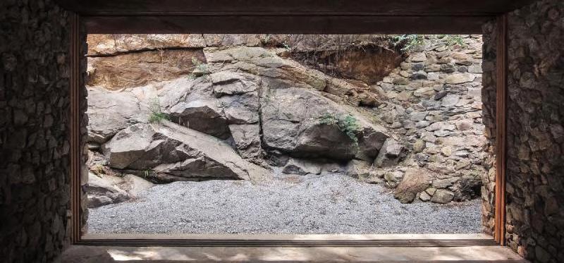
Vineyard Visitor Center by K-studio. Burried underneath the earth. Similar scheme.
Exposed Sturcture
The exposed ceiling appears to use battens and bamboo, reminiscent of traditional thatch roofs. This precedent inspired me to explore reed as a natural insulation material.
Natural Texture
The heavy stone and the thin glazing in top left creates a really nice contrast. And maximise the greenery into the interior
Load Bearing
The stone wall as retaining wall and structural support does make the whole building looks like one. Even the steps.
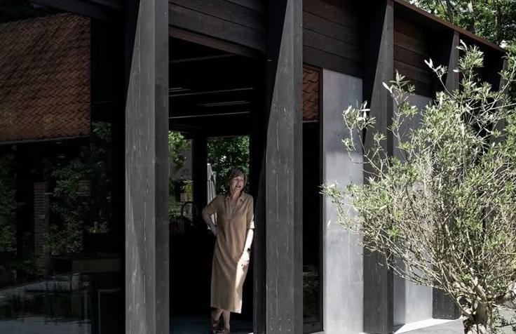
Interior
Finishes are embracing raw natural texture, and it creates pure cozy mood.
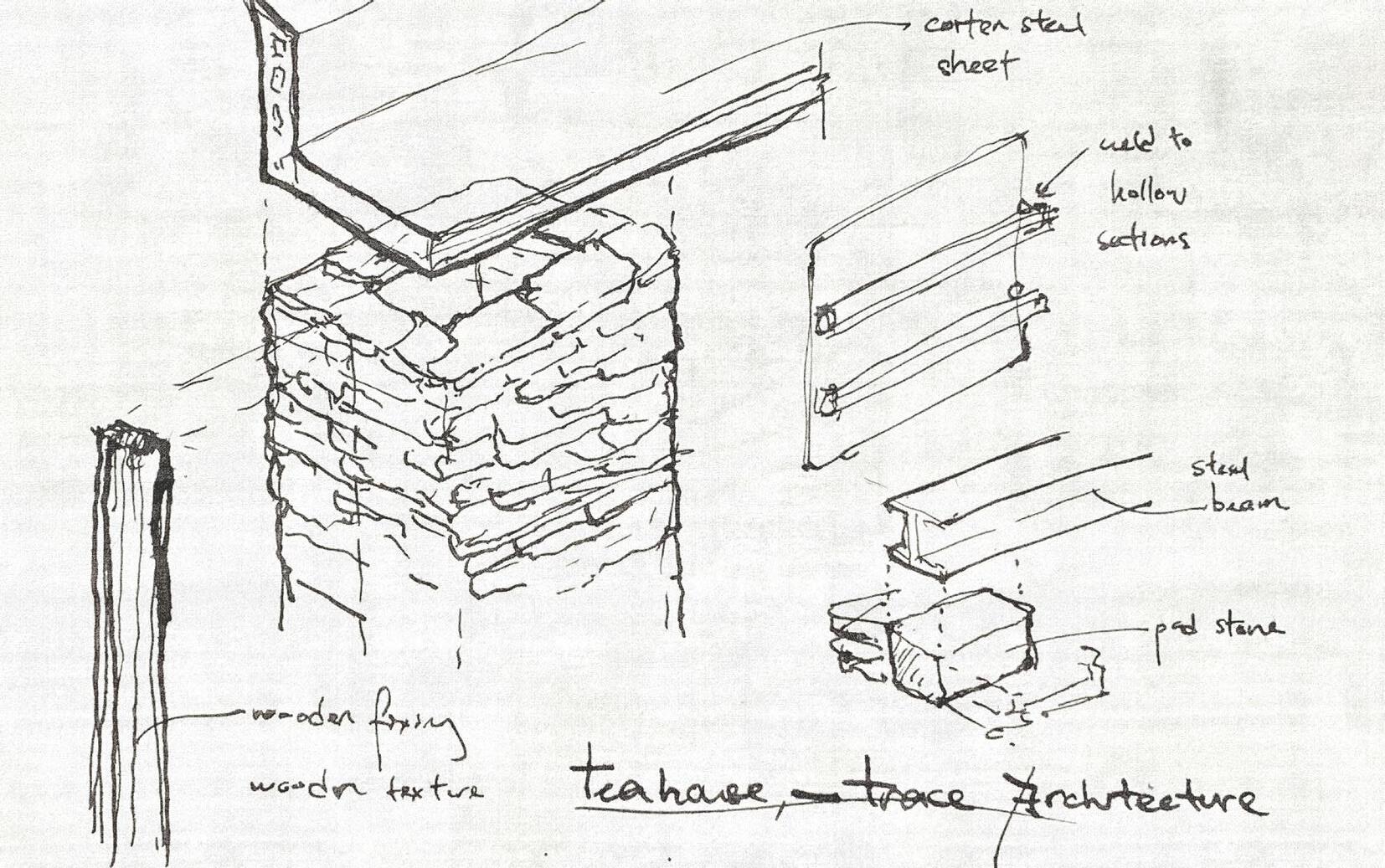
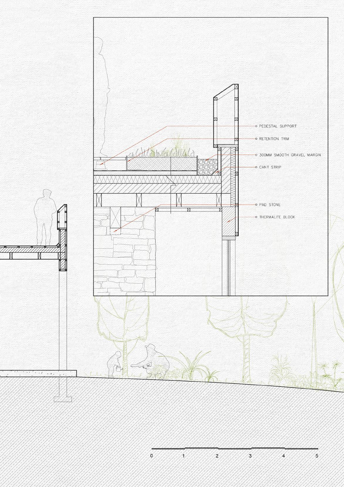
The roof design avoids concrete in favour of a timber batten and joist system. Above this, a green roof adds thermal mass, supports biodiversity, and reduces stormwater runoff. Roof edges are detailed in corten steel, chosen for its durability and weathered finish, echoing the reddish tones of Watchet’s cliffs and soils. Inside, insulation is layered with rockwool and reed straw, combining thermal performance with agricultural textures drawn from local thatch and hay. This approach is not purely aesthetic. It reflects spatial principles from the 25 Rules, where tactile surfaces, soft acoustics, and visual warmth help reduce stress and enhance emotional comfort.
Neuroarchitecture research supports this strategy. Natural textures like stone, straw, and wood help regulate the prefrontal cortex, promoting calm and attentiveness. These materials also reduce activity in the amygdala, easing anxiety and supporting spatial orientation, especially for older adults or those with cognitive decline. Familiar sensory cues such as texture, scent, and filtered light can reinforce memory and a sense of belonging.
The result is a material system that performs environmentally while supporting well-being. It is grounded, contextual, and aligned with the project’s aim to create architecture that ages with grace and remains rooted in its landscape.
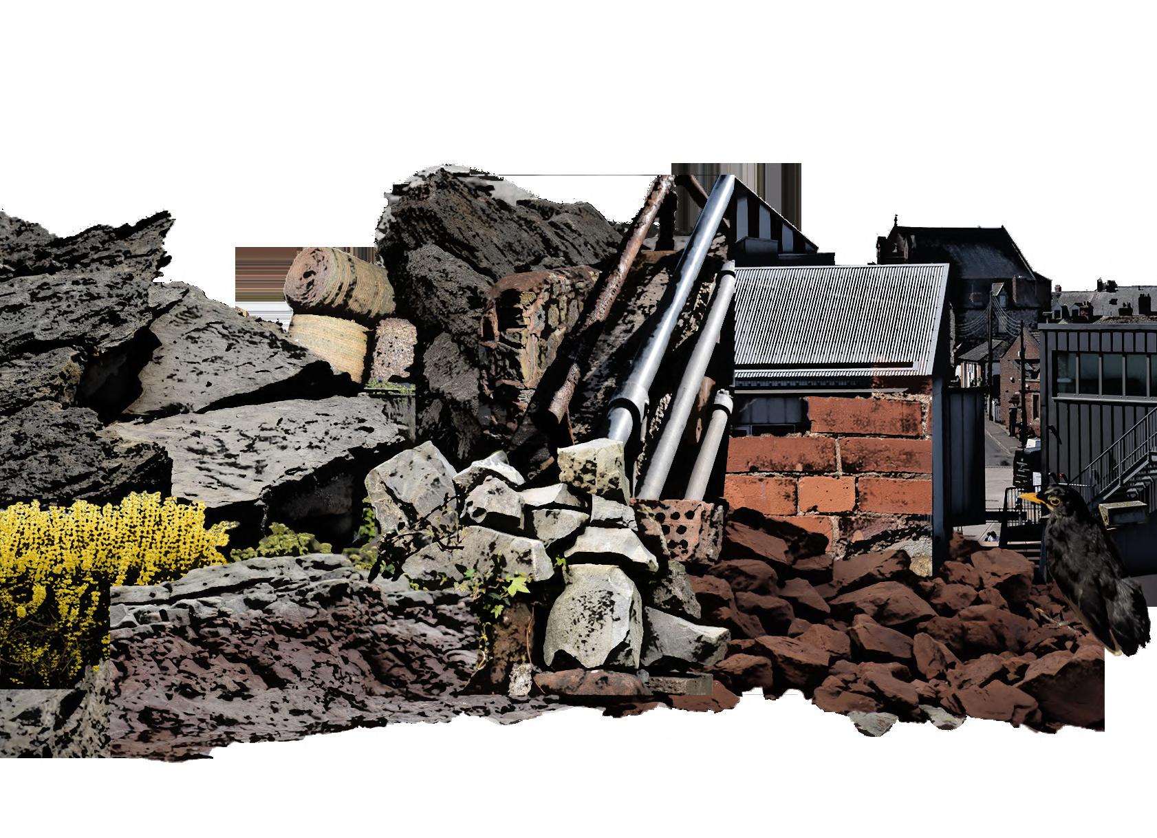
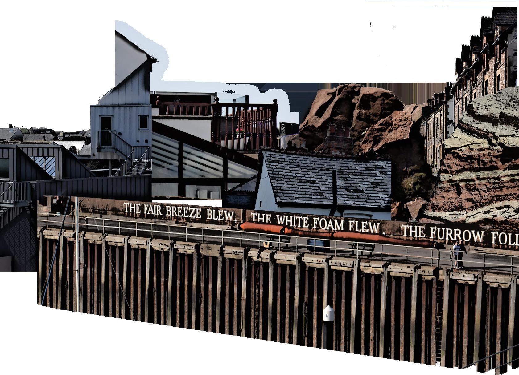
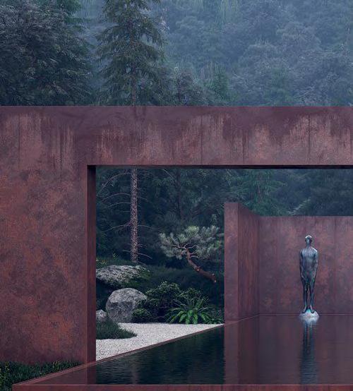
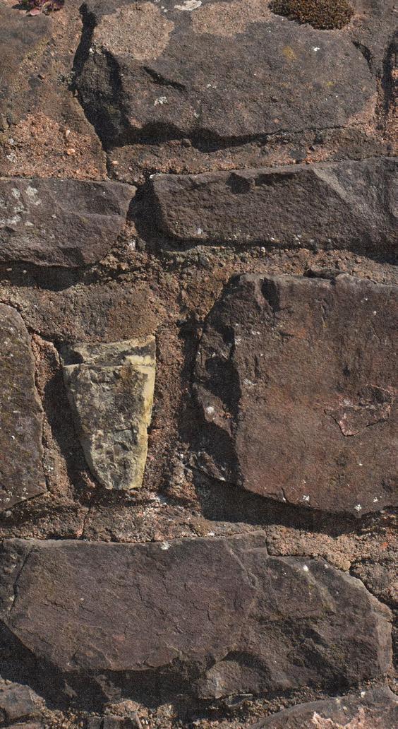
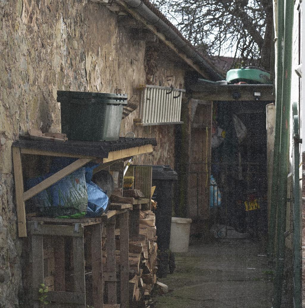
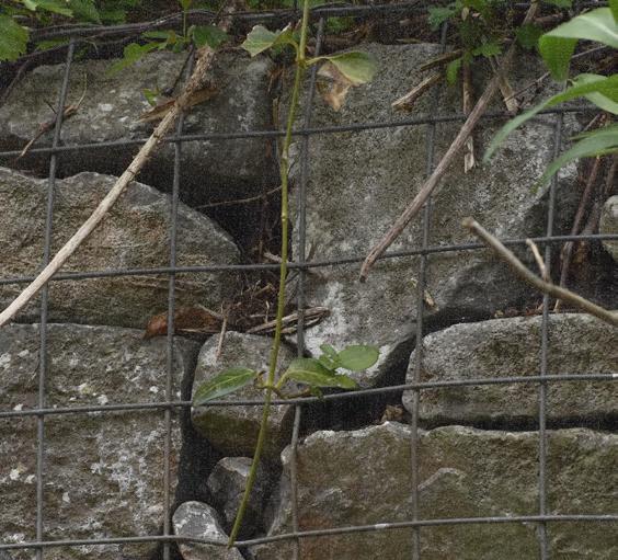
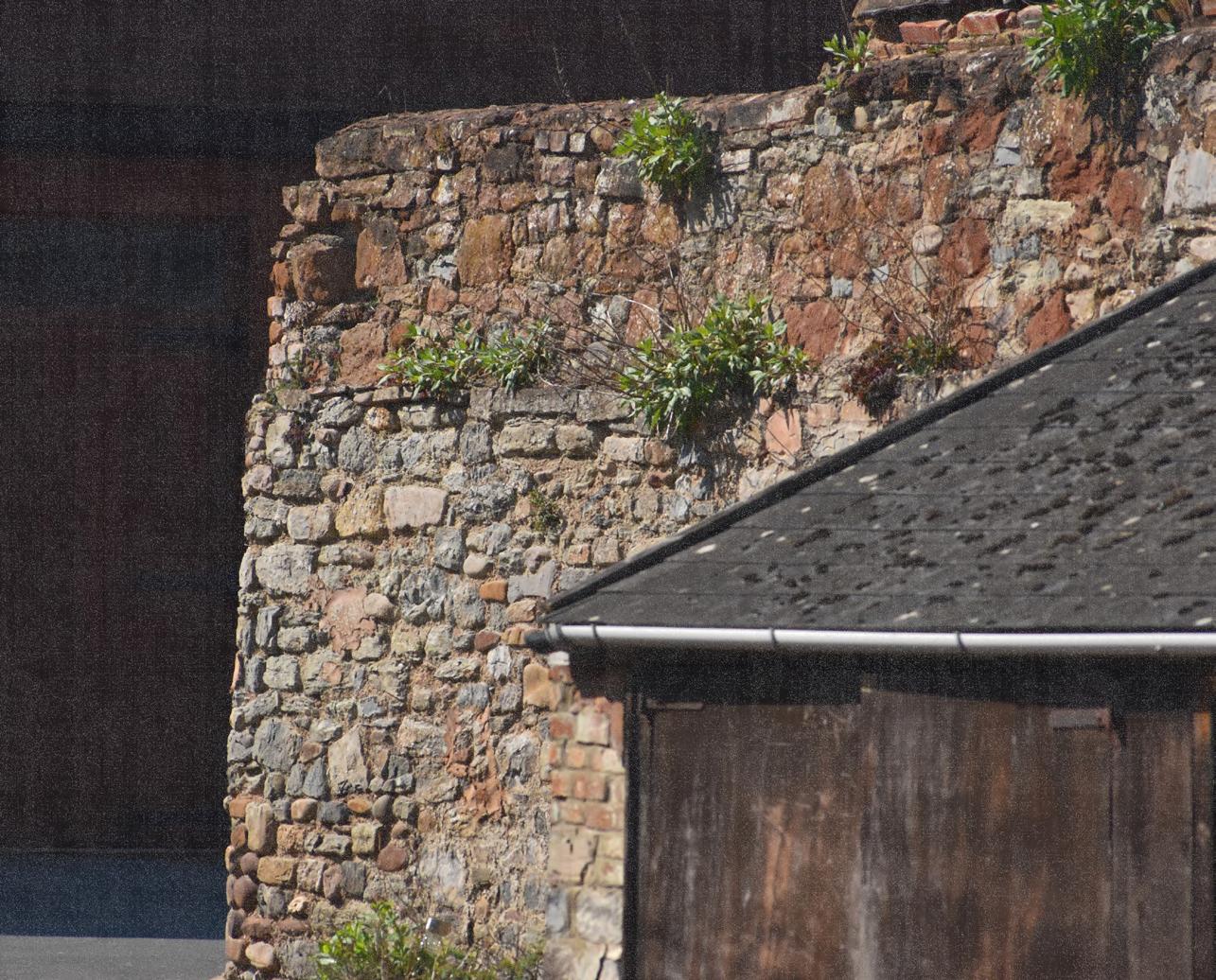
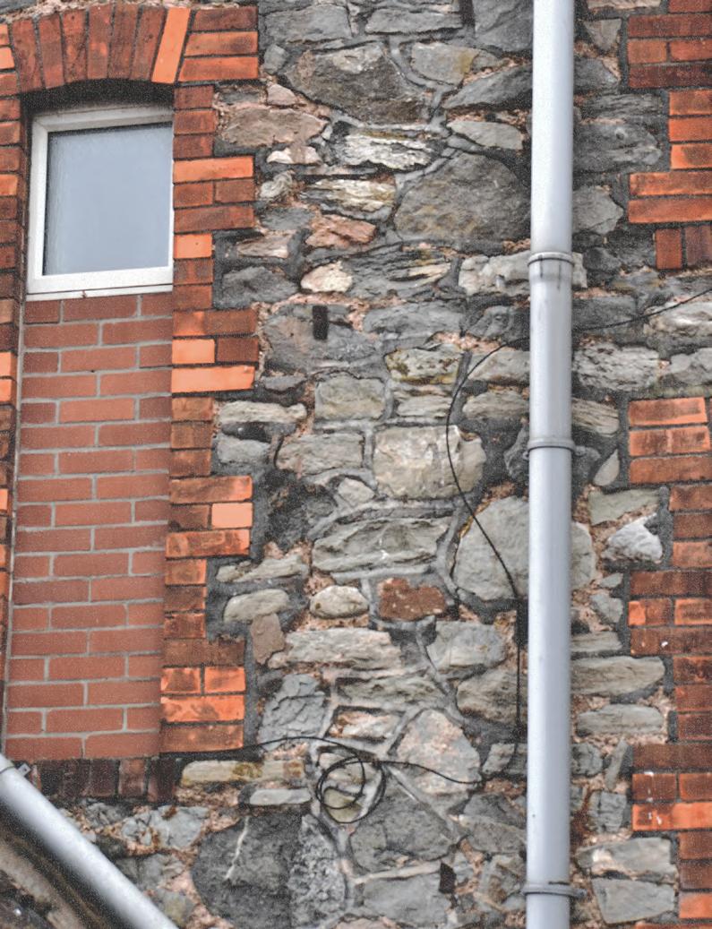
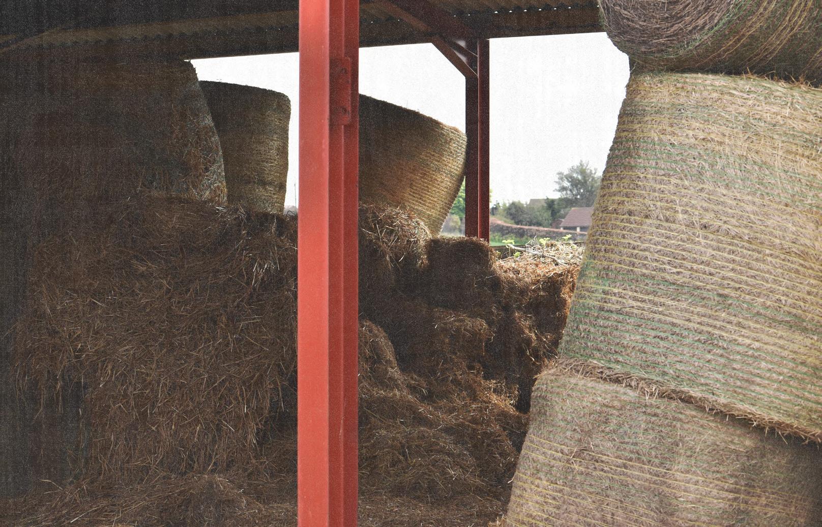
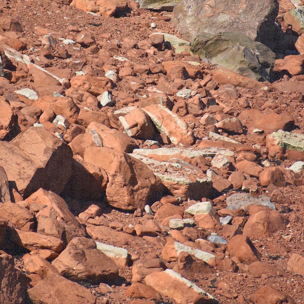
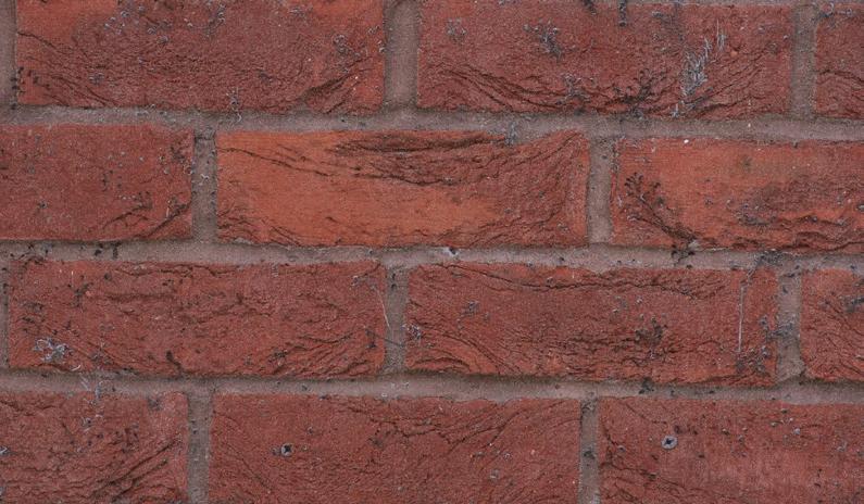
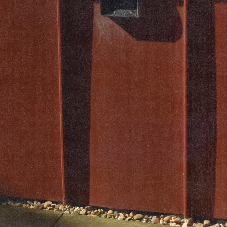
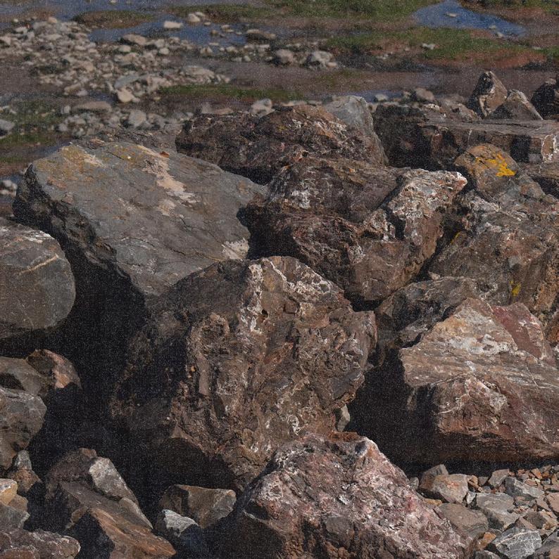
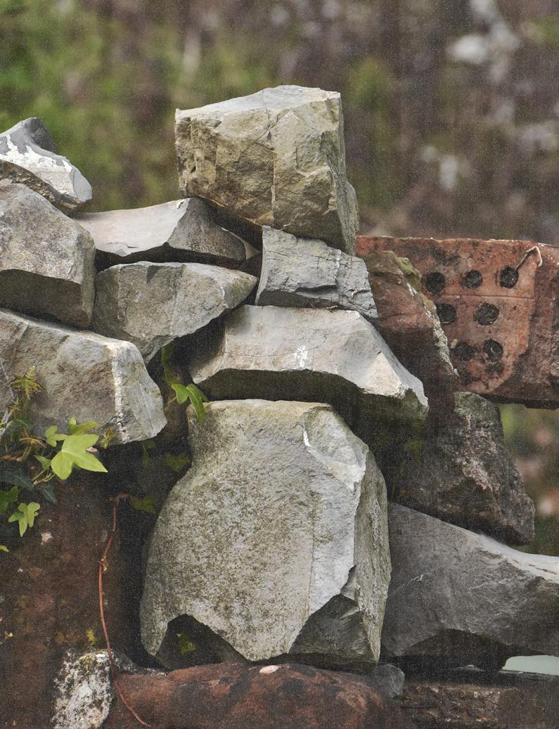
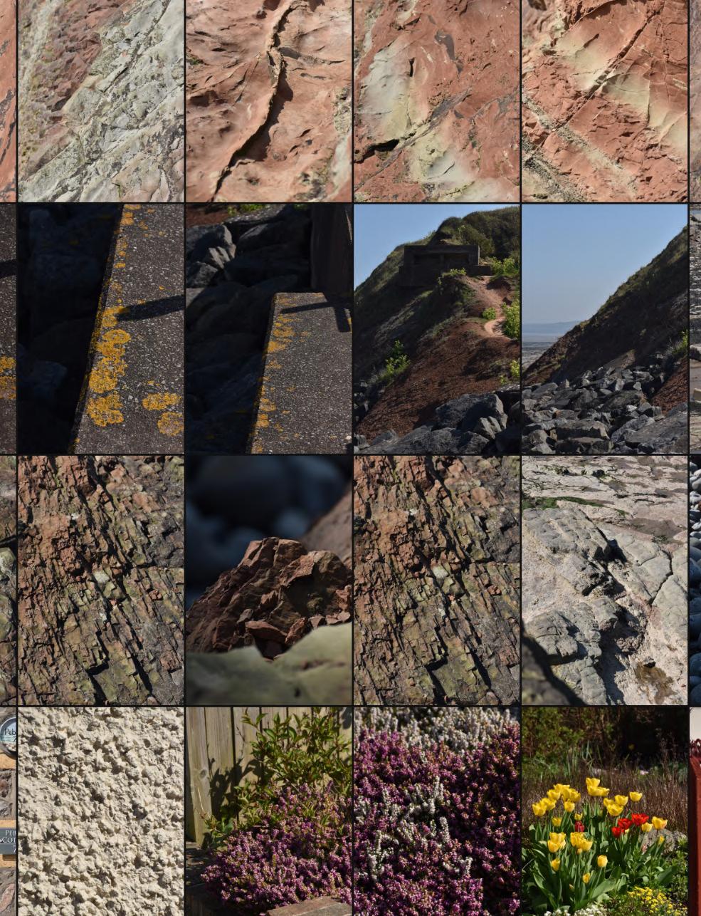
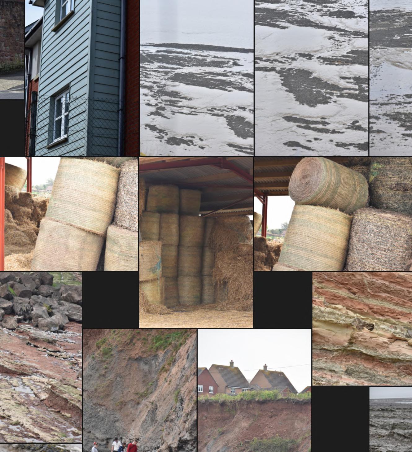
Rough stone, fractured red earth, rusted metal, crumbling brick, tangled growth. Pebbled paths, weathered timber, moss in the cracks. Scratched paint, flaking surfaces, patched repairs. Edges softened by rain, metal corroded by salt. Nothing polished, just things as they are, settled into place. A palette shaped by time, labour, and quiet erosion.
Technical
ROOFING STRUCTURE
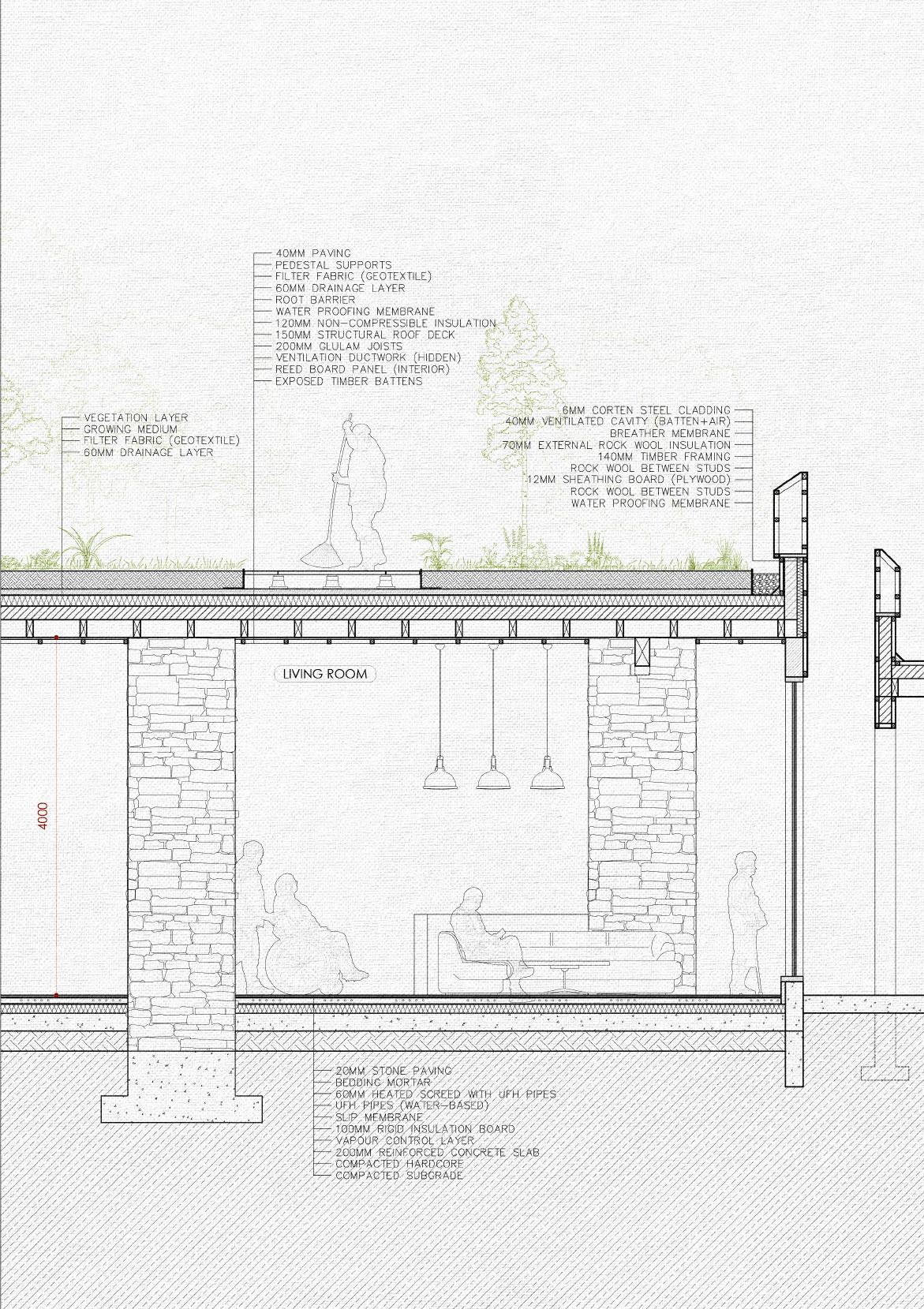
The roof is designed as a multi-functional system that supports vegetation, manages rainwater, and allows pedestrian access. It adopts an intensive green roof buildup, enabling the growth of larger planting species alongside paved walkways. Rainwater is filtered through a layered substrate and drainage system, directed to collection points for reuse, contributing to the sustainability goals of the project.
To ensure thermal efficiency and prevent interstitial condensation, a warm roof strategy is employed, with XPS insulation installed above a solid timber deck. Below this, a dedicated service void accommodates mechanical ventilation, maintaining internal air quality while preserving spatial clarity. Internally, the ceiling incorporates reed board panels set between exposed timber battens, providing acoustic performance and a natural finish.
The primary structure consists of load-bearing rubble stone masonry walls, referencing local construction methods while providing thermal mass and structural stability. These walls are supported by concrete pad foundations sized to accommodate point loads from the superstructure. At ground level, slate or stone paving is used for circulation surfaces, selected for its durability, slip resistance, and compatibility with the overall material palette.
The entire assembly is developed in accordance with BS 6229:2018 for flat roof design, the GRO Green Roof Code (2021) for vegetation and drainage layers, BS EN ISO 13788 for condensation risk, BS EN 1996 for masonry, and BS EN 1992 for concrete. The integration of structural, thermal, and material considerations ensures that each element contributes to both performance and long-term usability.
Environmental Strategy
Drawing inspiration from the Bullitt Center and Panal’s Regenerative Condominium, the design operates as a responsive system, harmonizing passive and active measures across seasons.
Seasonal Performance:
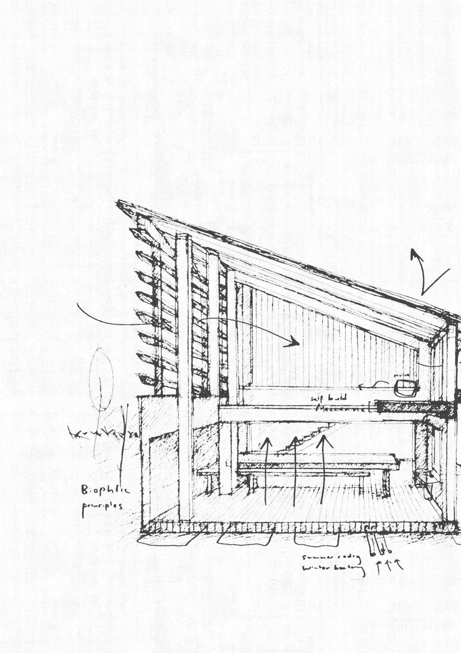
Summer Cooling: Deep eaves, operable windows, and clerestory glazing facilitate effective cross-ventilation, drawing cool air through the shaded central street and releasing heat through upper louvres. Timber and masonry walls regulate indoor temperatures through thermal mass and breathability. The roof’s extended overhang shields glazing while maintaining daylight.
Winter Heating: The high thermal mass of the masonry base retains warmth. An underfloor heating system, integrated within the raised timber floor, provides radiant warmth with minimal energy input. This is supported by a Mechanical Ventilation with Heat Recovery (MVHR) system, which preserves indoor air quality while reclaiming warmth from extracted air.
Participatory Design:
The mezzanine is intentionally left open for self-build, allowing residents to shape their own space—an act of empowerment aligned with Rule 1: People need to feel in charge again.
Water Management:
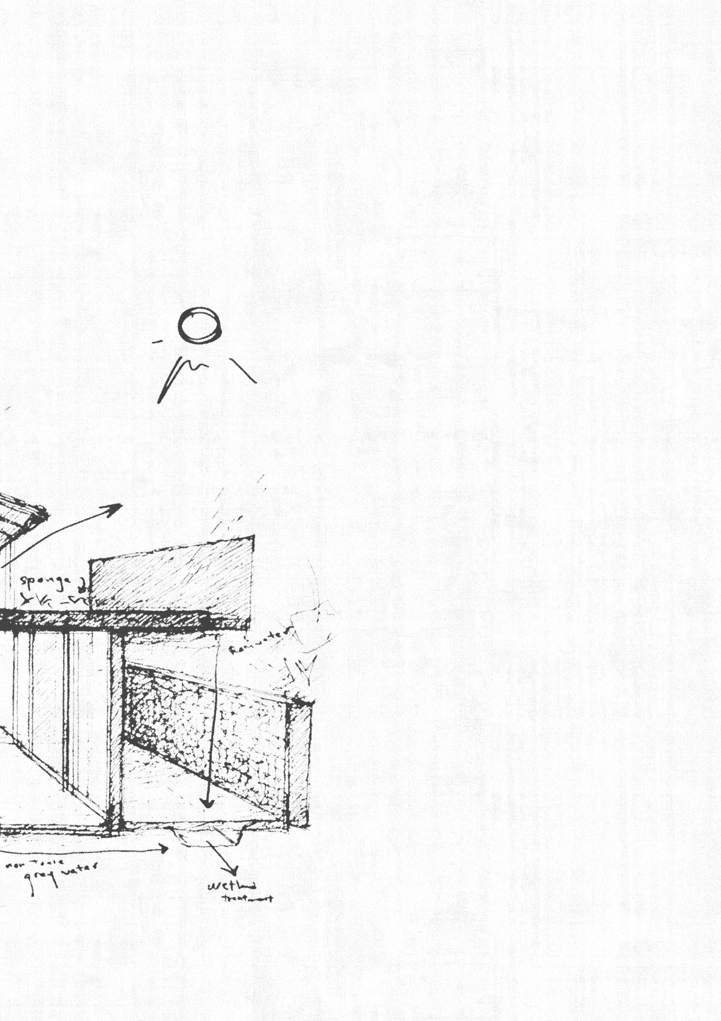
Rainwater from green roofs, showers, and sinks is directed into a visible drainage trench, echoing Bullitt’s closed-loop cycle. After filtration, it is released into the wetland park, completing a regenerative circuit between building and landscape.
Fire Strategy
The fire strategy is inherently supported by the building’s conceptual layout. As spaces are arranged around a central courtyard, creating a clear and open configuration. This design naturally simplifies evacuation, as each unit or zone remains in close proximity to open-air circulation and points of escape.
The escape routes indicated in the fire plan have been designed in accordance with Approved Document B (ADB) of UK Building Regulations. All travel distances fall within the required limits: where a single escape route is provided, it does not exceed 18 metres, and where two routes are available, the distance remains within 45 metres. The courtyard structure and direct access to external paths ensure clarity and safety during evacuation.
Escape threshold
Potential route for escape
Project: L.I.F.E.
ARCHITECTURE AS QUIET CARE
Aging is not a retreat, but a quiet return to the rooms that once held laughter, to the light that still spills across the floor each morning. This project began as a response, but deep down, it was a remembering. A remembering of voices growing softer with distance, of care that was once spoken aloud and now lives quietly in gestures. Project: L.I.F.E. imagines architecture not as structure, but as a companion—one that listens when no one speaks, that holds space when words fall short. A place where the past is not erased but gently folded into the present. Where each material chosen, each corner shaped, becomes a way of saying: I see you. You still matter. In this way, the architecture becomes a keeper of memory and an offering of care, not to fix time but to sit beside it and stay.
Final Thought
WHAT REMAINS MATTERS MOST
It feels like a shame that so much of the project remains conceptual. Unresolved fragments, unfinished thoughts. In many ways, it still feels incomplete, always circling around that familiar moment of “just one more iteration to make it perfect.” I’ve always tried to go beyond what I was ready for, to reach further than I could grasp. But this time, I may have gone too far. Time became my greatest constraint, and eventually, it caught up with me.
I spent too long exploring. Too long gathering ideas, chasing possibilities, studying references. The block that followed was heavy. For a while, I couldn’t find a way through. I felt overwhelmed and unsure. But I reached out. I asked for help. With the support of my tutors and peers, I found a way to refocus. I narrowed the scope and took small steps forward. That became my way through.
What stayed with me most from this process is the lesson of knowing when to stop. Not everything can be resolved. And perhaps it shouldn’t be. That simple truth - “you can’t solve everything”helped me see the work differently. Growth doesn’t come from staying within what I can already do. It comes from trying, failing, adapting, and accepting that imperfection is part of the process. And maybe that’s the deeper crisis we face in architectural culture today. We value completion more than risk. Outcome more than process. But it is in the unfinished where something real often begins.
Even within the limits, this project helped me find something meaningful. I want to create architecture that heals. Not just spaces
designed to respond to pain, but ones that quietly care before pain takes root. Spaces that listen, that shelter, that offer a kind of presence people can lean into. That is where architecture begins to matter most.
Some parts of my vision couldn’t be realised—integrated systems like rain gardens, composting, and regenerative cycles remained as ideas. But they’re not abandoned. They are part of what comes next. This project may not be everything I hoped it would be, but it has shown me where I want to go. It gave me direction, and that is enough.
Special thanks, in no particular order, to Annie Bellamy, Mike Lewis, Piers Taylors and Tim Healy . Your support helped me find my footing when I had none.
CHAPTER Ω APPENDIX
Constrast
Materiality exploration. Looking for the mislooked
Texture
Form finding. learning from the nature and the local.
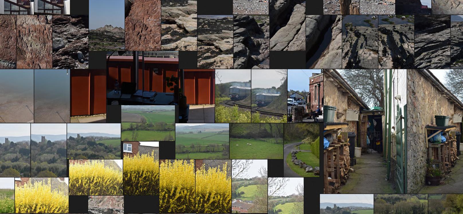
MOODBOARD
Local ‘Product’ In search for what define local.
The spirit of the site, not a word could explain all.
Genius Loci
STUDY MODELS
PRECEDENT ON: design briefs
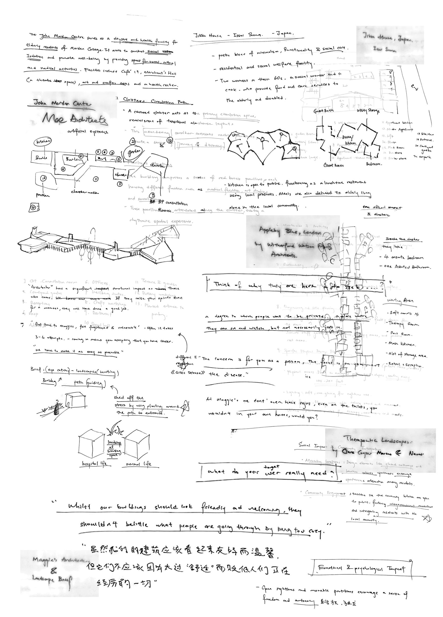
Maggie’s Architecture and Landscape Brief
BY MAGGIE KESWICK JENCKS
After reviewing the Maggie’s Centres architectural brief, what stands out is the focus on treating the person, not just the illness. As Maggie Keswick Jencks herself put it, “Our buildings must look friendly. They must have clarity. They should look as if they are acknowledging what people are going through, saluting the magnitude of the challenge they are facing and themselves rising to the challenge of trying to help.” This highlights the importance of creating spaces that acknowledge the emotional weight of a situation without trivializing it. Natural elements like light, outdoor views, and gardens are central to helping people feel connected to the world beyond, offering a sense of peace. Additionally, the design emphasizes flexibility, encouraging users to make small choices, like moving a chair or finding a space where they feel comfortable, helping them regain control in an environment that often feels overwhelming.
Key takeaways:
Design that acknowledges the emotional challenges and offers clarity without being intimidating.
Incorporation of natural elements to foster connection and emotional peace.
Flexible spaces that empower users to make choices and feel in control.
PRECEDENT ON: emotions
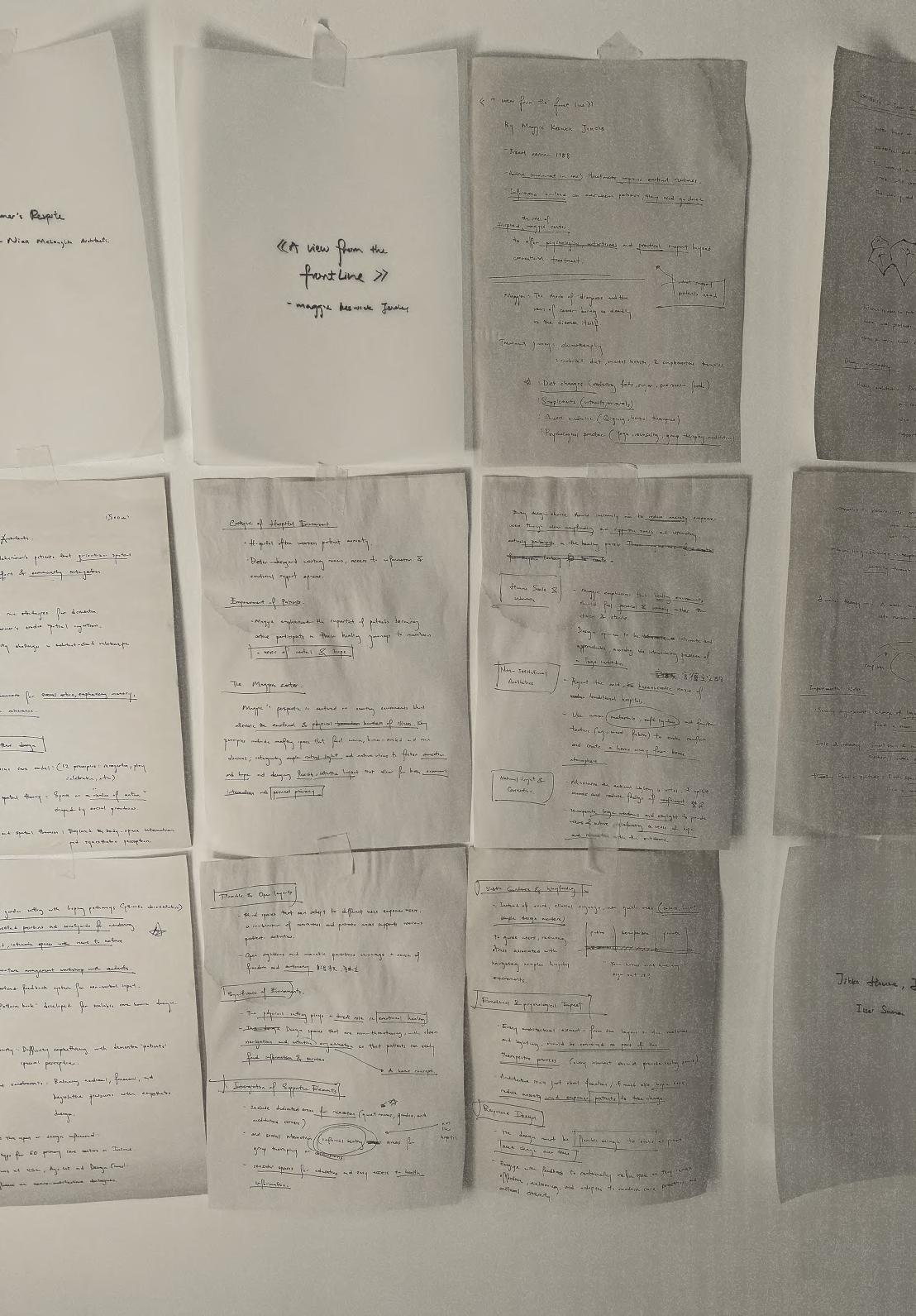
A View From the Front Line
BY MAGGIE KESWICK JENCKS
In A View From the Front Line, Maggie Keswick Jencks reflects on how architecture influences the emotional experience of cancer patients. She highlights the importance of creating spaces that feel welcoming and human, rather than clinical or intimidating. She notes, “In hospitals people are patients... A Maggie’s Centre is not just another hospital department. It is small and separate enough for the people who use it to identify it as their own place.” Maggie stresses that spaces should provide comfort and a sense of autonomy, helping patients regain control over their lives.
She emphasizes that the design of the Maggie’s Centres is focused on creating an informal, life-affirming atmosphere. Describing the Edinburgh Centre, she says, “The building is full of zest and life and colour. Light floods in... The atmosphere is hard to pin down, but it is far more coffee morning than cancer ward.” The goal is to offer a space that fosters emotional relief, where patients feel empowered to engage with their treatment in a supportive environment.
Key takeaways:
Comfort Through Design: Spaces should feel personal and welcoming, offering emotional comfort without the formality of a hospital.
Empowering Patients: Design should allow patients to feel in control and engaged in their healing process.
Atmosphere of Hope: The environment must nurture well-being, using light and color to create a life-affirming atmosphere.
PRECEDENT ON: programs
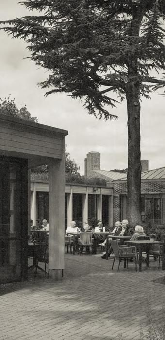
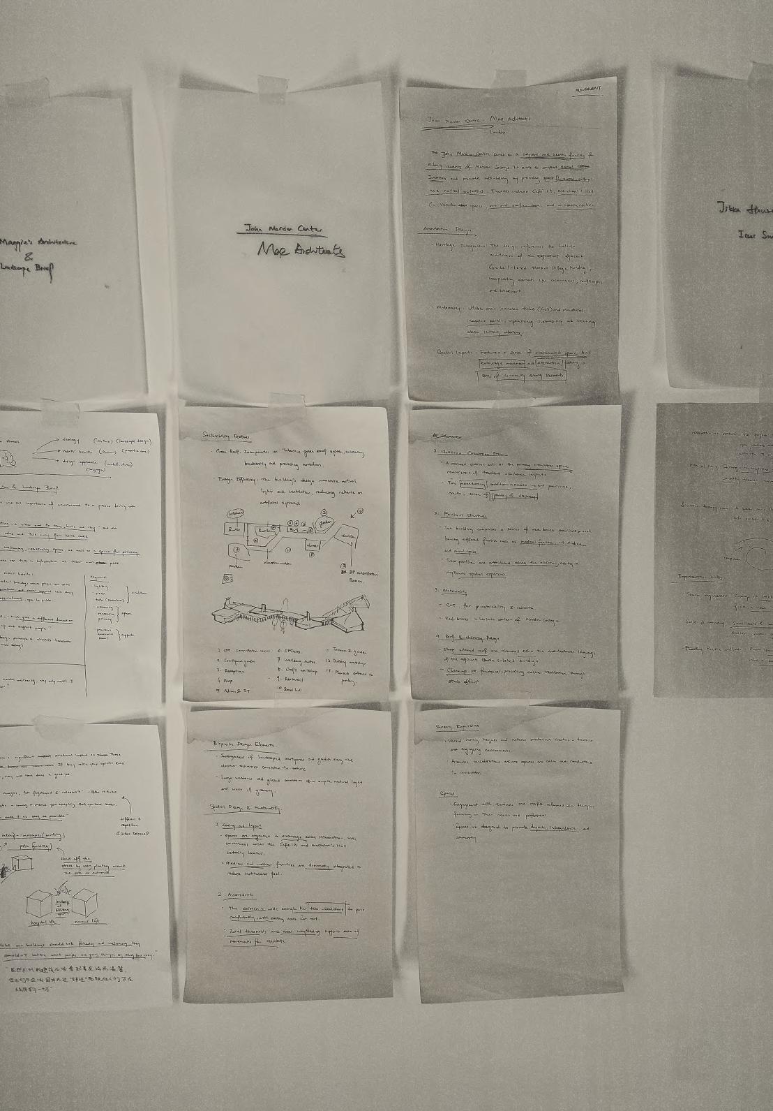
John Morden Centre
BY MÆ ARCHITECTS
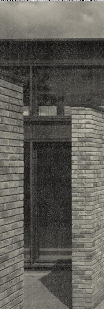
John Morden Centre, London • is an interesting project that focuses on creating a vibrant and community-oriented environment for older adults. Inspired by the almshouse model, the design seeks to invigorate residents through a range of programs and activities. The inclusion of spaces such as a theatre and classrooms aims to stimulate the mind and improve overall well-being. As highlighted in the design philosophy, “It’s a lot of ailments that come about through often isolation in old age,” emphasizing the importance of tackling isolation and encouraging connections among residents. The centre also offers flexibility, allowing residents to set up their own programs and activities, with the designers stating that the space should “allow residents to feel it’s theirs, and they could help shape the life of that building.”
Key takeaways:
Almshouse concept, fostering a sense of community and connection among residents.
Creation of stimulating spaces like theatres and classrooms to enhance mental and emotional well-being.
Flexibility in space usage, enabling residents to take ownership and influence the activities within the space.
PRECEDENT ON: programs
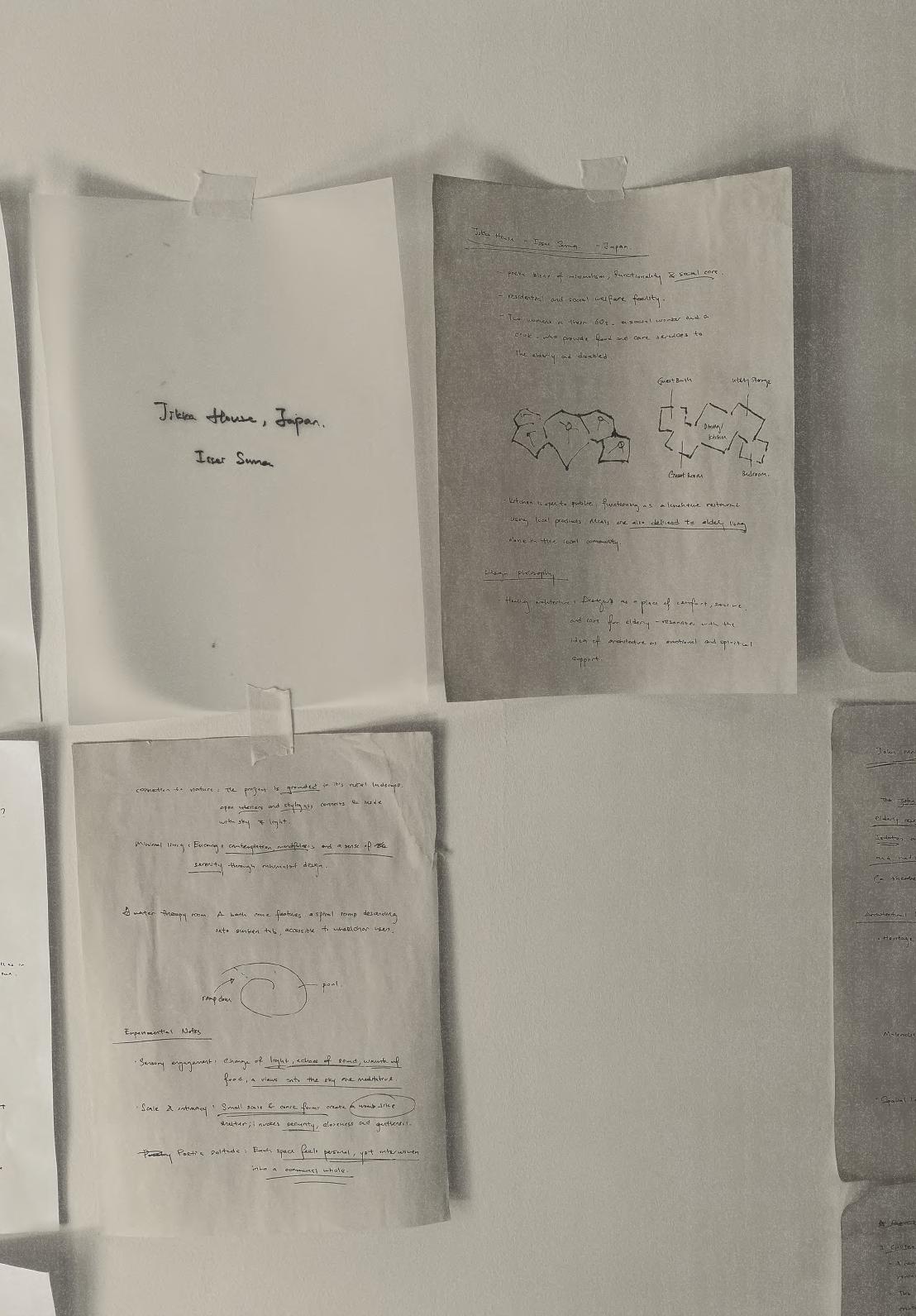
Jikka House
BY ISSEI SUMA
JIKKA, designed by Issei Suma, is a house located atop a flattened mountain ridge in Shizuoka Prefecture, Japan. Commissioned by two women in their 60s, a social worker and a cook, the complex consists of five interconnected hut-like structures, each serving a specific function within the community-oriented design. The central structure features a spacious kitchen and dining area, functioning as both a private residence and a public eatery that serves meals to the local elderly community. Additional facilities include guest rooms and a spiral-shaped, wheelchair-accessible bath, reflecting a strong commitment to accessibility and comfort. The design philosophy is summed up by Suma’s statement: “something as unembellished as a primitive hut and something as holy as a chapel,” highlighting the balance between simplicity and sacredness, offering a space that nurtures both physical and social well-being.
Key takeaways:
Community-Centric Design: The integration of shared spaces with private areas fosters a sense of community, encouraging social interaction and support among elderly residents. Accessibility and Comfort: The design incorporates thoughtful elements, such as wheelchair-accessible facilities and natural lighting, to ensure comfort and independence for all users. Simplicity with Meaning: The minimalist, hut-like structures create an environment that blends utilitarian function with a deeper, almost spiritual purpose, providing a space of tranquility and respect.
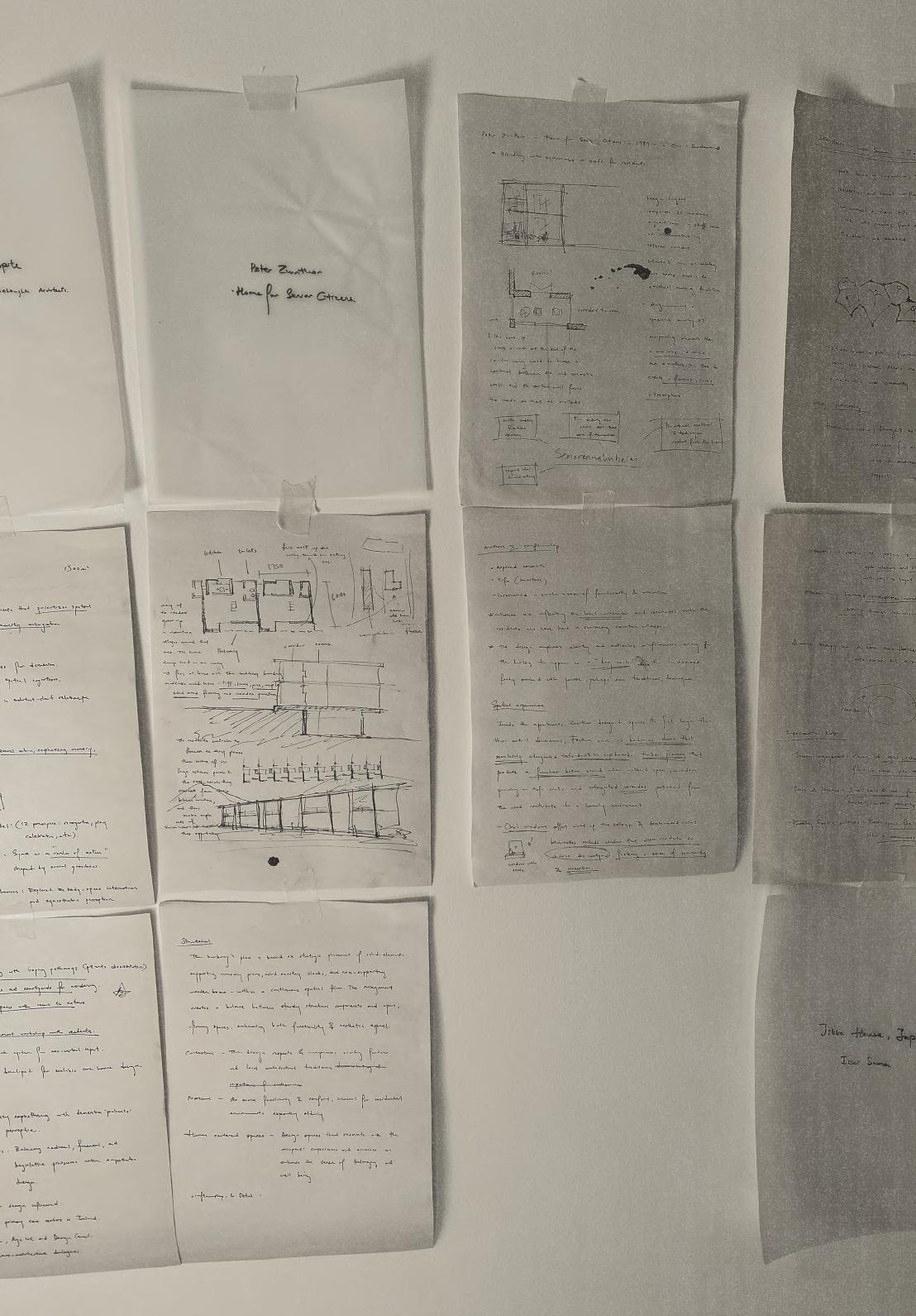
PRECEDENT ON: spatial design
Seniorenwohnheim
BY PETER ZUMTHOR
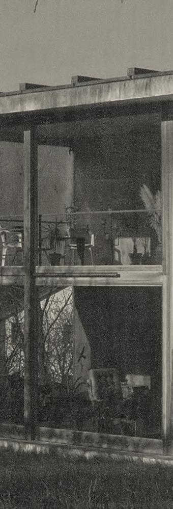
Peter Zumthor’s Home for Senior Citizens in Masans, Switzerland (1989–1993) exemplifies a sensitive approach to eldercare architecture, focusing on autonomy, materiality, and environmental integration. Designed for residents capable of independent living, the complex comprises 21 apartments, a guest room, and staff facilities, arranged around a central courtyard to foster community while maintaining privacy. Zumthor’s design philosophy emphasizes creating a “relaxed and informal” atmosphere, akin to a “big rock in the open expanses of a mountain landscape,” achieved through the careful selection and craftsmanship of materials such as exposed concrete, tufa, and larchwood. The layout incorporates elements familiar to local vernacular architecture, including timber flooring, wooden paneling on tufa walls, and integrated verandas, to evoke a sense of home and continuity with the surrounding village context.
Key takeaways:
Spatial Configuration: The arrangement of solid masonry piers and non-supporting wooden boxes within a continuous spatial flow allows for flexibility and personalization, enhancing residents’ sense of ownership and comfort.
Material Sensitivity: The use of local materials and traditional craftsmanship creates a tactile, sensory-rich environment that resonates with residents’ lived experiences.
Contextual Integration: By incorporating existing site features and aligning with the rural setting, the design fosters a harmonious relationship between the building and its environment, promoting a sense of belonging and continuity for the residents.
PRECEDENT ON: spatial and circulation
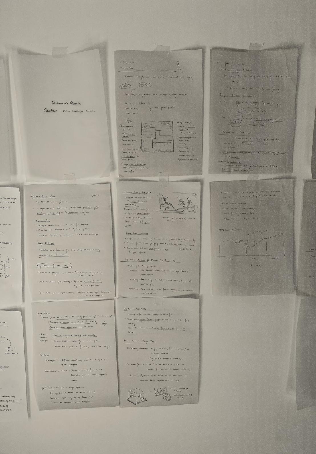
Alzheimer’s Respite Centre
BY NIALL MCLAUGHLIN ARCHITECTS
The Alzheimer’s Respite Centre, designed by Niall McLaughlin Architects in 2009, is a day care and respite facility commissioned by the Alzheimer Society of Ireland. Situated within an 18th-century walled kitchen garden, the centre comprises interconnected pavilions that integrate social spaces, serene gardens, and courtyards. The design aims to create calm, coherent spaces that reduce distraction, aid orientation, and encourage mobility for individuals with Alzheimer’s disease. The architectural strategy emphasizes the importance of framing a community and aiding orientation. The design incorporates features such as clear signage, distinct color coding, and carefully planned pathways to assist individuals in situating themselves within the space. The use of natural light, tactile materials, and varied spatial experiences contributes to a supportive environment that promotes sociable interaction and a greater sense of security.
Key takeaways:
Designing for Orientation: The architecture addresses the challenge of disorientation in Alzheimer’s patients by creating spaces that aid in situating oneself within the environment.
Integration of Nature: The incorporation of gardens and courtyards provides therapeutic benefits and supports the well-being of individuals with Alzheimer’s.
Community-Centric Approach: The design fosters a sense of community and social interaction, essential for individuals affected by Alzheimer’s disease.
PRECEDENT ON: spatial arrangement
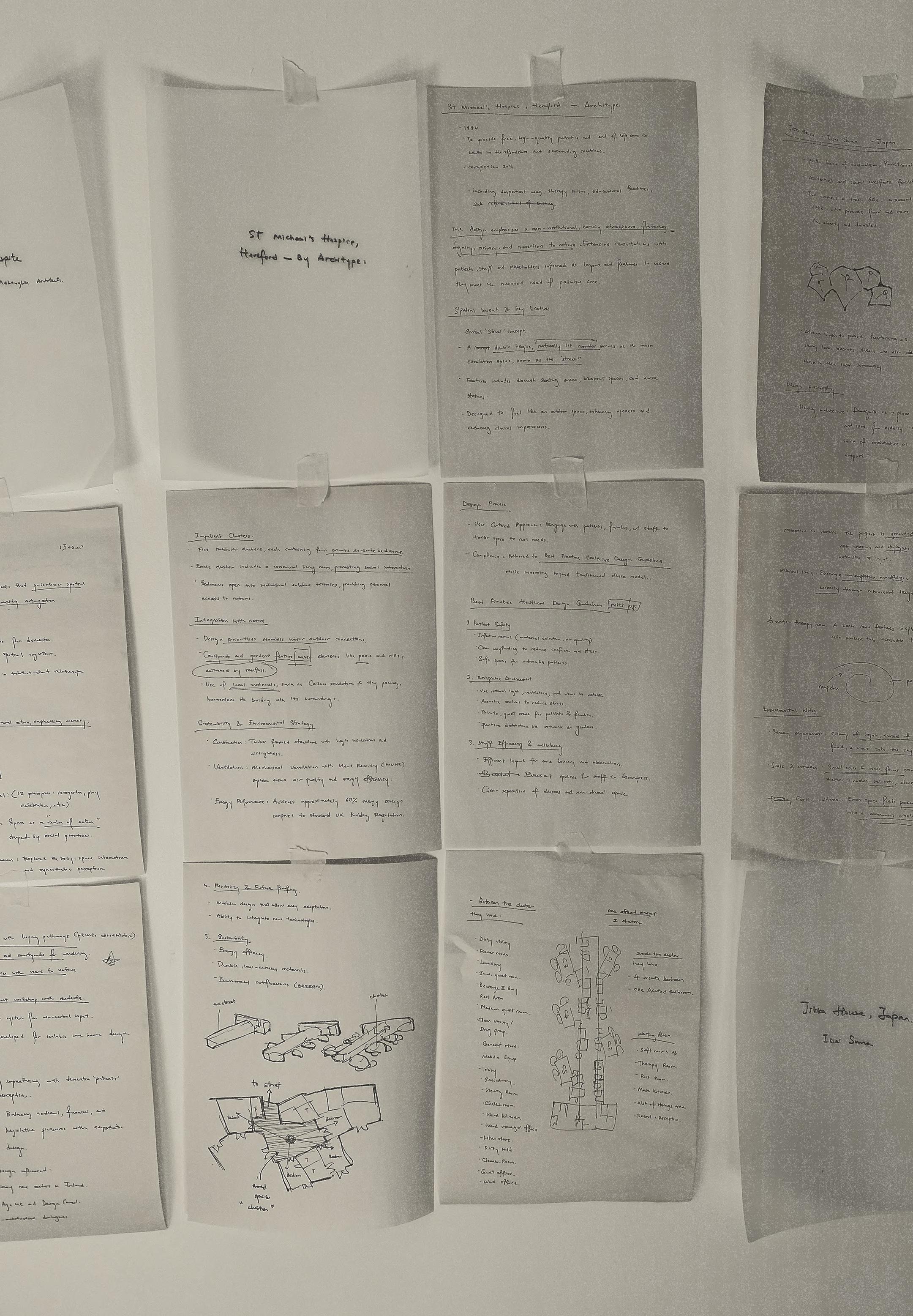
St Michael’s Hospice
BY ARCHITYPE
St Michael’s Hospice in Hereford exemplifies a human-centered approach to palliative care architecture. Designed by Architype, the facility comprises 20 single en-suite bedrooms arranged in five clusters, each centered around a shared lounge. This layout fosters a balance between privacy and communal interaction, addressing the nuanced needs of patients and their families. The design integrates a central double-height circulation space, referred to as ‘The Street’, which serves as the building’s main artery, connecting various functions and offering spaces for staff and visitors to pause and reflect. Natural materials, such as cedar cladding and Douglas fir boarding, are employed throughout to create a warm, noninstitutional atmosphere. The building’s orientation and extensive glazing ensure that all rooms have access to natural light and views of the surrounding landscape, promoting a sense of connection to nature.
Key takeaways:
Patient-Centered Spatial Organisation: The cluster model of four en-suite rooms around a shared lounge provides a supportive community environment while maintaining individual privacy.
Integration with Nature: Extensive glazing and thoughtful landscaping ensure that all spaces are connected to the outdoors, enhancing the therapeutic experience.
• Sustainable Design: Achieving Passivhaus standards demonstrates a commitment to environmental responsibility and operational efficiency.
PRECEDENT ON: spatial and circulation
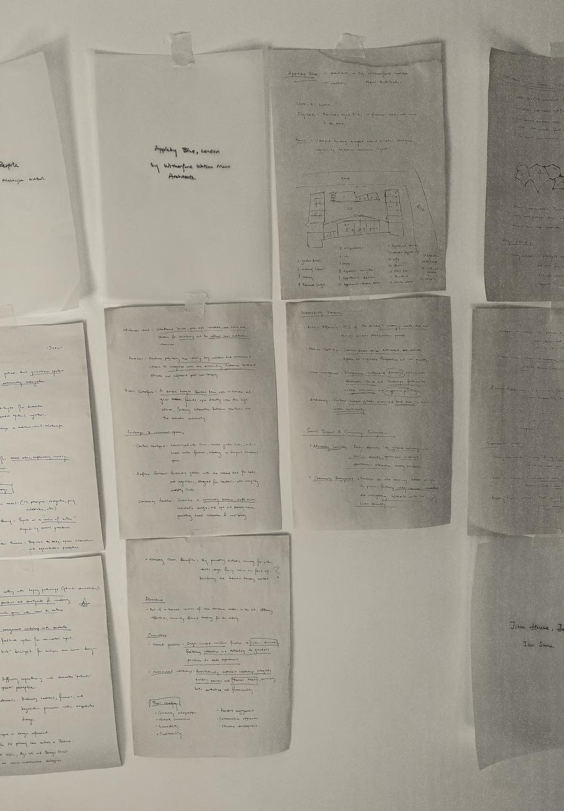
Appleby Blue
BY WITHERFORD WATSON MANN ARCHITECTS
This residential project reimagines the traditional almshouse for contemporary urban living. Located in Bermondsey, London, this social housing development comprises 57 homes for residents aged 65 and over. The design aims to integrate older residents into the vibrant city fabric, challenging the conventional notion of sheltered housing as a suburban retreat. Stephen Witherford notes, “We wanted something that was definitely not your typical sheltered housing block”, The building features a mid-rise structure that steps down from five to two storeys, mediating between the scale of Victorian terraces and post-war social housing. Public-facing communal spaces, such as a garden room and community kitchen, are situated at the front, fostering interaction with the surrounding community. The interior courtyard, inspired by the courts of coaching inns, serves as a tranquil space for residents, while the roof terrace offers opportunities for gardening and communal dining .
Key takeaways:
Urban Integration: Appleby Blue challenges traditional models by situating sheltered housing within the city, promoting active participation in urban life.
Community Engagement: The design prioritises communal spaces that encourage interaction, reducing isolation among residents.
Sustainable Design: Incorporating passive ventilation and photovoltaic panels, the building demonstrates a commitment to environmental sustainability.
PRECEDENT ON: landscaping
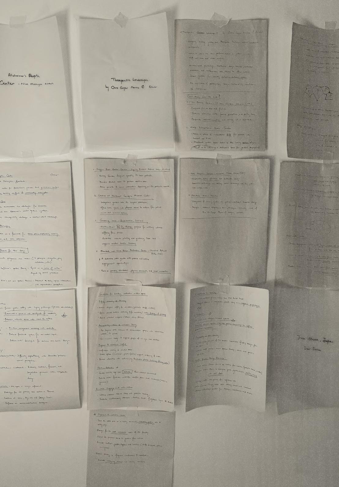
Therapeutic Landscapes
BY CLARE COOPER MARCUS & NAOMI A. SACHS
This book highlight the impact that well-designed outdoor spaces can have on health and well-being. In Chapter 6, they provide comprehensive guidelines for designing healing gardens, which focus on the integration of nature into healthcare settings. They emphasize that “the actual provision of appropriate outdoor space in healthcare facilities is often less adequate,” advocating for more intentional and thoughtful design to support patients’ physical, emotional, and social needs. The book stresses a participatory design approach, where patients, families, and healthcare staff collaborate in creating spaces that cater to diverse needs.The design strategy outlined in Chapter 6 involves practical recommendations for various patient groups, such as those with dementia, cancer, or mental health issues. It also stresses the importance of using evidence-based research to guide the design process, ensuring the spaces offer tangible therapeutic benefits.
Key takeaways:
Evidence-Based Design: Emphasizing the need for designs grounded in empirical research to validate the therapeutic benefits of outdoor spaces.
Participatory Approach: Involving all stakeholders in the design process to create spaces that truly meet the needs of users.
Tailored Environments: Designing specific elements that address the unique requirements of different patient groups to maximize therapeutic outcomes.
PRECEDENT ON: sustainbility
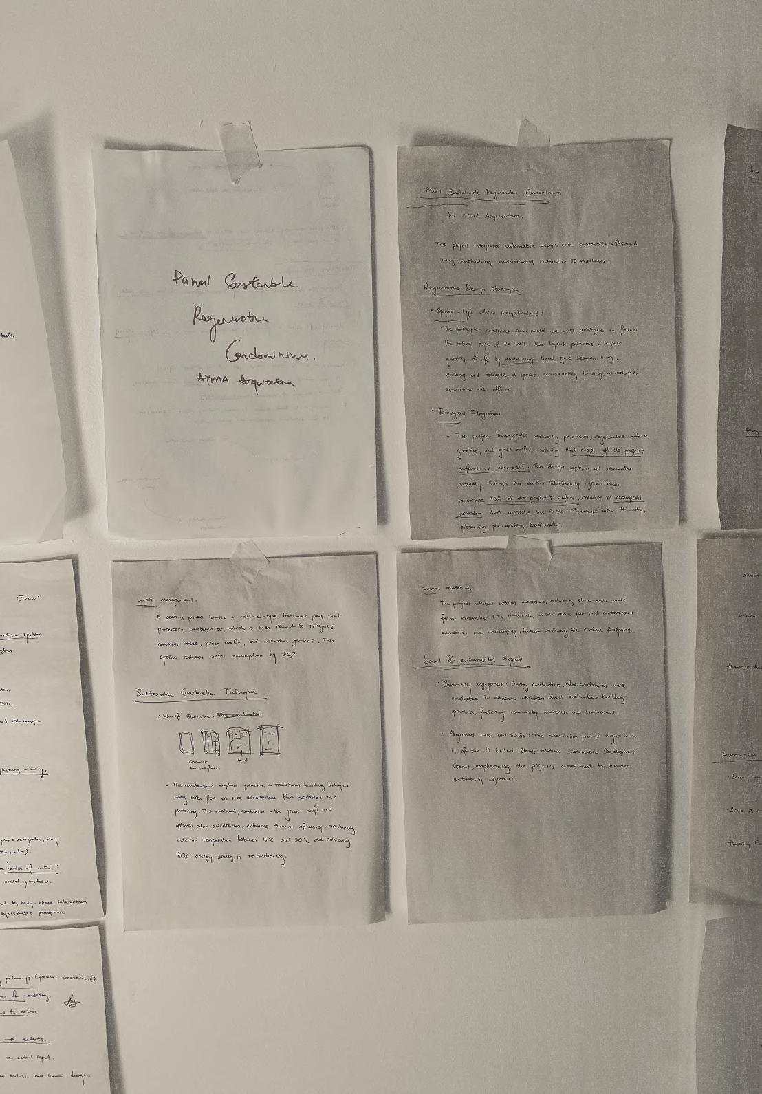
The Panal Sustainable Regenerative Condominium
BY AYMA ARQUITECTURA Y MEDIO AMBIENTE LTDA
The Panal Sustainable Regenerative Condominium integrates sustainable design with regenerative strategies to create a resilient, eco-focused community. The project employs a “sponge-type micro-neighborhood” with a focus on minimizing commuting distances and promoting mixed-use spaces. The building’s environmental strategy includes percolating pavements, native gardens, green roofs, and a wetland treatment plant for wastewater recycling. This approach reduces energy and water consumption while promoting environmental regeneration.
Key takeaways:
Regenerative Design: Focus on natural materials, green roofs, and water management systems to reduce environmental impact.
Mixed-Use, Community-Centered Planning: Combines residential, commercial, and communal spaces to foster local connectivity and reduce reliance on transportation.
Sustainability Integration: Achieves up to 80% energy savings and supports 11 UN Sustainable Development Goals through ecological and community engagement.
PRECEDENT ON: sustainbility
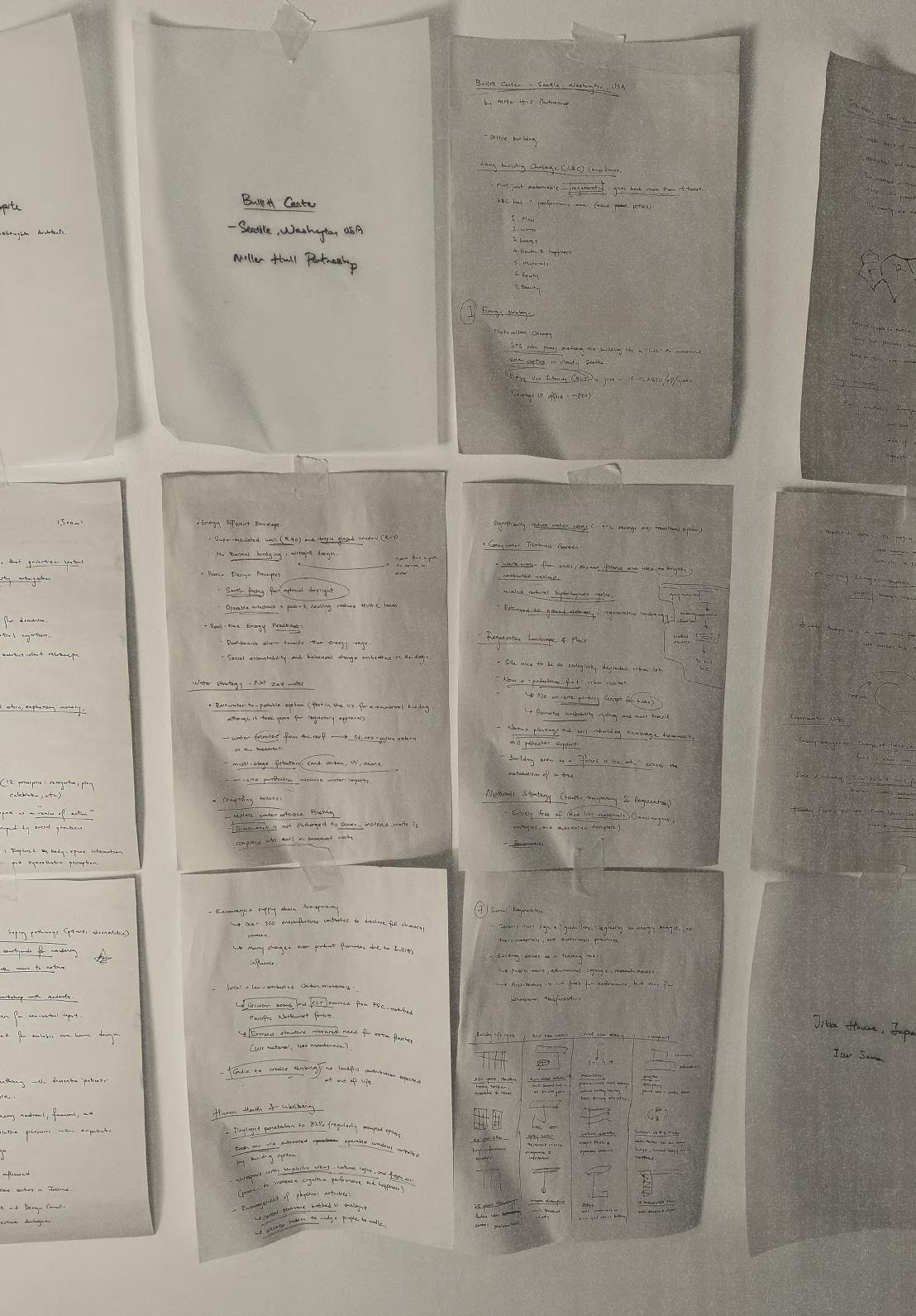
The Bullitt Center
BY MILLER HULL PARTNERSHIP
The Bullitt Center, completed in 2013, is a prime example of sustainable architecture, achieving Living Building Challenge certification. Its environmental strategy focuses on self-sufficiency and regenerative systems. The building generates more energy than it consumes through a 575-panel rooftop solar array, using highly efficient photovoltaic systems to meet its energy needs. The energy strategy is further supported by smart building technologies, minimizing demand and maximizing performance. Water is harvested from rain via a 50,000-gallon cistern, with a constructed wetland system on-site to treat graywater, ensuring that the building is water-positive. Operable windows, natural ventilation, and daylighting reduce reliance on artificial lighting and HVAC, optimizing the internal environment while reducing energy consumption. Toxic materials are avoided through careful selection, adhering to the Living Building Challenge’s Red List requirements.
Key takeaways:
Energy Independence: The Bullitt Center generates more energy than it consumes through a rooftop solar array and energy-efficient systems, reducing reliance on external power sources.
Water Sustainability: Rainwater is collected, filtered, and stored in a 50,000-gallon cistern, with graywater treated on-site via a constructed wetland, achieving water positivity.
• Regulatory Innovation: The center’s use of potable rainwater in an urban setting has prompted changes in building codes, influencing wider adoption of sustainable water practices.
The 25 Rules
Rule 1 | People Need to Feel in Charge Again
EMPOWER USERS WITH SUBTLE AUTONOMY.
Design spaces that restore a sense of agency, especially for those who may feel their independence slipping. Incorporate movable furniture, open kitchens where individuals can prepare their own tea, and user-controlled lighting or thermal comfort. These elements allow users to make choices about their environment, encouraging dignity and self-worth.
MA | JO | SE | AL | TH
Rule 2 | Let People Pause Before Committing to Interaction
CREATE TRANSITIONAL SPACES THAT OFFER CHOICE.
Design small, intentional areas - such as alcoves near entrances or widened corridor junctions - where individuals can linger, observe, or retreat without immediately engaging socially. These “pause zones” reduce social pressure and allow users to approach interaction on their own terms.
MA | AL | TH
Rule 3 | Let Nature Speak Softly
INTEGRATE NATURE AS A CONSTANT, GENTLE COMPANION. Ensure that natural elements are woven seamlessly into the environment. Incorporate sensory gardens visible from key rooms, use natural materials, and provide views of greenery and sky. Nature should not be a mere backdrop but an ever-present, soothing presence that supports healing and well-being.
MA | JO | JI | SE | AL | ST | AP | TH
Rule 4 | Each Room is an Invitation, Not an Obligation
DESIGN SPACES THAT WELCOME WITHOUT DEMANDING. Create environments with layered privacy and filtered thresholds. Use partially open doorways or visual connections to invite entry without forcing participation. Recognize the emotional difficulty some may face when entering healing spaces, and allow them to engage at their own pace.
MA | JO | SE | AL | TH
MA - Maggie’s Architecture and Landscape Brief
JO - John Morden Centre
JI - Jikka
SE - Seniorenwohnheim
AL - Alzheimer’s Respite Centre
ST - St Michael’s Hospice
AP - Appleby Blue
TH - Therapeutic Landscapes
PA - The Panal Regenerative Condominium
BU - The Bullitt Center
Rule 5 | Beautiful, Small, Humane Buildings
DESIGN WITH A HUMAN SCALE AND POETIC SPATIAL PROGRESSION
Avoid overwhelming scales and institutional aesthetics. Use tactile materials, warm transitions, and modest volumes that feel crafted and personal. Details should evoke a sense of care and intimacy, countering any clinical atmosphere and making spaces feel safe and welcoming.
MA | JO | JI | SE | AL | TH
Rule 6 | Domestic, Not Institutional
PROMOTE FAMILIARITY AND COMFORT
Design spaces that feel like an extension of home, not a clinical facility. Use homelike finishes, informal layouts, soft lighting, and domestic references. Incorporate elements such as a central kitchen or living room-style seating to create a welcoming atmosphere where individuals feel at ease.
MA | JO | JI | SE | AL | ST | TH
Rule 7 | Natural Light is Non-Negotiable
ILLUMINATE SPACES WITH THE RHYTHM OF THE DAY
Ensure that every room receives quality daylight, with changing light patterns throughout the day. Utilize clerestories, rooflights, or sun-tracking openings to connect users to time and weather. Natural light can uplift spirits and provide a sense of continuity with the outside world.
MA | SE | AL | TH
Rule 8 | Designing Scent and Designing Sight
ENGAGE ALL SENSES FOR HOLISTIC WELL-BEING
Incorporate tactile surfaces, seasonal smells (like plants, kitchens, wood), and curated visual moments - textures, views, and art that evolve with the day. Sensory engagement can evoke memories and provide comfort, making spaces feel alive and responsive to those within them.
MA | JO | JI | SE | AL | TH
MA - Maggie’s Architecture and Landscape Brief
JO - John Morden Centre
JI - Jikka
SE - Seniorenwohnheim
AL - Alzheimer’s Respite Centre
ST - St Michael’s Hospice
AP - Appleby Blue
TH - Therapeutic Landscapes
PA - The Panal Regenerative Condominium
BU - The Bullitt Center
Rule 9 | Quiet Joy
SPACES SHOULD UPLIFT AND SURPRISE GENTLY.
Joy doesn’t need to shout. It can arrive quietly — through the sound of children’s laughter in the background, a surprise bloom in the garden, or the play of sunlight across a textured wall. These moments should emerge naturally, not be staged, offering soulfulness without sentimentality. They nourish the spirit simply by being there, without needing to announce themselves.
MA | AL
Rule 10 | Framing
CREATE SPACE TO STEP BACK — AND SEE CLEARLY. Sometimes, what we need is a place to pause and reframe. Thoughtful lighting, a view out to trees, birds, or sky — these are not luxuries, but tools for mental clarity. Design spaces where people can relax and talk away from the weight of home cares. A bench under dappled light. A window that captures the quiet. Frame the view, soften the edges, and gently reduce sensory overwhelm.
MA | AL | TH
Rule 11 | You Can Decide Your Comfort, Private and Social Space
LET PEOPLE CHOOSE WHEN AND HOW THEY WANT TO CONNECT
Design with a spectrum of social proximity — from tucked-away corners for solitude to shared tables that invite conversation. People should be able to cry, rest, laugh, or simply sit — without judgment or pressure. Choice is dignity. Let the space adapt to the day, the mood, the moment.
MA | JO | SE | AL | TH
Rule 12 | Let the Bricks Talk
MATERIAL CAN SPEAK WHEN WORDS CAN’T
Use surfaces that feel grounded, warm, and lived-in — weathered timber, textured brick, stone that holds the memory of touch. These materials carry emotional weight, aging gracefully alongside their inhabitants. Let the building feel like it’s been there long enough to understand.
MA | JO | JI | SE | AL
MA - Maggie’s Architecture and Landscape Brief
JO - John Morden Centre
JI - Jikka
SE - Seniorenwohnheim
AL - Alzheimer’s Respite Centre
ST - St Michael’s Hospice
AP - Appleby Blue
TH - Therapeutic Landscapes
PA - The Panal Regenerative Condominium
BU - The Bullitt Center
Rule 13 | Not a Prison
LET SPACE OFFER FREEDOM, NOT CONFINEMENT
Avoid long, monotonous corridors and isolated rooms. Instead, shape the plan as a gentle journey with loops, layers, and unexpected destinations. Every turn should offer a view, a place to rest, or a chance to decide. Movement through the building should feel voluntary — never prescribed.
MA | AL
Rule 14 | A Sense of Purpose
ANCHOR LIFE TO THE RHYTHMS OF THE WORLD OUTSIDE Frame views to skies that change, trees that move, gardens that grow. Spaces should respond to the seasons, to the weather, to the wind. Let users be reminded — even subtly — that time is still passing, and they are still part of it.
MA | JO | JI | SE | AL | ST | AP | TH | PA | BU
Rule 15 | Layered Privacy
OFFER THE FREEDOM TO OBSERVE WITHOUT BEING SEEN
Use semi-transparent boundaries, filtered sightlines, or soft transitions to create degrees of participation. People should be able to enter a room fully, partially, or not at all — without feeling excluded. It’s the gentle difference between being alone, and being left alone.
MA | JO | AL
Rule 16 | Put the Disease Aside
DESIGN FOR THE PERSON, NOT THE CONDITION
Avoid medical cues that define someone by their diagnosis. Instead, let the architecture reflect life, not treatment — colour, texture, and warmth over signage, stainless steel, or sterility. Let people be reminded not of what they’ve lost, but of what still belongs to them.
MA | AL | TH
MA - Maggie’s Architecture and Landscape Brief
JO - John Morden Centre
JI - Jikka
SE - Seniorenwohnheim
AL - Alzheimer’s Respite Centre
ST - St Michael’s Hospice AP - Appleby Blue TH - Therapeutic Landscapes
PA - The Panal Regenerative Condominium
BU - The Bullitt Center
Rule 17 | Customised Space for Local
LET THE BUILDING SPEAK IN A LOCAL ACCENT
Design that feels deeply rooted — not imported. Draw from the rhythms, materials, and habits of the surrounding community. Whether it’s a garden layout inspired by a local farm or textures drawn from nearby coastlines, familiarity becomes a quiet form of reassurance.
Rule 18 | Visual Connection
KEEP PEOPLE SUBTLY IN SIGHT OF ONE ANOTHER
Use open thresholds, shared sightlines, and framed views between rooms to let people feel part of something — even when alone. Seeing movement, catching a glimpse of life nearby, is often enough to prevent loneliness from turning into isolation.
MA | AL | TH
Rule 19 | Local and Local
USE THE LANGUAGE OF PLACE
Work with local materials and traditional forms. Not because they’re nostalgic, but because they are remembered. A roof that echoes the neighbours, a timber that smells like childhood, a texture that feels like home — these details reduce anxiety before words are ever spoken. SE
Rule 20 | Memories
DESIGN TO HOLD THE PAST GENTLY IN THE PRESENT
Allow space for personal mementoes, textures that spark recognition, or layouts that mirror familiar patterns from home. A courtyard like the one they once tended. A hallway that feels like the old flat. These echoes make the unfamiliar feel safe again. AL
MA - Maggie’s Architecture and Landscape Brief
JO - John Morden Centre
JI - Jikka
SE - Seniorenwohnheim
AL - Alzheimer’s Respite Centre
ST - St Michael’s Hospice
AP - Appleby Blue
TH - Therapeutic Landscapes
PA - The Panal Regenerative Condominium
BU - The Bullitt Center
Rule 21 | Intuitive Pathways
PEOPLE SHOULDN’T NEED TO ASK WHERE THEY’RE GOING
Design circulation that feels natural. Paths should gently guide rather than direct — curving where necessary, widening when needed, always leading somewhere soft. The goal is ease, not instruction. If someone can find their way without
MA | AL
Rule 22 | Minimise Sensory Overload
PROTECT THE MIND BY QUIETING THE SPACE
Keep acoustics soft, avoid glare, and reduce unnecessary detail. The environment should never compete with the user’s internal world. For someone already overwhelmed, one harsh light or loud sound can unravel a moment of peace. Calm is designed, not accidental.
AL | TH
Rule 23 | Natural Materials
USE MATERIALS THAT AGE WELL — LIKE PEOPLE
Wood, stone, clay — materials that hold warmth, respond to touch, and gain character over time. They ground the building in reality and offer emotional texture. Avoid anything too smooth, shiny, or cold. Let the surfaces invite contact, not caution.
MA | SE | PA
Rule 24 | Spatial Cues
DESIGN SPACES THAT WELCOME WITHOUT DEMANDING. Let a change in floor texture signal arrival. Let ceiling height drop in places of rest. Use the body’s intuition — not signage — to suggest where to go, what to expect. Navigation can be felt, not just seen.
MA | AL
MA - Maggie’s Architecture and Landscape Brief
JO - John Morden Centre
JI - Jikka
SE - Seniorenwohnheim
AL - Alzheimer’s Respite Centre
ST - St Michael’s Hospice
AP - Appleby Blue
TH - Therapeutic Landscapes
PA - The Panal Regenerative Condominium
BU - The Bullitt Center
Rule 25 | Subtle Guidance and Wayfinding
HELP PEOPLE FEEL ORIENTED WITHOUT EVER FEELING DIRECTED
Use light, rhythm, and views as unspoken cues. A glimpse of the garden at the end of a hall. A change in wall colour to mark transition. Let the building guide like a good host — present, but never overpowering.