9 minute read
VISUAL IDENTITY GUIDE

A guide for branding design perception.
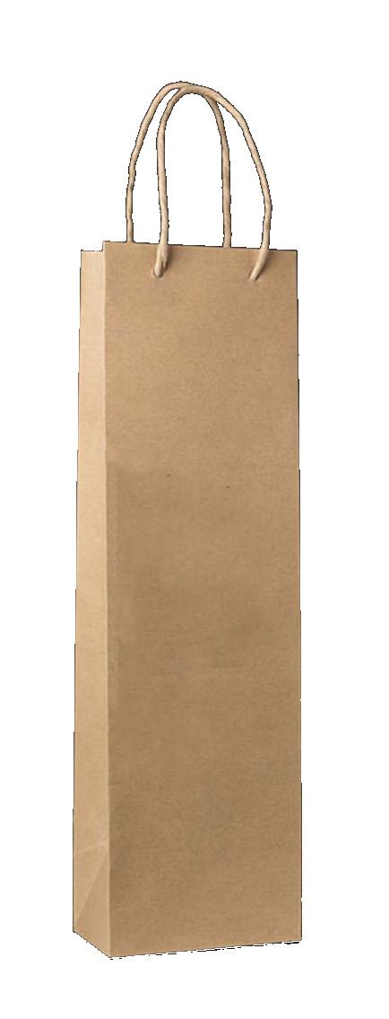
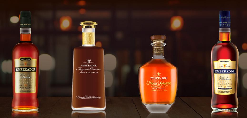
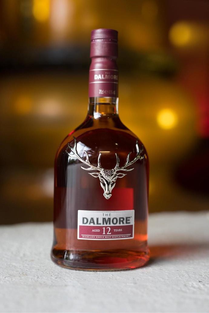
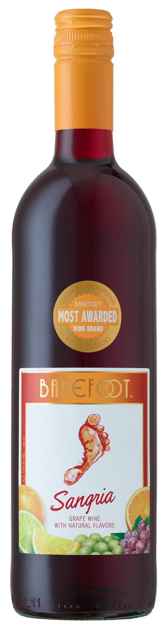
Wines
Advertisement
Karlisle Kompany Wines & Spirits is bringing back the premium gift and service of beers, liquors and wines. Every customer is a VIP. We treat them with appreciation, and deep recognition of who they genuinely are - young ones and the not so young ones who love to chill, relax, unwind and celebrate.
We deliver sought after brands with great convenience and hoping to add sparkle in making crowning moments.
Welcome to Karlisle Kompany Wines & Spirits.
It is a pleasure to serve you and partner with you.
Starting up an idea, product or service needs branding, that in reality, is not about the business itself at all.
We must recognize that branding is not about the logo, colors or fonts. These are designed elements that are well-crafted to represent us. Branding is how people perceive us, associate with the work culture, ethics, and benefits they get from our products and services.
A brand is built day by day. In every order, every glass, every package, and every bottle delivered like gifts. It nurtures relationship and foster loyalty to the people we serve, and cater to.
It is about people, it always has been. It’s about the convenience of getting sought after brands to make crowning moments and meaningful celebrations at the comfort of homes and get-togethers.
As we move forward, let’s recognize that this brand is alive, it’s fragile and still growing. The logo gives a face to the real body – the people of Karlisle Kompany Wines & Spirits. Treat the logo how you would treat those people – with respect and intention.
This set of guidelines are designed to help you understand the details of curating a consistent visual identity. We are all in this together.
KARLISLE KOMPANY WINES & SPIRITS - BRAND STATEMENT
Mission And Purpose
MANIFESTO. It is a pleasure to serve you today. Each encounter is an opportunity to show that you are highly valued. Every bottle is a premium gift delivered with great convenience to add sparkle to make crowning moments.
SLOGAN.
“Time to chill. Time to celebrate. Make your crowning moments.” Chill denotes relaxing and slowing down after a hard day’s work. Celebrate denotes fun, festive and joyful occasions. Both deserves golden experience as crowning moments.
SINGLE FOCUS. Every customer is a VIP. We treat them with deep appreciation, and recognition of who they genuinely arenoble young ones and the not so young ones who love to chill, relax, unwind and celebrate.
KARLISLE KOMPANY WINES & SPIRITS - BRAND STATEMENT
MISSION AND PURPOSE
Unique Identifier Type / Category
NAME
KARLISLE KOMPANY WINES & SPIRITS
KEYWORDS
CHILL RELAX UNWIND CELEBRATE LIQUORS WINES BEERS ALCOHOLIC BEVERAGE YOUNG PROFESSIONALS BUSINESSMEN PRESTIGE
WHAT WE MEAN:
Karlisle Kompany Wines & Spirits deeply appreciates and recognize the young ones and not so young ones who love to chill, relax, unwind, celebrate and experience them as crowning moments.
WHAT WE OFFER:
We are here to bring back the premium gift and service of beers, liquors and wines with convenience as we deliver at the comfort of your homes and get-togethers.
KARLISLE KOMPANY WINES & SPIRITS - BRAND MARKS
Logo System.
This system includes a series of graphic elements combined to create a cohesive and recognizable identity that represents Karlisle Kompany Wines & Spirits
1. PRIMARY ICON / BRAND MARK
An icon is the intentional visual mark that delivers the brand signature to the viewer. This is used to represent the company, its product and service.
2. WORDMARK.
Text-based part of the logo. It is a carefully selected typeface and customized to create a sense of unity when viewed in partnership and combined with the icon.
3. LOCK-UPS
These are final logo combinations that must be used in right attributions to stay true to the icon and wordmark partnership. There are usually four versions - vertical, horizontal, large scale and small scale.
WINES & SPIRITS
KARLISLE KOMPANY WINES & SPIRITS - BRAND MARKS
An Icon Inspired By Nobility
The specific logo has three main elements of direct symbolism embedded in the design, centered around the crowning moments we want people to experience.
1. CROWN OF MARQUESS
Prestigeously placed in the center is the crown of Marquess. The term is also used to translate as equivalent rank in Imperial China. It is generally, but not always, a middle-to-high ranking hereditary nobility title.
2. INTERFACING K INITIALS
Represents the company’s name: Karlisle Kompany, that aims to give the gift and premium service of beers, wines and spirits.
3. INTERFACING C INITIALS
Conveying the branding“Time to Chill. Time to Celebrate.” The Cs create focus on the crown to emphasize the prestige and golden experience in every bottle.
KARLISLE KOMPANY WINES & SPIRITS - BRAND MARKS
Designing The Crown
THE CROWN OF MARQUESS EQUIVALENT NON-WESTERN TITLES
Like other major Western noble titles, marquess (or marquis) is sometimes used to translate certain titles from non-Western languages with their own traditions, even though they are, as a rule, considered "equivalent" in relative rank.
In imperial China, 侯 (hóu) is generally, but not always, a middle-to-high ranking hereditary nobility title.
In Meiji Japan, 侯爵 (kōshaku), a hereditary peerage (kazoku) rank, is usually rendered as baron, viscount, count, marquis and duke/prince.
In Korea, the title of 현후 ( 縣侯 ; hyeonhu), the meaning of which is "marquess of district", existed for the hereditary nobility in the Goryeo dynasty.
In Vietnam's Annamite realm, hầu (侯 ) was a senior title of hereditary nobility, equivalent to marquis, for male members of the imperial clan.
The Marquess Crown fits the noble young ones and not so young ones; generally but not always, a middle-to-high ranking professionals and businessmen.
Emperor King
ArchDuke
Grand Prince
Prince/Infante
Duke
Sovereign Prince
Marquess /Marquis
Margrave/Langrave
Count / Earl
Viscount / Vidame
Baron
Baronet
Hereditary Knight
Knight
Equire
Gentleman
KARLISLE KOMPANY WINES & SPIRITS - BRAND MARKS
It’s not just a logo. It’s a story.
The logo of Karlisle Kompany Wines & Spirits has a story to tell.
1. MONOGRAM / INITIAL-BASED.
The logo design focuses on the initials KK of Karlisle Kompany. It also carries the initials CC for Chill and Celebrate.
2. ABSTRACT MARK The initials KK and CC were customized as a cohesive way to promote our brand - “Time to Chill. Time Celebrate. Make your crowning moments.” The crown in the middle conveys the golden moments made, shared and experienced in every bottle.
3. AMBIGRAM The logo can be easily recognized even when flipped, an intentional meaning that to chill and to celebrate coincides with marking crowning moments, either for splendid relaxation, or for festive and joyful occasions.
WINES & SPIRITS
KARLISLE KOMPANY WINES & SPIRITS - BRAND MARKS
LOGO LIBRARY
PRIMARY ICON
WORDMARK
WINES & SPIRITS
LOCKUP: Vertical Signature
LOCKUP: Horizontal Signature
WINES & SPIRITS
Time to Chill. Time to Celebrate.
WINES & SPIRITS
KARLISLE KOMPANY WINES & SPIRITS - LOGO USAGE
LOGO USAGE - Proper Clearance
Never crowd the logo. Always leave breathing room for the logo. Negative space is equally important.
Centering the logo. Logo should always be placed in the center.
LOGO VIOLATION - Fake Effects
Never apply effects to the logo. Drop shadows and other effects should not be applied to the logo.
Do not apply any faux effects to the logo like shadows, strokes or any type of alteration.
Just keep it simple and stick to the design of the logo.
KARLISLE KOMPANY WINES & SPIRITS - LOGO USAGE
LOGO VIOLATION - Stretching
Never stretch the logo. The logo should always maintain its predetermined aspect ratio. If the logo doesn’t fit, do not alter it.
LOGO VIOLATION - Straining or Skewing
Never strain or skew the logo. The logo should always maintain its predetermined aspect ratio. If the logo doesn’t fit, do not alter it.
KARLISLE KOMPANY WINES & SPIRITS - LOGO USAGE
LOGO VIOLATION - Alterations
Never alter or modify the logo in any way. Great detail and grids had been used for the final logo. Never alter the aspect ratio or positioning elements.
LOGO VIOLATION - Alterations
Never change the color of the logo. Altering the color of the logo is not allowed. Specific colors were used with meaning and intent in designing the logo. Wordmark however can be changed to gold if in black background.
KARLISLE KOMPANY WINES & SPIRITS - LOGO USAGE
LOGO VIOLATION - Unapproved Backgrounds
Always control backround contrast. Logo should only appear on approved backgrounds that has enough contrast that will make it easily recognized.
LOGO VIOLATION - Unapproved Backgrounds
Never place the logo atop a complex backround. The logo is designed specifically with its background color. Never use it on top of images or photographs.
KARLISLE KOMPANY WINES & SPIRITS - COLOR PALETTE


COLOR TONE - MOOD BOARD
KARLISLE KOMPANY WINES & SPIRITS - COLOR PALETTE
Color Palette
These colors were specifically chosen to communicate wines and spirits and remain true to their regal and historic view. These are the acceptable colors to accomplish consistency, cohesion and subtleties within the brand.
Primary Colors
The color gold is the color of extravagance, wealth, riches, and excess, and shares several of the same attributes of the color yellow. The color gold is a warm color that can be either bright and cheerful or somber and traditional. The color gold is cousin to the color yellow and the color brown, and is also associated with illumination, love, compassion, courage, passion, magic, and wisdom.
Burgundy color is a color that is linked to red which represents passion, energy, strength, love at a very deep level, among other things. This color is easily associated with the pigment of grapes and easily conveys wines and spirits.
Secondary Colors
KARLISLE KOMPANY WINES & SPIRITS - COLOR PALETTE
Color Palette
These colors were specifically chosen to communicate wines and spirits and remain true to their regal and historic view. These are the acceptable colors to accomplish consistency, cohesion and subtleties within the brand.
KARLISLE KOMPANY WINES & SPIRITS - TYPOGRAPHY
TYPOGRAPHY - PRIMARY FONTS
We use CORBEL Bold / Italic It is an expressive, legible and strong font to accentuate the branding of Karlisle Kompany Wines & Spirits. It should be used in all mediums of written and digital marketing to promote consistency in branding.
WINES & SPIRITS
PRIMARY COPY: CORBEL - BOLD, ITALIC , LIGHT, REGULAR
1. Corbel / Light ABCDEFGHIJKLM / ABCDEFGHIJKLM
2. Corbel / Regular ABCDEFGHIJKLM / ABCDEFGHIJKLM
3. Corbel / Italic ABCDEFGHIJKLM / ABCDEFGHIJKLM
4. Corbel / Bold ABCDEFGHIJKLM / ABCDEFGHIJKLM
NUMBERS: Calibri
Calibri
CAPTION AND FOOTERS: Corbel font light is used in captions and footers.
KARLISLE KOMPANY WINES & SPIRITS - TYPOGRAPHY
TYPOGRAPHY - PRIMARY FONTS
Headline
Subheadline / Subheadline
PAGE TITLE
SUBHEAD TITLE
This is the copy. You can use Corbel in regular, or italic. This font is legible and has a modern edge to it.
Corbel Bold 60 pt / 72 pt
Corbel Bold or Italic 30pt / 36 pt
Corbel Bold or Italic 20pt / 24pt
Corbel Regular or Italic
14pt / 18 pt
Calibri Bold 14pt / 18 pt
Corbel Regular or Light 6pt / 9pt
KARLISLE KOMPANY WINES & SPIRITS - BRAND TOUCH POINTS
Printed Collateral
WINES & SPIRITS
Time to Chill. Time to Celebrate.
WINES & SPIRITS www.facebook.com/karlislekompany
Time to Chill. Time to Celebrate.
KAREN REYES
Owner / Manager
Patubig, Marilao, Bulacan karen_reyes02@yahoo.com
+63922.818.0918
WINES & SPIRITS
Time to Chill. Time to Celebrate.
Patubig, Marilao, Bulacan facebook.com/karlislekompany karen_reyes02@yahoo.com
+63922.818.0918
WINES & SPIRITS
Time to Chill. Time to Celebrate.
KAREN REYES SANTOS
Manager ID No. 1001
Address:
Date:
Dear Sir/Ma’am;
Lorem ipsum dolor sit amet, consectetuer adipiscing elit, sed diam nonummy nibh euismod tincidunt ut laoreet dolore magna aliquam erat volutpat. Ut wisi enim ad minim veniam, quis nostrud exerci tation ullamcorper suscipit lobortis nisl ut aliquip ex ea commodo consequat. Duis autem vel eum iriure dolor in hendrerit in vulputate velit esse molestie consequat, vel illum dolore eu feugiat nulla facilisis at vero eros et accumsan et iusto odio dignissim qui blandit praesent luptatum zzril delenit augue duis dolore te feugait nulla facilisi.
Lorem ipsum dolor sit amet, cons ectetuer adipiscing elit, sed diam nonummy nibh euismod tincidunt ut laoreet dolore magna aliquam erat volutpat. Ut wisi enim ad minim veniam, quis nostrud exerci tation ullamcorper suscipit lobortis nisl ut aliquip ex ea commodo consequat.
Lorem ipsum dolor sit amet, consectetuer adipiscing elit, sed diam nonummy nibh euismod tincidunt ut laoreet dolore magna aliquam erat volutpat. Ut wisi enim ad minim veniam, quis nostrud exerci tation ullamcorper suscipit lobortis nisl ut aliquip ex ea commodo consequat. Duis autem vel eum iriure dolor in hendrerit in vulputate velit esse molestie consequat, vel illum dolore eu feugiat nulla facilisis at vero eros et accumsan et iusto odio dignissim qui blandit praesent luptatum zzril delenit augue duis dolore te feugait nulla facilisi.

Sincerely,
KAREN REYES-SANTOS Manager
+63922.818.0918
+63922.818.0919

@kkwinesandspirits facebook.com/karlislekompany
Patubig, Marilo City Philippines 3000
Novelties

KARLISLE KOMPANY WINES & SPIRITS - BRAND TOUCH POINTS WINES & SPIRITS
WINES&SPIRITS
KARLISLE KOMPANY WINES & SPIRITS - BRAND TOUCH POINTS

Packaging