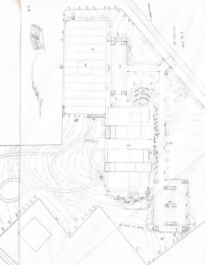
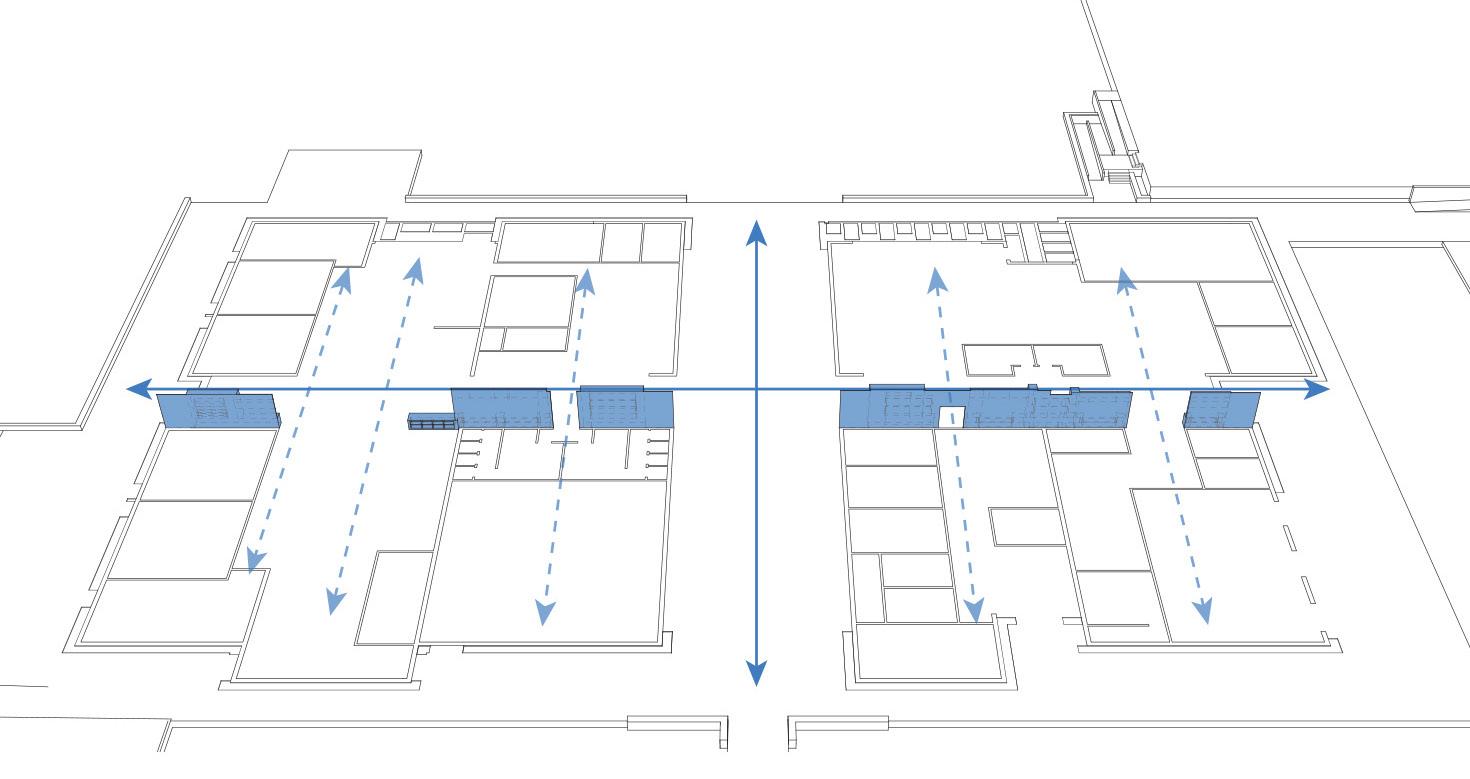
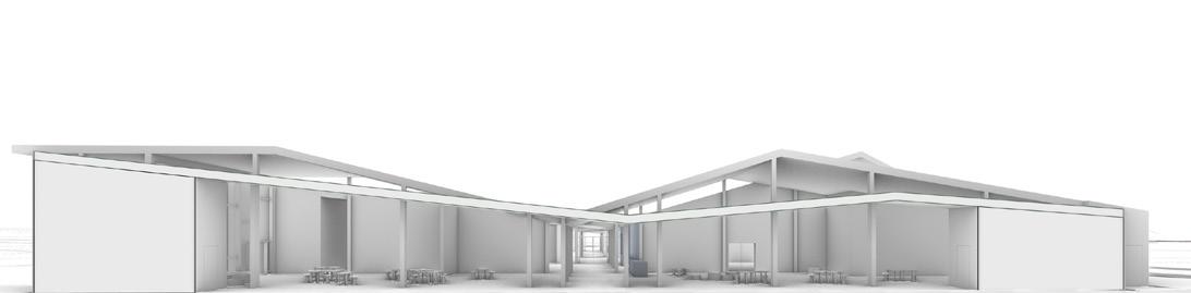
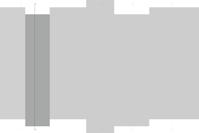
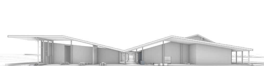
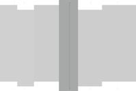
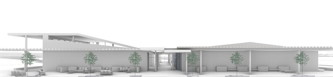
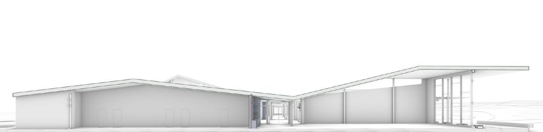
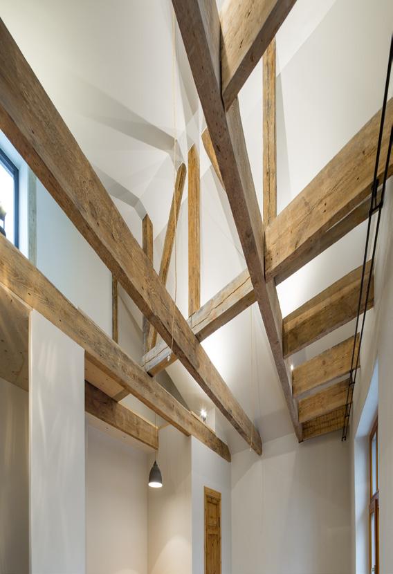
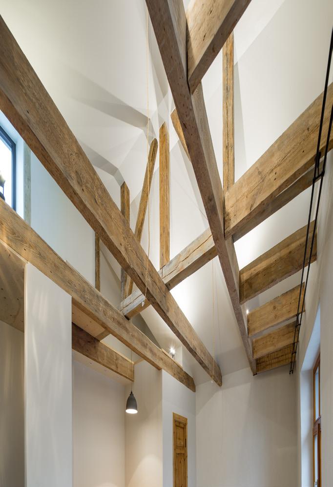
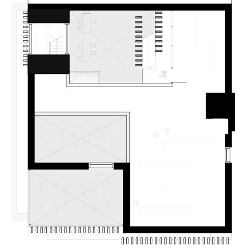
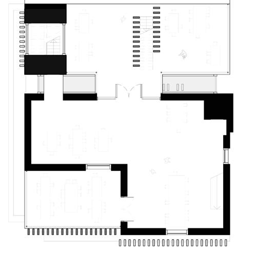
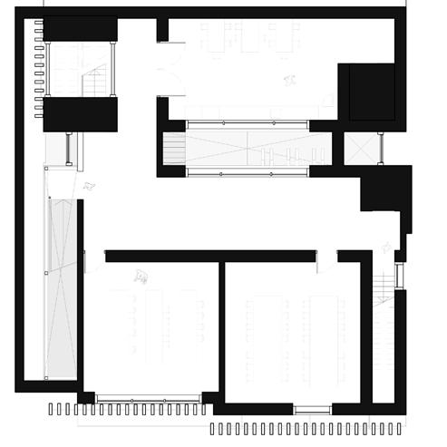
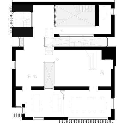
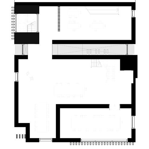
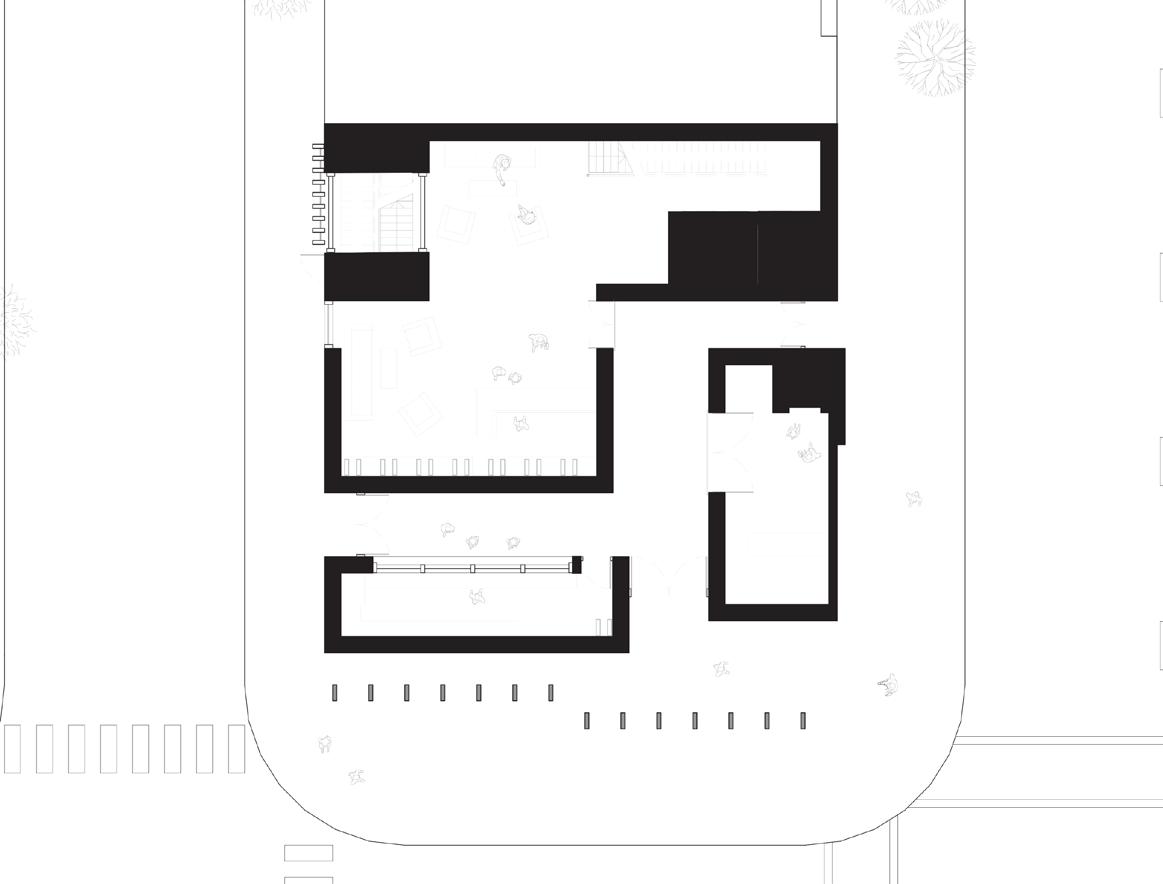
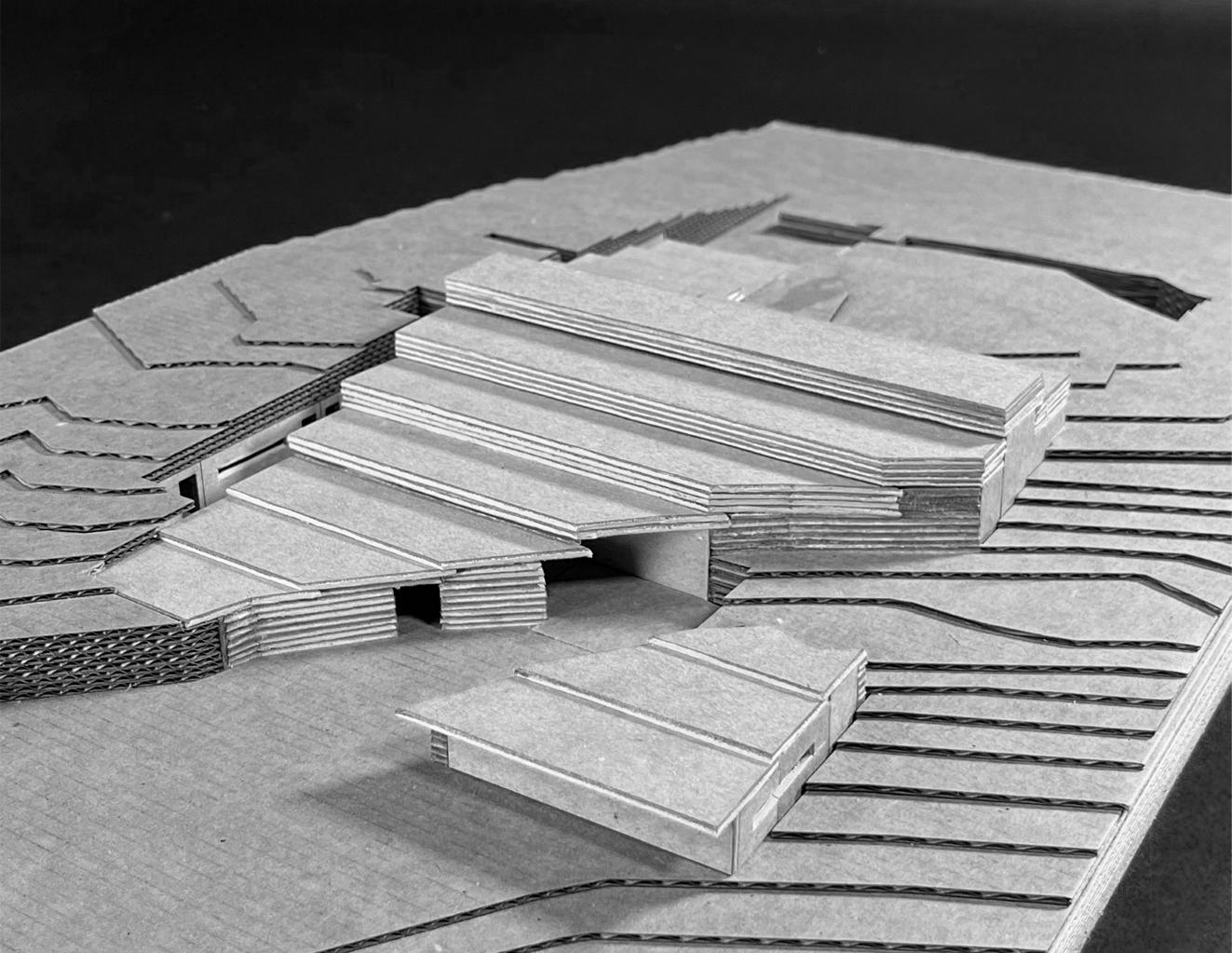
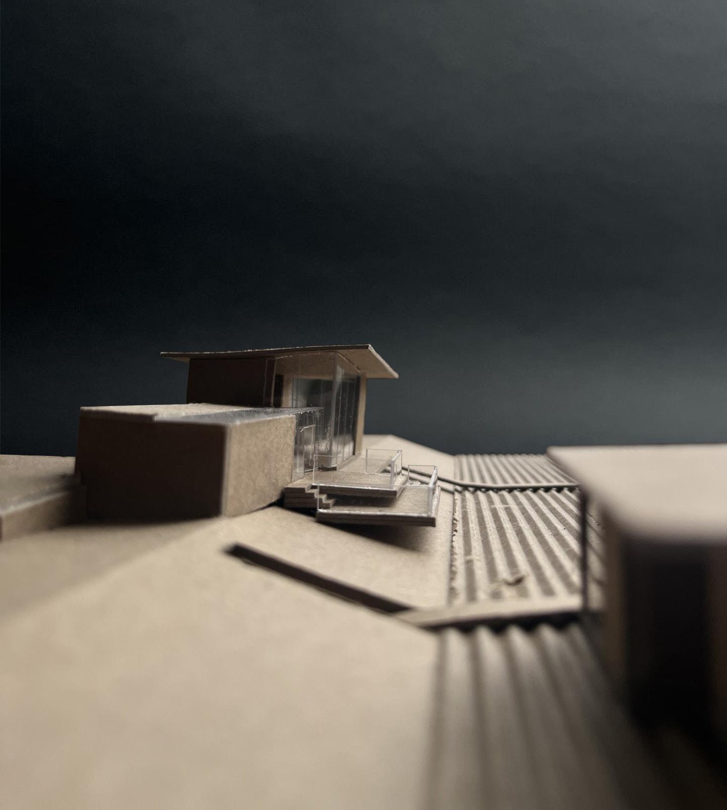
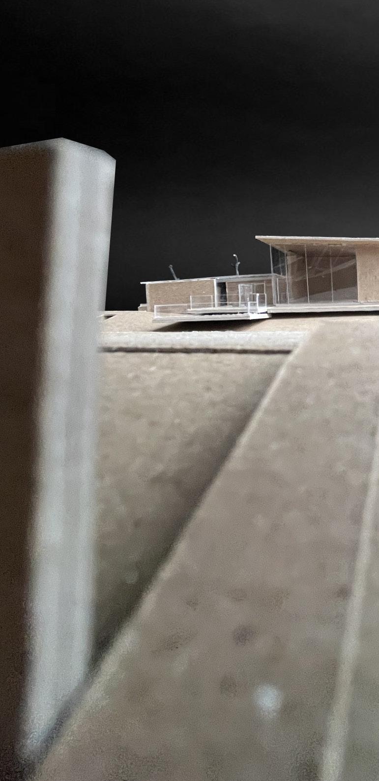
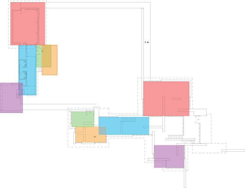
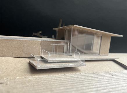
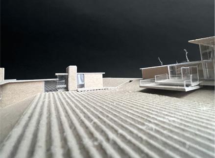
This project is located in Camden, AL in Wilcox County. Wilcox is known to have the lowest employment rate in Alabama and one of the lowest education systems. The goal was to create a community center and a center for their youth program (BAMA Kids) to house community gatherings, meetings, and to overall give more opportunity to the people of Wilcox. The program is split into two buildings, the east side holds the community center and Wilcox Works (a job training center) and the west holds the BAMA Kids youth program. The plan consists of 6 vertical bars of program with a central east west spine connecting both buildings.
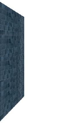
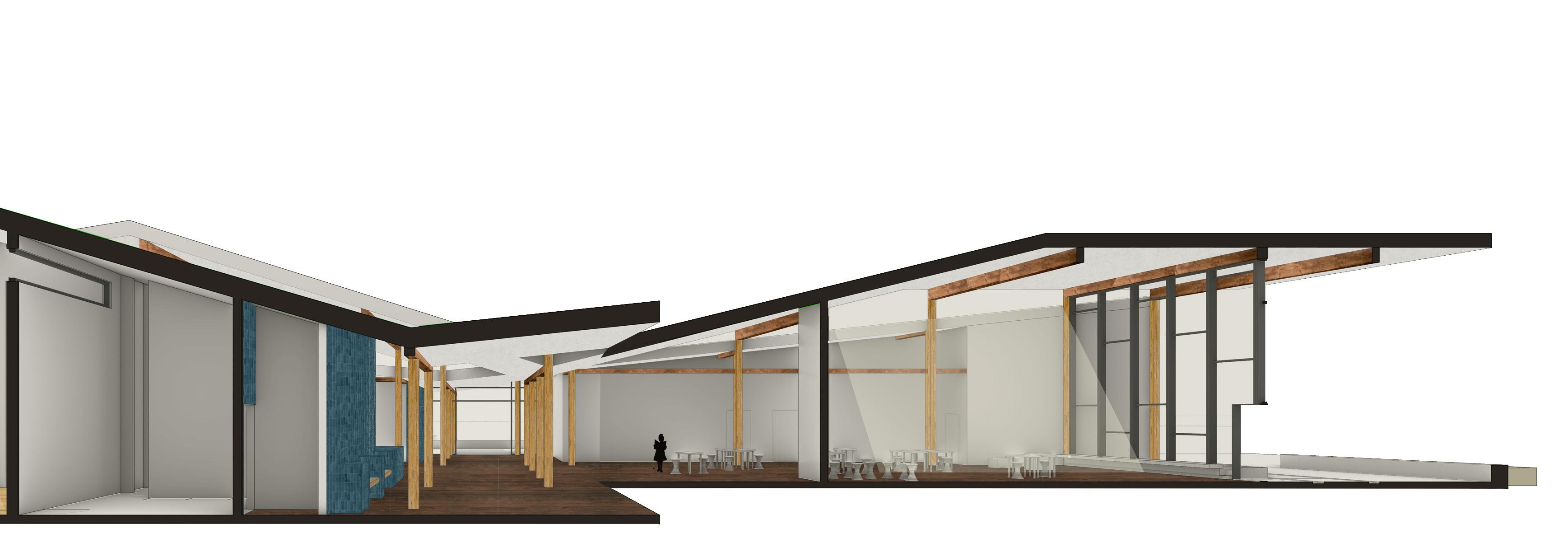
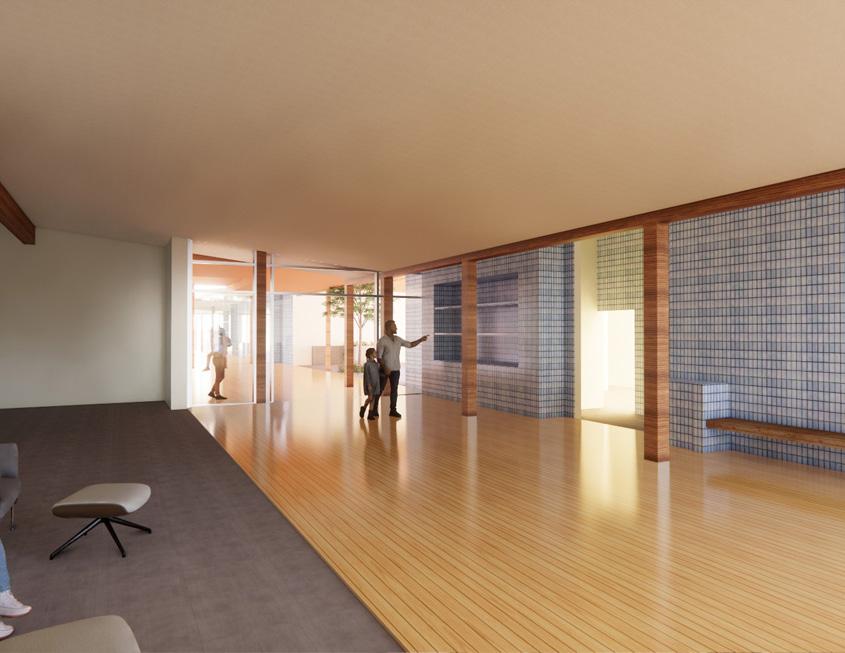
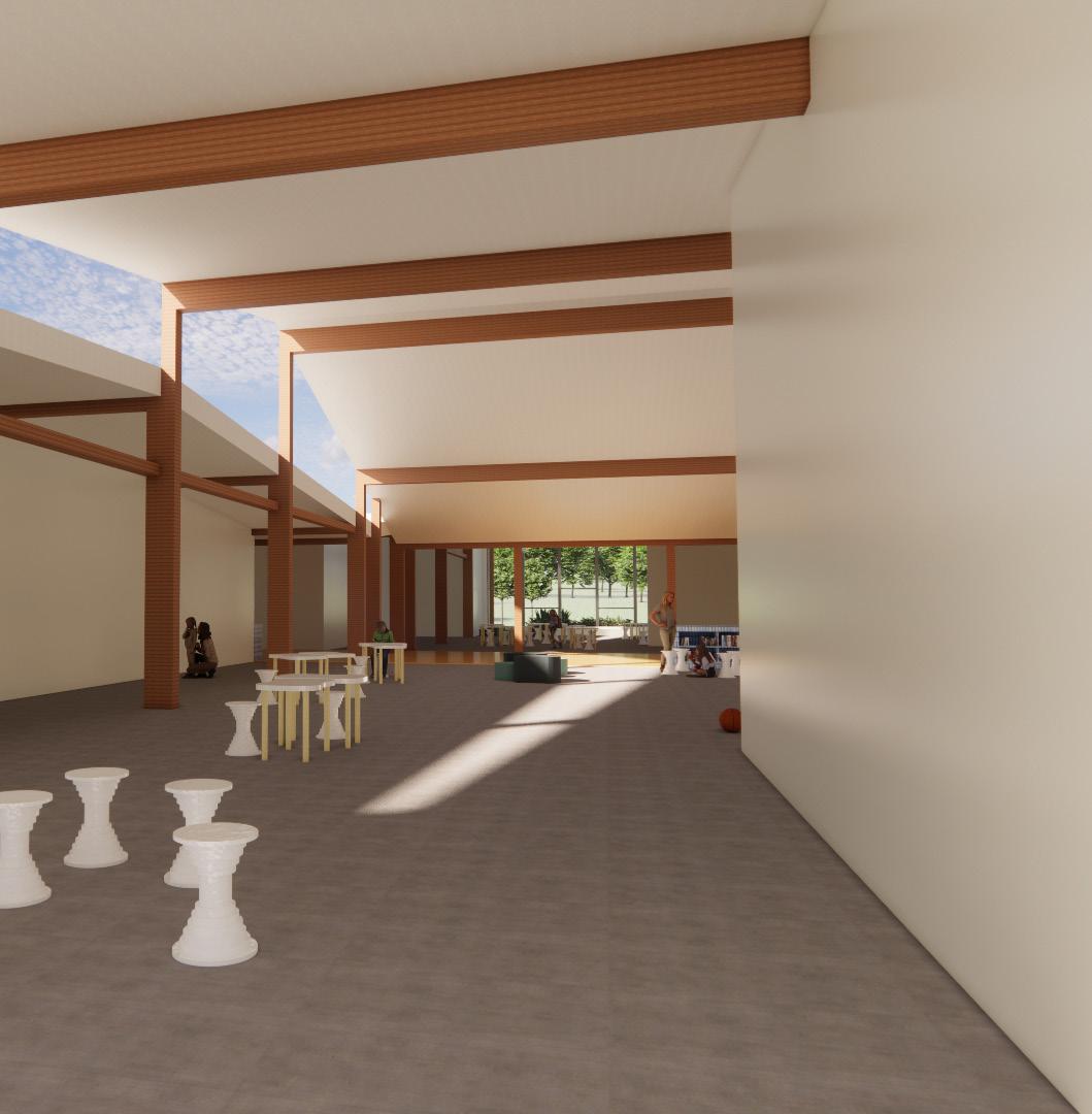
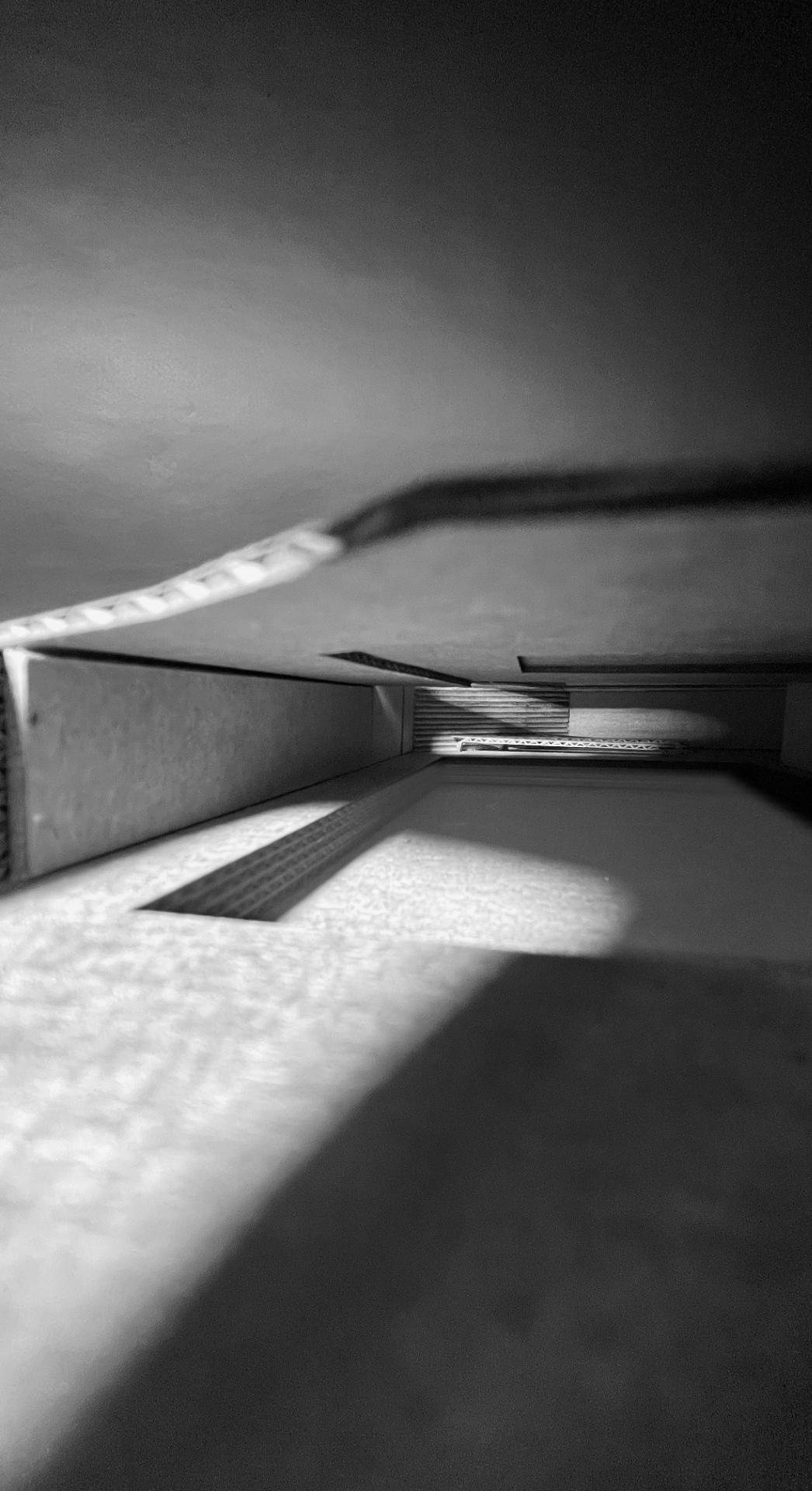
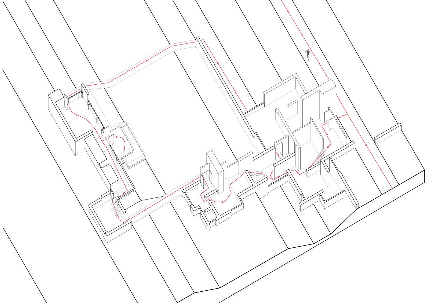
This spine visibly engages both sides of the unity center and is accompanied by the blue wall which includes built-in shelves, seating, and displays for active use. Due to security separation standards, this spine not only acts as a way to navigate but values the safety of the youth center while keeping it interconnected.
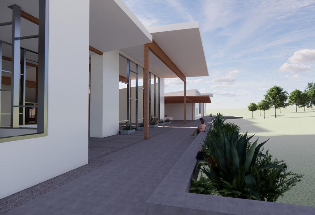
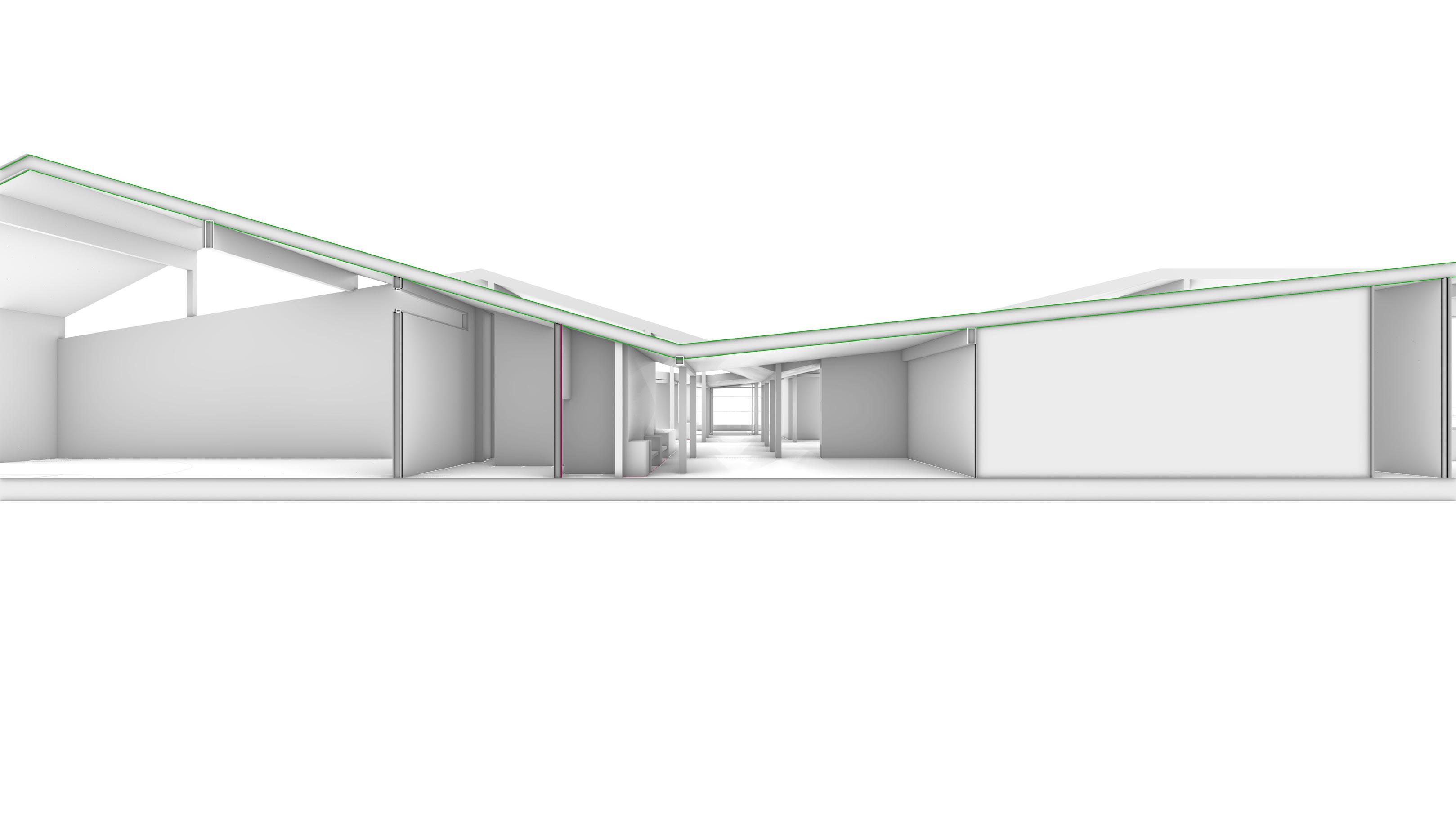
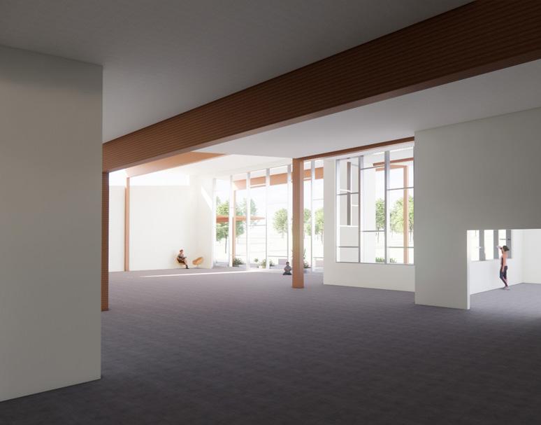
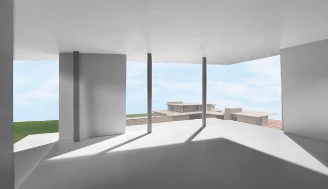
The concept of the unity center reflects through its unity to the exterior environment and also shared programing. The project utilizes large windows and long spaces inside to help light up the bars from the north. It also uses clerestory windows that stem from the unique roof design.
Wilcox
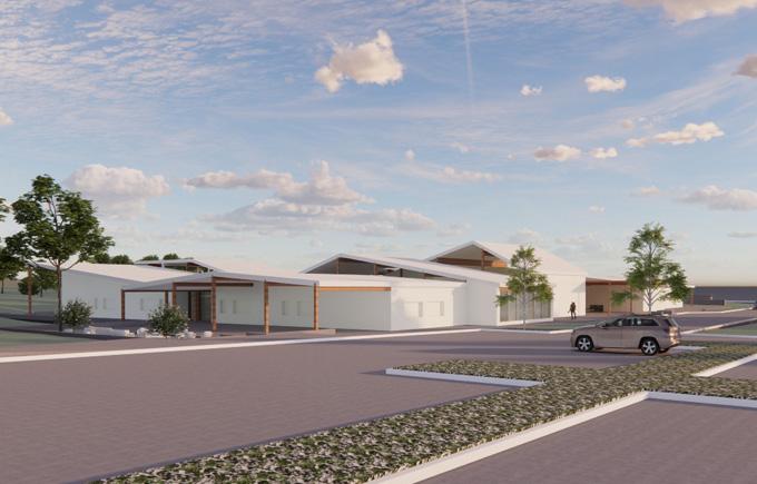
BAMA Kids and Community Center entrance
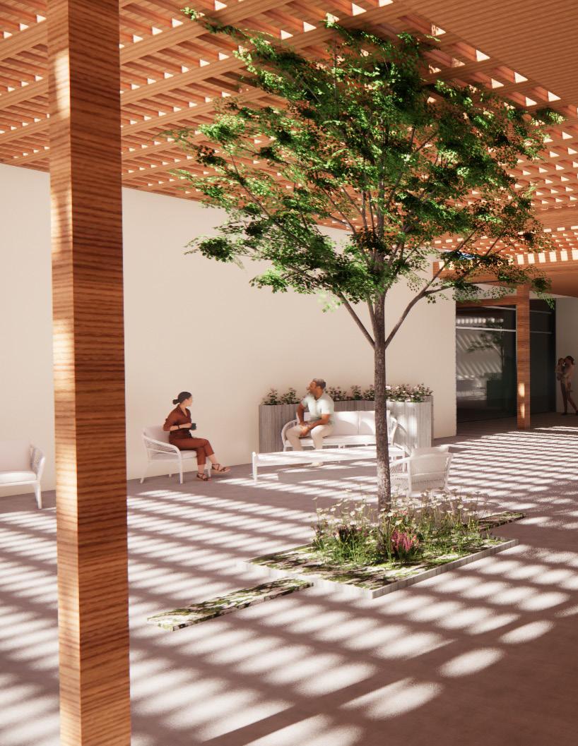
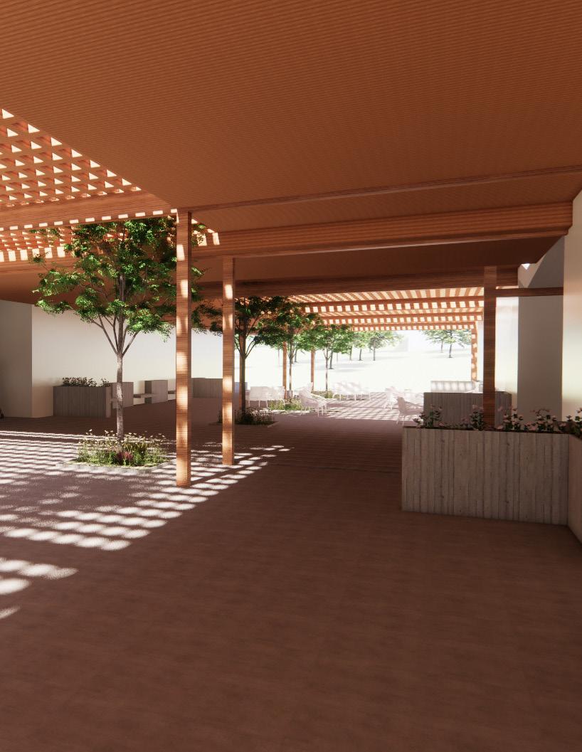
Programing in each bar starting from left to right looks like this; BAMA Kids classrooms, flex learning space, admin entry and gym/locker rooms, exterior welcome area with flexible seating, Wilcox Works and library, and last is a bar dedicated to admin and various rentable spaces. The shared programing includes the library, the interior/exterior dining room, and continues outward with the football field, walking path, and outdoor performance area.
Ground plan
Spine/Bars circulation paths diagram
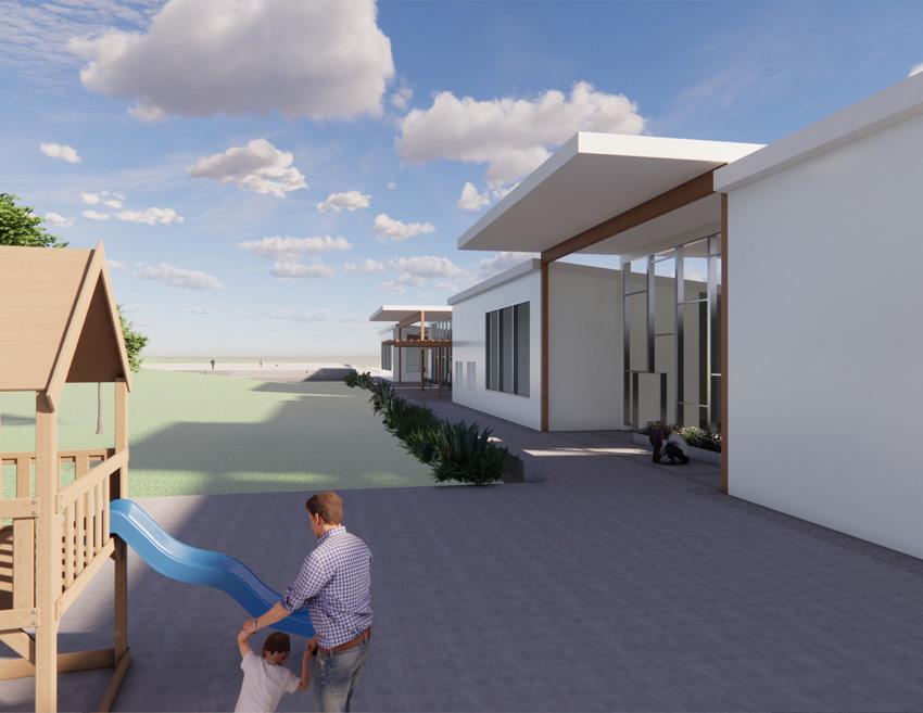
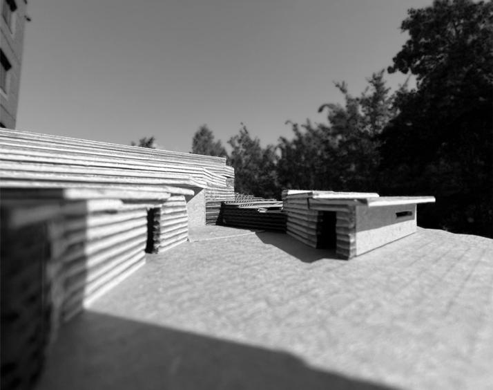
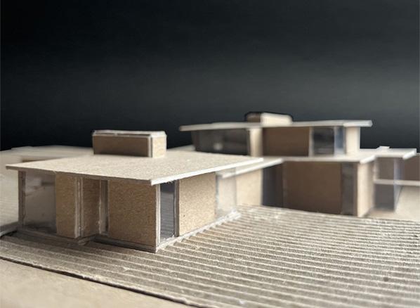
Southwest facade with clerestorys and exterior covered play area
Northern exterior facade of Library and Fitness
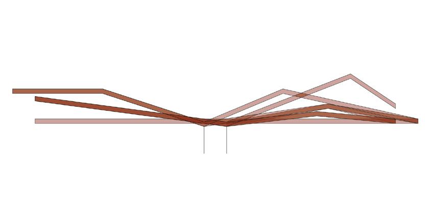
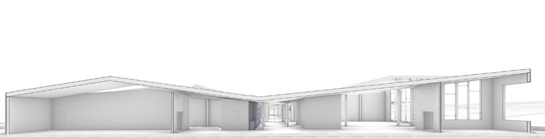
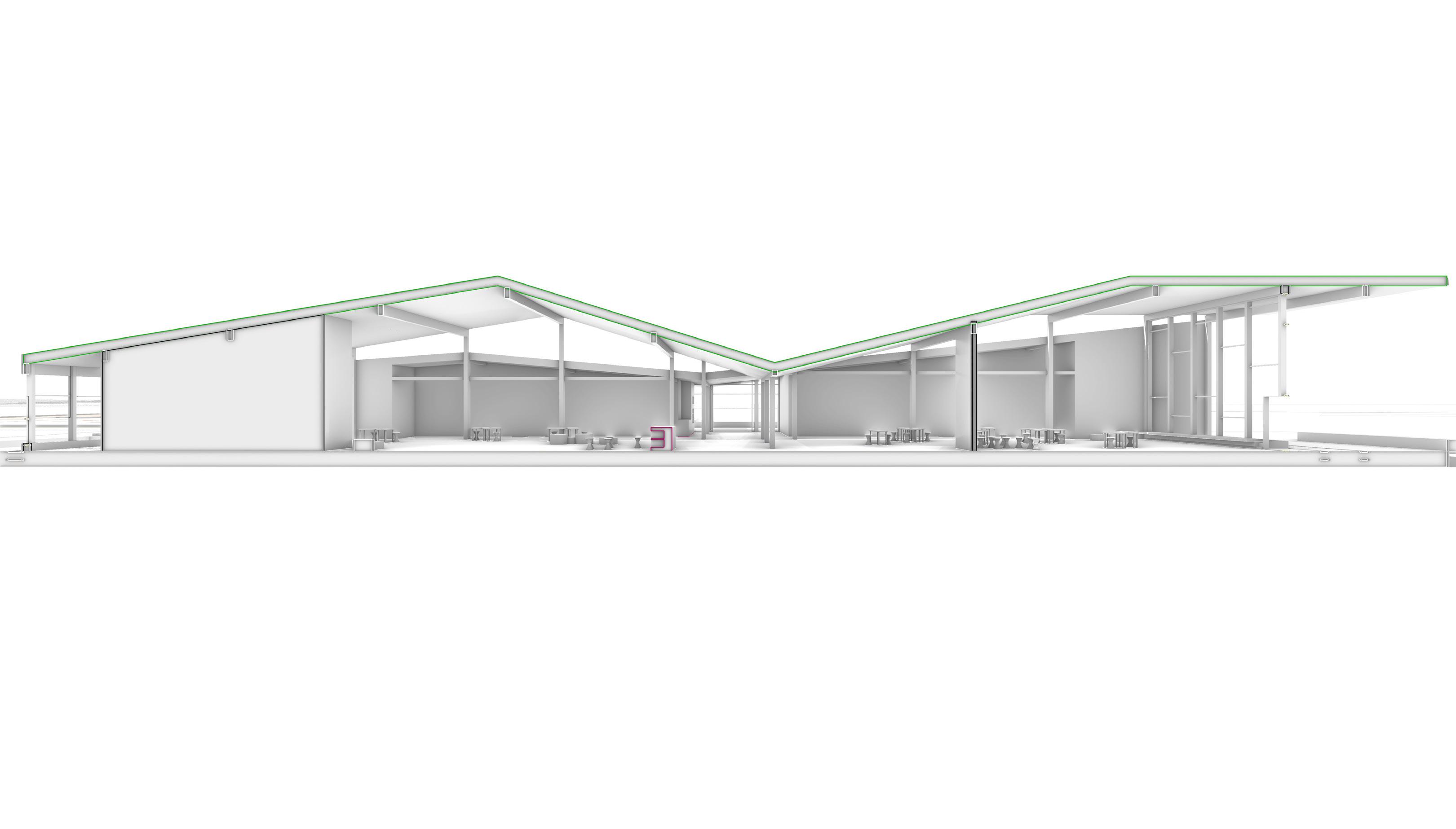
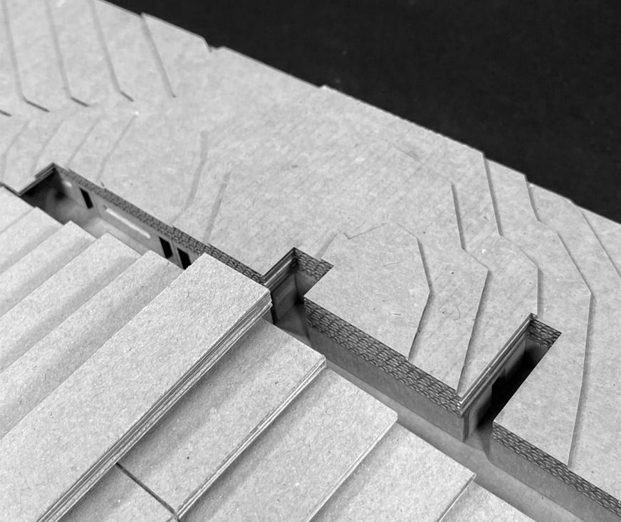
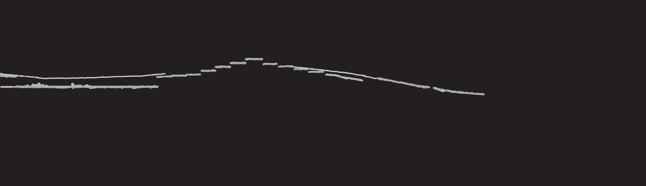
The roof design was influenced by the quilts of the Freedom Quilting Bee and locals in Gee’s Bend, a few minutes north of Camden. I went with double pitch and single pitch roofs to help fit into the surrounding forms in Camden. Each roof covers a singular bar of program, and that program below dictated the pitch of that individual roof. The exterior welcome entry roof is a flat wooden screen, vastly different from others. The shift between solid wood and screen is to allow for changing weather conditions in which occupants can adjust furniture as they wish.
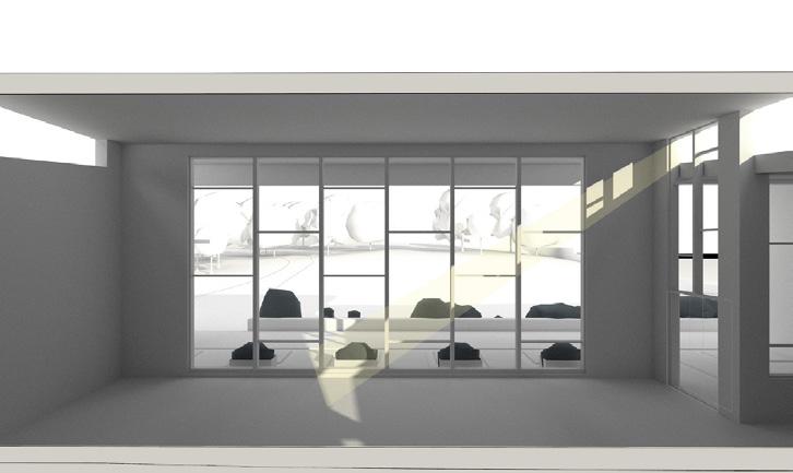
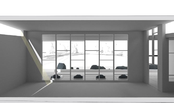
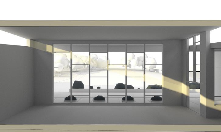
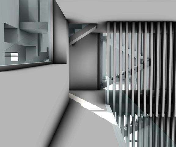
Due to the shifted bars, varying roof heights, and pitches, clerestory windows became a highlight of the project. They allow light to spill into space in interesting figures. A sun study was done in the library for different times of day. Doing so helped to compare the suns schedule to a typical user’s schedule.
Morett
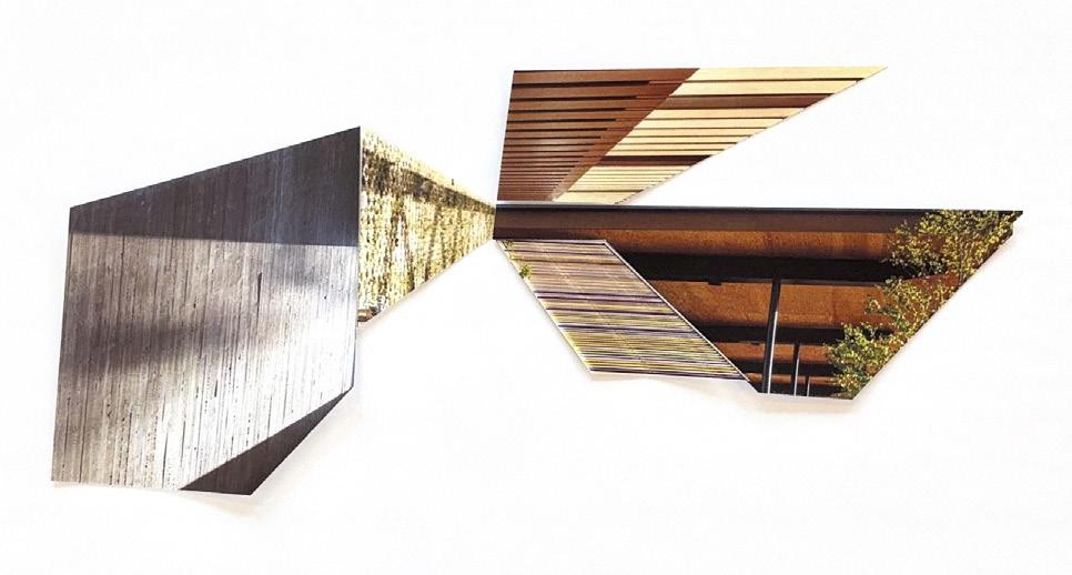
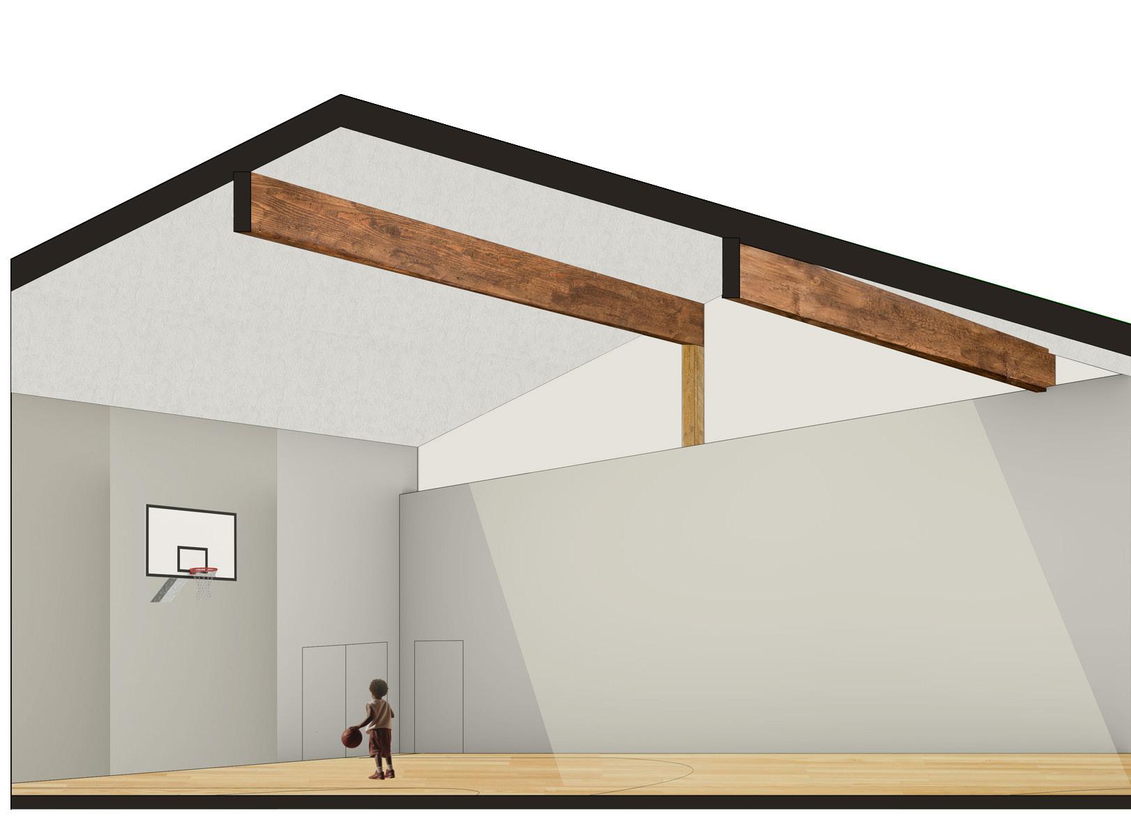
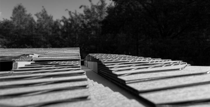
Paper collage experiement with depth
Section perspective
Roof plane pitch/height diagram SUN DIAGRAM- 9:00 am
1:00 pm
DIAGRAM- 5:00 pm
Caroline Morett
Northern exterior of Flex learning space and Playground
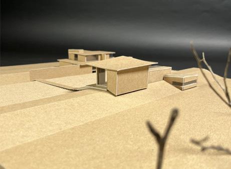
BAMA Kids entrance and Blue continuous spine wall
Community Center Library space
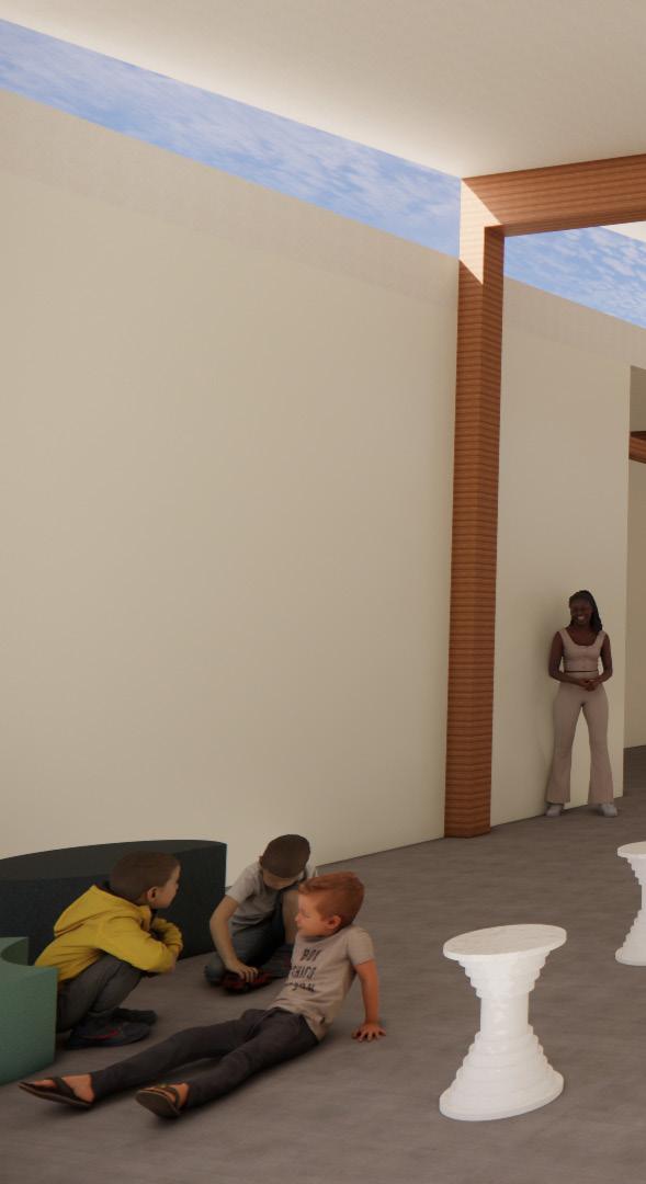
Interior BAMA Kids flex learning space
Circle of Living
An Environmental & Wellness Focused Project
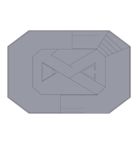
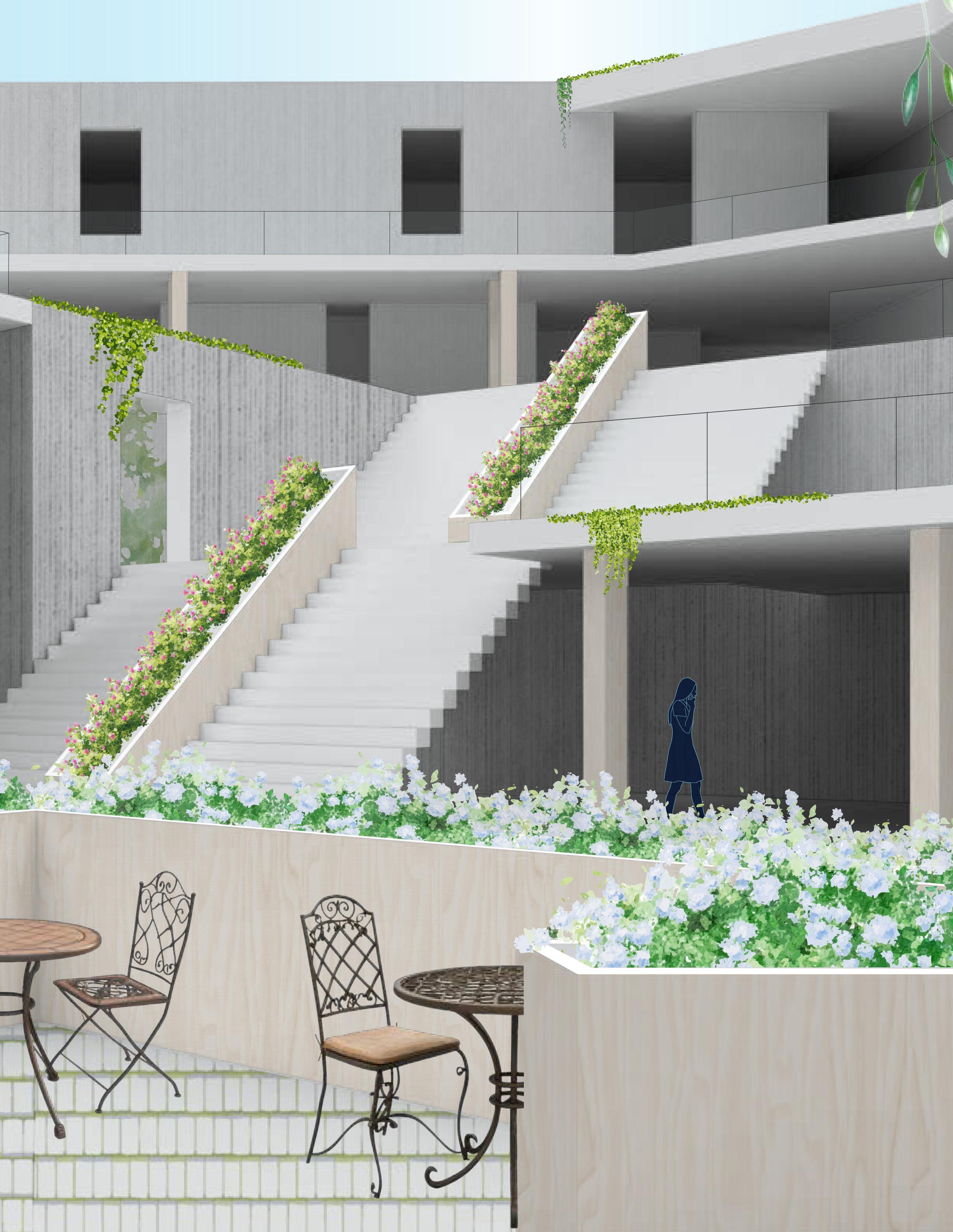
This project, titled Circle of Living, is a mixed-use multifamily housing development located on a sloped site in Montgomery, Alabama. The design responds directly to the topographic conditions of the site, which drops 30 feet from one end to the other. Using this natural terrain, the building is split into two interlocking U-shaped masses that step with the slope and create a central courtyard as a shared social core. Four chamfered corners anchor the massing, with diagonal lines drawn between them shaping the circulation, courtyard, and spatial organization of the project.
The concept of “circle of living” reflects both the physical form and the project’s deeper focus on community and wellness. Each corner holds a key communal function—gardens, gathering spaces, vertical circulation, active and quiet zones— so as residents move through the building, they pass through a continuous loop of shared spaces and experiences. The diagonals that connect each corner are not just visual—they become paths, view corridors, and transitional moments that encourage connection.
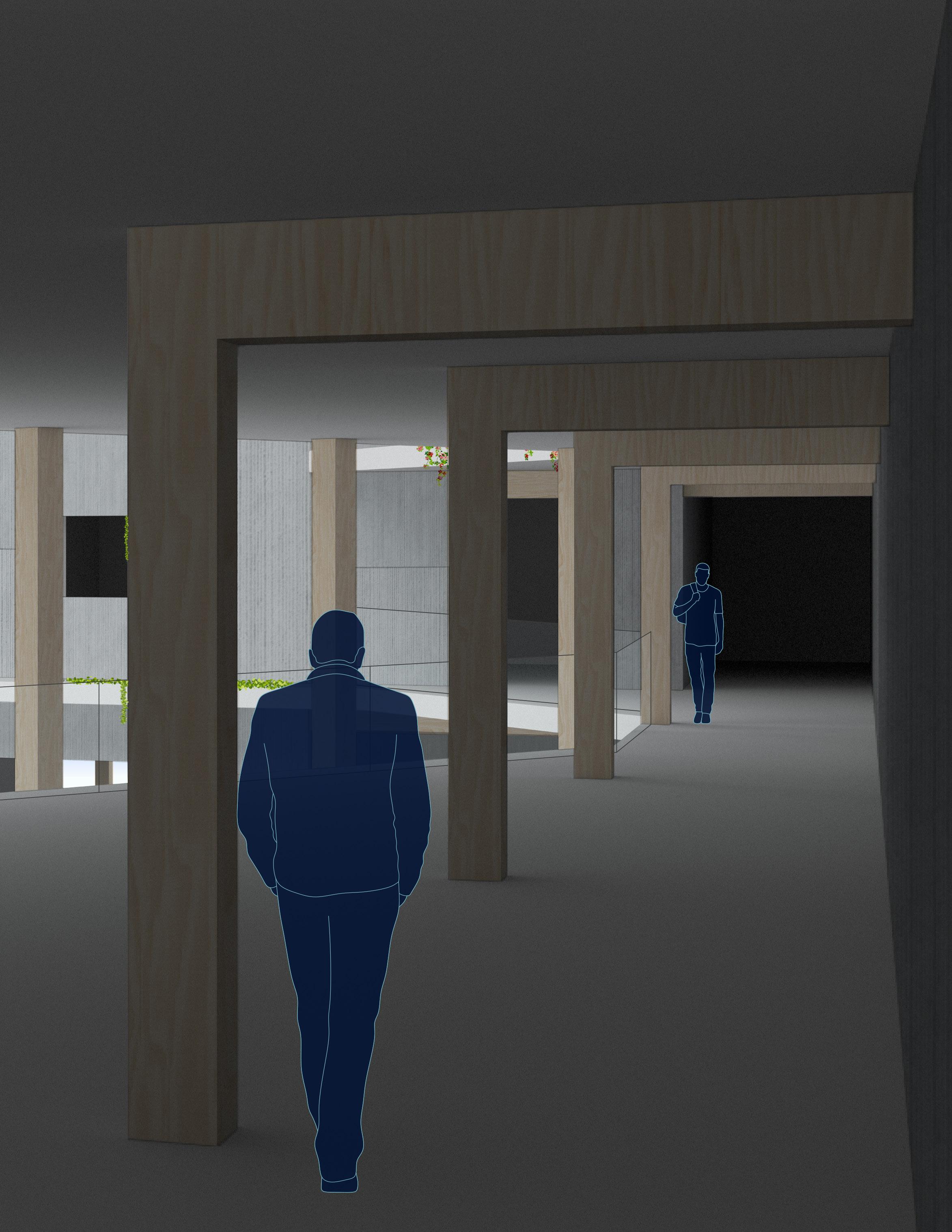
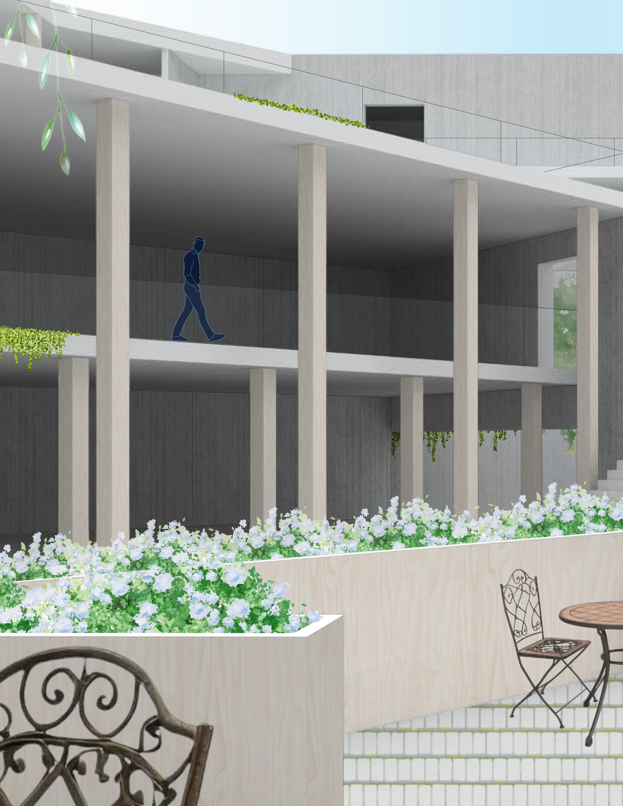
Green roofs serve as elevated community gardens, while under-deck spaces offer shaded gathering areas and flexible programs. These outdoor areas help bring a sense of wellness and openness to the living environment, even within a dense housing typology. Rather than separating living and social spaces, the project layers them, weaving moments of encounter and retreat throughout the site. Ultimately, Circle of Living aims to promote a balanced, community-centered lifestyle rooted in rhythm, flow, and shared experience.
Caroline Morett
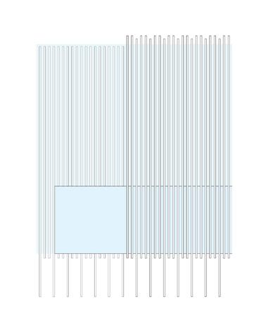
Partial louver system
Shared space diagram.
Greens and system diagram
Structure diagram
Caroline Morett
Section B: Grand stair
Section A: Private garden and Interaacting levels
Weaving Light and Mass
Exploring Urban Identity through Spatial Conditions
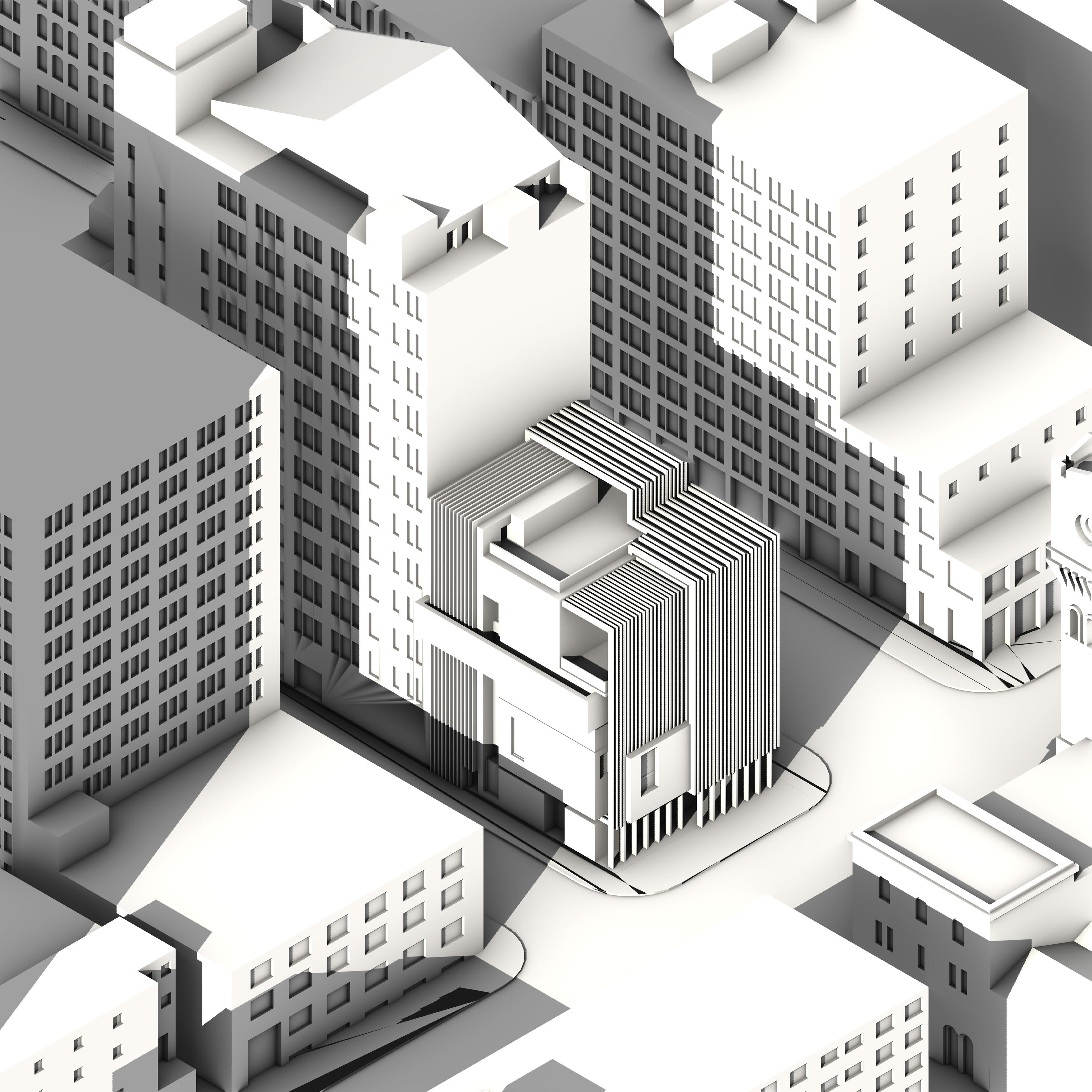
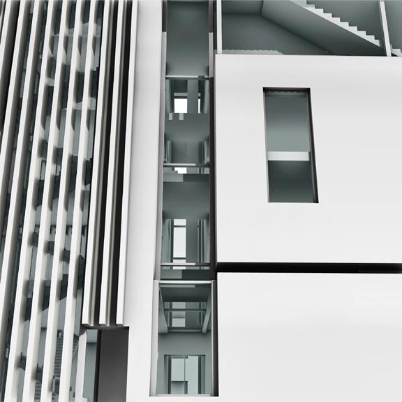
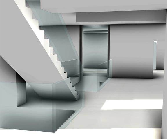
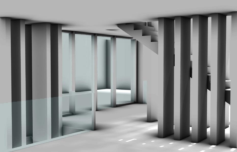
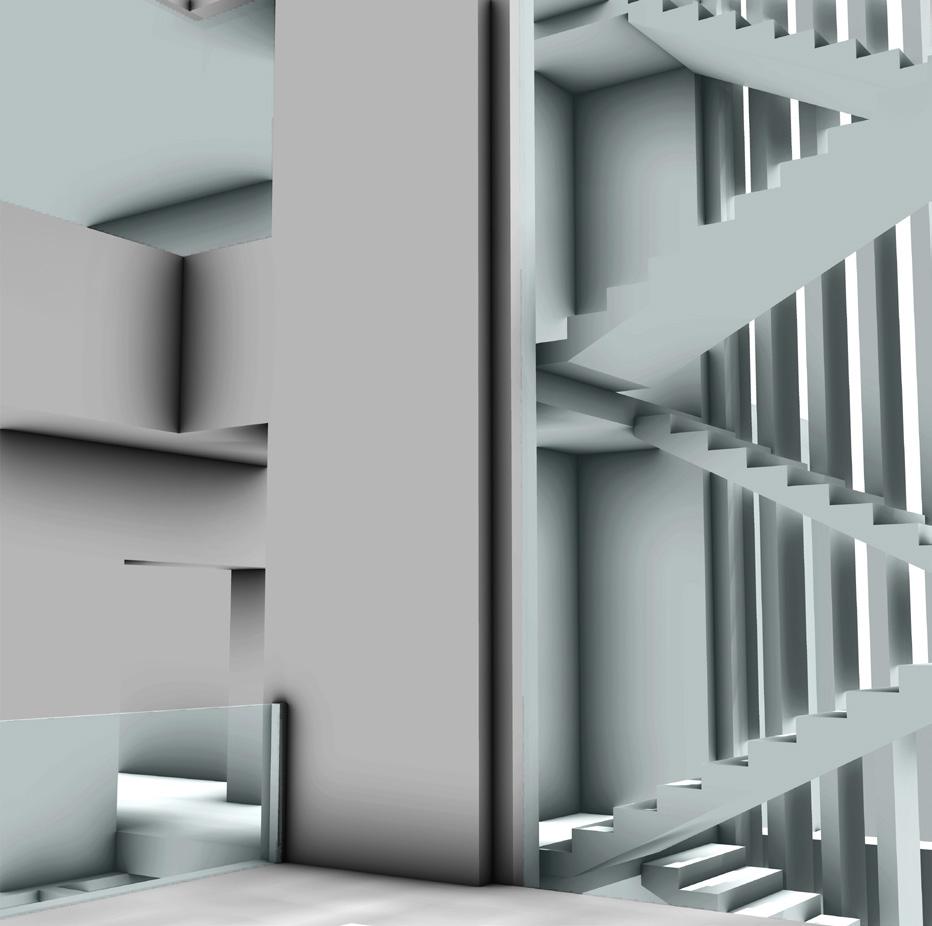
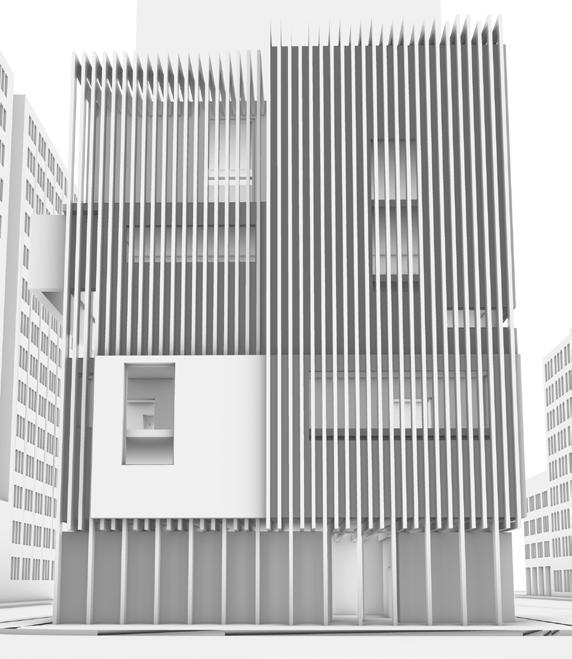
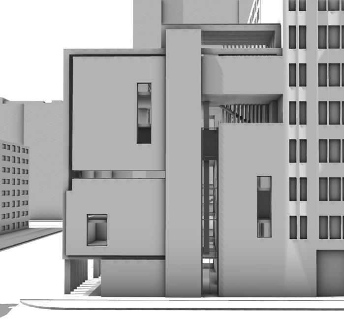
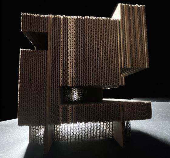
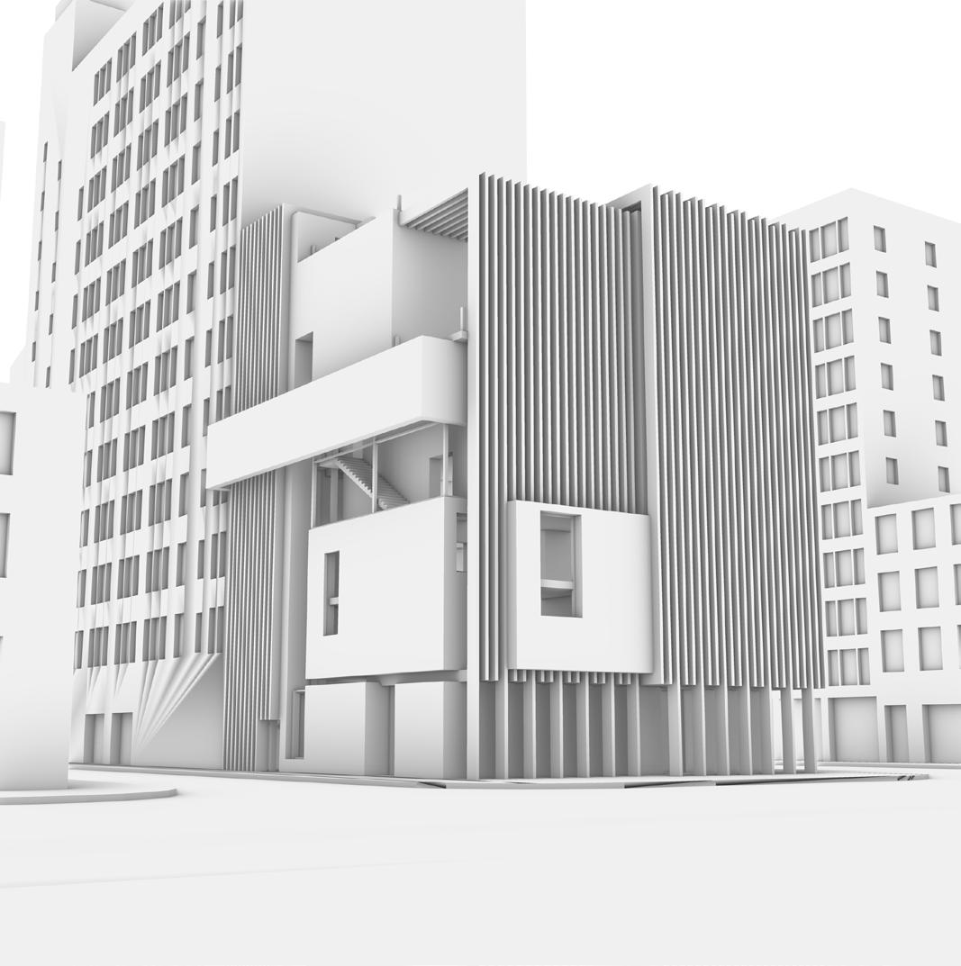
The project involves the design of a seven-story office building in Chicago’s historic Printers Row neighborhood, located at the intersection of Polk St and Dearborn. The design is guided by specific requirements, including the integration of a social stair, a fire stair, and daylighting strategies that optimize heating in the winter while providing shading in summer. The project investigates the interplay between solid and void conditions prevalent in Chicago’s urban fabric.
Public spaces such as parks, streets, and sidewalks are conceptualized as “voids,” while buildings are classified as “solids.” These urban conditions inform the spatial strategy of the design. Public areas within the building are conceived as extensions of the city’s voids, fostering a sense of connection and continuity with the surrounding urban environment. In contrast, the solid mass elements of the building are emphasized through their materiality and thickness, reinforcing a sense of enclosure and privacy. These private spaces are dedicated to meeting rooms, offices, and break rooms.
Building upon a previous project focused on carving solids with intersecting voids, this design shifts the focus to the creation and definition of void spaces in relation to solid forms. The intent is to explore innovative ways to form and contrast these conditions, resulting in a building that harmonizes with the dynamic, ever-evolving character of Chicago’s urban landscape.
Populated axon from the southwest angle.
Caroline Morett
Composite Mapping that explores the solid and void conditions of the city that surround the site.
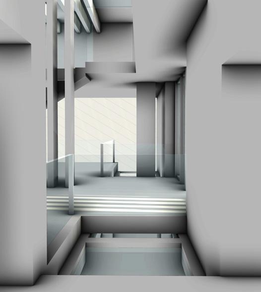
Each floor plan is unique, offering an immersive, head-turning experience as one moves through the building. Most floor plans feature a large open area on the northern side that spans the length of the site from east to west. Most floor plans share a large open area towards the North side that span the length of the site from East to West, interrupted on each floor by a form of circulation. Each floor has its own interpretation, with the floor plate cut to create rectangular visual scenes that frame views the city streets, parks, and other public spaces. The cuts are represented with an “X”, while shading techniques are used to indicate the area beyond the cut. The building also incorporates voids along both the x and y axes, as well as the z axis, resulting in double and triple-height spaces.
A - connecting space diagram
Section B - connecting space diagram
Caroline Morett
Section
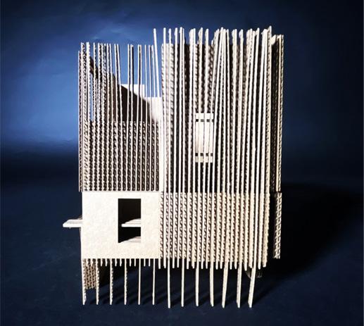
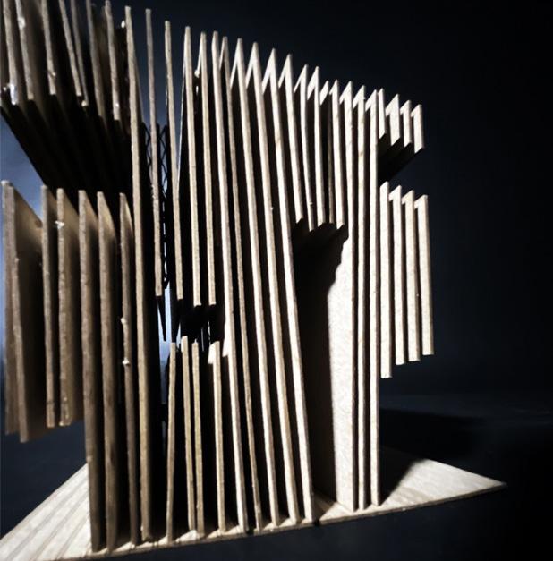
The study models experimenting with solid/void conditions through vertical layering, creating an interplay between enclosed and open spaces.
Caroline Morett
Unrolled elevation
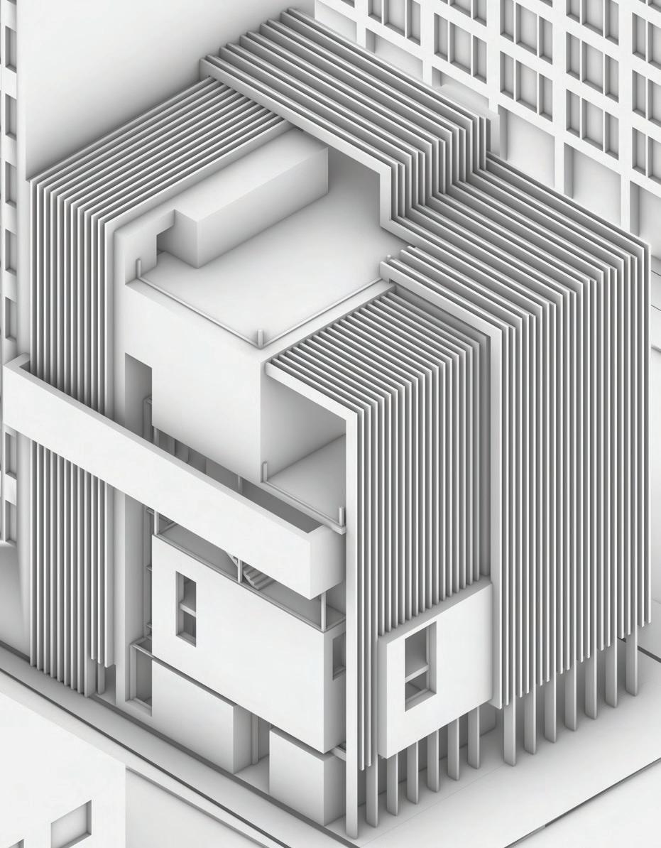
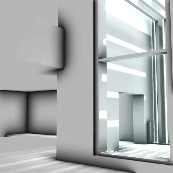
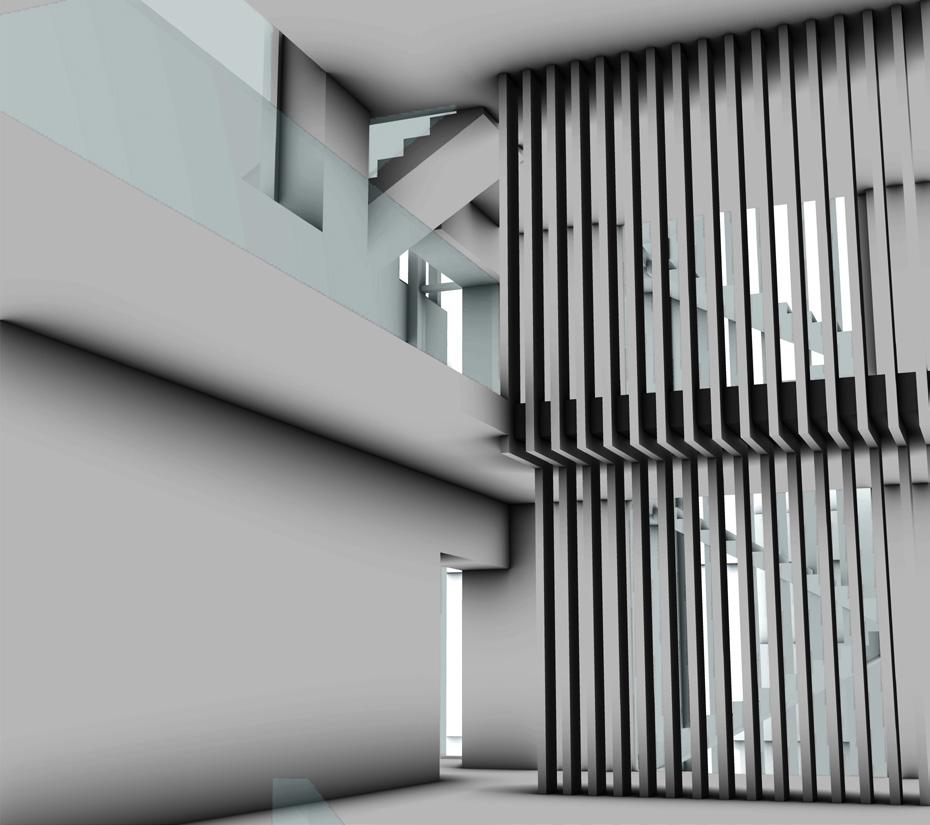
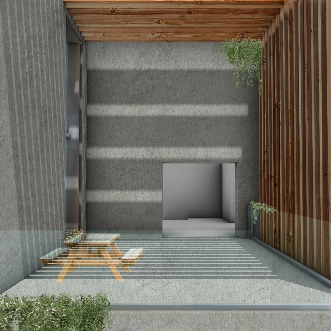
A prominent vertical void serves as the central circulation vestibule, designed as a dynamic and active space that mirrors the vitality and energy of the city. Additional voids throughout the building are strategically placed for circulation, collaboration, and exterior functions, offering a sense of lightness and openness. These voids are framed by louvers and incorporate glazing and double-height spaces, further enhancing their airy quality.
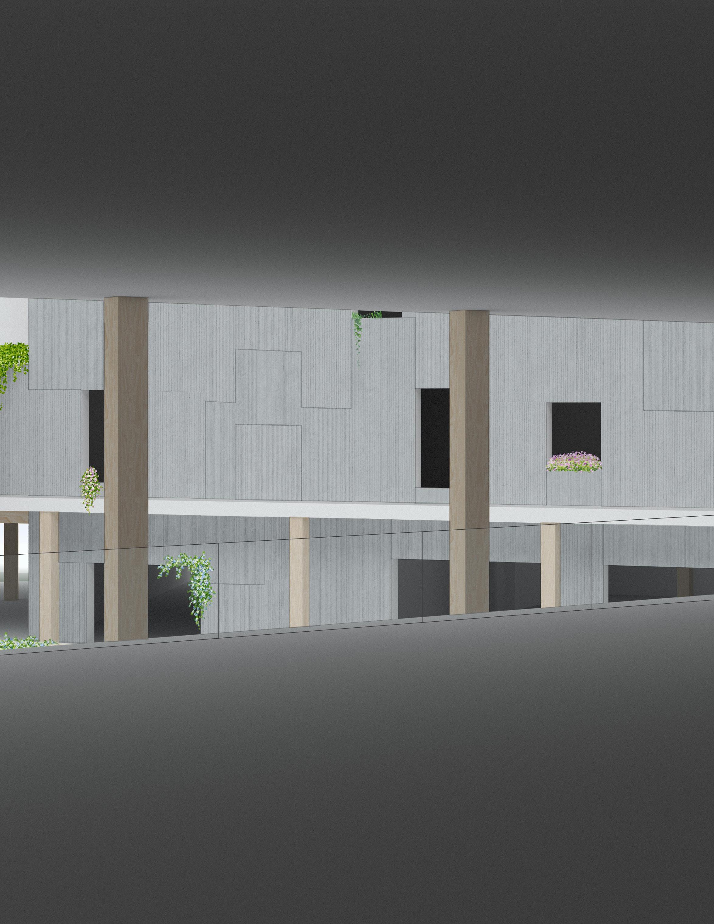
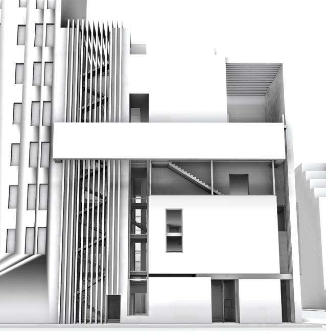
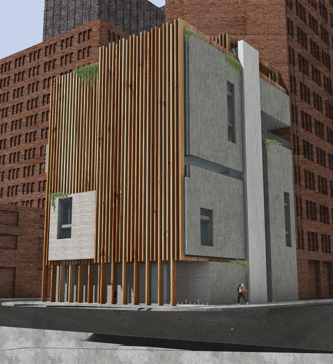
The design tackles the challenge of bringing natural light into the solid forms of the building. Large, multi-floor windows are strategically placed to allow for optimal daylight penetration while preserving a simplified façade, ensuring the solid elements remain visually cohesive. To address shading needs, layered elements are placed over windows, creating functional shading while offering visually engaging, overlapping experiences. The design process draws inspiration from the University of Michigan Museum of Art, particularly its use of structural elements to shape and wrap the building. Additionally, it draws from a previous project that experimented with horizontal layering or stacking, while this project explores this concept along the vertical axis. This approach informs the articulation of voids within the office building.
Facade digital photo.
Digital photograph of the sixth floor exterior public space shaped by southern vertical wrapping fins.
Within the Land
Exploring the Natural vs the Manmade
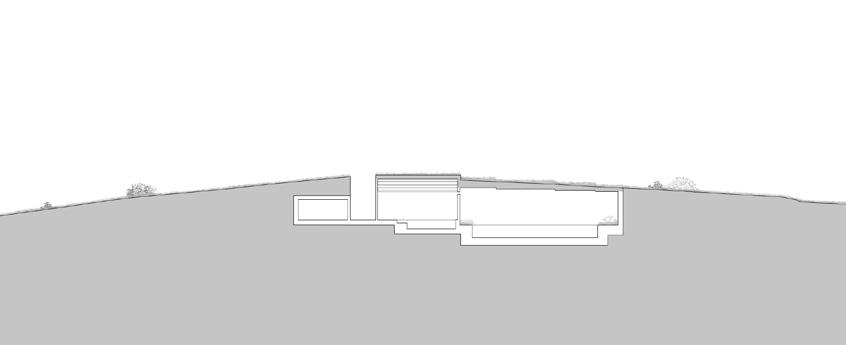
The site is located on the waterfront of Lake Martin in central Alabama. The region experiences hot temperatures year-round, along with regular precipitation. The project’s program includes the design of a natatorium, complemented by classrooms, locker rooms, a reception area, and additional spaces for seating, storage, and mechanical functions. An essential requirement for the design is full ADA accessibility.
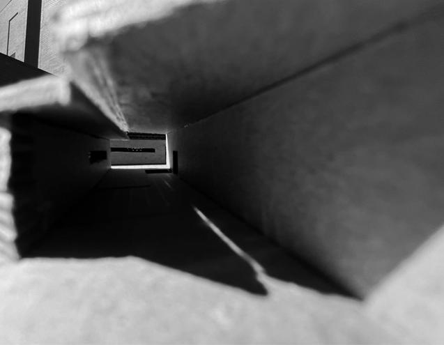
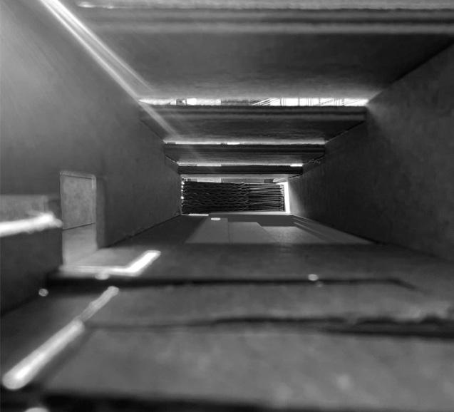
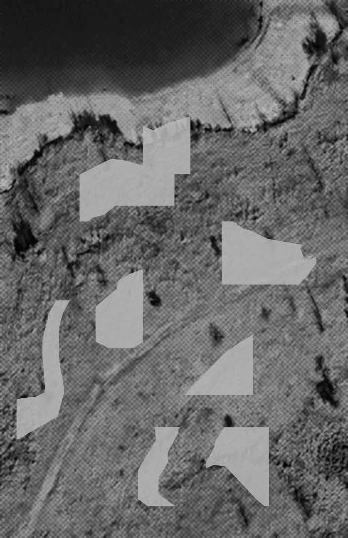
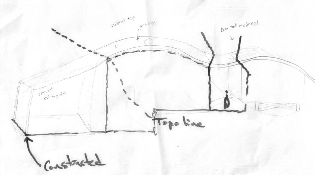
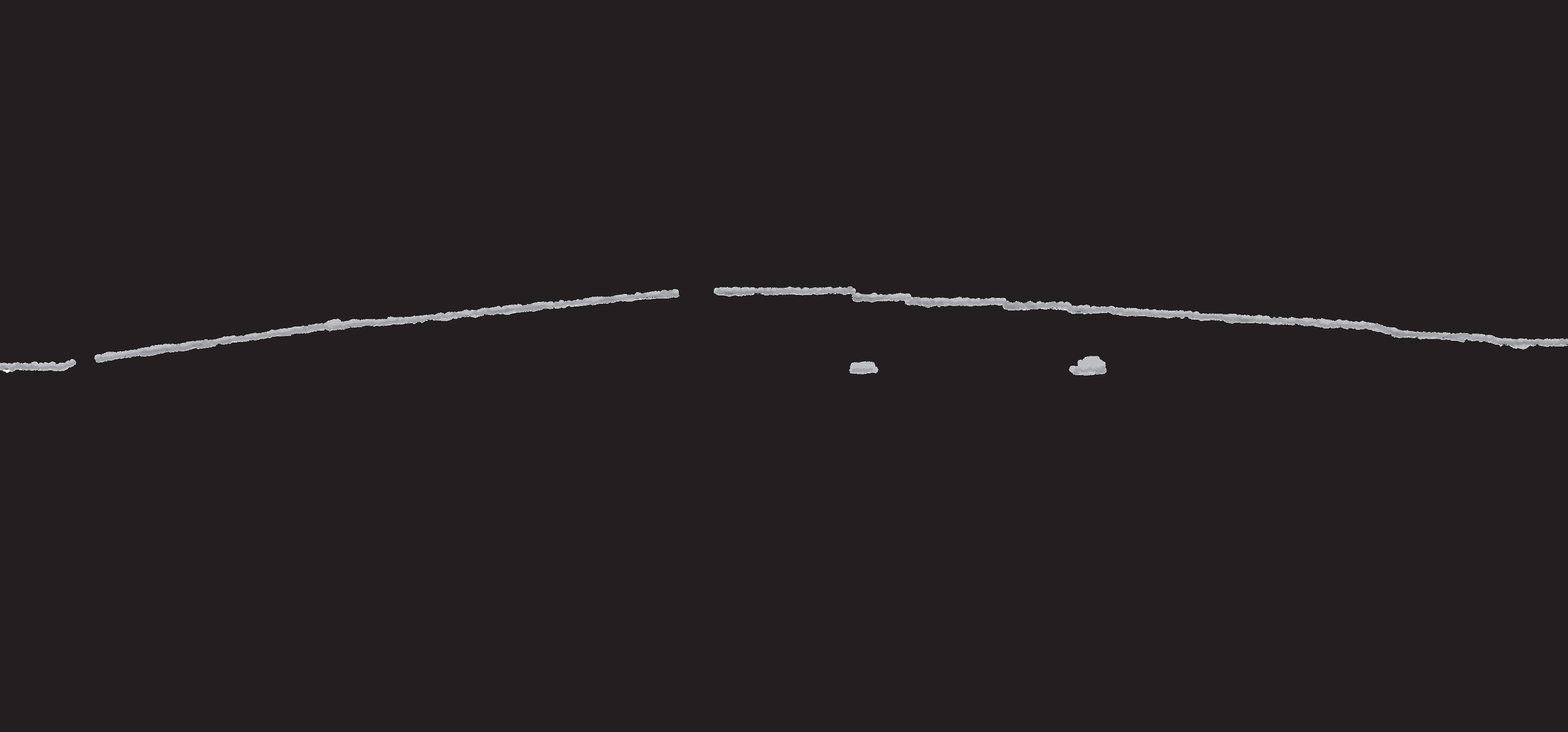
The design process began with precedent research into the House in Monsaraz by Aires Mateus. Mateus’ approach integrates geometric shapes into the natural environment, creating a clear distinction between interior and exterior spaces. This project explores the relationship between natural topography and an implemented grid, investigating how these elements interact and shape the overall experience.
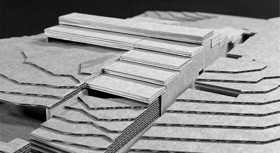
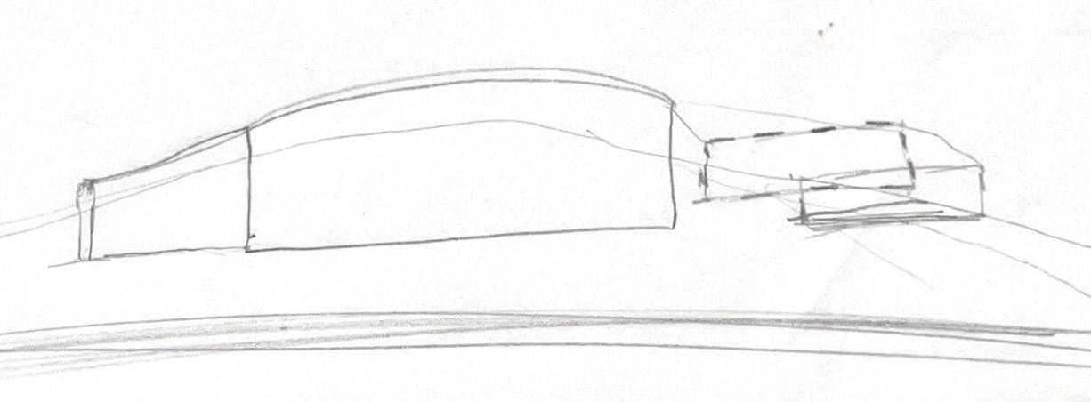
The varied geometric shapes prompted subtraction and embedding of the building into the original landscape, creating a unique experience through the site while shaping the interplay of void and solid. The roofline blends with the surrounding terrain, featuring a stepped green roof that serves as an artificial continuation of the landscape. On the north side, steps are divided by glass, allowing soft northern light to permeate the space. Additionally, the green roof plays a key role in regulating the building’s interior temperature, which is a critical aspect given the site’s hot climate.
The integration of the building into the landscape, along with the thickness of walls, creates a sense of unity between the structure and the land. This embedded design fosters a unique, immersive experience, where the spectator feels as though the building is naturally part of its surroundings. The layout of the space, guided by both regular and irregular design systems, maintains curiosity, leading visitors to wonder what they’re encountering next; a sharp corner, or an organic wall. The grid system, combined with the site’s original topography, influenced the shapes of the different buildings, creating a dynamic and playful design. The absence of traditional, straight-edged corners adds to the interest, ensuring the experience remains visually engaging and full of discovery.
Entrance experience showing the relation of the organic contour line met with a grid line.
Lighting also plays an important role in the design of the building, particularly given the challenging climate. The intense southern sun, as well as direct east or west exposure, can be difficult to manage. In contrast, northern light is ideal as it provides illumination without the harsh glare. This allows the space to remain bright and inviting while minimizing discomfort for swimmers, who are shielded from direct sunlight.
Caroline Morett
Overlay of Concept Exploration.
Stepped green roof interacting with original landscape.
Entrance path to program bar from lake path circulation.
Caroline Morett
Section A.
Section C.
Section B.
Opening the View Landscape Analysis and Learning to Shape Views
Caroline Morett
Passageway from Brick Country House, through the berm, into the private gallery.
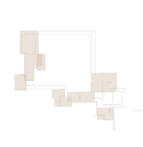
The project involved multiple aspects of design exploration. One key element was to create a house inspired by Mies van der Rohe’s Brick Country House, incorporating our own interpretation of the plans. To increase the challenge, we had to deal with various terrains, with random assignments of high vegetation, low vegetation, a valley, a berm, flat land, and a path. An additional component of the project was to design a new addition, relates to the Brick Country House, including a public gathering area, a gallery with an aperture, a gallery as an aperture, and restrooms. One of the views was specifically focused on the Brick Country House variation, taking architectural influence and purpose from its design.
Throughout the project, the views continually shift, whether it’s of the valley, of the high vegetation, or the brick country house itself. The experience is ever-changing. The circulation through the new addition starts with a more secluded and private atmosphere, gradually introducing more light as you move through the spaces that connect the two galleries. Placing the restrooms centrally, adds comfort and makes for a more enjoyable journey, allowing visitors to explore freely rather than wait or follow a strict path before touring. At the end of the new addition, the view opens up dramatically, offering the option to step outside. This space provides a direct view of the Brick Country House. By incorporating stereotomic and tectonic elements, the design shapes the visitor’s perception, initially blocking the view from behind to focus attention on the main attraction- the Brick Country House. As the view is opened, visitors are able to develop a deeper understanding of the house and its surrounding context.
These plans illustrate the placement of the new build, emphasizing its relationship with the Brick Country House. Rather than creating a hierarchal distinction, the new structure is positioned above, on top of, and embedded into the berm, enhancing the view of the house and highlighting their differences while acknowledging their similarities. The design strategy involved using the proportions of space from the Brick Country House, reinterpreting them in a new layout for the addition.
Morett
Proportion diagram.
Plan cut.
Circulation diagram.
View from Gallery.
East-West Section.
The southwest angle of Brick Country House extension is elevated on a two-foot plinth, raising viewers to improve their ability to see over the low vegetation. This lift enhances the visual connection to the surrounding landscape while maintaining a clear view of the house and its context.
The southeast angle demonstrates how the new building interacts with the high vegetation.
North-South Section.
The low vegetation flower field surrounds the public exterior patios, creating a secluded, private space between the new build and the Brick Country House. This design creates a sense of connectedness, blending the two structures while offering a tranquil, intimate environment.
The overhanging public gathering patio creates an immersive experience, seamlessly blending with the low vegetation and offering a direct connection to the Brick Country House.