Current Branding
Logomarks
(Pictorial, Emblems, Wordmark)
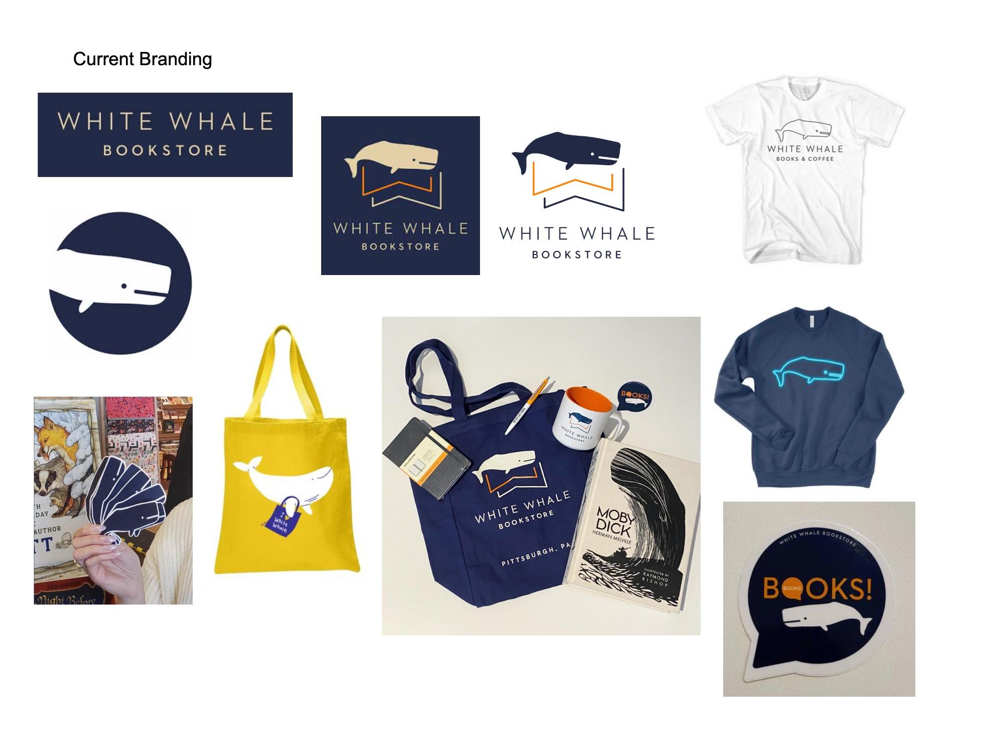
Observations: While the current logomark shows a simplistic and modern approach that conveys that the company is a bookstore with its triangular open book-like shapes that also looks like fins and two W’s, it is also a little boring, as the whale has a very blank expression. The logo could look more friendly and lively, as the White Whale bookstore aims to be a welcoming community space for all people. Even though Moby Dick, the famous white whale in literature that is store name is based off of, is not necessarily friendly, the White Whale mascot can be friendly because the bookstore wants to foster a friendly enivronment. Because of that, the logo is in need of revamping to appear more friendly.
Totebag shows inconsistency in branding (different whale design, blue whale not sperm whale)
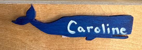
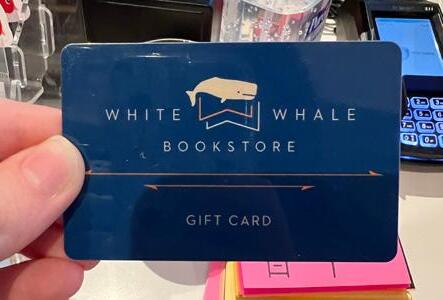
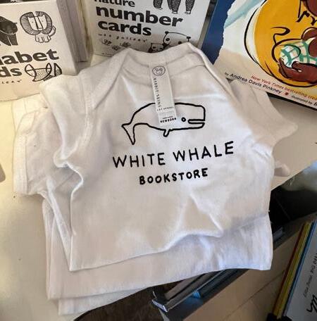
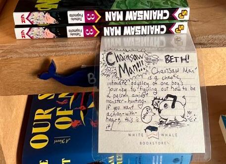
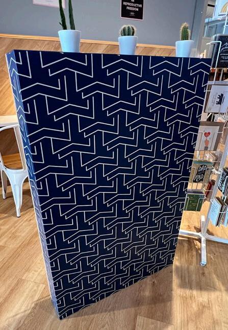
Logomarks implemented on merchandise and featured inside the store (whale variations, pattern on shelf, employee recommendations)
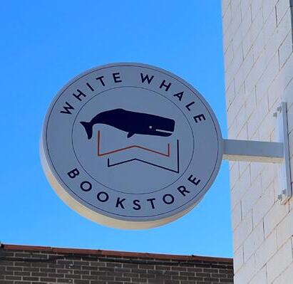
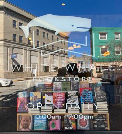
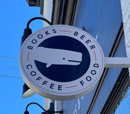
Outdoor signage:
- Two variations of whale logo, one for bookstore entrance and one for café entrance
- Whale logo on window and drawn on chalkboard
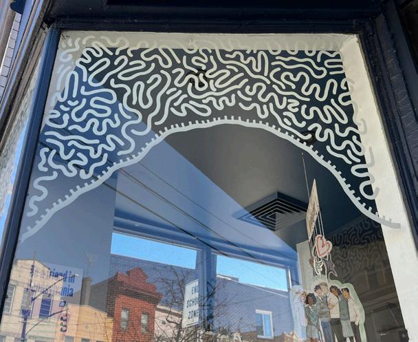
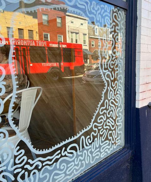
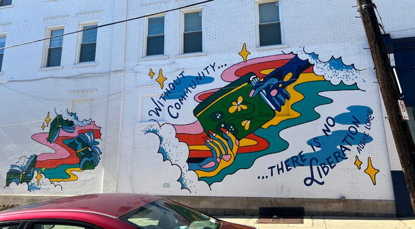
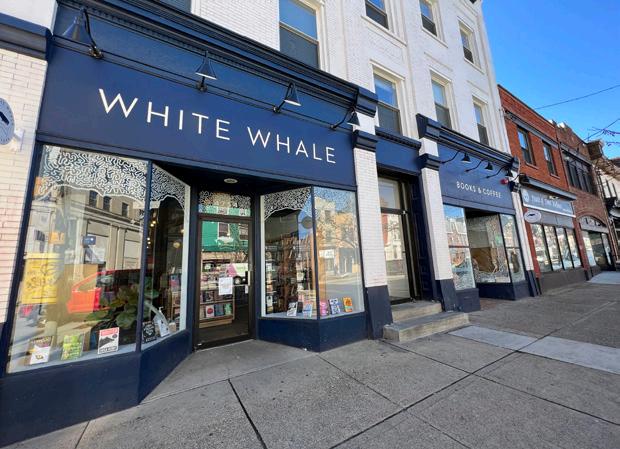
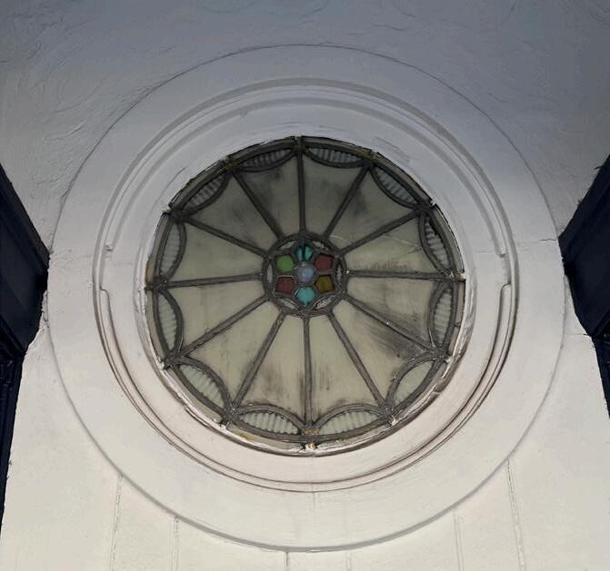
Stain Glass design in the middle of the outdoor café entrance. Middle of design is made out of colored pentagon shapes.
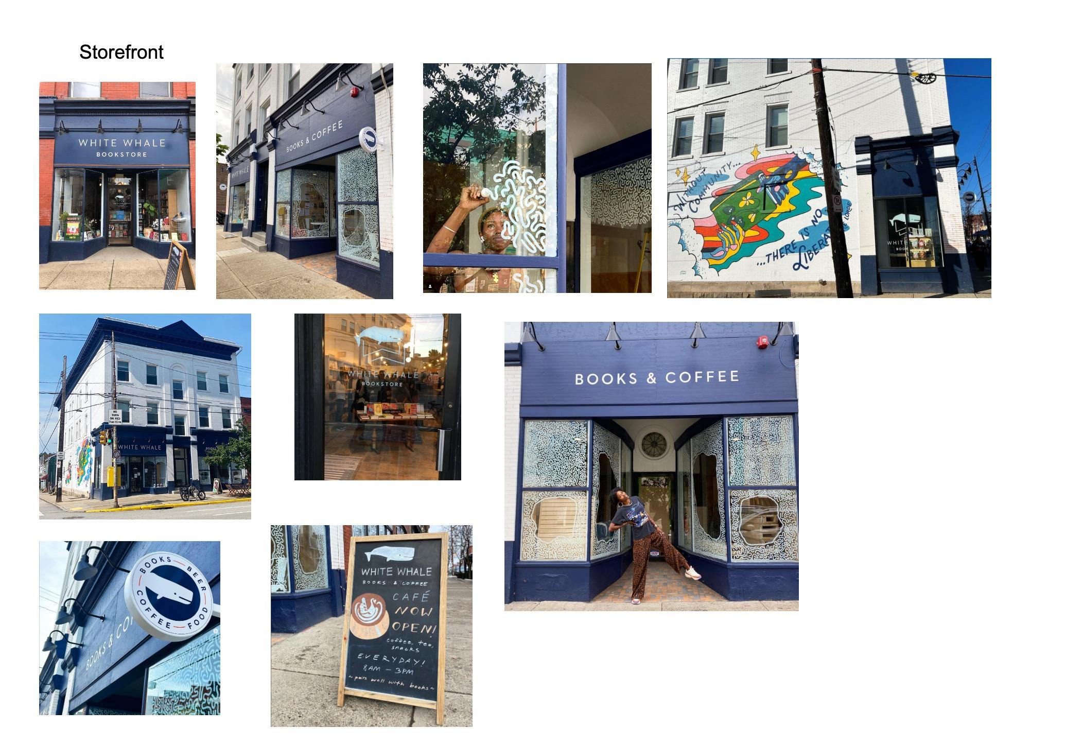
Front of building design Window design: “The Portals are Open” by Atiya Jones Building side mural: “Without Community, There is No Liberation”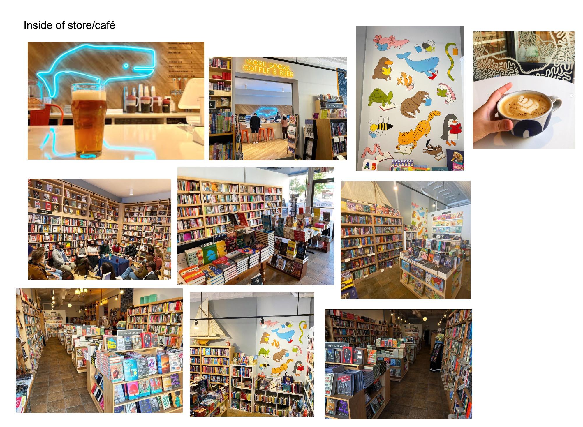
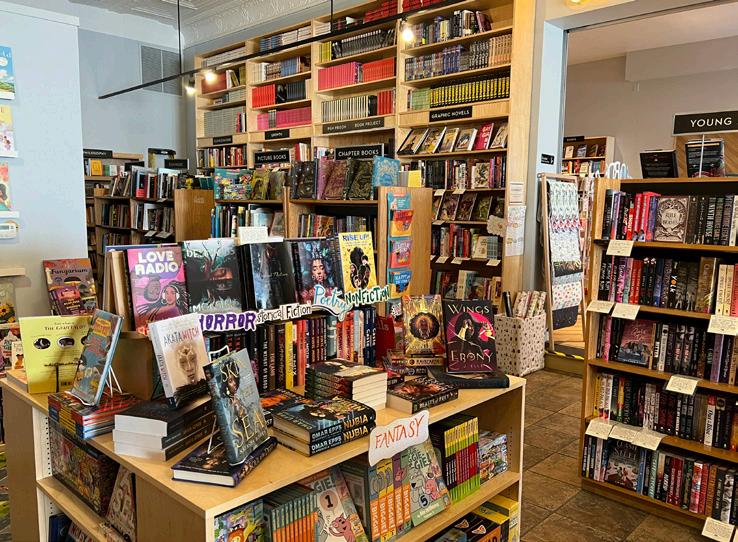
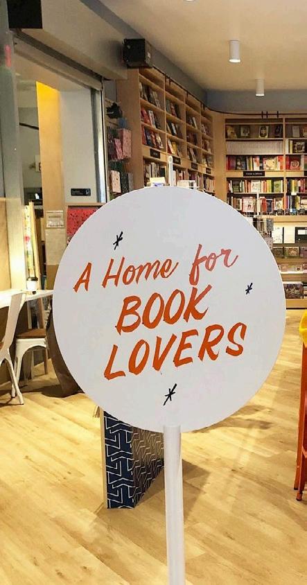
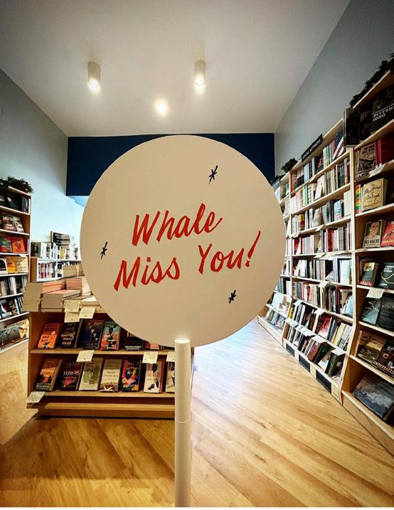
Sign with orange handwritten type by the café area, which is also surrounded by the nonfiction and regional sections
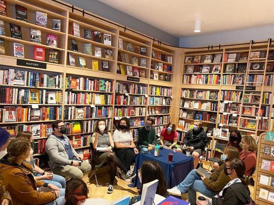
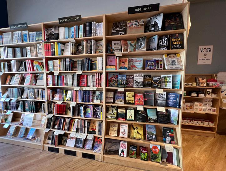
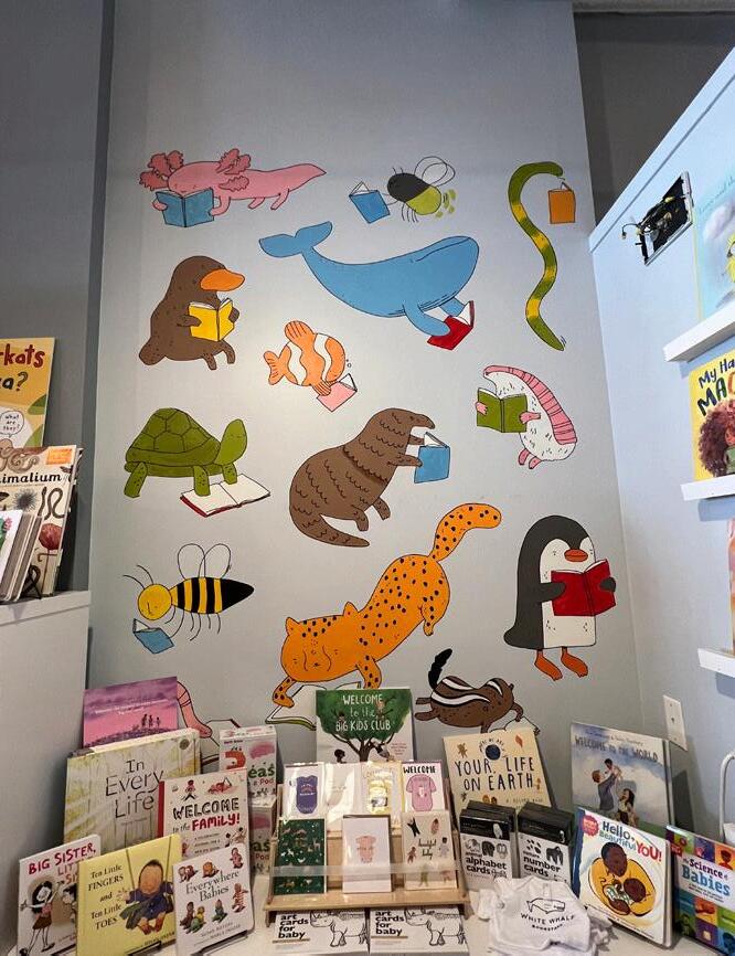
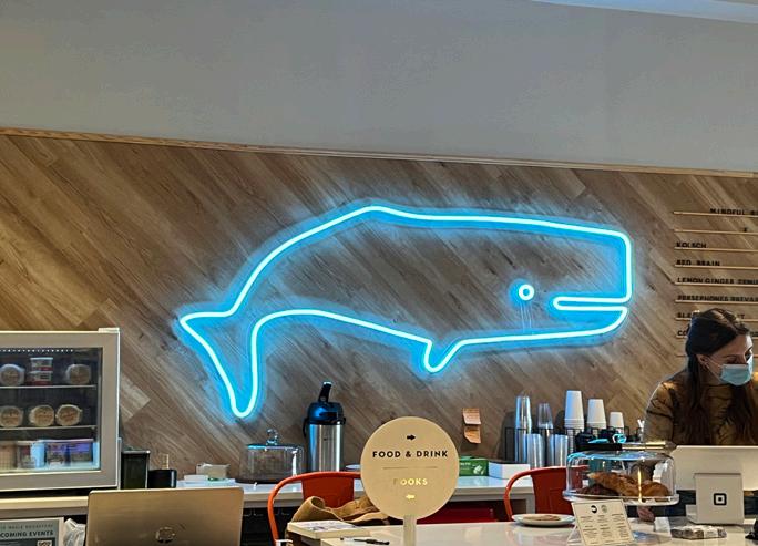
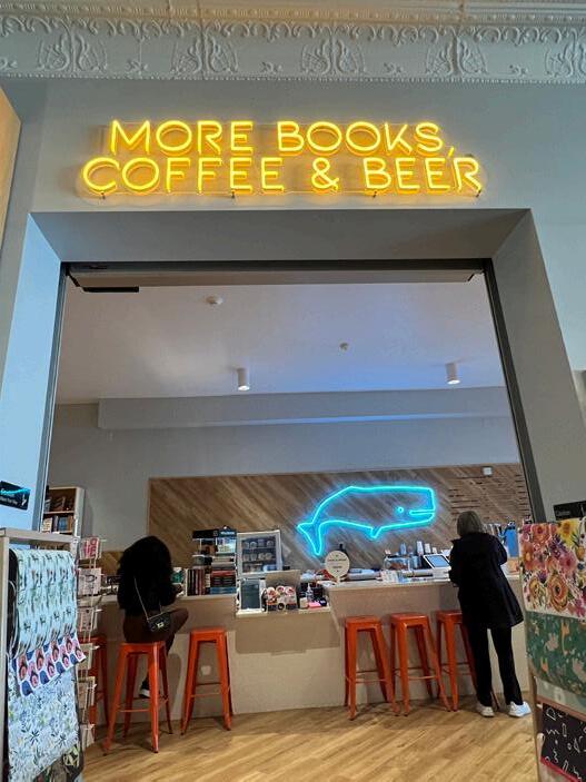
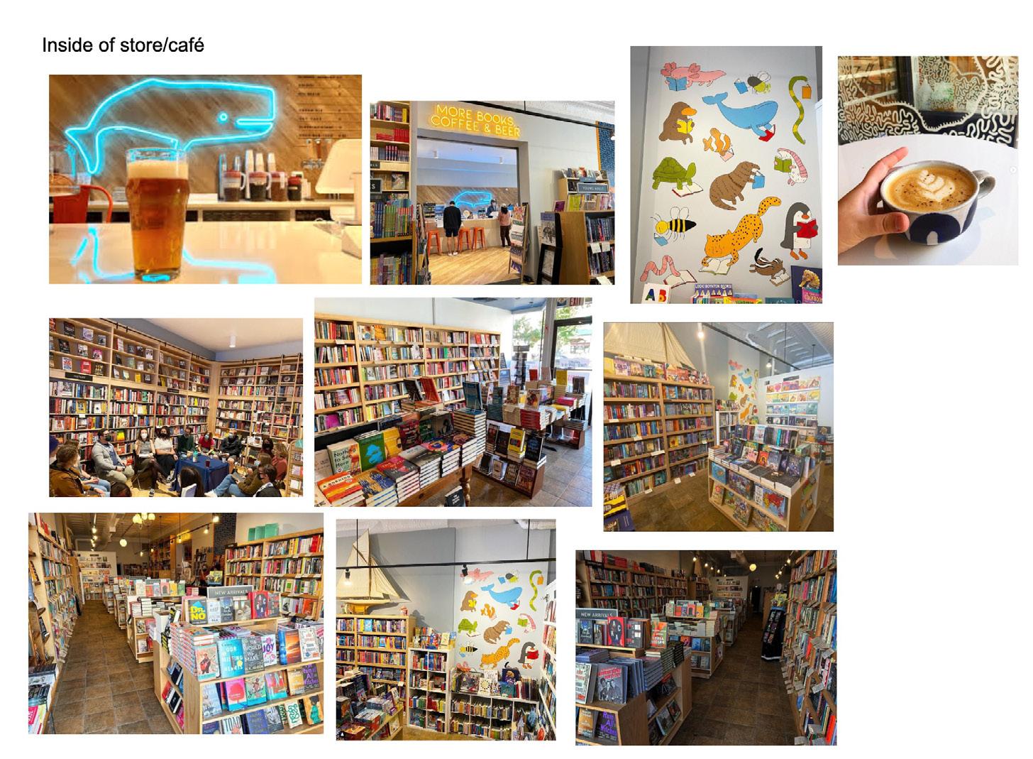
Fiction, Young adult, front of children’s section Pittsburgh/Regional and Local Authors Sections Children’s Section (Blue whale serves as inspiration) Neon café whale sign and entrance sign, artistic latte from café Book club in nonfiction sectionCompetition: The Big Idea Bookstore & Café
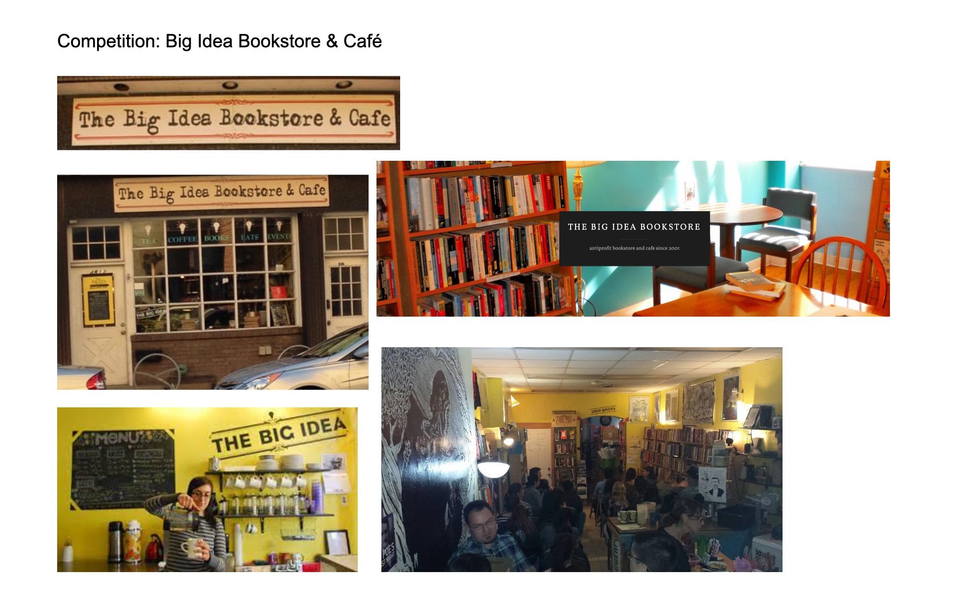 Logo and storefront
Inside of store and café
Website Letterhead
Logo and storefront
Inside of store and café
Website Letterhead
Competition: Penguin Bookshop
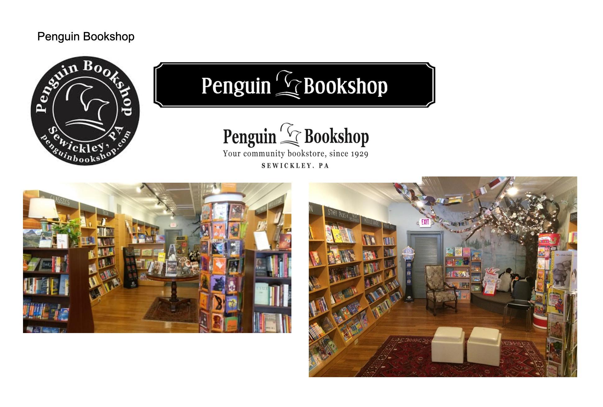 Logo emblems- horizontal and round versions
Inside of store, bottom shows children’s section with penguin plush
Logo emblems- horizontal and round versions
Inside of store, bottom shows children’s section with penguin plush
Competition: Riverstone Books
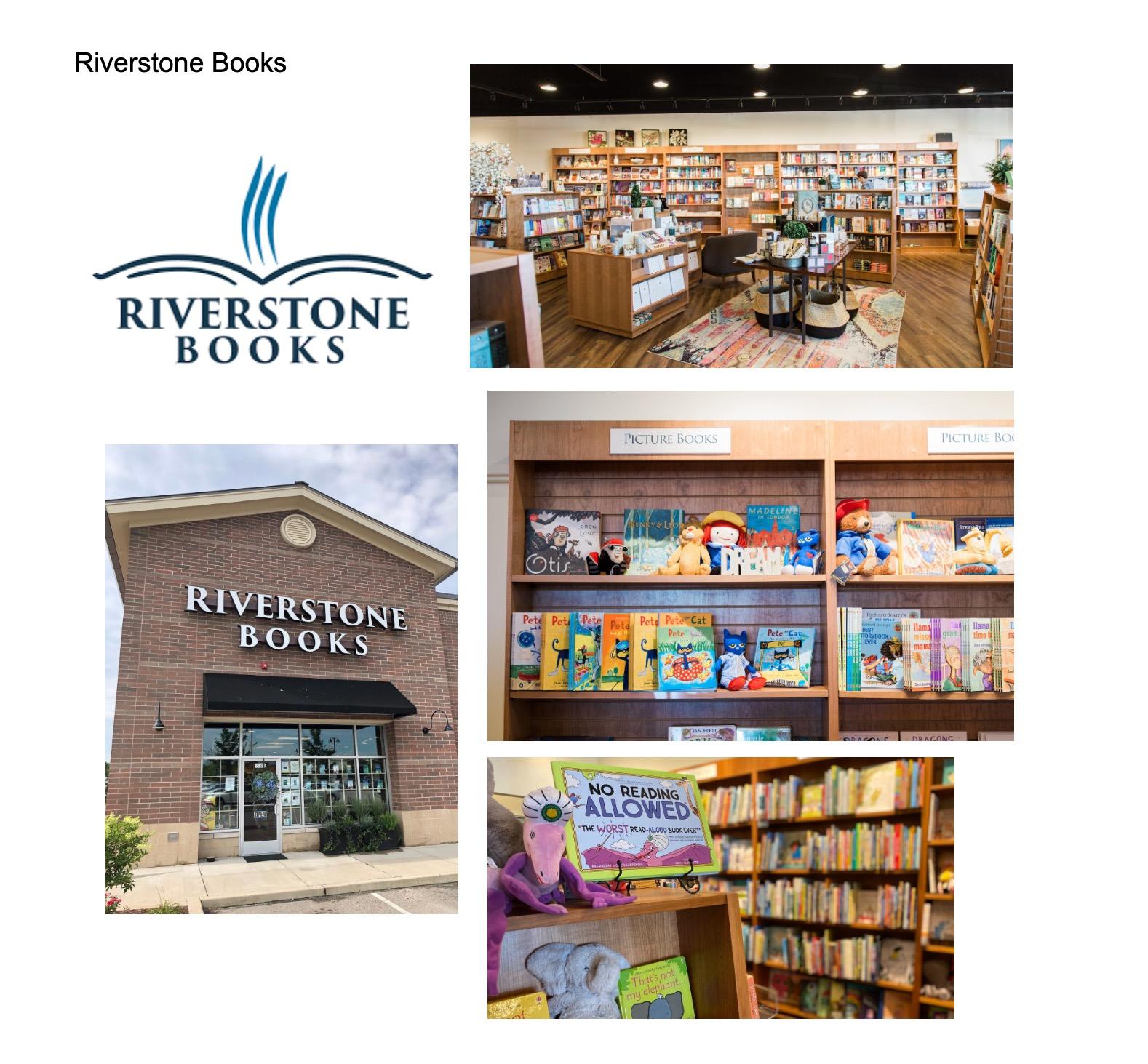 Logo and storefront
Inside of store: half of nonfiction section and children’s secion
Logo and storefront
Inside of store: half of nonfiction section and children’s secion
Competition: Kards Unlimited
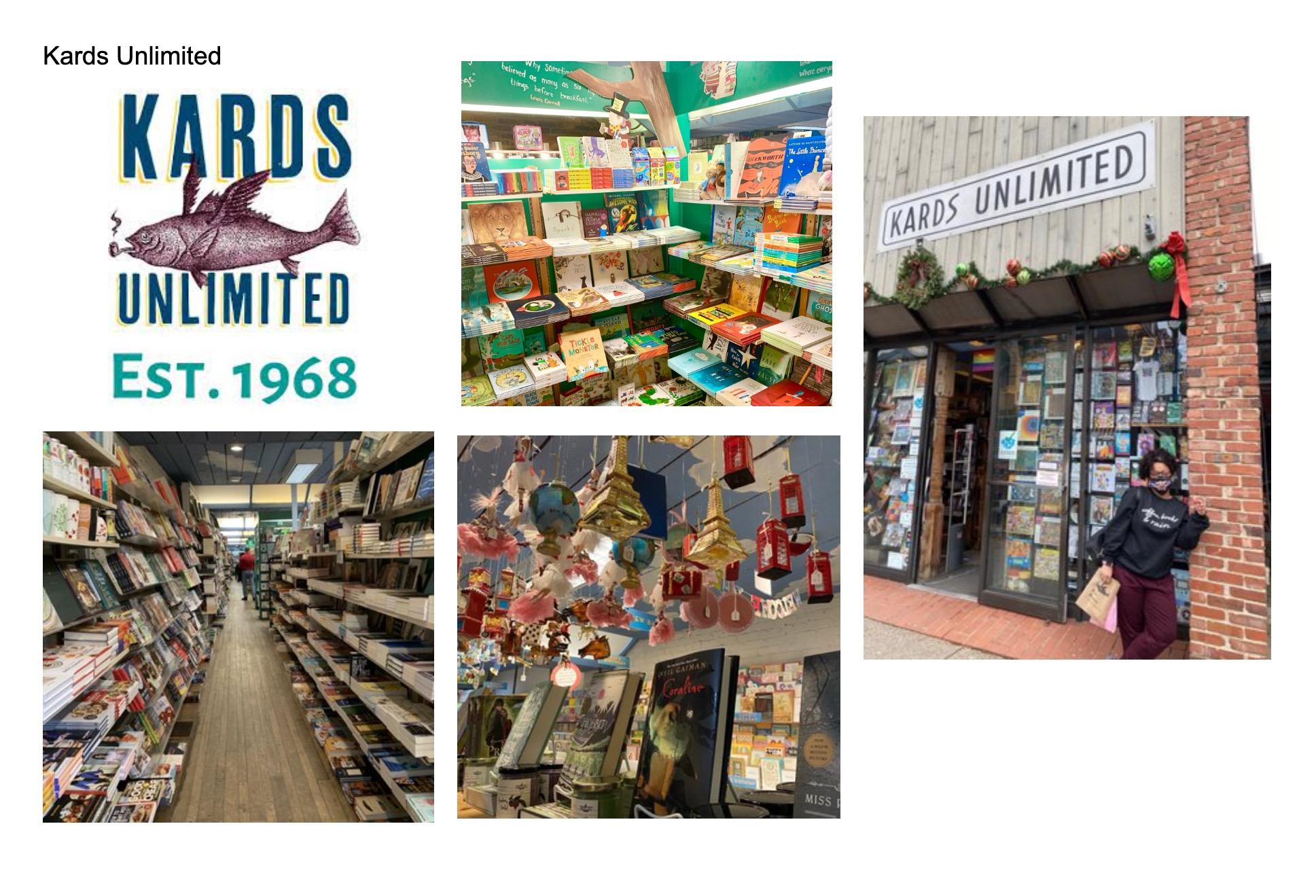
Logos: Wordmark on storefront and emblem versions
Inside of store: children’s section, hanging ornaments, nonfiction aisle
Competition: Half-Price Books
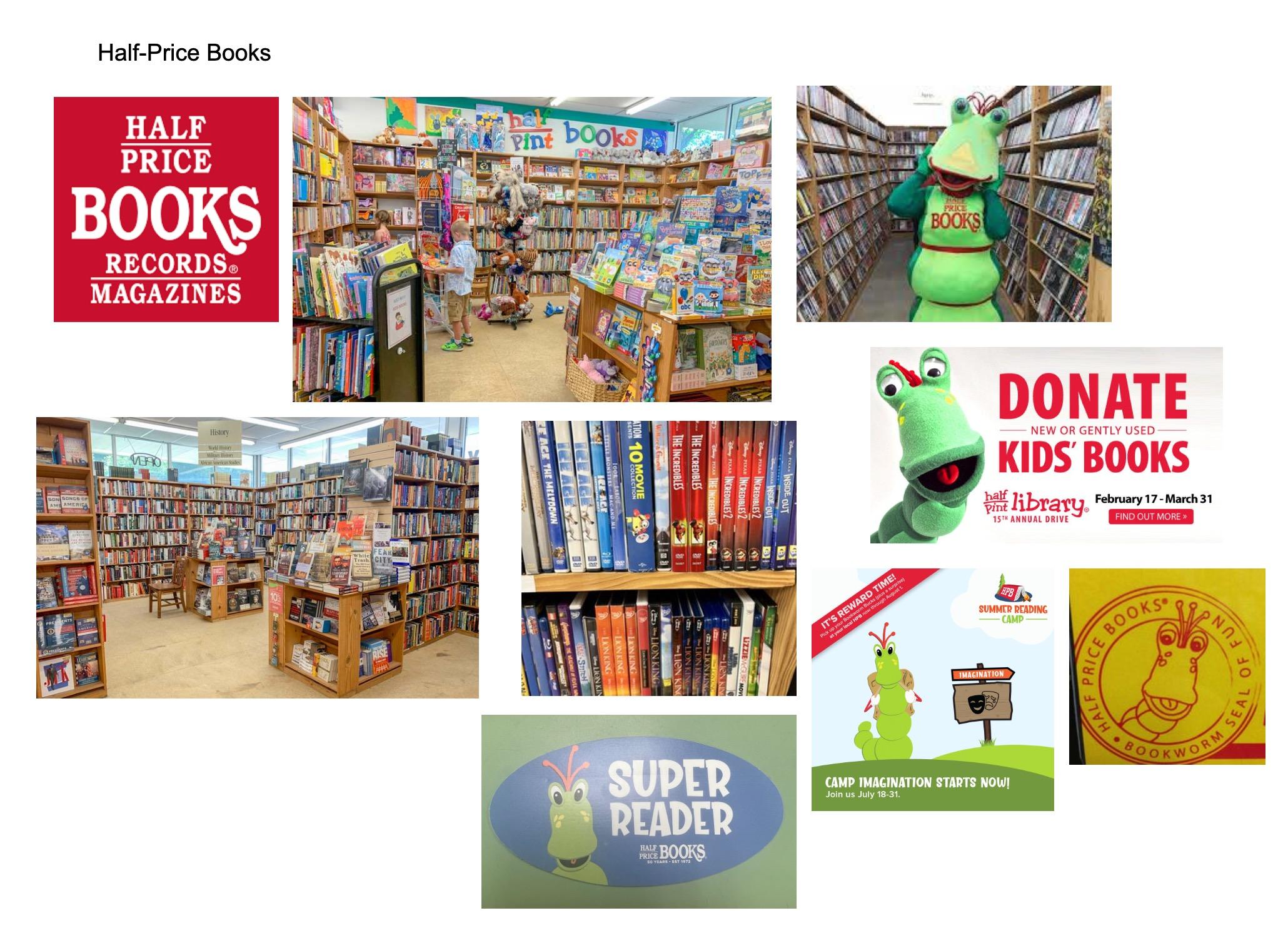
Main logo: Wordmark Emblem
Inside of store: children’s section, history section, DVD’s; noticed that Half-Price has a different logo for their children’s section: Half Pint Books
Mascot: Half-Price consistently uses a “bookworm” as their mascot, often when promoting children’s related items and programs
Competition: Barnes & Noble
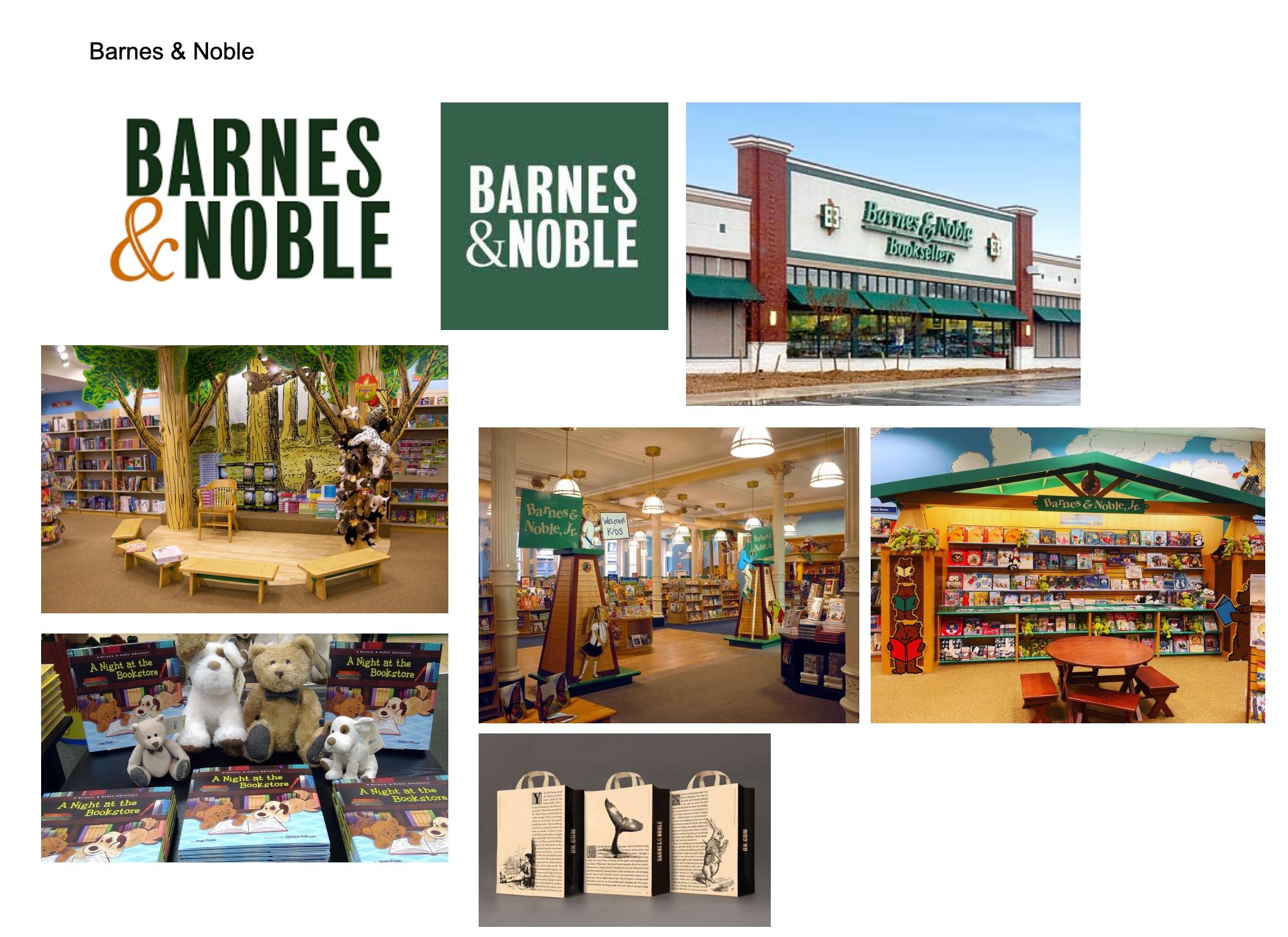
Logo: Wordmark; color variations and storefront version
Inside of store with large children’s section, different Barnes & Noble Jr. logo
Bags: B&N features old prints of classic books on bags, including Moby Dick with a sketched whale’s tale
Barnes & Noble mascots: Barnsie the Bear and Noble the dog; they even have their own bookCompetition Analysis
While looking at the competition, I noticed that most of the bookstores use wordmark and emblem logos. Like White Whale, Penguin incorporates an animal into their branding. Half-Price and Barnes & Noble use mascots for their brand. However, Riverstone’s logo serves as inspiration for me with the open book and river lines coming out, as it relates to water and book like with White Whale. Each of them use a very distinct style for their branding, and all brands except the Big Idea Bookstore are consistent with their branding (same fonts, colors, etc.).
Positioning Statement
The White Whale Bookstore is a family-owned, independent bookstore located in the Bloomfield area of Pittsburgh. They sell books of all genres for all ages in new condition, with a café built in the store. They define themselves as a welcoming community space that connects books with book lovers.
Inspiration:
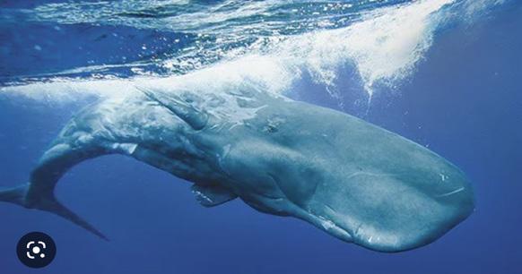
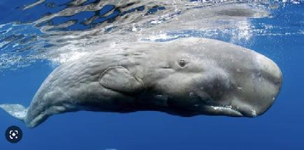
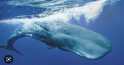
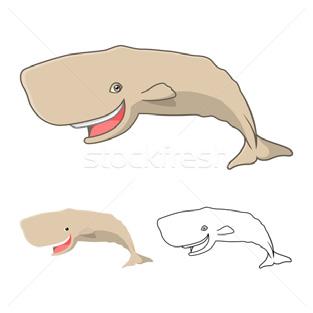
Sperm whale: Kind of whale Moby Dick is; Observations: has a large head with eye that’s far to the side
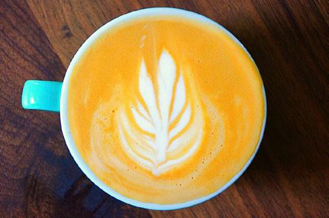
Coffee mug with a top point of view; focusing on latte art
Bible icon; inspiration for designing a book icon
Older copies of Moby Dick; utilize old serif type and balance of layout for logo
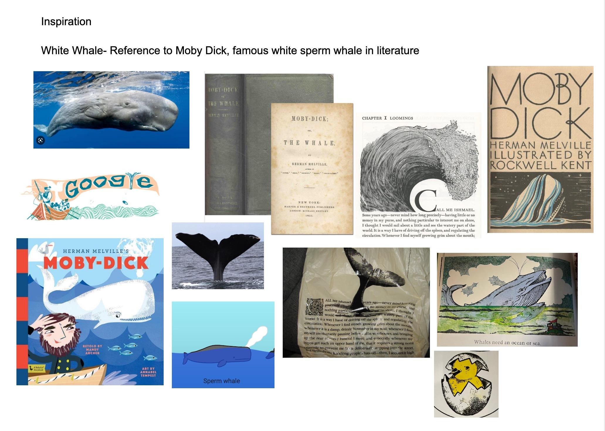
Moby Dick illustrations: Google doodle has spout for “l”; Children’s cartoon illustration
White Whale: reference to Moby Dick; famous white sperm whale in literature
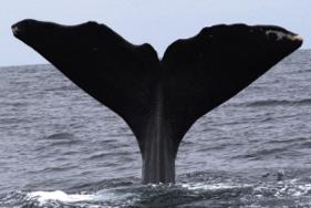
Sperm whale’s tail: has distinct, wavy shape; Sperm whale’s spout doesn’t go straight up but slants
Barnes & Noble bag with older Moby Dick print, featuring a whale’s tail sketch shaded with lines and a historiated capital
Older illustrations from children’s book; use small dots for shading
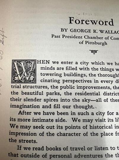
Book with historiated capital “W”, white capital is surrounded by decoative background
Inspiration:
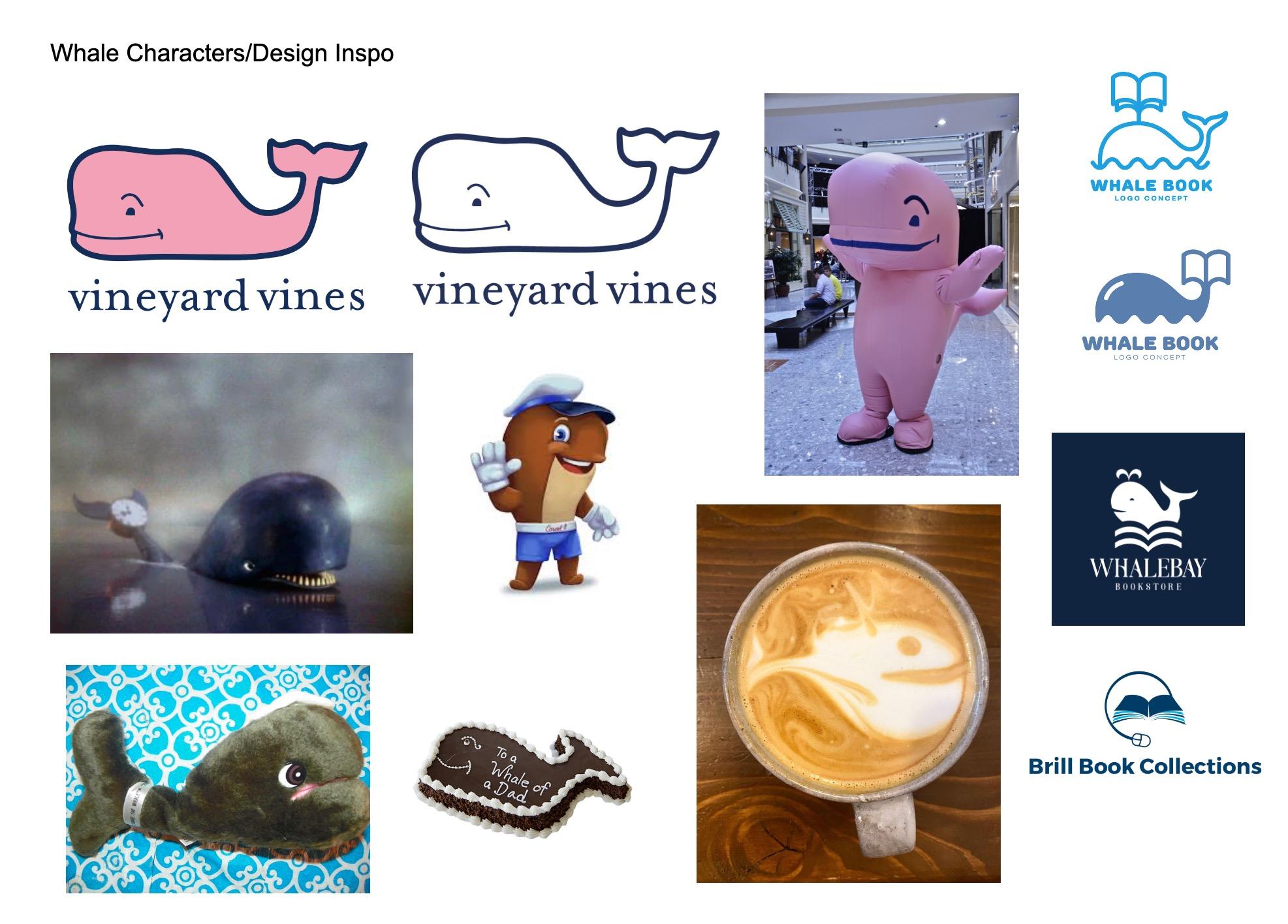
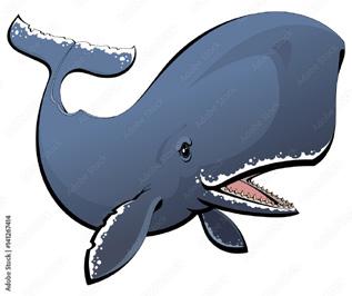
Whale character inspiration: Vineyard Vines (clothing store) whale, Big Ben from Rudolph’s Shiny New Year, and Fudgie the Whale of Carvel Ice Cream
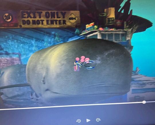
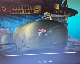
Shark Tale movie: scene had whale that looked like front of sperm whale; inspiration for profile/ position of whale and eyes
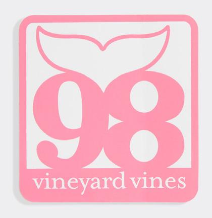
Vineyard Vines whale’s tale shape inspiration
Whale coffee latte art from White Whale Instagram account
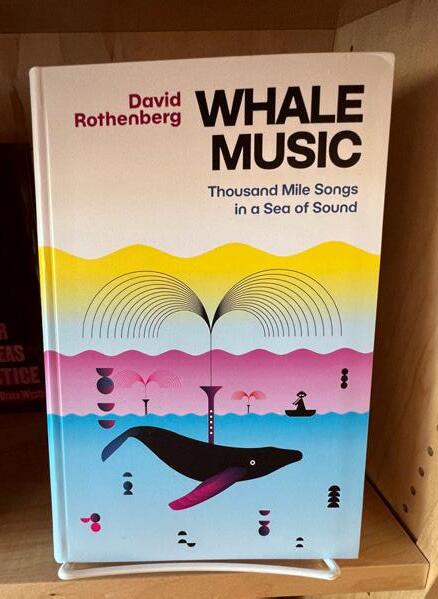
Whale Music book from White Whale Book Store; thin lined spout serves as inspiration
Logo inspiration: Whale spout as book, whale’s tail as book, waves as book, book with stacked pages
Sharky’s Cuts logo: Inspiration for pose of whale character logo
Lettermarks
Sketches and Drafts:
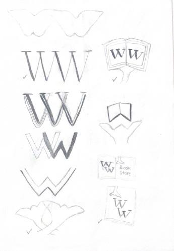
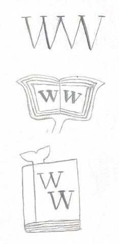
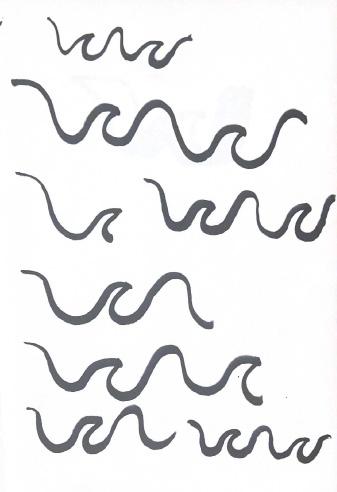
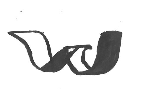
Digital Ideations:
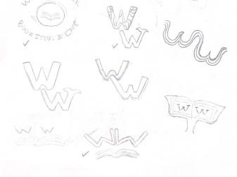
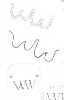
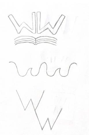
Reflected W’s above book being flipped, cursive script w’s with the middle tips resembling waves; played with the thickness of thinness of lines and weight of lines that make them ribbon-like.
Final Lettermarks
Two cursive script W’s that show the contrast between the thickness and thinness of lines (starts thin, then gets thick and back to thin again); resembles script writing from an ink pen, as if you are writing in a book; middle tips of W’s resemble waves, which relates to the whale aspect of the bookstore name.
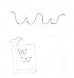
An iteration of the reflected W’s with the flipped book, the two elements of that idea were merged into reflected W’s that resemble pages of a book with a whale’s tail ribbon bookmark in the middle, resembling an attached ribbon bookmark being placed in the middle between two pages
Wordmarks
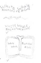
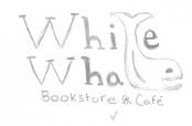
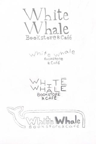
Sketches and Drafts:
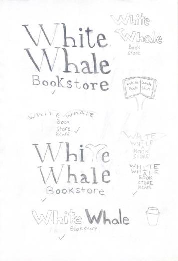
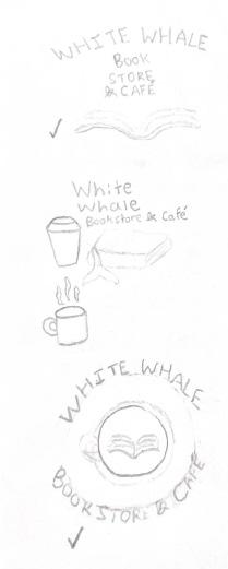
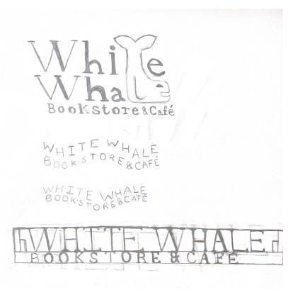
Final Wordmarks
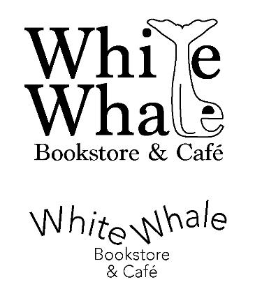
Classic serif typeface (Marion) that includes a whale making up the letters. The whale’s tale (based on how a sperm whale’s tale particularly looks) is the “t”, the whale’s fin serves as the “l” and the “e” makes up the whale’s face consisting of an eye and a mouth. The main “White Whale” words are evenly stacked while balancing them with the “Bookstore and Café” horizontal words.
The words “White Whale Bookstore & Café” formed in the shape of a whale’s tail. I took the approach of having the words typed in standard form (uppercase letter followed by lowercase) while balancing the letters out in order to give a friendly look.
Pictorials
Sketches and Drafts:
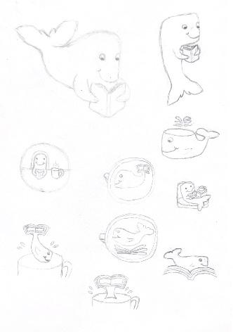
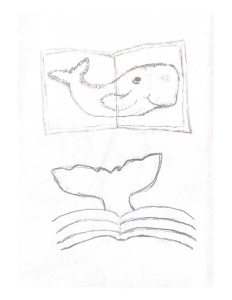
I attempted to create a whale illustration with the old-style stipple shading, but saw that it wouldn’t scale well and would lose detail when smaller
Final Pictorials
White sperm whale with a friendly smile reading a book while enjoying a cup of coffee, in order to represent the bookstore and café aspect and the White Whale name that takes inspiration from Moby Dick
Coffee mug from the top point of view with friendly sperm whale latte art. An open book fills the whale’s tail. The open book and the coffee mug/latte art conveys that the logo stands for a bookstore and a café, and the sperm whale resembles the White Whale name.
Emblems
Sketches and Drafts:
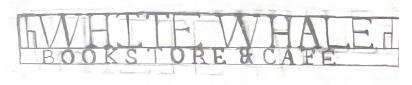
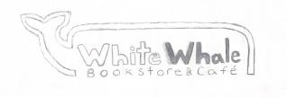
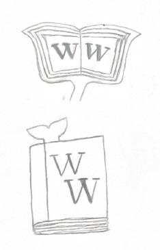
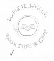
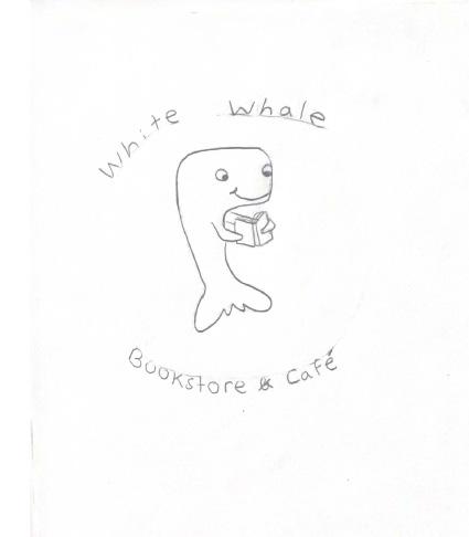
Since emblems include word and image elements that travel together, I considered some of my lettermark and wordmark sketches as ideas for emblem logos
Final Emblems
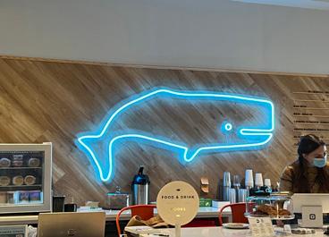
Name of company surrounded and enclosed by the outline of a whale; the “White Whale” name shows contrast as “White” is not filled with black and white in color, There is also contrast between “White Whale” and “Bookstore & Café with thick and thin typefaces.
The words “White Whale Bookstore & Café” in a serif typeface (Marion) similar to typefaces found in classic books placed within bookshelves
Book featuring two W’s on the cover for “White Whale” in a classic serif typeface (Playfair Display), with a whale’s tail bookmark inserted in and sticking out
Emblem logo featuring white sperm whale floating and reading a book; whale has same sperm whale nspiration as whale reading pictorial logo
Inspiration InspirationAbstracts
Sketches and Drafts:
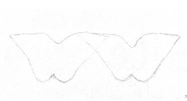
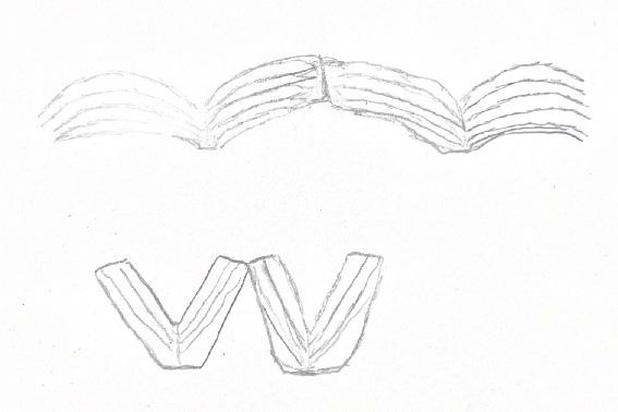
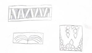
Final Abstracts
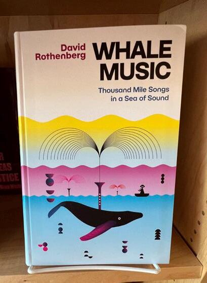
Thin lines as reflective waves; Inspiration from thin line art from bookstore book; line weight scales well; lines can resemble many attributes of the bookstore, including open flipped books, two reflected W’s, and water waves (connecting to the White Whale/ocean waves)
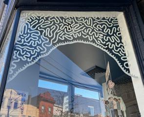
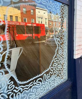
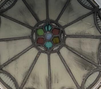
Multiple pentagonal shapes making up a “W” like image in the negative space. Pentagons are an inspiration from the stain glass round design that is in the middle of the outdoor café entrance (specifically the colored pentagons in the center), which is not acknowledged by the bookstore Inspiration also comes from portal art on window with lines surrounding circular portals.
Inspiration InspirationChoices for Final Logo:
Lettermarks:
Wordmarks:
Pictorials:
Emblems:
Abstracts:
Final Logo:
The pictorial logo of the white sperm whale reading a book and holding a cup of coffee is the logo that encapsulates all of what the White Whale Bookstore & Café is. As the name suggests, it is a white sperm whale like Moby Dick, the literary character the name was based off of, reading a book since the business sells books for customers to read, and a cup of coffee since there is a built-in café in the store. The whale has a friendly face and is happy to read his book with his coffee, which represents the friendly environment the White Whale Bookstore & Café aims to foster.