
1 minute read
A NEW LOOK FOR THE CA BRAND


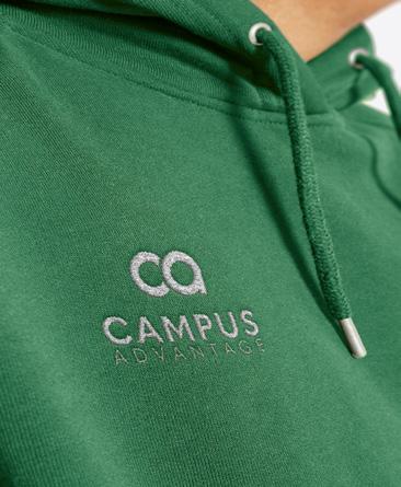
To celebrate two decades of creating successful communities, the Campus Advantage brand has undergone a 2.0 refresh — including modernized colors and typography, future-focused messaging, exciting new merch, collateral, and more.

Advertisement

This new identity pays tribute to our organization’s history while also bringing a renewed sense of life and energy. Read on to learn more about how this new brand sets the foundation for years to come.
OUR BRAND IS FLEXIBLE.
• Four bold secondary colors allow variations of the same brand to appeal to different audiences.
• CA departments are given free rein in areas where needed while still staying true to one overall look.
OUR BRAND IS FUTURE-FOCUSED.
• Color theory for this range of tones can feel both established and trustworthy but also innovative and ambitious.
• Everything from the typography to the circle pattern was selected with our “Future Lives Here” tagline in mind.
OUR BRAND IS INCLUSIVE.
• A new suite of stock imagery captures our commitment to diversity as well as a new generation of students and young professionals.

• Our team’s due diligence ensured these colors would resonate both across the country and around the globe.
OUR BRAND IS READY FOR GROWTH.
• It was important to us as an organization to have a brand that was scalable and would last for years to come.


