THE LOGOS FROM C-ROOTS PART 3


Boekformaat:
Dit is de eerste afdrukbare pagina in je boek. Deze pagina wordt aan de rechterkant afgedrukt.
Deze instructies horen niet te worden weergegeven in het geëxporteerde PDF-bestand.
Exporteer het voltooide document met de indeling PDF/X-3:2002. Gebruik de (ongewijzigde) PDFexportinstellingen die je hebt gedownload om ervoor te zorgen dat het bestand correct wordt geëxporteerd. Je moet één PDFbestand uploaden voor de pagina’s en een ander PDF-bestand voor minimaal één type omslag.
Boeken bevatten altijd een even aantal pagina’s. De eerste pagina bevindt zich aan de rechterzijde wanneer je het boek opent. De laatste pagina bevindt zich aan de linkerzijde wanneer je het boek sluit. Boeken met een hardcover bevatten een eindvel op zowel de voor- als achterzijde van de omslag, zodat het boek gebonden kan worden.
Opmerking: alle belangrijke tekst en afbeeldingen moeten in dit grijze gebied staan. Inhoud buiten het grijze gebied wordt mogelijk bijgesneden of verdwijnt tijdens het boekbinden. Als je wilt dat jouw illustraties helemaal tot aan de rand van het uiteindelijke boek worden weergegeven, trek je de rand van de illustraties tot aan de rode aflooplijn.
Bekijk het geëxporteerde PDF-bestand in een extern programma (bijvoorbeeld Adobe Reader) om te controleren dat het bestand correct en zonder deze instructies wordt weergegeven.
Meer informatie vind je op: www.blurb.com/pdf_to_book/resources
There’s just no getting away from logos, they’re positively everywhere, from your shoes, your watch, your laptop, to your coffee cup. And they’re all screaming for attention, crying out to tell the story of the product, organisation or service they symbolise. They’re graphic identifiers designed to trigger emotions and tell stories, personal signatures with unique statements from the sender.
It’s remarkable that on the one hand we develop as many logos as possible with qualities that make the sender special and identifiable, whilst on the other hand a host of values and associations are added to the mix by personal experiences, context and reputation. The world that lies behind a simple graphic image is simply amazing. We hope we can illustrate that with these logos that C-Roots has developed in recent years.
This modified reprint of The Logos of C-Roots part 3 has been expanded with a number of recent logo concepts, created by C-Roots.

When we create a logo at C-Roots, it’s not the beginning, but the end of a process. During this process it must become clear who you really are as a company or organisation, what you want to be, what you do, why it matters and what makes you unique. Once these questions have been answered, you’ve got the ideal starting point to develop a logo that can work for you.
It communicates how you want to be seen and what sets you apart from the competition. But more than anything, it conveys what you’re proud of, what you want to be seen wearing or build on the wall. The logo has become the symbol of corporate identity, it speaks from the core instead of being a convenient fence to hide behind.
Bart-Jan Horrée
Hogeschool van Amsterdam Connect & Create 8 Campus Creators 14
Jackie Delgado 20 KOO 26 Herbst 32 Kosmos 38 Jonge Honden 44 Amsterdams Lyceum Centenary 50
Fontys Campus of the Future 56 Ymere Heesterveld 62 Maua Mazuri 68 Himmelblau 74 Golden oldie, VSB Fonds 80 The Roots of C-Roots 86
House of Aviation 92 Phycom 98 Smelt 104 Reconext 110 Luitingh-Sijthoff 116 De power of design 122

The big event at the close of the academic year for students of the Communication and Creative Business degree courses. It’s their chance to display their work and present themselves to the business world with an audience of proud parents and family members.
C-Roots created the visual identity for this annual event. And of course, with the characteristic Hogeschool van Amsterdam logo of triangles as an important connecting element within the corporate identity.
 CONNECT &CREATE CO&MIC

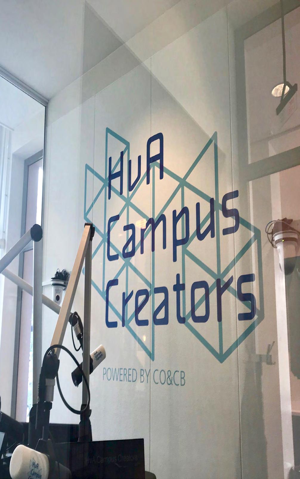
C-Roots designed the visual identity for the HvA Campus Creators. The student work platform of the Hogeschool van Amsterdam. The student editorial staff produces new content for the website every day and provides live radio broadcasts for Salto, the local Amsterdam radio station.
The ultimate goal is that students build their own online portfolio, facilitating contact with potential employers.


Our individual choices define who we are or who we want to be. Change and flexibility have become the fundamental premise. With everything in a constant state of flux, personal interest, development and lifelong learning are becoming increasingly important.
From the heart, open but firm and clear. These times call for surprising and unusual combinations to get people moving. These are just a few of the premises that are pivotal in Jackie Delgado Coaching & Workshops and thus typical of the characteristic visual identity of her agency.


This organisation for art education, based in The Hague, makes programmes and ongoing art education available to schools. It’s also a platform for a network of teachers who offer tuition and courses in the field of music, theatre, dance, visual arts and photography.
The organisation lives and breathes art, culture and education in a sustainable, inspiring way. C-Roots developed a new name for the organisation: KOO. The logo is both icon, logo and word image and very functional to use.


Het gaat over vrijheid en het overbrengen van dagelijks leven. Iedereen kan het, want het gaat om de techniek! Ik geef B-Boying bij KOO.
Ruben koo.nl


When it comes to learning to ski or ride a mountain bike, going on a tour with a guide or renting an e-bike, you want an expert. People who are skilled and committed. They’ll teach your children to ski as they would their own children. They do what they were born to do, inspired from an early age by the mountains, nature and the love of sport. In the area where they grew up themselves. C-Roots was asked to develop a brand strategy and visual identity in which the various activities reinforce each other for the town of Lofer, in Austria.
HERBST SKI | BERG | BIKE SHOP skischule-lofer.at
Lofer 1a 5090 Austria Tel +436664 / 72462 office@skischule-lofer.at


Kosmos has chalked up almost a century of publishing popular books for a large audience. Its publications embrace a broad social context. Kosmos is a name to be proud of - it’s concise, it has a beautiful typeface and not least because its literal meaning - the space where we live our lives - symbolises the role of the publisher so eloquently.
Exploring, enriching and discovering the unknown. The logo consists of the two ‘o’s of the word ‘Kosmos’. They represent the inner circle, the relationship with the authors and readers. The outer space stands for everything that can be new and discovered.


A junior ‘consultancy’ firm, manned by a team of ambitious young academics who work for companies on a project-by-project basis. It goes without saying that the Jonge Honden aren’t just academics, they’re also thinkers, doers, researchers, project managers, organisational talents and communication specialists.
But what makes them special is that they’re young and eager, on the threshold of their careers, raised in a time of change and innovation. There is a natural fusion of specialisms with skills that are needed right now and they are masters at ‘getting the ball rolling’.
Lisanne Beijk
Ambitieus | Creatief | Kritisch 06-26480999 lisanne@jongehonden.com
Jonge Honden
Gildstraat 91a, 3572 EL Utrecht Postbus 13131, 3507 LC Utrecht 030-2936468 jongehonden.com


For a big party in the Stadsschouwburg theatre to celebrate The Amsterdams Lyceum’s centenary, C-Roots designed the themed logo and the campaign around the event.
The classic school colours of blue, yellow, black and white were used. Colours to make many an old pupil or teacher dream back to bygone schooldays.


The campus of the future is literally and symbolically the place with no beginning and no end, one development stems from another, in one endless movement. Study, research, innovation and entrepreneurship are part of the cycle of education. The student not only acquires knowledge, but also passes it on to other students, as do the entrepreneurs and partners who are part of the campus culture. Physical spaces and landscaping interflow and comprise scalable flexible forms. But the energy-neutral footprint is also an aspect of the circular idea, the circular campus is the visualisation of circular thinking. C-Roots developed the concept for the campus of the future for Fontys.

Néla is een echt papa’s kind, al van jongs af aan trokken ze er samen op uit, deelden dezelfde interesses en moesten lachen om dezelfde humor. Hij was erbij toen ze 4 jaar geleden haar modulereeks mobiliteit voltooide op de Circle City Campus en was apetrots toen ze werd uitgenodigd door ASML om een Practice workspot te beginnen in Strijp-S naast een aantal andere Circle City Campus Hubs. Ze genoten altijd al samen van de sfeer op de campus, en ook toen ze er eigenlijk niets meer te zoeken had spraken ze er vaak af, gewoon om in de prachtige tuinen een fruitshake te drinken of om een inspiratiesessie te volgen over een onderwerp dat ze beiden aansprak.

Zo ook vandaag, want er is om 13.00 een hologram presentatie van een bedrijf in Japan waarin het effect van gaming wordt getoond op de ontwikkeling van foodconcepten. En omdat ze allebei gek zijn op koken leek ze dat een leuk uitje, en natuurlijk gaan ze na afloop wat eten en een biertje drinken op de campus. Waarschijnlijk komen ze wel bekenden tegen want in Eindhoven is de Circle City Campus wel een ontmoetingsplaats waar veel mensen afspreken. Niet gek, want er is altijd wat te doen en het bruist van het enthousiasme van bevlogen mensen. Néla is benieuwd of ze straks ook met haar dochter hier komt en net zoveel lol heeft als zij met haar vader… mmm, maar goed dat duurt nog wel even.
Rowel en Néla zijn nu 40 en 12 jaar. In 2030 zijn ze 52 en 24 en leven in Eindhoven.


The Heesterveld complex by architect Frans van Gool is located in the H neighbourhood of the Bijlmermeer in Amsterdam. It was built in 1982.
For Ymere housing corporation, C-Roots developed the vision of this special neighbourhood with the corresponding visual identity. The map of the various buildings viewed from above became the logo.


A state-of the-art Tissue Culture laboratory in Tanzania, where diseasefree plants are propagated in scientific, in vitro conditions. The yield of highquality plant material is a major boost to efficiency and productivity. The name Maua Mazuri means ‘beautiful flower’ in Swahili.
It refers to the Tanzanian roots and to the purpose of Maua Mazuri, with ‘beautiful’ in the broadest sense of the word. The visual style is technical, graphic and refined on the one hand and warm, human and natural on the other. A mix of Tanzanian and western European influences with an appealing tone of voice that is friendly, accessible and professional.
Himmelblau guides and connects social organisations and funders to increase their social impact. You need bridge builders to connect companies with charities. And that is where Himmelblau comes into its own.
They believe in the power of the symbiosis between companies and idealistic goals and combine this with the knowledge and practical experience in both worlds.
Everything for the good cause, hence a bright and optimistic logo.
Plantagekade 40 1018 ZV Amsterdam The Netherlands +31(0)20 4216214 himmelblau.nl


We don’t make a habit of showing the logos that don’t get past the drawing board. Although sometimes we just can’t resist the temptation because it could be one that we’re very proud of, but mainly because we thought it was such a great match with the organisation.
In 2012, we developed this corporate identity for the VSB fund in a competition; art and culture were the leading concept and the sparkles of our society.


Beautifully defined typography is often at the root of many logos and the Tri is a good example of that. Ad Werner designed the Tri back in 1978. His then assistant Bart-Jan Horrée drew the original version with a ruling pen, a trusty Rotring and erasing knife blade on chromecoat.
A few decades later, to honour the memory of Ad who died in 2017 at the age of 92, BJ created the digital version of the Tri with his agency, C-Roots.
Portrait of Ad Werner was made by
as part of the series of booklets ‘Roots’.
 photographer Aatjan Renders

The ROC, with its aviation-related vocational education courses, has joined forces with Luchtvaart Community Schiphol to launch a new initiativeHouse of Aviation, a Learning Hub and partnership with employers based at the airport. The place for real change and innovation is outside the existing structures and walls.
In an environment that serves to brings people together, inspire and facilitate. C-Roots developed the identity for this uniquely significant concept. It’s important that HoA presents itself in a recognisable and distinctive way. That means new design principles and surprising applications.


Phycom has developed a sustainable and complete industrial Algae production system. With two full-scale factories operational, Phycom is up there as one of Europe’s largest and most innovative algae producers. Phycom has great ambitions and that is why it’s time for the next step with a new corporate identity, whilst moving forward breaking the standards in the alternative vegan food industry.
C-Roots was asked to show what they stand for, what their ambition is, and make their identity visible. Not only to be seen and heard, but also to convince people of their ideals. The most important tool for this is the new corporate identity.
Anneke Roes Brand manager +31.6.8320 4673 a.roes@phycom.eu
Koningsschot 11 3905 PP Veenendaal The Netherlands +31.88.525 0000 phycom.eu


We don’t know what the future will look like, but we are pretty sure that algae will play a big role

The Dutch word for Melt is Smelt. This is the powerful and beautiful name of goldsmith Desiree Nysingh’s company, repurposing the precious metals and gemstones found in old jewellery to create new ones.
This can help to preserve a memory and give you a piece of jewellery that you like. The visual identity emphasises the name with a round flowing typography and optimistic, positive ‘melting’ colours.


Businesses have to completely rethink how to design, use and even reuse products, spare parts or materials to tackle climate change. Reconext is the answer for the electronics industry. It enables a prolonged lifecycle of electronic devices and the transition to a circular business model.
The carbon footprint of a refurbished product is much lower than a new device and as such, it has a positive impact on climate change. A strong logo with the icon in the leading role. The typography and icon are interconnected, but the icon can also be used as stand-alone, with its unique shape and a playful nod to the concept of circularity.


We are good corporate citizens. By extending the useful life of digital products and components we reduce the unnecessar y generation of waste and carbon and use of energy and materials. Improving the environment as well as the communities in which we operate is core to all that we do.

Luitingh-Sijthoff was created in 1989 as a merger between the two publishing companies A.W. Sijthoff and Luitingh. Nowadays, their publications take on all forms - paper, digital and audio. They believe in the power of stories. Stories for everyone: a colourful picture book, a nail-biting thriller, an audio novel for utter relaxation, a comforting nonfiction book, a creative book brimming with ideas or an inspirational podcast. C-Roots took the company’s name - long and tricky to pronounce but so characteristic – and developed the new corporate identity around it. A multi-coloured style with surprising colour combinations. An effective emphasis on the optimistic versatility of this publishing house.
Ik denk niet dat we elkaar kennen, maar als ik naar je keuze van literatuur kijk, zouden we zomaar vrienden kunnen zijn.

For a company, a visual identity means so much more than just an appealing graphic. There’s a whole range of amazing and fascinating worlds behind one simple graphic image. It’s striking that on the one hand designers let the subject be functional, distinctive and recognisable, while at the same time the general public adds all kinds of values and associations that stem from personal experience, context and their own interpretation.
The company logo represents the core of the organisation, in graphic form. It’s a reflection of purpose and ambition in its simplest, most basic form. Created to make the organisation recognisable and to connect it with the public.
Design that is created especially for you enables you to stand out from the rest. It’s a display of what epitomises you in a unique and authentic way. It adds value and meaning. It inspires, convinces and is something to be proud of. Although we might think that our perspective of the world is steered by our logic, we are much more influenced by what we feel and what moves us, our intuition.
The impact of design goes beyond the mere physical form, it extends to the emotions that we identify with. As a result, it influences our behaviour. It determines how we decide. It affects what we buy and what we care about. And ultimately, it shapes what we believe in. You’re rarely aware of what that thing is that you find attractive or tempting. What you do know for sure is that it’s meant for you. There is a great sense of obviousness.
Als je een Trade-boek maakt van “5x8 in – 13x20 cm” en het totale aantal pagina’s is een meervoud van vier (bijvoorbeeld 20, 24, 28, enzovoort), moet de laatste pagina van je boek leeg zijn.
OPMERKING: Als je totale aantal pagina’s geen meervoud is van vier, worden er tijdens het printproductieproces automatisch lege pagina’s toegevoegd aan het einde van je boek, zodat het totale aantal pagina’s wel een meervoud is van vier.
