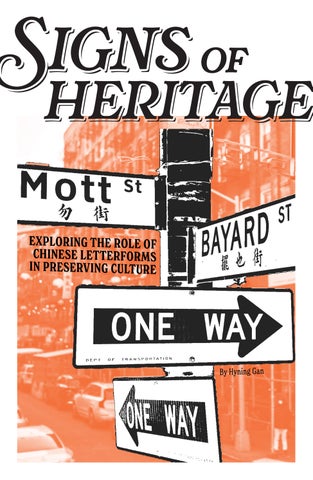
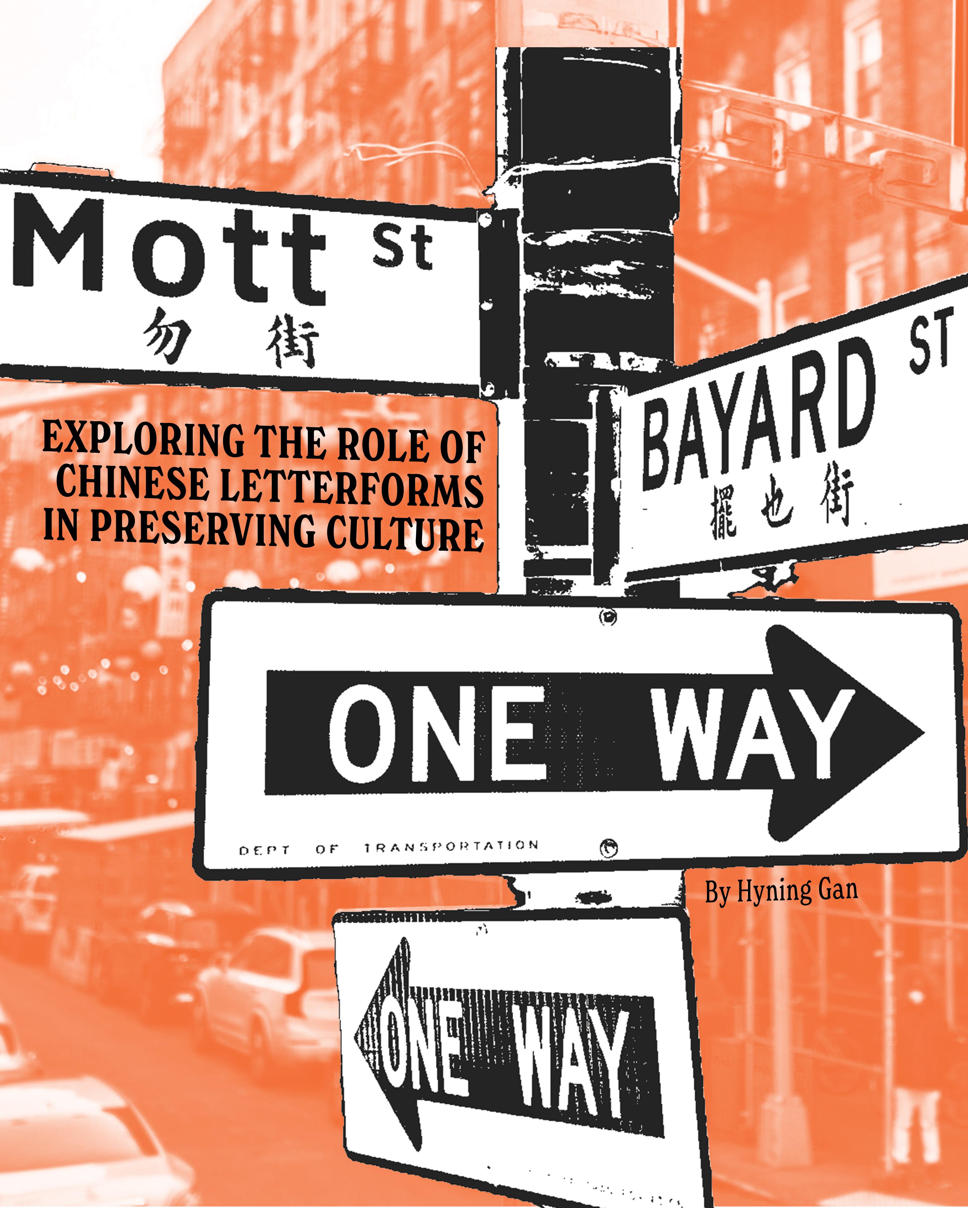
heritage of
Editor’s Note
This publication is an anthology and collection of research on a project close to my heart. As a designer shaped by my international perspective, I have always been fascinated by how visual design infuences our experiences, especially in the interconnected, multicultural world we live in today. This project emerged from that curiosity—a desire to delve deeper into how cultural visual signifers have a tangible impact on the real-world efects of cultural preservation. Initially, this project began as part of my academic work—specifcally for my Core 3: Topics class during my third year at Parsons School of Design—but it quickly evolved into something far more meaningful.
As I researched and designed this publication, I found myself not only exploring typography but also refecting on my own identity and connection to heritage. The Chinese characters we see in public spaces are more than just letters on a sign—they carry stories of migration, resilience, and cultural memory. They serve as links to a rich history, while also refecting the ongoing evolution of Chinese communities in urban spaces like New York.
In this publication, I have sought to capture the beauty and signifcance of these typographic forms. Through interviews, creative layouts, and personal refections, this is my attempt to honour the role that typography plays in maintaining cultural heritage, while also inviting readers to view it through a diferent lens—one that recognises the artistry, history, and profound connections embedded in every stroke of a character.
This project is my way of documenting what is fading, preserving the stories behind the signs, and exploring the intersection of design, culture, and identity that has shaped both my personal journey and the spaces I inhabit. I hope it invites you to refect on how typography can be a powerful link to our roots and a reminder of the beauty that exists in every corner of our shared cityscape.
编者注
本出版物是我心目中一个项目的选集和研究合集。
作为一名受国际视野影响的设计师,我一直对视觉 设计如何影响我们的体验着迷,尤其是在我们今天 生活的这个相互联系、多元文化的世界中。这个项 目源于这种好奇心—渴望更深入地探究文化视觉 符号如何对文化保护的现实效果产生切实影响。最 初,这个项目是我学术工作的一部分—特别是我 在帕森斯设计学院三年级的核心 3 个主题课程— 但它很快就演变成了一件更有意义的事情。
在我研究和设计这本出版物的过程中,我发现自己 不仅在探索排版,也在反思自己的身份和与传统的 联系。我们在公共场所看到的汉字不仅仅是标志上 的字母—它们承载着移民、韧性和文化记忆的故 事。它们是丰富历史的纽带,同时也反映了纽约等 城市空间中华人社区的持续演变。
在本出版物中,我试图捕捉这些印刷形式的美感和 意义。通过采访、创意布局和个人反思,我试图尊 重印刷术在维护文化遗产方面所起的作用,同时也 邀请读者从不同的角度来看待它—一个认识到每 个字符笔画中所蕴含的艺术性、历史和深刻联系的 视角。
这个项目是我记录正在消逝的东西、保存标志背后 的故事以及探索设计、文化和身份交汇的方式,这 些交汇塑造了我的个人旅程和我所居住的空间。我 希望它能让你思考印刷术如何成为我们根源的强大 纽带,并提醒我们共同城市景观的每个角落都存在 着美丽。
Featuring words and references from:
• “Exploring the Visual Representation of Chinatown in the Face of Gentrifcation” By Anson Li, Medium Article (2023)
• “Chinese Typographic Design” By Hynuza, Medium Article (2015)
Chinese Type Archive by Synoptic Ofce
• “Synoptic Ofce Interview” By The Type Director’s Club (2018)
“Tracy Ma Takes Us on a Typographic Tour of Manhattan’s Chinatown” By Tracy Ma, AIGA Eye on Design (2018)
“Manhattan’s Chinese Street Signs Are Disappearing” By Aaron Reiss and Denise Lu, New York Times (2022)
Typefaces Used:
• Georgia by Matthew Carter
• Rafaella by Maximiliano Sproviero New Spirit Condensed by Miles Newlyn & Riccardo Olocco
• Source Hans Serif TF by Pan-CJK Typeface Hellofont ID QingHuaLi by HelloFont
Paper Used:
Parchment in sand, 24lbs
• Frosted vellum, 28lbs
Image and text layout by Hyning Gan
Advised by Marcos Chavez For PUCD 3095 Core 3: Topics Fall 2024
Printed and Binded @ 12th Floor NBC Ofce 30 Rock 30 Rockefeller Plaza, New York, NY 10112
Copyright © 2024 Hyning Gan™. All rights reserved.
纽约唐人街 的绅士化 Letters Across Time
TRACY MA TAKES US ON A TYPOGRAPHIC TOUR OF CHINATOWN
Spotlight on Synoptic Office
从霓虹到纽约 香港霓虹到纽约 唐人街的旅程库
Manhattan’s Chinese Street Signs DisappearingAre
09 05 19 29 27
THE EVOLUTION OF CHINESE LETTERFORMS IN TYPOGRAPHY
报纸内容
Across letters
CHINESE TYPOGRPAPHY AS CULTURAL PRESERVATION IN NEW YOK CITY
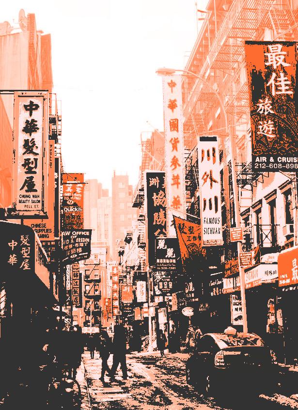
In the heart of New York City’s Chinatown, the streets tell stories in strokes of ink and fashes of neon. Side by side with towering skyscrapers and the thrum of modern life, there is a quieter narrative unfolding in these streets—one written not in English, but in the elegant, fowing characters of Chinese typography. To the casual observer, these signs may appear simply as directions or advertisements. But to those who pause and look deeper, they are much more: they are living artifacts of a culture transplanted across oceans, symbols of an enduring heritage that continues to thrive in a city that’s always moving forward.
For many, New York is the ultimate melting pot—a place where people from all over the world arrive to chase dreams, build communities, and shape the future. But amidst all the movement, something remarkable happens: some parts of the past are preserved. Chinese characters, emblazoned on shop windows, restaurants, and herbal medicine stores in Chinatown, are among these fragments of history. Each stroke tells a story, each character a bridge between past and present. And in this, typography becomes more than just a way to convey language—it becomes a vehicle of cultural preservation.
An Archive of Migration and Memory
The roots of Chinese typography in New York City can be traced back to the mid-19th century, when the frst wave of Chinese immigrants arrived in America. Drawn by the promise of work and new opportunities, many settled in enclaves like Manhattan’s Chinatown. As these communities grew, they brought with them not only their language but their visual traditions. In a time before widespread literacy, shopkeepers relied on the art of hand-painted signs to advertise their goods and services. These early signs were often adorned with traditional Chinese characters—elegantly brush-stroked symbols that carried deep meaning, refecting the philosophies and aesthetics of Chinese calligraphy.
The shop signs served a dual purpose: they were practical, guiding customers to the right place, but they were also a form of cultural expression. At a time when anti-Chinese sentiment was rampant, and Chinese immigrants were often marginalized, these signs stood as a visual statement of identity. They were a declaration: We are here. We belong.
Typography as a Means of Preservation
Over the decades, as the Chinese community in New York continued to grow, so too did its visual presence. By the 20th century, Chinatown’s streets were flled with a vibrant mix of traditional and modern signage. Neon lights lit up the night sky, advertising restaurants, tea houses, and family-run businesses. These signs were often written in a blend of English and Chinese, refecting the dual identity of Chinese-Americans— rooted in their heritage but adapting to life in a new country.
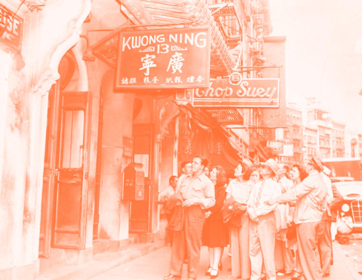
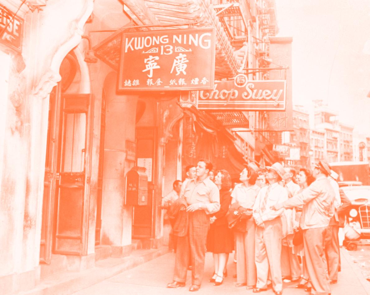
Blue Line Sight Seeing tour guide Louis Cooper leads a group tour of Chinatown, 1940 - 1949. Source: MOFAD + Eater, https://www.eater.com/a/mofad-city-guides/chinatown-nyc-chinese-history
What makes Chinese typography in New York City so fascinating is its ability to encapsulate not only the heritage of its creators but also the cultural shifts of the communities it represents. Walk through Chinatown today, and you will notice a fascinating contrast between old and new. Some signs are rendered in traditional Chinese calligraphy, the brushstrokes fowing like ink on rice paper. Others use simplifed characters, a more modern development refecting changes in language education post-1949 in Mainland China. Still, others feature blocky, modern fonts meant to attract the attention of passersby in a fast-paced urban setting.
This evolution mirrors the story of Chinatown itself, a neighborhood that has been shaped by waves of migration, political change, and economic forces. The oldest businesses still proudly display their original
Across Time letters
signage, while newer establishments adopt contemporary typographic trends. In this way, the typography of Chinatown becomes a visual archive of cultural change, a record of how this community has adapted to the rhythms of New York while holding fast to its roots.
For many shop owners, the decision of how to design their signs is not merely an aesthetic one—it is deeply personal. “I wanted something that felt traditional,” says Mr. Liu, the owner of a family-run herbal medicine store on Mott Street. “When people see our sign, they know we’ve been here for generations. It reminds them of the old ways.”
This sentiment is echoed throughout Chinatown. Whether consciously or subconsciously, the typography of these signs is imbued with meaning. It refects not just the business being advertised but the story of the people behind it—their journey, their struggles, and their determination to maintain a connection to their heritage.
A Visual Anchor in a Changing City
New York City is a place of constant transformation. In neighborhoods like Chinatown, gentrifcation and rising rents have led to the closure of many long-standing family businesses. Yet amidst this tide of change, the Chinese characters that adorn the remaining businesses ofer a sense of stability. They act as visual anchors, rooting the community in a cultural identity that transcends the hustle of urban life. In this way, typography serves as a form of resistance. While the physical makeup of Chinatown may be changing, the visual language of its signs remains a testament to the community’s resilience. For residents and visitors alike, these signs are more than just functional—they are cultural touchstones.
Typography, by its very nature, is about communication. It is a way of transmitting ideas and values across time and space. But in Chinatown, the typography communicates something even deeper. The characters on these signs are not just words—they are symbols of a community’s perseverance in the face of adversity.
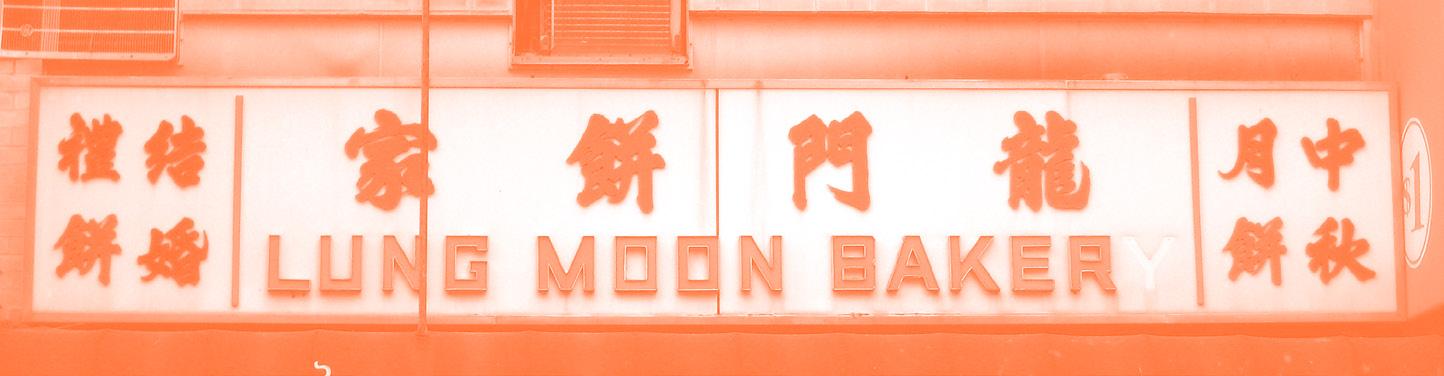
Lung Moon “Baker,” missing that last y, 2010
Source: Ephemeral New York, https://ephemeralnewyork.wordpress.com/2010/01/20/falling-apart-storesigns-chinatown-edition/
Street,
Source: The New Yorker, https://nymag.com/intelligencer/2015/09/how-has-chinatown-stayed-chinatown.html
Why This Matters: The Cultural Significance of Typography
At frst glance, it might seem trivial to focus on something as seemingly mundane as shop signs. After all, in a city as big and bustling as New York, there are countless other things vying for attention. But to dismiss these signs would be to overlook a vital part of the city’s cultural fabric. The typography of Chinatown is a living testament to the community’s history and identity, a reminder that cultural heritage is not something that can be confned to a museum or textbook.
In a world that is increasingly digitized, where language is often reduced to pixels on a screen, these physical signs take on even greater signifcance. They are tangible representations of a culture that has endured for centuries, even as the world around it changes. And in a city as transient as New York, where the old is constantly making way for the new, these signs ofer a rare glimpse into a past that is still very much alive.
But perhaps most importantly, the typography of Chinatown serves as a reminder that culture is not static—it is something that evolves and adapts, but remains rooted in the values and traditions of its people. Through their signage, the businesses of Chinatown continue to assert their place in the city’s ever-shifting landscape, preserving their heritage one character at a time.
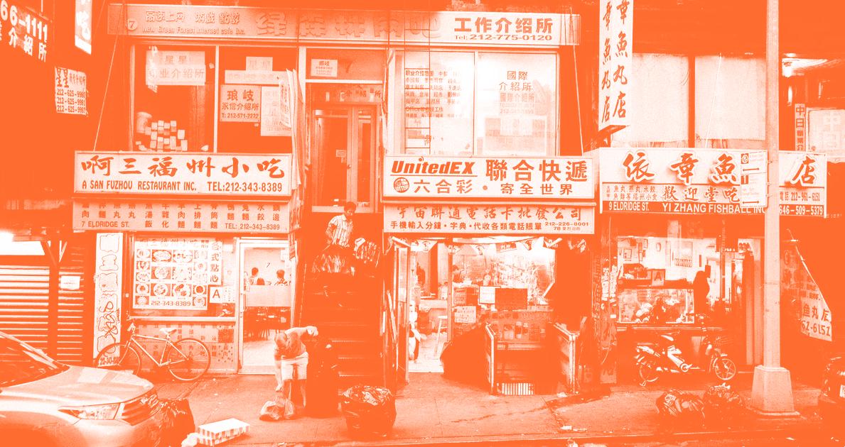
Eldridge
September 11, 2015. Photo: Joseph Michael Lopez
纽约的汉字作为文化保护
文化遗产
CHINATOWN IN THE FACE OF GENTRIFICATION
Translation of “Exploring the Visual Representation of Chinatown in the Face of Gentrifcation” by Anson Li
唐人街是几代亚洲移民的圣地,也是“华人性”这一族群身份的重要组成部分, 但如今,它正面临着绅士化势力的迫在眉睫的威胁。画廊的正规化及其资本力 量在这个独特飞地的郊区导致唐人街的公共空间、居民和文化遗产被排除在外。
与传统的研究方法相比,我发现通过摄影镜头审视唐人街及其居民同样重要, 以解开这个独特的移民大熔炉中复杂的动态。这些照片不仅为我们提供了麻烦 的士绅化过程的有力视觉证据,还为我们提供了启示,让我们看到了深深的团 结,这种团结既植根于唐人街的地域性,也植根于唐人街居民的精神本质。因 此,有必要通过摄影镜头进行批判性审视,以揭示围绕这个街区的复杂权力动 态,并强调保护唐人街精神和文化特征的迫切需要。
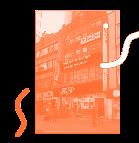
这张照片捕捉了唐人街最繁忙的街道之一的乡土建筑风格。照片中呈现的三种 主要颜色象牙色、灰色和红色表明了唐人街的文化意义。这张照片展示了唐人 街的多种功能,包括珠宝店、纽约太极俱乐部、广州联谊会和我爱纽约纪念品 商店。照片中的纪念品商店可以解读为纽约市主导叙事和旅游业的象征,与唐 人街的文化特征形成鲜明对比。照片中心的“店铺出租”标志表明了高档化、 建筑变化及其对城市经济和社会结构的影响的可能性。
图片中可以看到一条亮黄色的横幅,上面写着“服装艺术画廊”的英文翻译, 同时还配有无法辨认的英文说明,并用红色字母加下划线,以营造一种真实感。 究竟是哪家唐人街的企业启发了这间破旧的空间?肯定不是之前占据这个地址 的鱼市,也不是其他周围的餐馆、面包店和商店,它们都有清晰的遮阳篷和干 净的店面。值得注意的是,图片背景中还包括大兴商店,这是一家邻里友好型 杂货店,有清晰的遮阳篷和干净的店面,凸显了詹姆斯科恩画廊等高端画廊与 多年来一直是历史悠久的唐人街社区一部分的小企业之间的鲜明对比。总体而 言,这张照片强调了高档化给社区带来的流离失所和文化抹杀的威胁。
这张照片记录了唐人街城市乡土景观的绅士化,FIERMAN 的黑色横幅刻意居 中,背景中仍可见到“康大中药”的中英文标题横幅。这张照片展示了在“康 大中药”的旧址上新开一家画廊的过程,康大中药是为数不多的可以求助于中 药师的邻里友好型药店之一,已有 15 年历史。此外,这张照片的构图古怪, 高端画廊与邻里友好型药店并列,凸显了绅士化对小企业构成的迫切威胁。就 唐人街城市乡土景观的转变而言,这张照片有力地说明了绅士化带来的灾难性 影响,唐人街居民习惯的公共空间变成了他们不熟悉或奢侈的东西。
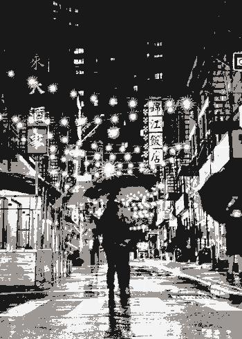
来自Sheng Lin,2021 | 佩尔街的夜晚
这张照片捕捉了唐人街一家裁缝店的内部景象,照片中央是一位年轻的裁缝, 面带微笑,抽着香烟,照片由刘博智拍摄。刘博智是一位纪实摄影师,以移民 摄影闻名,他专注于美洲、古巴、马来西亚和缅甸的华人移民。1977-1978 年间, 刘博智创作了一个名为“1977-78 纽约唐人街街道”的摄影系列,这张照片就 是其中之一。这张照片可能是在夏季或春末拍摄的,因为窗户似乎关着,突显 了员工们所忍受的艰苦工作条件。车间天花板较低,周围散布着下水道,这表 明它可能位于地下或一楼。尽管这张照片展示了充满挑战的工作环境,但照片 中央的男子面带微笑,或许反映了“美国梦”对唐人街华人社区的文化重要性, 同时也向我们展示了这个社区真实的生活经历。
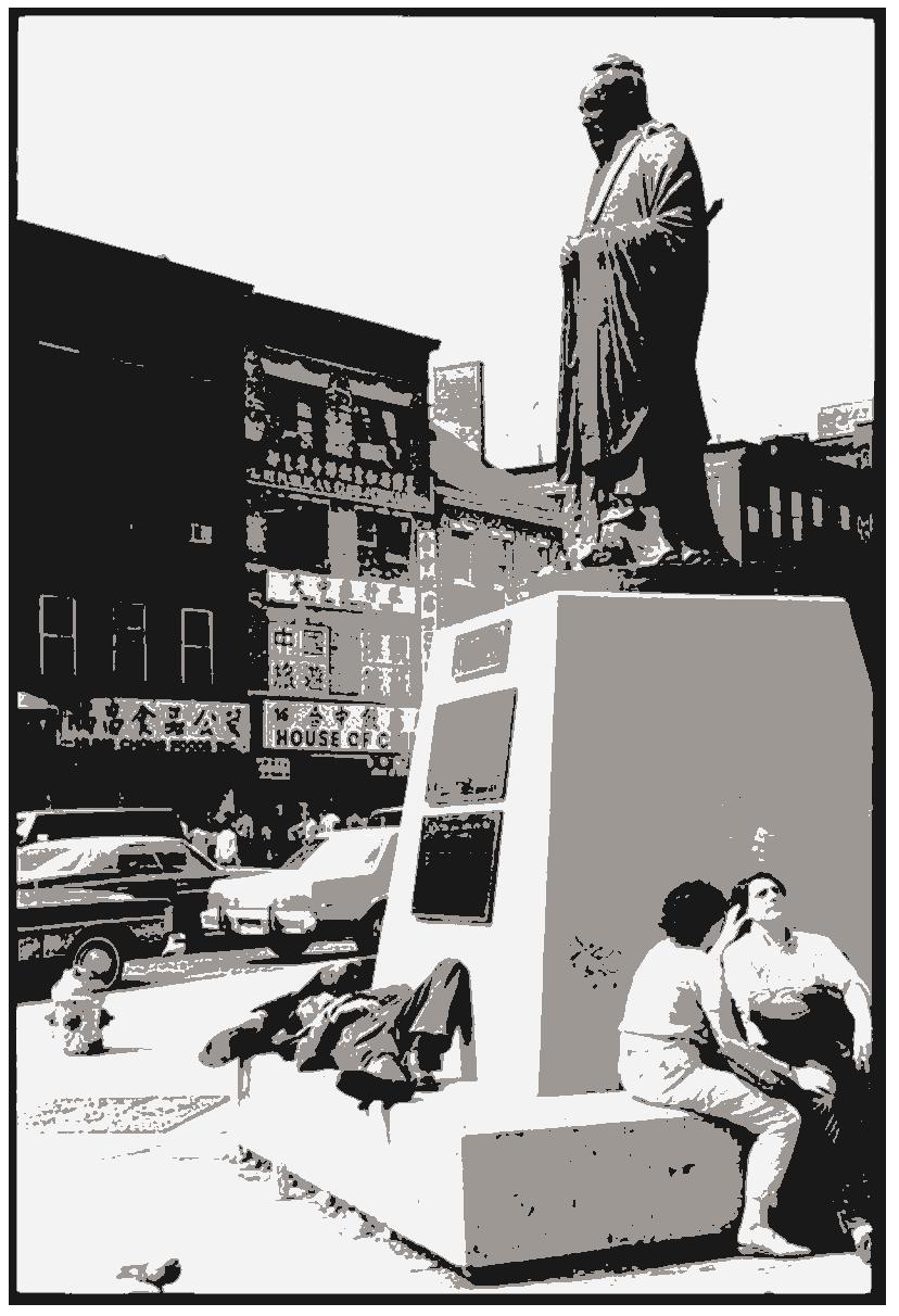
来自刘博智,1977-1978 | 紐約唐人街
这张纪实照片捕捉到了曾经将廉租公寓当做家园的人们的日常生活。这些狭小 拥挤的居住空间因没有电梯而闻名,是纽约市唐人街社区的一大特色。这张照 片上是一排生锈的邮箱,每个邮箱上都有一个号码和住在相应公寓的居民的姓 名。虽然只有少数号码和姓名清晰可见,但一些空白处有小块胶带上手写的数 字或姓名,表明居民随着时间的推移搬进搬出。拆除或添加的痕迹进一步表明 了这些廉租公寓生活的短暂性。从本质上讲,这张照片有力地证明了唐人街社 区的文化遗产,并强调了保护这个充满活力的社区的历史、传统和居民的重要 性。
在这个研究项目中,我通过摄影镜头探索了纽约市唐人街的绅士化带来的多方 面影响。通过采用各种摄影类型,例如街头摄影、建筑摄影、抗议摄影、室内 摄影、历史和文化参考的纪实摄影、唐人街居民的肖像摄影和过渡摄影,我旨 在捕捉唐人街及其社区的不同方面。总之,通过摄影镜头研究唐人街的绅士化, 这一研究项目有助于更好地理解绅士化对边缘化社区的影响以及保护文化遗产 的重要性。本项目中展示的照片有力地展现了绅士化对唐人街的影响,同时也 凸显了社区内部坚韧力量的活力。最终,本研究项目强调了摄影作为社会变革 的有力工具的作用,并强调了为子孙后代记录和保存文化遗产的重要性。
来自徐安荣,2019 | 刘妈妈和爱丽丝
这张照片生动地展现了刘妈妈和爱丽丝站在她们夫妻店纪念品店的中央,骄傲 地靠在前台。这张照片由徐安荣拍摄,展示了她们作为社区小企业主的辛勤工 作和奉献精神。周围整齐摆放的中国宗教文物和节日纪念品证明了她们对细节 的关注和对工艺的投入。刘妈妈和爱丽丝之间的联系显而易见,她们不仅是家 庭成员,而且是这家企业的共同所有者,从她们的面部表情和肢体语言中就可 以看出这一点。刘妈妈和爱丽丝的商店是一家由女性经营的企业,可以被视为 代际对话和基层抵制士绅化的完美场所。更重要的是,它可以被视为社区的基 石,抵制士绅化浪潮,这种浪潮可能会取代唐人街的长期居民和企业。
纽约唐人街的绅士化
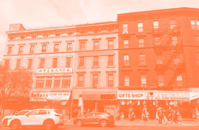
来自 Anson Li, 2023 | 运河街街景
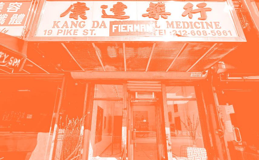
来自 Anson Li, 2023 | 派克街 19 号外景
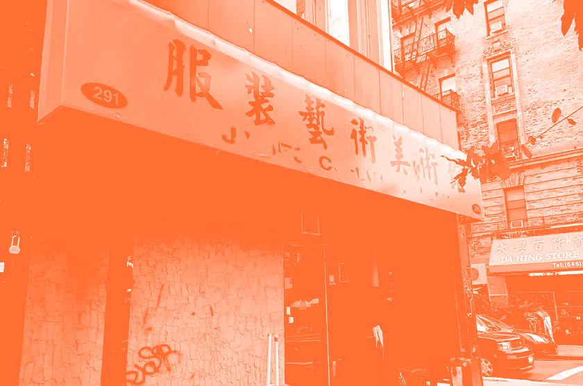
来自唐人街艺术大队,2017 | 詹姆斯·科恩画廊外景
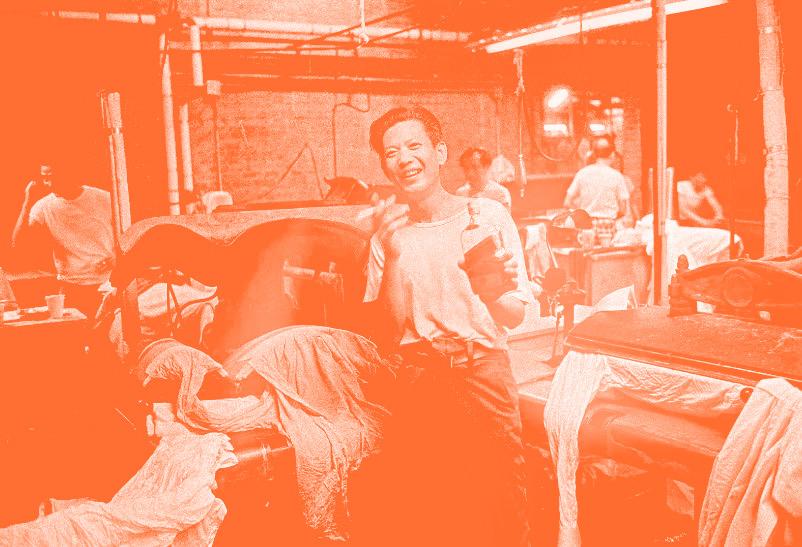
来自刘博智,1977-1978 | 裁缝
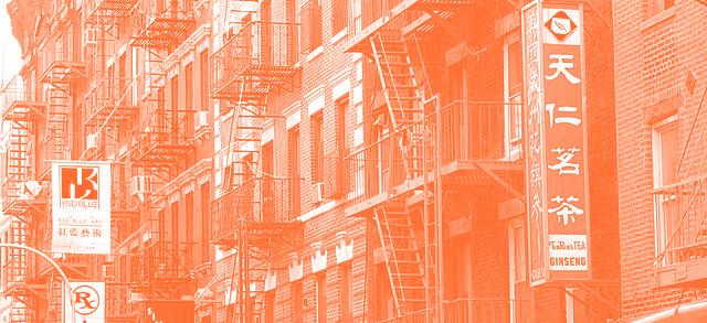
来自Alan Chin,2018 | 勿街
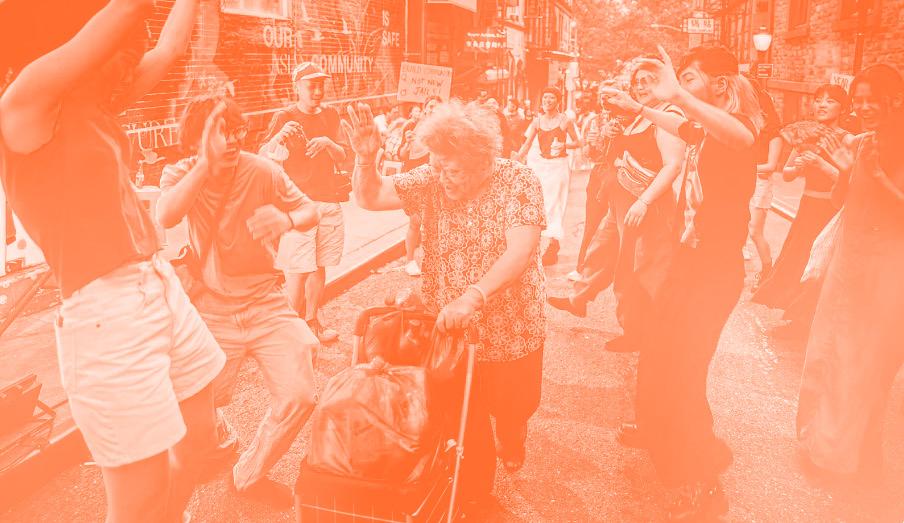
来自Cindy Trinh,2022 | 给阿姨让路
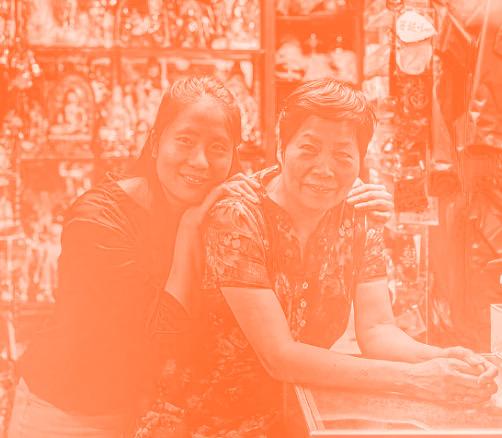
来自徐安荣,2019 | 刘妈妈和爱丽丝
摄影展现唐人 街居民的人性
Brush FROM TO Screens
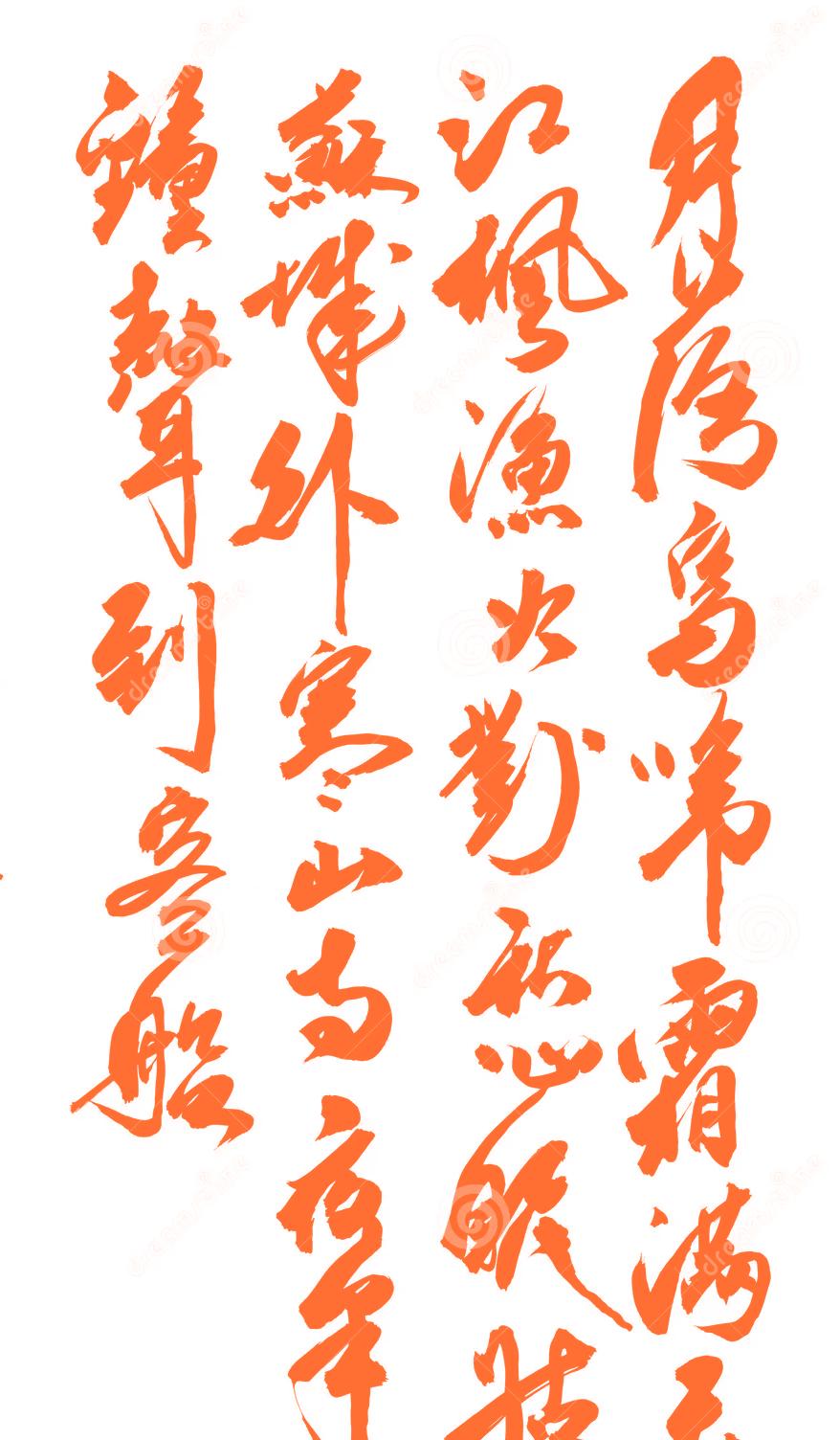
漢 字 的
THE EVOLUTION OF CHINESE LETTERFORMS IN TYPOGRAPHY
演 變
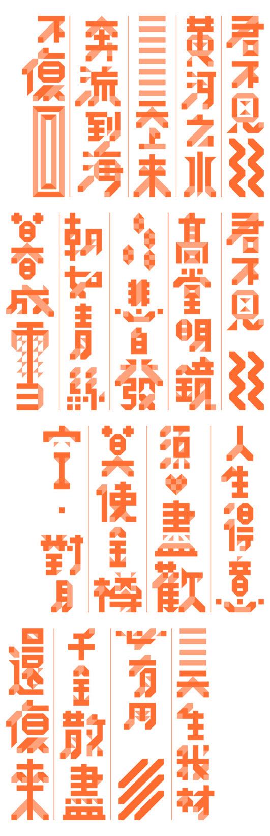
The visual language of Chinese typography has evolved over millennia, deeply intertwined with the cultural, social, and political history of China. From the elegant brush strokes of traditional calligraphy to the minimalist, modern lines of digital fonts like Song Ti (宋体) and Hei Ti (黑体), Chinese characters are carriers of both meaning and cultural memory. This evolution refects not only technological advances but also shifts in societal values, creating a dynamic interplay between form and function.
The preservation of Chinese typography in an urban landscape such as New York City represents more than just the survival of a written language—it is a celebration of identity, a living artifact of culture, and a way to ensure that these traditions continue to thrive amidst globalization and modernization.
An Introduction to Chinese Characters
The Chinese language is written in the Hanzi script, where Han refers to the dynasty (202 BC–220 AD) as well as the largest ethnic group in East Asia. Other languages also use subsets or variant forms of Hanzi: Kanji for Japanese, Hanja for Korean, and Chữ Nôm for Vietnamese. The origins of the Hanzi script date back to the Shang Dynasty (1600–1046BC), with inscriptions etched onto bones and animal shells used for divination. Hanzi is a logographic script, where each character represents a morpheme. The Hanzi script is made up of six kinds of characters known as liushu: pictographs, simple ideograms, compound ideographs, rebuses, phono-semantic compound characters, and derivative cognates. Each character represents one syllable, but pronunciation bears little relationship to the form of the character except in phono-semantic compounds, where pronunciation is imprecisely denoted. The Chinese language also consists of large numbers of homonyms –characters that share one pronunciation. The totalled number of Chinese characters currently documented in the GB18030–2005 encoding standard is 70,244, 4,808 of which are frequently used.
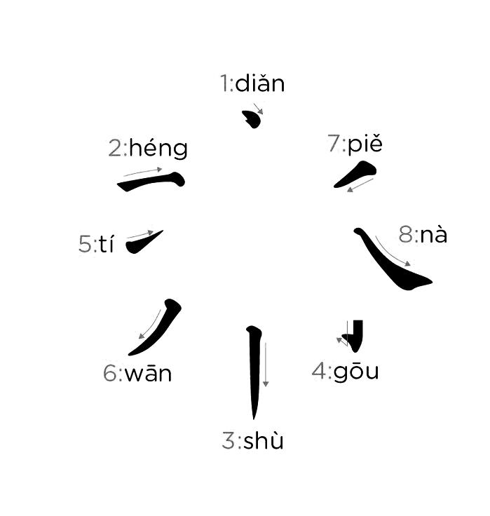
Strokes are the most elemental building block of Chinese characters. The character yong (永) is used to illustrate the eight types of basic strokes in Chinese calligraphy. Strokes are used to construct a total of 213 radicals (部首). These are root characters that can either exist as individual characters, or combined to form composite characters. A word in Chinese can be made up of one to three characters, with an average word length of 1.5 characters. 55% of words comprise of one character, 40% of two characters, and 5% of three characters. There is no spatial separation between words; they can only be diferentiated in context.
Modern Chinese Typography
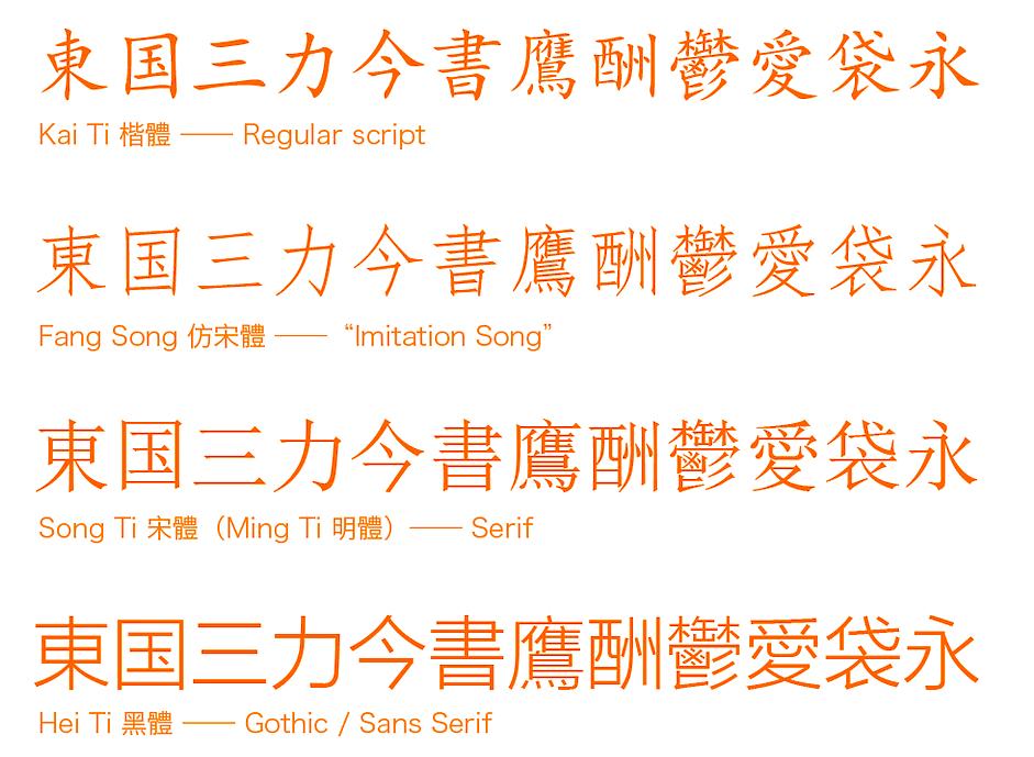
There are four major categories of Chinese font type. From top to bottom in the image shown above, the style varies from traditional to modern. Kai Ti and Fang Song are often used in traditional printed books and publications, they rarely appear in digital design nowadays. For Song Ti (or Minchō in Japanese) and Hei Ti (or Gothic in Japanese), we can roughly correspond them to Serif and Sans Serif typefaces of Latin language typography. Similar to English, Hei Ti typeface was believed to ft digital devices best since serifs of Song Ti / Roman / Serif typefaces can look terrible on low DPI screens, which will harm the legibility and readability. Thus, almost all the default font type of every Operating System are Hei Ti / Sans Serif. However, with the high DPI screen / Retina display coming into being, the problem of Serif fonts does not exist anymore, some Apps (like Readability, Circa), websites (like Medium) start to use Serif font again to provide a traditional, classic and prestigious reading experience. Yet since most screens are still non-Retina, it’s much safer for designers to use Hei Ti / Sans Serif fonts for digital design.
Influence of Calligraphy on Typography
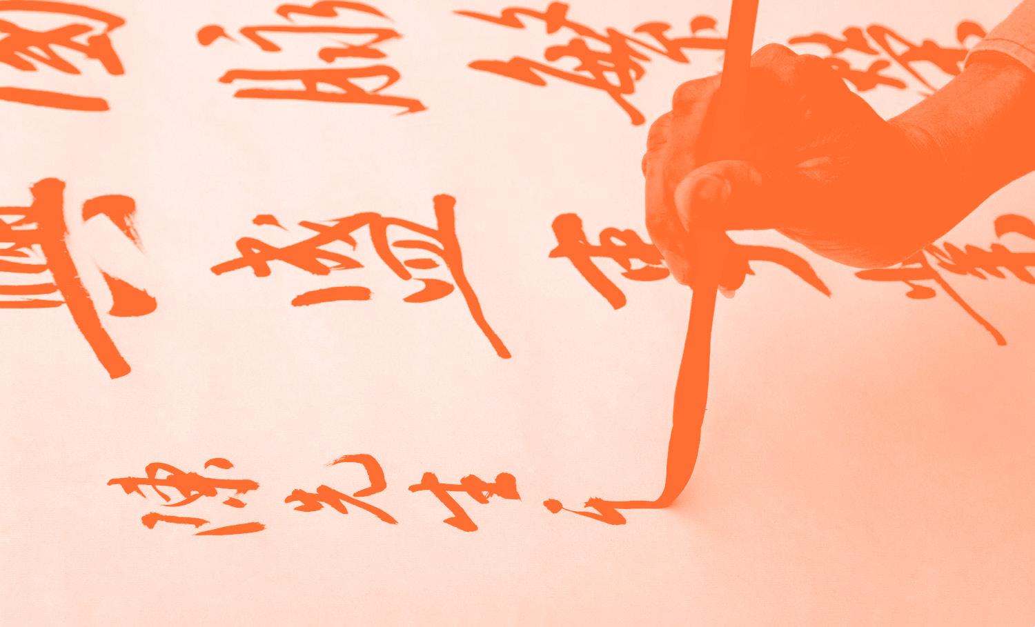
Calligraphy holds a sacred place in Chinese culture, long revered as one of the highest forms of visual art. From the earliest records of Chinese characters etched onto oracle bones in the Shang dynasty (1600-1046 BCE) to the fully developed scripts that emerged during the Han dynasty (206 BCE – 220 CE), calligraphy has been central to the Chinese way of life. Its infuence on modern typography cannot be overstated.
In the Tang Dynasty (618-907 CE), kaishu (楷书), or regular script, became the standardized form of writing. Its precise, balanced strokes have left a lasting impact on Chinese typography, forming the basis for numerous typefaces that we see today. Wang Xizhi (王羲之), perhaps the most famous calligrapher of the Jin Dynasty (266-420 CE), pioneered many of the fuid, balanced principles still seen in Chinese characters today. His Lantingji Xu (兰亭集序) remains a classic reference for typographic form.
Despite the proliferation of digital fonts and modern printing methods, the principles of calligraphy still hold sway. Whether it’s the meticulous attention to stroke order or the emphasis on proportional balance, modern typefaces like Song Ti and Hei Ti echo these age-old traditions. The essence of brushwork—where pressure and direction shift the thickness and weight of each stroke—remains embedded in the structural integrity of Chinese typography.
Role in Preserving Heritage
As the digital age progresses, the preservation of Chinese typography faces new challenges and opportunities. Digital platforms have allowed for the creation of thousands of new fonts, many of which blend traditional aesthetics with modern functionality. Platforms like FounderType (方正字库) and HanYi Fonts (汉仪字库) are spearheading eforts to digitize Chinese typefaces while maintaining their cultural integrity.
The importance of this work cannot be overstated. As cities become more globalized, and as languages and cultures become more homogenized, the role of typography in preserving cultural heritage becomes increasingly crucial. In New York City’s Chinatown, for instance, the retention of Chinese characters on public signs serves as both a tool of communication and a cultural artifact. These characters are visual ties to a rich heritage, making them essential to the community’s identity.
Designers and typographers have developed new digital fonts that bridge the gap between tradition and modernity, are vital in this preservation efort. By creating typefaces that refect the balance between aesthetic beauty and practical functionality, they ensure that Chinese typography continues to be relevant and accessible in both urban and digital spaces.
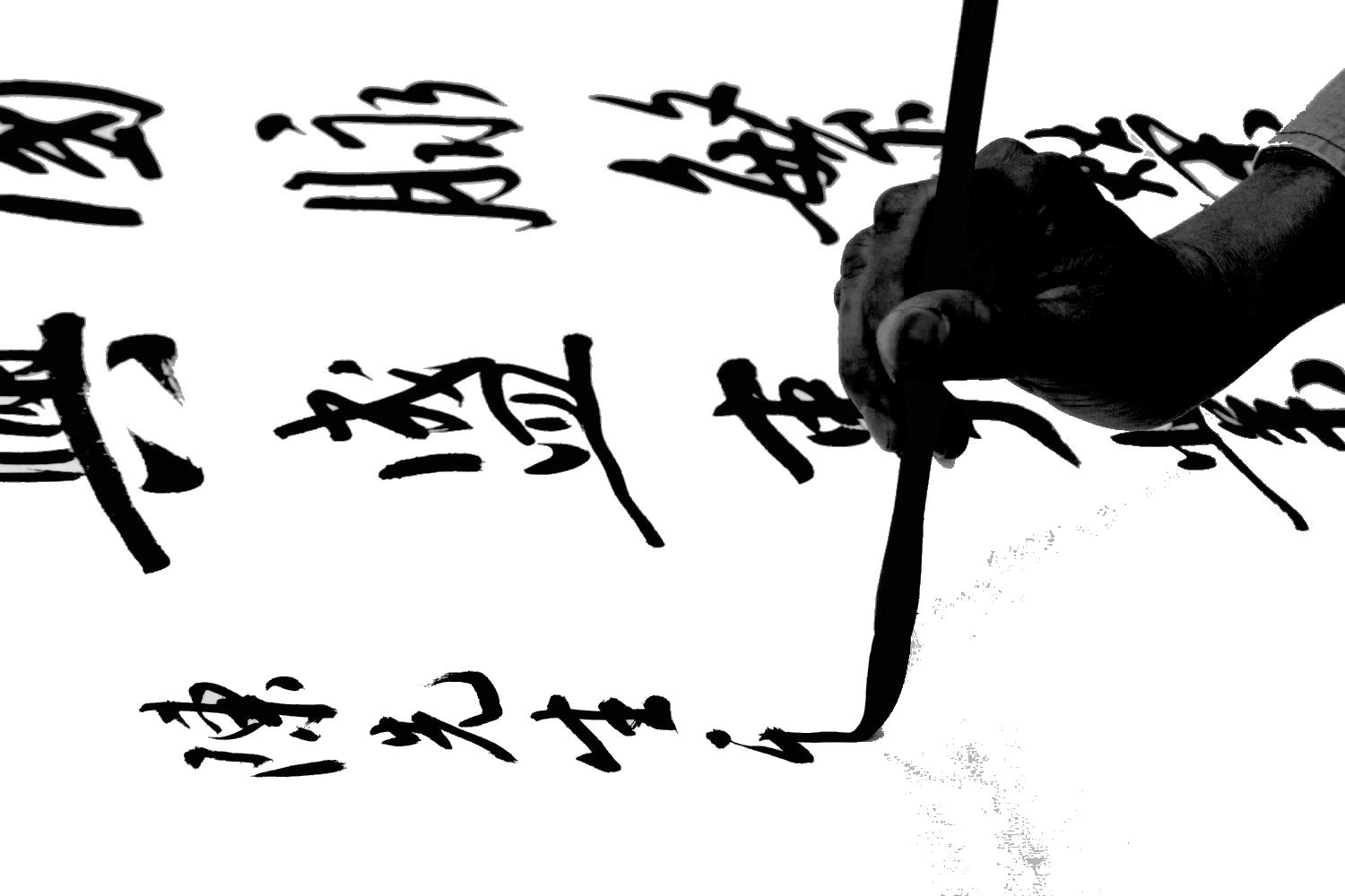
Typographic Evolution as Cultural Memory
The evolution of Chinese typography—from ancient calligraphy to modern digital fonts—mirrors the cultural, social, and political shifts that have shaped China’s history. From the elegant strokes of Wang Xizhi to the minimalist clarity of Hei Ti, the development of Chinese charactershasalwaysbeenaboutmorethanjustcommunication.These visual forms are carriers of cultural memory, identity, and history.
In cities like New York, where Chinese signage populates neighborhoods like Chinatown, typography serves as a living, breathing testament to the cultural heritage of immigrant communities. By preserving these characters and understanding their evolution, we not only honor the past but also ensure that the visual language of Chinese typography continues to thrive in the future.

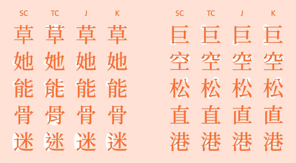
Simplifed Chinese, Traditional Chinese, Japanese, Korean regional variations of a selection of characters in Noto Serif. Source: Keith Tam, https://keithtam.net/category/typography/chinese-typography/
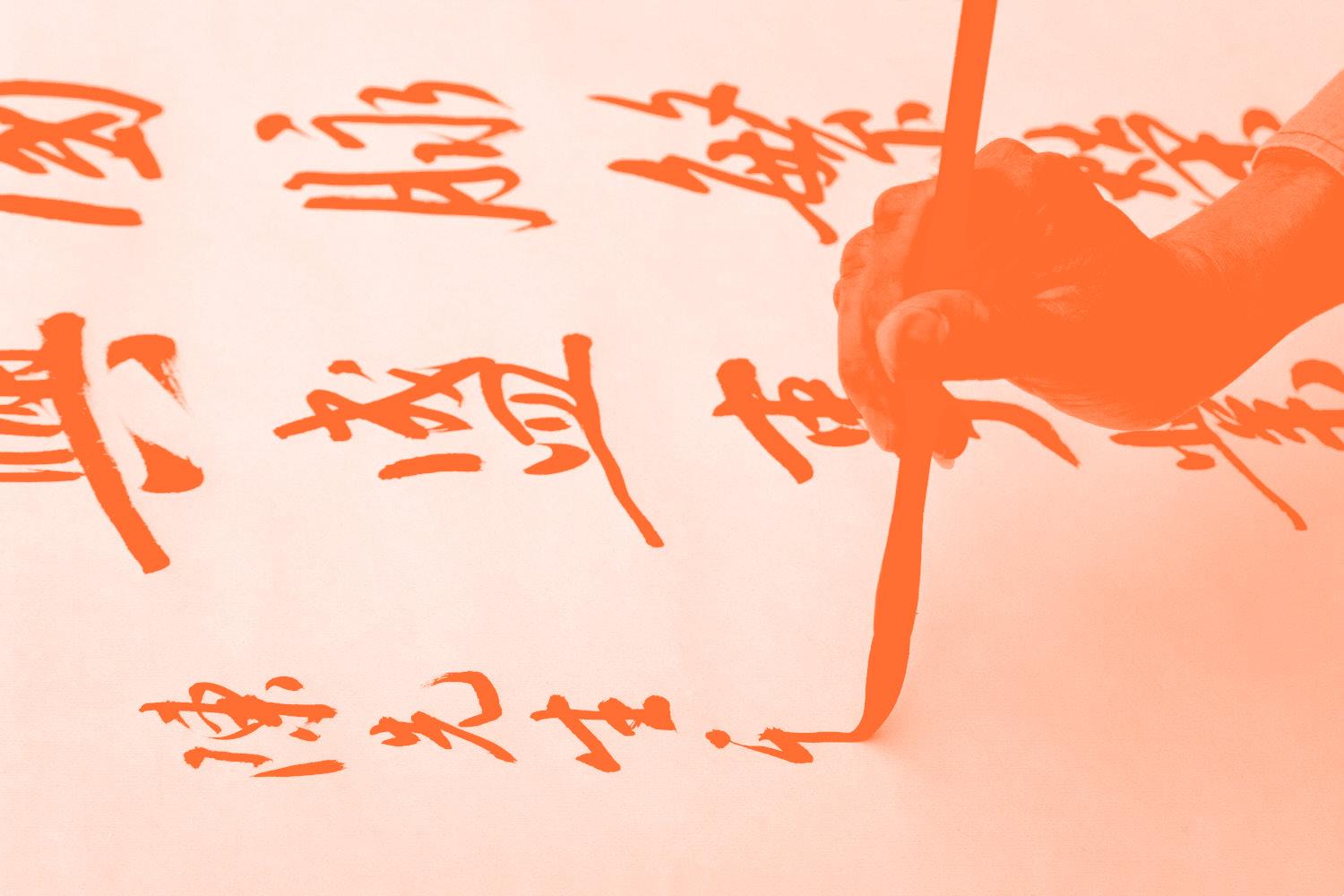
Source: https://www.thoughtco.com/number-of-stroke-chinese-names-2278472
精 墨 妙
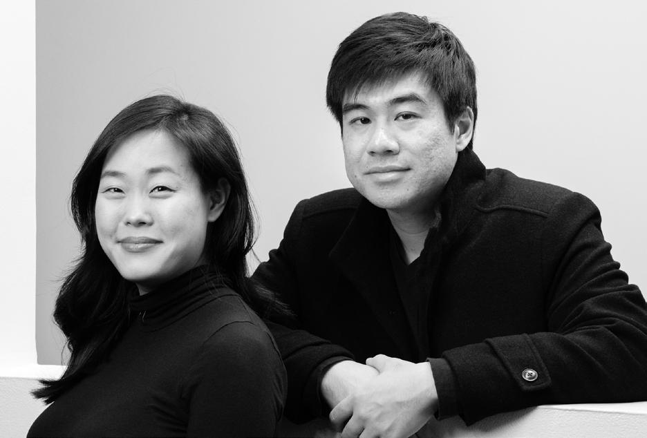
Synoptic Ofce is a New York-based multidisciplinary design partnership between Yale MFA grads YuJune Park and Caspar Lam. The duo recently released Ming Romantic, a fercely modern, high-contrast Chinese typeface comprising more than 2,300 glyphs, and paired its release with an exhibition, a poster, and a catalog, in which they remark, “because typography is the foundation of graphic design, our perception and employment of it are borne of a pragmatic nature: an urgency to solve a visual problem in the here and now.” This month, we spoke to them about their practice, teaching, and the cyclical nature of life and design.
Your studio, Synoptic Office, is a true design ‘practice’ – your work is exploratory and collaborative. Tell us how you got started in your design partnership?
We frst met in grad school at Yale. It was one of those serendipitous encounters where we frst began to work together on some projects here and there, and quickly realized that our work could fnd a fuller expression through collaboration. There was a complementarity but also an overlap in our skills and ways of working. In fact, this is what synoptic means: a coherence when things are seen together.
Congratulations on the release of Ming Romantic, your high-contrast Chinese Didone typeface! At the exhibition, it struck me that your system is in some ways the ultimate design Rubik’s cube: in how many ways can we svubdivide a square to make 2,300 glyphs? How did you devise the system you landed on?
The typeface has around 2,300 glyphs in three master-weights. We settled on a minimum set so that we could release this over time and spread out the cost, both in terms of time and labor as well as
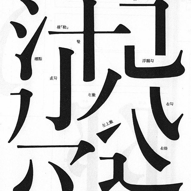
fnancial. This was important, because our studio is primarily a design studio rather than a type foundry. In many ways, the grid/squares are representations of ways in which the characters can be broken down. The parts of the characters themselves are the “Rubik’s cube,” rather than the grid. Individual strokes can form components or radicals that form characters.
These forms can be sliced and diced, grouped, and organized in a myriad of ways, which really speaks to the modular qualities of the language. At the same time, these “modules” are not exactly rigid with every character adjusted to create a sense
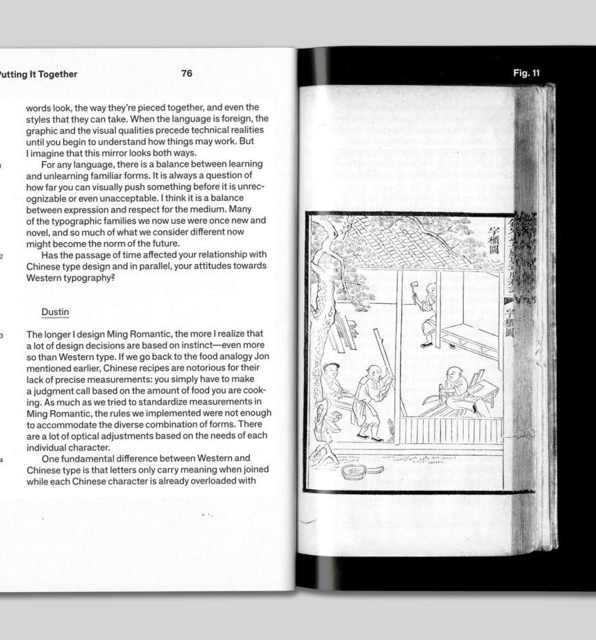
of coherence based on an inner center of gravity. Over time, we gradually realized through our making that the rigidity of the system we imposed erodes. We had to constantly negotiate a balance between being fexible to accommodate a character’s individual quirks and the parameters imposed from the beginning. Every time we look at the typeface, these negotiations vie for our attention. It is endless.
Both of you teach. How does teaching inform your design practice, and vice versa? Are there specific things that you are trying to extract from young designers?
We both see making, teaching, and research to be part of a single cyclical pattern of work. Each activity begets the other and ofers constraints to the questions we are asking about material culture. These constraints are important in our design work so that a single idea can be explored from multiple angles.
So, we do not see our role as educators to be about “extracting” some essence from young designers. Rather, the classroom dialectic is an important opportunity for all parties to continue a living tradition of design criticism and form making. The community building and mutual learning are important aspects of this. In fact, we learn a lot from our students, particularly about the future of design that has yet to unfold!
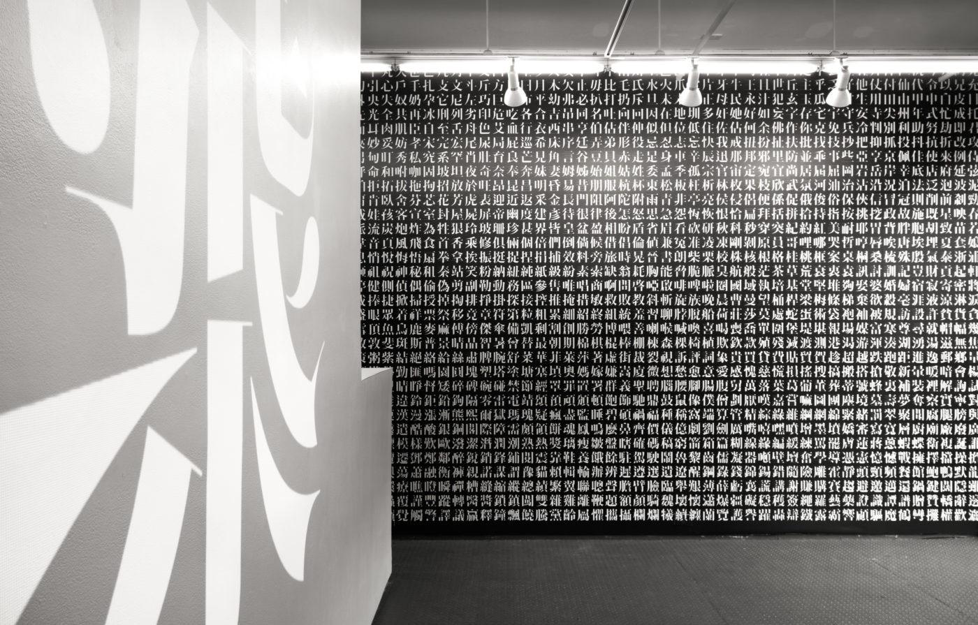
Exhibition of Ming Romantic by Synoptic Ofce.
Ming Romantic Reader by Synoptic Ofce.
THE CHINESE TYPE ARCHIVE 字体资料库
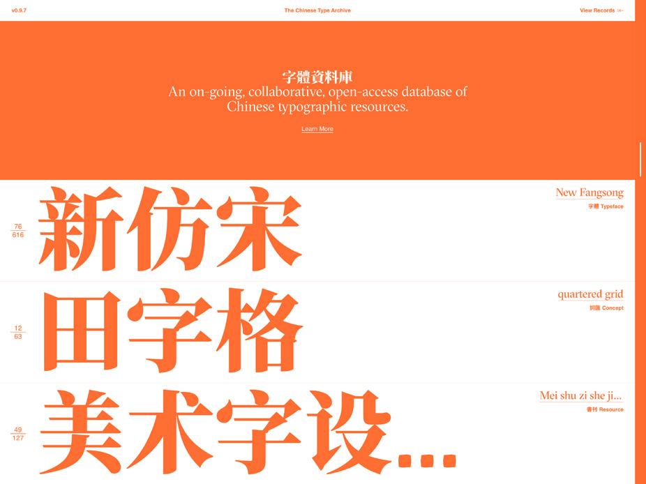
What is The Chinese Type Archive?
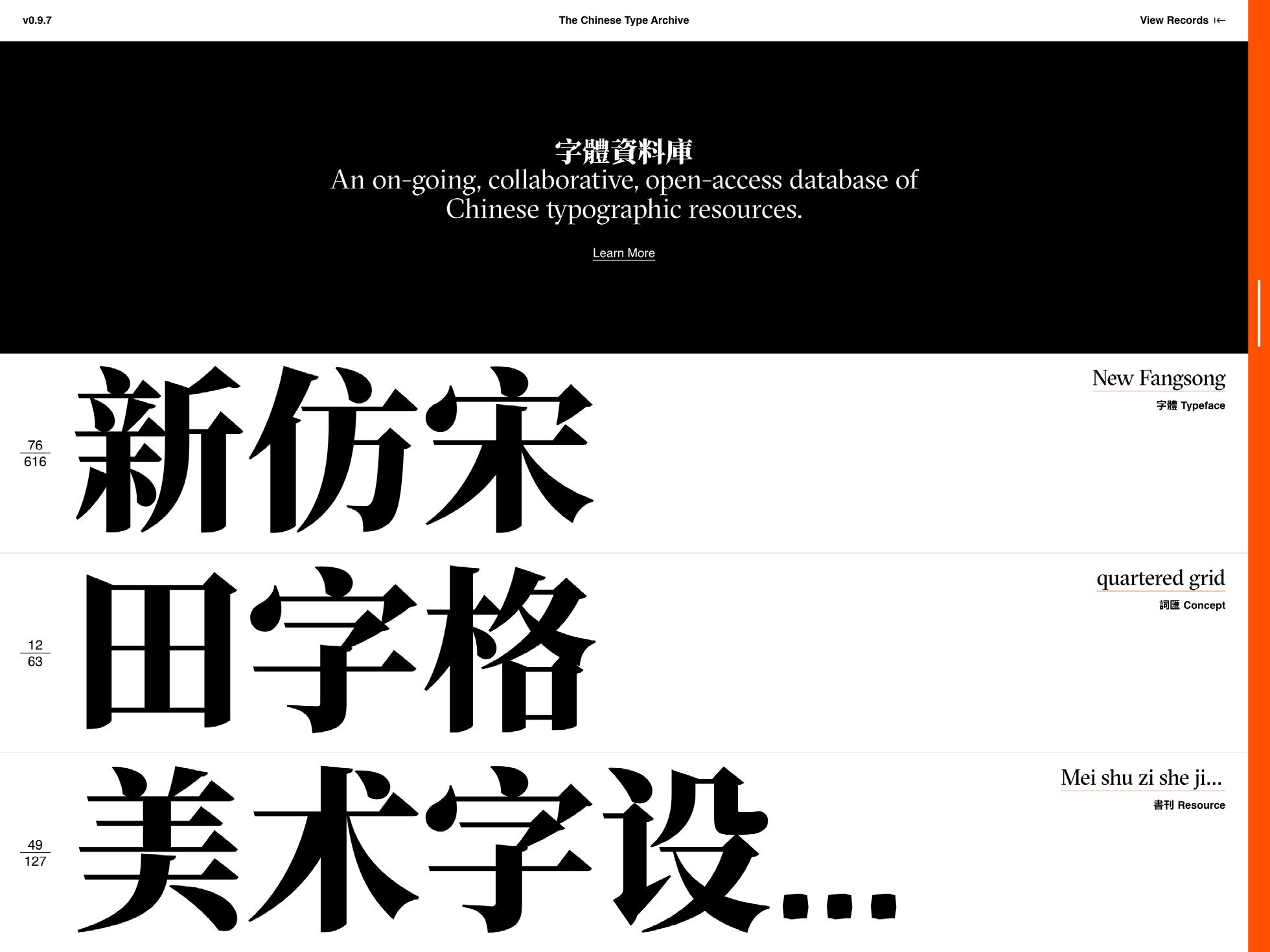
The Chinese Type Archive (v0.9.7) compiles and catalogs resources related to Chinese typography to make them open and accessible to the widest possible audience of designers. Its aim is to support designers who use Chinese typography by:
1. Developing descriptors for concepts, typefaces, and related entities
2. Archiving related and relevant visual examples
3. Providing points of entry through translation and relationships that may be equivalent and not equivalent to other typographic systems
We utilize a broad approach towards collecting with the aim of capturing design history and fostering the dialogue, use, and evolution of Chinese typography in a globalized context. The initiative focuses on Chinese typography, proper, and incorporates relevant material adjacent to it. Future eforts include tools and methods for typographic analysis and data publishing.
The Chinese Type Archive is an ongoing, collaborative efort run by volunteers. Because of this, the data is incomplete and contains omissions and errors. We welcome collaborators, submissions, and corrections.
This project is funded in part by the American Institute of Graphic Arts Design Educators Community grant and the Parsons School of Design General Research Fund. Material support comes from Synoptic Ofce.
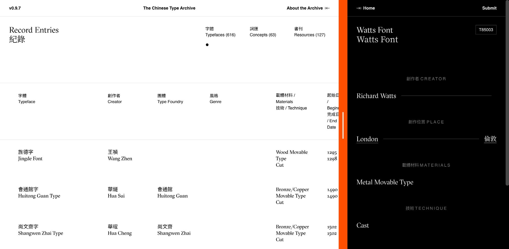
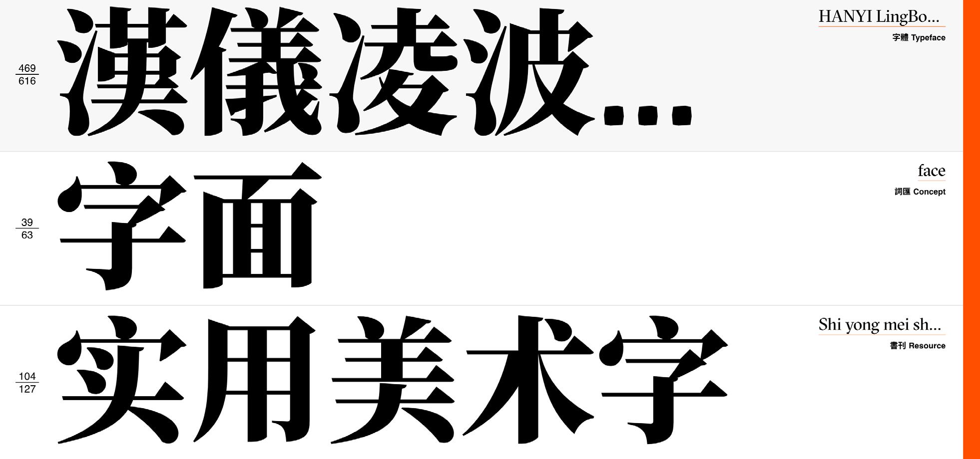
字体资料库(v0.9.7)搜集各种与中文字型设计相 关的资源并将其分类,让广大设计师拥有更加便利 的渠道的档案网站。字体资料库的目的是让来自世 界各地的设计师:
1. 发展有关中文平面设计概念,字型和其他相关 的词汇
2. 收藏相关的设计范例
3. 提供中文和其他语系的字体设计系统的切入点 作为一个资料库,我们利用了大量记载设计历史, 使用方法,字体演变的收藏。字体资料库结合许多 相关材料来集中关注在中文字型设计,并将会在未 来涵盖字型设计分析和数据发布的工具和方法。
这是一个由志愿者设计师合办的正在进行中的项 目,因此,字体资料库会存在漏洞及误差,并且仍 需完善。我们随时欢迎设计师们参与,提供新的信 息,指出错误。
什么是字体资料? Typeface
字体资料库由AIGA DEC和帕森斯设计学院赞助 支持。所有材料信息来自于Synoptic Ofce。
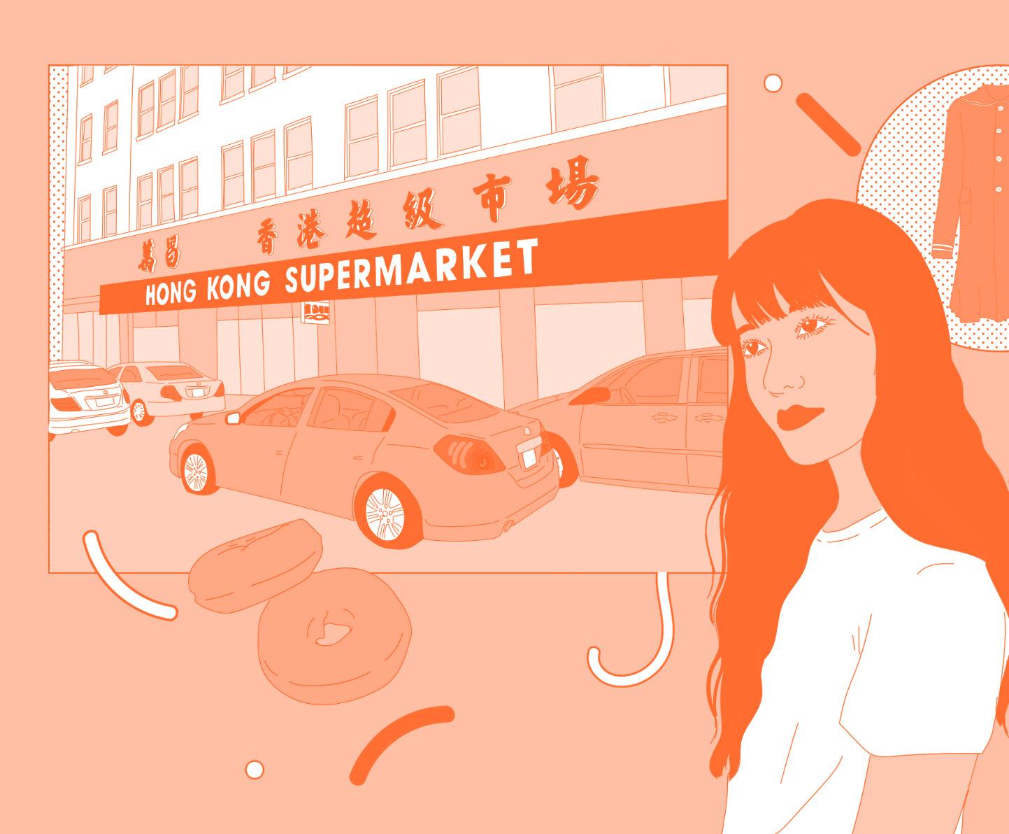
Weekend With Tracy Ma. Illustration by Anna Rupprecht.
Source: AIGA Eye on Design, https://eyeondesign.aiga.org/tracy-ma-takes-us-on-a-typographic-tour-of-the-signs-of-manhattans-chinatown/
Typographic Tour
OF MANHATTAN’S CHINATOWN

An Article by AIGA Eye on Design’s “Weekend With” Series Words by Tracy Ma
“Weekend With” is a new series that explores the world of design through the eyes of a designer on their days of.
Tracy Ma is a renowned designer whose distinctive style bridges the intersection of traditional design elements and contemporary media. Born in Hong Kong and raised in Canada, Ma is best known for her work at *The New York Times* and her exploration of visual storytelling that often grapples with identity, culture, and modern-day design challenges. Her connection to Chinatown is not just one of proximity, but of cultural signifcance, as her design sensibilities are shaped by a deep understanding of the evolving role that Chinese type and signage play in urban landscapes.
In the accompanying article, Ma refects on the tensions that arise as new, non-Chinese businesses in Chinatown adopt Chinese characters in their branding—often using Simplifed Chinese in an area where Traditional Chinese still dominates. This exploration is not only an analysis of visual design but also a commentary on cultural identity and gentrifcation. The article resonates strongly with the mission of this publication: to explore how Chinese typography preserves cultural heritage in New York’s urban environment, and how shifts in type use can refect broader societal changes. Through Ma’s refections, readers are invited to question the role of design in maintaining cultural continuity versus becoming a tool of commercialization and appropriation.
AIGA Eye on Design
“周末与你相伴”系列翻译 作者:Tracy Ma “周末与你共度”是一个新的系列,通过设计师在 休息日的眼光探索设计世界。
Tracy Ma 是一位知名设计师,她独特的风格将传 统设计元素与当代媒体融为一体。Ma 出生于香港, 在加拿大长大,她最出名的作品是《纽约时报》的 工作,以及她对视觉叙事的探索,这种探索经常涉 及身份、文化和现代设计挑战。她与唐人街的联系 不仅仅是距离的接近,而且具有文化意义,因为她 的设计感是由对中文字体和标牌在城市景观中扮演 的角色的深刻理解所塑造的。
在随附的文章中,Ma 反思了唐人街新的非华人企 业在其品牌中采用汉字时出现的紧张局势—在繁 体中文仍占主导地位的地区,这些企业通常使用简 体中文。这一探索不仅是对视觉设计的分析,也是 对文化身份和中产阶级化的评论。这篇文章与该出 版物的使命产生了强烈共鸣:探索中文字体如何在 纽约的城市环境中保护文化遗产,以及字体使用的 变化如何反映更广泛的社会变化。通过马的思考, 读者可以思考设计在保持文化连续性方面的作用, 而不是成为商业化和挪用的工具。
And
all its complexities.
“Simplified Chinese doesn’t equal accessibility.”
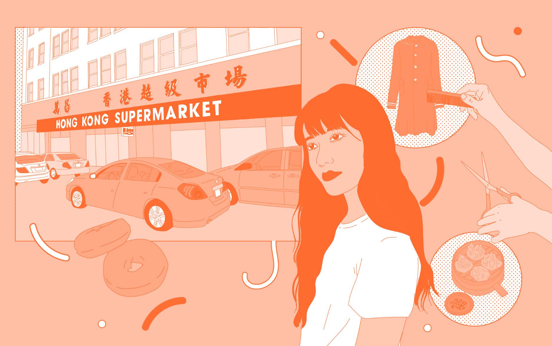
I commute for work every day, so on the weekends I avoid the subway like the plague. This means my world is a 1.3-mile radius around my home in Chinatown. I wake up and roll down to XO Kitchen for a meal that my husband has dubbed The 3 x Carb Diet: fried noodles, plain congee, and deep-fried doughnut.
Through the parts of the window not covered in their cool DIY promotions, you can see Hong Kong Supermarket across the street, the giant letters of its name spreading across a whole half block on a taut red awning. I’m not a big fan of Avant Garde Gothic, but it looks great here. Inside the supermarket are all my favorite snacks and spices, at unpredictable stock and supply. Or, if I feel like dim sum instead, I’ll saunter down Bowery over to Dim Sum Go Go.
I grew up reading and writing Traditional Chinese because it’s still used in Hong Kong, where I was born. It’s also still used in Taiwan and Macau. Along with Hong Kong, these are the parts of China that have had some degree of autonomy from the Mainland’s political system. Most overseas Chinese communities predate the PRC’s formation—some by almost a century—so they also predominantly use the Traditional script.
The facades of Manhattan’s Chinatown, as well as its paraphernalia, are emblazoned almost entirely in Traditional Chinese.
It’s probably why it has always ofered some comfort to me, and why Foxy’s Simplifed Chinese identity stands out so much.
I wonder why Foxy’s—one of many non-Chinese galleries to recently move into a neighborhood that has long been resistant to gentrifcation—is using Chinese characters in its branding? If it’s to appeal to its neighbors, it would be better of using Traditional Chinese, the clear preference among the local Chinese (who are not, by and large, the ultra-wealthy type from Mainland China who would buy big on the art market).
On my way there, I pass by Chatham Square, where you can see the windows of Foxy Productions on the second foor. I notice it because my friend Sara Cwynar made giant photos of me that hung there once, and because Foxy is one of the new, non-Chinese-owned businesses that uses Chinese as part of their identity design.
While putting in a very large order at Dim Sum Go Go—turnip cakes, chicken baos, spring-rolls, veal, and dumplings (shrimp, mushrooms, duck, spinach, parsley)—I think about how Foxy’s identity is written out in Simplifed Chinese. Simplifed Chinese was invented in the 1950s by the People’s Republic of China; it’s closely associated with Mao’s Cultural Revolution. To me, the Simplifed script alludes to— among other atrocities that feel intense to mention on a design blog— the erasure of history and a rejection of the Traditional form of writing.
After going for that last dumpling after all, I think further about how the art-world strives to create, in the words of the writer Lynne Tillman, a “continuity in value and taste.” It trades frst and foremost on exclusivity. Does this art-world outpost have any business in trying to appeal, in mass, to the local Chinese community?
I walk of the large meal down East Broadway. There is a vintage store I like; it’s on the second foor of an old mall. I am haunted by the memory of a jacket I saw there once and didn’t buy: an amazing Comme des Garçons with a perfect sailor collar, possibly from the ’70s, back when they still made their stuf in Paris.
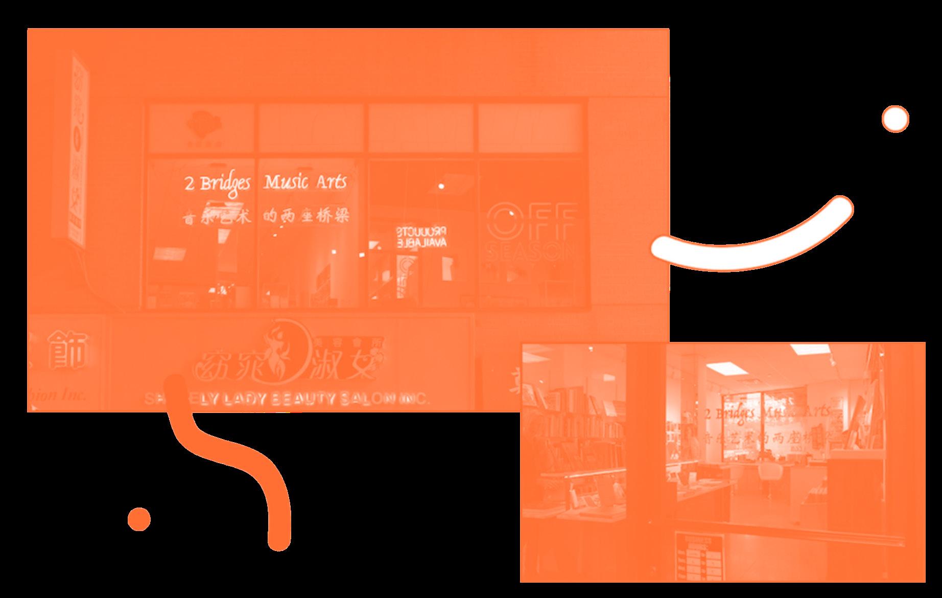
Next door to it is a bookstore called 2 Bridges Music Arts, another non-Chinese owned business that uses Simplifed Chinese lettering as part of its identity Asking the beanie-wearing bro working there:.
“Why did you use Chinese letterings as part of your brand?”
“Look where we are,” he replies rhetorically.
“Why did you use Simplified Chinese letters?”
Caught of guard, he utters a reply that’s hard to follow.
“We are trying to appeal to the most amount of people, to be accessible, by using the simplest.”
“But all the signs in Manhattan are in Traditional Chinese,”
I say, stopping myself from giving a TED Talk right then and there on how Simplifed Chinese doesn’t equal accessibility.
I don’t linger for too long because I have an appointment anyway: a massage at Seasons, where I see Vicky. On another weekend, it could be a facial at BB Beauty, where I only go when Janet’s around. Or maybe I’d go see Jacky at J-hair. He nags like a typical Cantonese uncle: “You don’t cut your hair often enough.” When we frst met, he thought I was a jūk sīng (American-born Chinese), but thought diferently when he recognized my Cantonese. Like me, he also immigrated from Hong Kong, but in the ’70s.
“Got my Green Card soon after,” he says. “My
son’s a jūk sīng. He’s studying at Syracuse University.”
I take my snack down to my studio where I work on personal projects. I rent it from my landlord Irene, who is a powerful boss-lady and fellow Hong Kong immigrant. She’s operated a small vegetable stand for decades, and is now landlord to the two adjacent buildings. One night, peering into a storefront under renovation, she gossips to me about the growing price of rent. “It’s absurd,” she said. I wonder what she thinks of the signs that says “Food Stamps Accepted” in Chinese further up the street, and how jarring they look next to the fancy non-Chinese owned Martos gallery that opened in 2016. I wonder what her customers think of it.
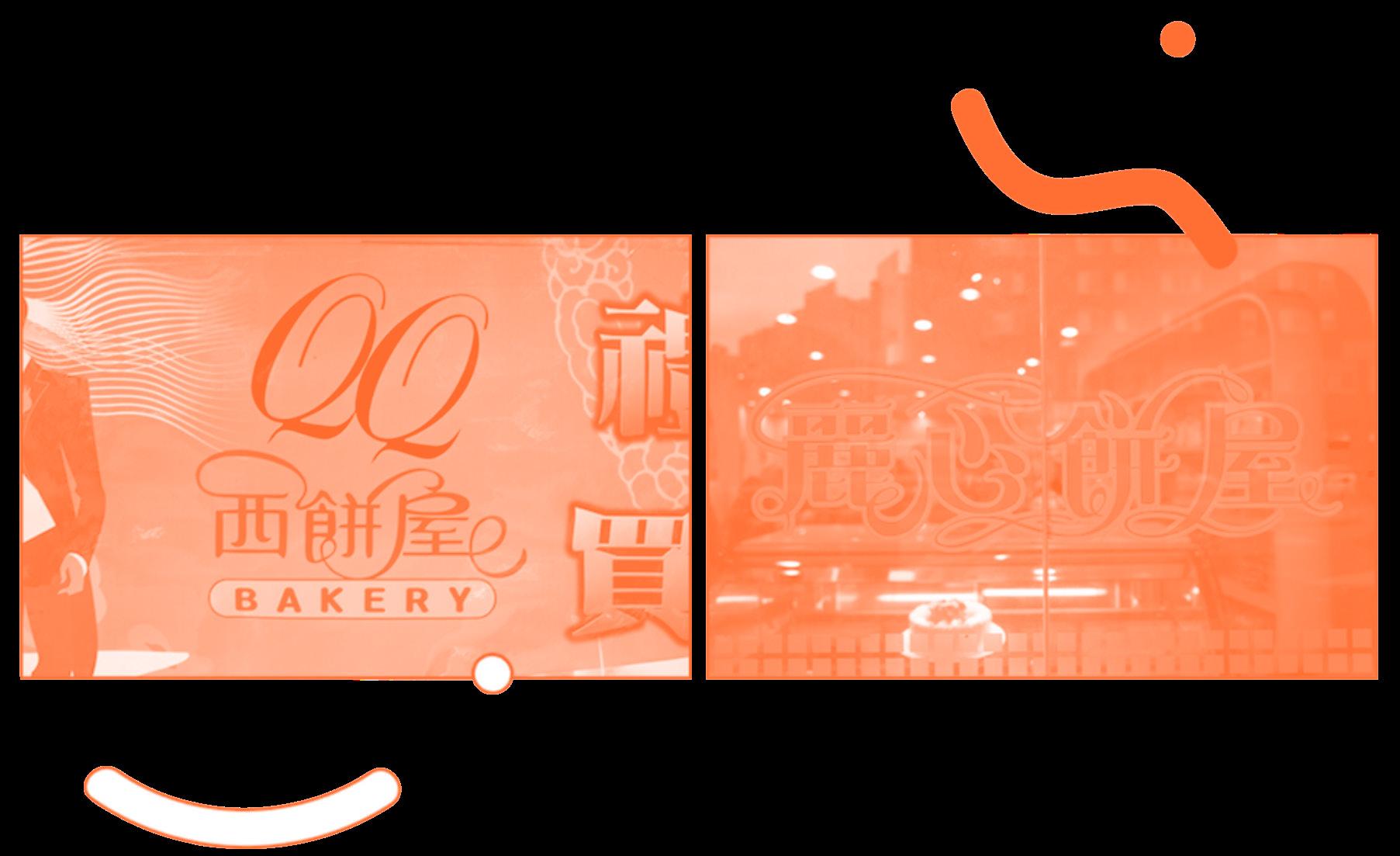
Afterwards, I grab a snack at a Cantonese bakery. I’ve noticed that a lot of them use this type of swash ligature as part of their logo design. It’s unusual, as it is derivative of calligraphic type in Romance languages, and not a natural extension of Chinese written script. I recognize its reference at once, and am amused by how it’s permeated through time and space. It’s a knockof of the Saint Honore chain of bakeries, which opened its frst shop in the ’70s in Hong Kong.
I distinctly remember fnding its logo pretty as a kindergartener, tracing my fnger along the glossy cake box. References like these, whether graphic or semantic, are prevalent in the Chinese diaspora. For example, there is a pharmacy called Mannings down the street, named after the Mannings chain back home.
The conversations at the hair salon, the Chinese bakery font with added swash ligatures, the packaging on condiments, how my landlord gives me special treatment: all of these things telegraph a collective longing. I tell people that I identify as being from Hong Kong, because it is a neat, sufcient answer. In reality my upbringing is strictly Cantonese-Canadian.
Overseas, these quotidian things get pressurized into gemstones. They make me feel seen, they mean “I got you,” a sort of antidote to every ounce of weird racist microaggression you’ve encountered. And somehow, living in Chinatown, bathed in a shared language of understanding, symbolic or spoken, mitigates some of the ways it could all curdle inside, like an intolerance to lactose. These new signs, put up by non-Chinese speakers, seem to miss this point entirely.
以及它的所有复杂性。
“简体中文并不等于无障碍。”
我每天都要上下班,所以周末我会尽量避免乘坐地铁。这意味着我的世界就在 我的唐人街家附近 1.3 英里的范围内。我醒来后就去 XO Kitchen 吃一顿我丈 夫称之为“3 x 碳水化合物饮食”的饭菜:炒面、白粥和油炸甜甜圈。
透过橱窗中没有被他们酷炫的 DIY 促销活动覆盖的部分,你可以看到街对面的 香港超市,超市名字的巨大字母在一个绷紧的红色遮阳篷上延伸了整整半个街 区。我不是先锋派哥特式的忠实粉丝,但它在这里看起来很棒。超市里有我最 喜欢的零食和香料,库存和供应情况难以预测。
或者,如果我更喜欢点心,我会漫步到鲍威里街的 Dim Sum Go Go。
在去那里的路上,我经过了查塔姆广场,在那里你可以看到二楼 Foxy Productions 的窗户。我之所以注意到这一点,是因为我的朋友 Sara Cwynar 曾经在那里挂过我拍摄的巨幅照片,也因为 Foxy 是一家新的非华人企业,将 中文作为其身份设计的一部分。
在 Dim Sum Go Go 下大订单时—萝卜糕、鸡肉包、春卷、小牛肉和饺子(虾、 蘑菇、鸭、菠菜、欧芹)—我想到 Foxy 的身份是如何用简体中文书写出来 的。简体中文是中华人民共和国在 20 世纪 50 年代发明的;它与毛泽东的文化 大革命密切相关。对我来说,简体字暗指—在设计博客上提到其他令人感到 强烈的暴行—抹杀历史和拒绝传统书写形式。我从小就阅读和书写繁体中文, 因为繁体中文在我出生地香港仍然使用。台湾和澳门也仍在使用。与香港一样, 这些都是中国部分地区,在一定程度上不受大陆政治体制影响。大多数海外华 人社区的成立时间早于中华人民共和国成立,有些甚至早了近一个世纪,因此 他们也主要使用繁体字。
SHOULD THIS TYPE OF DESIGN BE CONSIDERED CULTURAL APPROPRIATION, COMPARABLE TO INSTANCES OF “YELLOW FACE” OR A REGRETTABLE LOWER-BACK TAT?
曼哈顿唐人街的外墙和周边设施几乎全部用繁体中文装饰。这或许就是为什么 繁体中文总能给我带来些许安慰,也是为什么 Foxy 的简体中文身份如此引人 注目。
我想知道为什么 Foxy’s — 众多最近迁入这个长期以来一直抵制中产阶级化 的社区的非中国画廊之一 — 在其品牌中使用中文?如果是为了吸引邻居,最 好使用繁体中文,这是当地华人的明显偏好(他们总体上不是来自中国大陆的 超级富豪,不会在艺术品市场上大举购买)。这种设计是否应该被视为文化挪用, 与“黄脸”或令人遗憾的下背部纹身相媲美?
吃完最后一个饺子后,我进一步思考了艺术界如何努力创造一种“价值和品味 的连续性”,用作家林恩·蒂尔曼的话来说。它首先以独家性为交易。这个艺术 界前哨站是否应该试图吸引当地华人社区的大量关注?
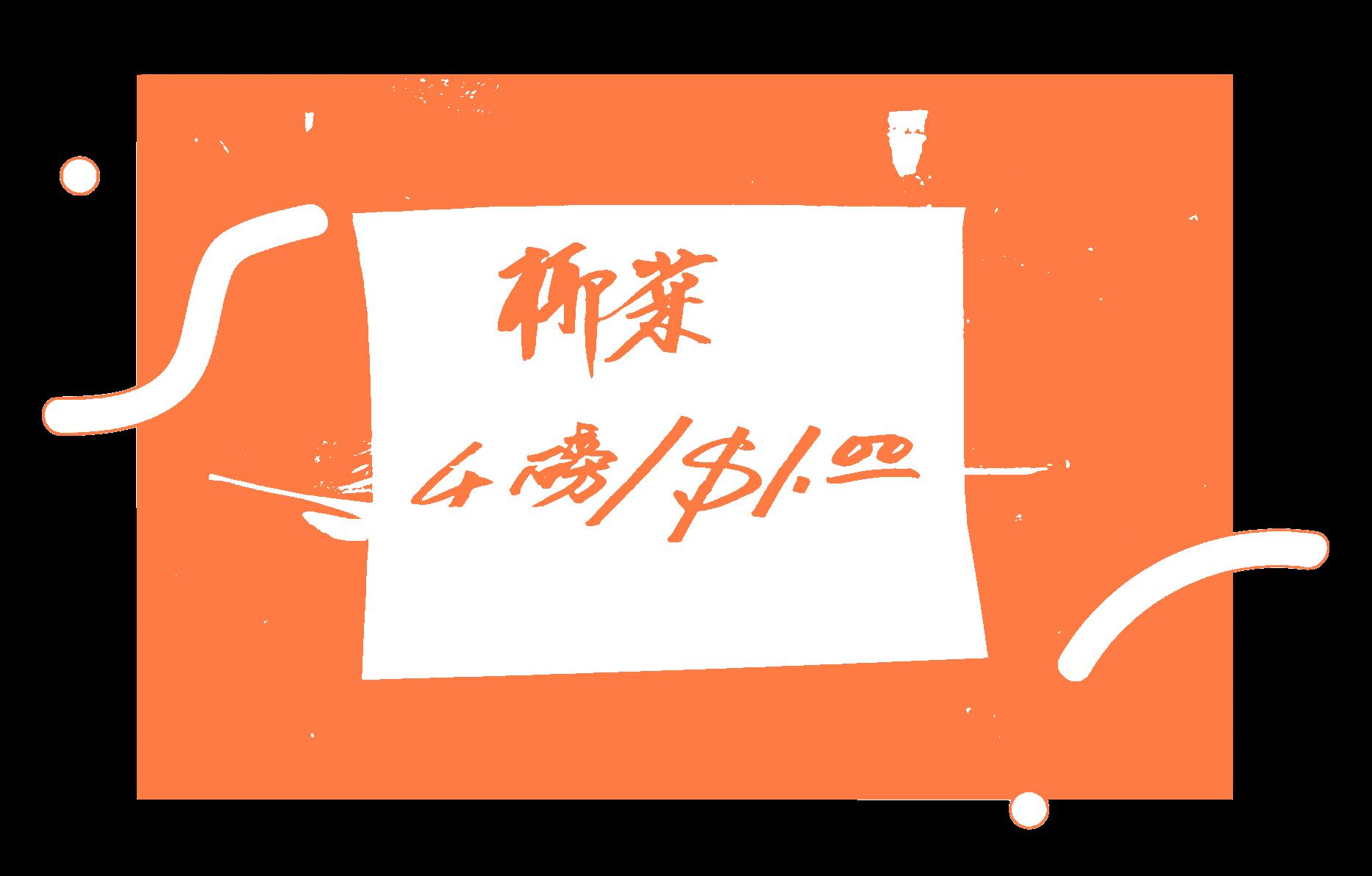
Tracy Ma, Cabbage, 4 Pounds/$1.00, written in Traditional Chinese
Source: AIGA Eye on Design
Tracy Ma, Outside of Alrite Pharmacy, a DIY sign that reads “ We Speak:
Toishanese, Cantonese, Hakka, Mandarin, English, Fujianese”
Source: AIGA Eye on Design
吃完大餐后,我沿着东百老汇走去。那里有一家我喜欢的古董店;它在一个旧 商场的二楼。我想起曾经在那里看到过一件 克,但没买:一件令人惊叹的 Comme des Garçons,有着完美的水手领,可能是 70 年代的,当时他们还在 巴黎生产。
“为什么你们要用中文字母作为品牌的一部分?”我问在那里工作的戴着无边便 帽的兄弟。
“看看我们在哪里,”他反问道。
“但你为什么要用简体中文字母?”我问。
他措手不及,回答得让人难以理解。“我们试图用最简单的方式吸引最多的人, 让其更容易理解。”
“但曼哈顿的所有标志都是繁体中文,”我说,阻止自己当时就做 TED 演讲,说 简体中文并不等于易理解。
我没有逗留太久,因为我有预约:去 Seasons 按摩,我会在那里见到 Vicky。 另一个周末,我可能会去 BB Beauty 做面部护理,只有 Janet 在场时我才会去 那里。或者我可能会去 J-hair 见 Jacky。他像一个典型的广东大叔一样唠叨:“你 剪头发不够频繁。”我们第一次见面时,他以为我是出生在美国的华人,但当他 认出我的广东话时,他改变了想法。和我一样,他也是从香港移民过来的,不 过是在 70 年代。
“不久后就拿到了绿卡,”他说。“我儿子是华人。他在雪城大学读书。”
之后,我在一家粤式面包店吃了点东西。我注意到很多面包店都使用这种花体 连笔字体作为其标志设计的一部分。这种字体很不寻常,因为它是从罗曼语书 法字体中衍生而来,而不是汉字的自然延伸。我立刻意识到了它的来源,并为 它如何跨越时间和空间而感到好笑。这是圣安娜面包连锁店的仿制品,圣安娜 面包连锁店于 70 年代在香港开设了第一家店。
我清楚地记得,当我还是幼儿园小朋友时,我曾用手指沿着光滑的蛋糕盒摸索, 觉得它的标志很漂亮。无论是图形还是语义,这类引用在海外华人中都很常见。 例如,街上有一家名为万宁的药店,以国内的万宁连锁店命名。
我带着零食去工作室,在那里做个人项目。我从房东艾琳那里租来的,她是一 位有权势的女老板,也是香港移民。她经营一个小蔬菜摊几十年了,现在是两 栋相邻建筑的房东。
一天晚上,她盯着一家正在装修的店面,跟我八卦租金上涨的情况。“太荒谬了,” 她说。我不知道她对街上用中文写着“接受食品券”的标志有什么看法,它们 在 2016 年开业的非华人拥有的豪华马托斯画廊旁边看起来有多刺眼。我不知道 她的顾客怎么看。
到了晚餐时间,我们考虑去 Dimes 附近新开的餐厅群。我们是附近 Forgetmenot 的常客,这家餐厅的老板于 2015 年在一家中国胶印厂旧址开了 一家名为 Kiki’s 的希腊餐厅。餐厅保留了旧印刷厂的原始招牌,旁边又加了 一个简体中文招牌,上面写着“Kiki’s 希腊餐厅”。两个招牌的对比—一个 是显而易见的艺术价值的旧招牌,另一个是那么草率和丑陋—让我很恼火。 这些天来,我无法接受它看起来既无知,又愤世嫉俗和自我放纵。
I DON’T REALLY KNOW “HOME” BUT I KNOW THE LONGING FOR IT, HOW IT MANIFESTS THROUGH SHARED SIGNS AND SYMBOLS.
发廊里的对话、添加了花体连字符的中式面包店字体、调味品的包装、房东如 何给予我特殊待遇:所有这些都传达出一种集体的渴望。我告诉人们我来自香港, 因为这是一个简洁、充分的答案。实际上,我的成长环境严格来说是粤语-加拿大。 我真正认同的是真实事物的模拟。我并不真正了解“家”,但我知道对它的渴望, 它是如何通过共同的标志和符号体现出来的:玻璃罐里装着咸梅,霓虹灯上写 着“蜡”的人物。
在海外,这些平凡的东西被压制成宝石。它们让我感到被看见,它们意味着“我 了解你”,这是一种对你所遇到的每一点奇怪的种族主义微侵犯的解药。而且不 知何故,生活在唐人街,沉浸在一种共同的理解语言中,无论是象征性的还是 口头的,都减轻了一些内心的凝结,比如乳糖不耐症。这些由非中文人士张贴 的新标语似乎完全忽略了这一点。
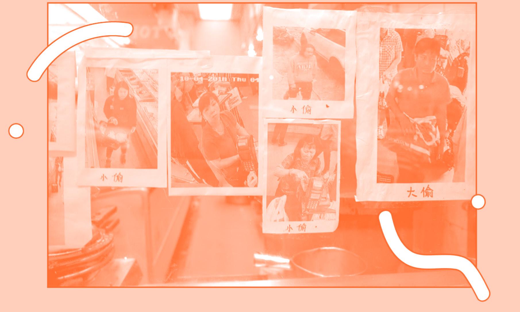
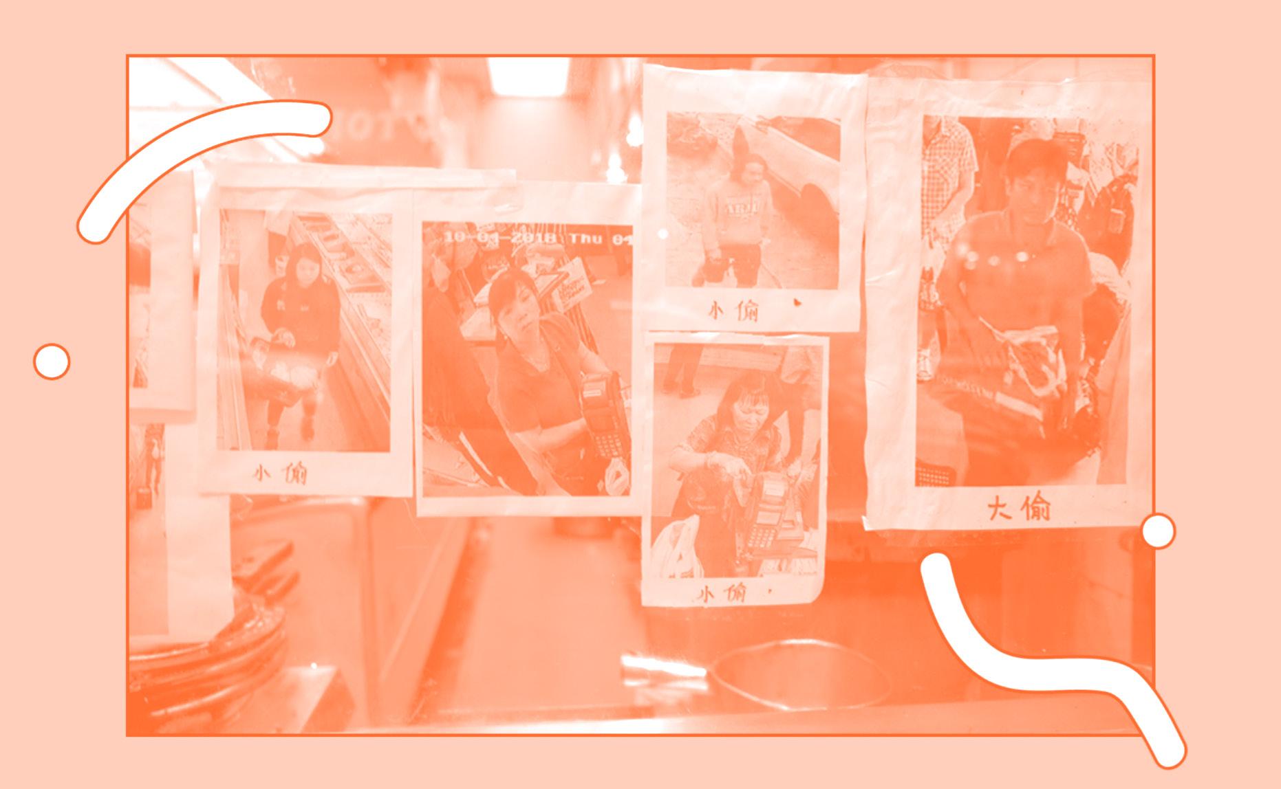
Tracy Ma, Mega shade- small time and big time thieves postd on the window of Deluxe Food Mart
Source: AIGA Eye on Design
NEON TO NEW YORK
My Journey from Hong Kong’s Neon Glow to New York’s Chinatown
Growing up in Hong Kong, I was surrounded by signs that buzzed and hummed above me, neon strokes lighting up the humid night sky. Each one seemed to have its own personality: some glowing in soft, welcoming greens and pinks, while others pierced the air with bold reds and yellows. The streets felt alive because of them, as if every street corner had its own pulse, its own rhythm of life. These signs were more than just letters to me—they were the heartbeat of my city, each character carrying its own weight of history and identity.
When I was a child, I didn’t think too deeply about the signs that lined the streets. They were simply part of my everyday landscape, like the tram rides through Wan Chai or the sound of Cantonese flling the air. But as I grew older, I started to realize what they represented. In Hong Kong, the neon characters weren’t just functional—they told stories. They were the names of generations-old shops, family businesses passed down through the years, places that had survived political upheaval, migration, and transformation. They were a testament to perseverance.
Now, living in New York, I sometimes fnd myself longing for those neon-lit streets. Though Manhattan ofers its own kind of glow—skyscrapers shimmering against the skyline, the relentless lights of Times Square—it’s not the same. It’s colder, more distant. But when I step into Chinatown, something shifts. Here, the streets narrow, and for a brief moment, I feel like I’m home again.
The signs are diferent, though. Most are simple now, written in plain Chinese characters, red on white, or sometimes green on beige, lacking the artistry and fourish of Hong Kong’s neon. But they still speak to me. There’s something comforting about the Chinese characters I see hanging above the restaurants and herbal medicine shops. In them, I fnd a connection between the past and the present—a sense that heritage isn’t something static, but rather something that adapts and evolves with each new place it lands.
But in New York’s Chinatown, as with Hong Kong, the signs are changing. The handcrafted neon signs that once lined Canal Street are slowly disappearing, replaced by more uniform, less ornate designs. It’s a quiet shift, one that could go unnoticed if you weren’t paying attention. But for me, it’s a reminder of how fragile cultural identity can be—how even the smallest details, like the style of a character or the glow of a light, can be markers of who we are and where we come from.
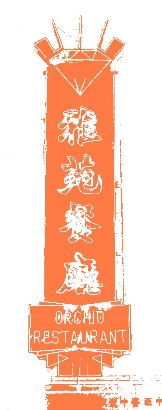
Hong Kong’s neon signs are rapidly becoming a thing of the past. In recent years, many of them have been taken down—due to new government regulations, safety concerns, or simply the march of modernization. Walking through Mong Kok or Central now feels diferent. The vibrant colors that once flled the streets have dimmed, and with them, so too has a part of the city’s soul. I know it might seem dramatic to say that the loss of a sign can signal the loss of an identity, but for me, it feels true. Neon was Hong Kong’s language, and when we lose a language, we lose a way of seeing the world.
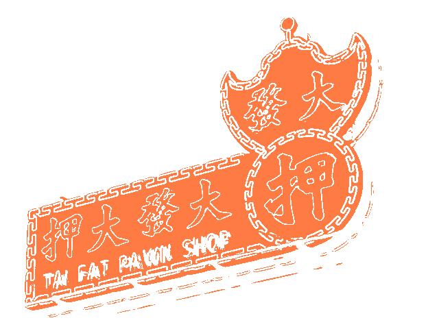
Ubiquitous pawn shop neon sign
Source:Zolita Magazine, https://zolimacitymag.com/forgotten-hongkong-icon-the-neon-master/
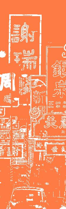
In New York, I see a similar transformation. Chinatown, once a thriving center of immigrant life, is under constant pressure. As the city changes, so too does the landscape of its immigrant communities. The signs that once told stories of migration, resilience, and survival are slowly being replaced by new ones—more sanitized, less personal, catering to tourists rather than the community that built them.
I often wonder what the next generation will see when they walk through these streets. Will they recognize the signs? Will they understand the signifcance behind each character, each stroke? Or will they simply see them as remnants of a past that no longer feels relevant?
As someone who grew up immersed in the language of signs, I feel a responsibility to preserve these stories. Not just for myself, but for the people who came before me, and for those who will come after. Signs, after all, are more than just markers of place— they are markers of identity. In the streets of Chinatown, I see echoes of Hong Kong, but I also see something new—a blending of cultures, a merging of histories. It’s this mix that makes the city so vibrant, so alive.
There’s a quiet beauty in watching how language and typography shift and adapt, how they hold onto their roots while simultaneously evolving to meet the demands of a new environment. The Chinese characters in New York’s Chinatown may not glow with the same intensity as Hong Kong’s neon signs, but they carry the same weight, the same signifcance. They are a testament to a community that has weathered change, that continues to thrive despite the pressures of gentrifcation and modernization.
Perhaps the future will bring new signs, new ways of communicating identity. But for now, I fnd comfort in the characters that still hang above the streets, each one a reminder that heritage isn’t something you leave behind—it’s something you carry with you, wherever you go.
从霓虹到纽约 香港霓虹到纽约 唐人街的旅程库
我在香港长大,周围都是嗡嗡作响的招牌,霓虹灯 照亮了潮湿的夜空。每一个招牌似乎都有自己的个 性:有些散发着柔和、温馨的绿色和粉红色,而另 一些则以大胆的红色和黄色刺破空气。街道因它们 而充满活力,仿佛每个街角都有自己的脉搏,自己 的生活节奏。这些招牌对我来说不仅仅是字母— 它们是我这座城市的心跳,每个角色都承载着自己 的历史和身份。
当我还是个孩子的时候,我并没有对街道两旁的招 牌想得太多。它们只是我日常生活的一部分,就像 穿过湾仔的有轨电车或空气中弥漫的粤语一样。但 随着年龄的增长,我开始意识到它们代表着什么。 在香港,霓虹灯字符不仅仅是实用的—它们还讲 述了故事。它们是世代相传的店铺、多年来传承下 来的家族企业、在政治动荡、移民和变革中幸存下 来的地方的名字。它们是毅力的见证。
现在,我住在纽约,有时发现自己很怀念那些霓虹 闪烁的街道。虽然曼哈顿也有自己的特色—摩天 大楼在天际线上闪闪发光,时代广场的灯光永不熄 灭—但那里已经不一样了。它更冷,更遥远。但 当我走进唐人街时,情况发生了变化。这里的街道 变窄了,有那么一瞬间,我感觉自己又回到了家。 不过,招牌不一样了。现在大多数都很简单,用普 通的中文字写成,白底红字,有时是米色底绿字, 缺乏香港霓虹灯的艺术性和华丽感。但它们仍然在 向我诉说。我看到悬挂在餐馆和草药店上方的中 文字,有一种令人欣慰的感觉。在它们身上,我发 现了过去和现在之间的联系—一种传统不是静止 的,而是随着它落到新地方而适应和发展的东西。 但纽约唐人街和香港一样,霓虹灯也在发生变化。 曾经遍布坚尼街的手工霓虹灯正在慢慢消失,取而 代之的是更加统一、不那么华丽的设计。这是一个 悄无声息的变化,如果你不注意的话,可能根本注 意不到。但对我来说,它提醒我们文化身份是多么 脆弱—即使是最小的细节,比如人物的风格或灯 光的光芒,也可以成为我们是谁、我们来自哪里的 标志。
香港的霓虹灯正在迅速成为过去。近年来,由于新 的政府法规、安全问题,或者仅仅是现代化的进程, 许多霓虹灯都被拆除了。现在,走过旺角或中环的 感觉已经不同了。曾经遍布街道的鲜艳色彩已经暗 淡,随之而去的是这座城市的一部分灵魂。我知道 说标志的消失意味着身份的消失可能听起来很 张,但对我来说,这是真的。霓虹灯是香港的语言, 当我们失去一种语言时,我们就失去了一种看待世 界的方式。
在纽约,我看到了类似的转变。唐人街曾经是移民 生活的繁荣中心,现在正承受着持续的压力。随着 城市的变化,移民社区的面貌也在发生变化。曾经 讲述移民、韧性和生存故事的标志正逐渐被新的标 志所取代—这些标志更加干净、不那么个性化, 迎合游客而不是建造它们的社区。
我经常想知道下一代走过这些街道时会看到什么。 他们会认出这些标志吗?他们会理解每个字符、每 笔画背后的意义吗?还是他们只会把它们视为不再 相关的过去的残余?
作为一个从小就沉浸在手语语言中的人,我感到有 责任保存这些故事。这不仅是为了我自己,也是 为了在我之前和之后的人。毕竟,手语不仅仅是地 点的标志,更是身份的标志。在唐人街的街道上, 我看到了香港的回响,但我也看到了一些新的东 西—文化的融合、历史的融合。正是这种融合让 这座城市如此充满活力,生机勃勃。
观察语言和字体如何变化和适应,如何坚守自己的 根源,同时又不断发展以满足新环境的需求,这是 一种静谧的美。纽约唐人街的中文也许没有香港的 霓虹灯那么耀眼,但它们却有着同样的重量和意义。 它们见证了一个经受住变革的社区,尽管面临着中 产阶级化和现代化的压力,但它仍然蓬勃发展。 也许未来会带来新的标志,新的交流身份的方式。 但就目前而言,街道上方仍然悬挂着的人物形象让 我感到安慰,每一个人物形象都提醒我,文化遗产 不是你抛弃的东西,而是你随身携带的东西,无论 你走到哪里。
Manhattan’s
An Editorial Print
Adaptation of The New York Times
Web Article by Aaron Reiss and Denise Lu
March 11, 2022
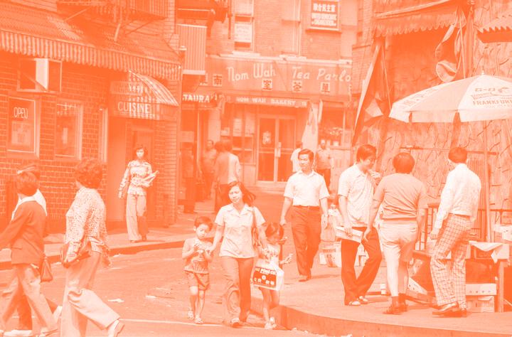
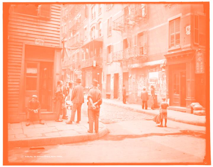
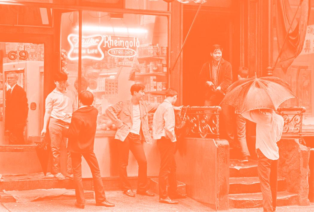
Doyers Street in 1977.Paul Hosefros/The New York Times
For more than 100 years, residents of Manhattan’s Chinatown have given the streets informal names using a variety of Chinese dialects.
100多年来,曼哈顿华埠的居民用中国 各地方言给街道起了非正式的名字。
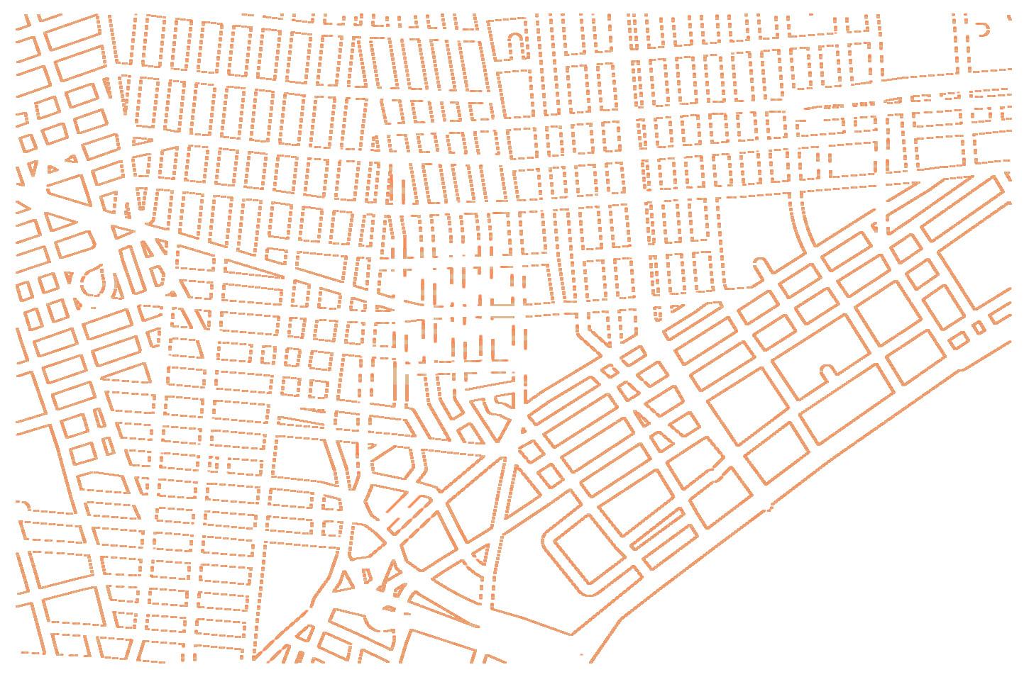
Map of Chinatown, Source: New York Times https://www.nytimes.com/interactive/2022/03/11/nyregion/nyc-chinatown-signs.html
As with many neighborhoods in New York City, Chinatown has a history that is legible in layers. Here in Lower Manhattan, Republic of China fags still futter above the ofces of family associations that were founded before the Communist Revolution. Job posting boards covered in slips of paper cater to recent immigrants. Instagrammable dessert shops serve young locals and tourists alike. “For Rent / 出租” signs are everywhere, alluding to the vshrinking number of Chinese businesses and residents.
In the 1960s, the city installed street signs featuring both English and Chinese, giving official Chinese names to streets in the heart of Chinatown.
1960年代,纽约市安装了中英文路标, 给华埠中心的街道起了正式的中文名。
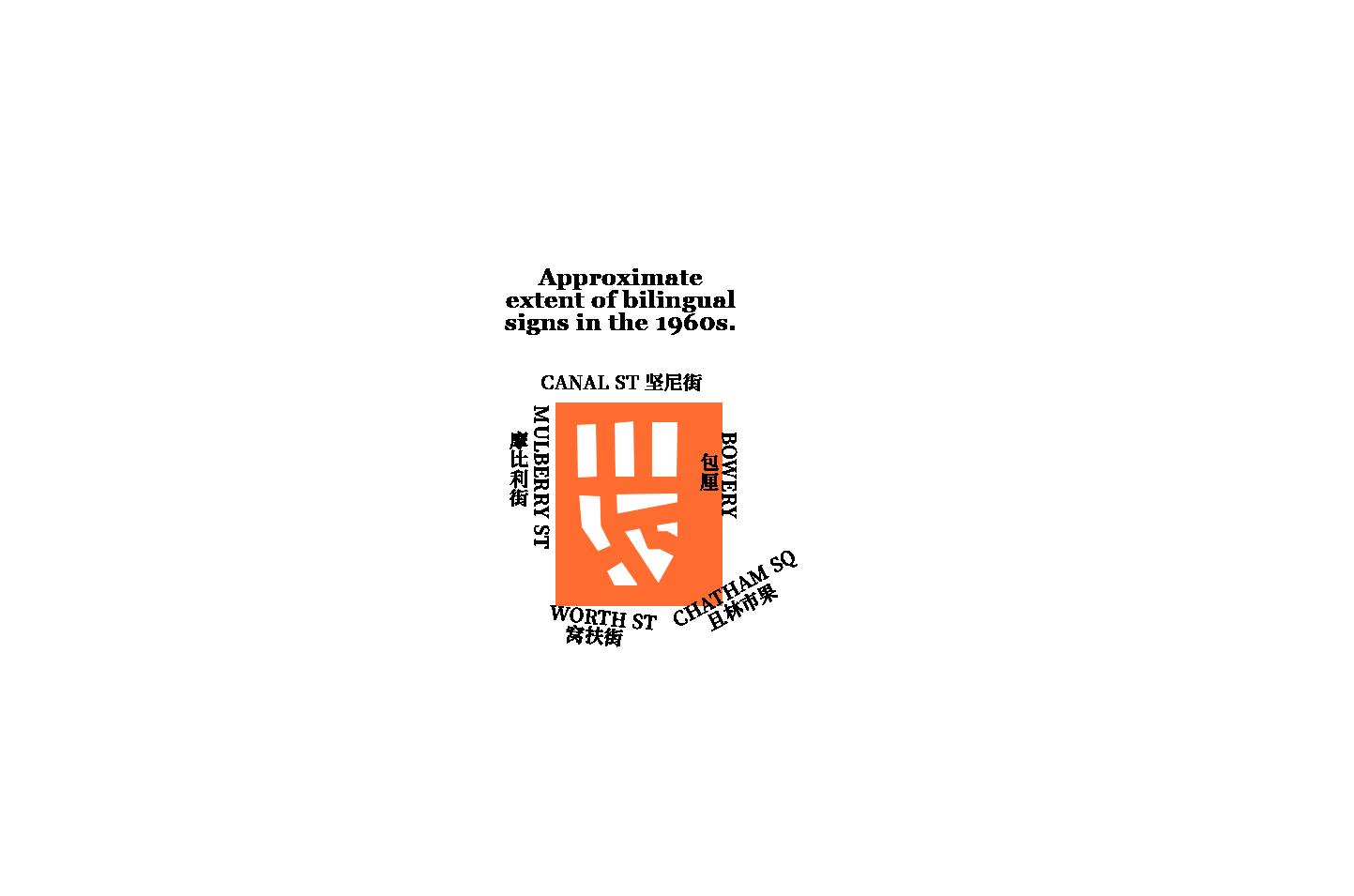
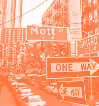
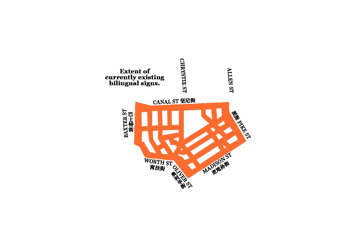
And above a dwindling number of intersections hang signs declaring the names of the street in English and in Chinese. Bilingual street signs have hung over the bustling streets of the city’s oldest Chinatown for more than 50 years. They are the product of a program from the 1960s aimed at making navigating the neighborhood easier for those Chinese New Yorkers who might not read English.
In 1985, the program was expanded to reflect the neighborhood’s rapid growth. At least 155 signs were ordered to be printed.
1985年,该项目扩大,以反映社区的 快速发展。至少155个标牌被下令制作。
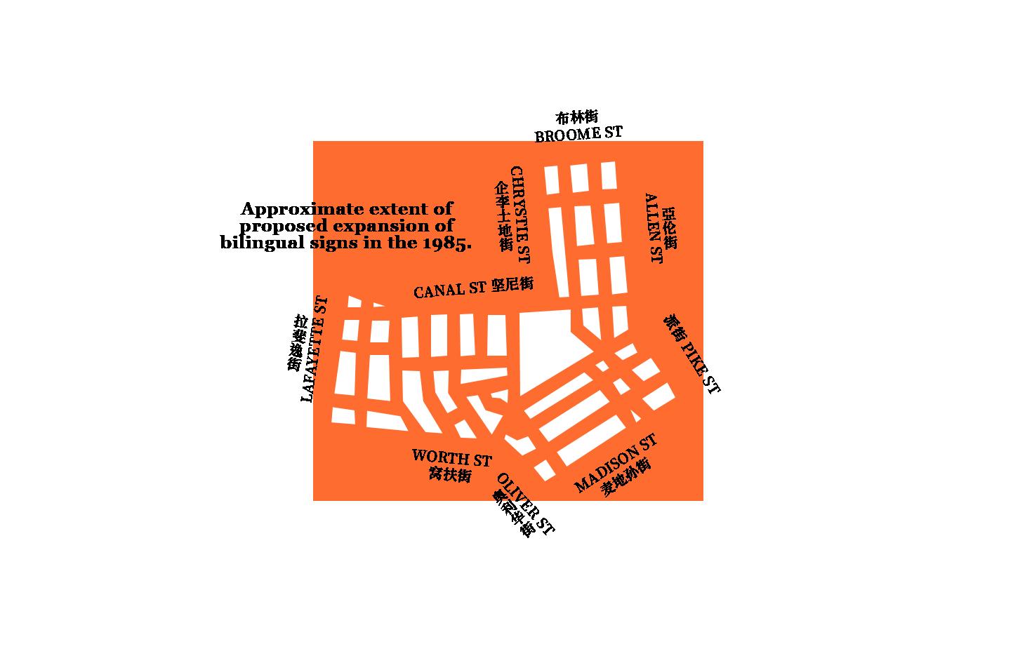
These signs represented a formal recognition of the growing infuence of a neighborhood that for more than a century had largely been relegated to the margins of the city’s attention. But as the prominence of Manhattan’s Chinatown as the singular Chinese cultural center of the city has waned in the 21st century, this unique piece of infrastructure has begun to slowly disappear.
Today, the Chinese population in Chinatown is shrinking. And with it, the number of bilingual street signs, as old signs get removed or replaced with English-only signs.
文化遗产的痕迹
颜 海 宁
传 承 中 的 作 用
探 索 汉 字 在 文 化