5 minute read
COLOUR CUES Be inspired to redecorate with the latest trends and palettes


Colour cues
NEED INSPIRATION TO BRIGHTEN YOUR HOME WITH PAINT? FOLLOW OUR GUIDE TO CHOOSE THE RIGHT HUE FOR YOU
Words CAROLINE BOTTING
Colour often reflects how we want to live and feel, whether it’s at home or at work. And perhaps now, more than ever, colour is having an important influence on our lives. As Dulux colour expert Andrea Lucena-Orr says, “We have all reacted to the upheavals of the last couple of years in different ways – some people crave lightness and whimsy, while others seek order and reassurance.”
Here, we look at what hues will set the scene for 2023 and show you how to make an impact – whether you decide to go bold, or stay on the more reserved side of the spectrum.
Raise a smile with gelato-like pastel shades from Dulux’s new Revive palette: Perplexed on the island and Paper Brown on the feature wall
The new palettes
According to the Taubmans trend report for 2022-2024, we’re set to see “a celebration of bright, bold colours at a time when their positive influence is needed most”. The Chromatic Joy palette of playful hues, which suggests optimism and positivity, is key to reflecting this.
Rachel Lacy, colour category manager at Taubmans, explains, “The pared back, bright white spaces of minimalist design make way for comforting and joyful colour. Riot of Sunlight, Glowing Bars, Beautiful and Bright, Torc of Gold, Early Leaf and Everything Is Going To Be Alright are all perfect choices for bursts of colour.”
Porter’s Paints Squid Ink is a deep, dramatic choice that complements timber accents

Mood-lifting hues also emerge in Dulux’s 2023 Revive palette, including rose pink, breezy blue, sunshine yellow, emerald green, violet and burnt orange. Described as “retro futuristic”, they make a statement – so are ideal for accent walls.
Melanie Stevenson of Porter’s Paints reveals the brand’s oceanic hues of calming blues and greens “inspired by sea and sky” are trending. “Colours of the ocean, from palest greens to saturated jewel tones, not only deliver serenity and calm, but also a sense of optimism and restoration,” she says.
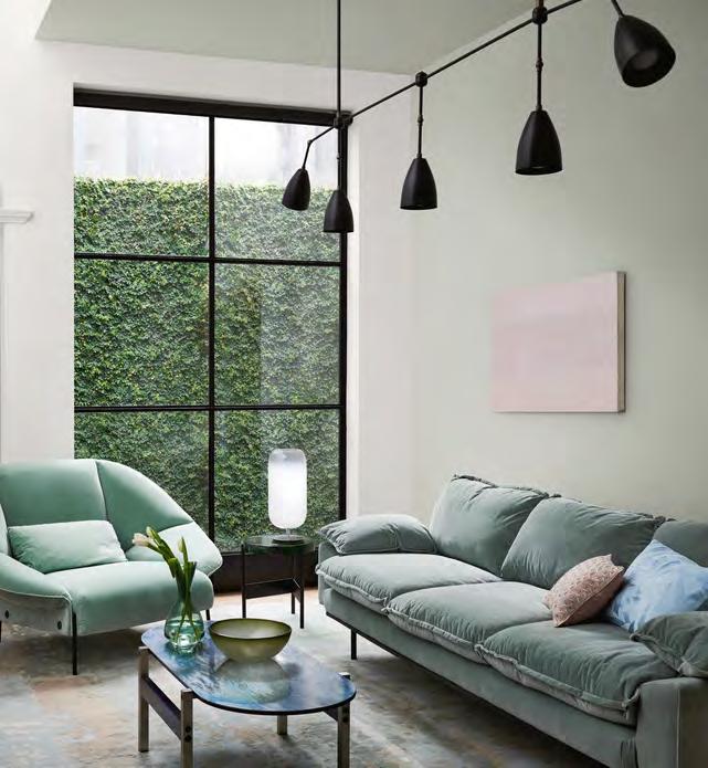
Marine blues, gentle greens and accents of deep garnet are also reflected in the Dulux 2023 Balance palette. “Balance is very much inspired by a ‘less is more’ philosophy,” says Andrea Lucena-Orr. These colours are the perfect complement to luxe textures including velvet and silk, and furniture with exaggerated, curved silhouettes.
Warm, earthy tones of sandstone, moss, wasabi, muddied yellow-green and charcoal also come through in the Dulux 2023 Connect palette. These colours may appeal to those who seek “calm, comfort and a simple approach to living,” explains Andrea.


Choosing your shade
If you’re not confident with embracing colour, choosing it and using it can be hard. “Look at the area you want to paint and explore how you and your family use and enjoy the space,” explains Rachel Lacy. “If it’s a bedroom, you will be looking for a different feel compared to a living room or bathroom.” She suggests seeking
BOLD & BUBBLY
Bring a lighthearted look to your scheme
Dulux Pharaoh’s Gem
Taubmans Beautiful and Bright Taubmans Torc of Gold
Porter’s Paints Gulf Stream
Recreate this sweet look with Kaboodle Kitchen raw board ‘Alpine’ profile cabinetry in Taubmans Clouds Flying paint
Andrea Lucena-Orr, Dulux
inspiration online. Andrea agrees and says people will usually either be drawn to images showing light and airy spaces or, conversely, darker, cosy spaces and colours that draw you in. “Then you have to take the functional use of the space into consideration,” she says. “You would probably want a working room (such as a kitchen or laundry) to be light and bright to enhance the work and time spent in this area. Whereas in a bedroom or living room you may want to feel secure and cocooned, hence a darker colour may be perfect for these spaces.”
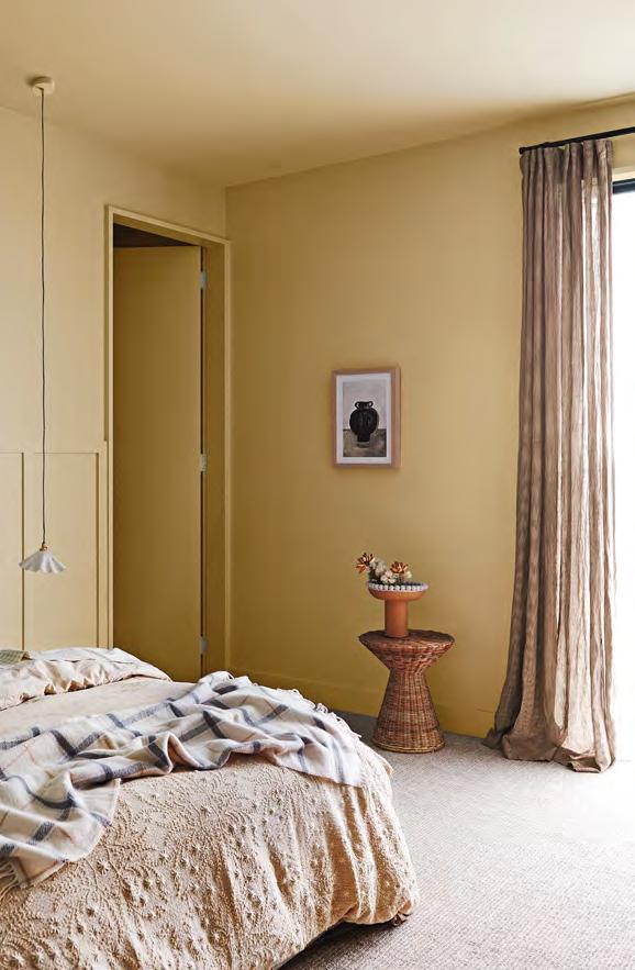
Dulux Beaten Track from the Connect palette lends these bedroom walls a warm glow Bring nature indoors by painting a feature wall in a soft green, such as Dulux Green Alabaster Half from the Balance palette
Colour conundrums
What if you love colour but are not sure how to use it? The easiest place to begin is often a bedroom, suggests Andrea. “This personal space is not an area your guests walk through, so you can completely colour without barriers or external critique,” she says. Start with a wall behind your bedhead as the focal point.
“Another great area is your front door, as it’s a quick project and creates a wonderful first impression for anyone entering,” she says.
Use pops of colour in unexpected places, suggests Rachel. “Painting a window reveal [the surface inside the architrave] is a lovely way to bring colour into a space. It looks considered and gives a feeling of confidence,” she says. “The inside of a wardrobe, cupboard or a pony wall [short wall] or vestibule can become a wonderful pop of colour that will bring joy each time you see it.”
Light matters
This will have a big impact on colour, so it’s vital to study how light works throughout the day in the space. Use a test pot to paint a large card to move around. But don’t line tester colour cards up beside each other as this will influence their appearance.
“You also need to view colour at different times of the day with natural lighting, to see it in full sun and shadows or even in diffused light, as well as under artificial lighting at night which can make a huge impact,” says Andrea. “Consider any surrounding colour and existing fixtures and fittings, such as your sofa, curtains or blinds, flooring, as well as any kitchen or bathroom materials, like stone, tiles, laminates etc.”
Texture effect
Surfaces will also affect colour – they absorb and reflect light in different ways, so should be considered in your final palette choice. “Texture often makes the colour have more depth as it changes the light-reflectance qualities,” says Andrea. “You also get shadows interacting with the colour, so it can change when viewed from different angles. It often gives a more natural look to the colour as well, especially with those earthy and muddied colours.”
CALM & COCOONING
Embrace the earthy for a relaxed vibe
Porter’s Paints Mist
Taubmans Everything Is Going To Be Alright
Taubmans Cliffs of Dover
Dulux Wasabi