1 minute read
BSB logos over the decades


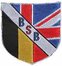
BSB has designed and launched three different logos over the five decades of its history. In 2007 the current BSB logo, fondly referred to as the “swoosh” was created. It was designed by some senior BSB students, together with an external design agency.
The first a ‘shield’ which was introduced in the 1970s, and the second logo was introduced during the 1990’s as seen below.
Advertisement
The red swoosh depicts a journey or path that each member of the BSB community travels along; a pathway of learning.
It doesn’t matter how long or short you stay at BSB, the memories remain with you forever.
#BSBforever was introduced in 2019 as part of a new advertising campaign.

For our special 50 th anniversary a simple and classic design is used.

And here are some logos that didn’t make it!