17 minute read
Jeffrey Haydock

The Impact of Sectoral Performance on the Stock Market: Does Volatility Equal Explanatory Power?
Jeffrey Haydocka
Abstract:
This paper investigates the real impact of sector performance on the overall stock market and the possibility that the primary culprit of negative or positive performance isn’t necessarily the one that significantly drives overall market performance. The study compares average gain or loss by sector with regression analysis to determine if the largest gainer or loser is also reflected in regression analysis after beta calculation. The results show that there is very limited correlation between the two measures suggesting that major volatility in one sector doesn’t necessarily have the greatest impact on total market movement.
JEL Classification: E44, G11, G14
Keywords: Sector Performance, Market Movement, Volatility.
a Economics Student, Bryant University, 1150 Douglas Pike, Smithfield, RI 02917. Phone: (401) 719-7710. Email: jhaydock@bryant.edu.
The author gratefully acknowledges the help/guidance from Dr. Ramesh Mohan.
1.0 INTRODUCTION
Individual sector performance on the overall stock market has not really been analyzed.
One could argue that this is because logically, the market reacts to news, news which affects any
individual sector, so the relationship should seem quite simple. It is this relationship that I believe
requires further attention. Is logical thought really accurate in this situation? Does Volatility have
Explanatory Power? This is the question that will be addressed.
This study aims to enhance the understanding of the intricate relationship between sector
volatility and actual explanatory power in overall market performance. From a policy perspective,
this analysis is important because if the results show that there is a disconnect in the two measures,
then it could have implications for the accuracy of corrective measures in the market and even
monetary policy. The relevance of this study is that it impacts the investing strategies of countless
investors, as well as the impact the results could have on policy makers. If there is no disconnect
between volatility and explanatory power, then logical thought is correct and we haven’t really
learned much new information. On the other hand, if that disconnect does in fact exist, then this
information immediately becomes valuable.
This paper was guided by two research objectives that differ from other studies: First it
investigates the possibility of a disconnect between sector volatility and explanatory power on
overall market performance. Second, it looks at which sectors tend to have, on average, the highest
levels of volatility and explanatory power as calculated through regression analysis. There tends
to be an absence of research on this specific topic. This paper successfully fills that void. The
rest of the paper is organized as follows: Section 2 analyzes stock market trends over the last eight
years. Section 3 provides a brief literature review on other research papers written on related
subjects. Section 4 outlines the empirical model, data and estimation methodology. Finally, section
5 presents and discusses the empirical results. This is followed by a conclusion in section 6.
2.0 STOCK MARKET TRENDS
While the scope of this paper covers a time period of the last eight years, volatility in the stock
market has been a characteristic since the establishment of stock exchanges. Since the year 2000,
however, we have seen plenty of volatility both in well defined crises and in less aggressive price
swings. The bursting of the tech bubble, along with the current financial crisis are two of the major
occurrences in sell-pressure volatility. The bulls took over at the beginning of 2003, resulting in
constant price appreciation until the recent credit crisis began in August of 2007. Below are three
charts displaying the trends in performance since 2000.
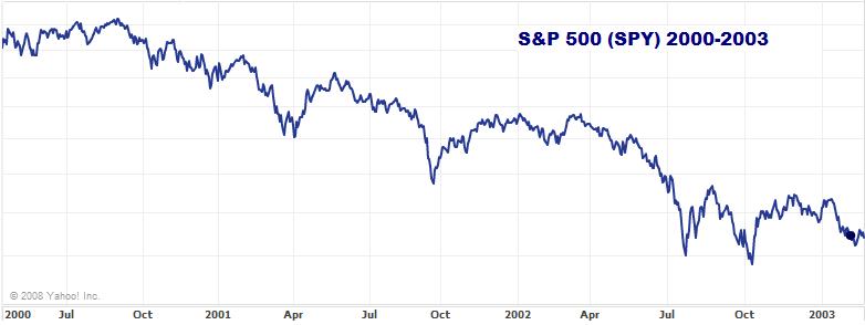
Figure 1:
Source: Yahoo! Finance
Figure 2:
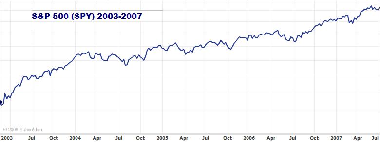
Source: Yahoo! Finance
Figure 3:
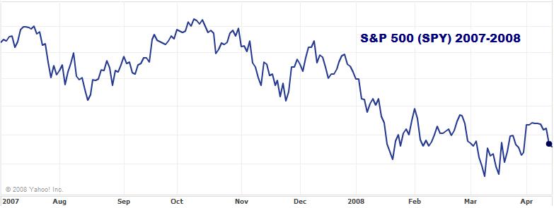
Source: Yahoo! Finance
Based on what the above charts show, it becomes very obvious that this eight year time
range is comprised ultimately of one phase of buy volume sandwiched between two phases of sell
volume. While it is not important in the scope of this paper whether there is buy or sell volume, it
is important that there is volatility and movement in the market, which is established here. It
generally seems to be widely accepted without much of a question as to what determines this
volatility. When the tech stocks tanked, we assumed the market was down because of the
technology sector. Now, in the midst of a financial crisis, we are assuming that the market is down
because of the sell pressure on financial stocks. But is that really the truth? That question is
ultimately what we are looking to answer in this research paper. When the market has a significant
price swing, what is actually the cause? An eight year performance chart of the S&P 500 (SPY)
has been broken down into twenty-three “significant price swings” or as they will be referred to
moving forward, “ranges.” Embedded in the chart as a black line is a sixty week moving average
which helps determine these ranges. Each time the moving average intersects the performance line,
the high and low point on either side is noted to determine a range. These ranges are marked out
in the chart below with vertical red lines.
Figure 4:
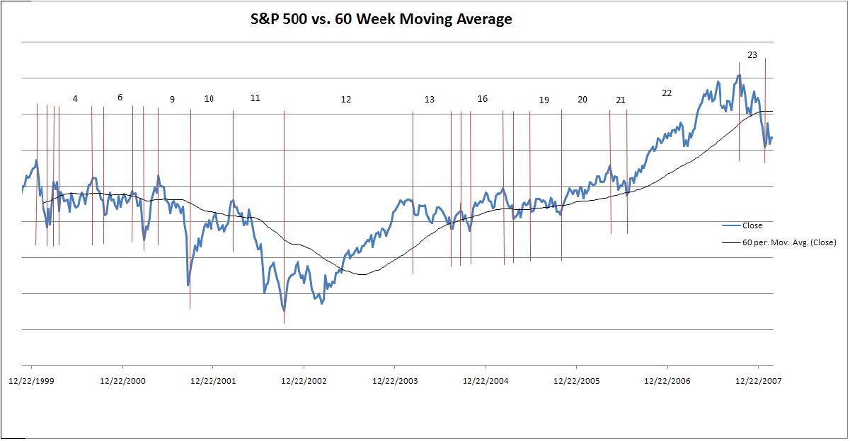
Source: Author Compilation with data from Yahoo! Finance
The ranges determined statistically significant after regression analysis are numbered in
the above graph. These are the ranges that will receive additional analytical attention in the
remainder of this research paper. Included as Appendix B is a table outlining the exact dates of
each data range. Outlined in Table 1 is the breakdown of statistically significant and insignificant
ranges:
Table 1: Corresponding time range breakdown to Figure 4.
Statistically: Range: Significant 4 6 9 10 11 12 13 16 19 20 21 22 23 Insignificant 1 2 3 5 7 8 14 15 17 18
3.0 LITERATURE REVIEW
Stock market volatility is a widely researched concept, with many different attack angles.
According to Is There a Positive Relationship between Stock Market Volatility and the Equity
Premium?(Kim, Morley & Nelson, 2004), volatility feedback is the idea that an exogenous
change in the level of market volatility initially generates additional volatility as stock prices
adjust in response to this new information about future discounted expected returns. Ultimately
this means that premature concerns about weak earnings reports results in high sell volume and
downward pressure on stock prices.
Another offered possibility in Daily Stock Market Volatility: 1928-1989 (Turner &
Weigel, 1992) suggests that most volatility is attributable to trading in the derivative markets.
This makes sense presently, as there has been high volume trading in the options markets, as well
as short selling of financial stocks. This explanation fits the bill as the financial sector has been
the most volatile in recent months.
One could also argue that volatility is due to movement in international stock markets,
with the idea that markets need to “decouple.” However, in Volatility and Links between
National Stock Markets (King, Sentana & Wadhwani, 1994) it is found that international markets
are not quite integrated and have low correlation. While that paper is a bit outdated especially
given recent developments in the concept of decoupling, their findings hold significance in the
idea of volatility.
Unfortunately, there is a lack of literature regarding stock market sector performance, but
that is the benefit of this paper, as we will analyze sectoral performance on the stock market.
4.0 DATA AND EMPIRICAL METHODOLOGY
4.1 Definition of Variables
SPYr = β0 + β1XLFr + β2XLKr + β3XLIr + β4XLVr + β5XLYr + β6XLPr + β7XLEr + β8XLUr +β9XLBr + ε
SPYr represents the Standard & Poor’s 500 index for time period, or range “r.” This is the
dependent variable, and is the benchmark used in this study to approximate overall stock market
performance. All of the independent variables are representative of each sector of the stock market
over different ranges, or “r.” XLF is the benchmark for the financial sector, XLK = Technology
sector, XLI = Industrials, XLV = Healthcare, XLY = Consumer Discretionary, XLP = Consumer
Staples, XLE = Energy, XLU = Utilities, and XLB = Materials. To sum it up, Table 2 displays
each variable and what it represents.
Table 2
Variable SPY XLF XLK XLI
Description S&P 500 Financial Sector Technology Sector Industrial Sector XLV Healthcare Sector XLY Consumer Discretionary Sector XLP Consumer Staples Sector XLE Energy Sector XLB Materials Sector XLU Utilities Sector
These benchmarks are all designed to track performance of each individual sector, and are
actual Exchange Traded Funds (ETFs) available for trading on the stock market. The acronyms
used as variables are actually ticker symbols for each ETF and can be reviewed on any financial
website or the website of their creator, www.sectorspdr.com. They are constructed with
approximately 50 companies that are considered major players in their respective sectors.
4.2 Data
The study uses weekly closing price data from January 10th, 2000 through January 14th, 2008. Data
were obtained from the Yahoo! Finance website. This weekly data for the SPY was then plotted
and graphed, and a 60 week moving average was plotted along the line. Ranges of time were
identified by looking for time periods where the moving average crossed the SPY line. These time
ranges are considered significant price swings in the SPY, and thus qualifying these ranges for
analysis. A 60 week moving average was used for two reasons; first, because betas for individual
stocks are typically calculated on a 60 month basis, but since 60 months in this case represents
over half of the total time range, it was reduced to 60 weeks. Second, a 60 week moving average
eliminates most of the smaller and less important price swings in the SPY.
Ultimately, twenty-three ranges were identified (see Appendix B for exact breakdowns),
and the weekly closing prices downloaded from Yahoo! Finance were divided into those ranges
for the SPY as well as all of the independent variables. Week over week percentage price changes
were calculated and these numbers were used as inputs for the X and Y variables in the regression
equation. A regression was run for each individual time range, totaling twenty-three regression
outputs. The regressions without enough observations or statistically insignificant were discounted
and removed from analysis, leaving thirteen of the original twenty-three outputs.
Once the Regression analysis was completed, the average gain or loss for each sector (X
variables) in each range was calculated. This is necessary because we are comparing the largest
gaining or losing sector with the highest correlation coefficient in each range to determine if there
is consistency between the two measures. Gain or Loss is our measure of volatility, while
correlation coefficients are the measure of explanatory power. Remembering that the key question
we are trying to answer here is if volatility equals explanatory power. If it does, then we should
see the most volatile sector in each range also have the highest correlation coefficient for that
range.
5.0 EMPIRICAL RESULTS
The results of the data analysis are astounding. Of the thirteen data ranges, only two showed
consistency in variables from % Gain or Loss (Volatility) to Highest Correlation Coefficient
(Explanatory Power). This suggests that sector volatility in this sample has very little to do with
explaining overall market performance, and thus, completely negating what I would have
expected. The major concern and implication of this in monitoring and aiding financial markets is
that we may be implementing the wrong solutions, simply because we have not correctly identified
the problem. This is particularly troublesome in range twenty-three. This range covers October 8th ,
2007 through January 14th, 2008, the primary period of losses due to subprime writedowns and the
credit crunch.
While the XLF shows the greatest loss (volatility) of any sector during that period,
regression analysis suggests otherwise. Regression shows the XLY, or consumer discretionary
stocks, as the most explanatory in accounting for market performance over the aforementioned
time period. This does make sense, as economists had been speaking of recessionary fears during
that time, scaring consumers from spending, ultimately causing those companies to suffer the most.
However, my concern here is that the initial problem was thought to have been clearly identified
as financial companies experiencing turmoil. That turmoil, being felt immediately, should
logically be most explanatory for market performance, but instead, the expected troubles in the
future earnings reports for consumer discretionary companies is what best explains market
performance during this time. What could this tell us? Perhaps brokers, hedge funds, mutual funds,
and institutional investors are more afraid of what could happen in the future than they are of
what’s happening right now. Or maybe they recognize that there’s more than just one leak in the
pipeline. Either way, it’s concerning that there isn’t more consistency from Volatility to
Explanatory power. Table 3 outlines the results:
Table 3
Column 1 Column 2 Column 3
Volatility Explanatory Power
Range Variable with Greatest % Gain or Loss % Gain or Loss Variable with Highest Correlation Coefficient
Four Financials 0.84% Technology
Six Cons. Discretionary 1.89% Cons. Staples Nine Technology -1.88% Financials
Ten Cons. Discretionary 1.54% Financials Eleven Technology -2.11% Cons. Staples
Twelve Technology 0.77% Technology
Thirteen Technology -0.49% Financials
Sixteen Energy 1.07% Industrials
Nineteen Cons. Discretionary -0.29% Financials
Twenty Materials 0.89% Financials Twenty-One Technology -1.19% Materials Twenty-Two Technology 0.52% Technology
Correlation Coefficient 0.399 0.452 0.263 0.229 0.227 0.184 0.313 0.303 0.258 0.28 1.509 0.203 Twenty-Three Financials -2.17% Cons. Discretionary 0.794 Column 4
Sector Consistency? No No No No No Yes No No No No No Yes No
Column 1 identifies each data range, as these were the ranges resulting in statistical
significance. Column 2 is our Volatility column, identifying which sector was the most volatile
during the given time range. Volatility is measured in % Gain or Loss for the given range. Column
3 is the measure of Explanatory Power, identifying the sector with the most explanatory power as
found through regression analysis. Explanatory Power is assigned by the correlation coefficient of
the sector with the market, and is listed in the corresponding column. Column 4 simply determines
if there is consistency in our measures across sectors. In other words, “Yes” means the most
volatile sector is also the one with the most explanatory power, and “No” is vice versa. The two
highlighted rows are the only data ranges with sector consistency.
Based on the results, we can also compare a volatility index with an explanatory index to
show the relationship between the two and find if there is any consistency in variables and their
overall contribution to either measure. Table 4 outlines which sectors (variables) were most
frequently calculated as the leader in volatility in Column 2 of Table 3. Table 5 outlines which
sectors (variables) most frequently produced the highest correlation coefficients in Column 3 of
Table 3, and thus, have the most explanatory power. Tables 4 and 5 are below:
Table 4 Table 5
Volatility Breakdown
Volatility Ranking Variable Volatility Leader % 1 Tech 46.15%
2 3
C.D. 23.08% Fin’ls 15.38% 4 Energy 7.69% 4 Mat’ls 7.69% Explanatory Breakdown Explanatory
Ranking Variable Explanatory Leader % 1 Fin’ls 38.46%
2 Tech 23.08%
3 4 4
C.S. Ind’ls Mat’ls 15.38% 7.69% 7.69%
4 C.D. 7.69%
The “Leader %” columns show the frequency with which any one variable appears as the most
volatile or as having the most explanatory power. This shows that in this sampling, Technology
and Financial stocks are major market movers while Consumer Discretionary stocks are secondary.
This information is important in that day traders and investors using technical analysis, option
investors, and short sellers can expect to make the most money, and have the most opportunities
to profit by focusing on tech and financial stocks. This is because all of these types of investors
thrive on volatility and movement. When the market moves sideways with no vertical movement,
these investors lose money.
One perfect example of the policy implications that have been discovered by this study is
illustrated in Range 23. This time period is the bulk of the credit crunch that began in the summer
of 2007 through the beginning of 2008. Our volatility leader was found to be financials, which
logically makes sense. On the other hand, the sector found to have the most explanatory power is
actually consumer discretionary. This, also makes sense, but the problem is that there is no sector
consistency here. Consumer Discretionary stocks are generally hit the hardest during recessionary
times, which explains why they had the most explanatory power in this recent time range. The
issue is that these companies are affected most by consumer sentiment, and there were no
preventive or corrective measures taken to ease and comfort consumers. Instead, we saw rate cut
after rate cut to bail out banks and financial institutions. This study proves that that course of action
was an error in judgment. The Fed believed that financial companies were driving the market,
when in reality, consumer discretionary companies such as Best Buy or Home Depot were the
actual root of the market movement. Instead of rate cuts, we should have taken measures to control
inflation, and maintain a favorable exchange rate. Instead, we saw the complete opposite.
6.0 CONCLUSION
Ultimately, we have determined that just because one sector moves the most in a given
time range, chances are that it does not actually have the greatest impact or explanatory power on
overall market performance. My expectations were proven to be inaccurate; however, this
information can certainly create profit opportunities or avoid losses for investors with the
perspective to realize these opportunities. By knowing and understanding that volatility is only the
surface of the movement and that it does not identify which sector is the root of the market
movement, we become investors with a deeper and more skeptical vision of investing.
These results also imply that taking corrective measures in periods of market turmoil may
not address the actual rooted problem. Therefore, taking drastic action without sufficient
information and analytics could further deteriorate markets, or delay recovery. If we look
specifically at the most recent data range, which covers the credit crisis of the last few months, we
can see that consumer discretionary stocks are actually the most impactful on the market. So in
terms of policy implications, one must consider the possibility that rate cuts to bail out financial
firms may not have been the most prudent decision. If consumer spending is what really drove the
market, then the Fed should have focused more on inflation and the value of the dollar. Hindsight
is 20/20, however, and perhaps this new information could be of some assistance in future policy
decisions. While this paper doesn’t offer a step-by-step solution to what the real determinants of
market movement are, it does prove that there is more analysis required to create and implement
an accurate and efficient solution. We have found that volatility does not equal explanatory power,
and thus, finding the most volatile sector and attempting to ease this volatility is not the needed
solution.
Appendix A: Variable Description and Data Source
Acronym
SPY
XLF
XLK
XLI Description
S&P 500 ETF, tracking the performance of the S&P 500
ETF designed to accurately track the Financial Sector
ETF designed to accurately track the Technology Sector
ETF designed to accurately track the Industrial Sector
XLV ETF designed to accurately track the Healthcare Sector
XLY ETF designed to accurately track the Consumer Discretionary Sector
XLP ETF designed to accurately track the Consumer Staples Sector
XLE ETF designed to accurately track the Energy Sector
XLU
XLB ETF designed to accurately track the Utilities Sector
ETF designed to accurately track the Materials Sector Source Yahoo! Finance Yahoo! Finance Yahoo! Finance Yahoo! Finance Yahoo! Finance Yahoo! Finance Yahoo! Finance Yahoo! Finance Yahoo! Finance Yahoo! Finance
Appendix B – Range Breakdowns
Range # From To
1 1/10/2000 2/22/2000
2 2/22/2000 3/20/2000
3 4 5 6 7 8
3/20/2000 4/10/2000 4/10/2000 8/28/2000 8/28/2000 10/9/2000 10/9/2000 1/29/2001 1/29/2001 3/19/2001 3/19/2001 5/14/2001 9 5/14/2001 9/24/2001 10 9/24/2001 3/11/2002 11 3/11/2002 9/30/2002 12 9/30/2002 3/1/2004 13 3/1/2004 8/2/2004 14 8/2/2004 9/13/2004 15 9/13/2004 10/11/2004 16 10/11/2004 2/28/2005 17 2/28/2005 4/11/2005 18 4/11/2005 6/13/2005 19 6/13/2005 10/17/2005 20 10/17/2005 5/1/2006 21 5/1/2006 7/10/2006 22 7/10/2006 10/8/2007 23 10/8/2007 1/14/2008 Green dictates the ranges with valid regression outputs
BIBLIOGRAPHY
Kim, Chang-Jin; Morley, James C.; Nelson, Charles R.; (2004), “Is There a Positive Relationship between Stock Market Volatility and the Equity Premium?” Journal of Money, Credit and Banking, Vol. 36, No. 3, Part 1, pp. 339-360. Turner, Andrew L.; Weigel, Eric J.; (1992), “Daily Stock Market Volatility: 1928-1989” Management Science, Vol. 38, No. 11, Focused Issue on Financial Modeling, pp. 15861609.
King, Mervyn; Sentana, Enrique; Wadhwani, Sushil; (1994), “Volatility and Links between National Stock Markets” Econometrica, Vol. 62, No. 4, pp. 901-933. Yahoo! Finance. Mar. 2008 <http://finance.yahoo.com>.
