Welcome to your brand manual.
Think of this as your adventure guide to Leveled Up Learning’s brand. It will take you on a journey through our brand story, logo, colors, fonts, design assets and usage guidelines. As you explore our visual branding, you’ll learn new skills to help you present Leveled Up Learning in consistent, professional, and creative ways that enhance viewers’ connection with the brand.
This guide is written for designers and non-designers alike. Look for the treasure chest icon to connect with tech tips for using software such as the Adobe suite to help create great results.
One note before we get started: This guide distinguishes between fully branded media, which should follow the guidelines in this manual, and genre media, which doesn‘t need to. Genre media includes our themed game materials, which have their own aesthetic and style to match the in-game world. See page 18 for more information about genre media.
Using this manual ensures that every interaction with our media connects clients to the playful, creative and adventurous spirit of Leveled Up Learning!
Now you’re ready for your mission: To create awesome, on-brand media!

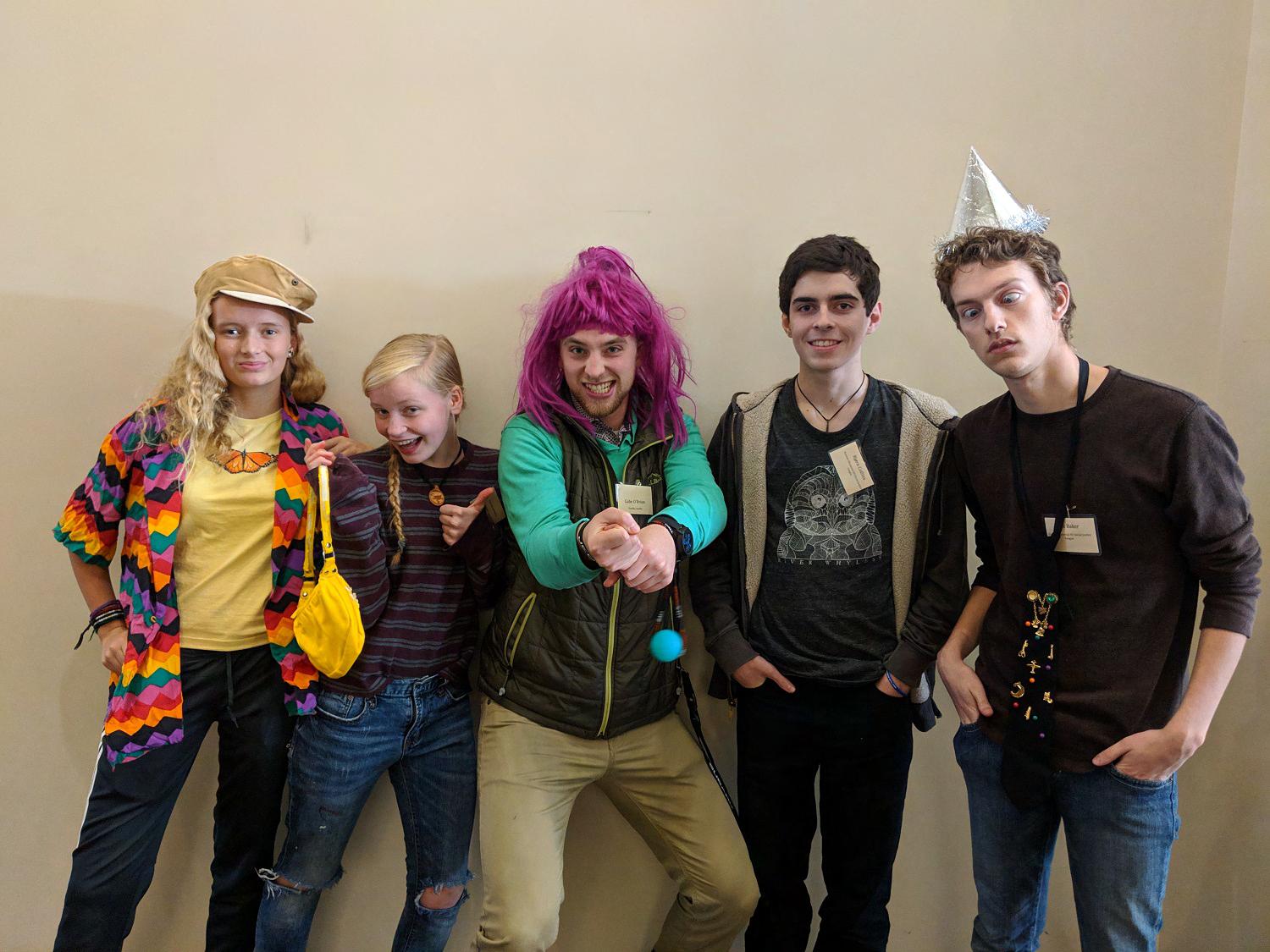

Leveled Up Learning “began” when I was five years old. My brothers introduced me to Dungeons & Dragons (D&D), and I created a Hafling Rogue named Shodow - mainly because I couldn’t spell Shadow. Despite my joy of learning, I struggled in school. I didn’t feel smart; it was hard for me to sit in a chair for minutes, let alone hours; and the curriculum didn't always feel relevant. But when I would open the D&D core rule book, I wanted to learn how to read!
Fast forwarding to many years later, I found myself at The Strong Museum in Rochester, New York. Painted on the wall outside of the Toy Hall of Fame in rainbow-colored font is the quote by Diane Ackerman, “Play is our brain’s favorite way of Learning.” And I love to learn.
Play, in all forms, can provide important learning opportunities. Legos offer an outlet that encourages creativity, team sports can teach collaboration and roleplaying games like D&D can cultivate empathy. The responsibility of the positive development of young people shouldn’t always fall into the hands of schools. The challenges facing the education system continue to grow as we navigate funding cuts, social isolation, mental health needs, and various other issues.
In partnership with schools and community organizations, Leveled Up Learning develops systems of support to promote the wellbeing of students, teachers, administrators and communities. Our programming is designed to augment existing school learning with tailored resources and training. Additionally, by partnering with community organizations we aim to build a network of school partners that support out-of-school learning and skill development. Above all else, we want to unlock the fun and excitement that is inherent to learning.
Leveled Up Learning is dedicated to the development of individuals and ideas through the power of play. We put young people in charge of their own learning, while encouraging them to pursue their curiosities. Join us and level up your learning.
G��� O’B���� Founder
A flexible, creative logo system for a flexible, creative brand.
The logo system consists of a logo mark and logotype, which can be presented together in a vertical format, a horizontal format, or a “distanced” or separated format. The logo mark can also be used alone as an icon, profile picture, or continuity marker.
The Logo Mark
The logo mark is a hexagon with the left side resembling, to those familiar, a D-20 die commonly used in tabletop roleplaying games (TTRPGs). The right side resembles the side of a cube (viewed in perspective) with a maze or puzzle inscribed on it, which also spells out Leveled Up Learning’s initials.
The overall effect joins two three-dimensional shapes, evoking TTRPGs on the left and video gaming on the right, emphasizing the way that games, puzzles and play are central to Leveled Up’s work in both spheres of gaming.
For those unfamiliar with gaming, the mark may look like an interesting abstract shape or monogram logo.
The Logotype
The logotype uses brand font Made Tommy, a friendly sans serif with balanced curves and fixed-width strokes.
The words ‘Leveled’ and ‘Up’ have been joined together to form an upward arrow, speaking to the way that Leveled Up Learning helps communities of learners grow and succeed together - while also reinforcing the concept of “leveling up” in the brand name.
LEARNING
Square Format
When the available space is square or tall, and large enough that all parts of the logo will be easy to see and understand, use the Square Format. If the space is not large enough for the square format logo to be seen clearly, just use the Logo Mark by itself (pg. 8).
6 logo system
Use the wide format for wide spaces.
Wide Format logo
system
Always scale the logo up or down proportionally. In Adobe programs, hold down Shift and drag on the corner of the bounding box to resize proportionally.
Logo Mark and Mini Mark
The logo mark is perfect for a wide variety of spaces. It should be the only logo format used for small spaces. See Logo Usage Guidelines for more guidance. Profile pictures, icons, continuity markers within documents, and other small-size logo instances use the logo mark format.
The Mini Mark is an option for representing the brand in extremely small spaces, such as a Twitch digital token and favicon (an icon used in web design which often appears next to a website’s name in its tab.)
The separated format is an option where both parts of the logo are displayed, but there is horizontal distance between them. One example is as a continuous design element within a document placed in the header or footer. In this case, the Logo Mark should be placed in the left corner of the page, and the Logo Type placed horizontally level in the right corner. To align these elements, they should be centered over the same invisible line.
Separated Format logo system
In Illustrator, use the Align window and select Vertical Align Center to vertically align the center point of two objects or groups. Group and ungroup objects under the Object menu.
Brand Fonts
The Brand Fonts of Leveled Up Learning reinforce the brand with friendly, bold, modern sans-serif text. Always use brand fonts in fully branded media.
Made Tommy Medium Made Tommy Regular
Made Tommy was selected for its clarity, friendliness and approachability.
Made Tommy Medium
Use for headings
Use for Reversed text (Light on dark)
primary brand fonts secondary brand fonts X
Use when bolding words for emphasis
All-lowercase headings are permitted
Made Tommy Regular
Use for body (paragraph) text
LEMON MiLK FONT FAMiLY
Lemon Milk is an all-caps font ideal for small headings and adding visual interest.
Lemon Milk (All styles)
An option for small headings
Adds font variety and interest
Never use for body text
Always embed fonts in documents to ensure the end user can view them. Many programs embed fonts automatically.
Primary Brand Colors
The Primary Brand Colors of Leveled Up Learning are the colors of adventure, exploration and learning! In media which is fully branded, these should be the only colors used.
River Blue is typically used for body text and for the darkest areas. Where you may think to use black, instead use River Blue. Black should not appear anywhere in fully branded media.
Spark Orange is used in small amounts as an accent and to draw attention to important information.
colors & fonts
River Blue
#204283
Spark Orange
Cloud White
Secondary Brand Colors
Dark Adventurine • HEX #46A066 • RGB (70, 160, 102) • CMYK (74%, 15%, 78%, 1%)
Dark River Blue • HEX #1F396C • RGB (31, 57, 108) • CMYK (100%, 87%, 30%, 17%)
Dark Spark • HEX #D84E35 • RGB (216, 78, 53) • CMYK (10%, 84%, 88%, 1%)
Dark Sky • HEX #878dAF • RGB (135, 141, 175) • CMYK (51%, 42%, 16%, 0%)
Light Sky • HEX #F0F1F4 • RGB (240, 241, 244) • CMYK (4%, 3%, 2%, 0%)
These colors are used less often. For areas where shadow or highlight is needed for a brand color, use these shades.
COLOR CODES EXPLAiNED
The brand manual gives codes for the colors in three ways: Hex, RGB (Red, Green, Blue) and CMYK (Cyan, Magenta, Yellow, Black).
Hex codes can be used in most programs and in web design. RGB is used primarily when designing for screens, and CMYK is used for print.
Typically, printed designs will be less saturated and bright, as printed inks can’t achieve the same type of vibrancy as a backlit monitor screen.
11 colors & fonts
Padding
Leaving enough space around the logo ensures that neither the logo nor other text or design elements look crowded. Avoid placing text too close to the logo.
Leave about 1/3 of the width of the logo mark as padding, at a minimum. For the square format logo, you can leave a bit less if desired (as little as 1/4 the width of the logo mark.)
Examples
1/41/41/41/4 1/4
1/31/31/3 1/3 1/31/31/3 1/3
Incorrect Logo Usage
Don’t display the logo in non-brand colors.
Don’t display the logo on backgrounds that don’t provide contrast, such as blue or green.
Don’t stretch or deform the logo. Don’t display the full logo if it is too small to be easily seen.
Avoid layering logos when possible. Instead, use a great photo or brand illustration for the larger image or banner.
13 logo usage guidelines
Companion Character
A COMPANiON TO MATCH OUR HERO
Throughout our adventures, we need companions. Teammates who help navigate challenges, share advice, and keep us company. This becomes even more true when we set on a journey to learn new ideas and/or skills. Learning can be uncomfortable, but you don’t have to go at it alone.
As part of Leveled Up Learning, we are joined by a sentient Icosahedron (also known as a 20-sided die) named Dee.
WHY DiCE?
Within the tabletop roleplaying game community, dice take on a form of sentience. Some players go as far to build dice jails where they lock away dice that “misbehaved.” Others spend hours sifting through their trusty dice bag trying to identify the “perfect” set for a session.
While I don’t lock away my dice behind plastic bars, I do believe in the power of dice.
Without dice, role playing games are just improv. These crucial polyhedral devices are the vehicle we use to build the collaborative narrative that we get to inhabit through these games.
They are always on our side, even when we blame them for a low result that prevents our avatars from succeeding. These moments of ‘failure’ often lead to the most exciting conflicts that challenge us to grow into the heroes we are playing. Dice seem to have an uncanny knack for sensing the dynamics of role playing moments to help produce a result that crafts the most interesting story.
Ultimately, dice are our allies, companions and sidekicks in our roleplaying stories! Keep this in mind as you begin your adventure.
DEE’S ROLE
Dee provides companionship on the reader's journey through Leveled Up Learning's materials, just as a sidekick character provides companionship to a player-character within a game. Dee is used within media to highlight important information, provide help and tips, empathize with the reader or player, and build emotional literacy.
DEE’S APPEARANCE
Dee is in the shape of an icosahedron, or twenty-sided polyhedron, just like the iconic D-20 die used in many tabletop roleplaying games.
One of her "faces", or sides, is a digital screen where Dee can display a face or other symbols. The screen is displayed with the point at the top. When a face is displayed on the screen, Dee has childlike facial features with wide-set eyes and a mouth set just below her eyes.
Dee also has translucent wings which help her to fly, as well as to convey emotions. Similar to a dog's ears, her wings raise and lower to show when she is happy, surprised, or upset.
To "look" at various objects in the environment or within a layout, Dee's body can tilt so that her screen is pointing toward the object.
DEE’S VOiCE & ABiLiTiES
Dee is friendly, curious, intelligent and loves to learn. She is especially good at inventing when she doesn't know how to solve a problem. Dee can theoretically generate any type of mechanical tool or device as part of her own body. Her ability to make new tools reminds players that when they encounter a challenge they don't know how to solve, they can learn new skills to help them.
Sometimes Dee shares what she has learned, observed, or wondered: "I noticed…" "I wonder what will happen if I…" "I learned…"
Dee is an interdimensional being— she can travel into any game of any genre by traveling through an interdimensional portal, as well as into curriculum materials and Powerpoint slides. Someday Dee may even break out of the world of the screen and printed page and enter our world (we just don't know!)
15 companion character
Portraying Dee
Body base
Linework
Eyes and mouth Screen
Screen highlight Wing Adventurine River Blue River Blue Sky Light Sky Light Sky
Modeling Dee
Want to depict Dee at a new angle? Dee’s icosahedron body can be modeled in 3D modeling software when needed to ensure that shading and perspective are correct.
An icosahedron can be quickly created in Blender 3D by creating a new Ico Sphere and adjusting it to have one subdivision (Add > Mesh > Ico Sphere).
Using Pre-Built Assets
A variety of assets are available for Dee, including two body positions (forward-facing and tilt), emotional states, scenes with backgrounds and more.
Mini Character
When the Companion Character willl be displayed very small, use the simplified Mini Character.
It’s dangerous to go alone! Take these.
Using Brand Assets
Our brand toolkit contains pre-built elements used to create many types of media. Assets range from single design elements to pre-built images that can be used as decorative illustrations or have text added to them. Our assets also include the logo, document templates and designed media.
These include:
Logo Files
Horizontal, Vertical, Logo Mark & Micro Mark formats
PNG, JPG, AI, PSD, SVG and EPS (Vector) formats
Transparent and non-transparent versions
A variety of sizes
Scene Building Elements
Pre-Built Landscapes
Landscape Shapes
Landscape Items (Trees, Clouds, Paths)
Companion Character Elements
Companion Character Poses
Character Faces
Speech and Thought Bubbles
Mini Character
PowerPoint Template
Microsoft Word PDF Builder Template
Designed Assets
Business Card
Letterhead
...as well as any other assets that may be added to the brand over time!
Raster vs. Vector
Assets may be vector or raster. A vector asset is defined by specific angles and points, so it can be scaled up or down without losing quality. EPS, SVG and AI files are vector.
A raster image is made up of pixels, so it can get blurry when it’s enlarged. JPEGs and PNG are raster. PDF, PPT (Powerpoint), Word and PSD files can contain both raster and vector elements.
Vector files are often better because they are always sharp. When possible, use an SVG vector file for your logo on your website. It will stay perfectly crisp no matter what size it is displayed.
Open and edit vector files in Adobe Illustrator, Affinity Designer or another program that is made for vector files. You can always make more raster files, such as JPGs and PNGs, from our vector files, at any desired size.
You can open and edit raster files in Photoshop or any other raster editing software.
Creating Graphics Using Brand Assets
Our brand assets include not only the logo and associated files, but also simple shapes and illustrations of mountains, fields, skies, trails, paths and maps. These can help create illlustrations, infographics, presentations, social media posts and more.
When assembling graphics and adding text, keep in mind these guidelines!
CREATE CONTRAST
Keep objects that are the same color apart, and utilize differences in color and shade (darkness) to make sure every element can easily be seen. This is especially important for small text.
CREATIVE AND NON-STANDARD LOGO PRESENTATIONS
Think of the Layered Up Learning brand like an onion: On the outside is the layer that everyone sees and interacts with, whether they are a client or prospective client, or just someone passing by. This is where we find the most standard presentations of the logo, as described earlier in the guide.
USE ONLY BRAND COLORS iN FULLY BRANDED MEDiA
Only use brand colors in fully branded media, unless displaying photos, external graphics or illustrations (such as an illustration from a game), human skin tones, or the logo of another organization.
Because our brand colors don’t include every color that is present in a real scene, choose a similar brand color to stand in for the missing color when creating new assets or adding to a scene.
As we move further into engagement with the brandinto the deeper “layers,” there is the opportunity to present the logo in creative or non-standard ways.
For example, the logo may be seen within genre media (such as a themed game guide) as a 3D building in a scene (left), a crest on a suit of armor, or a marking on the wall of a cave - or in many other creative ways! Such presentations do not need to conform to usage rules for the logo. The logo may be presented in any color or style.
18 using brand assets
Social Media
While all Leveled Up Learning social accounts represent the brand, they may connect with different audiences. What unites them is the Leveled Up Learning color palette, graphics and logo. You may also be using external graphics, photos, and more.
PROFiLE PHOTO OR iCON
Always use the logo mark as the profile photo for social media accounts.
USiNG PHOTOS AND OTHER iMAGES
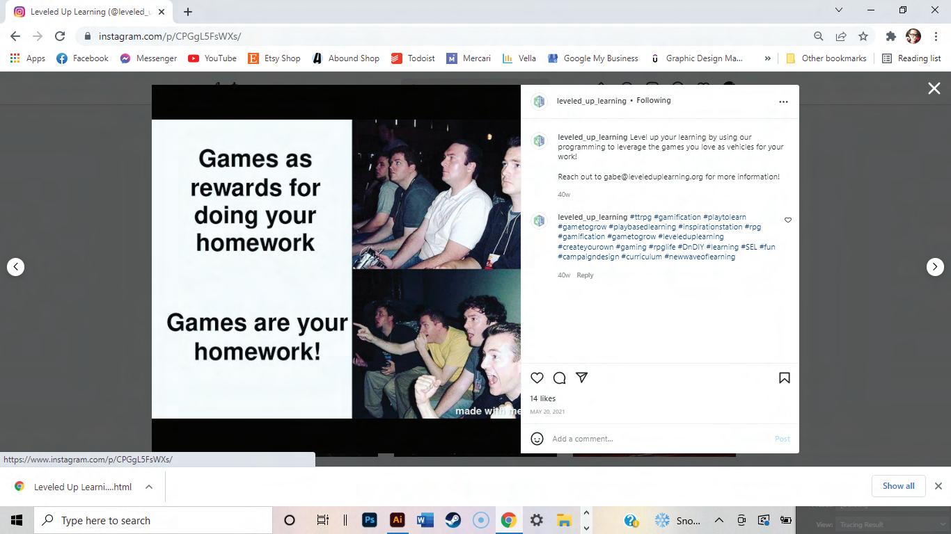
It can be a challenge to create a consistent look on social media. Placing a photo, meme, quote, or external illustration on a brand color background will instantly make it look branded and help it blend into a cohesive grid.

USiNG THE LOGO
“This is a social media post with a shareable quote.”
-Somebody
Using our logo in a social media graphics is one option that can carry the brand identity into the graphic. If you choose to use the logo in a graphic, follow these guidelines.
Place the logo mark in the upper right-hand corner
Ensure adequate padding around logo
Only use one logo per graphic