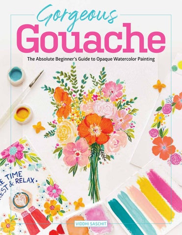
The Absolute Beginner’s Guide to Opaque Watercolor Painting VIDDHI SASCHIT
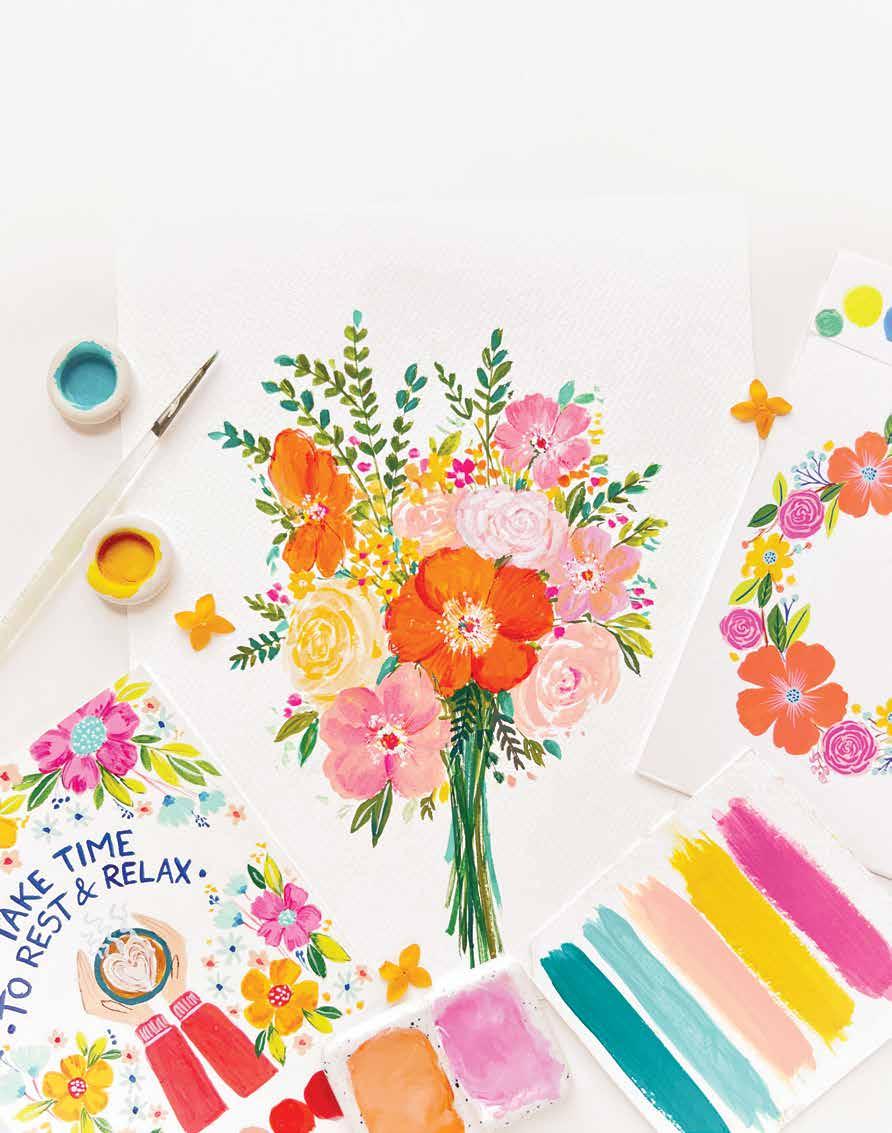
Gouache Gorgeous
Dedicated to my husband for always being there to support and cheer me and for believing in me throughout my journey. Gorgeous Gouache © 2023 by Viddhi Saschit and Better Day Books, Inc. Publisher: Peg Couch Book Designer: Llara Pazdan Editor: Colleen Dorsey All rights reserved. No part of this work may be produced or used in any form or by any means — graphic, electronic, or mechanical, including photocopying or information storage and retrieval systems — without written permission from the publisher. “Better Day Books,” the floral book logo, and “It’s a Good Day to Have a Better Day” are registered trademarks of Better Day Books, Inc. “Schiffer,” “Schiffer Publishing, Ltd.,” and the pen and inkwell logo are registered trademarks of Schiffer Publishing, Ltd. Library of Congress Control Number: 2022941040 ISBN: CopublishedFirstPrinted978-0-7643-6547-8inChinaprintingbyBetterDay Books, Inc., and Schiffer Publishing, Ltd. Better Day Books P.O. Box 21462 York, PA 17402 Phone: 717-487-5523 Email: www.betterdaybooks.comhello@betterdaybooks.com@better_day_books Schiffer Publishing 4880 Lower Valley Road Atglen, PA 19310 Phone: 610-593-1777 Fax: www.schifferbooks.comEmail:610-593-2002info@schifferbooks.com This title is available for promotional or commercial use, including special editions. Contact info@schifferbooks.com for more information.
The Absolute Beginner’s Guide to Opaque Watercolor Painting Gouache Gorgeous VIDDHI SASCHIT
4 | Gorgeous Gouache Welcome! ........................... 7 Meet the Author ..................... 8 Words for Creatives ................ 10 PART 1: Getting Started Essential Supplies ................. 14 Basic Techniques ................. 20 Color Theory and Mixing ...........25 Inspiration and Style ...............38 PART 2: Let’s Paint! PRETTY PATTERNS AND LETTERING ... 48 Spring Florals .................... 50 Autumn Treasures .................56 Ice Cream Galore ...................62 Fun Fruit......................... 68 Take Time to Rest and Relax ........ 74 FLORAL ABUNDANCE ............... 80 Seasonal Wreath ...................82 Envelope ......................... 88 Night Garden ...................... 94 Vase ............................. 100 Bursting Bouquet ................. 106 Freestyle Blooms .................. 112 INSPIRING LANDSCAPES ............ 118 Night Sky ........................ 120 Dreamy River ..................... 126 Desert Sunset ..................... 132 Morocco .......................... 138 Santorini ......................... 144 Oceanscape ....................... 150 Mt. Fuji........................... 156 Bright Floral Meadow ............. 162 Evening Hills ..................... 168 Index ............................ 174 Gouache Paper Practice Sheets and Project Templates ............. 177 Contents Let’sgouache!

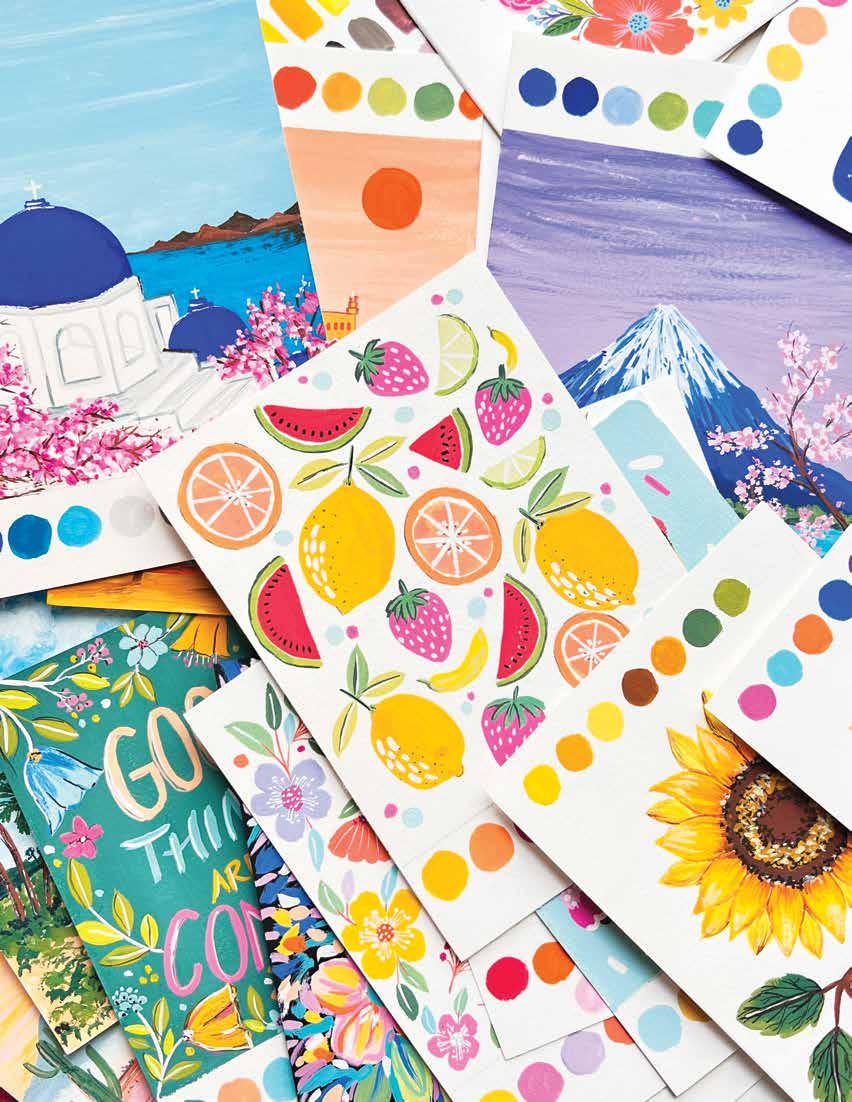
Once you make the projects in this book, get creative and try your own designs!
Welcome! | 7 Welcome!
Trust me—once you learn this medium, you will be hooked, and it will enable you to create so much more and take your creativity to the next level. I am grateful to be part of your creative journey through this book.
Sending you joyful colors and love,
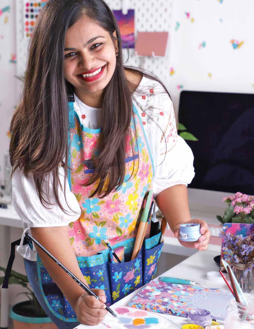
Are you ready to fall in love with gouache? Whether this is your absolute first time painting with gouache or you are a recent beginner, you are in for a treat. I am so excited to share my skills and knowledge with you through this book. The projects I teach here have been made with the goal of spreading some color and joy as you follow along and paint with me. My intention for this book is to guide you through the projects and help you learn and become familiar with the medium so that after you work through this book, you can fly on your own to explore the gorgeous world of gouache.

Hello! Where are you from?
I am from India and currently living in Chennai. What is it like where you live? I live in a coastal area of my country—in fact, I live in a city with a beach. I love beaches, so visiting the beach is my favorite thing to do near me. And since I have a home studio office, I spend most of my time in my home living with beautiful colors, my paintings, and my plant babies. What do you love most about India? My favorite aspect of Indian culture is the festivals and celebrations, which are filled with colors, joy, and cheer. Because India has so many different cultures, there are festivals almost every month—which mean celebrations to enjoy practically every week! India is known for its bright and beautiful colors—does that inspire you? Oh, it inspires me so much! I especially love how my culture has vivid and stunning clothing that features floral embroidery, block prints, sequences, glitter, golden lace, and more. How did you develop your art style?
Now,distinct.after three or four years of being a fulltime artist, my style has evolved; I tend to use a combination of my brand colors no matter what medium I’m working with. I redefined, in a way, what my style means personally. Besides painting, what are your passions? I love inspiring and uplifting creative people in a holistic way with my coaching, membership group, and different courses. I feel that a holistic approach is essential for the growth of any creative or artist, separate from just having good technical skills. Mindset is important, and I love sharing that through my offerings. Home décor and travel are two of my other passions. What do you think beginners struggle with most? Beginners often believe that they are not good enough and get bogged down by a lot of social media pressure. Numbers and likes convince people of the wrong assumption: that to be a good artist, you need followers. But the truth is, to be a good artist, you just need to be dedicated and have a true desire in your heart to create, and then you must be courageous to share your work with the world.
Meet the Author
8 | Gorgeous Gouache
I have always been interested in the arts, ever since my childhood, but I never planned to be an artist when I grew up. I started practicing art regularly after my college graduation, exploring different things. Then I realized I had a certain style and color palette that I liked to use, and my followers started calling me “queen of colors.” That’s when I saw how good I was with colors and realized my style of art was quite
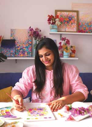
Viddhi Saschit is a deeply passionate artist and creative coach who is internationally known for her positive energy and use of bright color. She has collaborated with The Walt Disney Company, Faber-Castell, and Princeton Artist Brush Co. Viddhi is the founder of a surface pattern design company, Color & Joy, and has inspired more than 19,000 students through her creative workshops, Skillshare art classes, and coaching program, Flourish with Viddhi. She holds a degree in architecture and currently resides in Chennai, India. Find out more about her at www.viddhisaschit.com or @viddhi.saschit.
I hope they fall in love with gouache and how gorgeous this medium is, just like the name of the book says! And I hope it sparks a lot of creativity through the different projects and inspiration provided. What is your advice to a beginner?
Trust your process. Don’t compare your journey to others’ journeys. Your journey is unique, and you choose to walk on your unique path. Just hold firmly the true desire to create art, and the rest will start unfolding. And, most importantly, always listen to your heart and intuition. Is there anything else you’d like to share?
On your journey, the only constant thing is the genuine spark to create. Everything else can be learned over time. Where can we learn more about you and your work?
About Viddhi
What do you hope people take away from this book?
You can find out more about my courses, coaching, and podcasts on Instagram @viddhi.saschit, as well as on my websites www.flourishwithviddhi.com and Iwww.viddhisaschit.comhopetoseeyouthere!
Meet the Author | 9
Trusting yourself in every step of your journey is very important. Often, we get off-track when our focus is on other people’s journeys and how they are growing, comparing ourselves with them. But if you can shift your mindset to truly trust your own process and understand that everything will unfold for you in the right time, you will stop worrying about your journey, remove your self-doubt, and relieve pressure to work like others do. Your process is unique to you, and it is okay for your journey to be different than others’ journeys.
In early 2021, I learned that personal development and mindset play a huge role in the creative journey we all walk. But these are often neglected and overshadowed because of social media and today’s overworked culture; many creative people don’t really understand how to create things with purpose. Art is a sacred reflection of the soul, and we must channel our creative energy into a physical reality with joy, allowing our creative spirit to flow through us.
How many times have you not shared your artwork on social media because you thought it was bad or not good enough, or that people wouldn’t like it? Have you worried that if you post a certain piece of art that you will lose followers or not get enough likes or comments? Stop seeking external validation from others—just share your artwork freely and with good energy. Trust the universe to help your art reach the right people who will connect with that energy. This book only came into existence because I chose to share my gouache paintings on my Instagram account with honest joy.
Here are five key mantras to take to heart as a creative in today’s modern world. Trustprocessyour
Create art with joy and let go of all expectations
By 2022, I felt a calling to share and inspire other artists through a new podcast, The Limitless Art Podcast. This podcast is focused on helping artists unleash their creative powers and truly become limitless with their art. In it, I share my new understandings to help listeners grow and my own personal experiences to inspire them to step up and rise up.
3.
1.
2. yourSharework
Stop having expectations of your art before you even start creating it. Don’t sit down with the goal to make something to share on social media—instead, sit down with the intention of creating something for yourself. When you create with joy and allow yourself to play and explore what your heart says, you will notice how good you feel about your creativity. And remember not to strive for perfection, because perfect art doesn’t exist. You define what is great for yourself.
Words for Creatives
happensEverythingforyourhighestgood
Have you ever created or done something that you felt would sell or work, but it didn’t? And then you felt discouraged because you didn’t meet your own expectations? In the face of setbacks, I recommend that you trust that they happen for your highest good. Even if you didn’t get your dream project deal signed or you failed miserably at something, consider it a stepping-stone to a higher level. These ups and downs are essential. When you trust that everything happens for your highest good, you will find it much easier to channel your creative energy despite setbacks.
showingKeep up
5.
4. | 11
Showing up and letting your art shine is really important. If you are hiding, you are certainly not seeking all the goodness the universe has to offer to you. You can also hide from yourself, telling yourself excuses for why you aren’t creating art more frequently or at all. Make art part of your daily or weekly routine no matter whether you feel like you are improving or reaching people. Keep doing the work you love, and you will find opportunities and success flowing through you. The universe can give you what you seek, but you need to keep showing up to receive it.
4.

Getting Started
Learning won’t take long, so jump on in!
PART 1:
It’s time to dive into the wonderful world of gouache! This part of the book will set you up with all the essential information and skills you’ll need in order to start putting paintbrush to paper. You’ll learn about the right tools, paints, and paper to use as well as how to achieve a variety of effects as you paint. After reading the color theory section, you’ll be able to mix an infinite rainbow of beautiful colors, and once you’ve reviewed the inspiration section, you’ll know how to take everything you’ve learned and put it together creatively into your own unique artwork.
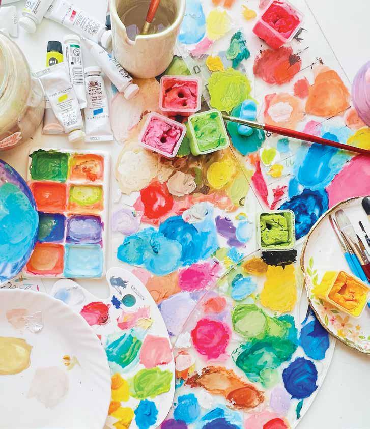
Gouache is a really fun medium that requires minimal supplies and tools. Let’s learn more about gouache and how it works. Essential Supplies
ϋ Gouache dries very quickly to a beautiful velvetmatte finish.
All about Gouache
An opaque, water-based medium, gouache has become very popular and trendy because it is easy to use and allows you to build layers and add details in a painting. It is often compared to watercolor; the main differences are that it is thicker and has an opaque finish as opposed to watercolor’s transparent finish.
Gouache can be used on any type of paper— black, white, gray, kraft, or paper of any color. (This is my favorite thing about gouache!)
TIP: When gouache paints are out on a palette, they will dry and crack a bit, but don’t worry—you can spray them with some water or otherwise rewet them and use them again.
ϋ A finished gouache painting must be kept away from water, since just a few splashes on the painting could ruin it.
The word “gouache” is pronounced “gwash,” rhyming with “wash” (at least in American English!).
ϋ
ϋ You can work in layers with gouache—from dark to light but also from light to dark.
ϋ You can use a spray varnish (such as one designed for acrylic or soft pastel artwork) to seal a gouache painting, but it is best to either store the work safely in a folder or frame it in a glass frame.
ϋ Once the paint dries, light colors layered on top of dark backgrounds appear brighter than they do when they are layered on top of light backgrounds—and vice versa!
ϋ You can add more water to your gouache paints to make them work similarly to watercolor.
Essential Supplies | 15
ϋ You can correct errors made in gouache by simply rewetting the paint and reworking on that area— or by painting right over it.
You could describe gouache as partway between watercolor and acrylic; it has some properties of watercolor, such as being water soluble, and some properties of acrylic, such as being opaque. Once you get rolling with gouache and understand how versatile it is, you will become obsessed with this medium just like I have. Here are the basics you should know about gouache.
Gouache paints can be expensive, so get started by investing in a few basic colors in a high-quality product. As a beginner, paint on small surfaces so that you don’t accidentally use up a lot of your paint on mistakes, and gradually increase the scale of your paintings as you gain experience and confidence. Keep the layers minimal in the beginning—it’s easier to use freshly squeezed paint rather than re-wetting dried paint.
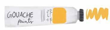
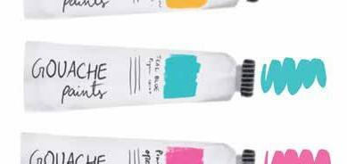
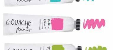
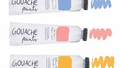
Water-soluble colored pencils: I highly recommend using these to sketch your design before painting. You can also use just a normal pencil, but you will want to be careful to sketch very lightly.
Miscellaneous materials: Before painting, make sure to collect paper towels (for potential cleanup) and several cups or bowls, including one filled with clear water (for cleaning brushes as you work).
Palette: You can use several different types of palette for gouache, including airtight palettes that seal closed, ceramic palettes (even a ceramic dinner plate), and regular plastic palettes. Ceramic palettes with large mixing areas are ideal for using and mixing colors. Try to squeeze just enough paint for what you’re working on to avoid wasting paint or having to rewet dried paint, which can be tricky.
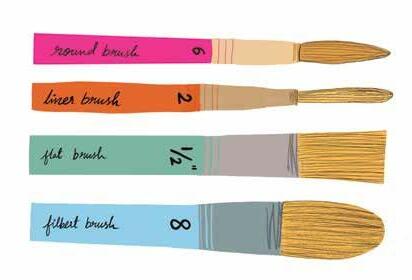
Brushes: Use paintbrushes with synthetic bristles— natural-hair bristles can be ruined very quickly with gouache. Brushes come in different sizes and shapes. Depending on the type of brush, a brush is sized using a number (smaller numbers indicating smaller sizes) or an inch/millimeter measurement (indicating the width across the bristles). A minimum essential set of brushes for gouache includes the following: round brushes in sizes 6 and 10, a flat brush in size 1/2", and a liner brush in size 2. Generally, you will use a flat brush for large color areas, a liner brush for small details and outlines, and round brushes for everything else. You can expand your brush collection from here as desired once you get to know your basic brushes and your painting preferences.
Masking, painter’s, or washi tape: Use a lowadhesiveness tape to tape the edges of your paper to stretch it flat on your work surface before painting.
Tools Here is a quick guide to the basic tools and supplies you will need. I recommend investing in highquality supplies, because they will help you learn and develop your painting skills faster. I used lowquality supplies in the very beginning of my gouache journey and was never able to get the blending and the brushstrokes right, but when I invested in highquality supplies, I saw a massive difference in my paintings in just a couple of weeks.
Gouache paints: I recommend that you invest in a beginner gouache set from a good brand. I can personally recommend Winsor & Newton Designers Gouache™, Art Philosophy®, and Holbein. Make sure you at least have the primary colors of red, yellow, and blue, plus black and white. More detail about paint is on page 15.
Paper: Remember, you can use any color of paper you want! More detail about paper is on page 17. TIP: Care for your paints to ensure you get the most out of them. Always close paint tube caps tightly. For leftover paints, put the wet paint in an airtight container and spray some water on it so it stays moist. If you don’t have an airtight container, spray some water on the paints and cover your palette with cling wrap. These sprayand-seal methods will keep the paint moist and away from dust until you are ready to paint again.
16 |
A Filbert brush in size 6 or 10, for example, is a good additional brush with a curved shape that is ideal for flowers and landscapes.
Gorgeous Gouache
Paper Gouache can be used on any kind and color of paper—black, white, gray, kraft, etc. It can also be used on other porous surfaces, like wood. How amazing, right? I love this property of gouache.
Essential Supplies | 17
ϋ Cold press watercolor paper typically has more surface texture, or “tooth.”
ϋ Your paper needs to be a thick enough weight to withstand the moisture of the paint. Any paper you use should be a minimum of 180 gsm. This is also sometimes written on products as “g/m2" (because it literally means grams per square meter). The higher the gsm, the sturdier the paper. Paper weight in pounds (lb.) is a different system than gsm and does not perfectly align with gsm because it is dependent on the type of paper. If you have to refer to lb. weight instead of gsm, on average, you should look for mixed media, Bristol, or watercolor papers whose weight is at least 100 lb.
ϋ Hot press watercolor paper has a smooth surface. It is very easy to paint with gouache on this smooth paper because the creamy paint spreads easily on it.
Here are some notes and recommendations for suitable papers, regardless of the color you want to use.
A cold press watercolor paper that doesn’t have much tooth is a good choice because paint can spread easily on the relatively smooth surface. You can certainly use watercolor paper with more tooth, but painting will be a little difficult on this kind of surface, especially for a beginner.
2. Next, close your eyes and imagine your dream workspace. Visualize how you want to transform the existing space. Think about different elements you may want to include (see the list on the facing page for ideas).
Workspace Setup
3. Finally, sketch what you have visualized into your existing creative area sketch. Now you have a plan and a model to follow. All that needs to be done is to turn your vision into a reality.
18 | Gorgeous Gouache
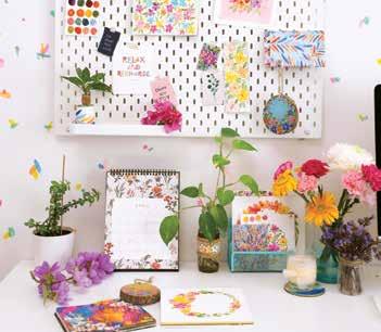
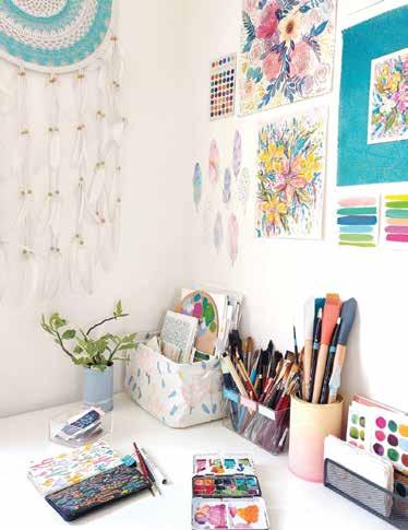
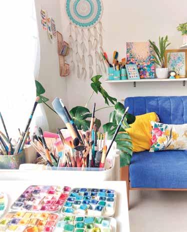
Not everyone will be able to dedicate an entire room to their art, but even a corner or a single desk can turn into a veritable art space. Your workspace should spark joy and encourage your creative energy to flow. The space can be colorful, minimal, or however you wish it to be, but just make sure it is not so cluttered as to distract you or inhibit your Partmovement.ofsetting up your workspace is organizing and arranging your supplies. Organizing is how you sort and segregate different items, whereas arranging is basically placing items in such a way as to be most functional to you. Keep this in mind as you design your workspace. Here is a method for designing a personalized workspace that will inspire you to create, play, and explore with your creativity.
1. First, take a sketchbook and roughly map out your creative area. Sketch your work desk, the wall behind it, and the nearby furniture.
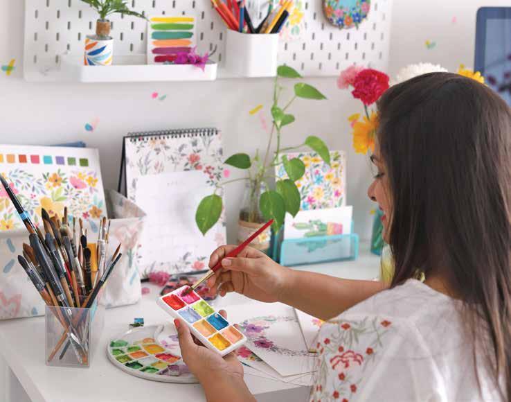
DIY storage: Do you want to include brush jars, organizers, sketchbook folders, paper folders, etc.?
ϋ
Walls and windows: Do you want colors or patterns on your walls? Can you hang curtains in certain colors or textures?
ϋ
ϋ
ϋ
ϋ
Décor: Add in any other specific elements that spark joy, like a picture of your family in a frame or anything that has sentimental value to you.
The elements that you will want to add to your space are your personal preference, but here are some things to consider mapping out.
ϋ
Art display space: This can be on a wall, a shelf or a ledge, or any other place that you want to display your favorite artworks. Plants: Add in plants to make your space lively. If you are new to home gardening, start with pothos/money plant—they are very easy to grow and require very little maintenance.
ϋ
Permanent storage: What do you have in terms of shelves, ledges, cupboards, drawers, etc.?
ϋ
Essential Supplies | 19
Lighting: I love having bright, natural light every time I paint. You can see all the colors clearly and accurately, and it fills me with positive energy.
Worktable/desk: Try to pick a spot where you can get at least some natural light. Also, do you want to upgrade to a different work surface? Chair: It is very important to have a comfortable place to sit while you work.
ϋ
In this section, you will learn all the basic techniques and tips to actually get started putting your paintbrush to paper using gouache. Basic Techniques

3. Adding the ideal amount of water to the paint will create a perfectly creamy consistency, which is what you’re looking for.
Gouache Consistency
Before starting to paint your first project, also practice creating even backgrounds and color areas by using round and flat brushes, since these brushstrokes are key for gouache paintings. Get out some scrap paper and practice these brushstrokes as explained here. Make sure to mix the paint to the right consistency before starting.
Background Brushstrokes
Creating the right consistency of gouache is essential for making the painting process fun and enjoyable. Take out some scrap painting paper and practice getting the right consistency as you review this information and before you tackle any projects. I know it might sound boring, but trust me, it is worth it.
Aim for a ratio of 1 part water to 2–3 parts paint. The exact ideal ratio will vary from brand to brand. Test your paint with some swatches to get a feel for it; the more you practice, the easier it will be for you to get the right consistency.
Round-Brush Exercise This exercise is essential because you will be using a round brush for most of your painting. Using a round brush, apply one brushstroke after another, each one next to and just barely overlapping the previous, to create a seamless, solid color patch. Flat-Brush Exercise This exercise will help you paint neat backgrounds for landscapes and other themes. Using a flat brush, apply one brushstroke after another, each one next to and just barely overlapping the previous, to create a seamless, solid color patch.
Basic Techniques | 21
2. Adding a lot of water to the paint will create a mostly watery but slight creamy consistency that won’t create an ideal finish for the gouache either. It will be transparent in a few places, but probably not in an attractive or consistent way.
4. Adding too little water to the paint will create a very thick consistency that makes it difficult to spread the gouache with ease. This will also increase the chances of the paint cracking on the paper after it dries.
Adding far too much water to the paint will create a watery consistency that will make your gouache function basically like watercolor. This is workable, but not the focus of gouache painting or of this book.
TIP: If your paint consistency is too watery, you may see the brushstrokes very clearly. If this happens, just mix more paint and layer it on again after the first layer has dried.
Basic Techniques
1.
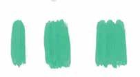
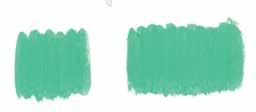
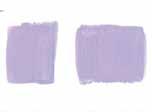
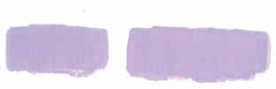
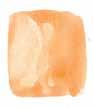
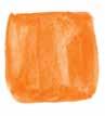
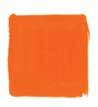
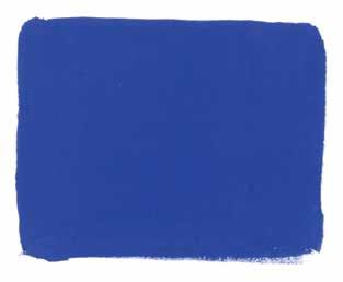
Wet on Dry This technique is simply applying wet paint to dry paper, or to an already-dry layer of paint. This is one of the most frequently used techniques in gouache. You will use this technique to paint base layers, to add new layers, and to add details to your paintings.
Let’s look at some basic painting techniques that you will need to use when working with gouache. You will be able to use these methods during the projects in this book, and in your future gouache artwork, to create some amazing effects! Get out some scrap paper to try each technique in a small patch.
Basic Painting Techniques
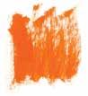
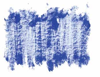
Drybrushing This is a fun technique that adds a lot of texture to a painting. Mix a little paint to a thick consistency (using very little water or none at all). Apply the paint to dry paper. It will give you a sketchy, textured effect. This effect is sometimes desirable!
22 | Gorgeous Gouache
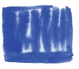
Wet on Wet This technique will mostly be used to color large background areas. Wet a patch of paper, then apply wet paint directly to this patch. You will see that the paint lays on thick in a few places and is transparent in others. Remember: you usually don’t want to add more layers to a gouache painting while the paint is still wet, or you risk muddying or overblending your colors and layers. So, normally, you will want to make sure any existing paint is fully dry before adding a new paint layer.
Glazing
Basic Techniques
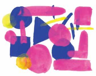
Glazing is a technique that helps create transparency between layers so that a new layer does not completely cover up the previous layer. To try it, paint some shapes using the wet-on-dry technique. Allow this layer to dry. Then use water to thin a second color of paint past the ideal standard gouache consistency. Using this watery paint, add a second layer of shapes on top of the previous layer. This technique gives the impression of depth with each layer. In the example, I started with solid blue, added watery pink, and then added watery yellow.
Color Lifting
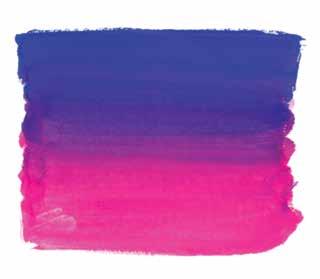
Start painting with one color from the top of the patch down to the center. Then paint with a different color from the bottom of the patch up to the center.
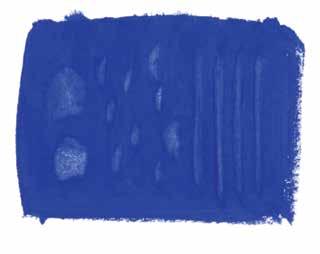
This technique lifts paint from previous, dry layers to create a kind of glowing effect. Paint a patch of color in a dark shade using the wet-on-dry technique. Once the paint has dried, add a few drops of water to the paint patch. After a couple seconds, grab a paper towel and dab the water droplets. Small areas of paint will come off with the water. This technique can also be used to correct errors while painting.
Basic Techniques | 23
Blending Two Colors
Use this technique to add gradients of blended colors in a painting. Determine the area you want to encompass the gradient (in this case, a square patch).
Finally, continuing with the same brush, paint in the center just enough to blend the two colors. Don’t load your brush with more water, because that would change the paint consistency.
24 | Gorgeous Gouache
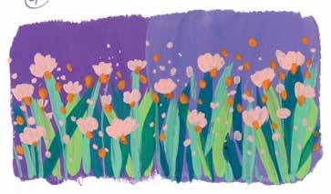
step-by-step example haven’t blended with the later layers. This is because when you paint on top of a dry layer with wet paint mixed to the right consistency (not too wet or watery), the dry layer won’t become rewetted and blended in by accident. If the later layers of paint are too wet, however, the previous layers have a higher likelihood of accidentally getting blended in.
4. Add one more shade of green grass if desired. This is layer 4; allow the layer to dry. Finally, add a new layer of flowers in light colors, overlaying these on top of all the previous layers. This is layer 5. In this case, I painted all the pink flowers and then carefully dotted orange on top of the not-yet-dry pink.
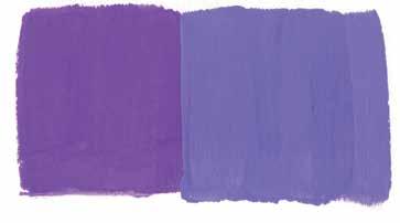
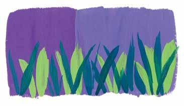
1. Paint one side with a dark color of your choice and the other side with a light color. This is layer 1; allow the layer to dry.
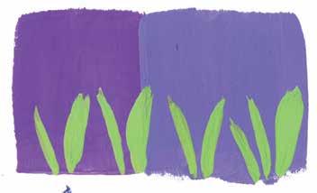
3. Pick a dark shade of green and layer more grass over the existing light grass layer. You will see that the dark grass shows up more brightly on the right side, against the light background color and light grass. This is layer 3; allow the layer to dry.
Important: Gouache paint can be easily rewetted, but notice how the colors in the initial layers in this
2. Pick a light shade of green and paint some long grass. You will see that the light green appears brighter on the dark background half than on the light background half. This is layer 2; allow the layer to dry.
Layering This technique is essential for gouache and is used throughout the book, so we will tackle it step by step using a simple flower illustration. Pay close attention to how the gouache colors behave on darker and lighter layers. Remember to keep each gouache color the right consistency as you practice layering.


Color Theory and Mixing
Every artist has a different take on color theory, and I am going to share my simple way to understand and mix colors. I have taught this method to thousands of students in my workshops, online classes, and membership group. You will be surprised by how many shades you are able to mix with just limited starting colors!
26 | Gorgeous Gouache
Split complementary colors are any set of three colors that includes a color plus the two colors next to that color’s complement. An example set is blue, red-orange, and yellow-orange.
Color mixing can be as simple as explaining how to mix different colors and as complicated as getting into scientific reasons why colors act the way they do. In this book, we’ll stick to the simpler side while still giving you a satisfying explanation for how colors work. The Color Wheel
Tetradic colors are any set of four complementary colors (but not ones directly next to each other on the color wheel) if you were to imagine a rectangle superimposed on the color wheel. For example, you might make a set from blue, orange, red, and green.
Triadic colors are any set of three colors that are evenly spaced around the color wheel. The three primary colors (red, blue, and yellow) are a triadic set. Another triadic set is the secondary colors (purple, orange, and green). Yet another triadic set is redorange, yellow-green, and blue-purple.
Basics of Color Theory
Analogous colors are colors that are right next to each other on the color wheel, such as blue, bluegreen, and blue-purple.
The primary colors are red, yellow, and blue. These colors cannot be made by mixing other colors. Every other color can be made by mixing the three primary colors. If you mix each distinct pair of primary colors, you get the secondary colors, which are orange, purple, and green. Here are the equations for mixing secondary colors: red + yellow = orange; red + blue = purple; and yellow + blue = green. To achieve the tertiary colors (the remaining shades shown on this color wheel), you simply mix a primary color with a secondary color on either side of it. With the three primary colors and the three secondary colors at your disposal, along with white and black, you can unlock unlimited possibilities for new Colorscolors.onthe wheel have different relationships with one another. Consider using one of the following sets of colors when building a color palette. Each of these sets of colors tends to work well in art.
Complementary colors are any two colors opposite one another on the color wheel, such as blue and orange.
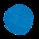
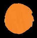
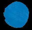


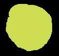
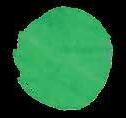
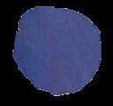
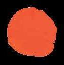
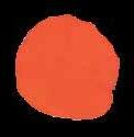
Color WarmcolorslCoocolors Red (primary) Blue (primary) Yellow (primary) Orange (secondary) Green (secondary) Purple (secondary) The Color Wheel

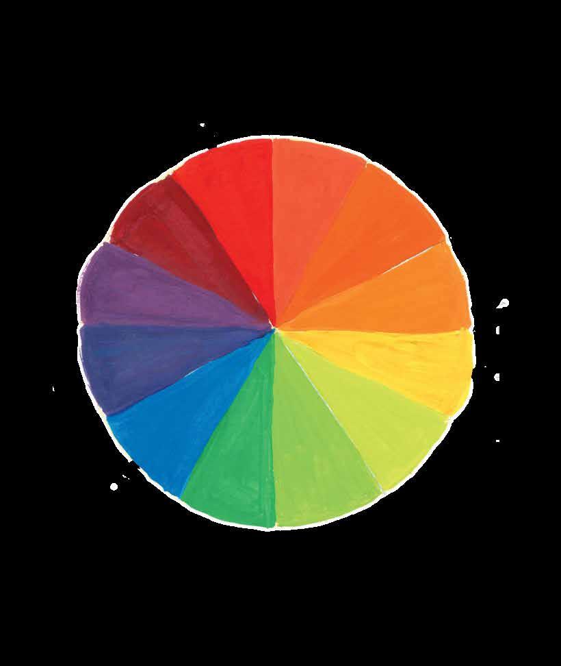
Colors can be warm or cool. There are two ways of classifying warm and cool colors. The first way is on the color wheel; the second is color-specific. In the color wheel, colors from red to yellow are considered warm colors, and colors from green to purple are considered cool colors. For the color-specific method, you can look at an individual color and discern whether it is warm or cool. For example, you could have a warm blue and a cool blue. Individual color temperatures are most apparent when comparing multiples of a single color next to one another. Check out the primary colors in warm and cool shades below.
WarmCool
You can easily alter the look of a color by adding white, black, or gray to it. When you mix a color with black, it is called a shade of that color. When you mix a color with gray, it is called a tone of that color. And when you mix a color with white, it is called a tint of that color. What we call pastels are essentially tints.
Tint White Tone Gray Shade Black Tint of blue Tone of blue Shade of blue
Color Temperature
Ultramarineblue Permanentyellow Primaryred yellowLemon Crimson
28 | Gorgeous Gouache Tints, Tones, and Shades
Ceruleanblue
TIP: Not all brands use identical color names. If you don’t have primary red, you can use vermillion; if you don’t have crimson, you can use scarlet.
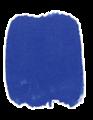
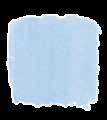
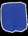
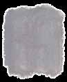
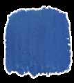
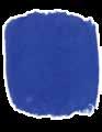
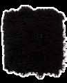
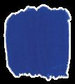
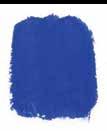
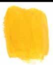
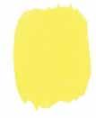
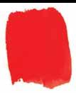
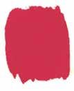
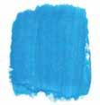
Permanentyellow (cool) (warm) (cool)
Primaryred
1:1
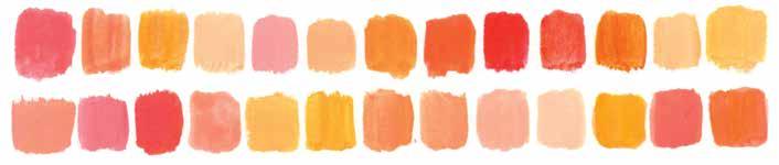
Color Theory and Mixing | 29 Color Mixing: Orange Using a few different variations of primary yellow and primary red, plus white, you can make many interesting shades of orange, peach, ocher, and more.
(warm) yellowLemon
Crimson
White This is just a sample of what’s possible. Try mixing yellow and red in ratios of 1:3, 3:1, 3:1 + white, etc. You can even mix two different oranges to get a new orange. Here are some more swatches to inspire you. ratio 2:1 ratio 1:2 ratio + white
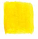
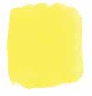
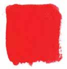
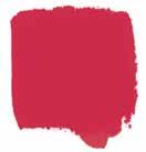


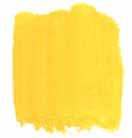
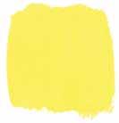
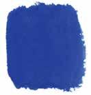
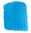
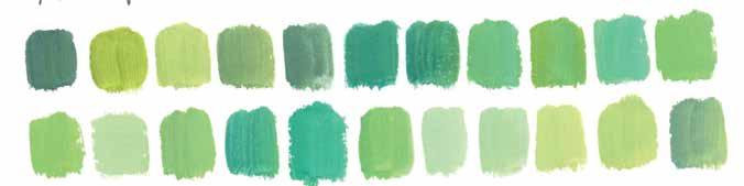
30 | Gorgeous Gouache Color Mixing: Green Using a few different variations of primary yellow and primary blue, plus white, you can make many interesting shades of green, lime, moss, and more. Permanentyellow (warm) yellowLemon (cool) Ultramarineblue (warm) Ceruleanblue (cool) White This is just a sample of what’s possible. Try mixing yellow and blue in ratios of 1:3, 3:1, 3:1 + white, etc. You can even mix two different greens to get a new green. Here are some more swatches to inspire you. 1:1 ratio 2:1 ratio 1:2 ratio + white


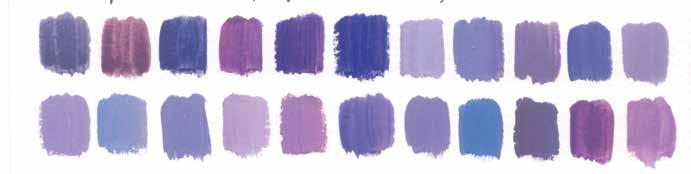
This is just a sample of what’s possible. Try mixing blue and red in ratios of 1:3, 3:1, 3:1 + white, etc. You can even mix two different purples to get a new purple. Here are some more swatches to inspire you. ratio ratio ratio white
1:2
2:1
+
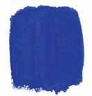
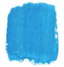
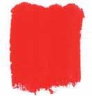
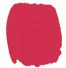
Color Theory and Mixing | 31 Color Mixing: Purple Using a few different variations of primary blue and primary red, plus white, you can make many interesting shades of purple, lavender, amethyst, and more. Ultramarineblue (warm) Ceruleanblue (cool) Primaryred (warm) Crimson (cool) White
1:1


Example palette: winter-themed florals
Here is a floral composition that includes some warm colors but still has a cool, wintry feel overall.
Here is my suggested method for choosing a palette.
TIP: An ideal color palette for a medium-sized floral artwork would include six to eight colors. If you are painting on a large scale, you can more easily include additional colors.
Creating a color palette is a very important part of any creative process. I always recommend choosing a color palette before painting; it makes it so much easier to focus on creating art when you have already sorted out which colors you will be using, instead of getting stuck not knowing what colors to add next.
2. Decide what kind of mood or vibe you want the art to radiate—bright, dreamy, vintage, autumn, winter, summer, etc. Once you know, write it down.
3. Write down the major elements that will be present in the piece. For example, if you are painting florals, your main element will be flowers,
1. Choose the theme of the artwork. Is it a landscape, a floral composition, a lettered piece, etc.?
Developing a Color Palette
32 | Gorgeous Gouache
leavesColorshighlightsbudsColorsflowersforColorsmainforandfor
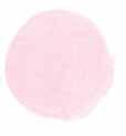
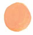
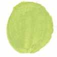
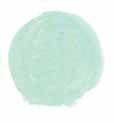
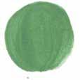
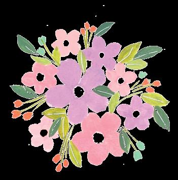
4. Now assign colors to all the elements according to the mood you decided on initially. You can also search for inspiration online to gets ideas for colors or palettes.
5. Finally, mix and swatch each of the colors in your palette. Make sure you like how they turn out together. Use your selected palette as the basic starting point while you paint. You are of course free to use more colors as you paint—don’t restrict yourself exclusively to your exact palette and stifle your natural creativity. If you intuitively feel you want to add a new color as you are painting, go ahead and do so. Consider swatching the new color next to your existing color palette first just to ensure the color goes well.
secondary elements may include buds and fillers, and tertiary elements may include leaves.
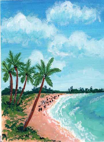
Colors for sky Colors for sand and vegetation Colors for ocean Example palette: ocean landscape
This beach scene incorporates some light, rich blues, greener blues in the water, dark greens for the palm trees, and rich, peachy sand.
TIP: Many people tell me they love the color palettes I choose. They describe them as beautiful, peaceful, and vibrant. That’s because I love having a mix of both pastel and bright colors in my palettes. I try to strike a balance between colors and ensure the combination is not too dull, pale, or overwhelmingly vibrant.
| 33
Color Theory and Mixing
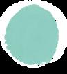
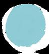
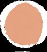
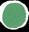

Here are a dozen suggested color palettes for you to choose from when painting. Pick a palette based on the mood you want your painting to exude, based on your favorite colors, or just based on your whim when you sit down to paint. Feel free to eliminate or swap out colors from within the palettes, too. It’s your art!
34 | Gorgeous Gouache Color Fun: 12 Palettes to Inspire
Color Theory and Mixing | 35 Color Theory and MixingVintageBrightShadesVibes6.4.2.5.3.1.


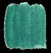
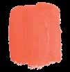
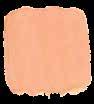
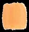
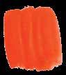
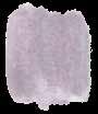
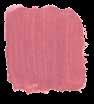
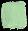
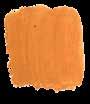
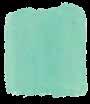
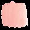
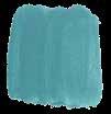
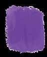
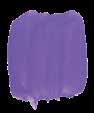
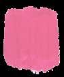
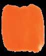
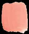
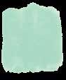
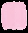
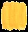
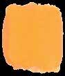
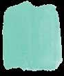
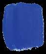
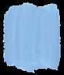
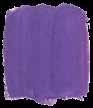
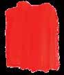
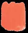
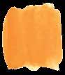
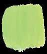
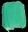
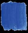
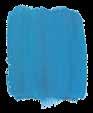
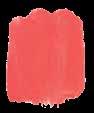
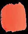
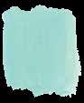
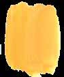
36 | Gorgeous Gouache Soft Pastels 12.10.8.11.9.7.
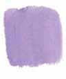
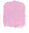
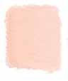
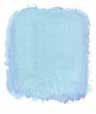
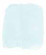
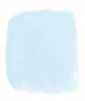
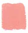
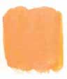
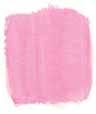
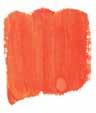
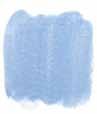
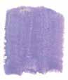
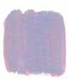
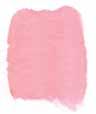
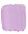
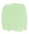
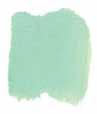
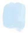
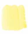
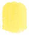
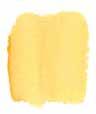
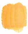
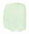
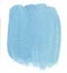
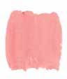
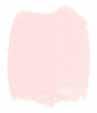
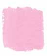
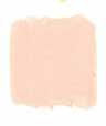
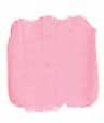
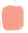
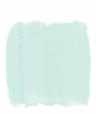
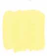
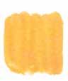
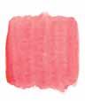
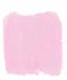
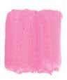
Color Theory and Mixing | 37 Color Theory and MixingBuild Your Own! Try building your own palettes using the rainbow of swatches provided on this page. Practice and experiment with mixing your own paints to achieve each of these colors.



You’ve learned so much about how to use gouache and mix colors already. But you may feel creatively stuck when it’s time to put paintbrush to paper. That’s what this section is for! InspirationandStyle
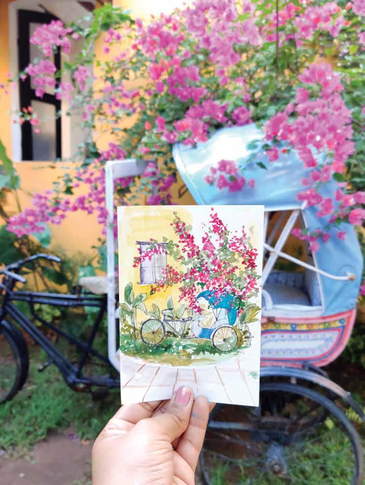
Inspiration is everywhere if you look around, and we as artists are gifted with creative thinking to get inspired from what surrounds us and express it in a different way than it is in reality. Own
40 | Gorgeous Gouache
Making Inspiration Your
Inspiration is everywhere around you. But how do you explore and convert that inspiration into finding your own style? Your style is usually a reflection of your own self. You will learn about and develop your style the more you paint, but for now, I will share a few tips for ways you can transform any inspirational or reference image into something uniquely yours.
Feel free to mix and match the ideas on the facing page to paint something new and creative, or just follow whatever your intuition says. Sit silently before you begin painting from the reference image, and allow your creative energy to flow through you. Trust what you feel. Remember to have no attachments or expectations while painting—just enjoy the process. In the examples on the following spreads, you can see how you can transform a single concept into several distinct and unique pieces of art. How might you decide to execute these concepts and compositions?
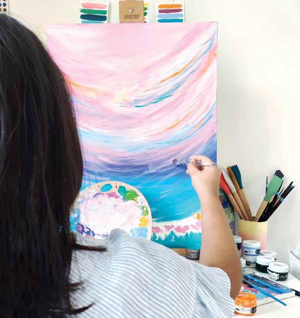
Try This! | 41 ϋ Change the color scheme of the painting to make it different from the reference content. Try This! ϋ Modify brushstrokes.your Emphasize or deemphasize them. Try painting your reference image in both a realistic and a freeform or abstract style. ϋ Add a background color, whether a gradient or a solid color. ϋ Incorporate mixed media, such as ink, gold foil, oil pastels, acrylic, or impasto texture (an area of thick paint). ϋ Change compositionthe of sizes,around,elements—movethethemchangetheiretc. ϋ Add new elements from your imagination. ϋ Combine two reference images to come up with something unique. ϋ Make a collage by painting feathers,elementscompositionsaroundthemgouacheyouindividually.cuttingelementsdifferentandthenthemoutForexample,canpaintindividualflowers,cutout,andplaywithdifferentandotherlikeleaves,etc.
42 | Gorgeous Gouache
One Concept and Color Scheme, Three Compositions
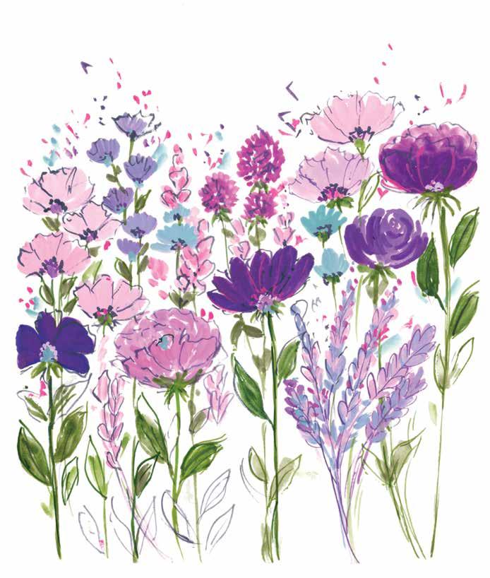
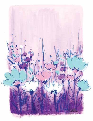
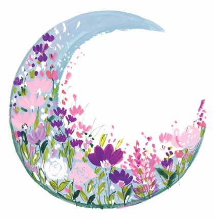
Here are three compositions using the simple concept of flowers and a purple, blue, and green color scheme. I started with a reference picture of a flower flat lay (flowers arranged on a flat surface and photographed from a bird’s-eye view).
| 43
For the first style (facing page), I choose to paint with loose brushstrokes and keep the painting more expressive. It’s a fun way to let loose and not worry about perfection. To make the artwork look more defined at the end, I added some rough, dark outlines with a thin liner brush.
For the second piece (top), I decided to keep the same color palette and flower shapes, but I added a light pink background and included some white, blue, and dark pink flowers. The dark purple at the bottom creates a kind of gradient effect. I love how beautifully this turned out!
Inspiration and Style
The last style (bottom) is significantly different from the other two. I thought about where else the lovely light blue shade in the color palette could look good—and came up with the moon! I let my inspiration guide me to paint this crescent moon bedecked with similar flowers to the other paintings.
InspirationandStyle
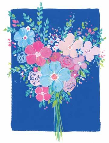
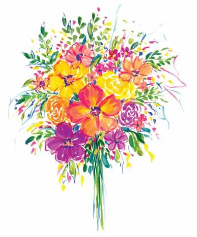
44 | Gorgeous Gouache One Composition, Three Color Schemes Here is one concept—a bouquet of flowers—done in just one composition, but in three different color schemes. My reference image was of a bouquet of flowers.
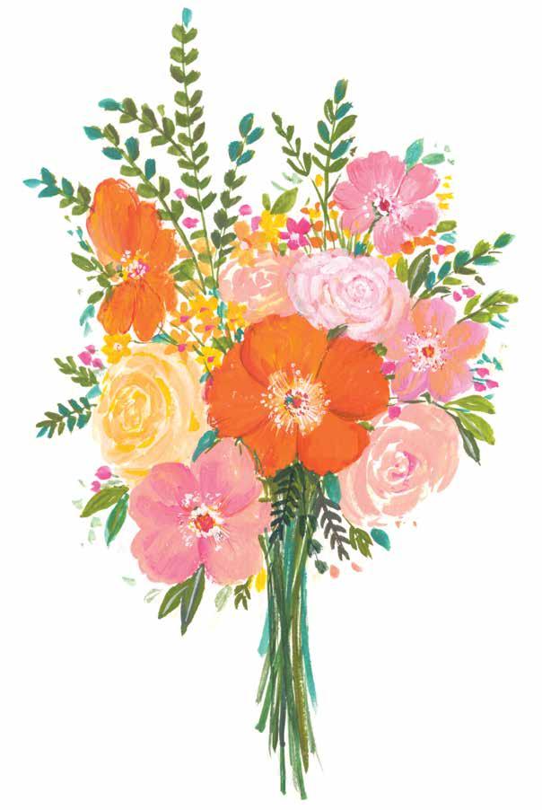
The second approach I chose (top) was to change the color palette completely and paint a less detailed bouquet on a vibrant blue background. This altered the entire mood of the painting and brought a lot of energy through the contrasting colors.
For the third painting (bottom), I painted the same bouquet in a very loose style by not gripping my brush tightly and just painting expressive strokes. You can see how fun and pretty this painting turned out to be. I also changed the color palette and used brighter colors.
The first painting (facing page) is a pretty accurate representation of the reference image I used, with just a few changes in the color palette and flower positioning. I made this piece quite detailed, with many layers and pastel colors.
Inspiration and Style | 45
You’ve tested your paper, mixed a palette of lovely colors, and warmed up your paintbrush with some practice strokes; now you are ready to make some art. In the following pages are 20 projects to inspire, challenge, and relax you—depending on how much you’ve done already and what painting mood you’re in!
The projects go in a loose order from more beginner-friendly to more advanced, but feel free to jump into whichever piece of art speaks to you when you sit down to paint. With complete color palettes, detailed color mixing instructions, recommended brushes, and templates for each project (provided in the ready-to-use sheets at the back of the book), you’ll soon be looking proudly down at your first gorgeous gouache painting. Have fun!
PART 2:
Let’s Paint!
Pretty Patterns and Lettering
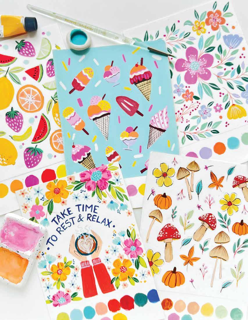
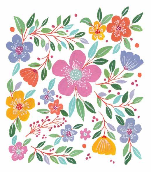
50 | Gorgeous Gouache Spring Florals Beautiful florals are nature’s gift to us. The vibrant colors, the varied textures, and their abundance in nature really make my soul glow. I think I could easily communicate through flowers—I love them so! In this project, we will paint a simple spring floral design where you will learn how to balance the colors while composing a pattern with discrete elements. BRUSHES AND SPECIAL SUPPLIES: ϋ Size 6 round brush ϋ Size 2 liner brush ϋ White gel pen (optional) See page 55 for color mixing instructions.

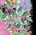


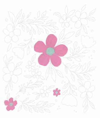
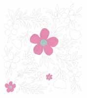
STEP 2. Mix a pastel pink (crimson + white) and paint some of the flowers. Paint the centers of the flowers pastel blue (turquoise blue + white). While painting during the next few steps, aim to balance the colors.
STEP 4. Mix a pastel violet (cerulean blue + crimson + white) and paint some more flowers. Paint the centers of these flowers with your pastel pink.
PRETTY PATTERNS AND LETTERING Spring Florals | 51
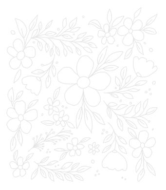
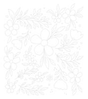
STEP 1. Use the template provided. Alternatively, sketch an illustration that incorporates big and small flowers, leaves, and fillers, such as berries and buds.
STEP 3. Paint some flowers with permanent yellow. Paint the centers of the flowers dark red-orange (permanent yellow + primary red). Keep the layers simple and solid.
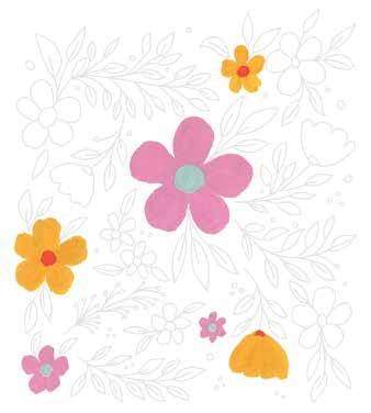
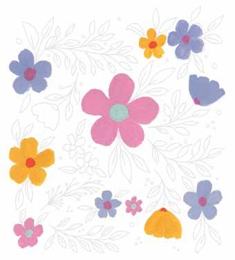
STEP 5. Mix a peach (permanent yellow + primary red + white) and paint some more flowers. Paint the centers of these flowers pastel pink too. Feel free to paint over an existing flower, as I did, if you don’t like how the colors are balancing out.
STEP 6. Paint about one-third of the leaves medium green (cerulean blue + permanent yellow + white).
52 | Gorgeous Gouache
STEP 7. Paint the stems for the flowers, leaf branches, and other fillers using the dark red-orange.
STEP 8. Mix a moss green (more ultramarine blue + permanent yellow + white) and paint another onethird of the leaves.
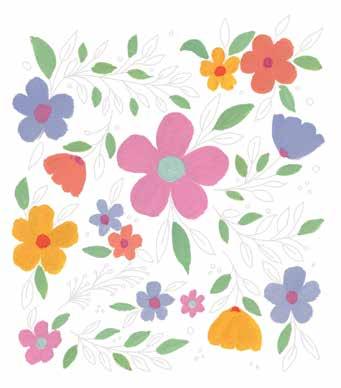
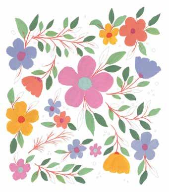
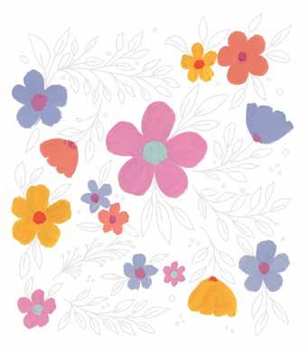
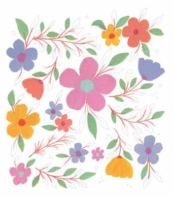
STEP 9. To make the design look more colorful, paint the remaining leaves in a combination of the previously used pastel blue and pastel violet.
STEP 10. Paint the tiny berries with the previously used pastel pink or a darker variation of it. Add some pink dots to fill the gaps in the design.
PRETTY PATTERNS AND LETTERING Spring Florals | 53
STEP 11. Using a thin liner brush and white paint, add details like dots to the centers of the flowers and vein lines to the leaves. Alternatively, try using a white gel pen.
STEP 12. Continuing with white, add more detail lines and dots to the flower petals.
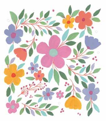
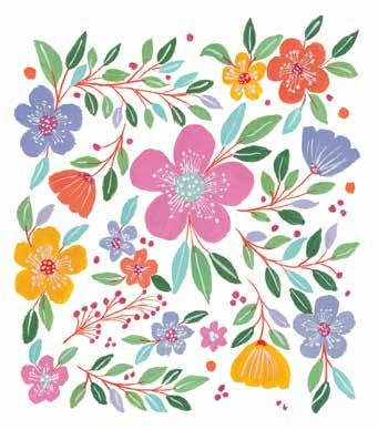
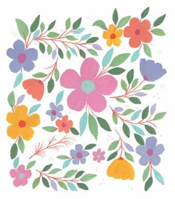
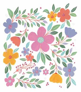
54 | Gorgeous Gouache STEP 4 STEP 7 STEP 10 STEP 2 STEP 5 STEP 8 STEP 11 STEP 3 STEP 6 STEP 9 STEP 12 At a Glance STEP 1
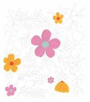
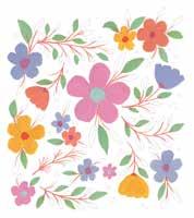
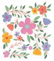
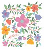
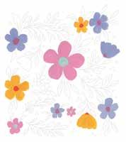
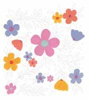
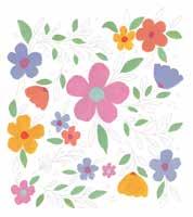
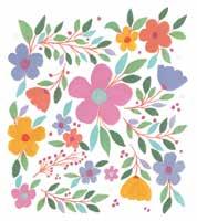
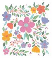
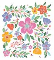
Spring Florals | 55 Color Mixing Recipes pastel pink (crimson + white) pastel blue (turquoise blue + white) darkyellowpermanentred-orange (permanent yellow + primary red) pastel violet (cerulean blue + crimson + white) peach (permanent yellow + primary red + white) medium green (cerulean blue + permanent yellow + white) moss green (more ultramarine blue + permanent yellow + white) white To get exact or similar colors, try different ratios of each ingredient or refer to the color mixing section (pages 29–31).



56 | Gorgeous Gouache
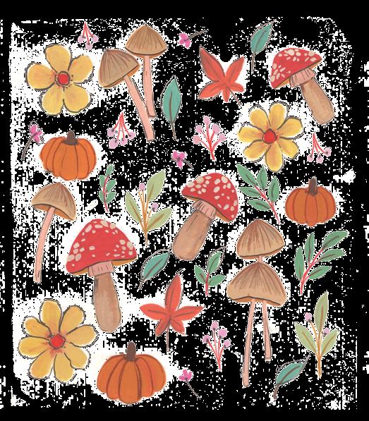
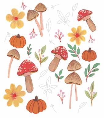
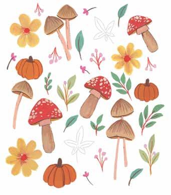
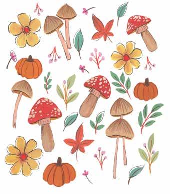
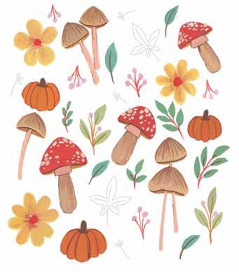
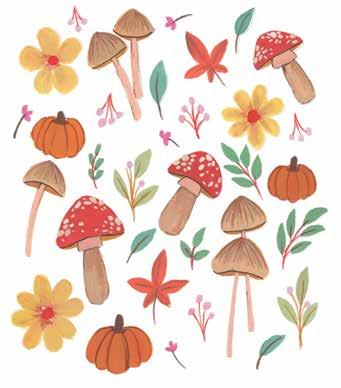
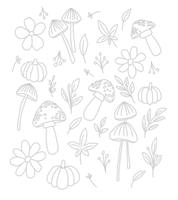
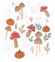
Autumn Treasures this project will paint all things autumn. You can include what I included or your own favorite elements from the season. I focused on mushrooms and maple leaves—two things that visually point straight to autumn! In India, where I live, leaves fall and grow throughout the year, so don’t have an obvious fall season. I fill in that void by painting autumnthemed botanicals! this project, you will experiment with adding outlines and sticking to a seasonal color palette.
we
we
Through
BRUSHES AND SPECIAL SUPPLIES: ϋ Size 6 round brush ϋ Size 2 liner brush ϋ Black pigment liner pen (optional) See page 61 for color mixing instructions.
In


PRETTY PATTERNS AND LETTERING Autumn Treasures | 57
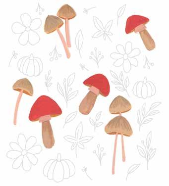
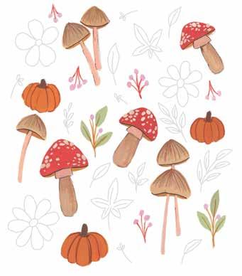
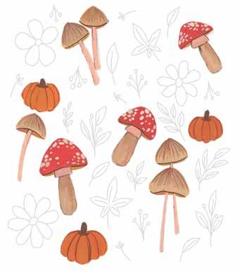
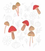
STEP 3. Paint some of the mushrooms’ heads primary red and some of them medium brown (burnt umber + white). Add orange (primary red + permanent yellow + white) to the bottom edge of all the mushroom heads.
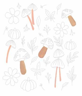
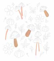
STEP 2. Paint the bases of the mushrooms in light brown (burnt sienna + a little permanent yellow + white) and pastel orange (permanent yellow + primary red + more white).
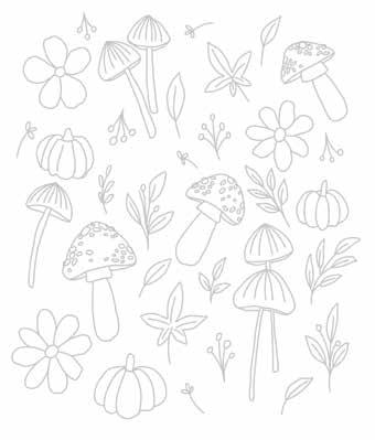
STEP 1. Use the template provided. Alternatively, sketch an illustration by using autumnal elements like mushrooms and pumpkins mixed with allseason flower shapes, leaves, and fillers.
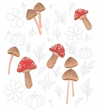
STEP 4. To the red mushrooms, add some light brown dots and a black outline. To the other mushrooms, paint some dark brown (burnt sienna + black) vertical lines from the top of the mushroom and add a black outline only along the bottom edge.
STEP 8. Mix a pastel yellow ocher (permanent yellow + white + a little burnt sienna) to paint the remaining flowers. Paint primary red in the centers of the flowers and add some light brown brushstrokes radiating out from the centers.
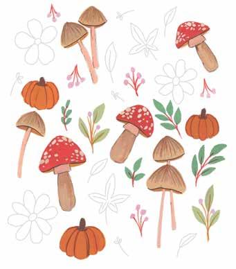
STEP 7. Paint some more leaves moss green (permanent yellow + ultramarine blue + white) with primary red stems.
STEP 6. Paint the berry fillers using a variety of colors, like pastel pink (crimson + more white), pale green (permanent yellow + cerulean blue + white), and primary red.
STEP 5. Paint the pumpkins dark orange (primary red + permanent yellow + a little burnt sienna). Use the dark brown to paint details on the pumpkins, like the stem and texture lines.
58 | Gorgeous Gouache
STEP 9. To balance the colors and make the design look more cheerful, paint the remaining small leaves turquoise-green (turquoise blue + permanent yellow).
STEP 11. Paint the big leaves with a dark orangebrown (primary red + permanent yellow + burnt sienna). Add dark brown stems and vein lines.
STEP 10. Paint the tiny floral fillers with medium pink (crimson + white) and dark brown.
PRETTY PATTERNS AND LETTERING Autumn Treasures | 59
STEP 12. Draw outlines around all the elements using black. Alternatively, you can use a black pigment liner pen.
60 | Gorgeous Gouache STEP 4 STEP 7 STEP 10 STEP 2 STEP 5 STEP 8 STEP 11 STEP 3 STEP 6 STEP 9 STEP 12 At a Glance STEP 1
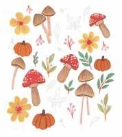
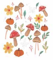
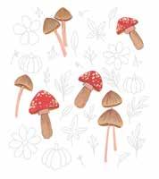
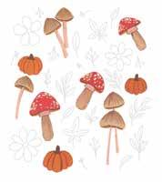
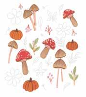
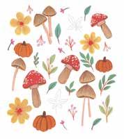
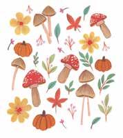
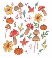
moss green (permanent yellow + ultramarine blue + white) pastel yellow ocher (permanent yellow + white + a little burnt sienna) turquoise-green (turquoise blue + permanent yellow) medium pink (crimson + white) dark orange-brown (primary red + permanent yellow + burnt sienna) black
Autumn Treasures | 61
Mixing Recipes
Color
light brown (burnt sienna + a little yellowpermanent+white) pale green (permanent yellow + cerulean blue + white)pastel orange (permanent yellow + primary red + more white) primary red medium brown (burnt umber + white) orange (primary red + permanent yellow + white) dark brown (burnt sienna + black) dark orange (primary red + permanent yellow + a little burnt sienna) pastel pink (crimson + more white)
To get exact or similar colors, try different ratios of each ingredient or refer to the color mixing section (pages 29–31).



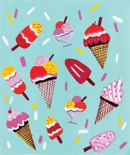
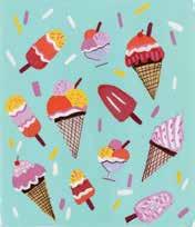
Cream Galore I wanted to include a summer project in this book, and I couldn’t get my mind off ice cream. I love that feeling of eating a cold ice cream on a hot summer day. Ice cream lollipops, ice cream sundaes, soft-serve, and ooh, that waffle cone! This
Ice piece
62 | Gorgeous Gouache
reminds me of sweet summer memories and simpler times. This is the first project in the book in which you will start by painting a solid custom-mixed background color. BRUSHES: ϋ Size 1/2" flat brush ϋ Size 6 round brush ϋ Size 2 liner brush See page 67 for color mixing instructions.
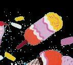


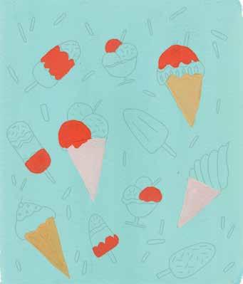
STEP 4. Mix an orange (permanent yellow + primary red + white) and paint just one layer or part of several of the ice creams with this color.
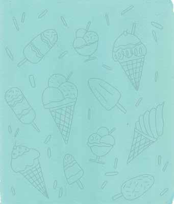
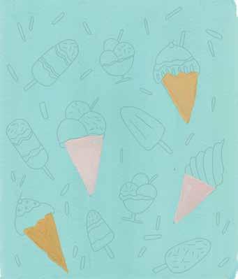
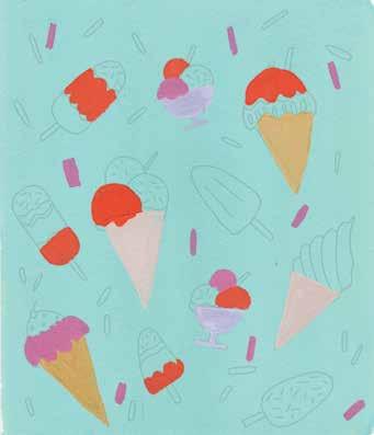
STEP 2. Sketch different ice creams on the background using a pencil. Also sketch some sprinkles in between the ice creams to fill up the background space.
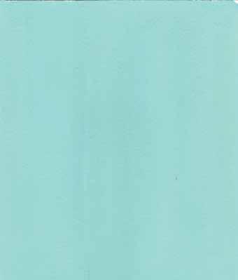
STEP 1. Mix a pastel blue (turquoise blue + white + a little lemon yellow). Don’t add too much yellow or your mixture will turn green. Take a photo or make a copy of the template for reference, then paint the background this color.
STEP 3. Paint the cones with two colors: a pale pink (more white + a little crimson + a little burnt sienna) and a pale yellow ocher (yellow ocher + white).
PRETTY PATTERNS AND LETTERING Ice Cream Galore | 63
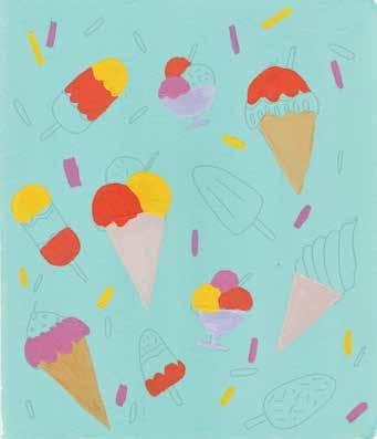
STEP 6. Using a medium yellow (permanent yellow + white), paint some more ice cream scoops/layers as well as some more background sprinkles.
STEP 7. Mix a pastel pink (crimson + a little ultramarine blue + white) and paint more of the ice cream scoops/layers.
64 | Gorgeous Gouache
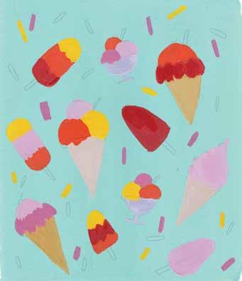
STEP 8. Finish the remaining ice cream scoops/ layers using a reddish brown (burnt sienna + primary red + white).
STEP 5. Paint the ice cream cups with a light violet (ultramarine blue + crimson + more white). Then mix a pink (more crimson + a little white) for some of the ice cream scoops/layers as well as some of the background sprinkles.
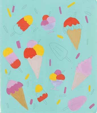
PRETTY PATTERNS AND LETTERING Ice Cream Galore | 65
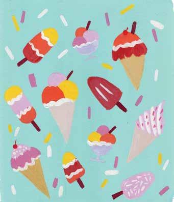
STEP 10. Using white, finish the remaining sprinkles and add more details to the ice cream layers.
STEP 9. Using a dark brown (burnt sienna + black), paint the ice cream sticks. Paint the cherries with primary red.
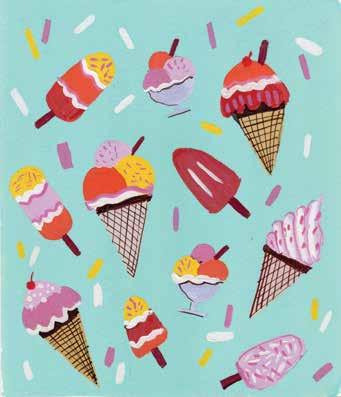
STEP 11. Using a thin liner brush and a blackbrown (burnt umber + a little black), paint the texture on the cones and add a partial outline to the cups.
STEP 12. Add more details to the various ice creams to make them look more dimensional. I mainly used pinks and violets I had already mixed.
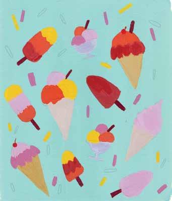
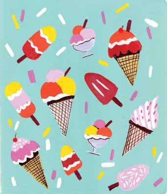
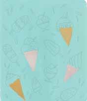
66 | Gorgeous Gouache STEP 4 STEP 7 STEP 10 STEP 2 STEP 5 STEP 8 STEP 11 STEP 3 STEP 6 STEP 9 STEP 12 At a Glance STEP 1

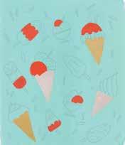
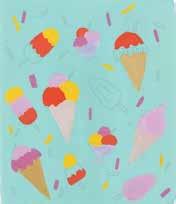
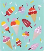
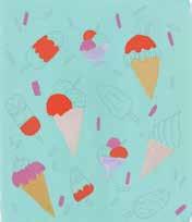
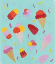
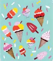
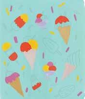
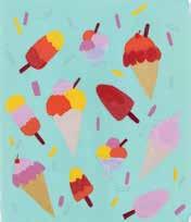
To get exact or similar colors, try different ratios of each ingredient or refer to the color mixing section (pages 29–31). Ice Cream Galore | 67 Color Mixing Recipes pastel blue (turquoise blue + white +a little lemon yellow) pale pink (more white + a little crimson + a little burnt sienna) pale yellow ocher (yellow ocher + white) orange (permanent yellow + primary red + white) light violet (ultramarine blue + crimson + more white) pink (more crimson + a little white) medium yellow (permanent yellow + white) pastel pink (crimson + a little ultramarine blue + white) reddish brown (burnt sienna + primary red + white) dark brown (burnt sienna + black) primary black-brownred (burnt umber + a little black) white



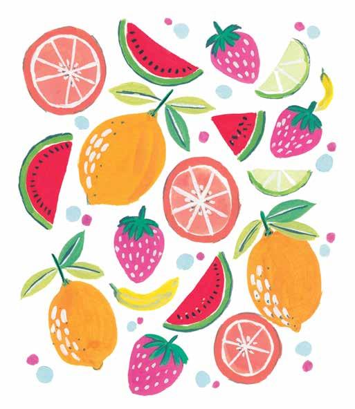
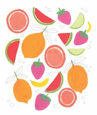
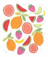
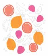
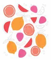
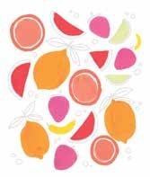
68 | Gorgeous Gouache Fun Fruit A bounty of fruits really makes my mouth water! I am a fruit lover because they truly refresh my energy. There’s nothing better than cold, juicy, plump, and ripe fruits—from melons and tangerines, to limes and berries, to oranges and bananas, there is a fruit for everyone. This is a fun design with a variety of different fruits—but feel free to add your own favorites while sketching and painting. This project is a good opportunity to practice adding highlights. BRUSHES: ϋ Size 6 Filbert brush (optional) ϋ Size 6 round brush ϋ Size 2 liner brush See page 73 for color mixing instructions.


PRETTY PATTERNS AND LETTERING Fun Fruit | 69
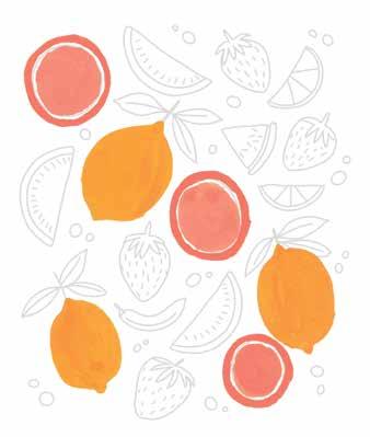
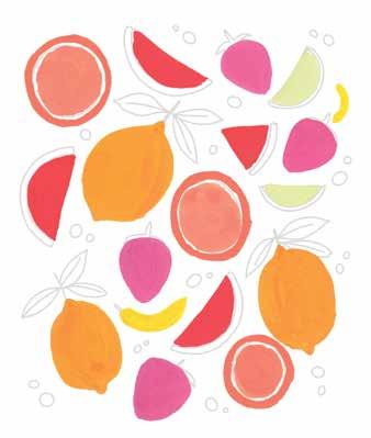
STEP 3. Mix a pastel orange (permanent yellow + primary red + white) to paint the orange slices. Leave a gap between the outer skin and the inner orange.
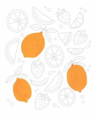
STEP 2. Mix a yellow-orange (permanent yellow + a little primary red) to paint the whole lemons. You can also do a little bit of a gradient in the lemons if desired.
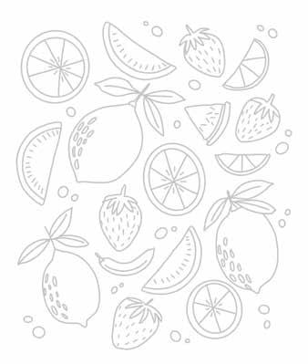
STEP 1. Use the template provided. Alternatively, sketch some fruits, both whole and sliced. Make sure to incorporate all your favorites!
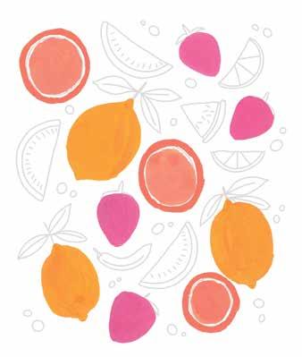
STEP 4. Mix a juicy medium pink (crimson + white) and paint the base layer for the strawberries.
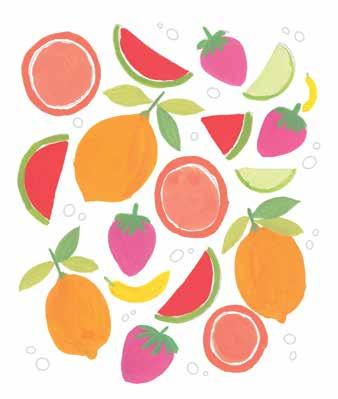
STEP 8. Continue using the greens to paint the leaves.
STEP 7. Mix at least two more greens, including light green (permanent yellow + cerulean blue + white) and moss green (permanent yellow + ultramarine blue + white). Paint the strawberry tops and the watermelon and lime rinds, choosing greens as desired.
70 | Gorgeous Gouache
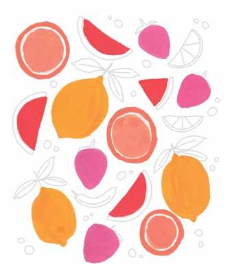
STEP 5. Paint the watermelon slices with primary red.
STEP 6. Mix a bright yellow (lemon yellow + permanent yellow) for the bananas and a pastel green (permanent yellow + cerulean blue + more white) for the lime slices.
PRETTY PATTERNS AND LETTERING Fun Fruit | 71
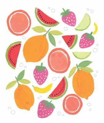
STEP 9. Add details to the fruits. Use black with a thick liner brush to paint the watermelon seeds, and use white to paint the strawberry seeds.
STEP 11. Use white to paint some shiny texture on the whole lemons as well as center veins in the leaves.
STEP 12. Add dark green (permanent yellow + ultramarine blue) detail lines to some of the fruit. Fill in some extra space with dots in contrasting colors like medium pink and light blue (cerulean blue + a little permanent yellow + more white).
STEP 10. Paint more white details on the orange slices and lime slices.
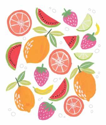
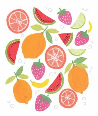
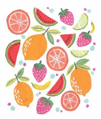
72 | Gorgeous Gouache STEP 4 STEP 7 STEP 10 STEP 2 STEP 5 STEP 8 STEP 11 STEP 3 STEP 6 STEP 9 STEP 12 At a Glance STEP 1
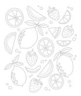
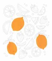
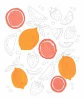
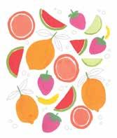
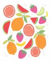
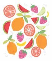
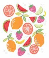
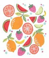
Fun Fruit | 73 yellow-orange (permanent yellow + a little primary red) light green (permanent yellow + cerulean blue + white) pastel orange (permanent yellow + primary red + white) moss green (permanent yellow + ultramarine blue + white) medium pink (crimson + white) black primary red bright yellow (lemon yellow + permanent yellow) pastel green (permanent yellow + cerulean blue + more white) dark green (permanent yellow + ultramarine blue) light blue (cerulean blue + a little yellowpermanent+morewhite) Color Mixing Recipes white To get exact or similar colors, try different ratios of each ingredient or refer to the color mixing section (pages 29–31).



See page 79 for color mixing instructions. BRUSHES AND SPECIAL SUPPLIES: ϋ Size 6 round brush ϋ Size 2 liner brush ϋ Marker or calligraphy pen (optional)
I’ve
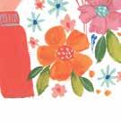
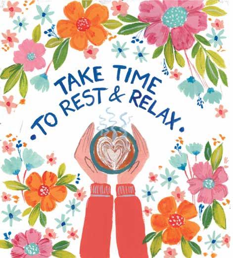
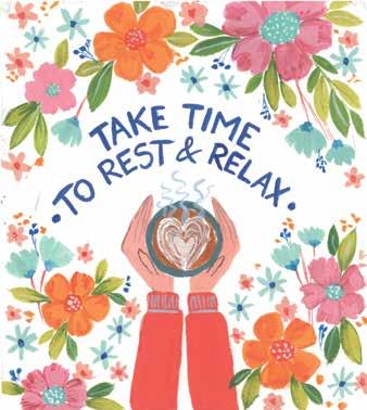
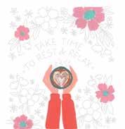
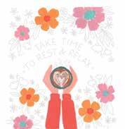
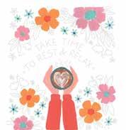
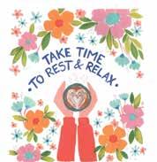
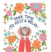
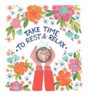
Take to Rest keeps us busy, but it is important—actually, crucial—for us to take time to rest and reflect. truly learned this over the past year—prioritizing rest and rejuvenation has changed how I approach productivity and the way I function in my business. No matter who you are, not working like a hamster on a wheel and resting without guilt are so, so important. So here’s a very floral reminder for you to take time out for yourself to rest and relax with no guilt whatsoever.
Time
74 | Gorgeous Gouache
and Relax Life


PRETTY PATTERNS AND LETTERING Take Time to Rest and Relax | 75
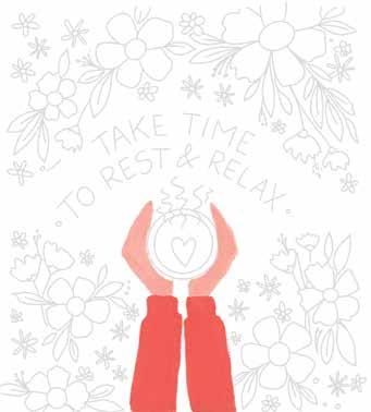
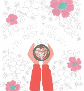
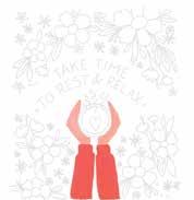
STEP 2. Paint the shirt sleeves with a bright redorange (primary red + permanent yellow), then use a skin tone of choice to paint the hands. I made this skin tone by mixing primary red + permanent yellow + more white.
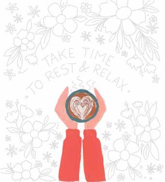
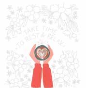
STEP 3. Paint the coffee in the mug using burnt sienna. Use white to paint some latte hearts in the center of the coffee. Paint the cup using greenish blue (more ultramarine blue + permanent yellow + white).
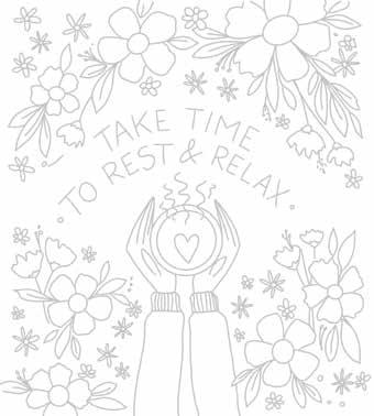
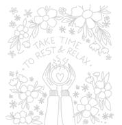
STEP 1. Use the template provided. Alternatively, sketch the illustration. First draw two hands holding a cup, then the quote, and then some flowers surrounding it and filling the remaining space.
STEP 4. Paint some flowers in pastel pink (crimson + white). Paint the centers of the flowers with a light blue (turquoise blue + white).
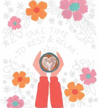
STEP 5. Paint some yellow-orange (more permanent yellow + a little primary red) flowers with the shirt color red-orange in the centers of the flowers. Keep the petal shape of these flowers simpler than the other flowers for variety.
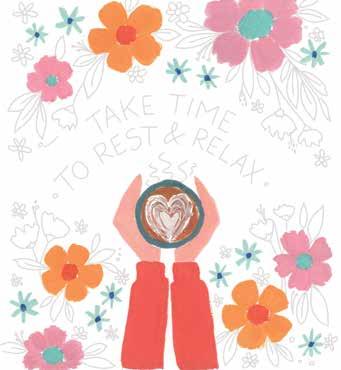
STEP 8. Paint some additional filler flowers using light blue and dark blue or greenish blue. Use burnt sienna to paint the stem of each filler flower.
STEP 6. Paint light blue flowers with thin and long petals. Place these flowers in between the previous flowers. After painting the petals, add ultramarine blue in the centers of the flowers.
STEP 7. Paint the leaves using two different greens: moss green (permanent yellow + ultramarine blue + white) and light green (permanent yellow + cerulean blue + white). Try adding some dark shading on some of the light leaves to add dimension.
76 | Gorgeous Gouache
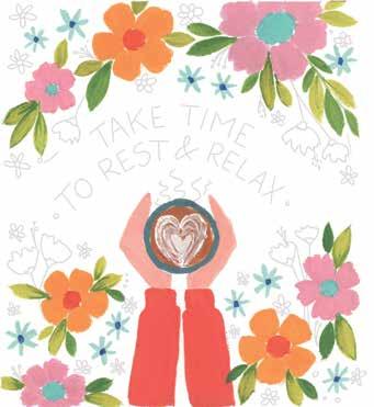
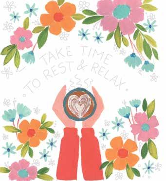
STEP 11. Using white and light blue, add white dots in flower centers, sleeve cuff ribbing, leaf veins, and coffee steam. Paint the finger outlines using burnt sienna or a different dark brown.
STEP 9. Fill the gaps with some tiny flesh tone or pink flowers with red-orange (or simply primary red) centers. You can see how the illustration is looking more balanced now.
STEP 12. In any desired colors, add final filler berries and dots and do some layering on the flower petals. Try doing the petal layering using drybrushing.
STEP 10. Write the quote with a thin liner brush using ultramarine blue. Alternatively, you could use a marker or a calligraphy pen.
PRETTY PATTERNS AND LETTERING Take Time to Rest and Relax | 77
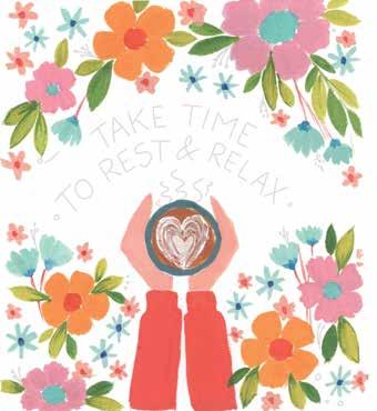
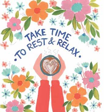
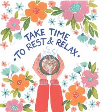
78 | Gorgeous Gouache STEP 4 STEP 7 STEP 10 STEP 2 STEP 5 STEP 8 STEP 11 STEP 3 STEP 6 STEP 9 At a Glance STEP 1 STEP 12



Take Time to Rest and Relax | 79 Color Mixing Recipes red-orange (primary red + permanent yellow) light blue (turquoise blue + white) skin tone (primary red + permanent yellow + more white) yellow-orange (more primaryyellowpermanent+alittlered) burnt sienna ultramarine blue white moss green (permanent yellow + ultramarine blue + white) greenish blue (more ultramarine blue + permanent yellow + white) pastel pink (crimson + white) light green (permanent yellow + cerulean blue + white) To get exact or similar colors, try different ratios of each ingredient or refer to the color mixing section (pages 29–31).


AbundanceFloral

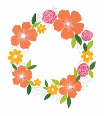
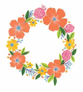
82 | Gorgeous Gouache Who said wreaths are only appropriate at Christmas? Floral wreaths are such fun to paint at any time of the year. You can tweak the flower and color choices to suit any season. Wreaths are also a fun subject to paint because they allow you to explore many elements and are easy to compose. Let me show you how! See page 87 for color mixing instructions. BRUSHES: ϋ Size 6 round brush ϋ Size 10 round brush (optional) ϋ Size 2 liner brush Seasonal Wreath

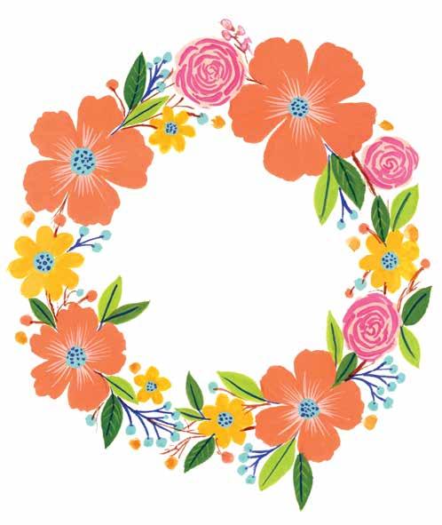


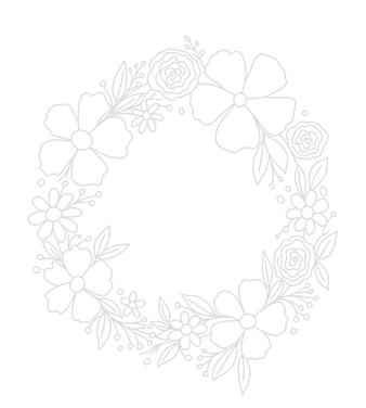
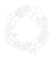
STEP 1. Use the template provided. Alternatively, sketch the wreath with a pencil. Start by drawing a circle, then sketch large flowers spaced out around it, followed by leaves and fillers.
FLORAL ABUNDANCE Seasonal Wreath | 83
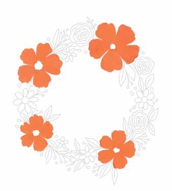
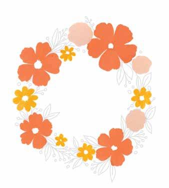
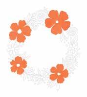
STEP 2. Before painting, if desired, partially erase the pencil lines to make them lighter so they are easier to cover. Mix a medium orange (permanent yellow + white + crimson) and paint the largest flowers this color.
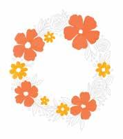
STEP 3. Switch to a smaller brush to make it easier to fill small areas. Paint the smaller flowers permanent yellow.
STEP 4. Paint the round roses light orange (crimson + permanent yellow + white).
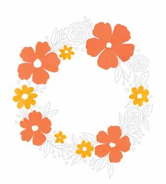
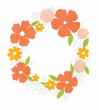
STEP 5. Paint some of the leaves light green (permanent yellow + cerulean blue + white).
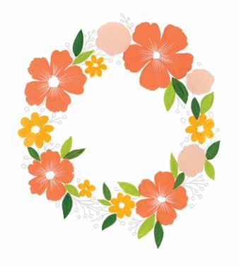
STEP 8. Detail the roses with crimson by painting some wavy lines to imitate rose petals.
84 | Gorgeous Gouache
STEP 7. Using a liner brush, add white details to the centers of the medium orange flowers. Paint very thin strokes patiently, radiating out from the center of each flower.
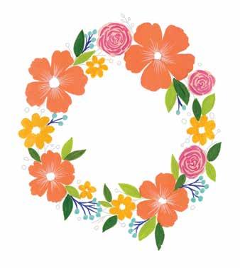
STEP 6. Paint the remaining leaves moss green (permanent yellow + ultramarine blue + white).
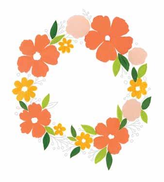
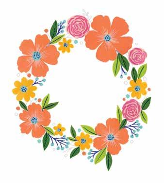
STEP 10. Use the same light blue to paint the center of each flower. Add some dots to these centers with the same dark blue.
STEP 9. Paint the filler berries with light blue (turquoise blue + white) and the filler stems with ultramarine blue. This will add a lot of contrast to the painting.
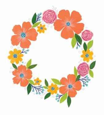
STEP 12. Finally, use burnt sienna to paint some twigs between the elements around the circle of the wreath to make it look more like a wreath.
STEP 11. Paint some small additional flowers, dots, or other minimal fillers wherever there is a gap you want to fill. I added some light blue, medium orange, and yellow dots.
FLORAL ABUNDANCE Seasonal Wreath | 85
86 | Gorgeous Gouache STEP 4 STEP 7 STEP 10 STEP 2 STEP 5 STEP 8 STEP 11 STEP 3 STEP 6 STEP 9 STEP 12 At a Glance STEP 1
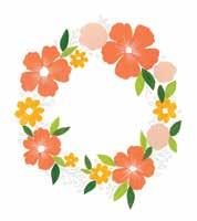
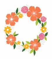
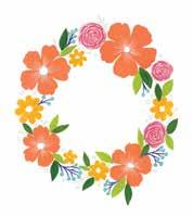
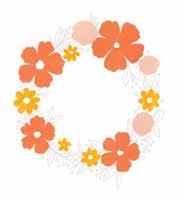
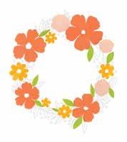
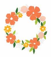
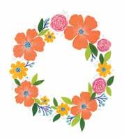
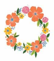
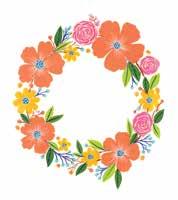
Seasonal Wreath | 87 Color Mixing Recipes medium orange yellow(permanent+white + crimson) white permanent yellow crimson light orange (crimson + permanent yellow + white) light blue (turquoise blue + white) light green (permanent yellow + cerulean blue + white) ultramarine blue moss green (permanent yellow + ultramarine blue + white) burnt sienna To get exact or similar colors, try different ratios of each ingredient or refer to the color mixing section (pages 29–31).



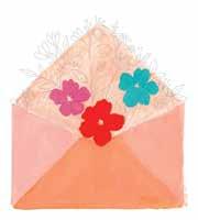
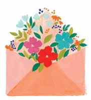
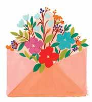
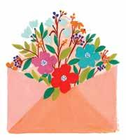
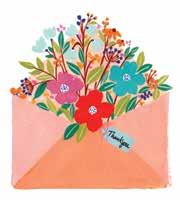
88 | Gorgeous Gouache Letters are now a somewhat forgotten form of art. Snail mail in a time of instant messaging allows you to make a mindful effort to pause, reflect, and spend time and energy on the person to whom you are writing. Even better than a letter is an envelope full of fresh and lovely florals to show your gratitude to your loved ones. Since it’s hard to actually put that in a mailbox, though, let’s paint it instead. This is a great composition for learning how to layer elements on a faux-dimensional color background. See page 93 for color mixing instructions. BRUSHES: ϋ Size 1/2" flat brush or size 6 Filbert brush ϋ Size 6 round brush ϋ Size 2 liner brush Envelope
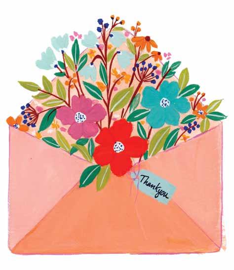


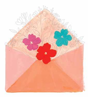
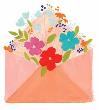
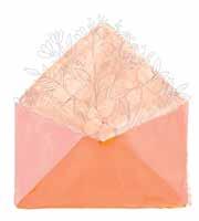
STEP 2. Mix a pastel orange (permanent yellow + crimson + white) and then keep adding white to create three different orange tints total. Paint the background of the envelope with these three tints; using three colors will make it look more realistic and three-dimensional.
FLORAL ABUNDANCE Envelope | 89
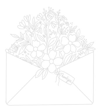
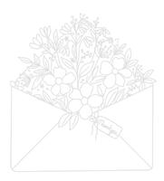
STEP 1. Use the template provided. Alternatively, sketch the illustration lightly with a pencil. First draw the outline of the envelope and then draw some flowers, leaves, and fillers. Take a photo or make a copy of the template for reference.
STEP 3. Paint the large flowers in different colors. I used a crimson, turquoise blue (or a mix of cerulean blue + white), and primary red.
STEP 4. Paint the smaller flowers orange (permanent yellow + primary red) and light blue (turquoise blue + white) to create a nice contrast to the other flowers.
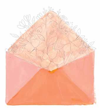
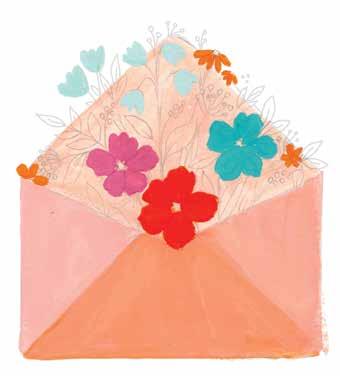
90 | Gorgeous Gouache
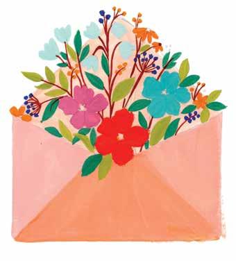
STEP 8. Next, paint stems for the leaves and the flowers to make the elements look like they’re emerging from the envelope. Use burnt sienna to paint these stems with a thin liner brush.
STEP 7. Paint the rest of the leaves in an emerald green (permanent yellow + ultramarine blue).
STEP 6. Paint some leaves in a light, grass green (permanent yellow + a little cerulean blue + white).
STEP 5. Paint the berry fillers orange and ultramarine blue.
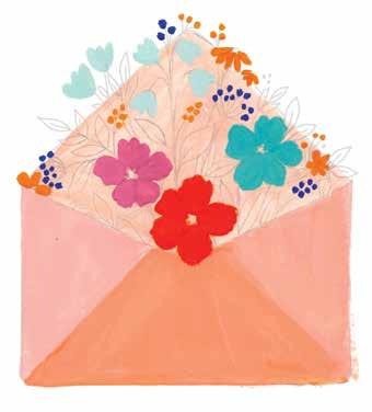
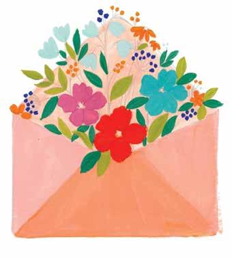
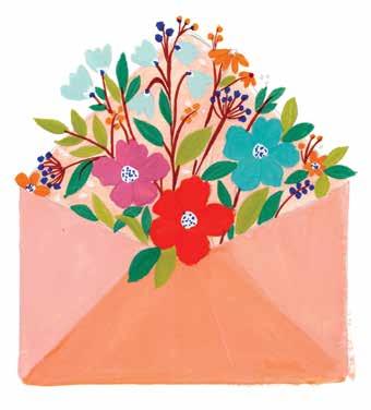
STEP 9. Paint the centers of the flowers white using a liner brush. After the white layer has dried, add some tiny ultramarine blue dots on top of these white centers.
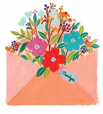
STEP 12. Draw an outline around the envelope in a pink using a liner brush. Don’t make it overly precise—instead, keep it rough, like a sketch.
STEP 11. Draw the gift tag outline with a pencil. Paint the tag with a slightly altered shade of one of your blues and paint a small ribbon using a crimson or primary red used for one of your large flowers. After the tag is dry, write a message on it.
STEP 10. Paint the center vein of each of the leaves with white. You can also add detail in the form of additional, smaller branching veins if you’d like. Also add some dots in various colors in between the larger elements to fill up gaps.
FLORAL ABUNDANCE Envelope | 91
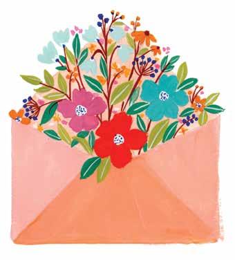
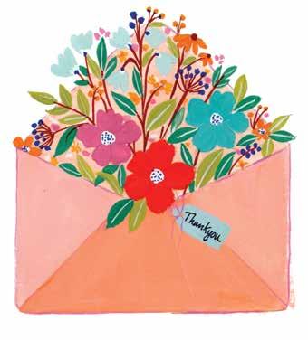
92 | Gorgeous Gouache STEP 4 STEP 7 STEP 10 STEP 2 STEP 5 STEP 8 STEP 11 STEP 3 STEP 6 STEP 9 STEP 12 At a Glance STEP 1
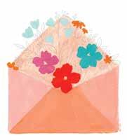
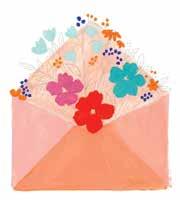
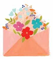
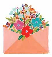
Envelope | 93 Color Mixing Recipes pastel orange (permanent yellow + crimson + white) ultramarine blue crimson grass green (permanent yellow + a little cerulean blue + white) turquoise blue emerald green (permanent yellow + ultramarine blue) primary red burnt sienna orange (permanent yellow + primary red) light blue (turquoise blue + white) white To get exact or similar colors, try different ratios of each ingredient or refer to the color mixing section (pages 29–31).


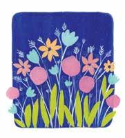
94 | Gorgeous Gouache Painting on a dark background is fun, but it can also be tricky. Let’s learn how to create effective layers on a painted dark background by creating a lovely midnight flower garden. This one really makes me think of being in the middle of a wildflower meadow at nighttime—what a beautiful and peaceful place to be. See page 99 for color mixing instructions. BRUSHES: ϋ Size 1/2" flat brush ϋ Size 6 round brush ϋ Size 2 liner brush Night Garden
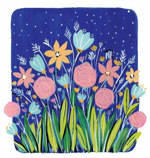


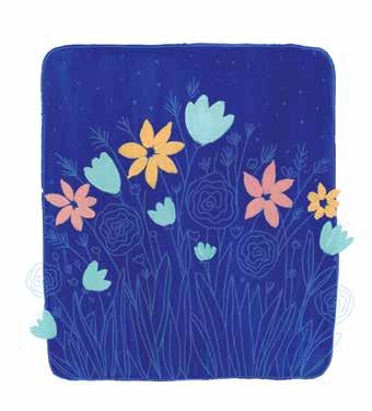
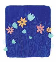
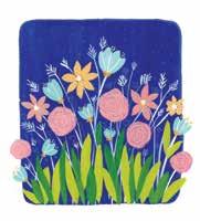
STEP 4. Paint the second set of flowers with light yellow (permanent yellow + white) and dusty rose (permanent yellow + more crimson + white).
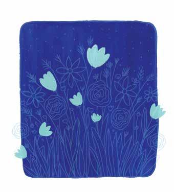
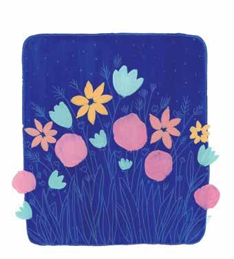
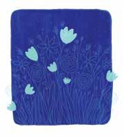
STEP 3. Mix a pastel blue (turquoise blue + white) and paint the first set of flowers. If you don’t have turquoise blue, mix cerulean blue + very little permanent yellow + white. The goal is for the flowers to highly contrast the blue background.
FLORAL ABUNDANCE Night Garden | 95
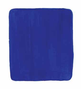
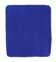
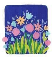
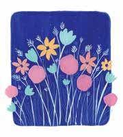
STEP 1. Use the template provided. Take a photo or make a copy of the template for reference, then paint a solid background with ultramarine blue. Don’t completely fill the page, and round the edges of the colored area.
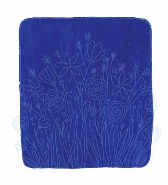
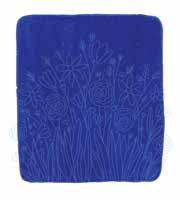
STEP 2. Use a pencil or a colored pencil in white or any light color to make a sketch of the flowers and leaves on top of your blue background, slightly extending beyond it on the sides.
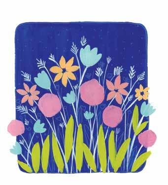
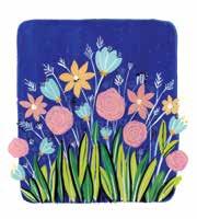
STEP 8. Paint emerald green (permanent yellow + ultramarine blue + white) leaves between and partially on top of the bright green leaves.
STEP 7. Switch back to a round brush and paint some long leaves in bright green (permanent yellow + cerulean blue + white).
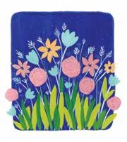
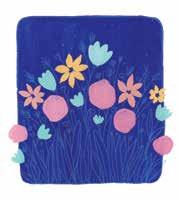
STEP 5. Paint the roses in a medium pink (crimson + less white). Instead of painting neat circles, shape these roses as wavy circles.
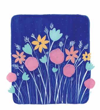
STEP 6. Using your pastel blue and a liner brush, paint some fillers and stems for both the flowers and the fillers. Hold your brush loosely and use gentle pressure to paint the thin lines.
96 | Gorgeous Gouache
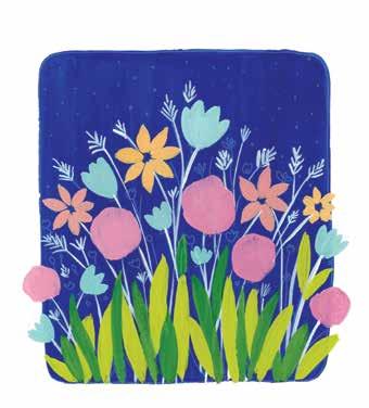
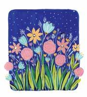
STEP 12. Finally, fill any gaps as desired with tiny flowers in the colors of your choice. Also paint some white dots in the sky background. Next time, in a larger composition, you could add more elements, like fireflies or a crescent moon.
FLORAL ABUNDANCE Night Garden | 97
STEP 10. Paint the centers of some of the flowers white and add some white detail lines to some of the other flowers.
STEP 11. Mix a very dark green (permanent yellow + more ultramarine blue + a little black). Use it to add shadows on the leaves and dots in the centers of some of the flowers.
STEP 9. While the previous layers are drying, pick up the liner brush and paint some thin, wavy lines on the roses to imitate petals. Use the same dusty rose color as before.
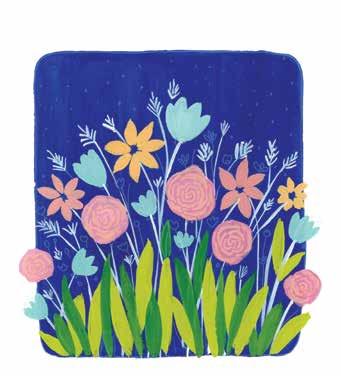
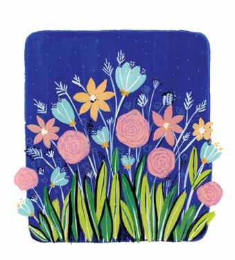
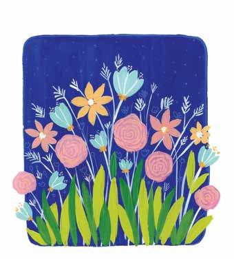
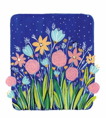
98 | Gorgeous Gouache STEP 4 STEP 7 STEP 10 STEP 2 STEP 5 STEP 8 STEP 11 STEP 3 STEP 6 STEP 9 STEP 12 At a Glance STEP 1
Night Garden | 99 Color Mixing Recipes ultramarine blue bright green (permanent yellow + cerulean blue + white)pastel blue (turquoise blue + white) emerald green (permanent yellow + ultramarine blue + white)light yellow yellow(permanent+white) white dusty rose (permanent yellow + more crimson + white) very dark green (permanent yellow + more ultramarine blue + a little black) medium pink (crimson + less white) To get exact or similar colors, try different ratios of each ingredient or refer to the color mixing section (pages 29–31).



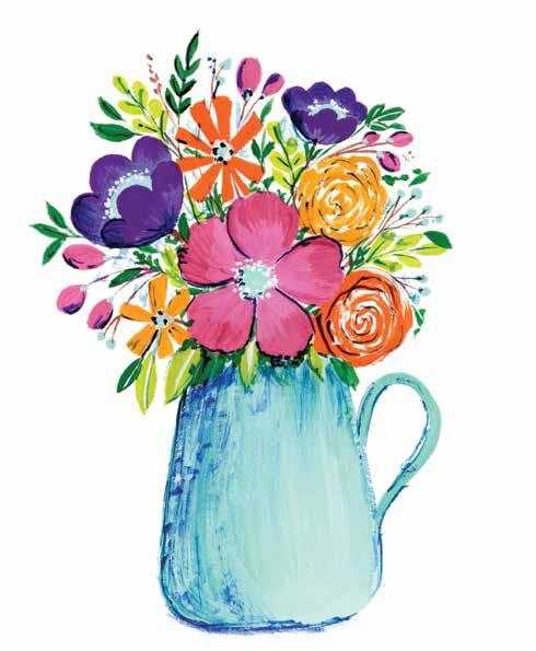
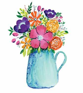
100 | Gorgeous Gouache Floral bouquets are so enthralling, and they’re equally addictive to paint, from the hero flower in the center down to the little fillers mixed in. Painting and studying bouquets also give a great insight into composition and flow. In this project, you will learn to paint in a semirealistic style and how to incorporate drybrushing. See page 105 for color mixing instructions. BRUSHES: ϋ Size 6 round brush ϋ Size 2 liner brush Vase


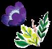


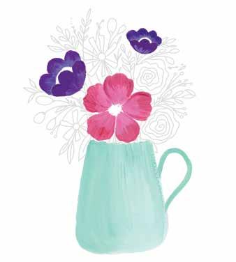
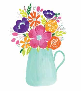
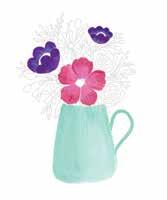
STEP 4. Paint the side-view flowers with two variations of violet—dark violet (ultramarine blue + crimson) and light violet (ultramarine blue + crimson + white). Approach these similarly to the center flower, with the lighter color near the bottom and the darker color at the tips.
FLORAL ABUNDANCE Vase | 101
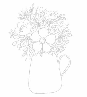
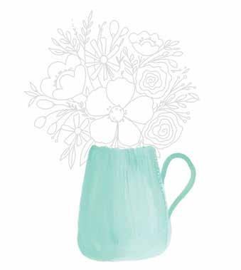
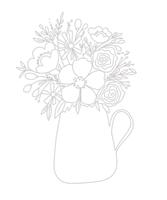
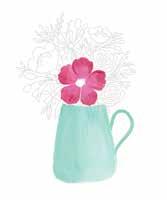
STEP 1. Use the template provided. Alternatively, sketch a vase and some flowers with a pencil. Make the vase whatever shape you like.
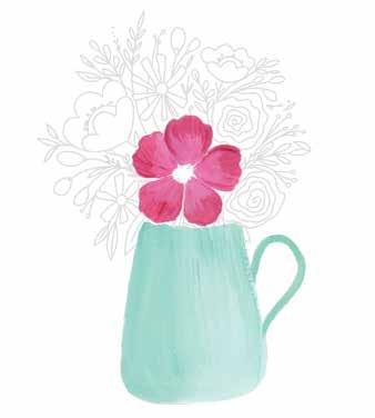
STEP 3. Paint the center flower with crimson and medium pink (crimson + white). Begin painting each petal from the inner portion with the lighter color and gradually paint with the darker color on the top near the outer portion.
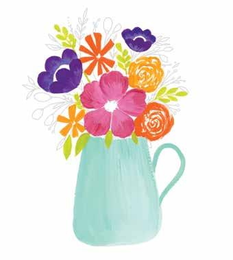
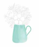
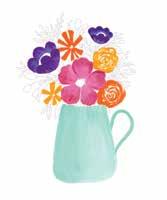
STEP 2. Mix a pastel blue (turquoise blue + more white) and paint the vase. Since this is such a light color, consider erasing the pencil lines before painting. Then, using some mint green (cerulean blue + less permanent yellow + white), drybrush some strokes down the vase to make it look dimensional.
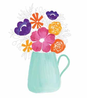
STEP 5. Paint the roses and other flowers with permanent yellow and orange (permanent yellow + primary red). Change up the style of the roses by leaving some unpainted gaps between the brushstrokes.
102 | Gorgeous Gouache
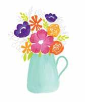
STEP 6. Mix a bright green (lemon yellow + cerulean blue + white) and paint some leaves.
STEP 7. Mix an emerald green (permanent yellow + ultramarine blue + white) and paint some more leaves.
STEP 8. Paint the buds with the medium pink. If desired, you can also use gradient colors for painting the buds. Paint the remaining berry fillers the same color as the vase to balance the piece.
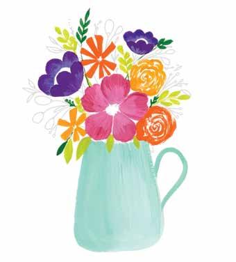
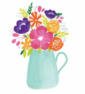
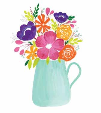
STEP 9. Using burnt sienna and a liner brush, paint the stems for flowers, leaves, buds, and berries.
STEP 11. To bring more depth to the vase and give it a realistic feel, gently drybrush ultramarine blue down from the top rim of the vase and horizontally in from its left side.
FLORAL ABUNDANCE Vase | 103
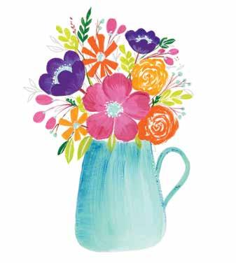
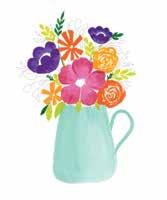
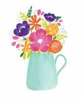
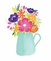
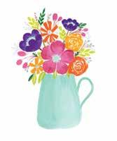
STEP 12. Using ultramarine blue, paint some rough outlines around the vase and the flowers, making it look like shadows. Feel free to also add more emerald green leaves and any other desired finishing details.
STEP 10. Paint the centers of the flowers with the same mint green as the vase. Add more details with white in the centers of the flowers and the leaves.
104 | Gorgeous Gouache STEP 4 STEP 7 STEP 10 STEP 2 STEP 5 STEP 8 STEP 11 STEP 3 STEP 6 STEP 9 STEP 12 At a Glance STEP 1
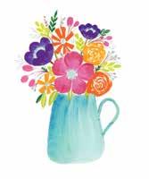
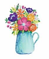
Color Mixing Recipes Vase | 105 pastel blue (turquoise blue + more white) orange (permanent yellow + primary red)mint green (cerulean blue + less permanent yellow + white) mediumcrimson pink (crimson + white) dark violet (ultramarine blue + crimson) light violet (ultramarine blue + crimson + white) permanent yellow bright green (lemon yellow + cerulean blue + white) emerald green (permanent yellow + ultramarine blue + white) burnt sienna ultramarinewhite blue To get exact or similar colors, try different ratios of each ingredient or refer to the color mixing section (pages 29–31).



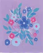
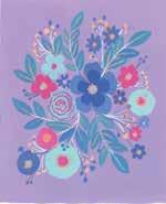
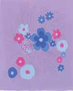
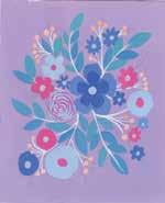
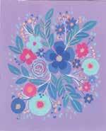
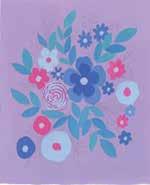
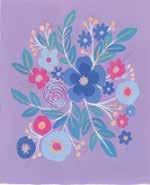
106 | Gorgeous Gouache In many cultures, shades of violet represent grounded strength, wisdom, and peace. This color combination surely inspires a feeling of calm and grounding! If you want to invoke a sense of serenity, surround yourself with shades of purple and violet. This painting is serenity in an afternoon—enjoy losing yourself in the colors and learning how to create an effective color palette with a strong mood. See page 111 for color mixing instructions. BRUSHES: ϋ Size 1/2" flat brush ϋ Size 6 round brush ϋ Size 2 liner brush Bursting Bouquet
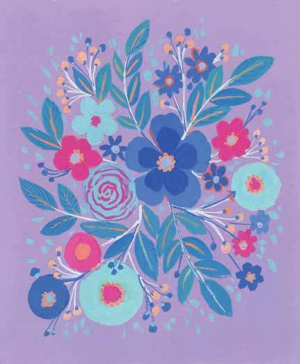


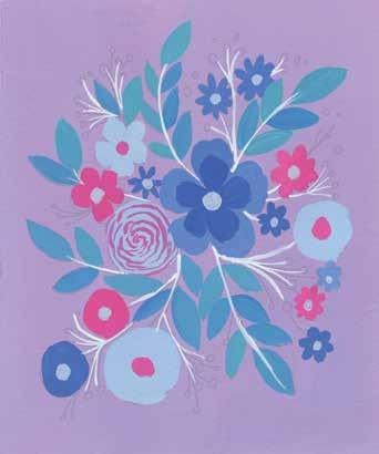
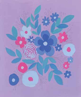
STEP 1. Use the template provided. Take a photo or make a copy of the template for reference, then paint a solid background in a pastel lavender (ultramarine blue + crimson + white).
STEP 2. Sketch the floral composition directly onto the background using a pencil or a colored pencil. Remember to draw lightly.
FLORAL ABUNDANCE Bursting Bouquet | 107
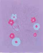
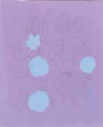
STEP 3. Mix a pastel blue (ultramarine blue + white). Paint base layers for some of the flowers.
STEP 4. Mix a bright pink (crimson + primary red + white) that contrasts with the background color. Use it to paint some pink flowers as well as to add details to the blue flowers.
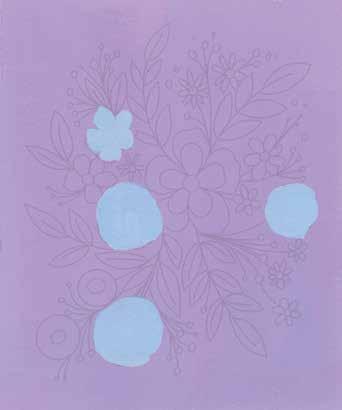
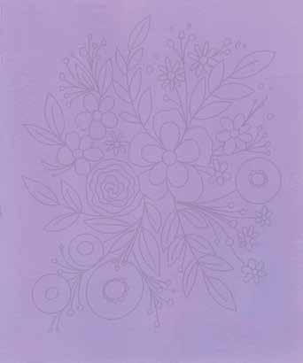
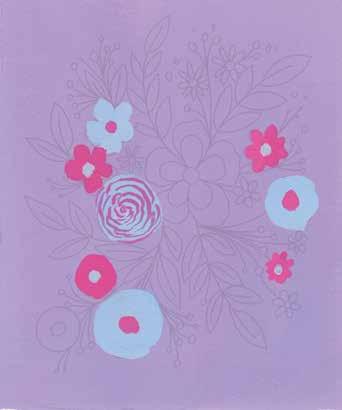
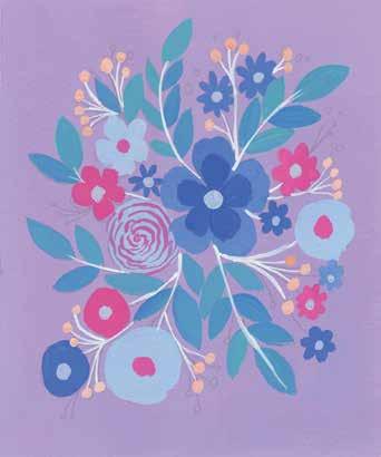
STEP 8. Mix a pastel orange (permanent yellow + primary red + white) and paint the berry fillers.
108 | Gorgeous Gouache
STEP 5. Mix a light cornflower blue (ultramarine blue + very little crimson + more white) and paint the remaining flowers. Paint the big center flower both this color and a cornflower blue (ultramarine blue + a little crimson + white).
STEP 6. Mix a teal blue (cerulean blue + a little permanent yellow + white) and a lagoon blue (ultramarine blue + cerulean blue + a little permanent yellow + white). Paint the leaves using these colors.
STEP 7. With a liner brush, paint the stems of the flowers and leaves in white.
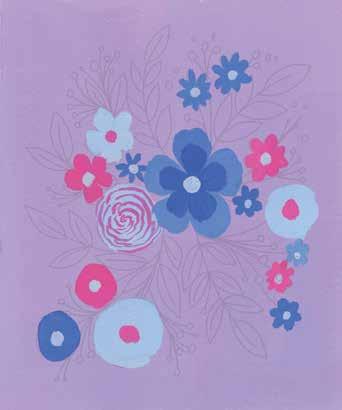
FLORAL ABUNDANCE Bursting Bouquet | 109
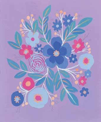
STEP 11. To fill up more space within the composition, add pastel blue dots in the empty spaces.
STEP 10. To make the pastel blue flowers look brighter, add a second layer of the mixture. Also paint a few new fillers with cornflower blue and add more details to the leaves.
STEP 9. Using the same pastel orange, paint the center veins of the leaves and the centers of most or all of the flowers.
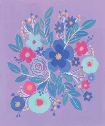
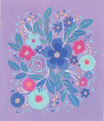
110 | Gorgeous Gouache STEP 4 STEP 7 STEP 10 STEP 2 STEP 5 STEP 8 STEP 11 STEP 3 STEP 6 STEP 9 At a Glance STEP 1
Bursting Bouquet | 111
pastel orange (permanent yellow + primary red + white)cornflower blue (ultramarine blue + a little crimson + white)
lagoon blue (ultramarine blue + cerulean blue + a little permanent yellow + white)bright pink (crimson + primary red + white) white light cornflower blue (ultramarine blue + very little crimson + more white)
Color
+
To (pages
pastel lavender (ultramarine blue + crimson white)
get exact or similar colors, try different ratios of each ingredient or refer to the color mixing section
29–31).
pastel blue (ultramarine blue + white)
Mixing Recipes
teal blue (cerulean blue + a little yellowpermanent+white)



112 | Gorgeous Gouache Do you remember the vibrant patterns you would see in kaleidoscopes in your childhood? If I could ever make a kaleidoscope, I would definitely add in floral patterns and make something like this painting—how cool would that be? I love creating something freeflowing like this. Such style allows you to explore new and different things. So throw off the reins of expectations as you dive into composing this abstract flower painting. See page 117 for color mixing instructions. BRUSHES AND SPECIAL SUPPLIES: ϋ Size 6 round brush ϋ Size 2 liner brush ϋ Black paper Freestyle Blooms
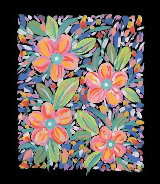


FLORAL ABUNDANCE Freestyle Blooms | 113
STEP 1. Sketch some big flowers with leaves using a white pencil on black paper. If you don’t have black paper, take a photo or make a copy of the provided template for reference and then paint the background black, but I highly recommend black paper.
STEP 2. Mix a pastel orange (permanent yellow + primary red + white) and paint the flower petals.
STEP 3. Paint the centers of the flowers Turkish blue (cerulean blue + ultramarine blue + less permanent yellow + white). Paint some medium pink (crimson + white) brushstrokes on top of the (dried) pastel orange petals.
STEP 4. Paint the large leaves using moss green (permanent yellow + ultramarine blue + white) and bright green (permanent yellow + cerulean blue + white).
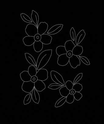
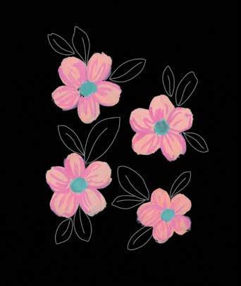
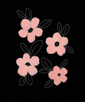
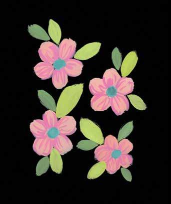
114 | Gorgeous Gouache
STEP 8. Add details to the flower petals using redorange (permanent yellow + primary red + a little white). Also add some more filler brushstrokes on the previous background layers.
STEP 5. Use the Turkish blue to paint free-flowing brushstrokes around the flowers and from the centers of the leaves to give the impression of skinny leaves or grass.
STEP 7. Paint some permanent yellow brush marks between the flowers as miscellaneous fillers. Add some yellow brushstrokes to the flower petals too.
STEP 6. Paint some loose, messy brushstrokes between the flowers using a medium blue (ultramarine blue + less white). Grip your brush loosely and let it just dance on the paper.
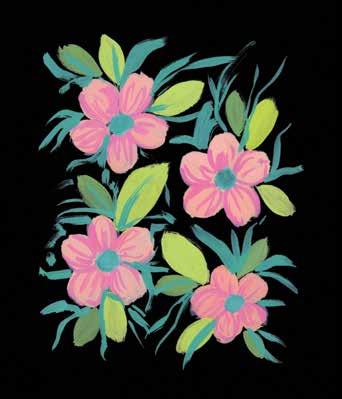
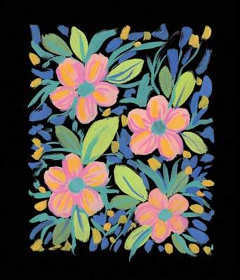
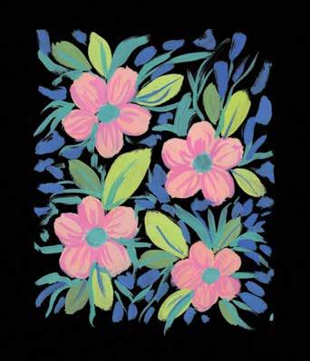
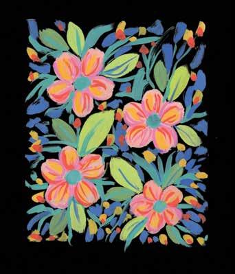
STEP 11. Paint the centers of the flowers with white. If desired, add more details to some of the leaves.
STEP 12. Finally, add some more pastel orange brushstrokes to all the existing background filler layers.
FLORAL ABUNDANCE Freestyle Blooms | 115
STEP 10. To fill more of the black spaces, paint small brushstrokes in the background, using the medium pink from earlier.
STEP 9. Add more random white brushstrokes to the previous layers. I love how much brighter and more beautiful it looks after adding the white.
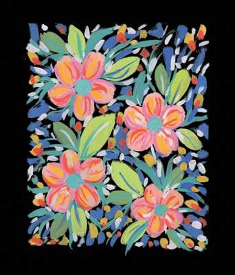
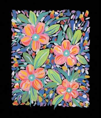
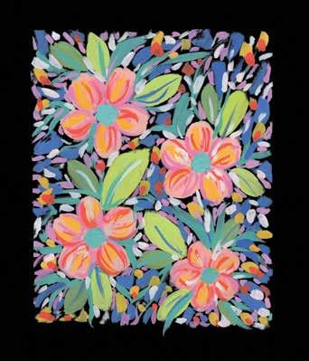
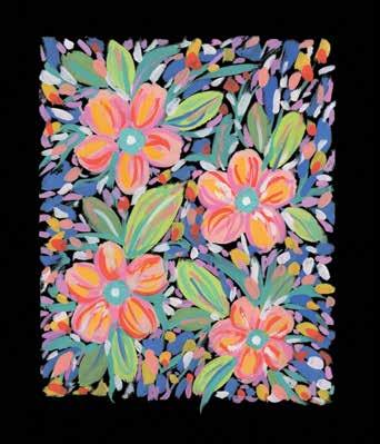
116 | Gorgeous Gouache STEP 4 STEP 7 STEP 10 STEP 2 STEP 5 STEP 8 STEP 11 STEP 3 STEP 6 STEP 9 STEP 12 At a Glance STEP 1
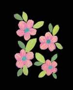
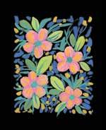
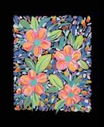
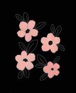
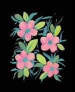
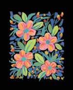
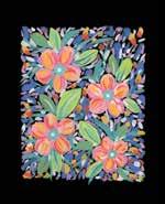
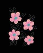
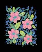
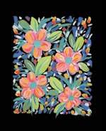
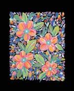
Freestyle Blooms | 117 Color Mixing Recipes pastel orange (permanent yellow + primary red + white) medium blue (ultramarine blue + less white)Turkish blue (cerulean blue + ultramarine blue + less yellowpermanent+white) permanent yellow medium pink (crimson + white) red-orange (permanent yellow + primary red + a little white)moss green (permanent yellow + ultramarine blue + white) white bright green (permanent yellow + cerulean blue + white) To get exact or similar colors, try different ratios of each ingredient or refer to the color mixing section (pages 29–31).



LandscapesInspiring
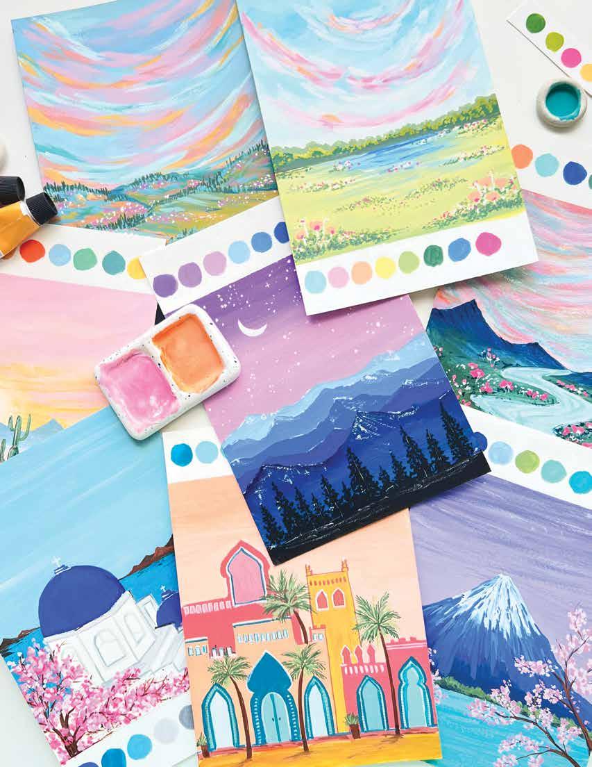
120 | Gorgeous Gouache Purple night skies over a dark mountain range—what a mood! It invokes feelings of stillness and calm. I wish I could transport myself to such beautiful scenery and bask in the glory of nature. Landscapes may seem challenging, but they are really quite fun to paint. In this project, you will learn how to add layers step by step to create the illusion of distance and depth. See page 125 for color mixing instructions. BRUSHES AND SPECIAL SUPPLIES: ϋ Size 1/2" flat brush ϋ Size 6 round brush ϋ Size 2 liner brush ϋ Scrap paper ϋ White gel pen (optional) Night Sky

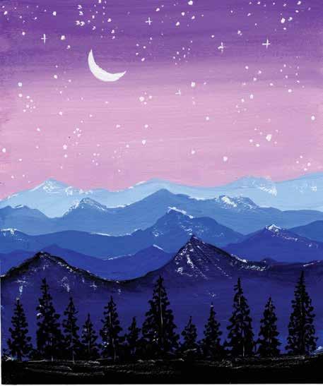


STEP 3. To paint the most-distant mountains, use a pastel blue (cobalt blue + more white).
STEP 2. Load your brush with a violet (ultramarine blue + crimson + white) and begin painting from the top of the sky. Then load your brush with a pastel pink-violet (violet + crimson + white) and paint the rest of the sky. Use the gradient technique to blend the colors.
STEP 4. To your previous pastel blue, add more cobalt blue to get a medium blue. Paint the second layer of the mountains this color.
INSPIRING LANDSCAPES Night Sky | 121
STEP 1. Use the template provided. Alternatively, sketch several rows of mountain ranges so you can paint different layers and give the impression of depth. Sketch a moon in the sky and some pine trees in the foreground.
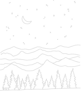
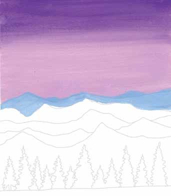
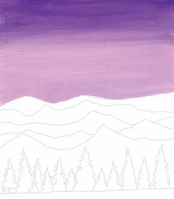
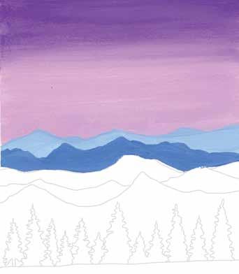
STEP 8. Paint the bottom foreground black. This will be the land on which the trees are anchored.
STEP 7. Mix a Prussian blue (ultramarine blue + a little black). Use the gradient technique to paint the foremost layer of mountains this color at the top and gradually shift to a navy (more ultramarine blue + a little black) near the bottom.
STEP 6. To your previous deep blue, add more ultramarine blue to make a vibrant dark blue. Paint the fourth layer of the mountains this color.
122 | Gorgeous Gouache
STEP 5. To your previous medium blue, add more cobalt blue and a little ultramarine blue to get a deep blue. Paint the third layer of the mountains this color.
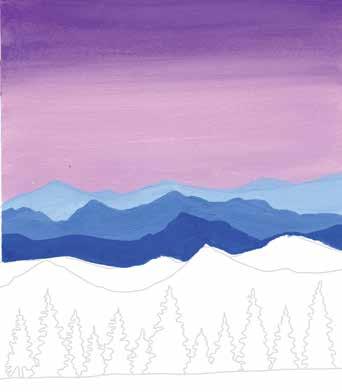
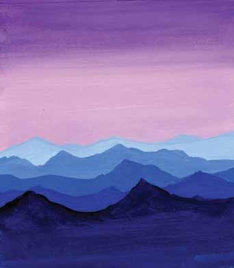
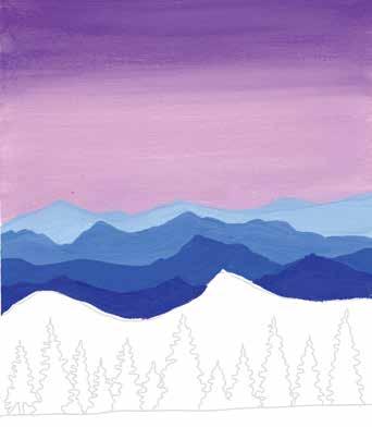
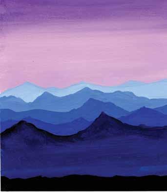
STEP 9. Paint black pine trees on your illustration, growing up from the ground. Vary the heights of the trees.
Before proceeding to the next step, practice painting black pine trees on scrap paper. Shown here are five steps to build a pine tree, as well as some variations on the theme.
STEP 10. Paint white stars and a crescent moon in the sky. Include some dot stars as well as some shining stars that are thin crosses. Alternatively, use a white gel pen to draw these details.
STEP 11. Finally, add some white highlights to represent the reflection of moonlight or snow on the mountains and ground. This will add beautiful depth to your painting.
INSPIRING LANDSCAPES Night Sky | 123
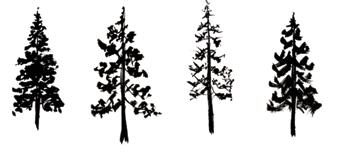
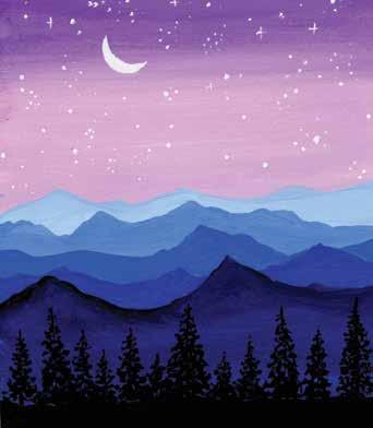
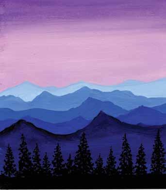
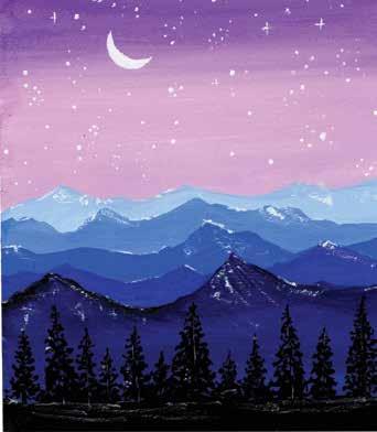
124 | Gorgeous Gouache STEP 4 STEP 7 STEP 2 STEP 5 STEP 8 STEP 10 STEP 3 STEP 6 STEP 9 STEP 11 At a Glance STEP 1
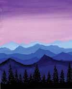
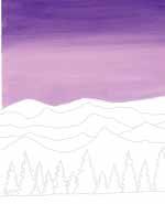
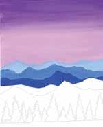
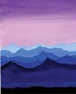
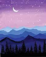
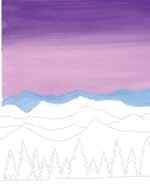
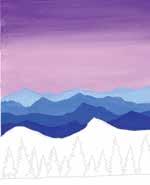
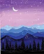
Mixing Recipes
Color
To get exact or similar colors, try different ratios of each ingredient or refer to the color mixing section (pages 29–31).
Night Sky | 125
violet (ultramarine blue + crimson + white) dark blue (deep blue ultramarine+ blue) pastel pink-violet (violet + crimson + white) Prussian blue (ultramarine blue + a little black) pastel blue (cobalt blue + more white) navy (more ultramarine blue + a little black) medium blue (pastel blue + cobalt blue) black deep blue (medium blue + cobalt blue + a little ultramarine blue) white



126 | Gorgeous Gouache This is a very otherworldly landscape with bright and vibrant colors. A crystal blue river flows beside dramatic pink skies and fields of flowers, skirted by stark mountains. I really feel like running barefoot across such a beautiful scene! In this painting, you will learn to build up layers in a different way by starting with an undertone. See page 131 for color mixing instructions. BRUSHES AND SPECIAL SUPPLIES: ϋ Size 6 Filbert brush ϋ Size 6 round brush ϋ Size 2 liner brush ϋ White gel pen (optional) Dreamy River


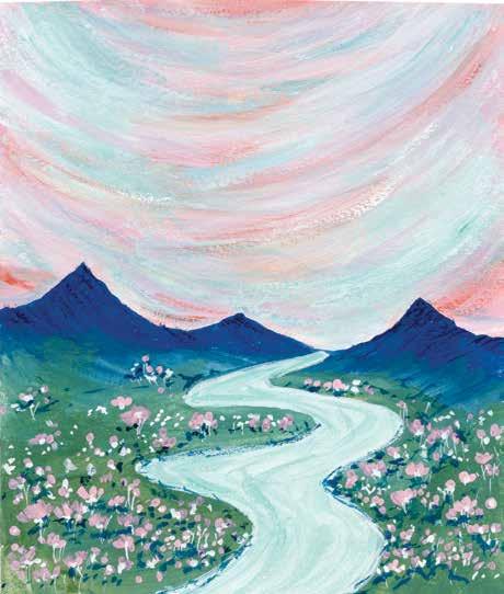
| 127
Dreamy River
STEP 3. Load your brush with coral pink (crimson + primary red + white) and paint in the white spaces, blending the edges of the pink with the orange.
INSPIRING LANDSCAPES
STEP 1. Use the template provided. Alternatively, sketch a basic scene with mountains and a river flowing into them, along with some strokes in the sky and some flowers.
STEP 4. Paint smaller strokes of turquoise blue and white, blending these colors in with the previous layers. Add more pink and orange as needed.
STEP 2. The first few layers of the sky will be in warm colors. Load your brush with bright orange (primary red + permanent yellow + a little white) and then paint broad brushstrokes on the sky, leaving gaps between the strokes.
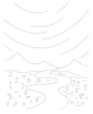
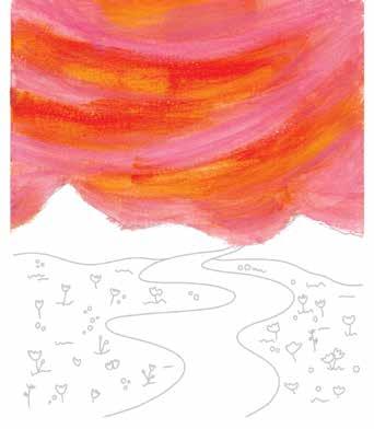
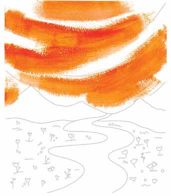
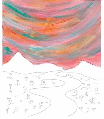
STEP 6. For the final sky layer, mix a light turquoise (turquoise blue + white) and add smooth, sweeping brushstrokes to the sky. I was imagining the Northern Lights.
128 | Gorgeous Gouache
STEP 8. Mix a moss green (permanent yellow + ultramarine blue + a little white); including ultramarine blue in the mix will help the grass visually connect with the mountains. Paint the grass, blending the green with the ragged mountain edge.
STEP 7. Mix a navy (ultramarine blue + a little black) and paint the mountains. Make sure to paint the bottom edge of the mountains raggedly, as shown, so it’s easy to blend the grass layer into it next.
STEP 5. To make the sky dreamier, add some more light and dark variations of the previous shades. I added a darker pink and a lighter blue, for example. Have fun mixing colors as desired.
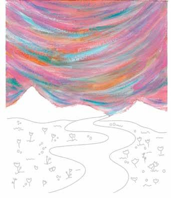
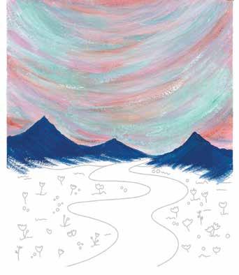
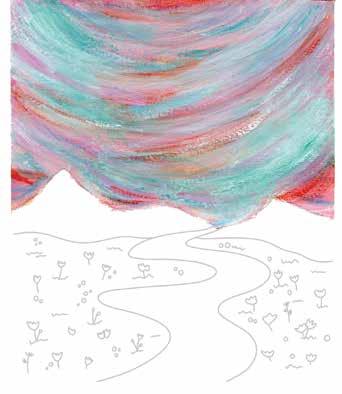
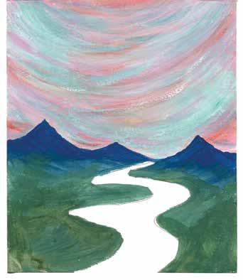
STEP 11. Paint white stems for the flowers using a thin brush. Alternatively, you could use a white gel pen to draw these lines.
STEP 10. Paint some tiny flowers in the same coral pink as you used in the sky, and some white flowers too. Use a thin brush to paint these flowers.
River | 129
STEP 12. Use the navy mountain color to paint shadows under the flowers. Paint some black drybrushing strokes on the mountains to create even more texture and depth.
Dreamy
INSPIRING LANDSCAPES
STEP 9. Use the same light turquoise as used in the final sky layer to paint the river. This gives the impression that the river is reflecting the sky.
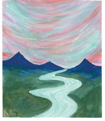
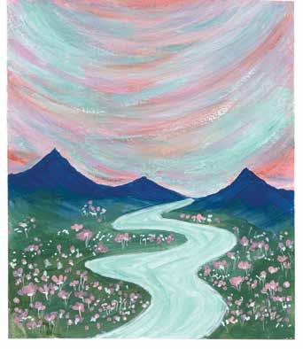
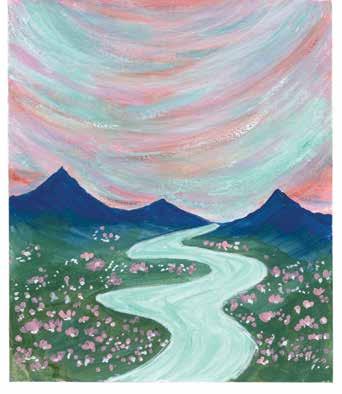
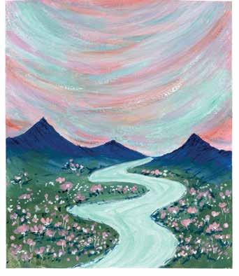
130 | Gorgeous Gouache STEP 4 STEP 7 STEP 10 STEP 2 STEP 5 STEP 8 STEP 11 STEP 3 STEP 6 STEP 9 STEP 12 At a Glance STEP 1
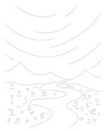
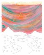
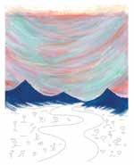
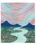
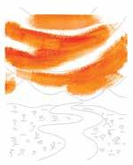
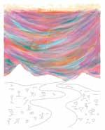
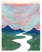
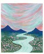
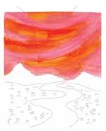
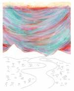
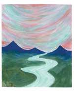
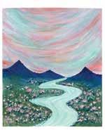
INSPIRING LANDSCAPES Color Mixing Recipes | 131Dreamy River Color Mixing Recipes bright orange (primary red + permanent yellow + a little white) light turquoise (turquoise blue + white) coral pink (crimson + primary red + white) navy (ultramarine blue + a little black) turquoise blue moss green (permanent yellow + ultramarine blue + a little white) white black To get exact or similar colors, try different ratios of each ingredient or refer to the color mixing section (pages 29–31).



132 | Gorgeous Gouache Candy skies and bountiful desert make for a very relaxing afternoon of painting. Who knew arid desert scenery could look so delectable? Sink into the sunset and feel the warmth fade from your face as night begins to fall. In this project, you’ll learn how to make blended gradient backgrounds and use watery paint to create ethereal shadows. See page 137 for color mixing instructions. BRUSHES: ϋ Size 1/2" flat brush ϋ Size 6 round brush ϋ Size 2 liner brush
Desert Sunset

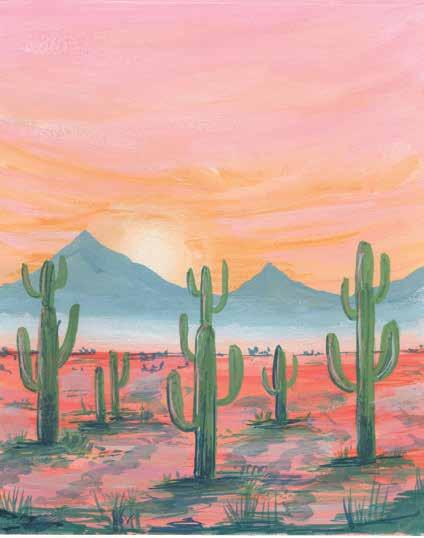


STEP 1. Use the template provided. Alternatively, sketch a desert landscape with a mountain range in the background and some big cactuses in the foreground.
STEP 3. Paint a white circle for a sun in the bottom of the sky and add white brushstrokes around it to blend it with the sky and simulate a sunset. You can also add pastel orange (permanent yellow + primary red) around the sun.
STEP 4. Mix a pastel gray-blue (ultramarine blue + white + a little black). Paint the mountains, covering half of the sun so it looks like the sun is setting behind the mountains.
INSPIRING LANDSCAPES
STEP 2. Paint a gradient sky with pastel pink (crimson + white) on the top and pale peach (crimson + more white + permanent yellow) at the bottom. Blend both the colors well while the paint is still wet.
| 133
Desert Sunset
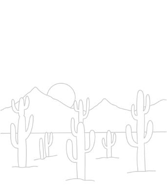
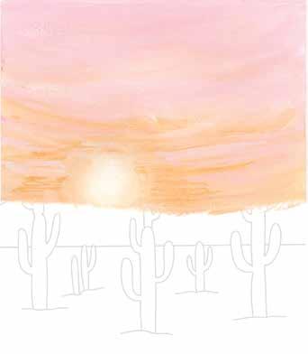
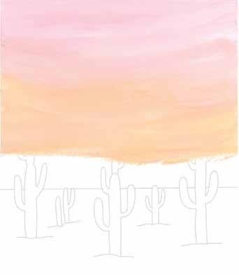
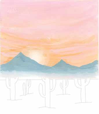
STEP 8. Add some grass and dark details around the cactuses with a moss green (permanent yellow + ultramarine blue).
STEP 7. Load your brush with medium green (lemon yellow + ultramarine blue) and paint a base layer for all the cactuses.
STEP 5. Mix a coral (crimson + permanent yellow + white) and a light coral (adding more white). Paint the land with a gradient from dark to light coral. To help blend the land with the mountains, add some white between them.
STEP 6. Add some dark coral (permanent yellow + more primary red) brushstrokes to the land. This gives the land more texture and depth.
134 | Gorgeous Gouache
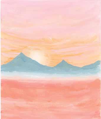
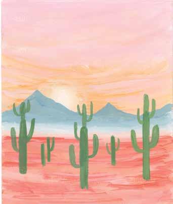
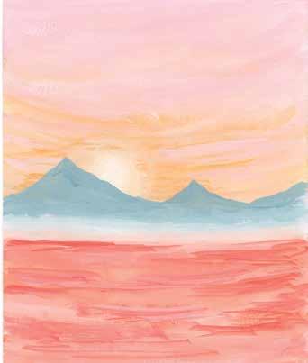
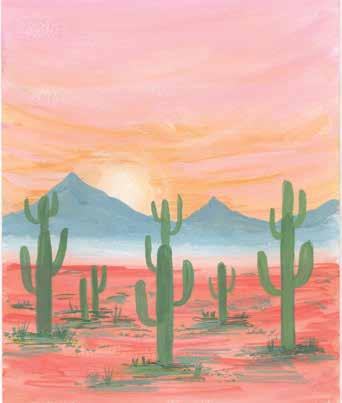
STEP 11. Paint the cactuses’ cast shadows on the land area. Use a gray (black + white) that has been watered down with extra water.
INSPIRING LANDSCAPES Desert Sunset | 135
STEP 9. Paint shadow areas on the cactuses with the moss green. Place these shadows on only one side. You can also add some details to the cactuses.
STEP 10. Add highlights to the cactuses using white. Place these highlights partially on top of the shadows.
STEP 12. Add moss green grass on the foreground to bring more depth into the painting. You can also add additional moss green detailing to the bases of the cactuses.
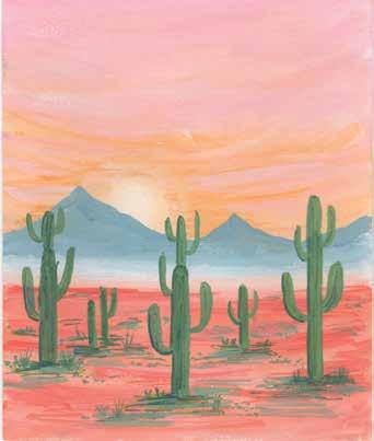
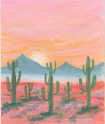
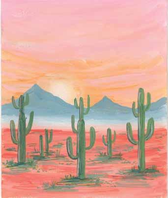
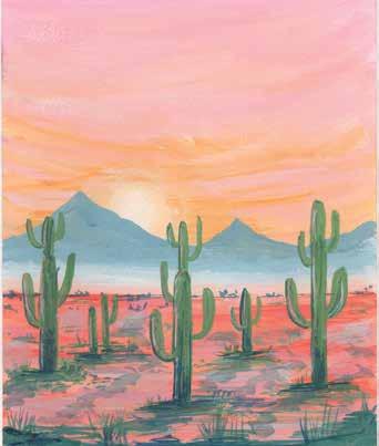
136 | Gorgeous Gouache STEP 4 STEP 7 STEP 10 STEP 2 STEP 5 STEP 8 STEP 11 STEP 3 STEP 6 STEP 9 STEP 12 At a Glance STEP 1
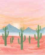
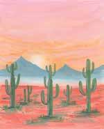
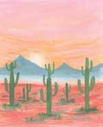
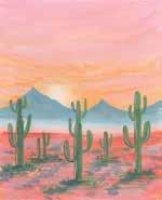
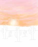
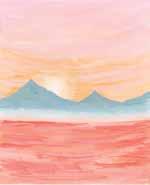
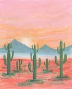
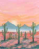
Color
Desert Sunset | 137
Mixing Recipes
pastel pink (crimson + white) dark coral (permanent yellow + more primary red) pale peach (crimson + more white + permanent yellow) medium green (lemon yellow + ultramarine blue) pastel orange (permanent yellow + primary red) moss green (permanent yellow + ultramarine blue) pastel gray-blue (ultramarine blue + white + a little black) white coral (crimson + permanent yellow + white) light coral (crimson + permanent yellow + more white) gray (black + white)
To get exact or similar colors, try different ratios of each ingredient or refer to the color mixing section (pages 29–31).



138 | Gorgeous Gouache Moroccan cities are marked by colorful buildings and sparse palm trees—truly a beautiful sight to behold. The marketplaces are boisterous and full of life and color, and I hope to visit them someday soon. Painting a landscape you wish to visit is a good way of getting a taste of it and bringing it into your life in a small way without paying for an airplane ticket. In this project, you’ll learn how effective painting colorful outlines around shapes can be. See page 143 for color mixing instructions. BRUSHES: ϋ Size 1/2" flat brush ϋ Size 6 round brush ϋ Size 2 liner brush Morocco
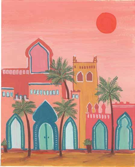


INSPIRING LANDSCAPES Morocco | 139
STEP 3. Paint the background buildings using the same brick red and yellow ocher again.
STEP 2. Paint yellow ocher at the bottom. For the foreground buildings, paint the left one with peach (permanent yellow + white + crimson) and the right one with brick red (crimson + permanent yellow + white + a little burnt sienna).
STEP 4. Paint the background sky in a gradient from peach to light peach (peach + white).
STEP 1. Use the template provided. Alternatively, sketch an illustration with Moroccan elements such as palm trees and the distinctive buildings with arches and domes.
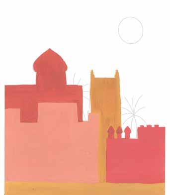
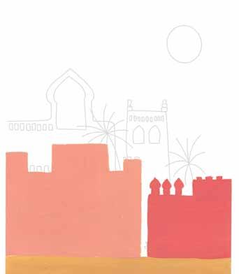
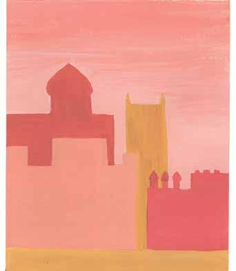
STEP 5. Mix a mint blue (turquoise blue + white) and paint some doors and arches on the buildings.
STEP 8. Mix a dark brown (burnt sienna + black) to paint palm tree trunks and a fern green (permanent yellow + ultramarine blue) to paint palm leaves. Also paint some tiny potted plants near the door arches.
STEP 7. Paint windows and arches on the buildings in the background. Use colors from the exciting color palette, like brick red and light peach, to contrast the existing colors.
STEP 6. Mix a light turquoise (turquoise blue + more white) and paint the doors and windows as shown.
140 | Gorgeous Gouache
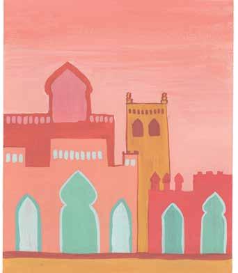
INSPIRING LANDSCAPES Morocco | 141
STEP 12. Add burnt sienna shadows to the ground to bring some depth into the painting. You can also add shadows to the buildings if you wish.
STEP 10. Use white to add additional windows, window and arch outlines, and details.
STEP 9. Mix a light fern green by adding more permanent yellow and white to the previous fern green. Paint additional leaves on top of the existing leaves.
STEP 11. Add additional details and filled areas with lagoon blue (cerulean blue + ultramarine blue + a little permanent yellow + white). Also add a redorange (permanent yellow + primary red) sun.
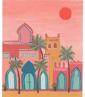
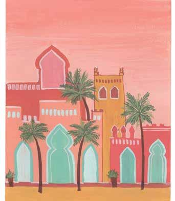
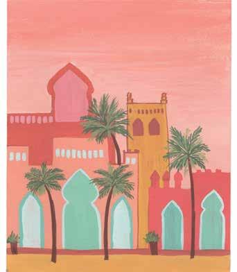
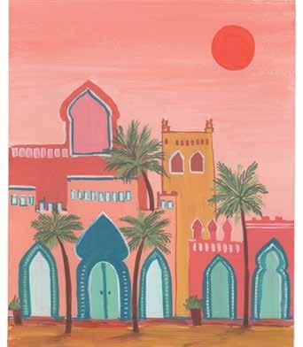
142 | Gorgeous Gouache STEP 4 STEP 7 STEP 10 STEP 2 STEP 5 STEP 8 STEP 11 STEP 3 STEP 6 STEP 9 STEP 12 At a Glance STEP 1
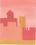
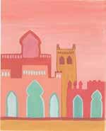
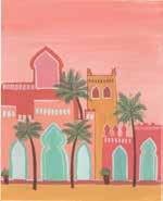
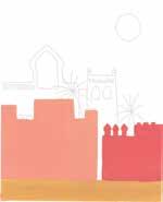
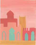
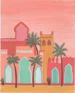
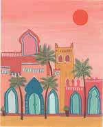
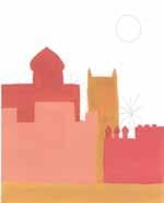
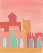
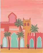
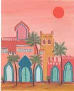
Morocco | 143
Color
Mixing Recipes
yellow ocher dark brown (burnt sienna + black)
To get exact or similar colors, try different ratios of each ingredient or refer to the color mixing section (pages 29–31).
peach (permanent yellow + white + crimson) fern green (permanent yellow + ultramarine blue) brick red (crimson + permanent yellow + white + a little burnt sienna) light fern green (fern green + more permanent yellow + white) light peach (peach + white) white mint blue (turquoise blue + white) light turquoise (turquoise blue + more white) lagoon blue (cerulean blue + ultramarine blue + a little permanent yellow + white) red-orange (permanent yellow + primary red) burnt sienna



See page 149 for color mixing instructions. BRUSHES: ϋ Size 1/2" flat brush ϋ Size 6 round brush ϋ Size 2 liner brush Santorini
Santorini is a beautiful city in Greece and is on my travel bucket list! The city is spotted with lovely blue architectural structures, and bright pink bougainvillea against the blue and white look absolutely striking. Since blue is my favorite color and bougainvillea are my favorite flowers, I always felt pulled to visit the place. In this project, you’ll also discover how the color gray can be anything but drab.
144 | Gorgeous Gouache

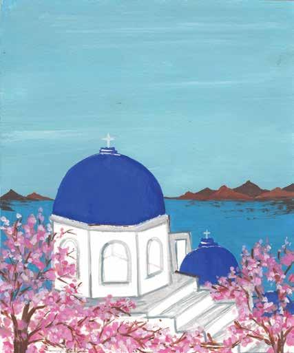


INSPIRING LANDSCAPES Santorini | 145
STEP 4. The buildings are mostly white, so paint the shadows in light gray (black + a lot of white) to define the structures. Paint the outline of the staircase light gray too.
STEP 1. Use the template provided. Alternatively, sketch the illustration with elements of Santorini. I included a domed building, distant water, and flowering branches.
STEP 2. Paint the sky with light cerulean (cerulean blue + white). Leave a few bare areas in the color so the sky is not perfectly solid; this implies light clouds.
STEP 3. Paint the domes with ultramarine blue using a round brush. Make sure the paint consistency is thick. I ended up adding a third, small dome at this stage (see the next step).
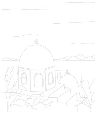
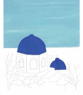
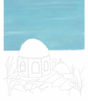
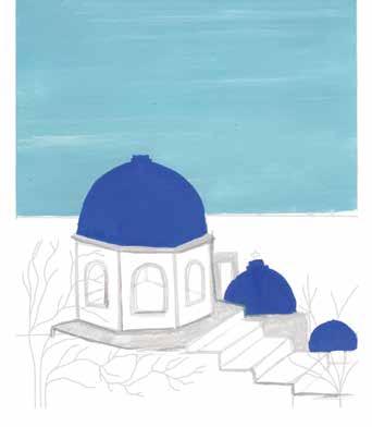
146 | Gorgeous Gouache
STEP 7. Using a thin brush, paint a white cross on the top of each dome. Also add a little bit of shadow to the right side of each dome, using dark blue (cobalt blue + ultramarine blue).
STEP 8. Paint bougainvillea branches on both the sides of the illustration, using either dark brown or burnt umber.
STEP 5. Mix an ocean blue (turquoise blue + cerulean blue + white) and paint the water.
STEP 6. Paint the distant mountains using dark brown (burnt sienna + a little black) for the farther mountains and pure burnt sienna for the closer mountains. Add some extra brushstrokes to blend the mountains into the water.
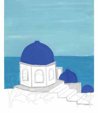
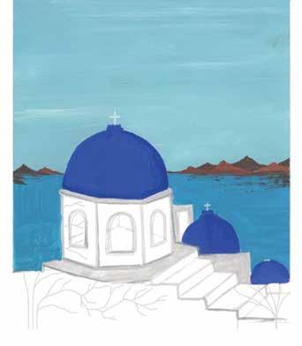
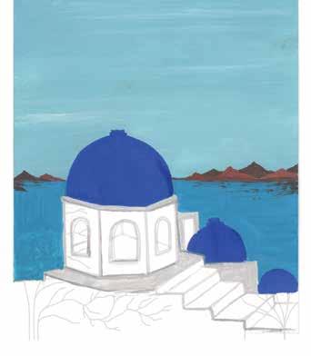
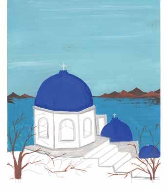
STEP 10. Mix a light brown (burnt sienna + primary red + permanent yellow + white) and paint a second layer of flowers. Also add more dark gray (black + white) shadows to the steps and buildings, as well as white highlights to the domes.
STEP 9. Paint bougainvillea flowers by using a pastel pink (crimson + white), dabbing the paint on the paper with the tip of your brush. Make sure to leave some gaps in between the flowers as you paint.
STEP 11. Paint back in more bougainvillea branches (reinstating some that were covered up), using whichever brown you prefer. Add more shadows by using the same brown wherever desired, such as along the bottom of the painting.
INSPIRING LANDSCAPES Santorini | 147
STEP 12. Mix a bright pink (crimson + primary red + a little white) and dab more flowers on top of the existing layers. After that layer dries, dab on some white flowers. The bougainvillea now has a ton of depth thanks to its many paint layers.
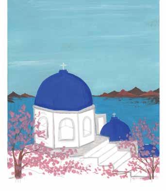
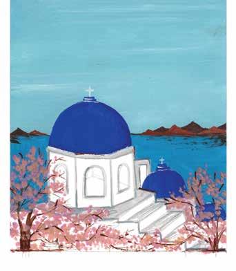
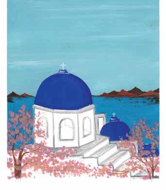
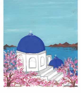
148 | Gorgeous Gouache STEP 4 STEP 7 STEP 10 STEP 2 STEP 5 STEP 8 STEP 11 STEP 3 STEP 6 STEP 9 STEP 12 At a Glance STEP 1
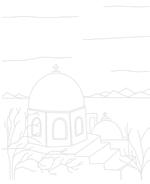
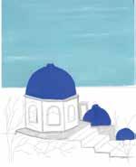
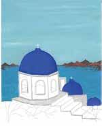
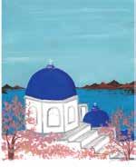
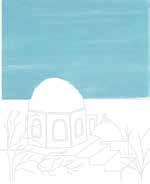
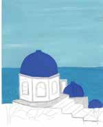
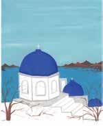
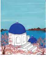
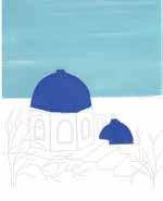
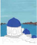
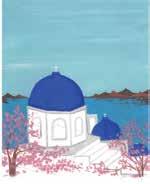
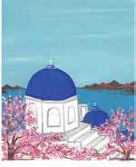
To
light cerulean (cerulean blue + white) white ultramarine blue dark blue (cobalt blue + ultramarine blue) light gray (black + a lot of white) pastel pink (crimson + white) ocean blue (turquoise blue + cerulean blue + white) light brown (burnt sienna + primary red + permanent yellow + white) dark brown (burnt sienna + a little black) dark gray (black + white) burnt umber bright pink (crimson + primary red + a little white) get exact or similar colors, different of each ingredient or to the color mixing section (pages 29–31).
Color
Santorini | 149
Mixing Recipes
try
ratios
refer



150 | Gorgeous Gouache
See page 155 for color
instructions. BRUSHES: ϋ Size 6 round brush ϋ Size 2 liner brush Oceanscape
I really love the quote “As above, so below.” Our biggest teacher, nature, truly exemplifies this idea. The blue sky is the reflection of water, and the water is the reflection of sky and sun, etc. In a similar way, things outside us and our circumstances reflect what is inside us. Nature is the best teacher to help you learn life lessons, so always be curious to see what message it is reflecting to you. Let’s paint this beautiful oceanscape and reflect on this idea! This project is also great for teaching you how to adapt and mix new color variations on the fly. mixing

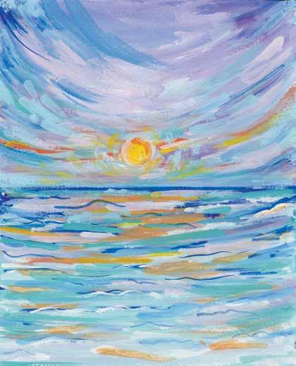


STEP 3. Mix a light cornflower blue (cerulean blue + crimson + white) and paint the rest of the sky. Mix more white into the light cornflower blue to paint in the center of the sky.
INSPIRING LANDSCAPES Oceanscape | 151
STEP 2. Load your brush with ultramarine blue to paint the horizon line and to differentiate between the sky and the ocean. Then mix a medium blue (ultramarine blue + cerulean blue + white) and start painting toward the bottom. Add strokes of pastel blue (turquoise blue + white) to finish filling out the water.
STEP 1. Use the template provided. Alternatively, sketch a horizon line and rough sun placement. Start by painting the sky. Mix a light blue (cerulean blue + white) and paint big brushstrokes for the bottom of the sky. As you move toward the top, make it lighter by mixing in more white. Also mix a pastel purple (cerulean blue + very little crimson + white) and paint just a few brushstrokes in the bottom of the sky.
STEP 4. After the blue sky layer is dry, mix a medium yellow (permanent yellow + white) and paint a circle near the horizon. Add some medium yellow, orange (permanent yellow + primary red + white), and blue (any blue of your choice) strokes in the sky.
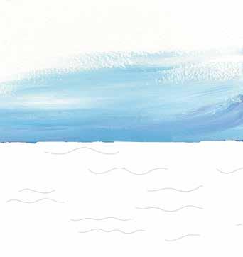
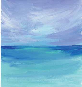
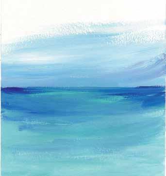
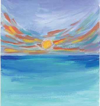
STEP 6. Use the same dark purple to paint some reflections of the sky in the ocean water.
152 | Gorgeous Gouache
STEP 5. To make the sky look more vibrant, add dark purple (cerulean blue + crimson + less white) between the previous layers.
STEP 7. Use the same orange and medium yellow from before to paint some brushstrokes in the water, reflecting the sun.
STEP 8. To give the painting more contrast, add some ultramarine blue brushstrokes in the ocean water.
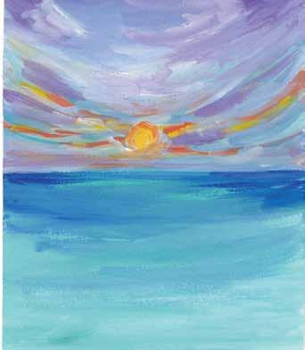
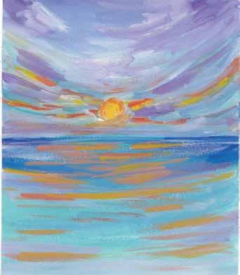
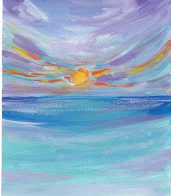
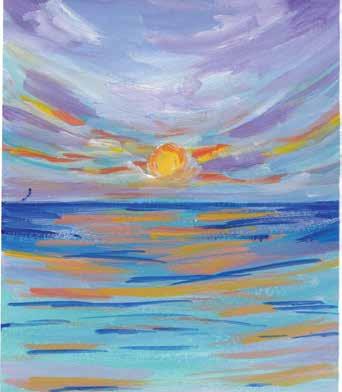
INSPIRING LANDSCAPES Oceanscape | 153
STEP 9. Load your brush with white and paint some brushstrokes overlapping the ultramarine blue strokes, effectively adding highlights to the ocean water.
STEP 11. Mix a light lavender (crimson + ultramarine blue + white) and paint some gentle brushstrokes in the sky and the water. Then paint some brushstrokes with ultramarine blue in the sky.
STEP 10. This painting is all about building layers and adding more depth, so now mix a grayish blue (cerulean blue + more white + a little black) and paint some overlapping brushstrokes in the water to blend the previous layers.
STEP 12. Paint more layers using any of your previous colors to bring even more complexity to the painting. Add some curvy lines in the ocean and then overlap them with more light blue. Add any other final details you desire.
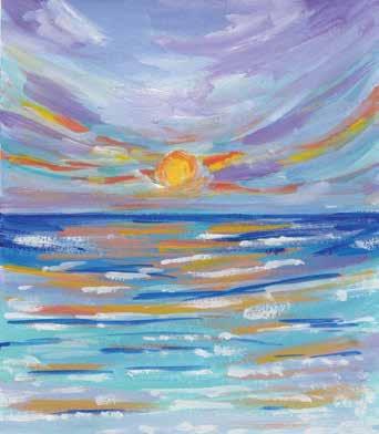
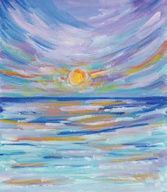
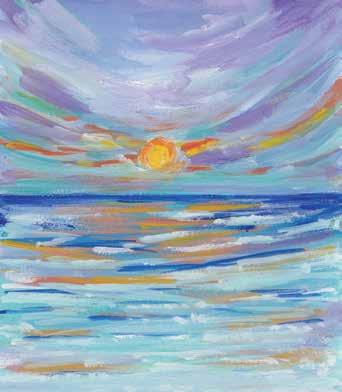
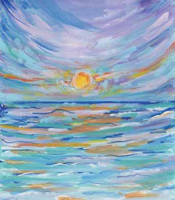
154 | Gorgeous Gouache STEP 4 STEP 7 STEP 10 STEP 2 STEP 5 STEP 8 STEP 11 STEP 3 STEP 6 STEP 9 STEP 12 At a Glance STEP 1
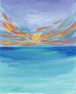
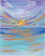
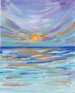
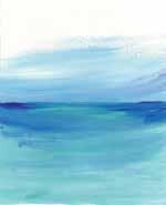
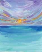
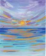
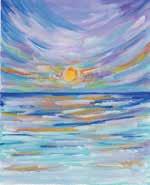
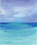
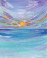
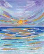
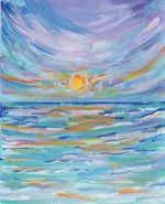
INSPIRING LANDSCAPES Color Mixing Recipes | 155Oceanscape Color Mixing Recipes light blue (cerulean blue + white) pastel purple (cerulean blue + very little crimson + white) ultramarine blue medium blue (ultramarine blue + cerulean blue + white) pastel blue (turquoise blue + white) light cornflower blue (cerulean blue + crimson + white) medium yellow (permanent yellow + white) orangewhite (permanent yellow + primary red + white) dark purple (cerulean blue + crimson + less white) grayish blue (cerulean blue + more white + a little black) light lavender (crimson + ultramarine blue + white) To get exact or similar colors, try different ratios of each ingredient or refer to the color mixing section (pages 29–31).



156 | Gorgeous Gouache Beautiful cherry blossoms and the sacred Mt. Fuji are two stunning feats of nature that have come to signify the beauty of Japan. This country is on my bucket list too—and painting this landscape is my version of visiting it! You’ll learn through this project how to blend adjacent colors together by using a more heavily stroke-based, rougher look rather than the smooth gradient look used in many other projects. See page 161 for color mixing instructions. BRUSHES: ϋ Size 1/2" flat brush ϋ Size 6 round brush ϋ Size 2 liner brush M t. Fuji
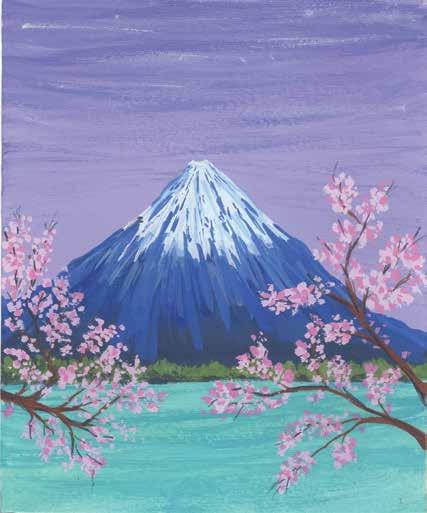


STEP 4. Mix a navy (ultramarine blue + black) and paint the bottom third of the mountain. Then, for the middle layer of the mountain, use pure ultramarine blue, blending it with the middle layer.
STEP 1. Use the template provided. Alternatively, sketch the mountain large in the center and some branches in the foreground. Below the mountain, sketch a layer of vegetation.
INSPIRING LANDSCAPES Mt. Fuji | 157
STEP 2. Paint the sky with a pastel violet (crimson + ultramarine blue + white).
STEP 3. Mix a darker violet by adding more blue to your existing pastel violet. Drybrush the top of the sky.
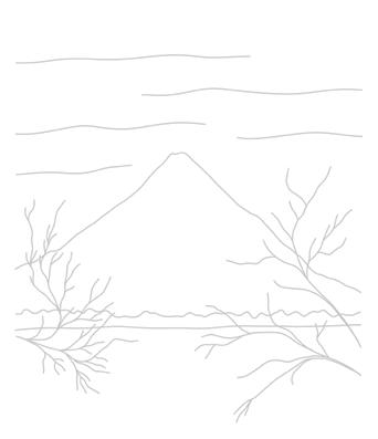
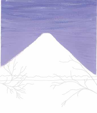
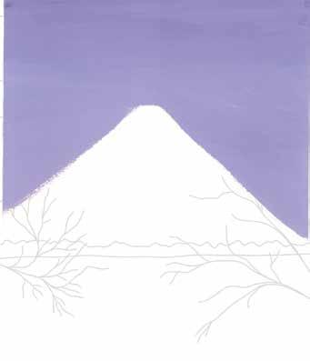
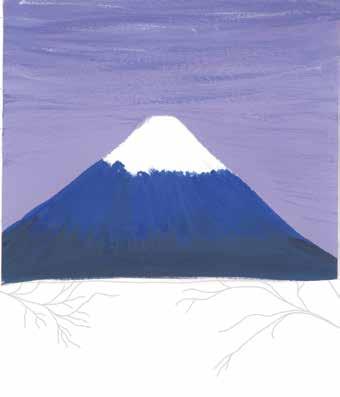
STEP 6. To make the mountain look even more textured, add another layer of ultramarine blue on top of the previous layers, using similar vertical brushstrokes.
158 | Gorgeous Gouache
STEP 7. Paint the vegetation below the mountain in a moss green (ultramarine blue + permanent yellow + white), making it look like a group of trees.
STEP 8. Mix a light turquoise (turquoise blue + white) and paint the water. For a second layer, paint on some Turkish blue (cerulean blue + ultramarine blue + less permanent yellow + white) using horizontal brushstrokes.
STEP 5. Mix a pastel blue (ultramarine blue + more white) and paint vertical brushstrokes down from the mountain peak, overlying the previous layers. Add a second layer of snow using a medium blue (ultramarine blue + less white).
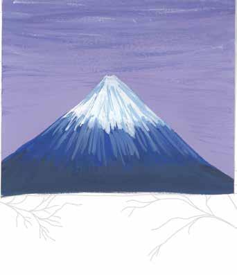
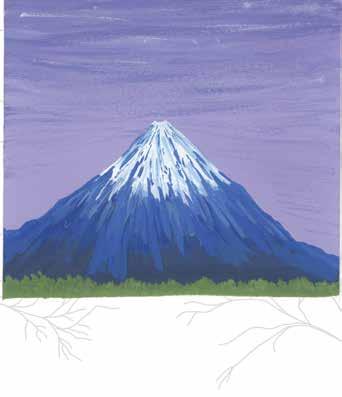
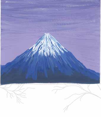
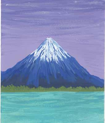
INSPIRING LANDSCAPES Mt. Fuji | 159
STEP 10. Mix a pastel pink (crimson + more white) and gently dab your paintbrush on the paper to create cherry blossoms along the branches.
STEP 11. Mix a medium pink (crimson + white) and paint a second layer of cherry blossoms on top of the first.
STEP 9. Paint the branches of the cherry blossom trees using dark brown (burnt sienna + burnt umber). Paint these branches by using partially broken lines, rather than perfect continuous lines.
STEP 12. Paint some black shadows at the bottom of the vegetation as well as along the branches of the trees.
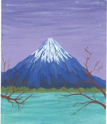
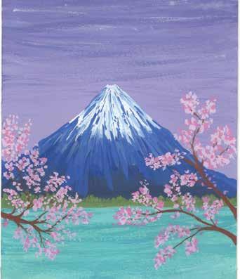
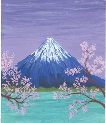
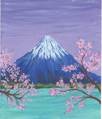
160 | Gorgeous Gouache STEP 4 STEP 7 STEP 10 STEP 2 STEP 5 STEP 8 STEP 11 STEP 3 STEP 6 STEP 9 STEP 12 At a Glance STEP 1
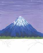
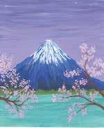
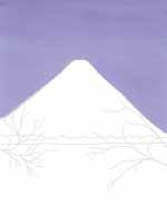
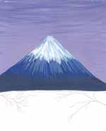
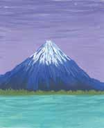
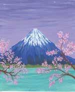
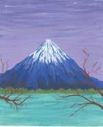
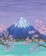
+ burnt umber)
+
+
+
+
+
+
+
+
Color Mixing Recipes
+
Mt. Fuji | 161 To get exact or similar colors, try different ratios of each ingredient or refer to the color mixing section (pages 29–31).
+
+
+
pastel violet (crimson ultramarine blue white) dark violet (pastel violet ultramarine blue) navy (ultramarine blue black) ultramarine blue pastel blue (ultramarine blue more white) medium blue (ultramarine blue less white) moss green (ultramarine blue permanent yellow white) light turquoise (turquoise blue white) Turkish blue (cerulean blue ultramarine blue less permanent yellow white) dark brown (burnt sienna pastel pink (crimson more white) medium pink (crimson white) black
+
+



162 | Gorgeous Gouache Summer skies and candy floral meadows—what I would give to transport myself into such beautiful scenery right at this moment! This painting in particular gives me Studio Ghibli vibes—a feeling of childhood, fantasy, and just a touch of adventure. In this project, you’ll push the limits of including a whole host of variations of one color, green, in a single painting. See page 167 for color mixing instructions. BRUSHES: ϋ Size 1/2" flat brush ϋ Size 6 Filbert brush (optional) ϋ Size 6 round brush ϋ Size 2 liner brush Bright Floral Meadow

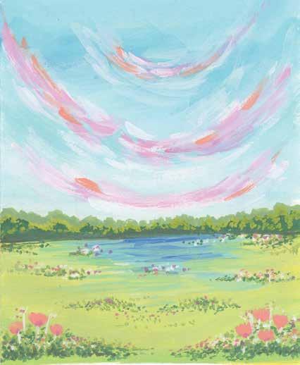


STEP 4. Mix a light green (lemon yellow + cerulean blue + white) and paint the top of the grass area. Mix a bright green (lemon yellow + cerulean blue) and paint the bottom. Blend these into a gradient.
INSPIRING LANDSCAPES Bright Floral Meadow | 163
STEP 2. Mix a bright blue (turquoise blue + cerulean blue + white) and a pastel blue (with even more white). Paint a gradient from bright blue down to pastel blue. After it has dried, drybrush some bright blue across the entire sky.
STEP 1. Use the template provided. Alternatively, sketch the elements of the landscape: the sky, some shrubbery, and some grass and flowers.
STEP 3. Mix a pastel pink (crimson + white) and paint small brushstrokes curving up on each side, creating a dreamy effect. While the pink is still wet, add some white and coral (crimson + permanent yellow + white) brushstrokes too, blending them in.
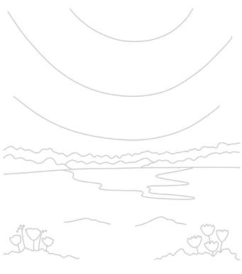
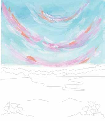
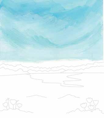
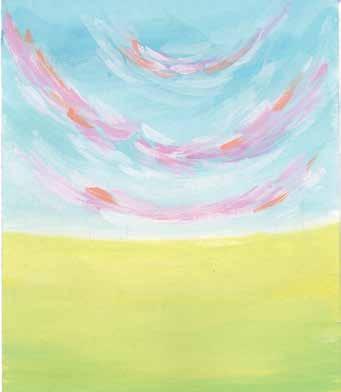
164 | Gorgeous Gouache
STEP 5. Mix a medium green (ultramarine blue + permanent yellow + white) and paint the bushes across the middle of the scene.
STEP 7. Mix more of the sky’s bright blue to paint the surface of the water in the middle of the grass. Leave some gaps between the brushstrokes for a natural effect.
STEP 8. Add details to the water using cobalt blue with gentle brushstrokes. Then add some additional green brushstrokes (using your green of choice) to blend the grass and the water.
STEP 6. Mix a dark green (ultramarine blue + permanent yellow) and paint the front area of the bushes. Once this has dried, mix a grass green (lemon yellow + cerulean blue + white) and then paint the sides and dab on top of the dark green.
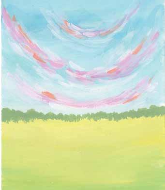
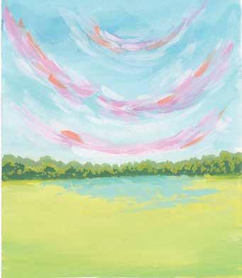
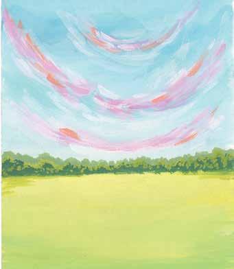
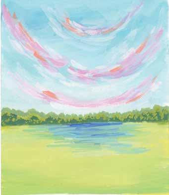
STEP 11. Use the dark green to add more tufts of grass. These tiny layers and details really bring together the whole painting.
INSPIRING LANDSCAPES Bright Floral Meadow | 165
STEP 12. Add some white highlights and some shadows with a very dark green (more ultramarine blue + permanent yellow) on the grass. Go back to previous colors or mix new colors, like medium pink (crimson + a little white), to add additional small flowers.
STEP 10. Use the medium green to paint some tufts and sprinklings of grass on top of the bright green grass layer.
STEP 9. Paint the flowers with coral. Start with the big flowers and then paint tiny dots in coral and white to represent buds, smaller flowers, and stems. Paint wherever you want on the grass.
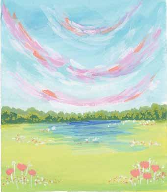
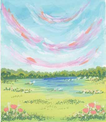
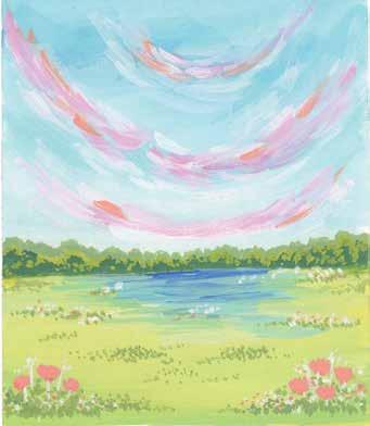
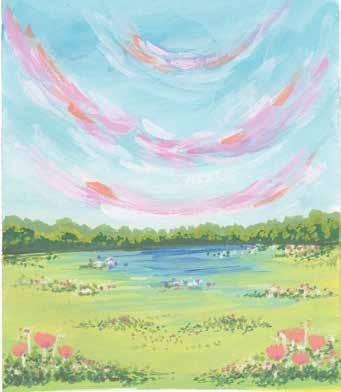
166 | Gorgeous Gouache STEP 4 STEP 7 STEP 10 STEP 2 STEP 5 STEP 8 STEP 11 STEP 3 STEP 6 STEP 9 STEP 12 At a Glance STEP 1
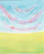
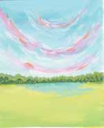
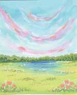
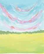
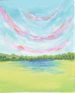
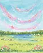
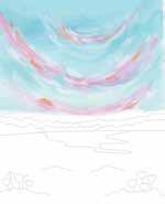
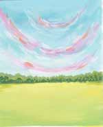
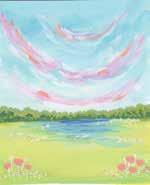
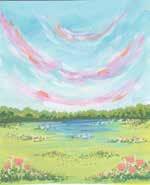
Bright Floral Meadow | 167 Color Mixing Recipes bright blue (turquoise blue + cerulean blue + white) pastel blue (turquoise blue + cerulean blue + more white) pastel pink (crimson + white) coralwhite (crimson + permanent yellow + white) light green (lemon yellow + cerulean blue + white) bright green (lemon yellow + cerulean blue) medium green (ultramarine blue + permanent yellow + white) dark green (ultramarine blue + permanent yellow) grass green (lemon yellow + cerulean blue + white) cobalt blue very dark green (more ultramarine blue + yellow)permanent medium pink (crimson + a little white) To get exact or similar colors, try different ratios of each ingredient or refer to the color mixing section (pages 29–31).



168 | Gorgeous Gouache For this project, we will use black paper again. Even on black, you can create dramatic pastel skies and a meadow blooming with flowers straight out of a child’s storybook. It’s one of the most amazing properties of gouache! See page 173 for color mixing instructions. BRUSHES AND SPECIAL SUPPLIES: ϋ Size 1/2" flat brush ϋ Size 6 round brush ϋ Size 2 liner brush ϋ Black paper Evening Hills
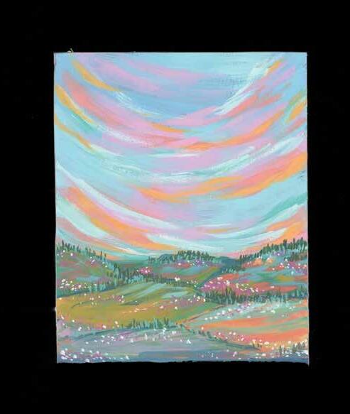


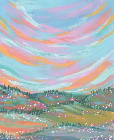
STEP 3. Mix a pastel pink (crimson + white) and paint small brushstrokes curving up on each side, creating a dreamy effect. While the paint is still wet, add some peach (crimson + permanent yellow + white) brushstrokes too, blending them in.
INSPIRING LANDSCAPES Evening Hills | 169
STEP 4. Mix a light turquoise (turquoise blue + white) and add more curving brushstrokes on top of the previous layer. This will brighten up the entire sky.
STEP 2. Paint the base layer for the sky in a combination of light blue (ultramarine blue + more white) and pastel blue (ultramarine blue + a lot more white).
STEP 1. Sketch some rolling hills using a white pencil on black paper. If you don’t have black paper, take a photo or make a copy of the provided template for reference and then paint the background black, but I highly recommend black paper.
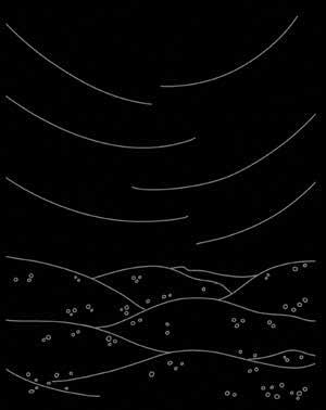
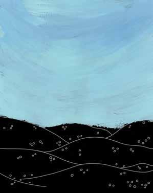
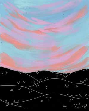
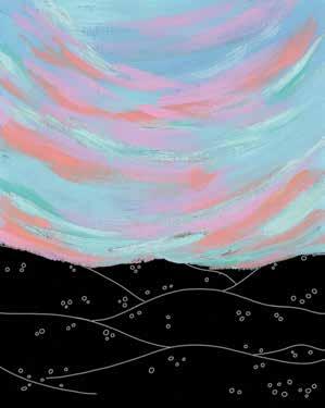
STEP 7. Paint the remaining terrain with some colors from the sky, alternating brushstrokes within each hill. The left hill is yellow ocher and peach; the right hill is pastel pink and pastel blue.
170 | Gorgeous Gouache
STEP 6. Paint the terrain with several greens. The rear hills are dark green (permanent yellow + ultramarine blue). While the paint is still wet, add some cobalt blue. For the middle hills, mix a moss green (dark green + white + more permanent yellow).
STEP 8. Add additional ocean blue (turquoise blue + cerulean blue + white) outlining to the hills. Also add light turquoise and pastel pink highlights using small brushstrokes, making sure the highlights contrast the existing hill colors.
STEP 5. Mix a light orange (permanent yellow + primary red + white) and add more curving brushstrokes to make the sky look even more colorful and dreamy. The layers are what make this sky magical.
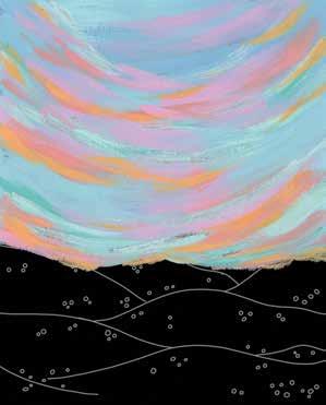
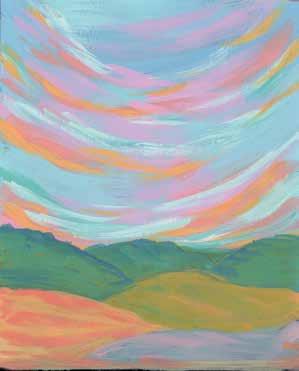
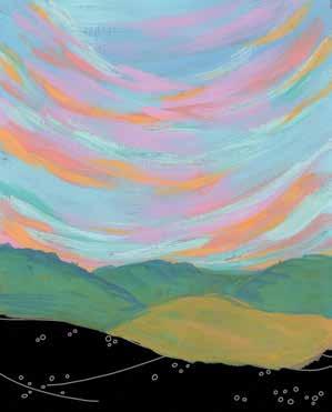
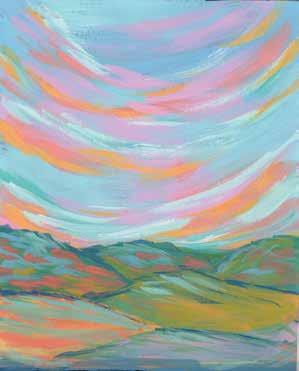
STEP 12. Finally, add some highlights in between the trees using the light turquoise.
INSPIRING LANDSCAPES Evening Hills | 171
STEP 9. Using a thin liner brush, paint some short trees on the terrain with a forest green (more ultramarine blue + permanent yellow). Just use simple, straight lines to represent the trees.
STEP 11. Paint more tiny flowers using white. This makes the painting look even more otherworldly.
STEP 10. Mix a dark pink (crimson + a little white) and paint tiny flowers scattered across the terrain.
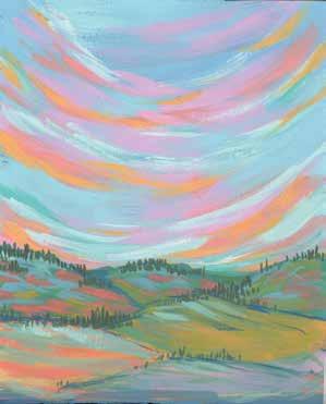
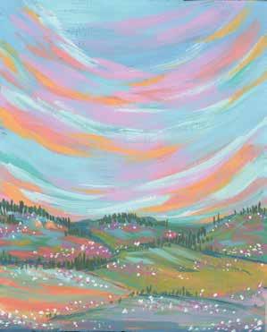
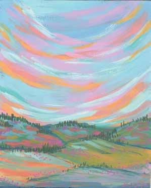
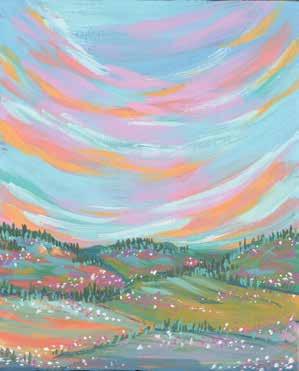
172 | Gorgeous Gouache STEP 4 STEP 7 STEP 10 STEP 2 STEP 5 STEP 8 STEP 11 STEP 3 STEP 6 STEP 9 STEP 12 At a Glance STEP 1
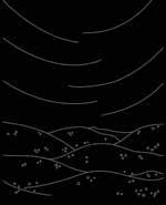
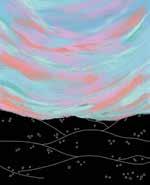
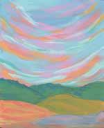
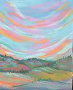
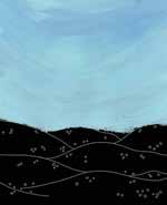
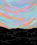
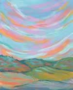
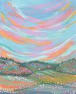
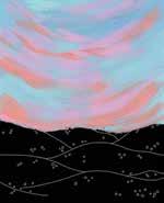
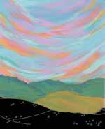
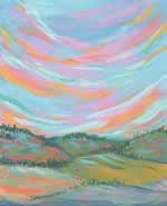
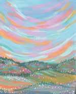
+
Mixing Recipes
To get exact or similar colors, try different ratios of each ingredient or refer to the color mixing section (pages 29–31).
light blue (ultramarine blue more white) pastel blue (ultramarine blue a lot more white) pastel pink (crimson + white) peach (crimson + permanent yellow + white) light turquoise (turquoise blue + white) light orange (permanent yellow + primary red + white) dark green (permanent yellow + ultramarine blue)
ocean blue (turquoise blue + cerulean blue + white) moss green (dark green + white + more permanent yellow) yellow ocher forest green (more ultramarine blue + permanent yellow) dark pink (crimson + a little white) white
Color
+
Evening Hills | 173



174 | Gorgeous Gouache Index A analogous colors, 26 art, display space for, 19 Autumn Treasures, 56–61 (187) B blending colors, 23 Bright Floral Meadow, 162–67 (221) bright vibes palettes, 35 brushes, types and specifications, 16 brushstrokes. See techniques Bursting Bouquet, 106–11 (203) C chair, 19 cold press watercolor paper, 17 color lifting, 23 color theory and mixing, 26–37. See also palettesanalogous colors, 26 basics of color theory, 26–29 color wheel, complementary26–27colors, 26 cool colors, 27, 28 cool/warm colors on wheel, 27 mixing green, 30 mixing orange, 29 mixing practice sheet, 181 mixing purple, 31 mixing recipes. See specific projects primary colors, 26, 27 secondary colors, 26, 27 split complimentary colors, 26 temperature of color, 28 tetradic colors, 26 tints, tones, and shades, 28 triadic colors, 26 warm colors, 27, 28 color wheel, 26–27 colored pencils, water-soluble, 16 complementary colors, 26 consistency of gouache, 21 consistency practice sheet, 177 cool colors, 27, 28 creativity, mantras for, 10–11 D décor, for workspace, 19 Desert Sunset, 132–37 (211) desk/worktable, 19 display space for art, 19 Dreamy River, 126–31 (209) drybrushing, 22 E Envelope, 88–93 (197) Evening Hills, 168–73 (223) F flat-brush exercise, 21 floral projects. See projects, floral FreestyleabundanceBlooms, 112–17 (205) Fun Fruit, 68–73 (191) G glazing, gouache23about:author’s background, 8–9; getting started, 12; this book and, 7 basics to know, 15 brushes for, 16 creativity mantras to use, 10–11 defined, 15 paints, paperpalettes,1616for,16, 17 tools and supplies, 16–17 tools for, workspace16setup, 18–19 green, mixing, 30 H hot press watercolor paper, 17 I Ice Cream Galore, 62–67 (189) inspiration and style, 38–45 making inspiration your own, 40 one composition, three color schemes, 44–45 one concept and color scheme, three compositions, 42–44 tips, 41 L landscape projects. See projects, inspiring landscapes layering, lettering.24See projects, pretty patterns and lighting,lettering19 M masking tape, 16 mixing colors. See color theory and mixingmixingcolors for projects (mixing recipes). See specific projects Mt. Fuji, 156–61 (219) N Night Garden, 94–99 (199) Night Sky, 120–25 (207) O Oceanscape, 150–55 (217) orange, mixing, 29 P paintbrushes, types and specifications, painter’s16 tape, 16 paints, palettes,1616about:12 palettes to pick from, bright34–36vibes, 35 building your own, 37 developing color palette, 32–33 practice sheet, 183 soft pastels, 36 vintage shades, 35 paper, for gouache, 16, 17 pastels palettes, 36
Note: Page numbers in italics indicate projects and (templates).
Turn templates!pagespagetheforpracticeandprojectpatterns. See projects, pretty patterns and pencils,letteringwater-soluble colored, 16 plants, practice19sheets, 177–83 primary colors, 26, 27 project templates, 185–223 projects, floral abundance, 80–117 Bursting Bouquet, 106–11 (203) Envelope, 88–93 (197) Freestyle Blooms, 112–17 (205) Night Garden, 94–99 (199) Seasonal Wreath, 82–87 (195) Vase, 100–105 (201) projects, inspiring landscapes, 118–73 Bright Floral Meadow, 162–67 (221) Desert Sunset, 132–37 (211) Dreamy River, 126–31 (209) Evening Hills, 168–73 (223) Morocco, 138–43 (213) Mt. Fuji, 156–61 (219) Night Sky, 120–25 (207) Oceanscape, 150–55 (217) Santorini, 144–49 (215) projects, pretty patterns and lettering, 48–79Autumn Treasures, 56–61 (187) Fun Fruit, 68–73 (191) Ice Cream Galore, 62–67 (189) Spring Florals, 50–55 (185) Take Time to Rest and Relax, 74–79 (193 projects:) about, overview of, 46 purple, mixing, 31 R round-brush exercise, 21 S Santorini, 144–49 (215) secondary colors, 26, 27 shades, 28 soft pastels palettes, 36 split complimentary colors, 26 Spring Florals, 50–55 (185) storage space, 19 T tape, masking/painter’s/washi, 16 techniquesbackground brushstrokes, 21 basic painting, 22–24 blending colors, 23 brushstroke practice sheet, 177 color lifting, 23 consistency of gouache, 21 consistency practice sheet, 177 drybrushing, 22 flat-brush exercise, 21 glazing, practicelayering,2324sheets, 177–83 round-brush exercise, 21 technique practice sheets, 177–83 wet on dry painting, 22 wet on wet painting, 22 temperature of color, 28 tetradic colors, 26 thickness of paper, 17 tints, toolstones,2828and supplies, 16–17 triadic colors, 26 V Vase, 100–105 (201) vintage shades palettes, 35 W walls, 19 warm colors, 27, 28 washi tape, 16 watercolor paper, 17 wet on dry painting, 22 wet on wet painting, 22 windows, workspace19setup, 18–19 worktable/desk, 19
The paper at the back of this book is thick, gouacheappropriate paper that you can tear out easily and jump right into painting! Here you’ll find not only templates for all 20 projects in the book, but also some bonus sheets that are perfect for practicing color mixing, brushstrokes, different layering techniques, and anything else you’d like.
Have fun!
Ready to Paint?
Note: If you think you’ll want to paint a project more than once, make a paper photocopy or scan of the template before you start painting so that you can reuse the template. It’s also a good idea to snap a photo of the template before you start painting—that way, you can refer to it as you paint and layer over different areas.
Practice using a thin liner brush to draw freehand small details like dots and lines in the space below.
GOUACHE CONSISTENCY AND BRUSHSTROKE PRACTICE Practice getting your gouache to the right consistency in the space below. Create an even background with nicely blended brushstrokes using a flat brush in the space below. Create an even background with nicely blended brushstrokes using a round brush in the space below.
For more guidance, see page 21.
Practice one of the following techniques from page 22 or 23: wet on wet, drybrushing, blending two colors, glazing, or color lifting. Paint a light background, then practice layering different colors on top of it. Paint a dark background, then practice layering different colors on top of it. Paint a flower or plant with at least three layers. For more guidance, see pages 22–24.
TECHNIQUE PRACTICE
COLOR MIXING PRACTICE For more guidance, see pages 26–28. Fill in your own color wheel with the primary, secondary, and tertiary colors, mixing your own secondary and tertiary colors. Practice mixing a tint, a tone, and a shade of a color in the space below.
COLOR PALETTE PRACTICE For more guidance, see pages 32–36. Create your own color palettes by filling in the swatches as desired until you have a collection of colors you want to use for a piece of art.
© Viddhi Saschit from Gorgeous Gouache SPRING FLORALS
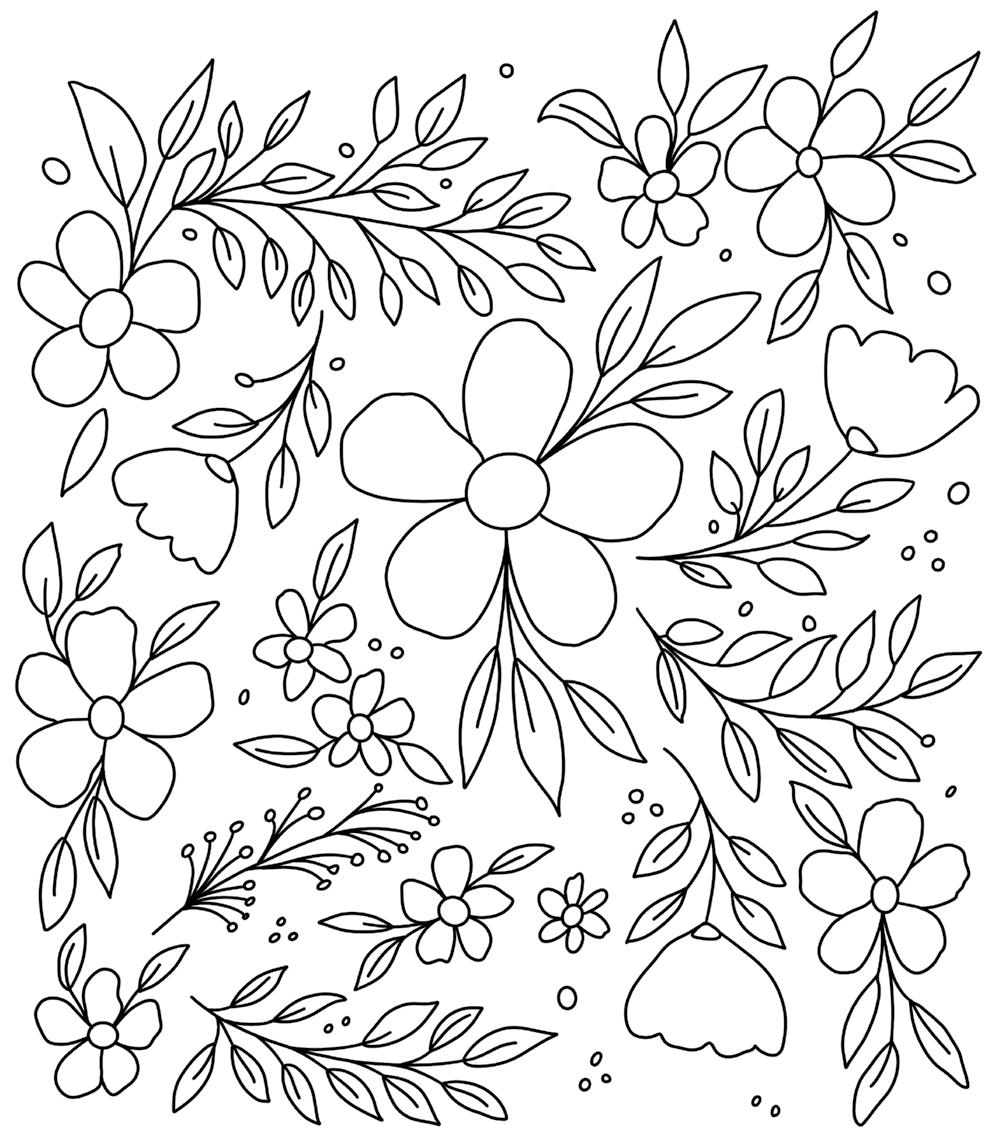
© Viddhi Saschit from Gorgeous Gouache AUTUMN TREASURES
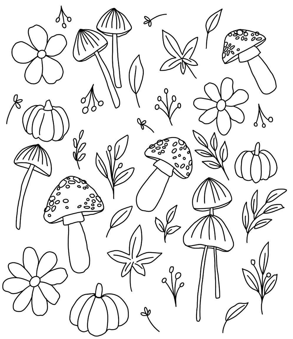
© Viddhi Saschit from Gorgeous Gouache ICE CREAM GALORE
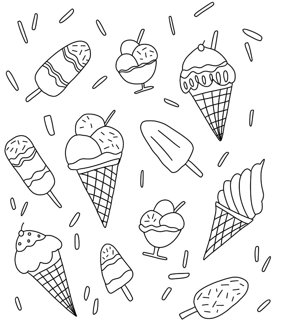
© Viddhi Saschit from Gorgeous Gouache FUN FRUIT
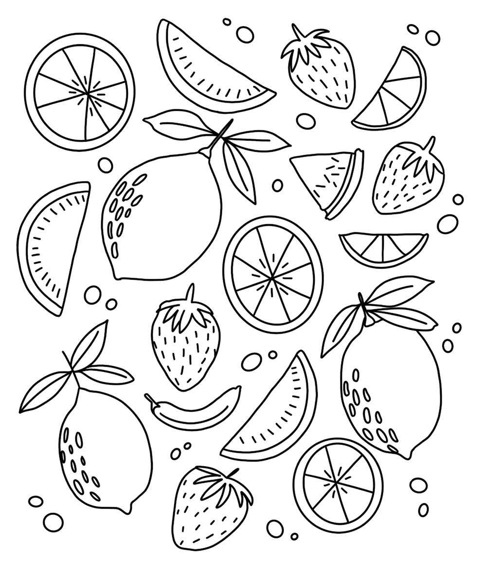
© Viddhi Saschit from Gorgeous Gouache TAKE TIME TO REST AND RELAX
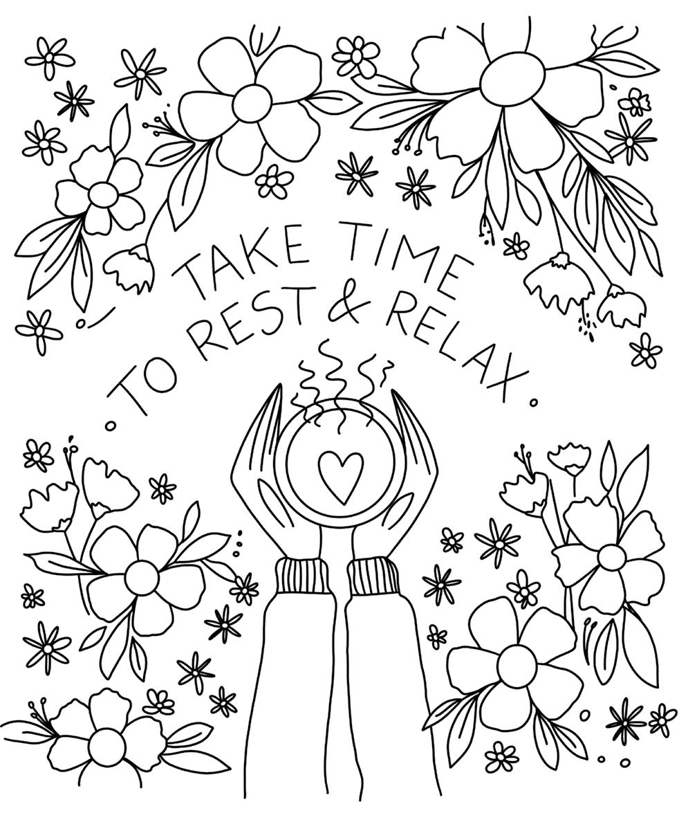
© Viddhi Saschit from Gorgeous Gouache SEASONAL WREATH
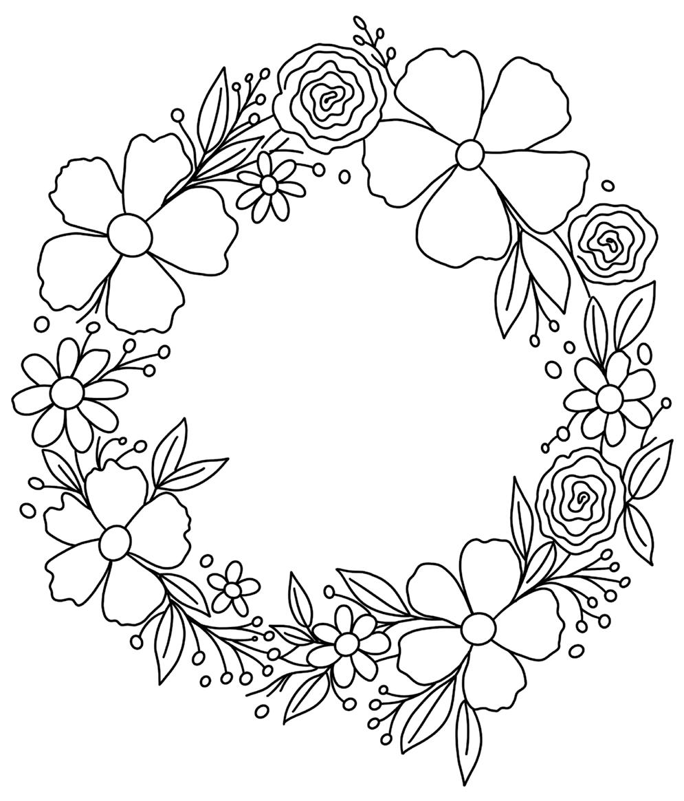
© Viddhi Saschit from Gorgeous Gouache ENVELOPE
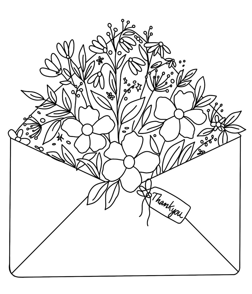
© Viddhi Saschit from Gorgeous Gouache NIGHT GARDEN
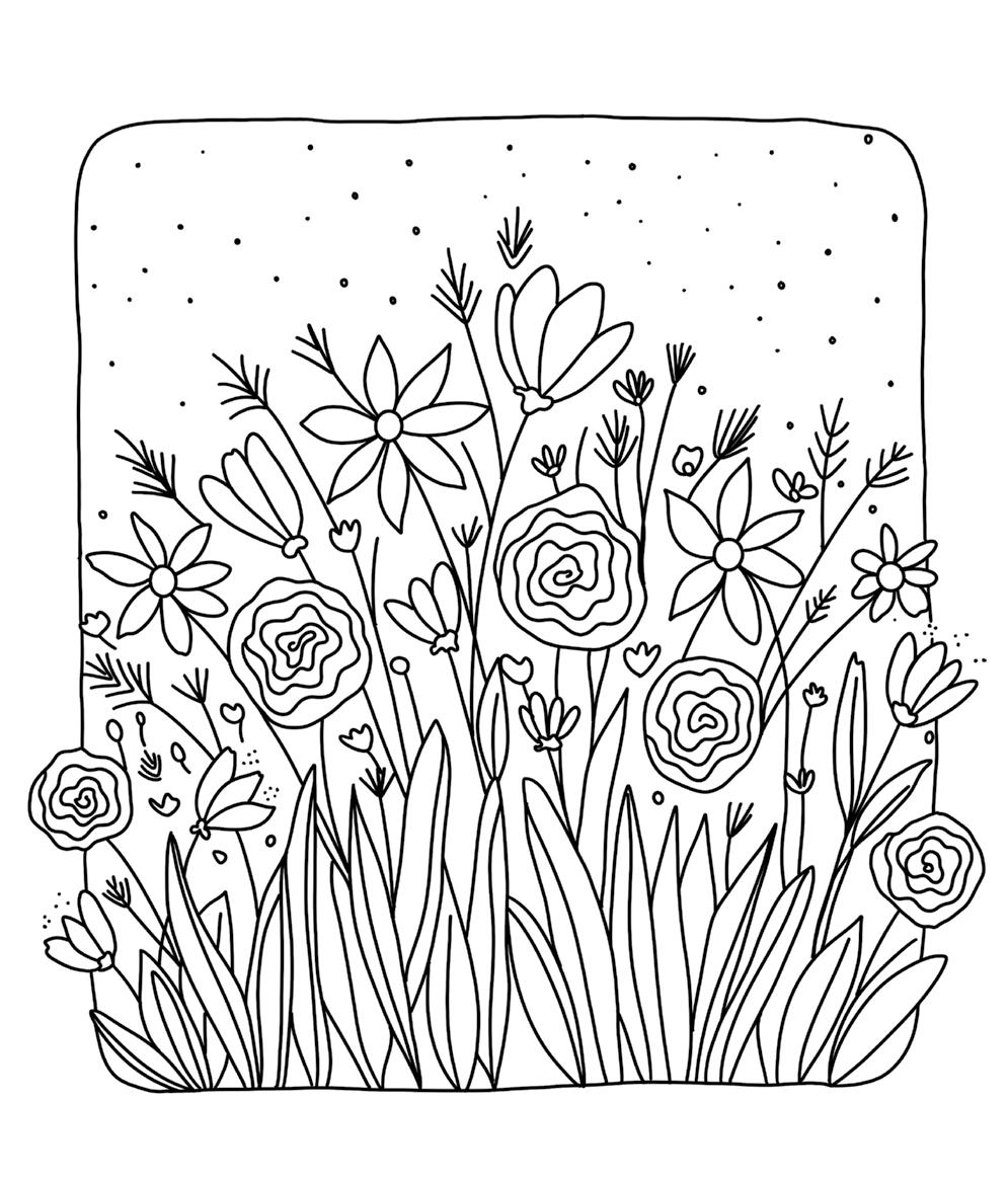
© Viddhi Saschit from Gorgeous Gouache VASE
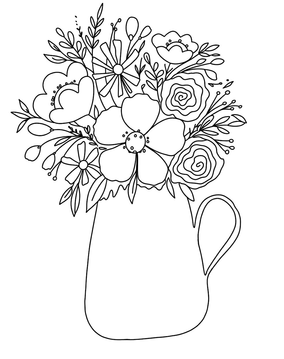
© Viddhi Saschit from Gorgeous Gouache BURSTING BOUQUET
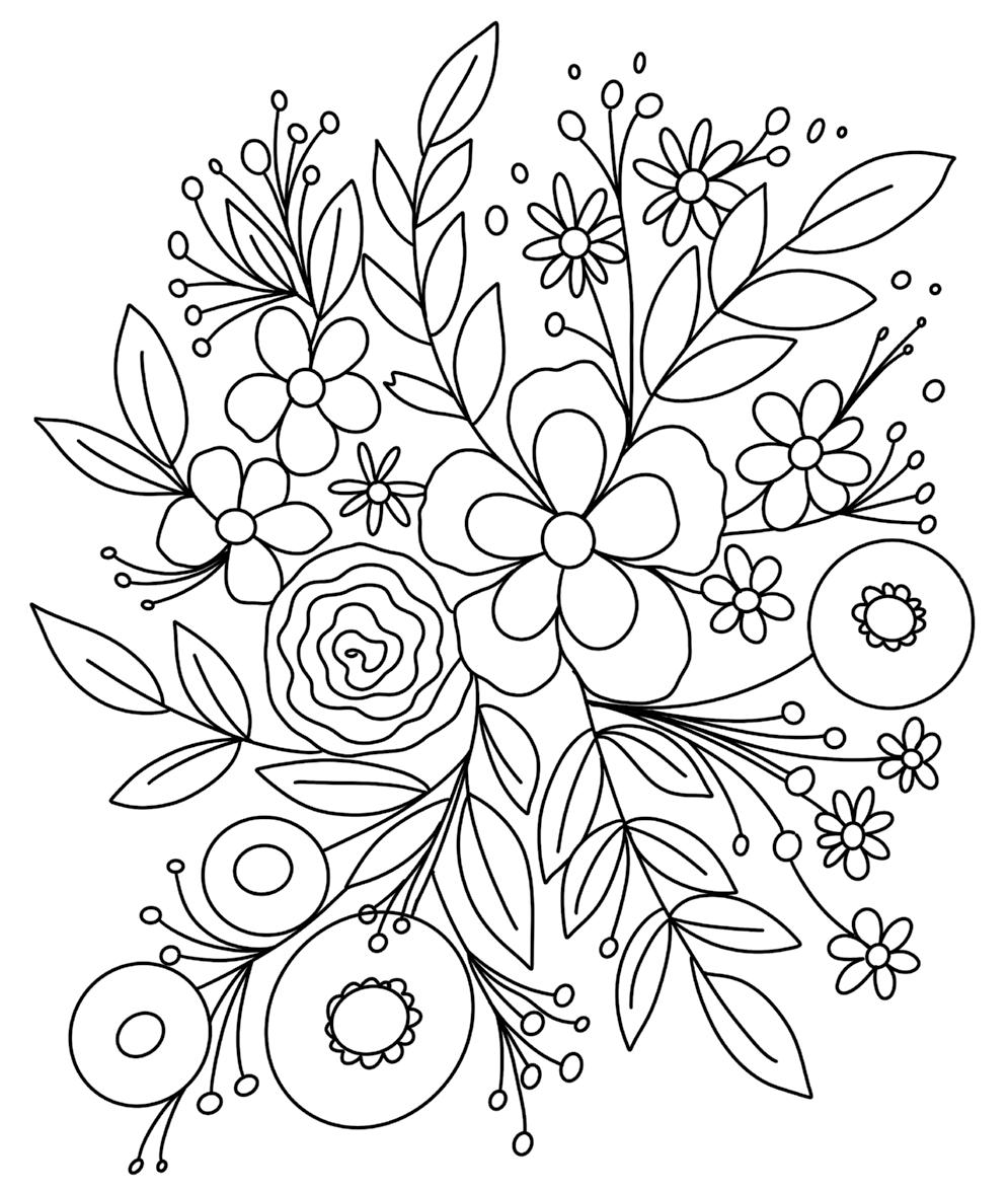
© Viddhi Saschit from Gorgeous Gouache FREESTYLE BLOOMS
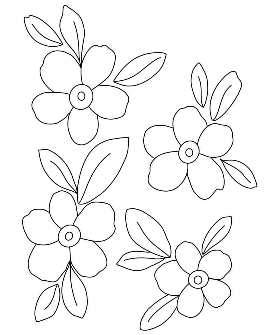
© Viddhi Saschit from Gorgeous Gouache NIGHT SKY
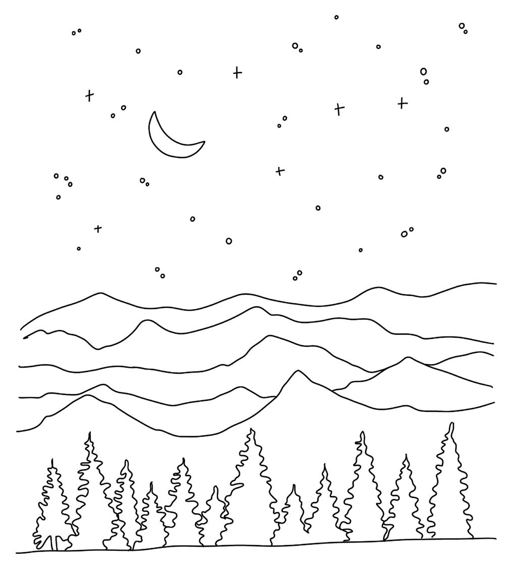
© Viddhi Saschit from Gorgeous Gouache DREAMY RIVER
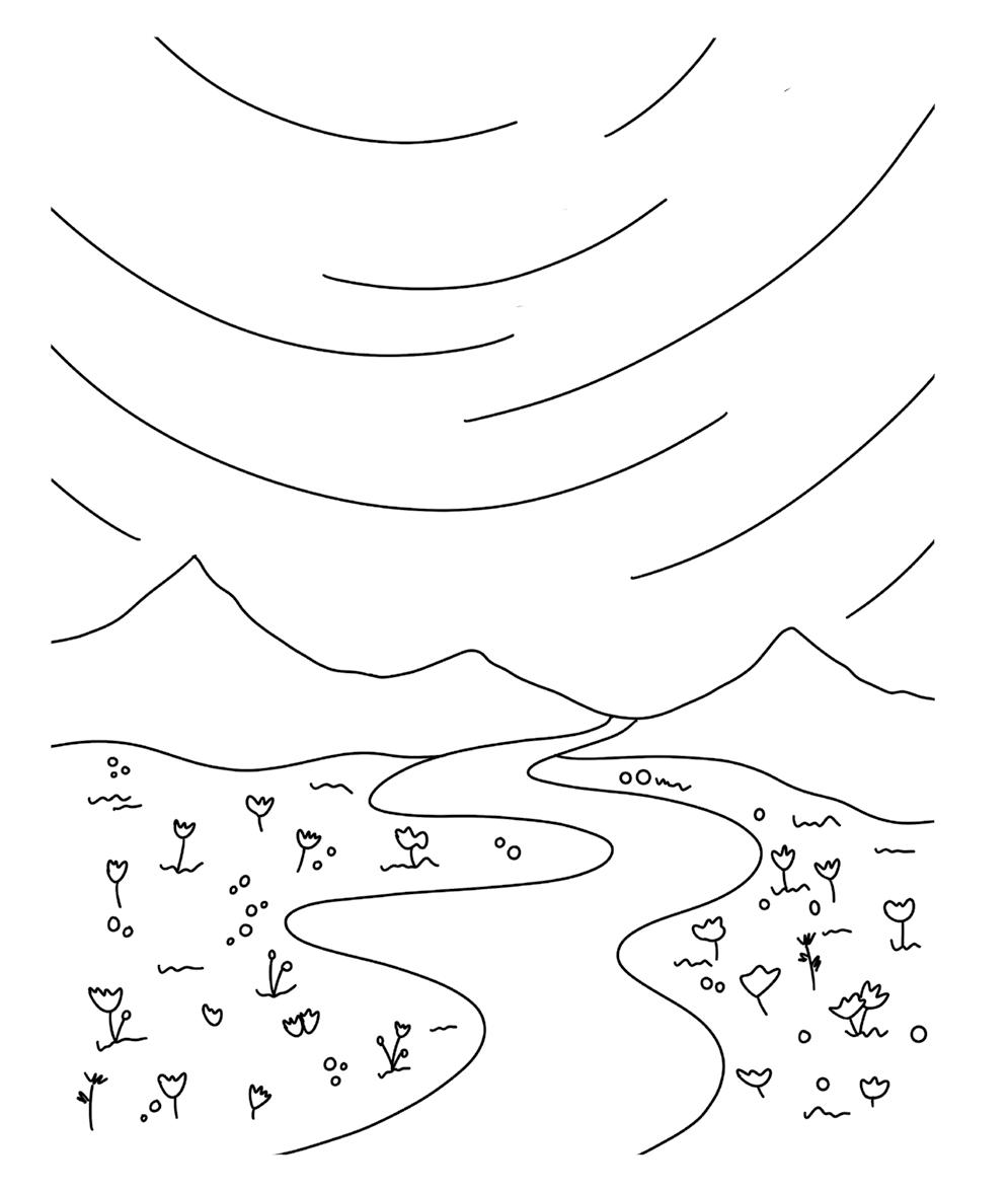
© Viddhi Saschit from Gorgeous Gouache DESERT SUNSET
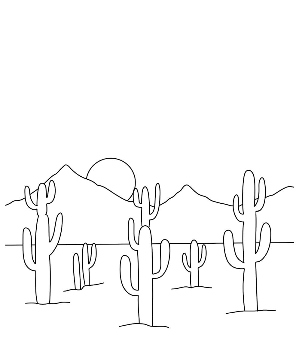
© Viddhi Saschit from Gorgeous Gouache MOROCCO
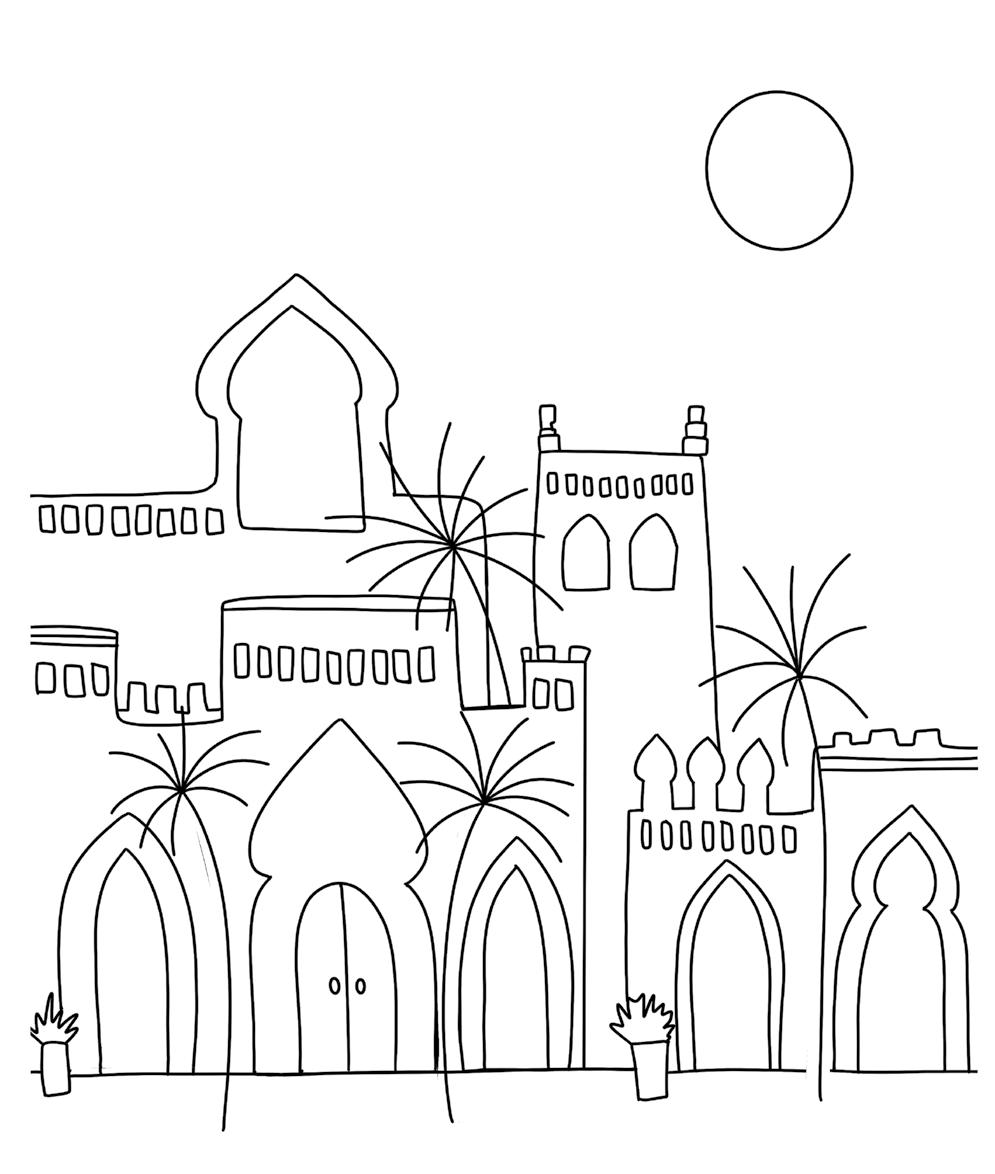
© Viddhi Saschit from Gorgeous Gouache SANTORINI
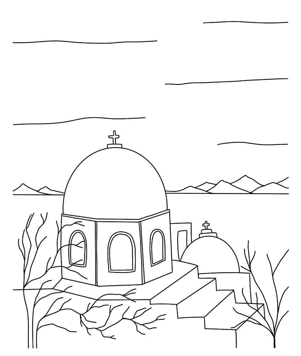
© Viddhi Saschit from Gorgeous Gouache OCEANSCAPE
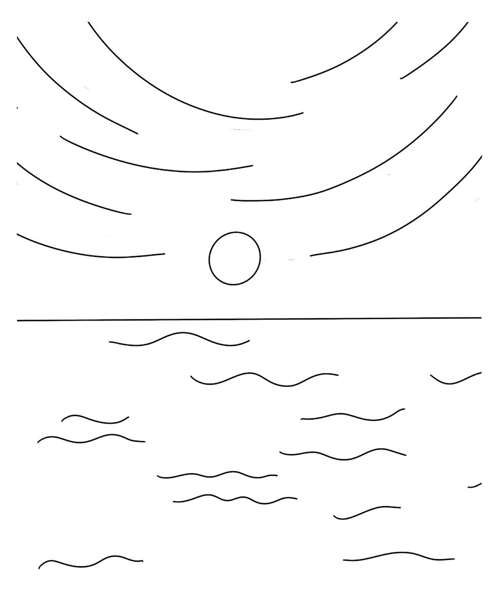
© Viddhi Saschit from Gorgeous Gouache MT. FUJI
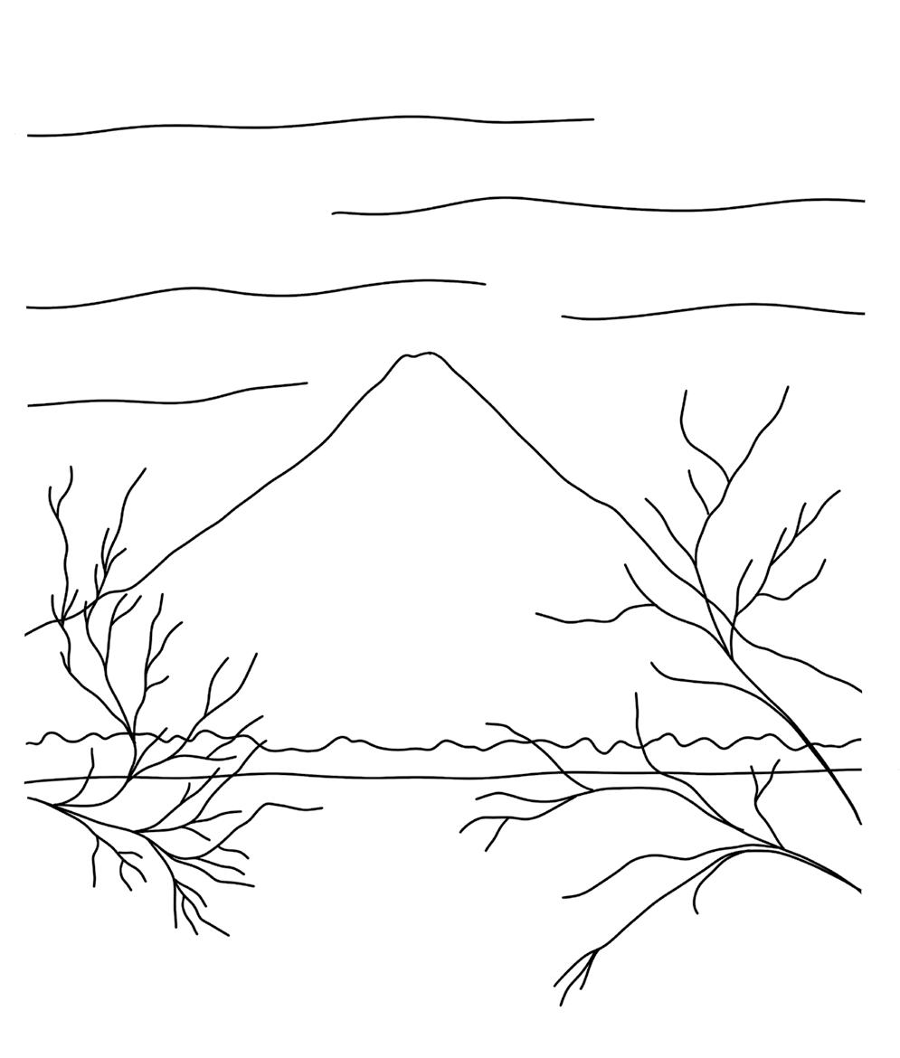
© Viddhi Saschit from Gorgeous Gouache BRIGHT FLORAL MEADOW
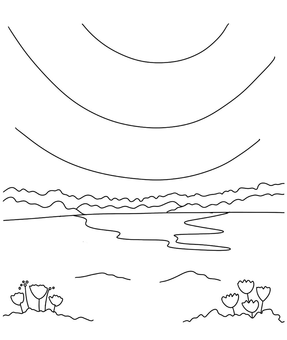
© Viddhi Saschit from Gorgeous Gouache EVENING HILLS
Business is personal at Better Day Books. We were founded on the belief that all people are creative and that making things by hand is inherently good for us. It’s important to us that you know how much we appreciate your support. The book you are holding in your hands was crafted with the artistic passion of the author and brought to life by a team of wildly enthusiastic creatives who believed it could inspire you. If it did, please drop us a line and let us know about it. Connect with us on Instagram, post a photo of your art, and let us know what other creative pursuits you are interested in learning about. It all matters to us. You’re kind of a big deal. www.betterdaybooks.com better day books
Viddhi Saschit is a deeply passionate artist and creative coach who is internationally known for her positive energy and use of bright color. She has collaborated with The Walt Disney Company, Faber-Castell, and Princeton Artist Brush Co. Viddhi is the founder of a surface pattern design company, Color & Joy, and has inspired more than 19,000 students through her creative workshops, Skillshare art classes, and coaching program, Flourish with Viddhi. She holds a degree in architecture and currently resides in Chennai, India. Find out more about her at www.viddhisaschit.com or @viddhi.saschit.
The Modern Guide to Opaque Watercolor Painting! ϋ Creative techniques to achieve gorgeous results no matter your skill level ϋ Super brushesforrecommendationssupplypaint,paper,and ϋ Visual color mixing recipes for every color in every palette ϋ Premade palettes in lots of colorways ϋ instructionsStep-by-stepfor every project ϋ toperforatedEasy-to-use,templatestearoutandpaint ϋ Inspiration encouragementand for creating with joy If you love the bold and beautiful look of gouache painting but thought the medium might be too complex for you, think again! Gouache is very similar to watercolor and totally within your reach when you follow the easy and accessible instructions inside this beautiful book from renowned artist, author, and designer Viddhi Saschit.