
1 minute read
The Historic Rebrand Journey

Marking the first of its kind in over 25 years
With extensive member engagement sessions accomplished in 2022 surrounding the anticipated revitalisation plans of the Club, it became clear that the overarching identity of Belmont 16s needed reassessing and a refresh to it’s branding to reflect the Club’s ongoing commitment to innovation while honouring its rich heritage and is delivered in line with our $20 Million + redevelopment.
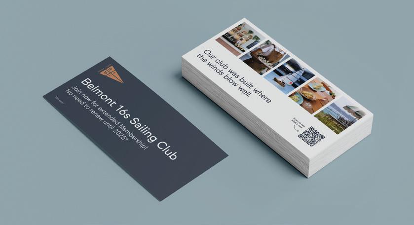
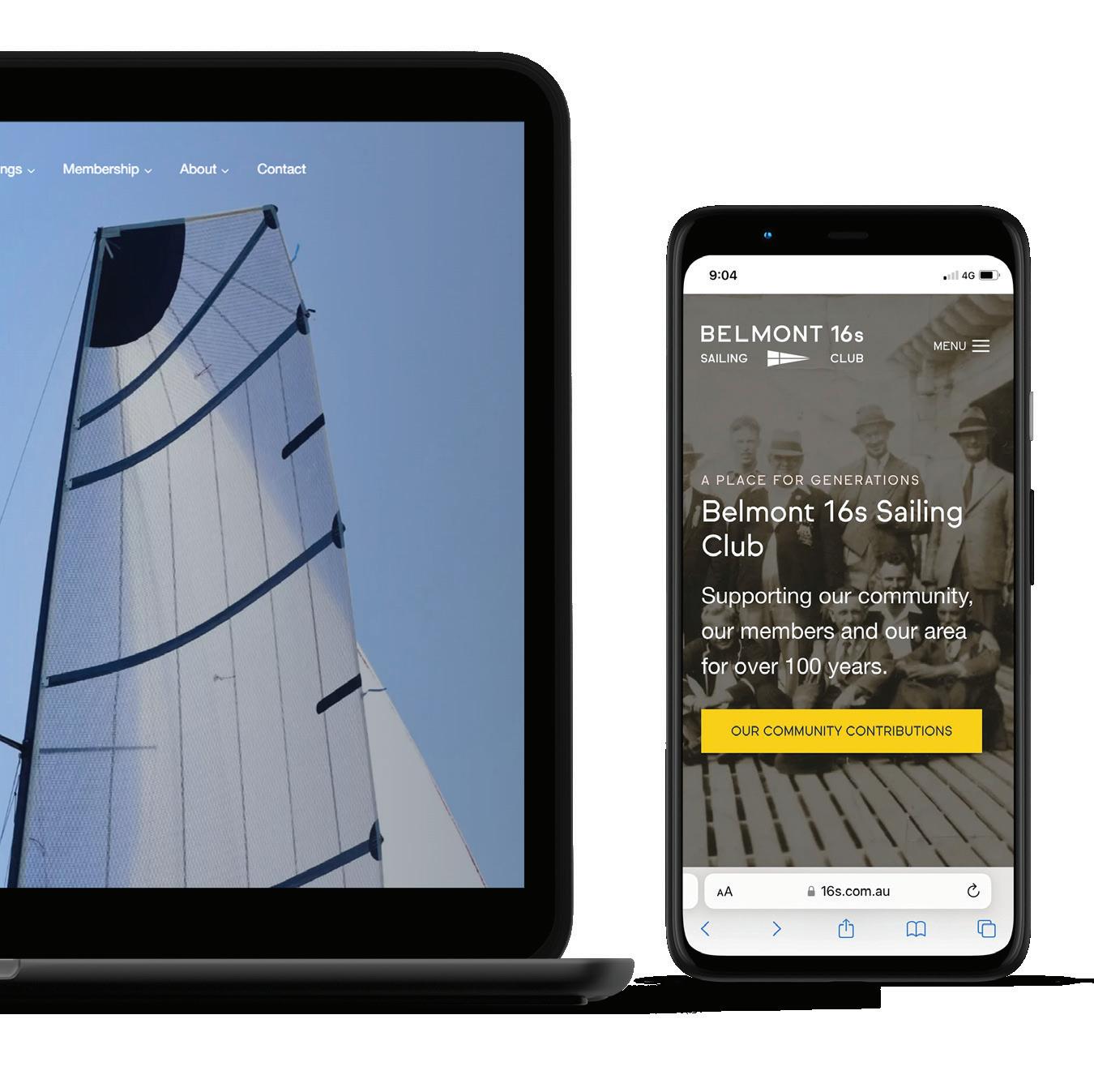
The new brand identity sees a return to the Clubs full name of Belmont 16s Sailing Club from other previously shortened versions and introduces a modern twist to the Club’s legacy. Featuring a redesigned logo that artfully blends a contemporary rendition of our reimagined original burgee flag, symbolising both our proud sailing history and our progressive vision.
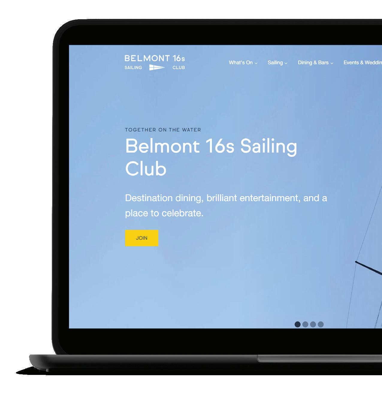
In line with commitment to our heritage, our new brand colours are inspired by the original palette from 1922 of Midnight Blue and Sunshine Gold and are harmoniously blended with a selection of tones that echo the natural hues of the stunning Lake Macquarie environment.
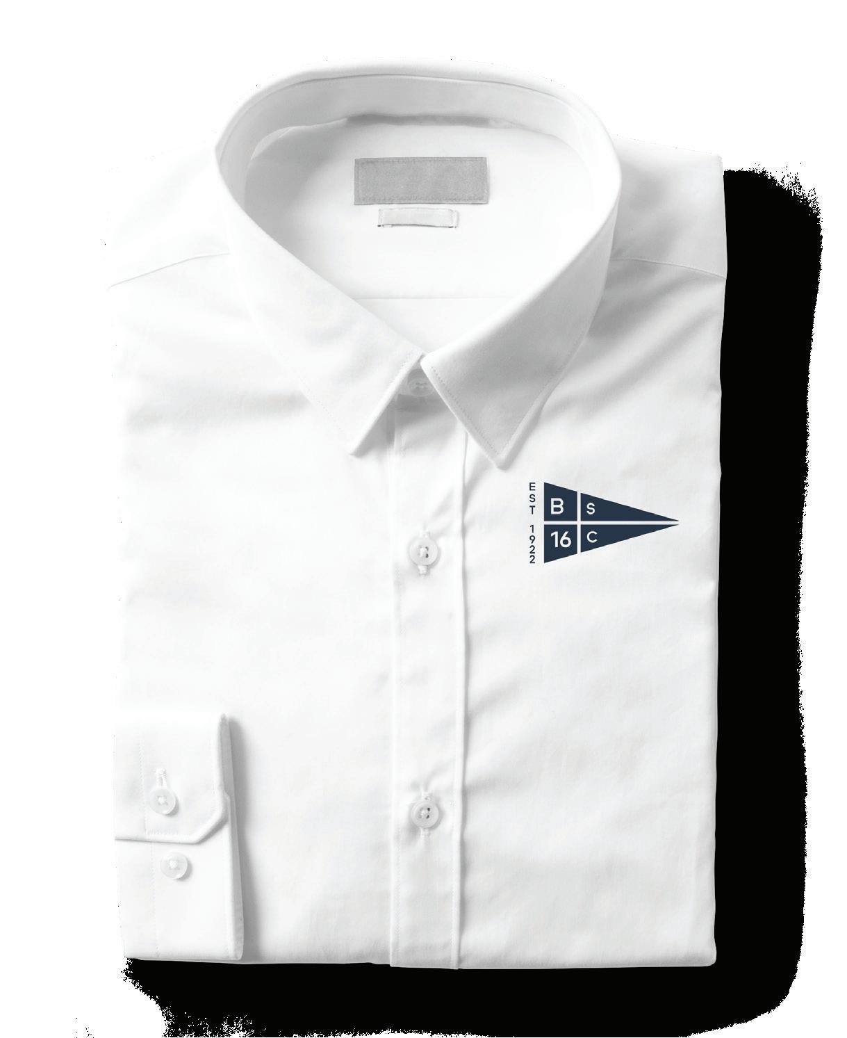
Another significant aspect of the Club’s rebranding is the introduction of new uniforms for our staff of over 180. These uniforms have been meticulously designed to reflect a contemporary nautical feel, resonating with our core identity as a sailing club. The new attire not only revitalises our team’s appearance but also reinforces our commitment to professionalism and excellence in service while being setting appropriate.
“Belmont 16s Sailing Club’s rebranding is more than just a visual transformation: it’s a recommitment to our values, members, and the broader community. We are excited to embark on this new chapter and continue to be a beacon of community, sport, and exceptional hospitality on the beautiful shores of Lake Macquarie.” Shares CEO Scott Williams.
A closer look...
Our fresh new website is up and running
WHAT’S IN A NAME?
While we revert back to our Clubs full name, the community have referred to our Club under various names ; Skiff Club, the Footers, the 16s, The 16 Footers, Belmont 16s, Belmont Sailing Club and Belmont Skiff Club.
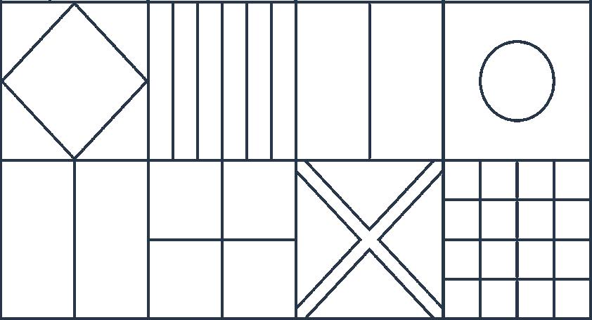
Purposeful Patterns
You may see a geometrical style line pattern accompany our new branding; this actually means something! These lines are a collation of our sailing flags that we use on the water to provide warning, guidance and direction.
Not Just A Line
Our brand pillars were created to redefine our ethos and came from a moving engagement session with 45 life members where stories, memories and yarns were shared one afternoon. From this we have created authentic bylines as part of our branding that you will see throughout our Club that reflect our Clubs essence “ Together on the water” “ Here you are always in good company” “ Our Club was built where the winds blow well” “ A place for generations”.
