
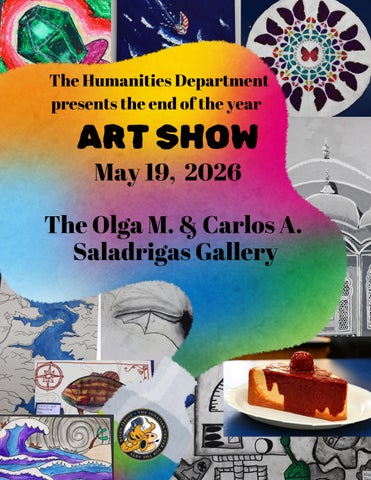
Welcome!
On behalf of the Humanities Department and the Ignatian Center for the Arts, we would like to congratulate our Belen artists for all they have achieved this year. The high caliber and wide range of artworks within the exhibition speak to their creativity, daring, and perseverance. Our artists have studied a variety of media, techniques, and art movements in which to ground their work. Some students have pursued art diligently for years guided by Mr. Font and now, Mrs. Snihur—while others have picked up a paintbrush for the very first time.
Apart from their practice of both classical and contemporary techniques, and the originality evident in every single object, what comes across in this student showcase is the pure joy that reverberates through the Art classroom. Studio Art is unlike any other discipline offered at Belen Jesuit. It is messy, urgent, hands-on, and it drives the soul to non-verbal expression. It is through Art that we glimpse the Divine. Our Creator has imbued each and every one of these artists with talent, with creative gifts, and with the ability to express the beauty of His world. It is our privilege as family and faculty to nurture this God-given talent, and to come together to celebrate it.
We are so blessed to have the Saladrigas Art Gallery on our campus and the opportunity to appreciate our students’ masterpieces on the gallery’s white walls. May they be inspired to continue pursuing the Arts for His Greater Glory. May God bless our artists, their families, their teachers, and the many champions of the Arts within the Belen Jesuit community.
AMDG,
Stephanie Hurst Humanities Department Chairperson
Welcome to the Saladrigas Gallery.
As we close the year with this Student Exhibition, the fourth and final show of our season, the Saladrigas Gallery is excited to fill its walls with artwork created by our students. Each piece you see here represents time, focus, and a willingness to take risks - making decisions, revising, and continuing until the work feels personal and complete. For our students, sharing art in a gallery setting is a meaningful step; for our community, it is an opportunity to witness the imagination and effort within each work.
Please take your time with the exhibition - ask questions, meditate, encourage the artists - and enjoy the range of ideas and materials on view. Your presence matters.
Thank you to our student artists for filling the Gallery, and to their families for the support that makes it possible. Thanks to Frances Snihur for her instruction and commitment to the process of making, and to the Humanities Department.
With gratitude,
It has been an incredible honor and joy to guide my students throughout this year and to have the opportunity to showcase their creativity in this gallery space. Watching them grow as artists, thinkers, and individuals has been one of the most rewarding parts of teaching, and I am so proud of the dedication, talent, and passion they have poured into each piece displayed here.
Creating alongside such smart, thoughtful, and talented students has been a true privilege. Rooted in our Catholic identity, this exhibition reflects the belief that creativity is a gift from God and that art allows us to express beauty, purpose, and the dignity of each individual. I am also deeply grateful for the continued support of our Humanities Department Chair and the Director of the Gallery, whose encouragement and commitment to the arts made this exhibition possible.
This show is a celebration of our students’ hard work, imagination, and artistic voice, and I am thankful to share it with our community.
THANK YOU for coming today to support the students and everything they made.
With gratitude,
Frances Snihur
Liam Andres Alonso '32
Lucas Adrian Bello '32
Nicolas Victor Casillas '32
Michael Charles Dolgos Jr. '32
Jorge Jayden Gonzalez '32
Luke Edward Lorenz '32
Edward A. Morrison '32
Nicolas Luis Pelleya '32
Nicolas H. Rubio '32
Leo Julius Twiggs '32
Miguel Andres Bermeo '32
Sebastian Eduardo Ceci '32
Aiden Matthew Cruz '32
Mario Andres Garcia-Serra '32
Nicolas Alejandro Lyons '32
Sebastian Mazman '32
Marco Esteban Montorro '32
Franco Alexander Sotelo '32
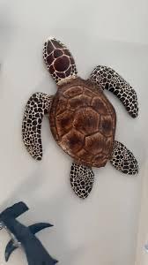
In this project, students explored the sculptural process of papier-mâché to create threedimensional turtle forms inspired by real-life observation. Students studied the anatomy, texture, and unique characteristics of turtles, applying this knowledge to build and refine their structures through layered construction techniques. As a meaningful extension of their work, these turtle sculptures were proudly displayed at Nicklaus Children's Hospital, allowing students to share their creativity with the community and contribute to a welcoming, uplifting environment for patients and visitors.
Manuel Victor Alvarez '32
Vidal Antonio Cadena '32
Alessandro Jose Delgado '32
Matteo Barroso Gherardi '32
Javier Jose Herran '32
Hermes Suarez lll '32
Zachary Joseph Alvarez '32
Nicholas Guillermo Brown '32
Jorge Eduardo Corzo III '32
David Augustine DeBayle '32
Guillermo Lopez Morante '32
Charles Joseph Markert '32
Logan Nicholas Melo '32
Charles Frank Perez '32
Miguel Alberto Sucre '32
The following projects were made by the same group of 6
Roman Ragnar Bello ’32
Max Blanch ’32
Tristan Robert Bustamante ’32
Noone Dunbar Carron ’32
Sebastian Manuel Casillas ’32
Franco de Mena ’32
Tomas Garrido ’32
Nikolas Christopher Gonzalez ’32
Andres Julian Grandal ’32
Eryk Kleszczewski ’32
Nicholas Sebastian Lopez ’32
Nestor Antonio Machado ’32
Francesco Luis Mendoza ’32
Mateo Ignacio Navarro ’32
Rafael Jose Ojeda ’32
Andrew Xavier Suarez ’32
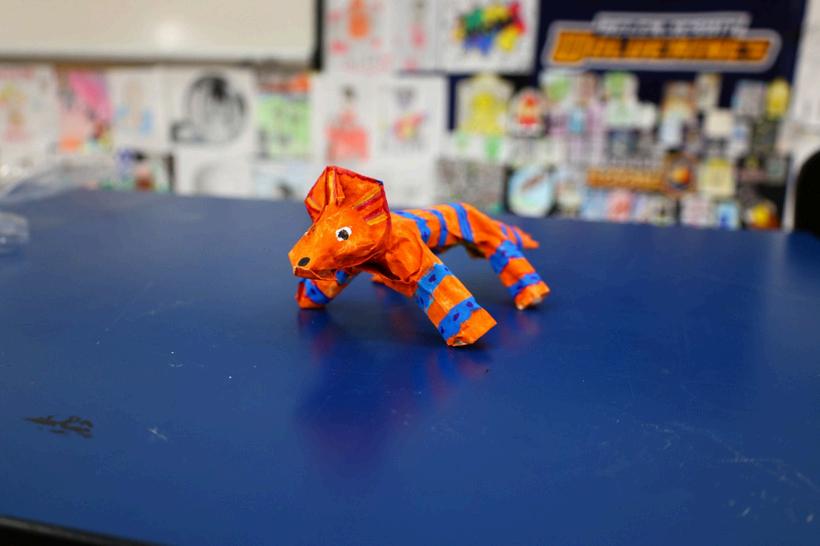
In this project, students explored the sculptural process of papiermâché to create three-dimensional lizard forms inspired by both reallife reptiles and the vibrant tradition of Mexican folk art known as Alebrijes.
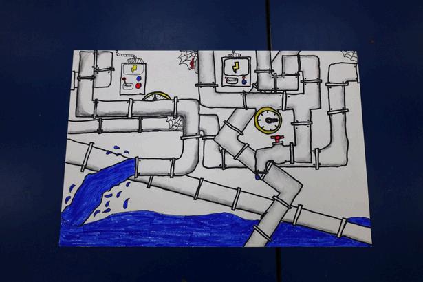
In this project, students explored the study of value through detailed observations of metallic forms, focusing on pipes as their subject matter. Using charcoal techniques, students developed their understanding of shading, contrast, and form to create the illusion of depth and surface texture associated with metal objects.
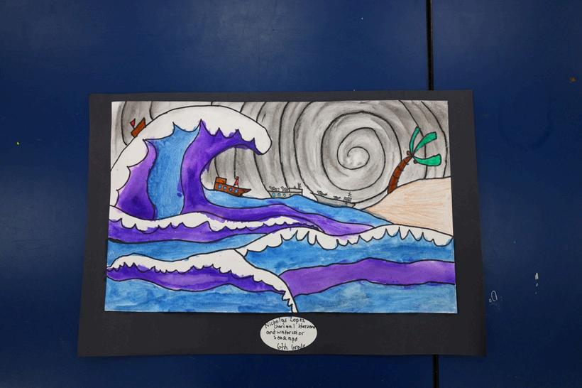
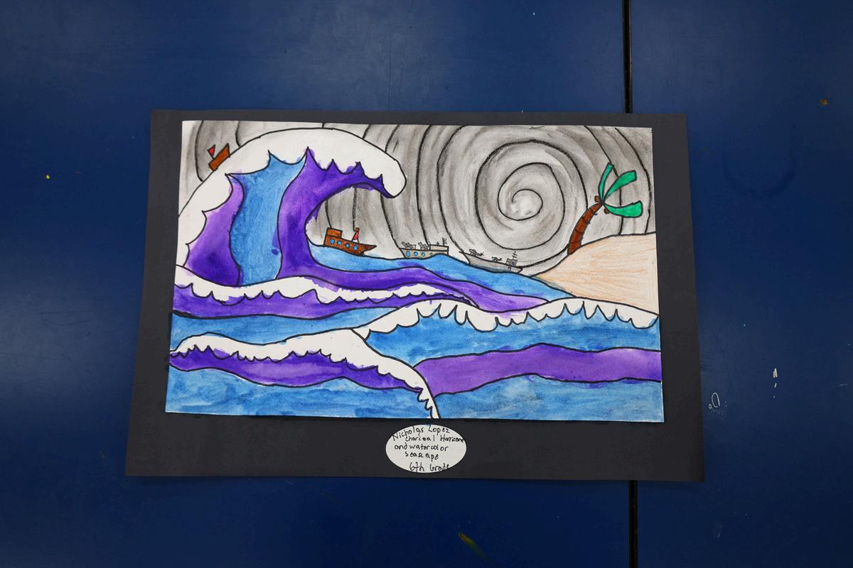
In this project, students explored the science and visual impact of hurricanes while developing their skills in value drawing using charcoal. Through observation and study, students learned how to create the swirling motion and atmospheric depth of a hurricane by applying a range of values, from light to dark, using blending and layering techniques. To complement their charcoal work, students incorporated watercolor to depict the surrounding landscape and additional environmental details. This combination of media allowed students to contrast the dramatic, monochromatic movement of the storm with controlled areas of color, enhancing both depth and visual interest.
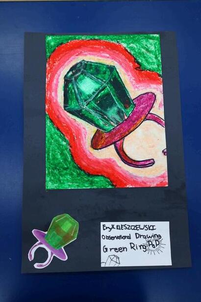
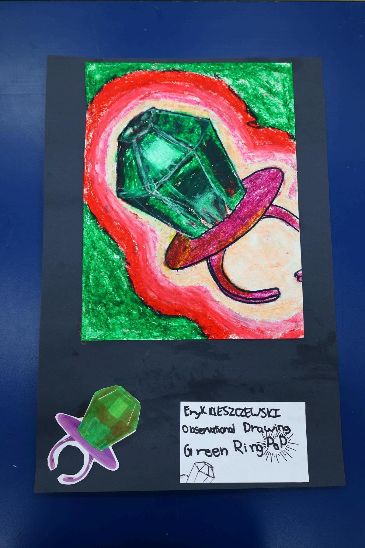
In this project, students explored the history and cultural significance of the iconic Ring Pop candy while developing their observational drawing skills. Using oil pastels, students practiced value study, color blending, and layering techniques to capture the transparency, shine, and form of the candy.
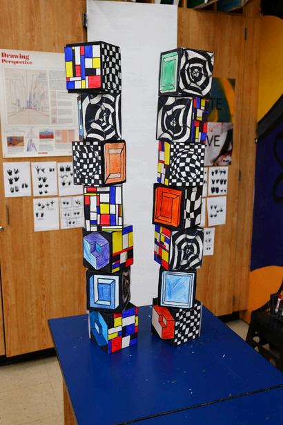
In this project, students explored the principles of optical illusions and three-dimensional art by creating designs on each side of a cube. Using tissue boxes as a base, students applied Op Art techniques, including pattern, repetition, and contrast, to transform everyday objects into dynamic visual experiences.
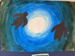
In this project, students explored the importance of our oceans and marine life while developing their skills in value, color blending, and composition. Using a blue ombré background to represent the depth and movement of ocean water, students painted silhouetted sea creatures, emphasizing contrast, shape, and visual impact.
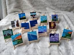
In this project, students explored the art of miniature painting, learning how to create detailed works on a smaller scale. Using 3x3 inch canvases, students carefully planned and executed compositions of their choice, focusing on precision, detail, and thoughtful use of space. This project emphasized patience, observation, and fine motor control, allowing students to transform a compact surface into a vivid and intricate masterpiece, showcasing creativity within a limited format.
Victor Enrique Cepero '31
Eduardo Creel Camara '31
Nicolas Jesus Dajer '31
Lucas Alexander Espino '31
Rodrigo Garcia '31
James John Hogan '31
Mauricio Matos-Echenique '31
Niberto Andres Moreno '31
Matthew Henry Pinera '31
Daniel Carlos Vargas '31
Juan Carlos Alexander II '31
Raj Neal Chanda '31
Alessandro Andrea De Mori '31
Manuel Alberto Gamoneda '31
Nicholas Gutierrez '31
Marcus Joseph Llorente '31
Jacob Alexander Mauras '31
Adriano Mora-Echeverry '31
Juan Jose Robayo '31
Daniel Joseph Uriarte '31
Patrick Nicholas Chagui '31
Aiden Lucas Cruz '31
Richard Logan Duran '31
Jacob Daniel Fernandez '31
Diego Ricardo Hernandez '31
Jacob Ryan Jasinski '31
Michael Javier McDowell '31
Daniel Jacob Perez '31
Lucas Daniel Salas '31
Guillermo Alberto Aguayo '31
Maximo Andres Botero '31
Alexander Jorge Luis Davila '31
Derek Andrew Espinosa '31
Santiago Gustin '31
Dominik Levy '31
Nicolas Llorente '31
Max Thomas Mauri '31
Nicolas Alexander Pinto '31
Benjamin Daniel Rodriguez '31
Jacob Levi Williams '31
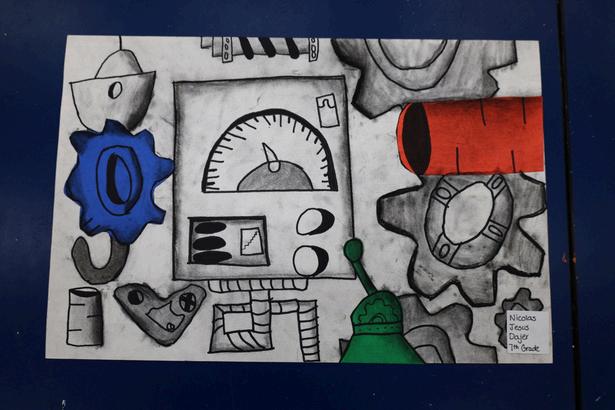
In this project, students explored industrial imagery inspired by Diego Rivera’s Detroit Industry murals. Through observation and study, students examined how machinery and mechanical forms can be represented with structure, precision, and depth. Using charcoal, students applied a range of techniques to develop value, contrast, and texture, bringing attention to the intricate details of machine components. Emphasis was placed on shading, highlighting, and creating the illusion of three-dimensional form.
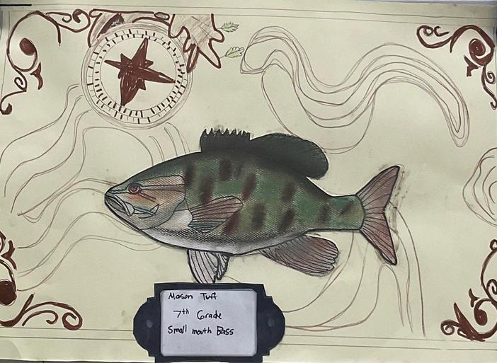
In this project, students developed their observational drawing skills by studying and illustrating freshwater fish. Through careful attention to proportion and form, students worked to accurately capture the structure and movement of their subject. Students explored texture techniques to represent the intricate patterns of fish scales, enhancing realism and surface detail. Using soft pastels, they applied color through blending and layering, creating vibrant compositions that reflect the natural beauty of aquatic life.
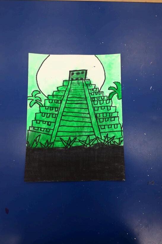
In this project, students explored a variety of landscape types while developing their understanding of color theory and value. Each student selected a location for inspiration and created a landscape using a monochromatic color scheme, focusing on a single color and its range of shades and tones. Using watercolor paint, students practiced blending and layering techniques to create depth, atmosphere, and contrast within their compositions. This approach encouraged careful observation and thoughtful use of value to define form and space without relying on multiple colors.
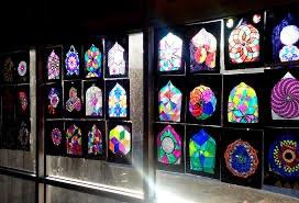
In this project, students explored the design process behind stained glass by combining digital art and traditional techniques. Students began by creating their designs digitally, focusing on composition, line, and color relationships inspired by the structure of stained glass. They then transferred their designs onto transparent film, using bold outlines and vibrant colors to replicate the luminous quality of stained glass. This process allowed students to understand how light, color, and line interact to create visually striking effects.
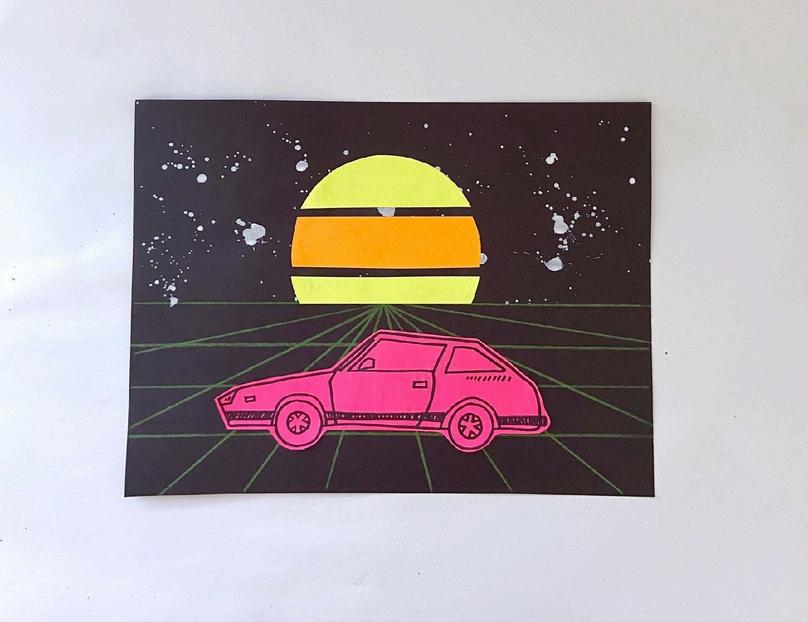
In this project, students explored the bold visual style of the 1980s while developing their observational drawing skills. Each student selected a car from the era and carefully rendered its form, focusing on proportion, detail, and accuracy. Students then created a dynamic background using one-point perspective, designing a stylized sunset landscape to enhance depth and composition. Using neon paint, they applied vibrant colors to capture the energetic and iconic aesthetic associated with 1980s design.
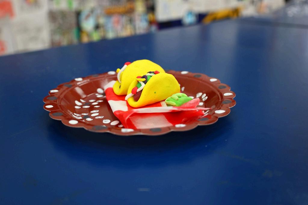
In this project, students explored three-dimensional sculpture by creating realistic tacos out of clay. Working exclusively with primary colors, students mixed and combined pigments to produce the range of colors needed for their tacos, practicing color theory and mixing techniques in a hands-on, tactile way. Through this project, students developed skills in form, texture, and surface detail, transforming simple materials into playful and visually engaging sculptures that demonstrate creativity, craftsmanship, and an understanding of color relationships.
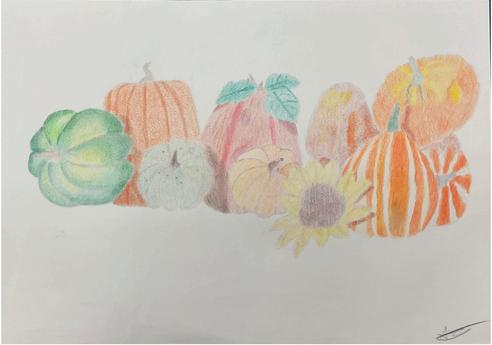
I used colored pencils to create my fall art project. The fall artwork drawing included various fall-themed fruits and vegetables. I made it with a high focus on blending and shadows. I really wanted to get the shading right. It took me about 3 weeks to make. I was hyper focused on including a natural relationship between all the colors.
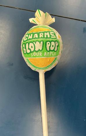
This year, I was able to explore multiple mediums and new techniques. Throughout the curriculum, my favorite piece I created was my Blow Pop sculpture. As a senior, it felt very nostalgic to be creating my favorite candy from when I was little. The process of papier-mâché was also one I had never experimented with. I learned how to manipulate the paper to create the lollipop's complex shapes and share my nostalgia with the audience.
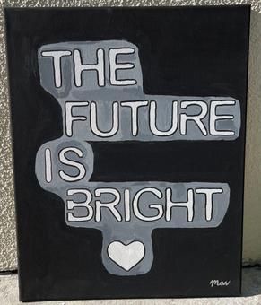
My artwork is about hope and optimism for the future. I made this piece because I wanted to create something simple but meaningful that could encourage people when they see it. The words “The Future Is Bright” stand out against the dark background, highlighting the contrast between hard times and hope. I used acrylic paint and layered shades of gray and white around the letters to make the words pop and add dimension. The black background represents uncertainty, while the lighter colors represent positivity, clarity, and better things ahead. The heart at the bottom adds more emotion to the piece and shows that hope is also connected to love and strength. Overall, I want viewers to feel encouraged and reminded that their future can still be bright even when life feels difficult.
Patrick Stewart '26
This year, art became more than just a practice for me; it became a way of thinking, feeling, and expressing the many dimensions of my creativity. Each piece I created emerged from something I experienced, observed, or felt, and was transformed through my own perspective into something personal and new, making it a piece that meets my standards.
Looking back, all of my work reflects not only what I’ve learned, but how I’ve grown. My time in this class during my final year at Belen allowed me to explore new ideas freely, experiment with different styles, and find deeper meaning in the process of creating. Every artwork carries its own profound story, some deeply rooted in moments I experienced this year, others in strong emotions that I felt, but they are all shaped by a desire to reinterpret what inspired me. I see my work as an invitation for others to connect, reflect, or even find their own inspiration within it. Many of these pieces will be shared with friends, not just as objects, but as reminders of the experiences and memories we created together. In that sense, my art becomes both a personal expression and a way to preserve connection, turning moments into something lasting.
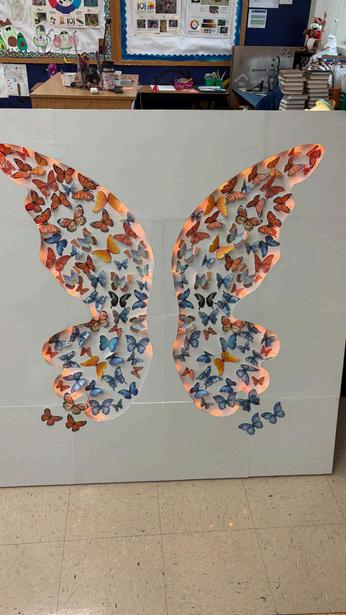
This installation is inspired by the idea of wabi-sabi, in which beauty emerges from imperfection, change, and the handmade. Hundreds of individual butterflies come together to form a pair of wings, each placed at a slightly different angle with small irregularities that give the piece a natural, human quality. The color gradient shifts from warm oranges to cooler blues, reflecting an emotional transition from intensity to calm and capturing the feeling of having “butterflies in your stomach,” when multiple emotions, like excitement, anxiety and anticipation, exist all at once. Smaller butterflies drift through the center like thoughts in motion, some gathering and others separating, echoing how emotions constantly shift and reshape themselves. Soft LED lighting moves between warm and cool tones, changing the atmosphere and reinforcing the idea that our inner world is never fixed but always evolving. The piece is meant to be experienced from different angles, bright, dim, or partially seen or on how just emotions are felt differently in each moment, and when viewers stand between the wings, they become part of the work, forming a larger butterfly made from many smaller ones, reflecting how a person is made up of many feelings at once, where even the most imperfect emotions belong to the whole. 27
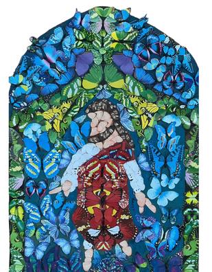
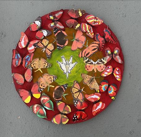
My artwork explores change and faith through the symbolism of butterflies. Butterflies represent transformation because they start as caterpillars and grow into something beautiful, which connects to the idea of new life in Jesus. I first drew my design to plan where everything would go, then I chose different-colored paper and 3D butterflies and arranged them according to the color pattern. I used cardboard for the background to give the piece structure. The many butterflies create texture and movement. Through this artwork, I want viewers to understand that, just as butterflies change, so does faith in Jesus, and that becoming a better person is part of that change.
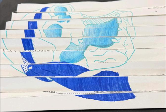
My artwork explores themes of life, death and rebirth. As shown by the skull and vulture, in ancient myths and legends, vultures represented wisdom and the cycle of life. While skulls offer a shocking reminder of how short life really is, they also offer wisdom. This piece reminds people to live in the moment rather than in the past or the future. I also enjoyed working with the ink in the oni mask and the dragon. Oni masks in Japanese legend represent the balance between good and evil, and raw power. While the dragon represents wisdom and controlled strength.
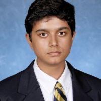
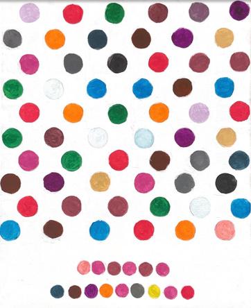
My artwork explores a plethora of themes, each unique from the others. The piece I favor the most is the dot painting. While some may believe it is simple compared to the fall still life or the greyscale piece, the beauty lies within. The words coded in different colors make you slow down and try to read. This leisurely moment makes the meaning much more potent. The quote by Malala Yousafzai reads: “with guns you can kill terrorists, with education you can kill terrorism”. Malala is an activist for the right to an education and faced many hardships to achieve equality in and out of the classroom. All in all, this dot painting carries the deepest message within the simplest of colors.
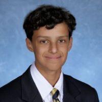
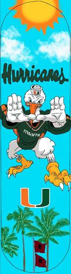
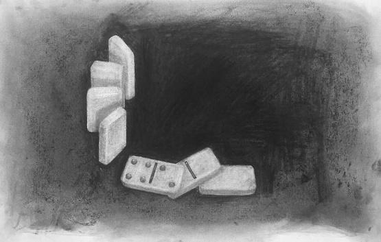
I started with foundational observational drawing, using charcoal to study how light falls across surfaces, such as the crumpled paper bag. I pushed that further with the domino piece by working against a blackened ground and pulling out highlights to create a stronger sense of depth. Moving into color, I used layered colored-pencil strokes to capture the different textures of each object. The dot painting let me work on color mixing and showed me how neutrals can affect a piece. The piece spells out the message “everything I’m not made me everything I am”, which I feel I can strongly relate to. The papier-mâché watermelon challenged me to create three-dimensionally, and the skateboard design allowed me to showcase my passion for the Miami Hurricanes and incorporate subject matter that characterizes the program as a whole.
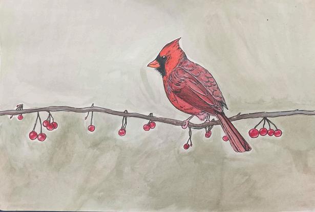
As long as I can remember, I’ve drawn/created realism and naturalistic pieces. In this series, I wanted to keep that attention to detail, but step away from realism and create something more colorful and fun. Works that don’t focus on perfection, that aren’t created to look exactly as it does in real life. It’s hard to let go of wanting to make everything as perfect as I can. It’s really about letting go.
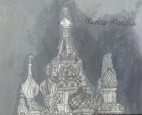
I really enjoyed my time in Studio Art this year, and one of my favorite artworks was my grayscale drawing of St. Basil’s Cathedral in Moscow, Russia. I drew this cathedral because I really like architecture, and one day I want to be an architect. For the grayscale drawing, I needed to find a building that was colorful, which is what this cathedral is. This artwork explores the insane details of the cathedral and how it was made. When viewers see this piece, I want them to feel amazed and impressed by the hard work that I’ve put into it.
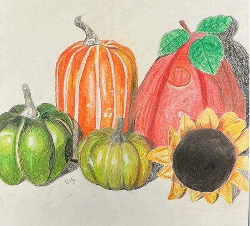
Throughout the year, the pieces I developed explored different medium of artistic creation: from charcoal to paint to even papier-mâché. As more and more pieces were made, I noticed that they not only grew in quality but also grew in meaning, with my later works having more definite and personal reasons for the subjects within them. However, for what is arguably my favorite piece of this whole series, I appreciate it not for the significance intentionally embedded within it, but for what it meant to me after realizing its creation.
You see, my first love for art did not come from my appreciation of painting or sculpting, but rather my fascination with drawing as a whole, specifically with traditional pencil and paper. Sketching the world around me and rendering these sketches with colored pencils, in particular, became my most common and enjoyable way of expressing creativity, an effect that is still evident in my works today. As such, I always fantasized about creating a pencil/coloredpencil piece like the professional ones I’d constantly see, and my Fall-Themed Still Life piece no doubt achieves that. I hadn’t realized it at first, but the quality of this piece would end up personally making me understand how far I’ve come as an artist and how proud I should be of the progress I’ve made ever since I first picked up a pencil.
My artwork explores various levels of abstraction that the natural world and everyday items can undergo, sometimes transforming into something completely unrecognizable. I try to convey this feeling by taking a more fantastical, individualistic approach to nature, as seen in Veteran Marlin, Death of the Monarch, and The Deeplights. In these pieces, I used the dynamic and fluid properties of charcoal to convey a sense of grit and tenacity within an individual animal, the swirling and obscuring texture of paint to convey the oxymoronic nature of a species otherworldly appearance, and a collage of materials to offer a glimpse into a strange and foreign culture during a time of mourning. I also try to give life and personhood to static objects and environments that we often overlook, and provoke interest in the mundane so that viewers might seek it out for themselves. I used volumetric shading and sharp lines, achievable with pencil, to capture a moment in time, and the animating properties of watercolor to bring static geography to life. Death of the Monarch remains my favorite piece and it explores the transformative properties of life and death, both on the mind and the body, and how it shapes our lives both on the individual and wider cultural scale.
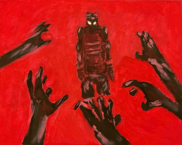
This piece is a painting of a comic book character that I have been working on with a friend of mine for the past year. I took a lot of inspiration from Francs Xie and the art from a video game called ULTRAKILL I chose this character, Mask, in particular because he is from a zombie story and I wanted to explore themes of violence and anger. The hands of the undead are outstretched to attack and he stands at the ready to fight. The piece is made with simple acrylic paint on canvas. Red is a color that evokes anxiety and fear, which is an emotion that I wanted to portray as being felt by the character as he likely faces his doom. Red is also my favorite color, which is why it’s very commonly used in my work. My work tends to wildly vary in content, but I have always been a fan of dramatic lighting and sketchy lines, as shown here.
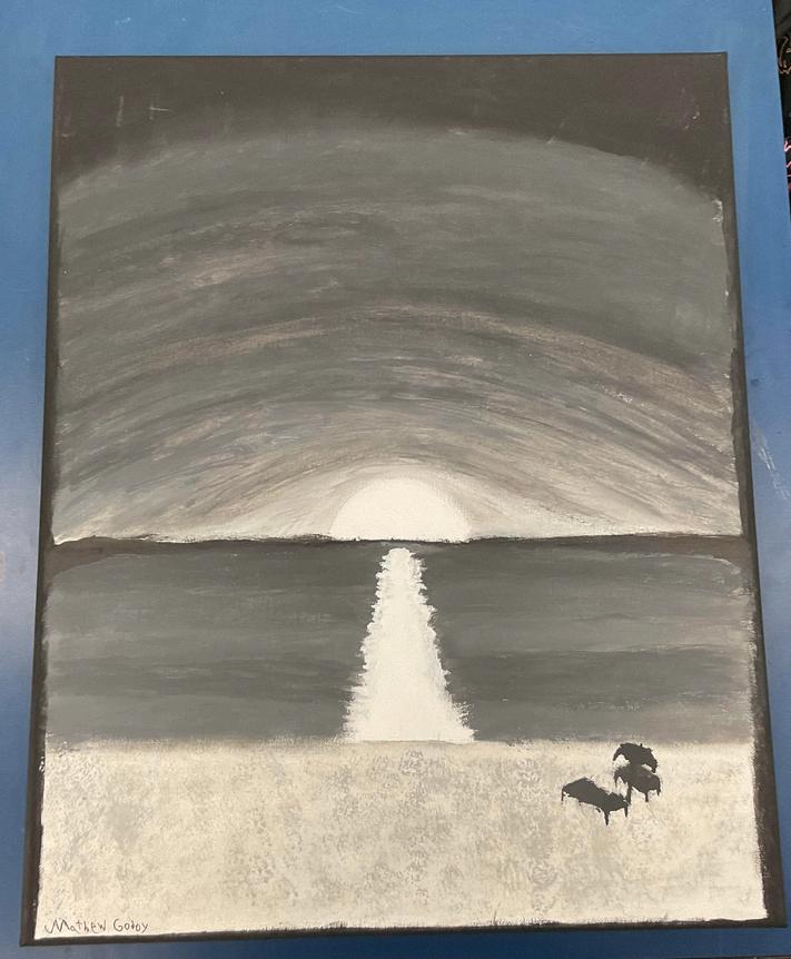
My artwork explores the idea of human relatability and connection through art. Throughout most of my life, I found that human connection is best formed around shared interests and nostalgia. As a result, most of my art is designed to encourage thought, conversation, and connection. I often do this through interpretive paintings such as Empty Horizon, an artwork made in greyscale using paint, which I see as an artistic representation of memory and nostalgia, which many people can relate to and share with each other. I have many other artworks that both connect with people on an emotional level and spark memories of things they may have enjoyed in the past. I still believe that shared experiences or interests are what bring people together, and I try my best to honor that in my pieces.
My portfolio is very thematically diverse, as I often use art to explore my own thoughts, emotions, and understanding of the world around me. My art style and subject matter throughout my portfolio are diverse, drawn from many sources and collaged to deliver a statement on the human condition. For instance, pieces like The Damned Man rely heavily on a syncretism between the art pieces that inspired them and symbolic attributes that give the piece new meaning or deliver a particular insight into an ideal of mine. My pieces also often rely heavily on color or dramatic shading for emotional expression or added drama, with pieces like Marriage deriving their meaning or emotional weight from their use. Though I created my pieces with a specific idea or emotion in mind, most often referring to my catholic faith, I leave all my pieces open-ended for the viewer to ponder and draw their own meaning from my art, hopefully finding beauty or comfort in the pieces.
Fr. Guillermo M. García-Tuñón, S.J., ’87
José E. Roca ’84
Patricia Bustamante
Olivia Zarrraluqui
Frances Snihur
Stephanie Hurst
Ignacio Font
Phillip Karp
Leandro Vázquez
Maria Victoria Ruiz
Richard Moncada
Betty Fuentes
Teresa Martinez
CJ Cristobal ’16
Robert Gonzalez THANK YOU