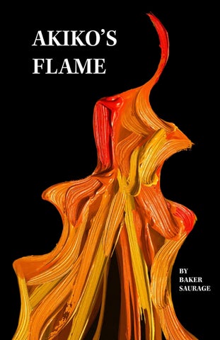
AKIKO’S FLAME
BY BAKER SAURAGE
WHO IS AKIKO? With 28 CLIO awards under her belt, Akiko Stehrenberger is no small name in the world of movie poster design. After some time freelancing as an editorial illustrator in New York, she moved to LA to work as a junior designer at an ad agency where she learned her way around Photoshop. Since then, she has been deemed “Poster Girl” by Interview magazine and had her posters for Funny Games (2007) and Kiss of the Damned (2012) included in Vanity Fair’s “Best Movie Posters of All Time” list. Akiko has even published a book in 2020 on her designs titled “Akikomatic: The Work of Akiko Stehrenberger.” Some of her clients include A24, Criterion Collection, Amazon Studios, Neon, Netflix, Lionsgate, and Sony Pictures.
Directed by French film director Céline Sciamma, the 2019 hit film Portrait of a Lady on Fire follows a painter, Marianne (Noémie Merlant) who falls in love with the young woman, Héloïse (Adèle Haenel), whose wedding portrait she is tasked with painting in 1770s France. Produced by the French/German media titan Arte, Sciamma’s film reached American audiences with the help of the distribution company Neon. In need of an alternate poster design, Neon turned to Akiko for help.
AKIKO’S INSPIRATIONS
Akiko credits Bob Peak as one designer that has inspired her work most. “I admired him for his versatility to adapt to all genres,” she tells Austin Film Society, “Not many artists during his era (if any) did that…It’s very important that the style of illustration serves the film, instead of just serving me (Stehrenberger).” Some of Peak’s most famous posters include those for My Fair Lady (1938)and Apocalypse Now (1979).
Beyond the work of one single designer, Akiko’s work and design philosophy is heavily influenced by her love for Polish and Czech posters. “I just love how weird they are,” she tells Beneficial Shock!. “I love how some feel naive, while others look effortless, and I think this is what makes them so charming.”
SO WHAT MAKES AKIKO’S PORTRAIT OF A LADY ON FIRE DESIGN SO GOOD?
THE FLAME:
THE NEGATIVE SPACE:
The poster’s primary focus is the flame. What makes this flame so interesting, though, is its texture. “It’s a mix of my own painting and a little bit of help to achieve that really dimensional, glossy look of an oil painting,” she tells Dazed. This decision is an homage to Marianne’s painting in the movie.
Even more fascinating than the flame itself is what can be seen in the space around it, which presents two faces close together about to kiss. Akiko is known for using optical illusions in her designs. This particular one is reminiscent of that of Rubin’s vase, arguably the most famous example of ambiguous or bi-stable two-dimensional forms. Above is Rubin’s vase, which Akiko draws heavily from.
THE LAYOUT:
THE TYPOGRAPHY:
The general layout is similar to that of designs from the “golden age of poster design,” which Akiko has expressed her love for. This layout includes a border around the central image with extra space at the bottom for general information, such as the film’s title. A similar layout can be seen in Bob Peak’s poster design for Richard Donner’s Superman (1978).
The typography on this design is actually hand drawn by Akiko and harkens back to calligraphy of the late 18th century. “Whenever I’m given enough time, the chance, and the context to do things by hand, I try to do that as much as possible,” she tells Dazed. “For Portrait of a Lady on Fire, this was an instance where there was already a locked logo. To make it feel cohesive to my piece, I repainted it so it made sense with the whole piece.”
SOME OF AKIKO’S OTHER WORKS Funny Games (2007)
Her (2013)
The Last Black Man in San Francisco (2019)
Uncut Gems (2019)
El Conde (2023)
Colossal (2016)
I’m Thinking of Ending Things (2020)