8 minute read
Designing a Typeface for Movies


How to capture the feeling of a movie in a single font
The type designers and typographers behind Suspiria, Sorry to Bother You, and The Favourite explain their creative processes
Advertisement
by Eliza Brooke | Vox
For the most part, it’s the spoken words in a film that we pay attention to. But sometimes the look of a movie’s title — or chapter titles, end credits, or subtitles — can really attract the eye. The right font can drive home a movie’s message or simply serve as a visual treat.
The thing is, a lot of 2018’s new releases looked the same, at least where type was concerned. Action movies like The Commuter, Mission: Impossible — Fallout, and Red Sparrow used capitalized, this-means-business sans serifs on their posters — sometimes italicized, for an added boost of adrenaline. So did actionfilled comedies, like Ocean’s 8 and Game Night. Dramas like A Star Is Born and Boy Erased went for serif caps, as though to convey a refined thoughtfulness. Title fonts like these prioritize readability; they’re marketable to a wide audience and, one might assume, generally easier and cheaper to produce than artier custom designs. So it’s rare, and exciting, when a movie mixes things up. Among the films that did so this year are Sorry to Bother You, Suspiria, and The Favourite. The mood of each film is reflected in its distinctive title typography. Sorry to Bother You’s absurdism and energy translates into blocky, bright pink type. Suspiria’s title, which is both attractive and jarring, captures the beauty and gnarly discomfort of the movie. In The Favourite, the pomp and perversity of Queen Anne’s fictionalized court registers through a historic typeface manipulated in surprising ways. Here, the films’ type designers and typographers explain the thought and process behind their standout text.
Sorry to Bother You
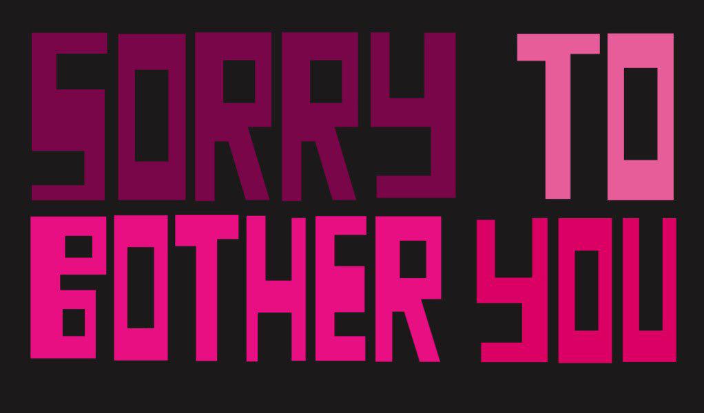
Sorry to Bother You is a surreal, dark comedy about a young telemarketer named Cassius (Lakeith Stanfield), who uses his “white voice” to land a promotion; that lucrative new job quickly implicates him in the many horrors of corporate oppression. The film is set in Oakland, where director Boots Riley and J. Otto Seibold, an artist and children’s book author, became friends years ago. As Seibold describes it, the title font
he created for Sorry to Bother You came about after Riley saw some paintings he was making just for fun. “I was painting names of various cities on planks of wood,” says Seibold. “The method was spray paint and tape.” That experiment became the movie’s title font. Seibold’s type packs a punch when it fills the screen at the start of the film: hyper-graphic right angles in four shades of hot pink and mauve. It’s a little robotic, almost like a video game. Thanks to their inconsistencies — T’s with uneven arms, letters that repeat with varying thicknesses — these super-geometric letters add up to something incredibly human. In the same way that Seibold was just messing around with spray paint and tape, the fonts that appear throughout the film have a punk feel that matches the story’s overall vibe. Over the course of filming, Seibold created all sorts of typographic materials for Riley. He designed some of the scene-stealing earrings that Detroit, Cassius’s performance artist girlfriend (Tessa Thompson), wears throughout the film, as well as the sign she twirls on a street corner for her day job. These fonts are all slightly different from one another — and few are as geometric as the title treatment — but there’s a real cohesiveness in their bold graphicness. “It was actually irreverent; that’s what I loved. It didn’t follow the rules,” costume designer Deirdra Elizabeth Govan told Racked in July, discussing the font for Detroit’s earrings. “It looks handdrawn. It looks like you were drawing with the side of a marker.”
“Most of the stuff in the movie was done quickly,” Seibold says. He painted the signage for a notunimaginable game show that recurs throughout the movie called “I Got the Shit Kicked Out of Me” on the same day he made four other set pieces. The exception to that rule is the design of the red soda cans that pop up throughout the movie — one gets chucked at Cassius’s head, and a video of the incident becomes a viral hit — since that design had to go back and forth with Coca-Cola’s legal team. Sorry to Bother You creates a world that’s heightened and bizarre, but still completely recognizable, through plot and typographic choices: Because of the white lettering on the red soda can, you know it’s meant to be a Coke, but Seibold’s sharp, handmade font swings it into strange territory.
Suspiria
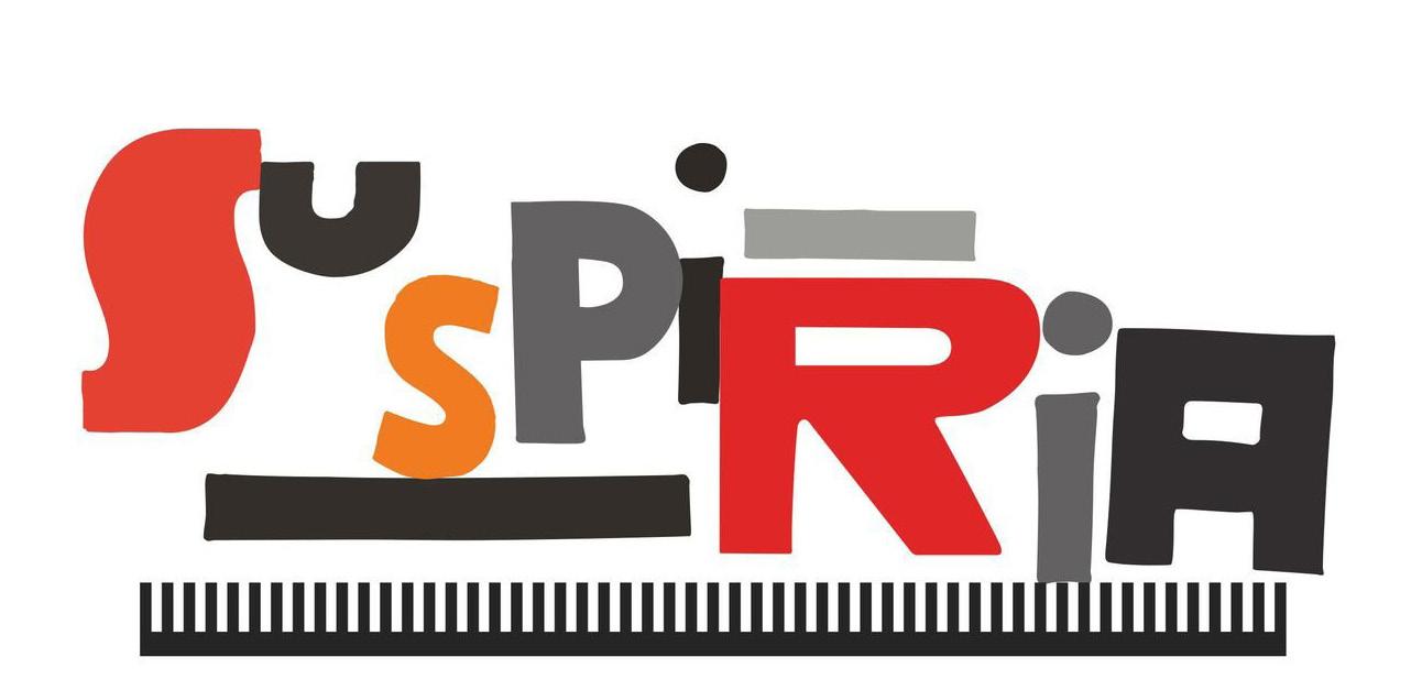
Dario Argento’s Suspiria, a horror classic set at a dance academy governed by a coven of witches, was released in 1977; Luca Guadagnino set his remake in the same year, in Berlin. Like Guadagnino’s previous films (Call Me By Your Name, I Am Love), Suspiria is aesthetically beautiful, filled with pale wintry light and rich, muted tones. Later on, it gives itself over to the super-saturated reds that dominate Argento’s original version. It’s also extremely gory. Suspiria reimagines a cult classic as a bonecracking tale of women, power, and pain Like the film itself, Suspiria’s Bauhaus-inspired title text — a calculated jumble of irregularly sized letters — is alarming and wonderful. Title designer Dan Perri, who created the famous text crawl at the start of Star Wars, describes the process of creating Suspiria’s title as a constant back-andforth with Guadagnino, who would send over references he found in magazines and books. Perri’s goal was to convey the sense of terror and disquiet that the film imparts through its title art. When he describes his design process, he takes it letter by letter. Each one relates to its neighbors and contributes to the unsettling effect of the whole word, which is framed by two bars and a long, rather menacing comb-like shape. “The first S of Suspiria was part of a design that, I think, Luca sent me a version of,” says Perri. “It felt so right — this blocky, bulky letter with these thinner, graceful ends to it. Then the U was more horizontal but still bulky and thick. It had to crowd the S, right on top of it, but be slightly lower than the height of the S.” He created the second S and P by hand, keeping them simple before going “to an extreme” for the I. The rest of the letters are capitalized, but Perri gave the I’s a lowercase dot “to further skew and confuse the emotions for a moment.”
Perri rendered the title’s strange, imposing R in red to punctuate the crimson hue of the S. They’re different shades though: “The red of the R is more like blood, and the S is like dried blood. They had to be in conflict, or saying different things.” He eschewed a pointy A, threatening as that would be, because he says the word seemed to dictate that it be blockier and less familiar. This letter Perri tilted left and right, until he felt as though it was shuddering in reaction to the rest of the word. “It’s all very emotional,” says Perri. “All those subtleties individually are not very important, but collectively they make a statement that conveys a feeling that’s similar to the feeling of the film.”
The Favourite
Set in early 18th century England, Yorgos Lanthimos’s The Favourite centers on three women: Queen Anne (Olivia Colman), who is wracked by emotional trauma and physical ailments; her longtime friend and adviser Sarah Churchill, the Duchess of Marlborough (Rachel Weisz); and a new servant seeking to bump Sarah from her position with the queen (Emma Stone).

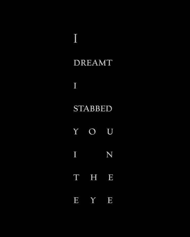
As costume dramas go, it is very dark and very funny. The movie’s title design — and, even more so, the chapter titles that appear throughout the film — is at once buttoned-up and off-kilter. These came courtesy of Vasilis Marmatakis, who has worked extensively with Lanthimos on films like The Lobster and The Killing of a Sacred Deer. In keeping with the movie’s setting, Marmatakis used Village, a typeface created by Frederic Goudy in the early 20th century that was modeled on Venetian styles from the 1400s. The real fun of the film’s typography lies in its spacing, which draws on the look of letterpress printing and then exaggerates it. Marmatakis’s guiding rules were that each word in a given piece of text (for example, the film’s title or chapter titles) would be set on its own line, and that the longest word in that phrase would determine the width of every other word. Practically speaking, he had to adjust the shorter words’ tracking, or letter spacing, so that they stretched to fill a fixed space, often leaving huge gaps between letters. In the movie’s title, there seem to be miles between each letter in “The,” while “Favourite” looks fairly normal. But this design rule becomes even more of a bizarre delight when applied to the chapter titles, which reference snappy, sometimes threatening lines of dialogue (“I dreamt I stabbed you in the eye”).
The chapters read: “I dreamt I stabbed you in the eye” and “I do fear confusion and accidents.” “Some chapter titles are really, really odd. In one, the longest word was ‘it,’ so that dictated the rest of the space,” says Marmatakis, describing one title that formed a tall, skinny column. “It almost poked out of the screen.”
The result is text that — with a wink at the viewer — presents itself as a little fussy and absurd, just like the characters in the movie.
Marmatakis takes a hands-on approach to design, often making collages with scissors and glue, and his work for The Favourite was no different. Because white type on a black background can look harsh and overly digital — not ideal for a period piece — Marmatakis designed each block of text on his computer, printed it out, and then took a brush and water to the type, blurring the edges a bit. After they dried, he scanned them back in. The final look is more analog — “warmer,” in Marmatakis’s words.
“If you go really close, if you can zoom in, the edges are completely spread out,” he says. “We were laughing, because we were like, you can hardly tell. But you can tell it’s not completely digital.”


