MALLORY PAINT

POWDER ROOMS THAT POP MOTHER NATURE'S TREAT SWEET AND SAVORY DISHES PERFECT FOR FALL SUPPERS
BUILD YOUR DESIGN LIBRARY
WELCOME MAT DIY A PERSONALIZED DOORSTEP GREETING
Bellevue 13120 NE Bellevue-Redmond Rd Bellevue, WA 98005
Phone: 425-454-7509
Covington 16929 SE 270th Pl Suite B-122 Covington, WA 98042 Phone: 253-277-0167
Everett 12SW Everett Mall Way Everettl WA 98204 Phone: 425-374-8195
Federal Way
31853 Pacific Hwy S Federal Way, WA 98003
Phone: 206-592-2314

Greenlake 1106 North 80th Seattle, WA 98103 Phone: 206-523-2000
Issaquah 145 NW Gilman Blvd. Issaquah, WA 98027 Phone: 425-369-4898
Kirkland 12620 NE 85th St. #100 Kirkland, WA 98033 Phone: 425-406-8323
Lynnwood 3225 Alderwood Mall Blvd Suite B Lynnwood, WA 98036 Phone: 425-977-4996
Moscow, Idaho 674 Pullman Road Moscow, ID 83843 Phone: 208-596-4267
Sammamish 612 – 228th Avenue NE Sammamish, WA 98074 Phone: 425-836-5484
Shoreline 18811 Aurora Ave. North Shoreline, WA 98133 Phone: 206-546-2468
Sodo
2933 4th Ave. S. Seattle, WA 98134 Phone: 206-467-6000
Spokane, WA 99205 509-328-5544
Spokane 512 West Indiana Ave Spokane, WA 99205 Phone: 509-328-5544
Spokane Valley 14401 E Sprague Ave #E Spokane Valley, WA 99216 Phone: 509-474-0243
Tacoma 2520 S. 38th St. #B Tacoma, WA 98409 Phone: 253-472-3838
Tukwila 339 Tukwila Parkway Tukwila, WA 98188 Phone: 206-708-6231
Woodinville 13320 NE 175th St. Woodinville, WA 98072 Phone: 425-487-6600



“Let me, O let me bathe my soul in colors; let me swallow the sunset and drink the rainbow.”
~Kahlil Gibran

SPACES: Real-home redesigns with wall-to-wall ideas you can use.
THE MODERN COTTAGE
Meet the cabin/home hybrid turning heads in Victoria Beach.
40
LBJ’S MOM’S HOUSE
A little bit of history and a lot of Southern charm.
46
THE FOREVER HOME
A traditional and timeless home for a young family to grow old in.
52
COLORFUL COMFORT FOR NEW YORK’S NEWEST NOMADS
An abode reflective of a hip family’s international influences.
60
POWDER ROOMS THAT POP
Courageously colorful bathrooms that aim to inspire.

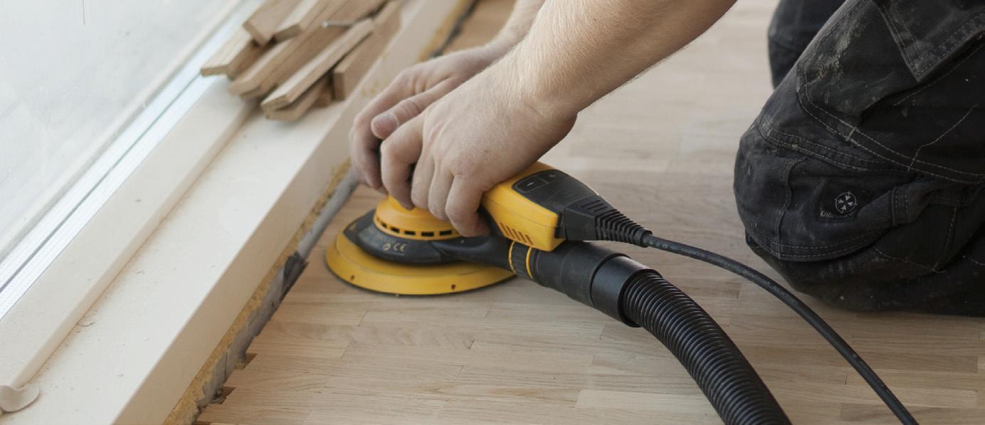




Random Orbital electric sander
• Available in 5” and 6” models
• Brushless DC electric motor with 5mm orbit
• Variable speeds from 4,000-10,000 rpm

• Ergonomic design provides greater maneuverability and control
• Maintains consistent speed while sanding
• Bluetooth™ technology pairs with the myM irk a app


• Compact brushless DC electric motor
• 3mm orbit
• Low profile of just 4” high and weighs only 2 lbs
• 3.2” x 5.2” (Also available in 2.75” x 8” )
• Variable speeds from 5,000-10,000 opm

• Ergonomic design provides greater maneuverability and control
• Maintains consistent speed while sanding
• Bluetooth™ technology pairs with the myM irk a app



AUTUMN 2018
Bahia Taylor Editor in Chief
Co-founder
Leigh McKenzie
Creative Director
Co-founder
Carlee Baigrie
Contributing Writer & Editor
Olivia Hiebert
Graphic Designer
Graphic Design Styling Gallon Creative www.galloncreative.com
Owned and Published by: Gallon Creative
For inquiries, please contact us at hello@galloncreative.com
5 Scurfield Blvd #25 Winnipeg, Manitoba R3Y 3G4
www.galloncreative.com hello@galloncreative.com
Cover Photography - Viking Projects
While every effort has been made to ensure that advertisements and articles appear correctly, At Home Magazine cannot accept responsibility for any loss or damage caused directly or indirectly by the contents of this publication. All material is intended for informational purposes only. The views expressed in the magazine are not necessarily those of its publisher or editor.
All rights reserved. Reproduction in whole or part prohibited without written permission from the publisher.
Typeset in Adobe Garamond and Avenir Printed in Canada
22
CRAFT TABLE:
DIY DOORMAT!
A creative and fun way to increase your porch chops!
26
HOT SPOT:
LABOR OF LOVE
How Small-Batch maple syrup brewing is making simple sweet again.
58
CHOW:
Just thinking about it is making us hungry.
MAPLE ON MY MIND:
Cooking with Mother Nature’s sweetest treat.
74
EXPLORER:
Pack your sense of adventure and let’s go.
ALASKA: “THE BRIGHT EDGE OF THE WORLD”
Channel your wild side and explore nature’s beauty at its rawest.
80
TOOLBOX TEXTS: BUILD YOUR OWN DESIGN LIBRARY
94
COVER FORMULA
96
STYLE TO STEAL
84
PARTING SHOT:
A final bit of inspiration.
We, like most of you, struggle with the feeling that each year is passing by faster than the one before—that no matter how tightly we try to hang onto our time, it races forward indifferently. As we gain responsibilities and shift our priorities, our days tend to fill up much faster than they did during the golden years of recesses and playdates. Recently, this has been troubling us— mostly because of the expression we have all had ingrained into our heads since childhood: time flies when you’re having fun. Time was definitely flying by, but, our allotment of “fun” was almost certainly trending in the opposite direction. As this realization weighed on us, we began probing for a resolution of this paradox. A friend complicated the inquisition further with her insight: “I heard that the reason why time seems to speed up as we get older is because we are doing fewer things for the first time, so we’re actually making fewer memories.” The conjecture held up logically, but what could we do? As we grow up into the world, we don’t always have the opportunity (or energy) to “try something new every day” and however idyllic this sounds in theory, sometimes there is nothing more magical than being immersed in the familiar. Clarity came when we realized that maybe it wasn’t just about the experiences we encounter, but how we encounter them. Maybe what we needed to slow time down was to—dare we say it—live in the moment: a cliché at best, but then again, we have always found clichés to be true.
This issue, we wanted to drive home the importance of giving our days the attention and appreciation needed to notice the small, seemingly insignificant details that transform moments into memories; a house into a home; a friend into family. If time is slipping away from us, we need to make sure we are spending it with passionate intent. By which we mean, we should consider our lives as an opportunity for artistic expression, because we believe that the surroundings of your morning shower can make or break your day (for inspiring ideas on how to ensure you make yours, check out “Powder Rooms that Pop” on pg.60). We wanted to underline how imperative togetherness is, featuring spaces that foster these connections, much like the cozy nesting spot on the front porch of LBJ’s Mom’s House (pg.41). We wanted to encourage our readers to enjoy the process as much as the product, a sentiment small batch maple syrup brewing has maintained through centuries of tradition (story on pg.26). We wanted to champion places and spaces that fight against the multi-tasking mentality of the millennium and instead encourage us to recognize the privilege of this planet (a fact simply undeniable after seeing the immense and unprecedented beauty Alaska has to offer on pg.74). Our issue hopefully reminds you to slow down and take time to marvel at even the little things. At the end of the day, this will be our greatest defense against the clock: to stop looking at the time and simply let ourselves lean into whatever we are faced with. This is the hard part. Then, all that’s left is making sure what we are faced with is worth leaning into.


Love the designs within our pages? Connect with the talented folks behind the gorgeous spaces.
“THE MODERN COTTAGE”
IVY ROW DESIGN I ivyrowdesign.com ivyrowdesign@gmail.com
“THE FOREVER HOME”
MARTHA O’HARA INTERIORS I oharainteriors.com design@oharainteriors.com
“LBJ’S MOM’S HOUSE”
J. FISHER INTERIORS I jfisherinteriors.com jfi@jfisherinteriors.com
“COLORFUL COMFORT FOR NEW YORK’S NEWEST NOMADS”
COLOR THEORY BOSTON I colortheoryboston.com

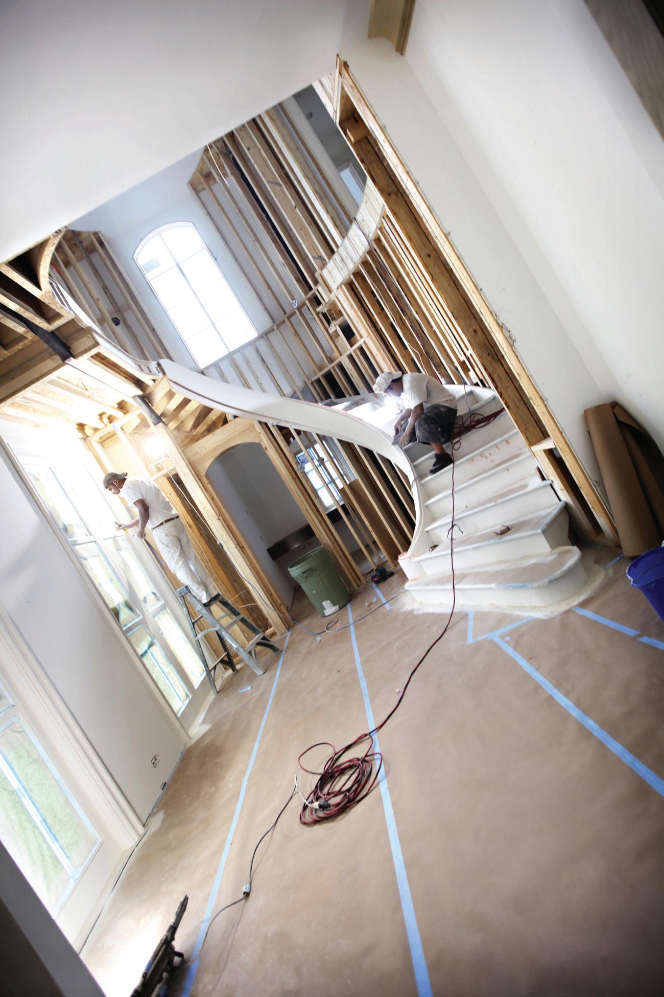
Ready to start your project, you walk into the paint store. Your eyes are immediately met with a colorful culmination of paint sundries ranging from average to unheard of. You spy a row of more brush options than any person could possibly need. Before you stand at the counter, possibly surrounded by a conglomeration of contractors giving orders to energetic employees. Shuffling your notes, you step into line behind them, half-listening to clips of conversations like, «-Polyamide Epoxy» and «-yeah, you›ll want an alkyd for that substrate-» and «-DTM, alkyd or acrylic?» The person in front of you steps aside. A smiling face wearing a Mallory Paint Store polo beckons you forward. «Hi! How can I help you?»
When you get to the counter we will likely ask a series of specific questions regarding your project.
IS THIS INTERIOR OR EXTERIOR?
WHAT TYPE OF MATERIAL IS THE SUBSTRATE? (WOOD, METAL, DRYWALL, ETC.)
HAS THE SURFACE BEEN PREVIOUSLY PRIMED OR PAINTED? (IF SO, WITH WHAT?)
DO YOU KNOW WHAT PRODUCT YOU’D LIKE TO USE?
Many people respond to this last question with, “Benjamin Moore,” however Benjamin Moore has multiple product lines for both interior and exteriors. Customers who have previously purchased a line of paint such as Regal Select may be familiar with the product and often opt to continue using the product with which they are familiar. Individuals who are not familiar with Benjamin Moore products may be given a brief description of the most suitable products including the paint features and benefits, thus allowing for a simpler selection. It is rare that there is a “one-size fits all” paint solution.
WHAT COLOR WOULD YOU LIKE THE PAINT TO BE?
Benjamin Moore offers a palette of over 3500 colors, and often a color can be chosen from this selection. At times, customers will request a competitor color to be matched and will provide a sample. It is smart to have your color pre-selected and to test the chosen color with a Benjamin Moore sample pint or a quart of the final product to make sure you really like it.
At Mallory Paint Store, your ultimate satisfaction is our success. It’s
If you require assistance with color selection, a Mallory Paint Specialist would be happy to help. Bring a photo of your project if possible, perhaps some photos of your inspirations. Tell the Specialist what colors you DON’T like as well as what color or impression you’re hoping to achieve. Even when we are busy we want you to have the best possible outcome and we will take the time to offer our expertise.
If you haven’t calculated the total square footage of the surface to be painted, using our tools we can get you close. However, a basic rule of thumb for judging surface area is base x height on each individual surface, then add the totals together.
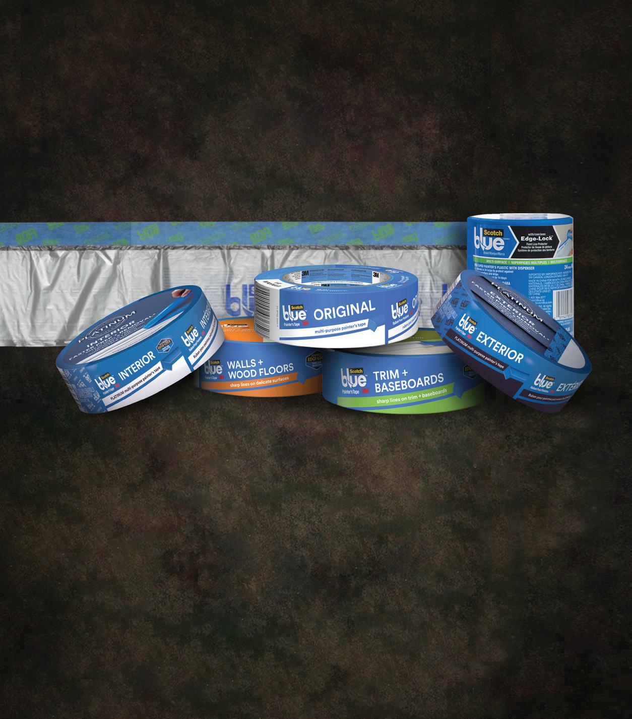
From this point on it’s simple. You can wait while we mix your order or return later for pickup. A typical wait time is around ten minutes. While you wait we can answer other questions including which roller cover is the correct one for your paint and substrate, what type of brush you need, as well as why are there so many different colors of tape and what do they all mean? We also find answers for hard questions like “Can I coat my garage floor?” (yes), “Is there a stain for my front door that is also a protective finish?” (yes), “Should I paint my boat with this house paint?” (NO!), and many, many more.
Just like that, you’ve ordered paint. Your project is now well on its way to being completed. As you exit the paint store you should have a good understanding of the products you’ve purchased and the confidence to use them or, if you’re lucky, make someone else use them.
THE EXPERTS AT MALLORY PAINT STORE ARE IN A PRIME STATE OF MIND, SO DON’T HESITATE TO POP IN WITH ALL YOUR PRIMER AND PAINT QUERIES.
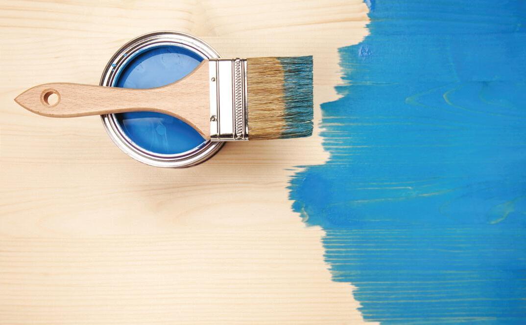
If you’ve spent any time in a paint store, watching home renovation shows on TV or browsing through Pinterest, you’ve likely come across the instructions, “Prime, then paint,” more than once. But do you know what the function of primer actually is? Primer is a prep coat, or undercoat, that goes on your wall or materials before you paint them. It helps paint adhere to the surface properly and evenly, increases paint durability and also provides an added layer of protection from water, tannin, grease and smoke stains that can soak through your topcoat. That being said, there are many different kinds of primer which have various properties that work with some surfaces better than others. Keep reading for a breakdown of five primer categories and why each one is designed for its specific use.
DRYWALL PRIMER: New drywall is a sponge when it comes to paint, which can result in a very uneven finish. Drywall primer will seal the porous surface and make it more receptive to new paint.
WOOD PRIMER: Clean, bare wood is hard for paint to cling onto, so an oil-based primer that will soak into it, fill the pores of the wood but not raise the grain, is the best option for a smooth, even finish.
METAL PRIMER: Once water hits bare metal, oxidation will begin and rust will form. A metal primer has components in it that will help guard against corrosion; its main function is to shield metal from moisture.
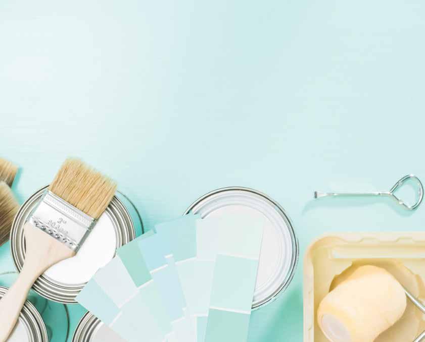
HIGH-ADHESION PRIMER: This primer is ideal for surfaces such as tile, ceramic, plastic and vinyl — basically all the slipperiest, glossiest spots that need a bit of extra help to get paint to stick. High-adhesion primer, or bonding primer as it’s sometimes called, will ensure your topcoat stays put.
STAIN-BLOCKING PRIMER: Who wouldn’t want some extra stain protection on their walls? Stain-blocking primer is great for keeping water and smoke stains from bleeding through the topcoat and revealing itself on your freshly painted surfaces.
A breakdown of the sheen spectrum from flat to high-gloss
From flat and matte to eggshell, pearl or satin, semi and high-gloss, it can be hard to know which sheen will work best for your space. For newbies who are just dipping their toes into the sheen pool, your best bet is to chat with the professionals at MALLORY PAINT STORES, who can point you in the right direction, but before you go shopping it never hurts to have a basic idea of what you’re after.
Generally speaking, the sheen spectrum — from low to high sheen — goes flat, matte, eggshell, satin or pearl, semi-gloss and high-gloss. Check out the sheen cheat sheet below to get the details on each of these options and see which one sounds like the perfect fit for your project.
FLAT: Low-sheen with a non-reflective finish. Ideal for very low-traffic areas and ceilings.
MATTE: Low-lustre finish, relatively durable, easy to clean and hides minor surface imperfections well.
EGGSHELL: Has a soft, smooth appearance, very much like its namesake, an eggshell; slightly reflective. It’s a moderately durable sheen and is a safe choice for most types of walls in your home.
More sheen means more durability: One rule of thumb is the higher the sheen the better it will be in a high-traffic area that requires a bit more durability. Flat and matte sheens that have little or no shine can be quite easily scratched and marked up, so bedrooms and home offices or similar, lower-traffic spaces would probably be the only places you’d want to use those sheens in. That said, some manufacturers have developed matte finish products with durability equal to that of their eggshells. Moderate sheens like eggshell, satin or pearl, and higher sheens such as
SATIN OR PEARL: Has a lustrous finish, and is a good option for high-traffic areas due to its durability. It can also stand some exposure to moisture.
SEMI-GLOSS: Super sleek, shiny appearance, and best for hightraffic areas and spots that get touched or bumped a lot, such as doors and trims.
HIGH-GLOSS: Creates a bright, ultra-shiny and reflective finish that almost resembles glass. Suitable for surfaces in a high-use environment.
semi or high-gloss, however, can stand a lot of abuse, so they are great for busy areas. Moisture-prone areas such as the bathroom or kitchen are great candidates for paints made specifically for those conditions, ask your local expert.
Sheen affects room mood: It’s important to base your sheen selection on the function of your room and using the sheen that will accommodate that, but you should also consider how it will look in that room and the overall feel you are after. For example, lower sheen paints soak up light, which helps hide imperfections, and high-gloss sheens do the opposite, reflecting light to make darker rooms feel brighter and lighter and emphasizing imperfections.

Time is money – and having to constantly touch up high-traffic public areas like hallways and stairwells, lobbies, gyms and other busy spaces is both costly and time consuming. That’s why Benjamin Moore has introduced Ultra Spec® SCUFF-X™, a revolutionary, single-component latex paint that resists scuffing before it starts.
This high-performance product is specifically engineered to deliver outstanding protection in the toughest areas, delivering superior durability and scuffresistant properties without the strong odor, pre-mixing, short pot-life and other application issues related to similar products. Best of all, SCUFF-X will retain its high quality appearance much longer and with minimal maintenance.
SEE THE BENJAMIN MOORE EXPERTS AT MALLORY PAINT STORE TO LEARN MORE ABOUT THE SCUFF-X™ ADVANTAGE IN COMMERCIAL, RETAIL AND INSTITUTIONAL ENVIRONMENTS.
Imagine the possibilities of using SCUFF-X in a wide range of facilities and environments where it is important to make a good first impression and maintain a professional appearance, such as:
HOTELS AND RESTAURANTS: In an industry defined by exceptional customer service, extended downtime due to painting and touch ups is not acceptable. SCUFF-X allows guest rooms, hallways, lobbies, stairwells and dining rooms to be painted and rapidly returned to service with minimal disruption.
SCHOOLS AND UNIVERSITIES: From dodgeball to dorm life, student activities can take a toll on primary, secondary and high education learning spaces. SCUFF-X keeps the walls of corridors, lecture halls, gymnasiums, locker rooms and dorms looking fresh and resistant to scuffs and stains.
HOSPITALS AND HEALTHCARE: For environments in which patient health is of primary concern, maintaining clean, unsoiled walls is key. SCUFF-X is low-odor, low-VOC and its anti-microbial additives makes it an ideal choice for busy waiting areas, exam rooms and medical laboratories.
OFFICE AND RETAIL ENVIRONMENTS: Projecting a professional image directly impacts the customer experience. SCUFF-X’s high-performance coating can protect walls from unsightly scuff marks appearing in occupied areas ranging from conference rooms to dressing rooms.
THE SCUFF-X ADVANTAGE:
• Proprietary scuff-resistance formula
• Single-component paint
• Washable
• Quick dry
• Great touch-up
• Spatter resistant
• Easy application
• Low odor
• Qualifies for LEED® v4 credit
• Collaborative for High Performance Schools (CHPS) certified
• Contains anti-microbial additives that inhibit the growth of mold and mildew on the surface of the paint










It’s a no-brainer to store leftover paint for future touch ups. Yet, keeping track of all those glorious colors used on the walls is a simple but often overlooked task once a paint job is complete.

Mallory Paint Store keeps a computerized record of customers’ previous paint orders, which saves you time and the hassle of having to play “Guess the Color” when it comes time to reorder. It also gives you a head start at the paint desk if you need to rely on color-matching technology to mix up a batch of paint in the color and finish you need.
Yet, even with technology at our fingertips, cataloguing your paint colors, brand, and sheen the traditional way is still a smooth move. Try these ideas for keeping track of your previous paint choices.
STIR STICKS: Dip an unused paint stirrer or a Popsicle stick into the paint to make a color swatch. Write the date, name of the color, order number, finish (flat, eggshell, satin, semi-gloss, etc.) and the room it was used in on the other end of the stick. Then tie all of the stir sticks together.
PAINTER’S TAPE: Record the paint brand, name of the color, type of finish, order number and date on a piece of painter’s tape, then attach it to the back of an electrical outlet cover or switch plate. For future reference, also jot down the amount of paint used in that space.
INDEX CARD: Paint a sample of the color on an index card, then write down the brand, name of the color, type of finish, order number and the room it was used in. Once dry, tuck your index cards inside a photo album with plastic protective covers. Voila: a handy and portable reminder of past paint jobs.
ON THE LID: Often, paint can labels get covered in paint drips. Use an index card to record the information you need along with a sample smear of color. Attach the index card to the lid of the paint can, securing it with transparent tape.
COUNT CHIPS: Hold on to your paint chip cards, taping them inside of a cupboard or drawer in the room they were used in. You’ll always remember where they are kept plus, if you move in the future, the paint chips will stay behind as a handy reference for the new homeowners.
SEE THE COLOR MATCHING EXPERTS AT
MALLORY PAINT STORE TO FIND AN EXISTING
COLOR OR CREATE SOMETHING NEW FROM A FABU -
LOUS COLOR YOU WANT TO REPLICATE AS PAINT.

When an exact color match is needed, your paint store’s expert color technician can use their keen eye or turn to technology called a spectrophotometer. Hooked up to a computer, this device is able to measure color electronically by shining a light on a paint sample or an object that is the color you want to match. It takes an intricate reading of each wavelength of light reflected off the object, then calculates the precise amount of color pigments it will take to make as close a match as possible. The computer will then do the measuring and pouring of the paint formula.

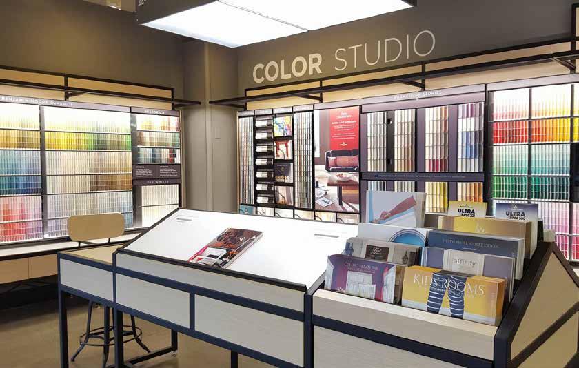

Mallory Paint Store has been helping customers find their colors for over ten years. It all began with a single store in 2006, serving Benjamin Moore paint in Woodinville. Our customers chose us for our hard work, for our dedication to finding the correct colors, and expert advice. It was our customers that have allowed us to continually grow and reach out to new homes and projects. This year Mallory Paint opened its 15th, 16th and 17th locations, adding new stores in Federal Way, Covington and Everett.
As we grow, we remain committed to providing expert advice and a no-pressure atmosphere. With spring arriving and the
weather warming up everyone will be getting ready for the new painting season. Getting a room ready to paint can be quite challenging to plan, schedule, and prepare. Our staff is trained to be color experts, able to help with anything from finding just one perfect color from thousands or creating a color palette for the whole home. We even match colors to find that perfect match to a new chair, the same shade of white as the rest of the house, or even just your favorite pillow.
Come talk with our friendly staff about your next project, browse through our catalogs, or just pick up a few color chips. You can find the closest store near you at MalloryPaint.com
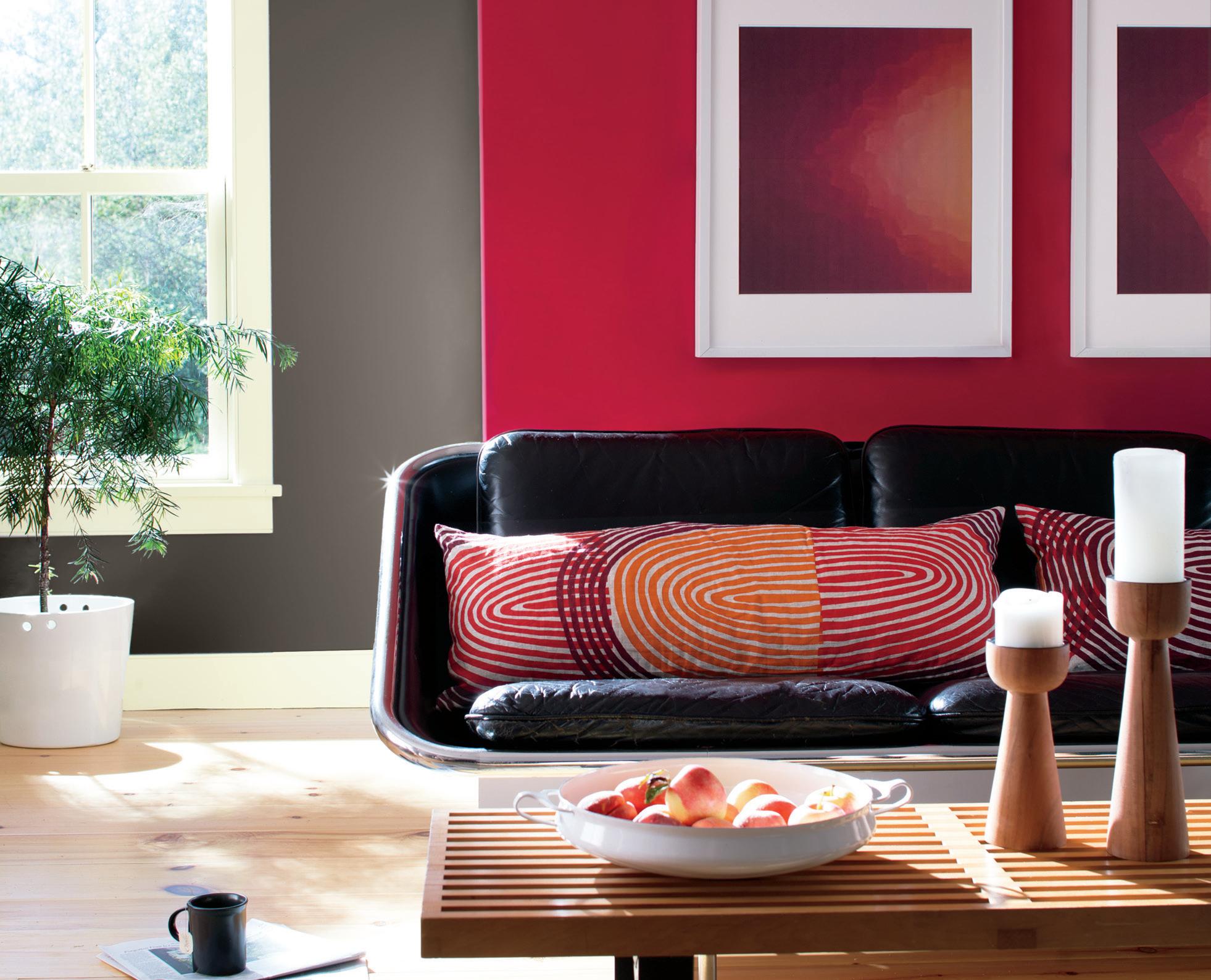
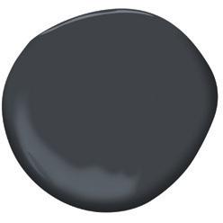
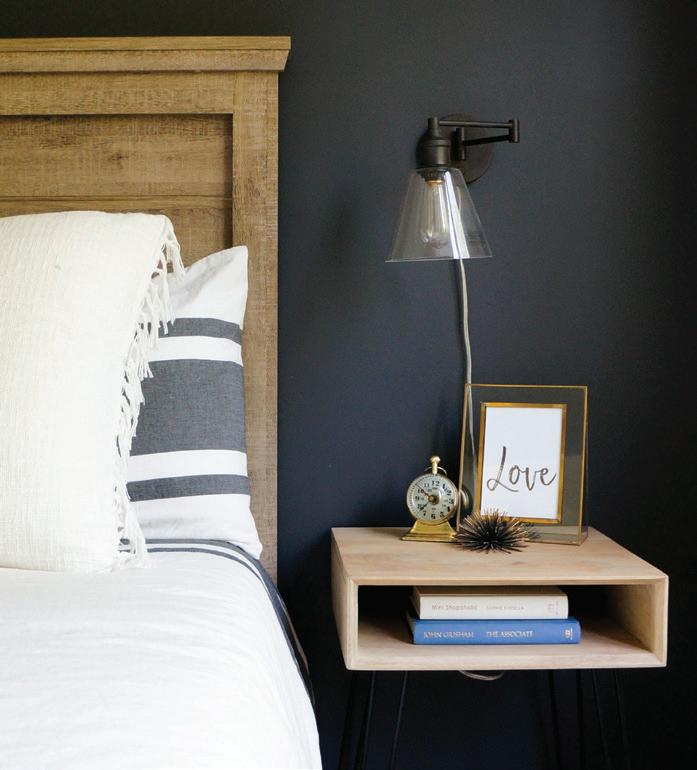
This charcoal tone with notes of navy is a rich shade that draws you in and immerses you in whatever room it covers. It dominates while inviting lighter colors to enhance its depth, lending a sense of expansiveness to any space. The subtle navy undertones pull mystery from this sophisticated gray and allow it to pair effortlessly with wooden hues. It’s no wonder Ivy Row Design opted for Abyss in the master bedroom: sleeping surrounded by this shade would have you thinking you’re under the midnight sky.
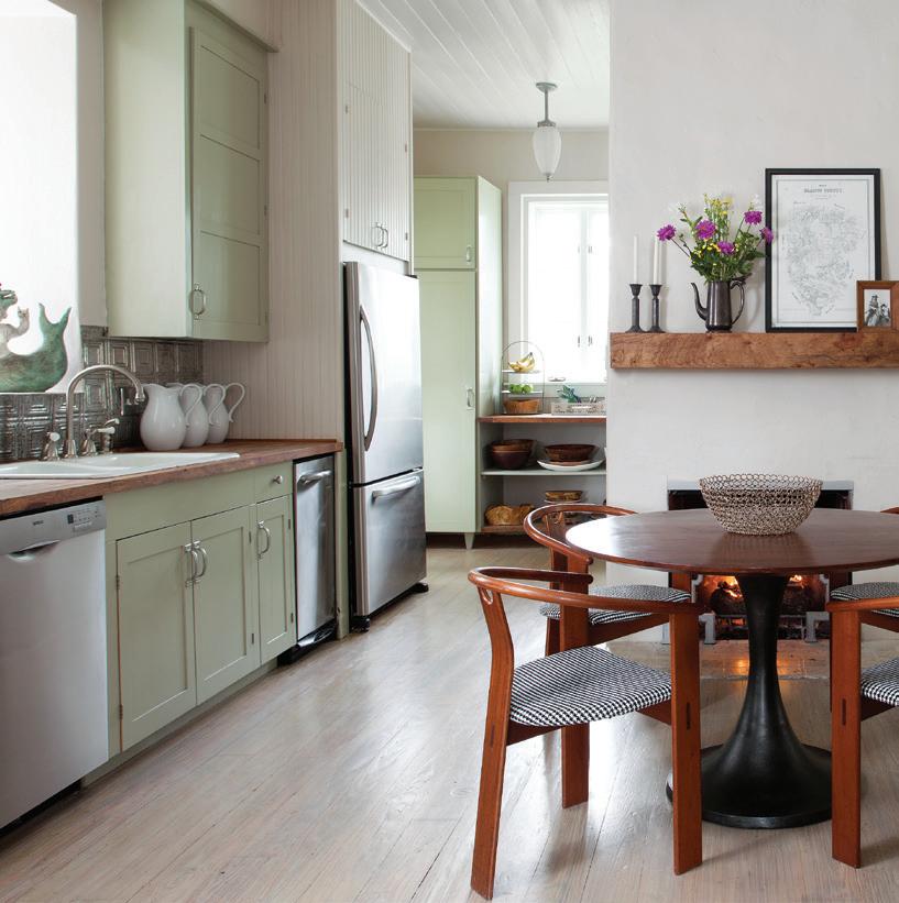
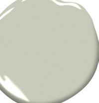
The owner of this home’s favorite descriptor for this Texan ranch is “zen”, and this is no doubt a result of the dreamy and creamy green that dominates this space. The color calms and comforts, relaxes and refreshes, automatically inducing the tranquility that is such a crucial aspect in any home. This rich color achieves all of this in introverted fashion, providing the perfect backdrop for recharging and reconnecting.
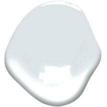
Easy and breezy, just like the West Coast city it’s named after, this stunningly subtle blue-gray hue is enough to induce the sweetest of dreams. Seattle Gray is the color equivalent of cloud-nine, seducing with a sense of slowing time, especially when paired with crisp-white finishes as done in this master suite. It’s time we stopped associating gray with boring and started appreciating what it lends to the color canon!
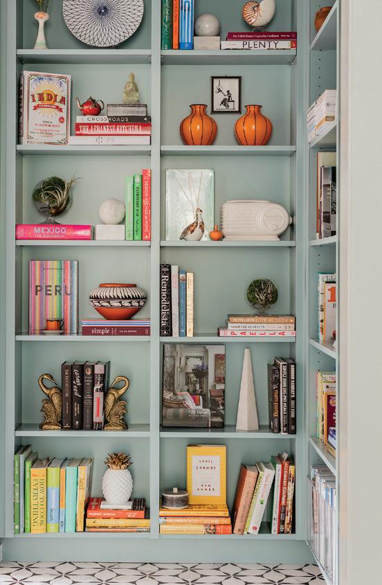
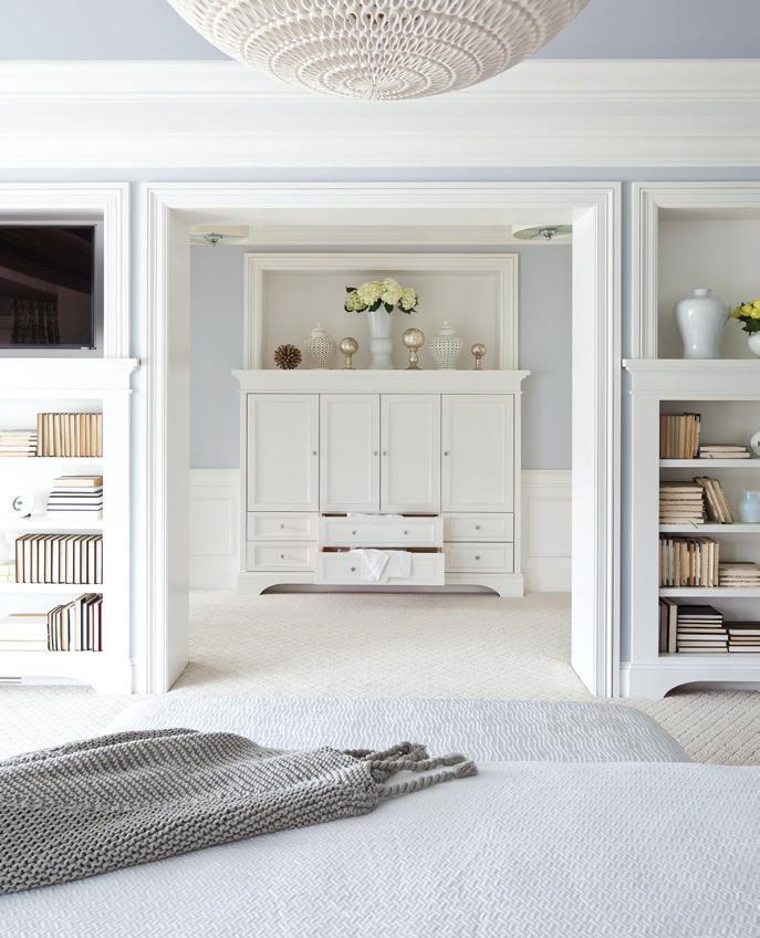
The slightest variations can sometimes reimagine even timeless colors. Baby blue borrows a slight greenish tint and reappears newly energized as the moody but lively Woodlawn Blue. This shade can be compelling on the walls or be used as a backdrop for accessories (such as on a bookshelf, as pictured here), allowing them to pop with its understated delicacy and refined elegance. However you choose to use it, this zesty twist is on its way to becoming one of our favorite tried-and-true blues.
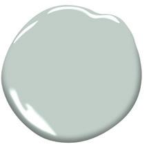








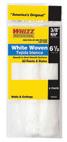







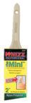

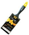











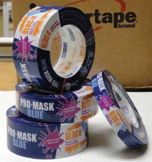
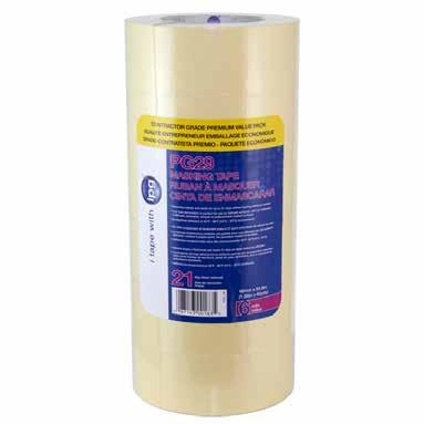
IPG®’s full line of masking tapes provides value and performance for both the contractor and consumer alike! Whether on the job at a new construction site or giving your home a fresh coat of paint, IPG has the solution for you!
Pro•Mask Blue ® with Bloc-It®
Pro•Mask Blue ® Designer
Production Painters Tape
PG5 Masking Tape
PG29 Masking Tape


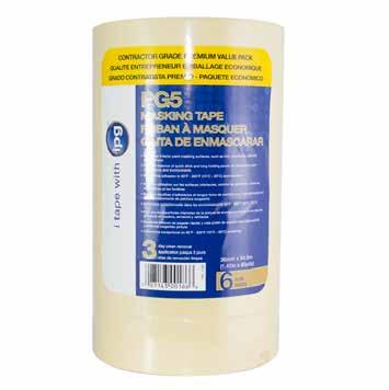
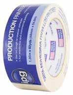
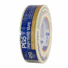


There is something to be said for a really great doormat. It sets the tone for your visitors, sends you off on your way out the door in the morning, and welcomes you home at night — not to mention its important function of trapping dirt and debris before it has the chance to be tracked inside. Crafting your own DIY Doormat is a fun, affordable, and accessible way of exercising your creativity, and it might even buy you a few extra seconds when you’re scrambling to answer the door (because your guests will be admiring your new doorstep accessory, of course). No need to roll out the welcome wagon with this DIY — your customized doormat is sure to increase your porch chops!
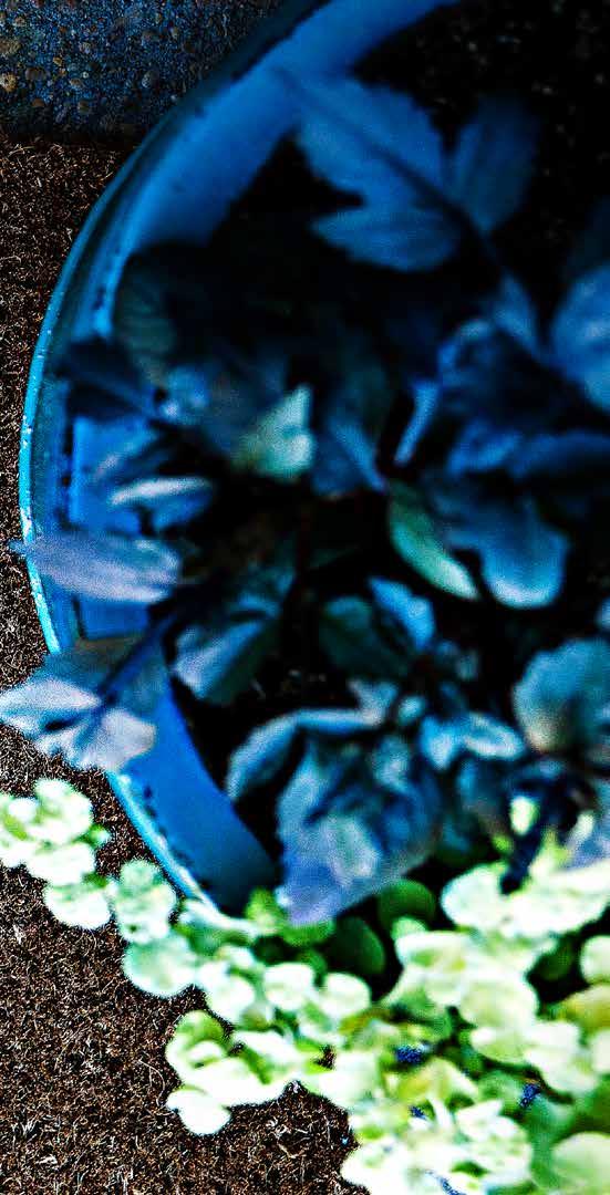


TOP IMAGE: Gather all your supplies before beginning your project. You won’t want to be running around hunting for things; preparation is key.
MIDDLE IMAGE: Take your time and cut each letter out carefully. Remember you are removing printed portions of your text and anything white needs to stay in place as part of your stencil.
BOTTOM IMAGE: Multiple coats will be necessary to ensure the paint gets into all the nooks and crannies of the mat. Apply gentle pressure to work the paint down into the fibres and let dry between coats for a better build up of the paint.

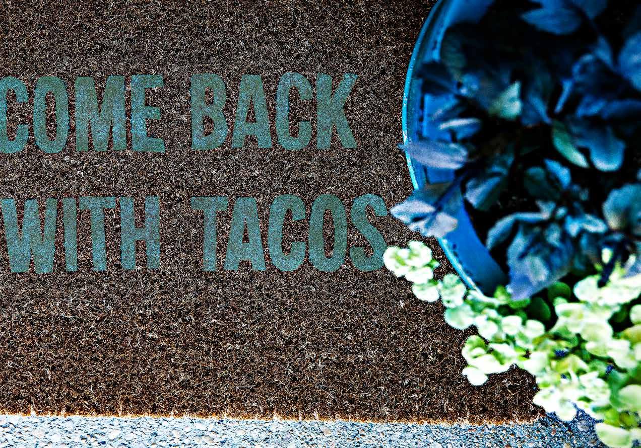
STEP ONE: Decide what you’d like your doormat to say. Remember that you’ll be using an X-Acto knife to slice around the edges of whatever you choose, so we recommend you keep it short and sweet. Use any program similar to Microsoft Word, set your page template to landscape, and select a font and size for your phrase or image. Once you’ve printed your template (hint: this will probably take up several pages, depending on your selection), set it off to the side.
STEP TWO: Take your double-sided carpet tape and secure it horizontally onto one side of your blank doormat. Try to overlap the tape slightly to ensure no paint will get where you don’t want it to go!
STEP THREE: Lay your template over your taped-up mat and experiment with where you would like it to be: In the center? Off to one corner? It’s entirely up to you! Feel free to use a tape measure to ensure symmetry if needed. Once you’ve settled on the perfect spot,
remove the top layer of the carpet tape to reveal the sticky side up and adhere your stencil. Secure the edges of the stencil with painter’s tape.
STEP FOUR: You may now begin to cut out your letters with your X-Acto knife. Remember: slow and steady wins the race! Be cautious and patient, especially when it comes to any tight corners!
• Once your template is cut out, re-check your tape and ensure nothing has moved or loosened while you were cutting out your template.
STEP FIVE: You’re ready to start painting! Using your sponge brush, dip the tip into the paint and begin brushing along the open areas. Gentle pressure will be needed to push the paint into the pile of the rug. You will have to apply several coats — just keep going until you’re pleased with the opacity of the letters.
STEP SIX: Remove all the tape, allow to dry overnight and enjoy your new welcome mat!
• PLAIN DOORMAT
• DOUBLE-SIDED CARPET TAPE
• PAINT
• SPONGE BRUSH
• X-ACTO KNIFE
• PAINTER'S TAPE



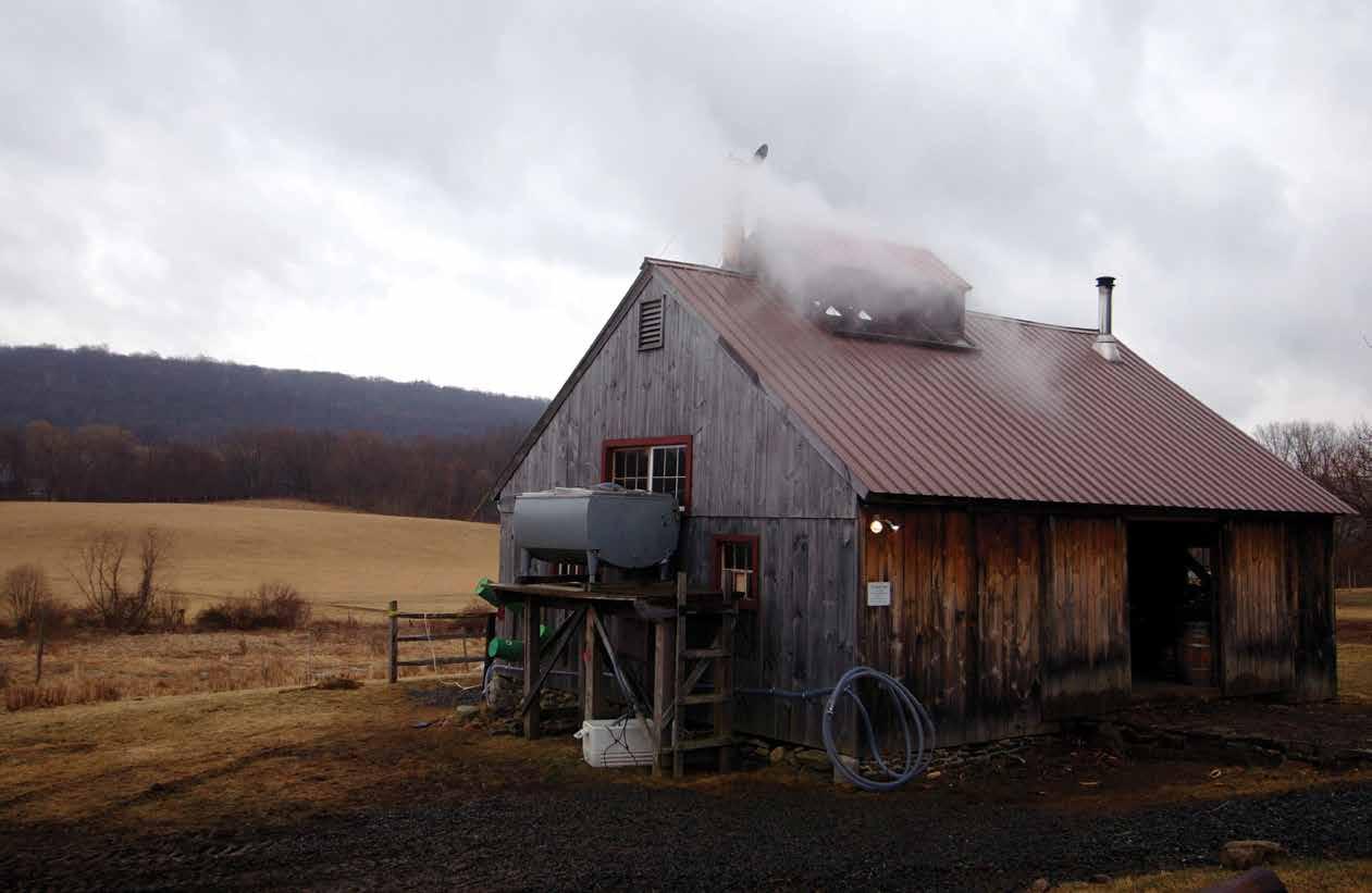
In the deep woods straddling the Northeastern Canadian/American border, just as winter’s last vestiges begin their recession and spring starts to steal itself into focus, the world’s maple syrup farmers trek out into the bush to begin their brief but intense harvest. A small portion of these farmers have embraced the traditional values central to the antiquated craft, opting to brew their share of the liquid gold the oldfashioned way.
These sugar shack operators’ secret to success is that they know that nature does the bulk of the work when it comes to transforming their sap into the sweet treat we love to slather over our breakfasts. Retaining relatively small-scale production without the help of industrialized machinery is no small feat; one gallon of maple syrup requires 40 gallons of sap boiled down over several days. The small-batch brewers have chosen to take the road less travelled in a noble effort to avoid the sacrificial shortcuts large-scale production often necessitates, like the vacuum lines of commercial producers which can have harmful impacts on the environment. These farmers combine their commitment to creating the purest possible product with a fierce ethical obligation to the conservation of nature. The story that these primarily family-owned businesses tell through their shared vision is a story that balances hard work and humility; a reminder of the value of simplicity and the virtue of patience. It is stories like this that resonate in our fast-paced society- a society that is often quick to forget a vital lesson that nature generously and steadfastly reminds us of: there is beauty in the process.
As the food industry shifts to accommodate more conscientious consumers, it is no longer an anomaly to encounter attempts at disentangling the long and elusive road from resources to retailer, but small batch maple syrup breweries have the concept of conscious sourcing embedded in their brand. With tools like social media, it is easy for owners and operators to practice transparency in the way they conduct business and production, fostering a connection with the consumers as well as personalizing their brand. The closer we can be to the production of our goods, the better we can feel about consuming them.


Similarly, the more we know about the companies we support, the better we can feel about exercising our purchasing power in their favor. One company, Cosman and Webb, integrates the history that informs the practice of sap collection, aligning their methodology with the indigenous peoples of northeastern North America, who were the first to discover the potential of sugar maple sap. The company’s organic certification is central to their image, boasting on their company website: “Unchanged by time, we sustainably tap delicious, organic maple syrup in a traditional sugar bush.” These assurances do more than ease anxieties over the impact of toxic chemicals and pesticides on bodies and the environment—their commitment to authenticity procures syrup with distinct flavor. Graeme Foers, owner and founder of “Tapped Out Small Batch” claims “a smoky, full-bodied, thicker consistency” differentiates the small batch mode of production from commercial vendors. This difference derives from the meticulous care put into the craft, but also from an approach that considers the endeavor to be a collaboration with nature rather than an exploration of it.” This sense of revere for the environment is both refreshing and inspiring in a period of overindustrialization and increasingly profitdriven business practice.
The process of maple syrup production begins during the lingering winter months when the temperature drops below zero during the night and tips above during the day. This repeated cycle of freezing and thawing creates the exact conditions necessary for the sugar maples to be ‘tapped’ (a small hole is drilled into the bark), allowing the sap to flow. Once spring takes full swing and trees begin to bud, the sap becomes too bitter to be boiled into syrup. This means their harvest (its length and productivity) is highly dependent on weather conditions, which is perhaps an integral aspect of the consistently genuine respect for nature evident in the philosophies of these businesses. They depend on the perfect conspiracy of several environmental factors to make a living; they have endured the despair and disappointment of winters where their harvest ends abruptly due to an unexpected heat wave, but they have

Boiling the sap over an outdoor wood-burning fire generates a distinct and smoky flavor, and keeps the operatation as close to what nature intended as possible.

also experienced the serendipitous joy of extended seasons that produce record setting crops. These small batch brewers consider their sugar maples to be the homes of diverse ecosystems, and they are careful to disrupt those habitats as little as possible. Graeme Foers of Tapped Out vows he “only takes what the tree will naturally offer”.
The inkling of rustic charm that attaches itself to this tried-and-true tradition proves it has substantial merit lurking beneath its wholesome appeal. These dedicated sugar maple brewers prove that there is a way to turn a profit and create valuable goods without taking shortcuts along the way. They demonstrate the oft-repeated and oft-overlooked sentiment: you can’t rush perfection. The labor-intensive task of collecting and transforming sap into syrup brings nature’s abundance into focus, fostering a keen sense of interconnectedness that inspires us not only to trust in the process, but to relish in it.
You may have noticed that syrup sometimes varies in color and consistency: this is due to the point of time in the season the sap was collected.
Clear and transparent enough for 75% of the light to shine through. This sap was probably collected in the early days of the season. The lighter the color, the lighter the taste.
Medium dark syrup. Rich in flavor. This syrup was collected sometime in the middle of the season.
A dark toned syrup that is robust in flavor and collected late in the season. Typically too strong to be used on its own, but often great for baking and cooking.
Less than 30% of the light can shine through. Very dark and extremely strong. This syrup would have been collected at the close of the season

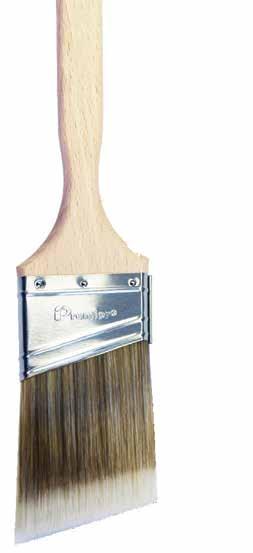
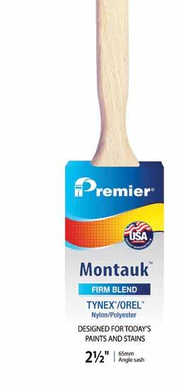
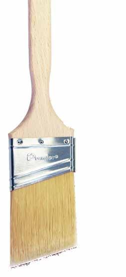

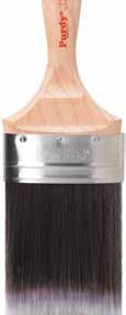
For over 50 years, Premier Paint Roller has been a leading manufacturer of high quality paint rollers. Now, with the same commitment to quality, we are proud to introduce handcrafted paint brushes.
MADE IN USA
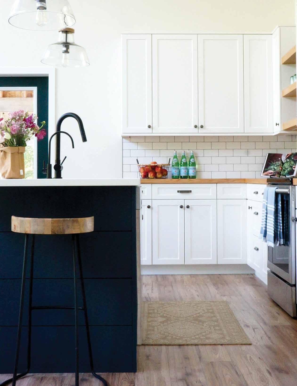
A space with all the function of a home and all the attitude of the cottage; Ivy Row Design captured the laid-back lifestyle and aesthetic of the lake and provides the perfect ambiance for entertaining with maximum functionality, creating an ideal playground for adults and children alike.
Text: Carlee Baigrie
Design: Ivy Row Design
Photography: Sarayah Moffat & Ivy Row Design
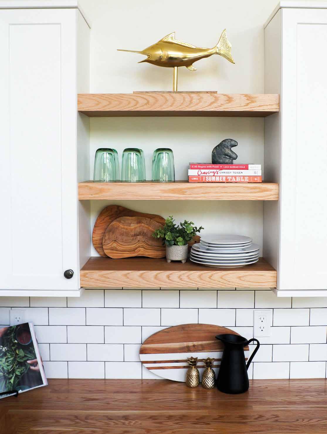
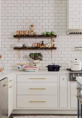
Open shelving can double as a display case: integrate ornamental items with your dinnerware and cookbooks to maximize storage and style.
Nestled on a peninsula extending out from the southeastern shores of Lake Winnipeg, Manitoba lies the small rural municipality of Victoria Beach, a popular summer destination for the prairie region’s cottage goers. Established in 1910, the RM of Victoria Beach has been praised for its pristine beaches, family-friendly atmosphere, and off-the-grid mentality. During peak season, car-traffic is prohibited: if you want to stop in at Einfield’s famous bakery to try one of their delectable dream-cookies, you better hop on your beater-bike (a selling feature for family residents with young children who are wary of traffic)! This is the context of Ivy Row Design's latest project, a space that brings the amenities of city life to the coziness of lake life.
Jocelyn and Kate of Ivy Row Design called the clients, a young family of four, their “dream clients” due to their hands-off approach and trusting personalities. This trust enabled the designers to take certain stylistic risks that paid off in the big picture. By the time the designers got involved, the space had already been given its predominantly modern architectural bones, and it was up to Ivy Row Design to fill the home with an aesthetic that made sense within the borders of this beachy haven. Kate and Jocelyn experimented with bold material choices to ensure the space reflected the character of the town it inhabits. Their mission with this space was to bring the outdoors inside as much as possible. This inspiration came about very organically in response to the jaw-dropping floor-to-ceiling windows in the room, which showcase the deep emerald green of the mature trees that line the property, with streams of sunlight illuminating the living room where the trees will permit. “We didn’t want to compete with that” Jocelyn adds, reminiscing over the stunning view. Choosing materials and colors that call to natural elements was one avenue taken to ensure the modern build maintained an easygoing atmosphere. The shiplap in the bathroom, typically used in exterior settings (painted a deep mesmerizing navy blue) brings the cottage sensibility into focus. Where cottage design concepts often overuse wood to achieve the rustic aesthetic, Ivy Row Design utilizes it sparingly to frame their neutral tones, drawing clean lines that add warmth and depth to the space.
The one request these clients did have when communicating their vision to Jocelyn and Kate was their need for this to be a user-freindly and comfortable space. With young children, they needed it to be equal parts function and style. “We have our own kids, which is a huge help when it comes to making
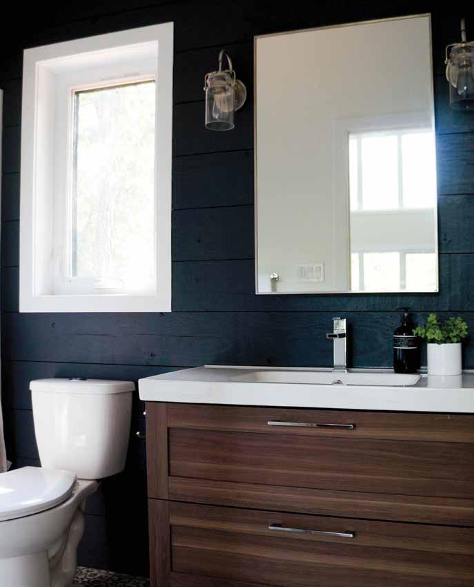
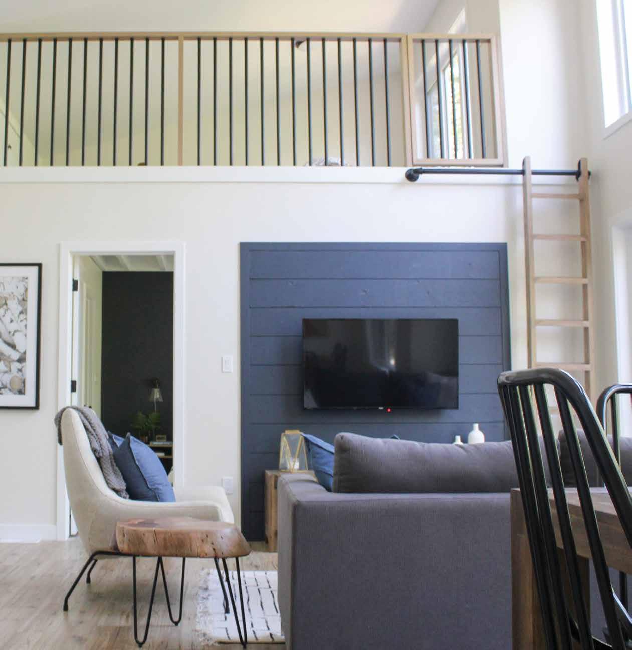
A loft offers a safe place for kids to play (within earshot) while adults entertain below. Hiding within plain sight are various storage areas for toys and other items for quick clean-ups.
a space work for young families” Jocelyn shared, adding that her experience as a mother has enabled her to curate a wide repertoire of tricks for creating kid-friendly spaces.
Jocelyn shares that for the clients, “it was all about creating that adult space where you can have your friends over and you can entertain but the kids can also be there too”. Kate elaborated, contesting the myth that having
tiny humans automatically precludes the possibility of ‘having nice things’. Their personal experience as parents helps them create spaces that work with kids instead of against them: “its sometimes just a matter of picking those pieces where you can store the toys, or having baskets around, but the basket is really nice. It’s all kind of a balancing act”.
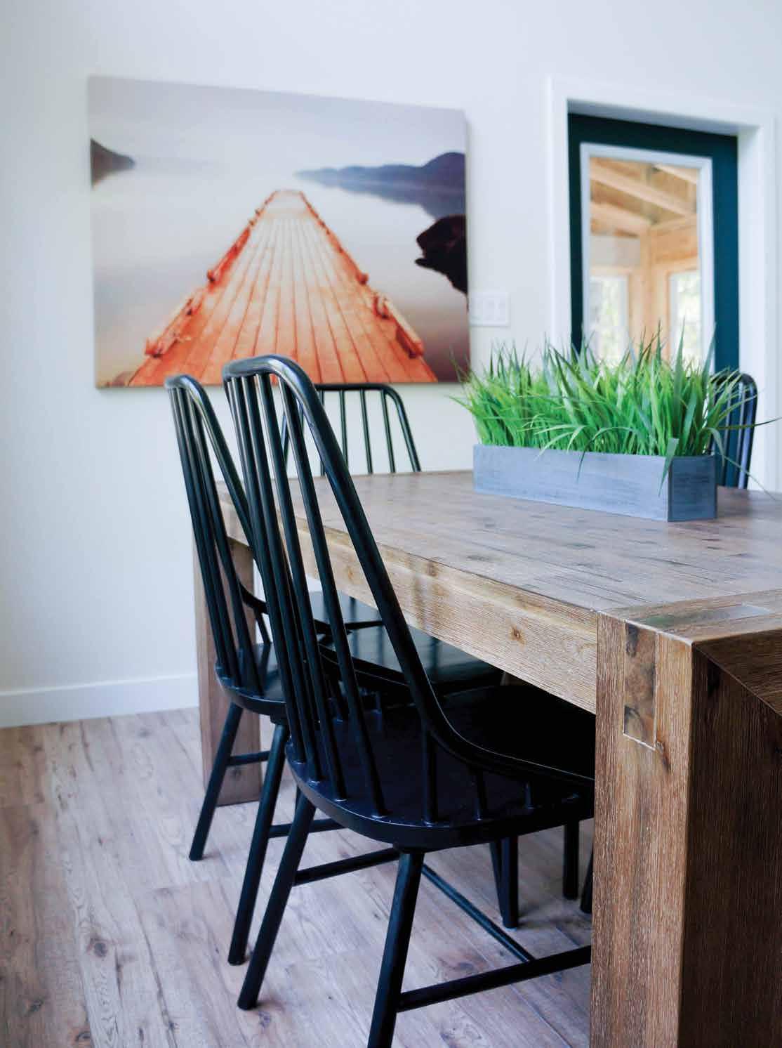
Adding simple and elegant accessories like this table's centerpiece was another way that Ivy Row Design paid tribute to the great outdoors while maintaining its composed but casual allure.
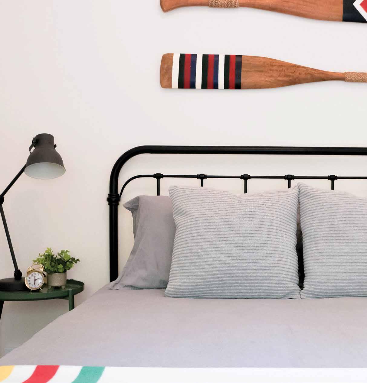
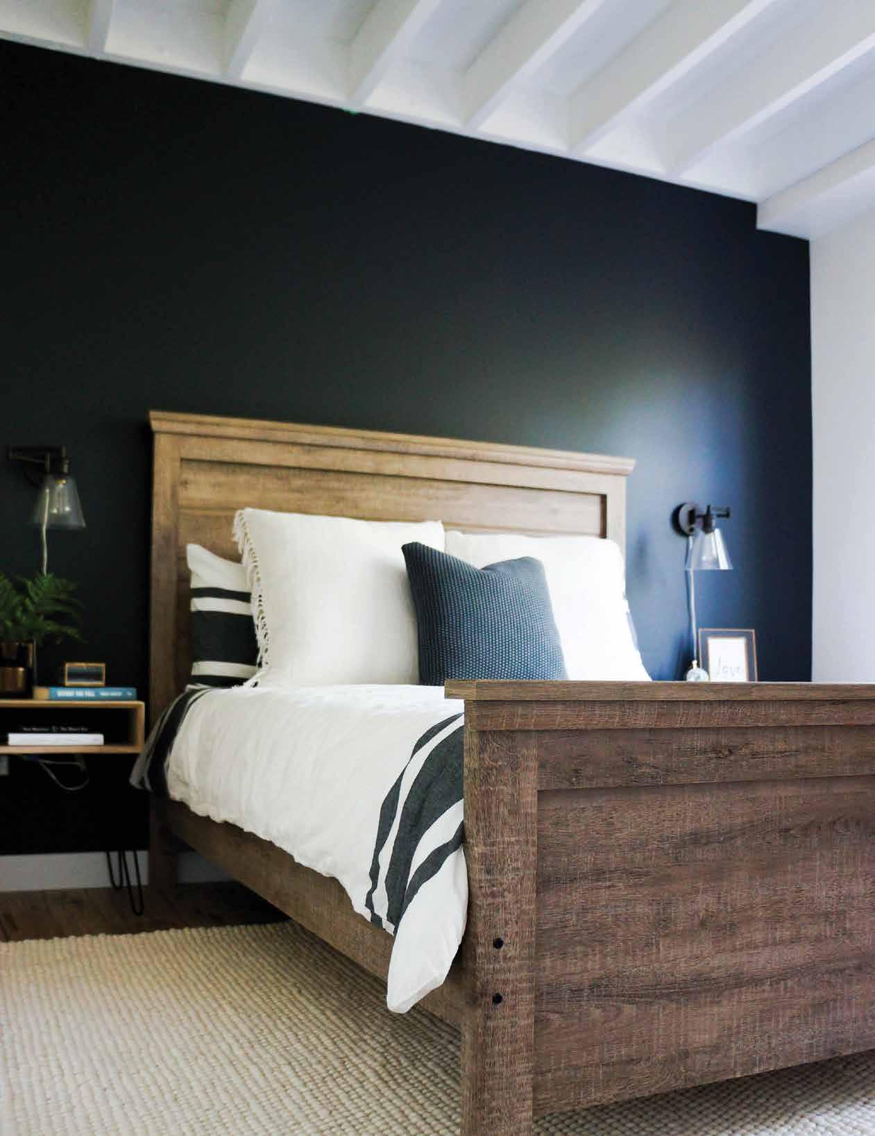
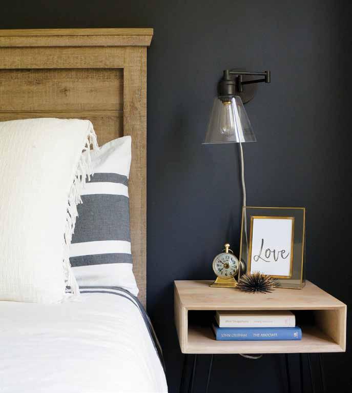
Rustic touches like these painted paddles hung above the headboard (which pair nicely with the Hudson's Bay blanket peaking from the bottom of the image) keep this lake house from feeling too modernized while offering a touch of character.
Despite its modern-looking exterior, the designers created a space imbued with all the rustic charm one would expect from this summertime getaway town. Whether entertaining or just laying low with loved ones, this space masters the art of easy living and pairs it with a meticulously crafted beachy aesthetic that will act as the perfect background for memories to be made in their new home away from home.

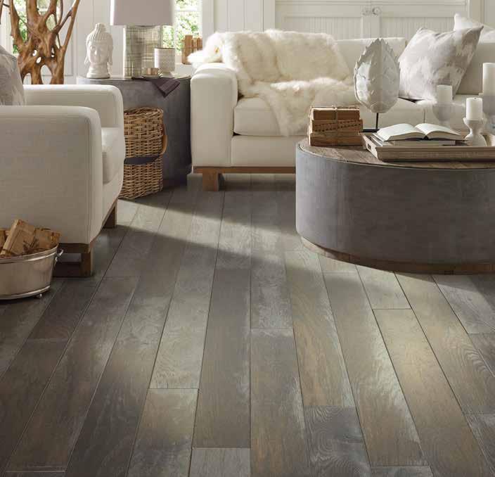
You deserve the very best for your home. And with Shaw Floors, you can expect just that.
For 50 years, Shaw Floors has been the name to trust for the most beautiful and comprehensive assortment of high quality flooring solutions.
From luxuriously soft carpets to todays’ most desirable looks in hardwood, Shaw Floors has the perfect products to help create a home that’s uniquely you.
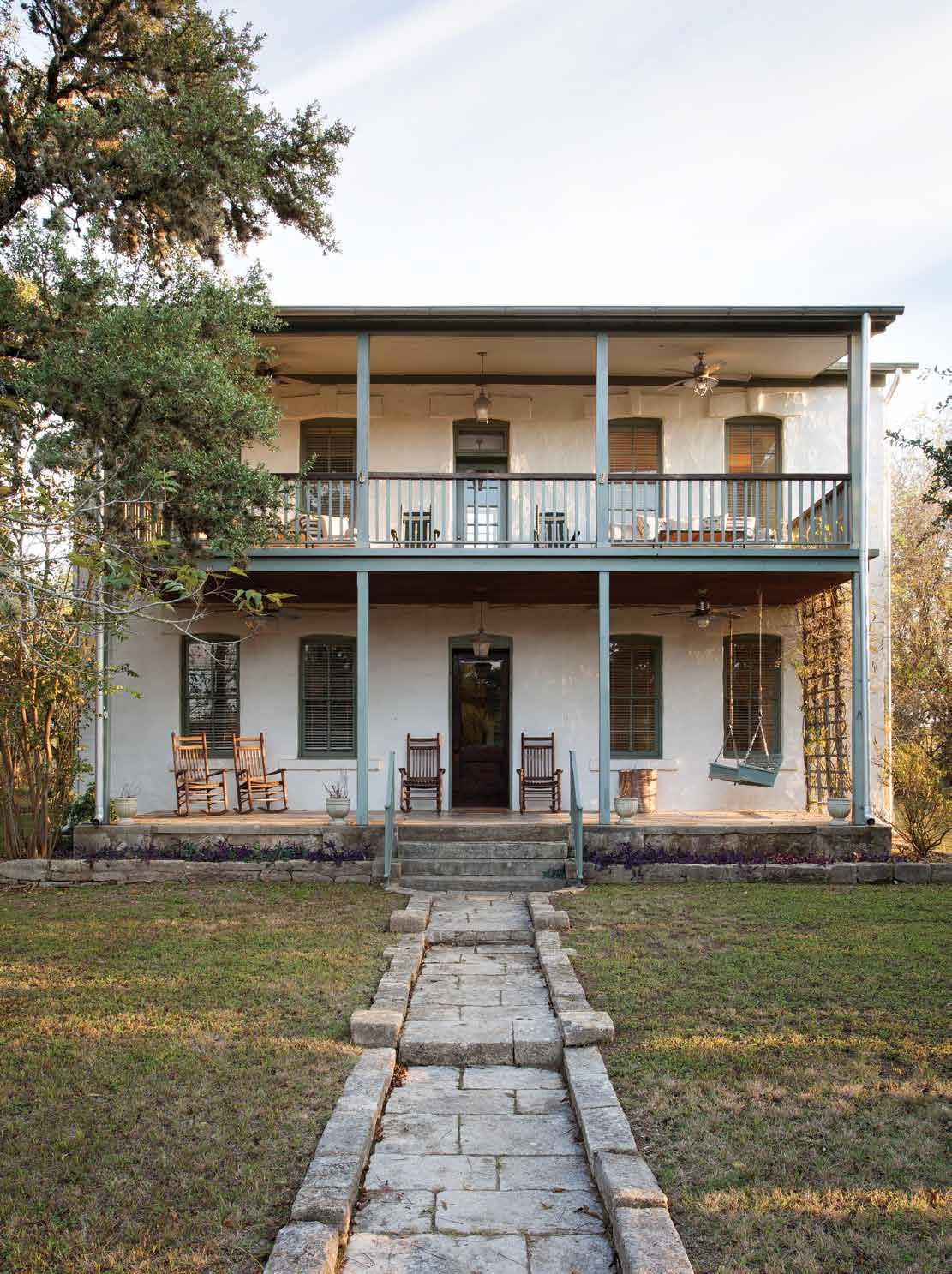
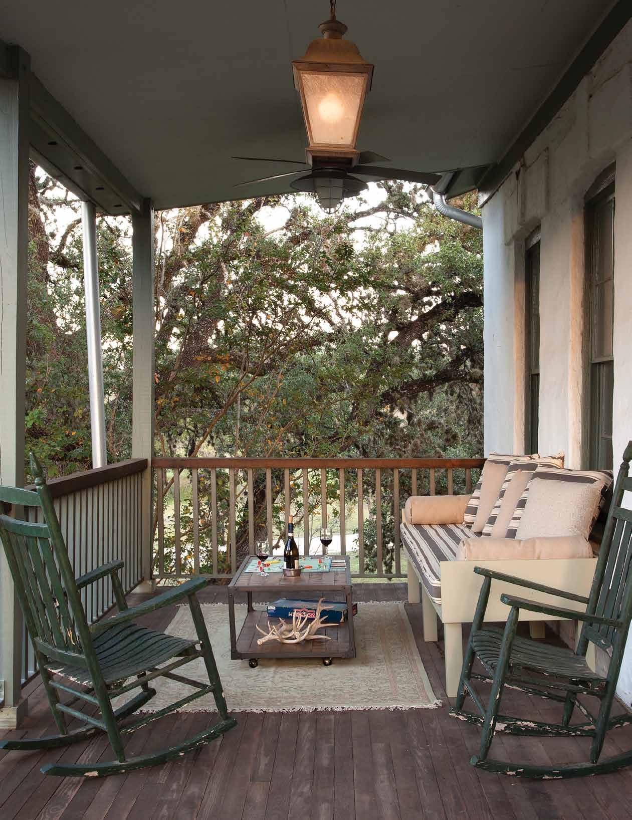
Set along the Blanco river surrounded by lush greenery, this Texas Ranch house channels its notable past to provide a soothing second home for the owner’s close-knit family. Its earth-tones and local materials bring an unrefined texture of warmth, comfort, and soul to this monumental building.
Text: Carlee Baigrie
Design: Fisher Interiors
Photography: Ryann Ford
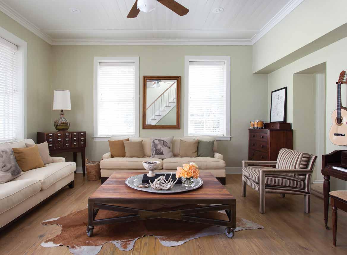
The designers drew inspiration from the landscape where the home is situated: muted colors blend with the natural textures and elements in the room. Ample seating allows for maximum comfort and conversation simultaneously.
When Jennifer Fisher, the designer, got involved with LBJ’s Home, she knew it was paramount that this property’s significant heritage not only be preserved, but celebrated. The home receives its historic status from its original owners, John Wilson Baines and Ruth Ament Huffman, who later became the grandparents of the 36th President of the United States, Lyndon Baines Johnson. The couple purchased the home from an Irish Craftsman who built it for the mere cost of one thousand dollars. Its name, “Amenthall”, is a tribute to Ruth’s middle name.
J. Fisher Interiors was required to maintain the exterior of the building due to its historical status, so their main mission was to saturate the interior with as much spectacular southern charm as the structure could manage.
As a longtime friend of the client (Jennifer divulged that the most difficult part about working together was getting a word in), Fisher knew how important it was to ensure the home had ample space for their big and growing family to congregate. The family’s relatives all grew up in the Houston area, and, with several generations all with busy schedules to coordinate, they rely on this space for quality time; Jennifer knew “this [would be] a house that would be entertained in constantly”. The home was to serve as a meeting place for their loved ones to celebrate their family’s storied past, vibrant present, and promising future. The roots of this
property run deep, and it was up to the designers to ensure their work stemmed from a devotion to those roots.
Because the house was originally built in 1883, a time when the importing of raw materials was relatively limited, the original structure was made from local materials exclusively. In an effort to maintain this authenticity, they utilized local materials like quarried limestone for the restoration, and furnishings were crafted from local Texan mesquite, adding warmth to the subdued color pallet of the home. The kitchen’s corner bench, which operates as a resting place for those fortunate enough to be exempt from cooking-duty, is a prime example of the impact of these selections. Jennifer shares “this is a place for conversation”, and having the extra seating space allows everyone to participate as meals are brought to life. Fisher calls the kitchen the heart and soul of the home, where family and friends gather to listen to music or talk over a smooth glass of cabernet.
The home owners' favorite word to describe this space is “zen”, and that’s certainly the sense one gets from this restoration project. The home sits about 50 yards from the Blanco river, which can be heard trickling upstream from the home’s balcony, providing ample cuddle spots with symmetrical day beds sitting on either side of the door. Directly below this cozy outdoor living space sits a front porch of similar form and function: a pair of rocking chairs
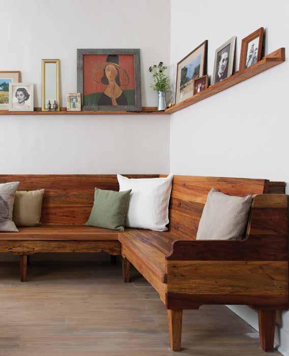
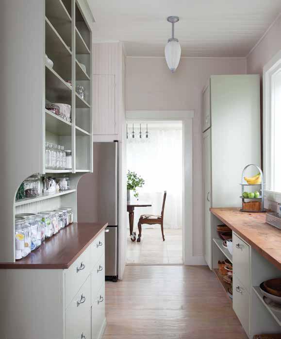
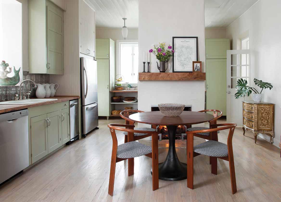
Minimal walls allow for maximum mingling among the many house-guests that visit this family's vacation home. Fun prints like the black-and-white checkered fabric of the chairs excite the neutral and tranquil pallette of the home without disrupting it.
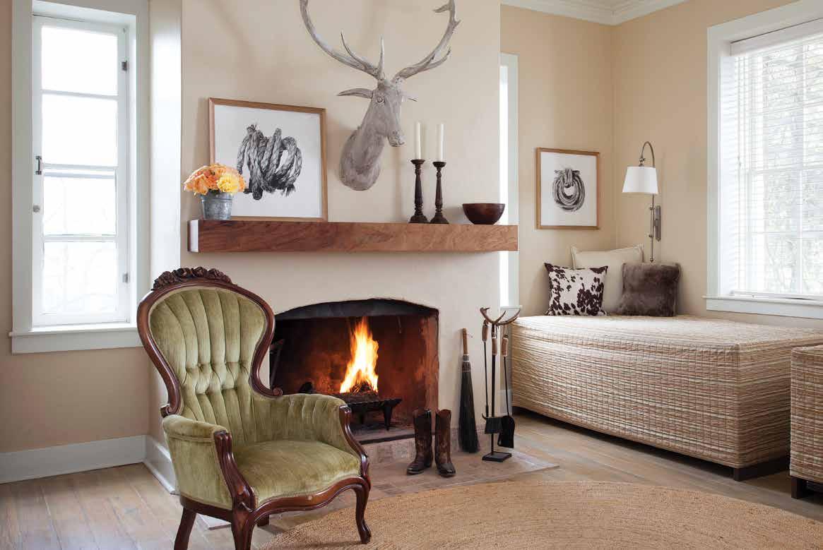
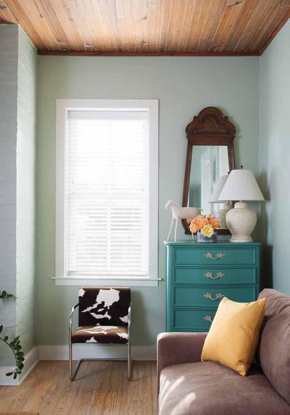
add a touch of antiquated beauty. This rustic retreat offers tranquility and peace, a welcomed reprieve from the hustle and bustle of city life where family can take precedence.
The designers knew it was crucial to create a space that fostered togetherness and relaxation, and one of the ways they executed this was through color, opting for predominantly subdued tones that soothe while incorporating bolder earth tones with expert subtlety. The property surrounding the home is lined thick with mature trees, and with the river trickling nearby, Jenifer knew she wanted the home to encapsulate this peaceful atmosphere, stating “we wanted the inside to be as refreshing as the outside”.
J Fisher Interiors' design pays tribute to the home’s history, and encourages it to expand upon itself, inviting new memories and stories. This home revels in the joy of family and honors its remarkable heritage. It reminds us of the simple yet substantial stillness of being at home and at peace with the ones you love the most in the world.
Above: A lightly accessorized floating wooden shelf anchors a white washed fireplace, drawing out the other warmer tones in the room. Simple, elegant, and comfortable.
Left: Unique pieces like this teal dresser breathe an air of intrigue into the softer pallette of the home's overall feel. These small eclectic elements bring significant character to the space.
• Proprietary trimming process for superior edge and straight lines.
• Ultra Stiff formulation for better paint flow and control with low VOC and heavy-bodied coatings.
• Durable filaments maintain form after every use.

TO YOUR TASTE
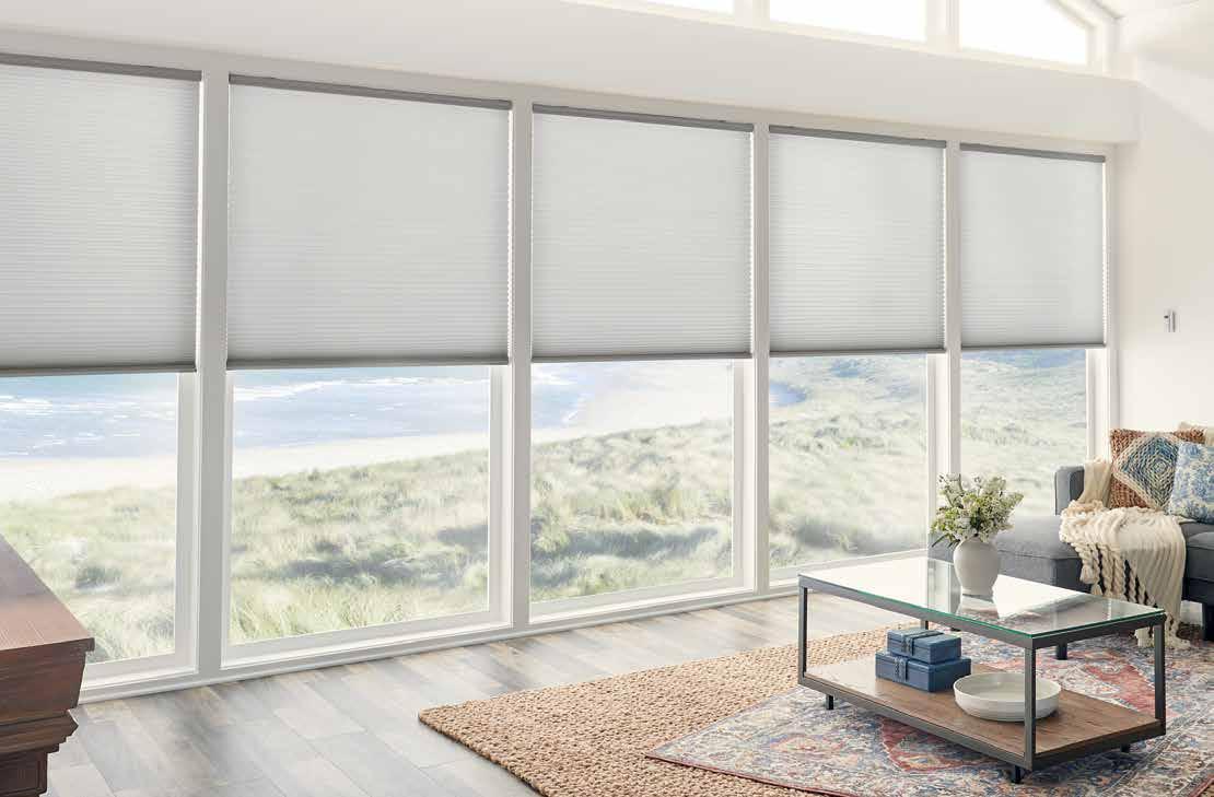
A well-dressed window is fundamental to your well-appointed home. Whether contemporary or traditional or somewhere in between, you’ll find a Graber custom window treatment to suit your style.
For our comprehensive product portfolio, check out graberblinds.com/athome.

purdy.com
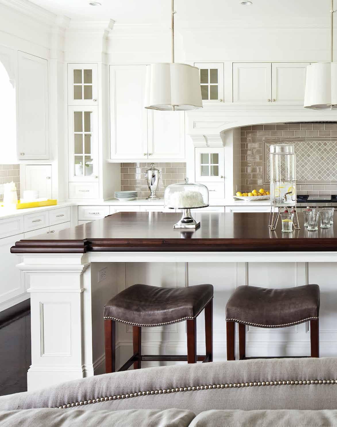
A timeless blend of neutrals and pastels conspire to create a classic take on the perfect family home that will no doubt be fostering memories and moments for years to come.
Text: Carlee Baigrie
Design: Martha O’Hara Interiors
Photography: Troy Thies
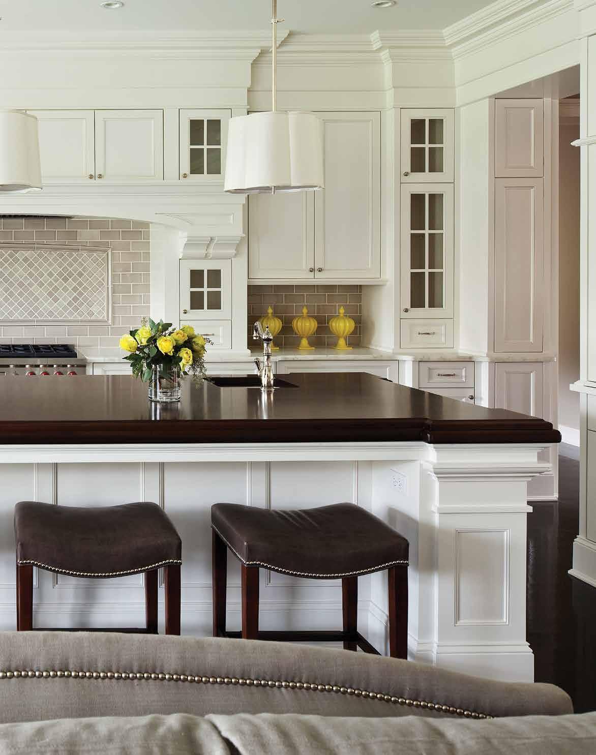
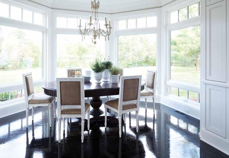
This bright and spacious common room combines kitchen, living room, and dining room with expert cohesion to create a functional meeting place for the whole family. Pops of color energize the neutral pallette.
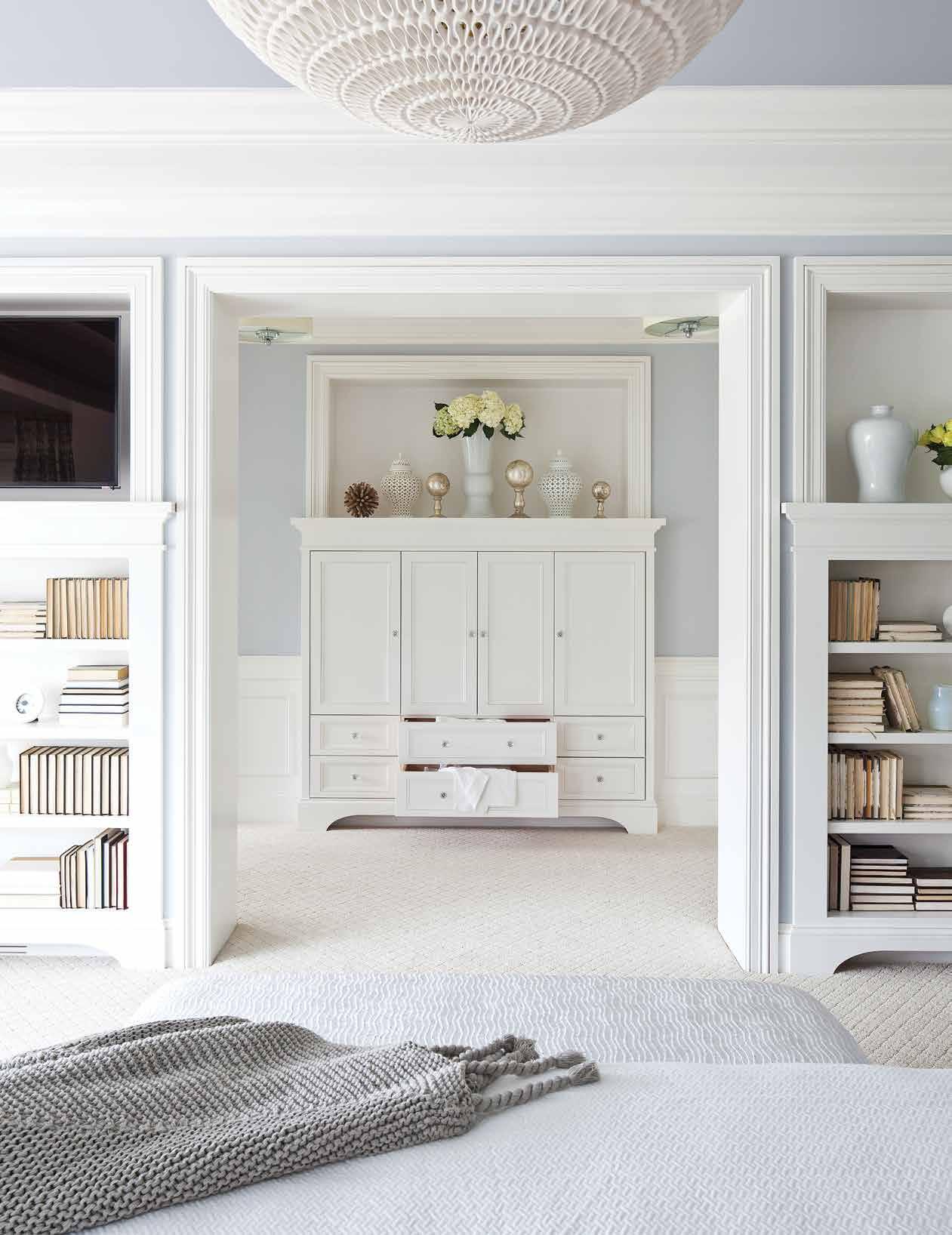
Baby blues and dreamy creams showcase the home's exceptional natural light while effortless symmetry provides the perfect nesting place to relax and unwind after a long day.
Larger-than-life windows send thick streams of sunlight beaming into the open-concept living space of the corner lot home on Parkwood Road, illuminating the classically breath-taking design by Martha O’Hara Interiors. Their work on a young family’s “forever home” showcases the property’s natural lighting with pride and offers tranquility with its predominantly cream-colored canvas, which is splattered intermittently with bursts of personality in the form of bold prints and pops of color. The Parkwood Road project’s clients wanted a home that could grow with them. As a young family, they wanted their house to have the room to evolve and take the shape of their busy lifestyles and rapidly growing children, but it needed to be a space that fostered the sort of togetherness that they wanted to instill in their new family.
The designer, Carrie Ellington, is a personal friend of the clients and has been lucky enough to witness firsthand the home’s functionality in an everyday context. Carrie shares that the clients are still living in the corner lot, and with a new addition to the family as well: “Every time I go there she says ‘I still absolutely love everything [O’Hara Interiors] did
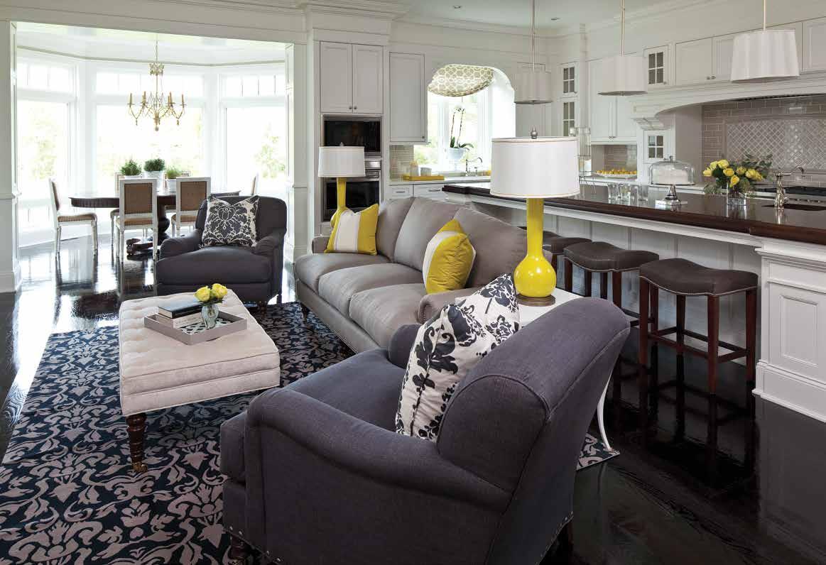
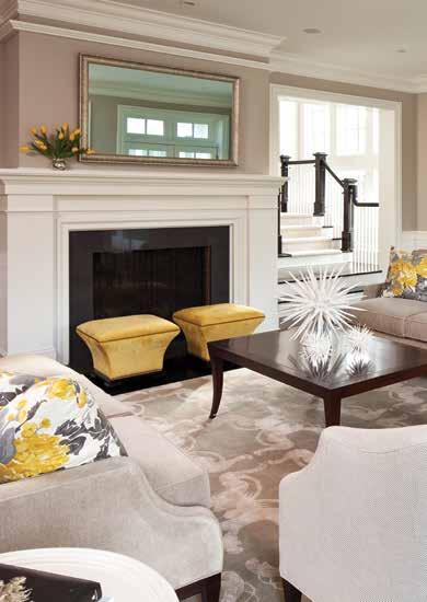
Above: This home's open concept layout lets everyone be a part of the action while yellow accessories act as accents throughout, energizing the home's traditional style.
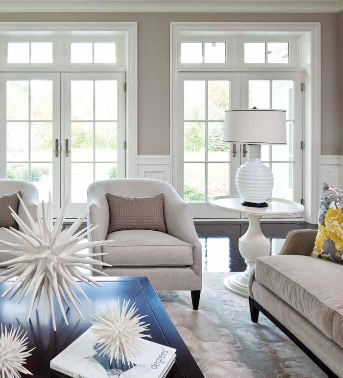
Below: In the formal living room, throw pillows take turns adding texture and vibrancy to the room, while french doors crowned with transom windows ensure the space is alive with sunlight.
in this house’” adding “that’s a great end goal”. Indeed, the space has a sense of timelessness that lends itself generally to the futurity that the growing family wanted to achieve. One of the reasons for the resounding success of this project was the fact that the design team was involved from day one: “We helped pick all of the selections for the tile and the floor, the carpet… any interior selections”, enabling them to ensure they had an ideal landscape to mold their design to.
When asked about their clients' personal taste, Carrie reveals that they were very involved in the decision-making processes: “they were pretty traditional in their style…. But they definitely had ideas to share and we collaborated really well together”. For Carrie, this cooperative dynamic is crucial to creating a project of this caliber: “that collaboration and putting that trust in us can make all the difference in the world”. Elaborating further, she asserts “A lot of people don’t know how to bring what they want to life, but we do… by listening to someone and understanding what they need…. When you’re able to do that for someone, it's huge” even when it comes down to the small details like picking the right chair.
The home’s most compelling feature is its expansive open-concept living space, which Carrie calls “the hub” of the home. Kitchen, dining room, and living room merge into one with seamless ease, inviting the quality time and sense of collectiveness that was so important for both the designers and the clients to communicate. Carrie states “it’s where the action happens”, after reflecting on the evenings she’s spent visiting the clients' home. It’s the ideal zone for adults to entertain while kids can stay within sight.
Equally eye-catching is the home’s remarkable master bedroom. Here, symmetrical bookcases stun with subtle idiosyncrasies that keep the space from feeling too contrived. The neutral palette of the home makes way for muted blues, which cascade themselves over the ceiling and wall, casting a refreshing wave of beach-side ambiance.
Overall, this home is a classic and beautiful take on the traditional family home. The openconcept living space will ensure their family has room to create lasting memories together and its tranquil designs will offer them comfort and peace when they need reprieve. It is undoubtedly a house that will grow with their family and serve nobly as their “forever home”.




Text: Carlee Baigrie
Design: Color Theory
Photography: Michael J. Lee
These travel lovers needed a place to rest their wandering spirits and to bring their worldly tastes home with them. The result is a bright and bubbly home with sophisticated elegance; a stunning space to display international treasures that could make a home-body out of even the fiercest wanderlust-er.
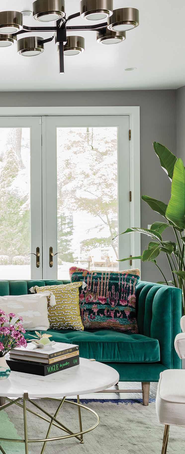
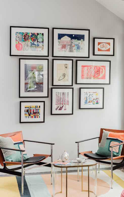
Brad and Kendra of Color Theory Boston are quick to describe their NY Larchmont project as a collaboration with the clients, attributing their shared vision to nearly identical stylistic preferences, and it is evident from the bold colors and prints that permeate the home that this synthesis of taste is one of daring proportions. Color Theory had worked previously with the clients on a brownstone project in the Boston metro area, and, after what was intended to be a brief series of emails inquiring about wallpaper manufacturers, the clients quickly decided to bring Brad and Kendra back on board for a second time. Despite the distance that separated them (the couple’s latest real estate purchase was in New York and Color Theory is based out of Boston), they managed to create a stunning space together that reflected the clients' diverse and vibrant family.
It was this exceptional energy that seemed to project itself from the clients’ personalities that Color Theory was most inspired by when they began working on this project. Brad and Kendra describe their clients as youthful and spirited people with an insatiable love of travel. They wanted to create a space that authentically incorporated their international influences but still afforded them the tranquility and comfort of a home — a relaxing space to rest their wandering spirits that concentrated their worldly experiences. Color Theory
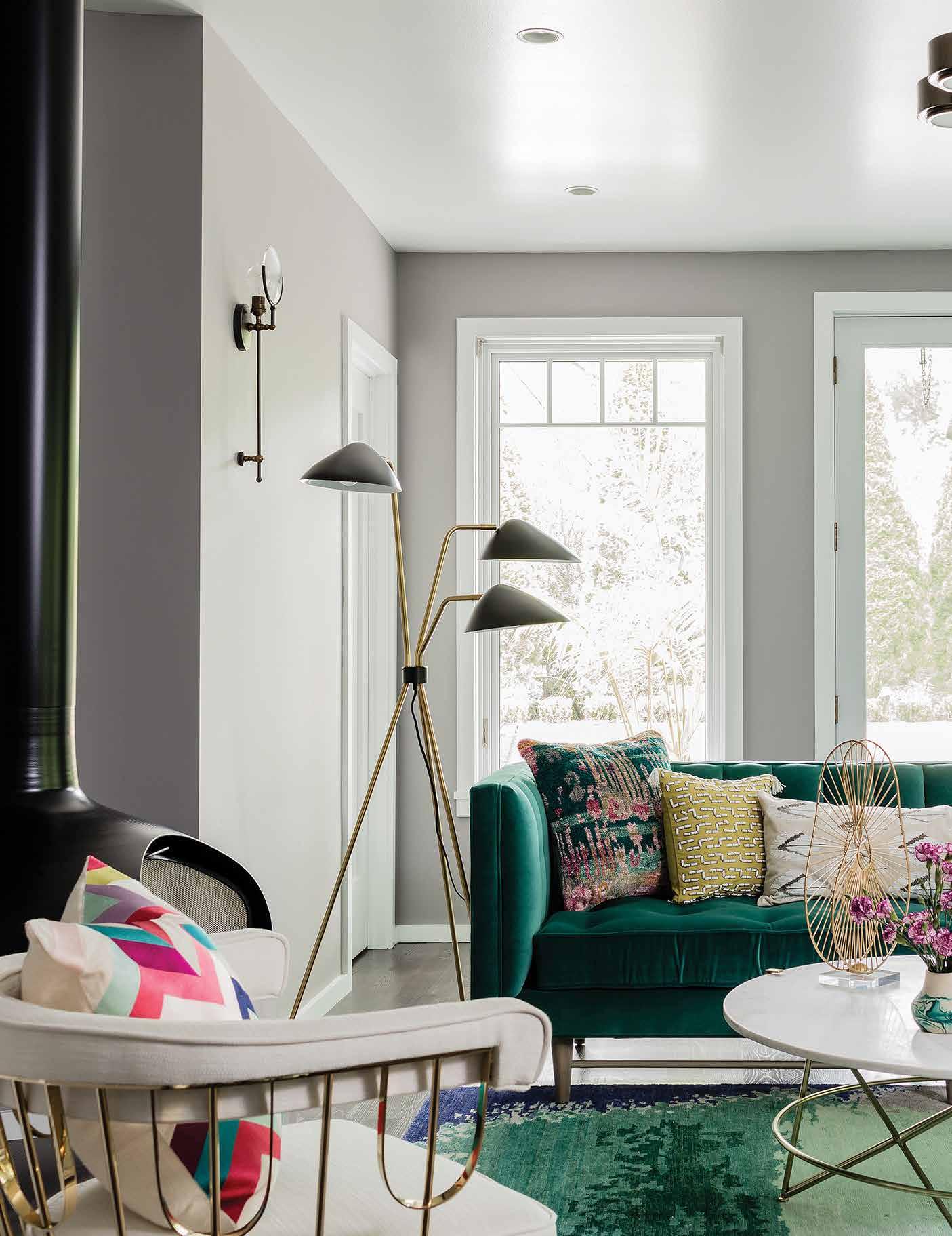
Luxurious fabrics and rich colors mingle to create a space filled with depth. Bold pieces like the velvet sofa and floating fireplace help to generate the homes' unique and distinct personality.
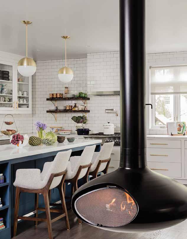
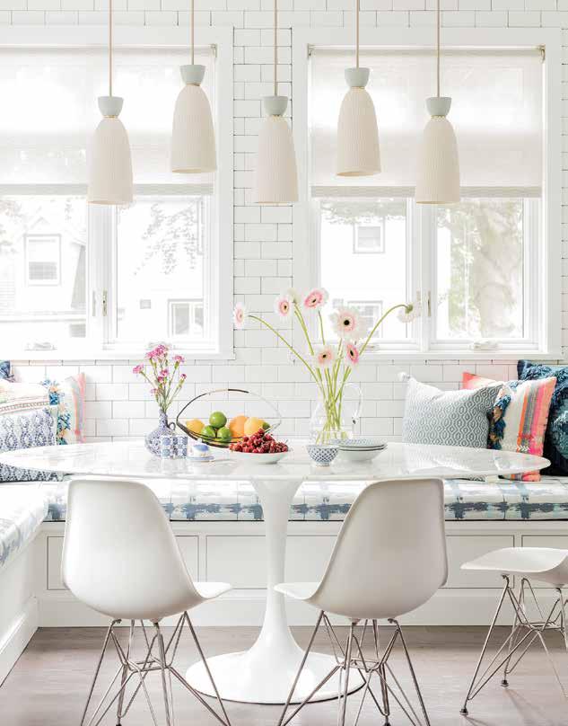
worked hard to ensure this nomadic characteristic shone through in their design by generating a curated disposition that allowed them to showcase the family’s memorabilia from various trips around the globe. Kendra ruminated on the eclectic inclination of the home, citing the Paris Market as a key influencer in bringing this collection to a cohesive state: “I wanted it to leave the impression that there were treasures hiding behind every corner”. There are several architectural features as well that render this home so unique, like the two floating fireplaces suspended from the ceilings, or the shelving case that moves to reveal a secret room functioning as a “bat cave” for the clients’ son- a feature exemplary of this space’s playful nature.
Because both the client and designers are so fearless in their stylistic sensibilities, the home is endowed with a diverse array of prints and fierce punches of color. Brad and Kendra discussed the task of managing this visual variety through the scale of their selections to ensure they prevented it from feeling too overwhelming, explaining “particularly in the rooms that are sort of print heavy, it’s just about balancing the scale of those prints….
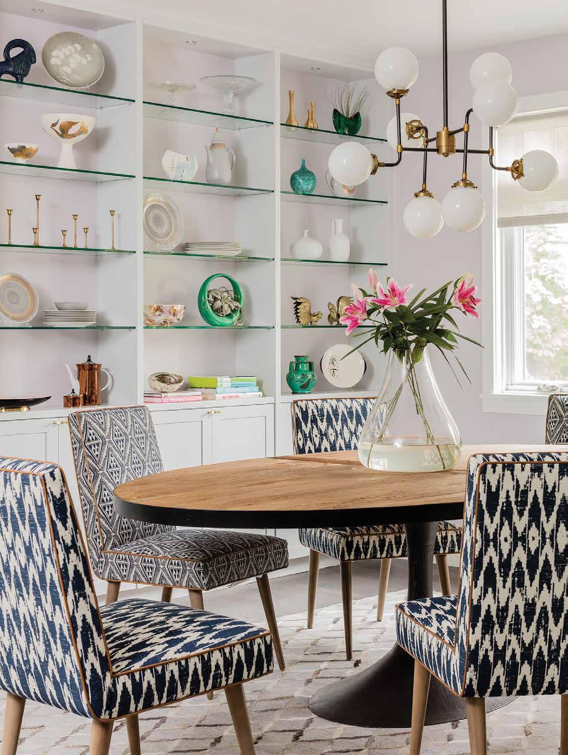
Above: A cozy breakfast nook sports cushions with neon prints while a neutral canvas keeps the space airy and bright. White walls allow for maximum experimentation with color and texture.
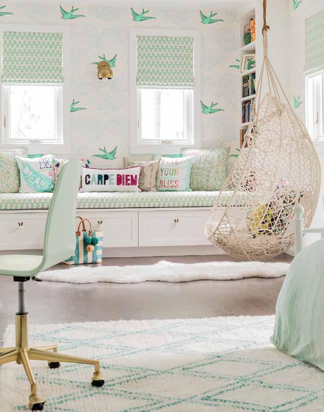
Left: Delicate pieces like this woven hanging chair add to the whimsical nature of the room. The recurring teal-blue utilized in varying tones and patterns make the room feel congruent, yet relaxed.
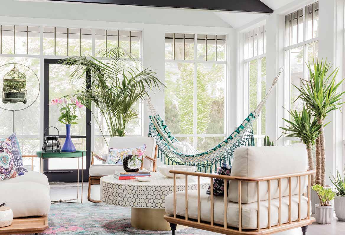
Below: Touches of lush greenery increase the outdoor appeal of this stunning sunroom while circular shapes of the coffee and end table soften out the squatted structure of the chairs.
That contrast is really where the balance comes in”. This is most evident in the girl’s room: the animated wallpaper featuring large cartoon birds that appear as if they have escaped off the page of a storybook is tamed by fabrics with smaller-scaled prints. The unexpected juxtaposition between the sizes and shapes prevent these elements from competing against one another and help to fuse them together.
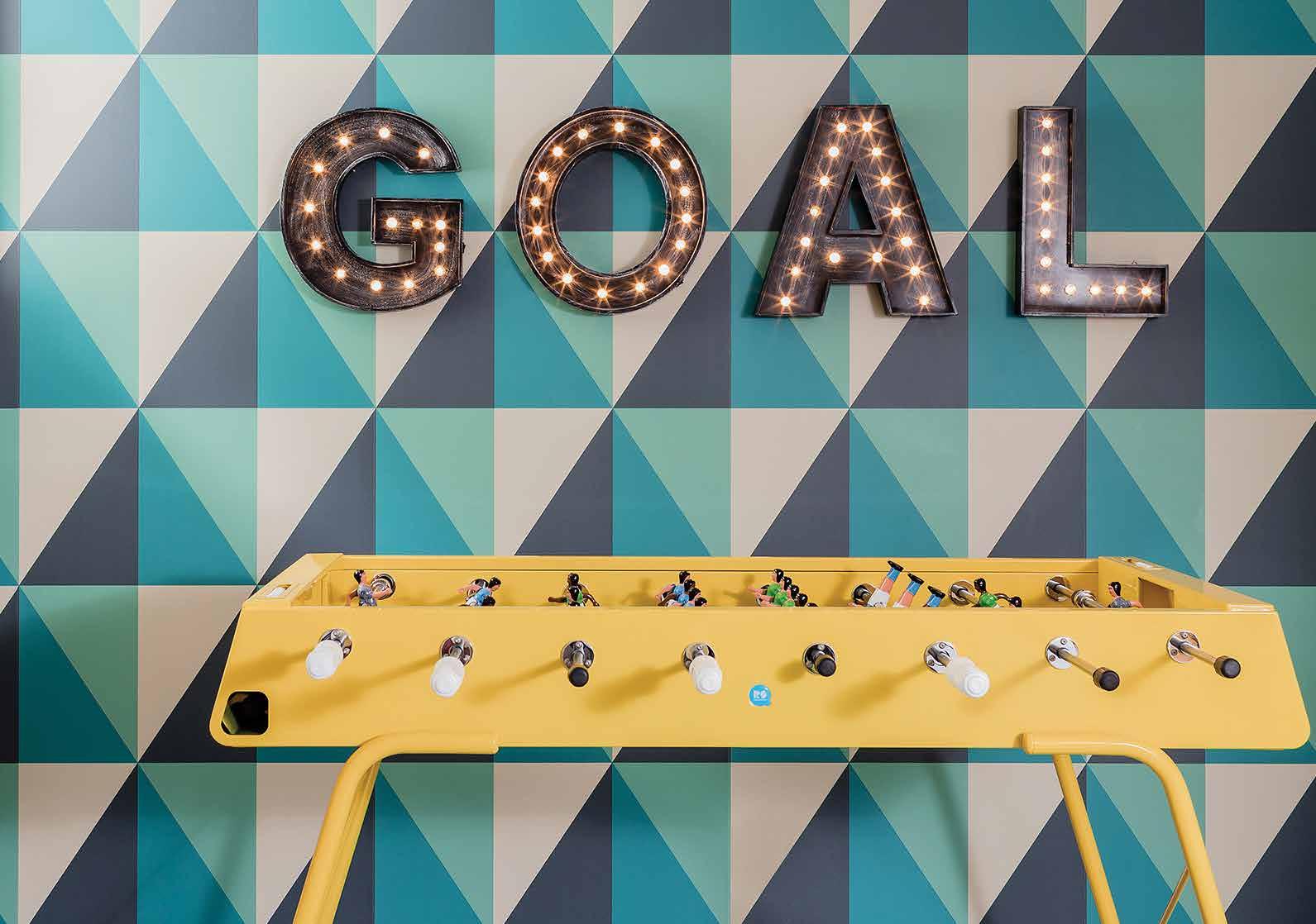
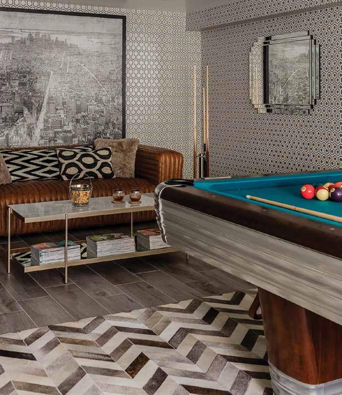
The basement game room is where playfulness takes center stage, magnetizing with metallics while a shimmering geometric wallpaper beacons to the chrome of the room’s centerpiece: a 1946 Centennial Brunswick pool table from New York City that the client had purchased for her husband as a gift. The designers wanted the rest of the room to gesture towards the glamourous era that produced this unique piece, ensuring the materials and textures mirrored the luxury of mid-century city life. These bold and reflective materials and textures mix together to bring this bustling room into a vision of dazzling excess.
Nothing brings a family together like game night, and what better than having an entire room dedicated to this fun-filled tradition? Here prints and textures are free to be as wild as the most competitive of the clan!
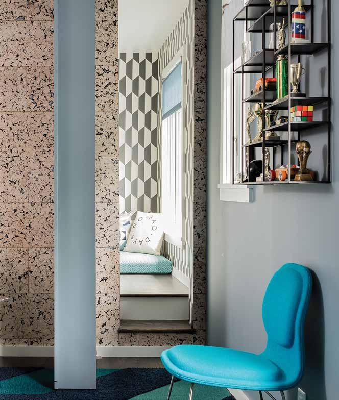
Despite offering a plethora of colors and quirky features, the home excites instead of overwhelms; it achieves character and comfort. The complexity and continuity operate simultaneously to generate a beautiful display of the family’s vibrant and diverse personalities. The result is an electric array of color and spirit that incorporates the family’s experiences abroad and their willingness to experiment and take aesthetic risks; a home that manages to encapsulate the essence of this family’s unique charm.
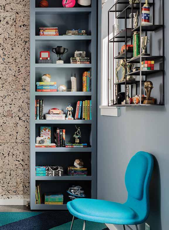
Above: This home is stacked with fun features like this grey bookcase, which doubles as a secret door revealing behind it a private room for the client's son.
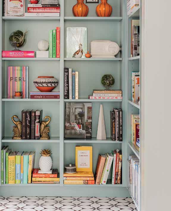
Left: A balanced bookshelf allows you to store your favorite stories and titles amongst your most cherished treasures. The perfect opportunity to showcase ornamental items without wasting precious storage space.

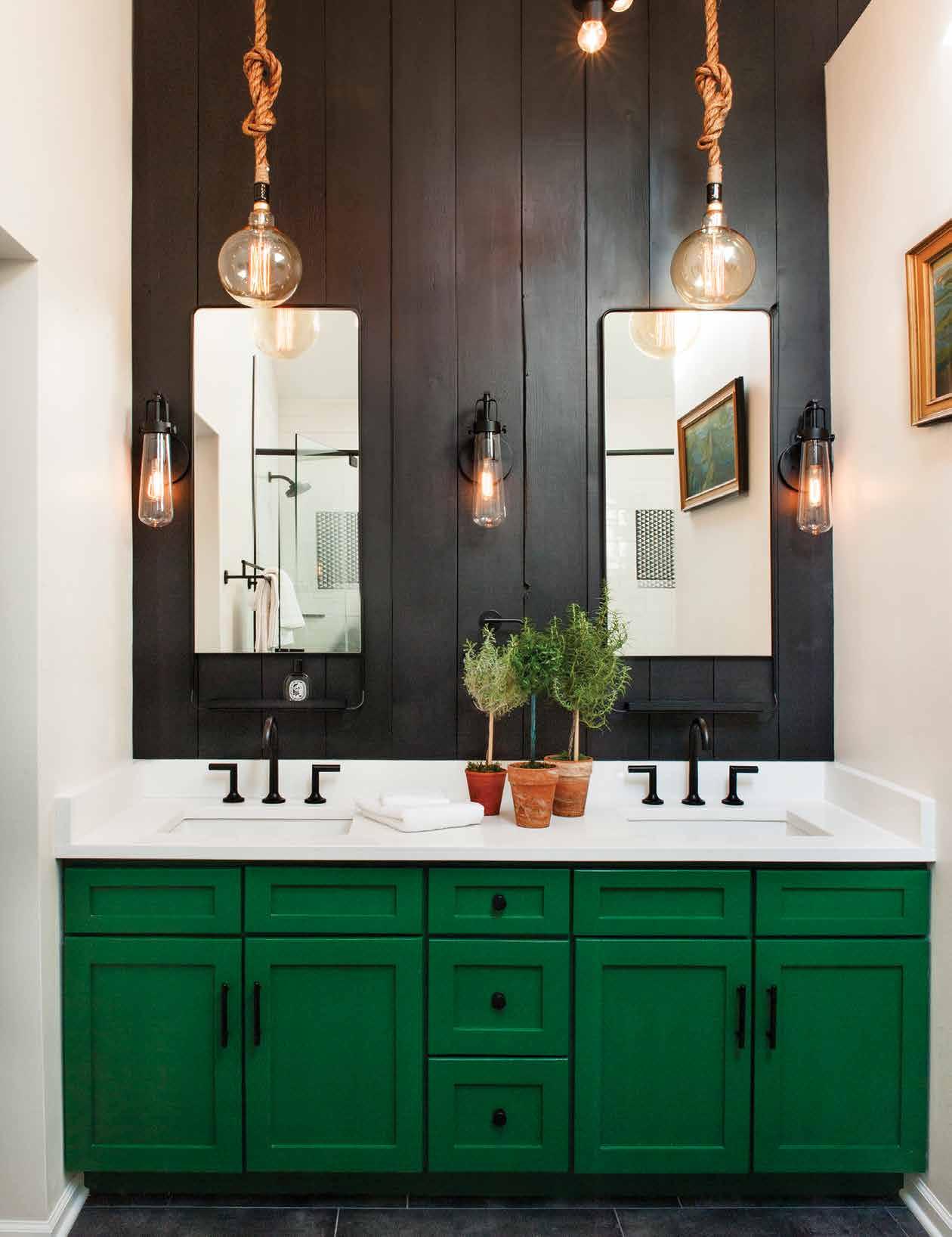
These bathrooms use color in innovative and inspiring ways, daringly utilizing bold prints, patterns, and paints in unexpected forms that are sure to have you starting your day with a spring in your step while adding a burst of energy to your home.
Our bathrooms are the backgrounds of our bedtime routines and our morning showers; they act as a momentary solace for a weary dinner guest, or a waterpark for our little ones at bathtime. It’s been estimated that the average person spends a grand total of nearly two and a half years over a lifetime in their bathroom, so why not make it a space that doubles as an optimally functioning clean-up station AND a brilliant showcase of style? Check out some of the most colorful of the crème de la crème; we hope they’ll inspire you to pamper your powder room too!
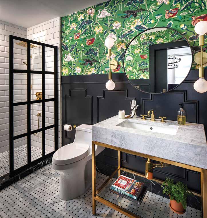
Above: Colorful doesn’t have to mean chaotic! In this eclectic bathroom by CM Natural Designs, they opted to use a busy, whimsical, and colorful wallpaper to provide a burst of energy, while the black half-wall beneath prevents the print from overwhelming the room. The circular mirror overlaps this break in the wall, binding the two tones together. Gold accents, like the sink and shower fixtures, bring sophistication and class to the room’s motif, while the molding along the wall and paneled shower divider provide structure.
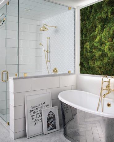
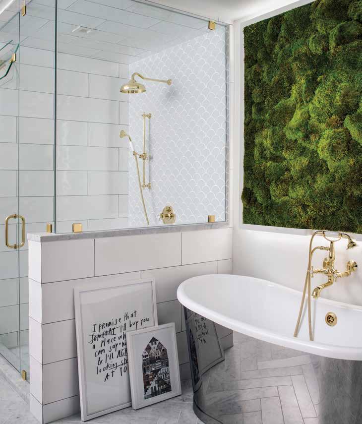
Left: Sometimes the best place to look for color inspiration is right outside our doors and under our feet! This room stuns with a sustainable living moss wall, providing an eye-catching focal point for a glossy white canvas. The wall thrives on the moisture generated during showers/baths and adds a breath of fresh air (literally!) to this otherwise pristine space. The subway tile and subtle accents of gold create a polished and minimalistic aesthetic, while the contrast of the contained green vegetation offers dimension and playfulness.
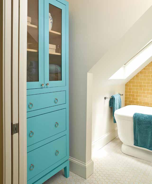
Opposite, top left: Cream colored walls and flooring make room for quirky colors to shine. Having a muted base is an excellent way to experiment with bold colors. It can also be an opportunity to repurpose older furniture by adding a fresh coat of paint and making it look brand new again. This bathroom battles stark angles as if it were a breeze, utilizing a feature wall filled with subway tile colored a warm yellow. Contrasting this is a teal-painted cabinet, accented by matching towels. Simple, elegant, modern, and energetic. Did we mention how jealous we are of the skylight streaming sunlight into that soaker tub?
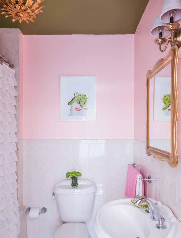
Opposite, top right: Think pink! This perky powder room uses a bubblegum pink paint with a white glossy half wall. Rose gold accents, like the radiant mirror above the sink provide glamour and luxury to the relatively small room. A frilled and flirty white shower curtain adds texture and dovetails nicely with the feminine theme already established. The perfect room to pamper yourself in, sing in the shower, or to remind yourself (in Elle Woods’ voice—of course) that whoever said orange was the new pink was seriously disturbed.
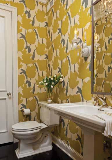
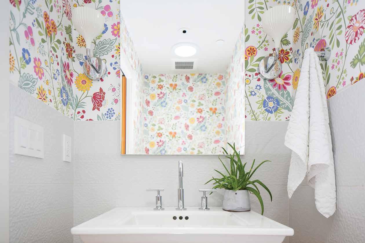
Opposite, bottom: Vibrantly colored and animated floral wallpaper refreshes this immaculately white room, making it feel energized instead of teetering into hospital hallway territory (eeek fluorescents!). This space feels clean, lively, and fresh—exactly how a bathroom should. Subtle touches like a green house plant (aloevera, pictured here, is unbelievably low-maintenance) break up the bottom half of the room and add some variety. The clean lines of the mirror and sink tame the wild print of the wallpaper and add structure.
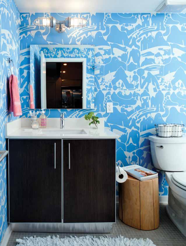
Left: Fun and playful wallpaper is an excellent way to spice up the spirit of any space. The bathroom is a perfect place to experiment with bold prints because of its relative isolation from the rest of the home. Here, the busy pattern on the walls is grounded by dark cabinets, simple accessories, and tile flooring. A contrasting hand towel serves as a second pop of color, accenting the baby blue of the wallpaper perfectly and increasing the bubbly nature of the room. A fun and fabulous way of playing with print and color that will have your kids counting down ‘til bath time!
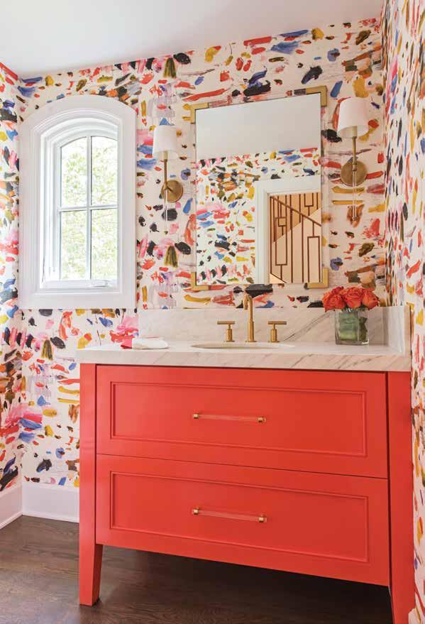
Below: This bright bath also features floor-to-ceiling wallpaper without being over-bearing. The fantastic thing about a busy wallpaper is that there are endless possibilities to play with the range of color presented in the pattern. The sink cabinet anchors the room and creates cohesion by drawing its color from the coral in the wallcovering, while the gold light and sink fixtures highlight the gold strokes in the pattern. This vivid burst of energy is contained by white baseboards and a thick window frame, allowing the flirtatious nature of the room to retain a mature feel.
Color doesn’t always have to come from a paint can! There are a million creative ways of crafting a powder room that pops. Here are a few ways you can achieve some of these looks:
Accents & Accessories: This is a great way to go if you’re a little hesitant to branch out into the riches of the rainbow because they can be easily switched out for a totally transformed look while making a big impact on your space. This can be as simple as colorful hand-towels or a vase of flowers in a bright hue. The options are limitless (and usually fairly inexpensive, too)!
Cabinetry: A sink cabinet does wonders to anchor a space and can add an extra spark of personality. Try this in a bold and brilliant shade to balance a neutral-dominated space.
Wallpaper: Bathrooms are a wonderful place to experiment with interesting patterns and prints that you might be a little hesitant to try in heavier-traffic rooms because they are relatively contained. Even a smaller strip of a wallcovering can make a huge difference, especially in a smaller space.
Repurposing with paint: Have an old piece of furniture that is lacking its luster? Re-imbue its magic with a new shade and add character and color simultaneously to any space. This is a fabulous and efficient way of maximizing your budget and clearing out some garage space, but it can also change the entire atmosphere of a room.
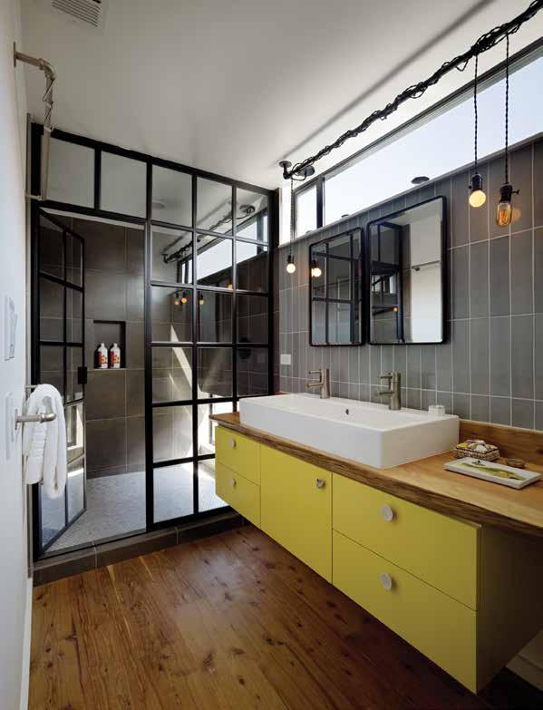
Above: Neutrals don’t have to be boring! A simple pop of color from cabinets or accessories can go a long way in keeping a room exciting. Here, a bright yellow greets the sophisticated and modern aesthetic of the room, bringing significant personality with it and brightening up the otherwise predominantly charcoal coloring of the room. Industrial styled lighting hangs, calling to the metal frame of the shower divider and the matching mirrors hung above the sink, while rustic wooden flooring ties the look together and adds warmth.
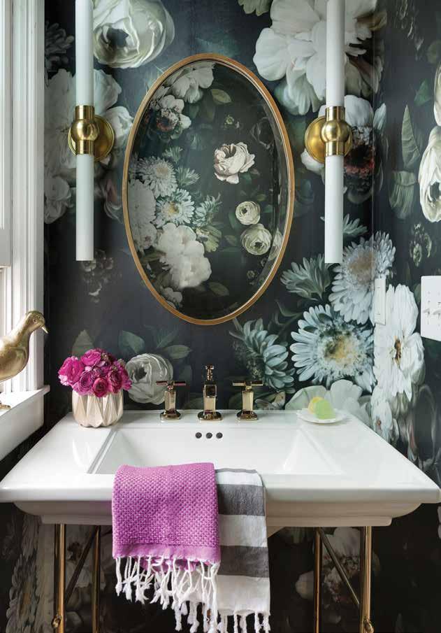
Left: This stunning half-bath boasts a dreamy and muted pastel colored wallcovering with a romantic floral print. Here, our pop of color comes from a simple touch: magenta flowers paired with a matching hand towel. Gold accent colors bring a glamourous feel to the delicate texture of the room (how adorable is the bird statue perched on the window sill!), while the oval shape of the mirror extracts attention from the room's narrowness. A little slice of heaven and the ideal enclave for a moment of solitude in the midst of a busy day.







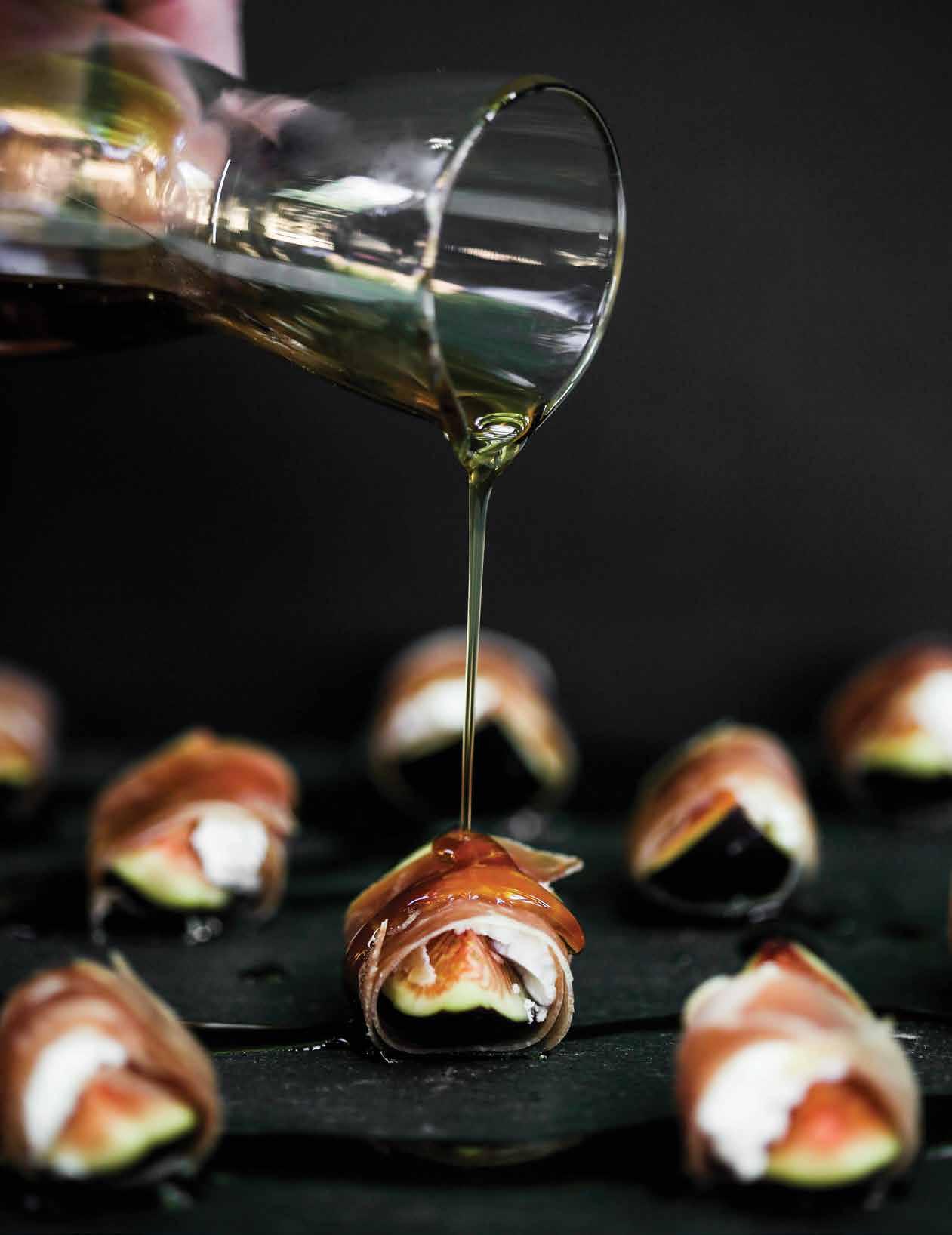
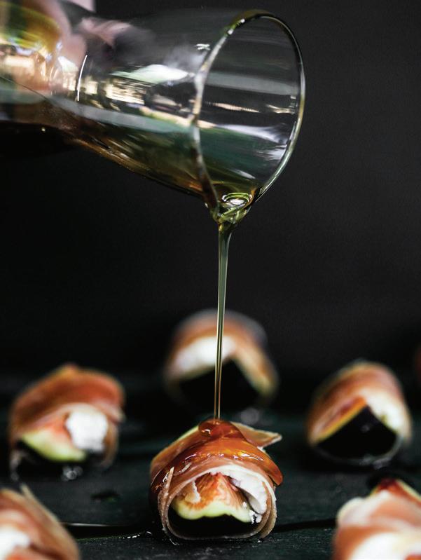
Whether you're contributing to the Thanksgiving spread or creating the perfect snack for your next Netflix binge, this surprising sweet treat will do the trick to liven up your next culinary endeavor (or adventure, depending on your level of expertise). You've loved showering your pancakes and waffles in it for years, but you may not have considered the delicious potential of nature's finest liquid gold.

PROSCIUTTO WRAPPED FIGS
12 fresh figs
12 slices prosciutto
4.5 oz goat cheese
1 cup maple syrup
Remove stems from figs and cut into quarters (halves if the figs are smaller)
Cut prosciutto into 1 inch strips and set aside
Take one of the fig pieces with a dollop of goat cheese and wrap a strip of prosciutto around the fig
Bring maple syrup to a gentle boil and remove from stove
Place all wrapped figs on a serving dish and drizzle with heated maple syrup
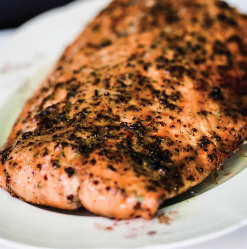
MAPLE GLAZED SALMON
1 2.5lb salmon fillet
MARINADE
1/4 cup maple syrup
1/4 cup brown sugar
1 tbsp whole grain mustard
1 tbsp red wine vinegar
1 tsp dried tarragon
½ tsp salt
½ tsp pepper
Mix all marinade ingredients in a bowl until combined
Place salmon in a sealable bag and add marinade
Refrigerate for up to 6 hours
Preheat oven to 425oF
Remove salmon from marinade, place in oven-proof dish and bake for approximately 15-20 minutes until salmon is cooked through
Top: Maple Glazed Salmon: A tasty twist on a classic dish. Sweet and smoky maple notes mingle with a hint of vinegar and other spices, bringing out a rich and robust flavor that is sure to leave your taste buds happy. Simple, easy, and delicious.

MAPLE ROASTED VEGETABLES AND QUINOA
QUINOA
1 cup quinoa
2 cups water
1 tsp salt
Add quinoa, water and salt to a pot
Bring to a boil over medium heat, once at a boil reduce heat and simmer for about 20 minutes until water is absorbed
Remove from heat and cover for 5 minutes
VEGETABLES
Medium sweet potato cut into 1/2 inch pieces
12 Brussels sprouts, stems removed and cut into half
½ head cauliflower, broken into smaller pieces
3-4 shallots, peeled and quartered
4 cloves garlic, roughly chopped
TOPPINGS
1/4 cup crushed pistachios
2 tbsp maple syrup
1 lemon, cut into wedges
MARINADE
4 tbsp maple syrup
3 tbsp olive oil
1tsp thyme
½ tsp salt
½ tsp pepper
Mix maple syrup, olive oil, thyme, salt and pepper (marinade) in a large bowl
Add all of the vegetables and toss to coat with marinade and let sit for 15 minutes
Preheat oven to 425oF
Spread vegetables out on a roasting pan, making sure not to overcrowd (as they won’t brown up if they are too close)
Roast for 20-25 minutes turning halfway through
Spread cooked quinoa on large serving dish, place roasted vegetables on top and finish with a drizzling of maple syrup, crushed pistachios and lemon wedges on the side
3 tbsp maple syrup
1/4 cup brown sugar
2 tbsp dijon mustard
1 tsp pepper
½ tsp cayenne pepper
1lb thick cut bacon
Preheat oven to 375oF
Mix all ingredients except bacon into a medium sized bowl
Add slices of bacon while making sure to coat both sides of each strip
Place bacon on a greased wire rack over a foiled roasting pan (this helps with clean up)
Bake at 375oF for 20 minutes, flip and cook for another 10-15 minutes until crisp
Remove from oven and let cool for 5 minutes, remove from rack to prevent sticking.
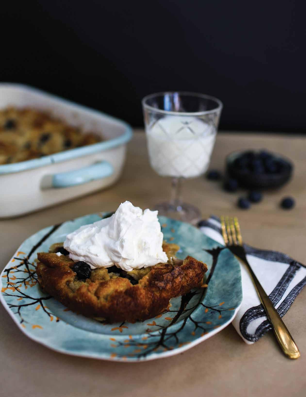
2 apples peeled and diced
3 tbsp butter
5 eggs
1 cup full cream
1 cup milk
1 cup white sugar
½ cup brown sugar
1/3 cup maple syrup
1 tbsp vanilla
1 tsp cinnamon pinch of salt
12 slices day old Italian or French bread cut into 1” cubes
1 cup blueberries (frozen or fresh)
Melt butter in a pan and sauté apple until soft, set aside and cool
In a large bowl combine all ingredients except bread and blueberries and mix well
Add bread cubes and blueberries to bowl and mix well to absorb liquid
Put in fridge and let sit for 15 minutes
Transfer to a 9x12 greased baking dish
Bake at 350oF for 30-40 minutes.
Top with ice cream or for more maple flavor fold 3 tbsp of maple syrup into whipped cream
Brian Johnson spends his free time experimenting with flavors. Although he loves being adventurous with food, this selftaught cooking enthusiast truly appreciates a simple meal made of fresh ingredients and thoughtful preparation. Brian enjoys making soul-satisfying meals for his family and community of friends who happily clean their plates then ask, "When are you opening your own restaurant?" While that dream may someday be in the works, Brian's recipes continue to transform his kitchen into a chefowned eatery that gives his wife and three children the best table in the house.

SHOP LOCALLY. SUPPORT INDEPENDENT BUSINESS.

"THE BRIGHT EDGE OF THE WORLD"

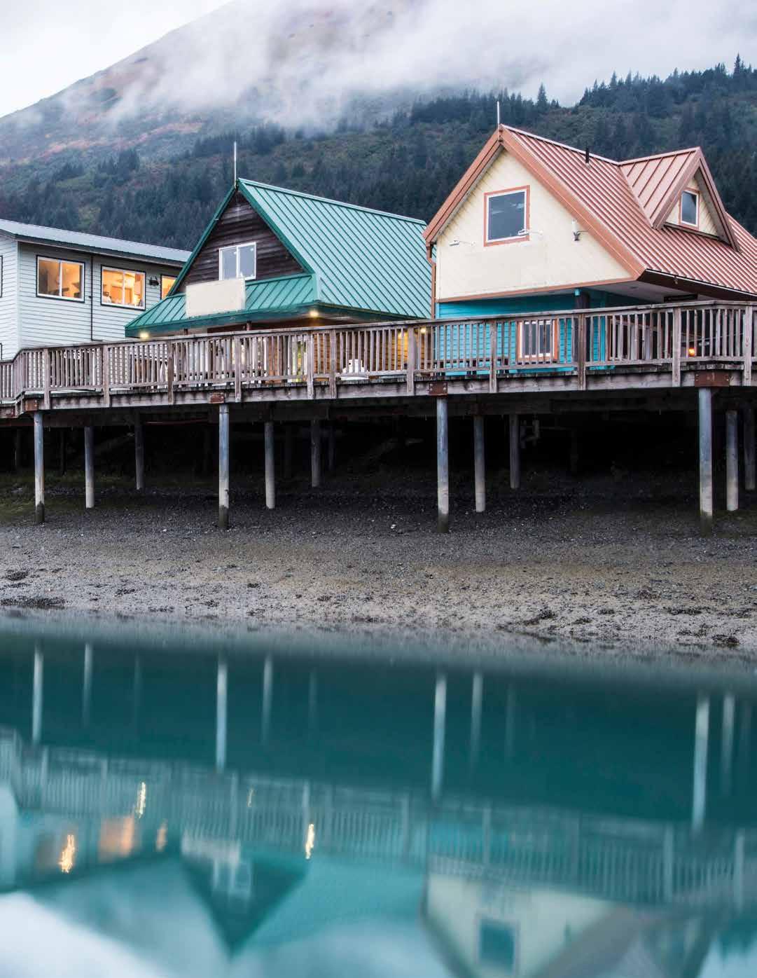
Mountain peaks tower over crystal-clear waters, casting their reflection over a ripple-less surface.
From the dizzying mountain tops to the vast and seemingly infinite stretches of arctic tundra, Alaska is a land of mystical magnetism. Perhaps its enduring allure can be attributed to its relative inaccessibility—it holds a certain feeling of farness, of a land untouched and out of reach. Though its landscape may be diverse and its climate extreme at times, Alaska holds tremendous beauty for those daring enough to make the journey.

Historians believe Alaska has been inhabited by humans since as early as 10,000 BCE, having crossed over the Bering Land Bridge which extended from Siberia. Together, these migrant groups form the Seven Nations of Alaska First Nations People, each with distinct cultural belief systems, languages, and histories. These histories are widely celebrated throughout the region and play an integral role in the land’s storied past and vibrant present. You can learn more in places such as The Museum of the North, which moved into its new location at the University of Alaska in 2005 and showcases various artifacts and exhibits that outline and honor Alaska’s unique and rich cultural heritage.
Much later, in 1784, Russians (led by a man named Vitus Bering— the namesake for the infamously harsh and tumultuous Bering Straight) arrived in Three Saints Bay on Kodiak Island. He then began establishing settlements, only to sell the land mass to the United
States in 1867 after financial troubles in the Russian government. The acquisition was highly criticized at the time due to many believing the land was inhospitable and devoid of resources. Gold was later found in 1890, initiating a wave of settlers and prospectors.
The state remained relatively remote until Alaska’s tourism industry took off after World War II, during which time two Aleutian Islands, Kiska and Attu, were occupied by Japanese troops. American soldiers returned from battle commending the land’s natural beauty, initiating its status as a tourist destination. With the rising importance of tourism to Alaska’s economy (the state now receives nearly double its population in visitors with 1.4 million tourists each year), environmental conservation became a chief priority. In 1980, 53.7 million acres of the Alaskan landscape was added to the National Wildlife Refuge System, securing Alaska with two thirds of the total land mass dedicated to United States’ National Parks.

From the moment you touch down in Anchorage (the most populous city in Alaska, located in the southeastern region), the charming and rustic appeal of this location will steal its way into your heart. Be sure to check out one of the town’s local farmers markets for all sorts of memorabilia (and produce, depending on the season you visit). There are plenty of kitschy Alaskan delicacies to try, like salmon quesadillas (don’t knock it ‘til you try it!) or their famous and festive reindeer sausage. Before trekking out too far from the metropolis of Anchorage, be sure to give yourself the chance to take in the diversity of the landscape and the expansive shoreline in Chugach State Park.
Travelling northward, the complex land formations and thick boreal forests dissipate, softening into the low-elevation Taiga Forest. Here, you’ll find Denali National Park; the perfect place to reflect on the immense grandeur of this earth and to contemplate your own place within it. The six million acres of wild land also contains North America’s tallest peak, Denali (recently re-named from Mount McKinley), summiting at a bewildering 30,310 feet above sea level. If
you’re travelling to Janeau, the state capital, stop by the Mendenhall Glacier, which stretches an awe-inspiring thirteen miles and is the most accessible out of the thirty-eight glaciers in the region. Its worldclass visitor center contains interactive and informative exhibits and is an excellent place to observe and understand the persistent threat that climate change poses to our natural world.
Despite all that Alaska has to offer, its population sits at a mere 710, 231 (recorded in 2010). Its climate is fierce and unforgiving, the landscape is jagged and difficult to terrain. And still, people travel from all over the world to experience its remarkable and unprecedented beauty. Visitors often report an otherworldly sensation when immersed in the landscape; it is the sort of majestic scenery that requires reminders that you are, indeed, on Earth. Eowyn Ivey (an Alaskan born writer) aptly described her homeland as “the bright edge of the world”. There is adventure gleaming in this corner of the Earth: in the northern lights beaconing from the sky, calling out in invitation. Will you answer?


During the long daylight season when midnight sun shines in fractures as it dips below mountain peaks, a prolonged twilight lingers over the landscape, gleaming off of the snow and ice. A breathtaking and awe-inspiring spectacle of light.
02
Just twelve miles from Juneau, the state’s capital, exists a remarkable coalition of ancient ice. A wonderful spot for Alaskan views of epic proportions. The visitor center offers kayaking, guided tours, and hiking trails for the adventurous!
03
The fourth largest state park in the United States, and the most biologically diverse and wildlife-rich habitat existing in such close proximity to a major city (Anchorage). Chugach State Park contains a diverse range of land formations, from alpine tundra to marine waters, with 45 different species of mammals.
If you haven’t had the privilege of seeing the brilliant array of neon colors electrify the sky with their midnight dance, Alaska is the perfect place to do. Photos fall short in communicating their beauty.
05
Experience Alaska’s remarkable array of landscape and be blown away by spectacular views of the Alaskan Range (containing Mount Denali) while exploring Taiga forests, meadows, sculpted valleys, and moraines—just a few features of the park’s six million acres.
06
Adventure through the Alaskan canopy and get an exclusive view while being immersed in the rainforest’s diverse ecosystem.
Surrounded by the valley of the same name concentrated with cottonwood, balsam poplar, spruce, and birch trees, this river trickles its freezing whitewater downstream 75 miles from Matanuska Glacier to Knik Arm of Cook Inlet, where it finds the sea.
The marvel of Mother Nature is on full display at Tracy Arm Fjord Waterfall, where glaciers release their melted portions in epic force into mesmerizingly crystalline blue-green water.
Formerly known as “Strawberry Point” (and sometimes still referred to as such by locals) because of its predilection for berry-picking, Gustavus is a small fishing village that will give you an authentic Alaskan experience
This destination received its name after soldiers were forced to retreat into the bay's calmer waters to wait out a deadly storm, which finally broke on Easter Sunday. A spectular view awaits if you're able to visit by boat.
A highly recommended pastime for visitors, wherever you are in the region. Don’t miss the opportunity to witness the grandeur of these majestic creatures up close and personal.
12
This town is named after William H. Seward, the Secretary of State who negotiated the purchase of the landmass in 1867. Moderate temperatures due to its location keep this city a popular tourist destination.

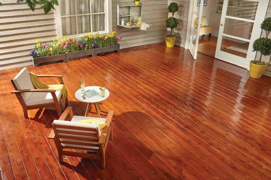


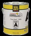
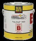
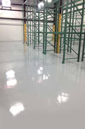
• Are formulated for exceptional durability
• Withstand harsh conditions
• Resist chemicals
• Offer complete solutions for a variety of applications – horizontal and vertical
• Deliver lasting value and return on investment
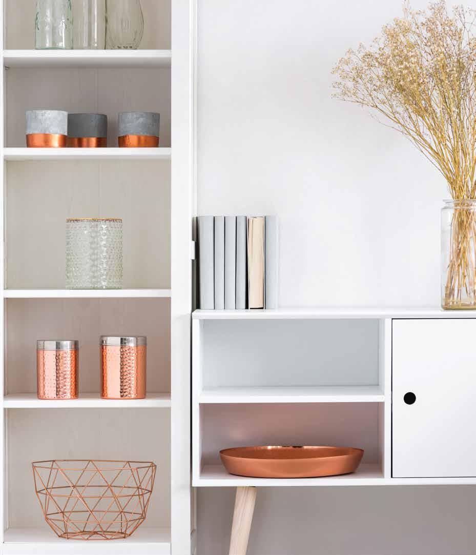
You've heard it a million times before: knowledge is power. The sharpest tool in the box is always the one that's best read. Whether you're an "Interior Design for Dummies" DIY-er or an evolving expert in the field, these titles are sure to equip you with tips of the trade that'll make your next project a little less intimidating and hopefully bring you a little laughter and inspiration along the way.
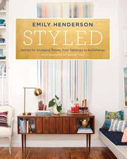
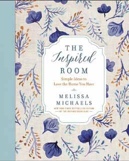
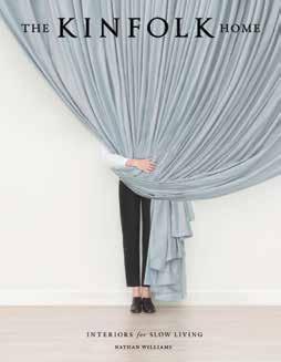

01 Styled: Secrets for Arranging Rooms, from Tabletops to Bookshelves
02 The Inspired Room: Simple Ideas to Love the Home You Have
03 The Kinfolk Home: Interiors for Slow Living
Emily Henderson offers a toolbox full of tricks to transform rooms from drab to fab. Emily helps you find your own personal style preferences (a convenient quiz greets you within the first few pages) and then unpacks how to best use your individual style persona to create spaces that work for you and your budget. Emily is resourceful in her method and meticulous in her commitment to detail. She has an eye for repurposing the vintage, and if you’re looking for a way to utilize that funky thrift shop find or antique heirloom, Emily Henderson is your gal and Styled is your guide.
Celebrated blogger, Melissa
Michaels, invites readers into her expertly curated home to share her wealth of décor knowledge with the rest of us. Accessible and aesthetically pleasing, her book traces room-by-room through her Seattle Craftsman Home, while offering helpful tips and suggestions. These helpful hints range from full on remodel to subtle shifts with big impact, and they are delivered with all the wit and charm that readers of her blog “The Inspired Room” fell in love with. Michael’s message is clear: love the home you’re in; and she offers plenty of potential pathways to get there.
Nathan Williams has scoured the globe to prove that comfort and class do go hand in hand. His design book, The Kinfolk Home, covers a lot of ground by featuring homes all across the world that have perfected the art of easy living, complete with pristine décor. The stunning images are the most compelling aspect of the book, capturing expertly curated homes with a minimalistic aesthetic. Warning: This book will give you severe home envy!
04 The Finer Things: Timeless Furniture, Textiles, and Details
Chistiane Lemieux’s book could have made it on this list based on its cover art alone (this one is likely to make your coffee table stack). Fortunately, its contents cash the cheque its cover writes. Lemeuix emphasizes the importance of having a sturdy foundation for your designs, and discusses why furniture should be considered a crucial aspect of your home’s structure. The Finer Things incorporates international insights from experts on everything from wallpaper to accessories in hopes of educating and empowering readers to create environments that make luxury accessible.
continued on next page

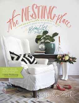


05 Elements of Style: Designing a Home & a Life
06 The Nesting Place: It Doesn't Have to be Perfect to be Beautiful
07 Homebody: A Guide to Creating Spaces You Never Want to Leave
08 Habitat: The Field Guide to Decorating
Erin Gates lets us learn from her mistakes (even experts make mistakes!) in a helpful edition to the book titled “10 Renovation Lessons”. Gates breaks down the often overwhelming task of redecorating into bite size pieces, demystifying the art of style and helping you find your own along the way. Her book offers a range of ideas, making it easily applicable to everyone from studio apartment renters to home owners. The book is splattered with Erin’s personal insights and anecdotes that help bring the pages down to earth and render their content relatable. All in all, a must-have on your bookshelf!
Myquillyn Smith got her start as a blogger of the popular page “The Nester”. For Smith, creating a home is also about creating a lifestyle; she encourages her readers to take a similar approach in their design endeavors, advocating for the acceptance of imperfections and taking risks in order to build a home that is reflective of and functional for its owner(s). Life is messy, and sometimes (okay- often) so are our homes. Learning to let go of the neverceded desire for order in chaos is exhaustive, so Smith instead suggests we simply manufacture a functional chaos that doubles as a stylish backdrop to our busy lives.
You may recognize Joanna Gaines as a TV personality and one half of the design duo/ adorable married couple from the HGTV show “Fixer Upper”. Joanna Gaines’ solo book deal takes all her familiar soul and wit along with her keen eye for style and space to the page, gifting us with an enjoyable and easygoing guide to creating spaces that reflect our personalities and function for our families. For Gaines, the magic lies in the little things—the small details that act as reminders of our stories and conspire to make a house a home—and Gaines gives you all the advice you need to curate a home that is as expressive as it is comfortable.
*To be released on November 6th, 2018.
Lauren Liess’ signature style is all about collaborating with nature to create inviting interiors, and she articulates this style with energy and passion in her first book, Habitat: The Field Guide to Decorating. Her designs are heavily inspired by the great outdoors, utilizing textures and colors derived from the natural world. She breaks down the often overwhelming task of designing a home to a science; making elements like lighting, color, and furniture easier to manage. But her scientific design methodology is far from artistically lacking— her spaces achieve mood and aesthetic to rival even the most breathtaking of prairie sunsets.
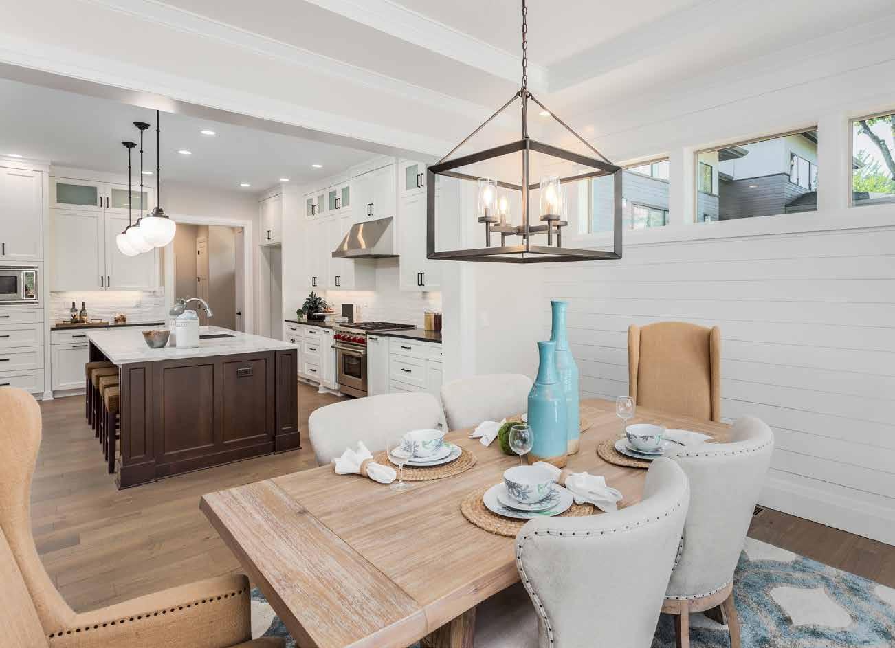
Masters Armor® protects floors, cabinets, furniture, and all types of woodwork with a clear, beautiful finish. Using the latest in water-based technology, Masters Armor is extremely easy to apply and fast drying allowing you to quickly create the wood project of your dreams. The finish imparts excellent clarity allowing the beauty of the wood to show through. The superior durability of Masters Armor keeps your project looking great for years. It is available in flat, satin, semi-gloss, and gloss sheens.
Masters Armor® protects floors, cabinets, furniture, and all types of woodwork with a clear, beautiful finish. Using the latest in water-based technology, Masters Armor is extremely easy to apply and fast drying allowing you to quickly create the wood project of your dreams. The finish imparts excellent clarity allowing the beauty of the wood to show through. The superior durability of Masters Armor keeps your project looking great for years. It is available in flat, satin, semi-gloss, and gloss sheens.

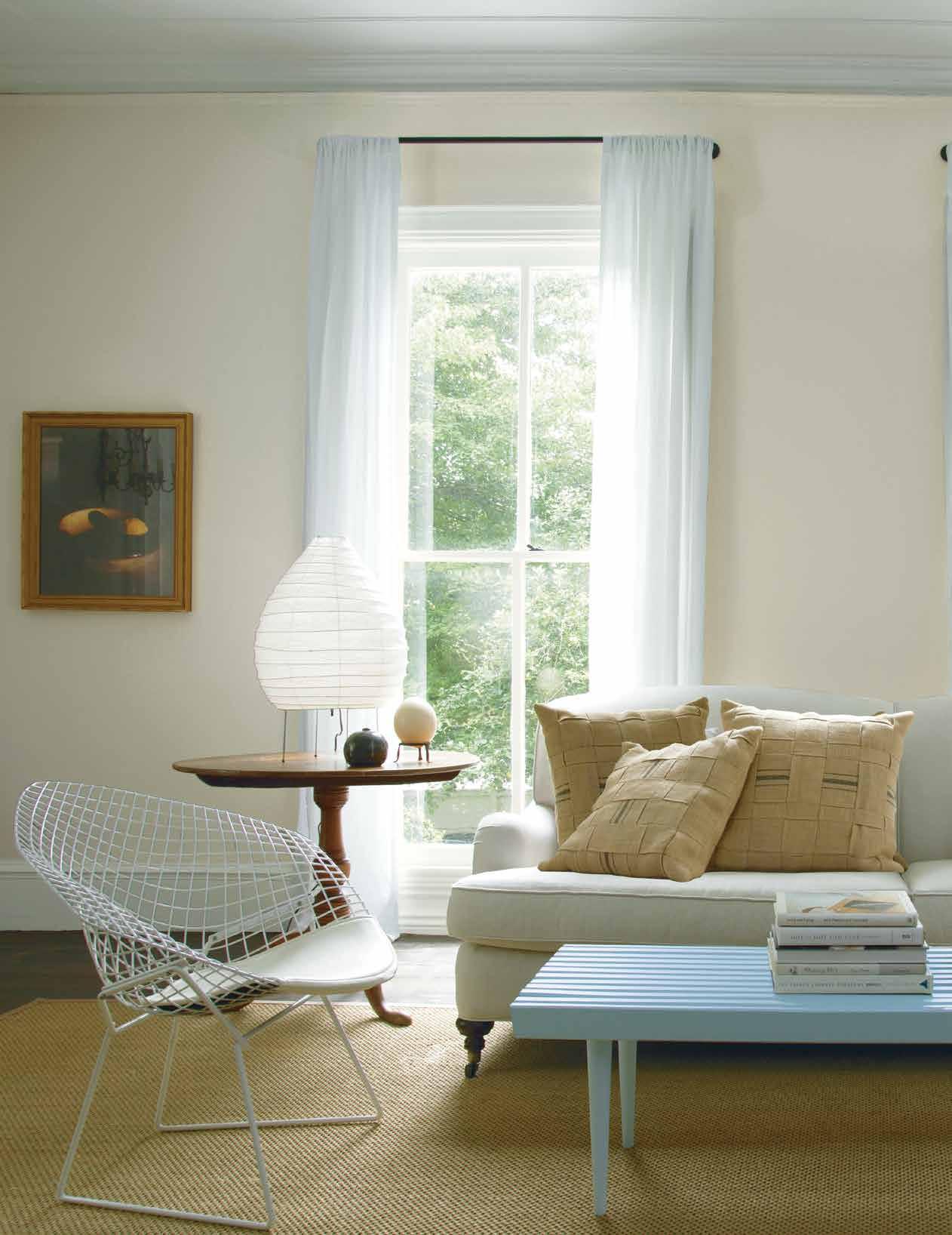
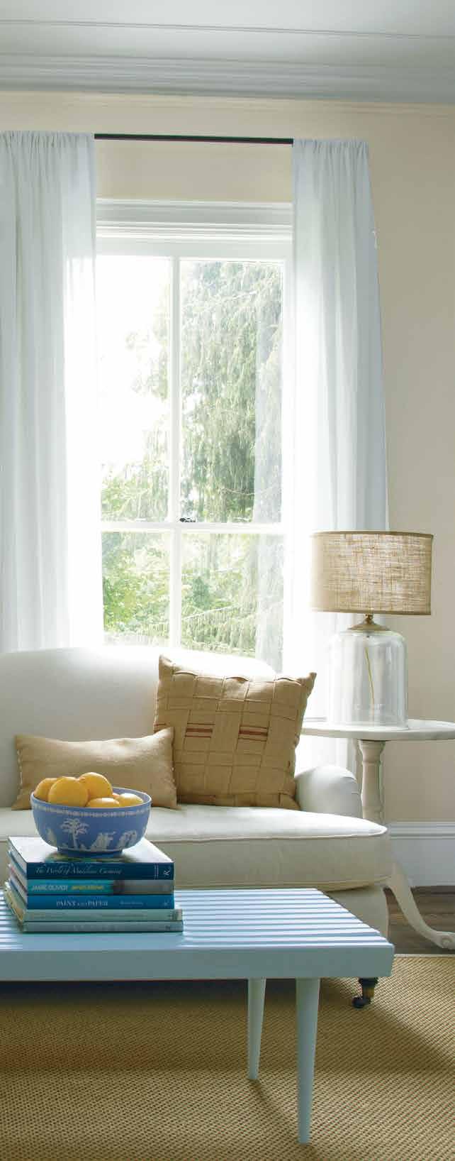
Color may be all the rage this season, but design, like life, is all about balance. Powerful pops in bright shades need some help from neutrals to blend effortlessly into our busy lifestyles and cherished homes. Tame your wild side and frame your vibrant vision with these timeless and classic hues.
Polished ebony floors. Ironed linen sheets. Rustic farm tables. Our collection of neutrals never gets weary. They’re an atmospheric and inviting choice—subtle, nuanced colors for any time, every space.
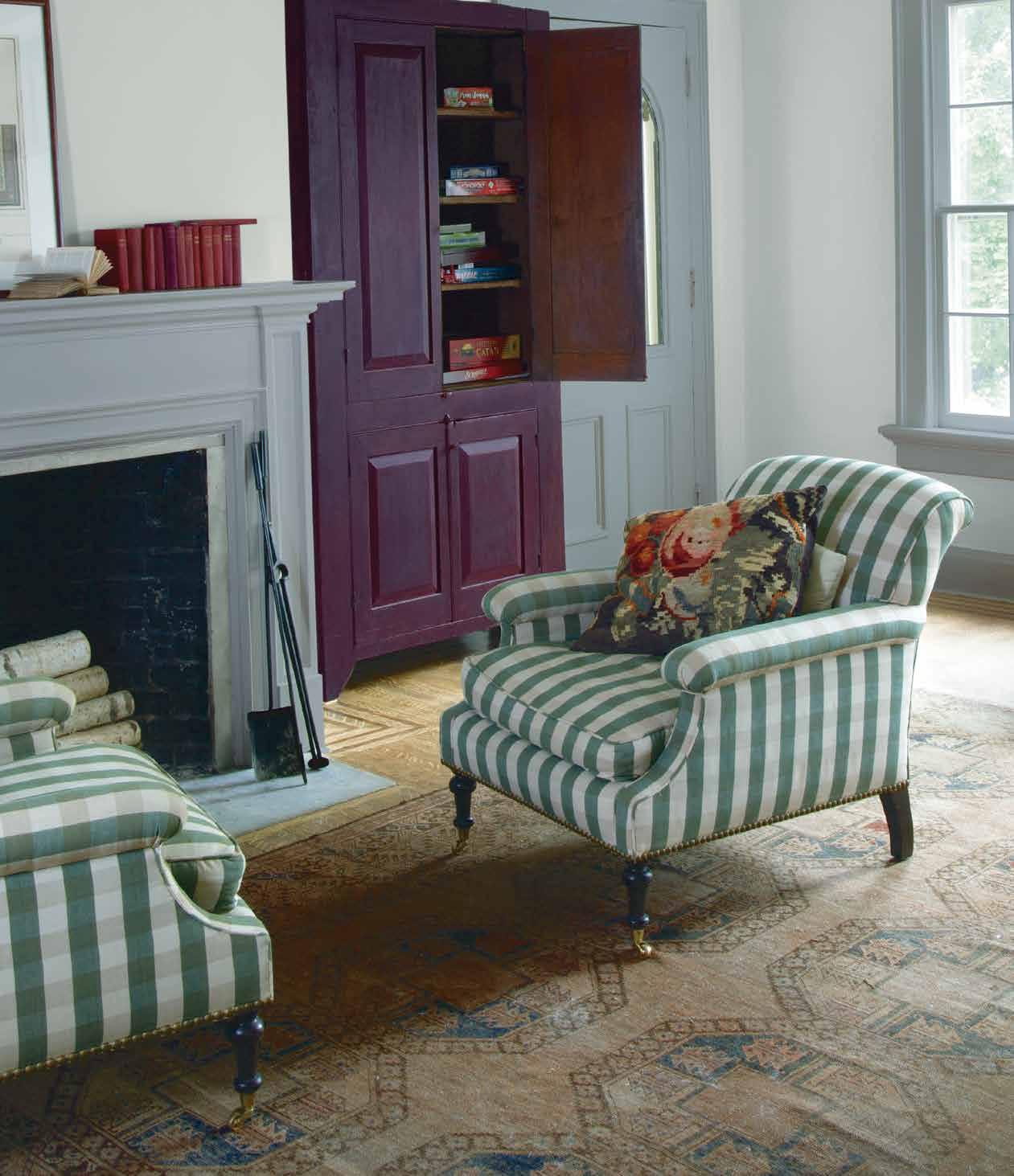
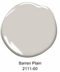
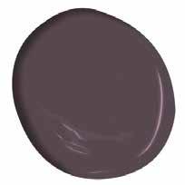
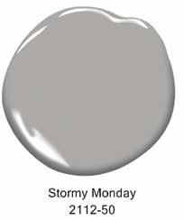
•
•
•
•















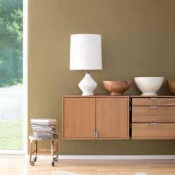
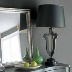
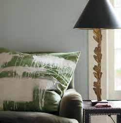


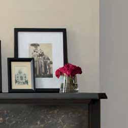
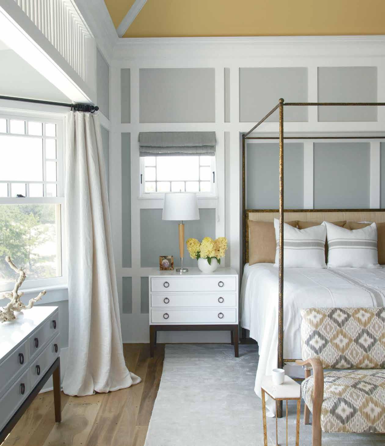


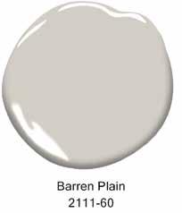


Deep greens with blue undertones are cropping up everywhere as accents as well as moody all-over-room colors.
Pomegranate AF-295
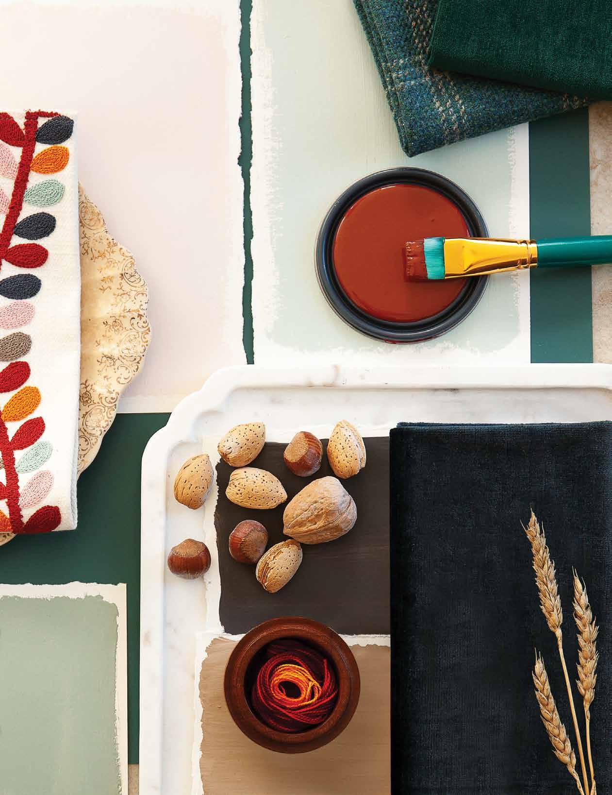
Not to be out done by its cooler cousins, warm greens are also taking center stage in light hues as impressive neutrals on walls and millwork.
Comfortable and classic navy blue is still hot, hot, hot on everything from dreamy bedroom walls to sophisticated kitchen cabinets.
This season, we are falling back in love with color! The trend forecast is looking sunny as we shift away from the world of beige and begin experimenting with boldness. There are so many ways to start this adventure, from fun and flirty accent colors to rich and dynamic color combinations. Whether you choose to use the rainbow to be a risk-taker or prefer to tread lightly with subtle and softer tones, there has never been a better time to dive into the spectrum.
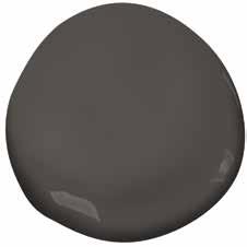
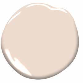
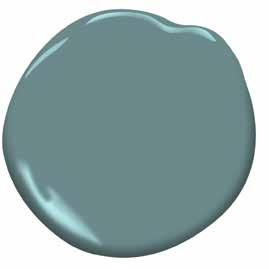
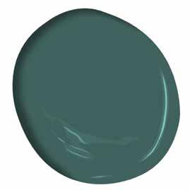
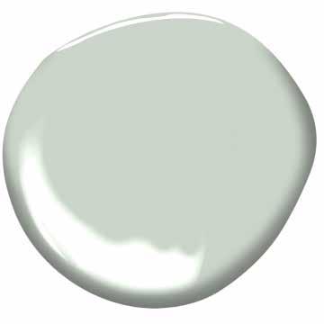
Feeling cautious about color? If you aren't ready to swathe your walls in this season's bold and beautiful color trends you can always dip your toe, and your brush, into the arena with a small DIY project. How about some new big box paintable stools, chairs or end-tables? A quick coat of paint on some small pieces such as these can transform your room in a big way with little effort—and can be easily changed again when you're ready for a different look!


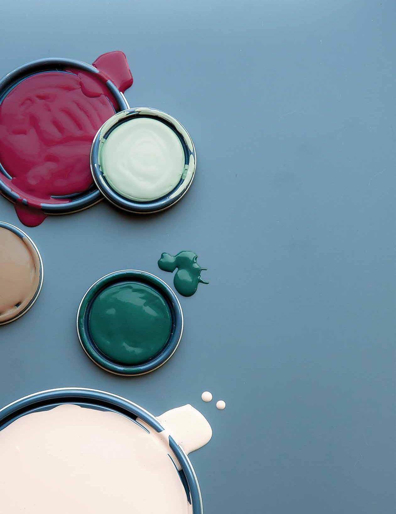
We've gone color happy—and you should too! Long gone are the days of the monotonous and monochromatic. We're officially comfortable with color again, and excited to jump into this brave new world. We believe that our homes should be as unique and lively as the people who live in them, so why should we limit that expression to just the neutrals? We should be fearless in our selection of color and eager to choose hues that pack a punch so we can create spaces that reflect our wild and vivacious personalities.
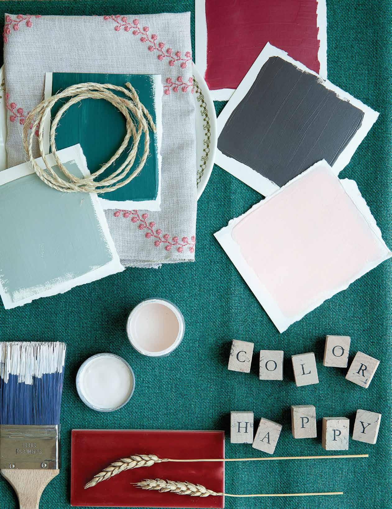
Intriguing tones and unique textures in your favorite shades can make you see even the classics in new light.
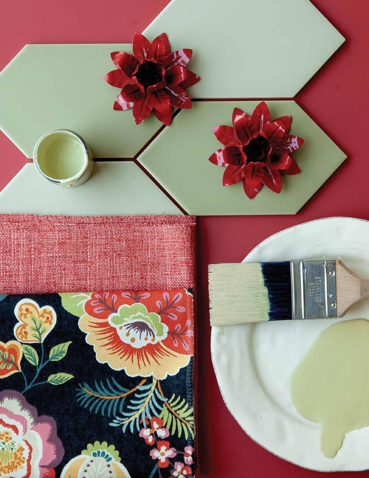
Red and green are complimentary colors. This means they sit exactly opposite each other on the color wheel and that they do the most to enhance each other as well. While the combination is typically associated with Christmas schemes, subtle variations in the tone or shade of either make for a vibrant palette that is both organic and rich. When tempered with neutrals that will anchor the space (like the black in the background of the floral accent fabric - or any array of creams and whites), this winning combination is timeless and exuberant.
Tile in unique and interesting shapes, textures and patterns is stealing the show away from the classic but ubiquitous white subway tile. Kitchen backsplashes, washrooms, and laundry rooms are popular spaces for these bolder design choices.
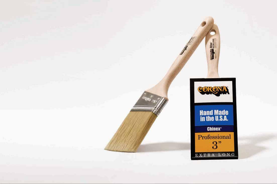



A medium-dark shade of cyan-blue. Sophisticated and alluring, a classic navy is the perfect neutral. Pairing nicely with nearly every color under the sun while also drawing intrigue and depth on its own, you'll want your walls to be championing champion cobalt!
Adding house plants is sure to liven up any space with color and vibrancy while adding depth to the room's design dynamic. A cute patterened pot is another opportunity to bring additional prints and colors into the room, or add cohesion by coordinating with the existing components. Welcoming the outdoors into our homes can also have health benefits, as they clean the air we breathe. This specific plant may even bring you wealth. The Pilea, a.k.a The Chinese Money Plant, is said to bring good fortune and abundance to its owner.
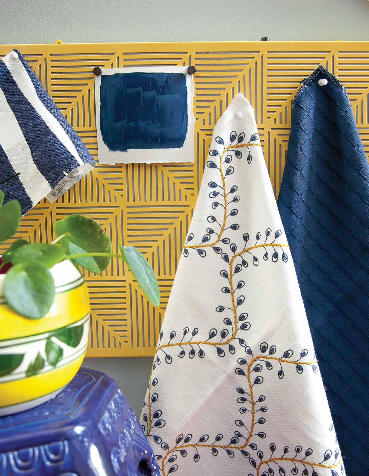
Texture is a crucial aspect of designing a space with depth, but it is often best pronounced using solid colors, as demonstrated here. This allows the eye to focus on the space as a whole instead of overwhelming by doing too much in a concentrated area.
Embroidery is a fabulous way to add dimension to any space. This fabric brings together two featured colors in a delicate print, softening linear shapes and structures.