









































Check out more colorful and inspiring spaces starting on page thirty-two.
SPACES: Real-home redesigns with wall-to-wall ideas you can use.
32
INTO THE WILD: THE LEOPARD INDIGO HOME
Bright + buoyant inspiration for the wild-hearted eclectic 40
THE JOURNEY TO EMERALD CITY: TAKING THE SCENIC ROUTE
A colorful abode with an unconventional starting point 48
THE HOMECOMING
A big city condo gets a down-to-earth do over 54
HISTORIC BONES, MODERN REFRESH
A Massachusetts marvel receives the royal treatment
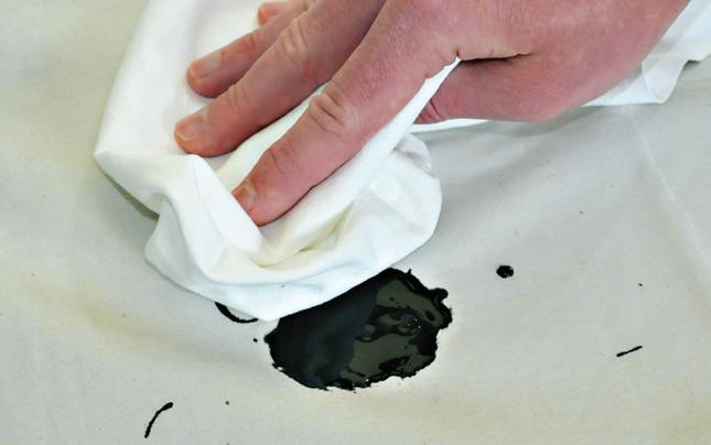
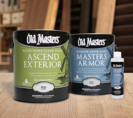
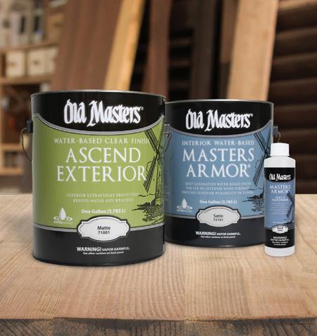
Our advanced clear finishes offer easy application, water clean-up, fast dry, and superior durability.
Ascend Exterior Water-Based Clear Finish
Perfect for outdoor furniture, railings, doors, and interior windowsills.
Masters Armor Interior Water-Based Clear Finish
Use on floors, cabinets, and furniture. Add the Hardener for maximum protection on high traffic floors, table and bar tops.
CONTRIBUTORS
CARLEE BAIGRIE
ARTHUR LIFFMANN
OLIVIA HIEBERT
TWILA DRIEDGER
JIM TAYLOR
AUBREY TAYLOR
DARREN GRUNERUD
IRA VAN DEN BERG
myoldmasters.com | (800) 747-3436 |
Love the designs within our pages? Connect with the talented folks behind the gorgeous spaces.
INTO THE WILD: THE LEOPARD INDIGO HOME PG. 32
Sarisa Shaw Minoz Sarisakay40@gmail.com Instagram: @the_indigo_leopard_home
THE JOURNEY TO EMERALD CITY: TAKING THE SCENIC ROUTE PG. 40
Studio Sven Lauren Svenstrup hello@studiosven.com studiosven.com
THE HOMECOMING PG. 48
Studio Miel Nancy Harper hello@studio-miel.com studio-miel.com
HISTORIC BONES, MODERN REFRESH PG 54
Hudson Interior Designs Jill Goldberg info@hudsonboston.com hudsoninteriordesigns.com
SPRING 2021
Bahia Taylor Editor in Chief Co-founder
Leigh McKenzie
Creative Director Co-founder
Carlee Baigrie
Contributing Writer & Editor
Olivia Hiebert
Graphic Designer
Melanie Truman Project Management
Graphic Design Styling Gallon Creative www.galloncreative.com
Owned and Published by: Gallon Creative
For inquiries, please contact us at hello @ galloncreative.com
5 Scurfield Blvd #25 Winnipeg, Manitoba R3Y 3G4
www.galloncreative.com hello @ galloncreative.com
Cover Photography - Viking Projects www.vikingprojectsco.ca
While every effort has been made to ensure that advertisements and articles appear correctly, At Home Magazine cannot accept responsibility for any loss or damage caused directly or indirectly by the contents of this publication. All material is intended for informational purposes only. The views expressed in the magazine are not necessarily those of its publisher or editor.
All rights reserved. Reproduction in whole or part prohibited without written permission from the publisher.
Typeset in Adobe Garamond and Avenir Printed in Canada
22
CRAFT TABLE: DIY? WE SAY Y-E-S!
PRETTY PLANTS & PETALS
A fun + fragrant way to use paint
26
HOT SPOT:
High standards and strong ethics breed beautiful results
THE CALL OF THE ARTIST A CONVERSATION WITH PAINTER, JESS FRANKS
70
CHOW:
Just thinking about it is making us hungry
ON SUNDAYS, WE BRUNCH!
Recipes to revel all morning in
76
EXPLORER:
Pack your sense of adventure and let’s go
BARBADOS BOUND
Explore the jewel of the Caribbean
82
TOOLBOX:
Helpful resources for any homeowner
THE HANDY HOMEOWNER’S ESSENTIALS
Three lists to live by






This past year has felt unlike any other before, and as this pandemic and its accompanying restrictions begin to seem more and more like something we might be grappling with for some time to come, we are all seeking solace in the places and things that bring us comfort—and most importantly, joy. Without the regular distractions of social events, vacations, and meetings (that we now know for sure, indeed, could have been emails), we have been left to stare at our walls and imagine new possibilities for what home means to us. As much as we’d all like to return to our old lives, fast paced and jam packed, there’s something refreshing about sitting still and something empowering about focusing on what we can control.
Just like Benjamin Moore’s color of the year inspires us to settle in and enjoy the simple pleasures in life (PG. 86), we hope the stories we’ve shared do the same. And who knows? With all this time spent at home left to our own devices, you might just find your new favorite hobby (if you’re looking for a reason to try out a new skill, read about artist Jess Franks remarkable rise to fame on PG. 26). But if nothing else, we hope you find a reason to find beauty in even the most mundane details of the spaces you inhabit. Whether it’s in your backyard, planting a vegetable garden for the first time (flip to PG. 83 to find a list of everything you’ll need to start), or in reimagining your interior to better serve the flow of your family (look no further than the remarkable talents of our featured designers: PG. 32; PG. 40; PG.48; PG. 54), we hope you find new reasons to wake up in the mornings excited for what’s to come.
We know that circumstances may have us feeling at standstill right now, but we hope you choose to lean into the restorative powers that a new spring always brings. ere is always hope on the horizon, so long as you have the creativity to find it.











Color has been inspiring us since the beginning of time, bringing beauty and depth into our world. Color can transform a blank space from blah to bold, from meh to marvel. Color brings the soul into a space. Bringing design elements together into a cohesive whole is an art form, and an undervalued one at that. It often feels safer to wade in the shallow end of the spectrum when it comes to color, opting for tried-and-true neutrals rather than more vibrant hues.

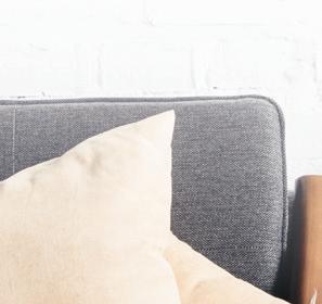

While this is a surefire way to ensure your space does not overwhelm the eye, sticking to the neutrals without dabbling in the brighter hues can often let a space fall flat. Challenge yourself to experiment with color, whether that be with standout accessories or an accent wall. A daring palette creates drama and leaves a dazzling effect on the home, and the combinations for play here are endless, with each palette creating its own distinct mood and texture.



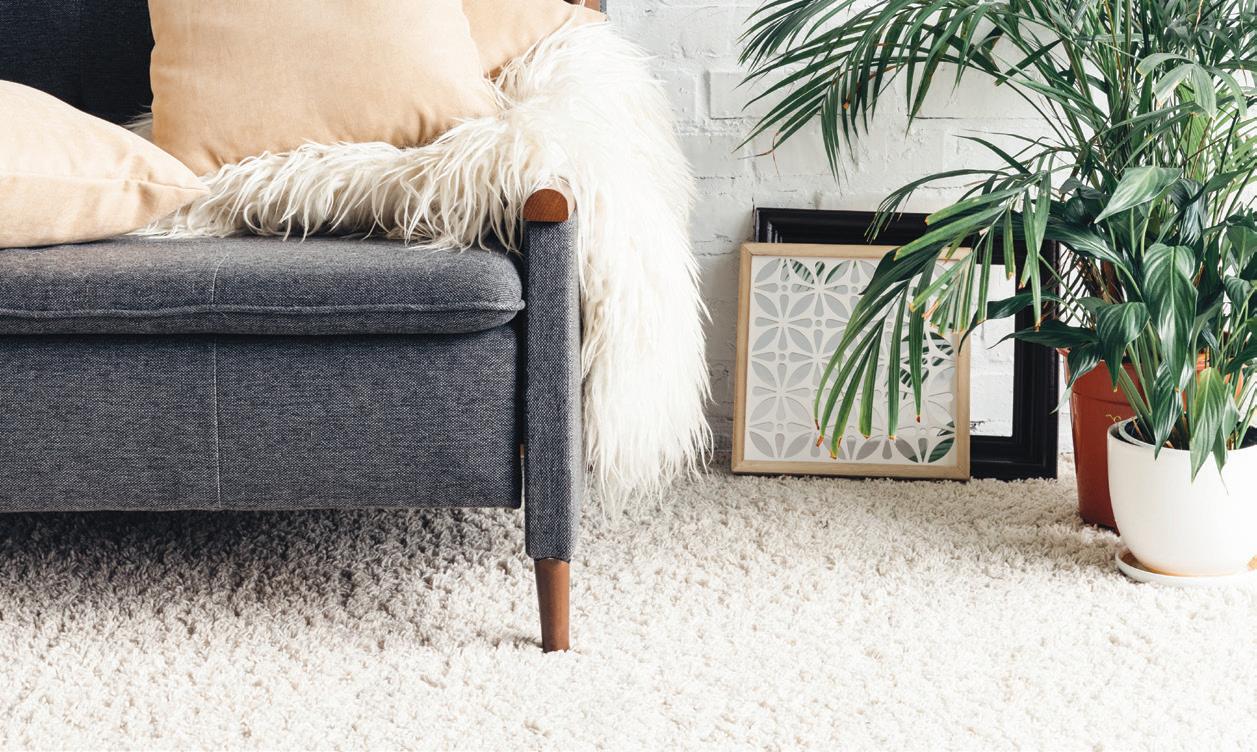
DO YOU HAVE A DESIGN DILEMMA? OR MAYBE YOU ARE JUST FEELING BOLD & READY TO BRING MORE COLOR INTO YOUR HOME, BUT UNSURE WHERE TO BEGIN? EITHER WAY, THE EXPERTS AT HIRSHFIELD’S CAN HELP! WE HAVE THE BEST PAINT COLORS IN TOWN FROM THE VERY BEST BRANDS – AND 127 YEARS OF EXPERIENCE TO HELP YOU SELECT THE PERFECT SHADE FOR YOUR HOME.

by Hirshfield’s
Premium paint in 36 curated colors designed to complement our modern furniture and decor.
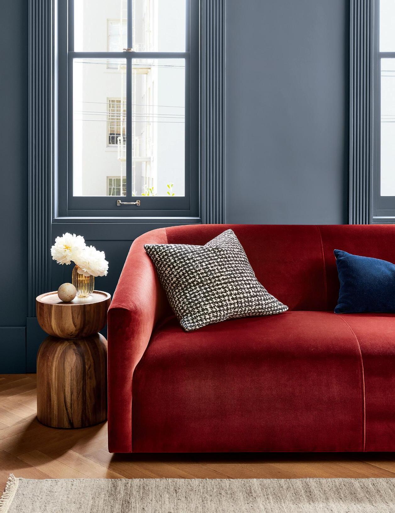
Sometimes, you see a pairing so beautiful, there’s no doubt in your mind that they were meant to be. But unlike our favorite celebrity couples, these paint pairings have some serious staying power.

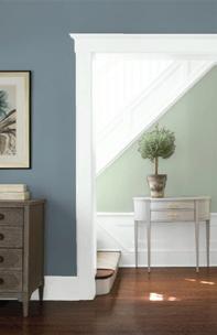

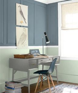
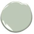

e moody depth of this stunning blue is grounding and contemplative, while the airiness of Prescott Green elevates the palette, ending a sense of restorative energy to whatever room these colors come to inhabit. Nature is always the best source of inspiration, and these combos transport us into the scenic arena of the great outdoors, creating the illusion of a lakeside landscape. is duo is perfect for an office or bedroom, inviting serenity while blocking out distractions from the outside world.


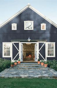
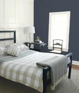

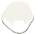
Hale Navy is one of our tried and true blues, soaring in popularity and highly versatile. We’ve seen this shade pop up everywhere from bathrooms to exteriors. e trick to utilizing this stand-out shade is paring it with the perfect accent color to complement its mesmerizing depth. White Dove is the perfect white for the job, with its cool undertone and almost chalky properties. A great palette for a dreamy bedroom, kitchen, or even an all-out exterior scheme (think shutters and a big wrap around porch!).
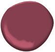

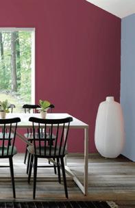
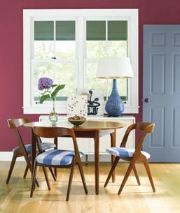

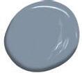
Feeling a little bit dramatic? is dynamic duo may be just the thing you’re craving. e luxurious opulence of this ruby red is perfectly balanced by the coolness of Oxford Gray, a subtle shade of blue that welcomes and soothes. e stark contrast between the two shades offers a vibrant and energetic vibe, without overwhelming the eye. is combination would be ideal for a dining room—an excellent space to experiment with bolder shades—or a living room/bar area that isn’t afraid to be a little daring.
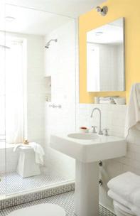
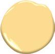

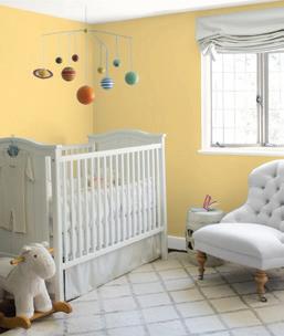
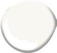

If you need to give a room a boost of sunshine, these are the right shades for the job. e warmth of this yellow boasts a burst of optimism and energy, without being too on-the-nose or in-your-face. It has a vague burnt quality to it, making it appear subtle and sophisticated. e understated and refined warmth of White Opulence perfectly complements and calms the vibrancy of the yellow, making for one beautiful pairing, perfect for a nursery, bathroom, or bolder living room look.
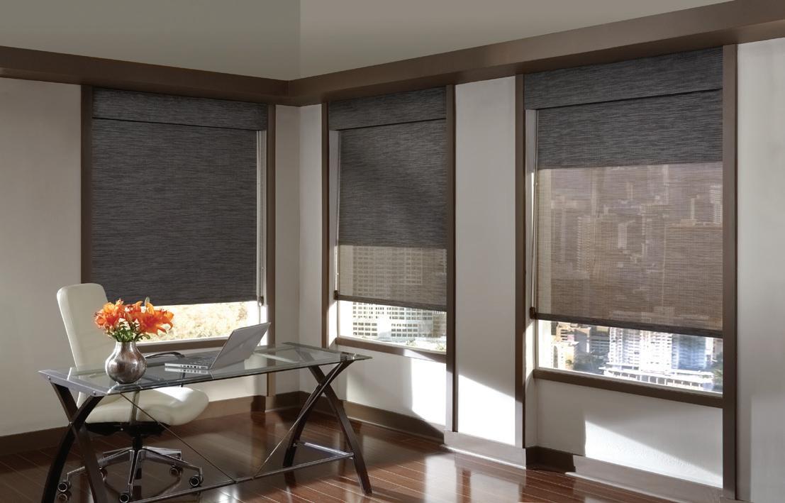
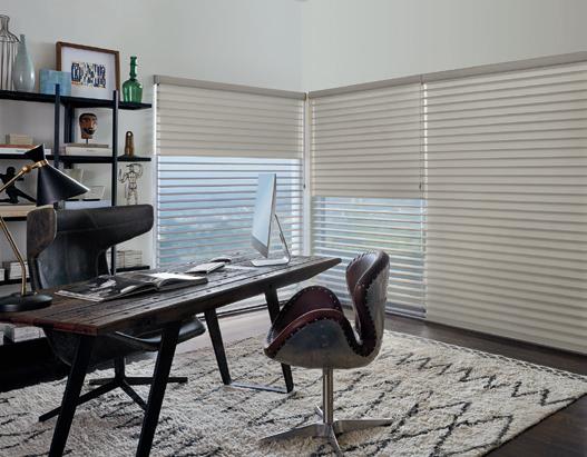
Often in situations where space is in short supply, people will automatically gravitate toward crisp whites to make a room feel more open. This is a good, tried-and-true tactic for creating the illusion of expansion, but it also leaves little room for character and personality to shine through. While a nice clean
white is never a bad idea, don’t concede too soon! There are plenty of shades in the color wheel that can have a similar effect without sacrificing the much needed punch that a bold shade can pack, or making it feel like the walls are closing in on you. A few general rules of thumb to keep in mind:
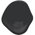
Dark colors won’t always make a room feel more compact. In fact, a darker hue can actually make a space feel bigger by drawing the eye inward. Try using a deep shade of black in your powder room—the darkness can actually be your friend, creating the perception of depth.
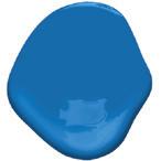
Smaller spaces can present the perfect opportunity to experiment with colors outside of your comfort zone. Because smaller spaces are usually more secluded from the rest of the home, you have more freedom to play with the atypical. Choose a brilliant blue in a bedroom to make it feel simultaneously relaxing and exciting.
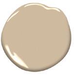
Neutrals are always a safe bet in smaller spaces, bringing warmth without overwhelming the eye. This is perfect for those that aren’t willing to settle with white and want to incorporate some color, but aren’t ready to commit to anything too bold or bright. This shade is perfect for a smaller-scale living room or sun room.
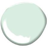
One of the most important aspects of decorating a smaller space is ensuring there is plenty of contrast. Try a lighter pastel on your walls and pair it with white décor or furniture. The de nition will help make the space feel more dynamic, while the lighter tone of the pastel will keep things from feeling too weighed down.
WHEN
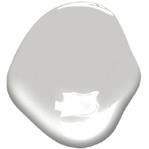
Gray is one of those timeless neutrals that never seems to go out of style. Go for one with a lighter tone and a little bit of luminosity in it. The color will uctuate slightly with the changing natural light throughout the day, keeping you on your toes. This is a great option for a high-traf c areas like a hallway or entryway.
Painting your walls and ceiling the same color give the illusion of a bigger space. Because there is nowhere for the eye to stop, the room will feel more expansive. If you’re working with a smaller space and want to choose shades that create the illusion of expansion, talk to the experts at Hirshfield’s to choose the perfect Banjamin Moore Color.










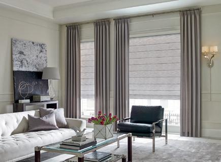
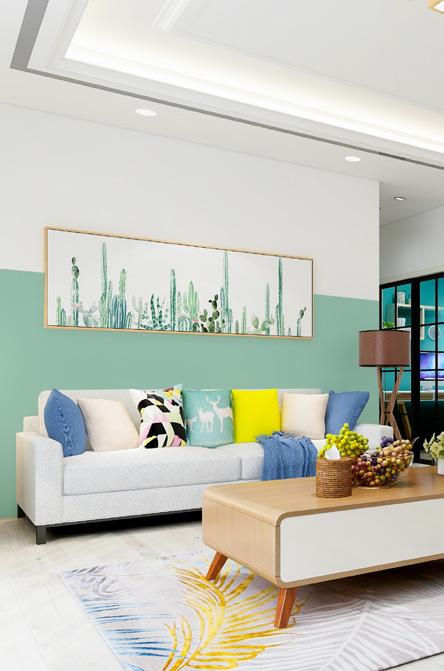
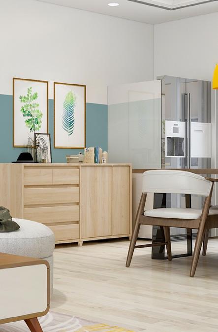
Everyone knows that paint is the easiest (and least expensive) way to make an impact on your space, but the impact can be even bolder when you employ a creative application. What better way to utilize paint in your home than by mimicking the calming scene of a sunset with a two-tone look? This approach provides an even greater opportunity to let colors play off one another, and, it creates a unique feature that instantly adds character to your home. Plus, it’s simple enough for even the DIY-shy—just follow the steps below!
01 02 03 04 05
Clean your walls with warm soapy water or TSP and a sponge to make sure you’re working with clean surfaces void of any dirt or oils.
Plan out your color combination. You’ll need two shades, one for the top of the horizon line (roughly the top quarter of the wall) and one for the other bottom three quarters.
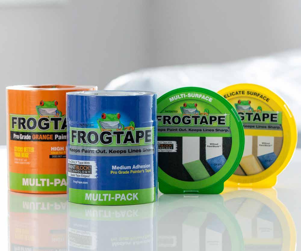
Measure starting from the ceiling and plot marks every four feet with a pencil indicating where you would like your horizon line to be. Use painters tape to mark out the line. Your tape should be below the marks (since you’ll be painting the top portion first) and don’t forget to paint any window or door frames, too!
Use a brush and/or roller to apply your top color along the perimeter and corners of your taped-off area. Using a ladder or an extension roller, continue onto ceiling as well if you’d like an all-encompassing look. Once complete, remove tape while paint is still slightly “tacky.”
Once paint has dried completely, tape off the bottom area that needs to be painted, including any baseboards or trim. Repeat painting application technique with second color. Remove tape, and voila! Enjoy your new two-toned horizon line!
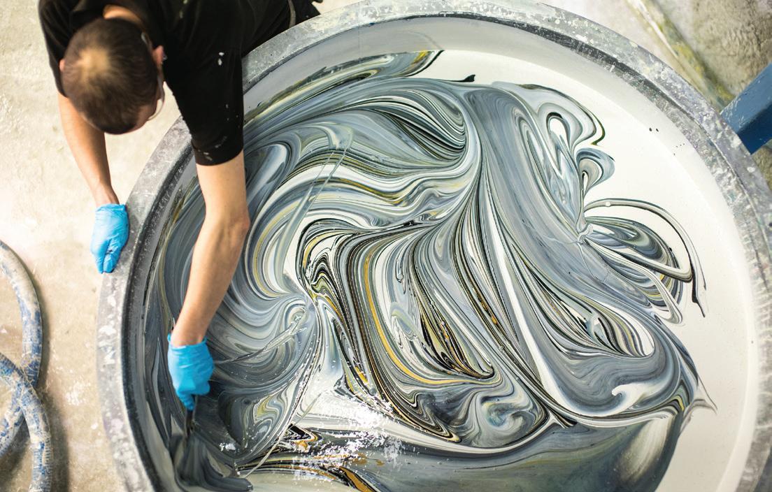
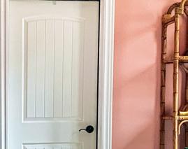
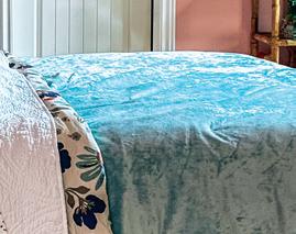







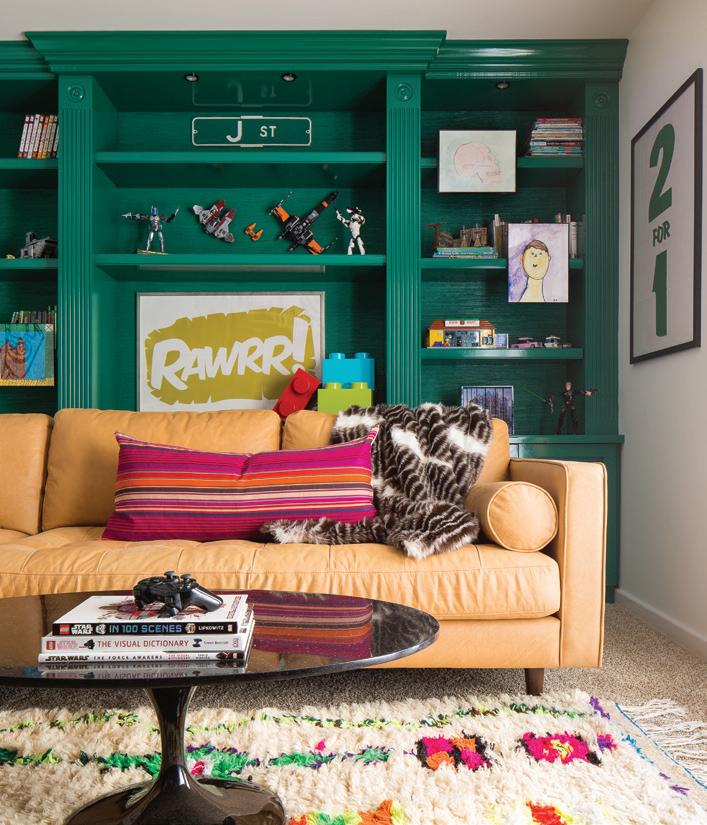
A brilliant green that packs a punch, this buoyant hue feels playful and vibrant, while still retaining the ability to play the part of a sophisticated shade under the right circumstances. Ripe with energy, it works well as a backdrop for a high-contrast sofa (as pictured here). But it can also work wonders in smaller quarters. Paint the walls and the ceiling for an enveloping effect in a powder room or office space—just make sure you tweak the lighting to accommodate!

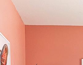
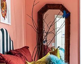
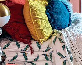
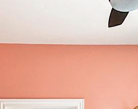
Reminiscent of a sweeping sunrise, this magnetic pink is the ideal shade to deploy when walls are wanting for a strong dose of personality. Soft enough to work alongside muted hues, but bold enough to stand out as an accent, this paint color breathes femininity and fun, all without coming across as overbearing. Pair with dreamy creams for a romantic rendering, or, create a scene brimming with optimism in harmony with turquoises and earthy yellows.



As classic as they come, this flagship shade has remained at the core of many palettes for decades. Versatile enough to operate as a neutral, but bold enough to still tell a compelling story, this deep blue deserves a feature in every home. Use it as a cabinet color to give an all-white kitchen an upgrade, or, coat shiplap for a cozycabin vibe. There simply isn’t a wrong way to work it.
An unexpected but welcomed trend in the design world is the recent resurgence of all things green. This lighter-iteration feels especially inviting, with its undeniable earthy quality and calling toward the restorative powers of nature. Dress it up with gold accents and regal fabrics, or down, with wood tones and rustic décor. Either way, you’ll end up with a stunning example of color’s calming capabilities.


























SHOP LOCALLY. SUPPORT INDEPENDENT BUSINESS.







STEP BY STEP
• Wrap each cylinder or branch of your plant with delicate painters' tape about a third of the way from the tip to the soil line.
• Paint above the tape using the brush or pour some of the paint into a container and dip the ends of your plant into the container. Allow all excess paint to drip off if using the dip method and make sure you are holding the soil into your pot when you turn your plant upside down. Wait until tacky and remove your tape then let it dry completely.
Sansevieria cylindrica
Water based paint or floral paint*
Delicate painters’ tape
Brush or container slightly wider than plant
Plastic or canvas drop cloth
*Water based paints, while not toxic, may effect the longevity of your flowers and plants. For long term results use a paint specifically formulated for fresh plants and florals.
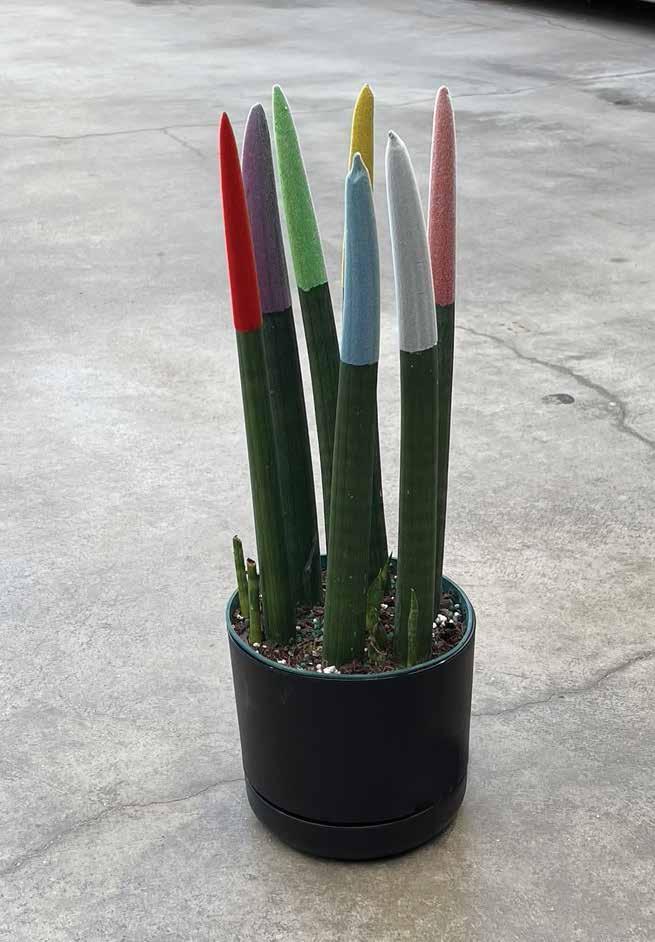
Get the party started with a speckled confetti bouquet (pictured on p. 24) or dip painted snake plant. Mums dappled with a rainbow of color are a bright, happy surprise to celebrate someone in a big way or just brighten the day. Dipping the ends of cylindrical snake plant fingers in jewel tones or pretty pastels makes for the most jovial plant and is sure to bring your curated coffee table or styled shelves next level. Place your creations prominently in the background of your next virtual meeting for an instant conversation starter!
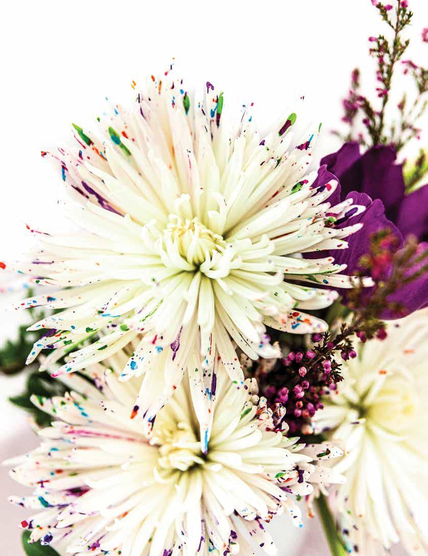
Spider mums
Water-based paint or floral paint* in a variety of colors
Small spray bottles
Plastic or canvas drop cloth
STEP BY STEP
Protect your work surface with a drop cloth – flicking paint or applying it with a spray bottle can be messy. Make sure to protect your surfaces far and wide or work outside in a suitable area.
Fill a spray bottle with water based paint watered down to a consistency that will spray out of your bottle but that isn’t so runny it will drip. You will need to experiment here based on your nozzle but try a 4:1 paint to water ratio to start.
One color at a time spray paint onto the petals of your mums. You can spray all over, just the centers, just the edges or combine the patterns.
*Water based paints, while not toxic, may effect the longevity of your flowers and plants. For long term results use a paint specifically formulated for fresh plants and florals.
• We’re your local paint store. Each of us is part of a cooperative of over 1,700 independent, family-owned paint and decorating stores.
• Since 1960 we’ve built a network of retailers who believe in the entrepreneurial spirit, community, hard work, and determination.
• By working together we’re able to thrive in an ever increasingly competitive market. Spending less time focused on the business of business and more time focused on you.
• So next time you have a painting project or need decorating expertise, shop your local ALLPRO retailer.
To find the retailer nearest you, visit our website at www.allprocorp.com/locator
Text: Carlee Baigrie
Photographer: Jessie Passon
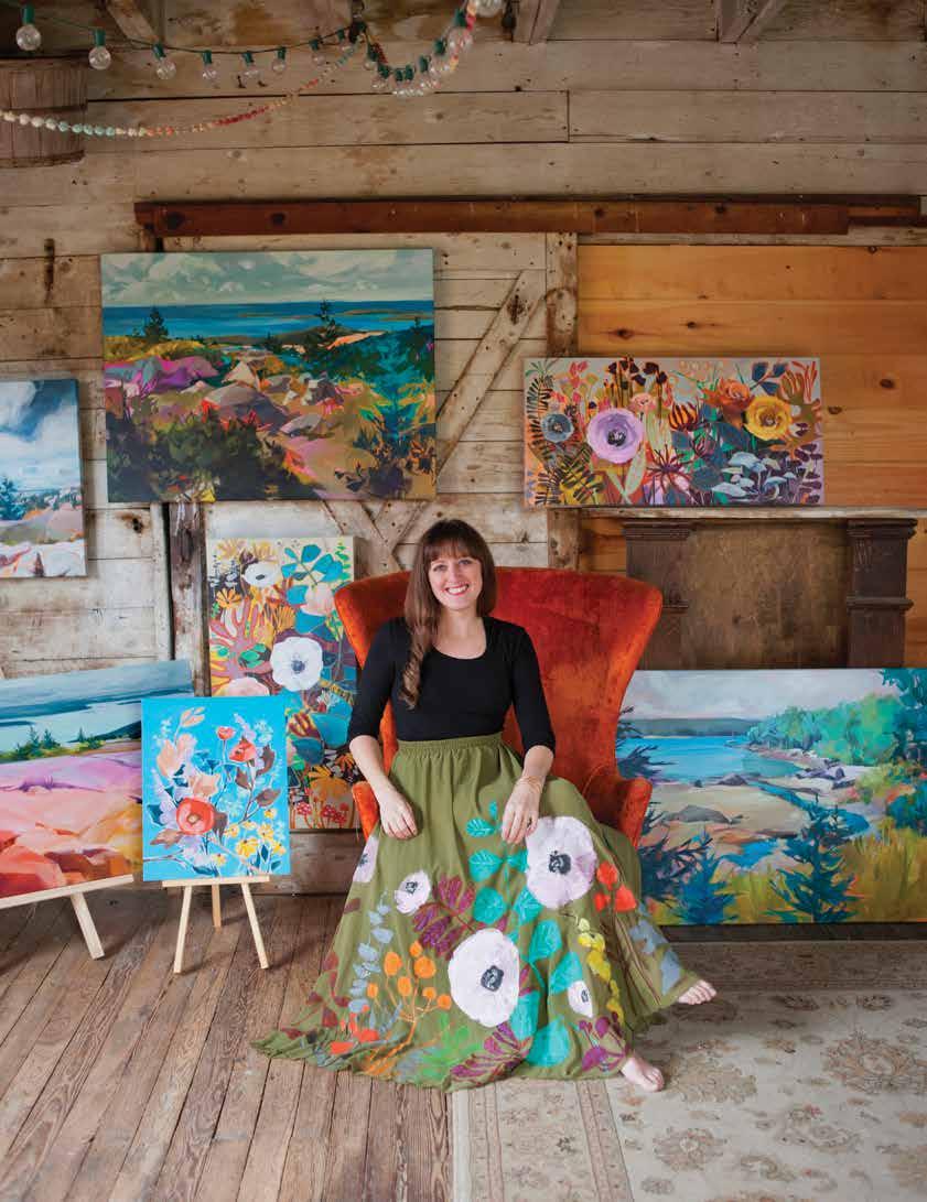
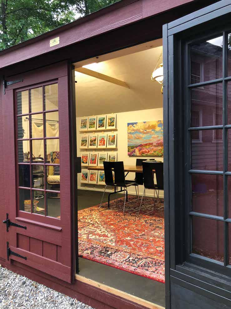
Equipped with a background in graphic design and a long lineage of creatives in her blood, painter Jess Franks is creating stunning works of art from her small studio positioned on the outskirts of her Connecticut property. After sharing her work on Instagram, she quickly became an online sensation, winning contests, selling out collections, and brokering major licensing deals with big-box retailers. We got the chance to catch up with Jess to chat all things art, the creative process, and being an entrepreneur in the digital age.
A“Art has always been part of my world,” proclaims painter Jess Franks, recalling her childhood filled with mashing up markers to create new palettes and peering over her grandmother’s shoulder as she mixed watercolors on a bright white canvas. Growing up, art was all around her—in her bloodline even. Jess had the unique privilege of being homeschooled, which allowed for a deeper exploration of the non-conventional world of making art. “In my teens, my mom and I actually owned a craft business,” explains Jess. “We made crafts together and painted things and I learned how to sell…and make not very much money,” she chuckles. “But there was no better experience to set me up in my early teens.” There was no way for Jess to know then that these preliminary explorations of art and the business around it were laying the foundation for her livelihood and her greatest passion.
Despite feeling an inherent draw toward a more artistic sensibility, Jess characterizes herself as a very pragmatic person. Seeking a practical and lucrative application for her skills and passions, Jess pursued publishing and graphic design in university, and went on to design for several magazines such as Mechanical Engineering Magazine in South Carolina and New York City. “At the time, I loved it,” explains Jess, a far cry from the usual monotony that artists feel under the reign of a 9-5 lifestyle. “Sometimes that’s frowned upon [in the art world]… as though you’re not being your authentic creative self. But you’ve got to pay the bills! It’s the same thing I say to kids who are interested in art. I say it’s awesome but make sure you learn something else along with it.” It’s an important lesson to learn, albeit one that often feels unfair to creatives. In order to have the creative freedom to follow your artist whims, you first have to have the financial freedom to allow for exploration. “I get to feel so creatively free now because [making ends meet] is not taking up all of my brain space.”
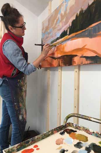
After starting a family, Jess began to focus more on freelance work which provided the flexibility she needed as a new mom. “I had a little bit of extra time and I started to think about how I would love to paint.” Some of Jess’ fondest memories as a child involved her grandmother’s art studio up in New Hampshire, where she had tried her hand at watercolors on a few occasions, but never oils, which had always been an interest. Jess’ greatgrandmother had also been an artist, although not by trade. She had painted beautiful oil paintings, one of which remains in her family, along with an old palette, which Jess keeps in her studio now as a tribute to her lineage. In recognition of her desire for a different medium of artistic expression, Jess’ husband encouraged her to take lessons from a friend. This discovery felt like an awakening for Jess, a seismic shift that brought everything else into focus: “Everything that I had been learning through my whole life seemed to all intersect into that. I started painting on the side a lot, whenever the kids were at school and whenever I wasn’t doing my graphic design work.”
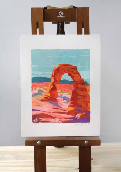
At first, Jess wasn’t keen on pursuing it as a career, it was just something that made so much sense to her. It was when she started sharing her work on Instagram that things began to really take off.
“People were just starting to see the value of Instagram for the art world at that point,” shares Jess, remembering the social media boom of 2014. “Being able to get in there at the beginning and getting feedback was great. Having an audience for the first time helped me understand a whole other side of things.” Jess used Instagram as more than just a platform to show others her work, she used it as a tool for market research. “I know art is not all about what the market wants. But at the same point, there’s this really beautiful intersection of what I like to paint and what people love to have on their walls. I don’t think those things need to be exclusive to each other. You can tell what’s resonating with potential collectors and what’s not. And that can help determine your direction.” Jess, equipped with a unique style of painting, which she describes as “the colors of impressionism with the bold graphicness
of cubism,” started gaining major traction, growing her audience as she shared her journey with her followers. “I want my work, when people see it in their feed, to stop them in their scrolling tracks,” explains Jess. “I want it to be something new that they just haven’t seen before. That’s also why I’ll explore different palettes and go into different subject matter, because that keeps my work fresh, and people can follow my exploration with me and that’s exciting for them.” With her work gaining popularity in the online world and enough money coming in from her art, her painting quickly became her priority. Jess began submitting to Minted, which garnered her even more exposure, fostering connections which have wagered big licensing deals with brands like Anthropologie. “I might have done a really big happy dance when I got that email,” admits Jess.
Jess acknowledges that even great painters can often have trouble gaining the notoriety that should accompany talent and vision. “There are always factors that you don’t have control over [when it comes to Instagram], but you do have control over the quality and uniqueness of your
The only thing better than your classic white subway tile back splash is knowing that you are supporting a company that takes their impact on the environment seriously.


work.” With this knowledge in mind, Jess prefers to focus on her creative process. Typically, Jess gains inspiration from nature, which has always held a special place in her heart. “I grew up hiking… When I’m out there I’ve always got my phone and I take reference photos as I go. My kids have just learned to walk ahead—mom will catch up!” Each collection usually deals with a sense of place, with Jess using reference photos as a jumping off point, layering in memories and other places as she fleshes out the scene. Typically, a collection will take two months to complete. “I like to work in segments,” explains Jess. “That way when I release a collection I can do all the shipping and prints at once. It’s much more efficient that way.” With logistics out of the way during her creative process, Jess feels she can really dive into her work and get into a zone. “Each painting is informing the next—every painting you’re learning something—and I like to apply that as immediately as I can before I forget it.”
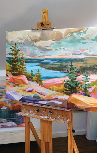
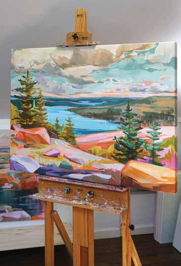
Jess’ painting style is more focused on recreating a feeling rather than staying true to her reference photos, especially in past collections. “It might be the mountains from one scene and the distant waters from another. I try to create an impression of that area without being specific to that view. It’s about how the place feels, not how it looks.” With Jess’ most recent collection, which was inspired by a three week trip to Maine, her work is more literal than past explorations, particularly in the paintings inspired by Acadia, which Jess recognized “holds a special place in so many people’s hearts.” Jess used the familiar structure of a particular view point, and then utilized unexpected colors to create a surreal image that still sparks the nostalgia of the scene. “There’s not necessarily hot pink rocks, but the rocks have a pink tone to them. So I take the tones I see and exaggerate them. So it’s a new spin on a familiar scene that’s really
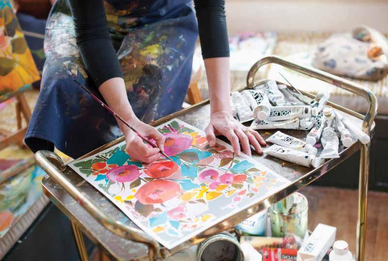
special.” Jess also employs a unique application, called sumi-e, a Japanese technique she learned about in elementary school, where “you load the brush and create an entire leaf with one brush stroke.” From there, she layers in more paint, drawing from her experience as a graphic designer. “There’s a boldness to it,” explains Jess. “With four kids, I don’t have time for pointillism, I have time to create impressions of scenes, and that’s what I love anyway. I don’t want to fill in every single detail. I want to show the feeling of a place and let your mind fill in the details.” In addition to her collections, Jess also does a limited number of commissions every year, which she feels are a crucial component of her work. “It gets me out of my head. I’ve found I’ve had some of my biggest breakthroughs in my art when I’m doing commissions. It gets you out of your creative rut.”
Although it was a long journey that led Jess to discovering and then fulfilling her passion, she has no regrets about the path she took. “What I learned interpersonally working in companies and what I learned technology-wise I use every day in my business. I’m a planner to begin with but having the practice allows me to be able to manage a full business from start to finish. It’s crazy how all that experience wove in to the point where I’m not hiring out a ton of stuff. “ Self-sufficient and brimming with “more ideas than time,” Jess feels optimistic about where her art will take her in the future. “I’m always most excited about the next thing I’m going to paint. There’s this urgency to paint as many pieces as I can. When I was younger, I didn’t have that drive. I didn’t think I could paint all day. And now, it’s all I could ever hope for.”
You can view more of Jess Franks’ artwork and learn how to purchase one of her stunning pieces at jessfranksart.com
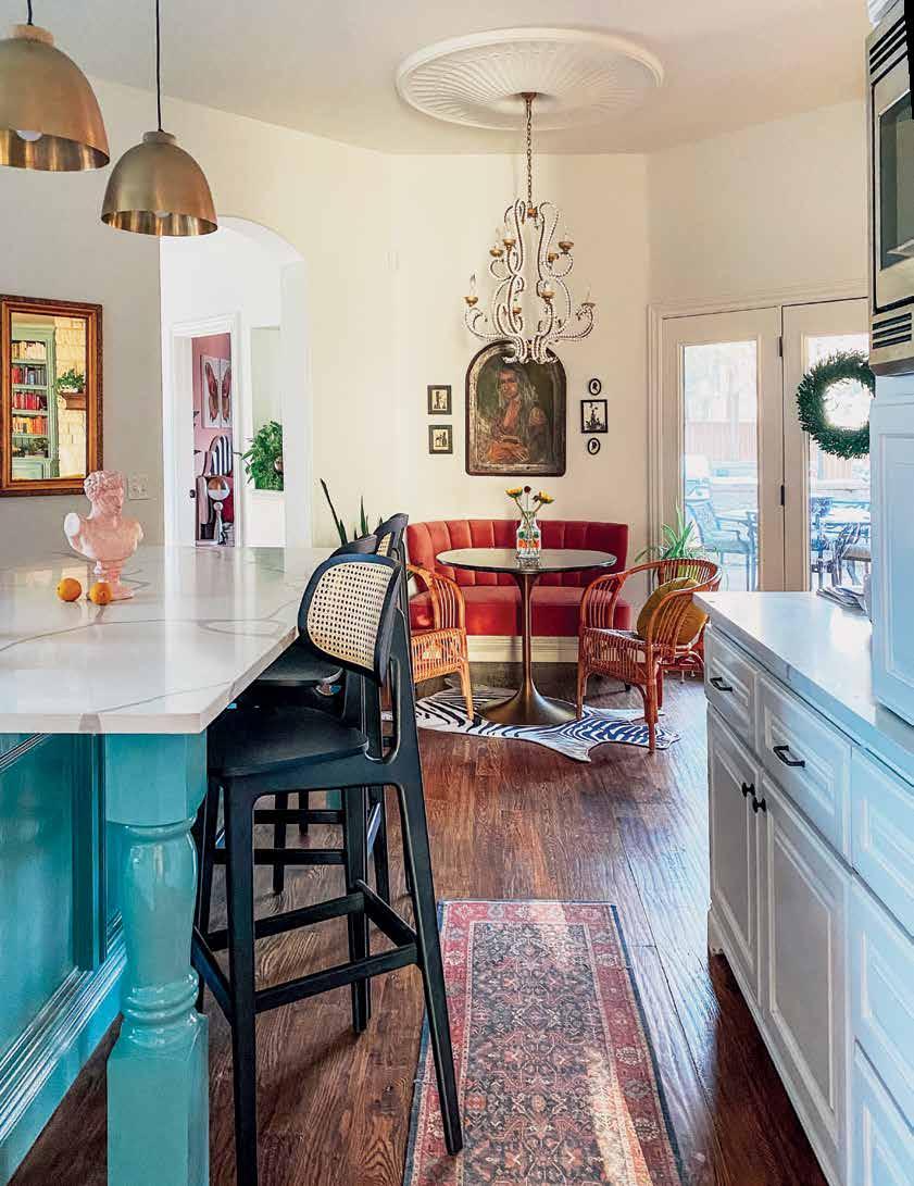
When stay-at-home Mom Sarisa Shaw Munoz started snapping images of her bohemian-inspired interiors and sharing them on her Instagram page, @the_indigo_leopard_home, she couldn’t have possibly imagined the attention she would garner. What started out as a creative outlet soon transformed into a cult following of 64,000 and counting. We caught up with the social media influencer and self-taught designer to discuss her most recent project: a complete redesign of her Oklahoma City home.
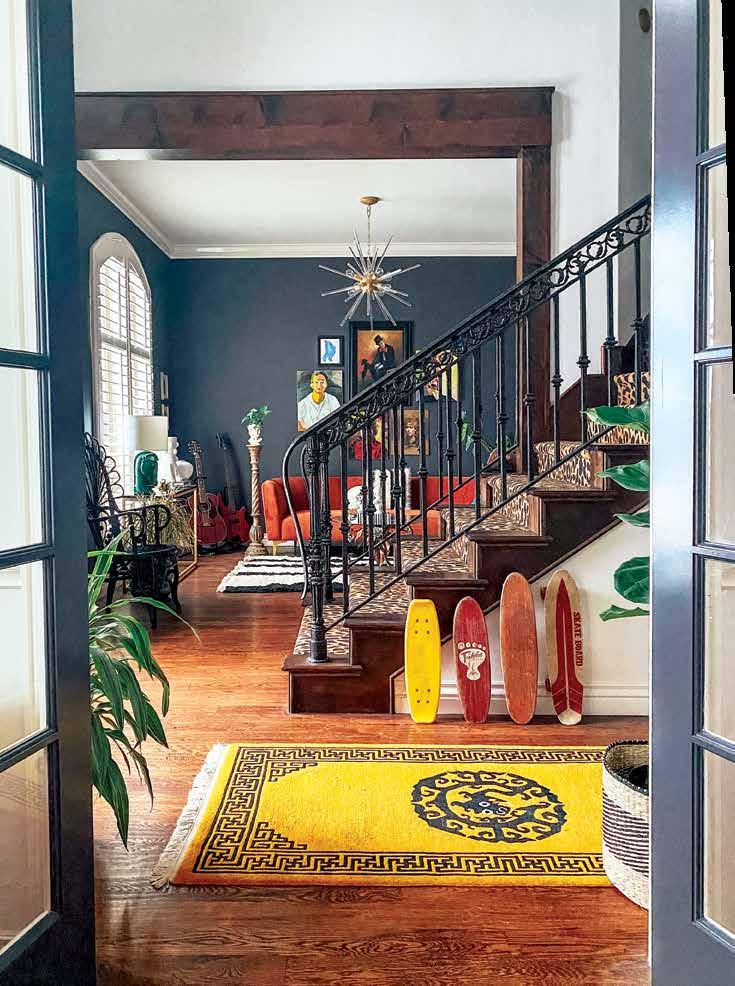
With no shortage of color and a wilderness of texture, maximalism looks good on
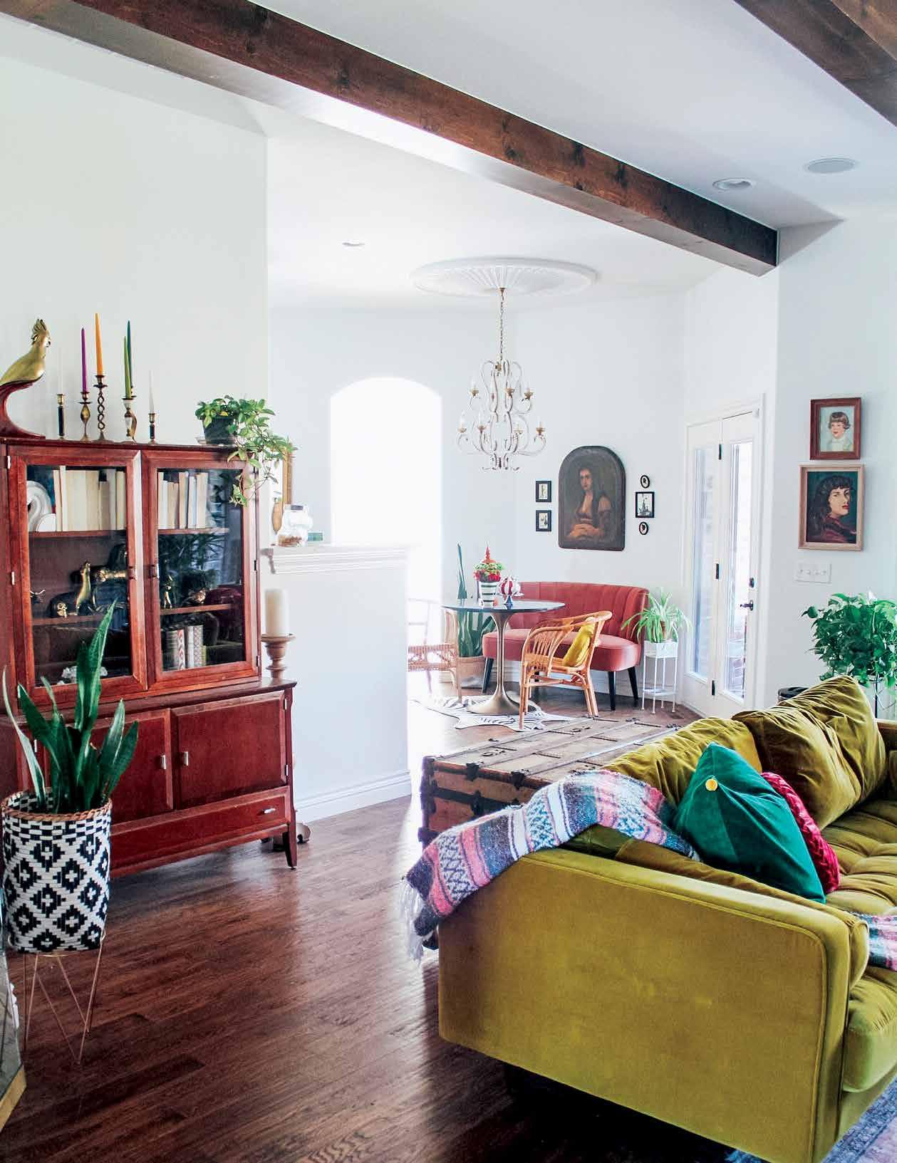
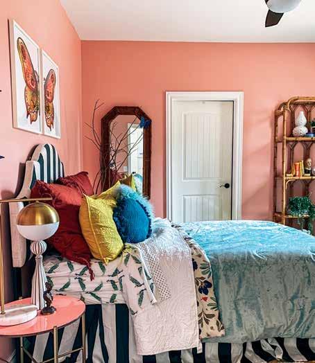
Sarisa Shaw Munoz made her first Instagram post on December 11th, 2018: a simple shot of her cozy Texan bedroom, effortlessly undone and exploding with texture, warm hues, and other bohemian staples. This post generated over 1,000 likes within weeks, demonstrating the power of social media and the interior design community it hosts in connecting audiences to great content. From there, Sarisa continued sharing images of her colorful tastes, always brimming with optimism—her following couldn’t get enough. By the time she and her husband decided to move across state lines to Oklahoma City in August of 2020, she had built up the confidence to completely redesign their generously sized home in a matter of months. It didn’t matter that Sarisa couldn’t be there to supervise construction herself, or that they purchased the home sight unseen thanks to a highly competitive seller’s market and a global pandemic making even domestic travel a major hurdle. She had faith in her new home’s potential, her vision, and the binder which contained it.
Layers of fabric, finishes, and color mix to make magic. And who doesn't have a sweet spot for a pink bedroom?!
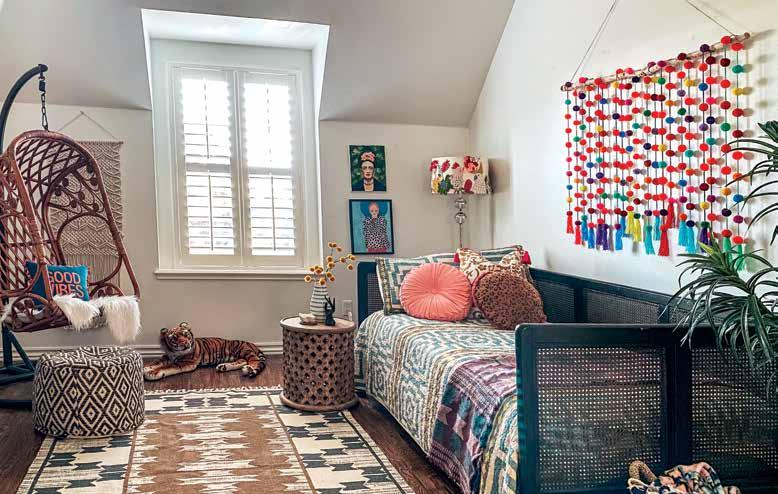
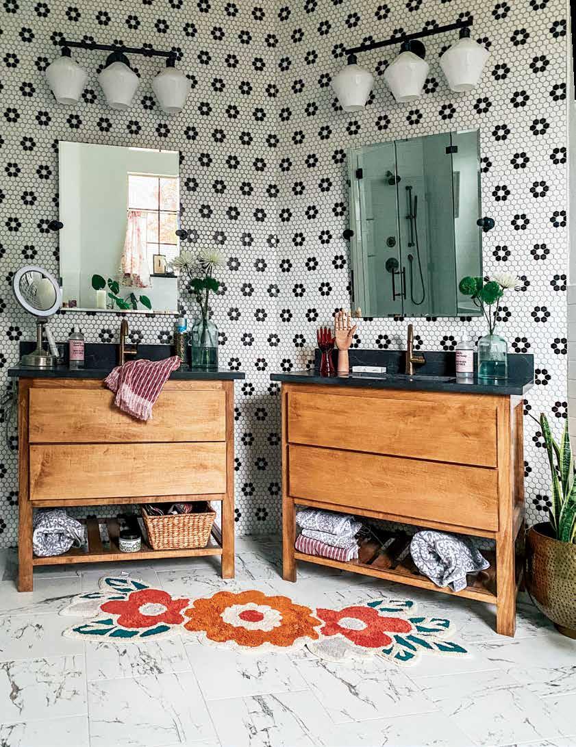
has a place even in a jungle.
You read that correctly. In lieu of her presence on sight, Sarisa assembled a binder filled with laminated pages that outlined her plans for each room: “Pictures, paint colors, every single detail so that nothing would be left to question.”
It wasn’t necessarily that the home had any tremendous flaws that needed to be overcome—it was just plagued by the overwhelming beige-ness that often accompanies homes constructed in its era (2012). The lack of color simply would not do for the self-taught designer. “We changed up the elements so it was more our style,” explains Sarisa, modestly, underplaying the magnitude of her undertaking considerably. Exploding with color and pattern without ever overwhelming the eye or losing touch with the wider context of the home, one wonders how Sarisa has managed to pack in so much personality without feeling too claustrophobic. Her short answer: “I don’t know!” Thankfully, she elaborates: “I just play a lot. Not everything I put together the first time works. I have to tweak a lot of stuff. Come back to it, redo it.” In terms of color, although there is no shortage of it throughout the home, Sarisa takes a more strategic approach: “I try to keep most of the walls white. A lot of people say that’s boring, but the white helps the [other] color come through. I do have some crazier rooms, but the majority of the house is white, and I did that on purpose so the colors would pop.”
A lot of the home’s charm comes from its eclectic personality, generated by Sarisa’s love for vintage, antiques, and all things animal print. “I’m just really inspired by funky elements,” shares Sharisa. Growing up, she was often dragged begrudgingly to flea markets and garage sales hunting for treasures with her mother, something she didn’t learn to love until later in life when she began decorating her own spaces. “I go antique shopping, I scour Facebook marketplace quite a bit, I’m always thrifting and looking for unique art. It’s whatever I come across. I make it work in the space somewhere.” Now, her home is filled with pieces from past lives, packed with stories, some known, some untold. Especially since gaining recognition online. Sarisa speaks fondly about her collaborations and the brands she’s interacted with on the photo-sharing app. It’s opened a whole other door for her collection. The painting mounted to her vent
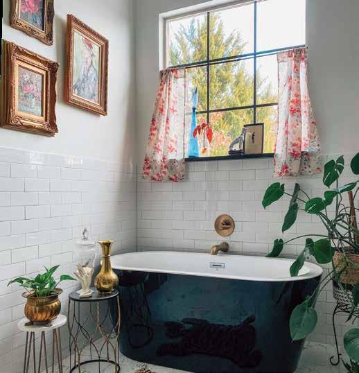
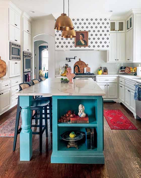
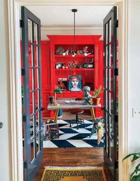
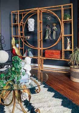
hood, for example, was sent to her by a company called Curated Home Décor: “I named her Eleanor, she is actually from the 1800s, a very old, very fragile oil painting. I’m sure she has a very interesting story to tell.
But I don’t know about it. And now I get to showcase her.” Sometimes with art, as with design, the unspoken or unknowable elements are the ones that prove to be most intriguing.
For Sarisa, the most exhilarating aspect of her rise to Instagramstardom has been the community that has embraced her and her work.
“That’s the constant inspiration for me. Just to see how people are relating, not just to the way that I decorate, but also just my captions or what I’m doing that day. Connecting with people.” A true case study in the power technology holds to bring us together, find common ground, and cheer one another on. As for what’s next for Saris and the Leopard Indigo Home, she hasn’t quite tackled everything on her to do list. A few wallpaper projects are in the works, as well as the daily maintenance of ensuring her home reflects her everevolving style. One thing is certain: we’ll be following along!

Design: Lauren Svenstrup, Studio Sven
Text: Carlee Baigrie
Photography: Jacob Hand Photography
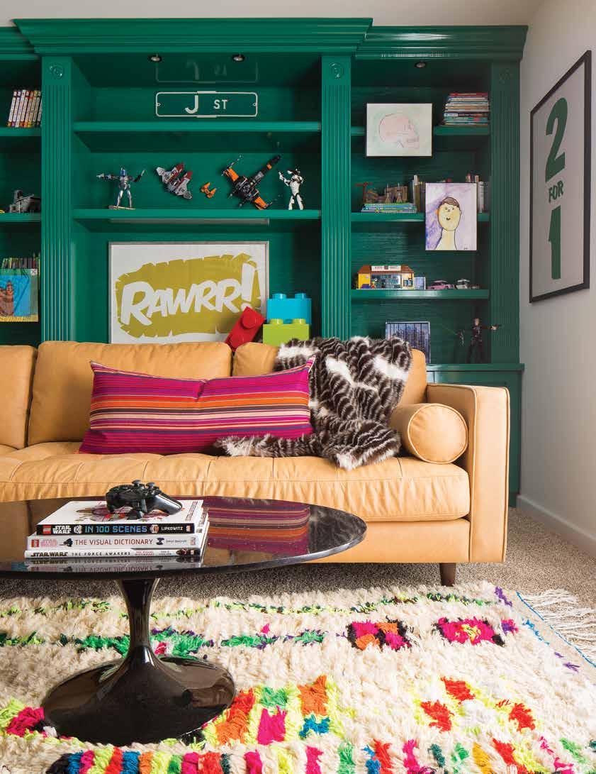
Lauren Svenstrup of Studio Sven has a reputation for boldness. Featured previously in our Fall 2020 issue of At Home for her work on “The Bucktown Beauty,” Lauren takes a fearless approach to color and design that is rare in an era obsessed with neutrals. But at the time of this project, completed shortly after Lauren had branched out to start her own design firm, she was just establishing herself as a rockstar in the design world. We’re taking a look back at one of her flagship projects, titled “Emerald City”: a colorful abode with playful character and eclectic charm.
to the world of interiors, although in retrospect, she feels there had been signs directing her there since childhood. “I was constantly redecorating my bedroom and coming up with interesting solutions as to how I could do that on my own without my parents fully funding it. So I would convince them that I could buy used furniture and paint all over it, or one time they bought me plywood and I learned how to use a jigsaw and cut out my own headboard.” Aware of her proclivity for design but unclear on the right medium, she sought out programs relating to furniture design, even enrolling in one in Northern Michigan. She eventually switched majors to “Human Centered Design,” which Lauren credits her competitive advantage in her current field to. “It was a little more conceptual. All about how humans interact with the spaces around them, products around them, their environment. It wasn’t necessarily interior design, but it sent me into that world.” From there, she went on to intern at an aunt’s interior design firm, which focused on designing commercial multifamily units. A few years of work and a recession later, Lauren moved to Chicago in search of more work, and was greeted with a job offer: Design Director at a high-end residential firm. “I realized I could take my skillset and my passion for design, and I could combine the two in a more impactful way—in a more immediate way—by working with actual homeowners. Really studying them and getting to know them, what their daily struggles are, what their aspirations are. It was like ‘wow, this is exactly where I need to be.’”
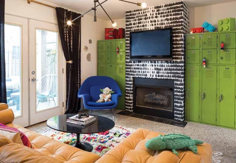
Lauren eventually struck out on her own, recognizing the unique advantages her background had imbued in her and eager to take young designers under her wing and teach them a similar approach. “As my business grows and I hire more and more employees,” explains Lauren, “I’ve realized that I truly love teaching. All the people I’m hiring have a more curated education. But they don’t look at things the same way that I do. Anytime I’m onboarding a new employee, the first step is always aligning the mindset.” For Lauren, the decorating aspect of design is the easy part. “I can make your home look beautiful. But we need to make it function for you. We’re designing a lifestyle. Your kids throw all their things on the floor as soon as they walk in the door? How do we curb this? We need to give them better storage. We need to lift their routines and habits upside down and teach them a new way. It’s aligning mindsets with clients when we start a new project. But in that, I have to teach that mindset to my clients so that when they’re executing a project they can try to think about things the way that I approach them. It’s not only asking them what they want, but teaching them how to get there.” Lauren took this same approach to designing “Emerald City,” slowly unravelling the fabric of her client’s day-to-day to ensure she could achieve optimal functionality. The only hitch? A massive vintage lunchbox collection that needed to be on display in relatively tight dimensions. “Immediately I was like, ‘what on earth?!’” But Lauren took on the challenge with delight, working backwards to curate a spectacle of color and pattern that worked with the unique request. “I had
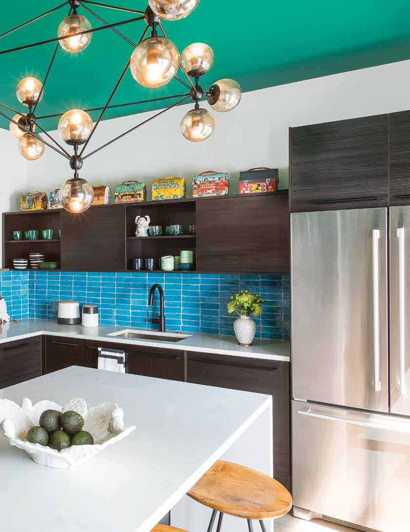
her pull the collection out of storage and looked at the colors. Right away I knew this wasn’t going to be a white kitchen.” But boring was never really in the cards for the Studio Sven client, who Lauren describes as “one of the funniest women [she’s] ever met.” A celebrated copywriter and single mother living in one of Chicago’s coveted townhouses, Lauren’s client had her own way of walking on the wild side.
Initially, the scope of the project was limited to the kitchen, which, Lauren agreed, needed some TLC. What she didn’t quite have a grasp on was how she would build an entire design concept around such a diverse and oneof-kind compilation of objects. Things began to come into focus as Lauren got to know her client better and discovered that the art of collecting was something passed down from
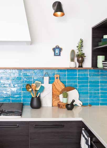
Daring in its depth, this moody green shade was one of the last details finalized in Lauren's design.
her mother. The quick-witted single mom was undergoing a life transition (a state that often coincides with interior projects, as Lauren points out) and was finally ready, after owning the home for over a decade, to make it her own. A part of that meant making space for the things she had long cherished, but never had the chance to highlight; it meant creating opportunities for her vibrant personality to shine through. Thankfully, these vintage lunchboxes proved to be a welcomed dose of character, a focal point to draw out from when the client inevitably opted to extend the scope of the project to encompass the entire first floor.
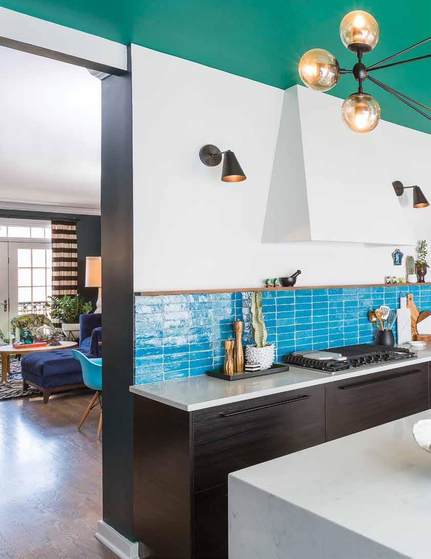
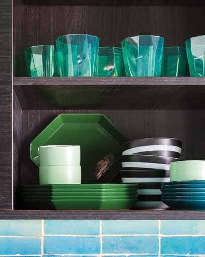
Lauren carefully constructed a color palette that would complement rather than compete with the graphic and colorful collection, opting for neutral white walls and a turquoise ceramic backsplash with a distressed finish. Working backwards and within the somewhat limiting parameters of IKEA cabinetry, Studio Sven needed to get creative in their approach, building shadow boxes atop a full wall of functional storage to make the display of vintage lunchboxes feel intentional. “How we bring this all together was that punch of color in the ceiling,” explains the designer, illustrating the ways in which she intuitively thinks outside the box. Once the kitchen design was done, the challenge laid in translating the same energy into the rest of the home. “We truly brought her personality in. It wasn’t overly curated. We started in this wild place in the kitchen. Where do you go from there? You really have to stay at that level to make it all make sense.”
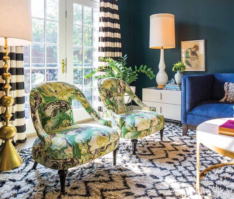
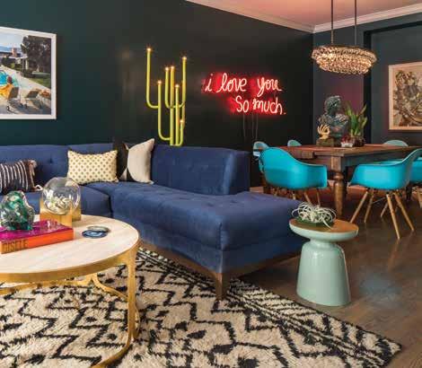
Studio Sven opted for a dark green on the living room walls, a shade she avoided finalizing until the other elements were confirmed. “We’ll start with that concept, but I’m not going to tell the actual color until we’ve finetuned everything else. Even the finish. [Paint is] the last detail for me. It’s where we start the design, but it’s also where we finish so we can tweak it as we go.” Elaborating, Lauren explained how a sofa might only have four shades to select from, or even twenty, but with paint, there are infinite iterations of every color category—it’s better to leave that ability to find the optimal shade until the last moment. Part of the reason for her adventurous approach to color, particularly in her early days where she was working with more constrained budgets, was a decision of tact. “Paint is the easiest most affordable way to fill a space and not have to overfill it. When you paint the walls a deeper tone or color in general, you have to do a lot less to make it feel like a finished and full design.”
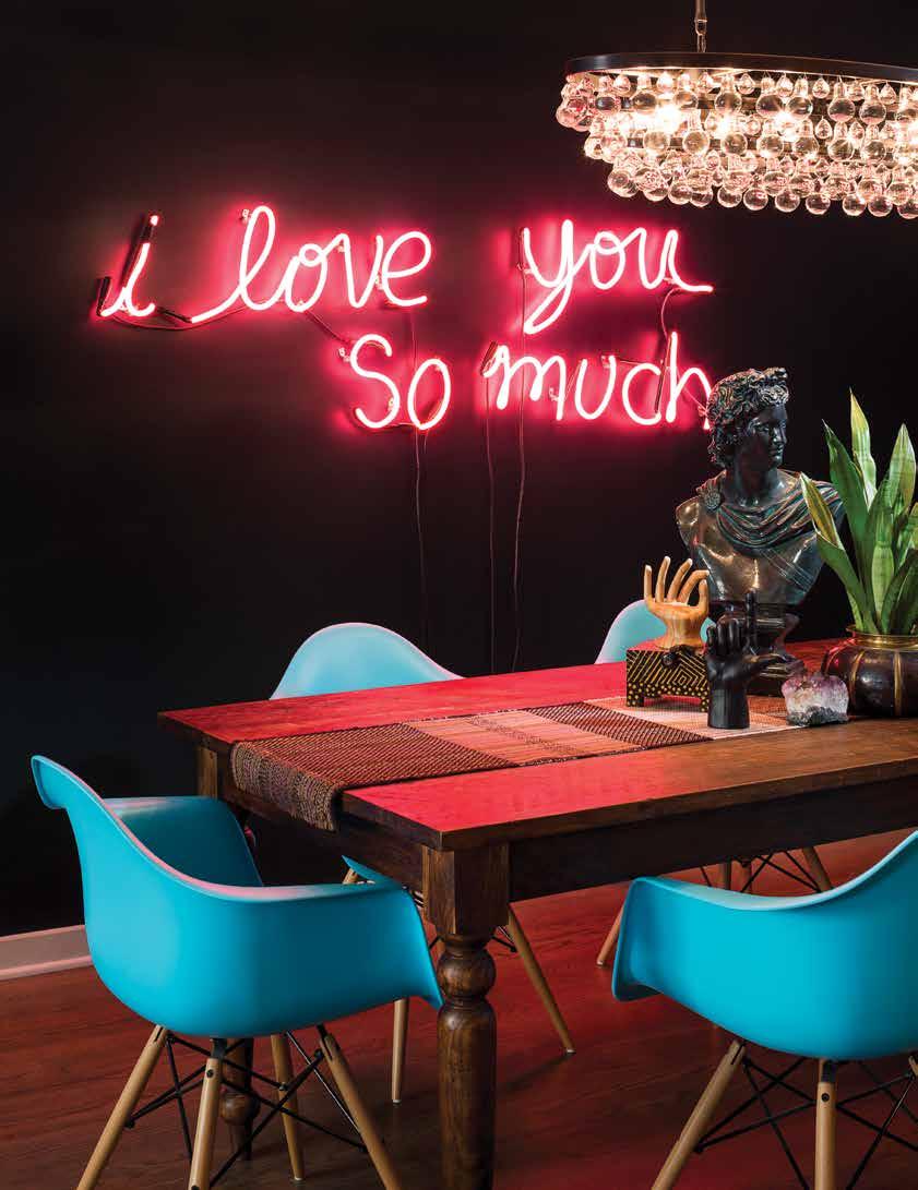
The black and white drapes featured in the living room pre-existed Lauren’s involvement, but she took it upon herself to craft an intentional design around them, bringing in a softer rug to anchor the space, extending the black and white theme and creating consistency and cohesion. Beyond the home’s rich color play, the townhouse is also stacked with other sentimental details that help to showcase the client’s unique style, telling a compelling story about her experiences and life. Up the staircase, for example, you’ll find a gallery wall, with frames containing her son’s artwork. Additionally, the graphic prints featured in the basement are actually her own work from a poster company she created years ago. And in the living room, a custom made neon sign, a homage to the words she speaks to her son every night before bed. Each intricate detail is a celebration of life, and a true collaboration of Lauren’s skillset and her client’s taste. Although Lauren acknowledges that her style has evolved over the years since this project, it still stands as a shining example of her capabilities as a designer, and further, confirmation that it is, indeed, exactly where she is supposed to be. But more importantly, it provides a solid foundation for her client to build on her collections, whether it be vintage lunchboxes, traditions, or memories.
Top: Open shelving allows table wares to act as an extension of the room's palette.


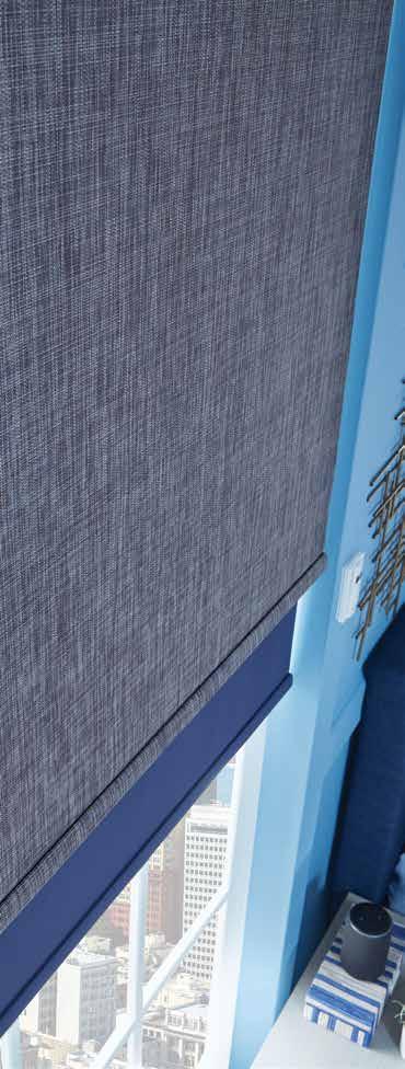
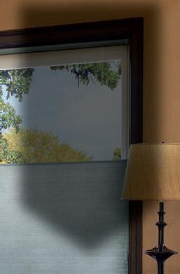
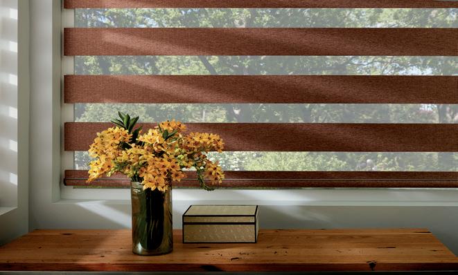
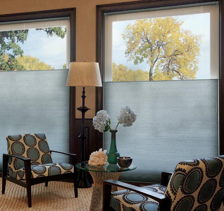
www.graberblinds.com
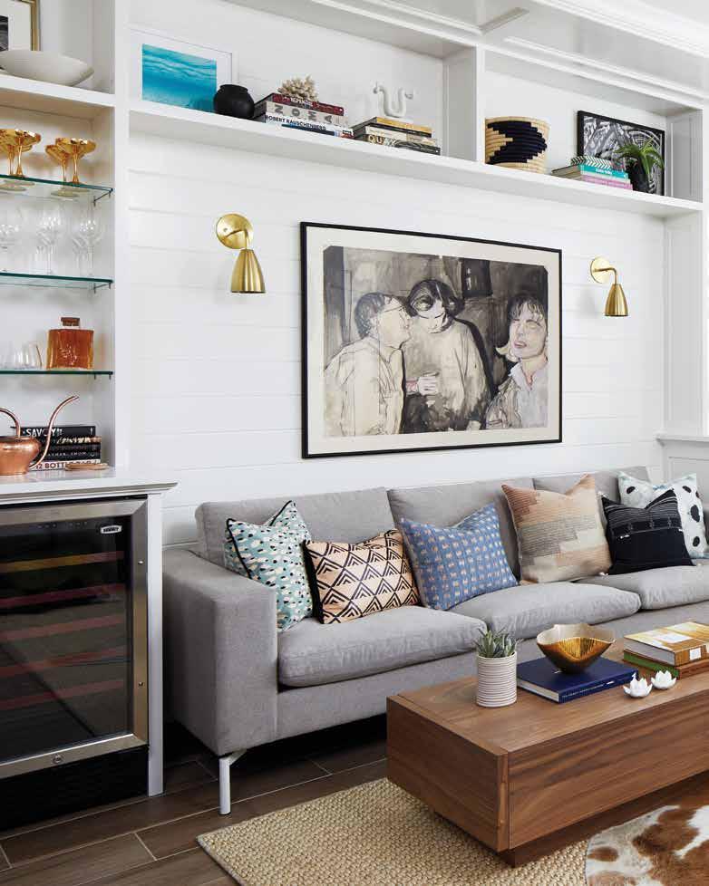
Design: Nancy Harper, Studio Miel
Text: Carlee Baigrie
Photography: Stacy Zarin Goldberg
A busy professional’s condo gets a facelift with the help of Studio Miel’s Nancy Harper and inspiration from a favorite childhood cabin.
The life of a jet-setter is a glamorous one in theory: business meetings at fancy hotels, room service, and all the travel pictures your Instagram grid could hope for. But for many, the best part of travelling comes after you’ve pulled your suitcase past the threshold of your front door and finally breathe that sigh of relief: you’re home. This feeling of ease, however, is only present at homecoming if you love the space you live in, and for one Facebook employee used to travelling nearly 300 days a year who was looking to give her passport a break, that just wasn’t the case. The young professional enlisted the help of Studio Miel’s Nancy Harper to transform her dimly lit condo into a place she would be relieved to come home to—a place that would reflect her rustic roots, unique personality, and worldly influences.
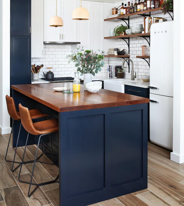
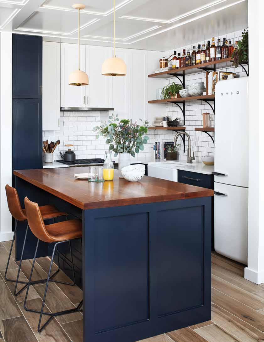
Nancy Harper, a self-taught designer who got her start selling restored vintage furniture on Etsy with friends from college, prefers to get in on a project from the ground floor. “I very much believe that more heads at the table are better for the final product,” explains Nancy. “When we can be involved early that means that we can work alongside the architect to come up with ideas and really create a space that represents our client and her needs. If we’ve got furniture or floorplan ideas, the architect only benefits from having that mapped out already. It’s just a more streamlined process.” It’s very much a collaborative process for Studio Miel, one in which the client’s tastes and lifestyle needs are considered as paramount. For instance, she really wanted to have a functional bar somewhere in the space, but the kitchen just didn’t have the necessary room. Nancy worked with the architect and general contractor to extend a wall unit into the living room and position the bar there, designating a shift in zones by utilizing different knobs. Another hurdle this team had to overcome was the issue of space. As a two-bedroom unit, they needed to take some extra measures to create a feeling of openness. By selecting neutral tones and a crisp white for the wall color, they were able to maintain an illusion of expansion. Nancy didn’t want to avoid color altogether, though. She went with a dark shade for the kitchen cabinets and island, a nearly black blue that really anchors the space. To prevent things from being imbalanced, Nancy decided to stick with the wall color on a few of the upper cabinets, allowing them to recede into the wall. “You always want to make sure there’s color and contrast!”
Nancy knew going in that her client wanted a space she could entertain in, a space that looked beautiful but felt comfortable. But in terms of aesthetics, Nancy found herself digging a little deeper to find inspiration. “We were showing her a lot of imagery and asking her a lot of questions about what she wanted from the space,” reflects Nancy. “We talked about places that made her feel happy and where she really felt at home, and she called a cabin in Wisconsin where she grew up to mind.” Harper decided to use this as a jumping off point, understanding that she would have to take some steps to modernize the feel to ensure it made sense in the context of an urban environment. Rather than try to replicate anything from the childhood home, Nancy set out to “take elements from that cabin idea and incorporate it into the design through materials or specific furniture and accents.” Most notably, perhaps, with the white SMEG fridge, which connotes all the nostalgia of
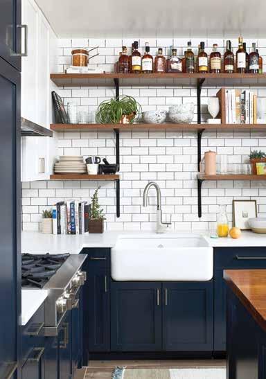
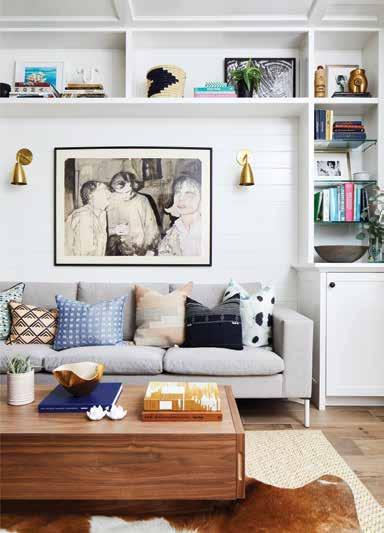
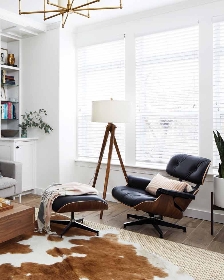
the 70s without feeling off-trend for 2021. “It really gives so much character. I really felt like it was the perfect touch.” Nancy opted to focus on choosing materials that spoke to a cabin-feel, like the shiplap detailing on the kitchen island and backdropping the wall unit in the living room, or the white subway tile backsplash and industrial-style shelving in the kitchen. The farmhouse sink calls out to country life while shaker-style cabinets scream of the simplicity of life off the grid. A layered cowhide rug in the living room also lends itself well to a rural sensibility.
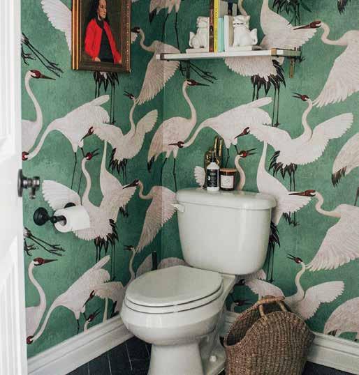
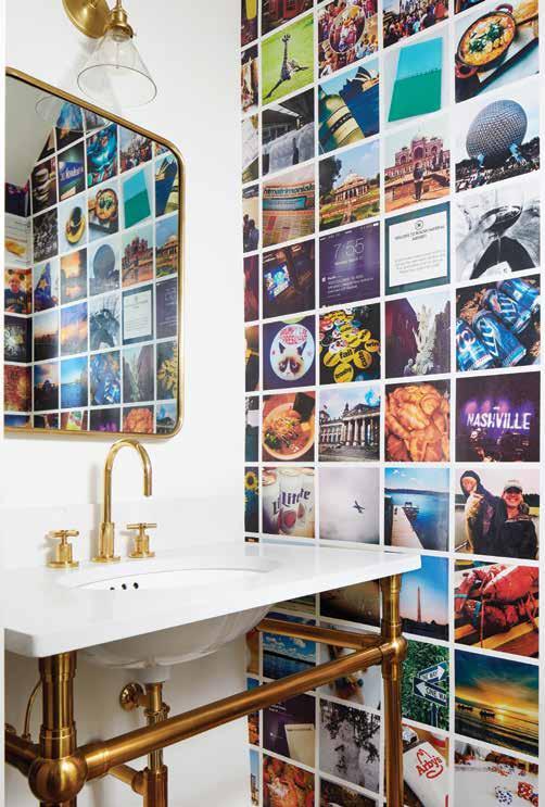
The key challenge, then, came with trying to balance that rustic feel with a more modern style. Nancy was sure to choose pieces that would meld well with the cabin aesthetic and simultaneously elevate and modernize the space through detail. This is demonstrated best in the powder room, a powerful punch of personality and color. As a Facebook employee (and consequently an Instagram employee), she had a wealth of imagery available on her feed, something Studio Miel looked to for inspiration when determining the vision for the space. Nancy’s colleague, Tamara, felt those images represented the perfect opportunity to bring more of the client’s personality into the space. They were able to track down an Australian company that would create a custom wallpaper from submitted images. “Each photo was hand-picked by [the client] and by us. We would spend hours re-arranging until we found the right layout.” The result is a homage to experience. Because this fun quirk appears in a relatively secluded area of the home, it prevents things from getting too busy, while still delivering that kitschy sentimentality often relegated to cabins.
On closer observation though, the home is filled with touches that speak to the owner and her experiences, little nods to different parts of her life. The antlers hung above the staircase belonged to a deer that the client had shot herself in her time living in Wisconsin. Her carefully curated collection of whiskey bottles purchased from her travels is displayed on the kitchen shelves, rather than her bar, as an ode to her jet-setting days. It was important for Nancy to develop a design that both felt meaningful and looked beautiful. A welcomed reprieve from the busy-ness of professional life and a solid foundation to build new memories upon and cherish old ones.
Top: Custom wallpaper draws inspiration from the client's own Instagram feed. The powder room provided the perfect opportunity to try something out of the box.
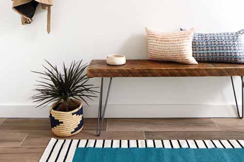
Bottom: A simple entryway scene: a streamlined bench doubles as a catch-all for incoming jackets and bags, or, extra seating for entertaining.






















|
|
A historic Milton, Massachusetts home gets a refreshing aesthetic upgrade to keep up with a young family.
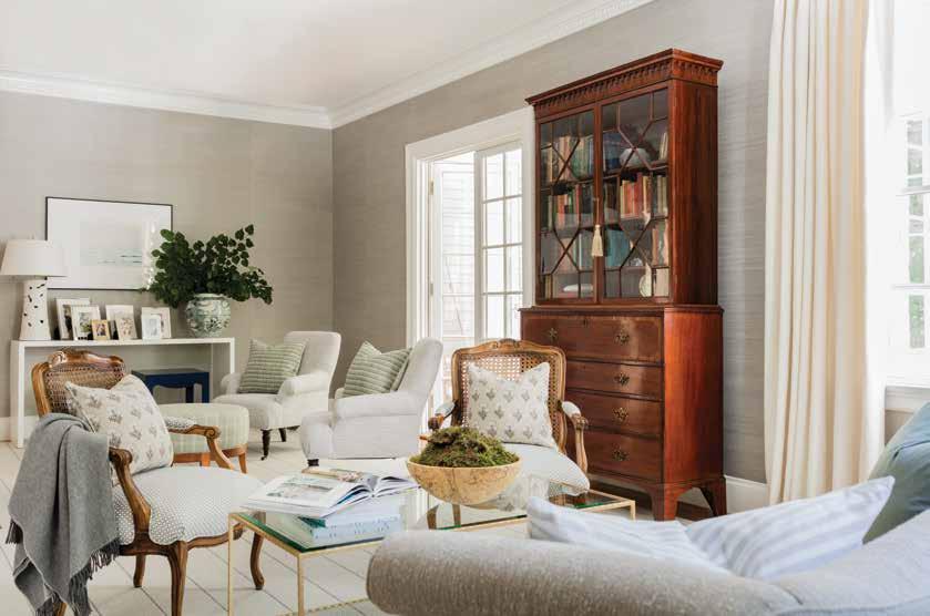
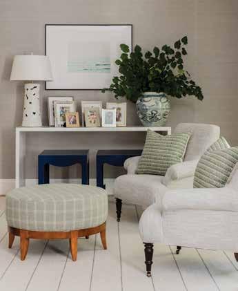
When a young family purchased a beautiful but dated historic home in the suburbs of Boston, they knew they needed to bring in a little help to make the home—which featured great bones, but lacked in modern conveniences and conventional style—their own. A New England native herself, Jill Goldberg, was the perfect woman for the job. Growing up, Jill had a mother with an eye for design, and she recalled driving around at night with her, looking in from the car at interiors through lit up windows, discussing the décor choices of nameless neighbors, never imagining she would one day be making those selections for a living. After attending college in LA with dreams of becoming an actress, Jill found she couldn’t fight her calling any longer. She went back to school for interior design and, after completing her degree, moved back to Boston and eventually started her own firm. Rather than networking at parties and gaining clients that way, she utilized her furniture and décor shop as her calling card to solicit clients. “I felt like it was more visual. You can be as charming as you want at a party, but if you can’t bring the goods, why should they hire you?” comments Jill. “You’re able to flex your muscles a little bit that way.” After opening her doors in 2006, Jill’s been busy ever since with both the retail business and her design projects, helping to create beautiful spaces for clients all over Boston.
With this particular project, the clients were looking for a classic feel that still delivered unexpected style moments. “[The client] loved traditional mixed with a little bit of hip.” “The home was already beautiful,” relays Hill, “but not
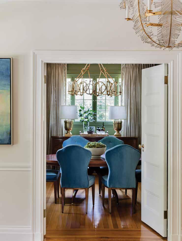
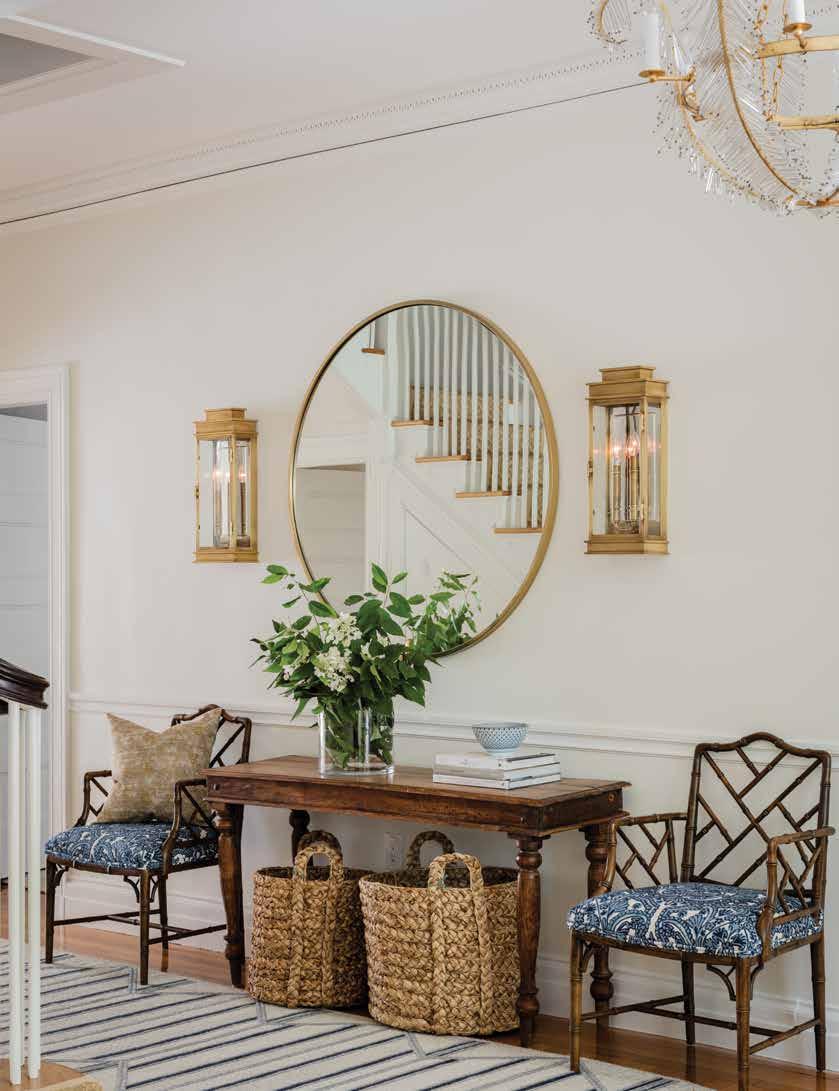
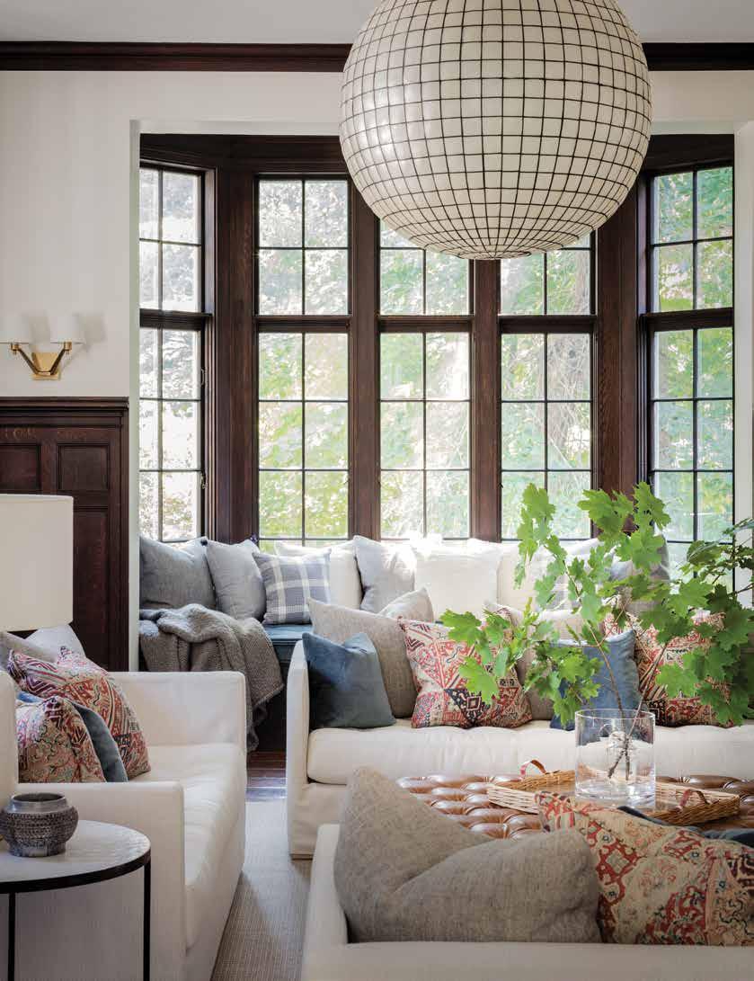
really [the client’s] style. It was very dark, so we wanted to bring it back to life. We wanted to update it so that it remained a traditional elegant home but be modern enough for a young family.” With the home’s bones already intact, Jill turned to color and materials to modernize and improve upon its layout. “Even if it’s a traditional form,” explains Jill, “it was about playing with [those] lines and pulling in more modern textiles.” The clients didn’t want to completely forego the character the home already possessed—they just wanted to create some cosmetic upgrades to make the home feel more current. Jill accomplished this by playing with neutral tones and layering in more modern accessories and subtle nods to the home’s roots.
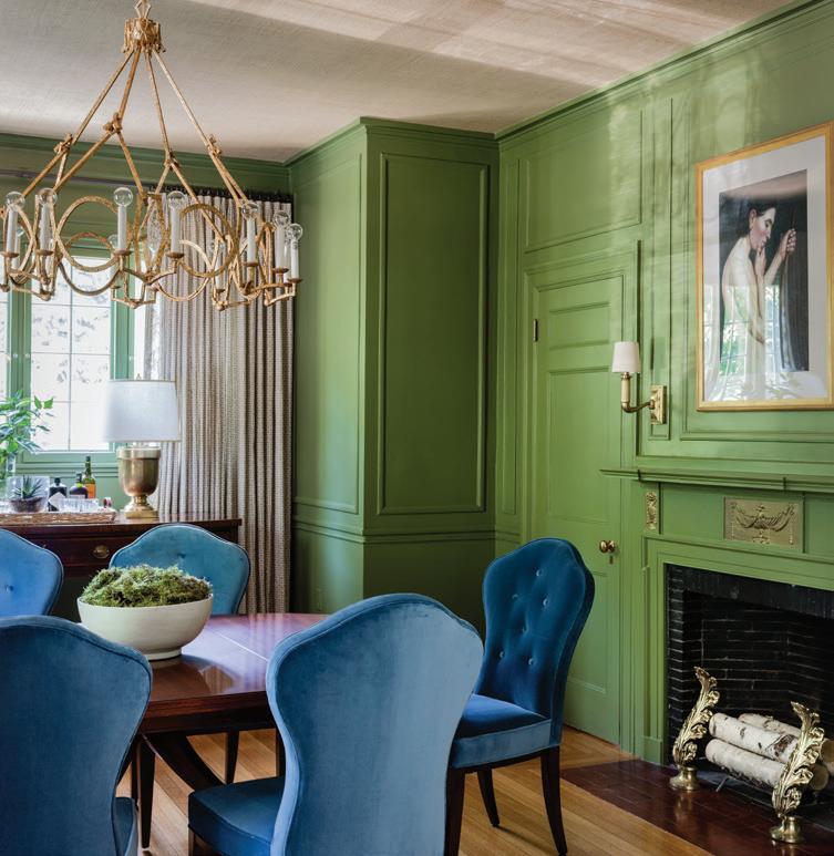
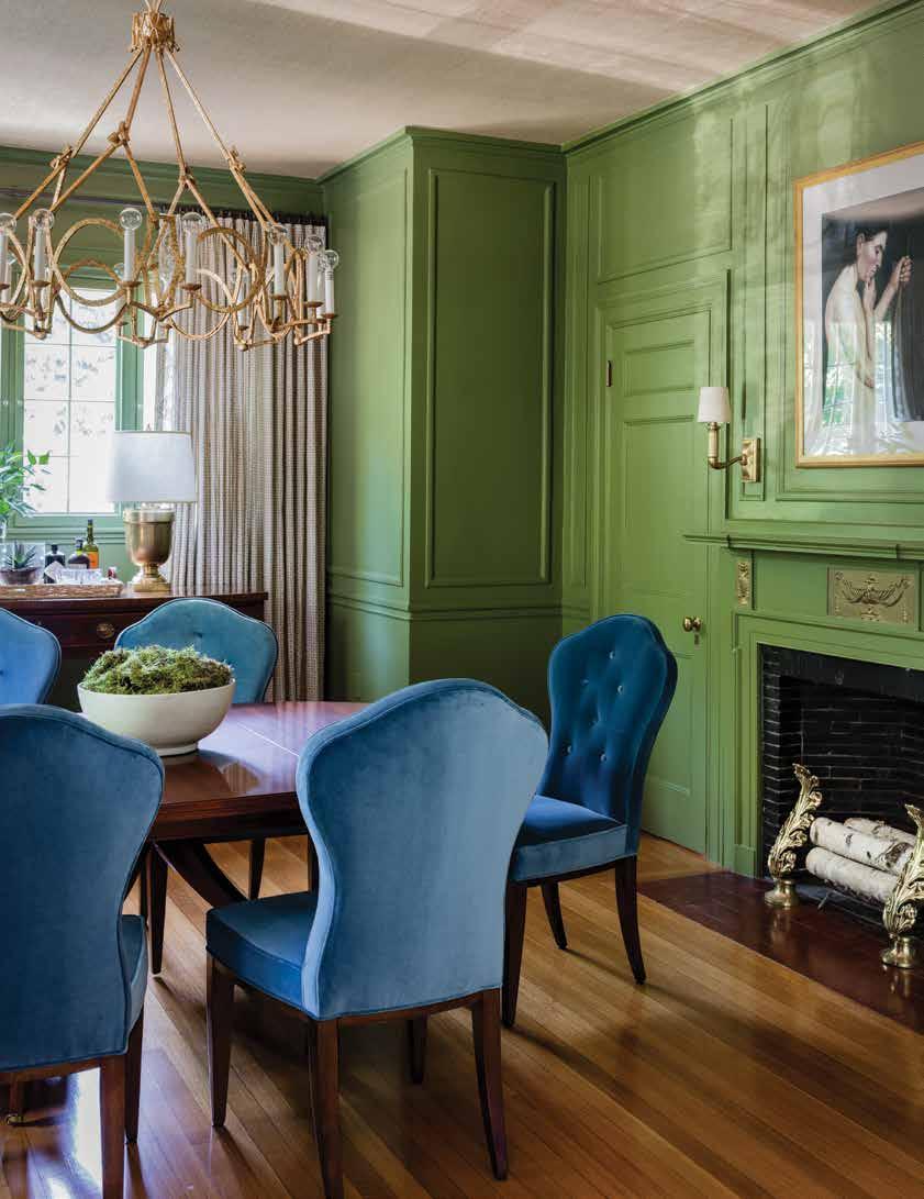
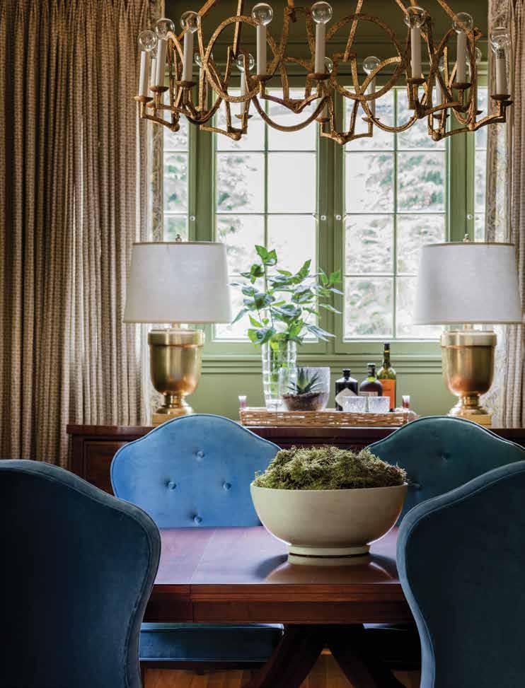
In terms of color, Jill wanted to maintain something that felt traditional but not boring. “My big thing is about allowing those large public spaces to be bright and seamless. So throughout the home you’ll see that light cream color. And then it’s the rooms that start to go a little richer. But even the open spaces hint at what’s to come.” The dining room, for example, was intended to envelop. “We wanted you to be able to have a dinner party there and feel that you were wrapped up in the color.” The walls are coated in an earthy but elegant green perfect for entertaining--a tone that speaks to an old-world charm—while velvet blue chairs invite guests to settle in. Rustic wall lanterns provide a hint of medieval charm, while hand irons left from the home’s previous owners provide a dose of formality. Even new items were selected with careful intent to capture a certain continuity with the home’s bones. A vintage buffet table found in the North Shore of Boston acts as the perfect anchor to the space: “Even though the table is a more updated hickory table, it still plays off of that age.”
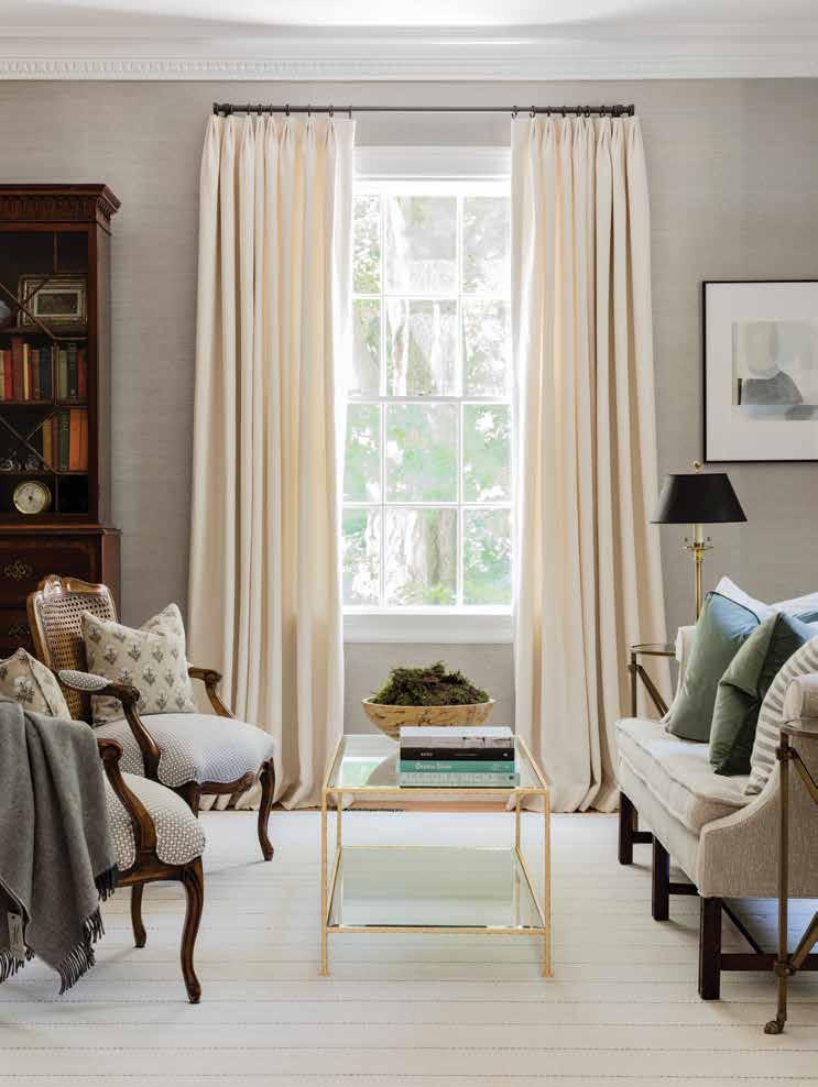
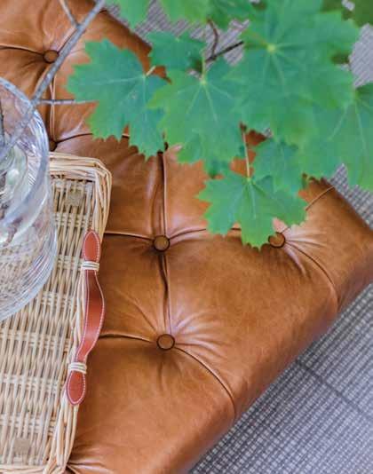
The living room, a more muted space, is wrapped in grass cloth to produce a warming effect, while white washed floorboards, textiles with delicate prints and patterns, and white French doors make the space feel airy and cozy all at the same time. Here, a vintage cabinet purchased from the home’s previous owners balances the lighter tones of the rest of the room, giving the eye a place to settle in the midst of an otherwise neutral nirvana. The gold accents scattered throughout the home help tie each distinct zone in together, helping them to feel cohesive when considered as a whole. The second living room, a space that feels much more grounded and relaxed, features three sofas wrapped in perennial fabric (perfect for young kids not yet attuned to the art of avoiding spills and stains), and plenty of pillows for comfort’s sake. A dark chocolate stain covers the home’s original wood, giving the space a masculine energy, complimented by leather materials (as on the ottoman), and more feminine prints on the pillows to keep things from feeling too heavy. Both of these living spaces, although dramatically different in style, feel like the perfect place to cuddle up with a good book.
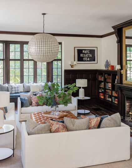
Top: A button-tufted caramel-colored ottomon acts as the centerpoint for this family room. The home's original fireplace adds unprecedented charm and traditional appeal.
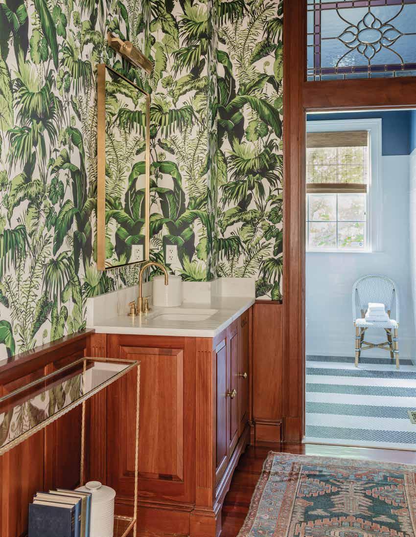
This balancing of the old with the new is seen throughout the home, but perhaps most notably in the bathroom, which features the classic millennial print (green palm leaves against white) as its wallpaper, framed by the home’s original wood paneling. The powder room’s gold accents, a recurring theme throughout the home, help make these ostensible opposite elements make sense in pairing. In fact, this seems to be the main lesson we learn from this design story: sometimes, opposites really do attract. But hey, it doesn’t hurt to have an eye like Jill’s helping to make sure it all comes together in beautiful fashion.

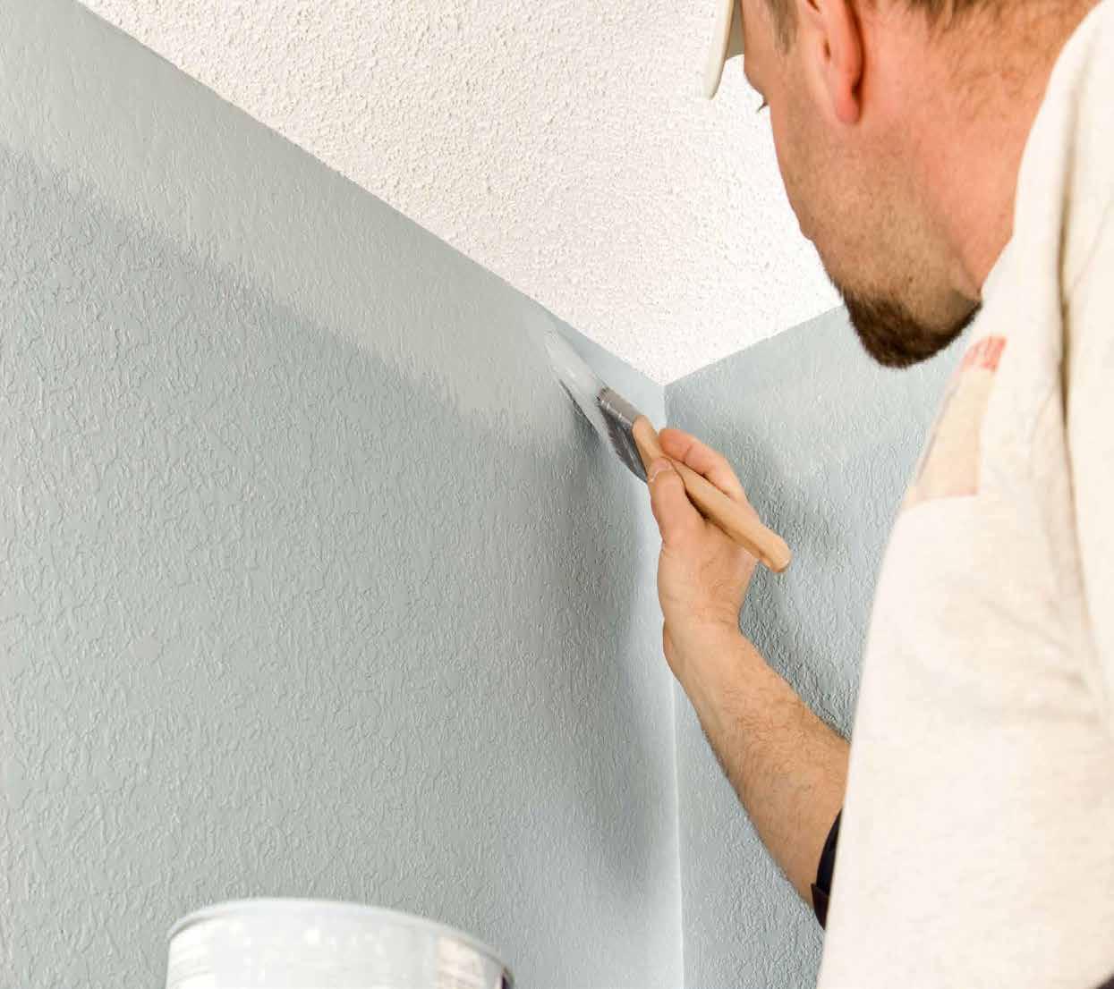


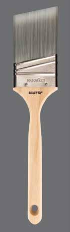
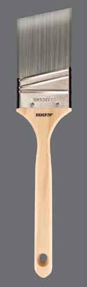
✓ Superior Taper
✓ Advanced Flagging
✓ Exceptional Quality
✓ Holds & Delivers More!


✓ Supreme Woven Fibers
✓ Solvent Resistant Core
✓ Exceptional Pick-up and Release




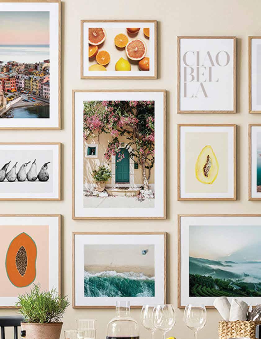
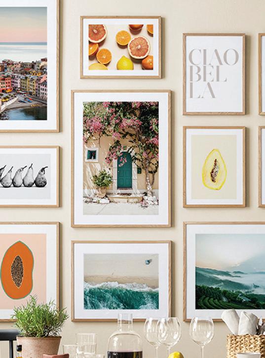
Artwork creates character in a home. While decorating your home you probably apply certain rules, such as investing in neutral wall colours and timeless flooring – but when choosing artwork you can throw caution to the wind and follow your heart. Dare we say you can even make more irrational and eclectic choices? However, hanging your chosen masterpieces can be daunting or downright intimidating resulting in artwork leaning against baseboards…and not in a deconstructed loft kind of way. Luckily there are some simple tips that can make the task easier and and you'll never have to second guess the placement again!
Consider hanging pairs or trios side by side to compliment the rooms’ proportions. Anchored over a sofa or console this looks especially sharp, it should be 6-8 inches above the piece and take up approximately ⅔ the width of the furniture.
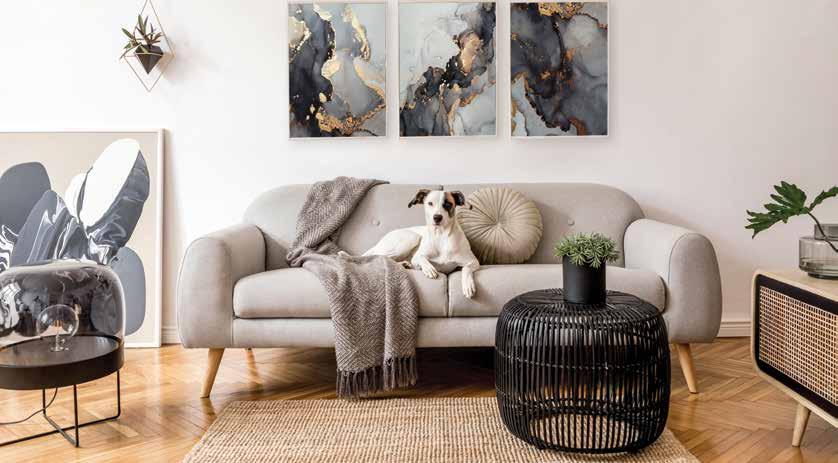
• Hang single art pieces at eye level around 57 – 60 inches from the floor.
• Treat multiple pieces as one and anchor the grouping around the 57-inch focal point.
• Cut newspaper or kraft paper into templates that match the size of your art and tape them to the wall with delicate painter’s tape for a preview of how your installation will look.
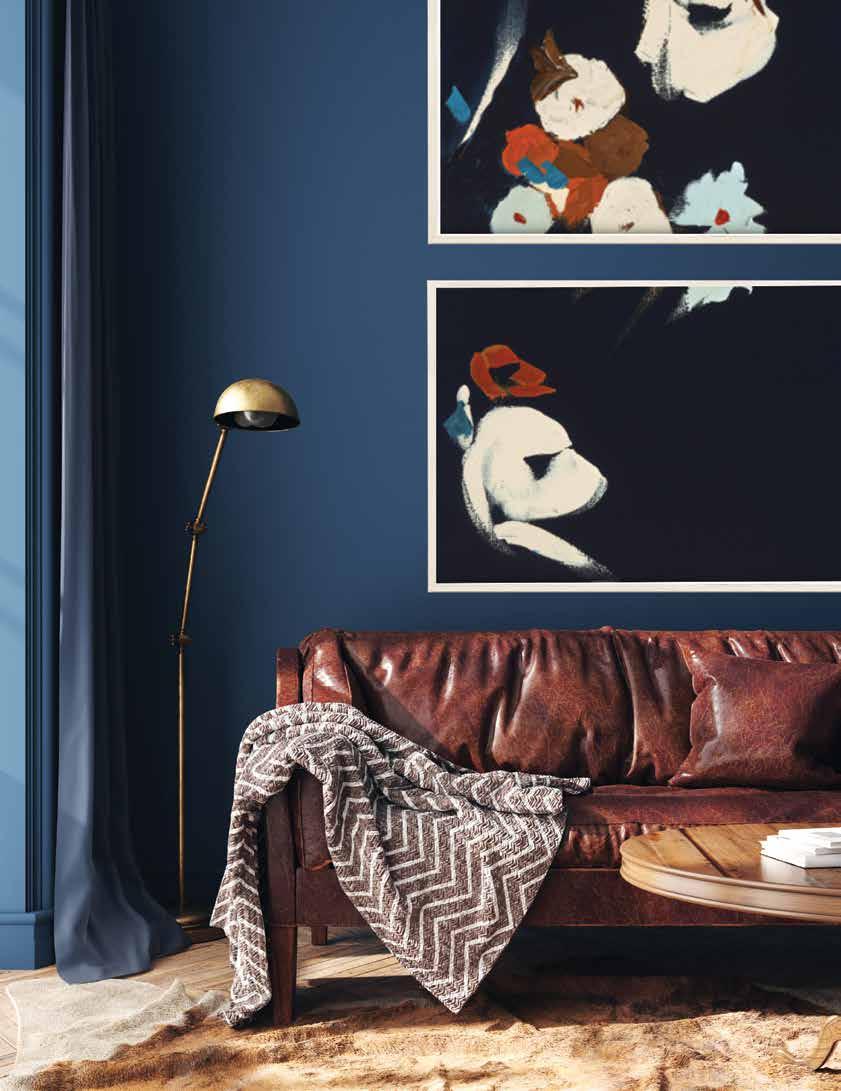
A perfect complement to tall walls is vertical artwork. Try a single oversized bold image or stack a set vertically to enhance the height in your space, don’t fight tall spaces but rather embrace them.
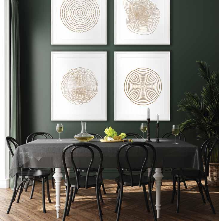
A square wall is the perfect place for a grid gallery wall as it helps create a superbly balanced room. Use prints and photos with a similar theme or with consistent frames if the subject matter is varied, or go with completely different pieces in mixed frames for an eclectic look. Hang large and medium pieces 3-4 inches apart, and smaller pieces 1.5-2.5 inches apart.
Recipes to revel in all morning
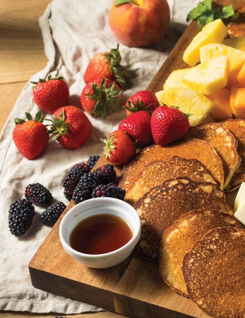
Forego the short or full stack and make your breakfast something special with a charcuterie board featuring fluffy pancakes, breakfast meats, fresh fruits and all the fixings.


2 cups all-purpose flour
¼ cup sugar
1 tbsp baking powder
2 tsp baking soda
1 tsp salt
2 cups buttermilk
½ cup vegetable oil
2 large eggs
2 tbsp vegetable oil, for cooking
Whisk flour, sugar, baking powder, baking soda and salt in a large bowl. In a separate bowl, whisk together buttermilk, oil, and eggs. Pour the buttermilk mixture into the dry ingredients and mix until well combined. Let your pancake batter sit for 30 minutes (this is what gives you light batter and fluffy pancakes). Heat enough of the oil to coat your skillet or flat grill over medium high heat. Use a ¼ or ½ cup scoop to drop pancakes onto your grill, don’t let them touch. When the top of your pancakes are covered in small bubbles flip them over to brown the other side. About 2-3 minutes per side, depending on the heat of your grill. Repeat until all your batter is gone, adding more oil as needed.
Serve hot with butter and toppings!
2 cups all-purpose flour
½ cup shredded coconut
¼ cup sugar
1 tsp baking soda
1 tsp salt
1 cup milk
1 cup coconut milk
¾ cup ricotta cheese
2 large eggs
2 tbsp vegetable oil, for cooking
2 cups whipping cream
¼ cup powdered sugar
Shredded coconut for topping

Warm your maple syrup by standing in a pot of water on low heat for a few minutes before use!
Mix whipping cream and powdered sugar on high with an electric mixture until whipped and fluffy. Refrigerate. Whisk flour, sugar, baking soda, and salt in a large bowl. Mix in the coconut. In a separate bowl, whisk together both types of milk, ricotta, and eggs until well blended. Pour the ricotta mixture into the dry ingredients and mix until well combined. Heat enough of the oil to coat your skillet or flat grill over medium high heat. Use a ¼ or ½ cup scoop to drop pancakes onto your grill, don’t let them touch. When the top of your pancakes are covered in small bubbles flip them over to brown the other side. About 2-3 minutes per side, depending on the heat of your grill. Repeat until all your batter is gone, adding more oil as needed. Serve with tropical jam, whipped cream, and shredded coconut!
2 cups chopped ripe mango or pineapple
¾ cup sugar
1 teaspoon lime juice
In a saucepan combine chopped fruit and sugar over medium heat for 20 minutes while mashing the fruit into a thick jam-like consistency. Stir in the lime juice and cook for another 5 minutes. Let the jam cool completely and transfer to a jam jar. The jam will continue to thicken over the next 24-48 hours and lasts 2-3 weeks in the fridge in an airtight container.

3 round slices of orange 1½ tsp sugar
6 ounces wine
Fruit for garnish and fresh rosemary for garnish
Ingredients are per individual cocktail
Place the orange slices on a hot grill. Grill orange slices for about 3 minutes, until grill marks have appeared, then flip and repeat on the second side. Remove the orange slices from the grill and set aside to cool. Gently muddle the sugar and two orange slices together to dissolve the sugar in the juices. Add crushed ice or mini ice cubes and pour the wine over the cubes. Stir well, add remaining grilled orange slice and a sprig of rosemary to garnish.
12 to 16 ounces thick sliced bacon 4 tbsp brown sugar
2 tbsp maple syrup
Preheat the oven to 350 F. Line a rimmed sheet pan with foil. Place a large cooling rack in the pan and brush with vegetable oil or spray the rack with cooking spray. Lay the bacon strips on the rack, overlapping slightly if necessary. Combine the brown sugar and maple syrup in a bowl or small saucepan and heat until warm. Brush the warmed sugar mixture over the bacon strips. Bake the bacon in the preheated oven for about 30 to 35 minutes, or until nicely browned and slightly crisp.
To spice things up a little you can dust the bacon strips lightly with cayenne pepper or freshly ground black pepper or for an unexpected burst of heat add some sriracha sauce or your favourite hot sauce to the maple mixture.

1 cup unsalted butter, room temperature
½ cup blueberry jam or pie filling
��⁸ tsp salt
Beat the butter in a mixer on high until light and fluffy. On low speed add the preserves a tablespoon at a time until incorporated. Add the salt and beat on high until light and fluffy.
Store in an airtight container, refrigerated, up to five days.
1 cup sugar
1 cup water
2 tsp pure vanilla extract
¼ tsp cinnamon
¼ tsp nutmeg
¼ tsp allspice
¼ tsp cardamom
In a medium saucepan combine the sugar and water and bring to a boil. Add the vanilla and spices and reduce heat to low. Simmer for 20 minutes, stirring occasionally.
Store, refrigerated for up to two weeks. Warm before serving.
1 cup honey zest of one orange juice of one orange 1 tbsp Grand Marnier
In a small saucepan, whisk together honey and the freshly squeezed orange juice over medium heat until mixture comes to a boil and the orange juice is completely incorporated. Remove from heat and stir in orange zest. Allow to cool slightly before serving. Sauce will thicken as it cools.
Store, refrigerated for up to two weeks. Warm before serving.

Escape to the best kept secret in the Caribbean and immerse yourself in the laidback lifestyle of the island’s people. If the blowing palm trees, sparkling seas, and stunning beaches don’t do it for you, the endless rum punches most certainly will.



ith a vaccine roll-out in the works and some promise of normal dangling in our midst, it suddenly feels possible to dream about boarding a plane again. And let’s face it—we could all use a vacation after the chaos of the last year. Our toes are all tingling to feel the warmth of sand beneath our feet and our palms are itching to hold a cold drink under the hot sun, and what better place to achieve some post-quarantine bliss than the beautiful island of Barbados. Between the rum punches, stunning ocean-side views, and the eccentricity of their local culture, it’s the perfect place to set your sights and soak up the sunshine once travel restrictions are lifted.
Barbados has been misunderstood over the years after gaining a reputation for being a haven for retirees looking to winter in a warm climate and enjoy a slower pace of life. And while we can’t argue with that—it certainly lends itself to an ease of living—it’s much more than a retiree’s paradise. Every year, people flock to the island to enjoy its gorgeous beaches, adventure up into the Northern coastline and its caves, or dance the night away at St. Lawrence Gap. It is, after all, the homeland of Bajan pop sensation turned bad-gal, Rihanna—a country that gave us an artist of her calibre couldn’t really be that tame.
As soon as you spot the runway, which starts right at the precipice of the southern coastline—a small thrill as the wheels hover mere meters above the frothy blue waves—you’ll feel a sense of calm wash over you and a wall of heat warm your sun-starved skin. Wherever you’re staying, it won’t be farther than 45 minutes from the airport (the island is conveniently compact, making it easy for you to see and experience all that Barbados has to offer). There are no shortage of swanky hotels, but the best of this country is experienced with a little more freedom and mobility.



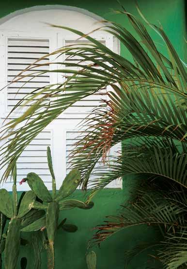
here are plenty of properties available for rent ranging from cozy and quaint to lavish and luxurious, and car rentals can be made right at the airport. And thanks to a government regulation barring the privatization of beaches, every inch of Barbados’ golden coastline is fair game—even the perfectly manicured sands of the iconic Crane Beach Hotel are open to the public.
This accessibility speaks to the welcoming nature of the island. Locals have a deep sense of pride for their homeland, and they’ll go out of their way to ensure you and your family enjoy your time. Don’t shy away from chatting up passersby—you’ll likely leave the conversation with a dinner recommendation and directions to their favorite beach. The island has a way of embracing its visitors with open arms, a big part of the country’s charm. And this friendly feel is no façade, either. It’s widely considered a safer alternative to its neighboring islands, and reports of violence or crime are few and far between. Even at night, it feels safe to roam the streets. If you walk longer than five minutes along the coast line, chances are you’ll stumble into a beach bar, each inexplicably with the best burger you’ve ever tasted (North America needs to start putting cucumbers on more of our burgers—we can’t explain it but it’ll change your life). Between the live music, the cold Banks beer that you’ll wish they exported, and the salty wind in your hair, you’ll think you’ve found the best kept secret in the world, just to find another favorite spot the following day.
Completely surrounded by the Atlantic Ocean, there are enough beaches to visit a new one each day. The northern and eastern coast isn’t typically great for swimming, but they do boast some stunning views and they are ripe for adventure—animal flower caves, rainforest tours, and a rolling picture-perfect landscape you’ll want to keep the camera around for. The west coast is where you’ll get your best beach days—the farther north you head the more peace and quiet you’ll find. There are some fabulous snorkelling spots too—most notably, Carlisle Bay, where a shipwreck hosts a flurry of fish and turtles not far off from an expansive beach. If you have the opportunity, consider booking a catamaran tour. Most charters will take you up the west coastline, anchoring a few times throughout for lunch, a dip in the crystalline waters, and of course a chance to swim with ocean life.
The island really can be whatever you make of it, with a little something for everyone on your trip. But as intoxicating as island life can be, the real treasure lies in the people. The easy going nature of locals going about their lives—fixing up boats, sitting back with a deck of cards with friends, or selling small wares as mementos for tourists, their untethered optimism is sure to inspire. There’s an infectious happiness about the island that cannot help but be adopted by those that visit. You’ll likely return with a newfound appreciation for the simple pleasures in life—those seemingly insignificant moments of togetherness and peace that remind you how beautiful this world is. So whether you’re ready to book the moment you’re able to roll up your sleeve to receive the vaccine or simply day dreaming about the next great family vacation slotted for some distant point in the future, Barbados might just be your next paradise.

1. Crane Beach
The country’s calling card in terms of famous hotels. A little village in and of itself, you can choose from several restaurants, enjoy your own private pool, or ride boogie boards into the massive waves on a windier day.
2. The Cliff Restaurant
Easily the most extravagant dinner spot on the island with a view to match. Enjoy five star service on a balcony overlooking the ocean for a full course meal, or stop by around 5 o’clock for happy hour and a phenomenal view of the sunset.
3. Nikki Beach
Located a stone’s throw from Holetown, the island’s first settlement, this day club blasts Caribbean rhythms and its patrons dance all day atop white linen day beds, consuming champagne like water and jumping into pools until the sun wears them out. A great spot for a younger crowd!
4. Carlisle Bay
A great spot for the adventurous—bring your snorkeling gear or rent from the locals who have set up shop on the beach.
5. The Fish Pot
Located in the province of St. James, this restaurant sits right on the beach in open air. Delicious cuisine prepared with fresh ingredients will most certainly wow your taste buds.
6. St. Lawrence Gap
Perfect for party-goers. This ocean-side strip lights up after dark between Thursday and Sunday. Sip cocktails, dance to local music, and be sure to grab a roadside burger from one of their food trucks.
7. Welchman Hall Gully
Monkeys, palm trees bigger than you ever imagined they could be, and rich foliage comingle to create a marvel of Mother Nature. Grab a rum punch at the hilltop bar on your way out and enjoy the scenery!
8. Port St. Charles
This luxurious yacht club is where the island’s most extravagant visitors dock to have lunch on solid ground. Equipped with a swim-up bar, a dock just a few laps away from the beach, and delicious eats, it’s a great place to enjoy a sandwich and a mimosa to start your day.
9. Bathsheba Beach
Large rock formations in remarkable shape and scale made from centuries of water erosion are scattered along this roadside beach. It’s not great for swimming but it’s a fun spot to set out a blanket and crack a cold one.
10. Rum Tour
Mount Gay Rum is a favorite of locals and tourists alike, with many purchasing an extra bottle or two for their suitcases. Visit the distillery for tastings and a brief history of Barbados’ signature liquor.

The jump from renting to owning is stressful for all sorts of reasons: financially, it’s a huge undertaking, of course, but that’s a well-known reality of owning property. What often catches people by surprise is the maintenance. Suddenly, there is no landlord to call when you come home after a long day and are greeted with an overgrown bush in your back yard, or find that the neighbor’s dog has scratched the paint off your front door. But like most things in life, the burden of maintenance can be alleviated significantly with a little bit of preparedness. As a homeowner, you’ll wear many hats, from gardener to painter to professional cleaner. The easiest way to make sure you don’t get overwhelmed by the work it takes to keep your space looking good and feeling fresh is to keep the tools you need readily accessible, so when you are greeted with an unwelcomed surprise, you have everything you need to make it a quick-fix.

Whether you enjoy keeping a prim and proper flower bed filled with your favorite florals, or you’re simply trying to keep stubborn weeds from completely taking over your lawn, there are a few tools of the trade that every gardener swears by.
KNEELING PAD: Far from superfluous, this item is a must-have for anyone spending time kneeling in the dirt. Save your knees from the strain and your pant legs from stains.
GARDENING GLOVES: Even for those that feel at home with their hands in the dirt, a good pair of gloves is an essential for dealing with prickly weeds or thorny brush. Plus, it’ll allow you to skip the after-care involved in removing dirt from the underside of your finger nails.
SHEARS: If there’s one tool to invest in, it’s a great pair of stainless steel shears. Let the blades do the work and effortlessly prune unruly plants and keep your garden in check.
GARDEN FORK: Just the thing to ease the effort of digging into dense soil. This is actually better than a spade when it comes to breaking up packed dirt.
HAND TROWEL: A must-have for transferring plants, planting fresh seeds, or digging up weeds.
WHEELBARROW: Save your back the trouble of the heavy lifting. Your chiropractor will thank you profusely.
ORGANIC WEED KILLER: It’s 2021, so harsh pesticides aren’t going to be a popular choice, especially if there are animals or children that frequent your lawn. Test out a few organic weed killers and find what works best to combat your problem.
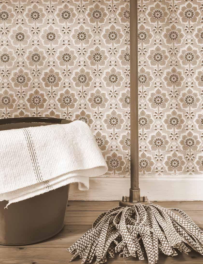
Contrary to popular belief, curb appeal is not born, nor even created—it’s a steady commitment that involves plenty of scrubbing, caulking, and just about everything in between. Keep these products on hand to make quick and easy work of your monthly clean sweep.
BROOM: A non-negotiable when it comes to spring cleaning. Brush away dried leaves and cobwebs that have accumulated.
BUCKET: Warm soapy water will work wonders to remove the coat of grime and built-up dirt on your windows and exteriors. Try to use a mild, environmentally friendly soap so that you can feel guilt-free about letting soapy run-off seep back into the earth.
SOFT CLOTH OR SPONGE: The right cloth/sponge can actually cut down or eliminate altogether the need for harsh chemicals. Ensure yours is lint-free and completely clean before use.
PRESSURE WASHER: You can save yourself a lot of time and hassle by hooking up your hose to one of these. Be cautious of the material you’re spraying and also the setting of your washer— if it’s too high you could do some major damage.
SQUEEGEE: This is the ultimate tool to make windows shine, plus, it transforms the task of window washing from annoying to oddly satisfying.
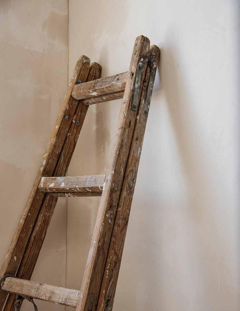
Painting tasks can range from quick touch-ups to full on renovations, but either way, it’s worth it to invest in the necessary items to avoid constantly running to your local paint or hardware store for something as simple as a roll of tape.
A CAN OF THE ORIGINAL PAINT USED: From exteriors to interiors, it’s a good idea to keep a can in the same sheen and product line as the original paint to use for touch-ups. If you’re starting a new painting project, account for a little bit of extra to be left behind after the project is complete. This will help you save time and avoid the color-matching process down the line.
SANDPAPER OR BLOCK: From minor paint jobs, like giving an old chair a new face lift, to whole room renovations, you’ll likely need some sandpaper to get the job done. Keep varying grits on hand and you’ll speed through the prep process.
LIGHTWEIGHT PATCHING COMPOUND: Although in a perfect world it would be, drywall is not impermeable, and holes and cracks can happen quite organically, even if you aren’t drilling without a stud-finder. Keep this putty close to quickly repair imperfections.
PRIMER: Most paint jobs require primer, so this is a bit of a no-brainer. Save yourself the inevitable trip and keep a few cans on hand. Keep in mind different surfaces may require different types of primer.
BRUSH: Getting those crisp, clean lines and even color is all about the application. Invest in a few good brushes to conquer the corners and edges of your surfaces. Clean them thoroughly after each use to ensure years of viability.
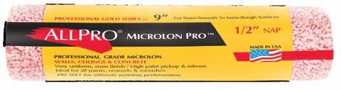
ROLLER SLEEVE (SAME NAP AS ORIGINAL PAINT JOB): Don’t slack on the nap! The nap (the length of the fibers used on the roller sleeve) can have a big influence on overall appearance. Using the same nap will make any additional coats flow seamlessly.
ROLLER CAGE: This is a necessity for any painting projects where you need to cover a large surface area. [Tip: If you’re looking to trick others into helping with these projects, purchase two, so they won’t have an excuse not to help!]
COLOR OF THE YEAR 2021
COLOR OF THE YEAR 2021
AEGEAN TEAL
2136-40
Take a moment to reflect and reset. Nourish the spirit with comforting, sunbaked shades. Intriguing, balanced and deeply soothing, Aegean Teal creates natural harmony.
Take a moment to reflect and reset. Nourish the spirit with comforting, sunbaked shades. Intriguing, balanced and deeply soothing,
creates natural harmony.
Take a moment to reflect and reset. Nourish the spirit with comforting, sunbaked shades. Intriguing, balanced and deeply soothing, Aegean
creates natural harmony.
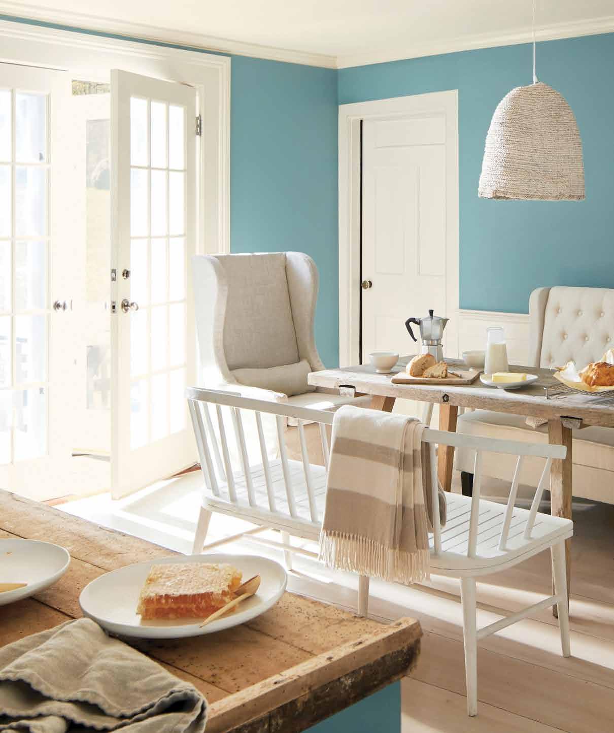
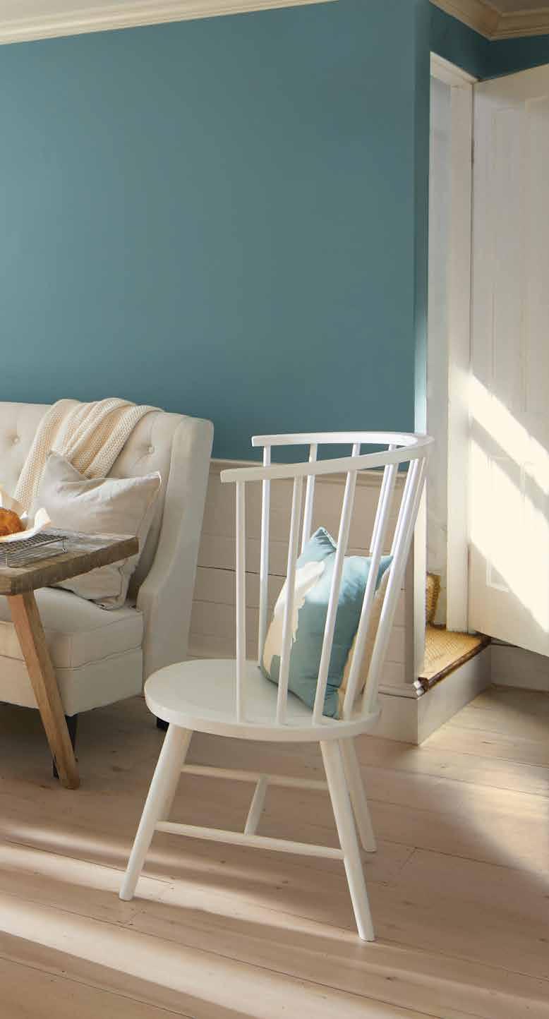
With the world around us swirling in chaos and elected officials encouraging its populations to stay at home as much as possible, there’s been a sense that we’re in the eye of a storm, sheltering in place until the outside world is safe to explore once again. This burgeoning feeling of impending relief and destruction wrapped into one was likely a key motivator in Benjamin Moore’s selection for 2021’s Color of the Year, Aegean Teal 2136-40, which encourages us to slow down and embrace this period of solitude and rest, to relish in a quieter tone of life and take note of what is truly important in our homes and in our lives.
Aegean Teal 2136-40 feels ancient and fresh all at once, recalling the nostalgia of mid-century palettes while simultaneously conjuring the calmed teal waters from your favorite holiday. Benjamin Moore describes the shade as “an intriguing blue/green that creates natural harmony and invites us to reflect and reset.” Indeed, the shade inspires thoughts of a beautiful backyard scene on a Sunday, drenched in sunlight. It’s equal parts elegance and comfort, with a subtle undertone meant to induce a state of peace. The selection comes with an accompanying palette: 12 hues intended to inspire us to settle in and be enveloped by the simple pleasures in life. The company’s color experts suggest we should think of “the faded rumple of fresh linen sheets in the morning” and “perfectly ripened fruits on the windowsill” when we examine their sunbaked shades, each wrapped in its own sense of home.
Benjamin Moore spokesperson, Andrea Magno, states, “Amid uncertainty, people yearn for stability,” making the turn toward the comfortable and familiar in this palette seem intuitive. Elaborating, she shares, “The colors we surround ourselves with can have a powerful impact on our emotions and wellbeing. Aegean Teal 2136-40 and the corresponding Color Trends 2021 palette expresses a welcoming, lived-in quality that celebrates the connections and real moments that take place within the home.” Although each shade drums up beauty and freshness, the associated feelings are already deeply rooted within us, the colors are simply the access point.
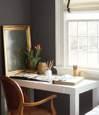
WALLS: Silhouette AF-655, Aura, Matte TRIM: Atrium White OC-145, Aura, Satin
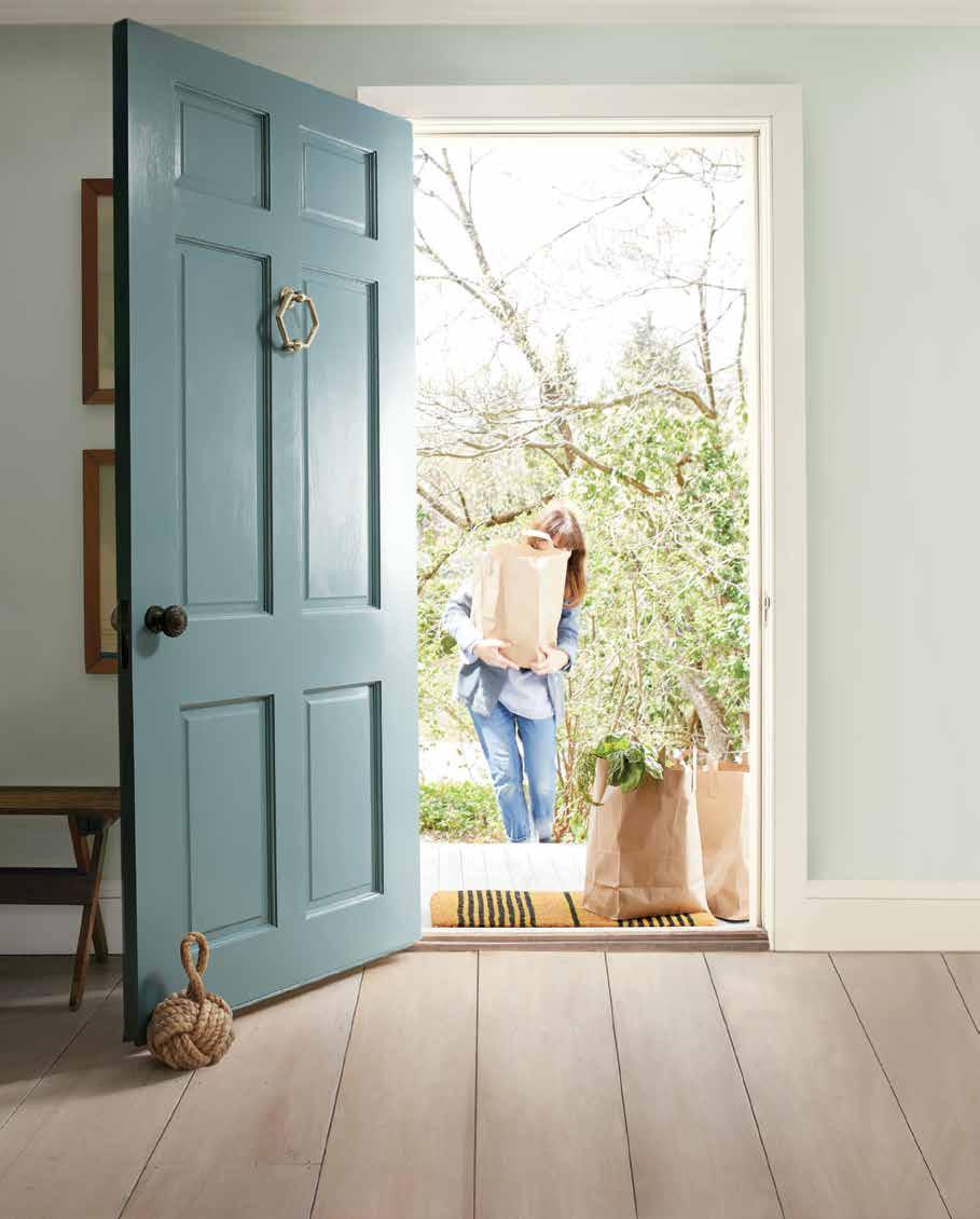
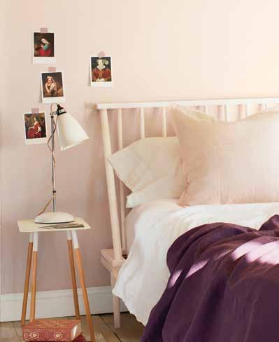
Right: WALLS: Foggy Morning 2106-70, ben, Eggshell TRIM: Atrium White OC-145, ben, Semi-Gloss


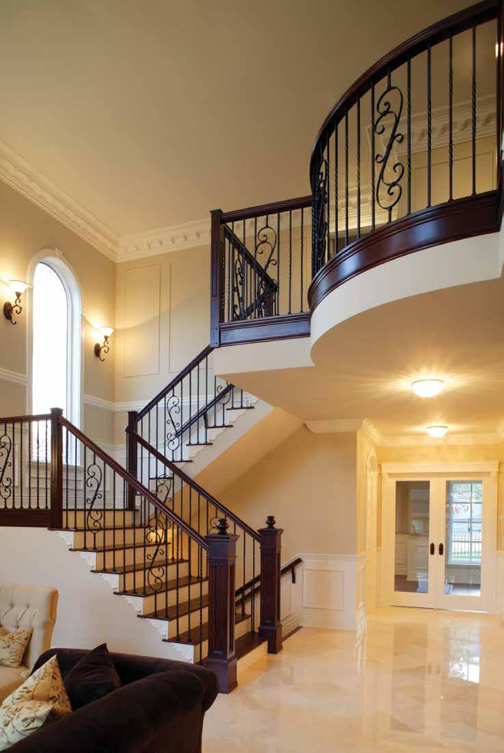


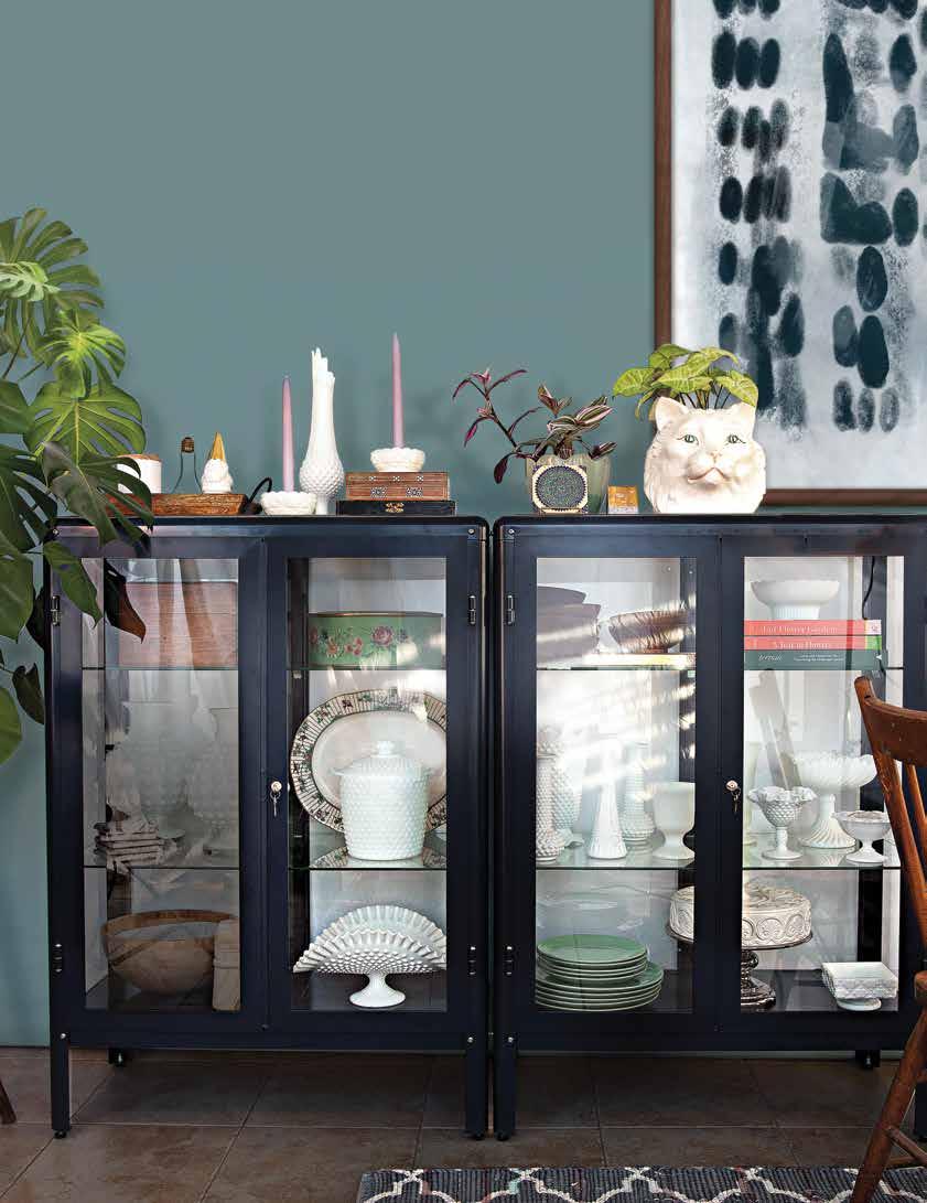
More often than not what’s going on in the world subtly affects trends in design and what we all desire in our homes. In an effort to create comfort, unity and fellowship harmonious color schemes are frequently appearing in current spaces.
Palettes that easily blend into each other are the new evolution of the gradient trend that has been popular as of late.
Deep blues, teals and jadeite greens are a perfect example of colors that are related, but not immediately – distant cousins if you will. The use of colors like these in tandem tempered with a neutral and punctuated with organic elements like wood, foliage and metals are no fail companions on the path to creature comforts.

Curating the best dressed shelves or a dinstinctive display cabinet can be a trying exercise. Create some of the best dressed vignettes around by choosing a color scheme and execute it with the objects you place on your shelves.
When in doubt of a color direction go back to basics (like way back, to middle school in fact!) and consult the color wheel. Analogous color schemes pair colors together that are next to each other on the color wheel, these are often found in nature and are harmonious and pleasing to the eye.
Start by selecting a color you love to anchor your scheme. Pinpoint the color of your feature collection, or simply identify your very favorite color. Armed with this color to use as a jumping off point find it on the color wheel and look to the left or the right or take steps in both directions to land on the perfect palette.
By selecting a favorite to focus on and a few additional choices to play second fiddle you automatically create balance. Be sure to create a distinction between your colorful pieces by varying tints and shades and use the colors in small, medium, and large doses.
When showcasing a one-color collection mixing in other materials can add interest to the overall display. Try adding metals, woods and books both vintage and new.
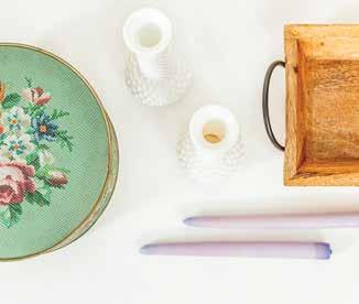
Opaque glass in a variety of colors was first made in 16th century Venice. The white variety coveted by collectors today rose to prominence during the Victorian era and was mass produced in the 1950s and 1960s by companies such as Anchor Hocking, Fenton, and Westmoreland. It was even placed in boxes of laundry detergent or given away at movie theaters! The mid-century finds are readily available today at tag sales, thrift shops and antiques dealers — many for mere milk money.
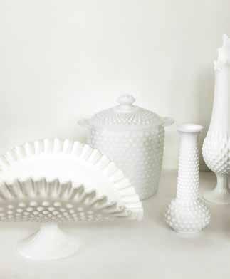
Pieces like banana bowls and ice buckets are well sought after and can be hard to find, while pieces like bud vases can be easier to find.
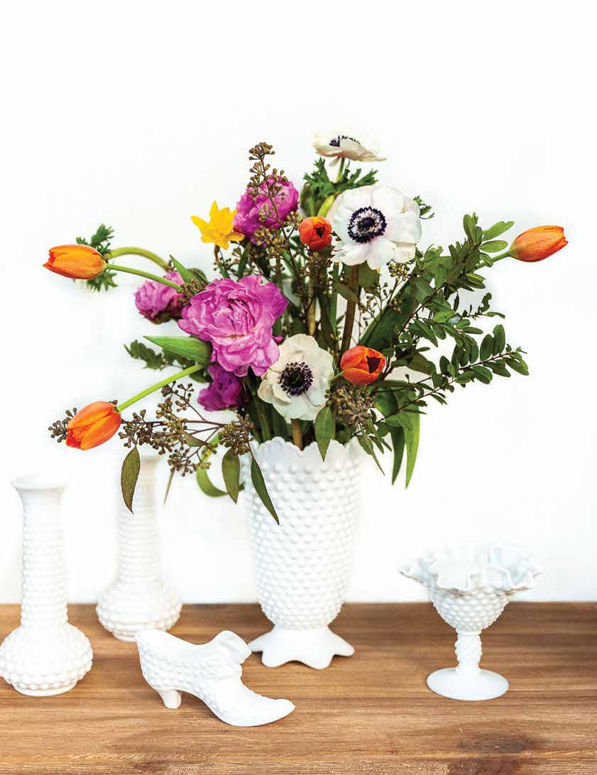



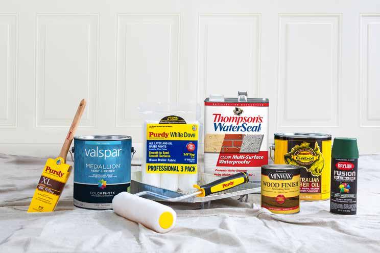





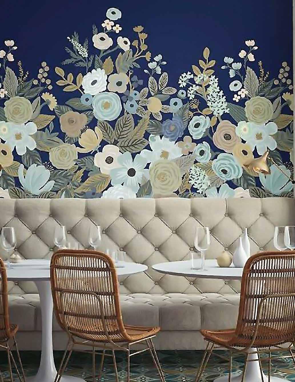
When it comes to interior decor, what goes around eventually comes around again! Retro trends are making a massive comeback these days and marvelous wall murals are no exception. Available in myriad design options from hot geometrics to floral fantasies to cityscapes and forest floors – you can even opt for a custom mural created from your own photograph or illustration! Many styles are easily strippable just like modern wallpaper and some are made even easier to install and remove by way of peel and stick backings – perfect for the fickle at heart or renters. Whether you are revisiting the bold design grooves of the 60s and early 70s or finding yourself exploring the era’s trends for the first time around there is definitely a mural made for you!
#RMK11430M


This ain’t your grandma’s floral! Keep your look modern and fresh as a daisy with a large scale pattern, and pair it with an equally gutsy depth of colour for your paint to keep everything balanced. We love this pattern with Precious Pink 2084-40 and Misted Green 2138-50.
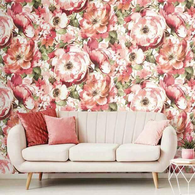

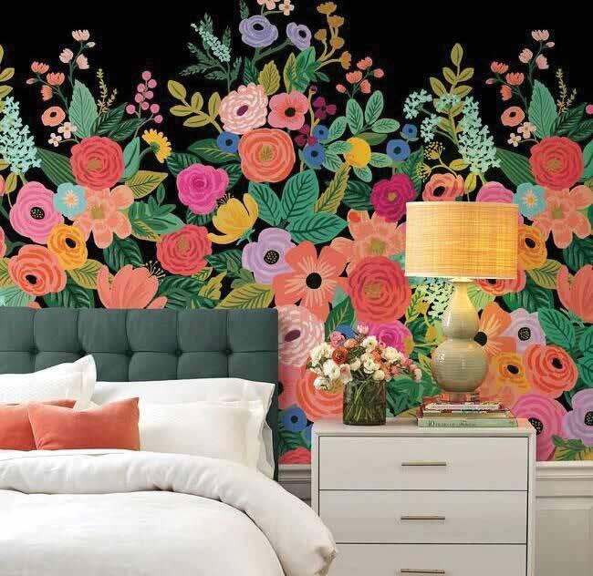
Decoristas everywhere are celebrating the debut wallpaper collection from the design superstars at Rifle Paper Co. Their iconic Garden Party print, shown here with a dramatic black background, provides a pure injection of joy into any space. It’s super with any of the pattern’s multiple colours and shades, like True Blue 2066-50 and Amethyst Cream 2071-50. PRECIOUS PINK 2084-40 MISTED GREEN 2138-50
BLUE 2066-50

CREAM 2071-50


A room with no view? No problem. Scenic murals, ranging from tonal impressionistic landscapes to full walls of photographicquality panoramas, are a great way to bring view-challenged spaces into focus. We’re feeling calm pairing this relaxing space with Waterdrop CC-902 and Gray Mist OC-30.
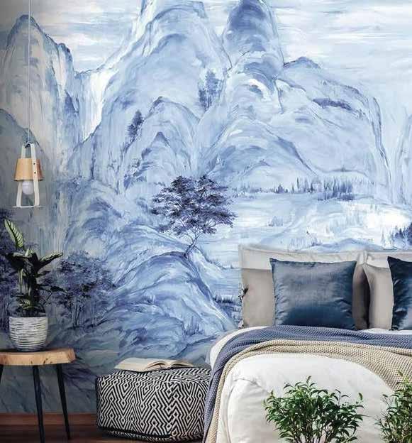
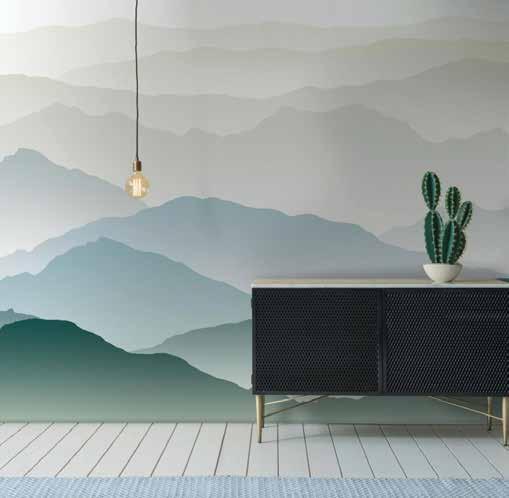


…with the sound of silence. If you’re searching for your ‘serenity now’ moment, throw some natural beauty on the walls. The repetition of mountain ridgetops, combined with a soft ombre palette, effectively grounds a space while leaving you floating in the clouds. Try it paired with Aegean Teal 2136-40 or Icicle 2142-70.

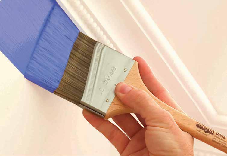
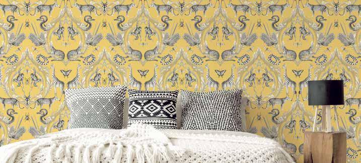
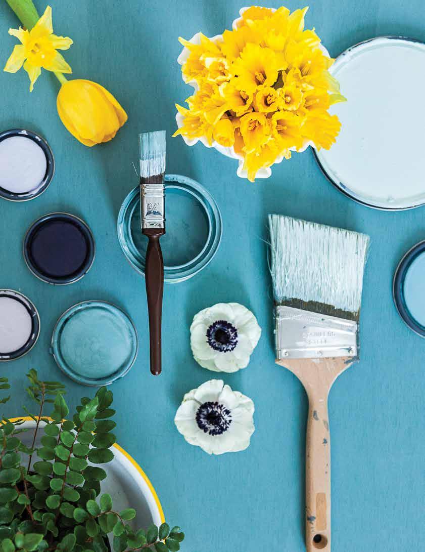
“If



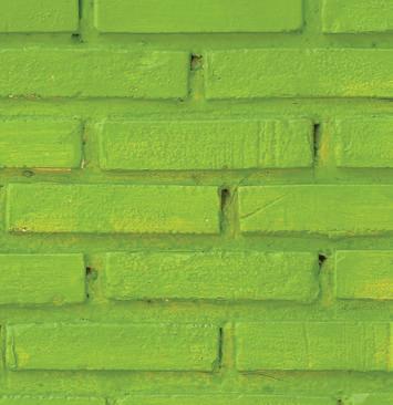
No two surfaces are alike — that’s why starting with the right prep can make all the difference. With a family of tapes designed specifically for your surface, Scotch® Painter’s Tape helps you prep right for professional-looking results.
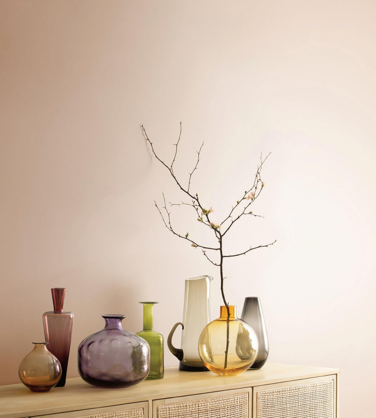
When you find the perfect color, nothing else will do Perfection comes from our paint and our proprietary Gennex® colorants, together, creating results that are breathtaking.
Rely on Benjamin Moore® for premium quality and Gennex Color Technology, which makes our long-lasting colors, all 3,500 of them, one-of-a-kind. Unmatchable.
When you find the perfect color, nothing else will do. Perfection comes from our paint and our proprietary Gennex® colorants, together, creating results that are breathtaking. Rely on Benjamin Moore for premium quality and Gennex Color Technology, which makes our long-lasting colors, all 3,500 of them, one-of-a-kind. Unmatchable.