ANDRIOTS
HOT LOOKS WITH STAYING POWER TOUR FOUR HOMES WITH FRESH STYLE BREAKING THE MOLD TRANSFORMING THE TILE INDUSTRY FROM INSIDE OUT FROM FRAZZLED TO FRESH!
SPRING INTO STRING DIY SOME PERSONALIZED STRING-ART

HOT LOOKS WITH STAYING POWER TOUR FOUR HOMES WITH FRESH STYLE BREAKING THE MOLD TRANSFORMING THE TILE INDUSTRY FROM INSIDE OUT FROM FRAZZLED TO FRESH!
SPRING INTO STRING DIY SOME PERSONALIZED STRING-ART







A modern farmhouse with a vibrant personality.
HEAVEN IN NORTH HAVEN Bohemian style with modern bones.
FARMHOUSE FUSION
The sensibilities of the country with the luxury of the city.
THE NEW MODEL HOME
A polished and relaxed unit that’s ready to turn heads.
Innovative

SPRING 2019
Bahia Taylor Editor in Chief
Co-founder
Leigh McKenzie
Creative Director Co-founder
Carlee Baigrie
Contributing Writer & Editor
Olivia Hiebert
Graphic Designer
Graphic Design Styling Gallon Creative www.galloncreative.com
Owned and Published by: Gallon Creative
For inquiries, please contact us at hello @ galloncreative.com
5 Scurfield Blvd #25 Winnipeg, Manitoba R3Y 3G4
www.galloncreative.com hello @ galloncreative.com
Cover Photography - Viking Projects www.vikingprojectsco.ca
While every effort has been made to ensure that advertisements and articles appear correctly, At Home Magazine cannot accept responsibility for any loss or damage caused directly or indirectly by the contents of this publication. All material is intended for informational purposes only. The views expressed in the magazine are not necessarily those of its publisher or editor.
All rights reserved. Reproduction in whole or part prohibited without written permission from the publisher.
Typeset in Adobe Garamond and Avenir Printed in Canada
22
CRAFT TABLE:
STRING INTO SPRING
Design your own décor with the latest DIY craze.
26
HOT SPOT:
BREAKING THE MOLD
How Fireclay Tile is changing the tile industry from the inside out.
66 CHOW:
Just thinking about it is making us hungry.
PATIO PIZZERIA
A backyard, wood-fired pizza party serving everyone’s favorite guilty pleasure.
76
EXPLORER:
Pack your sense of adventure and let’s go.
PARADISO POSITANO
Why the jewel of Italy’s Amalfi Coast should be your next destination.
84
TOOLBOX TEXTS: FROM FRAZZLED TO FRESH
Simple organization hacks to get your life back!
94
COVER FORMULA
96
STYLE TO STEAL
100
PARTING SHOT: A final bit of inspiration.


Spring is the season of change. As the snow melts away and flowers begin to bloom again, we are reminded of our own mutability. We come to embrace the natural cycles of our earth and adopt them in our own lives to filter away what is no longer useful to us to make room for the potential of the new. We took this sentiment to heart this issue, and wanted to emphasize the power of change, even, and maybe especially, in the smallest of gestures. In 2019, we are all feeling the pressures of time, the immense weight of our responsibilities and obligations, from after-school pick-ups to Easter dinners with the in-laws; meetings that could have (should have!) been an email to mortgage payments that could have (should have!) been a beautiful new Birkin bag. It seems as though in terms of time and energy, we never have enough of it to tackle the things we actually want to do. We wanted to bring ideas for small changes that make a big impact. Subtle shifts that require minimal effort and consume little time, but enhance your space in a way that makes it feel more like you. In our “Just Add Color” feature (pg. 60), we showcase how one simple paint-job on an unassuming fixture or furniture piece can transform an entire room, adding spark and personality. We also wanted to share ways to save you time, like our “Simple Organization Hacks to Get Your Life Back!” on pg. 84, which will let you spend the time you used to spend scrambling over finding the right Tupperware lid bonding with your loved ones instead. We feature some stunning spaces this issue, like the effortlessly chic “Heaven in North Haven” (pg. 42), where designer and owner, Kimberley, utilized subtle but impactful décor detailing to warm up the modern bones of her home with a colorful bohemian feel that worked for her family. These touches are easy to swap out, letting her home evolve alongside her family. All of the designers we feature in this issue illustrate the importance of personality in a space, and the idea of this personality being fluid, and undergoing several reinventions and rebirths throughout a single lifetime, much like the way our own identities evolve over time with experience and insight. They also suggest that this subjectivity to change should not be feared, but relished in, as it inspires more creativity and more opportunity for expression. Our homes should be the solid foundations upon which these reinventions can play out. This commitment to adaptability so often feels out of reach in the midst of busy and demanding schedules, but hopefully this issue reveals the ways in which it can sometimes be achieved in the simplest of ways.


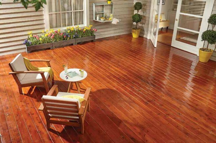
• Can be applied in 110+F direct sunlight
• Can be applied in 110+F direct sunlight
• Able to walk on wet stain without having to back brush (Application footprints blend in over 24 hours)
• Able to walk on wet stain without having to back brush (Application footprints blend in over 24 hours)
• Wet stain marks blend in when stain is applied within 20-30 minutes
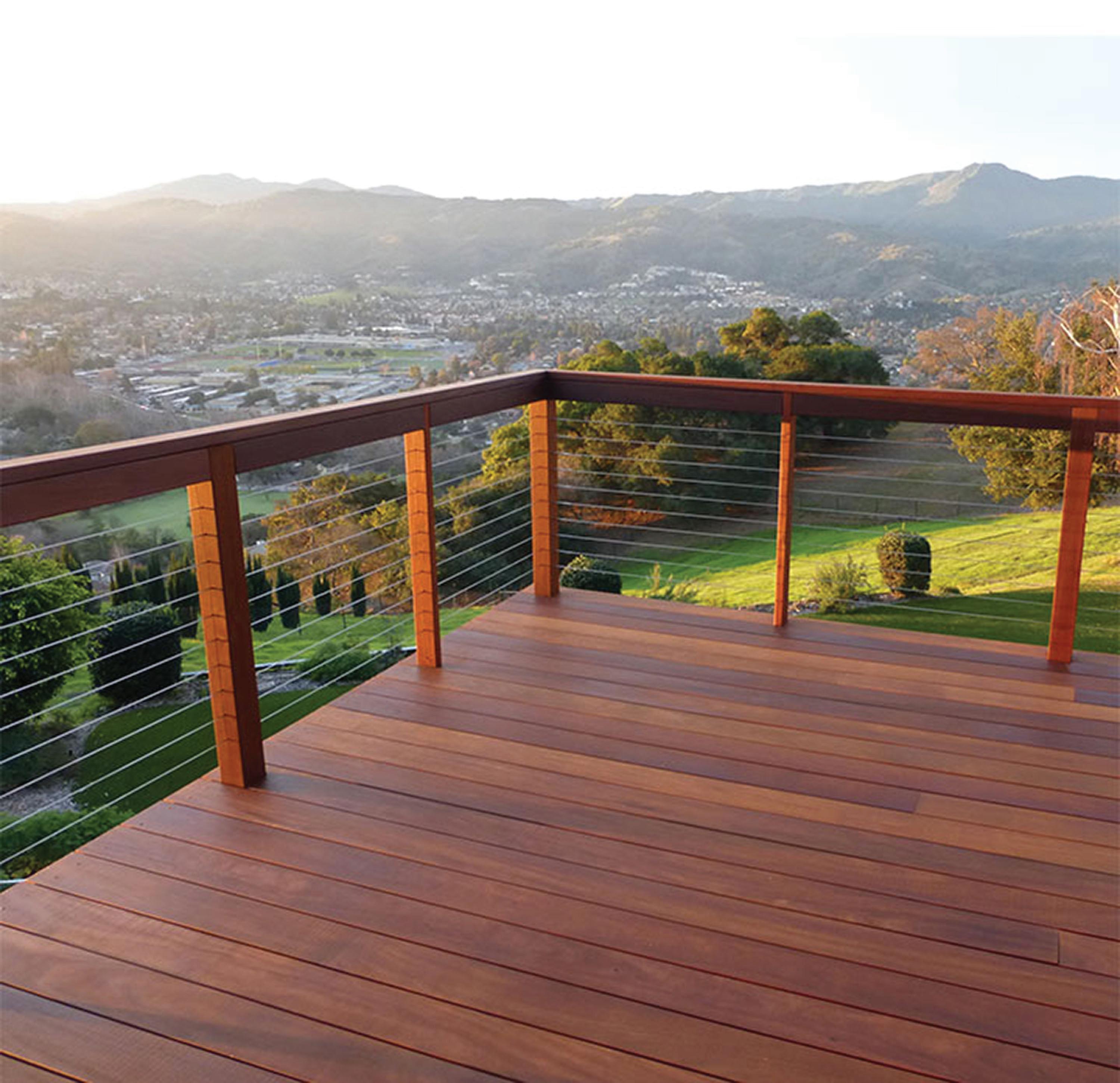
• Wood can have up to 20% moisture content
• No peeling, cracking, flashing, or shiners
• Wood can have up to 20% moisture content
• Conditions and rejuvenates wood
• No peeling, cracking, flashing, or shiners
• Conditions and rejuvenates wood
• Formulated for single coat application
• Formulated for single coat application
• No stripping / sanding on maintenance coats
• Wet stain marks blend in when stain is applied within 20-30 minutes
• No stripping / sanding on maintenance coats
• Can be exposed to rain 60 minutes after stain fully absorbs into wood
• Can be exposed to rain 60 minutes after stain fully absorbs into wood
Oil Based Exterior Wood Stains compliant in all states (not modified oils)
• A 2nd coat can be applied wet on wet or wet on dry for extra protection (for many applications)
• A 2nd coat can be applied wet on wet or wet on dry for extra protection (for many applications)
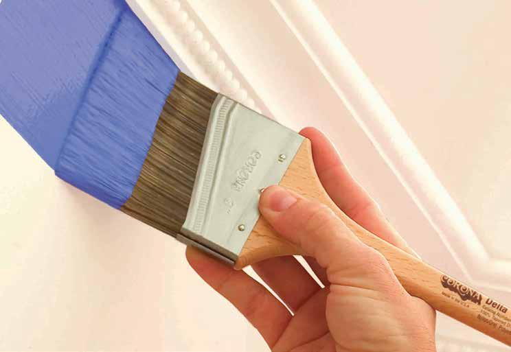
Put down the brush and pick up a roller for a smooth, even finish.

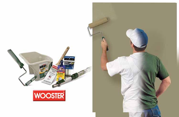
When painting walls, ceilings and other flat surfaces, a good roller will make your job quicker and easier. Because they can apply paint at about three times the rate of brushes, a roller cuts down on painting time and leaves behind a smooth and even finish. But before you get rolling, here are a few things to consider:
• If you are applying latex paint, choose a roller cover made with a synthetic “nap” or fiber surface. If you are applying an oil-based paint, choose a natural fiber cover or a synthetic cover.
• When selecting a roller, you should consider the length of the nap. They range from 1/8” (short) to 1” (long). Short naps are suitable for smooth surfaces, while long naps are best for rough surfaces such as stucco or brick.
• While it may be tempting to go with a cheap roller that you can throw away after, a high quality roller is a worthwhile investment. They will apply paint more easily, hold more paint, and have less tendency to leave nap fibers on the surface being painted.
• For latex paint, wash the roller sleeve in soap and water, using your hand to squeeze and push the paint off the fibers.
• For oil-based paints, pour solvent into the paint tray and dip and roll the cover into the solution.
• Stand the rollers on end as laying them flat will cause the fibers to mat on one side and create an uneven roll next time they are used.
Andriots has the paint & accessories you need to succeed
• Before painting, moisten the cover of the roller with water when working with latex paints or with a bit of paint thinner for oil-based paints. Lightly blot the roller cover with a paper towel to remove any excess moisture.
• Do not submerge the roller in paint. Roll it in the tray until it is half coated, then up onto the grid of the tray and then back down into the paint. Do this a few times to ensure the sleeve is well saturated but not overloaded with paint. You want as few drips as possible.
• Don’t start against an edge with a roller full of paint or you may get lumps. Instead, start about 6” from the edge so you can gradually unload the heaviest paint and then work your way toward the edge, where you can overlap areas already cut in by your paint brush.
• Roll the wall in a straight line from top to bottom to coat the surface. Work quickly, lapping newly applied paint onto paint that is still wet.
• Remember, the roller should sound wet; when you can no longer hear that crinkly, moist sound, it’s time to reload it in the paint tray.
• It’s important not too press too hard. Too much pressure can leave a “fat edge” or roller mark on the wall. After each stroke, lightly lift the roller away from the wall to avoid causing an edge.




Tips for cleaning and storing your paint and painting tools.
Congratulations on completing your paint project. It looks great! But now it’s time for the cleanup. It’s important to make sure your brushes are cleaned well so that they are free of paint and ready for whenever they are needed next.
LATEX PAINT
Gently scrape off the excess paint, ensuring that the bristles are as free of paint as possible. Wipe the brush against the brim of the can to work some of the paint out before rinsing it in soapy water. Work the paint free using your hands. Rinse and repeat until the water runs clear.
Similar to the above, except that instead of soapy water, you will need paint thinner to get the brush clean. Get the brush as free of paint as possible. Rinse it in paint thinner, using a brush comb to remove any stubborn, clingy bits of paint. Dip the brush in a clean container of paint thinner. Move the brush around to agitate the bristles. Shake out on dry newspaper and reshape the bristles.

• If sealed and stored correctly, paint can last a long time. Save the leftovers for touch-ups down the road. However, if you are certain you won’t use it again, see if someone you know can use it – a neighbor, a school or a community center. Sometimes groups such as Habitat for Humanity will accept extra paint, but call ahead.
• Never dump leftover paint down the drain. It can contain hazardous materials that can leech into the ground or contaminate water sources.
• Wet latex paint should be hardened before disposing. If there’s a small amount of paint left in the can, leave it in the sun, or alternatively, purchase a paint hardening additive to mix in.
• Review your local laws to see if paint can be included with curbside trash pickup. If not, find out where the nearest hazardous waste drop-off facility is located and take unused paint there.
If you forgot to thoroughly clean your paint brushes last time, they’ll be crusty and stiff as boards by now. Not to worry, they may still be saved.
1
Know whether your brush has natural or synthetic bristles. Use a cleaner appropriate for your bristle type, as a solvent-based cleaner could deteriorate a synthetic bristle brush.
2
Soak brushes in a jar of cleaner overnight (ensure it is in a well-ventilated area; the jar can be covered with foil to limit fumes) but be sure the brushes are suspended as they will soften and settle to the bottom of the jar, bending the bristles. Rinse well using directions for cleaning either latex or oil-based paint from a brush.

Follow this formula to estimate the paint requirements of your project.
You’re nearly finished painting when you look down into the almost empty can and realize – yikes! You won’t have quite enough paint to finish the job.
Estimating the amount of paint you need is as important as choosing your color scheme. Save yourself time and a panic attack by taking the guesswork out of your paint requirements using a calculator similar to the one on this page. It’s as simple as measuring the dimensions of the room being painted to find the surface area.
STEP 1: Measure the Walls
Wall 1 Width: ___ ft. X Height: ___ ft. = _____ ft.
Wall 2 Width: ___ ft. X Height: ___ ft. = _____ ft.
Wall 3 Width: ___ ft. X Height: ___ ft. = _____ ft.
Wall 4 Width: ___ ft. X Height: ___ ft. = _____ ft.
Add together to find Total Wall Surface = _____ ft.

STEP 4: Add Total Doors plus Total Windows to = Surface Not to Be Painted.
STEP 5: Subtract Surface Not to Be Painted from Total Wall Surface = Total Surface To Be Painted.
STEP 6: Divide Total Surface to Be Painted by the Spread Rate* = Amount of Paint Needed For Each Coat.
STEP 2: Measure the Doors
Door 1 Width: ___ ft. X Height: ___ ft. = _____ ft.
Door 2 Width: ___ ft. X Height: ___ ft. = _____ ft.
Add together to find Total Door Surface = ____ ft.
STEP 3: Measure the Windows
Window 1 Width: ___ ft. X Height: ___ ft. = _____ ft.
Window 2 Width: ___ ft. X Height: ___ ft. = _____ ft.
Add together to find Total Window Surface = _____ft.
*SPREAD RATE: The spread rate is the recommended yield you can expect from a can of paint. Typically, a U.S. gallon of paint will cover 350-400 square feet. As coverage may vary depending on paint product and thickness of application, check your paint can label to determine the spread rate before purchasing.
PRO TIP: It’s wise to buy a bit more paint than you think you will need for the job. This way, you can ensure you will not run out of paint before the job is done, plus you’ll have leftover paint for touch-ups.
Don’t run out! Let Andriots help calculate the right amount for you

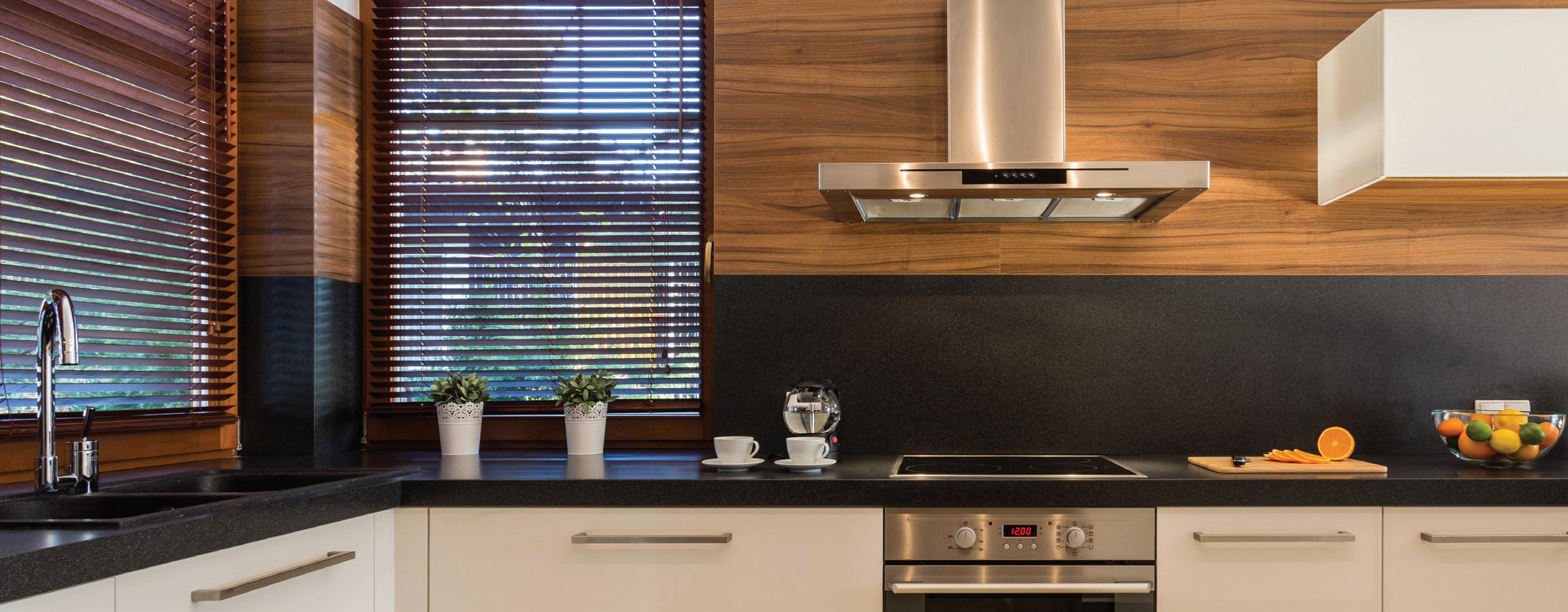
As elegant as they are resilient, wood blinds add natural color, character and warmth whether your taste runs from classic to contemporary. When shopping for window coverings to style your home, you will be faced with the choice between authentic wood blinds and faux wood blinds. Other than the obvious, is there much of a difference? In short, yes.
WOOD BLINDS: REFINED QUALITY, NATURALLY
If you’re seeking to add genuine organic elements to your décor or prefer eco-friendly alternatives, wood blinds are for you. Like a refined piece of furniture, wood blinds do not go out of style; their distinct fine grain and natural texture bring a sense of sophistication to any space.
It’s important to find out where wood blinds are sourced, as most are made out of North American hardwoods from sustainable forestry practices.
What most people love about wood blinds is that their attractive patina and unique details are undeniable and cannot be exactly replicated. Because of their naturally strong construction, they provide effective insulation all year around, while offering excellent privacy and protection from harsh sunlight. They are lightweight, durable and available in a wide variety of sizes and stain colors.
The drawback to genuine wood blinds is that they do require some extra care to prevent scratches or damage when cleaning, as they cannot be wiped with harsh chemicals. However, wood only improves over time, ensuring that with the right amount of care, they can last throughout the lifespan of your home.

FAUX WOOD: EVEN BETTER THAN THE REAL THING
“Faux” means imitation or artificial. While faux wood blinds are designed to look like what’s only found in nature, they are made entirely out of composite wood material, PVC/vinyl material, or have a wood core coated in a high-tech synthetic polymer. There are many benefits to this.
For one, these materials are very durable, shielding your blinds from warping, fading or cracking if exposed to too much moisture or sunlight. This resistance makes them especially suitable for rooms with high humidity – bathrooms, laundry rooms, basements and kitchens, as well as in coastal or tropical climates.
Secondly, and often most important, faux wood blinds are affordable. They are an economic way of incorporating a “natural” look that fits your budget. Lastly, they are also easy to clean with water and home cleaning products without worrying about causing damage.
As versatile and as inexpensive as faux wood blinds are, one downside is that they tend to be heavier than their real wood counterparts. This can make them slightly more difficult to raise or lower on a large window.
“WOOD” YOU BE LOOKING FOR BLINDS?
VISIT
ANDRIOTS TO VIEW OUR WIDE SELECTION OF MODERN WINDOW COVERINGS.

PRO STRETCH™ is a one component, high performance, gun-grade, Acrylic Urethane Elastomeric Sealant. PRO STRETCH™ offers superior adhesion and durability, 50% total joint movement and 800% elongation. PRO STRETCH™ is safe for UV exposure, will not discolor and forms an airtight, water resistant seal, once cured the bead is mildew resistant.




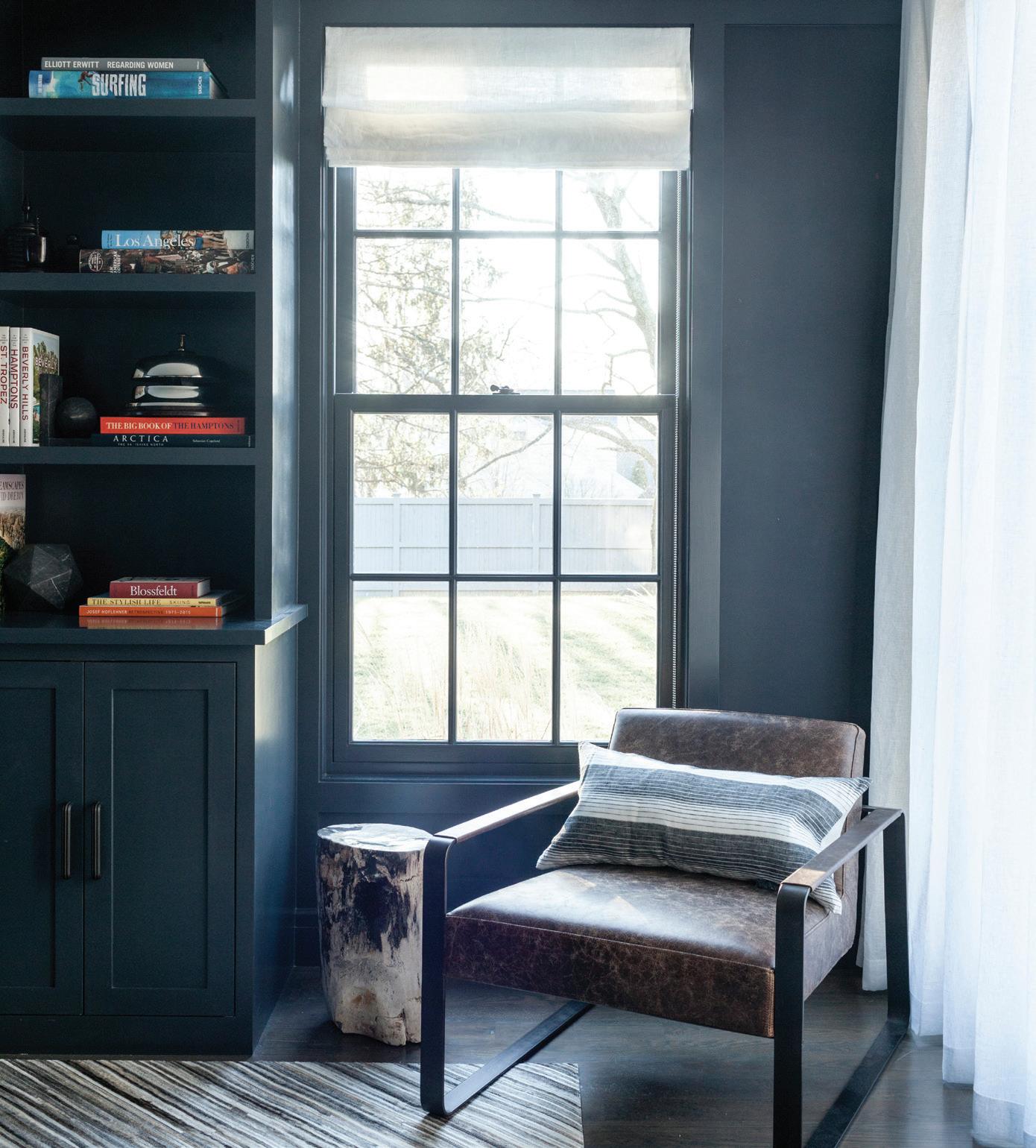
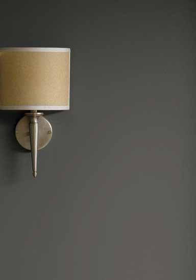
A sultry but sophisticated tone that provides a masculine energy with its depth and assertiveness. Its versatility is its best quality: perfect as a floor-to-ceiling interior wall for an immersive and moody aesthetic, or as an accent to provide some intensity to a lighter toned space. This shade brings ambiance through its richness and serenity through its calming and subdued elegance. “Black Pepper” is the little hint of spice that everyone needs in their home.

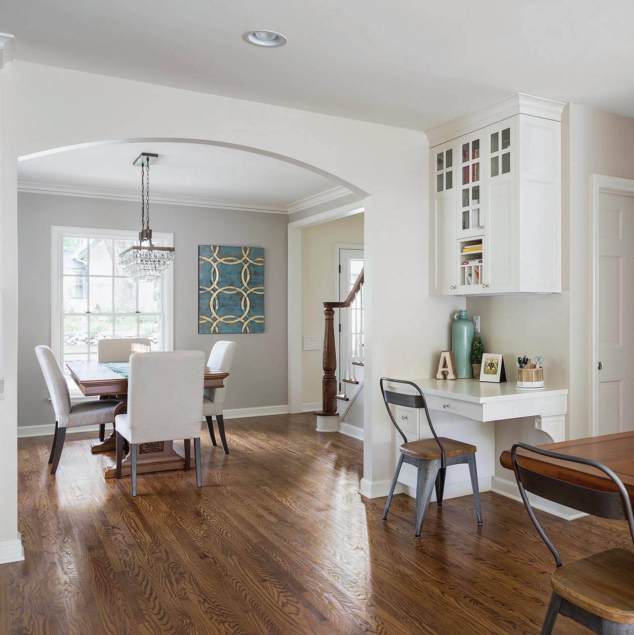
This delicate and creamy neutral is complex in its composition and sits on the fence between warm and cool, a magnificent hybrid of grey and beige, making its applications endless. Somewhat of a chameleon, “Balboa Mist” will take on the sensibilities of its surroundings, but without sacrificing its simple yet chic character. Darker than your regular cream, the shade is endowed with an allure that heightens its timelessness and renders it the perfect color for an open concept space.

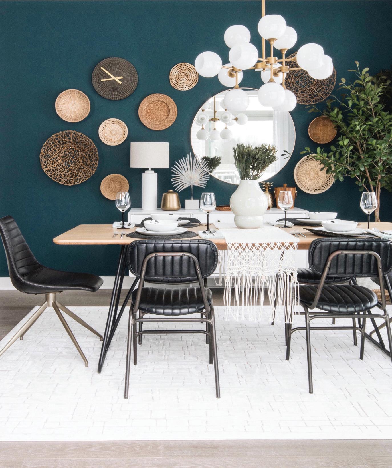
Bold, beautiful, and irresistibly appealing, this teal shade adds depth and dimension to whatever space it occupies. Its personality is vibrant and energetic, but it still achieves subtlety through its darker shading. “Beau Green” is the perfect accent wall color, pairing beautifully with neutrals across the spectrum. Its enigmatic greenish hue is exactly the “wow” factor you need in your space.
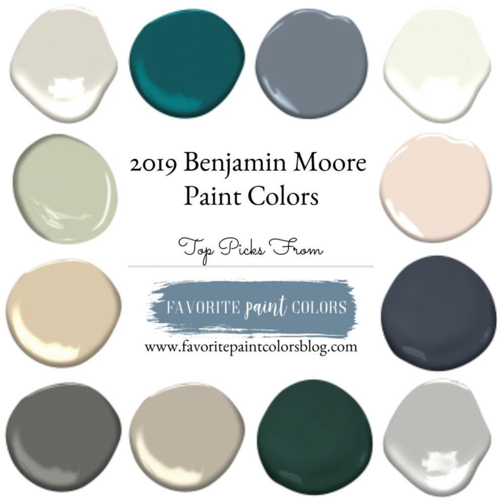
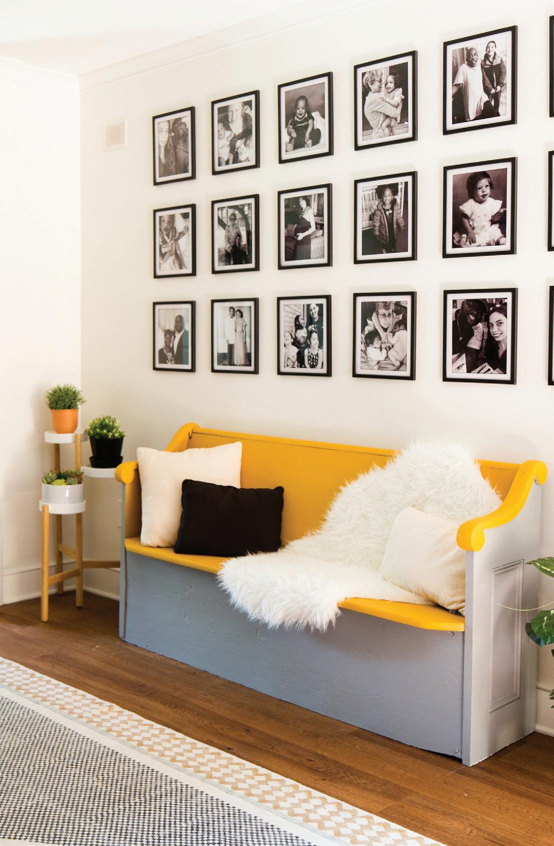
This optimistic and saturated color is one that most certainly sparks joy (as Marie Kondo would put it). Its bold and brilliant yellow is one that evokes the feeling of spring, energizing its surroundings like the rays of sunshine it emulates. “Yellow Marigold” is undeniably hopeful in its composition, brimming with buoyancy while still appearing mature and refined. Perfect as a pop of color to elevate a neutral palette, as pictured here, or in a smaller space.







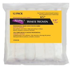
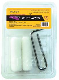
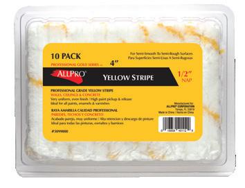

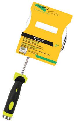



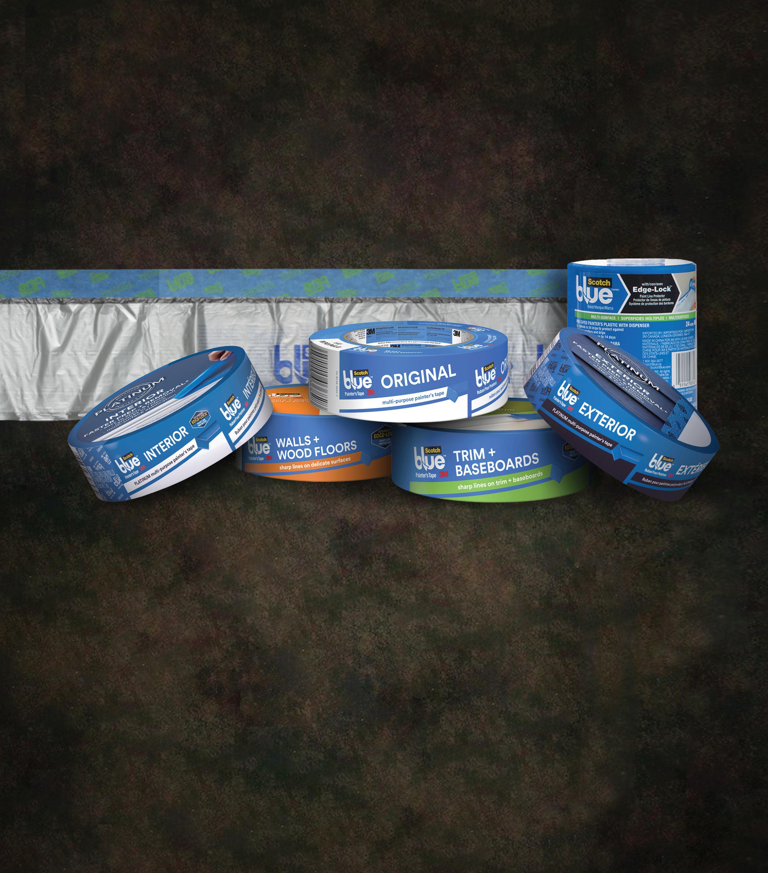
IPG®’s full line of masking tapes provides value and performance for both the contractor and consumer alike! Whether on the job at a new construction site or giving your home a fresh coat of paint, IPG has the solution for you!
Pro•Mask Blue ® with Bloc-It®
Pro•Mask Blue ® Designer
Production Painters Tape
PG5 Masking Tape
PG29 Masking Tape







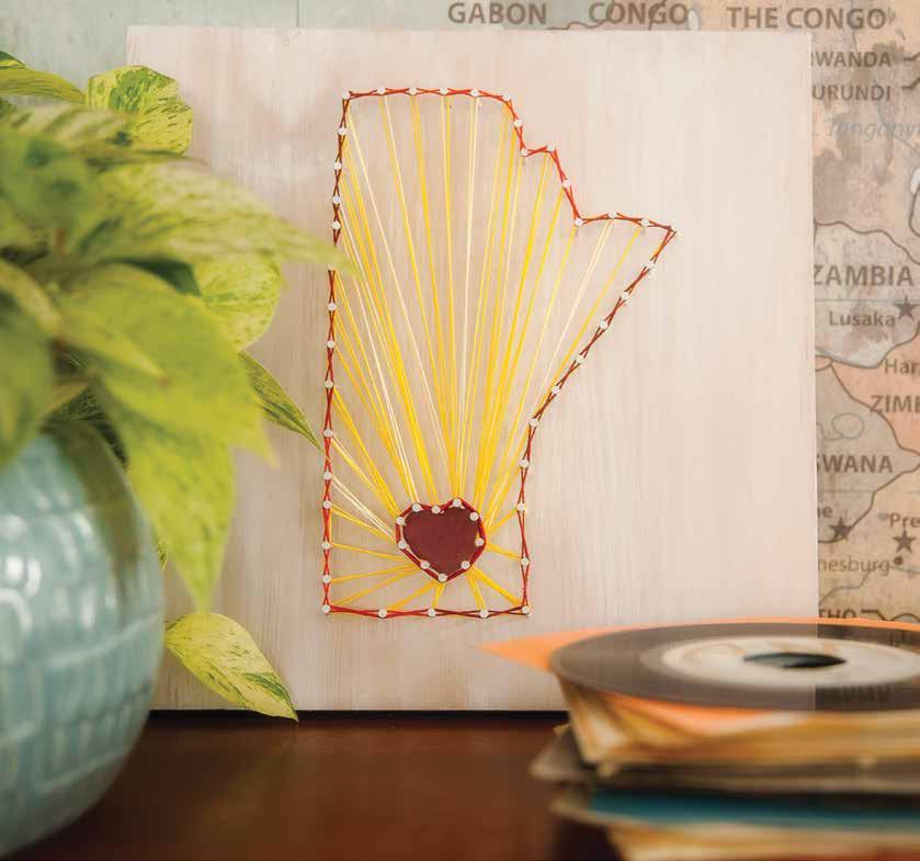
Looking for a way to spark your creative juices and start the spring season with some new hand-crafted décor? This string-art DIY is the perfect place to start. The difficulty can be managed by selecting a template that matches your skill-level and you can customize your design and color based on the template you select (the options are plentiful). The finished product will add a personalized touch to your home and provide you with an opportunity to boast about your creative prowess when entertaining.
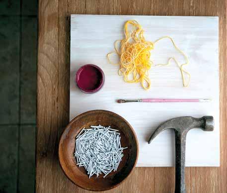

• Small Finishing Nails
• A Piece of Wood
• Baker's Twine, Jute or Embroidery Floss
• String Art Template (Sized & Printed)
• White Paint or Stain
• Hammer
• Pink or Red Paint
• Brushes
• Sanding Block or Paper, Medium Grit
If you are looking for a kid-friendly version of this craft, simply hammer in the nails before passing it off to the youngsters!
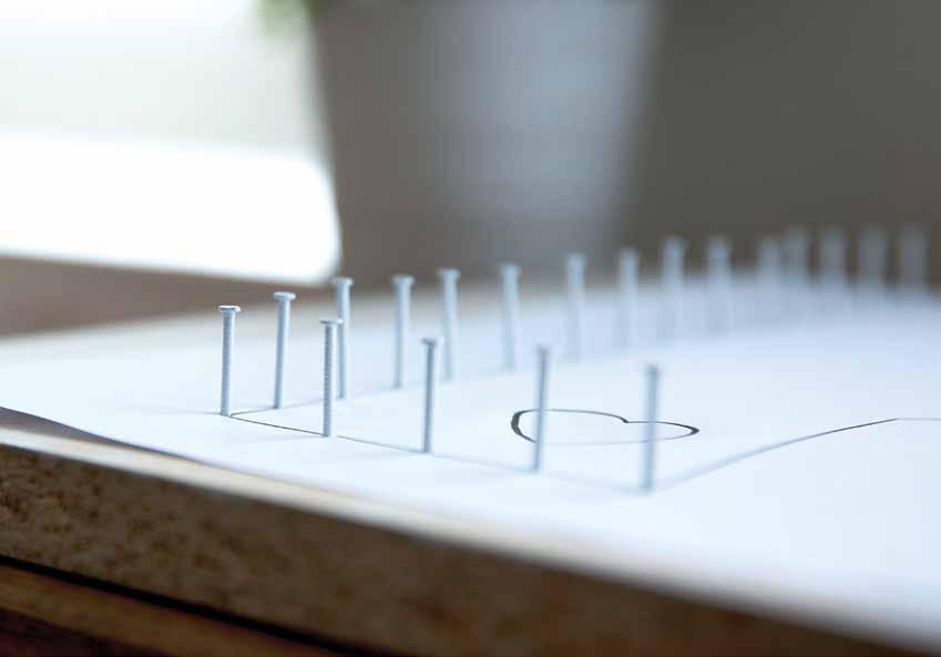
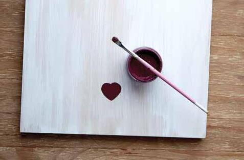
STEP ONE: Sand the face and edges of your board until nice and smooth with a medium grit sanding block or sandpaper. Paint or stain your board white and allow to dry. Find a template or design that you like, or sketch a simple image outline onto your wood. Trace or freehand a heart shape onto the board positioning it within your template or sketch at the desired location and paint out the heart in pink or red with a small artist brush.
STEP TWO: If you are using a printed template, secure onto the piece of wood using tape or clips (depending on the thickness of the wood you’re using). Before you begin nailing your template, consider how you want to hang/display the wood and ensure the placement of your template is conducive to this. If you are going to hang your wood using hardware, it is much easier to complete this step before you begin nailing.
STEP THREE: Begin hammering your nails into place over top of your paper template. We found it easiest to
put the nails in the corners first, and then add nails into place at a quarter or half-inch distance between each. If your design has interior shapes, it is best to work from the inside out.
STEP FOUR: Once the nails have been secured, you may carefully remove the paper template. Double knot your string around one of the nails (it doesn’t really matter where you start). Pull it tight so it will not slip and then trim the tail end of the rope.
STEP FIVE: Depending on whether you are looking to make geometric or more organic looking shapes with your string, you can loop your string around nails in a random pattern, skip the same amount of nails each time or use a very precise pattern.
STEP SIX: Continue until you are satisfied. For a more polished look, trace the string around the perimeter of your design and/or around the heart shape.
TRANSFORMING THE TILE INDUSTRY FROM THE INSIDE OUT
How Fireclay Tile re-invented the tiling industry by focusing on ethics, sustainability, and their employees.
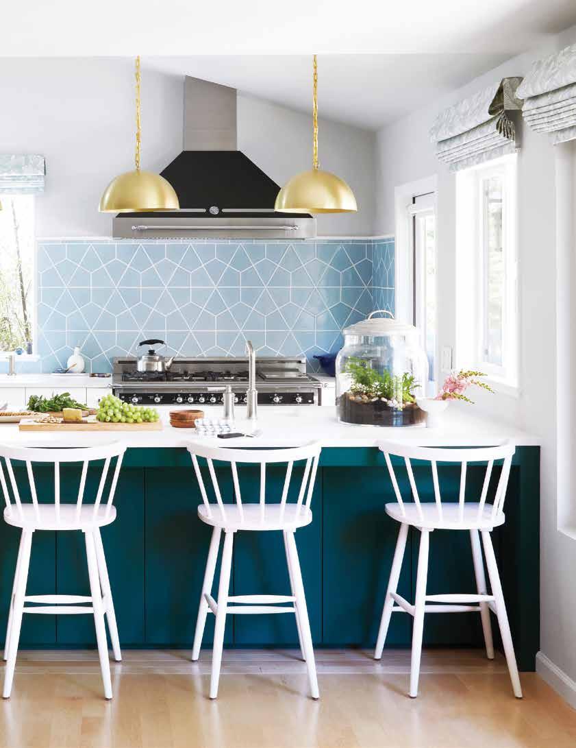
Tile is an often overlooked staple of kitchen and bathroom surfaces, but with the right design and shape, the perfect selection will energize and elevate an entire room.

In the world of interior design, there are those that follow trends, and there are those that set them. These trailblazers are the innovators—the companies that are changing industries from the inside out by challenging their competitors to engage in more ethical and sustainable business practices. At the first impression, its apparent that Fireclay Tile has set out to be one of these trailblazers: sharing “We’re scavengers. We’re innovators. And we’re changing the way you think about tile.” on their company website. With a primary focus on ethical production, they consider themselves to be “reinventing, redefining, and radicalizing the industry” and it is this mentality that has driven their success.
The story of Fireclay Tile’s genesis has a certain familial texture that pulls at the heartstrings and inserts itself into a wider
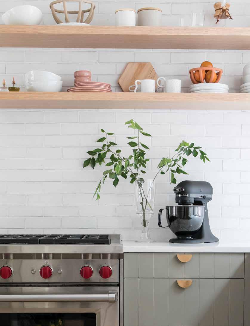
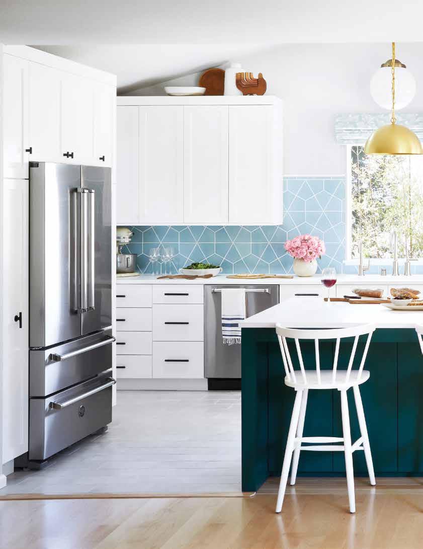
The only thing better than your classic white subway tile back splash is knowing that you are supporting a company that takes their impact on the environment seriously.
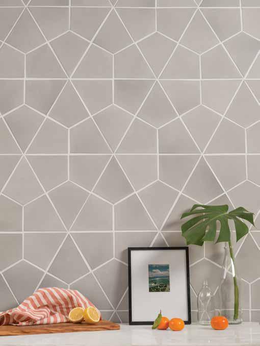
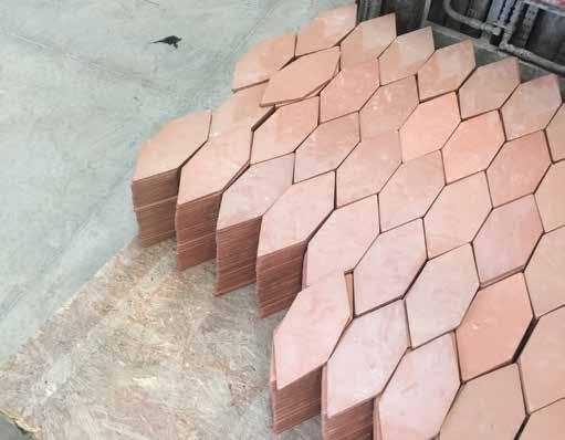
context of the human story, inviting connection by making you feel a part of their tradition. The company’s chief ceramicist, Paul Burns, was just ten years old when he began apprenticing under his Uncle, planting the seeds of what would one day become Fireclay Tile, and transforming a family tradition into an ethically executed empire.
Their ability to strip the industry down to its roots and relate the task of tile making to the human condition and our progress narratives throughout history is irresistibly effective. “It’s about the earth. We dig our hands into the dirt and feel a connection to the past, to our history, and to our need for shelter.” This sort of mentality calms and soothes the millennial mindset, which is in a near constant state of information overload. We are wired to seek out ways to create meaning from even the simplest of choices, driven toward participation in the human story in some profound faculty. The invitation here is simple: make tiles with us and you will feel connected to the earth and the past in a way that feels impossible in present day. We feel connection through out relation to the stories we tell ourselves and each other, which is perhaps why branding techniques such as these can be so powerfully impactful.
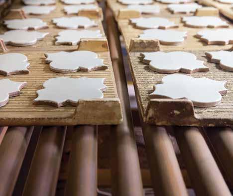
They make their tiles to order as to reduce waste, and are committed to using exclusively local and recycled materials, reducing waste and creating 100% sustainable products. Their commitment to environmentally friendly business practices goes the extra mile (literally!). Too offset the carbon emissions generated from shipping their tile to customers, they’ve
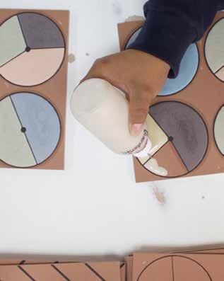
partnered with the Carbon fund. They re-use shipping crates cushioned with sawdust from a local furniture manufacturer in boxes that are also 100% recyclable. It’s clear that Fireclay Tile does more than just talk the talk when it comes to conserving the environment. There is a genuine regard and love of what they do rooting their idealist vision.
But it is more than just their humble backstory and ethical vision that breathes life into this brand — it’s their passion. This passion is evident in the way they talk about their resources: “Clay is one of the oldest building materials known to man, yet somehow, it continues to surprise us everyday.” The team works directly with customers to craft each tile by hand, which they say “captures a little part of us… in every tile we make.” It’s clear that beyond their clay, it is their people that bind this brand together.
Despite the rapidly evolving technological world in which we live and the revolving door of methodologies and tools at our disposal, Fireclay Tile steadfastly believes that their most valuable assets are “locally-sourced materials and the cultivated hands that shape them.” Just as Fireclay Tile goes above and beyond the standard obligatory environmental practices expected of businesses in 2019, their respect for their employees does the same. Their company website shares “We are dreamers and adventurers with a tenacious spirit…. We are a team that looks more like a family. We work hard and play hard.” They understand that in order to have a business that consistently yields top quality products, the people in charge of production have to come first. That’s why they offer equity stakes, benefits, fair living wages, paid time off, and invitations to Fireclay’s famous BBQ’s to each and every one of their employees. Employees can feel it when their employers care about them, and when employees feel valued, they are more likely to care about their company’s success. If their business model is not enough to sway you into exercising your purchasing power in Fireclay Tile’s favor, their product certainly is. Their tiles are stunning and imbued with all the TLC you would expect from a brand that brings such care and thoughtfulness into their production methods. The intricacies of the hand-painted designs are arrestingly beautiful, and a happy reminder that there is a certain ineffable human touch that remains to be replicated by the power of machine and technology.

Design: Chango & Co.
Text: Carlee Baigrie
Photography: Raquel Langworthy
A simultaneously polished and playful space invested in the farmhouse aesthetic, but equally committed to taking stylistic risks, achieves a refined rural allure through its balance of tradition and individual expression.
When Chango & Co began working on this Westport property to create a summer home for the owners, a young family of five, they wanted to deliver a “well-polished and high-end home” that “did not feel showy or unapproachable.” Elaborating, Susana, the lead designer on this project, shares that their mission was to create a home that felt “livable, kind, and open-hearted.” We certainly see this commitment to comfortability on full display, however, it is executed with a consistent eye for detail that elevates even the more laid-back design elements of the space so that it achieves the high-end allure described as a goal for this project. For Chango & Co, this balance is the defining feature of the space: “people seem to have reacted well to the fact that this home delivers on the farmhouse aspect but is decidedly elegant and timeless.” This modest acknowledgement of praise is mirrored in the sensibility of the home, which seems to be quietly confident, humble, and yet utterly extraordinary.
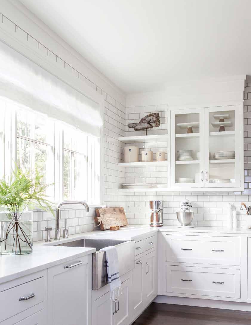
The project was not all rainbows and butterflies, however, as Susana reveals there was a major time constraint that placed serious pressure upon designers and contractors. Chango & Co was hired onto the project in February of 2016, with an expectation of having it completed by early June, when the family would (ideally) begin their first summer with their new vacation home, which would act as a retreat from the hustle and bustle of city life into the slower-paced lifestyle that their new farmhouse would supply. This left Chango & Co with a mere four months to “design, purchase [furniture, décor, appliances], and install a 12,000 square-foot home from scratch,” a daunting task for any project, let alone one of this magnitude. Thanks to the power of teamwork, many late nights, brainstorming sessions, and coffees, they were able to pull off their clients’ request in time for them to enjoy a first blissful summer with their new Farmhouse.
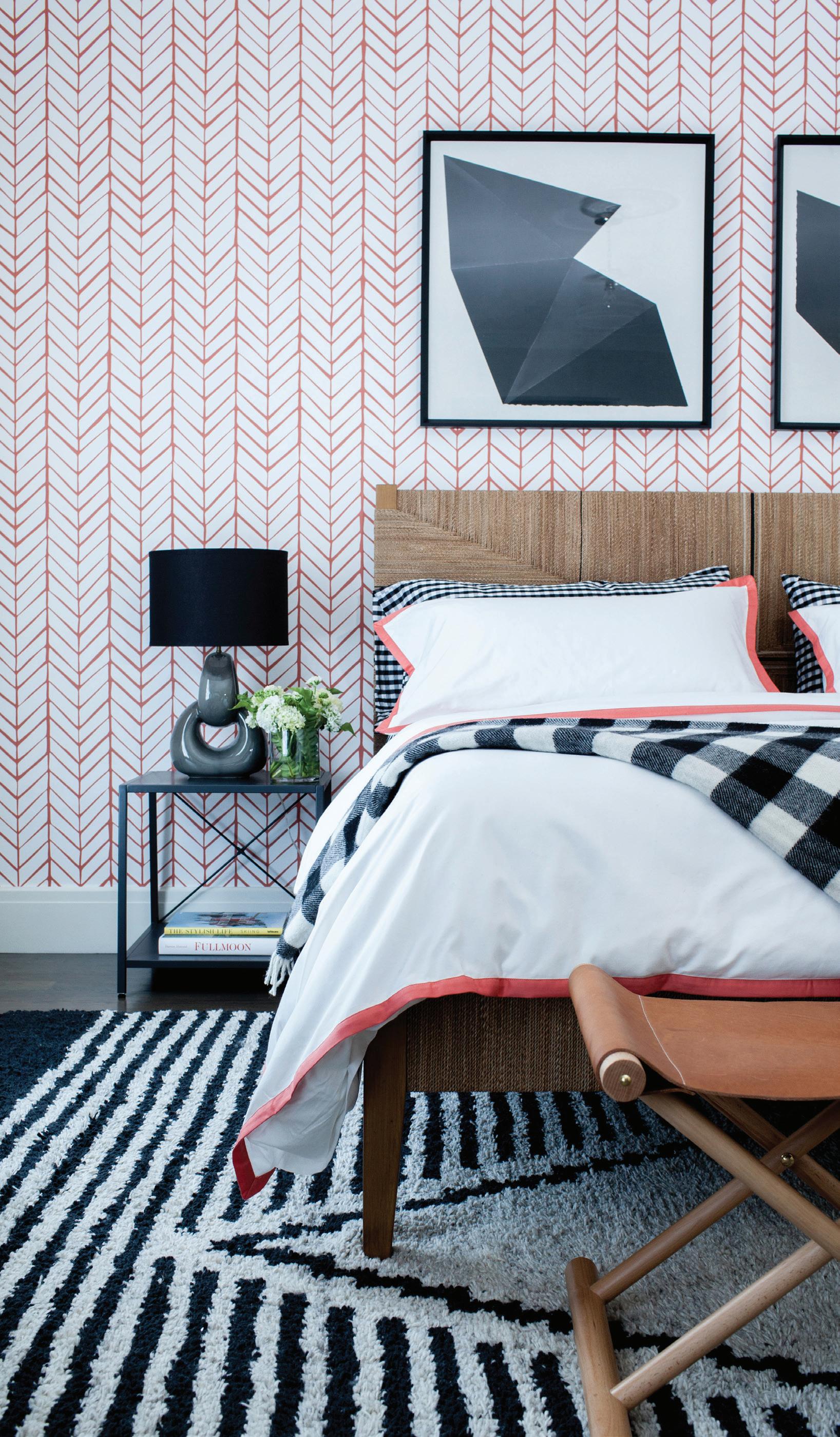
In terms of inspiration, it appears that there was no shortage. Upon purchase, the home reportedly already had phenomenal bones, making its very structure a constant source of creative influence. Susana shares that “the house was beautiful, and the family even more so. It was easy to find inspiration at every turn.” Susana also shares that this is true to the majority of her projects, as she enjoys taking her “cues on design both from the homes (location, scale, etc.) and from the people who inhabit them.” For the clients of the Westport Farmhouse, they were after a home that fit with their lifestyles. They wanted a home that “felt clean and relaxed, yet… also playful for their three children.” This playfulness comes out predominantly in the children’s bedrooms and playroom, which feature whimsical prints, patterns, and images to emphasize a juvenile tone and bold colors to add energy. But this youthful energy also crops up in unexpected places as well: red and white wallpaper featuring geometric patterns livens up a guest bedroom while stripped patterned textiles in the form of pillows and tea-towels relax the neutral palette of the common spaces of the lower-level.
This commitment to molding a home around the individual nuances of the client is critical to Chango & Co’s vision. Susana shares that they like to think they “work with nice people with open minds and that each one of our projects is a reflection of our client’s personality.” Translating this personality into stylistic elements is a pleasurable task, as it is incredibly rewarding to see the results of such an endeavor.
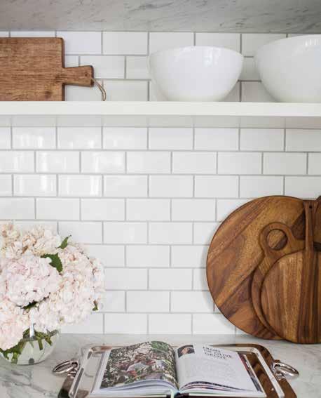
Bottom right: These chairs provide a unique texture, enhancing the sleek lines of the space adding a bohemian edge.
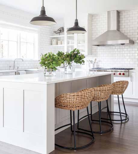
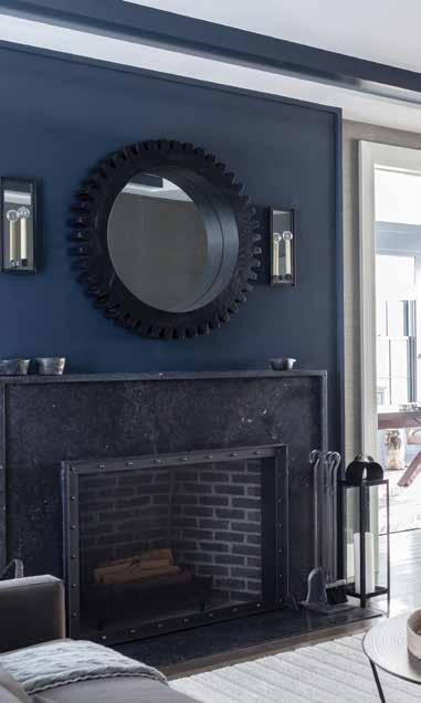
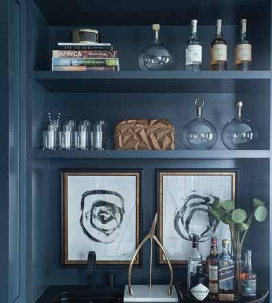
Particularly, with a project of this scale which gave Chango & Co such a significant amount of space to experiment with contrasting elements that still fall together in cohesion with the other aspects of the home. The home maintains a weightless feel throughout, despite boasting a generous array of color. Common spaces are filtered with streams of natural light, while neutral tones with subtle prints, patterns, and textures mingle to generate depth.
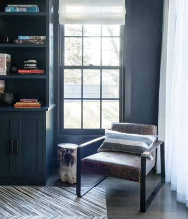
The home’s office/den marks a departure from the buoyancy of the rest of the home, which is cemented through predominantly neutral shades, earthy tonal elements, and airy textiles. Its darker hue mirrors the sophistication present in the rest of the home, but with a decidedly more austere demeanor. It’s moody navy blue cascades over shelves and cabinetry, while ample natural light filters through several single hung windows, softening any severity developed by the darker tones to formulate a stoic and pensive sensibility instead. The office is, traditionally, a space of quiet revere, and Chango & Co materializes this memory of the office, and all of its associations of wisdom and reclusive tendencies, while incorporating modern twists to update this classic space. Bar accessories, glass ware, and a wine fridge add both convenience and character.
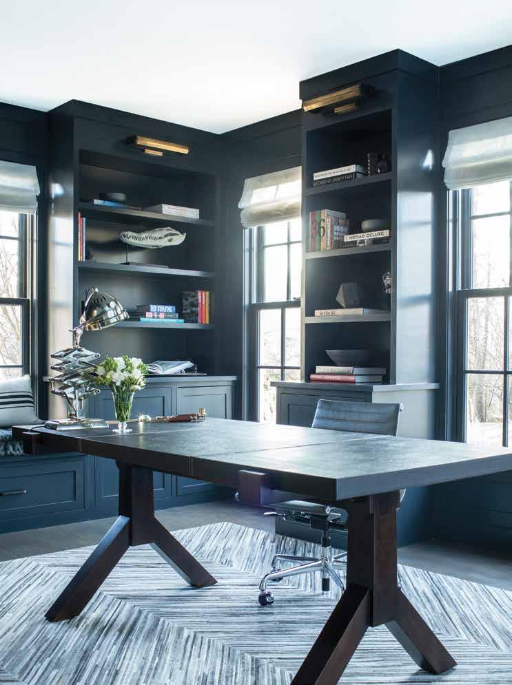
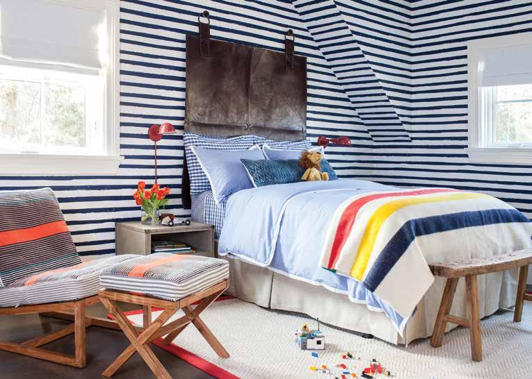
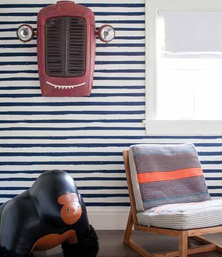
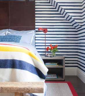
Top: Several striped-patterns in varying scales bring a liveliness to this youthful space, while contrasting scales prevent these prints from overwhelming the eye.
Left: Fun elements heighten the juvenile texture of this bedroom.
"THE HOUSE WAS BEAUTIFUL AND THE FAMILY EVEN MORE SO. IT WAS EASY TO FIND INSPIRATION AT EVERY TURN."
This nursery is a sky-blue sanctuary for a little one to play and rest. Detailed wallcoverings outfitted with bird-like figures emulate the airiness and vitality of a beautiful summer day.
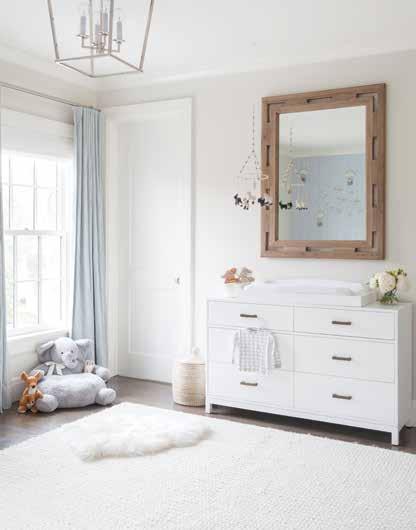
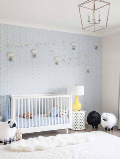

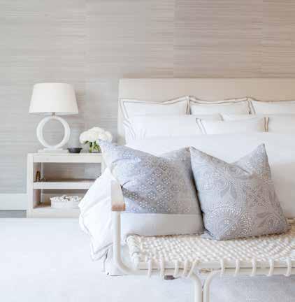
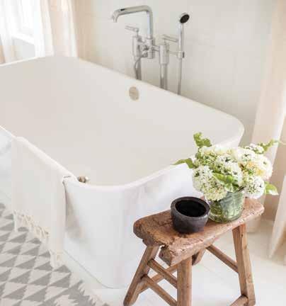
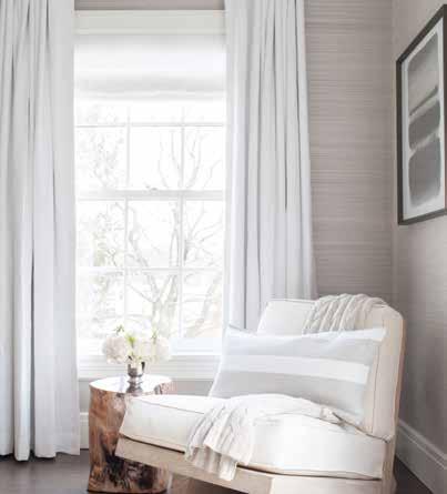
This project marks an astonishing amalgam of style and function, comfort and class. The house maintains a cohesive overall aesthetic while also taking the time to experiment with bolder concepts and ideas. The home’s simple yet sophisticated stylings conspire to create a comfortable second home for its inhabitants. Chango & Co courageously manages these colorful spurts of energy within the enduring elegance of the larger design concept with effortless precision, achieving a home that will act as the perfect nesting place for a tight-knit family to enjoy one another’s company after a long summer day filled with sun-soaked adventures.
Top Left: Subtle decor elements like this intricate and elegant pillow print provide a sophisticated air to this light and airy master bedroom. Top Right: Rustic touches like this worn wooden stool bring the energy of the natural world into the home.
Right: A cozy reading chair paired with a wooden stump-inspired side table makes for the perfect afternoon resting spot.








Kimberley Horton creates her family’s dream home with a mix of bohemian and modern sensibilities; a timeless space to grow with her and her loved ones.
Design: Kimberley Horton, KH Home Design & Furniture
Text: Carlee Baigrie
Photography: Allegra Anderson Photography
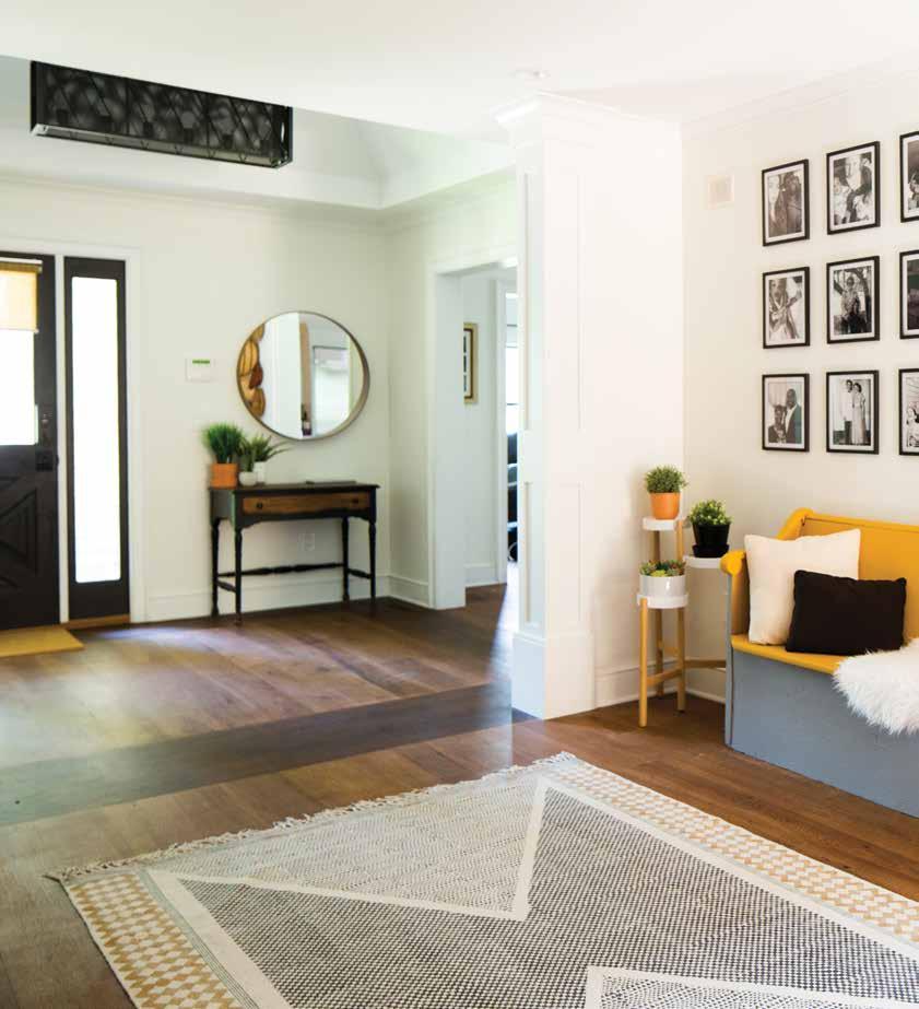
A spacious entryway featuring designer, Kimberley Horton's repurposed console table, graciously welcomes guests as bohemian elements energize the home's neutral color palette.
When Kimberley and her family purchased this 1980’s home, they understood that they were paying for the home’s potential. A year after their purchase, and after realizing just how much this house didn’t fit with their family, they embarked on a full-scale renovation to create the house of their dreams. A professional interior designer herself, Kimberley had the unique opportunity to be her own client, a position that had both negative and positive implications. Kimberley elaborates, sharing “working with clients, you kind of have to figure out their style, whereas I already knew mine, so I got to skip the questionnaires.” While Kimberley enjoyed being able to see this project through from start to finish and be involved in every decision, this emotional investment also came at a cost: “at times it was difficult; I knew what I wanted but being able to share that in the midst of the construction process” wasn’t always the easiest thing to communicate. Learning how to articulate her vision effectively “all while people are hounding you and things are being delayed and going wrong” has given Kimberley new insights that she feels will give her a leg-up in her future interactions with clients. This experience of being displaced from your home during construction, or else living through the chaos, has helped her to better empathize with the stress her clients often endure: “now I have that first-hand account of what my clients go through,” she relates.
Kimberley describes the finished renovation as a true representation of her personal style, while also involving elements of her husband’s “ultra-modern” sensibilities. She discusses trying to formulate this synthesis, saying, “I like modern… but I don’t like the cold, sterile environment that tends to come with ultra-modern, so my house ended up being a collection of both.”
Subtle interjections of Kimberley’s more freespirited and cheerful aesthetic inclinations work well to bring a fresh and functional take on her husband’s more modern preferences. This balance was achieved by consistently finding ways to incorporate personality through pops of color, vintage pieces,
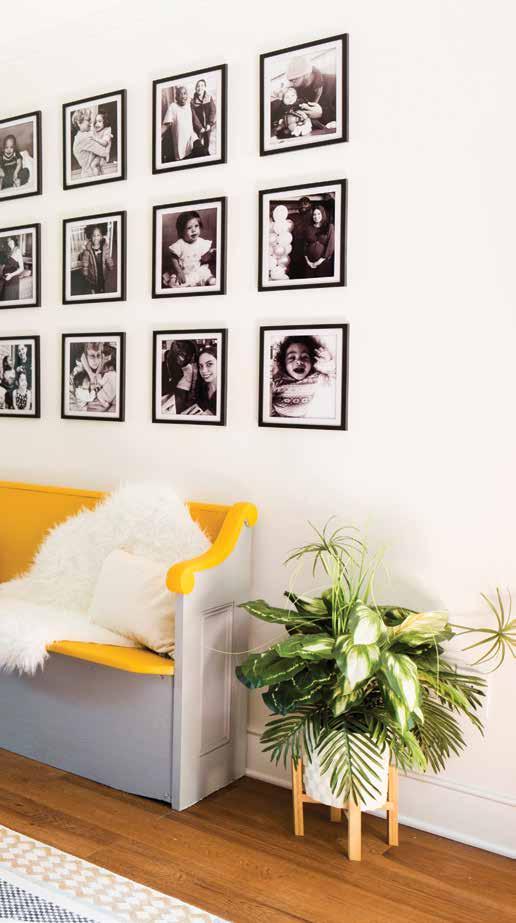
An evenly-spaced gallery wall offers a structured but subtle pop of personality above a bench filled with cozy furs.
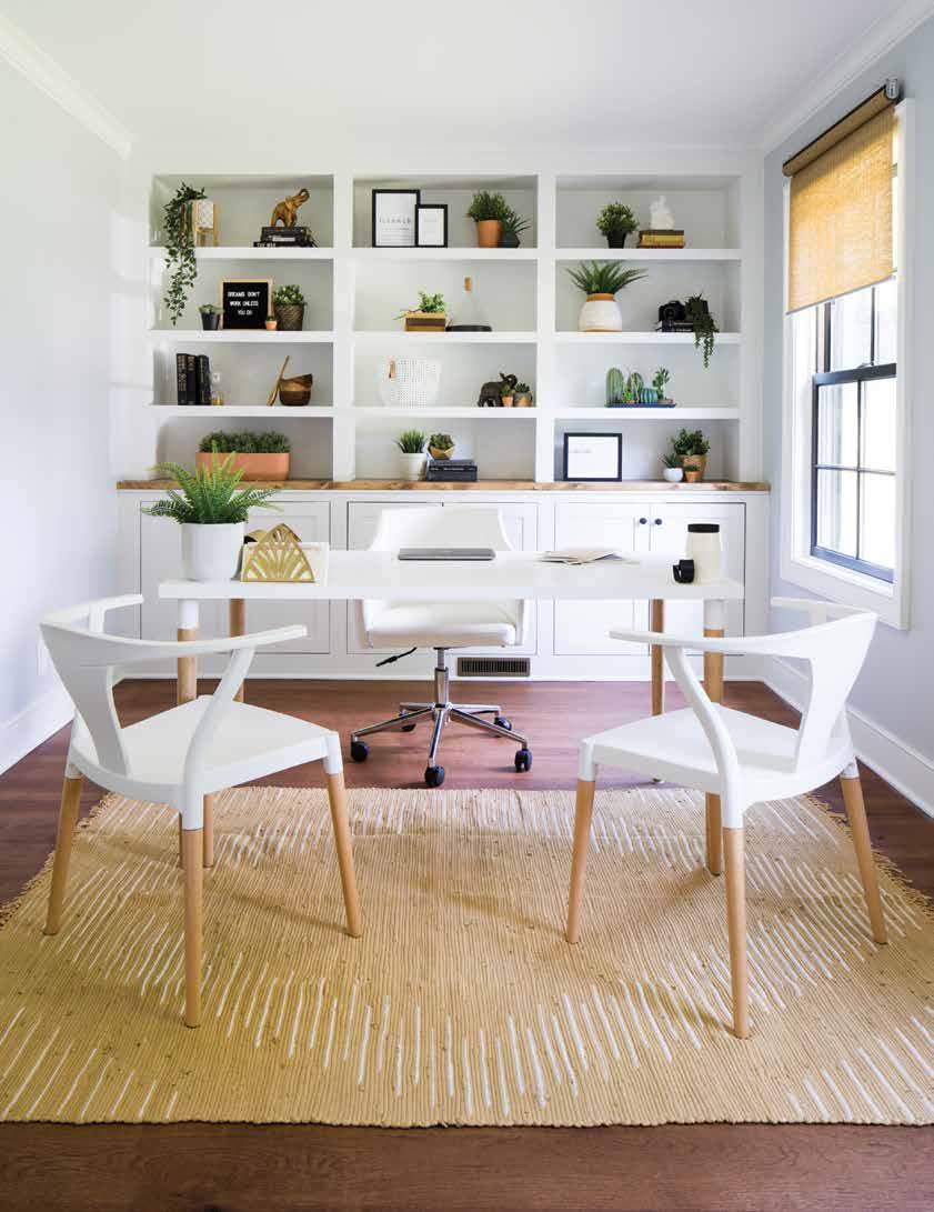
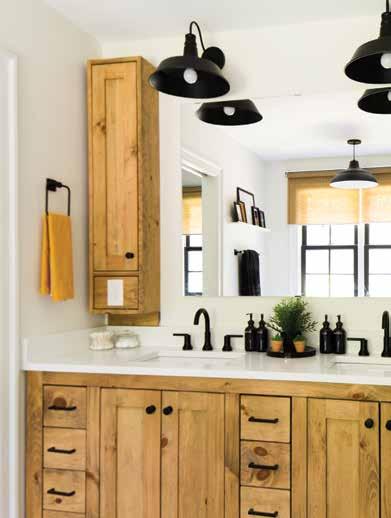
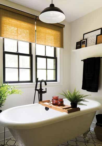
and other elements to add character and warm up the modern build of the home: “we have clean straight lines, white, against dark blacks,” but there is also an undeniably welcoming and inviting charisma attached to the space. We see this dynamic operating on a multitude of levels, but primarily in the bathroom, which showcases a large wooden vanity, custombuilt for the project and a stunning claw-foot tub that gives the room “that old-school feel.”
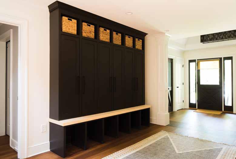
Kim describes her own style as a rebellion from the cookie-cutter: “I’d rather be a little funky and play around.” This playfulness is evident throughout Kimberley’s home, which is constantly softening the sleeker and more streamlined aspects of the home with fresh and bohemianinspired décor. Eclectic and custom-built furnishings play an instrumental role in warming up this space, a prime example of this being the stunning refinished entry-way table, which Kim repurposed herself in her spare time, an activity she enjoys “when the creative energy is flowing.” More stunning custom pieces include the locker-inspired mudroom cabinets, which were an absolute necessity for Kimberley, a mother of four young children who haven’t yet discovered the art of cleaning up after themselves. There needed to be a space “where jackets, coats, and boots could belong, but also be hidden.” To a certain extent, building a home for a large family is mainly about organizing the chaos.
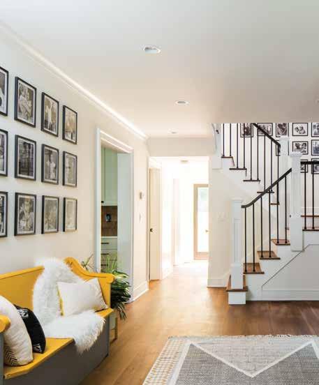
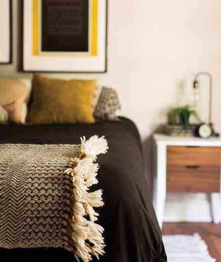
Kimberley shares that she believes homes need to be built to function for the families that live in them. Constructing a space that worked for Kimberley’s family was slightly more complicated than your typical build, as her husband is a towering 6’5 football player who couldn’t fit into the home’s original narrowed hallways and doorways. “Our shower had to be heightened, all of the doorways widened,” Kimberley discloses. To accommodate her husband’s size, Kimberley attempted to eliminate any hallways or cramped spaces and instead focused on making the big open spaces of the home as functional as possible. She jokes, “No one ever thinks of these things! But then, you think, oh, it makes sense that Shaq has a ten-foot bed!” Providing these personalized touches that can drastically improve day-to-day life for a home’s inhabitants is an incredibly rewarding aspect of the job; it was a unique pleasure to be able to provide this comfort for her own family.
When Kimberley first embarked on this journey, her goal was to create something timeless. She continues, sharing “the foundation of the house will be able to grow with us, change with our personalities and styles.” The pieces that bring the home its own unique texture are easily interchangeable and mutable if they need an update or a fresh spin. To sum up her feelings about her new home, Kimberley swoons: “it’s everlasting”; a stunning labor of love that has translated into a home that will nurture her family for years to come.
A custom wooden vanity adds character to the home's master bath, complimenting the stunning claw-foot tub that anchors the room.
• Proprietary trimming process for superior edge and straight lines.
• Ultra Stiff formulation for better paint flow and control with low VOC and heavy-bodied coatings.
• Durable filaments maintain form after every use.

TO YOUR TASTE
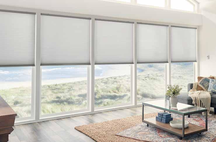
A well-dressed window is fundamental to your well-appointed home. Whether contemporary or traditional or somewhere in between, you’ll find a Graber custom window treatment to suit your style.
For our comprehensive product portfolio, check out graberblinds.com/athome.


purdy.com
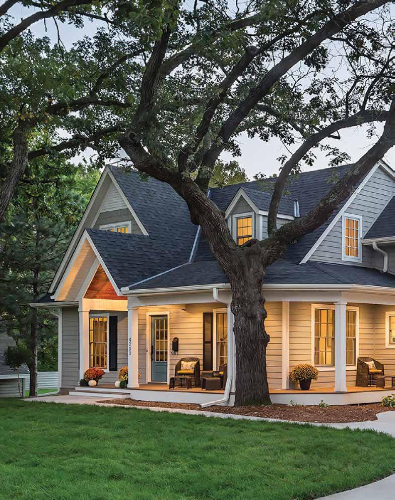
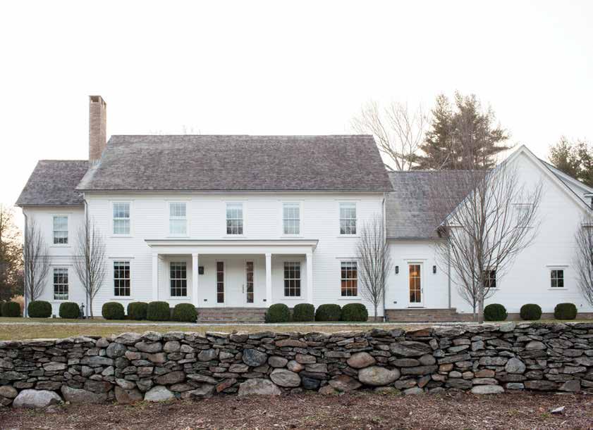
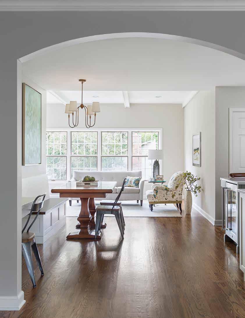
Anchor Builders gives a “diamond in the rough” property a makeover, enhancing the home’s original charm and adding modern textures throughout.
Design: Anchor Builders
Text: Carlee Baigrie
Photography: Andrea Rugg Photography
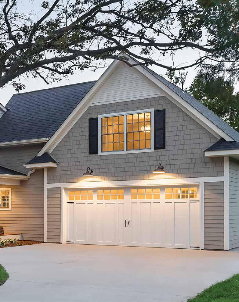
Anchor Builders replaced the original one-car garage with this spacious two-car unit along with the master bedroom that sits atop, overlooking the front of the property.
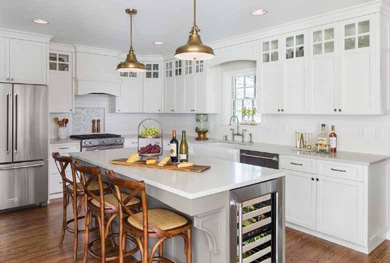
Jackie, from Anchor Builders, calls the “Farmhouse Fusion” property a “diamond in the rough.” This hidden gem is nestled in the northern suburbs of Minneapolis, surrounded by trees and a preserved marsh, which their backyard stretches out to meet. This sort of space and serenity is apparently rare for this neighborhood. “Usually in this area it’s very tight, you’re basically pushed up against another house.” In contrast, this sprawling landscape lends generously to a sense of tranquility often attached to rural properties. The country sensibilities of the property are complimented by the comfort of the city: neighbors for play dates with the children, schools and supermarkets all close by for easy access, and, most importantly, a breathtaking view of the Minneapolis skyline from the upper-level bedroom. The result is a hybrid home that truly encompasses the best of both worlds. This sort of mingling of elements and concepts repeats itself in Jackie’s designs for the home. For Jackie, it was apparent from the beginning that the home owners weren’t interested in “reinventing the original charm of the house, they just wanted to revamp it.” The scope of Anchor Builder’s remodel didn’t cover every room in the house, so it was crucial to create cohesion amongst the old and the new. The way that Jackie approached this was by maintaining the traditional feel of the existing house and stretching it into the renovated spaces, “but also modernizing it with the new layout.”
Jackie calls herself “a very practical or purposeful designer;” she relishes in creating beautiful spaces that work with the lifestyles of her clients. “I like to dig into who [my clients are] as people, how they use a space, and what’s important for them while they’re in that space.” She gains the majority of her inspiration through talking with clients about their likes, dislikes, and
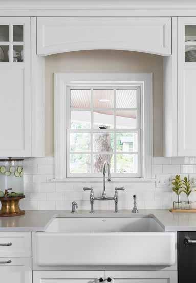
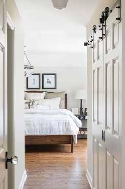
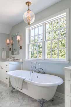
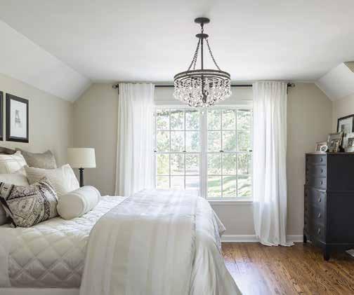
hobbies, and then customizing her designs to create an optimally functioning household. For the Farmhouse Fusion project, this manifested in the positioning of the kitchen. Jackie learned that the couple’s children spent a lot of time playing in the front yard, so she created the front-facing window to keep them in sight-line during meal-prep. Additionally, there was a beautiful sunroom off the back of the house that wasn’t being utilized to its full potential. Anchor Builders repurposed this room as a second living room connecting to the kitchen, providing another look out point, this time into the resplendent scenery toward the back of the property. These views were a key feature generating the “diamond in the rough” status of the property. They owners made it clear they wanted to capitalize on these views from as many angles as possible, bringing the outside indoors and letting the natural elements of the property drive the character of the home.
This affinity for nature was at times a challenge to balance with the aims of the renovation; specifically, the mature oak tree that sits in the front of the property and the client’s request for a wrap-around porch. Anchor Builders was able to manage these conflicting goals by creating a unique design, clipping the corner of the porch so the large oak’s roots could continue growing without obstruction. Jackie calls this porch “one of the biggest parts of the project.” It was important to the clients that they disturbed the natural landscape of their property as little as possible, but they needed to find a way to make the porch work, as it’s a feature that emphasizes “that homey and endearing quality” that the clients wanted to generate.
Jackie recalls learning about her client’s personal taste in an initial walk through of their home, where they exchanged preliminary ideas and concepts about their vision for the space: “the vibe that I got from them was that they are very sentimental people. They had a lot of family photographs hanging around, almost on every wall of the house.” Additionally, Jackie noticed a prevalence of antique and vintage items, demonstrating “a respect for the memories that carry with those pieces throughout the years.” Jackie tried to emulate this sensibility when crafting her designs, respecting the character and memories the house already held, and enhancing them by adding more function, space, and style. Overall, the house achieves a delicate balance between the traditional and the modern, the natural influences and the modern textures; the result is an amalgam of the laid-back and rustic lifestyle belonging to the farmhouse aesthetic and the smooth and elegant lines of modern architecture. A stunning backdrop for a family to live, play, eat, and enjoy one another’s company, all while immersed in the remarkable views that their beautiful property provides.

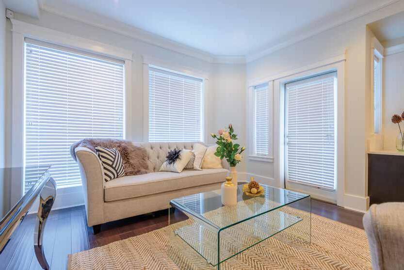










Text: Carlee Baigrie
Photography: Mary Ann Elston
How Leclair Décor balances personality and mass appeal in its latest Model Home project.
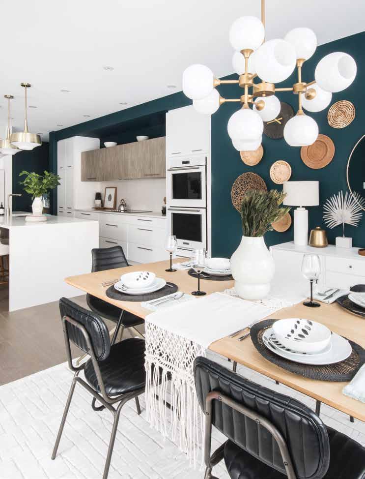
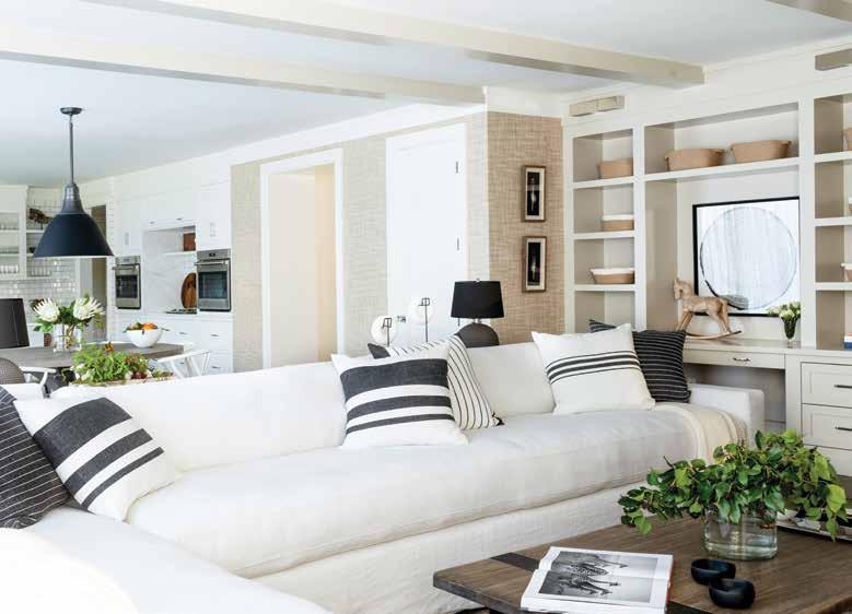
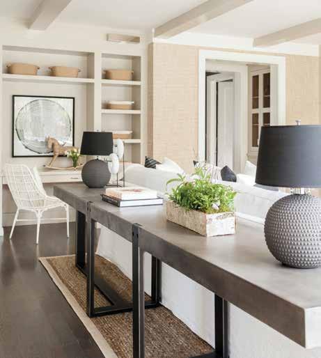
Delicately woven fabrics, like the table runner pictured here help to generate the bohemian aspirations of the space, while crisp clean lines of the kitchen allow it to retain a modern vibe.
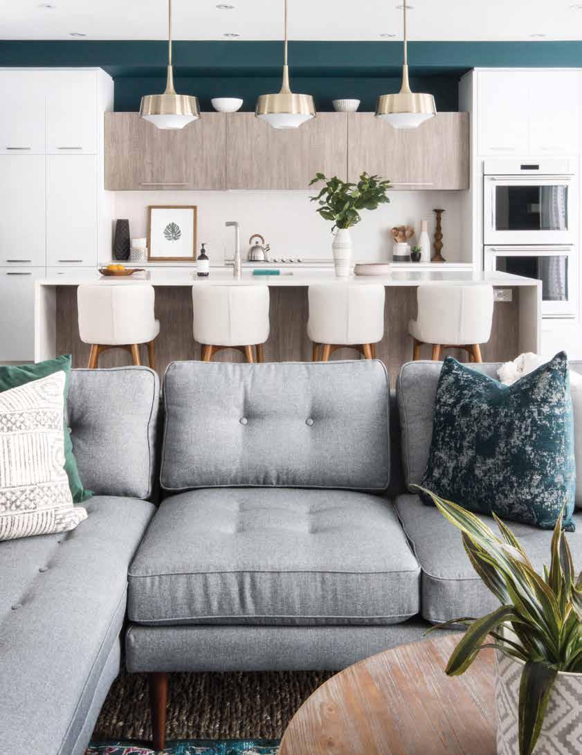
With Leclair Décor’s Beechside project, designer, Melissa, decided to walk on the wild side, transgressing the customary neutrality of color palettes typically seen in model home design concepts. Softening the edges of the space’s modern build is a colorful bohemian spirit, which works mainly because of the subtlety of its execution. Woven circular textiles serve as wall art, perfectly complimenting the boldness of the living room’s accent color with comforting soft beiges and browns. This decision to take a step in a different direction was a bit of a risk, especially considering that the Beechside project’s status as a model home, meaning their design needed to be crafted to appeal to a wide demographic. Typically, when designers are commissioned for a model home, they are given information about the ideal buyer: their tastes, their economic status, all so designers can mold their design around the ideal consumer’s preferences. The easiest way to make a home appeal to a mass audience is to stay generic, neutral, and generally toned-down so that the buyer can imagine themselves living in the space and project their own stylistic preferences onto the structure of the home. However, because the Beechside project was a newer development and this information wasn’t yet available, Leclair Décor was granted a little more freedom. They “invented the ideal buyer” and imagined their personal tastes and preferences to go along. Melissa characterizes the experience of designing a home to act as an enticement for potential buyers as “a fun challenge” which she owes to the opportunity they were afforded to “play up different styles” and experiment with various aesthetics.
Another advantage of designing a space for a model home, Melissa reveals, was being able to brainstorm in the space. Usually, you have to be considerate of your client’s personal schedule and limit initial consults so as to not be overly disruptive to their routine. When you’re designing a model home, the clients are “imaginary” and, therefore, “accessibility is a lot easier,” allowing for more time to immerse yourself in the space and experiment with different colors, textures, and layouts against the lighting, structure, and sensibility of the home. This creative process is crucial for Melissa, citing mood boards as one of the many ways in which she clarifies the direction of her design concepts. The inspiration for the bohemian influence grew from past experimentations with the aesthetic in previous projects, although Melissa clarifies “this one has the strongest bohemian edge.” Melissa felt it was “perfect timing” to create a space with the bohemian aesthetic as the central sensibility, after gaining inspiration from continuously “seeing the boho-chic aesthetic pop up on Instagram.”
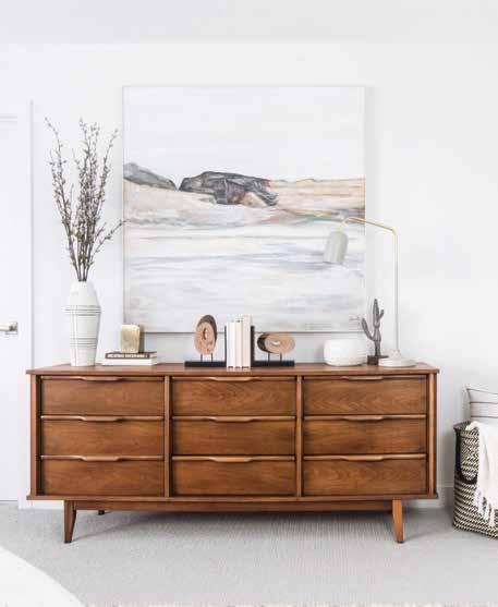
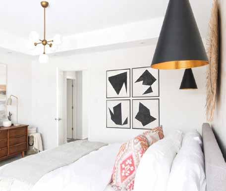
A remarkably refined wooden dresser (top left) grounds the feminine accessories organized on it, while geometric art (left) contributes an element of boldness.
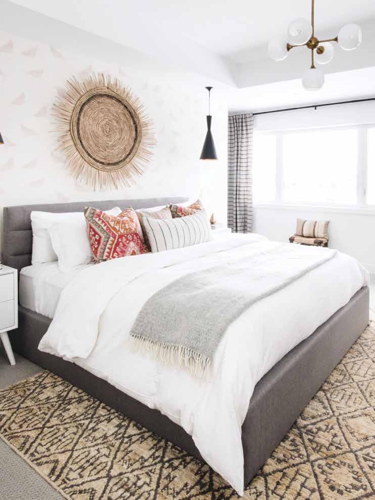
Soft patterning on the room's rug, throw pillows and decor add novelty and diversity to the softer tones of the bedroom with subtle sophistication.
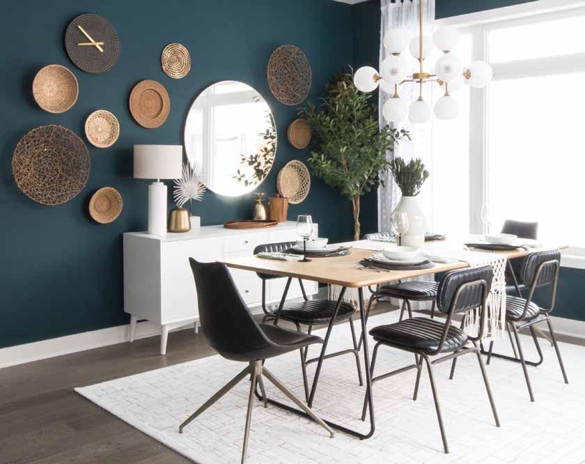
Circular shapes and curved lines dominate in this dining room, inscribing the space with light-hearted eccentricity.
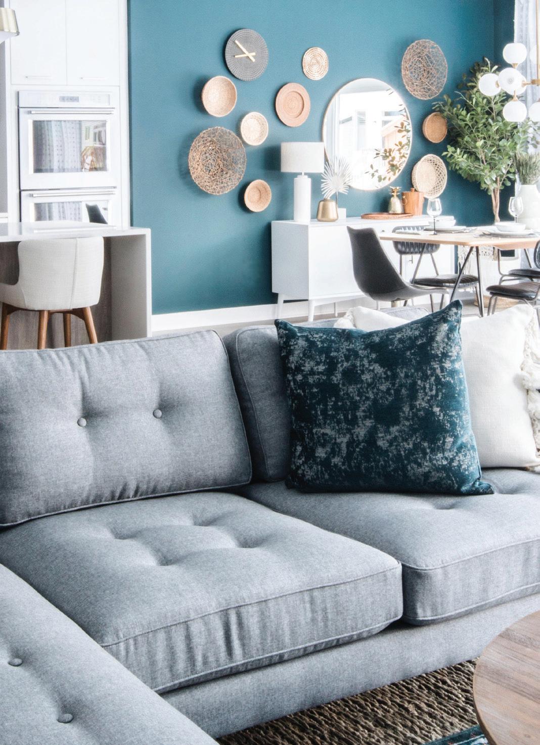
When Leclair décor first came on the scene, Melissa tells us the structure and layout of the space had already been determined. She describes seeing the space at her first consultation: “everything was white and grey which is a great neutral base, but it didn’t feel homey or cozy—we wanted to imbue some personality into this space.” Leclair Décor was determined to “make this unit fun and playful.” The Beechside project succeeds in bringing both the added pop of energy as well as the mass-appeal demanded by the function of a model home. We see this playfulness on full display in the stunning sweep of teal covering the interior walls of the main living space. For designer, Melissa, this wall is the defining feature, gushing “I was obsessed—I think I still am!” She shares with me that she originally planned on painting only one wall the brilliant yet understated blue/green hue, but later decided to “stretch it into the living room and kitchen”, hoping to “give it that wow factor.”
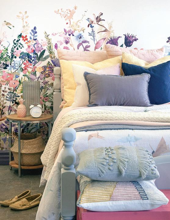
Moving into the bedroom, where the bohemian sensibility takes on more of an agentic role, we see romantic and whimsical textures comingling to create a dreamy and
weightless appeal. Leclair Décor wanted to channel this freespirited energy and play it up using “eclectic furnishings” and dreamy accessories. Anchoring the room’s ethereal feel is a stunning wood dresser, adding warmth and depth to the room’s overall demeanor. Melissa divulges that this wooden dresser was actually a rare Craigslist find, an arresting revelation considering how well the piece works in the space, as if it were designed specifically with its surroundings in mind.
Overall, the Beechside Project is a magnificent testament to the power inherent in thinking outside the box; the pleasure and ultimate pay-off of taking a risk and daring to be bold. Far from being the banal empty landscape of a model home designed with mass appeal at the forefront of its vision, and allowing potential buyers to project themselves on to this empty landscape, the Beechside Project is a creative endeavor that succeeds precisely because it rebels the traditional model home ideal. It entices buyers by revealing to them the potential embedded in the structure of the space, just one of the many stunning iterations possible within its walls.

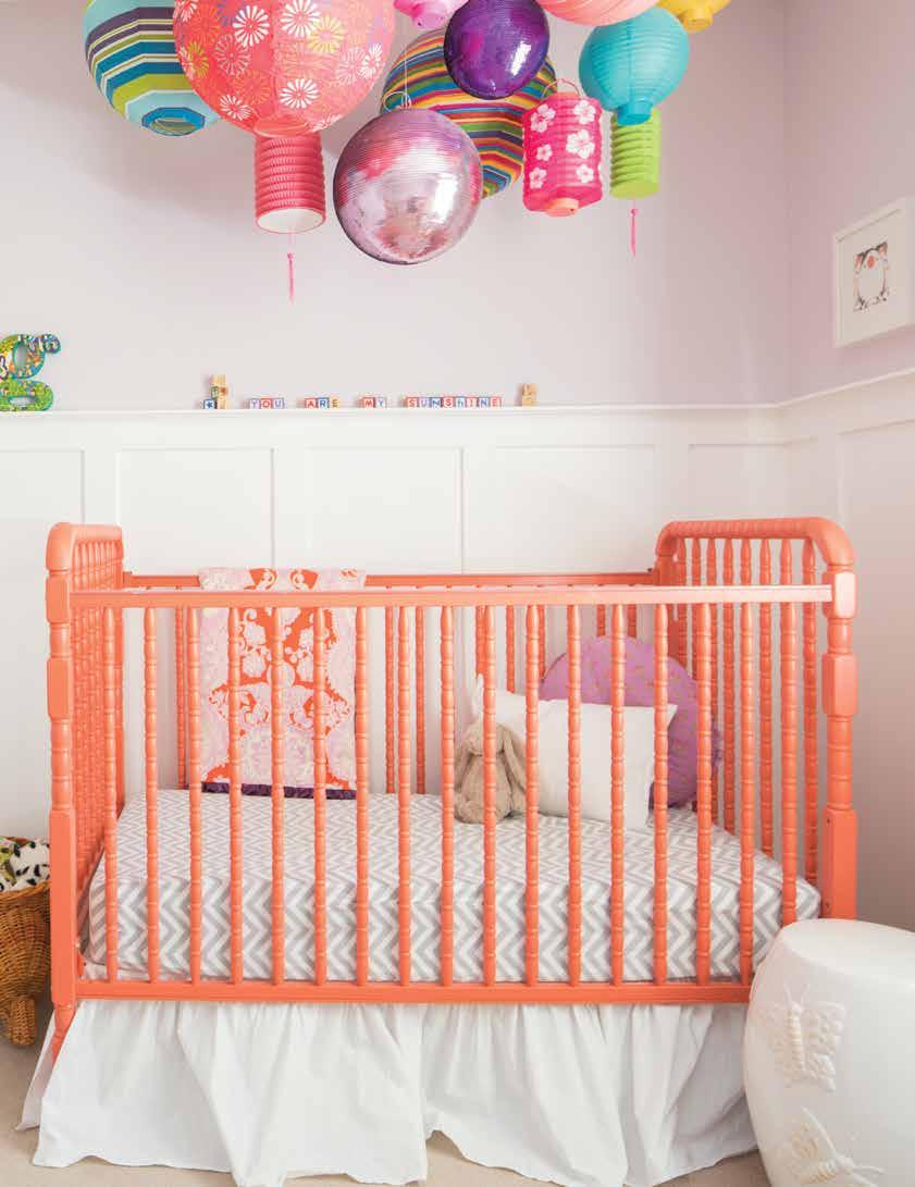
In every stand-out room, there is always that one stand-out feature demanding your attention, elevating the rest of the room’s contents and adding an element of playfulness and wonder to the overall tone. Color is the easiest way to bring personality and charisma into a room, and yet many often overlook paint’s potential, predominantly because they overlook the plethora of possible applications that exceed the standard wall applications. There are so many ways to
experiment with these pops of color: subtle hints of a bold hue to compliment a common space, or more dominant uses of the rainbow in smaller spaces. The designers featured here have mastered what we’re calling ‘the art of vibrancy’ in effortless balance. We hope their designs bring you inspiration and encourage you to branch out of your color comfort zone to embrace the full spectrum of possibilities!
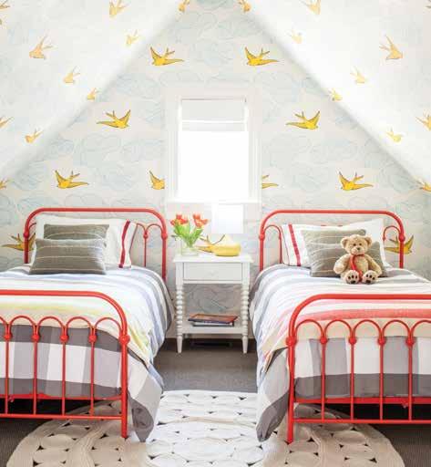
Here, red twin bedframes dazzle with symmetrical boldness, providing an anchor for the rest of the room’s ethereal aesthetic. Whimsical wallpaper featuring canary-yellow cartoonlike birds stretches from baseboards to meet at the seam of the room’s vaulted ceiling, creating the illusion of an animated blue sky and helping to elevate the space to a playful peak. The bedroom is both fitted to the child-like sensibility of the room’s function and experimental in its expression. The boldness of the fire-engine red bedframes stabilizes the youthful texture of the room and helps create cohesion among these various tonal elements.
Designer: Chango & Co
Photographer: Raquel Langworthy
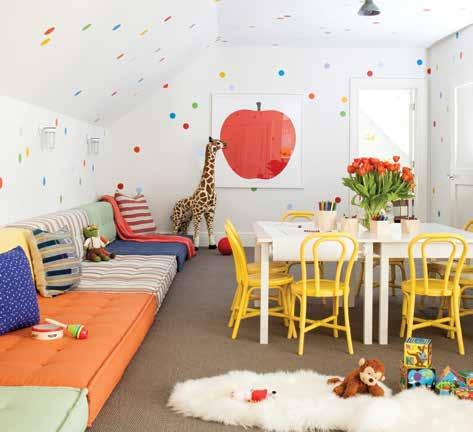
Aplay room must be, first and foremost, versatile; capable of transforming at a moment’s notice alongside the rigorous imaginations of the children at play. Throughout any given day, a play room can serve as a pirate ship, a kitchen, a forest, a store, or a decadent tea room for an exclusive afternoon soiree. This room effortlessly merges the functional needs of the space with the style that will keep its users’ malleable minds energized as they invent fantastical worlds and learn about their own. Chango & Co clearly understands the mutability required of a space like this: there is plenty of room for activities, and just the right amount of color to spark creativity and curiosity. Small chairs painted a cheerful yellow compliment the polka-dotted walls, creating the perfect canvas for play.
Designer: Chango & Co
Photographer: Raquel Langworthy
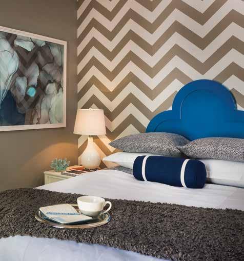
This space is dominated by bold patterns and shapes, but it maintains cohesion through the main focal point of the bedroom’s clubsshaped headboard. The board is coated in a vibrant blue tone, asserting itself as an anchor for the eye. Juxtaposing this daring shade is an accent wall featuring a large-scaled zig-zagging wall covering in gold and cream, which transition into the beige-color that covers the rest of the room. Textured throw pillows call towards this earthy tone, incorporating the lighter creams of the palette as well to articulate a clear and cohesive vision.
Designer: Mandeville Canyon Designs
Photographer: Nat Rea
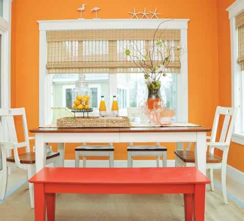
Often we are so stuck on the idea of paint on our walls, we forget the plethora of other uses available for paint and its power to transform a space. Here, a dining room table bench is rendered the focal point of the room, with a tenacious tangerine orange, enhancing the softer hue featured (and highlighted through crisp white trim) as the wall color. These two tones mingle and energize the room, blanketing it in a playful yet poised sensibility which is complimented by coastal décor elements, like the simple inclusion of white starfish and bird figurines above a large window outfitted in bambooblinds. The result is an easy-going, fresh take on a dining space.
Designer: Mandeville Canyon Designs
Photographer: Nat Rea
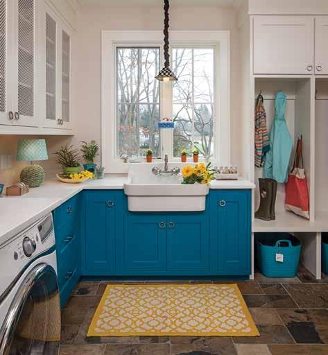
his laundry/mud room gets an updated look with colorful cabinetry! The brilliant teal color blanketing the cabinets, a custom mix by the cabinet maker, was actually the initial inspiration for this newly built Modern Farmhouse in Ann Arbor, MI. Although a mud room is typically a space somewhat out of the regular line of sight, it plays a vital role in the overall flow of a household. Here, laundry is done, jackets and boots are kept, and important materials for a busy work or school day are stored. This is the last stop on our way out the door in the morning and our first breath of home after a long day. The client was seeking a fun and unexpected hue to energize these in-between moments and liven up her daily household tasks (especially on those gray Midwest Winter days!) and Laura Zender Design delivered, proving that a little TLC goes a long way!
Designer: Laura Zender Design, Ann Arbor Michigan Photographer: Jeff Garland Photography
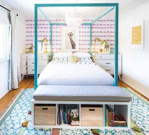
Afabulously bold bedroom uses a colorful bed frame to pack its punch. The subtler tones of the teal color are replicated in softer textures, like the rug centering the room, or the artwork lining the interior wall, creating a cohesive feel without an element of obvious compulsion. Its effortless aesthetic renders the space feeling authentic, inviting, and mature. Whimsical prints, like the giraffe hung where a headboard might usually be found, add a hint of youthful energy, softening the structured sensibility of the bed frame.
Designer: Kate Bendewald Interiors
Photographer: Brit Tucker
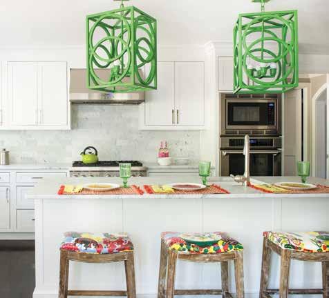
An ability to think outside the box is a designer’s greatest asset. This combination of creativity and courage can bring brilliant ideas to life and can even trailblaze new trends in the interior design world. Here, a bold punch of color takes the shape of a hanging light fixture, which helps bring life into the otherwise relatively muted palette of the room without taking up valuable space or crowding the eye with conflicting patterns or prints. D2 Interieurs chose a moody and romantic blue to accent the relatively white kitchen and set a sophisticated tone for many meals to come. The fabulous thing about utilizing color in smaller doses in a room, is that it allows you to easily change your accent color at any point, allowing your house to evolve alongside your own personal style growth.
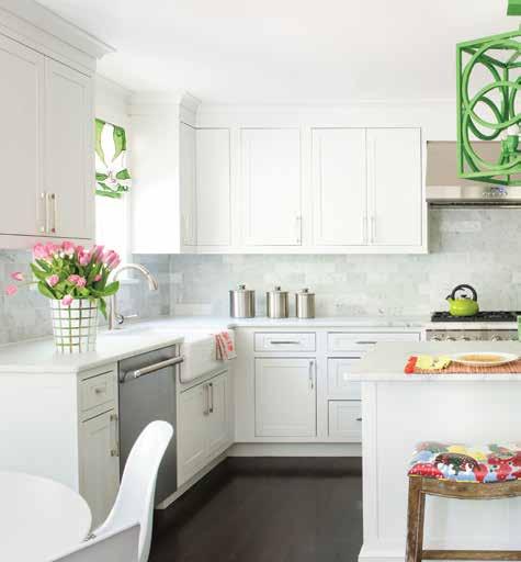
Designer: D2 Interieurs
Photographer: Jane Beiles












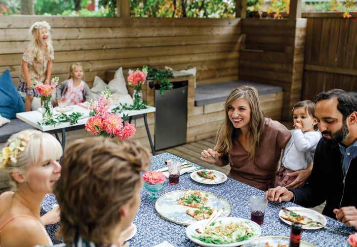
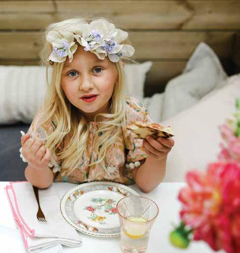
Is there any better way to welcome warm weather than by hosting a patio pizza party? We think not, so we've snagged a few of chef, Brian Johnson's best wood-fired pizza recipes to ensure your soiree will not soon be forgotten.


3 tbsp olive oil
1 small yellow onion, finely chopped
2-3 cloves of garlic, minced
1 tbsp Italian seasoning
1 tbsp sugar
1 tbsp dried oregano
1 tsp salt
1 tsp pepper
24 oz. strained tomatoes
Heat oil in a pot over medium heat. Add the onions and cook until they become translucent, then add the garlic and cook 30 seconds more. Pour in tomato sauce, spices, sugar, salt, and pepper. Bring to a light simmer and cook for 20-30 minutes.
1 cup of sour cream
1 chipotle in adobo sauce minced (add more adobo sauce from the can for extra spice)
½ a lime, juiced
Add all the ingredients into a bowl and mix until well combined.
To achieve the best woodfired-style pizza using a conventional oven, you will want to preheat your oven to the highest temperature possible or 550°F. Use a pizza baking stone and allow it to preheat for at least 30 minutes. The higher the temperature the better. At this temperature the pizza will cook properly in 7 to 8 minutes.
For the dough we recommend purchasing pizza dough from your local Italian grocery. When rolling out the pizza dough make sure it is very thin, it can be slightly thicker around the edges but you should be able to see some light through it in the center. This will ensure crispy pizza crust when cooked.


FENNEL SAUSAGE
⅓ cup tomato sauce (see recipe on p. 69)
¾ cup shredded mozzarella
1 fennel sausage
½ sweet yellow onion, cut into thin slices
⅓ cup sour cream, or creme freche
First, remove the sausage from its casing, break it into smaller pieces, and cook in a frying pan. Next, take the sliced onions and caramelize them.
Shape the pizza dough roughly into a 11-12" round. Spread the tomato sauce in an even layer to the edges, sprinkle mozzarella over the dough evenly, scatter the cooked sausage and caramelized onions evenly over the dough. Cook following the conventional oven directions on p. 69, then top with dollops of sour cream, or creme freche, and serve.
BRUSSELS SPROUTS AND CANDIED BACON
⅓ cup tomato sauce (see recipe on p. 69)
¾ cup shredded mozzarella
10-12 roasted Brussels sprouts halves (see recipe below)
2-3 slices candied bacon crumbled into small pieces (see recipe on p. 72)
lemon aioli (see recipe on p. 72)
Shape the pizza dough roughly into a 11-12" round.
Spread the tomato sauce in an even layer to the edges, sprinkle mozzarella over the dough evenly, scatter roasted Brussels sprouts and candied bacon evenly over top. Cook following the conventional oven directions on p. 69, finish by drizzling lemon aioli over cooked pizza.
SIMPLE LEMON AIOLI
½ cup mayonaise
2 garlic cloves minced
½ of lemon zested
1½ tbsp lemon juice
salt and pepper to taste
Add all ingredient in a bowl and whisk thoroughly.
ROASTED BRUSSELS SPROUTS
10-12 Brussels sprouts halved
2 tbsp olive oil
½ tsp salt
½ tsp pepper
preheat oven to 425°F
Toss Brussels sprouts in a bowl with oil, salt and pepper. Spread on a baking sheet in a single layer. Roast in the oven for 20-30 minutes until browned and crisp.

⅓ cup of sour cream sauce (recipe on p. 69)
¾ cup shredded mozzarella
10-12 shrimp (recipe below)
½ cup Pico de Gallo (recipe below)
20-25 medium to large size shrimp
1 lime, juiced and zested
1 tbsp garlic powder
1 tbsp smoked paprika
2 tsp cumin
1 tbsp olive oil
salt and pepper
Combine and marinate for ½ to 1 hour, then add shrimp and marinade into a hot frying pan and cook through. Reserve.
5 roma tomatoes seeded and diced
1 jalapeño seeded and diced
½ cup finely diced onion
¼ cup finely chopped cilantro
½ a lime, juiced
¼ tsp salt
Combine all ingredients in a medium bowl and toss together gently until fully mixed. Reserve.
Shape the pizza dough roughly into a 11-12" round. Spread the sour cream sauce in an even layer to the edges, sprinkle the mozzarella over the dough evenly, and add the shrimp. Cook following the conventional oven directions on p. 69, then top with the Pico de Gallo and serve.
3 tbsp maple syrup
¼ cup brown sugar
2 tbsp dijon mustard
1 tsp pepper
½ tsp cayenne pepper
1lb thick cut bacon
Preheat oven to 375oF. Mix all ingredients except bacon into a medium sized bowl. Add slices of bacon while making sure to coat both sides of each strip. Place bacon on a greased wire rack over a foiled roasting pan (this helps with clean up). Bake at 375oF for 20 minutes, flip and cook for another 10-15 minutes until crisp. Remove from oven and let cool for 5 minutes, remove from rack to prevent sticking.



⅓ cup tomato sauce (recipe on p. 69) fresh mozzarella
approximately 8 slices of calabrese 8-10 serrano chilies (adjust for heat) 2-3 tbsp maple syrup
Shape the pizza dough roughly into a 11-12" round. Spread the tomato sauce in an even layer to the edges, rip the fresh mozzarella into small chunks and scatter evenly over the dough. Add the calabrese and serrano chile, and then cook following the conventional oven directions on p. 69. Top with a drizzle of maple syrup and serve.
Brian Johnson spends his free time experimenting with flavors. Although he loves being adventurous with food, this self-taught cooking enthusiast truly appreciates a simple meal made of fresh ingredients and thoughtful preparation. Brian enjoys making soul-satisfying meals for his family and community of friends who happily clean their plates then ask, "When are you opening your own restaurant?" While that dream may someday be in the works, Brian's recipes continue to transform his kitchen into a chef-owned eatery that gives his wife and three children the best table in the house.
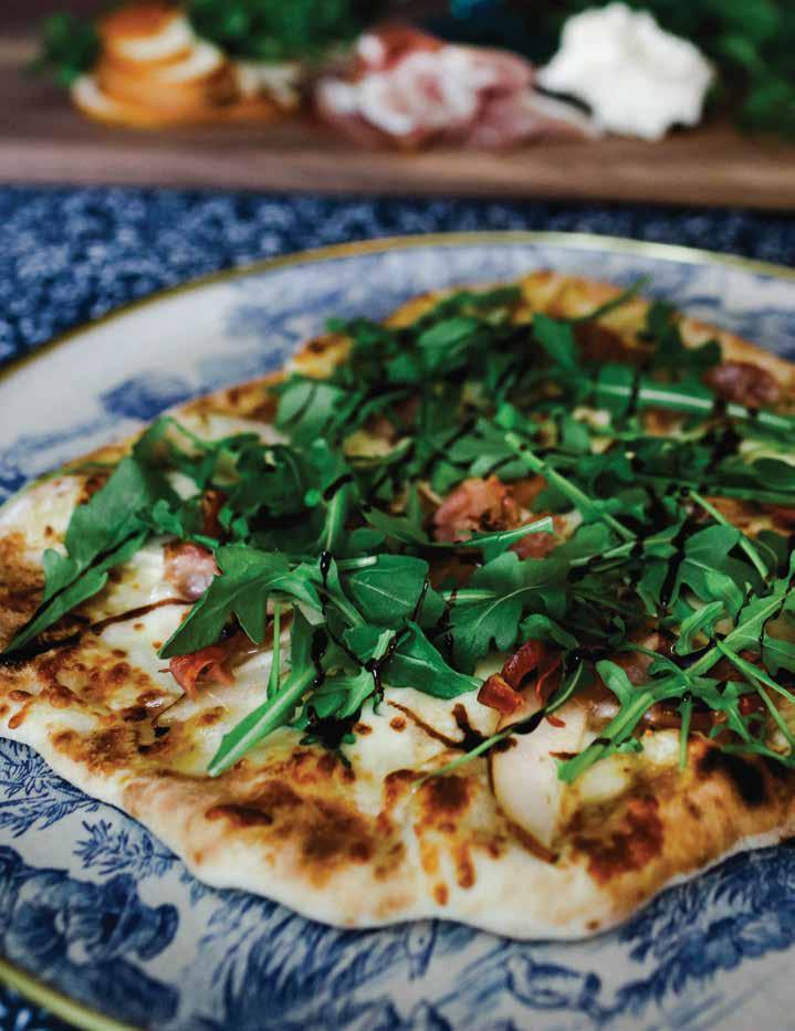
THE FIG
⅓ cup fig jam
½ cup mozzarella
⅓ cup goat cheese crumbled ½ pear, sliced 1-2 slices prosciutto (ripped into smaller pieces)
1 large handful of arugula balsamic drizzle
Shape the pizza dough roughly into a 11-12" round. Spread the jam in an even layer to the edges, add the mozzarella, pear slices, and prosciutto evenly over the dough, and then cook following the conventional oven directions on p. 69, top with the arugula and balsamic drizzle and serve.



Scattered ubiquitously amongst the shoreline and its vertically integrated villas are orange, lemon, and olive groves, the fruits of which are sold on the streets in the market daily. The view from the sea is nothing short of spectacular. Sun-tanned tourists line the town’s famous pebble beach under vibrant umbrellas stationed in perfect rows, eager to be immersed in the chic and elite culture of Positano. Though historians have traced back human occupancy to as early as 6000 B.C.E., Positano’s origins are ambiguous at best, serving only to enhance the town’s mystical allure. Ruins of luxurious villas once erected by Ancient Romans and other remnants of the town’s past lives lurk beneath a picturesque surface, coloring the local culture and further driving fascination. Legends and folklore have taken shape around the little and uncertain information that does exist surrounding the city’s genesis, with these tales often growing to take on a mythic quality. Perhaps these stories are best examined in relationship to the town’s name, and the accounts of how this name came to be.
Positano was once a resting place for the Ancient Greeks during longer expeditions traveling westward, many historians have posited that the town was named after the Greek God of the Sea, Poseidon. Another tale claims its origins came after a deadly storm left a ship of Saracen pirates carrying a plunder in grave danger. Aboard the ship was a thirteenth-century Byzantine icon of a black Madonna, and legend has it that the ship’s captain heard the painting whisper “Posa, Posa” (“set me down, set me down”) and threw the painting into the sea in compliance; the ship then floated into the harbour to safety. Those on board the ship interpreted this as an instance of divine intervention. Locals later built a church where the painting washed up to shore in commemoration of the Virgin Mary’s chosen resting spot. This church, Santa Maria Assunta, still stands today, with the black Madonna hung above the alter
and a plethora of other rare paintings in its midst. Also found in the Santa Maria Assunta are the colorful and captivating majolica tiles which outfit the dome of the church; a must-see for any art enthusiasts and an awe-inspiring sight for all.
Positano’s economic history is as tumultuous as the storm from the Saracean pirates’ legend. In 1343 the town was destroyed by a tsunami and its inhabitants were subjected to relentless attacks by pirates in the fifteenth century. Early in the eighteenth century, Positano gained financial prosperity after its port become an essential trading hub, however, the town was reduced to a humble fishing village after new commercial routes were established, forcing many of its inhabitants to emigrate for job opportunities.
It wouldn’t be until the late twentieth century when Positano would become the chic tourist destination we know it as today. Amongst various infrastructural upgrades that increased accessibility, its sudden prominence as an elite tourist destination can be partially accredited to the publication of an essay written by John Steinback in a 1950’s issue of Harper’s Bazaar, in which Steinback writes “[Positano]… is a dream place that isn’t quite real when you are there and becomes beckoningly real after you have gone.” Since then, Positano has seen a steady stream of tourists—all aching to be seduced by the marvels of this remarkable city.
Pastel-colored houses cling to a coast so steep it wants to be called a cliff. Positano is certainly not for the easily tired or faint-footed. Steinback famously noted in his Harper’s Bazaar article that one does not drive to visit a friend—you either “climb or slide.” The town’s infamous narrow and numerous meandering staircases make you work for your view.
Some of the best activities in Positano involve walking tours to reach incredible sights. The options here can be overwhelming, especially if you’re only visiting for a brief period of time. If you can choose only one, and so long as you don’t easily scare (this destination is considered to be haunted by locals), definitely take time to check out the following sight, steeped in the mystical allure that makes Positano such a desirable location: La Torre Dello Ziro.



One of the more accessible sights is the ruins of what once was the walls of the Dukedom of Amalfi, which consists of two towers used in Medieval times to spot approaching enemy ships, specifically, Saracen pirates. These towers have their own history of tragedy: in the 16th century, the Duchess of Amalfi, Giovanna D’Aragona, was locked up in the tower along with
her small children. This was a punishment after rumors that the Duchess was having an affair with the court butler circulated the town, shortly after her husband’s death. After a period of imprisonment, the Duchess’ late husband’s brothers executed Giovanna and her infant children. Permanent residents of Positano rarely visit this sight and consider it to be haunted.


written by: carlee baigrie
We’ve heard it been said that for every minute spent organizing, an hour is saved. We’re not sure on the exact mathematics, but we do know that the morning fumble over finding the right Tupperware lid can suck precious time out of an already hectic day. An organized and streamlined storage space can help improve your home’s overall aesthetic and increase accessibility to household items. Simple transformations like these can have a huge impact on the overall flow of your day. These hacks pack a punch!




Functional Fun-Zone:
If you have children, you know that an organized house is fleeting. Most parents don’t have time to follow their little ones around ensuring each toy goes back in its designated spot, but there is a simple solution! Keep a designated toy basket or drawer in the rooms where your kiddos like to play, and teach them to put out-of-use toys or crafts in this area when they are done playing. Not only does this clear the clutter out of sight, but it also begins teaching children to take responsibility for their messes at an early age!
Tupperware Tailor:
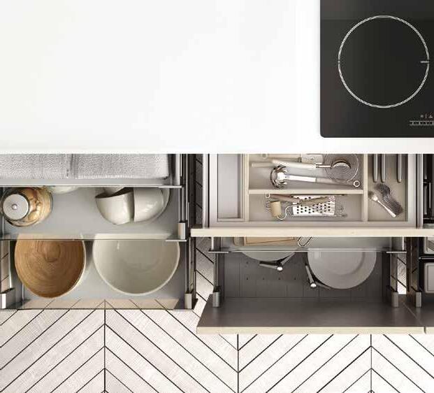
Divide and conquer your tupperware drawer and improve visibility for easier access. You can purchase simple drawer dividers at most home improvement stores, sectioning off a designated area for lids to be lined up on their sides so you can easily determine the right fit for each container. Stack containers based on size in the remainder of the drawer.
Junk Drawer Genius:
Every home has a designated junk drawer, but who says this drawer can’t have a method to its madness? There is a way of managing these miscellaneous items: use a cutlery organizer as a starting point and group items based on size (think of this like a game of Tetris); use any leftover drawer space for larger items. This will keep your junk in plain sight and you can access it without being stabbed by several safety pins in the process.
Pristine Pantry:
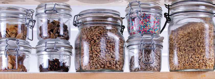
Ever see the celeb house tours where their pantry’s look like something out of a dream? You don’t need to be an A-Lister to have your pantry in top-top shape. Taking pantry items out of their cardboard packaging and placing them into glass containers, like mason jars, can enhance the aesthetic of your kitchen and make it easier to see what you have, and when it might be time for a re-stock (this is especially helpful for those with family members with a habit of putting empty cereal boxes back on the shelf).
continued on next page



05 Rewards Card Key-Chain:
As a homeowner, you likely have a thick stack of rewards cards for various goods and services taking up space in your wallet. When you’re on the go, the last thing you want to do is go rummaging through your bag and shuffling through cards to find the right one. Hole punch each card (be sure to avoid the bar code that’s needed for scanning) and attach to your key chain and you’ll always have your Rolodex of rewards on hand.
06 Cleaning Supplies Hanging Rack:
Bathroom storage space is a hot commodity: secure a small hanging rack a couple inches below the top of the cupboard under your sink, and allow cleaning supplies to hang with the head of the spray bottle over the edge. This will allow you to have the bottom of the cabinet for other necessities like toilet paper, towels, etc.
07 Gift Wrapping & Paper Storage:
Use file folders to store gift-bags and tissue paper, and store wrapping paper upright in an unused garbage can. A large-mason jar or Tupperware can hold bows while allowing you to see the colors and sizes of what’s available. This will make wrapping gifts for any occasion hassle-free and allow you to evaluate all your color and size options to best fit each gift.







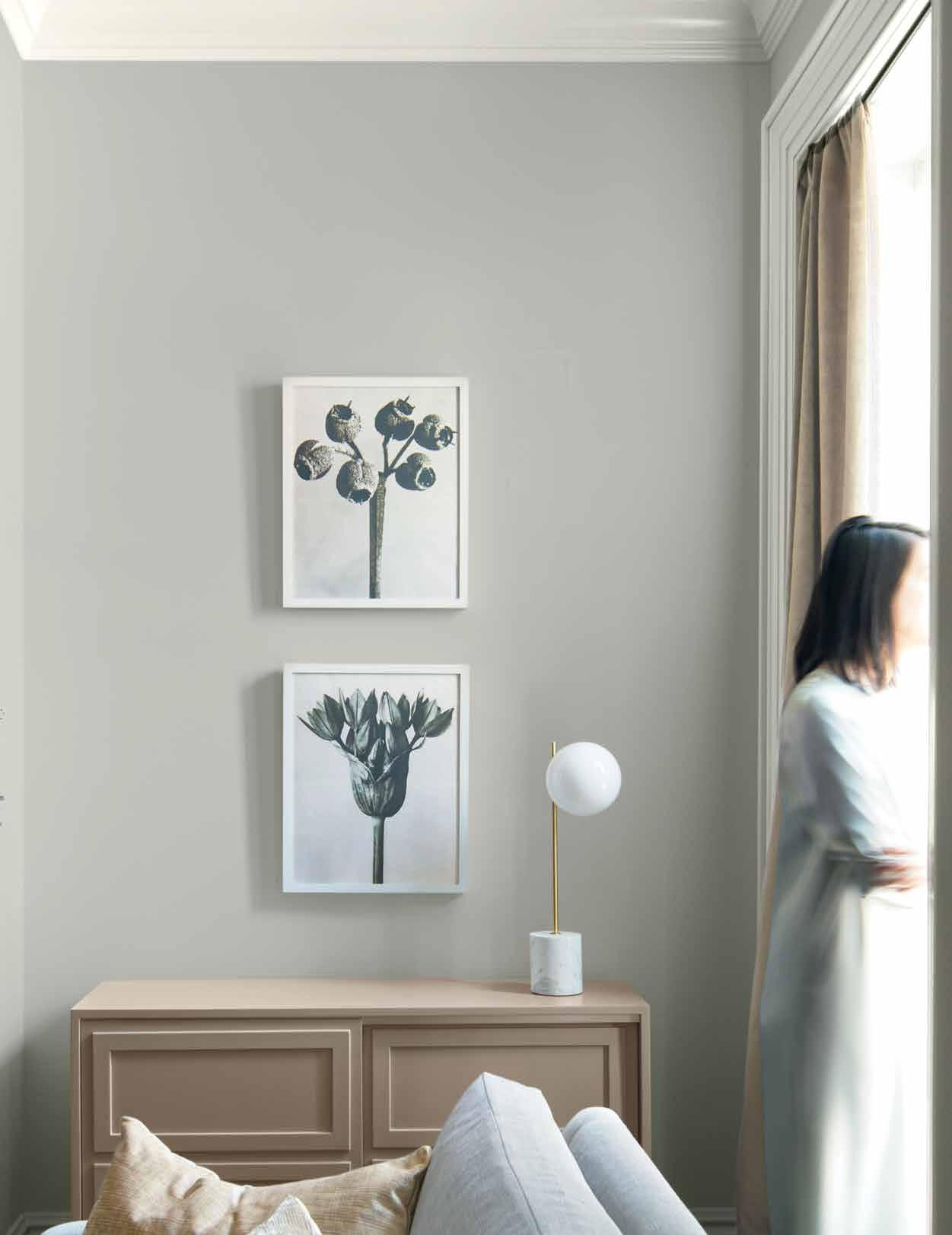
BENJAMIN MOORE'S 2019 COLOR OF THE YEAR
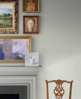
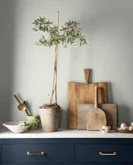
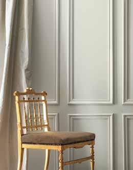
Benjamin Moore’s 2019 Color of the Year has been announced, and people are raving about the quiet sophistication and stunning mutability of this year’s selection. Hannah Yeo, a Color & Design expert with Benjamin Moore, provides some insight into this year’s shade and the intricate selection process.
In early January of each year, the Color & Design experts from Benjamin Moore embark on a mission to find the next color trend. This team analyzes design trends across all industries and considers everything from cultural and societal influences to macro-economics, all to discover “how we live with color.” This research process spans over several months and is followed by several additional months of discussions and deliberations, the whole process spanning over the course of a year, requires that their team “never take their eyes off of the current climate.”
Hannah Yeo, Benjamin Moore’s Color and Design expert, describes this year’s selection for Color of the Year as “a silvery gray that adapts to its surroundings.” She elaborates further on this meditative shade, calling it an “effortlessly sophisticated” neutral that “exudes beauty and balance.” Yeo divulges that their research corroborates this shade as “a balance between softness and glamour, presented in a way that is powerful through its subtlety.” Yeo speculates on the shift that caused this turn toward a comforting neutral, especially after 2018’s “Caliente” which was a fiercely bold red that feels strangely foreign in comparison to the understated subtlety of “Metropolitan.” Yeo shares that over the last year, “quietude and a retreat from noise and chaos seemed to pervade the mood.” Elaborating further on the drive behind this impulse toward the calm, Yeo shares the cultural factors that contribute to such trends: “breaking away from the constant notifications from our phones
and noises outside, the simplicity accompanied by quietude felt fresh and much needed.” Indeed, as our political and social climate feels increasingly fraught with fear, it is important to take the time to reel in the simple pleasures in life, to allow our homes to act as shelters that recharge, re-energize, and revive us so that we have the center to reach out into the world and make positive impacts.
Yeo shares that the color’s versatility played a large role in its selection. In deliberations, the color and design experts tasked with the job of determining the Color of the Year also consider its longevity to ensure it stays relevant for at least 5-7 years. This was not a concern with Metropolitan, however. Yeo shares that Metropolitan AF-690 easily “adapts to any surrounding,” and can be “layered with cozy throws” to “bring out the peace and quietness” or glamorized further by utilizing “higher gloss and reflective surfaces.” Yeo characterizes the color as capable of playing “the hero of the room” but is also happy to be in a supporting role with “bold, darker colors.” It seems as though Metropolitan AF-690’s possibilities are limitless; something to be drawn out of this shade for every user.
When asked about predictions for 2020’s Color of the Year, Hannah Yeo kept tight lipped, but did share that they are currently “deep in their research” and urges us all to stay tuned!
Carlee Baigrie
Gennex ® is Benjamin Moore’s proprietary color technology that delivers one-of-a-kind hues and unsurpassed durability—resisting color fading indoors, and standing up to harsh weather conditions outdoors. Benjamin Moore paint and Benjamin Moore Gennex colorant, together, make our products impossible to replicate.
Gennex ® is Benjamin Moore’s proprietary color technology that delivers one-of-a-kind hues and unsurpassed durability—resisting color fading indoors, and standing up to harsh weather conditions outdoors. Benjamin Moore paint and Benjamin Moore Gennex colorant, together, make our products impossible to replicate.
Gennex ® is Benjamin Moore’s proprietary color technology that delivers one-of-a-kind hues and unsurpassed durability—resisting color fading indoors, and standing up to harsh weather conditions outdoors. Benjamin Moore paint and Benjamin Moore Gennex colorant, together, make our products impossible to replicate.

The most advanced way to bring color to life, Aura® uses proprietary Color Lock ® technology to create richer colors that stay true over time.
The most advanced way to bring color to life, Aura® uses proprietary Color technology to create true
The most advanced way to bring color to life, Aura® uses proprietary Color Lock ® technology to create richer colors that stay true over time.
The most advanced way to bring color to life, Aura® uses proprietary Color Lock ® technology to create richer colors that stay true over time.
A trusted premium brand that delivers consistent and dependable performance and is washable in a wide v ariety of colors and finishes.
A trusted premium brand that delivers consistent and dependable performance and is washable in a wide v ariety of colors and finishes.
A trusted premium brand that delivers consistent and dependable performance and is washable in a wide v ariety of colors and finishes.
A luxurious that can and maintain
A luxurious matte finish that can repel moisture and maintain color integrity.
Our greenest paint, Natura has zero emissions and offers b eautiful and durable results.
Our greenest paint, Natura has zero emissions and offers b eautiful and durable results.
Our greenest paint, Natura has zero emissions and offers b eautiful and durable results.
A premium interior full line of durable, high-end ideal for kitchen cabinets, t ypes of interior woodwork.
A premium full line ideal for t ypes
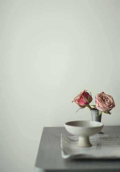
A luxurious matte finish that can repel moisture and maintain color integrity.
A luxurious matte finish that can repel moisture and maintain color integrity.
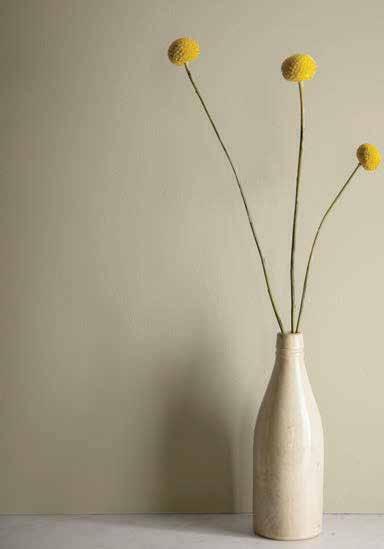
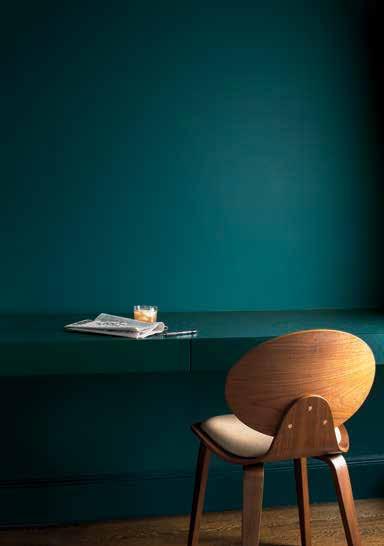
An interior/exterior door and trim enamel that creates a rich, lustrous finish as durable as it is beautiful.
An interior/exterior door and trim enamel that creates a rich, lustrous finish as durable as it is beautiful.
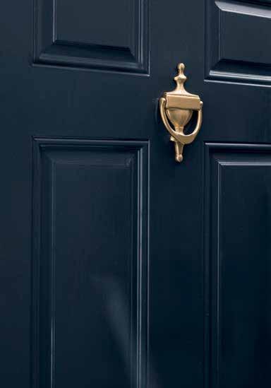
A premium interior paint that offers a full line of durable, high-end finishes ideal for kitchen cabinets, trim and all t ypes of interior woodwork.
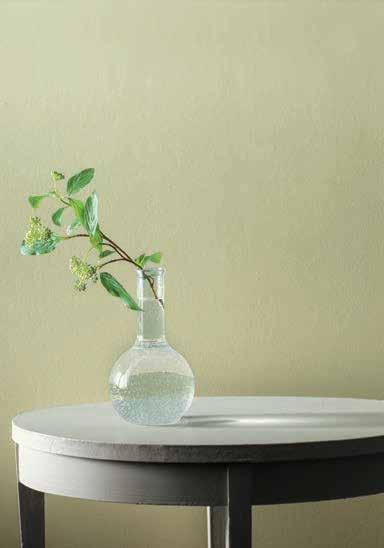
The perfect introduction to premium paint, ben® offers easy application and great touch-up characteristics.
2130-40



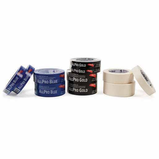


Keep the look light and timeless; a few classic accessories ground the look while keeping the vibe fun and current.
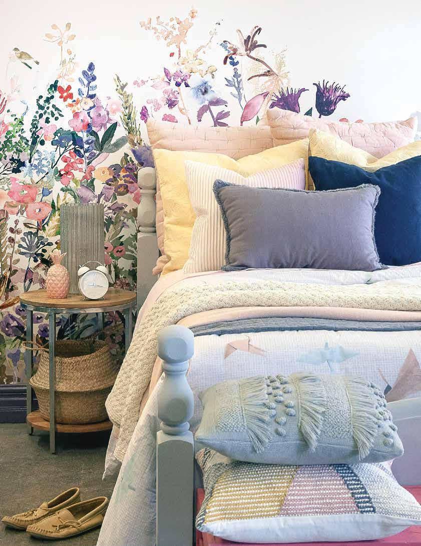
Metropolitan AF-690 can transform furniture in a fresh and unique way. Remember to think of paint for items other than walls!
Lush floral wallpapers are a perfectly on-trend way to add a bold and playful trifecta of colour, pattern and texture to an otherwise neutral space.
For a considered look, make sure to layer your bed with heavenly-hued linens in a mixture of shades drawn from your wallcovering.
Pairing Metropolitan AF-690, the color of the year, with pattern, contrast and texture is a great way to balance bright ideas and beautiful spaces. The variety of colors that will complement this modern neutral to help transform your surroundings are endless. Check out these four unique roomscapes on the following pages that showcase winning color combos and tips on how to incorporate color and pattern into your home.






This whimsical print utilizes floral watercolor imagery to deliver a bright and energizing aesthetic. Its delicate details mimic the jovial spirit of nature: beautifully rendered flowers depicted in shades synonymous with spring bring the serenity of the natural world into the home. The result is a playful yet polished print primed with a youthful and dreamy energy. Ideal for a nursery, bathroom, or bedroom; this stunning wallcovering is sure to make any room bloom.
In pattern play, there is an opportunity for personality to shine through in a big way, a chance to bring your own vision into focus. The key to executing a brilliant patterned look in your home is to balance the print with the rest of the elements in the room. If you have an extremely busy print, you’ll want its surroundings to be minimal and calming, so the eye does not become overwhelmed. If you have a larger scaled print, you’ll want to keep the scale of any other patterns smaller to prevent clashing. Oftentimes, designers will opt for a single feature wall, and then compliment the surrounding walls with a paint color matched to the palette of the print. This is an especially great option in a bigger space, where too much busy-ness could drown out the other aspects of the room and actually make it feel smaller. Patterns and prints are a wonderful way to bring a polished and professional edge to whatever space you’re working with, adding intrigue and depth with its variety. A wallpaper with a busier print can hide wall imperfections
or divert attention away from architectural eyesores. Vertical lines can make ceilings feel higher, whereas horizontal stripes create the illusion of more width. If you are using prints generously and in multiple rooms in your house, we suggest selecting patterns that compliment one another, utilizing similar colors or themes to keep your home’s design feeling cohesive.
Whether your tastes are bohemian and subtle or you gravitate more toward sophisticated and elegant aesthetics, there is a print or pattern out there that is perfect for every style profile. A metallic print can add sheen to a room, providing a glamorous texture while natural light refracts to create an ambiance of luxury. On the other end of the spectrum, prints emulative of nature can bring a rustic quality into a space. The options do not end here. Get creative experimenting with geometric shapes, floral and botanical imagery, different graphic illustrations… the possibilities are endless.
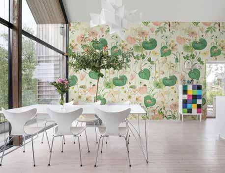


A beautiful print featuring whimsical lily pads, leafy greens, and dusty pink florals take center stage while the rooms’ minimalist aesthetic provides a calming and streamlined compliment to the romantic and dreamy sensibilities of this wallpaper. Experimenting with natural elements indoors is a sure-fire way to get your house spring-ready!
A detailed and decadent print outfitted with Paris’ iconic monuments brings a cozy bedroom scene into cohesion. The smallerscaled print is complimented by a bolder and less structured pattern on the comforter, while solid pillows sporting pink and blue hues pulled from the busy backdrop anchor the space. C’est magnifique!

York Wallpaper Novelty Euro Scenic

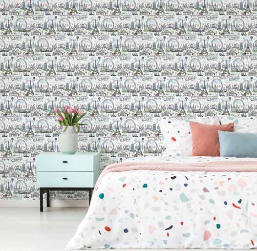

York Wallpaper Bunny Toile
A black and white print outfitted with adorable little rabbits frolicking amongst garden goods (perhaps commandeered from Mr. McGregor!) signals a storybook sensibility central to nursery motifs while remaining versatile and subtle. A print with a neutral palette will let other colors pop while bringing continuity and style.

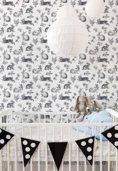
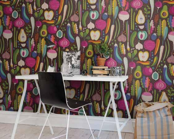
This funky print provides plenty of jumping off points for a space, with bold and saturated colors that permeate an eccentric feel. Bold white trim contains a print on the wild side, while accents can be pulled from the ample array of colors available. The print evokes a sense of the surreal, making any space feel imaginative and intriguing.

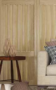
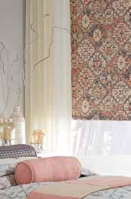

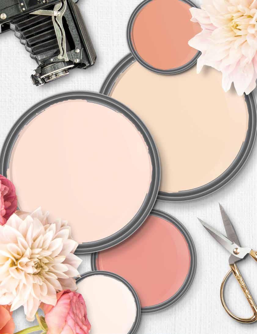
Colors found in nature lend the tranquil character of the outdoor elements they emulate to interior spaces. Sweeping sunset hues bring an understated and intriguing glow, cultivating a serene setting and letting architectural elements and décor details shine. These paler tones make the perfect gallery wall color, letting the eye settle softly on the calming shade after perusing through images.