“IN DESIGN, MOTHER NATURE IS OUR BEST TEACHER” – VAN DAY TRUEX
BEE THE CHANGE
With dramatic declines in bee populations, beekeepers know the importance of saving our planet...
HOUSEPLANT HARMONY
Interior plants infuse their surroundings with character and pay tribute to the great outdoors...
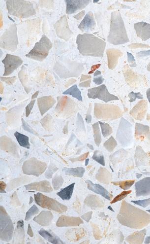
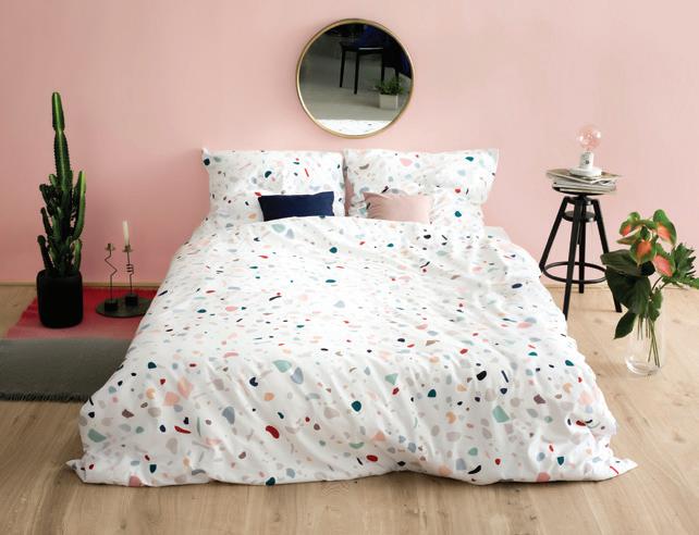
TRENDY TERRAZZO
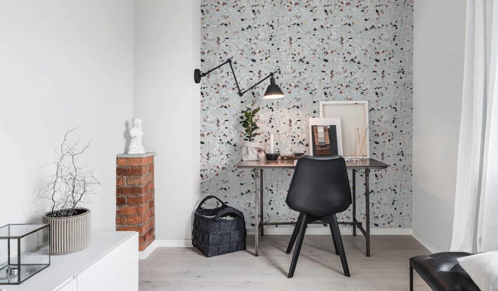
Terrazzo teaches a valuable lesson about learning to appreciate the beauty in a little bit of disorder...
COLOR THEORY: YELLOW
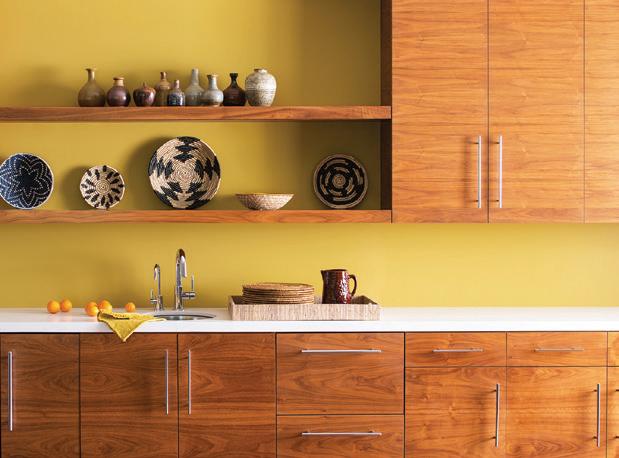
These shades will have your spring cleaning feeling like a breeze, and your house feeling happy...
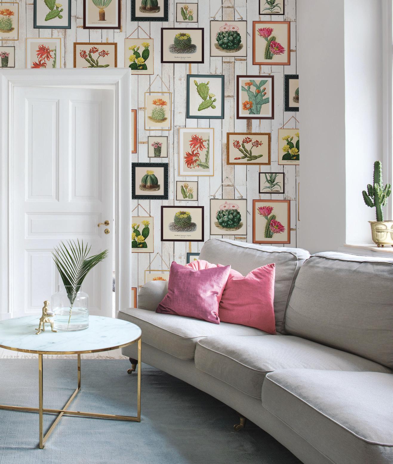
Rebel Walls’ collection of astonishingly life-like prints and patterns has something for everyone, whether your style is simple and sophisticated, or whimsical and eclectic, like “Cactus Wall Art”, pictured here.
CACTUS WALL ART By Rebel Walls, Available at WWW.ENVYPAINTANDDESIGN.EN-CA.RW.NU/
WELCOME TO ENVY’S ISSUE Nº 1
They say that the best designs take their cues from the natural world: a sentiment we hold dearly as we champion the organic beauty of the earth in every facet of our practice. When we allow ourselves to be inspired by the stunning array of colour, texture, and light in the natural world, we nourish a respect for our environment and its processes. This sensibility reaches far beyond our aesthetic choices: it becomes a statement about how we choose to live in this world. We choose to live in colour and
comfort, and share how we make this happen with our community. In this periodical, we’ll be shining a spotlight on the products, projects, and stories that motivate and inspire us to dig deeper and push ourselves further. We consider this issue to be a visual representation of the insights we utilize as a springboard for all of our design endeavors, and it’s our distinct pleasure to share these insights with you. Thank you for reading and we hope you enjoy the view!
DIRECTORS
Bahia Taylor
EDITOR
Carlee Baigrie
GRAPHIC DESIGNERS
Olivia M. Hiebert
Leigh McKenzie
NEW AND IMPROVED!
We’ve revamped our website so that you can shop at Envy from the comfort of your home.
Check out our blog while you’re there, where we provide a behindthe-scenes look into some of our favorite products, projects, and design trends.
www.envypaintanddesign.com
Stay connected with Envy to learn about our latest and greatest promos, products, trends, and more by following us on Instagram!
OUR TEAM PICKS!
AMBER
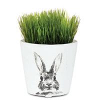
This adorable pot featuring a watercolor-esque illustration would be the perfect gift for some-bunny special.
LAUREN
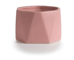
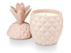
Pretty in pink and sporting a geometric shape, this candle is just the item to step up your #Shelfie game.
ARTHUR
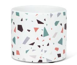
Fully on-board the Terrazzo trend train, we’re finding this playful print pairs beautifully with lush foliage.
SPRING FAVOURITES
THINK PINK!
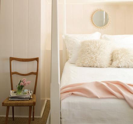
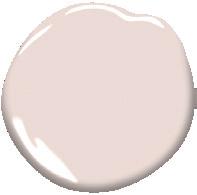
“Proposal” is the ideal understated pink, paired with a soft array of creamy hues to create a plush haven to rest your head at the end of a long day.
Walls: Proposal AF-260, Benjamin Moore
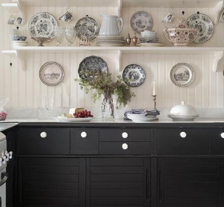
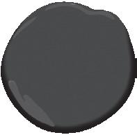
Nothing quite like “Jet Black” to make a statement. This kitchen utilizes the deepest of our blacks to create drama without overwhelming the eye.
Cabinets: Jet Black 2120-10, Benjamin Moore
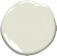
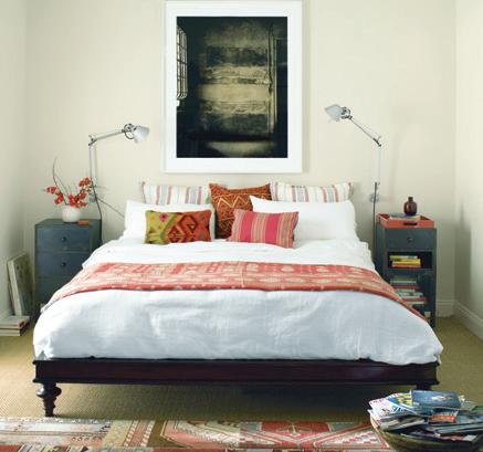
Effortless, eclectic, and oh-so-cozy, this trendy bedroom outfitted in “Old Prairie” hits all the right notes while maintaining a relaxed feel.
Walls: Old Prairie 2143-50, Benjamin Moore
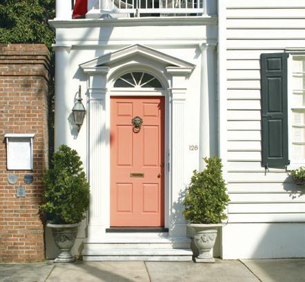
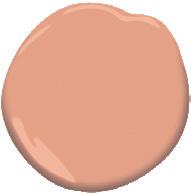
Utilizing a fun pop of colour like “Coral Spice” on your front door is an excellent way to leave a great first impression on your guests.
Door: Coral Spice 2170-40, Benjamin Moore
DARK ELEGANCE
BOHO BEDROOM
CORAL CURB APPEAL
WORKSPACE WHIMSY
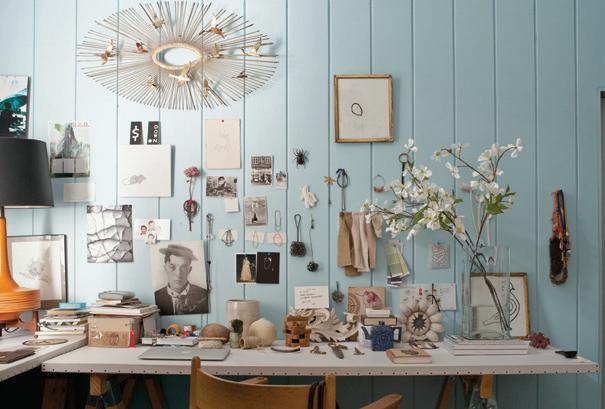
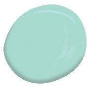
Décor with personality shines on a baby blue backdrop. Items mounted directly to the wall, painted in “Breath of Fresh Air,” creates an effortless artisanal aesthetic.
Wall: Breath of Fresh Air 806, Benjamin Moore
EMERALD ENTRYWAY
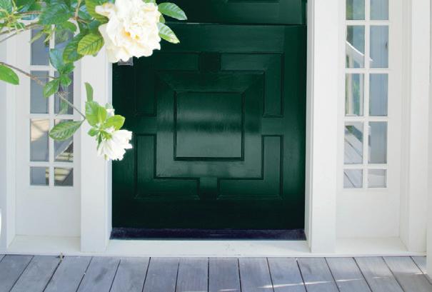
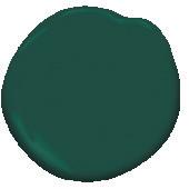
You can forget the welcome wagon when you’ve got a porch this inviting. A front door sporting “Hunter Green” is sure to make your home the belle of the block.
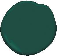
Door: Hunter Green 2041-10, Benjamin Moore
NESTLED IN THE NURSERY
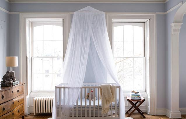
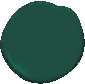
Nurseries are best in shades that induce feelings of serenity and peace, like “Windmill Wings” pictured here, which eases little ones into bed after busy days of exploring.
Walls: Windmill Wings 2067-60, Benjamin Moore
BOLD IN BLACK & WHITE
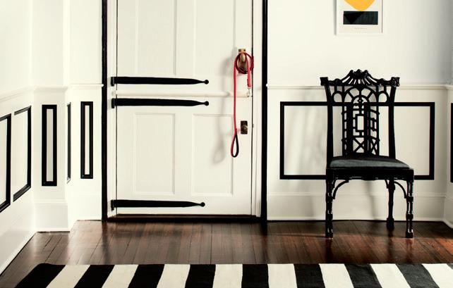
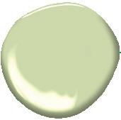
A dramatic entryway utilizes “Frostine” to contrast its black outlines, co-mingling to generate a structured sense of elegance and opulence.
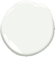
Walls: Frostine AF-5, Benjamin Moore
breath of fresh air - 806
hunter green 2041-10
windmill wings 2067-60
frostine af-5
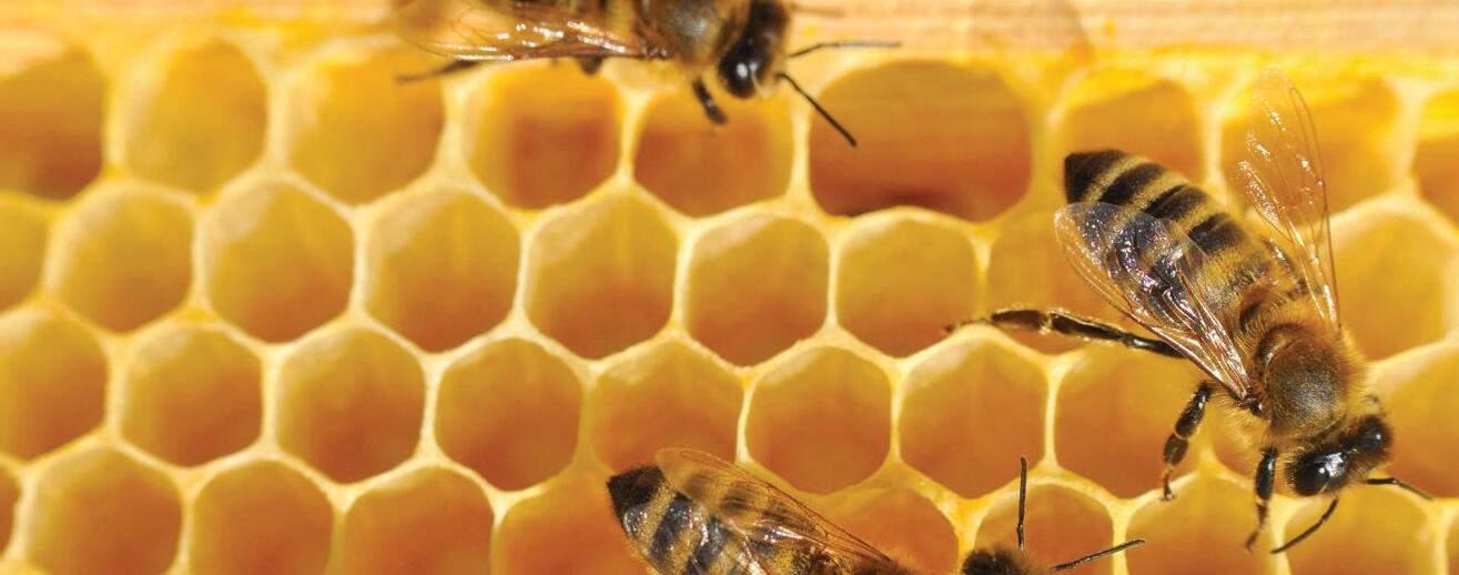
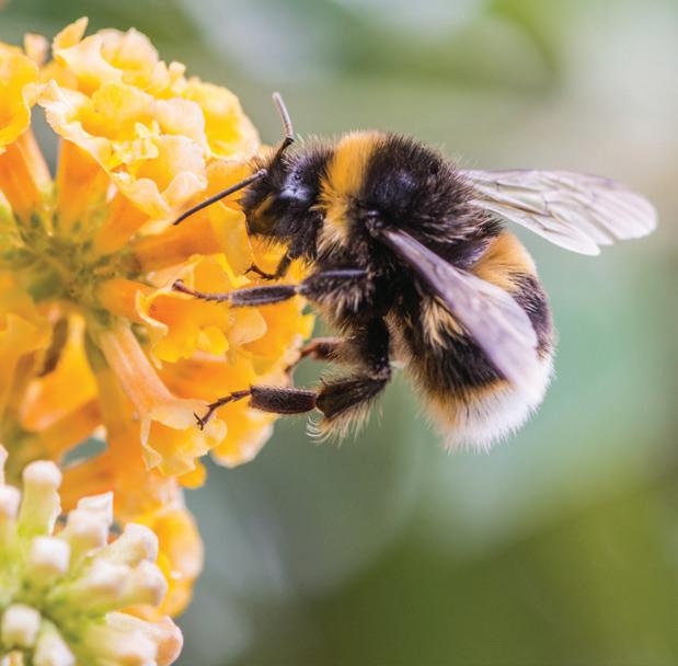
BEE THE CHANGE
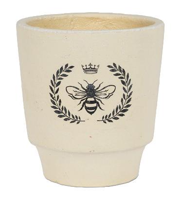
With the threat of environmental crisis looming, there has been a collected attempt across industries to highlight the importance of collective action against climate change going forward. As members of an industry rooted in design, we feel a particularly potent compulsion to render the gifts that the earth provides us visible, as we gain the majority of our inspiration, materials, and colour palettes from the greatest designer: Mother Nature herself. One of the best ways to foster a better relationship with our planet is to slow down and take the time to marvel at our remarkable world. With the esteem and respect that this proximity encourages for our natural world, we might begin to take better care of our home. We took a lesson from some of the most patient and appreciative people in the farming industry, who depend every day upon nature’s provisions to prosper. With dramatic declines in bee populations in recent years, no one knows better than beekeepers the absolute imperative that is saving our planet.
For third generation apiarist, Phil Veldhuis, beekeeping is a family affair. The roots of his business date back to 1917, when his grandmother began beekeeping and became a founding member of Manitoba Cooperative Honey Producers. Phil became a member in 1991, where he served a term as Chairman and several stints as Director. Phil’s apiary is nestled against the banks of the La Salle River near Starbuck, where it has been producing top-quality honey for Canadians from coast to coast for many generations, and hopefully many more. After nearly three decades in the industry, Veldhuis is still enamored with his work and the connectivity it fosters amongst his family and his community. “It’s very much a father-and-son thing” Phil recounts of his Saturday ritual of selling his honey at the St. Norbert’s Famer’s Market, where he was amongst the first of the market’s local business to set up vendor stalls. “When things slow down, Timmy will get out his fiddle and do some busking next to the table. The fiddle music is how many people find us in the market.” It seems that much of Phil’s life philosophy seems to be learned from the Bees, who have mastered teamwork and understand the importance of hard work in generating quality outcomes.
It’s a job that requires tremendous patience and an immense appreciation for the natural world, but Phil seems to take it all in stride, sharing “the days are long and warm. You sit in the yard while you’re working in the sun shining on your back, the birds singing and the trees blooming. It’s very pleasant.” The majority of the crop is canola honey, but they also produce buckwheat, sunflower, and alfalfa and clover varieties. Veldhuis and his wife, Vona Guiler, and their two children, Timmy and Jayna, run a 1000-hive operation which yields approximately 250 barrels of pure Canadian honey, each weighing in at about 600 pounds each—no small feat in a world increasingly being overwhelmed by
mechanical and synthetic production. In fact, Phil’s honey is sold under the label of Bee Maid Honey, the only packager that boasts the title of 100% pure Canadian honey. With dwindling population numbers, sustainable practices like that of Phil’s farm are placed at a premium, particularly for environmentally and health-conscious buyers. Phil’s commitment to environmentally friendly business practices is evident: “Sustainability is important, not only because consumers expect it, but because I have kids and hopefully someday, grandkids; plus I am the grandchild of someone who farmed and looked after things well. To contemplate this coming to an end because of avoidable mistakes you made seems pretty unacceptable to me,” he explains.
Beyond a deep reverence for the environment and the remarkable little producers of his product, Phil shares his own personal standards of integrity are “reinforced by the expectations of [his] customers.” Elaborating on this welcomed pressure, Phil says “when a mom of three wants your word that your food is safe and healthy to feed her family, it forces you to take what you do very seriously.” This sense of commitment to the quality of his product has clearly been passed down through the generations, with their family being selected as 2014’s Farm Family of the Year by the Red River Ex Association, a testament to their superior product and process.
With dwindling population sizes and widespread panic over losing one of nature’s most sophisticated insects, Phil reflects on the significant challenges that lie ahead: “As bee populations shrink, there will be more tendency for beekeepers to focus on professionally pollinating rather than producing honey. This could mean that good quality honey will someday be priced as a luxury item instead of a staple. It will be more like caviar than peanut butter,” adding, “It’s a doomsday scenario to think that there will be no honey in the future, but it is conceivable that there won’t be as much of it available.” The numerous threats posed to the bee population are scary in more ways than one: not only would it be a tragedy for our taste-buds to see Canada’s honey supply slip into obscurity, but the diminishing bee population would also cause potentially devastating effects for the ecosystems that rely on the Honey Bee as an essential part of their food chain.
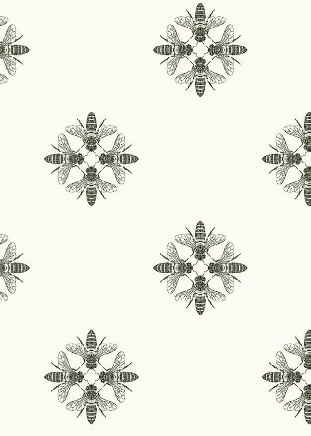
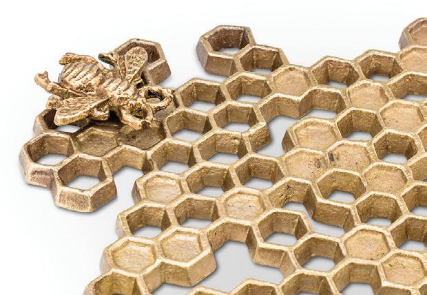
Phil and his family are a prime example of how respect for nature stems from a proximity to it. When we spend time immersed with the wonders of the natural world, we cannot help but develop a deep sense of reverence for the rhythms of the earth and all that it provides for us. In an effort to celebrate these remarkable creatures that support so much of human, animal, and plant life, we’re carrying wallpaper and Abbott décor items with designs inspired by the wildlife that brings us nature’s sweetest treat!
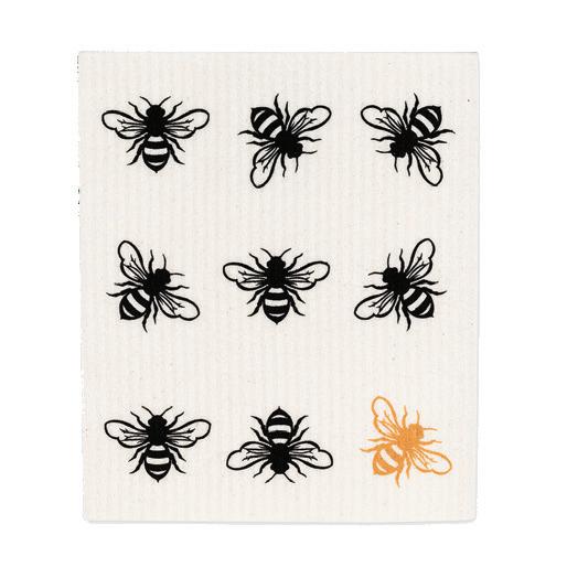
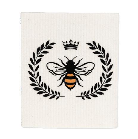
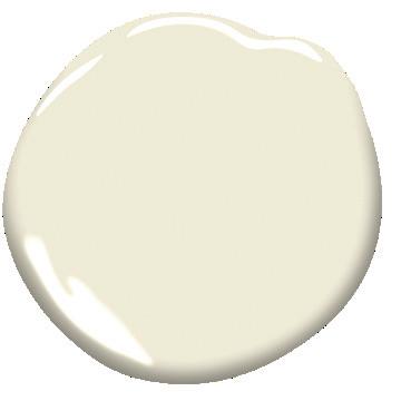
HONEYCOMB TRIVET WITH BEE – $25, LARGE BEE CREST PLANTER – $12, BEE DISH CLOTH-SET OF TWO – $12, HONEY BEE WALLPAPER – $100/per double roll, OPALINE OC-33 Benjamin Moore
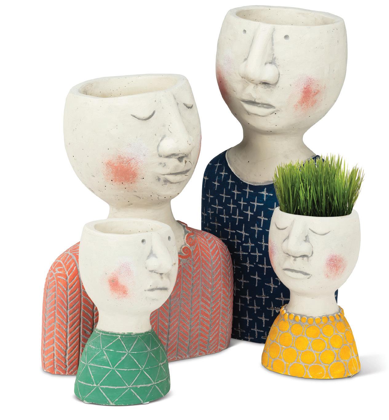
No ned to limit these artsy pots to being homes for your houseplants:
Perfect for keping track of keys at your entryway or as a trendy pen-holder at your workstation. Get creative & use them as a convenient catch-al!
HOUSEPLANT HARMONY
SHADES THAT SHOWCASE YOUR PERFECT PLANTS
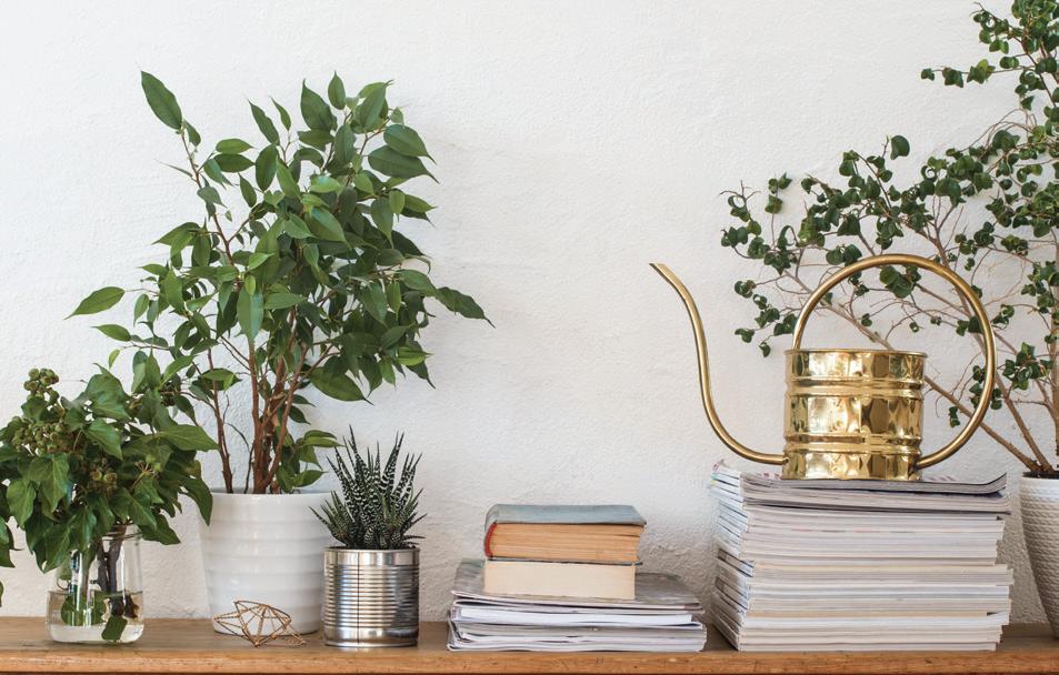
As we shift our collective consciousness toward a more interdependent view of the natural world, it’s no surprise that houseplants have seen an explosion in popularity in interior design. Interior plants infuse their surroundings with character, while paying tribute to the great outdoors.
While their visual impact is reason alone to scatter shrubbery throughout your abode, the benefits of utilizing greenery indoors goes beyond their looks; they also have surprising health benefits. These green genies reduce carbon dioxide and air pollutant
levels, regulate air temperature, increase humidity, and reduce airborne dust levels! But just as living things need a little TLC to help them thrive, a little support from their surroundings can highlight their aesthetic effects. Choosing the perfect paint color to complement your foliage can make all the difference. With the wrong backdrop, greenery can often get lost in the mix and wind up taking away from your overall vision rather than enhancing it. We put together a list of our favorite shades to showcase houseplants, so your plants can glow and grow in the limelight!
COLOUR PALETTE
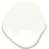
Benjamin Moore paint in: Simply White OC-117
Benjamin Moore paint in: Tangelo 2017-30
Copper Patina 619
Benjamin Moore paint in: Forest Green 2047-10
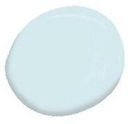
Benjamin Moore paint in: Morning Sky Blue 2053-70
COVER RECIPE
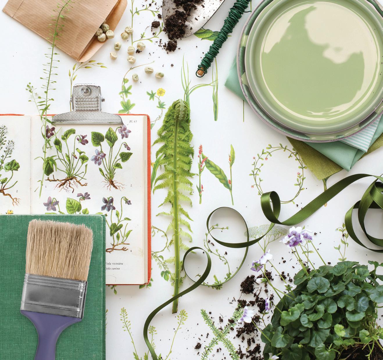
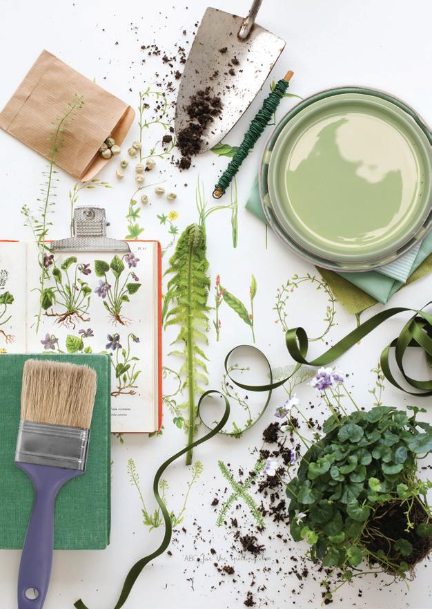
The most imperative aspect of the creative process has always been curiosity. Being observant about the world around us opens-up new pathways for potential inspiration. It’s so easy to get caught up in the hustle-and-bustle of busy city life and forget to marvel at the beauty that’s all around us: in the rivers that rush on between thick boreal forests, in plants that grow defiantly year after year, despite the winter’s frost, and in the stunning lilac flowers that sprout up to face the sun. Our cover shoot was all about capturing this co-mingling of artistic energy and the earth, letting our ideas and creative projects take root in the very ground we walk on. Considering the creative process as a gardening of sorts, as if through design, we’re weeding through the abundance of existence to let the bloom shine through.
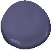
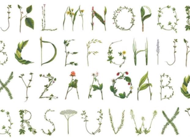
Back-dropped by Rebel Walls’ “Floral Alphabet” wallpaper, which encapsulates the idea of learning and creating alongside nature perfectly, soft and subtle greens, like “Sienna Laurel” by Benjamin Moore anchor the wallpaper’s intricacies and produce a calming effect. The deep purple hue pulled from the paper, “Darkest Grape,” compliments the foliage nicely, conjuring the image of a meadow scattered in lilacs. We are never ones to shy away from the messy aspect of the creative process; we’re firm believers that to produce something beautiful, you need to be willing to dig in and get a little dirty. In fact, we’ve found that the mess is often where the magic happens.
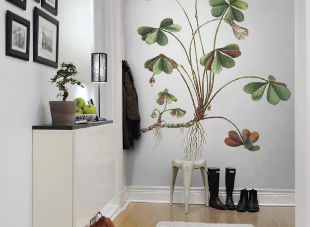
FOREST GREEN 2047-10 Benjamin Moore, SIENNA LAUREL 536 Benjamin Moore, DARKEST GRAPE 2069-30 Benjamin Moore, FLORAL ALPHABET By Rebel Walls, OXALIS By Rebel Walls
Spring is in The Air
HUE’S ON FIRST
HOW TO USE A STANDARD COLOR WHEEL TO PAINT YOUR HOME
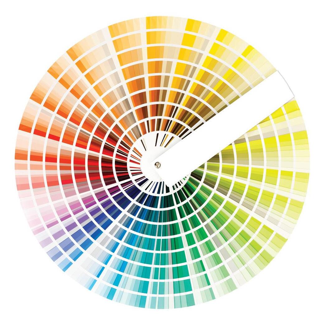
Every shade is connected and bears a relationship to one another. By familiarizing yourself with the color wheel and the way it operates, you can gain a better understanding of the relationships between shades, and therefore be able to select colors that help achieve the desired aesthetic of your home. Working with a color wheel, the
MONOCHROMATIC (ONE COLOR)
This scheme utilizes one color in several different shades or tints, often in light, medium, or dark tones. A monochromatic palette screams sophistication when using softer or subtle shades. When the palette is using a darker or bolder shade, the result is daring.
(Ben. Moore: American White 2112-70, Arctic Seal CSP-15, Onyx 2133-10)
ADJACENT / ANALOGOUS (TWO-SIX COLORS)
This system employs two or more colors which are found next to one another on the color wheel. The best execution of this color scheme involves choosing one color to use more dominantly than the others.
(Ben. Moore: Instinct AF-575, Blue Daisy 2062-40, Darkest Grape 2069-30, Lazy Afternoon 1378, Pale Petal 1178)
COMPLIMENTARY (TWO COLORS)
Opposites DO attract in the world of interior design. This scheme mobilizes two colors that sit opposite to one another on the color wheel. Again, the best results will favor one shade more prominently to prevent the shades from clashing.
(Ben. Moore: Harbour Side Blue 740, Yellow Marigold 2155-30)
TRIAD (THREE COLOR)
This scheme takes three colors that form an equally-spaced triangle on the color wheel. For example: violet, orange, and green. With the triad scheme, you’ll want to select one shade as your dominant, one as your secondary, and another as your accent.
(Ben. Moore: Spring Lilac 1388, Pumpkin Pie 2167-20, Martha’s Vineyard 630)
potential for devising attractive decorating schemes is practically limitless. Schemes are helpful guidelines that ensure cohesion and cooperation amongst your selected shades. The most successful colour combinations fall into one of the following categories:
FEATURED PRODUCTS
Swan Watering Can
– $15
The watering can that will make gardening an insta-worthy event.
Ceramic Coconut Mango Pineapple Candle – $25
Nothing says Spring quite like the uplifting scent of tropical fruit.
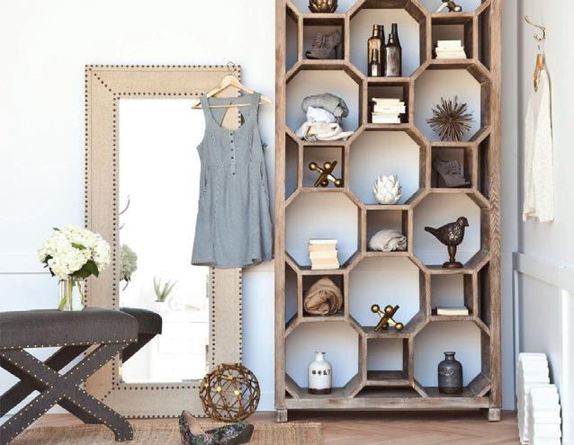
Traro Bookcase – $2595
The perfect piece to showcase all your favorite things, from knick-knacks to book stacks.
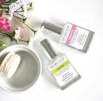
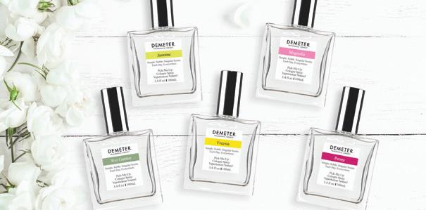
Wet Garden, Jasmine, Freesia, Magnolia, Peony
– $26 each
Enjoy the fresh scent of spring with these soft & subtle pick-me-up perfumes.
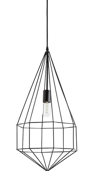
Pendant Light – $255
A light fixture with an industrial edge.
Hippo Bottle Opener
– $10
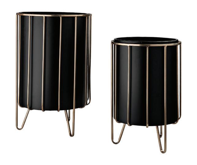
Modern Brass Planters
– $145
Uproot & upgrade your house plants into these chic & stylish brass planters.
Flamingo Watering Can
– $15
Add a splash of style to your garden with this adorable watering can!
No need to stuff him away in a junk drawer, this adorable tool will double as décor.
Designer Scrunchies
– $15
In playful patterns and prints to go with every outfit.
TRENDY TERRAZZO
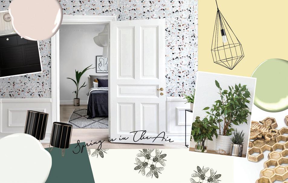
While the terrazzo trend began due to its nature as a convenient and sustainable flooring material, this stunning design is cropping up on all sorts of surfaces: mugs, dinnerware, textiles, rugs, vases, and other décor items, making it easy for everyone to incorporate this playful design into their homes.
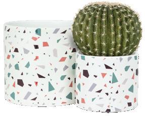
Terrazzo Plant Pot
– Small $10, Large $15
A stunningly stylish home for your plants & flowers.
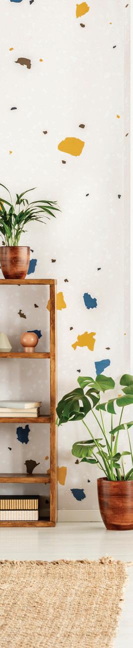
Spring seems to be the ideal season to be sporting terrazzo, with its vibrant collage of colour against a crisp white background in random constellations which appear in perfect disarray. This fun print can be used in virtually all spaces in need of a little energy boost; a welcomed break from the recent dominance of
neutrals in the majority of interior palettes. Beyond providing a dazzling and sophisticated spectacle, the terrazzo trend is also incredibly versatile. Some prints are muted, making them the perfect companion to vibrant accessories or backdrops; other manifestations of the trend pack significant punch, making it the perfect stand-out piece in a relatively neutral palette. The scale of the speckled colors makes it easy to match or pair with other prints, colors, and textiles. As a design made beautiful because of its imperfection and asymmetry, it teaches a very valuable lesson about the art of learning to appreciate the beauty in a little bit of disorder.
Rebel Walls, Terrazzo
OWNER’S PICK
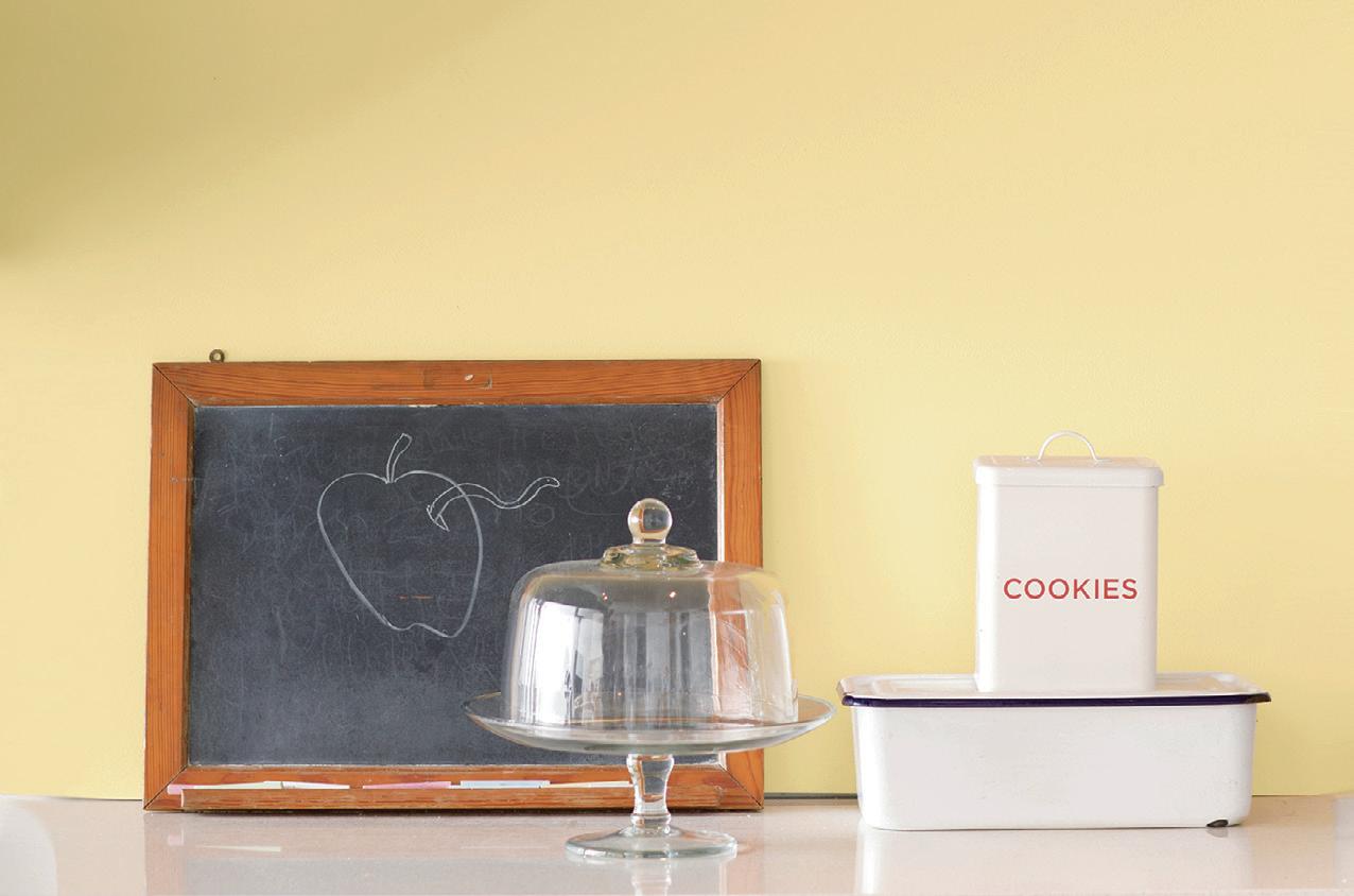
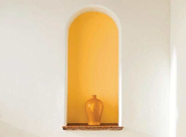
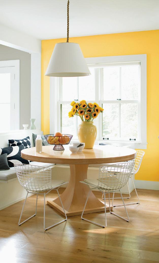
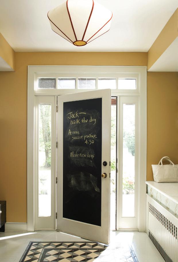
COLOUR THEORY: YELLOW
People have been theorizing about colour for over 500 years; Leonardo Di Vinci was among the first to begin thinking critically about colour and the way human beings interact with it. His scrolls, along with the writings of Leone Barrista Alberti’s, marked the genesis of the progression of this school of thought. In the 1800s, the three primary colours were identified as the fundamental sensory qualities that can be blended to create the perception of secondary colours. Shortly after, Isaac Newton invented the colour wheel to describe complimentary colours (colours opposite to one another on the wheel), and posited that these contrasting shades would cancel one another out. This eventually led to preliminary investigations into colour psychology to answer the question of why certain shades and combinations generate an emotional response, and how we as a species have come to identify certain feelings and phenomena with particular shades.
The contributions to colour theory have significantly improved our ability to cultivate pleasing aesthetics and produce appealing colour combinations. As a paint store, we consider ourselves to be champions of this practice. We’re looking at colour families and celebrating the ways in which the variations in shade or tone can impact our moods and behaviours. Each shade tells its own story and, in the spirit of sunshine, we’re starting with bright and beautiful YELLOW.
Yellow is the hero of Spring: when winter breaks and the golden hues of sunshine come peering in, we know it is time to usher in a new season filled with fresh beginnings, clean slates, and bright futures. As the colour of optimism and hope; yellow hues foster creativity and improves over-all mood. These energetic shades will have your spring cleaning feeling like a breeze and your house feeling warm and happy.
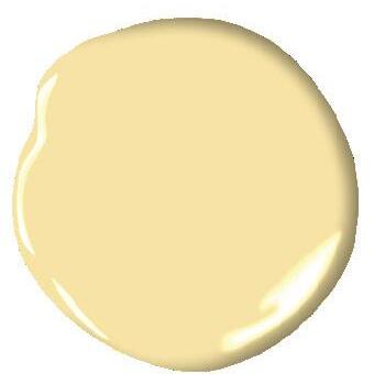
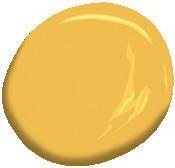
HAWTHORNE YELLOW HC-4 Benjamin Moore
YELLOW RAIN COAT 2020-40 Benjamin Moore, ANTIQUE BRONZE 217 Benjamin Moore, YELLOW FLASH 2021-10 Benjamin Moore, LUMINOUS DAYS 300 Benjamin Moore
Now is the Perfect Time to Paint Buy One, Get the Second at 50% O ! May 23–27, 2019 Now is the Perfect Time to Paint Buy One, Get the Second at 50% O ! May 23–27, 2019 the Perfect Time to Paint One, Get the Second at 50% O ! May 23–27, 2019 Now is the Perfect Time to Paint Buy One, Get the Second at 50% O !