
11 minute read
KINEMATIC PAVILLION


Design was part of an
Advertisement

GARDENS BY THE BAY, SINGAPORE
Largest climate controlled glasshouse in the world.
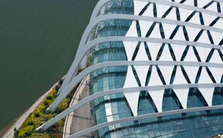
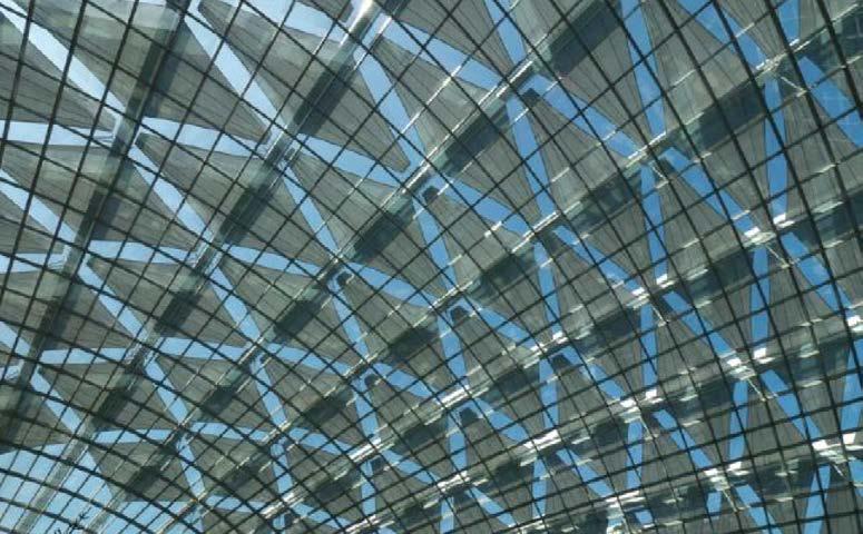
Retractable tiles to prevent and absorb sunlight for the plants growth and overall health.
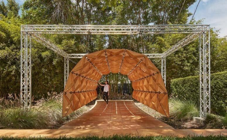
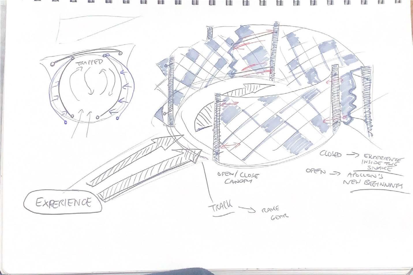
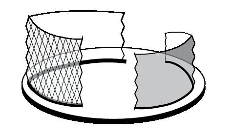
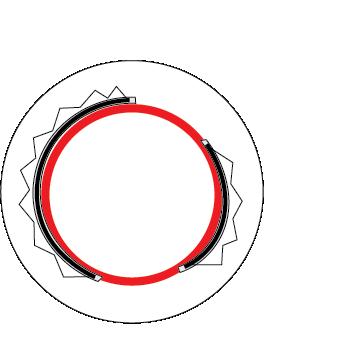
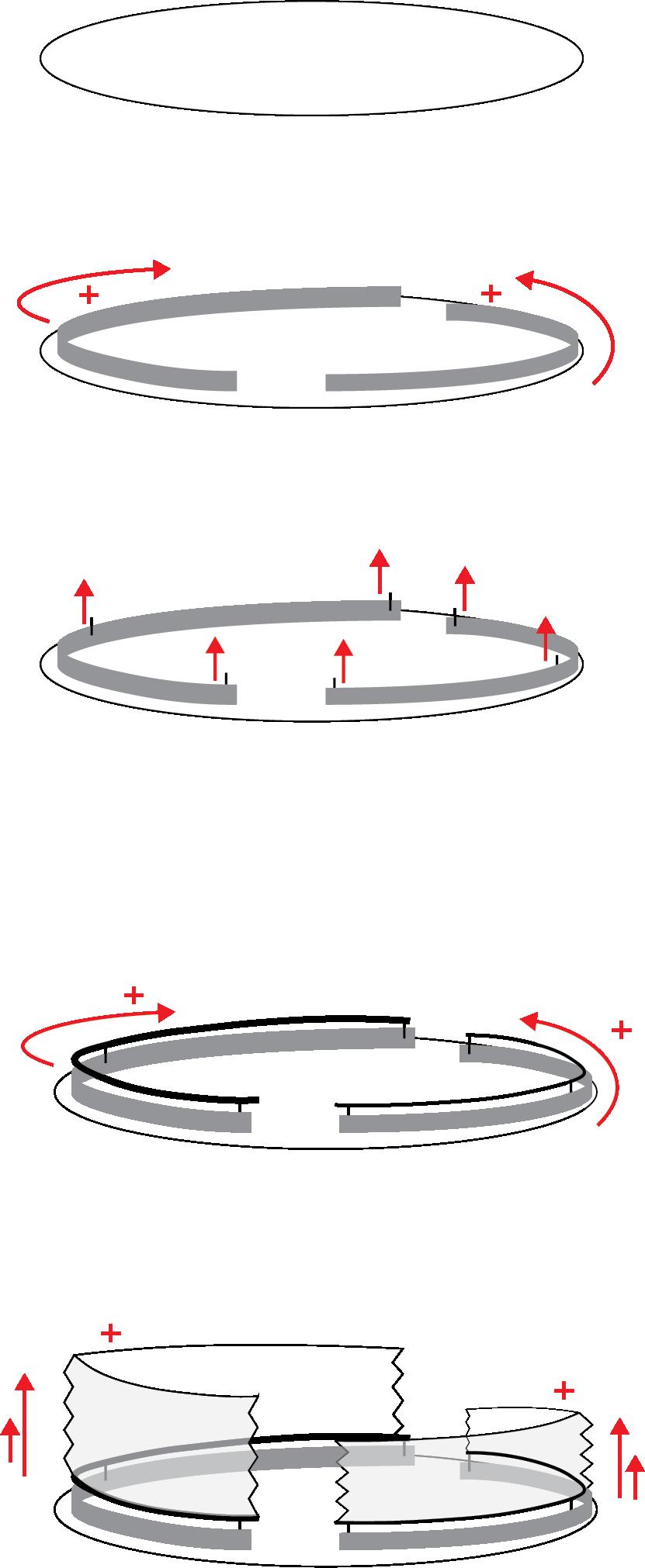
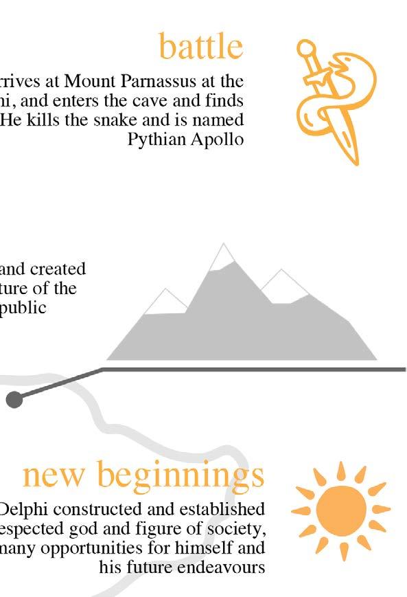
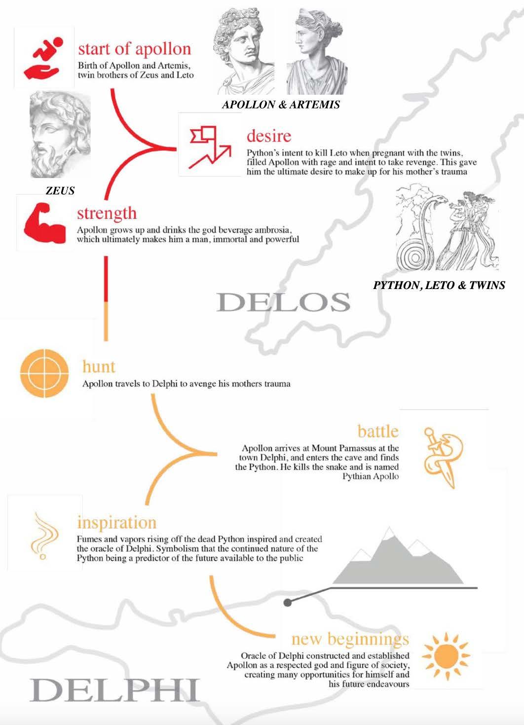
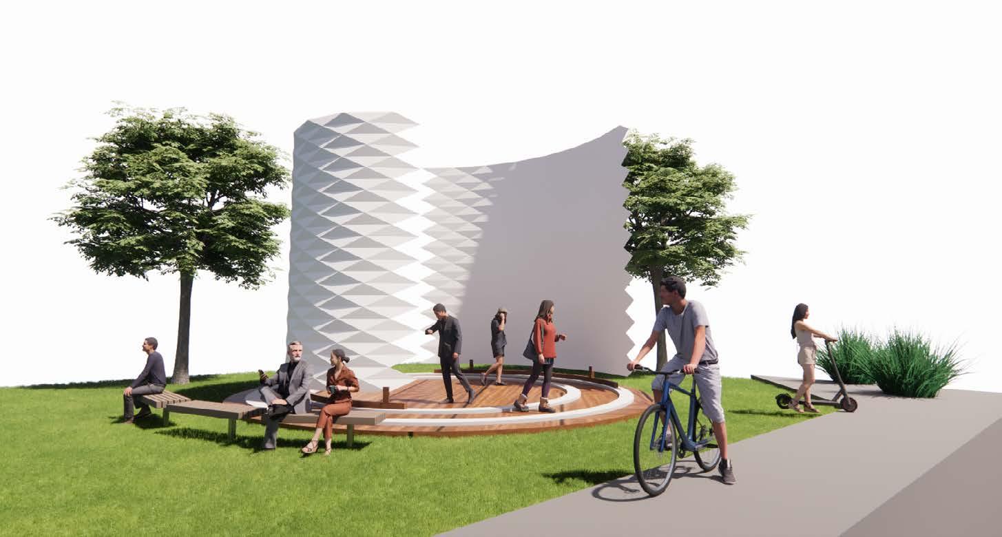
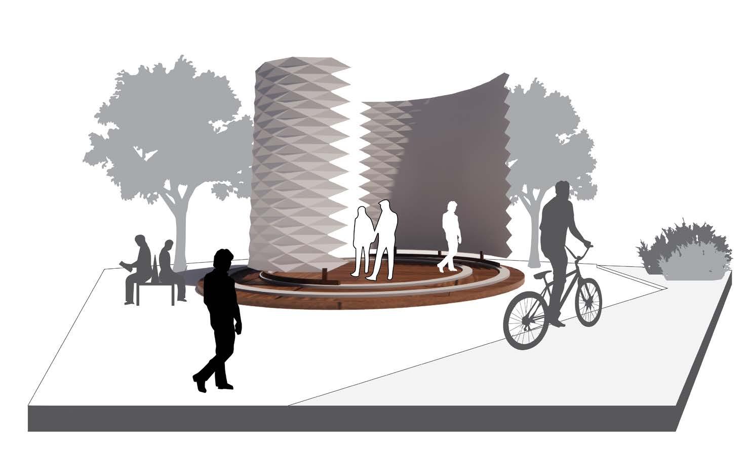
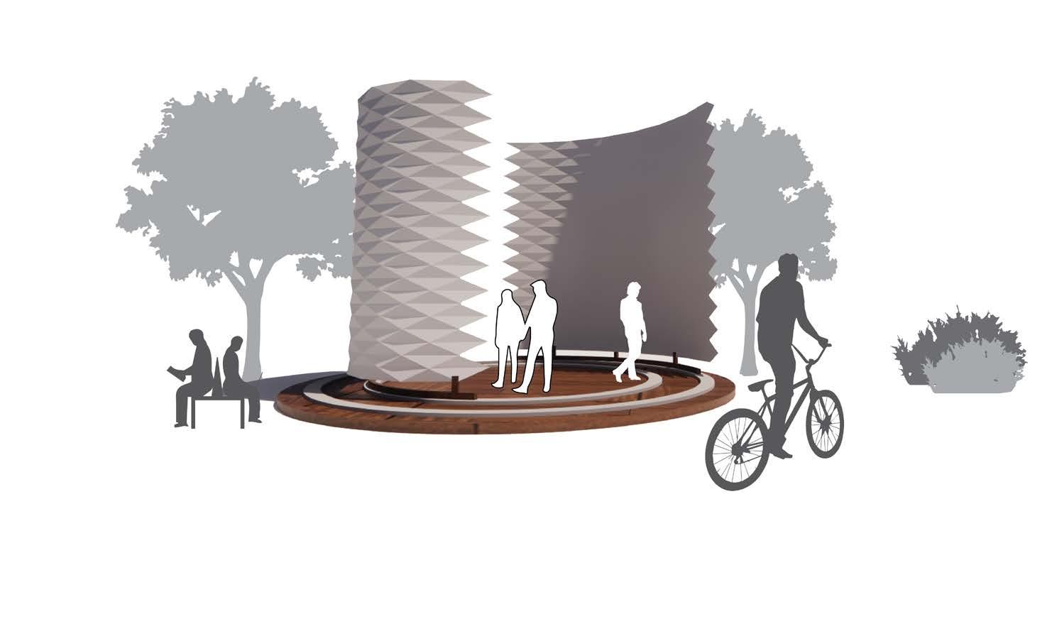
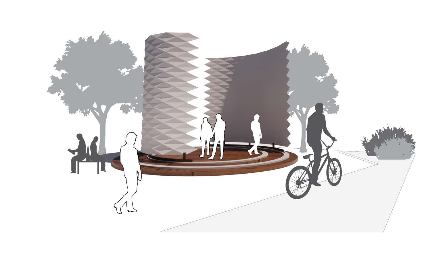
Spinning system of skins, creating an experience within and out, almost like you are trapped within the snake skin. Then when it opens up, you experience the effect the after the story, and the enhanced social profile he has with the new beginnings.
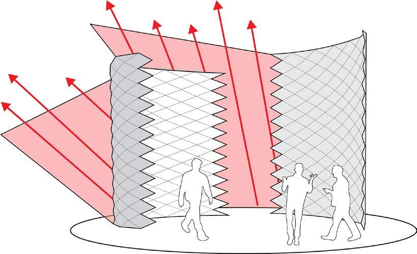
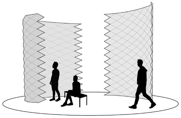
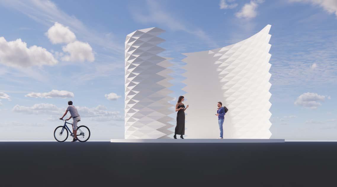
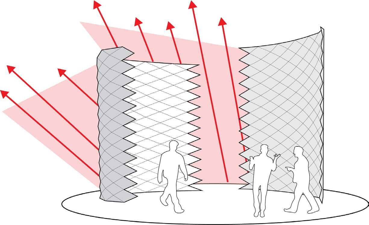
Modular system so to convey the overall feeling and motion of the model, I decided to elimate the extra walls, and keep one moving wall and one constant wall, for contrast effect and an insight into the environment it is located in, and how the public would interact with it.
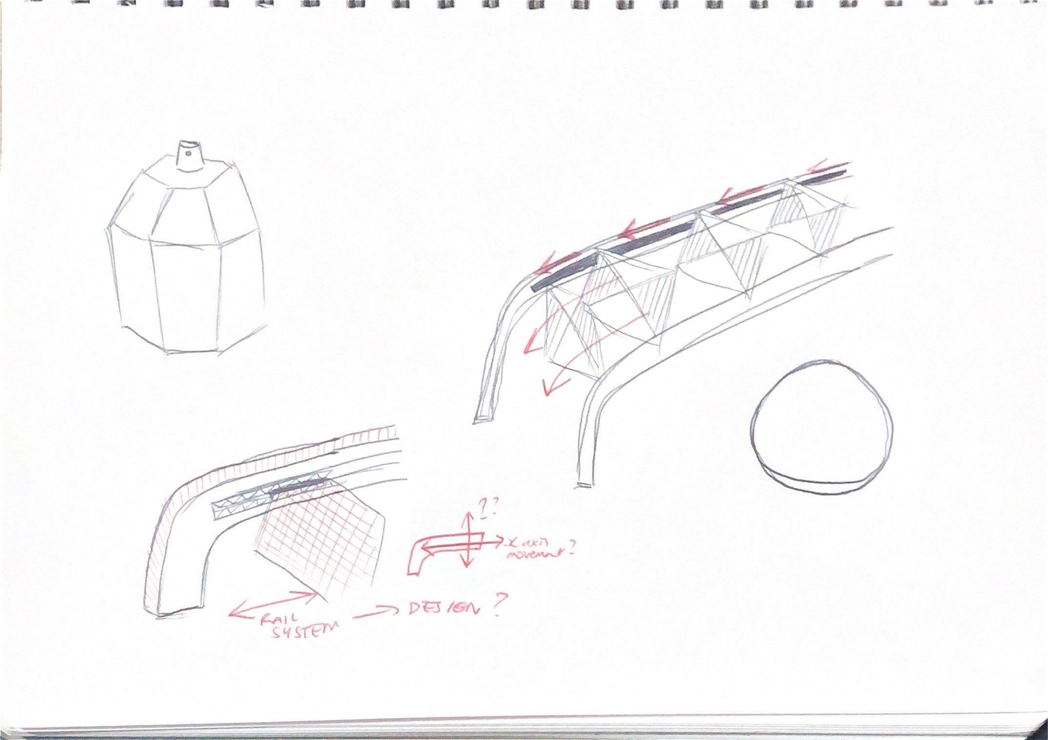
possibility of different skins? circle base? circle roof system to enclose the model?
Feel it links closely to the allegory and would be suitable on the site and its interaction will facelift the environment. Various skins being used may create contrast between the walls and evoke various feelings amongst the audience. But would it change the snake relation and aesthetic.
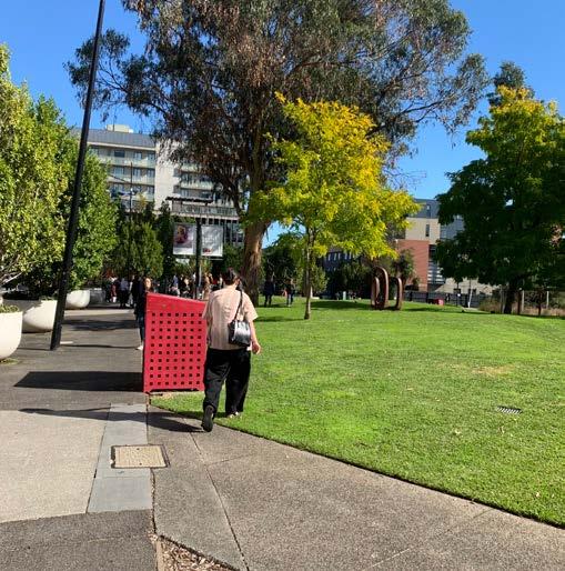
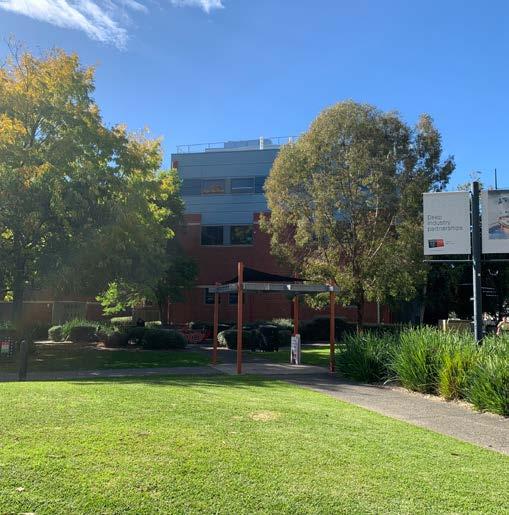
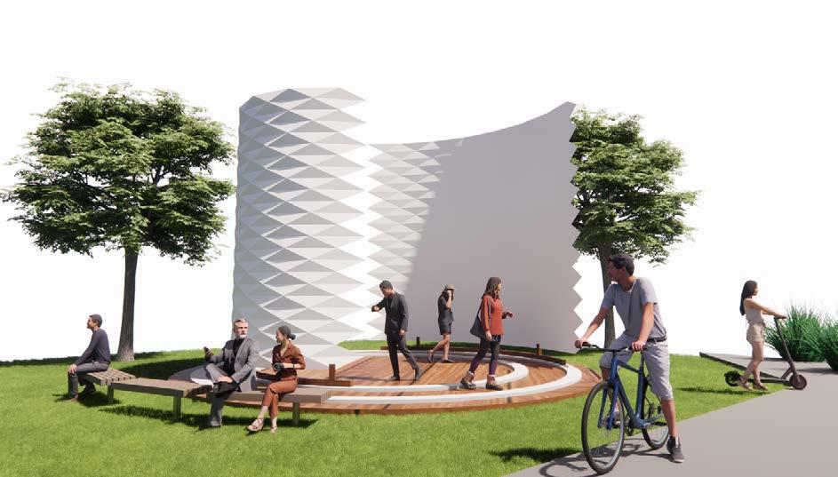
Outdoor space on campus, an open green space which can nest this pavillion wall enclosed environment.
Will be inviting and also enclosing within, and when the walls open up, the audience will engage in the environment with the greenery and wider natural environment of the setting.
Also open up a social setting and environment for students to engage variations during the day variations during different wind patterns
Being a general open space I feel that wind will definitely be a factor in regards the movement and speed of the wall rotation. Main axis of wind going between the buildings into this green space, may limit possibilities on a windy day.


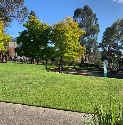
Feel that weather will also affect the potential of the area and exhibit, and therefore may need a canopy above the walls to eliminate any rain or weather conditions that will one decrease the performance of the machine, but also decrease the experience that the user undertakes.
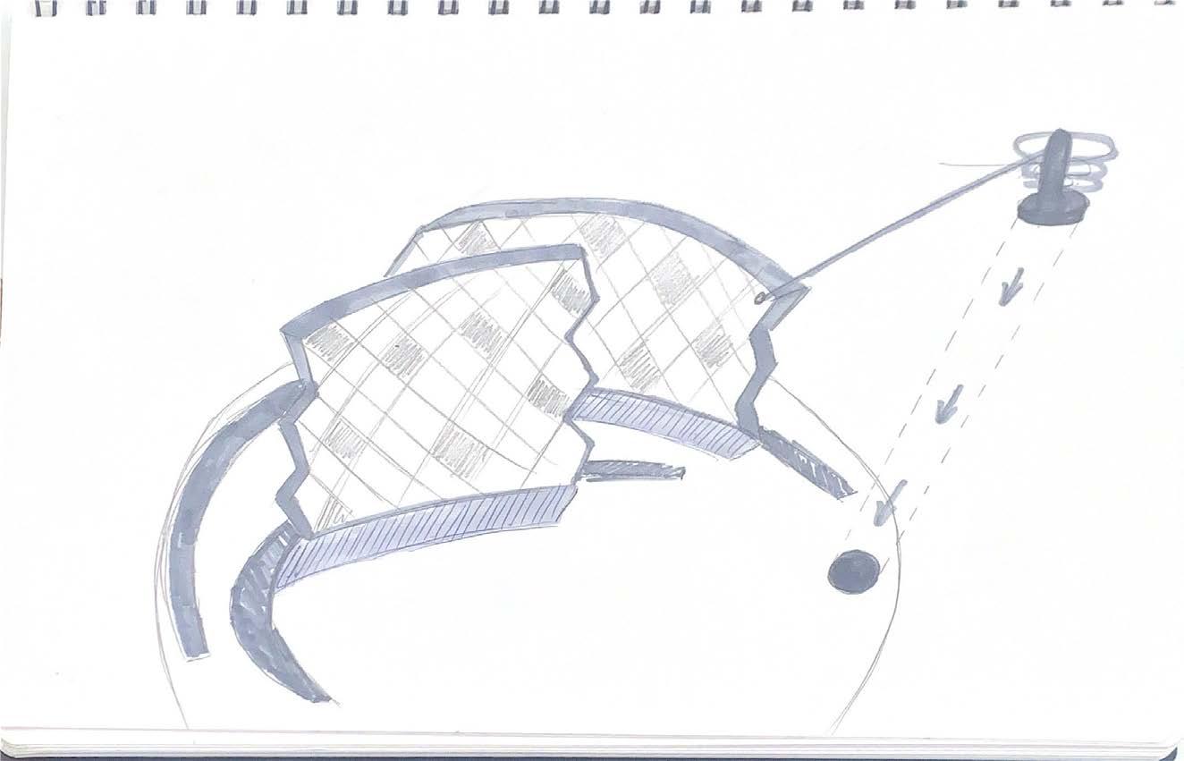
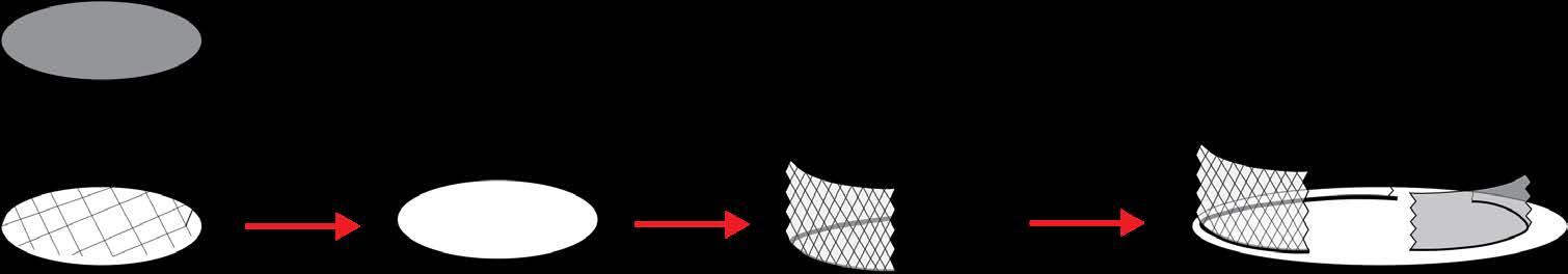
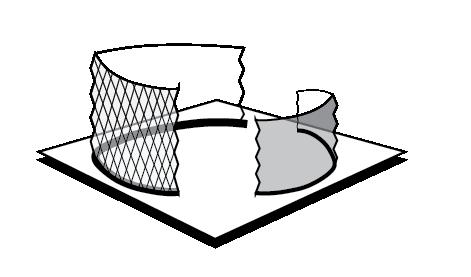
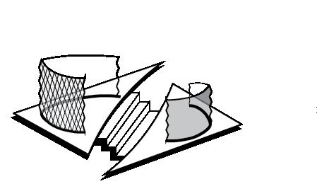
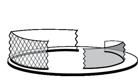
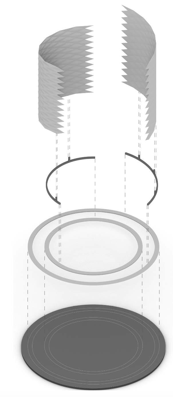
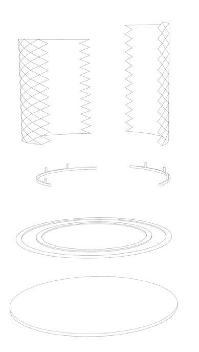
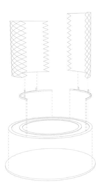
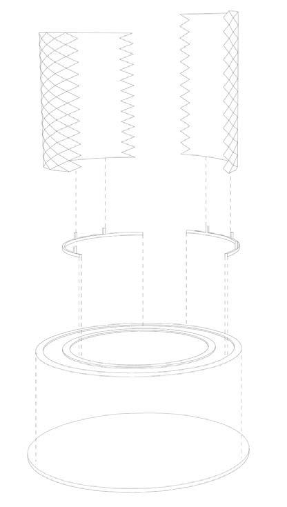
Yoshimura Extracted Base Extracted Skin Design
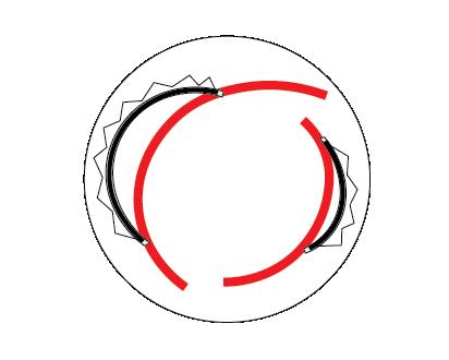
walls start to open as people arrive to the location and use the space walls open as the weather will not be a restriction on experience diagram explanation of how the rail system works, and how the walls are rotating walls are clearly divided and opened up to create clear circulation between the enclosed area as well as surrounding interaction with lowered walls. diagram explanation of how the walls at a constant state, are moving up and down to create movement and experiences between interior and exterior spaces. walls start to close while still being able to enter the space, but no direct circulation to the otherside weather restriction creating the need for high walls and one side entry/.exit weather restriction creating the need for high walls and one side entry/.exit

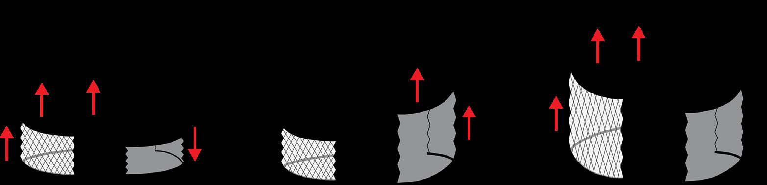
CIRCULATION OUTCOMES:
1. Height of wall alters amongst different times and weather patterns
2. Therefore, circulation between the space and the exterior alters depending on shape of the walls

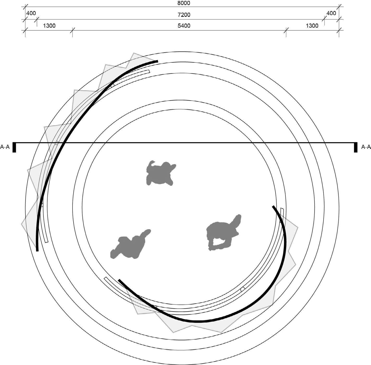
3. Alternative weather patterns has created uncertainty between the user experience within, and therefore the need for a roof system type canopy to cover the space and ability to be used in all times of the year variations of base size and form shape variations of rail system, curved, circular and linear

OUTCOME:
1. Circular base is the most effective as it emulates the round nature of the curving skin
2. Rail system is in the same mannor, circulate fashion, only depending if it be semi circular or a complete circular system offsetting the base general design concept of the walls enclosing the interior environment, via the python, and how opening and movements of the walls create and symbolise new beginnings amongst the user and the environment.

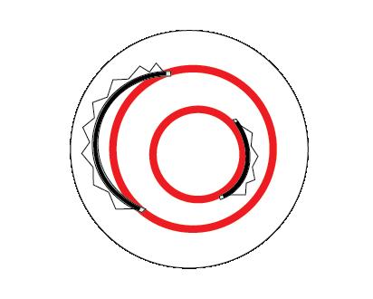
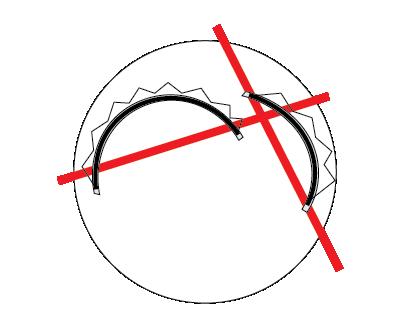
1 circular base
2 Addition of the 2 rail systems
3
Addition of the wall support beams
4 Addition of the wall base rail to increase movement and structural space
5
Addition of skin walls, lifted up from the rail
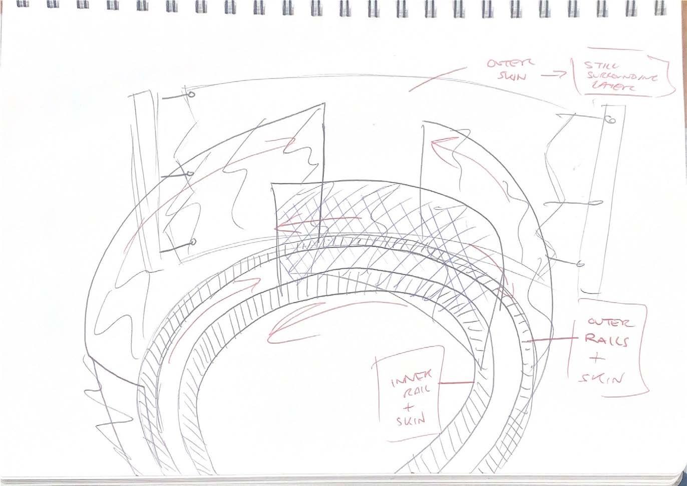
Structural Diagram
plan view of the design at a steady state, where the walls are at default position. I reflects the story and how it flows on from the python and opens into bright surrounding nature, and increasing that experience of new beginnings after you leave the space.
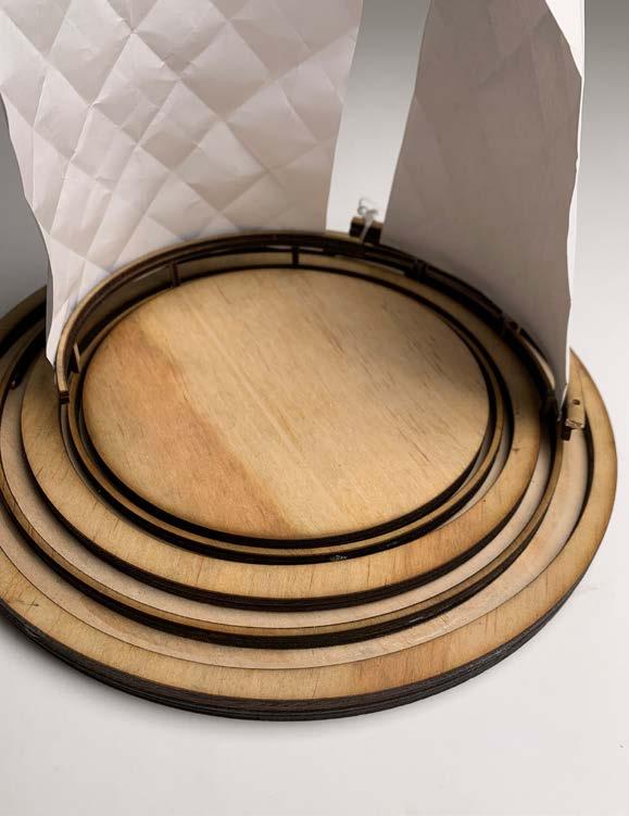
rail system moveable rail system piece (inner section) base detail showing how all sections of the design are connected, by the central rail system, and all of its layers.
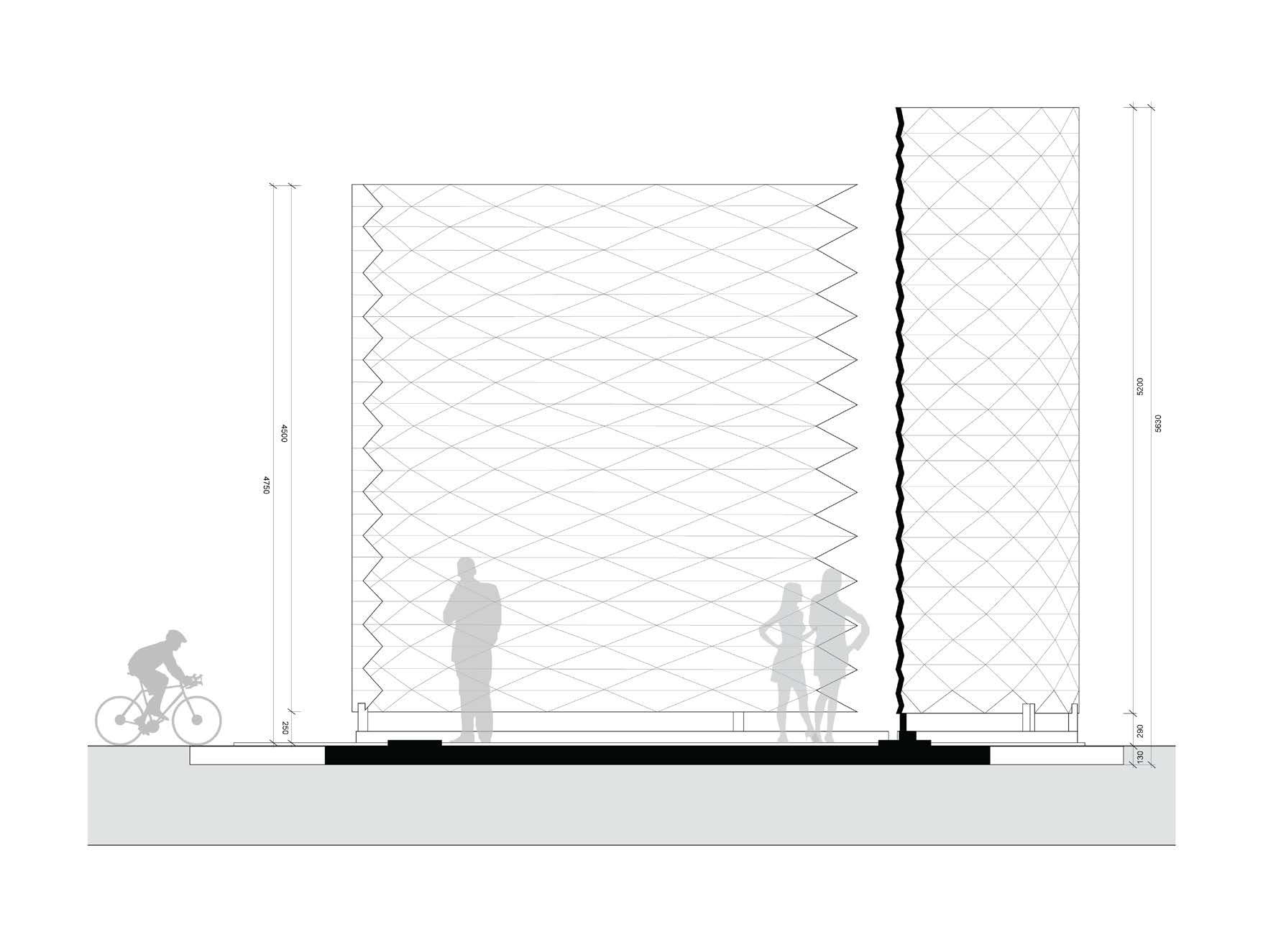
1:10 scale skin facade two walls
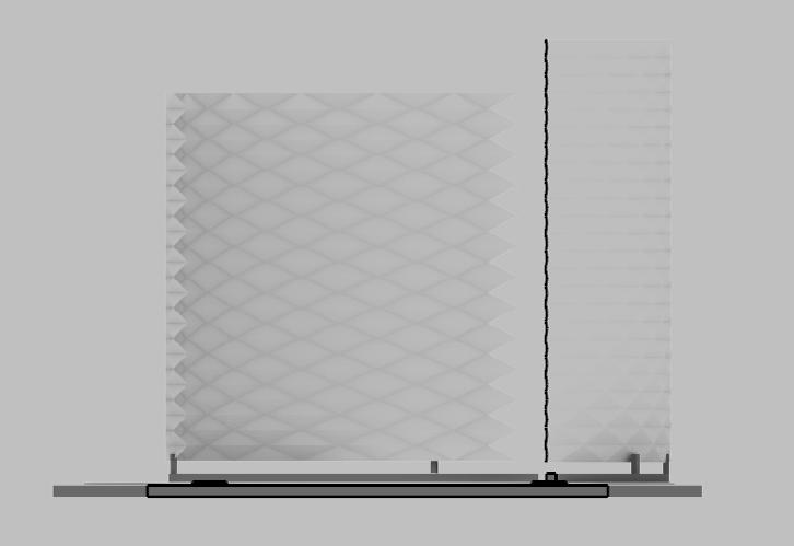
1. 4500
2. 5200 (height) thought this would be the best section cut for the system, demonstrating both exterior and interior elements of the space. final section demonstrates how the space has been used directly, at a 1:25 scale rail system top: moveable & dynamic part of the system bottom: structural permanent section that holds the dynamic system in place circular base
8000 diameter visualisations that directly relate to the site and its location regarding the surrounding pathways and vegetation.
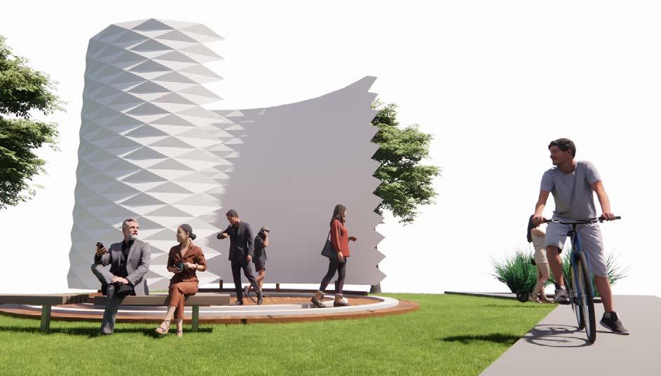

I feel the natural environment enhances the design as well as creating an easy flow in and out of the space
Believe the experience of leaving the space and stepping into the grass, itself is the new beginning, the reconnection the user gets with the natural environment, evoking positivity and focus for the students in class.
PROJECT 2 (WEEK 5-8)
1. heading icons have a border, need to make transparent 2. this applies for both red and gold icons
3. delphi and delos typeface is stretched and doesn’t portray any message updates are effective and make the layout or aesthetic cleaner and even more of a quality poster typeface complements the graphics well, effectively portraying the messages of the story.

F97-99
New Beginnings
black outline on red identifies that the new beginnings are part of the structure, and therefore confusing and needs to be removed. Opacity can also be decreased to create the clear contrast between structure and experience new beginnings effective outcome and easily identifiable differences between variables

Render was affective in its scale and physical relation and user experience, however it didn’t link to the rest of the poster theme. Therefore, the decision to only render the form, and use linework and silhouettes to portray the same message is effective, whilst also relating to the wider aesthetic of the project.
Further development removing the base as it looks weird in context to the rest of poster 7. Then I thought that it was too basic and therefore added the footpath to add the context into the render.
Identified that the axonometric is off Rhino, and doesn’t link straight to the line work theme across the posters.
I feel this needs to be updated.
First linework drawing I feel is squashed, and the spacing must be increased between elements.
The final works well, evenly distributed across the drawing, therefore efffective in nature.

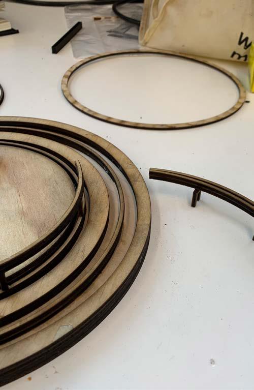
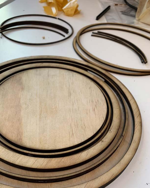
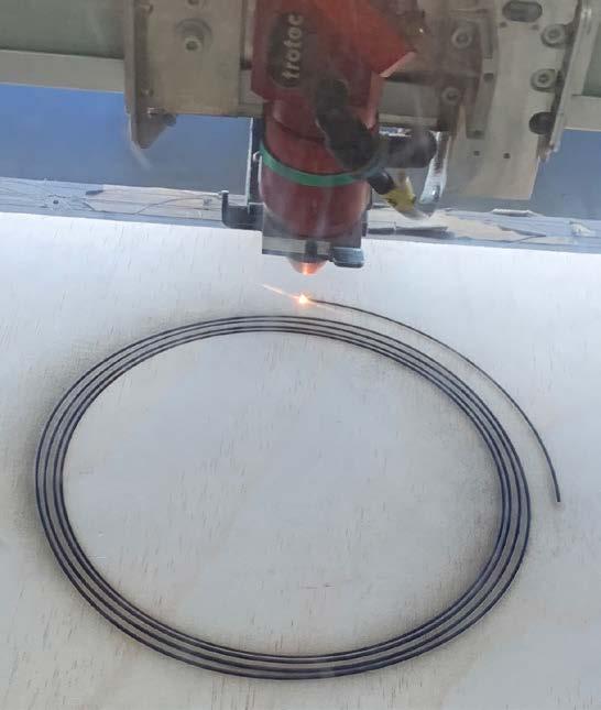
Laser cutting the pieces that construct the base of the structure.
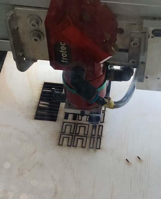
Applying the base pieces and completing the railing system.
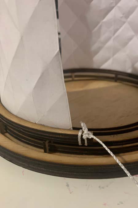
Final model outcome, with skin applied to the top of the rail, one that rotates too. Rope applied to pull the skin across the base.

Model Development

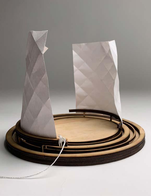
Final outcome, effective in portraying the overall story and message of the Apollon and the Python.
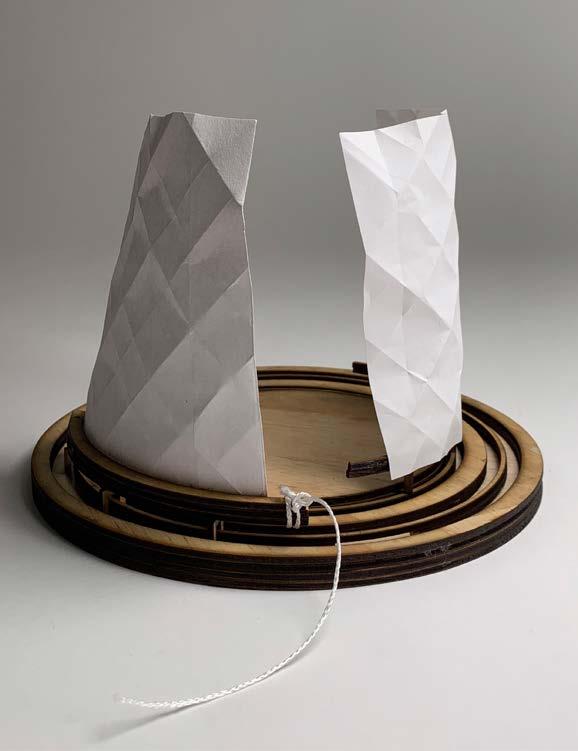
Rope makes it effective to move the outer skin across the rail, and it moves quite smoothly across the surface.
Final Model Photography
Architecture should tell a story as the Ted talks suggest, form follows not only function but fiction that he means which was a unique way of playing on that statement we hear on and on in the industry. I immensely enjoyed the insight he brought to the table and can use that moving forward in concept creation. I believe AI will not change the manual aspect but could replace us in the fact of quick concept creation and generation, with AI printing out communication in a matter of minutes on end, is very scary moving into the future.
A 2D line drawing replicates the visualisation of a 3D object at an important point to acknowledge between the two dimensions. 2D drawings can emulate 3D elements via perspective drawings, as well arrows and annotations depicting points of motion and rotation amongst the space. At a point of motion and heavily important to the duration of the movement, perhaps a change in direction of the story. I feel photos at different stages to movement and processes can implicate what happens next and how the stages are interconnected in the time frame. I feel this sequence is necessary to fully understand the complete story and complexity of the design. Video and photography is basically in my opinion another set of eyes to look at, where the point of view may be different to your own personal thoughts, due to different camera angles and hidden messages missed when performing the act previously.
Challenges in documenting my investigation in photos only were not seeing the range of motion that the video provides, but I found that annotations work in portraying this motion across the stop frame photos. Still, for myself being a visual learner I would find it beneficial to use the video tape. For written analysis, visually not there, but regarding analysis of pros and cons it is outstanding in communicating for the folio, and with my peers in my studio. Line drawings alone with no context cannot be understood by anyone. Lines indicate movement, and without a context image or sketch, it is pointless to communicate to the viewer. But, with clear annotations and descriptions, plus visuals and signage to indicate areas of interest and key concerns, it can be understood. I feel the more information you provide on paper, while the visuals should be able to communicate effectively alone, some written context assists and benefits the reader.
I feel architecture can evoke feelings through design via creating an experience within the space and forcing an action, or a motion that has a flow on affect and motion on the viewer or audience. My program is all about creating the new experience once you enter the walls, as well as when you leave the space, and therefore, it is more important regarding the feelings and experienced emotions the audience recieves, due to purposely designed systems and located well on the site. Designers can also make sure there idea is communicated effectively via diagrams and short captions displaying the key message of their design. I personally find annotations effective in my design process to further punch and grow my design which maximises the best outcome, as I visually represent it. Visualisations and illustrations must be displayed clearly and easily identifiable variables and sections for the audience to understand the wider picture.
The impact of design variations and their affect on fabrication is huge when coming up with a final product. I feel that the variations have to be completed to realise and develop the design further, in regards to its location and surrounding environment, and how it is imposed and effects the design dramatically. Line drawings apart from displaying a design, can also be random geometry and lines that influence a design, and “reverse engineering of a theory” to discuss potential outcomes and overall design layout. Also can be interpreted many ways, and may evoke different meanings for all parties involved if not a finalised product drawing.
Aside from the design, architects can communicate experience via enhancing the surrounding habitat with natural flora and fauna, as well as indigenous nature enforced in the environment. I feel this brings the user closer to the natural world, rather than being enclosed by the walls that surround us. Experience and evoking feelings out of the audience I feel is what forces design to be successful, and therefore the base of our design is how it makes the user feel amongst the space.
I feel the art that my design is performing is evoking feelings amongst the user, with the interior interaction, the skin walls create a unique experience and perception when you leave the space. As well as the skin itself, being of an art form, Yoshimura origami and its sharp façade yet warm and comforting interior. I feel like it was challenging to translate this art onto a poster due to the nature of it being an experience based form of art, rather than strictly being of physical importance, and rather social and spiritual emulation of the original story. But this was translated with the help of descriptions across the posters. The technology that my design is using to perform the experience of the new beginning is the rail system, and its simple yet effective connection across all layers of the design. It is two rails parallel to each other, one for each rotating skin wall on the site base. The challenges I faced was not that I could show how it is made and where it fits as that was easily applicable through a detail as well as a section, but it is more a a challenge to describe how the user engages with it. This was the main challenge faced, whether they acknowledge it or completely ignore it.
It is important to structure how you visually and verbally communicate your design in presentations in order to have a complete flow and story for your project. You must really sell what you have created with both mediums to achieve a successful design, and to also engage and distract the audience to keep them interested. It is also important to structure how you describe your design process in the folio and have a clean layout because that is how one, you continue to grow your concept by constantly reviewing it, and to present your folio and have the freedom for anyone to understand your complete design process. I feel like in the past I structured my design process, but it was also quite messy and rushed in foilo, mostly focusing on the outcome and presentations or models, as they were the focal point of my design. But I feel from now on, learning from this unit, It is a must to have a clean and effective structured communication pallet across all areas of projects. This starts from a clean folio, easily readable and flow is adjacent to the design process. As well as having a well-designed and structured outcome, depending on the project and its capacity to produce a desireable outcome for not only myself but the audience I am presenting to.
Overall, in this unit, I believe I have come a long way. My first project focusing on the Allegory and the storyline was successful and I was bound upon the journey of creating my communicative design. This started with the research and ideation of the skin and the way it interacts with the user. The sharp exterior of the Yoshimura I felt was a good fit for the Python and embarking inside to a smooth surface and interaction.
This created the need for the new experience to be the outcome of the design, and the new beginnings of those after their interaction with the space, both interior and exterior interactions. I feel once Project 2 was completed, even though it took some time to realise the intended outcome and notion of the design, this made it clear of the steps moving forward. This was even more tunnel-visioned to the outcome where the precedents were showing the same identity and nature of the design.
This was developed to the point of difference in my design, where the rail took the design to another level. This then took even further time and factors into how the design works and how it will work effectively in communicating the message of the story. I feel now upon final submission that I am satisfied with my design and overall work across the board, where I feel like this new graphic style I have chosen has actually been effective.


