Production Portfolio
BA (Hons) Graphic Design
Astyn Williams
08 The Idea Production Objectives Project plan Research Competitors Mood board Audience Initial Designs SWOT Costing Brand overview Brand Development • Colour Palette & guidelines • Icon • Fonts • Logo & Concepts • Patterns • Imagery Branding outcome Branding 09 10 12 14 16 18 20 34 32 38 52 46 44 43 42 40 58 Contents Project Outline
Website purpose Planning & Site maps User journey Wire frame Functionality & Design development Outcomes Social Media Promo Videos Merchandising Feedback Bibliography Illustrations Website 64 72 76 78 70 68 66 65 83 80 90 86 References Marketing
Life Qube Promo Video
https://youtu.be/L8jfETevjvY
Life Qube’s XD Website
https://xd.adobe.com/view/bf317e75-7b3f-4bb2-86f2-890a94043178-ea62/
Links
Brand guide Issuu
https://issuu.com/astynjanelle/docs/a5lifeqube_brandguide_v2
Major Project Video
https://youtu.be/LxJ6liivUGA
Project
Outline
The idea
The objectives for this project is to create a brand that can provide some support to young adults that are looking to living a sustainable life. Providing them with sustainable, off-grid living solutions that promote independence, self-sufficiency, and environmental stewardship. The branding should seeks to create a vibrant community of like-minded individuals who share a passion for sustainable living. Foundering a goal to inspire others to adopt sustainable lifestyles and contribute to a greener future.
The aim of this project is to supply a solution to the current living crisis. Current times are making it impossible for young people to move out and find their independences. As times are chancing this is a great opportunity to change the way of living not only for young people but for generations to come. My intention for this project is to treat my audience as young ‘first time buyers’ that are living in a unhealthy expensive sociality as well as been expected to live a healthy sustainable live.
Its primary function is to provide young adults with off-grid living solutions that promote independence, self-sufficiency, and environmental community of likeminded individuals who share a passion for sustainable living. It gives independence to young individual in a time where the government make it possible. With this project my aim is to show that there are way to live the life your way. The brand will need to empower young adults, to want more from life. Foster community, to allow the young individuals to have the support and information to be able to make better life chooses. As well as promoting sustainability, due to the way we have been living, it is now more important than ever that more people need to take global warming seriously!
Context
In a world where the choices we make today shape the landscape of tomorrow, young adults are at the helm of a transformation journey. From navigating the complexities of modern life to forging paths towards a brighter future, the decisions we make now hold the power to redefine the way we live, thrive, and coexist with our planet.
In this dynamic era of innovation and possibility, there's a compelling case for embracing sustainable living and the ingenious marvels of shipping container homes. It's not just about reducing our carbon footprint or embracing an alternative lifestyle—it's about seizing the opportunity to pioneer a new way forward, where ingenuity meets eco-consciousness, and where the essence of home is re imagined amidst the harmonious rhythms of nature.
Join me as I embark on a journey of exploration, discovery, and redesigning—a journey that starts with a simple question: What kind of future do you want to build?
Production Objectives
Establishing a Strong Brand Identity: The primary objective is to meticulously craft a compelling brand identity that resonates with the target audience. This involves developing a cohesive visual identity, defining brand values, and establishing a unique brand voice that communicates authenticity and credibility supported by a Brand guide.
Designing an Interactive and User-Centric Website Prototype: The project aims to create an immersive user experience through the development of an engaging XD website prototype. This involves crafting intuitive navigation, captivating visual elements, and compelling content that effectively communicates the brand’s message and values. Additionally, the creation of complementary marketing materials will further enhance brand visibility and engagement.
Effective Project Management and Continuous Improvement: A key focus is on efficiently managing the project’s progress, soliciting and incorporating feedback, and strategically planning for future milestones. This includes fostering a culture of continuous improvement by lever-aging tutorials and online resources to enhance skill sets and adapt to evolving industry trends and technologies.
01
02 03
Project Outline
planning
Creating a timeline at the outset of this project proved invaluable in maintaining focus and direction. It provided a clear roadmap of milestones and deadlines, guiding my progress and ensuring I stayed on track toward my goals. However, as the project evolved, I realized the need to adapt and accommodate unforeseen factors, such as additional projects and shifting priorities.
To address this, I began supplementing the timeline with detailed to-do lists, allowing for more practical time management and flexibility. These lists helped prioritize tasks, allocate resources effectively, and maintain productivity amidst competing demands. By striking a balance between adherence to the timeline and flexibility in task execution, I ensured progress while remaining responsive to changing circumstances.
01Week 1 30 Nov - 5 Nov Week 2 6 Nov - 12 Nov 13 Nov - 19 Nov 20 Nov - 26 Nov Week 3 Week 4 27 Nov - 3 Dec Week 5 4 Dec - 10 Dec Week 5 Develop Branding Feedback 4 Dec - 10 Dec 11 Dec - 17 Dec 18 Dec - 24 Dec 25 Dec - 31 Dec 1 Jan - 7 Jan 8 Jan - 14 Jan Working designing and development the Catalog Trip to Devon Draft one branding Working designing and creating the Catalog Trip to Devon Design and production Wire-frames Christmas Holiday New Years Draft one Brand guide Finalise Wire-frames Website development Prepare for FS1 15 Jan - 21 Jan 22 Jan - 28 Jan 29 Jan - 4 Feb 5 Feb - 11 Feb 12 Feb - 18 Feb 19 Feb - 25 Feb Week 6 Week 7 Week 8 Week 9 Week 10 Week 11 Week 12 Week 13 Week 14 Week 15 Week 16 Week 17 Formal feedback session Respond to Feedback Meeting supervisor Catalog Development Group Critique Working on Website Second Formal Feedback Working on feedback Meeting supervisor First test prints for BG and Catalog 26 Feb - 3 Mar 4 Mar - 10 Mar 11 Mar - 17 Mar 18 Mar - 24 Mar 25 Mar - 31 Mar 1 Apr - 7 Apr Week 18 Week 19 Week 20 Week 21 Week 22 Week 23 8 Mar - 14 Mar 15 Mar - 21 Mar 22 Mar - 28 Mar 29 Mar - 5 May 6 May - 12 May 13 May Week 24 Week 25 Week 26 Week 27 Week 28 Week 29 Respond feedback Group Critique Web Testing and new image update Second test prints for BG and Catalog More Web Testing Easter Holidays Finalise all Content Meeting supervisor Meeting supervisor End of Year show Prep Complete Feedback Hand in Marketing Marketing
As the project progressed, adhering to set deadlines became increasingly challenging due to the growing number of tasks on my plate. Recognizing the need to streamline and prioritize, I realized the importance of simplifying my approach: focusing on the essentials and cutting out unnecessary complexities.
Branding
Name Logo Colours Fonts Patterns Icons Images Audiences Profiling
Ui design marketing
Website Wire-frames Content / assets prepared XD Website prototype User journey profiling
Online Issuu Social media Presents
I’ve discovered that to maximize my productivity, I’ve been diligently crafting to-do lists outlining the tasks that require completion. To enhance organization, I find it most effective to prioritize these tasks from most to least important. This prioritization considers factors such as task magnitude and impending deadlines, aiding in maintaining focus and efficiency.
Project Outline
research
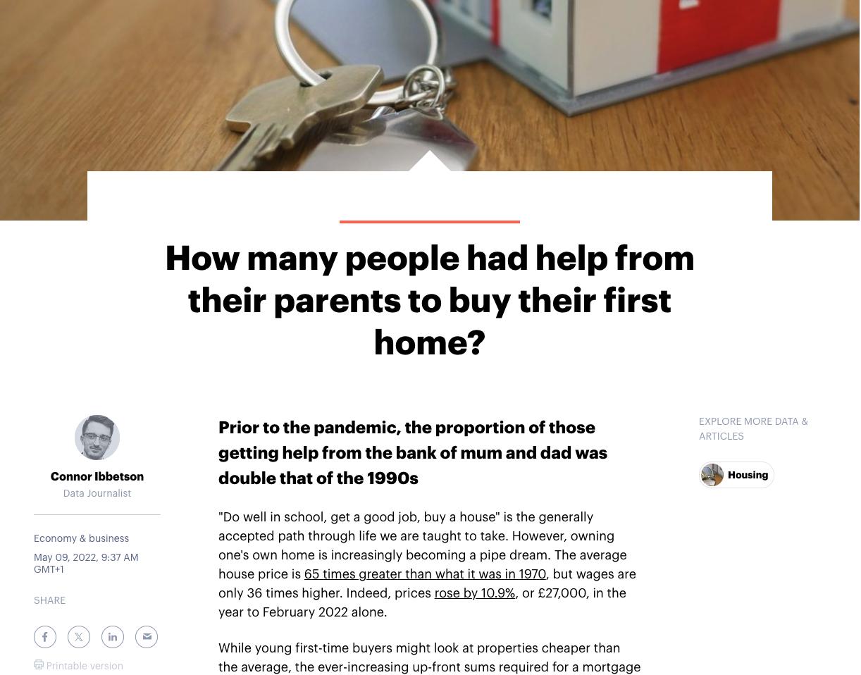
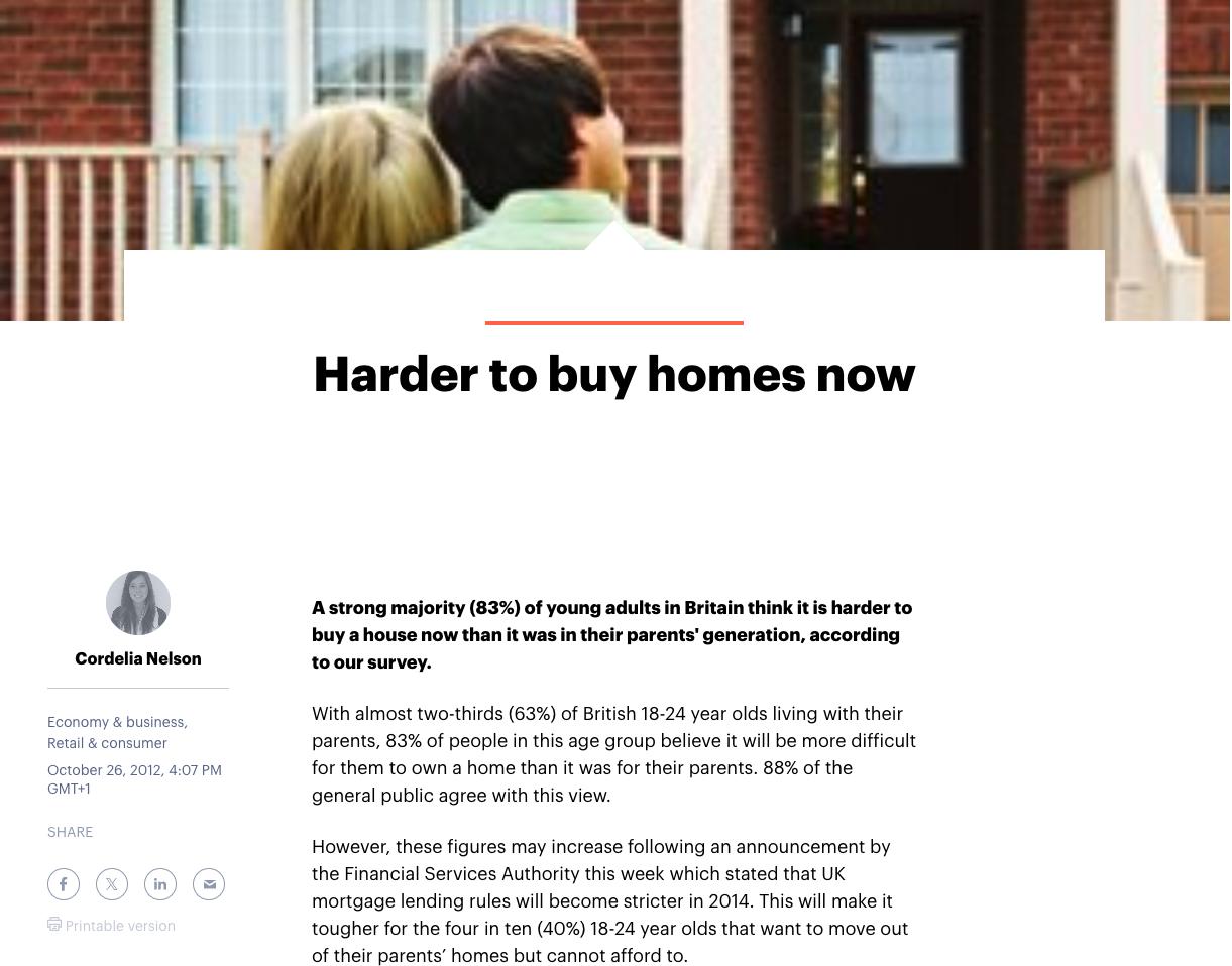
These insightful articles shed light on the stark reality faced by young adults in Britain today. According to Nelson, C. (2012), a staggering 83% of young adults believe that purchasing a house is now more challenging than it was for their parents’ generation. This sentiment is echoed by almost two-thirds of British 18-24 years old, with an overwhelming 88% of the general public agreeing.
The disparity between house prices and wages further compounds the issue. As Ibbetson, C. (2022) highlights, house prices have sky-rocketed to 65 times their 1970 value, while wages have only increased 36 times over the same period. The struggle for home-ownership is evident, with 54% of young first-time buyers between 2015 and 2019 receiving financial assistance from their parents, compared to just 27% between 2000 and 2004.
Moreover, the tightening of mortgage lending rules in 2014 has added to the challenges faced by young adults. This has left 40% of 18-24 years old unable to afford to move out of their family homes despite their aspirations to do so. The outlook is disheartening, with 43% of young adults not expecting to own their own homes until they are over 30, and 9% resigning themselves to never achieving home-ownership.
Understanding these pain points is crucial in catering to the needs of our target audience. It underscores the urgency of addressing the housing affordability crisis and providing viable solutions to support young adults in their quest for independence and home-ownership.
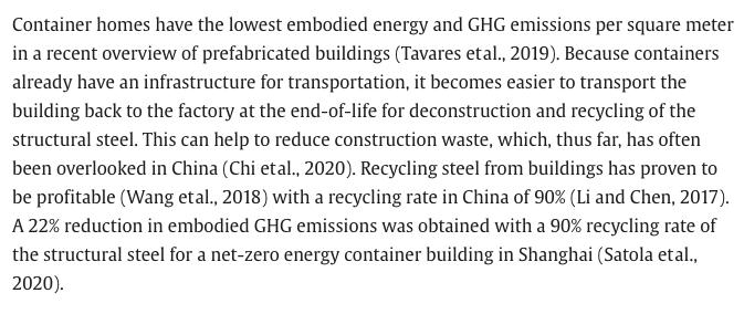 Kristiansen, A.B., Zhao, B.Y., Ma, T. and Wang, R.Z. (2021).
Ibbetson, C. (2022)
Nelson, C. (2012)
Kristiansen, A.B., Zhao, B.Y., Ma, T. and Wang, R.Z. (2021).
Ibbetson, C. (2022)
Nelson, C. (2012)
This article sheds light on a problem that my shipping container company could potentially address. It highlights the growing issue of long-term rental shortages, driven by property owners converting residences into short-term holiday lets, particularly prevalent in coastal and tourist areas.
For instance, within the North Devon district alone, at least 435 homes were converted from permanent residential use to holiday lets in the three years preceding the article. This trend has led to a scarcity of suitable long-term accommodation, adversely affecting individuals’ health, well-being, and the local economy.
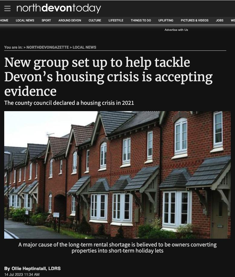
I had looked at these to gain past and current knowledge about the living conditions for young people today and the challenges they face when it comes to purchasing their first home. This shows the incline of house pricing that young adults are facing today in comparison to previous generations and further shows if this situation is not be tackled in the near future then it will continue to get worse and increasing harder to fix in the long term. Therefore, private companies are need to create better solutions for the future to ensure sustainability.
Heptinstall, O. (2023)
Project Outline
competitors
As I delved into the realm of establishing an off-grid shipping container business, I encountered several companies already operating in this space. Their presence served as a valuable learning opportunity, allowing me to discern the existing gaps in the market and identify areas where innovation and differentiation were needed.
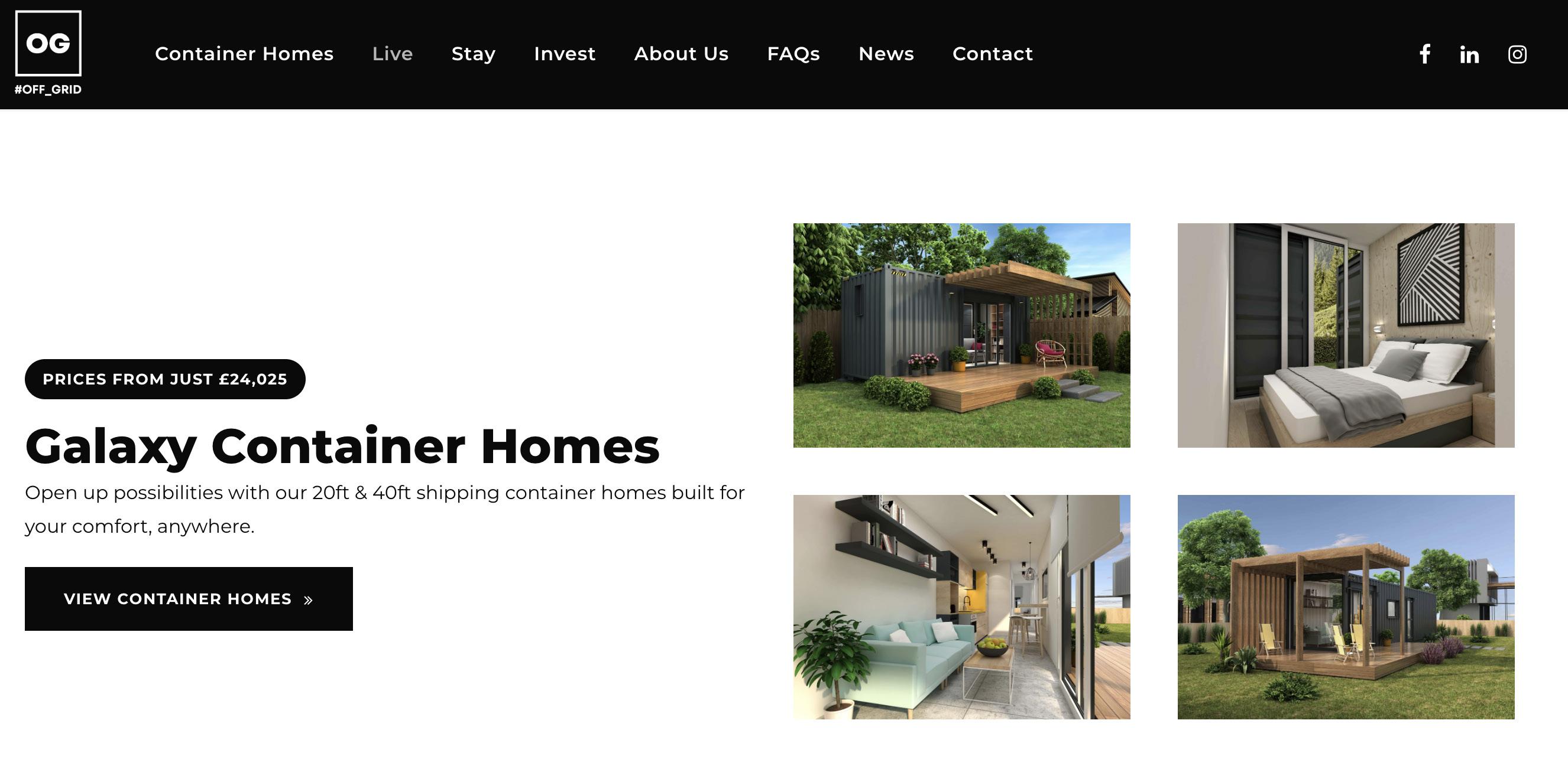
The Off Grid Company stood out to me significantly, primarily because of its sleek aesthetics and practical functionality. They seemed to offer a comprehensive solution, covering not only shipping container homes but also a commitment to off-grid living and sustainable investment. The captivating imagery on their website caught my attention and elevated their branding, leaving a lasting impression.
I intend to leverage their imagery to showcase the various types of homes that can be created, as it effectively communicates the possibilities of off-grid living. Furthermore, I anticipate using their website as a valuable resource for gathering information and logistics for my own business endeavours.
Their approach to the branding is in a very minimal, ‘basic’ design. Creating a bland base to allow the CGI’s to stand out. Attracting young adventurous adults. As the image isn’t realistic they have provided a website full of knowledge about off gird living in a sustainable fashion.
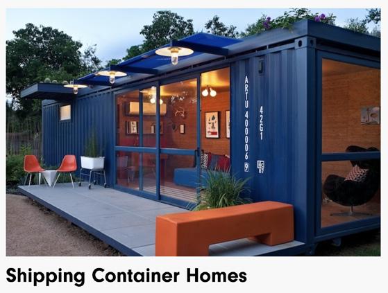
The design for me has a robust approach that resonates with my vision. They’ve furnished a wealth of crucial information essential for home projects, including a comprehensive article on shipping container homes, outlining their advantages and disadvantages. This valuable resource equips me with insights to inform my own approach and decision-making process in this realm.
Design For Me branding approach is also in a very minimal design. Although they do have a more realistic method creating as sense of realism to their audience; attracting young adventurous adults. They have provided a website full of knowledge to education and inform the young audience.
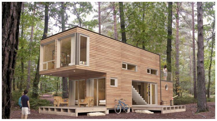
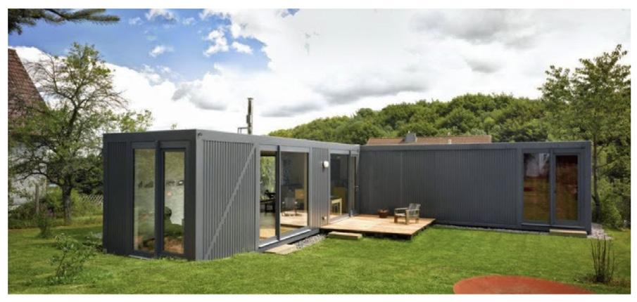
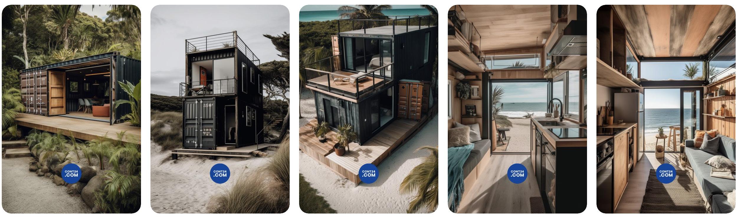
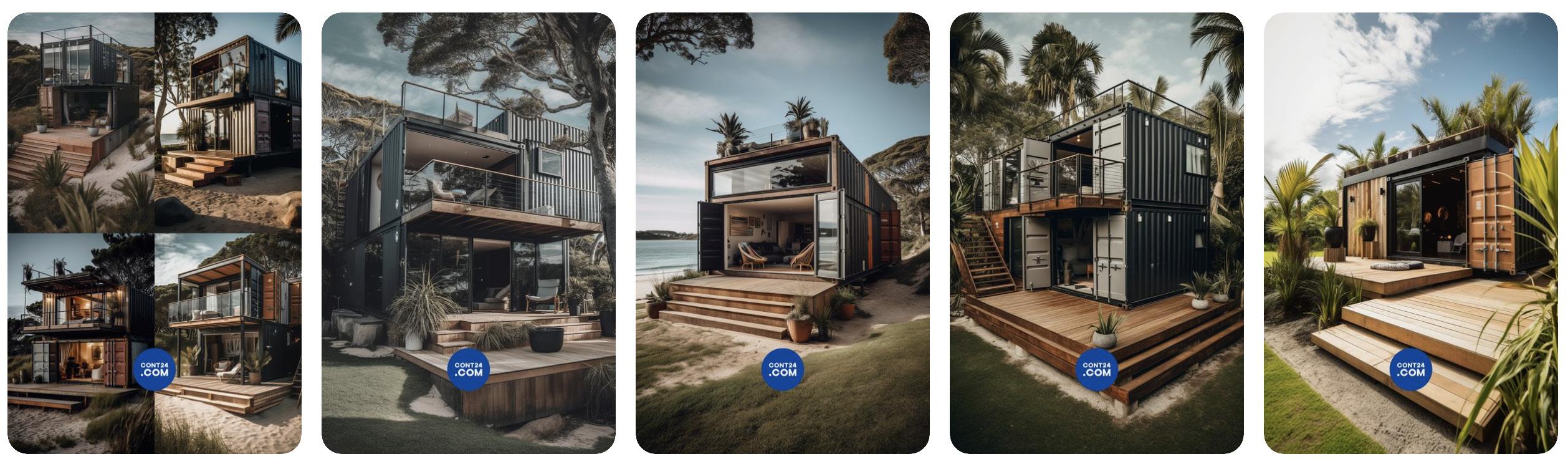
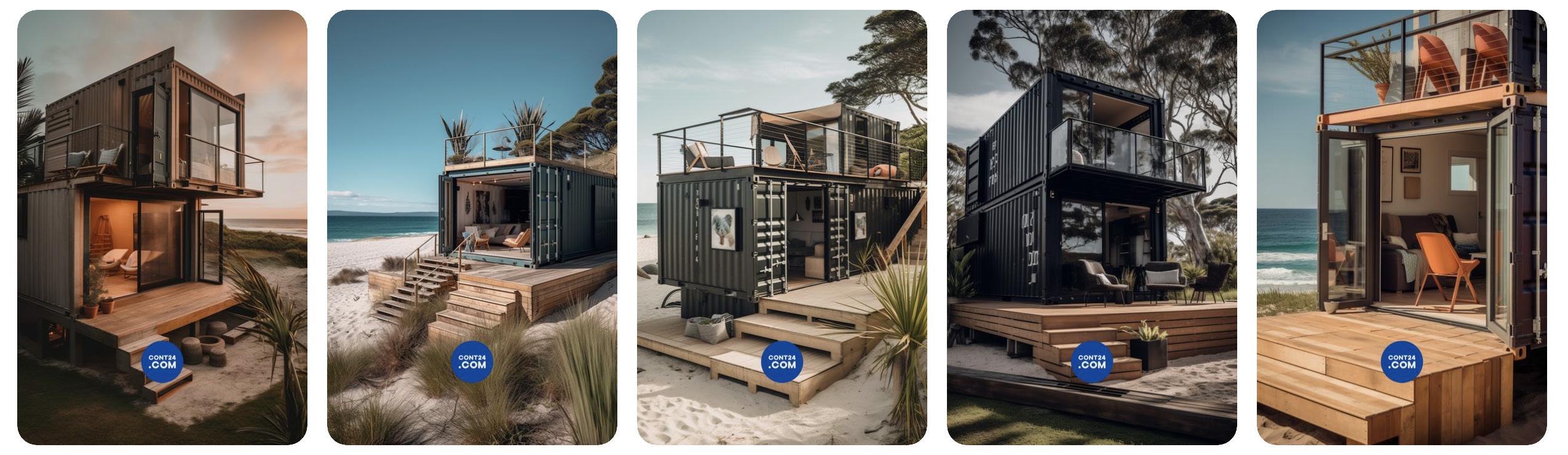
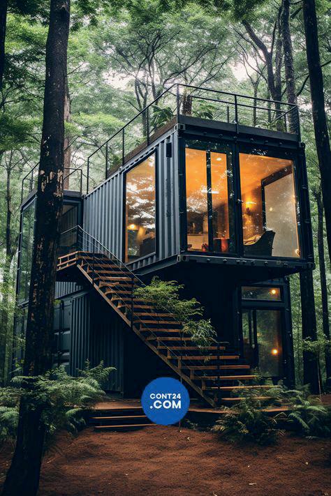
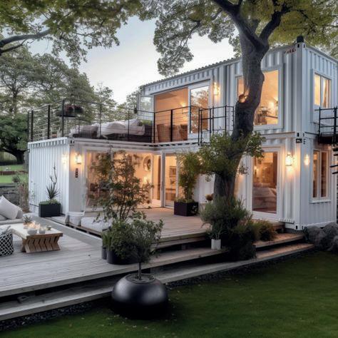
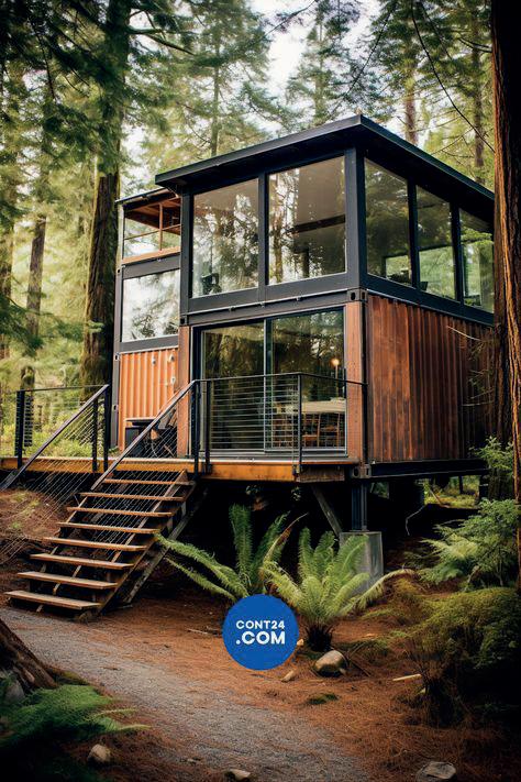
Cont24.com proved to be a treasure trove of inspiration for marketing and selling the off-grid lifestyle. Their engaging and simplistic videos sparked ideas for my own brand’s marketing strategies. The captivating imagery they employ is not only eye-catching but also effectively showcases various locations, highlighting not just the homes themselves, but the entire lifestyle they represent. This comprehensive approach, revealing both the physical structures and the enriching way of life they afford, is something I aim to emulate in my own marketing efforts.
Cont24.com approach to their branding in a very different than the others. They take minimal design to a new level by just providing a simple logo to AI generated images and videos. They create a dreamy sense of ‘holiday living’ to their audience; almost resembling Airbnb attracting young adventurous adults.
Project Outline
moodboards
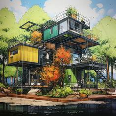
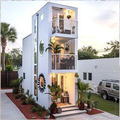
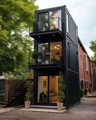
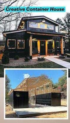
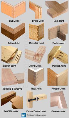
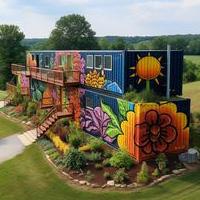
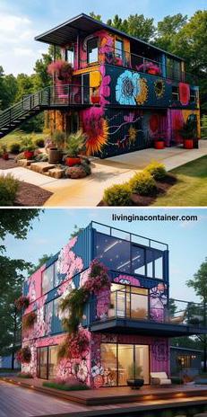
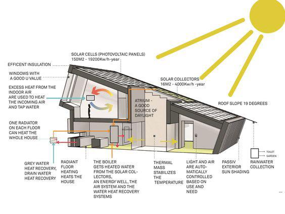
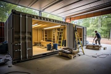
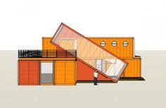
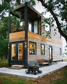
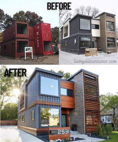
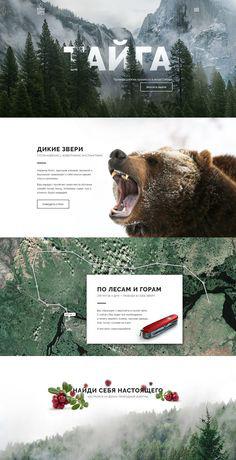
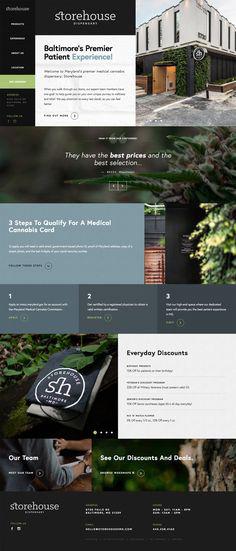
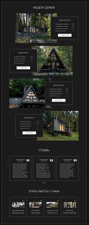
Proving existing visuals for different converting containers. As well as images of content ideas to create for a new brand.
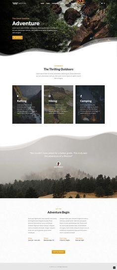
Project Outline
audience
My target audience comprises young adults, typically aged between 18 to 22 or 18 to 25. This demographic faces significant challenges in achieving independence and moving out of their parental homes, as evidenced by research conducted by Nelson, C. (2012). A staggering 83% of young adults in Britain believe that purchasing a new house is more challenging than it was for previous generations. Moreover, approximately 63% of British individuals aged 18 to 24 still reside with their parents, reflecting the difficulty they encounter in securing their own accommodation.
The introduction of stricter mortgage lending rules in 2014 has further exacerbated the situation, with 40% of 18 to 24-year-olds expressing a desire to move out of their family homes but lacking the financial means to do so. Additionally, 43% of individuals in this age group anticipate not owning their own homes until they are over 30, if ever. Alarmingly, 9% of 18 to 24-year-olds do not foresee ever being able to afford their own homes.
The disparity between house prices and wages further compounds the challenges faced by young adults. Since 1970, house prices have soared to 65 times their original value, while wages have only increased by 36 times. To cope with these escalating costs, 54% of young first-time buyers between 2015 and 2019 received financial assistance from their parents, highlighting the generational shift in home-ownership affordability compared to the early 2000s.
A well-developed and thorough branding, coupled with a user-friendly website, will serve as a beacon of hope and empowerment for My target audience of young adults facing significant housing challenges. Here’s how I am aim to achieve this:
Empathy and Understanding:
The branding and website will demonstrate a deep understanding of the struggles and aspirations of young adults in today’s housing market. By addressing their pain points head-on and offering viable solutions, you’ll establish a strong emotional connection with the audience.
Solution-Oriented Approach:
Through clear messaging and compelling visuals, the branding will communicate that my company offers more than just housing solutions— it provides a pathway to independence and financial freedom. By showcasing the benefits of off-grid living and alternative housing options, I’ll position my brand as a tangible solution to their housing woes.
Education and Empowerment:
My website will serve as a hub of valuable information, offering insights into off-grid living, sustainable housing options, and financial planning tips. By empowering young adults with knowledge and resources, I’ll install confidence in their ability to navigate the housing market and make informed decisions about their future.
Overall, a well-crafted branding and website will position my company as a trusted ally and advocate for young adults seeking independence and affordable housing solutions in an increasingly challenging market. By offering support, guidance, and a sense of belonging, I’ll attract and engage my target audience, ultimately driving success for my brand.
Community Building:
My branding efforts will emphasise the importance of community and belonging. By highlighting the stories and experiences of other young adults who have successfully embraced off-grid living, I’ll create a sense of camaraderie and solidarity among the audience, inspiring them to join the movement.
Primary Advertisement
Phase one: Building a well-through out Brand.
*Establish a brand identity that fosters community, belonging, and embraces the benefits of off-grid living, inspiring solidarity among the audience.
Secondary Advertisement
Phase two: Building a user-friendly website.
*Create a user-friendly website that serves as a comprehensive resource hub, empowering young adults with knowledge and resources to make informed decisions about off-grid living and sustainable housing solutions.
Project Outline
Fig.1
Initial Designs
Taking brand experience for passed work I embarked on my entrepreneurial journey with humble beginnings, hoping to find my feet somewhere. As I’m still finding my way with perfecting my methods and process of branding. My approarch for this is keeping it simple but effective to start with. Therefore, to create a starting point I chose the name Thrive, which I wanted the Company to provide for its customers. I did research on AI logo generators to help kickstart my design process. Using Looka, I entered my company name. After answering a few questions about the industry and what I was looking for, it generated a range of editable logos for me to start with. My journey with it all is shown below.
At this juncture, I had unearthed a potent cornerstone that would serve as the foundation of my brand identity, being this interlock block concept, shown in fig.1. Through meticulous exploration, I identified key design elements that would form the bedrock of my branding strategy. Simultaneously, I pruned away font styles and layout options that failed to align with my vision, ensuring coherence and consistency in my aesthetic choices.
Moreover, in my quest for a name that resonated more deeply with the ethos of my enterprise, I stumbled upon another contender that seemed to offer a more fitting representation. While “Thrive” had served as a launching pad, this new-found moniker held the promise of better encapsulating the essence of my venture, signalling a pivotal moment in my branding journey.
Through out this process I had reserved verbal feedback what had helped my design decision in these early stages. I has told the more serif squared font works better, to reveal a more confidante and trusted brand as well as pairing well with the block elements. I knew I wanted to use this block within my branding I just struggled to structure everything else this element.
Fig.2

I had started with the blue to create a cool tone to the brand to see if it would work. I felt this colour palette was very corporate and at the time thought it might be a good place to start. Keeping in mind it can always change.
Once playing around with a blue colour theme I felt I could get the feel of it a bit more and after review, I had reserved feedback to chance the colour theme to step away from the more corporate identity. All of the image I want showing is earthy and green. Which also plays in to the sustainable off grid live, theme. Now the pieces began to come together.
Project Outline
A1D3D6 89BABF 4D7B88 3C4C60 D4D4D4
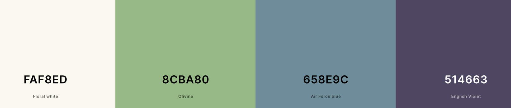
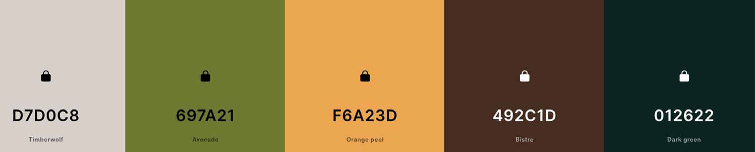
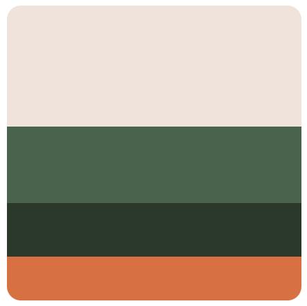
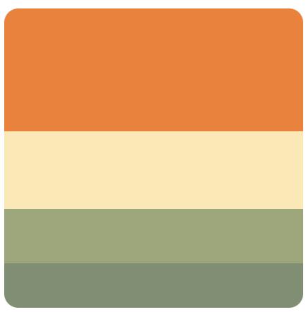
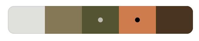
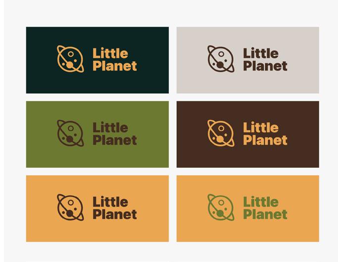
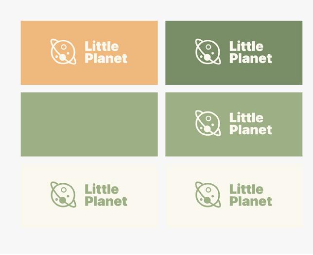
In my exploration of colour palettes, I leveraged tools such as Coolor and Adobe Color to discover a diverse range of hues. Additionally, I employed Colornamer to assist me in assigning evocative names to each colour, enhancing the overall aesthetic cohesion of my designs.
I had found these process helpful to begin to create sense of visualisation, through just seeing set colours and tones. I enjoy the vibrancy that was coming to light as well as the earthy tone playing they part in the background create a sense of depth. I had settled with the earthy tones with pop of colour to create a even balance
Going back to the drawing board I revisited my initial collection of images, carefully selecting a handful that resonated with my vision. I aimed to capture the essence of earthiness while infusing vibrant hues to echo the sustainable, off-grid living concept I envisioned. In curating the palette, I opted for a restrained selection of five colours, each chosen to harmonize with the theme of eco-consciousness and vitality.
05161E 3A3F1E A6B972 F6A136 728227 1E1C1B A26139 E2E1E1 FFFFFF Project Outline
More Names...
The hardest part of branding is finding the right name that fits the brand objectives. Do I want to go down the roots of having a meaningless name or having a name that means something? I felt it added much more value if the name has meaning behind it. Therefore, I found this part particularly tricky.
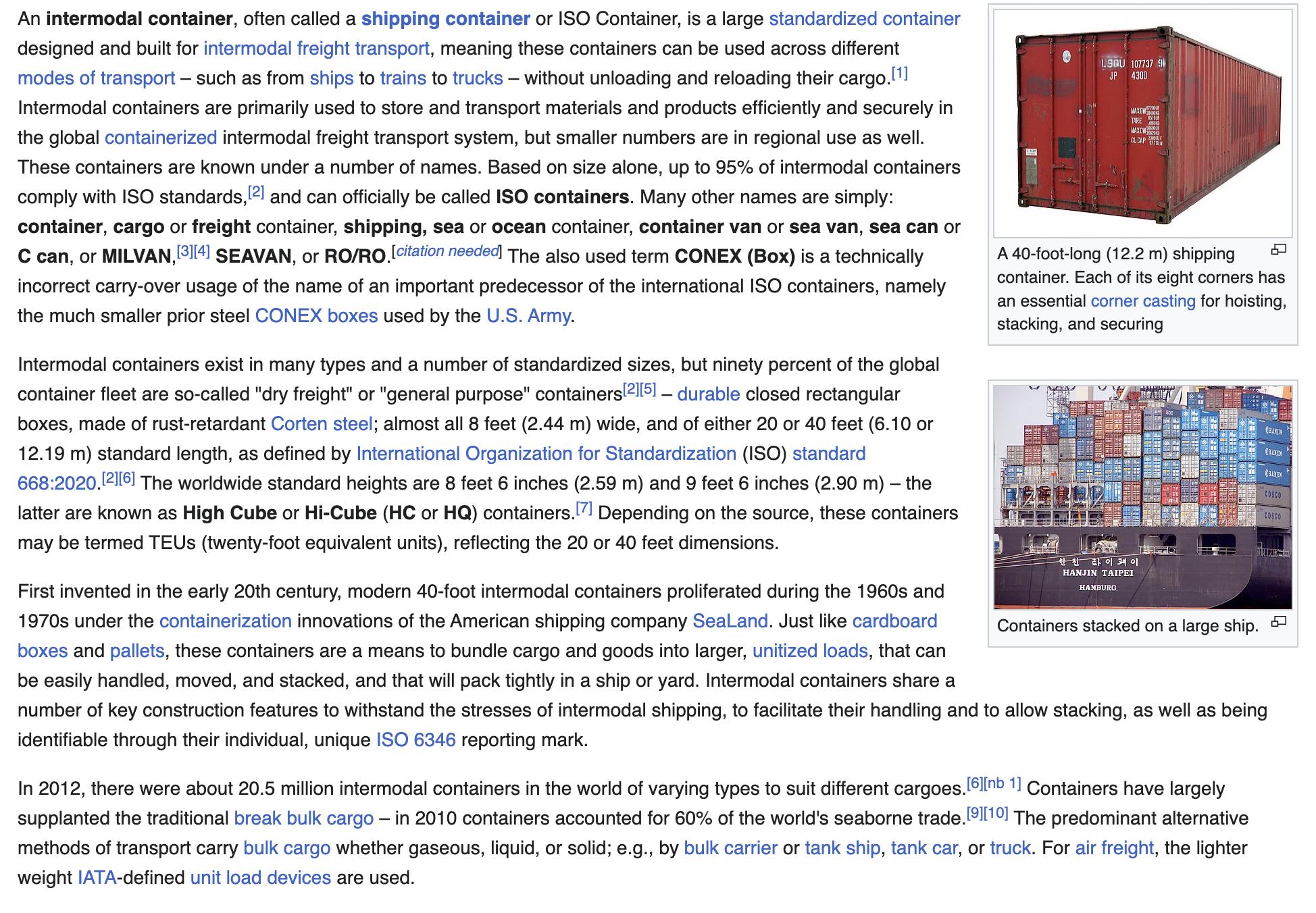
To help myself I created a list of name that I think could have potential. I shared this for feedback and received feedback directing me towards the Latin words or a couple of words from a Wikipedia search of containers. Sometimes, materials or nicknames could be potential names. Hi-Cude and 20 by 40 were added to the name list to be experimented with. Evidence shown in fig.2 and Wikipedia Contributors. (2019
Nova Bond
Build and Bond
Nature Bond
Root
The Stack Reign
Core Haddertats
Corten
Gass and Steel - GNS
Quadrata - Square (latin)
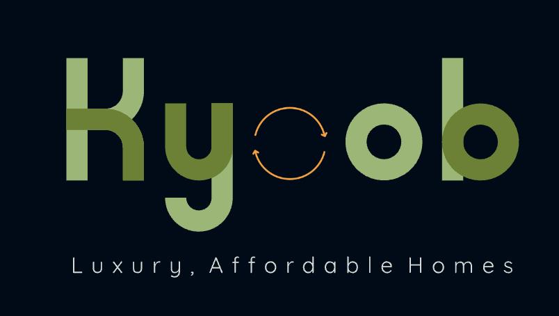
Kyoob - Cube (Latin)
Wikipedia Contributors. (2019)
Brand, B. (n.d)
Fig.3
Subsequently, I crafted and tested on the name Quadrata. Rooted in the Latin term “quadratus,” signifying “square” or “quadrilateral,” this name elegantly conjures images of geometric symmetry and structural integrity.
I knew I was going to explored multiple names i just chose this next just of gut maybe this was the next best one or not. Proved on the basis of experiments. I enjoyed the new icon product most but didn’t like the main font being used. It wasn’t showing the creativity that the brand should show. After exporting this different logo, I became overwhelmed. I found myself create thing and not getting anywhere closing in fact I has drifting far from where I wanted /needed to be.





Project Outline




It embodies the essence of stability and precision inherent in foursided objects, aligning with themes of balance and order. However, upon reflection, I realized that the name inadvertently leaned towards a corporate builder aesthetic, which diverged from the authentic vibe I sought to cultivate for the brand. Moving on to experiment with other names.
Project Outline






Project Outline
20 4 20 4











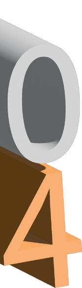
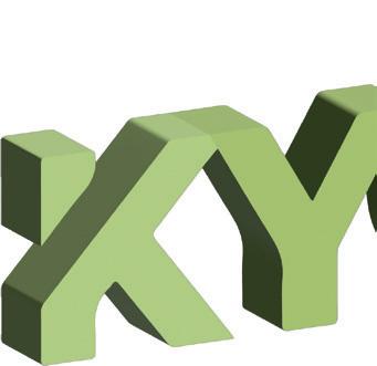
I found myself fixated on making the pieces fit together, feeling adrift in a sea of uncertainty regarding the ideal name for my endeavour. Amidst this creative impasse, I realised that the concept of “blocks” was the only tangible aspect I had managed to solidify thus far.
Seeking guidance and a fresh perspective, I scheduled a meeting with my supervisor. During our discussion, I presented my progress so far and articulated the direction I aimed to pursue. The act of sharing my ideas and receiving input proved invaluable, injecting renewed energy and clarity into my thought process.
As I continued to experiment with the blocks, a desire to incorporate the letters “L” and “Q” emerged within me. Gazing at the arrangement of blocks, a serendipitous moment occurred where the words “cube” and “lifestyle” resonated deeply with me. In that instant, my mind expanded beyond borders, embracing a global perspective as inspiration flowed freely. Page 38 contues this these new brand lead.
So, I hid all my other concepts and focused on the creativity that had come, leaving these outcomes unfinished. This allowed me to stop over-thinking so many ideas and just run with the most solid concepts.
Hi-C ude
Project Outline
Strengths:
1. Unique Value Proposition: Offering off-grid living solutions fills a niche in the housing market and appeals to environmentally conscious individuals seeking sustainable alternative.
2. Brand Recognition: Building a strong brand identity and community fosters trust and loyalty among customers, setting the business apart from competitors.
3. Comprehensive Website: Providing a user-friendly website as a hub of valuable information establishes the business as a go-to resource for those interested in off-grid living.
4. Strong Market Demand: Increasing awareness of environmental issues and rising housing costs create a growing demand for off-grid living solutions.
5. Financial Viability: Offering a range of products and services, along with potential revenue streams such as consulting and educational resources, ensures financial stability and growth potential.
Opportunities: SWOT
1. Market Expansion: Diversifying product offerings and targeting additional demographics, such as eco-conscious families or retirees, can broaden the business’s market reach.
2. Technological Advancements: Embracing innovations in sustainable construction techniques, renewable energy systems, and smart home technologies can enhance offerings and attract tech-savvy customers.
3. Government Incentives: Taking advantage of government incentives and subsidies for sustainable housing projects can reduce costs and stimulate demand.
4. International Expansion: Exploring opportunities to expand into international markets where off-grid living is gaining popularity can fuel growth and diversify revenue streams.
5. Educational Initiatives: Offering workshops, courses, and educational materials can position the business as an authority in off-grid living and attract customers seeking guidance and support.
Weaknesses:
1. Limited Market Reach: Targeting a specific demographic of young adults may limit the business’s reach and growth potential.
2. Initial Investment: The cost associated with acquiring and retrofitting shipping containers into liveable spaces may pose a barrier to entry for some customers.
3. Education Gap: Lack of awareness and understanding of off-grid living may require extensive education and marketing efforts to attract and convert customers.
4. Seasonal Demand for off-grid living solutions may fluctuate seasonally, impacting revenue streams and cash flow.
5. Dependence on Suppliers: Reliance on suppliers for materials and components may pose risks related to quality control, availability, and pricing fluctuations.
SWOT
Threats:
1. Economic Instability: Economic downturns or fluctuations in housing markets can impact consumer spending and demand for off-grid living solutions.
2. Regulatory Changes in government policies, building codes, or zoning regulations may affect the feasibility and legality of off-grid living projects.
3. Competition: Increased competition from established players or new entrants in the offgrid living market can erode market share and pressure prices.
4. Environmental Factors: Natural disasters, extreme weather events, or environmental degradation can disrupt supply chains, increase costs, and impact business operations.
5. Legal Liabilities: Potential liabilities related to safety, health, or environmental hazards associated with off-grid living projects can expose the business to legal risks and financial losses.
Costing A5 Brand Guide, 32 page of 216gsm recycled paper, with a soft finish. Wire bind X5 Brand Guides Per Booklet £18.79 Home printing 82 pages of A4 80gsm white paper. £0.40 per page approx. £1 for plastic binding . Production Report Printing & Binding £33.80 One Clear A4 folder Clear A4 Folder Per folder £2.99 Creative Cloud all apps 100gb. Year subscription Allowing me to have all the apps to create the brand guide, production report and the website. Creative Cloud Per year £346.18 To be able to have access to AI generating image. Adobe Stock images Per Booklet £23.99 Total: £425.75
The costing for the project is calculated around my three areas of design: branding, website, and content creation. I will be self-funding the project and keeping costs to a minimum, printing and binding the production report myself, I didn’t have to pay or rely on anyone for this project making it cheaper but much more work for myself. I didn’t need to pay for website host as I could showcase it on XD.
Project Outline
Branding
Brand overview
PUMPKINCAMBRIDGEBLUE
STELLAR EXPLORER
SEPIA FLORAL WHITE
Aa
Aa
Kiln Serif
Romelio Sans
Secondary Font
Primary Font
Brand identity:
• LifeQube embodies the ethos of sustainability, independence, and community.
• It represents a modern approach to living, embracing off-grid solutions and ecofriendly practices.
• The brand logo and visual elements convey a sense of innovation, resilience, and harmony with nature.
Brand Values:
• Sustainability: Commitment to eco-friendly practices and minimizing environmental impact.
• Independence: Empowerment of individuals to live on their own terms and embrace selfsufficiency.
• Community: Cultivation of a supportive and inclusive community of like-minded individuals.
• Innovation: Embracing cutting-edge technologies and creative solutions to address housing challenges.
• Quality: Dedication to delivering high-quality products and services that meet the needs of customers.
Brand Communication:
• Engaging storytelling: Sharing the stories and experiences of individuals who have embraced off-grid living to inspire and inform others.
• Educational content: Providing valuable information, tips, and resources on offgrid living, sustainable practices, and environmental conservation.
• Social media engagement: Active participation in social media platforms to foster community, facilitate discussion, and connect with the target audience.
• Collaborations and partnerships: Partnering with influencers, organizations, and experts in the sustainability and off-grid living space to amplify the brand message and reach a wider audience.
Target Audience:
• Young adults aged 18 to 25 who are seeking independence and sustainable living solutions.
• Eco-conscious individuals who prioritize environmental stewardship and value selfsufficiency.
• Those interested in alternative housing options, such as shipping container homes, tiny houses, and off-grid living communities.
Products And Services:
• Off-grid living solutions: Innovative housing options such as shipping container homes, tiny houses, and modular structures.
• Educational resources: Workshops, guides, and online content to educate and empower individuals interested in off-grid living.
• Consultation services: Expert advice and support for navigating the complexities of off-grid living, including site selection, design, and logistics.
Overall, your brand is positioned as a leader in the off-grid living movement, offering innovative solutions, educational resources, and a supportive community for individuals seeking a more sustainable and independent lifestyle.
Branding
Branding Development
Following a thorough discussion with my supervisor, we arrived at the name “Life Qube.” Instantly, it felt like the perfect fit. The unconventional spelling adds a touch of intrigue and captivation, while the name itself resonated deeply with the brand on multiple levels. It encapsulates the essence of our brand’s mission and vision succinctly, speaking volumes about our commitment to enhancing and enriching lives. Shown below is my journey with the branding, now the right name has been made
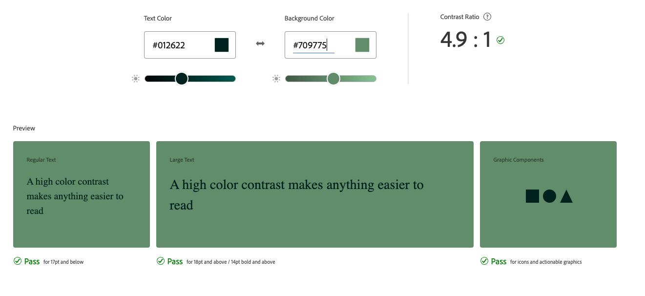
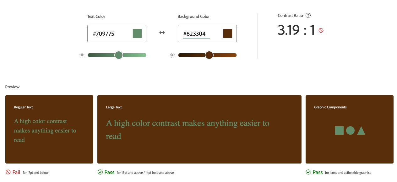
It started with refining the colour palette and finding out want works together and what doesn’t. When creating a colour palette I had learn to consider the colours in grey-scale. As it is a good way to check if your chart relies on colour to be understood. There is still a need for some users to print in black and white as well as seeing in grey-scale is a specific type of colour blindness.
When refining the colour palette I wanted to have a more muted colour palette. Even though the first colour palette works best well in grey-scale and had create the second colour palette, to be more colour focus but always considering the eligibility in grey-scale when coming to colour pairing.
Function,A. (2021).
Do not use these colours together
Do not use these colours together
Is can be used with any of the other colours
Light colour
Dark colours
Neutral colours
This was really helpful to me to navigate what colours a compatible / eligible for the users.
Shown on page 43 of the colour compatible results made
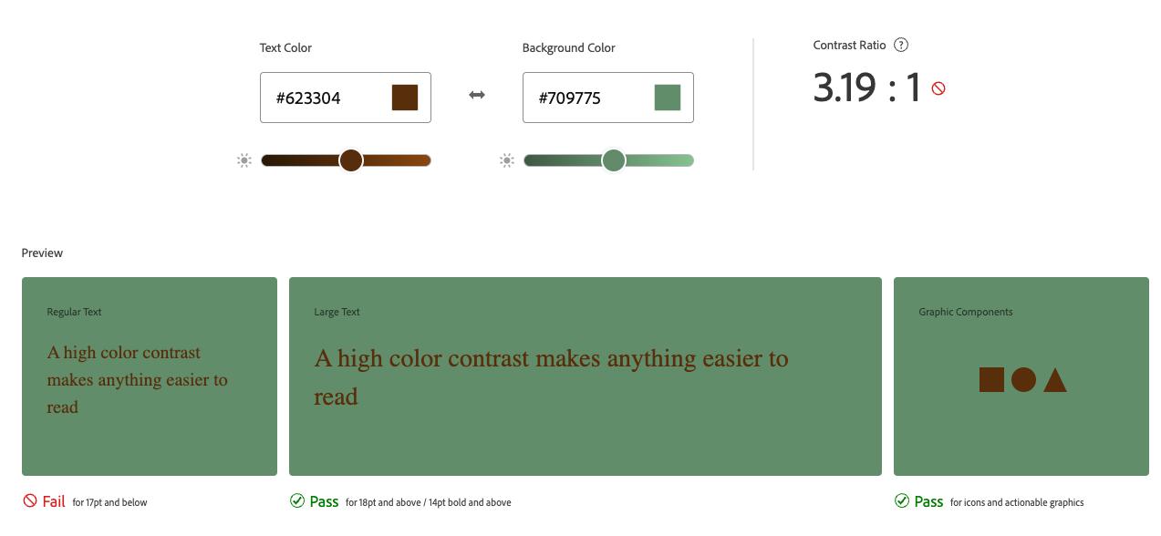
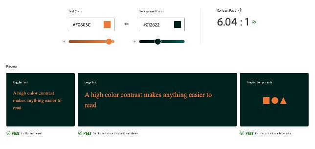
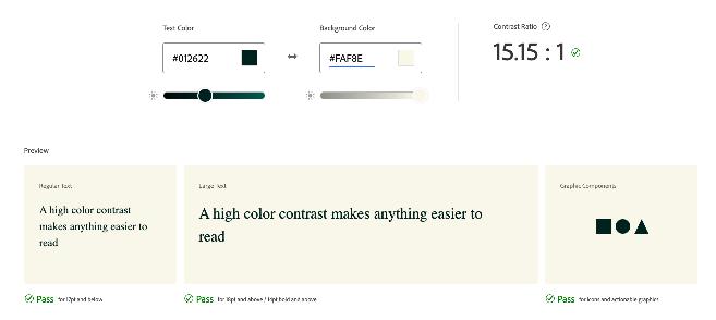
Branding
As I experimented with the arrangement of the blocks, I found myself rotating and flipping them, hoping to unveil hidden symbolism. My intention was for the blocks to take on the shape of an “L” and a “Q,” symbolizing the genesis of our brand name and underscoring the rationale behind its unconventional spelling.
During the presentation of my evolving work, someone astutely observed that the configuration resembled a key. It was a revelation moment for me, as I realized I had stumbled upon the perfect metaphor. The block, now resembling a key, not only enhances the visual allure of our brand but also serves as a potent emblem of our message. It conveys the essence of Life Qube as not just a name but a solution—a key to unlocking sustainability and independence in living.
Icon
Fonts
So far, I’ve solidified the name of my company, honed in on its icon/logo concept, and established a cohesive colour palette. Now, my focus shifts to selecting appropriate fonts to complement the brand identity.
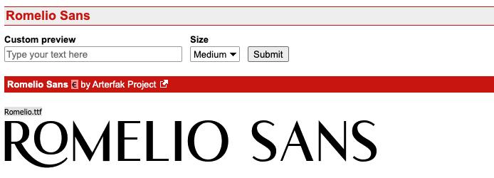
My quest for fonts led me to Adobe Fonts, where I sifted through various options that aligned with my vision. After thorough exploration, I stumbled upon Kiln, a typeface crafted by Ryan Martinson of Yellow Design Studio. Its rugged aesthetic resonated with the imagery of shipping containers, offering a versatile range of styles to choose from. While I initially gravitated towards the textured variant, in hindsight, I ponder whether incorporating the spiked style could have enriched the brand’s visual language and allowed for future growth in branding.
In my endeavour to pair fonts harmoniously, I drew upon the insights shared in Lucia Venzano’s article on font combinations, which provided invaluable guidance. With Kiln serving as the primary sans-serif font, I swiftly sought out a complementary pairing. Enter Romelio Sans—a sans-serif font that exudes a softer, more refined aesthetic compared to Kiln. Its graceful curves and gentle demeanour create a compelling contrast against the boldness of Kiln, fostering an elegant visual rhythm.
Upon unveiling this font pairing, the response was immediate and enthusiastic—a testament to the arduous journey it took to reach this point. This breakthrough affirmed the meticulous thought and effort invested in crafting a brand identity that resonates authentically.
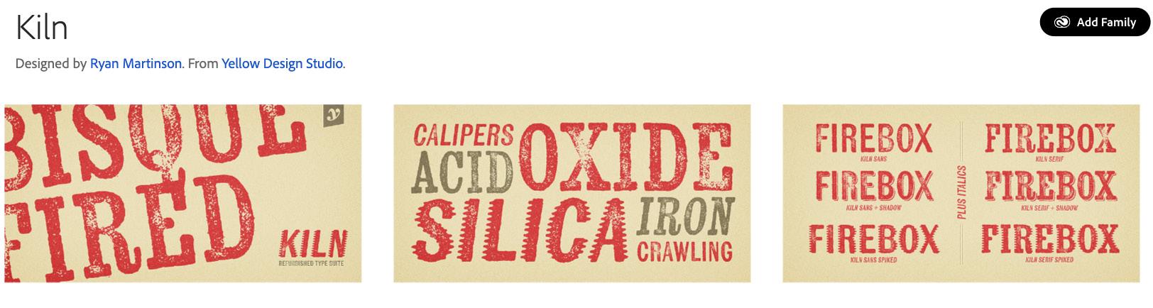
 fonts, A. (n.d).
fonts, D. (2021).
fonts, A. (n.d).
fonts, D. (2021).
Branding
Venzano, L. (2018).
Logo
With the selection of fonts finalised, I proceeded to integrate the same texture as the Kiln font onto the icon “blocks” to maintain visual coherence. Upon creating the sporadic texture, I over laid it onto the blocks, but I found myself uncertain of the result. Did it convey the desired effect, akin to ivy growing on a house?
Exploring alternative uses, I considered leveraging the texture as a negative element to enhance its branding appeal, as demonstrated in the accompanying images.
Logo and text
Logo
Branding
Icon
Patterns
These initial pattern ideas boast a more geometric aesthetic, designed to serve as secondary patterns in areas deemed appropriate. Contrasting with the primary pattern, which exudes elegance and softness, these geometric designs impart a sense of robustness and orderliness. Their versatility makes them well-suited for integration into building plans and other design elements where a strong visual presence is desired. As seen this design has stemmed from the blocks.
Patterns stand as captivating and dynamic facets within a brand’s identity, wielding significant power in shaping memorable brand experiences. Armed with my Apple Pencil and iPad, I embarked on a creative journey to explore the realm of patterning. Staying true to the essence of natural elements, I drew inspiration from leaves, intending to weave a narrative that traverses the seasons —a reflection of the resilience required for off-grid living, particularly during England’s harsh winter months.
The result? Four distinct patterns, each bearing its own tale. Utilizing hues from the colour palette, the Pumpkin tone infuses an autumnal warmth, while Sepia evokes the serene chill of winter. Spring and summer find expression through vibrant greens, seamlessly harmonizing with the overall palette.
Three of these patterns celebrate the leaf’s intricate beauty, while the fourth ventures into the realm of trees, with repeatable lines mirroring the passage of years, akin to the growth rings of trees. Designed to be highly adaptable within illustrator, these patterns offer endless creative possibilities, empowering designers to freely craft with flexibility and finesse.
To create the patterns, I started by creating these elements, and then it grew from there. Flip through the following pages to witness the designs come together.
Branding
Branding
Imagery
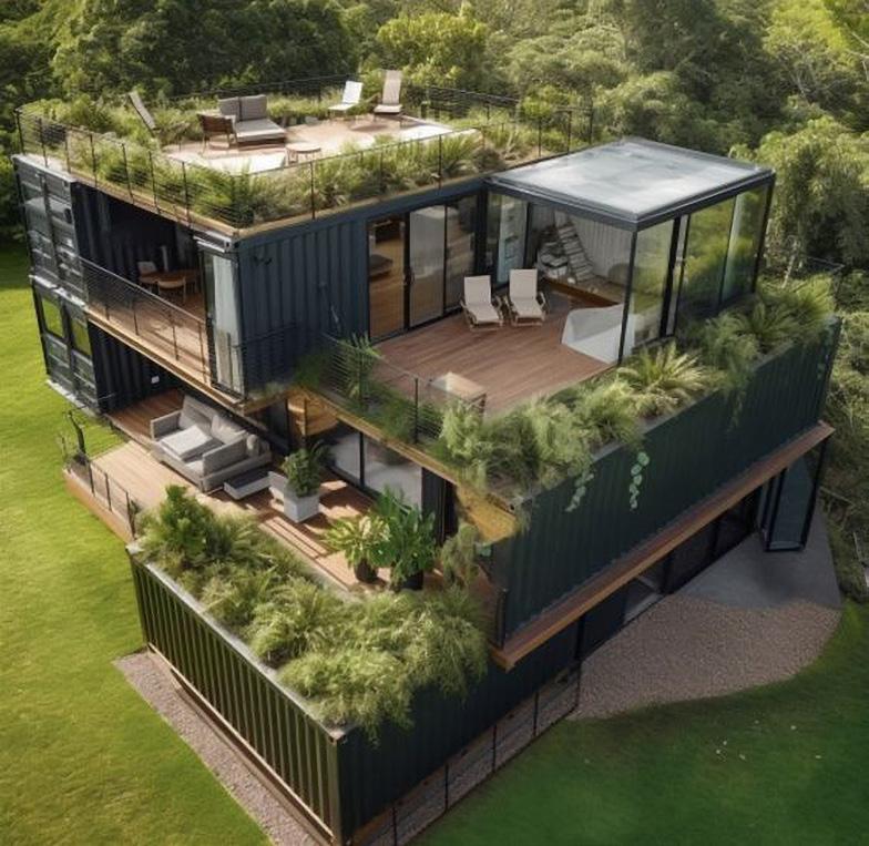
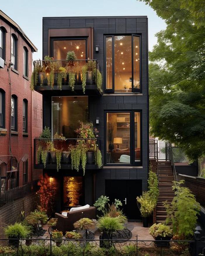
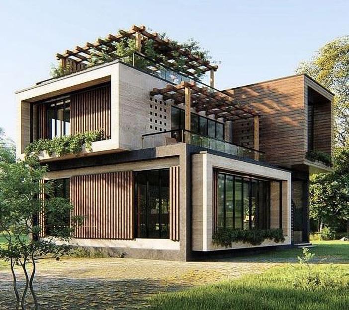
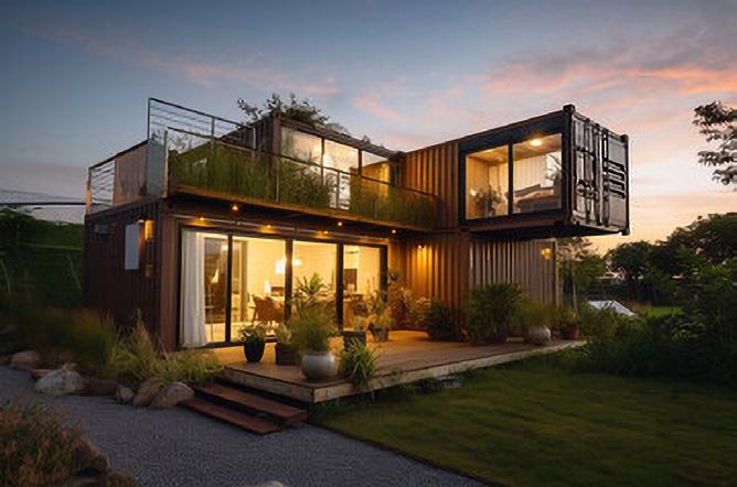
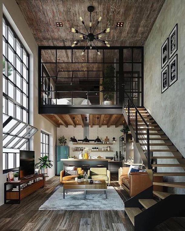
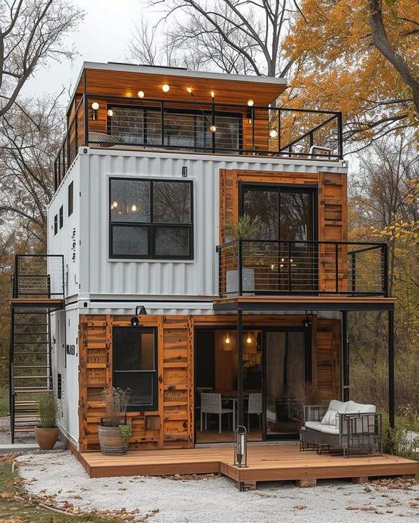
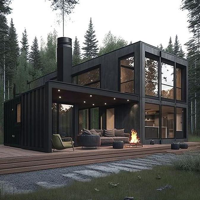
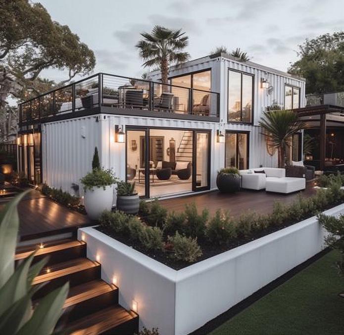
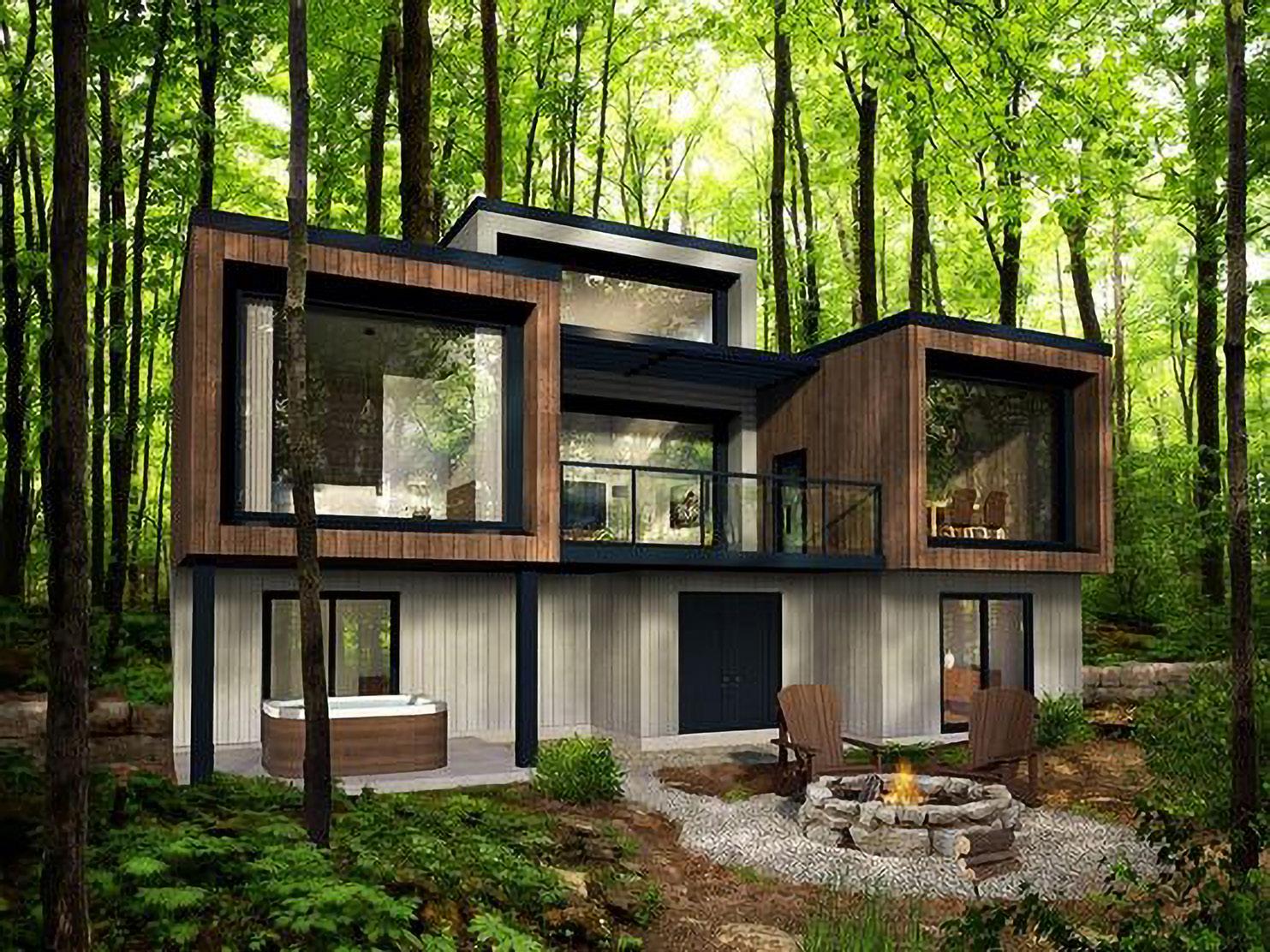
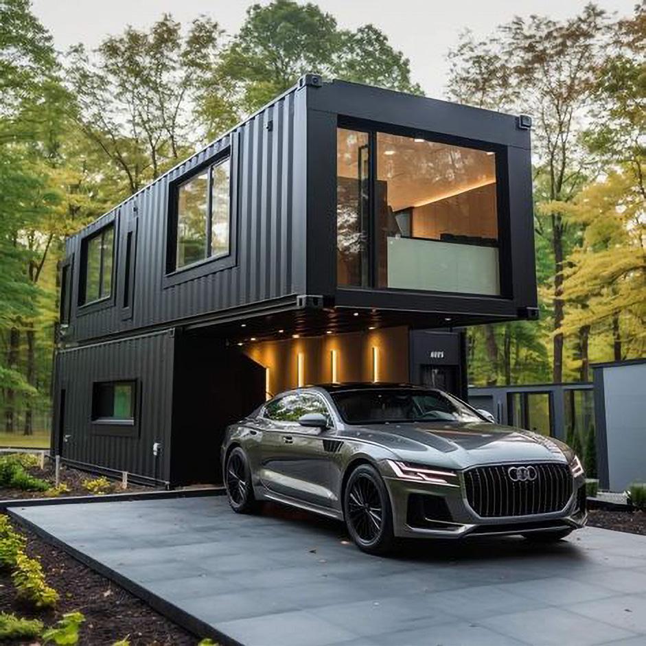
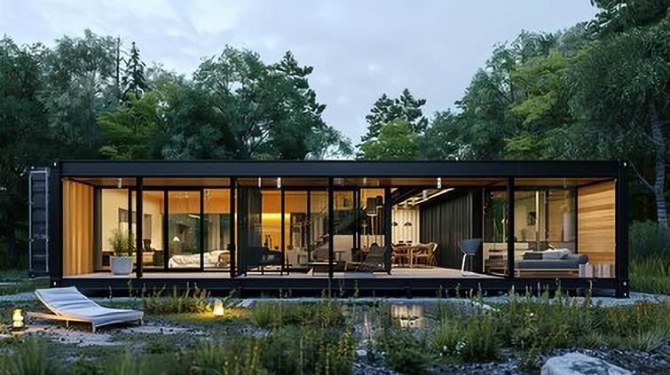
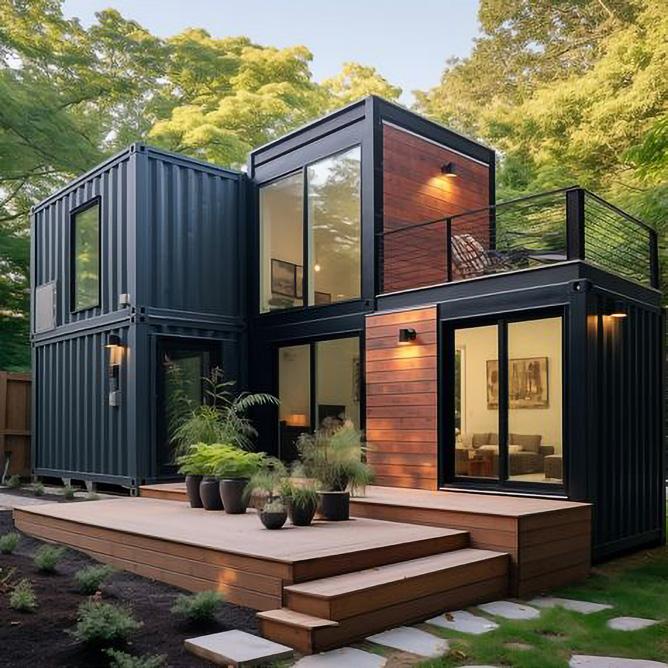
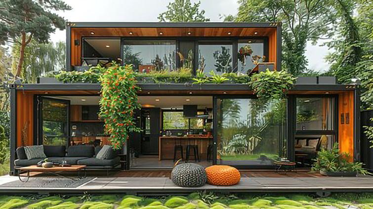
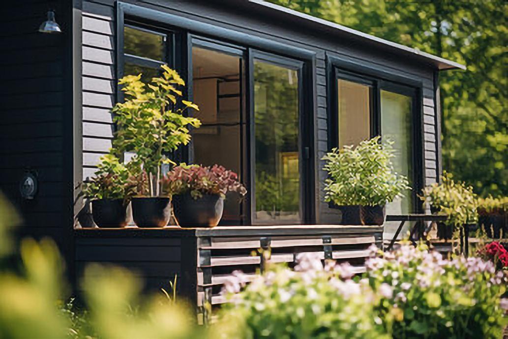
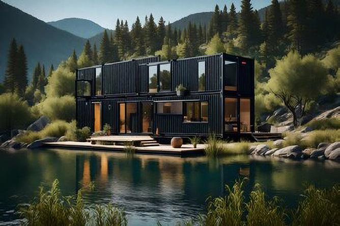
To curate the images, I scoured Pinterest and Adobe Stock, meticulously selecting visuals that adhered to a cohesive colour palette while offering a variety of styles. However, sourcing realistic images of shipping container homes posed a challenge, with many available visuals being AI-generated. Consequently, I resorted to resizing and refining these images in Photoshop to ensure they met the desired aesthetic standards.
Branding
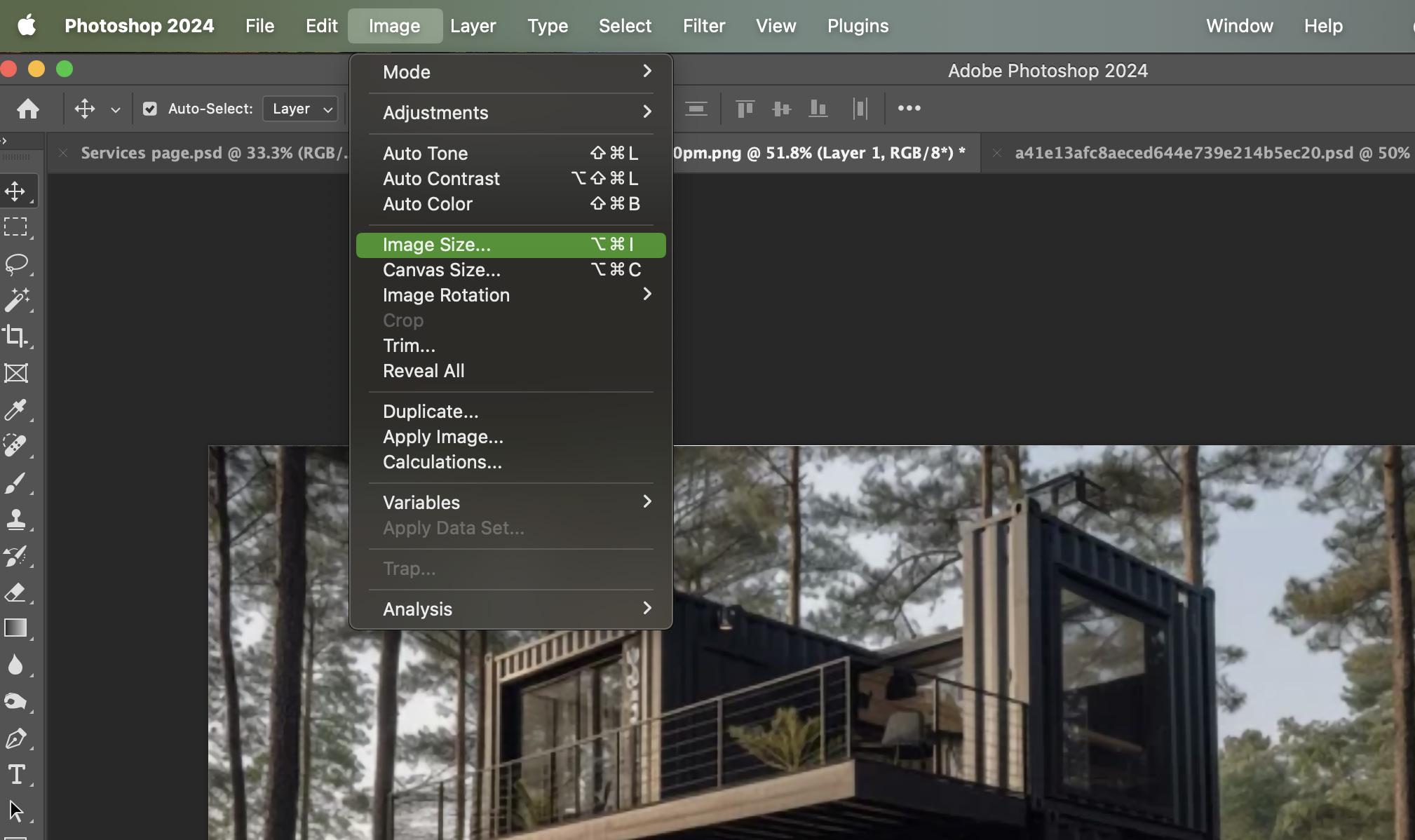
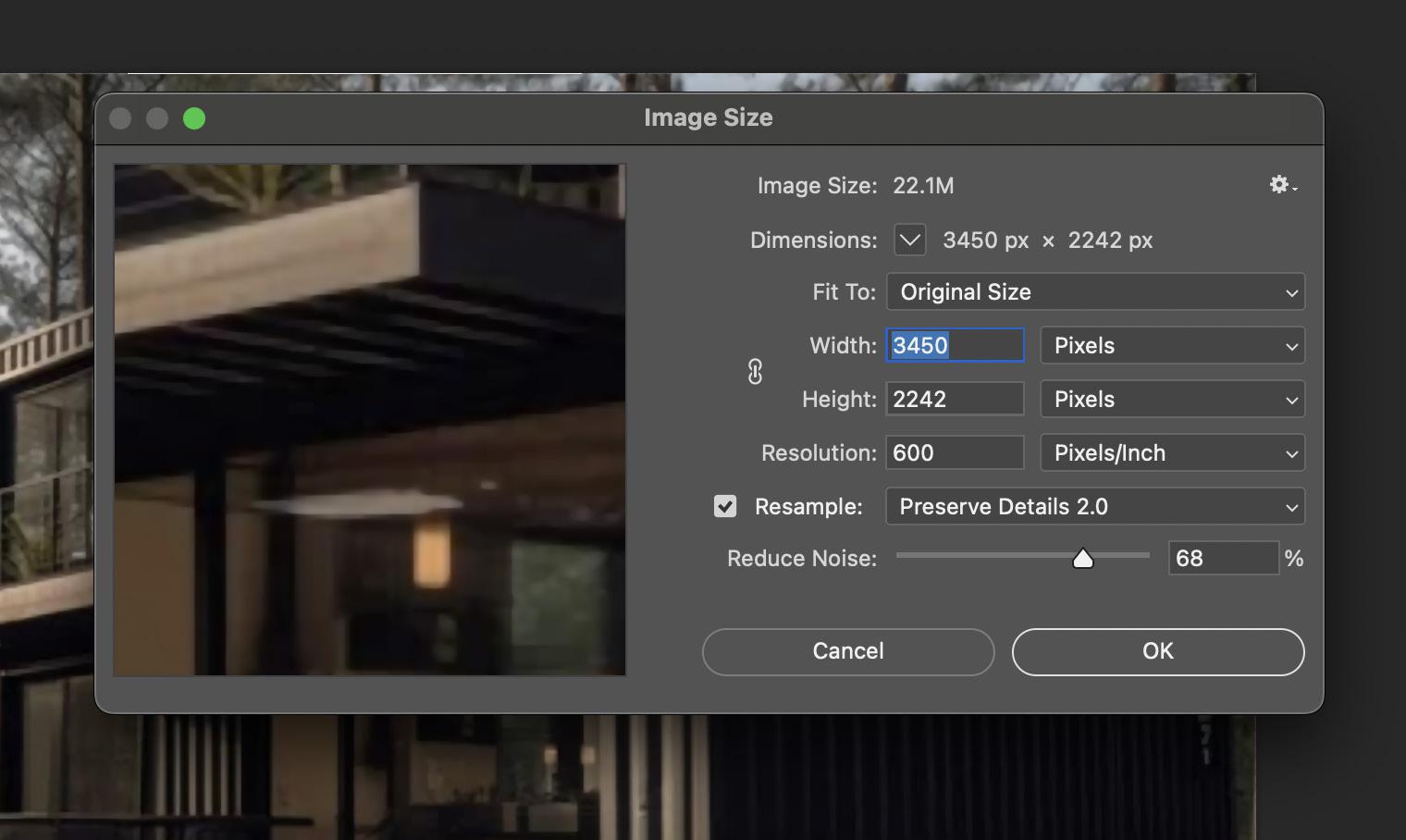
To active higher quality image I had followed Williams, B,(2021) tutorial to educate my self on how to Convert low to high resolution photos in Photoshop. I had to make sure that the size and resolution was high enough.
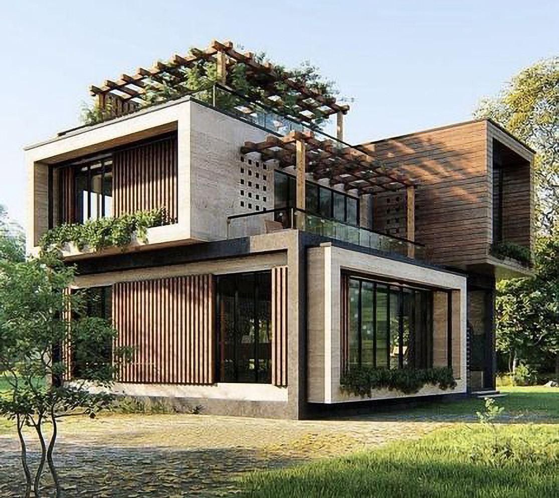
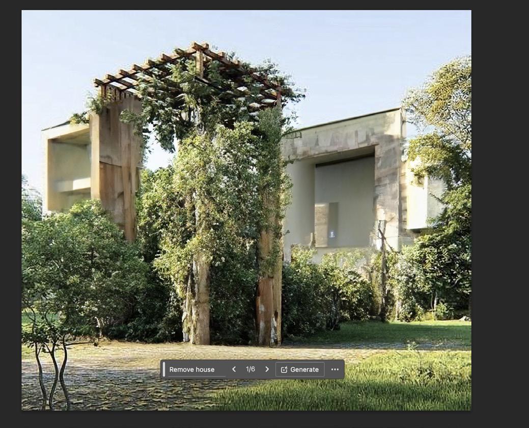
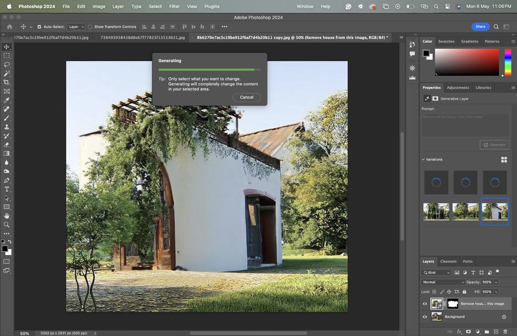
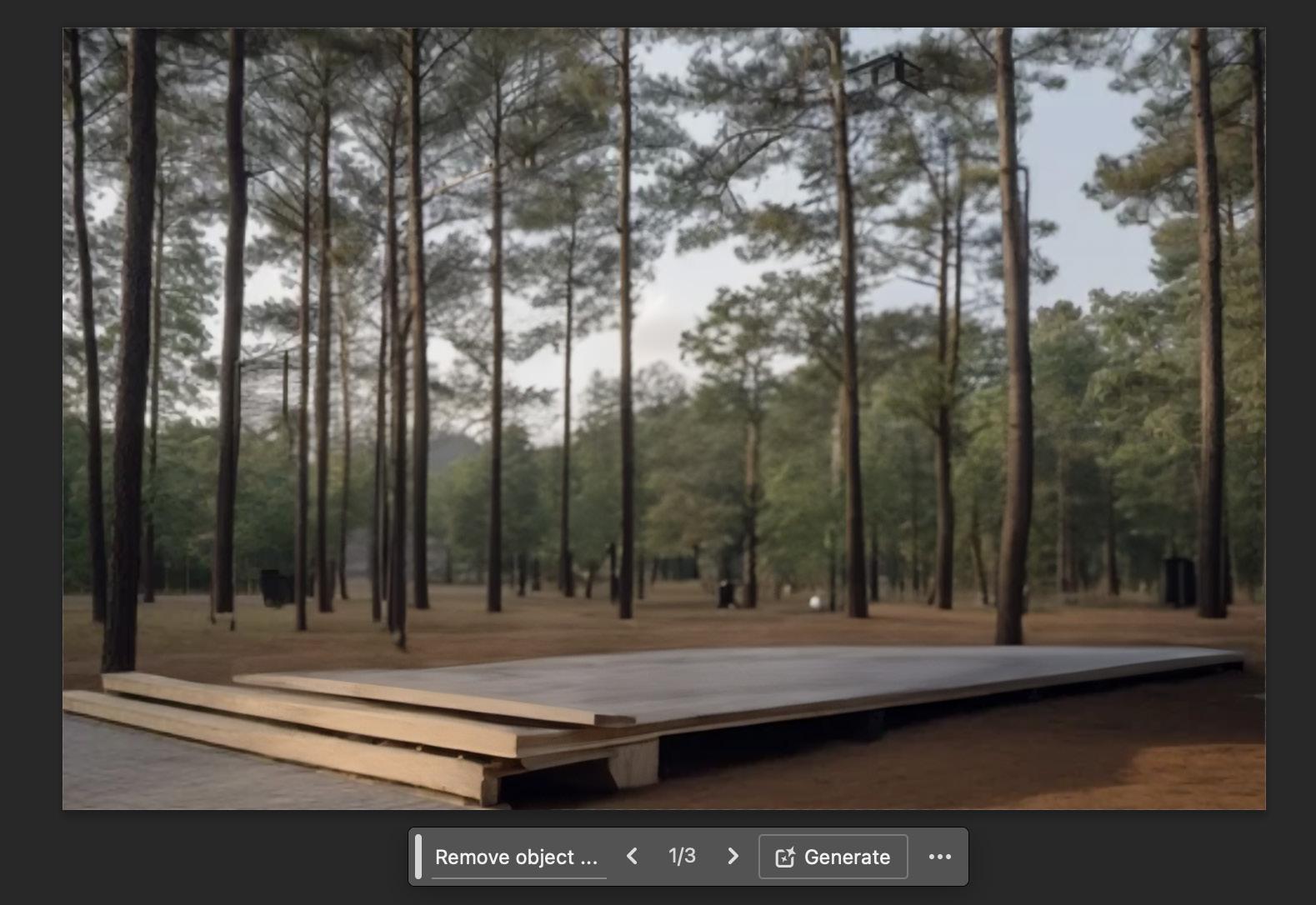
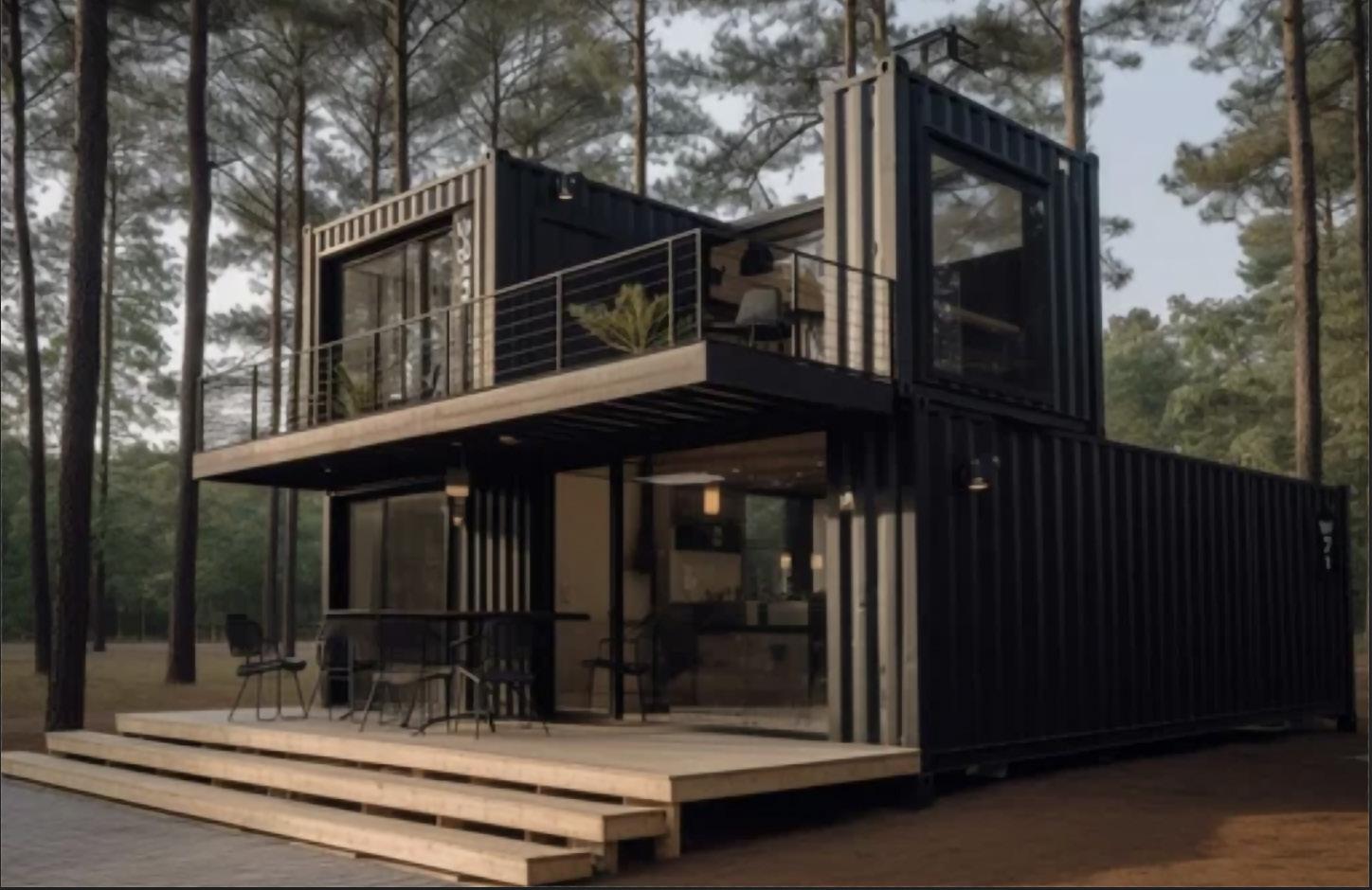
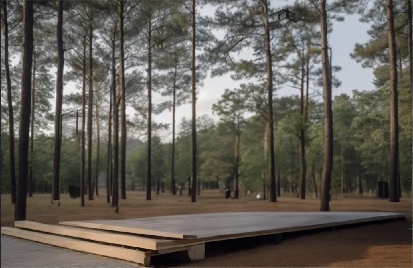
AI’s prompts: Remove house
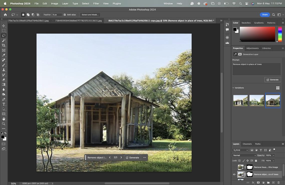
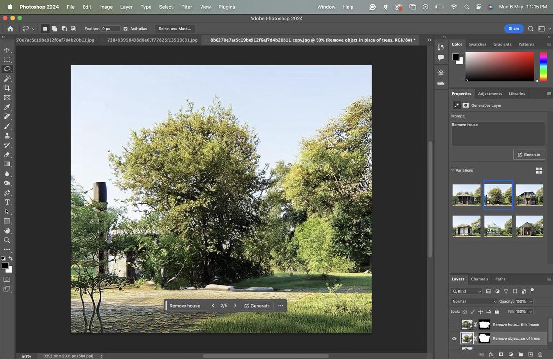
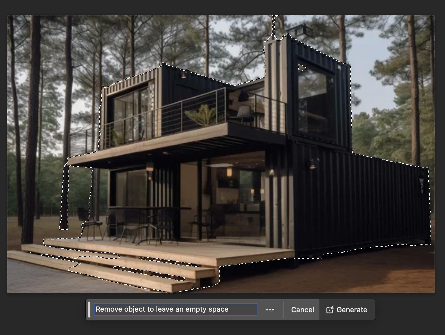
I had an idea to use this image in a way that I could use a functionality slide in XD create a piece of content material to showcase a empty field and to have the functional the slide across the image and the home would appear on the same field. I had experiment with AI to help me achieve this but as you can see AI could not achieve this. So I tried another prompt: Remove object to leave an empty space. Shown on the following pages that this was more successful than the last prompt. It had help i had gain so experience from before so I had a better understanding.
Branding
Branding
Brand Guidelines
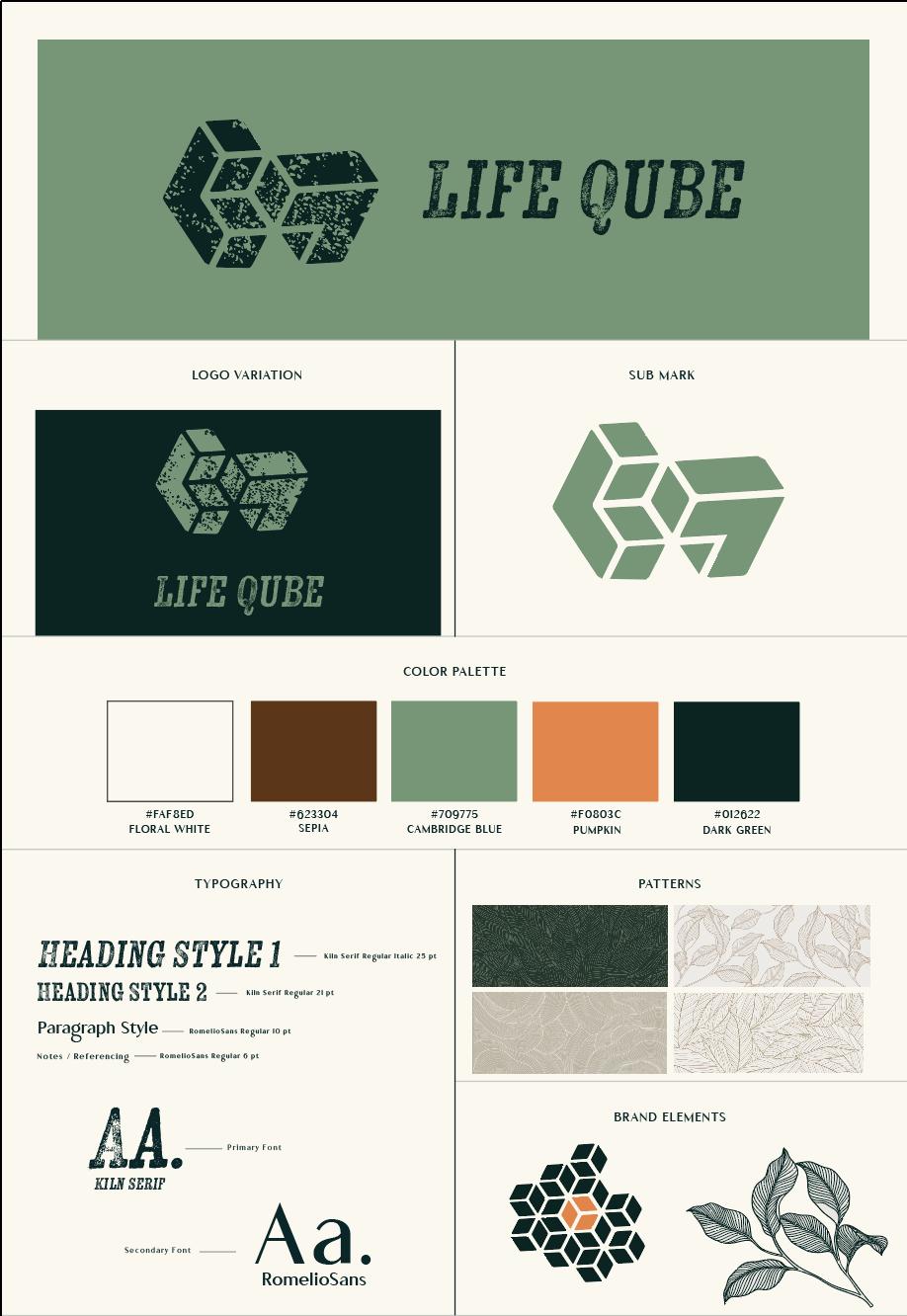
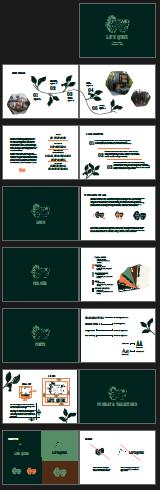
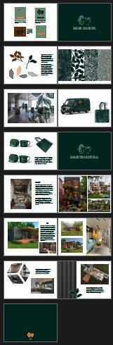
As I was creating a brand, I needed to create some sort of brand guide document. This originally started out as a brand sheet, shown in Fig. 4. There is so much more to show than just the logo colours, font, and design elements. Therefore, I created a full brand guide in InDesign for the Designers and clients to follow.
Fig. 5 is showing the development of the brand guide going from 20 page to 32 pages. Fig 6 is a terrible screen shot of the final brand guide PDF.(This is the best I could do as there are so many pages. This is better viewed in the final outcome folder.) This brand guide was created for PDF and print, so the functionality is there when the designer needs to design digitally and the printed copy is viewed physically.
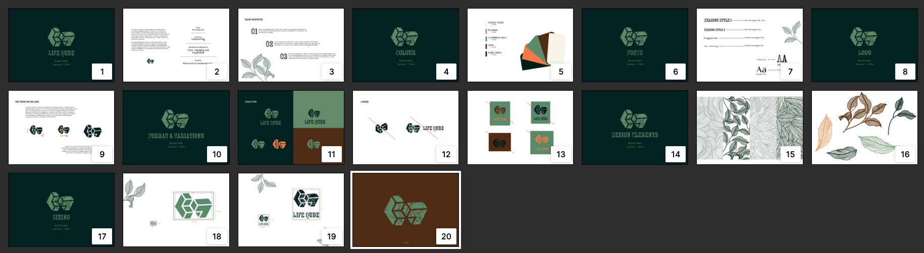 Fig.4
Fig.5
Fig.4
Fig.5
Branding
Fig.6
Brand Guidelines Outcomes

Check out the Brand Guide digitally as well. You can scan the QR code using your camera for instant access on the go, or utilise the link provided earlier for an optimised experience on desktop.
I designed the brand guide to be accessible both in print and digital formats, recognizing the shift towards a paperless world and the increasing convenience of accessing information from anywhere. However, after receiving some feedback I had desired to create a printed version since the company will also be producing physical outcomes, I aimed to set the tone by ensuring high-quality standards. This makes the brand guide an invaluable resource for clients and designers alike, providing comprehensive insights into the company and guidelines on how to represent it effectively.
Branding
Website
Website Purpose
I initiated this phase of the project by envisioning the website’s purpose and user experience. I aimed for a seamless journey for my audience, guiding them effortlessly through the site with a minimalist approach that encouraged them to envision themselves in the space.
To gather design inspiration and explore potential hosting options, I researched platforms like WP Engine, WordPress, and Squarespace. However, as the branding process took longer than anticipated, I devised a plan to leverage Adobe XD for website design and Dreamweaver for hosting if necessary.
The website’s core objective was to serve as a comprehensive knowledge hub, enabling users to explore various facets and draw inspiration. Sections such as a blog and shop were envisioned to empower users to navigate at their own pace while embodying the values synonymous with Life Qube.
User Experience
Creating a Clear and seamless user experience, with focus on Coherent branding.
Layout
Focus on content layout and fluidity, That asts as a starting point for products and servise
Meeting current Website Standards from an environmental and accessibility perspective.
01
Content
Functionality 02 03
Planning & site maps
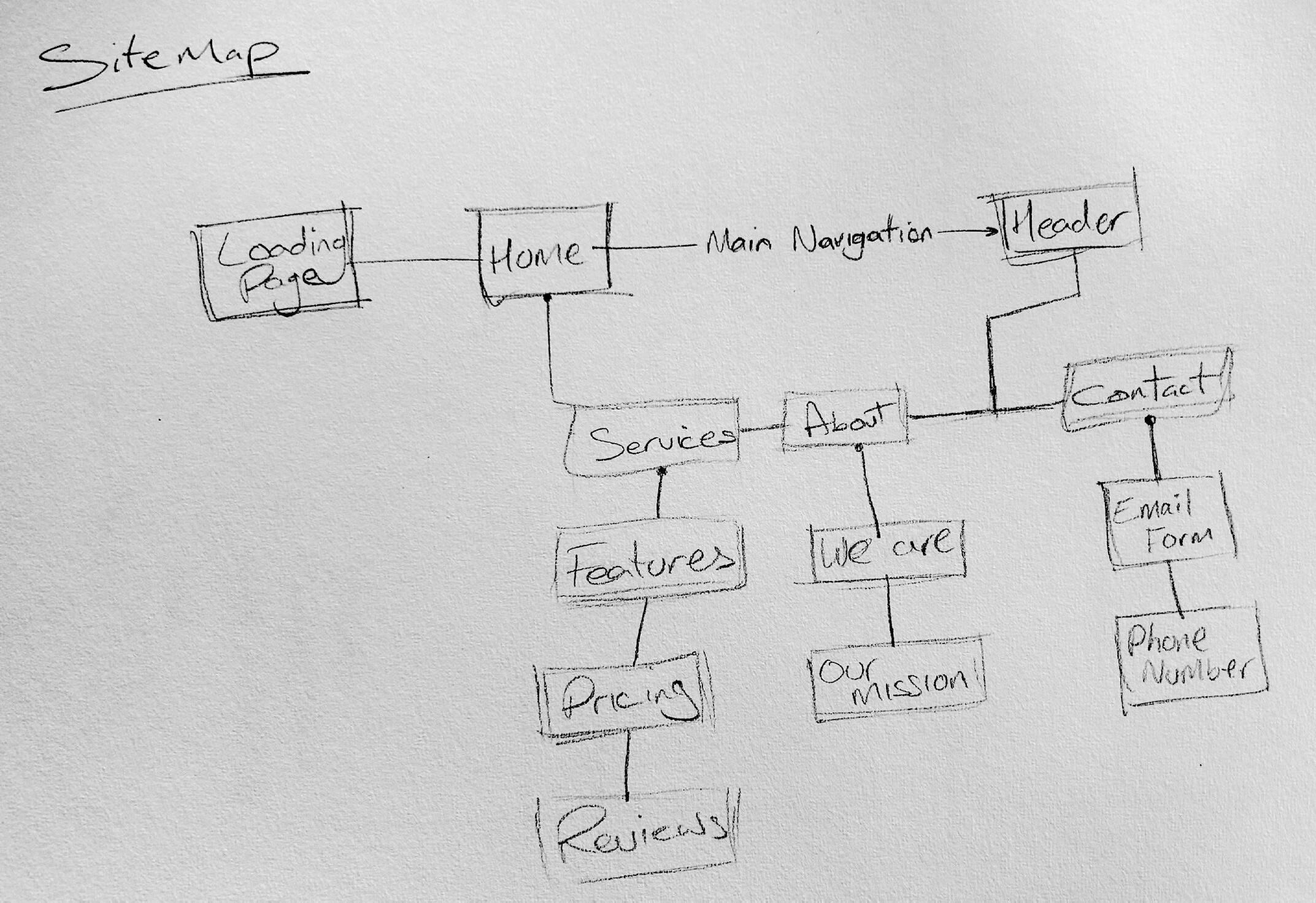
With the website purpose in mind, I began planning the website content and created a rough sitmap to set out how I would Ideally want the website function. It was important to look back on research to outline the details of what my site needed, upon reflection I would of ideally add a blog page to allow of a more informative website. This allows room for improvement.
I identified the much haves:
• Home page (a clear and welcoming overview of Life Qube, Purpose & values, with clear links to other pages)
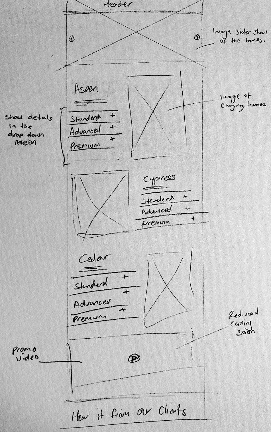
• Service Page (showing the client Life Qube offers backed up with reviews to insure the client feels like they can trust Life Qube.)
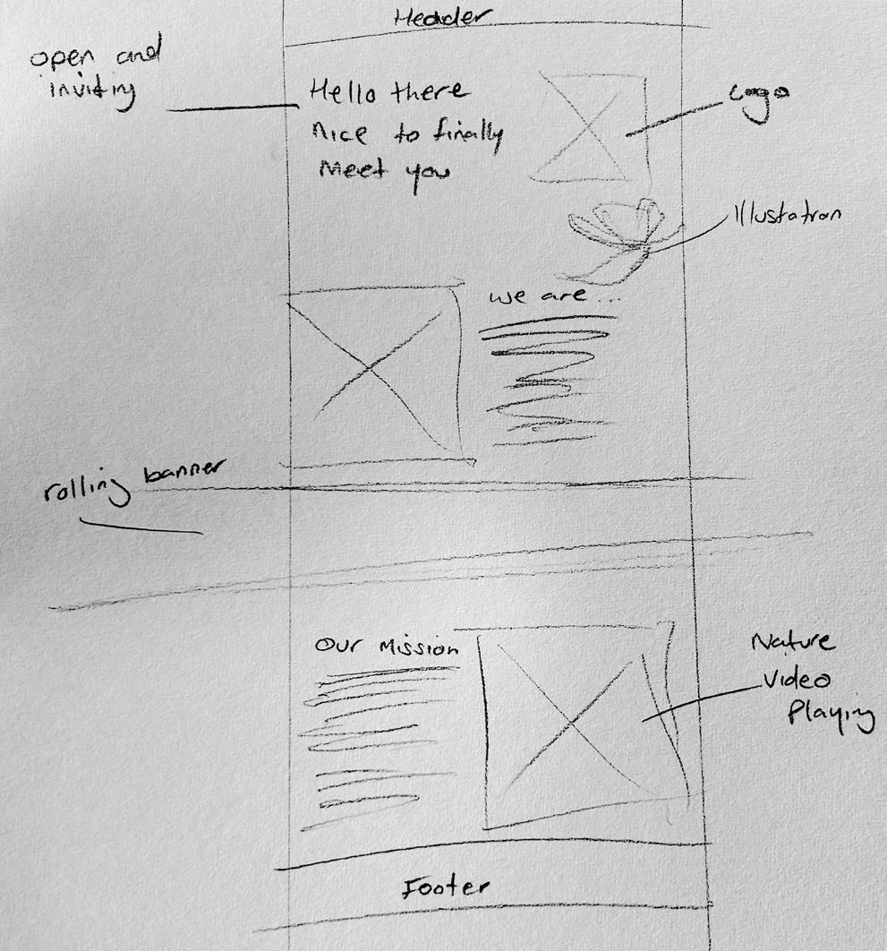
• About page (a more detailed look at the who Life Qube and their purpose)
• Contact us page (for general enquiries, help and assistance.)
I later identified additional pages need to correct interactivity, and lead off to more single pages suck as adding a Blog page, providing shared posts from other individuals and insightful knowledge about shipping container homes. As it is such a niche marked, very little people know about it. Therefore the blog would have been a great addition to the website.
Creating this rough sitemap helped me plan for what i would need to build, how long each area of the site may take, and how many different elements I would need, e.g. Video content, images, illustration and body copy.
Website
Fig.7
User Journey
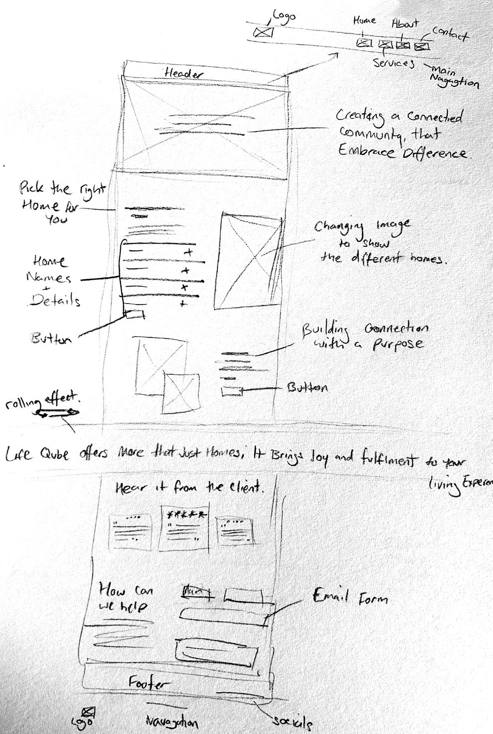
Next, I delved into enhancing the interactivity of the website’s content, focusing on crafting a seamless user journey and user experience. Utilising the sitemap I had previously developed, I sketched rough wireframes to visualise page connections and identify areas requiring interactive elements. This process allowed me to meticulously plan how users would navigate through the site and anticipate their interaction needs.
It was important when assessing the UX trends and theories behind user journey and navigation structure. I considered the use of layout, navigation and structure to plan the content within each page. Additionally, this ensures a straight forward process when coming to build the website.
In crafting the website content, clarity and simplicity were paramount to ensure smooth user navigation across pages. Each page seamlessly connected to others through well-labeled navigation menus, footers, or text links, maintaining a coherent narrative structure. Integrating text with imagery and animations was key to conveying information effectively and leaving a lasting visual impression. While aiming for a visually captivating site, I remained mindful of its environmental impact, striking a balance between visual appeal and sustainability.
Consequently, the benefits of looking deep into the user journey allows a strategic reduction of carbon emissions that are being emitted as a result of website traffic. This is made possible by having a big focus on the content strategy of the website by not creating content which does not serve a purpose therefore wasting energy and frustrating users. Reducing the search efforts to find my website is another important aspect I focused on as on average 68% of users start their journey through search. To make this happen focusing on an efficient Search Engine Optimisation (SEO) strategy was key.
Turner, C. (2021).
Awareness Consideration Decision Buyers journey
Define problem by allowing a sustainable future that is affordable and realistic to the target audience. Life Qube would need to acknowledge the buyers considerations such as sustainable solutions, cheaper long-term costs which are reliable and provide a guarantee for a better future by proving warranties with every purchase. Therefore demonstrating that the purchase in Life Qube is not only justifiable but also the most logical decision.
Filidis, S. (n.d).
Website
Fig.10
Fig.8
Fig.9
Fig.11
Wire frames
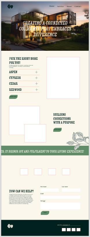
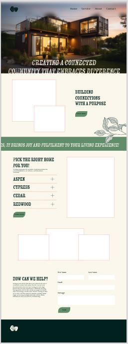
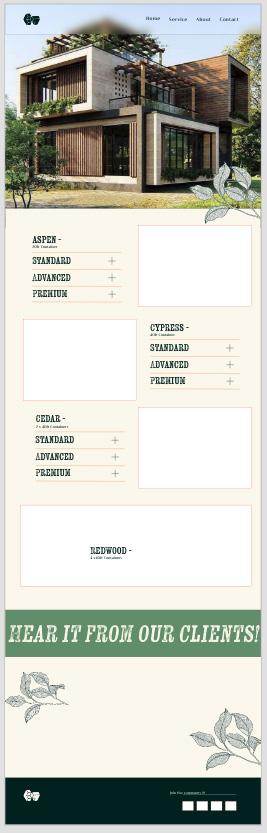
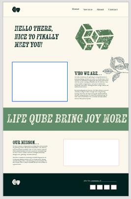
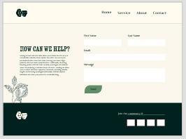
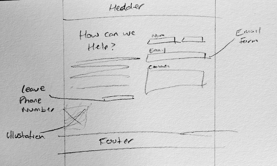
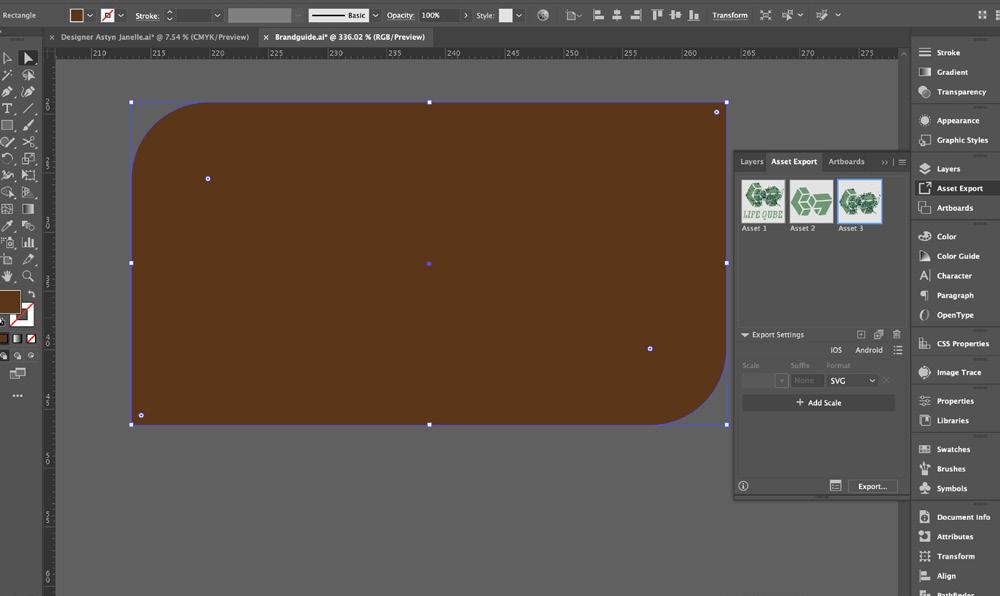
I used Adobe XD to create wire Frames and to prototype the website. Fortunately, I found it an easy tool to navigate as it is very similar to Webflow Builder, which could be used to produce the site. XD allows me to add assets created from illustrator consisting of the brand elements and components like buttons, making this process of Wire Framing more efficient.
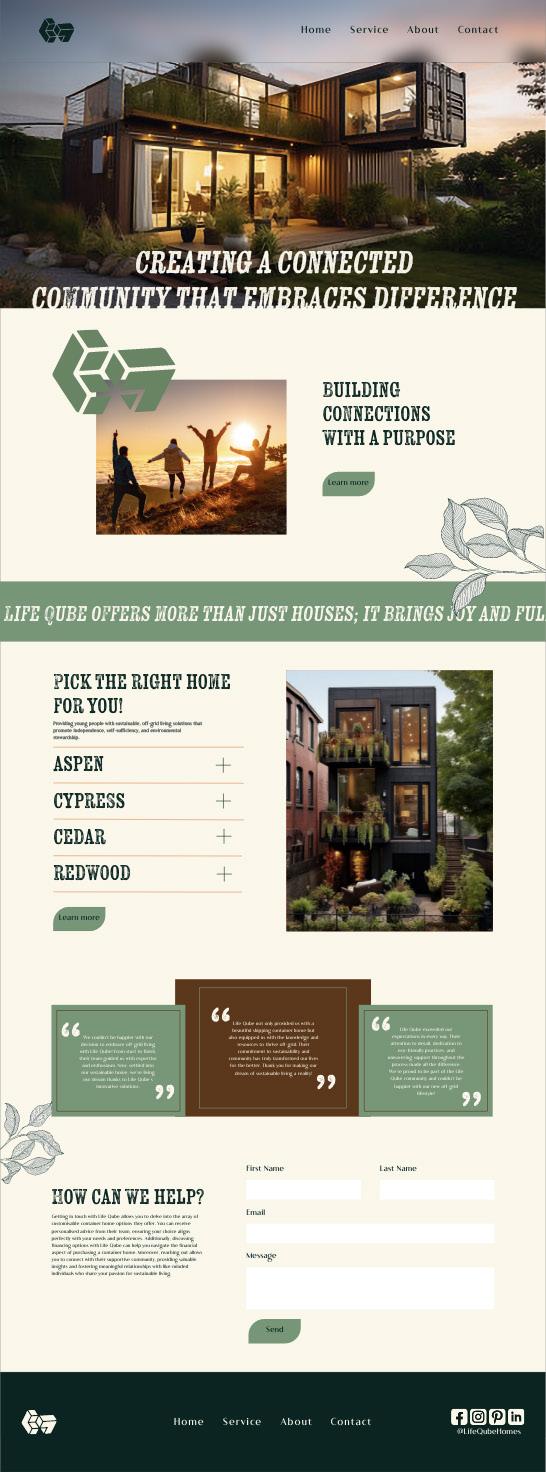
I had decided to create a loading page at the centre front of the website. As the user first reaches the website it gives them a moment to absorb the branding opening up into a cohesive and welcoming website. Originally an early development of the Wire Frame the user scrolled past the initial page and was met with the services that we provide which had been changed down the line to now reflect more of what the brand is and the mission behind the branding. As the user scrolls through the website relaying more of the illustrations of the brand and functionalities to then reveal previous positive experiences from existing home owners therefore providing the user with an immediate positive response. Concluding the home page is a ‘How can we help’ section where the branding has been designed to ensure customer satisfaction and ease of service by displaying the phone number clearly as well as in the footer.
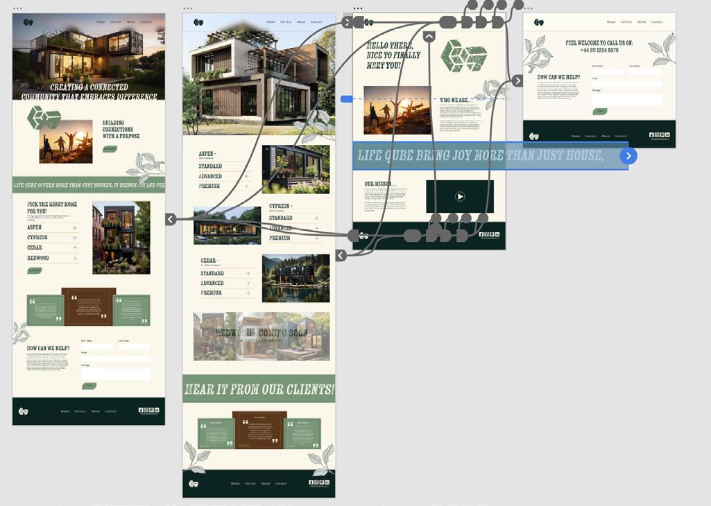
All of these pages have been created with a footer navigation as well as a header navigation to stop the user from having to scroll up and down and creating a clear direction of where to navigate the website which in result reduces clicks. Drop down menu’s have been designed to have a hoover state instead of a click response to also reduce carbon emissions.
Functionality & Design Development
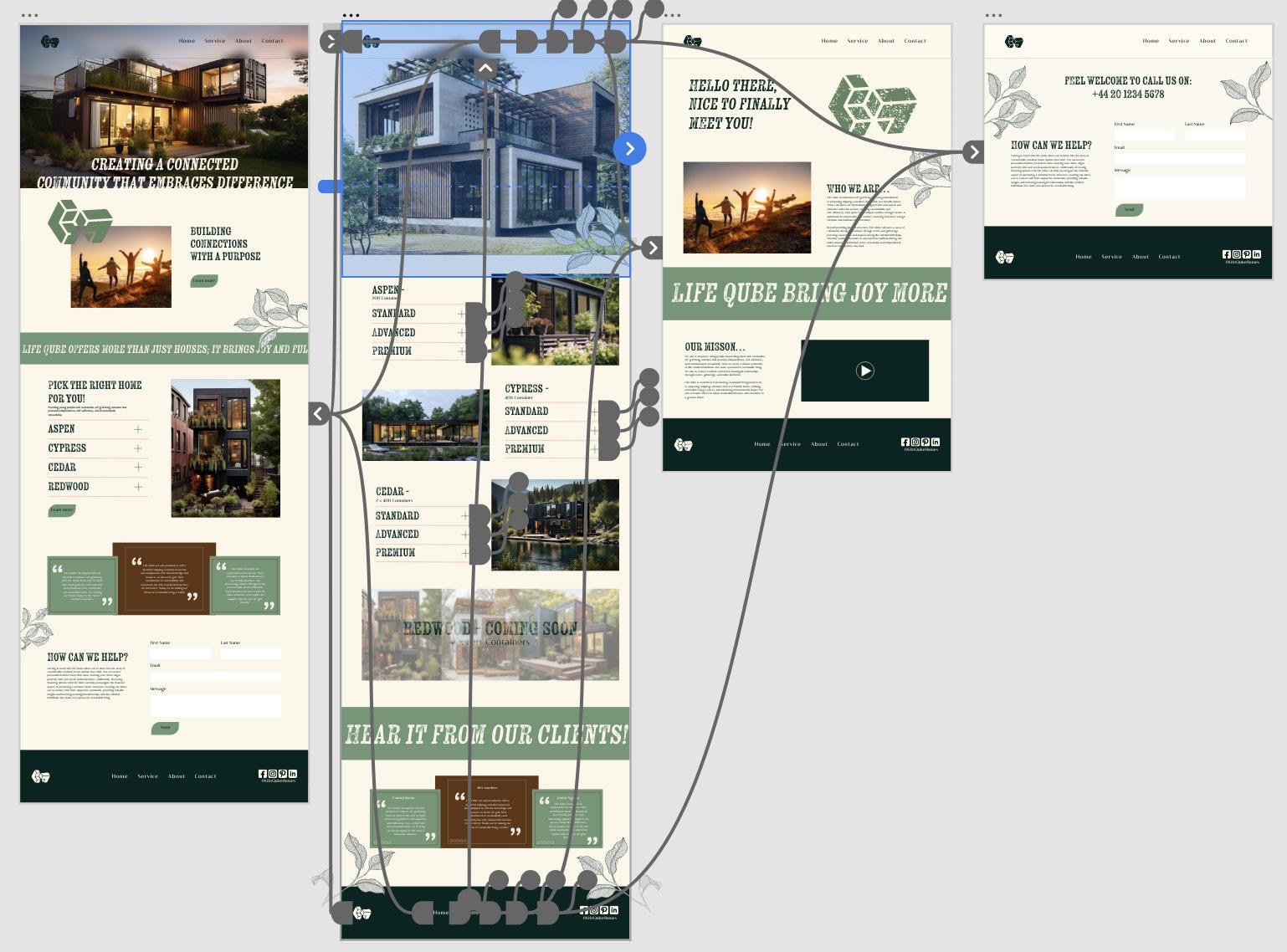
Now having the Wire Frames and a well structured plan to create this website, moving into the prototype stage within XD. I had found the switch between design mode and prototype mode very minimal due to the user ability within XD which allowed me to create function able elements to the website. This allowed me to add in more information throughout the website as well as making it easy to navigate.
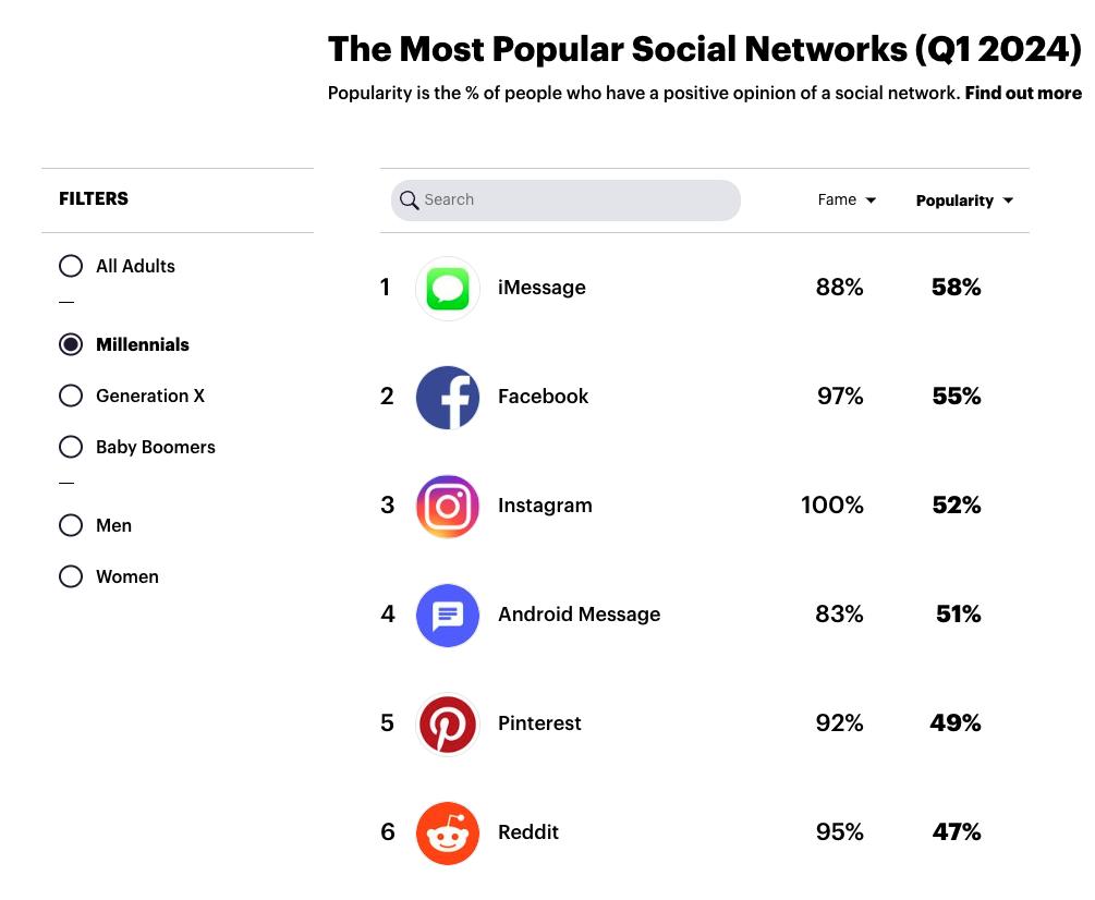
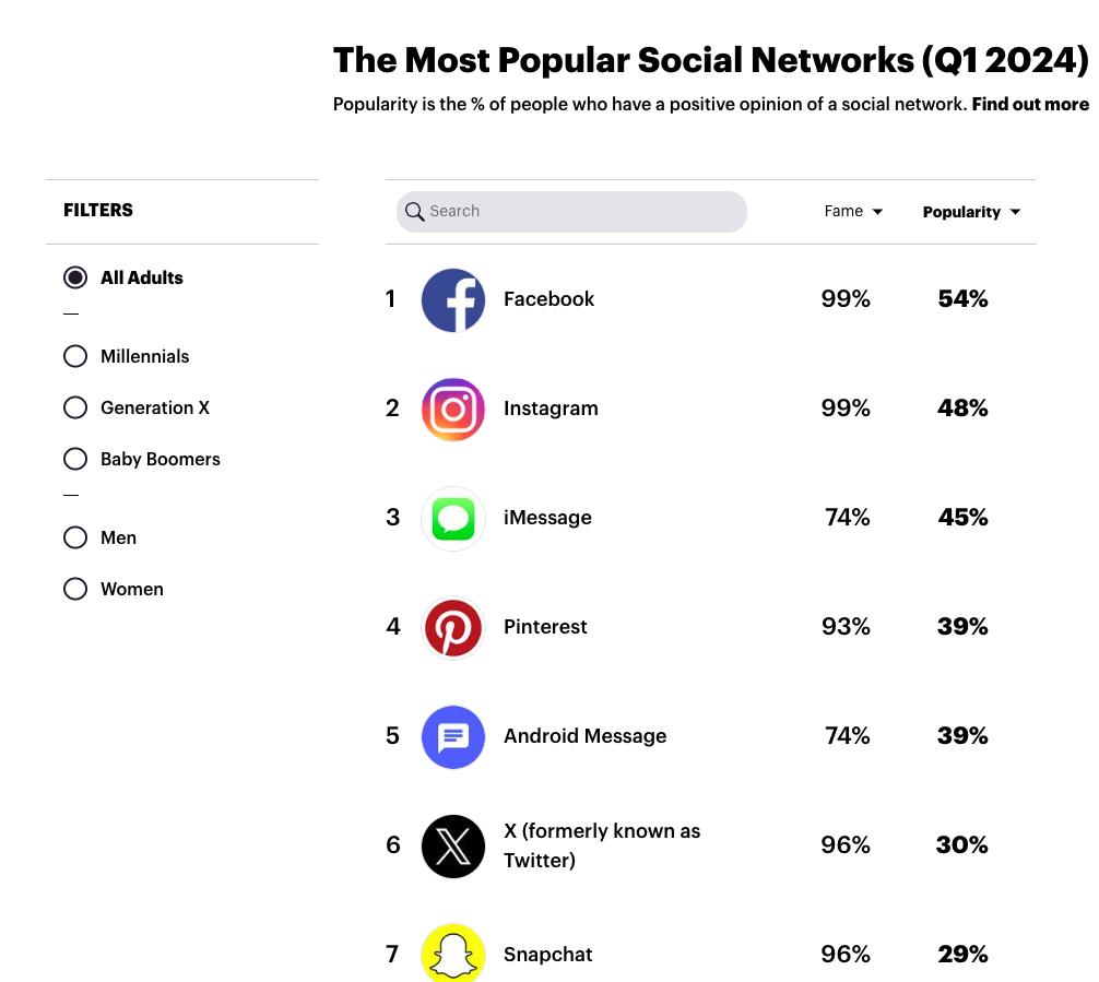
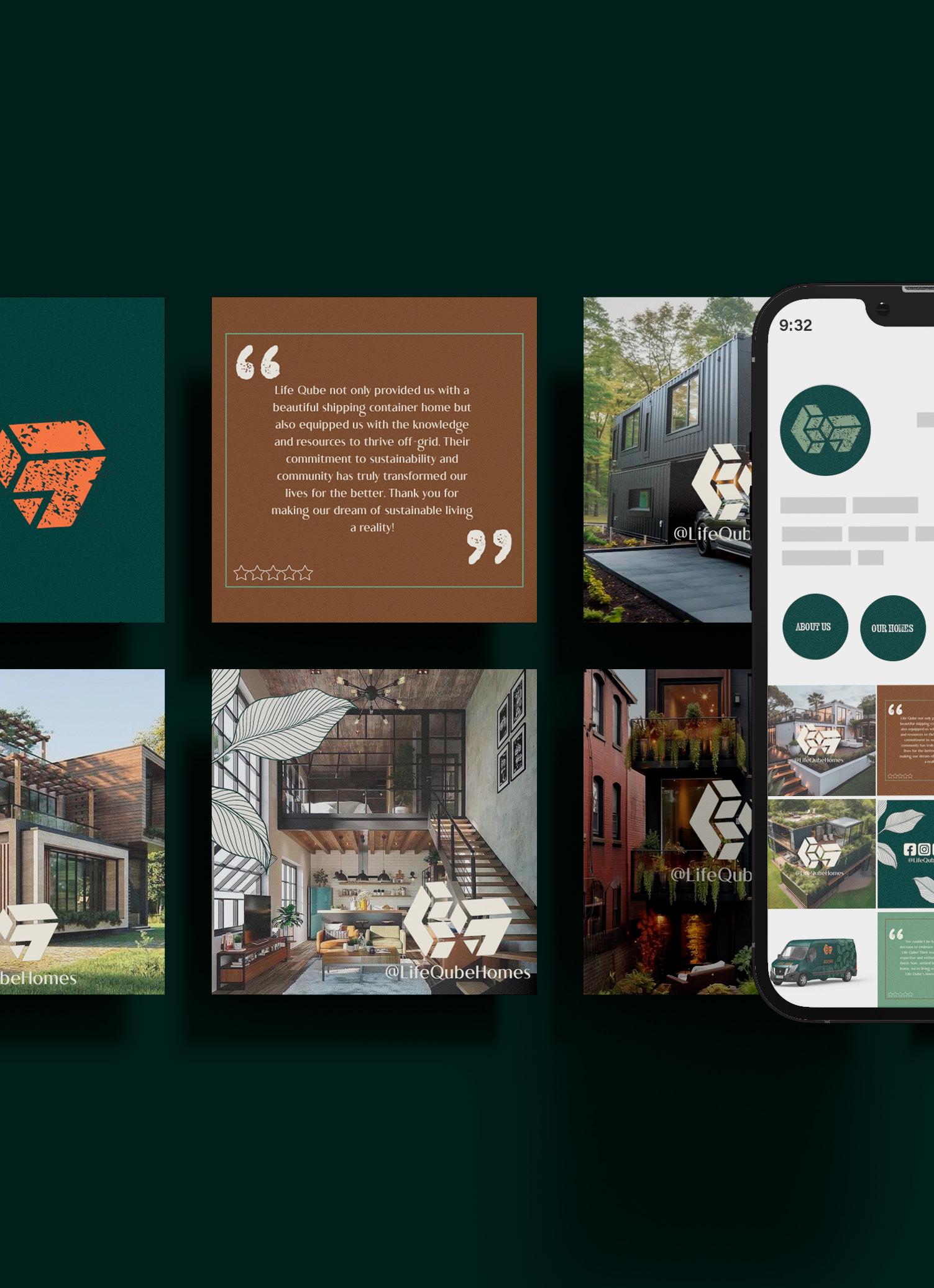
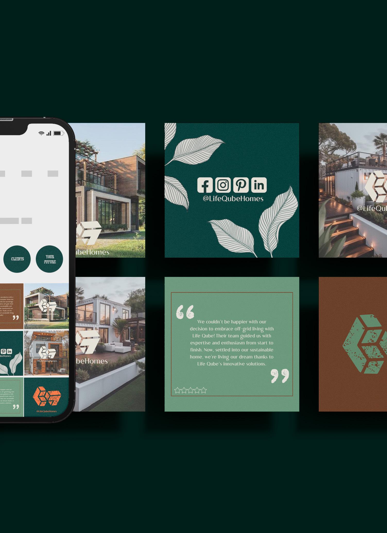
I conducted research using YouGov to identify the most popular social networks among millennial in 2024. This data served as a valuable guide in determining which social media platforms would effectively reach my target audience. Given that LinkedIn ranked 10th in popularity among millennial, I saw it as a promising platform for business engagement and networking.
Website
YouGov.(2023)
Outcomes
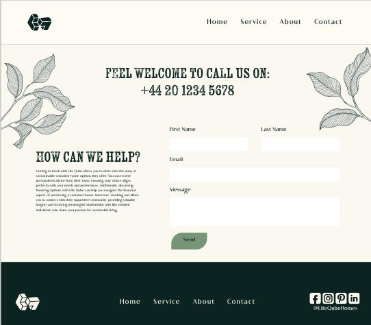
Overall, I’m satisfied with the outcome of the project. Given more time, I would have preferred to build the website in Dreamweaver for a smoother and more seamless experience. Additionally, I wish I had allocated more time to develop stronger marketing materials. Despite the marketing aspect not being as robust as I had hoped, I believe I successfully translated the branding into the website and social media. The design process ended up consuming more time than anticipated, especially with other projects occasionally taking priority.
Website
marketing
Social media
Marketing
Promo Videos
Marketing
Merchandise
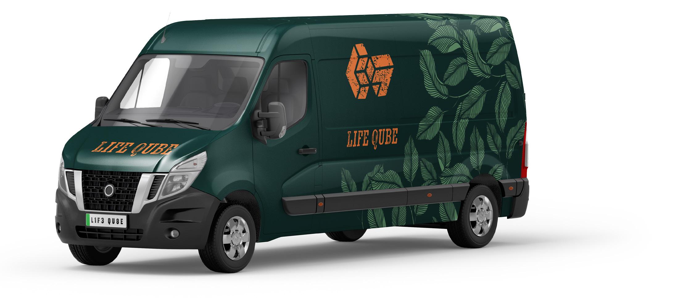
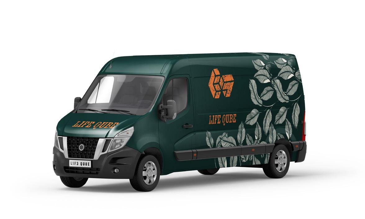
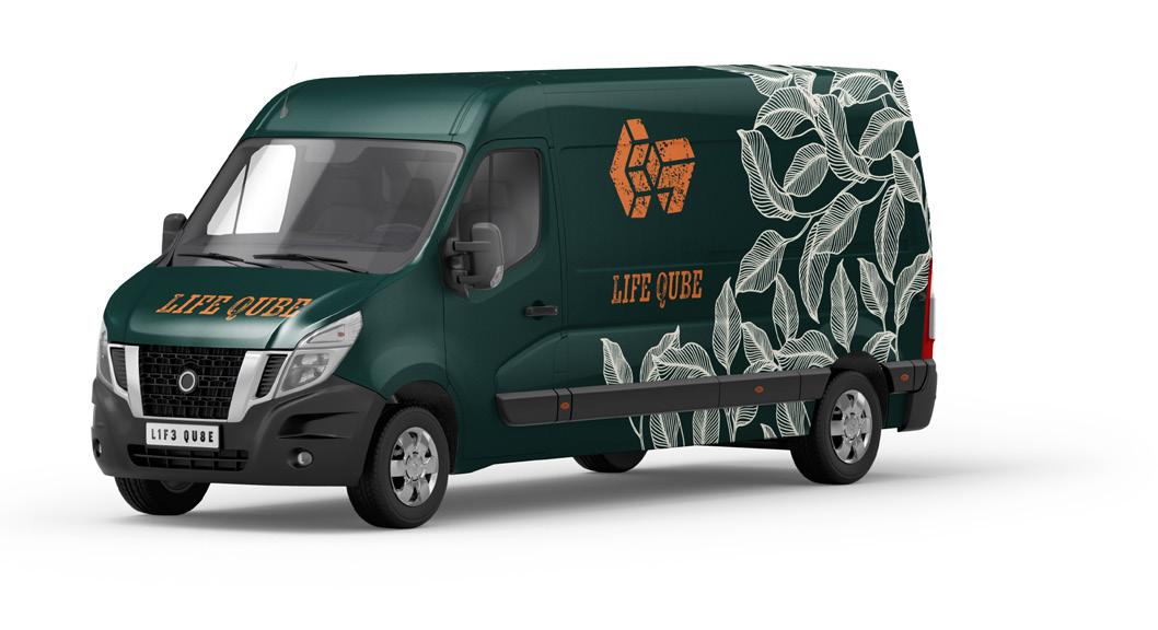
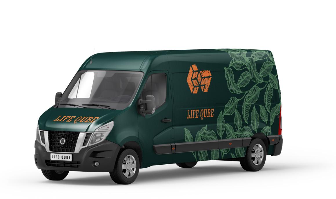
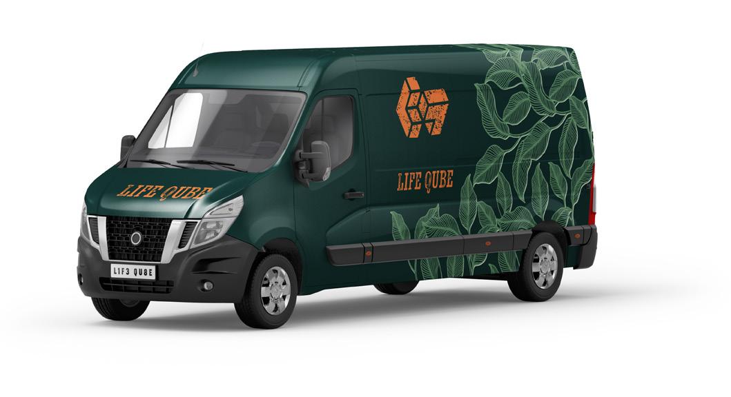 Fig.12
Fig.13
Fig.12
Fig.13
marketing
Fig.14
Fig.15
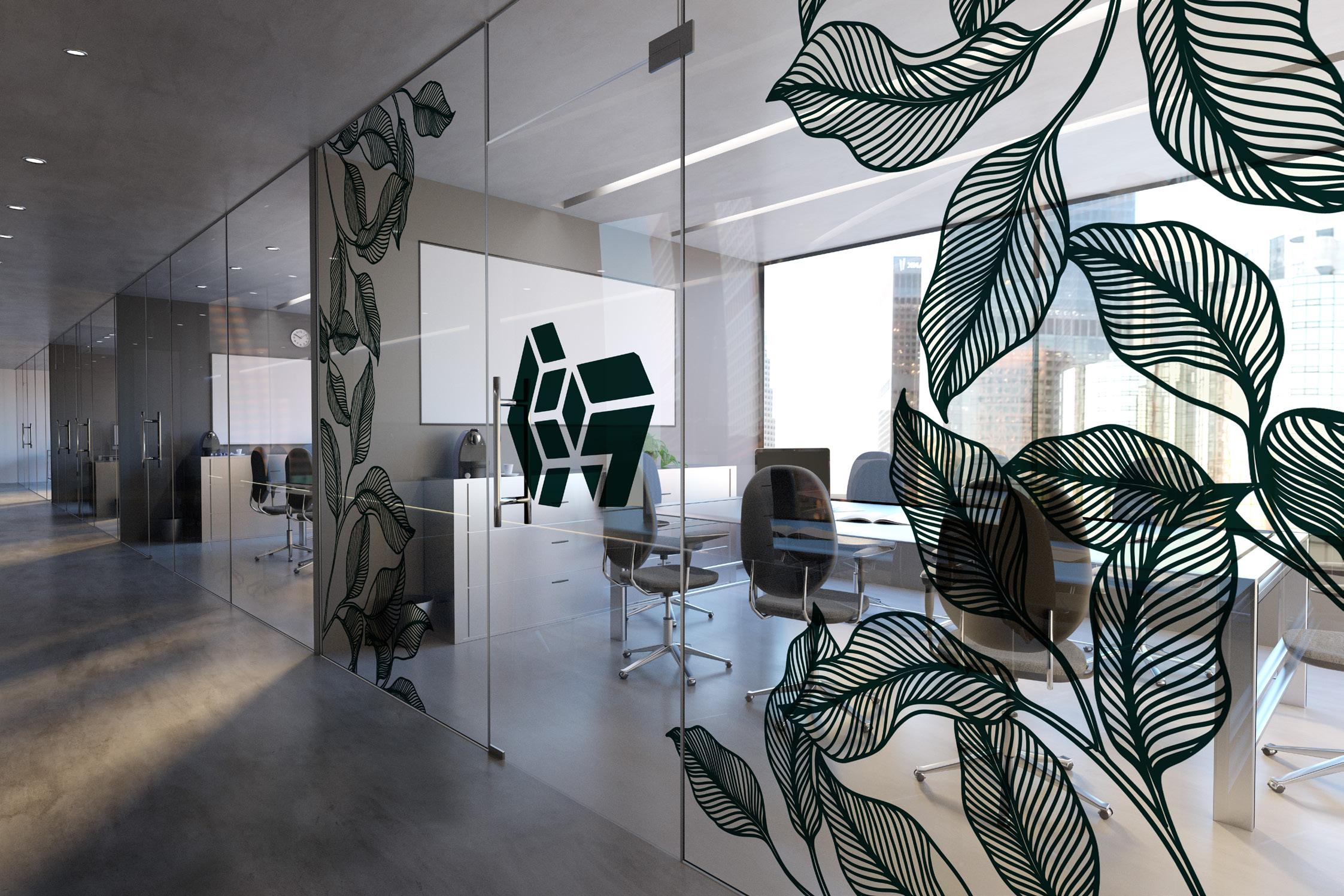
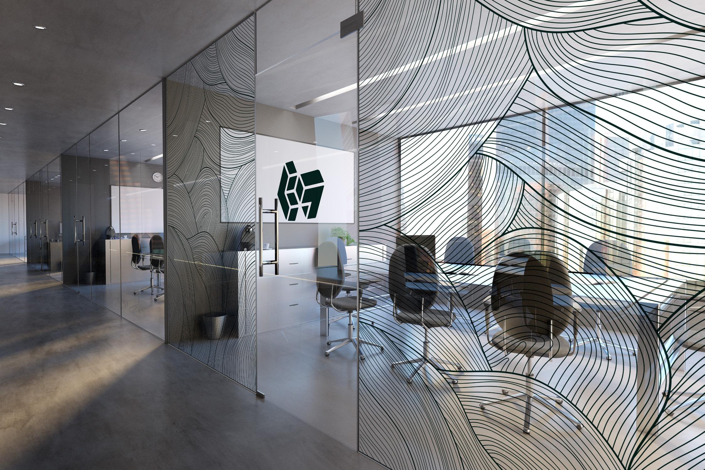 Fig.16,a
Fig.16,b
Fig.16,a
Fig.16,b
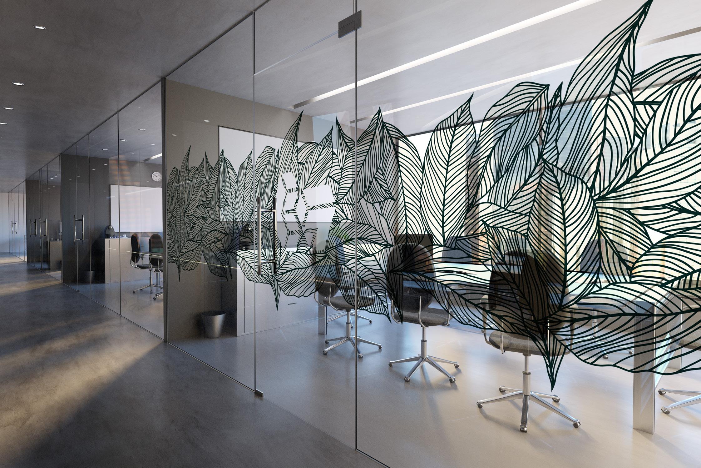
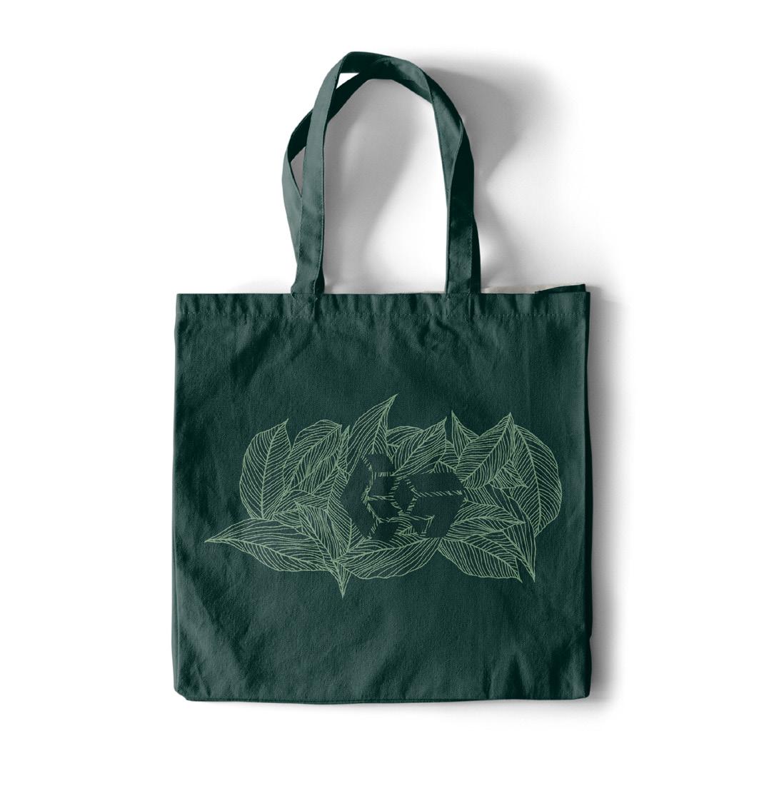
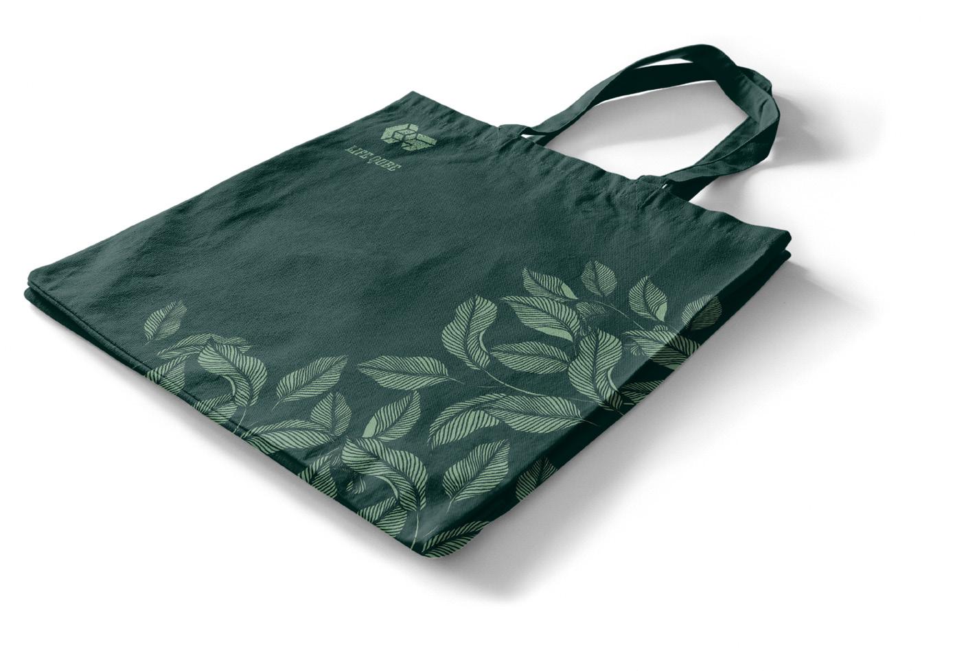
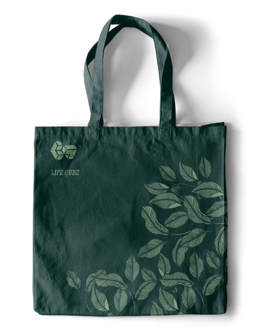
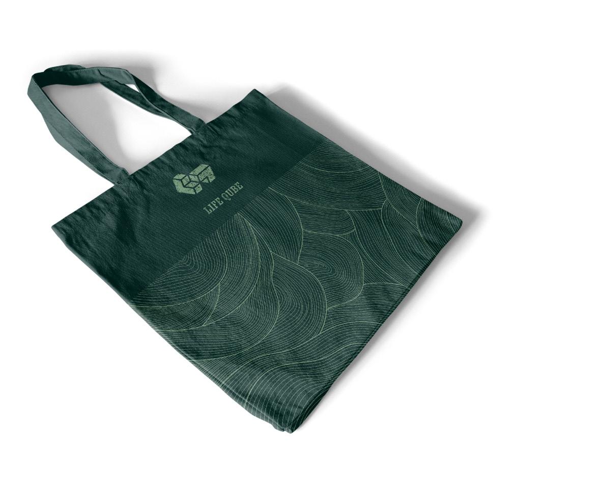
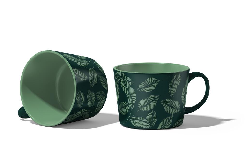
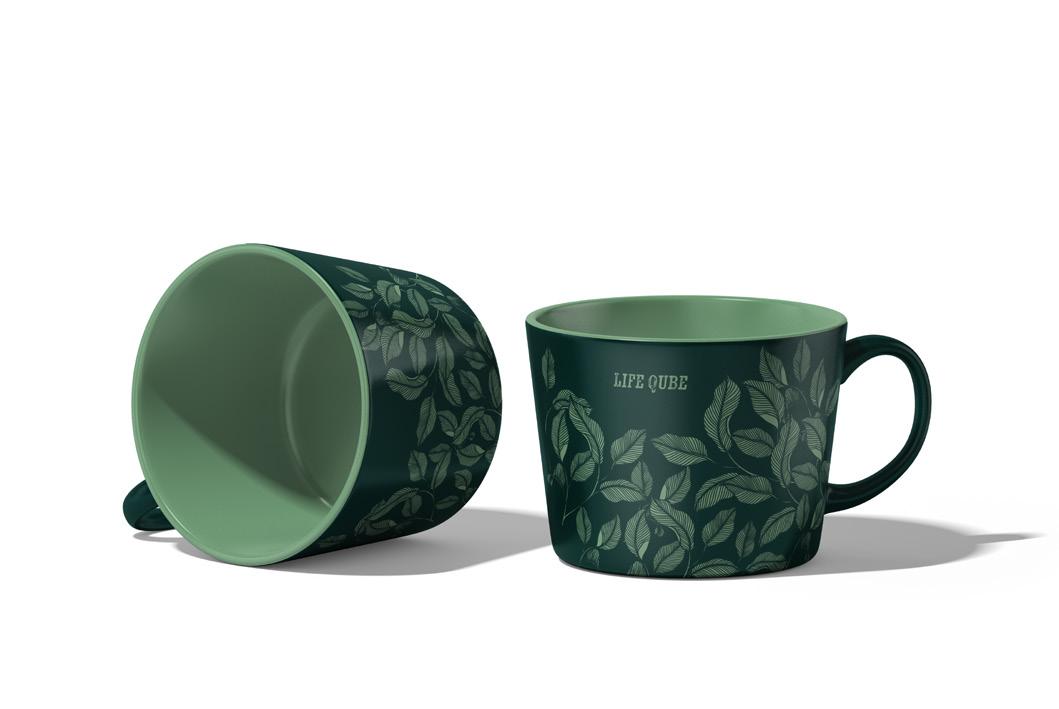
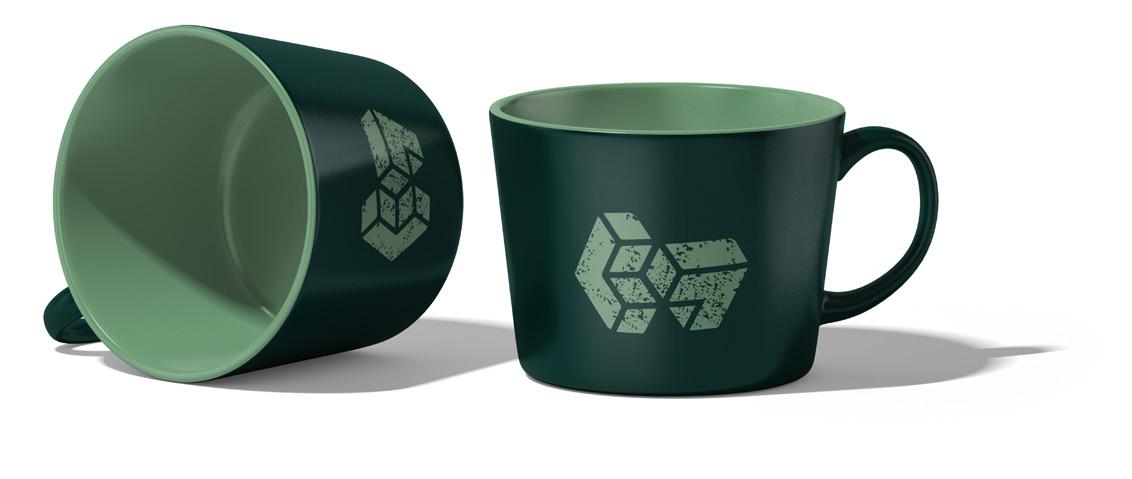
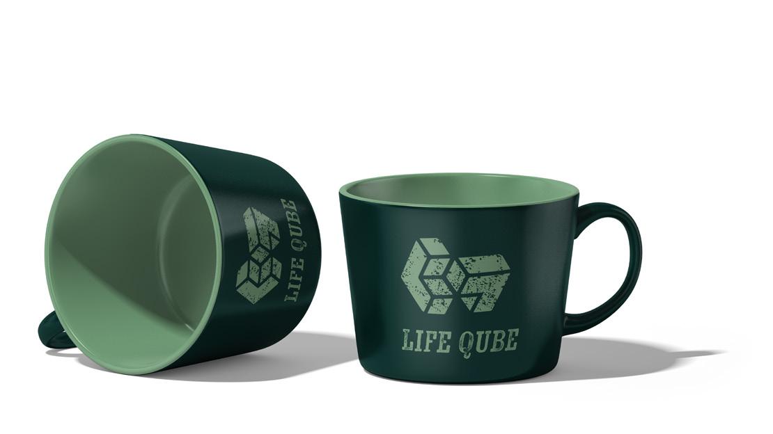
These mockups were crafted to showcase the design in its tangible form, with the business van designs serving multiple purposes. They serve as mobile marketing assets, reaching audiences on the road, Fig 12. While also acting as sustainable carriers for everyday items like bags for life and branded mugs for our clients, shown on Fig.14,15. Importantly, Fig. 16, a,b,c contribute to creating a positive and creative atmosphere within our office space for employees.
Figures 12 and 13 represent the final design for the vans and the various design iterations that led to its refinement, respectively. These designs effectively capture the essence of our brand when displayed on the road.
Figures 14 and 15 showcase merchandise tailored with our clients in mind, including sustainable bags for life and a range of mug designs. These items are intended to foster a lasting connection with our clients, providing them with functional items that align with our brand values.
Figures 16a, 16b, and 16c offer examples of the patterns utilised within the office space, contributing to a visually stimulating and engaging environment for our team.
You will be able to see the final chosen mockup within the brand guide; the final decisions have been revised in our class group whatsapp group. Fig,16,a what the most liked one Although upon feedback the logo on the door should of been a bit smaller
Fig.16,c
References
Bibliography
Adobe (2019). Adobe Color. [online] Adobe.com. Available at: https://color.adobe.com/ create/color-wheel [Accessed 2023].
Bianchi, F. (2018). Coolors. [online] Coolors.co. Available at: https://coolors.co/ [Accessed 2023].
Brand, B. (n.d.). How Hard Is It To Name A Brand? [online] Bailey Brand Consulting. Available at: https://baileygp.com/article/how-hard-is-it-to-name-abrand/#:~:text=There%20are%20a%20lot%20of [Accessed 2024].
Cont24 (n.d.). Instagram. [online] www.instagram.com. Available at: https://www.instagram. com/cont24.co/ [Accessed Aug. 2023].
Container24 (2023). CONT24 - YouTube. [online] www.youtube.com. Available at: https:// www.youtube.com/@container24/about [Accessed 8 Oct. 2023].
Design, lilmalvi (n.d.). Instagram. [online] www.instagram.com. Available at: https://www. instagram.com/lilmalvi.design/ [Accessed 15 Oct. 2023].
Digital, M. (n.d.). Tiny Houses. [online] Live Off Grid. Available at: https://liveoffgrid.co.uk/ tiny-houses/ [Accessed 2023].
Emily (2023). Shipping Container Homes. [online] Design for Me. Available at: https:// designfor-me.com/advice-and-tips/shipping-container-homes/ [Accessed 8 Oct. 2023].
Express, A. (2022). How to get the ideal logo size for all your marketing needs. [online] www.adobe.com. Available at: https://www.adobe.com/express/learn/blog/logo-size [Accessed 25 Mar. 2024].
Filidis, S. (n.d.). 6 Popular Types of Content Experiences (with Examples). [online] www. foleon.com. Available at: https://www.foleon.com/blog/6-popular-types-of-contentexperiences-with-examples [Accessed Mar. 2024].
Filidis, S. (n.d.). How to Map Your Content to the Buyer’s Journey. [online] www.foleon. com. Available at: https://www.foleon.com/blog/how-to-map-your-content-to-thebuyers-journey [Accessed 2024].
FofaFiction (2023). Why Move Out of Your Parents’ House? [online] Reddit. Available at: https://www.reddit.com/r/Adulting/comments/16ngujz/why_move_out_of_your_ parents_house/?rdt=41291 [Accessed Apr. 2024].
Fonts, A. (n.d.). Kiln | Adobe Fonts. [online] fonts.adobe.com. Available at: https://fonts. adobe.com/fonts/kiln [Accessed 2023].
Fonts, D. (2021). Romelio Sans Font | dafont.com. [online] www.dafont.com. Available at: https://www.dafont.com/romelio-sans.font?text=Life+qube&psize=xs [Accessed Mar. 2024].
Function, A. (2021). Data visualisation: colours – Government Analysis Function. [online] analysisfunction.civilservice.gov.uk. Available at: https://analysisfunction.civilservice.gov. uk/policy-store/data-visualisation-colours-in-charts/ [Accessed 8 Mar. 2024].
Heptinstall, O. (2023). New group set up to help tackle Devon’s housing crisis is accepting evidence. [online] www.northdevongazette.co.uk. Available at: https://www. northdevongazette.co.uk/news/local-news/1246542/new-group-set-up-to-help-tackledevons-housing-crisis-is-accepting-evidence.html [Accessed 10 Oct. 2023].
Hunter, L. (2018). Container Homes - Pros, Cons & Cost Comparison. [online] Rise. Available at: https://www.buildwithrise.com/stories/container-homes-are-exactly-whatthey-sound-like-homes [Accessed 10 Oct. 2023].
Ibbetson, C. (2022). How many people had help from their parents to buy their first home? [online] Yougov.co.uk. Available at: https://yougov.co.uk/economy/articles/42453how-many-people-parents-help-first-home-deposit [Accessed 2024].
Kristiansen, A.B., Zhao, B.Y., Ma, T. and Wang, R.Z. (2021). The viability of solar photovoltaic powered off-grid Zero Energy Buildings based on a container home. Journal of Cleaner Production, 286(125312) [Accessed 2023].
Looijenga, D. (n.d.). Who Is the Target Audience of Your Content? [online] www.foleon. com. Available at: https://www.foleon.com/blog/who-is-the-target-audience-of-yourcontent [Accessed 2023].
Looka (n.d.). Logo Maker | Used By 2.3 Million Startups. [online] www.looka.com. Available at: https://looka.com/onboarding [Accessed 2023].
References
Namer, C. (n.d.). Color namer. [online] colornamer.robertcooper.me. Available at: https:// colornamer.robertcooper.me/ [Accessed Jan. 2024].
Nelson, C. (2012). Harder to buy homes now | YouGov. [online] yougov.co.uk. Available at: https://yougov.co.uk/consumer/articles/4643-harder-buy-homes-now [Accessed Apr. 2024].
Reijnders, D. (n.d.). 6 Reasons You Should Stop Using PDF for Business [Accessed 2024]
Content. [online] www.foleon.com. Available at: https://www.foleon.com/blog/6-reasonsyou-should-stop-using-pdf-for-business-content [Accessed 2024].
Samal, S. (2021). Create An Effective Sitemap For Websites - Examples Included. [online] www.scalenut.com. Available at: https://www.scalenut.com/blogs/different-sitemapexamples-create-effective-sitemap-website [Accessed 2024].
Simpson, A.R. (2018). Young Adult Development Project. [online] hr.mit.edu. Available at: https://hr.mit.edu/static/worklife/youngadult/changes.html#:~:text=Young%20 adulthood%20(generally%20defined%20as [Accessed 2024].
sunlife (2023). The only way is up. House prices in Britain then and now. [online] SunLife. Available at: https://www.sunlife.co.uk/articles-guides/your-money/the-price-of-a-homein-britain-then-and-now/ [Accessed 2024].
Taney (2019). 5 Creative Ways to Use Brand Patterns - Taney Creative. [online] taneycreative.com. Available at: https://taneycreative.com/5-ways-to-use-your-brandpattern/ [Accessed Dec. 2023].
Turner, C. (2021). Sustainable web design: how to reduce your website’s carbon footprint. [online] CultureHive. Available at: https://www.culturehive.co.uk/resources/sustainableweb-design-how-to-reduce-your-websites-carbon-footprint/.
Venzano, L. (2018). Brand Patterns | Longitude°. [online] Longitude. Available at: https:// longitudedesign.com/brand-pattern/ [Accessed 5 Feb. 2024].
Warnock, P. (n.d.). The Benefits of Using Digital Brochures in Your Content Marketing. [online] www.foleon.com. Available at: https://www.foleon.com/blog/brochure-benefits [Accessed 2024].
Wikipedia Contributors (2019). Intermodal container. [online] Wikipedia. Available at: https://en.wikipedia.org/wiki/Intermodal_container [Accessed 8 Oct. 2023].
Williams, B. (2021). Easily Convert Low To High Resolution Photos In Photoshop. YouTube. Available at: https://www.youtube.com/watch?v=MoYeX4tX2KA [Accessed Mar. 2023].
YouGov (2023). The most popular social networks in the UK | Technology | YouGov Ratings. [online] Yougov.co.uk. Available at: https://yougov.co.uk/ratings/technology/popularity/ social-networks/all [Accessed 2024].
ZOOMCATALOG (2020). Digital vs Print Catalog Design: 7 Things to Consider. [online] ZOOMcatalog Blog. Available at: https://blog.zoomcatalog.com/digital-vs-print-catalogdesign-7-things-to-consider/#:~:text=and%20mobile%20experiences.- [Accessed 1 Apr. 2024].
References
Illustration
Figure 1. AI-produced. (2024) Target Audience objectives.
Figure 2. Self-produced. (2024) Interlocking block design concept.
Figure 3. Self-produced. (2024) Possible business name list.
Figure 4. Self-produced. (2024) Life Qube Brand sheet.
Figure 5. Self-produced. (2024) Brand Development.
Figure 6. Self-produced. (2024) Brand guide outcome.
Figure 7. Self-produced. (2024) Website site map.
Figure 8. Self-produced. (2024) Home page layout.
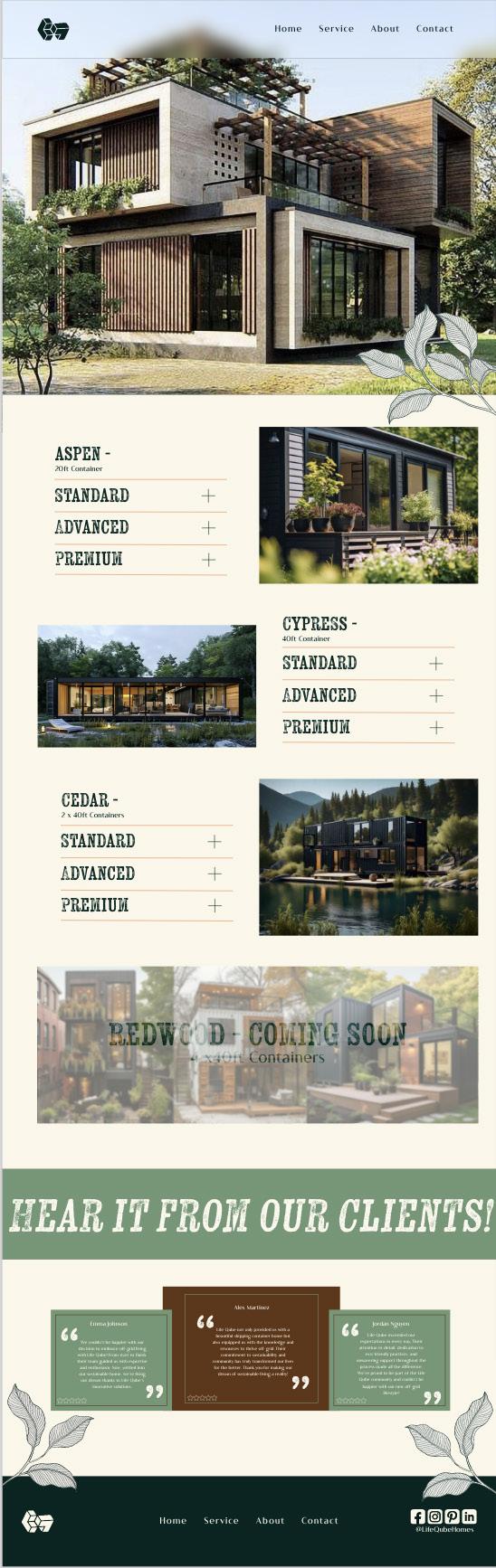
Figure 9. Self-produced. (2024) Service page layout.
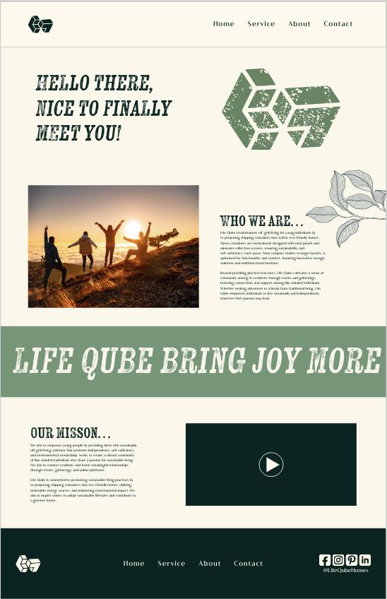
Figure 10. Self-produced. (2024) About us page layout.
Figure 11. Self-produced. (2024) Contact page layout.
Figure 12. Self-produced. (2024) Final Van design.
Figure 13. Self-produced. (2024) Van design experimentation.
Figure 14. Self-produced. (2024) Bag for life merchandises
Figure 15.
Self-produced. (2024) Mug merchandises.
Figure 16,a.
Self-produced. (2024) Office Pattern display design.
Figure 16,b.
Self-produced. (2024) Office Pattern display design.
Figure 16,c.
Self-produced. (2024) Office Pattern display design.
References
BA (Hons) Graphic Design Astyn Williams 20221815 2023 - 2024