Brand Guide Version 1 / 2024 Life Qube
Contents Page
Who we are. Pages 04 - 05 01 03 Logo, Colour, Fonts & sizing. Pages 06 - 14
Format & Variations. Pages 15 - 18
02
05 Design Elements. Pages 19 - 24 Marketing Material. Pages 25 - 31
04
We are:
Life Qube revolutionises off-grid living for young individuals by re-purposing shipping containers into stylish, eco-friendly homes. These containers are meticulously designed with solar panels and rainwater collection systems, ensuring sustainability and self-sufficiency. From compact studios to larger layouts, each space is optimised for functionality and comfort, featuring innovative storage solutions and multifunctional furniture.
Beyond providing physical structures, Life Qube cultivates a sense of community among its residents through events and gatherings, fostering connections and support among like-minded individuals. Whether seeking adventure or a break from traditional living, Life Qube empowers individuals to live sustainably and independently, wherever their journey may lead.
Our voice is:
This means our communication is: We are not:
Clear, Engaging and Purposeful
Re-purposed Empowering
Reserved or Unadventurous.
Brand Objectives
Empower Young Individuals: Life Qube aims to empower young people by providing them with sustainable, off-grid living solutions that promote independence, self-sufficiency, and environmental stewardship.
Foster Community: Life Qube seeks to create a vibrant community of like-minded individuals who share a passion for sustainable living. Through events, gatherings, and online platforms, we aim to connect residents and foster meaningful relationships.
Promote Sustainability: Life Qube is committed to promoting sustainable living practices by re-purposing shipping containers into eco-friendly homes, utilising renewable energy sources, and minimizing environmental impact. Our goal is to inspire others to adopt sustainable lifestyles and contribute to a greener future.
01 02 03
Logo
The Vision for the Logo
The logo is crafted to symbolise the integration of shipping containers, forming an abstract representation of the letter “L” for “Life” and a stylised “q” on the right, subtly spelling out “Life Qube.” This design captures the essence of our brand, blending functionality with creativity. Upon closer inspection, the arrangement of containers forms a key, cleverly conveying our commitment to unlocking sustainable living solutions. This innovative design not only enhances the visual appeal of our brand but also serves as a powerful tool for communicating our message of community, sustainability, and independence.
Examine closely, and you’ll notice imperfections, mirroring real life. These logos intentionally feature slight flaws to enhance relatability. Their edges are both soft and sharp, mimicking the unpredictability of life. Lines may appear slightly uneven, yet maintain a sense of structure, avoiding a polished, sterile look. These imperfections lend character and authenticity, evoking a sense of humanity and connection.
Colour
FLORAL WHITE
RGB: 251, 247, 238
CMYK: 2.09, 3.07, 8.18, 0
#FAF8ED
PUMPKIN
RGB: 238, 128, 64
CMYK: 1.17, 59.74, 77.84, 0.09
#EE8040
CAMBRIDGE BLUE
RGB: 112, 151, 117
CMYK: 60.94, 24.42, 59.9, 6.91
#709775
SEPIA
RGB: 97, 53, 20
CMYK: 38.53, 71.89, 92.87, 56.76
#613514
STELLAR EXPLORER
RGB: 1, 37, 33
CMYK: 93.57, 55.52, 67.19, 76.81
#012521
SEPIA FLORAL WHITE
PUMPKINCAMBRIDGEBLUE
STELLAR EXPLORER
FONTS
Heading Style 1
Kiln Serif Regular
Heading Style 2 Kiln Serif Regular 18 pt
Paragraph Style Romelio Sans Regular 10 pt
Notes / Referencing Romelio Sans Regular 8 pt
Romelio Sans Secondary Font Primary Font
Kiln Serif
Italic 24 pt
Aa Aa
Smallest
Life Qube
This variant of logo can not be any smaller than measurement shown on the smallest logo. This is due to the detail within the logo.
Show above the element of the logo would be use for spacing, no matter the size of the logo you will be able to measure the correct distances, to allow the logo to ‘breath’. Always measure on the shortest side.
SPACING
Life Qube
24 mm 90.7 px
24 mm 90.7 px
Format & Variations
Formatting
Life Qube Life Qube
Missuse
Life Qube
Please refrain from rotating the logo, as it diminishes its value and deviates from our brand identity.
Please avoid laying out the logo and name horizontally, as it disrupts the logo’s balance.
Life Qube Life Qube
Please refrain from mixing and matching the colors of the logo and name.
Please avoid mixing the plain logo with the textured name, and vice versa.
Ensure fairness by using colors that seamlessly blend into each other.
Life Qube
Design Elements
Elegant patterns, subtle lines, we evoke the essence of lifelong growth, mirroring the organic beauty of trees. Our designs capture the nuanced textures and delicate nuances found in nature, infusing the brand with a sense of depth and richness.
Just as trees evolve with the seasons, our creations adapt and transform, embracing change and embodying the dynamic spirit of life. Through thoughtful craftsmanship and attention to detail, we weave a narrative of timeless elegance and enduring beauty, inviting customers to experience the journey of growth and renewal with us.
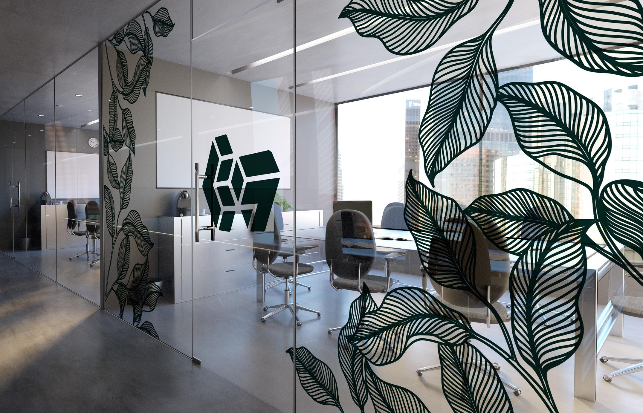
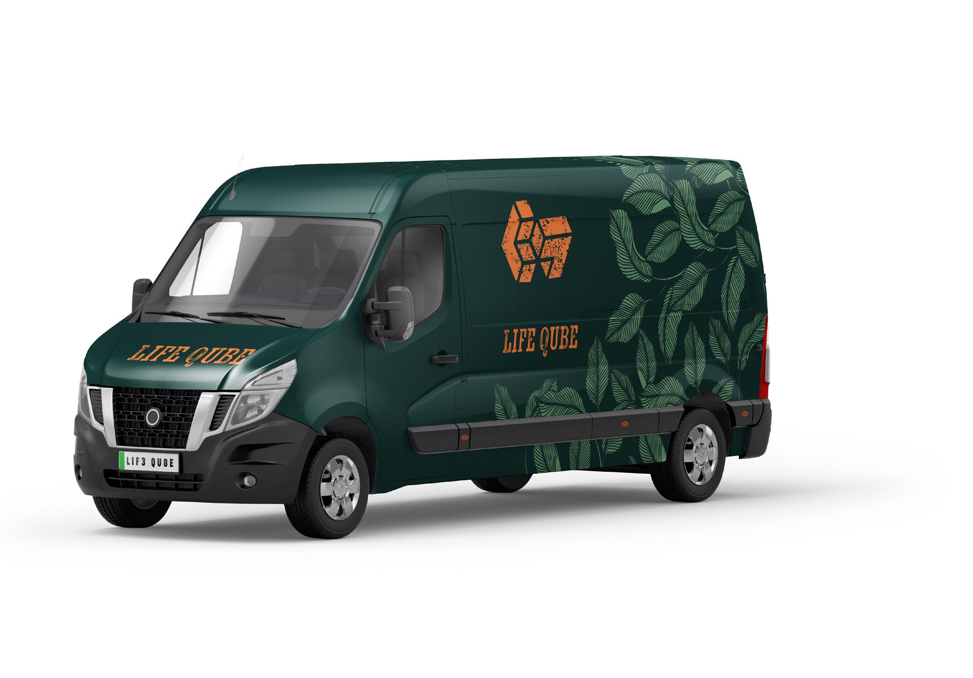
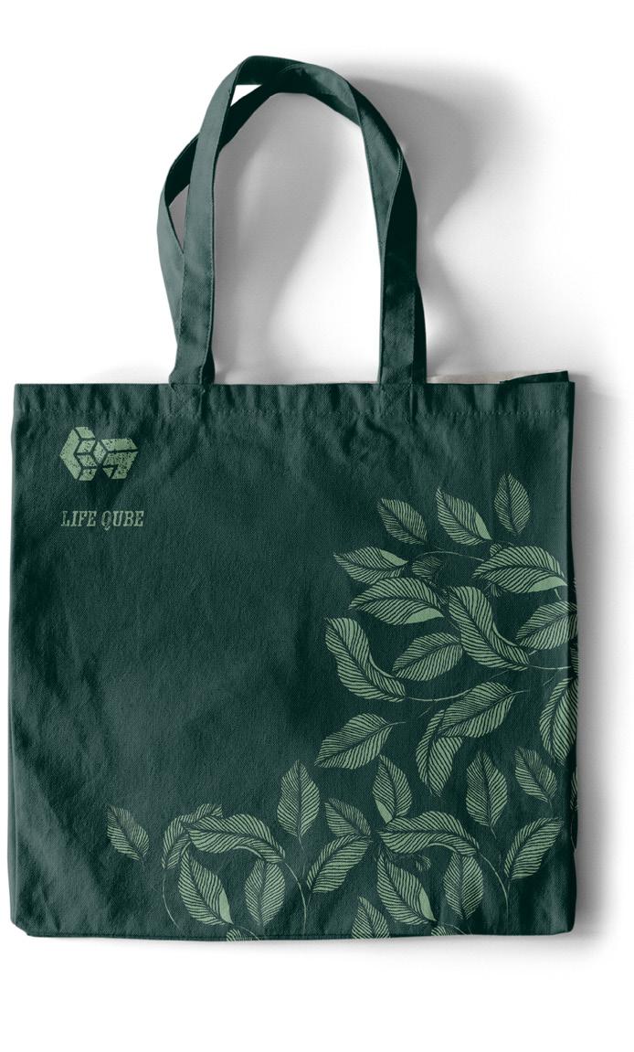
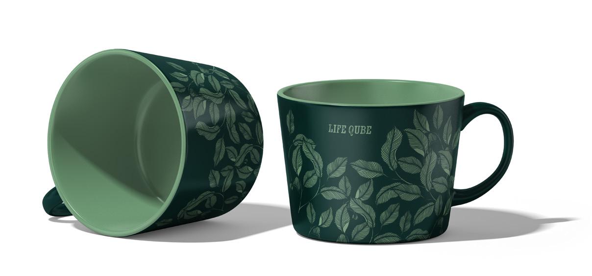
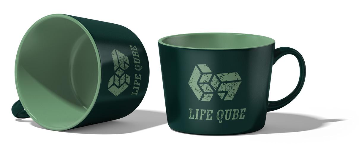
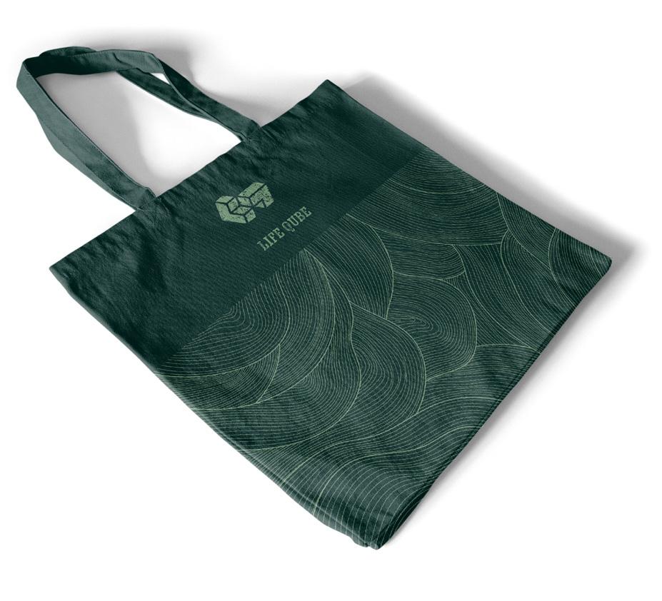
Explore the endless possibilities of incorporating our signature patterning into the brand identity with these mock-ups. Let your creativity flourish by experimenting with colours and patterns that reflect the vibrancy of each season. Inviting customers to immerse themselves in a world of endless inspiration and creativity.
Marketing Material
Imagery
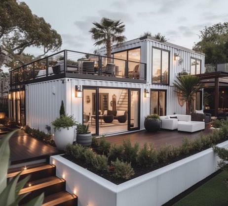
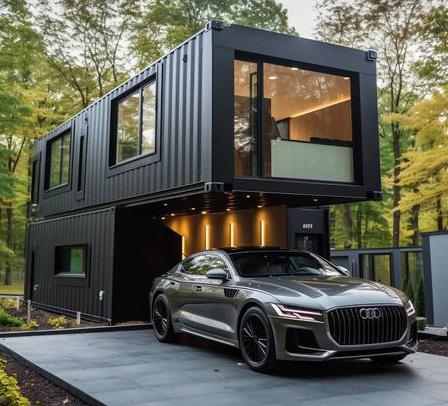
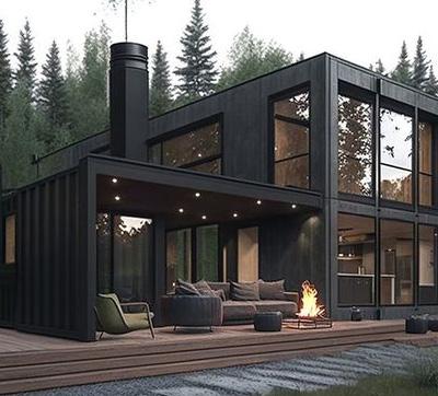
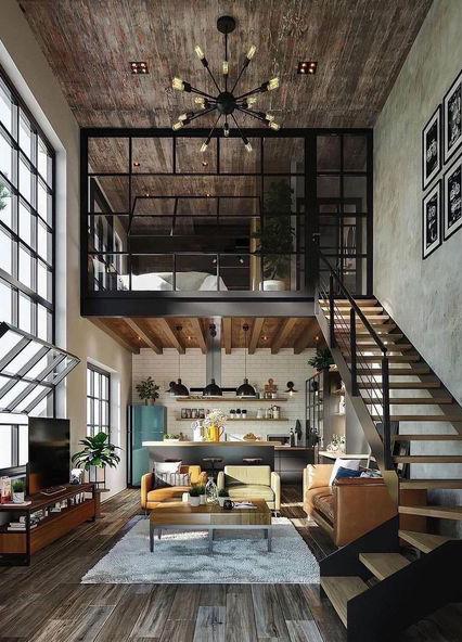
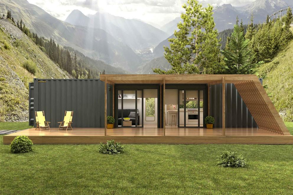
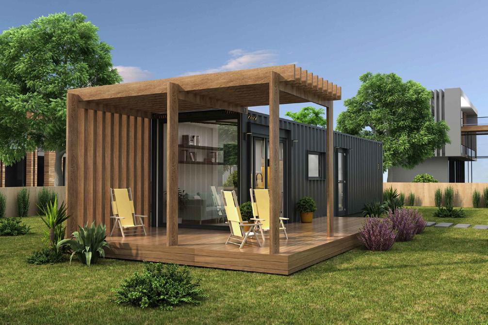
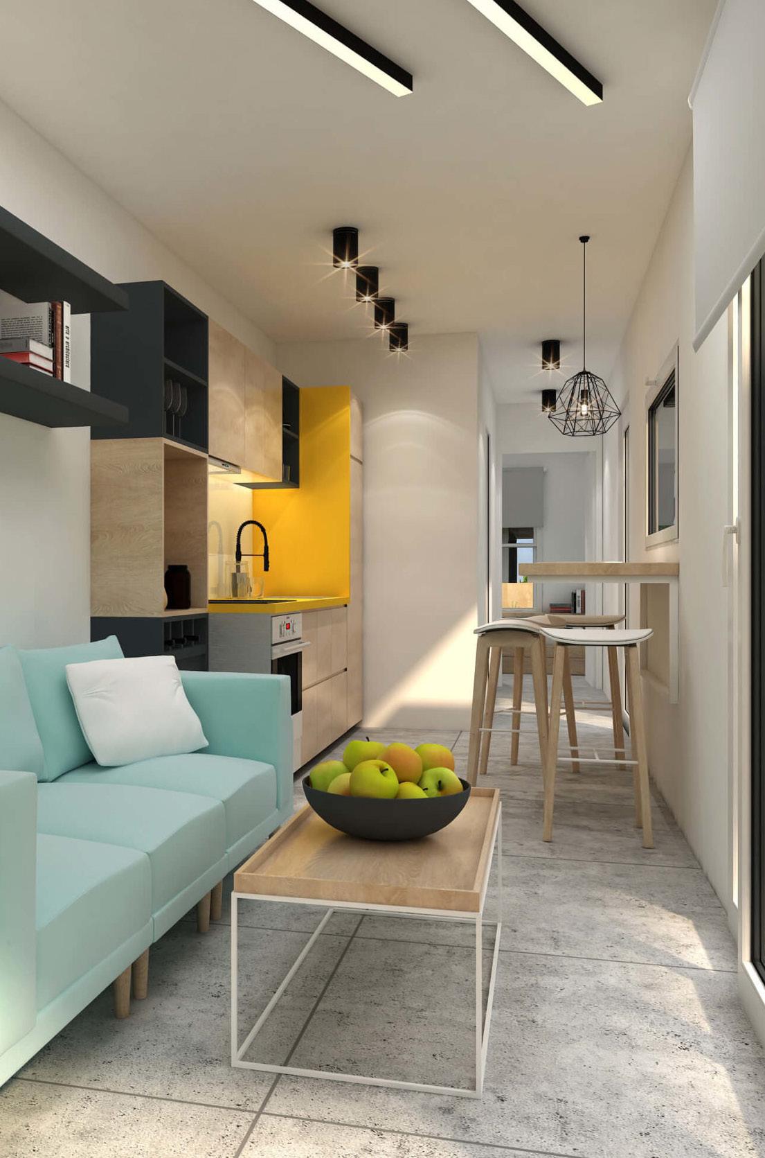
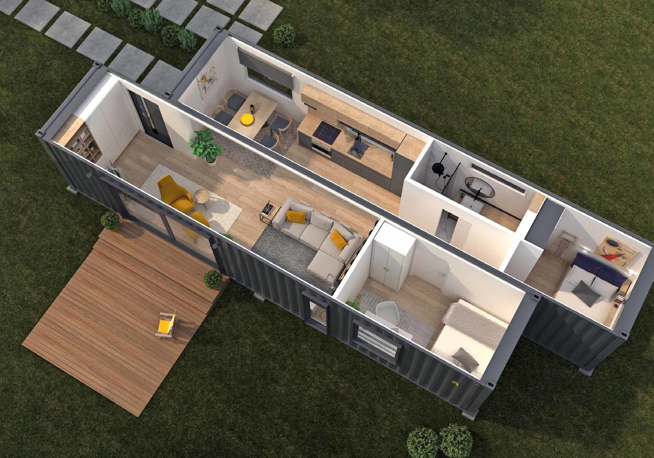
Life Qube’s imagery captivates with its realism, modernity, and distinctiveness. Our designs boast robust architecture that stands out with its bold and innovative approach. We pride ourselves on creating living spaces that not only meet practical needs but also inspire with their unique aesthetic appeal. Whether it’s the sleek lines, the attention to detail, or the seamless integration of sustainable features, our imagery reflects the essence of modern living at its finest.
We purposefully exclude people from our home images to encourage viewers to envision themselves there. While people may be used for marketing purposes, showcasing the home without them allows for a more immersive experience, fostering a personal connection with the space.
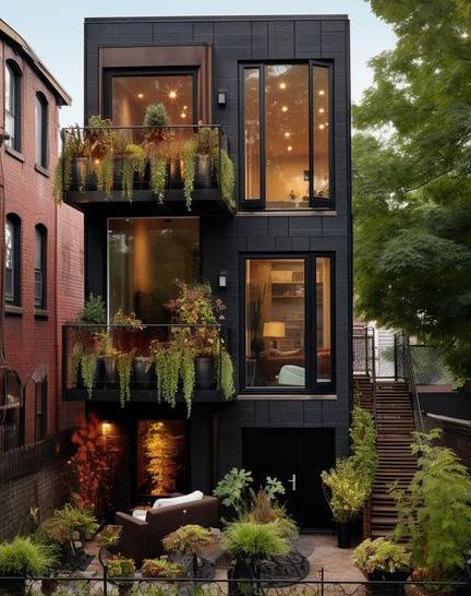
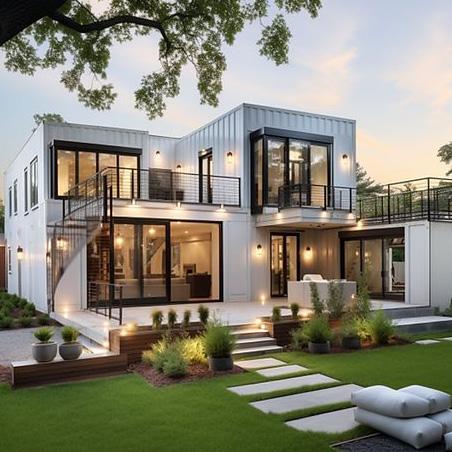
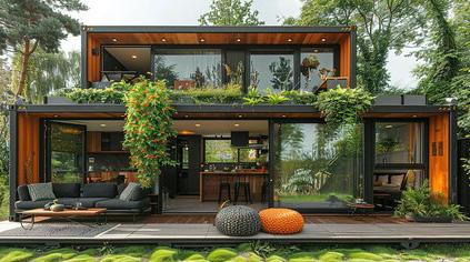
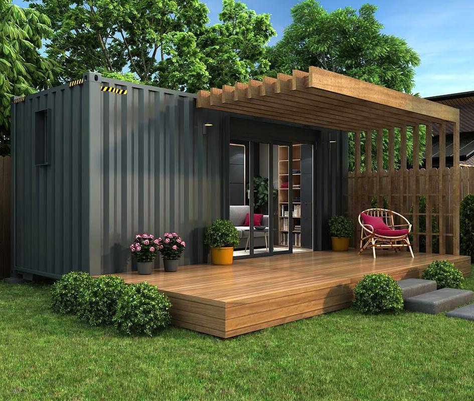
We harness the power of CGI to bring our clients’ ideas and dreams to life, infusing every detail with meticulous attention and a sense of realism that’s truly captivating. From conceptual sketches to fully realised visualisations, our CGI renders immerse viewers in a world where imagination meets precision. Each element is carefully crafted to convey the essence of our clients’ visions, allowing them to explore and refine their concepts with confidence. With our commitment to detail and realism, we transform concepts into tangible, inspiring realities that exceed expectations.
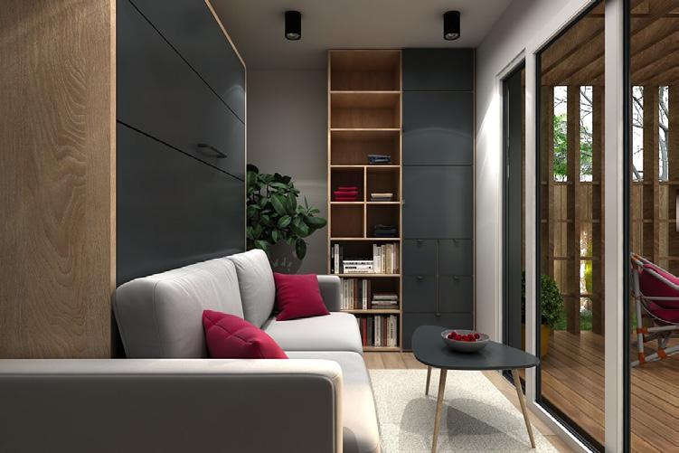
CGI
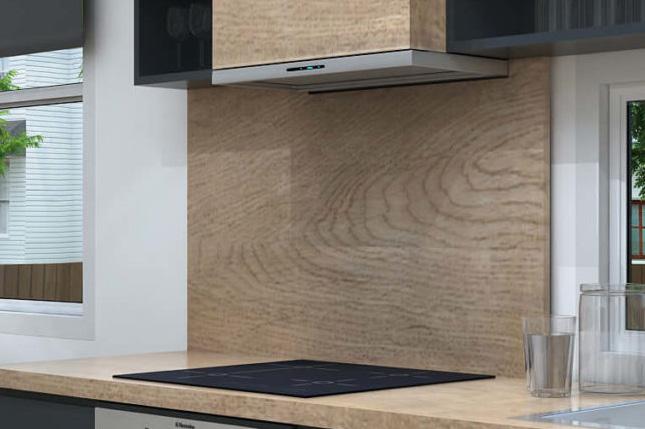
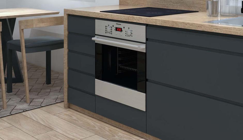
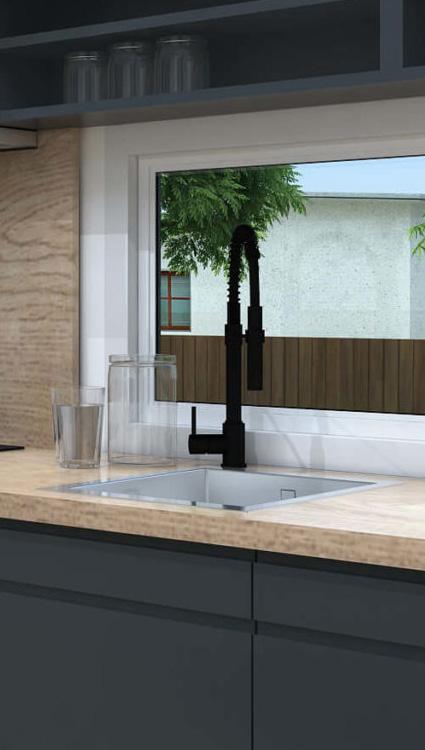
Infuse creativity into your design elements, crafting creations that captivate and elevate. Take inspiration from the intricate details of our homes, celebrating their unique features with artistry and flair.
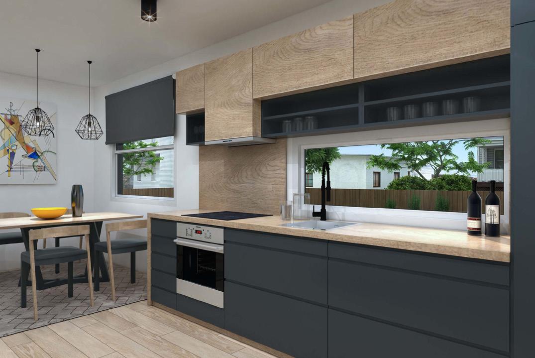
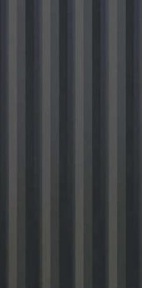
Let each design element serve as a canvas for innovation, bringing forth the essence of our spaces in ways that inspire awe and admiration.
By glorifying the details, we elevate the ordinary into the extraordinary, setting new standards for creativity and excellence in home design.
2024