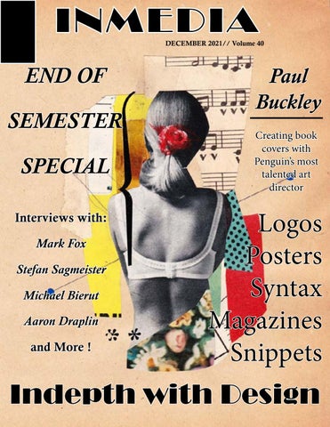
INMEDIA
DECEMBER 2021// Volume 40
END OF SEMESTER SPECIAL Interviews with: Mark Fox Stefan Sagmeister Michael Bierut Aaron Draplin and More !
Paul Buckley Creating book covers with Penguin’s most talented art director
Logos Posters Syntax Magazines Snippets
Indepth with Design
Every process has a beginning Processes for Project 1: Snippets My first snippet was, “Oh ! I was wondering that”. During my anthropology lecture, a girl in front of me had said that to one of her friends. I had never heard anyone say something like that before and thought it would make a great snippet. For my concept, I decided to draw a girl thinking about what most girls think about: relationships. To add effect to the “thoughts,” I decided to glue cotton balls along the outline of her thought bubble. My second snippet was supposed to be a photography shot based on Jeremy Zucker’s lyric “ No amount of time will change the way I feel inside” from his song Brooklyn Boy. After realizing I had no time to take pictures, I decided to go with a different snippet: “You give me butterflies.” For this drawing, I decided to draw a guy instead of a girl because guys by nature don’t like to express their feelings, and I thought it would be interesting to capture how a guy feels on the inside when he sees someone he likes. My final snippet was based on the phrase “Beautifully preserved” spoken by my Art history professor. The original plan was to capture my fish Whiskey in a way that revealed the beauty in life in a “dead” world. However, when I went to take his picture, he gave me a tough time. (Lesson learned: Whiskey does not like pictures.) Once again, I had to do another drawing. While sitting at my desk, completely mad at my fish, I instantly remembered a willow tree I used to see all the time when going to my grandparent’s house. The tree sits off by itself, so I decided to capture that in my drawing by having the tree surrounded by grass which represents “life” being preserved. The background represents an industrialized world where everything is dark and lifeless in a sense, therefore highlighting the aspect of something being “beautifully preserved.”
An Interview session with...
Stefan Sagmeister
The interview with Stefan Sagmeister was relatively brief; however, it brought a unique insight into an individual’s designer style and choices. Sagmeister is a very daring individual and is not afraid to be bold and risky. As a designer, he is passionately driven by the reactions of his audience to his work. Being a designer means putting yourself out there, and in his case, literally. He bore himself to the world not to promote himself sexually but to make a statement. He wanted to tell the world, “This is me. If you don’t like me or what I do, you can leave.” His self-confidence allows him to be more creatively diverse, meaning that no idea is wrong or too far out. Such thinking has become an advantage in the industry, causing clients to be drawn instead of repulsed to him. One part of the interview that I found interesting was his seven-year cycle sabbaticals. To combat routine and boredom, Sagmeister takes long, extended breaks to get his creative senses flowing. As an aspiring artist, I have learned that it is essential to take breaks. Sometimes the mind can become overwhelmed with the lack of ideas which often leads to artist blocks. His approach may not be what I would do; however, it shows me a unique method of gaining creativity while also taking necessary breaks.
The Art of Poster Making Project 2 Process For my quote, I chose Hellen Keller's. She had once said, " Walking with a friend in the dark is better then walking alone in the light." At first, I had created a scene of people talking about the sadness of leaving for college. I ended up flipping it because my poster was too stereotypical of a friendship poster. For my new one, I decided to go with a similar scene but portray a deeper meaning. Using a combination of my pictures and pictures online, I created the same conversation from my previous poster; however, I added another friend to the final. Only this time, I portrayed the friend as deceased. I wanted to play with the idea of an event being bittersweet. The "light" (indicated by the sun flares and sunset) represents the group heading to college while their deceased friend represents the "dark." The bittersweet part of that is they're heading off to college, which is a great thing, but it's without one of their friends. However, through this "dark" time, the remaining friends deal with it together instead of by themselves.
Putting it all together To create the roof top scene I combined three images which comsisted of a sunset I took in Arizona, friends on a roof from Pinterest, and a sun flare from Google.
Walking with a friend in the dark is better then walking alone in the light.”
Lydia Deetz and Lavender Reimagined Creating logos based off of iconic movie characters
Project 3: Creating the logo For my logo, I chose the characters Lydia Deetz, from Beetlejuice and Lavender from Matilda. For Lydia, I had drawn her entire hairstyle with the polaroid framing her eyes. However, I realized that it was too much and not simplified. For the next two weeks are so I spent hours sketching out simplified designs of Lydia. I removed her ponytail and other unnecessary details. All that was left was part of Lydia’s face in which I added her iconic bangs and a streak of red in representation of the red dress she wears at the end of Beetlejuice. For Lavender’s, I wanted to incorporate her glasses and the salamander. I originally was going to draw Lavender herself, but once again, that was too much. In the end, her design narrowed down to her glasses and the salamander> At first, the salamander curved around one part of the glasses; however, I ended up having it curve on the other side of the glasses (almost like a half infinity sign). For typography, I decided to go with a handwritten font to emphasize them as being kids.
Lavender from Matilda
Keeping Things Simple One of the hardest parts about logo making is creating a design that is simple but clear. Out of all of the projects done during the semester, this one was by far the hardest. As an artist, I’m an used to creating detailed images however for this project, i had to dial it down a notch to create a simplistic piece. To accomplish this task, I first had to figure out what stood out to me about Lydia Deetz. Her bangs and camera instantly came to mind so i decided to do a polaroid style logo with only haf her face showing. The original was too detailed for I added her entire ponytail and parts of her neck and shoulders. After i eliminating all the extra features, iwas able to come up with a a simplistc design. I took the same approach for Lavender as well. Her galasses and encounter with the salamander were insporation for her logo. I decided recreate her glasses while adding the salamander wrapped around it. Just like Lydia’s , there were some extra details that had to be removed, however when they were, the deisgn became dramatically more simpler than before. Once I got into InDesign, i was able to take my simplified designs and recreate them using various different shapes. Overall the design process was somewhat stressful but once those adjustments were made, the process becomae much easier to maintain.
“Simplicity is the ultimate sophistication” -Leonardo da Vinci
The World of Logo Making With :
Mark Fox Mark Fox's interview gave a fantastic in-depth insight into the world of logo making. As most design professionals would say, logo making is not exactly an easy task. In both the art and design world, pieces begin with a process. Fox's starts with assessing what the client wants and how they want to express their business/product to the public. While working on project three, I went through the same process. After choosing my characters, I had to decipher what I wanted the logo to say, and after several brainstorm sessions, I concluded what I wanted to project. Fox also explains that a logo will be suitable when it is innovative/original and when the forms are beautiful or well crafted. Before arriving at the final version of my logo, I had to redraw them repeatedly to get the right image. Then, in Illustrator, I had to play around with the image until the design was finalized. A perfect logo doesn't require natural talent, but one must have the patience to rework a design. Like Fox says, the ability for logo making comes with time and practice. It is not an art form that is magically made overnight.
Creating Logos With :
Aaron Draplin Logo Designer Aaron Draplin also gives insight into the process of logo making. After talking to his client, Draplin starts writing the logo's name down and plays around with it. After playing with it, he begins to make notes to indicate possible design approaches. In addition, Draplin refers to his books to refer to the simplicity of logos. He does this to define what a logo means to the world and how to handle making one. Once he defines his sketches, he puts them into illustrator and refines them again until he gets the right design. Finally, he plays around with different design perspectives to solidify which design would work in the real world. After watching the video, I conclude that he and Mark Fox take the same approach when creating a logo. A logo design must be refined again and again to get the right one. It's an extensive process however becomes easier over time and with the help of practice.
Becoming a Graphic & Digital Designer With Michael Bierut I enjoyed reading Michael Bierut's interview on his journey of becoming a graphic designer. He spoke about how he wanted to become a graphic designer through a project he did for his school's play. I related to him in the sense that I discovered wanting to be an artist in school too. Through his experiences, Bierut stated that he learned a lot about both aspects of the design world. Being a designer didn't mean having excellent design work; it also meant knowing how to work with various types of clients. Before reading his interview, I had little understanding of what it meant to work in the design world. However, after reading, I learned that designing means having good work and having communication and social skills. Also, as a designer, you have to be open to multiple ideas from others. Bierut also taught me that the work you do must be relatable and speak to the audience. After all, you never know what design piece can change a person's life.
For project 4, Syntax, I decided to go with dresses. Although it is a fundamental object, it was the first one I thought of honestly. I went with dresses because I really like clothes and often use pictures when I'm creating characters. (I have a whole Pinterest board dedicated to outfit inspiration for characters ). When starting the project, I pretty much knew what dress types I wanted to do. The hard part was getting them cut out and into InDesign; however, doing more profound observations for such a simplistic clothing item was fun. As for the wedding dress, usually, I would describe the dress in a generic sense; however, for this project, I had to dig deeper and describe the dress more explicitly using the form, patterns, lines, etc., of the article of clothing. Additionally, I decided to go with columns for the format since it would've been easier to place the dresses in instead of placing them in blocks. Overall, although the project was simple, it was interesting to look up objects and describe them from a designer's perspective.
Project 4: Syntax Syntax : The
arrangement of
words and phrases to create well-
formed sentences in a language.
Left- Finished Syntax
Creating Book Covers With: Paul Buckley While reading Paul Buckley’s interview, I learned a lot about the design world. As an artist there is a lot that one can do in the design world which includes cover designs for books. Paul states that how for every book, there is different designs. When creating a cover, there are endless possibilities on where the design could go making it one of the reasons why Paul loves his job as a designer. I relate to this personally, because I want to be in a career where it is not monotonous. I prefer to work on projects that are unique to itself instead of being repetitive. As for the creating process, when working alone, Paul tends to come up with smart ideas while having multiple versions of them. From reading this interview, I have learned how important the beginning of the design process is. The process is not always flawless, which is something I have learned with my own experiences. It takes a lot of time, dedication, and energy to recreate designs over and over again. However, once it comes together, it worth all the time invested into it. Additionally, Paul gave insight on what he looks for in potential illustrators who want to work for him. There are countless illustrators and designers he works with, so each candidate must bring something new to the table. For me, it further emphasized the importance of having a diverse portfolio while also not being afraid to create differently, even if it seems odd from everyone else’s.
“I look for stunning work and an individual voice. I look for visual intelligence and problem solving. I look for risk taking and those who clearly love what they do.”
“With books, every day, every project, I get to explore different styles of art and design, and work with some of the best artists in the world. . . it is the perfect design job.”
“So many people take design so seriously—that’s fine, but I also want to have fun with it. Th is is key; people forget to take risks, to have fun. . .
“Each book is different and comes with its own cast of characters and its own needs based on the content and players involved.”
The Final Project : Progress 5: Constructing a Magazine Our final project was to create a magazine that consisted of all the projects we had done in class this semester. Overall, the process itself was tiring and at times frustrating however, the result to me looks wonderful. For me, I wanted to go with a very simple layout. I didn’t want to over-crowd a page with too many pictures or have too little pictures. So, for each page, I added two to three pictures related to whatever subject I was discussing on that page. Additionally, I did have to adjust for the text. On Tumblr, my blogs had appeared to have a ton of wording however when I dropped them into InDesign, it turns out I had very little text. To compensate for that, I had to bump my text to nineteen and enlarge my pictures. From there, I played around with different compositions until I found one suitable for what I trying to accomplish. On the other hand, the task did require a lot of adjustments and do-overs. At one point, I even had to restart my project completely to get the design right. Out of
Process age for bookmaking article
all the projects I’ve done this semester, this one was one of the hardest yet one of the most enjoyable.