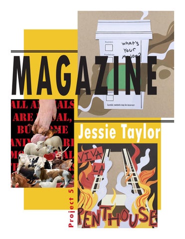
MAGAZINE P ro j e c t 5
Jessie Taylor
Reading Reflection Pages 14 - 22
#1
Project 1
SNIPPETS
As an artist who enjoys people watching and taking inspiration from the world around me, I quite liked project 1, the “Snippets” project. For this project we were instructed to creat three 8 x 8 illustrations depicting “snippets” (words or short phrases that you’ve heard that you found interesting). These snippets could be from just about anything: overheard conversations, songs, movies, etc. When doing my personal sketching for this project I was heavily inspired by college life and things I had heard while on campus (sketches pictured above and to the left). I wanted to visually communicate the various aspects of what being a college student is like, and I think my finalized illustrations portray that.
In the simplest terms, graphic design is the combination of “words and pictures to convey a message.”
Graphic designers are as much communicators as they are artists. Their job is to catch the viewer’s eye with an aesthetically pleasing or interesting design, while at the same time providing the viewer with information. For example, if the piece of graphic design in question is a book cover, the design should hint at the book genre, characters, plot, or contents of the book. Book covers, magazines, websites, posters, signs, logos, all of these things require graphic design. Contrary to what the average person may think, graphic design is an essential part of society. According to graphic designer, Michael Bierut, graphic designers require four things to execute a successful design: structure, an idea, technical skill, and style. Graphic designers must also be able to communicate and compromise with their clients in order to design something that will satisfy not only their clients, but the general public. In conclusion, the work of a graphic designer is way more than simply creating something pretty.
The first illustration I created (pictured in the top left corner) took the longest amount of time, but turned out to be my favorite of the bunch. It was based off of that classic line heard everywhere and asked by everyone: “What’s your major?” This piece was created to be a commentary on the pressures placed on firstyear students to quickly select their majors, and how this decision becomes a second label that defines them as much as their own names. However, similar to how Starbucks baristas often misspell people’s names on their cups, students often get their major wrong the first time. The piece on the right was based off of a funny joke I read on my dorm hall’s GroupMe: “Viva la Penthouse” (the slogan for our dorm hall’s pretend revolution and plan to overthrow our RM). I like it, but I feel that compared to the sketch, it looks too cluttered. The snippet on the left was inspired by a popular tik tok audio going around when the semester started: “Into the Thick of it.” In context it’s a cute song, but without hearing the tune with the words, the phrase, “into the thick of it,” could convey several different moods. In this case it implies the feeling of being aware of falling back into a depressive episode. Mental health is something a large majority of the student body struggle with. The one area of this project I had difficulties with was cropping the image down into perfect 8 x 8 squares in Photoshop. At this time my experience with Photoshop was minimal, so I wasn’t familar with the tools.
(pictured to the left) ended up being my favorite, and ultimately looks very similar to the finished poster. The one major difference between the sketch and final product is how I arranged the text behind the animals, although one thing I did keep consistent was the color sceme - primarily red, white, and black. I really struggled at first trying to execute my idea in Photoshop. I’d never used Photoshop to create anything from scratch before, so this whole process was entirely new for me. I didn’t originally anticipate how difficult learning all the various Photoshop tools would be (their functions and how to use them).
GREAT IDEAS POSTER
ALL ANIMALS ARE EQUAL, BUT SOME ANIMALS ARE MORE EQUAL THAN OTHERS
Create a poster in Indesign that visually conveys an inspirational quote through an image - that was the general assignment description for project 2. On the left is my finished product, but it took a lot of trial and error to get to this end result. Before jumping straight into Indesign, I had to accumulate a bunch of images of farm animals I found on Google for my virtual collage. Next came the hard part - arranging these images in Photoshop. Figuring out how to cut out and separate the images of the animals from their backgrounds was tricky to learn, but after a few tries, and instruction from my professor, I finally got the hang of it. The more I worked at it, the faster the process became. Lastly, I applied text in Indesign, and done! In the end, I don’t think I could be prouder of how my poster looks. For never having done anything like this before, I’m impressed at what I was able to accomplish. I spent many many hours on it, and it looks exactly as I envisioned. The triangular stack of animals is reminiscent of a hierarcial pyramid (just like I’d hoped), and the incorporated pieces of raw meat symbolize Napoleon’s view of the rest of the “lesser” animals as simply slabs of meat (objectifying them for his own personal gain).
#2
Pages 27 - 29
Reading Reflection
“All animals are equal, but some animals are more equal than others.” Choosing this quote for project 2 was a no-brainer for me. I’ve always adored the novel this quote is from, Animal Farm, ever since I first read it way back in my 8th grade English class. Going into the sketching process, I already had a general idea about how I wanted to design and compose this poster - a stack of farm animals all getting crushed under the weight of Napoleon’s (the tyrannical pig from the aforemention novel) hoof. I did a few sketches to try out different layouts, but the first sketch I did
In this week’s textbook readings we learned about Stefan Sagmeister, a graphic designer with an unconventional habit of
taking a year long sabbatical every seven years.
According to Sagmeister, his main reasoning for doing this is to prevent himself from falling into a creative rut, or what others may call “art block.” By taking off for a whole year, upon returning to his studio, he is able to come back with a fresh start, new ideas, and a desire to create. If he were to create nonstop he would fall into a trap of creating the same types of things in the same style with the same materials over and over. This is something I personally fall victim to as well. I forget to try out new mediums and stray away from projects outside of my comfort zone. This method is clearly working for Sagmeister, as the two examples of his work in the textbook are both very different and unique from one another, while at the same time being incredibly well done.
The logo plays the most important role in a company’s branding and graphic identity. And for being such simple little pictures, logos hold a lot of responsibility, a logo is, after all, “the mark that reduces all business attributes into a recognizable sign.” A few of the main jobs a logo must fulfill include...
-- Be visually, cognitively, and emotionally appealing to the public -- Symbolize the company’s mission and ideals -- Create a relationship between mark and company
With so much riding on the logo, it’s important it’s designed correctly - that’s where graphic designers come in. I found it interesting how graphic designer, Mark Fox, started his career in the graphic design world by simply creating
fake trademarks for fake companies for a whole year. This is pretty smart. Not only did
Pages 116 - 117
this enhance his creative abilities and improve his technique, without even attending college for graphic design, he was able to build a portfolio to present to potential clients.
One thing I never thought of before was that logos aren’t just for companies that sell products (take Apple or McDonald’s), but they can be for anything really, even organizations and intangible ideas. This thought crossed my mind as I read in the textbook about how the swastika became a logo for the Nazi party. I’d never
considered this symbol a logo before, but now that I think about it, it makes sense. Logos are symbols and symbols are logos. That got me wondering about what other symbols in my day to day life are also logos, and I realized that the cross is a logo for Christianity and the Gamecocks symbol is a logo for UofSC.
#3
Video Reflection
Reading Reflection
Video Reflection
Aaron Draplin
Draplin’s logo design process is similar to the one we were instructed to use in class, especially the beginning stages. Like us, he begins his thought process with nothing but pencil and paper. He churns out several ideas in just a short amount of time, each sketch becoming a bit more complex and fleshed-out than the last. When he’s come up with an idea he likes, he sticks it in Illustrator, where he plays around with shapes, which come together to form a logo. Draplin explains that the best logos are simple - just a few shapes - anything more than that would be too complicated and not as memorable. I’d have to agree. Knowing this now, I feel like my logos could be improved upon by being simplified. One piece of advice Draplin gives that I found helpful is to ensure that your logo will work in the real world by seeing how it would look on things like hats, shirts, trucks, etc. - things that people put logos on. Very rarely will a logo just be floating on a blank background. This is why it is important to experiment - see how your logo looks on different things and how it shows up on different colored backgrounds, or how it looks in black in white, or with text attached. The possibilities are endless.
As a graphic designer, it is your job to make a company look as good as possible with its logo. Make it look better than its competing companies, even if it’s not in actuality.
For Matilda, the majority of my
inspiration for her logo designs came from her signature red ribbon that she always wears in I have a lot of nostalgia and happy memories from my childhood surrounding the movie, Matilda. I hadn’t thought about this movie in a few years, heck, I almost forgot it existed. But when I saw it was one of three movie options to choose between in project 3, it was a no brainer to me one to choose, although I did watch Beetle Juice for the first time before I started sketching, just in case.
Now that I had my movie picked out, I had to figure out which two characters I wanted to design logos around. THAT was a touch tougher to decide on. All the characters in Matilda are iconic. I kept going back and forth between Trunchbull, Bruce, Ms. Honey, and Matilda herself. In the end I ended up going with Bruce (or Brucey as I like to call him) and Matilda, simply because I had the most ideas for them.
Now that I had my ideas, I stuck them into Illustrator. Figuring out Illustrator wasn’t as difficult as I expected it to be, probably because I’d already familiarized myself with Photoshop and InDesign. I still don’t have a solid grasp on any of the programs though, but I am able to work the basics. I had a lot of fun playing around with the curvature pen tool in this project. I liked how simple it was to trace my sketch, and then how easy it was to fix and smooth out lines and curves with just a few anchor dots. Overall I’m really happy with how this logo turned out. I feel like the lettering really does look like a ribbon (which was the main goal I wanted to accomplish). And of the two logos I designed, this one is my favorite. Although, I do feel like the A at the end of Matilda’s name reads as a G instead of an A.
the movie. The first sketch I did (and also the one I ultimately went with in the final project) is basically just Matilda’s name spelled out in this cursivey font, but it’s her ribbon that’s forming the word. I really liked how the composition of this sketch turned out, and I think that’s why I went with this idea in the end. All of my sketches for Brucey are some variation of cake. That’s what he’s known for. He doesn’t have too many scenes in the movie, but the one he does have is quite memorable. In his five minute scene, Trunchbull forces him to eat a whole chocolate cake as the entire school watches as a form of punishment.
P ro j e c t 3
While this logo didn’t take me quite as long as the other, it definitely was trickier to get right. I’m still not perfectly content with it - the font in particular. I struggled to get the font just right on this logo. I had to redo it multiple times. I wanted the lettering to look flowy and bubbly, like icing on a cake. But this was a difficult task to accomplish. I tried my best though, and while I’m not perfectly satisfied with the final outcome, I’m okay with it.
L O G O S
For project 5 we learned about Syntax (aspects of form, such as shape, color, composition, and texture - what something LOOKS like) and Semantics (the meaning of form - what something IS). As well as a few other concepts that derive from Syntax and Semantics, such as denotation, connotation, and presence. This project was basically just understanding key vocabularly for Graphic Design. This was a very short project - it only took me a night to complete. For the project I chose to study and compare different types of shoes. I figured shoes would be good forms to analyze, as they all share the same purpose (protecting one’s feet), but different shoes are meant for different occassions -
this is Semantics. For example, you wouldn’t wear flip flops in the snow, and you wouldn’t wear furry boots to the beach; you wouldn’t wear fancy high heels to play sports, and tennis shoes wouldn’t be an appropriate thing to wear for prom. The Semantics part of the project was easy for me, but Syntax was a touch harder. When writing the Syntax portion for the shoes, I couldn’t think of the shoes AS shoes: I needed to look at them as only forms. But it’s hard to turn the Semantics part of your brain off.
Project 4
SYNTAX & SEMANTICS
#4 Reading Reflection Page 130