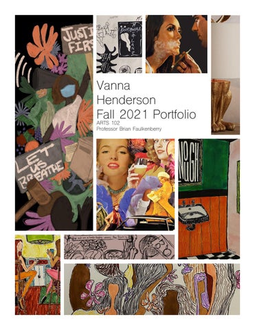
Vanna Henderson Fall 2021 Portfolio ARTS 102 Professor Brian Faulkenberry
Reflections Becoming a Graphic and Digital Designer, pgs. 16-22
After reading about Michael Beirut’s interview and how he got into graphic design, I felt very inspired to say the least. I have always been passionate about creating, and to see somebody who shares similar passions and interests work hard enough to get to the point where they can successfully live out their goals and dreams always encourages me to continue to push and grow as an artist. I also really appreciate that he can trace his interest in graphic design all the way back to a book that he came across. I found Beirut very relatable through this, because he started the same way a lot of us have started or will start, before we find out what we want “UN Stamps” by MIchael Beirut to do for the rest of our lives. Although he is very skilled, successful, and experienced in his line of work, I admire that he presents himself as someone who is humble, and still eager to learn and be surprised with what he does for a living. In my opinion this is the best state of mind you can have in a creative field, and I aspire to always have the mindset of somebody eager to learn and grow.
Becoming a Graphic and Digital Designer, pgs. 26-29
When reading about Sagmeister and his style of work, I thought about how interesting and unique it is that he makes so many risks in his career. At the same time, I think that is what makes him so successful. He makes very intricate risks in his career and that’s what I believe makes a desirable artist-somebody unpredictable and very independent with what they do, with little to no concern about the general opinion the mainstream “Banana Wall” by Stefan Sagmeister public might have. This shows through Sagmeister that it draws in attention and therefore an interest by consumers. I also admire that he doesn’t look for traditional requirements in his employees, all he wishes is that they have well-executed ideas. I find this very meaningful, because it shows that he values how passionate and creative his employees are, more than what they have or have not done in the past. This is also nice because it allows new graduates and those entering this field of work a better opportunity.
Process of “Fruit” By Vanna Henderson
Week One
During the first week of my process I planned out a sketch I made through Procreate to allow for a visual of what I plan to do on Photoshop. I also added notes to describe what I wanted to do with this project and “dump” my thoughts out so I would have them documented. I did not have Photoshop on my iPad at time so I planned on starting this process after I returned back to school from quarantine.
Week Two
During my second week working on this project, I shifted my train of thought just a little to have more “classy” women to show more of an incentive or a glamorous idea that somebody would want to work towards or “go out on a limb” for. I also wanted to have a deeper message. The “fruit” that I wanted the fruit to represent does not last forever. It is nice for a while but like all good things, it comes to an end. The fruit “rots”. To show this I wanted some fresh fruit and flowers, but also some that are old, rotten, and decomposing. I had also gone through and found some images on google I planned to edit into PNGS for mycollage, and had decided I wanted a black
background to make the color pop in the images and to show focus on only the collage. I found all the pictures by searching things such as “1970s alcohol ads”, “1970s playboy covers”, “fresh fruit”, “rotting fruit”, and “1970s makeup advertisements”.
Week Three
During week three I downloaded Photoshop on my iPad, which allowed me to create PNGs from images I found online in week two much quicker and easier with the Apple Pencil. This was the most fun part of the project, although it was time consuming and occasionally difficult. I would say my biggest obstacles for creating the PNGs were working around the girl’s eyelashes in the cigarette ad, and making the petals on all the flowers look naturally shaped. Hair was also a big deal, and took a lot of patience. After finishing these, I transferred all my images from my iPad to Photoshop on a desktop and layered the images in a way that seemed appealing to the eye. The text I chose was a simple typewriter font that wouldn’t take away from the collage, that was placed in the bottom right corner so the viewer’s eye would travel to the text after taking in all of the images.
Reflections Cont.
Aaron Draplin in his design studio Aaron Draplin Logo Design Process
Watching Aaron Draplin’s process in designing a logo helps my own process with what we’re currently working on in class a lot, because the way he teaches is very casual and easy to follow. You can see all of his process from the pen to paper to the final product, and I love how he references other designers in his work and his idea of creating a logo that is “timeless”, like the ones he researches from half a century ago. I like this idea not only because I love midcentury design, but it also shows that clever design can go a long way, 50 years in fact. There was a lot of things he brought up throughout the video I had never thought about in logo design as well, such as the fact that you want the logo you’re creating to make it seem like the company or thing it will be representing is the best there is, even better than the competitor. It was perfectly explained and it’s a good thing for me to remember when I am trying to make my work look clean, professional, and meaningful.
Becoming a Graphic and Digital Designer, pgs. 116-117
Reading about Mark Fox and how he got into logo design was helpful for me because he shares not only how he got to where he is now, but also that although you can have an eye for logo design, putting in the work and practicing takes you so much farther. I love this because I feel there is a lot of misconception when it comes to art in general. A lot of people think art is a natural talent that people are gifted with. People can be creative and have an eye for expressing it, but practice and hard work are what takes people Logo for Embarko restuarant by Mark Fox places. I feel this is true for music, theatre, and all kinds of skills people are gifted with. It was nice hearing this from a professional that has worked his way up. I also took a lot from what he said about text and image, and that although text can be very useful at times, images have the benefit of being translingual and take up less space. You can also see in some of his work he plays around with his images to cleverly include text.
Process of “Barbara and Delia” By Vanna Henderson
Week One
During the first week of this project I was very excited to get started, as Beetlegeuse has always been a movie I’ve loved and I loved the idea of representing the characters in a new way. I bounced around a few ideas for both Delia and Barbara, but I will say it was much more difficult coming up with ideas that were a good symbol of who Barbaba was because she’s well... boring. I wanted to show something that was a clear representation of who she was, but my logos got a little too obvious during my efforts. Delia is very expressive in the things she does and how she carries herself and I believe that is why it was much easier for me to design logos for her.
Week Two
During this week I chose three logo designs from my sketches and scanned them to transfer them to Illustrator. I couldn’t decide which Delia logo I thought was my better piece, but eventually decided to go with the sculpture logo because it is an iconic piece of Delia’s in the movie but also an interesting shape that you can do a lot with. This is when I began to struggle with how I could work with pure shape to communicate a message, and when I truly understood the difficulty and challenge of logo design.
Week Three
After critiques I decided to scrap the monster head logo for Barbara because of the amount of line used to make up the shape that would have been impractical if the logo needed to be scaled down. It was also rather obvious it was Barbara because it is her face, rather than an object she possessed like Delia’s sculpture. I worked with new designs that might be more symbolic for Barbara and landed on her initials mixed with the tongue and eyes from when she was a monster briefly in the movie. For Delia, I landed on a font I thought matched the logo well, converted it to an image, and bent the letters around the curves of the shape using an Apple Pencil and my iPad for more precision.
Process of “Lamp Syntax” By Vanna Henderson
Syntax (visual elements & relationships) Object is a warm gold color with a hollow cream-colored cylinder shape between two sections. Both sections consist of many lines that cover up both shapes entirely. The base of the object has many curves and rounded edges that meet together towards the bottom. The upper section of gold is made up of two small shapes with smooth edges that that turn into points.
Syntax (visual elements & relationships) Object is a light pink pyramidal shape with smaller geometric shapes in the center. There is a thin copper line of color bordering all shapes, and a matte base with small black shapes underneath. In the center there is a white oval above a moon shape with emerald lines inside in a pattern. There are three navy blue triangular shapes under this that are multiple shades of navy swirls.
Semantics: Denoation (specified) Home Decor > Lighting > Lamps > Table Lamps
Semantics: Denoation (specified) Home Decor > Lighting > Lamps > Accent Lamps
Semantics: Expression (feelings) Playful, whimsical, and artistic
Semantics: Expression (feelings) Eclectic, relaxing, and spiritual
Semantics: Connotation (associations) Novelty, millennials
Semantics: Connotation (associations) Bohemian, natural spaces, and ambient lighting
Presence (contextual) Little: In a coffee shop or private office Lots: A desk in a stockholding office
Presence (contextual) Little: Nightstand in a teenager’s room Lots: Desk at a doctor’s office
Syntax (visual elements & relationships) Object is made up of two sections, with the upper section being a white hollow shape that begins small and becomes wider towards the bottom of the shape. The bottom section is wood with alternating shades that curve up and around the shape, which gradually widens as it progresses.
Syntax (visual elements & relationships) Object is white with a rounded cylinder shape on top, following with a geometric shape that meets in the center and then moves outwards and back to the center again, to widen once more to complete a symmetric pattern. There is a small black pole shape running up the center of the object supporting and connecting the two sections.
Semantics: Denoation (specified) Home Decor > Lighting > Lamps > Table Lamps Semantics: Expression (feelings) Basic and warm Semantics: Connotation (associations) Solidity, calming, and natural Presence (contextual) Little: Adult’s nightstand Lots: A child’s desk
ions. both curves the botsmall ts.
Syntax (visual elements & relationships) Object is a light pink pyramidal shape with smaller geometric shapes in the center. There is a thin copper line of color bordering all shapes, and a matte base with small black shapes underneath. In the center there is a white oval above a moon shape with emerald lines inside in a pattern. There are three navy blue triangular shapes under this that are multiple shades of navy swirls.
mps
Semantics: Denoation (specified) Home Decor > Lighting > Lamps > Accent Lamps
Semantics: Denoation (specified) Home Decor > Lighting > Lamps > Table Lamps Semantics: Expression (feelings) Modern, minimalist, and organic Semantics: Connotation (associations) Modern art, clean, and contemporary Presence (contextual) Little: Office of a designer or art collector Lots: A receptionist’s desk
Semantics: Expression (feelings) Eclectic, relaxing, and spiritual Semantics: Connotation (associations) Bohemian, natural spaces, and ambient lighting Presence (contextual) Little: Nightstand in a teenager’s room Lots: Desk at a doctor’s office
r secand . The hat widens
Syntax (visual elements & relationships) Object is white with a rounded cylinder shape on top, following with a geometric shape that meets in the center and then moves outwards and back to the center again, to widen once more to complete a symmetric pattern. There is a small black pole shape running up the center of the object supporting and connecting the two sections.
mps
Semantics: Denoation (specified) Home Decor > Lighting > Lamps > Table Lamps Semantics: Expression (feelings) Modern, minimalist, and organic Semantics: Connotation (associations) Modern art, clean, and contemporary Presence (contextual) Little: Office of a designer or art collector Lots: A receptionist’s desk
For my syntax project, I chose lamps in hopes of
exploring a little bit behind the design of different pieces of home decor. I also am very interested in interiors and cleverly designed furniture and thought it would be fun to search for some pretty cool table lamps. I wanted some variety in my work as well, so I made an effort to find lamps that were both sleek and modern, as well as some that were creative and unique. Three of these lamps are designed and sold by Anthropologie, and the glass desk lamp by Urban Outfitters. After choosing my four objects, I removed the backgrounds on my iPad with an Apple Pencil, converted the images to PNGs, and transferred these to indesign where I added the syntax, all three semantics, and presence for each object.