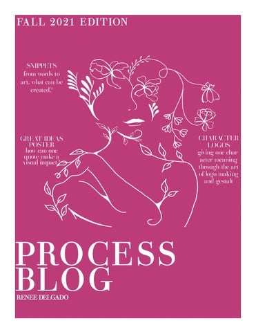
FA L L 2 0 21 E DI T ION
SNIPPETS from words to art, what can be created?
GREAT IDEAS POSTER how can one quote make a visual impact?
PRO CE SS BL O G RENEE DELGADO
CHARACTER LOGOS giving one character meaning through the art of logo making and gestalt
WHAT IS A SNIPPET? A snippet can be a few words you hear on the radio, read on a billboard, an interteresting overheard conversation, or even a line from your favorite movie. What matters is that it stands out to you. Throughout the snippets project I was excited to
self-expression. So, I thought about how people
see how I could turn simple lines, phrases, and
with tattoos do not only display works of art, but
lyrics into art. When I imagined my work while
they are one as a whole. The body itself is art and
I was sketching ideas, I saw it beyond
so is the ink. I decided while sketching
what it eventually came out to be. I
to put the human figure inside of a
have very little experience, most
frame to compete the idea of her as
of which I have forgotten, when
an artistic masterpiece. For my last
working with digital art and
snippet I changed my “snippet”
so my big ideas did not ex-
quote becasue my orhinal fi-
actly get to become what
nal piece did not please me
I originally wanted. I at-
in the slightest. I orginal-
tempted each snippet digi-
ly went with the lyrical quote
tally but I found I didn’t have
from a Deante Hitchcock freestyle
the ability to complete it the way
that stated “Like life was a game the
I had hoped. Nonetheless, I was still
cards the man in the mirrir dealt.” I
enjoying the process of being able to
do feel for this quote and I have always
get create these ideas on paper. My first idea came
seen it as a way to self reflect on my own choices
once the project was proposed, and it was a lyric
and be able to place blame and praise where and
from an unreleased Juice WRLD song called Fall
when it is due. Nonetheless, I didnt execute my
Back that said, “That’s my ambition baby, you’ll
design visually the way I wanted and so I decid-
never kill that.” This line stuck out to me the first
ed to go forth with a new quote and I chose the
time I heard it and it is one I think about daily as
saying “Growth is a Process”. This is something
it’s a self-reminder that I am in control of my fu-
I have to constantly remind myself of.
ture and actions, and no one can get in the way.
It
I began thinking about what it means to me and
my nerves and is all around something to live by
that’s when I envisioned it being protected by a
and be in rememberance of. I decided to make the
bulletproof case because that’s the way I see my
female body a growing plant to show that artisti-
T H E
A R T I S T I C
P R O C E S S
helps
O F
me
gain
perspective
and
calm
C O N V E R S I O N
SNIPPETS
own drive. My next snippet came from me just
cally and included the quoted for emphasis. You
scrolling through my phone and I saw the phrase
have to allow yourself to grow and flourish on
“I am art” and it struck me. I began thinking about
your own time, it cannot be forced. This project
it in many ways, but I would keep coming back to
definitely challenged my mind in creating visual
the art and ideas of of tattoos. I want to be a tat-
representations of these “snippets”, but I enjoyed
too artist one day and I deeply believe in the art of
every step the artistic process of the conversion.
SNIPPET QUOTES TOP TO BOTTOM: “GROWTH IS A PROCESS” “I AM ART” “THAT’S MY AMBITION BABY, YOU’LL NEVER KILL THAT.” -JUICE WRLD
process image
process image
Great Ideas Poster
CH Lo rO eO mSiIN p
At the start of this project, I was excited to see what I could visualize when working with my quote, “Choosing the lesser of two evils is still choosing evil” -Jerry Garcia. I began thinking about
O F TWO EVIL
E
the face of evil and how even though one may look less threatening it does not take away from the fact that at its
“CHOOSING THE
LESSER OF
TWO EVILS, IS STILL CHOOSING EVIL.” - JERRY GARCIA
core it is sill evil. My first design was too blocky and didn’t really give the sense of evil as a choice. At this time, I realized that this quote was more difficult to conceptualize visually than I had originally thought. I knew there was something missing that I couldn’t quite figure out that would pull my poster all together. With the help of my classmates and professor we came up with small design changes that would impact my piece’s overall aesthetic and help further create the message I was trying to relay. I consistently felt unsatisfied with my work but knew I was on the right path to making it right.
CH OOSI
CHCHOOSINGOOSIN
m Lore
N psGuTH EL md o lE oS rS sE itR
L L S , IS STIL
IN G
NG
EEV I L
I consistently felt unsatisfied with my work but knew I was on the right path to making it right. I always enjoyed my overall idea but of course I am still growing into thinking like a designer and making my ideas come full circle. I have also observed the way my confidence as a creator has changed throughout this project because I have always been very hesitant to receive feedback. I never thought my work was good enough for anyone to see. Thankfully I am learning that feedback is essential in this line of work, and I have to get over my own fears and self-doubts. I began playing around more with the composition and finally landed on a design I was proud of. My final piece includes two devilish skulls that are made to be a mask, the evil we choose. The hand pulls away the ribbon showing that when you choose evil, regardless of how it looks or you look, you yourself are becoming that choice.
C H A R A C T E R LO G O S The character logo project was an interesting way to see how I could explore a specific person as a design. I chose the characters Atreyu form “The Neverending Story” and Lavender from “Matilda”. I began by creating numerous logo sketches for even more characters but settled on these two because of their readability and my likeness of the design. I was proud of my top two Atreyu sketches but went with the one that involved his charcter personality more inherently. After my first attempt at putting it on the computer I saw it was lacking more
than it gave. I decided to rework the design to make it more representational of the medallion I was working off of for his letter initial. This made the design much more complete and add-
ing color gave it the pop it needed to final. For Lavender’s logo, I chose to combine her name with the salamander as it was moment in the movie where
she showed her strength. It began with her name partially inside the lizard but I went back and fully incorporated her name into the body and left the limbs and tail intact with the salamander shape. Adding color to this was a little more difficult for me as I did not want to be basic with a purple shade but it does in fact make sense for her character logo regardless of how cliché I thought it to be. The final products of this project were fun to see as it took much reworking but I was satisfied with the end result.
T H E N E V E R E N D I N G S T O RY & M AT I L DA
PROCESS IMAGES
FINAL PRODUCT ATREYU ATREYU
ATREYU
ATREYU
ATREYU
ATREYU
L AVENDER
REFL EC T I NG O N MICHAEL BIERUT GRAPHIC DESIGNER, DESIGN CRITIC, AND EDUCATOR
Throughout this reading I learned that graphic design went beyond the task of conceptualizing art and typography into one main idea. It extends itself into every aspect of people’s lives without them even realizing it. It is difficult work that requires thinking beyond a surface level idea and demands a tenaciously creative brain to achieve wanted results that will properly affect the audience. Graphic designer Michael Bierut helped me better understand the depth of this profession and its universal need by the public. Bierut relayed the importance of
while being in such a demanding field you must be open and accepting to others’ ideas regardless of what you as a designer may think. He says this is because you never know when one word spoken could lead to the idea and then design of a perfect piece. Graphic design works best when you are accompanied by the brains of multiple individuals with whom you can share ideas with. This type of art goes beyond the regularly assumed visual aspects of a work of art, as it applies a further purpose and function in our day to day lives.
GREAT D ES I GNERS STEFAN SAGMEISTER GRAPHIC DESIGNER, TYPOGRAPOHER
While this interview was short and direct, a lot can be learned from Stefan Sagmeister and his personal drive as an artist. He relays to the audience an attitude of him and his work as one. He is so deeply immersed in his work that he has adopted it as a part of his own body, also by literally using his body as a work of art in the beginning. This is the type of self-motivation and self-love that I aspire to have in my future career. He seemingly has no self-doubt and his strong awareness of his own confidence is what makes him such a reliable artist and business man.
One part of the interview that stuck out to me the most was his response the final question asked. He was asked what there is that he has not yet tried but would like to in the future, and his response to that was that speaking on ideas he has yet to try takes away the aspiration for him to even make an attempt. This mindset sets him apart from others and proves the intensity of his will to always achieve. While this type of energy regularly links to a more egotistical individual, his involvement of others and care for partnership makes him a very powerful creator.
REFL ECT I NG O N AARON DRAPLIN GRAPHIC DESIGNER, AUTHOR, ENTREPRENUER
This video of Aaron Draplin gives a quick tutorial and explanation of design as an exciting and rewarding career. He takes us through the beginning steps of designing a logo for a company that reached out to him. They detailed him their requests and preferences for the final piece so Draplin takes those ideas into consideration from the beginning moment he starts sketching. Draplin explains how it doesn’t need to seem so intimidating to begin putting your pencil down and how all that matters is that you get ideas flowing through simple linework and text. He enforces the idea that you don’t have to be confident in any design in the beginning because the more you rework your designs and sketches, the more ideas will come. Draplin also makes a point in
making sure you never lose past work ideas by always duplicating them to make sure you have your starting point to go back to. He uses inspiration from other designers and books he has to get juices flowing but once he has a solid idea he runs with it as far as he can and looks at it from different perspectives. It is important to think about how a logo would be displayed; on a truck, shirt, business card, profile picture etc. After completing all of these beginning phases of logo making, he explains how even when doing that so quickly there is still more to be done. The important aspect to take away is that this is a very fluid job and you have to be welcoming of the ideas you can conjure up without having a specifically set plan for the entire project.
GREAT D ES I GNERS MARK FOX GRAPHIC DESIGNER, ARTIST
In the interview with Mark Fox, he explains the importance of logos and how they truly do impact the company or person and the audience. While starting young with little experience he made a name for himself in the school of design. Throughout the interview he explains how important it is to make sure that your final product satisfies both you and your client as it is a crucial part of any business plan. He stresses that the final logo should not just be encapsulating the ideas shared in a company but it needs to pull the eye of the
viewer and fully capture it. Fox explains how there is no better way when it comes to images or typography, but logos give you a chance to create an eye-grabbing image and you should never avoid pictures over text. He finishes the interview by explaining how anyone can become a designer, you just have to workout that area of the brain and overtime it will become defined and conditioned. Talent can only take a person so far but by thinking and working as Fox did you can achieve great success.