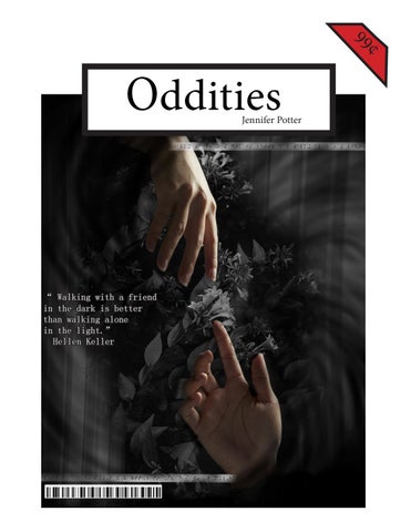
99
¢
Oddities
Jennifer Potter
“ Walking with a friend in the dark is better than walking alone in the light.” Hellen Keller
Snippets For the first project, I chose to use the words Abgelehnt and Love and the phrase “My Brain is Jello.” I enjoy making art that either has comedic value or symbolism. The word Abgelehnt is German for “denied.” I chose to put this word in a rainbow-like arc to contrast the negative meaning of the word. I chose to not make the rainbow like a normal rainbow since I wanted to stay neutral and not have any possible lgbtq+ ties.
I chose Love as another snippet. I practiced drawing the cyclamen flower and debated how I would incorporate it into a piece. I wanted to use plants with symbolic meanings. I ended up using butterfly weed flowers, cyclamen flowers, and weeping willow branches.
The last snippet is designed for the phrase “My Brain is Jello.” I wanted to share with others how my brain feels when I have spent hours working on something. I chose to draw a brain, which is not anatomically correct, suspended in melting Jello. The Jello is on a piece of earth suspended in a blank space. I leave it up to the viewer to determine what the white space it to him/ her. It could be interpreted as just a void or in actual outer space.
Michael Bierut Michael Bierut’s interview provided valuable insight into how he became a successful graphic designer. After he submitted his portfolio to Vignelli Associates, he was offered a job right out of college by a famous Italian designer Massimo Vignelli himself. It is amazing to me what opportunities can open up to an artist with a professional portfolio. Throughout the interview, Bierut answers each question professionally and honestly which I appreciate.
When asked about his time working under Vignelli, he is honest about how he struggled learning from his mentor. Instead of giving up, he persevered and continued to polish his own style. Bierut mentioned that one of his strengths is being a good listener and one of his major weaknesses is having a short attention span. I find it interesting when an artist is open about one’s weaknesses. He says that designing is like writing. One has to have a detailed structure in order to communicate a message efficiently in a design. Overall, I find Bierut’s interview to be helpful in that his answers encourage artists to be true to their unique design styles.
I chose Hellen Keller’s quote, “ Walking with a friend in the dark is better than walking alone in the light.”
Great Ideas Posterr Posterr I chose to use hands reaching for each other to represent that there can be a bond between two individuals regardless of physical distance. Her quote is included in this piece written in braille. I wanted the hands, braille, and black and white background to represent how she “saw” the world. Since she was deaf and blind, she was constantly surrounded by darkness and touch was one the ways she could communicated with others. The final piece with have a stronger vignette than the draft.
Stefan Sagmeister Stefan Sagmeister is said to take year-long sabbaticals to leave projects that he has started to his assistants to pursue new ideas. This is a new process of creating art that I have not heard of before. I knew artists have hired others to help them finish their artwork, but I have not heard of a year-long break. An interesting part of the interview was the topic of his studio. He apparently has a small studio compared other artists. He says that having a humble studio helps him keep costs down. This fact surprised me a little since he could probably afford a larger space. I found the most memorable part of the interview was the topic of his workers. I figured that his workers could not claim any credit for the artwork they helped him created, but I was wrong. His workers take credit for the jobs that they complete.
Logos
Lydia Deetz is an observant, caring, and lonely individual. She is often seen dressed in black and physically separated from others. Her main hobby is photography which enables her to discover the discover the Maitlands were deceased. I chose to stick with the camera theme in her logo. I experimented with placing her first and last initials in the camera body. The bottom of the camera forms an L for Lydia, and the lens forms a D for Deetz. After changing the type of camera body from a Cannon to a Polaroid, I am confident that the final logo design fits her perfectly.
The font I chose for Lydia’s name is Perpetua Tilting MT Bold. I chose a simple and delicate font to compliment the camera body. The font is fitting for Lydia since she is quite feminine in how she dresses and acts. The font can be a variety of sizes and still be legible.
Beetlejuice is a selfish and toxic individual who uses the living for his own gain. Keeping that in mind, I chose to continue with the death theme in his logo. I tried several versions of a gravestone attempting to make it both a gravestone and a J. I ended up choosing a coffin shape instead of a gravestone since his coffin had to be dug up to release him. I chose the snake to represent his sleazy personality while also serving as an abstract B.
The colors green and black best suited his logo. The green alludes to his hair color, and black alludes to his death. Beetlejuice's name is typed in Metal Mania font. I wanted to choose a font that was bold and spooky. After manipulating the individual letter shapes, I am confident that it reflects his bold and unstable personality. I am confident that this font compliments the rest of the logo.
Making Logos After reading “Making Logos and Marks”, I have learned that the meaning of logos can change. The example that was used was the history of the swastika. It was originally a symbol of good fortune before the Nazi party used it as their own. It is strange to me how people can steal symbols and forever taint their meanings.
...the
meaning of logos can change. Mark Fox offered his advise and process on creating logos in an interview. He started off as a printer’s devil and continued to surround himself with artists. After building up his portfolio by creating fake logos, he was able to start his logo design career with Michael Schwab. Fox focuses on creating logos that are original and hold one’s attention. He believes in starting a logo from scratch and developing it into a logo with pleasing forms. A strong logo can be viewed multiple times and still be eye-catching and pleasing to look at. Another designer, Aaron Draplin also offers his advice on creating logos. In a short video, Draplin briefly shares his process of designing effective logos. He first gathers information about what the logo is for and what audience the client wants the logo to reach. He often goes back to his collection of books to study old designs that have been effective. After gathering information, he will sketch down his thoughts and early designs. He transfers his sketches into Illustrator and continues to refine his ideas. When designing a logo, he stresses the importance of trying to put the logo onto different colored backgrounds. The logo is strongest when it will fit any color background and font color.
Syntax and Semantics My favorite vodka bottle design is the Reyka vodka. I find that the labels, font choice, and color scheme to be the most visually appealing. The visual weight and thickness of the body compared to the thin neck makes the vodka brand itself seem like a reliable/quality product. The fact that the word Iceland is embossed on the bottle shows that the brand takes pride in the origin and quality of its product.
For this project, I chose different types of vodkas. The four that I chose are unique from each other while sharing the common theme of a clear glass bottle. Syntax (visual elements & relationships) Simple form with the neck of the form having about equal visual weight with the stout body; the word Iceland embossed just below where the neck and body meet; the neck is sealed with a cork; the labels used on the neck and body of the product are simple and clean designs; the color scheme is greyish white, black, and orange Semantics: Denotations (specified) Drink>Alcohol>Exotic Vodka Semantics: Expression (feelings) Desirable, Sophisticated
Syntax (visual elements & relationships) Small clear form with a short neck closed with a silver cap; Simple black font is used; brand seal printed on in a silver/ gray color; 5cm huntsman spider positioned inside the liquid
Semantics: Connotation (associations) Shared: Premium vodka Specific: Reminds me of one of my close friends who loves Iceland Presence (contextual) Little: at a restaurant, at a wedding
Semantics: Denotations (specified) Drink>Alcohol>Medicinal vodka Semantics: Expression (feelings) Exotic, off-putting Semantics: Connotation (associations) Shared: Unique/medicinal vodka Specific: It looks like either a vodka bought for medicinal purposes or for the novelty. It reminds me of those people who try unique
foods
Presence (contextual)
Little: medicinal settings, novelty situations
The second vodka that interests me is the spider vodka. Although it is slightly off-putting to me, I would try it under the right circumstances.
Lots: in the average person’s home bar, at com-
The Smirnoff vodka seems interesting, but I am not drawn to it as much as the Absolut vodka. Overall, I am happy with my vodka brand choices. I think that each one adds both visual interest to the project and that each one has advertising appeal. Syntax (visual elements & relationships) Clear glass with silver cap; the overall form is simple with a ring of glass around the bass of the neck; a seal with the portrait L.O. Smith is stamped just below the base of the neck; the text is black and blue; the font varies from a cursive/calligraphic font to a bold/box-like font Semantics: Denotations (specified) Drink>Alcohol> Common Vodka Semantics: Expression (feelings) Common, unique, choice Semantics: Connotation (associations) Shared: Simple bottle design for a premium vodka Specific: Reminds me of a vodka I would find at college party Presence (contextual) Little: at a bar or at a college party Lots: at a formal event or among an older audience
Syntax (visual elements & relationships) Simple form with the body being quite tall in proportion to its neck; the neck is wrapped in green foil or plastic with a series of crowns and white text with gold borders wrap around the base of the neck; color scheme of green, white, and gold with black accents and outlines; on one side of the form the brand name is in a banner of green and gold placed towards the top of the form; in the middle of the form there is a green apple design with a description of the product; the name of the product is written twice each in different fonts Semantics: Denotations (specified) Drink>Alcohol>Flavored Vodka Semantics: Expression (feelings) Intriguing, unique Semantics: Connotation (associations)
Shared: Common green apple vodka
Specific: Seems like a vodka I would try with my friends
Paul Buckley Paul Buckley is a designer for Penguin Books. He directs the design of book covers and is in charge of a staff of 25 people and countless freelance designers. When asked about his methods of creating his designs, he says that he basically gets the general idea of what the client wants and creates something to show them. He first thinks of different designs and hopes that a strong design begins to form. If he cannot think of anything, he just submits something to the client for critic.
When asked what he looks for in an artist, he responded by saying he looks for a strong portfolio, risk taking, and overall nice people. I find this part of the interview helpful in that I can see how other people view things and what they look for. I understand that nice people are easy to be around and make collaboration easy. I still wonder about the “not so nice” artists. I wonder what becomes of them since people tend to like superficial kindness and adherence to societal norms.
After reading this article, I have learned that being a graphic designer is basically working with people and figuring out what they like. One can have his own personal style, but at the end of the day the client needs to approve the design. When designing for the client, ideas may come immediately, or they may not. Buckley mentioned that they sometimes will read the books that they are going to design a cover for in order that the design be relevant.