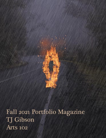
Fall 2021 Portfolio Magazine TJ Gibson Arts 102
Great Ideas Poster!! I
really wanted to open
the discussion of “forced identity.” I wanted to convey a sense of not belonging and standing out in an environment that doesn’t fit the subject. The idea of the panda really sparked my interest because of how different it is when compared to other kinds of bears. I really wanted to put an emphasis on that contrast. I am glad that I went with the idea of a grizzly physically changing his appearance to fit in rather than having an actual panda standing out in a world of Grizzlies like my original idea suggested. I’m pleased of the creative process of this design and the evolution of the concept.
To be yourself in a world that is constantly trying to make you something else is the greatest accomplishment. -Ralph Aldo
Reading Reflection 1 Michael Beirut Interview
Beirut separates having
knowledge of graphic design from being a graphic designer. I love this distinction because it puts the focus on the creator and the act rather than the just the art. Beirut mentions the complications that comes with working with advanced clients and the importance of being a good listener as a designer. The ability to go into a project with an open mind and listen for ideas and inspiration cannot be taught by reading a book. These are traits that are developed with time and experience in the field. I relate to Beirut in many ways, especially with his biggest weakness being a short attention span. Sometimes I struggle to stay focused on one project over a period of time. However, seeing a successful graphic designer go through similar challenges is encouraging because I know that I can overcome my weaknesses and become successful as well. I enjoyed the interview as it was very insightful and relatable.
SNIPPETS!!! American Exceptionalism
Lit in the Rain
The first snippet was meant to visualize “American Exceptionalism” and the idea that America is exempt from criticism and can’t acknowledge its flaws. The initial intent was to show that America was actually removing the “blindfold” of extreme patriotism, symbolized by the flag. However I decided to go with the visualization of American Exceptionalism itself, the Statue of Liberty holding a gun, a book of exceptions, an American flag blindfold, and a white robe to symbolize the country’s supposed innocence.
My third and final snippet was a combination of multiple song lyrics/ albums that ultimately had the theme of a flame being lit despite a rainy day, or continue living life even though the world is burning around you. The most relevant lyric that describes the final snippet is “momma said you’re playing with fire… but you don’t know about this flame, it’s lit in the midst of a rain of being addicted to pain.” I think my final snippet was my favorite and was the
Bound by Nature
The second snippet was an extension of my original “rhythm of nature” drawing that was presented in class. I flipped the theme to fit the main concept of being “bound by nature.” I chose to use vines and thorns to represent chains and a rose to symbolize a padlock in my final drawing. This was maybe the most challenging snippet as it went through a lot of changes and conceptual tweaks. I also decided to draw the snippet by hand which is something that made this one that much more intensive.
Reading Reflection 2
Stefan Sagmeister on Being Self Motivated
Stefan Sagmeister’s main message was to “seek discomfort” and don’t be afraid to take risks. I honestly liked his answer to the question, “what do you look for in hiring an intern?” His answer, “good ideas well executed” is a very simple yet intriguing philosophy in the artistic world. There is no right or wrong. No good or bad. There is only effective and ineffective. This is something that I will keep in mind when working on my own designs in the future.
Character Logos!!
Lydia Deetz
Lydia Deetz logo went from through a lot of changes, most that were on the fly and never got to see
pencil and paper. My original idea for Lydia was a camera with her signature hat placed on it, with a spider coming down from it. The significance of the spider is Lydia’s facination for creepy things and her quote, “I could live here,” when she first saw a spider in the house. My second idea was playing around with the hat, giving it stripes that resembled those of Beetlejuice’s suit. The major changes came when I got the idea of having an actual silhouette of Lydia in the logo, using typography as the main logo instead of just including it. My idea was to have Lydia’s silhouette be the recognizable element that made the logo stand out. The silhouette is captured from her “jump in the line” dance in front of the stairway. I also had the idea to incorporate the rails of the stairway in a way that resembled beetlejuice’s striped but that was not effective and ultimately was unsuccessful. wanted Lavender’s logo to really capture some of her most iconic moments in Matilda: capturing the newt and being just as smart as Matilda. I wanted to show off her intelligence by having the logo be very clever yet simple. My first idea was having the newt spell out Lavender’s name. I believe it was clever and effective, however it must have not been very original as I noticed someone doing a similar design. My next idea was having a pair of glasses and a book opening, having the pages spell out “Lavender.” This also did not work as warping the name the way i wanted was very hard to do on illustrator. My final design was a jar with the newt sitting on top of books. It was eventually simplified to a newt crawling on the books. I used that particular typography because the letters had “tails” on them thatl looked like the newt’s.
Lavender
I
Mark Fox The Mark Maker
Mark Fox’s interview was very inspiring. His mindset is what stuck with me throughout the reading. From him admitting to never studying design in college and spending an entire year building a portfolio to finally getting a job with Michael Schwab, his grind is inspiring. My favorite quote from him was him breaking down whether or not creating trademarks was a talent or a learned skill. He says, “Innate talent is only a benefit when there is a continual application of that talent.” That is a powerful line that speaks on wasted potential. If you have a talent, it will only take you as far as you allow it.
“I strive to create trademarks that don’t simply identify but that pull the eye and hold it, that reward repeated viewings.”
-Mark Fox
Aaron Draplin Video Reflection Aaron Draplin really broke down the process of making a logo. He first started off by simply writing the name of the company. He discussed the process of an effective logo design is the same, no matter the era. His design process is the same as the one we used in class, proving that it is effective for any level of graphic designer: beginner, intermediate, or experienced. What I got from this is that no matter how experienced you are in graphic design, no one is an expert and the process is the same for all levels.