ARTS 102 Portfolio
Brianna Smalls
Project 1 Snippets
The first snippet comes from th Disney movie, UP. Within this movie, the thought of adventure is always lurking around the corner. With this being said, this snippet illustration shows common items that can be used for an adventure. These items include a compass, telescope, globe, and backpack. In the background, there is a mountain with a waterfall. If you look very closely you can see footsteps which show you a path. The footsteps are not fwully colored in. This represents that the person going on the adventure can either follow a predetermined path or create their path. The second snippet that I choose to design is from the saying “You miss 100% of the shots you don’t take!” This saying reminds me of the saying quitters never win. With this snippet depiction, I decided to draw an archery competition where one of the competitors doesn’t take their shot. The winner of the competition receives a trophy while the loser receives nothing. Three blasts on the board signify that the game is over and that it is too late to take any more shots. Opportunity only comes once and sadly, the competitor did not take the opportunity and because of it, they lost the competition.
The third snippet that I chose to design came from the famous pop singer, Ariana Grande. I can recall listening to her music a few days before the project was due and the song, No Tears Left To Cry came on. I thought that this would be a great snippet to illustrate because of the emotion that I could draw. With this drawing, I illustrated a girl crying so much that she formed a lake. Within the lake, there are people on boats fishing and sailing. This portion of the illustration signifies life going on as you may think the world around you is crashing down. This is my favorite of the three snippets. In the end, I think that I did the best that I could. With these snippets, I tried my best to illustrate how I interpreted these sayings. Each drawing had its own concept that I tried to follow and relate to a certain theme. I realize that I may not be the best drawer. But as the saying goes, “You miss 100% of the shots you don’t take!”
Micheal Bierut Interview Reading the interview with Micheal Bierut I believe that he made some very good points. Before beginning this class I had no idea what a graphic designer does. Reading Bierut’s interview, I love how he was able to put into simple words his definition of a graphic designer. At the beginning of his interview, Bierut talked about how he knew that he wanted to become a graphic designer. Even though I am not an art major I can relate to Bierut because my experiences in school helped to influence my major in college. What I happened to find the most interesting is how Bierut describes how he got to work for Massimo Vignelli. With this, I thought about how connections you make in college can help you get a career later in life. These experiences can be life chaning. Bierut describes his experience as amazing.
While reading the interview questions Bierut brings up a good point. What I didn’t realize was how close writing and designing are core-related. Bierut describes it as they both need a structure, idea, and technical skill to execute the idea. Overall I enjoyed Bierut’s interview. In his interview, it seems that he was successfully able to talk about his journey in graphic design. Bierut also successfully discusses his strengths and weaknesses. I think that being able to talk about your strengths and weaknesses shows that you are willing to adapt and overcome any obstacle that may come your way. Now that I know a little about this famous designer, in the future I will look to see if I recognize any of his work.
Project 2 Great Ideas Poster For project 2, I decided to create a poster that would convey Saint Augustine’s message that “The world is a book, and those who do not travel read only a page.” With this poster, my first idea was to do a globe sitting on a bookshelf with other books. The globe would display readers flying off to destinations around the world on books while others who weren’t reading were still on
Oh the Places You’ll Go!
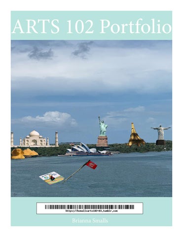
the ground. With feedback, I learned that for this project I should step outside of the box. One commenter even said that my drawing was too literal. I took all of this feedback into consideration and decided to go back to the drawing board. I know what I wanted to portray but I still had difficulty with bringing my idea to life. It should also be noted that I had a little difficulty getting accustomed to Adobe Indesign and Photoshop. Before this class, I have had no experience with this software. With patience and trial and error, I was able to navigate the software. The same can be said with my project design. With more time and thought I came up with an idea. I decided to do a person being stoped by an obstacle. With this perception, I was able to display a man on a boat not being able to get to the good side of the island because his boat is sinking When the second critique came around I had an idea developed, but there was still more that could be done to better portray the quote. In my first image I had a man sitting on a sinking ship. WIth my feedback I change my sinking ship to a sinking book. In the image, the “boat” is Dr. Seuss’ book titled “Oh The Places You’ll Go!” I believe that it’s a little ironic because the man is not able to go anywhere because his boat is sinking. On the island, there are all types of famous landmarks such as the Eiffel Tower, the Taj Mahal, and the Sydney Opera House. With these landmarks, I tried to choose various structures from all over the world. In the end, I was able to overcome my inexperience with Adobe software. I am proud of my finished project. So much thought went into this project and I am happy with the finished image!.
Stefan Sagmeister Interview You are known for unpredictability. What is it that you haven’t tried that you’d like to? do? “I have found that it is not so helpful to talk about things I have not tried yet, as the act of talking about it removes some of my desire to actually do them.”
This week’s reading came from an interview with Stefan Sagmeister. Sagmeister is a New-York based graphic designer and international speaker. In his interview, Sagmeister talked about his self-motivation and his process of stepping out of his comfort zone. Sagmeister mentions that every seven years he takes a sabbatical to be able to come up with new ideas. I love how Sagmeister realizes that sometimes you need to step out of your old environment into new surroundings so that you can have originality. Reading the interview, I think that Sagmeister can be considered a spontaneous person because of how he implements all of his ideas (especially the card design). At the end of the interview, Sagmeister talks about how he doesn’t talk about any ideas that he hasn’t tried yet. He says that “the act of talking about it removes some of my desire to actually do them.” I think that Sagmeister says this because the more you talk about things that you haven’t done yet, the more likely you are to convince yourself that it can’t be done or that you can’t do it. I think that we can all learn something from Sagmeister’s interview. Such as sometimes you have to step out of your comfort zone to get to the next level. Sagmeister has found out how to self-motivate himself. Like Sagmeister, everyone should be able to find something that helps them to motivate themselves.
Mark Fox Interview Overall, I think that this reading brought awareness to home important branding is and how it plays a part in businesses marketing. At the beginning of the chapter, it talks about branding through creating a trademark or logo. In this section, there was a huge emphasis on how important a logo is. I completely agree with this because logos make companies recognizable to the consumer. A recognizable logo plays a major part in company branding. Major corporations such as McDonald’s, Instagram, or even Nike all have unique branding because of their logos.
In the second part of the chapter, there is an interview with a designer by the name of Mark Fox. In his interview, Fox talks about his work and his process for creating these various logos. Fox says that he strives to create trademarks that are appealing to the eye. In the reading, there are various examples of some of Fox’s work. In the interview, Fox makes some great points when he answers the question, “Do you think trademark and icon making is an inborn talent or a learned skill?” What stuck out to me the most was Fox’s comparison of skill. Fox says that “Innate talent is only a benefit when there is a continual application of that talent.” I think that this is something that we can all use in our daily lives. As the saying goes, “use it or lose it!”
Project 3 Character Logos
With this project, I was honestly first puzzled on how I was going to produce a design for these logos. I had previously not seen any of the movies recently, so it was hard for me to think of something. The day after we were given this assignment, I watched the movie Beetle Juice to get some inspiration. While watching the movie I wrote down some of the unique things that I noticed about all the characters. After watching the movie, I looked at the list to find the two characters that I had written the most about Lydia and Beetle Juice. What stuck out the most about these characters was Lydia’s love for cameras and Beetle Juice striped suit and green hair. With these characteristics, I made 8 designs for each character. From these 8 designs and with feedback from the class I was able to choose 2 design that really fits these characters’ personalities. With my designs, I tried to portray the character’s personalities in a way that was unique to them. With Lydia, the focus was her camera. This is because
throughout the movie she can always be found snoop ing around with it. For Beetle Juice, the focus was his green hair and his striped pattern suit. This is because the black and white stripes are unique to him. I also included the striped sandworm in the design because at the end of the movie he is eaten by the sandworm. In the final design, I was able to implement a design
that I am proud of. With Lydia’s final design, I made sure that her camera was made from her initials. In the corners, the Ds are painted red to represent her red dress. With Beetle Juice logo, I made sure to include the black and white stripes and the eye-catching green
hair color. From start to finish this project was a little challenging. I am glad that I was able to create a design that I feel best describes these characters.
Aaron Draplin Design Challenge Listening to this 16-minute-long video, I think that the narrator made some good points. Aaron Draplin is the owner of Draplin Design Co. In this video, he shows the viewers how he can come up with a design for a company and the different ways that these logos are versatile. Draplin starts by showing some of his previous designs which include logos on badges and pins. Draplin had received a request to design a logo for a concrete company. With this, Draplin begins to talk about how he likes logos that are universal because they can be used anywhere and at any time. Through viewing this video, I was able to see an example of how logos are created. With every good logo, there are a few things that must be had. These things include the ability to duplicate the logo, change the logo size, and ability to be placed on different items. In the video, Draplin can create a universal design that can work for the concrete company. The steps for creating this logo include starting with a foundation, showing context, creating a design and rebuilding it, using colors that are out of the ordinary, saving every step of your design, and last but not least make sure that your design can be placed different ways. In the end, this video gave me a better understanding of how logos are created. Watching this video, I was able to implement some of Draplin’s main points into my design.
Project 4
Syntax and Semantics At first glance, this project seemed like it was too easy. After investigation, I learned that this project is not as easy as it looks. From picking images that were visible enough to be seen to creating very detailed descriptions. This project gave me a run for my money. Even though we could choose any image, I decided to choose dresses because I felt that I could describe these objects the best. I do have to say that it took me a while to pick some of these images because of the quality of images that I could find on google. After I picked my 4 images, I made sure to crop out the background and the mannequins that the dresses were on.
When I started to describe these objects, I tried to use words such as rectangular, circular, and narrowing. This is because I wanted to describe the shape and the flow of these dresses. With the connotation, I wrote about events where you would probably see these items to. When it came to describing the presence I used situations where you are mostly likely to and not to see these items. Overall, I enjoyed describing these objects. I think that doing this project has helped to make me stop and not just look at these items as objects, but to see bigger things such as shape and design.
w