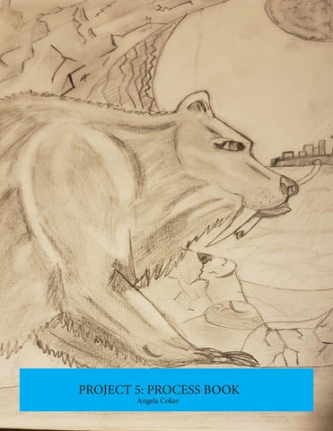
PROJECT 5: PROCESS BOOK Angela Coker
Project #1 For the first project we had to create based on three snippets of conversations we had heard. For my first snippet I used “Never tell me anything about moose again.” Which was said by my former roommate. After I had returned from a trip to Tennessee and told her about the elk I saw. She looked up pictures to save of them and accidentally included one of a moose. After I explained the difference, particularly the height of moose she said what I would use as my snippet.
“Never tell me anything about moose again.”
For my second snippet I was first inspired by Professor Faulkenberry when I was explaining ideas I had for the project. He mentioned the bodies of Pompeii which aligned with a thought I was working on relating to how remains were once living people. The snippet I used was a line from the song “In The Woods Somewhere” by Hozier. The line “I clutched my life and wished it kept” was a thought I feel people in that event could have had particularly as they embraced their loved ones to try and protect them.
“I clutched my life and wished it kept.”
My final snippet was similar to the second in relating to history. “Wherever you go something has before” was a thought I often had at my parents house when seeing deer tracks in mud in their yard. Instead of painting a canvas I painted a plank of wood to resemble a river bank. Then I made silicone molds of the feet of toy animals I had and layered them to give an appearance of every animal having been there at a different point in time
“Wherever you go something has been before.” Michael Beirut on being a Graphic designer: Reading Response I found Michael Beirut's interview about his work in graphic design very interesting. The beginning answer connects to how many people feel about art, they start out with a vague interest through album covers and art museums that eventually progresses to be more focused. As someone who has never had much experience with the professional world of graphic design I also found the descriptions of workplaces and environments to be interesting. Particularly the shift from the more rigid environment under Massimo to the open plan independent work with Pentagram. Pentagram also sounds very different from how I had initially thought of a graphic design workplace. Beirut says that it is not the place for seclusion and quiet work on one project. Instead it requires interpersonal skills and the ability to multitask. I respect his acknowledgement of his ability to listen as a strength along with pinpointing his weaknesses.
Project 2: Great Ideas Poster I struggled on the second project trying to find the right quote to use as the basis for my poster from the list we were given. My initial choices did not work out until I finally settled on the John Cleese quote of “If God did not intend for us to eat animals then why did he make them out of meat?”. For my poster I thought of taking the view that humans are also animals and made of meat and so other animals could see humans in the way humans see them, as food.
“If God did not intend for us to eat animals, then why did he make them out of meat?- John Cleese
Stefan Sagmeister On Being self-Motivated: Reading Response After reading Stefan Sagmeister’s short interview on being self motivated I was left with the feeling that although he has done revealing art (including his own nudity) he is far less eager to reveal his thoughts or process to his art. He mentions a very small office studio and does not elaborate on hiring criteria he uses. However I do agree that at times talking about a future project can less your willingness to do it. For me it is fear that the project will not live up to the expectation of other people while for Sagmeister most of his art relies on “shock value” or subverting expectations that requires a lack of prior knowledge of the art. He also makes a point to say that he avoids boredom and routine with his year long sabbaticals every seven years. I think this thought process is important for artists as burnout can happen very easily in creative fields.
Project 3: Character Logos For the third project we had to choose two from a list of characters from three different movies: Matilda, Beetlejuice, and The Neverending Story. I chose to make logos for Atreyu and Gmork, both from The Neverending Story.
For Atreyu’s logo I used his horse Artax as the main Component of the letter A. In the movie Atreyu is influenced by his relationship to Artax and their relationship helps Atreyu in his character arc. After entering the Swamps of Sadness Artax drowns and his death leaves Atreyu alone and without his best friend. This leads him to start to be consumed by the swamp as well and to see his journey in a more bleak way. After Artax is revived at the end of the movie he is shown with Atreyu again signaling that all is again right with the world of Fantasia.
Gmork is a secondary antagonist of the movie who is only seen briefly and the only time he speaks is just before his death at the hands of Atreyu. In his final scene Gmork states that he is a servant of the Nothing and does this job because without Fantasia people are easy to control and he wants that power for himself. The logo I made shows Gmork holding his name between his teeth in a way similar to how I imagined he would grab the power he wanted from the Nothing.
Mark Fox The Mark Maker: Reading Response In his interview Mark Fox explains some of the history of logos and the process of creating them along with his own professional journey. I liked that he openly said he built his portfolio through creating logos for companies he had made up which got him more professional work. He also explained the origins of the word logo as coming from history, specifically the words logograph, logogram, or logotype. Although what he creates are also called logos he prefers the term trademark as it is a more concise term referring to one smaller element. I also like that he gives direction on what makes a good logo such as it being visually pleasing.
Aaron Draplin Logo Challenge Response
In the video Aaron Draplin tackled a logo design challenge and walked through his process of logo design. I thought his methods made a potentially daunting task seem easy with his rapid succession from sketches to digital work to mock ups of shirts and business cards. He also had a very loose interpretation of what made a good logo or a good design to build off of. He basically made many different iterations of the logo and chose based on which ones felt more “right” to him. I liked that he pointed out how working independently can be both good for the designer as well as bad. He gets to work with his friends and on projects he might otherwise miss out on but also he deals with more difficult clients and has even not been paid for his work. Overall I liked that despite pointing out the negatives he still highlighted how much he enjoys his work.
Project 4 Syntax and Semantics
Our fourth project was the easiest project. We had to choose 4 objects that were the same type of thing but different in more specific ways and describe those objects and their function without saying directly what they were. I chose Backpacks and had a military backpack, child’s backpack, formal backpack and a dog backpack