32 minute read
It’s All About Meme - by anthony ausgang

from The Digital Issue
by artillerymag

BY ANTHONY AUSGANG
A meme is unit of cultural information, such as an idea or belief, transmitted from one person to another. The word is an alteration of the Greek mimeme, meaning something that is imitated, not duplicated. The difference is important, as each iteration of a meme reflects the biases of its creator and subsequent co-creator. Memes in their analog form were first identified in 1976 by the evolutionary biologist Richard Dawkins, who confirmed that the primary component of meme-culture is the creative act of remixing and sharing memes with others. Applied online, this makes the customization of memes a facile method for social commentary and personal expression.
Advertisement
Artist Shephard Fairey introduced his famous sticker meme “André the Giant Has a Posse” in the 1980s, and at the time he described it as a joke, “a skate crew thing that has no meaning except to cause people to react.” Fairey’s Situationist approach jibed with the era’s predigital zeitgeist and the meme became globally ubiquitous; an impressive accomplishment considering that the sticker was spread only by Fairey and his street teams. But even so, The Walrus contributor Nick Mount believes that “following the example set by galleries, some street art is more about the concept than the art.” So, when Titan Sports sued to stop the use of André the Giant’s trademarked name in 1994, Fairey promptly updated it with the iconic branding “OBEY.” Conceived in analog form, the OBEY meme was eventually digitized and went online. But despite Fairey’s cultural prescience, the combination of still-image and text that is considered a digital meme’s classic format first appeared in Nehal Patel’s 1997 meme “Mr. T Ate My Balls.” Since then, internet memes are almost exclusively presented as jpegs and viewed on phones or laptops. In 2015, the Queen’s Museum of the Moving Image presented the show “How Cats Took Over the Internet,” and it was a rare chance to see internet memes as wall pieces in a museum. But many didn’t agree with the concept and, after some criticism, Carl Goodman, the museum’s executive director, defended the show, stating that “we’re not saying that it’s art, we’re not saying that it’s not art; we’re saying it’s culturally significant.”
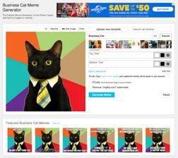
On January 1, 2011, Something Awful forum user Apple Jax posted a picture of her boyfriend’s cat Emilio wearing a tie while sitting on a living room couch. The photo was reposted to Reddit with the title “Business Cat”, then put on MemeGenerator. A second Reddit thread entitled “Business Cat Ain’t No Joke” marked the first appearance of the image macro, initially captioned “No LOL Here, Get Your Ass in My Office.” The “standard” Business Cat meme now featured a close-up of Emilio and his tie in front of a starburst background with an overlaid text that usually included something an office boss would do or request, but with a feline twist. Professor Ryan Milner posits that, “based on spatial online context, memetic imagery becomes fluid. The user must be in the know to understand the underlying message before the meme can effectively spread and evolve while in their hands.” As the Business Cat meme’s customizations proliferated, it became what is called an “advice animal image macro series.” Since then, the template’s combination of feline and office totems has proven so popular that, since there are certainly no limits to its duplication, its number of uses could be accurately described as infinite.
Memetics is the study of information and culture based on the analogy of Universal Darwinism. Digitally, it comes down to an algorithm that leads to a meme’s evolution through selection and variation. But as is the case with many memes that go viral, Business Cat puts an emphasis on humor, a quality Milner finds essential. “Humor is a great way to make something resonate, and if people see something that resonates with them, they are more likely to make it their own before passing it on.” Apologies to Marshall McLuhan, but the meme is now the message.

artlounge.co
Now showing artist Justin Prough in the Magic Box at the Mondrian Los Angeles Hotel

An Art Review for The Nation by Clement Greenberg, January 24, 1948
BY ALLISON STRAUSS
Art Libs is our take on Mad Libs, the popular party game/book series created by Leonard Stern and Roger Price in 1953.
How to Play: As in the original Mad Libs, players blindly fill in the words of a story template, then discover the absurd story they’ve written. It’s best played with at least three people (good for video calls). Since you’re the one seeing this page ahead of time, you be the scribe/reader. Ask the other players to think of the types of words indicated beneath the blanks in the story below: “Give me a noun.” “Give me a verb,” writing in their answers accordingly. (Also substitute personal pronouns as needed.) Go through the prompts like a list, do not read the story as you go. Once the story is all filled in, read it aloud to the amusement of all. Make the Surrealists proud!
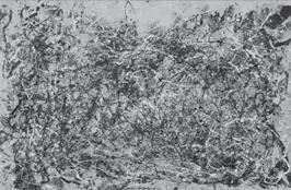
Jackson Pollock, Number 1A, 1948
FIRST AND LAST NAME OF PLAYER ’s most recent show, at
CELEBRITY
step forward on his/her part. As before, his/her new work offers a puzzle to all those not ’s, signals another
ADVERB
in touch with
not
VERB
and so on. Since
ADJECTIVE painting. I already hear: “
HOUSEHOLD ITEM patterns,” “the picture does
inside the canvas,” “
FAMOUS EUROPEAN ARTIST ADJECTIVE ADJECTIVE emotion” and so on,
no one has driven the easel picture quite so far away
from itself; but this is not altogether
LAST NAME OF SAME PLAYER ’s own doing. In this day and age the art of painting
increasingly rejects the easel and yearns for the
ARCHITECTURAL FEATURE LAST NAME OF SAME PLAYER ’s mood
has become more
ADJECTIVE these past years, if the general higher key of his/her
NUMBER
NOUN can be taken as a criterion in this respect. A very successful canvas, “Enchanted
NOUN “—which resembles “
TYPE OF BUILDING ,” though inferior in strength—
is mostly
from “
COLOR ish in tone and is distinguished by being the only picture in the show, aside
,” without an infusion of aluminum
Hammer Museum
By Ezrha Jean Black
The landmark exhibition “No Humans Involved” was remarkably compact, filling a single gallery at the Hammer with installations by only seven artists. Its impact, however, was seismic and sustained. Its title alone was enough to take viewers aback—and that was part of the point.
The term “N.H.I.” was first reported as appearing in internal Los Angeles Police Department communications, referring mostly to suspected street gang members, virtually all of them Black or Brown. Stanford literary philosopher and critic, Sylvia Wynter, seized upon this and events surrounding the 1992 LAPD beating of Rodney King to challenge what she regarded as its signal reflection of the implicitly racist linguistic and epistemological foundations of Enlightenment concepts of humanity.
The result was a sprawling 1992 epistolary essay challenging not merely conventional notions of humanity, but critical methodologies attached to art, culture and aesthetics. Curator Erin Christovale used this essay as the springboard for what is essentially a visual symposium to “interrogate and disrupt notions of what it means to be (hu) Man.” Whether it might “[offer] inklings of a future humanism that holds the potential for physical, cognitive and social liberation,” is slightly more fraught.
Certainly Wilmer Wilson IV’s 2017 Measures Not Men—a 7-foot wall of salt blocks like a blown-up frame of movable type inscribed on both sides—a “war memorial” in more than one sense—put paid to any simplistic reading of the notion, neutralizing the white-hot anger of its inscribed message (a letter sent to a Mississippi sheriff in the wake of a spate of lynchings of Black army veterans, promising to “burn the entire state” if it did not stop), yet literally rubbing salt into a wound that does not seem to close in our youthful “democratic experiment” of a republic.
Directly across, from Wilson’s wall/war of words, SANGREE, the collaborative partnership of Mexico City artists René Godínez-Pozas and Carlos Lara, countered with what almost seemed to pastiche the notion of a museum exhibition itself. Here, in this grouping of work from their Abiogenators series (playing on the notion that human life might have emerged out of a non-biological chemistry of clay, mud and earth), the artists constructed a semaphoric choreography of brilliant-hued vessels, masks and their connective supports—piers, pillars and pedestals in volcanic stone (cantera rosa).
That nonorganic construction was answered in turn by what from certain angles looked like a roiling sea of flesh—Sondra Perry’s large-scale mount of multiple lenticular panels, which proved to be exactly that, Flesh on Flesh (2021), a 3D image of the artist’s own facial skin surface morphed (via digital tools), into a super-magnified pigment-and-blood saturated terrain of pools and ridges, continuously refocused as the viewer moved from one end of the mount to the other, as if to foreshadow its ultimate transition into the stuff of earth and sea.
Before encountering any of these installations, though, the viewer was confronted with Eddie Aparicio’s monolithic cube of amber, Sepultura de semillas / Sepulchre of Seeds (2021), morphing and melting down through the duration of the exhibition; embedded with everything from fragmented steel and plastic car parts to organic detritus. At almost any angle, you could make out ceramic plates and cutlery, bits of fabric, straws and cigarettes, discarded commercial packaging—the detritus of a neighborhood, also its lifeblood. As both distillation and real-time decomposition of such notions, Aparicio perhaps came closest to the question framed in Christovale’s gloss of Wynter’s thesis: “How do you measure a life?”
No More Tears (2020), a luminescent jungle cavern constructed by siblings Mulowayi and Mapenzi Nonó, working collaboratively as Las Nietas de Nonó, seemed to most directly reference the trauma embodied in that dark police code, borne out of hunger (what might be walls of timber or stone looked like a patchwork of tortillas) and yearning for escape as if from desert islands (fantastical river rapids faded into view from inset digital screens; repeated on screens representing the Nonós’ formerly incarcerated cousins, the Salgado brothers and echoed in their “third eyes”).
WangShui’s overhead anamorphic video projection, Suspended Animation (or Scr...pe) (2021) with its blue boreal sea of protoplasm in undulant metamorphosis, inspired by Octavia E. Butler’s Xenogenesis trilogy, suggested that the imponderables of human life might only be answered by the equally imponderable alternative of an entirely transformed life form projected into the cosmos—effectively bringing the exhibition full circle; in short, that a future cognitively liberated ‘humanism’ might not be entirely human at all.

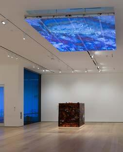
Aparicio Sepultura with the WangShui Suspended Animation, “No Humans Involved,” installation view, Hammer Museum, Los Angeles, Photo: Jeff McLane.
By Deborah Krieger After remaining indoors for over a year, it’s refreshing to be confronted with the idea of the natural passage of time in the outside world—how life consciously accumulates and mutates, even when we aren’t there to watch it happen. Mary Brøgger’s retrospective
exhibition “Altercation,” a small survey of her textiles, fiber art, and sculpture (all works mentioned 2021) illustrates this essential. Brøgger uses wool, acrylic yarn and cotton gauze not as the building blocks of garments and rugs—as human-cultivated applied arts— but rather to emulate living organisms like coral, moss and algae that represent nature in uncontrolled form.
Indication, a felted wool wall hanging, quickly gets at this theme. Where a work with these materials might have a repeating pattern or pictorial motif, the artist uses patchy blues, whites, yellows and grays abstractly, suggesting wispy clouds drifting across the sky. In the gallery space, Indication is installed across from the plywood construction Untitled (low folding seat). You can’t sit, but you want to, and you want to be able to just look at Indication and relax, staring deeply into its beautiful nothingness.
Untitled, a massive “wool painting” (per the artist’s description), similarly illustrates the animating force that drives “Altercation”— the clash between how we think of Brøgger’s materials and how she uses them instead. The work hugs the convex corner of a temporary wall rather than lying flat, suggesting a pale ivy clinging to a building. It’s a simple choice of display, but one that speaks volumes, because Untitled ends up seeming truly alive—and live against the wishes of a civilization that would prune it back into something consciously tended.
Where Indication and Untitled evoke moving clouds and irrepressible ivy, There and Black brings the accumulative qualities of coral—the organism and the ecosystem—into play. Created out of acrylic yarn and mixed media, There and Back gives the impression of having existed forever beyond the bounds and concerns of human time, just endlessly attaching thin yellow crusts of paint to its black surface of simulated polyps and anemones.
While the ceramic works in “Altercation” are a little out of step with the show’s theme in that they don’t reference the passage of

Mary Brøgger, Untitled (low folding seat), 2021. Copyright Mary Brøgger. Courtesy of ROSEGALLERY. time, or of changing nature, in any particular way, Untrodden works perfectly within the overall context of “Altercation” by attempting to falsify its premise. Placed on the gallery floor, Untrodden consists of a large swatch of sickly gray-green industrial carpet. Unlike moss, or algae, or coral, this carpet is not alive, and was never alive, and will never decay in anything resembling real time. Rather, the consciously artificial Untrodden will meet its end only when the last Twinkie on Earth goes stale.
For all the intricate production present in “Altercation,” this body of works shines in how unconstructed it truly seems. Like lichen spreading over the side of a rock, they appear to have the potential to grow and change and thrive beyond the purview of human eyes, hands, and imagination.
Eric Croes
Richard Heller Gallery
By Jody Zellen Towering more than six-feet high, three large glazed ceramic totems confront viewers who enter the gallery space. These works— Fakir’s Foot, Philosof’s Foot and Fantomas’ Foot, (all 2021–22)—by Brussels-based sculptor Eric Croes, function as the introduction to his exhibition “The Gods Must Be Crazy.” Each vertical column is constructed in the spirit of an Exquisite Corpse drawing combining eight to ten colorfully glazed objects ranging from candles, plants, animals and books to head-shaped vessels with mask-like features. The base of each sculpture is a sturdy, thick, flat disk upon which sits a cartoon-like depiction of an oversized foot purportedly belonging to the namesake of the sculpture—Fakir, Philosof or Fantomas.
In Fantomas’ Foot, Croes has stacked a foot covered in a white athletic sock, a coiled pot embedded with the face of a man who has a rope coming out of his nose that wraps around the upper porEric Croes, Vesta’s Hand, 2021–22. Image courtesy Eric Croes and Richard Heller Gallery. Photography by Hugard & tion of his face, a hol- Vanoverschelde. lowed out red die, a green stem with leaves, a white puckered sphere like an oversized golf ball, a brownish, mask-like head with closed eyes and an open mouth; and a bright blue head with tears running from its oval, carved out eyes. The sculpture is topped with an old-fashioned orange candle holder and a white candle with a bright yellow flame. The other totems combine seemingly unrelated objects that begin to tell a story alluding to the protective nature of these Gods.
While the totems hold court in the front gallery, smaller, more human-scaled, gargoyled sculptures fill the back space. Each work is an amalgam of hands, animals and faces that become a figure. These creatures sit atop low stools with bony white legs beneath various colored bases. They beg to be seen from all sides and the way they are displayed—centered in the gallery on low white pedestals—allows for this. It seems evident that Croes is having a blast
constructing these sculptures, inserting personal, as well as universal symbols into his Frankenstein forms.
On the backside of the Vesta’s Hand, the artist has created a face with holes for eyes, red circles for cheeks, and a small mouth with a protruding pink tongue. The top of the head merges with clunky, albeit realistically rendered fingers with translucent blue fingernails. The tail of a green snake wraps from one side of the hand to the other. Here, the fingertips are small mask-like faces with outstretched tongues and empty eyes and the thumb is both a spout and a skull. Each hand is likewise an inventive combination of faces and functions.
By titling the exhibition “The Gods Must Be Crazy,” Croes creates a playful irony. If the Gods are crazy, they can be, or do, anything. This allows him to make figures with qualities that relate to both actual and invented Gods. Drawing from folklore, mythology and history, as well as his imagination. Croes manifests a menagerie of figures with a range of personalities and expressions. Whether the starting point is hands or feet, these sculptures surprise and delight, providing viewers with challenging imagery to decipher and savor.
Elsewhere is a Negative Mirror
Vellum LA
By Shana Nys Dambrot This thoughtful, surprising, eclectic yet focused group bridges the gap between an elevated gallery presentation and the untamed wilds of the cryptoart space. “Elsewhere is a Negative Mirror” is organized around the theme of architecture. Displayed on high-res screens, at no point until purchase does it matter that the work lives on the blockchain. Curators Jesse Damiani and Sinziana Velicescu conceptualized the show posing questions such as, if artists are indeed creating a new world, what kinds of spatial and temporal structures will be imported? What will be replicated or reimagined, used as symbols to elevate or smash? What laws of physics, gravity, perspective and time will they obey, subvert or ignore? The assembled artists answer these questions by mining not only fantasy and literature, but the territory of art history, which has in its own way asked questions like these before—especially the last few times the world changed forever.
In Luminous Depths (2022, photography with digital render and effects, 18-second infinite loop), Peticia Le Fawnhawk and DeepLight Labs offer a perfect, motion-enhanced take on de Chirico-style surrealism in a scene where a lone figure in a windy, desert expanse faces a luminous portal to the unknown. Vince Fraser’s Deconstruct to Reconstruct (2021) digital-mixed reality/AR video animation, one-minute infinite loop) has the majesty of a Sphinx, revealing that its flamboyant colossus is backed by scaffolding, a resplendent work in progress. Sabrina Ratt based Machine for Living, Deconstruction I (2018–21, video, 1:06-minute infinite loop) on a Brutalist complex outside Paris. As a verdant, prismatic stream floods tiers of concrete the piece asks, whose Utopia is this?
In Mari.K aka MadMaraca’s Happy Place III (2021, digital 3D) Ruskin’s battle of the sublime and picturesque still rages. A floating city of terraced gardens, an isolated paradise with no egress, or a memory palace for the ages—the citation of Greco-Roman, Babylonian or even Olympian motifs complicates the rush toward pure futurism with obvious delight. Escher meets Eco in Kirk Finkel aka untitled, xyz’s Monument of Errors (2022, digital, MP4, 32-second infinite loop). Inspired by the speculative writing in Italo Calvino’s Invisible Cities, this vibrating confection of distorted Roman architecture turns sacred geometry into a playground for poetry. Nate Mohler’s Echo the Color (2022, video, 2:45 minutes) glories in fusing mediums. He works with a combination of street photography, drone footage and AI to generate Fauvist scrolling landscapes that turn language about movement in painting into something literal. It’s like he’s fulfilling the goals of the fin-de-siècle painters using tools of the future; at the same time, he’s exploring the present in these aerial love letters to the city of Los Angeles.
untitled, xyz, Monument of Errors, 2022. Courtesy Vellum LA.
PORTALS
Angels Gate
By John David O’Brien Thresholds—with their curious balancing act between two places, spaces or states—have always exercised a tremendous pull upon human imagination. It is, without even working at it, a naturally apt analogy for multiple types of transformation. The number of
commonly used phrases in our language that we take for granted shows how we all understand the liminal quality that the concept of a brink reveals.
In the truly grand geography of greater Los Angeles, going down to San Pedro always still surprises, as this tip of land, the bottom-most point of LA, opens onto the ocean. Surmounted by a seemingly endless number of dock rigs and ship riggings, boats, and containers, it really feels like you’ve arrived some place other than the City of Angels. Located in what was once a military base, the cultural center of Angels Gate has taken a decommissioned barrack and transformed it into art galleries. On the top floor of the main gallery “PORTALS” inhabits the slightly diminutive spaces, and the art installed there in turn plays around with the sense of portals being something from a port (which is a portal) and each being a portal to elsewhere.
What engages so wonderfully about this exhibition is that it avoids a monolithic definition of how all this disparate art fits with the thematic premise. There are works that look like framing devices through which one could gaze from one physical world into another. Erin Harmon’s low-relief cut-paper architectural constructs, Echo and Occulus (both 2015), Yevgeniya Mikhailik’s smoky drawings on translucent paper from the Barrow Series (all 2021), and Howard Schwartzberg’s willfully awkward abstract Open Space Ban-

Erika Lizée, The Subtle Body Prepares for Emergence, 2021. Courtesy Angles Gate.
dage Paintings (2020) all allude to multiple interpretations of these gateways. There are others in which the boundary being crossed is more of a philosophical nature. These loosely corral visual quanta that lead us to consider our presuppositions, as one moves from the certainty in one moment to the instability of another. Svetlana Shigroff’s wild mythologem-laden tapestries, Esther Ruiz’ somber light-and-reflection works, and Elana Mann’s handcrafted sound conveyors all share in this impulse. There are works in which the brink being pursued is much more symbolic in nature. They work on visualizing the movement from one state of being to another, as one goes from life into the afterlife, from the present to the transcendent. Alicia Piller’s dense Blue Memories, Flooding Back. Navigating Tongva Waters (2021) and Erika Lizée’s expansive and astounding The Subtle Body Prepares for Emergence (2021) are both rapturous site-specific works that underscore these complexities.
As with the most entrancing of exhibitions, “PORTALS” springboards a viewer’s imaginative musings into an altogether unexpected set of considerations. It’s like a box within a box within a box, and not only physically fitting together but conceptually and imaginatively. It is a perfectly fitting liminal experience to have at one of the outer limits of this immense city of many portals.
Noelia Towers
de boer
By Leanna Robinson Noelia Towers’ new collection of works, “Opening an Umbrella Indoors” (all works 2021), presents a world of dichotomies: pleasure/pain, soft/hard, natural/synthetic, obscured/vulnerable. The collection of paintings is consistent in its motifs of both overt and covert sexuality, and natural flora and fauna. In each of the figurative paintings, all self-portraits, the artist’s face is obscured, either by her body-positioning, composition structure, or by objects and fabric. In this manner, the viewer gets only part of the story, and an air of mystery is added. In many ways the still life paintings help fill in those gaps and, like obscure clues, offer hints at the artist’s hidden self. Towers offers the viewers both a dead bird (Ferit de mort) and cut flowers (Remember Me and Memorial To Self). By presenting these living things that have suffered death, or certain to reach it soon, Towers plays with the theme of the death of nature, and perhaps the death of innocence. Towers’ painting style is in the vein of photorealism in that it is clearly based on photographs as references, and the finished works appear photogenic, but lack the hyper-realistic details present in the likes of Chuck Close. Towers’ technical strength is her treatment of different textures. In Vow Of Silence—the wood texture of the wall, the detailed lace neckline, the floral dress and Noelia Towers, Vow of Silence, 2021. Courtesy of the shiny latex accessories—all artist and de boer, Los Angeles. Photo by Jacob Phillip. receive different treatments that are effective in breaking up the painting composition. The attention to detail on textures also gives the paintings an editorial quality—the patent leather shoes, and lace-up boots could be pulled from images in a magazine. That said, the oil paintings have a pointedly matte finish that is accentuated by the muted color palette, and a flat, illustrative texture. Each painting also has a stark and brightly lit overexposed quality that blows out colors and adds to the photo-realistic impression. The works are all cohesive—they could easily be photos taken by the artist during the COVID lockdown of the last two years.
While only some of the paintings are figurative, each piece functions as a kind of self-portrait, as the subtle storyline woven through the paintings leads the viewer to infer that even the still-life paintings are autobiographical. By illustrating the self in fetish-ware of submissive motifs like schoolgirl and gimp, the artist’s own sexuality is presented as matter of fact, which is inherently subversive when the artist is a woman. There is also a darkly humorous, sardonic quality that’s demonstrated in Self Help, which shows the artist sitting in a schoolgirl outfit reading a book with the title “HOW TO STOP SUFFERING (immediately).” The artist is clearly playing with ideas of identity, and while the paintings are a bit tumblr goth-girl aesthetic, I’m not sure there’s anything wrong with bringing the world of e-girl BDSM self-portraits into the “art world” and galleries. Towers’ paintings are markedly of the moment without coming off as trite or derivative. Instead, they are vulnerable, risqué, cheeky, feminist explorations of the self and solitude.
Raymond Logan
George Billis Gallery
By Genie Davis From George Washington’s celebrated portrait to Frank Sinatra’s mug shot, Raymond Logan paints a wide range of subjects with exquisite depth and color. His layered palette resembles sculpture, crafted of hue and shadow. While each portrait in his current exhi-
bition is instantly recognizable, they are not realistic in the truest sense of the word. It is as if an explosion of colored confetti had descended from the sky and reshaped itself into the personification of a human being. All the elements are there, but it is those many disparate pieces that form a realistic whole. Created in oil paint, using both palette knife and brush, Logan’s images are exhilaratingly lovely and magical. That magic is the sleight-of-hand the artist employs, cohering disparate slivers of color into a cohesive image. His strategy employs intensely thick texture and a rich understanding of color. The works have reverence and gravitas, coupled with a lively

Raymond Logan, John Coltrane, 2021. Courtesy George Billis Gallery.
playfulness, born of both the artist’s execution and the connections he evokes between the viewer and the subject.
His figures range in size from small portraits to large works. The image of Washington (46”x 46”) is as thoughtful as it is iconic, and the president’s face is flecked in American red and blue to build a surprisingly authentic skin tone. His fierce blue eyes match his elegant jacket. Unlike many portraits of the first US president, rather than a haughty look, his appearance is thoughtful, even bemused, as if he were thinking, “we really accomplished something here—I hope.”
There is a similar sense of hopefulness in Logan’s smaller portrait of Frederick Douglass (16”x 16”) , who nonetheless seems to simmer with a fierce strength and burning passion. His hair, rendered primarily in shades of blue, semi-circles his countenance as would a halo befitting an icon. An older, white-haired rendering of Douglass, in a diminutive but powerful 8”x 8” format, speaks less of fire and more of resolution. Among the largest works is Sinatra’s mug shot (60” x 40”), in which a decidedly young performer faces drummedup indecency charges with a look of pained consternation.
While Logan creates landscapes that are equally evocative, the current exhibition depicts only portraits of those who have influenced the artist, both highly public figures and personal friends and family. In many cases, the photographs Logan refers to in his work are based on photo shoots he’s staged himself; in others, they represent images that are meaningful to the artist and connect to his own personal zeitgeist. He notes that his work is meant to serve as a “dialogue between the viewer and myself about those shared connections.”
From John Coltrane lovingly cradling his saxophone, to intimate portraits of personal friends—Charlie, Greg and Lalo, as well as Logan’s wife, Julie—the images are nuanced, thoughtful, and above all else, represent a visceral, glowingly alive rendering that reveres some classic icons and creates new ones.
Richard Wyatt Jr.
Steve Turner
By Richard Allen May III Capturing human dignity through drawing requires commitment not only to clearly see but to deeply observe. Current works by Richard Wyatt Jr. at Steve Turner gallery encapsulates such an act. As a muralist in the tradition of such predecessors as Charles White, John Biggers and Hale Woodruff, the Los Angeles-based Wyatt is no stranger to portraying humanity with proficiency and sensitivity. The Capitol Records building, Watts Towers Art Center and Ontario International Airport all testify to the caliber of Wyatt’s public art. Yet this current exhibition of pencil, charcoal and graphite works on paper places him in a much-deserved category of his own within an art canon that tends to consistently ignore some while invariably celebrating the same individuals. In fact, just as John Coltrane revolutionized the saxophone into an instrument never heard before, Wyatt’s heightened vision coupled with expert eye and hand coordination transforms a surface with abstract lines and marks as if playing A Love Supreme (1964) on paper.
Glory Cloud (2019), for example, introduces Wyatt’s father at age 88. In a society that glorifies the notion of permanent youth, this work dismantles such a destructive obsession. Portrayed as if stepping out of the sky, this realistic yet interpretive rendering differentiates shirt texture from skin surface, suitcoat from mustache and beard, hands with veins from suitcoat with buttons. Moreover, his penetrating stare suggests that wisdom comes with age. Like Dean Mitchell’s watercolor portrayal of an older African American male in For Freedom (2020) and Carolyn Lawrence’s acrylic work, Pops (1970), Wyatt accomplishes the same; he captures the essence of the human experience. Additionally, within the context of a 21st-century global pandemic that ravaged African Americans and the elderly, this personal aesthetic choice is socially conscious and timely.
Road to Recovery (2021) and The Gifted One (2021) show Wyatt’s ability to expand the boundaries of the Photo-Realism movement of the 1960s and 1970s. The former image is a graphite portrait of his daughter wearing a face mask, demonstrating the tenderness of Wyatt’s application of chiaroscuro. With a three-quarter view, her eyes anticipate a hopeful future. The latter is a timeless charcoal snapshot of the late NBA great, Kobe Bryant. A first reading of both images reveal Wyatt’s skill at capturing the nuances of skin texture.
Finally, there is Joyce, (2021) in which Wyatt’s rendition of his wife of 43 years demonstrates his advanced skill at portraiture regarding facial features, proportions, and shadow contrast. Starting with the hair and then to the earrings and to her glasses, this image breathes life; he captures the look of love as her eyes suggest the value of memory. Each intricate pencil mark and suggestive contour line communicates an uplifting message to his wife, family and community.
Ultimately, “Loss, Healing & Restoration,” accomplishes what is implied by the title—acknowledgement of pain with a single-minded focus on transformation. A visual historian of his community, Wyatt’s works reinforce the sacred interconnection to others. Richard Wyatt Jr, Road to Recovery, 2021. Courtesy Steve Turner.
Miles Regis
Von Lintel Gallery
By Catherine Yang Trinidadian artist Miles Regis searches for hope and meaning in the ugly and chaotic. An astute social commentator drawing from his experience as a Black man who emigrated to America 31 years ago, Regis imbues each canvas with a rich visual narrative dealing with racial injustice, identity politics and the healing power of unification. The impeccably crafted mixed-media paintings in “Better Days Ahead” fuse image with text to create moving portraits of the pain and frustration of our contemporary world while simultaneously translating these emotions into idiosyncratic beauty.
Upon entering the gallery, viewers are immediately transported back to the summer of 2020 and the raw heat of protests that suffused the wake of George Floyd’s murder. Rife with scenes of homebound families and political strife, the works are unambiguously of the moment. Regis is not concerned with creating a time capsule, however, but with representing how the sense of unrest that gripped the nation is inescapable for Black Americans and pervades all aspects of their daily lives. His vivid hues and active compositions burst with hurt and anguish, as well as harmony and hope.
One striking painting Be Careful (2017, 51” x 47”) of a Black figure with exaggerated features is encircled with frenzied swaths of color and lines, watchful eyes and dire warnings: “Everybody Is Watching,” “Don’t Be The Stereotype.” Of similar scale America (2020) declares, “I Can’t Breathe” on a sign flanked by masked protestors of various skin tones but similarly raised fists. The largest, 70”x 56”, and one of the most arresting pieces, We Just Tired

Miles Regis, Be Careful, 2017. Courtesy of Von Lintel Gallery and the artist.
(2021), shows a lone Black woman standing in darkness, shrouded with flames, raising a sign that speaks the words of its title. Their pain and hardened courage are palpable in their expressions.
Regis’ paintings are often finished with splatters of paint droplets and frenetic etchings across the surface of the canvas—personal touches that point to the exasperated urgency of both the artist and his subjects. In settings of domestic leisure just as in those of political action, Regis’s all-Black subjects do not smile; rather, they are wary-eyed and morose, imparting the feeling that they are pensively waiting, never feeling completely safe or at ease.
And yet, Regis’ positive message of healing through togetherness is equally as loud as his condemnation of racial injustice. An unmistakable optimism permeates each piece, and his paintings are ultimately celebrations of Black resilience and harbingers of hope. In the same breath, he proclaims pride in his identity and faith in the future of our nation. Sweet Surrender (2021) measures 56”x 44” and depicts a couple bowing their heads together, showing us that moments of compassion are still within our grasp, as long as we remember to turn to one another for solace. In the Connected (2021, 33”x32”), a kaleidoscopic diagram of Black profiles welded in a ring of light echoes this sentiment: We are all “Connected.” These works are hard to look at, yet impossible to look away from.
Karla Knight
By Annabel Keenan Karla Knight is sending us a message. With maps, symbols and UFOs, there are mysteries in every piece. Four decades worth of paintings, tapestries and drawings are on view in Knight’s first institutional solo show, “Navigator,” at The Aldrich Contemporary Art Museum in Ridgefield, CT. Signs and glyphs dart from top to bottom and side to side. Spacecrafts weave in and out of orbs and all-seeing eyes. Some imagery appears to be based on recognizable symbols, but the artist purposefully presents her work without meaning or explanation. Pointing to the mysteries of life itself, Knight tempts the viewer to seek their own rhyme or reason.
Visually, the show is minimal in its color palette, with most works limited to a few, mainly solid colors; yet the overall effect is surprisingly impactful. “Navigator” spans Knight’s career beginning with early works on paper from the 1980s inspired by her interest in language, Ouija boards and UFOs. Knight’s lifelong fascination with all things science and occult stems in part from her father’s career as an author of books on astronomy, ghosts and the supernatural. These smaller, earlier pieces are almost academic in their investigation of symbols, as if a documentation or discovery, perhaps all working towards a larger, secret lexicon.
The symbols in her earlier works evolve into full landscapes later on in Knight’s career. Wayfinder 1, 2, and 3 (2020) form a monumental triptych of indecipherable glyphs, spacecrafts, orbs and charts. The triptych is part of a new body of tapestries on reclaimed cotton from seed and grain bags from the 1940s and 50s that Knight found on eBay.
The works titled Fleet Mind 1 and 2 (2020–21) add to the exhibition title’s suggestion of movement or searching, but they leave more questions than answers. What is the fleet doing? Is it navigating towards a final destination? Is it protecting the yellow orb? What are the shapes and grids of symbols that surround the fleet’s delineated borders?
The orb at the center of the fleet constantly reappears in Knight’s work as both a central figure and a member of the background. Perhaps communicating some unknown message, the orbs also recall the classic, grainy photographs of UFOs that Knight would have seen throughout her father’s books.
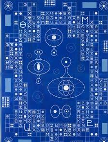
Another image possibly taken from her science studies is the periodic table that appears in Blue Navigator 2 (2021), an arrestingly rich blue tapestry with a white grid filled with small white symbols. There is an irresistible temptation to try to identify the signs. Yet again, we are left with infinite questions. Do the forms in the center represent spacecrafts or a space station? Are they extraterrestrials? What message is communicated in the intricate symbols so neatly organized in the white grid? Is this a blueprint for a machine? Ultimately, Knight leaves no clues, allowing the viewer to parse meaning as they choose. Overall, the show is a celebration of some of life’s greatest mysteries, as well as an invitation to let your imagination take over.
Karla Knight, Blue Navigator 2, 2021. Courtesy of the artist and Andrew Edlin Gallery, New York.