01.BRANDING
02. EDITORIAL
03.GRAPHIC DESIGN
04. FINE ART AND ILLUSTRATION
PARSONS SCHOOL OF DESIGN CLASS OF 2026
Raina Khalid FULL LENGTH CREATIVE PORTFOLIO LinkedIn: www.linkedin.com/in/rainakhalid Email: connectwithraina@gmail.com
1
Table of Contents 1. Noorionettes A branding and packaging thesis project based on four characters from a Fictional Universe
3-20
2. Museum of Asian Architecture Brand identity and packaging for US-based museum institution curating modern and historic architecture across Asia.
21-23
3. Anais Mae An editorial Lookbook for a Fashion Label expanded into marketing collaterals
24-28
4. The Peckham Pelicans Brand identity, album design, and market presence for a Garage Rock Band
29-33
5. Documentary Talks: Poster Series Marketing graphics for a series documentary screenings organized by the Media Studies department at The New School
34-37
6. Fine Art and Illustration A selection of paintings, prints, digital 2D and 23 Illustration works
38-44 2
Branding
3
Noorionettes Noorionettes: Fusion of “Urdu” word Nur (written in Urdu script “ )”ﻧﻮرmeaning ‘Light’ and the English word “Marionettes”
This is a world building project inspired by the culture and Craftsmanship of the “Kashmir Valley” (Northern State of India situated in the heart of the Himalayas) that is translated into a Brand Identity through a collection of figurines, environment designs, packaging, and merchandise.
Zun
Hafa
Sheen
Orin
The project spotlights a Venerable culture through a collectible product such as clay figurines. Noorionettes integrates Indian heritage into the mainstream market by introducing Kashmiri motifs across packaging and brand collateral to Grow and Connect Consumers.
Branding: Character Design
4
Box packaging for Hafa, inspired by her visual appearance-- “Noon chai”
Branding: Packaging
5
Box packaging for Sheen, inspired by her visual appearance-- “Shikara”
Branding: Packaging
6
Box packaging for Orin, inspired by her visual appearance-- “Chinar leaves”
Branding: Packaging
7
Box packaging for Zun, inspired by her visual appearance-- “Marble Shrines”
Branding: Packaging
8
Shopping Bag Design Design and mockup that introduces the consumer to sceneries of the “Kashmir Valley” while encouraging brand recognition
Branding: Retail and Stationary
9
A ESG-friendly cloth tote bag featuring an illustration of ‘Sheen’, meant for everyday use.
Character Tote Bag
A Branded Paper Bag A branded paper bag designed for retail use in stores to elevate purchase experience. Additionally created as low-cost, recyclable packaging encouraging, incentivizing eco-friendly NGOs and low-income communities to participate.
*ESG: Environment, Social and Governance
Branding Retail and Stationary
10
An official letterhead (premium uncoated paper) with a decorative border to connect with the reader through eye-catching visuals aligned with the brand identity. Communicating the messaging in a creative and pleasant manner.
An official envelope in cardstock paper with its roots in Kashmiri floral motifs (art has historically been a component of written communication in ancient India) to provide a classic touch and feel to the receivers
Branding: Retail and Stationary
11
Character-Led Brand Differentiation: Customize each notebook around distinct characters and environments, creating recognizable and ownable brand identities. Craftsmanship as a Retail Signature: Use premium detailing, thoughtful design, and unique illustrations to elevate merchandise from functional products into collectible brand experiences. Cultural Storytelling & Connection: Embed culturally relevant narratives and visual cues to build emotional connection, strengthen brand recall, and create differentiation across retail touch points.
Wooden cover notebook with character-specific environment illustrations
Branding: Retail and Stationary
12
Storytelling Through Advertising: Transforms the notebook from a functional product into a storytelling platform, using culturally inspired characters and environments to build emotional connection, brand recall, and stronger audience engagement.
Distinctive Visual Identity: Uses character-led illustrations, a recognizable color palette, and consistent graphic elements to create a memorable brand language that stands out across advertising and retail touchpoints.
Branding: Advertising
13
User-Centered Design: Created intuitive and accessible digital experiences by aligning user needs with clear brand objectives across key touchpoint Consistent Brand Experience: Translated brand identity into cohesive UI systems through typography, color, imagery, iconography, and reusable design components. Intuitive Interaction & Navigation: Designed clear information hierarchies and seamless user journeys that improve usability, engagement, and overall experience. Scalable Design Systems: Developed flexible UI patterns and design standards that maintain brand consistency while supporting growth across platforms, devices, and experiences.
Branding: UI/UX
14
Main landing page for the official Noorionettes website,
Branding: UI/UX
15
Shopping page for the purchase of individual figurines
Branding: UI/UX
16
Character bio page for ‘Zun’ showing 2d illustration, environment design and 3d figurine
Branding: UI/UX
17
Character bio page for ‘Hafa’ showing 2d illustration, environment design and 3d figurine
Branding: UI/UX
18
Character bio page for ‘Sheen’ showing 2d illustration, environment design and 3d figurine
Branding: UI/UX
19
Character bio page for ‘Orin’ showing 2d illustration, environment design and 3d figurine
Branding: UI/UX
20
Branding
21
Museum of Asian Architecture Museum of Asian Architecture is a mock museum institution based in the USA curating modern and historic works of architecture across the continent of Asia. MOAA promotes cultural preservation, appreciation and showcasing history and creativity from a different region of the globe under one roof. Shopping Bag Design A
Front
Shopping Bag Design B
Back
A designed and prototyped paper shopping bag intended for retail use in the museum to signal brand identity and to improve shopping experience.
Branding: Retail Packaging
Front
Back
An alternate design for the paper shopping bag designed for retail use in the museum to signal brand identity and to improve shopping experience. Additionally beautified with illustrated elements to encourage re-use or repurposing as home decor to double as an eco-friendly initiative in a cost-effective manner.
22
Packaging Tape Designed for brand storytelling even in transient, disposable items from everyday life by inspiring excitement through illustrated visuals. Additionally deisgned with an upside of organic advertising and tactile connection with the brand.
Museum Tickets A recyclable ticket designed to communicate brand values through small details and encouraging brand retention through the collectible value of ephemera like tickets
Branding: Brand Ephemera
23
Editorial
24
Anais Mae Distinctive Brand Positioning Positioned Anais Mae as a contemporary luxury concept, combining playful kitsch aesthetics with urban street culture to differentiate the brand. Cross-Industry Audience Strategy Integrated fashion, fine art, and design to broaden cultural relevance and engage audiences beyond traditional luxury fashion. Experiential Brand Storytelling Used scent notes as an unconventional storytelling device, transforming the collection into a distinctive multisensory brand experience. Marketing and Brand Value Demonstrated how experiential design can strengthen brand recall, deepen consumer engagement, and create a differentiated market presence.
Editorial
25
Inspiration behind the fashion looks
26
Inside spread leveraging stylized collage, textured typography, and scent cues to reinforce brand identity, elevate product storytelling, and create a distinctive multi-sensory consumer experience.
Inside spread combining digital 2D fashion illustration and textured calligraphy to elevate visual storytelling, reinforce brand expression, and create a distinctive editorial experience.
Inside spread leveraging a cut-and-paste collage aesthetic to showcase streetwear design details, strengthen brand storytelling, and drive audience engagement through a distinctive fine-art direction.
Editorial: Inside Spreads
27
Strategically designed promotional touch points including premium packaging, branded wrapping, and invitations to build event anticipation, amplify brand visibility, and convert audience engagement into attendance.
Editorial: Brand Collaterals
Strategically designed brand hangtags as a key brand communication touchpoint, reinforcing core messaging while elevating the customer experience, product perception, and premium brand value at the point of purchase.
28
Graphic Design
29
The Peckham Pelicans Developed a cohesive album and merchandise identity for The Peckham Pelicans, a conceptual garage-rock band inspired by London’s iconic bohemian café-bar culture, translating its local character and underground music aesthetic into a distinctive, culturally relevant brand experience.
Developed album cover, jacket, CD, and liner-note designs as integrated brand touchpoints, strengthening the artist’s visual identity while driving audience engagement, storytelling, and recognition across music and entertainment.
Graphic Design: Album Cover and CD
30
Concert Ticket (Front)
Wearable Brand Media: Transformed concert wristbands into mobile brand touch points, extending visibility beyond the event experience. Audience Engagement: Designed branded wristbands to deepen fan connection and strengthen recognition through memorable physical interactions. Organic Brand Reach: Leveraged fans as brand ambassadors, generating continued exposure across locations and social settings.
Concert Wristbands
Market positioning through outdoor poster advertising, storytelling through brand language Concert Ticket (Back)
Graphic Design: Merch and Advertising
31
Bus-wrap Advertisement Mobile Brand Visibility: Leveraged bus advertising as a high-reach outdoor media channel to increase brand awareness across key London locations. Targeted Audience Reach: Positioned the campaign within high-traffic urban environments to drive audience exposure and connect with relevant consumer segments. Urban Brand Presence : Used bold visual storytelling to strengthen brand recognition, enhance cultural relevance, and create a memorable citywide presence.
Graphic Design: Outdoor Advertising
32
17
Developed music lyric booklets as strategic print collateral to strengthen brand storytelling, deepen consumer engagement, and build cultural relevance through music and contemporary expression.
Graphic Design: Lyric Booklet
Brand Communication: Designed lyric booklet spreads using strategic typography and editorial design to reinforce brand identity and communicate the band’s creative positioning. Audience Engagement: Structured lyrical content and visual hierarchy to enhance content accessibility, deepen product understanding, and strengthen the listener experience.
33
Documentary Talks: Poster Series
Graphic Design
34
Documentary Talks: Poster Series Developed and designed a cohesive ecosystem of posters, banners, social media graphics, email campaigns and print-ready production materials for documentary screening events organized by the Media Studies department at The New School to communicate the message of each film to the relevant target audience while encouraging attendance and message retention.
Graphic Design: Event Collateral
35
Increased visibility Designed eye-catching social media visuals for platforms like Instagram to maximize outreach and spread the message about the event, while grasping the essence of each documentrary in a single image Storytelling through still graphics Using visual hierarchy to communicate the relevant information to the user at at a single glance while ensuring an impactful visual giving an overview of the documentary.
Graphic Design: Social Media Graphics
36
Bi-fold Brochure
Information communication Designed to communicate deep education with the help of a controlled visual hierarchy to effectively convey relevant messages to the reader Attendee engagement A highly tangible marketing collateral like a brochure builds trust through touch and feel while its keepsake value gives the event series repeated visual exposure and higher attendance
Graphic Design: Print Production
37
FINE ART AND ILLUSTRATION
Fine Art and Illustration
38
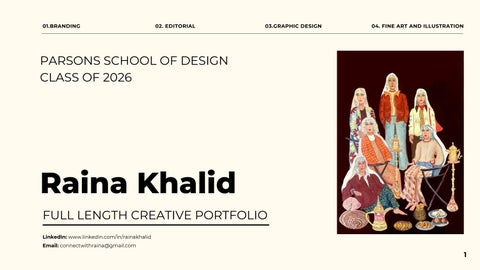
Women of Kashmir Colour Print 8.5x11 inches Originally painted on wooden canvas in acrylics and then digitised to print. Inspired by the local fashion and colour scheme at Gail’s (a popular coffee chain in the UK), this print blends contemporary culture from a steely capitalist establishment with traditional Kashmiri attire.
Fine Art and Illustration: Painting/Print
39
Aquatic Vivarium
Blue Sea Dragon
Digital; Procreate 2160 x 1620 px
Digital; Procreate 2160 x 1620 px
This is a digital inkwash illustration inspired by a series of ink sketches at the MET.
Inspired by the architecture at the Wat Rong Khun temple in Thailand, this digital rendering of a ‘Sea Dragon’ enabled me to continue my practice of fusing cultures and design practices
Fine Art and Illustration: 2D Illustrations (Digital)
40
Environment design for character Sheen, titled ‘Shikara’ Digital; Procreate
2160 x 1620 px
Fine Art and Illustration: 2D Illustrations (Digital)
Environment design for character Hafa, titled ‘Living Room’ Digital; Procreate
2160 x 1620 px
41
Photo Lithograph: Rekha Ink on paper 10x 12 inches
Created to highlight traditional intricate South Asian jewellery
Fine Art and Illustration: Lithography
42
Photo Lithograph: Kashmiri Girl Ink on paper 11x 17 inches
Inspired by Mughal-style illuminated manuscripts and motifs
Fine Art and Illustration: Lithography
43
‘Detestiny’ Maquette Porcelain clay, acrylic 5 x 3 x 17 inches This is a maquette of a supervillain I made using clay, aluminium foil, wire, paint and soft materials.
Fine Art and Illustration: 3D Prototyping
44
Raina Khalid Bachelor of Fine Arts Parsons School of Design 2026 www.linkedin.com/in/rainakhalid Full Portfolio link: https://issuu.com/artandraina.com/docs/full_length_design_portfolio_raina_khalid
Thank you
45