1 minute read
125 Years of the ABA: The Evolution of the ABA Logo

For 125 years, the Arkansas Bankers Association has represented Arkansas’s hometown bankers, but what has represented the ABA? Through the years, the ABA logo has undergone several transformations. While the artwork has evolved with the times, logo elements have always pulled from the state the association represents and the bankers it serves. 125 Years of the A rkansas Bankers A ssociation The Evolution of the ABA Logo
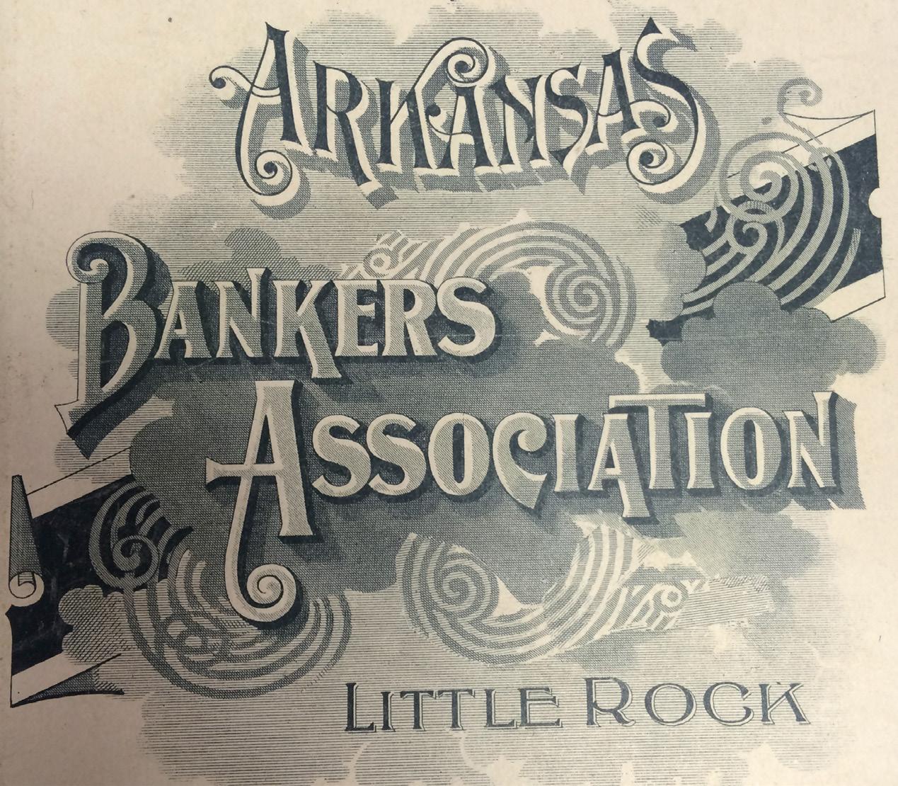
The first ABA logo can be seen in this artwork on the cover of the 1896 ABA Convention proceedings.
Referencing one of Arkansas’s early nicknames, “The Bear State,” ABA adopted this seal as early as 1917.
This logo dates as far back as October 1944, when it first appeared in an issue of The Arkansas Banker... the use of the image became more prevalent in the early 1980s.
Revamping the logo was among the undertakings of ABA past-chairman Bob Burns of Farmers Bank & Trust Co. in Magnolia in 2002. Upon approval of the new logo, Burns noted “I think it is fresher than the one we’ve had for many years. It is more reflective of the state of Arkansas, and more reflective of the trade industry.”

The most recent ABA logo was approved by the Board of Directors in December, and became effective January 1, 2016.