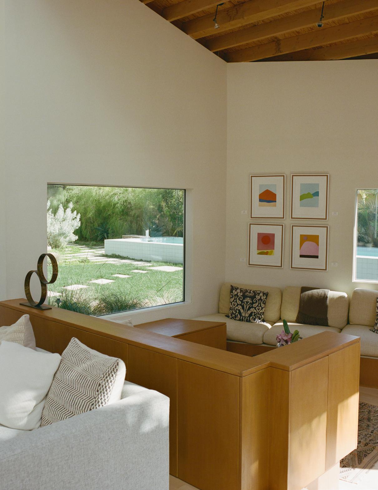
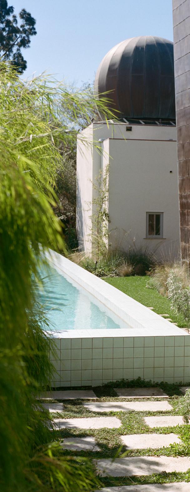
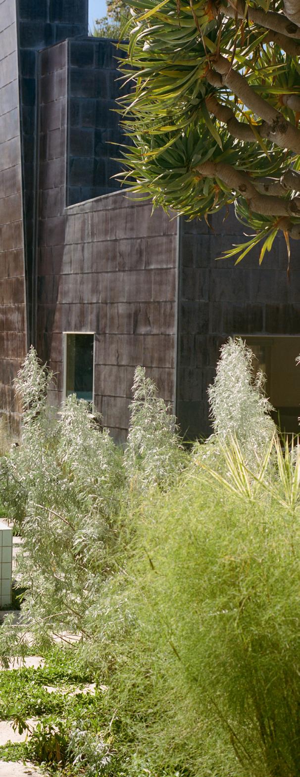
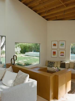
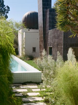
Take a look inside Frank Gehry’s Schnabel House, completed in Los Angeles in 1989, which was recently renovated by Thomas Safran. 106
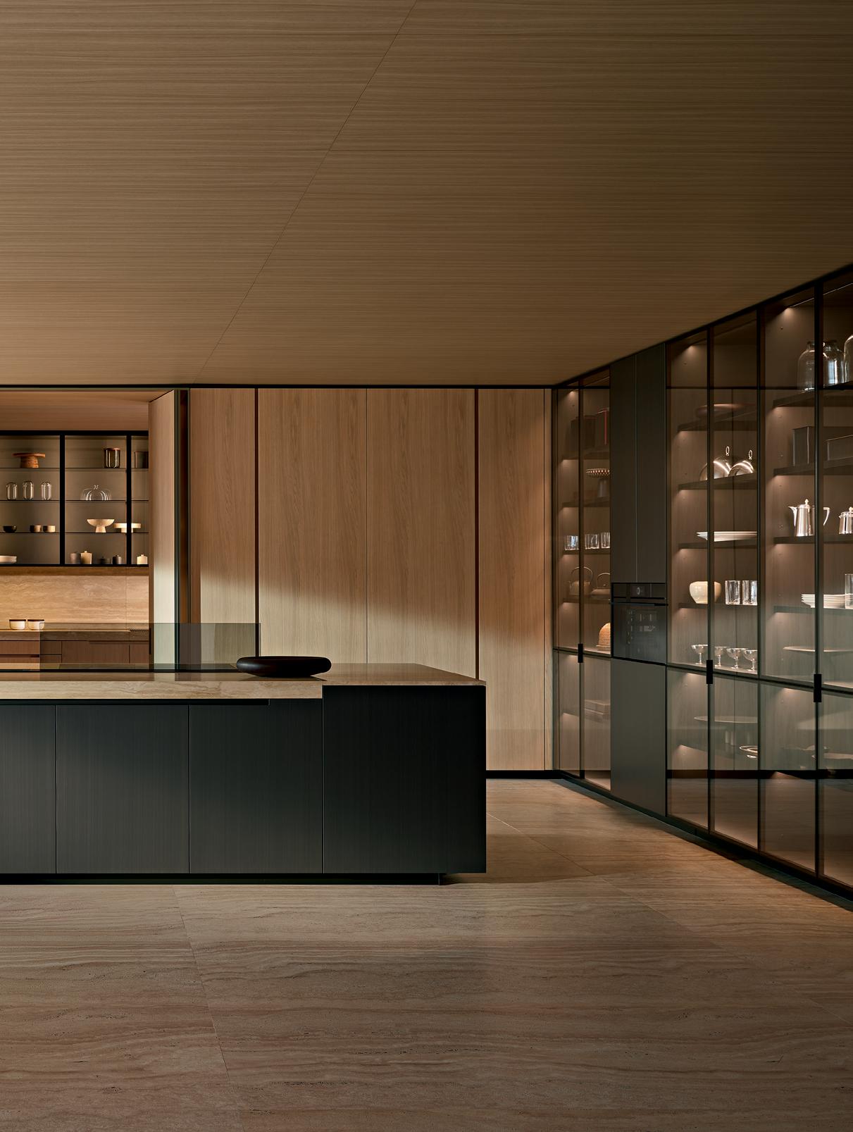
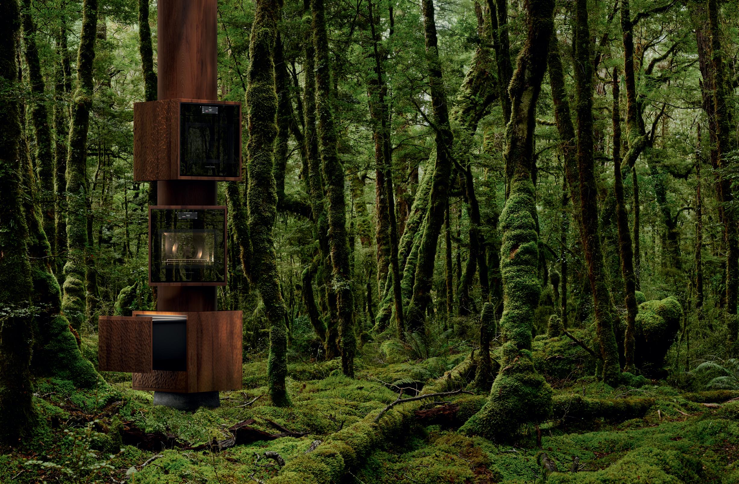
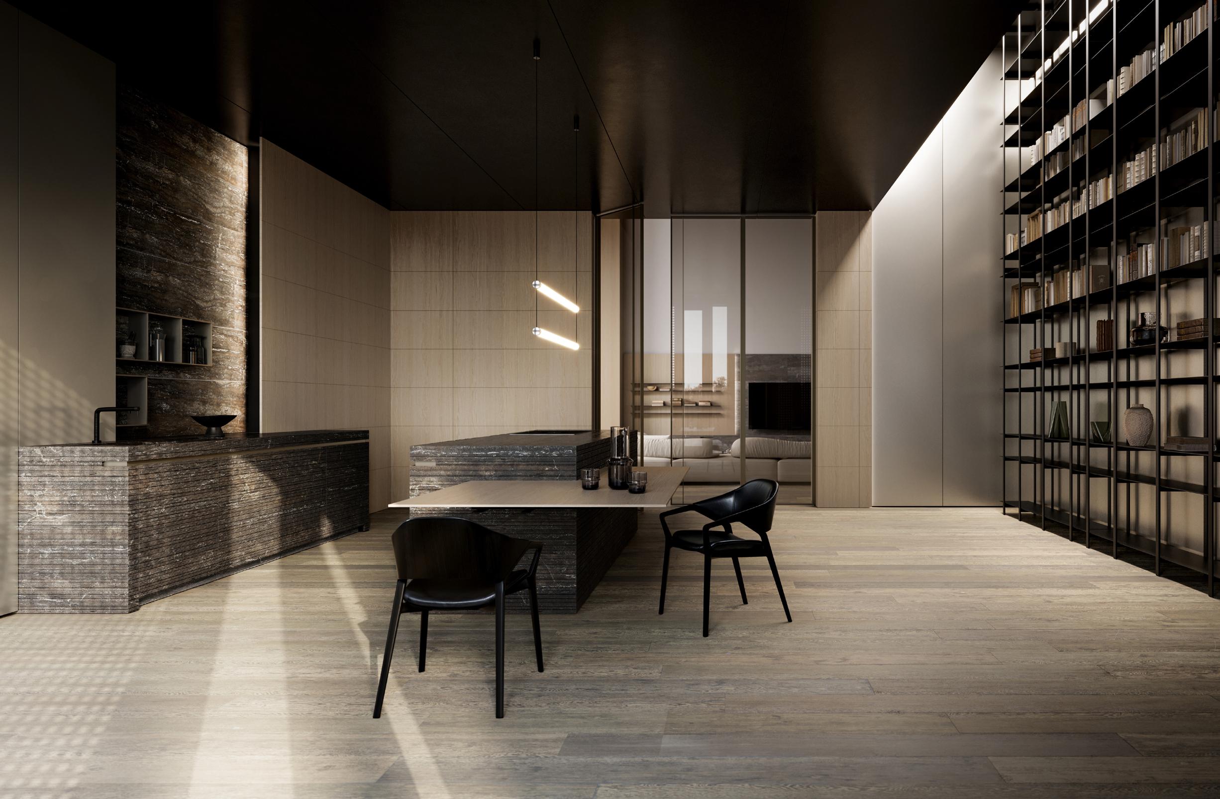
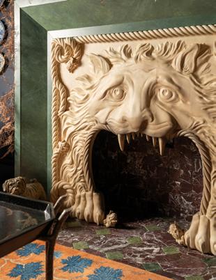
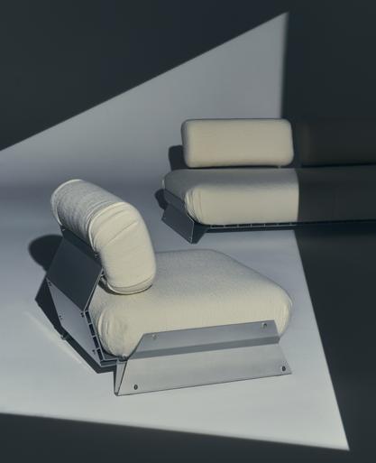
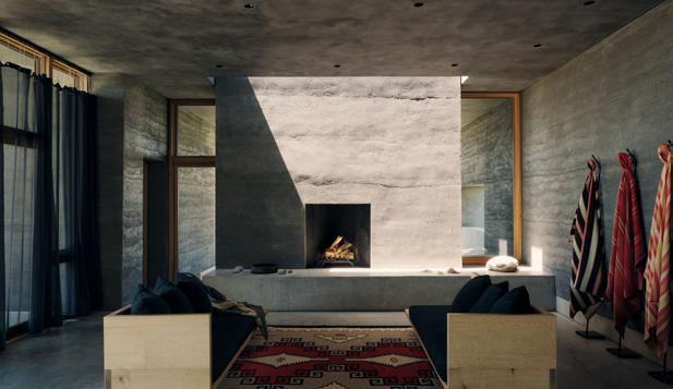
From top: Delfino Sisto Legnani, Piercarlo Quecchia, DSC
Studio, Courtesy FORM(LA), Joe Fletcher, Courtesy TileBar

Take a look inside Frank Gehry’s Schnabel House, completed in Los Angeles in 1989, which was recently renovated by Thomas Safran. 106
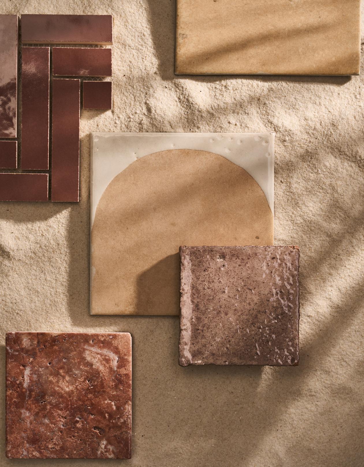
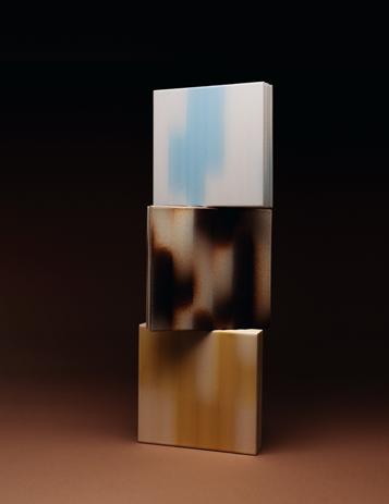
Introducing Cosmos, Apricot, and Perriwinkle — part of our new expanded color offering. From bold hues to warm neutrals, our new exclusive tones help designers bring character and quiet to any space.
turf.design
As I write these words to you, spring is fast approaching. The blooms of my neighbor’s magnolia tree fill a back window of my apartment, and across the city budding trees stand at the ready. The thaw is welcome after an intense winter.
In anticipation of summer, our features whisk readers away to five remote homes, from Mexico to Santa Fe to Saint Kitts, where architects have delivered thoughtful buildings with limited footprints that prioritize connection to their natural surroundings. On page 68, find a house in Greece crafted by Not a Number Architects for themselves, a continuation of the region’s generations-long tradition of how to spend the summer. And turn to page 76 to find a zen-like retreat with contemporary craft sensibilities in Accord, New York. The theme extends to an essay about the Norwegian architect Wenche Selmer, who often camped on the land while she was designing a summer house for it.
Beyond these destinations, we also include a tribute to Frank Gehry, who died last December: In Los Angeles, his Schnabel House has been lovingly renovated by Thomas Safran. We get a tour thanks to photographs by Zara Pfeifer and a story from Michael Franklin Ross. The project is special enough that we decided to put it on the cover of our issue. See the story on page 106.
Spring brings waves of new product releases, as seen at design shows in North America and Europe. Kelly Pau, our design editor, collects the most interesting kitchen and bath items for your consideration, and in a special section, we showcase a wider catalog of new design arrivals to admire. Along the way, we highlight emerging architects, tour great projects, and invite you to try your hand at writing a zingy designworld dispatch with a back-page Mad Libs prepared by FOR SCALE ’s David Michon.
Beyond the solitude that travel can bring, we need moments of calm in our daily lives. We can see this in a Manhattan apartment carefully renovated by Lang Architecture (page 40) and Casa Gardenias, a scuptural residence by Vrtical near Mexico City (page 44).
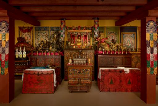
Restorative calm can also happen outside the home. On a visit to the Brooklyn Museum, I spent some time with the Rubin Museum Tibetan Buddhist Shrine Room, relocated to the former’s Arts of Asia galleries. On loan for six years, the installation imagines a space within a Tibetan Buddhist household where family members would practice their religion. Within a simulation of a traditional Himalayan interior, created for the original version at the Rubin Museum in Manhattan, the staging contains more than 100 artworks and ritual objects. Set atop furniture pieces, the paintings, sculptures, scepters, bells, bowls, pitchers, mandalas, musical instruments, and ornamental textiles establish a reflective environment. The lights are dimmed, a whiff of unlit incense fills the air, and recordings of chants burble quietly. Glasswalled off from the rest of the museum, it is a private moment, a specific world within an encyclopedic museum. I sat on a bench and scanned across the ornate items, the Buddhas glinting back at me. The moment deepened my appreciation of this devotional tradition.
Later, my mind wandered to a line about mental discipline from the first chapter of the Dhammapada, a collection of the Buddha’s sayings: “Just as rain does not break through a well-thatched house, so passion never penetrates a well-developed mind.” Across this issue of AN Interior, there are many well-thatched houses. I hope they give you some respite—and inspiration for your next design adventure.
Talk soon,
Jack Murphy Editor in Chief
Lila Allen is a writer, brand strategist, and editor of the new design publication Wrong House. She has held senior editorial roles at Architectural Digest, where she ran AD PRO, and Metropolis, where she was managing editor. Today, she runs an independent practice supporting designers and cultural organizations with brand story-telling and messaging strategy while continuing to write for leading publications.
Suleman Anaya writes about architecture and culture for T Magazine, Aperture, Apartamento, and the Architectural Review, among other publications. He studied at London’s Architectural Association and is based in New York and Mexico City.
Jesse Dorris is a writer and DJ based in Brooklyn. His work has appeared in Aperture, Architectural Digest, Crack, Dwell, Frieze, Galerie, The New Yorker, PIN-UP, Pitchfork, and many other publications. He is also the host of the show Polyglot on WFMU.
Doublespace is an architectural photography agency based in Toronto, Canada and operating worldwide. Nationally, its work has come to define the visual standard for modern Canadian architecture. Globally, it is rated among the best in its field, frequently competing with and being recognized alongside world-renowned photographers.
Elizabeth Fazzare is a New York–based editor and journalist who covers architecture, design, culture, and travel for publications including Architectural Digest, Dwell, and Interior Design. She was previously the senior architecture and design editor at Cultured and an editor at Architectural Digest.
Bridget Goldberg is an architecture writer and communications consultant based in London.
Adrian Madlener is a New York–based journalist and consultant. He contributes to Architectural Digest, Ark Journal, Artnet, Curbed, Domus, Dwell, Hypebeast, Metropolis, and Wallpaper* and coauthors the design criticism Substack EXT.RUDE.D. Madlener cowrote Vincenzo De Cotiis: Interiors (Rizzoli, 2023) and has curated exhibitions on tool theory and copycat culture.
David Michon is the author of FOR SCALE, a weekly newsletter and annual magazine about the supreme potential of interior space, also partnering with brands such as FRAMA, Louis Poulsen, USM, and Santa & Cole. He has previously worked for and contributed to publications including Monocle, Kinfolk, Acne Paper, L’Uomo Vogue, Vogue Italia, and The Gourmand.
Joann Plockova has been a design writer for over a decade. Her bylines have appeared in The New York Times, Architectural Record, Dwell, and Wallpaper*. Following Come Together: The Architecture of Multigenerational Living (Gestalten, 2021), her latest book is Courtyard Homes (Monacelli, 2025).
Michael Franklin Ross is an architect, educator, and journalist who has published over 90 articles and taught at USC, SCI-Arc, and UCLA.
Will Speros is a writer and journalist based in Brooklyn. With a focus on architecture and design, he covers topics including sustainability, wellness, and queer experience. His work has also appeared in Architectural Digest, Metropolis, Hospitality Design, Workplace Design, Luxe, and Inc.
This issue’s cover features images from Zara Pfeifer who documented the Safran/Schnabel house. Originally designed by Frank Gehry and completed in 1989, it was respectfully renovated last year. Read Michael Franklin Ross’s story on page 106.
CEO/Creative Director
Diana Darling
Editor in Chief
Jack Murphy
Art Direction
Studio Loutsis
Managing Editor
Isabel Ling
Design Editor
Kelly Pau
Web Editor
Kristine Klein
News Editor
Daniel Jonas Roche
Associate Editor
Paige Davidson
Copy Editor
Don Armstrong
Proofreader
Joanne Camas
Editorial Interns
Mariana Martinez-Pazzi
Josh Ilano
AN Interior is published twice a year as part of The Architect’s Newspaper (ISSN 2476-1532), which is published 6 times a year by The Architect’s Newspaper, LLC, 25 Park Place, Floor 2, New York, NY 10007.
Presort-standard postage paid in New York, NY. Postmaster, send address change to: 25 Park Place, Floor 2, New York, NY 10007.
For subscriber service, email subscribe@archpaper.com.
$15.00 per copy, $45.00 one year (2 issues of AN Interior and our Best of 2026 issue). Entire contents copyright 2026 by The Architect’s Newspaper, LLC. All rights reserved.
The views of our reviewers and columnists do not necessarily reflect those of the staff or advertisers of The Architect’s Newspaper.
AN Interior
Vice President of Brand Partnerships
Dionne Darling
Director of Brand Partnerships
Tara Newton
Sales Manager
Heather Peters
Audience Development Manager
Samuel Granato
Vice President of Events Marketing and Programming
Marty Wood
Assistant Programming Manager
Bernard Pollara
Events Marketing Manager
Andrea Parsons
Business Office Manager
Katherine Ross
Design Manager
Dennis Rose
Graphic Designer Carissa Tsien
Associate Marketing Manager
Sultan Mashriqi
Marketing Associate Trista Bowser
Marketing Assistant Eazhel Breeden
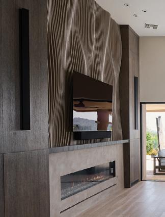
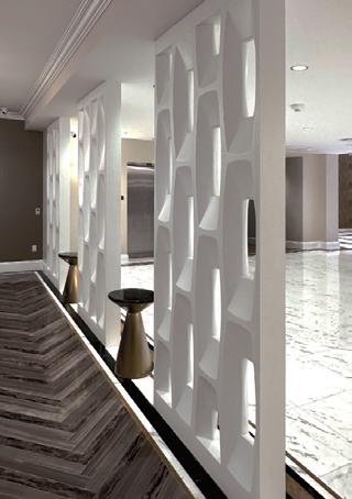
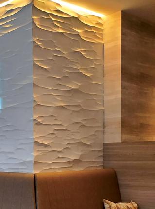
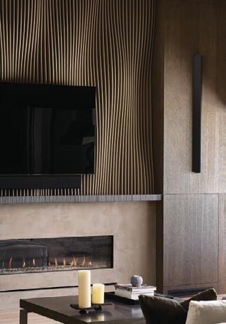
→ COLOR CORD COMPANY
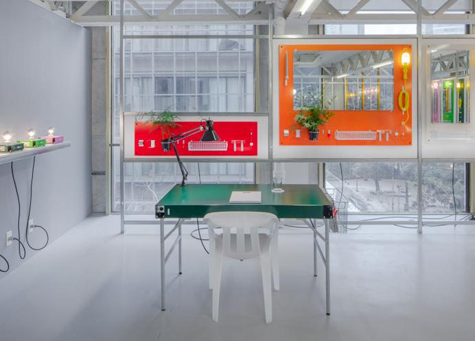
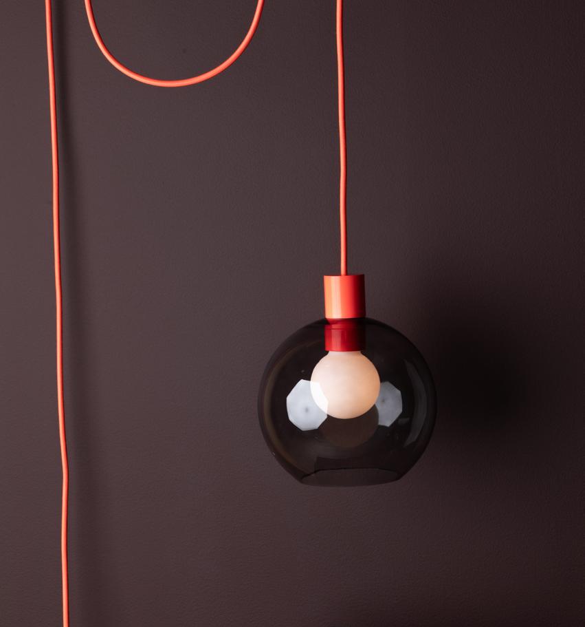
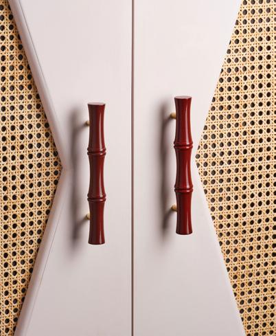
The Totally! Collection by Color Cord Company unites a series of pendant lights around a vibrant selection of cords, turning the feature people try to hide into a part of the design. colorcord.com
← MAGSI
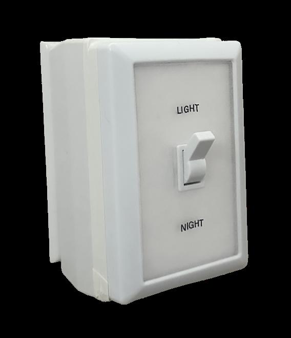
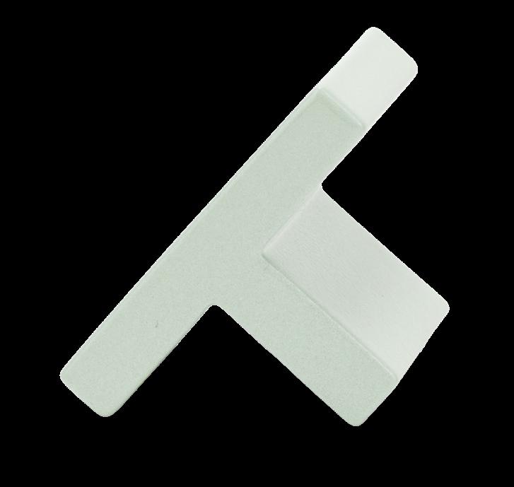
Switch R-1 by MAGSi is a cover that elevates the banal light switch into a bouncy and bright design object. magsidesign.com
→ THOMAS YANG STUDIO
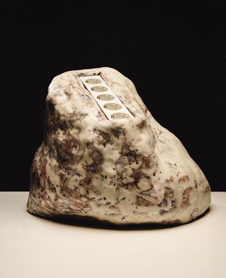
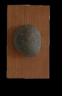
The Rock Dimmer Switch is exactly that: a river stone from Trout Brook affixed to a piece of cherrywood. Thomas Yang Studio brings the outside in with this fixture, which dims or brightens light with the turn of a rock. thomasyangstudio.com
→ BUSTER + PUNCH
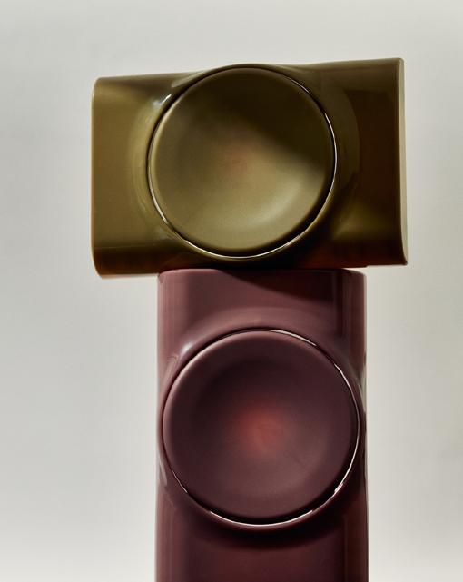
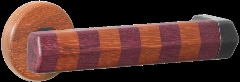
Door Knob Set Cast takes the language of music-informed light switches, which have become Buster + Punch’s calling card, and extends it into a limited edition. us.busterandpunch .com
← 22 SYSTEM
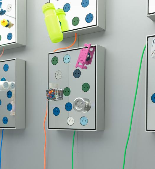
Presented at Matter and Shape, Plug-It is an installation by Crosby Studios, in collaboration with Bocci’s 22 System, that reimagines plugs and outlets as living artwork.

crosbystudios.com
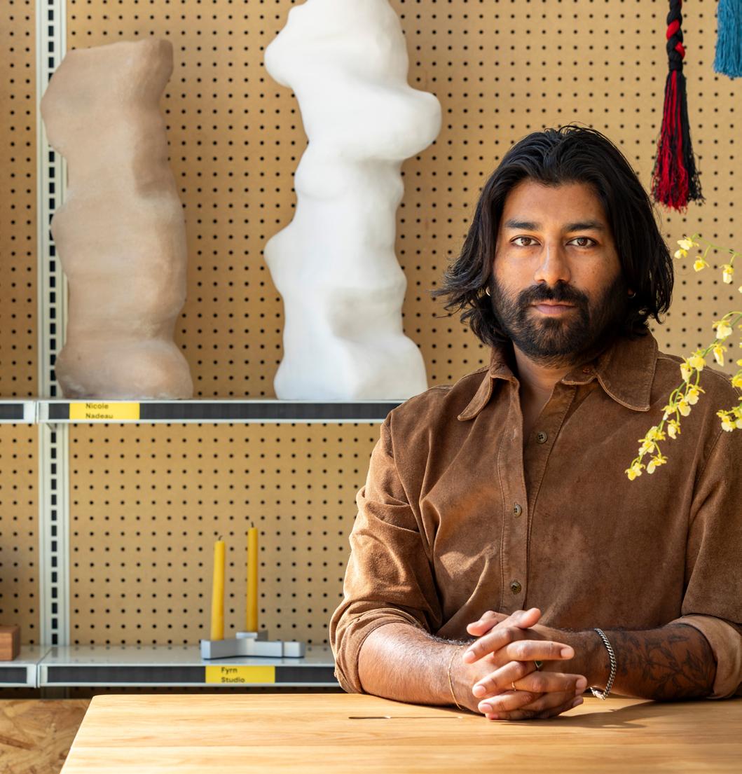
Based in San Francisco, Studio Anand Sheth works across residential, hospitality, workplace, and exhibitions as well as furniture and curatorial projects in California and New York. What balances the studio’s diverse scales is a careful reading of context, resourcefulness in materials and construction, and attention to community. Established in 2021, the studio has a reach that extends beyond client work: Founder Anand Sheth opened Storefront Anand Sheth, a platform for exhibitions, furniture, and public programming. Located in the city’s Mission neighborhood, the space was constructed in under a month, and it features repurposed retail gondola shelving salvaged from a liquidated Rite Aid. The initiative is now evolving into Salon Anand, an experimental, public-facing practice that will curate events, installations, and collaborations with an emphasis on emerging local voices and architecture as cultural work. —Kelly Pau

Founded in 2019 by Mary Casper, Social Studies Projects builds on her background working at firms like Johnston Marklee and WW Architecture, as well as The Archers, where Casper was the director of architecture. Her Los Angeles–based practice works across architecture and interiors, rooted in California’s culture of experimentation. The studio draws on historic precedents across disciplines to make detail-driven spaces that prioritize warmth, simplicity, craft, and a sense of wit. Current projects include two Altadena rebuilds; a hilltop property neighboring Schindler’s Oliver House; and a new ocean-view residence in the shadow of Gropius’s Murchison House in Provincetown, Massachusetts. When it comes to ground-up and renovation projects, the team of six approach history with sensitivity while maintaining a pragmatism for the needs of modern living. — Kelly Pau
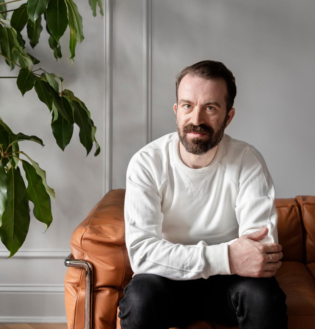
Nicholas Potts established his eponymous studio in 2020 after stints at SHoP Architects and Bjarke Ingels Group, where he worked on projects like the Spiral at Hudson Yards. Within its six years, the studio, based in Washington, D.C., and New York City, has spearheaded buzzy renovations with an emphasis on history. In D.C., the office updated a pied-à-terre in the Watergate Complex, synthesizing its distorted design history with a rich material palette. Then in New York, the studio reworked an apartment in Wallace Harrison’s 1936 Rockefeller Apartments, restoring the International Style–era approach to residential planning and interweaving an aura of decadence and moody ambience. Anchored by a team of three, the small but mighty studio looks to turn the rich well of historical references into something contemporary, sometimes surprising, and always irreverent. — Kelly Pau
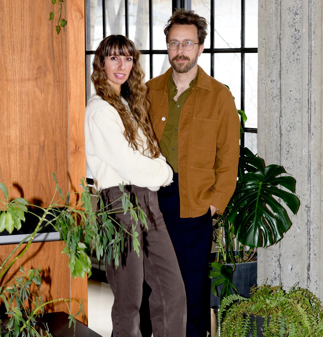
Run by founder Christine Djerrahian and partner Ernst van ter Beek, Future Simple Studio maintains a small, dedicated team of architects, industrial designers, and interior designers with backgrounds in visual arts, graphics, math, and marketing. The projects the Montrealbased office takes on are wide-ranging, from commercial and residential architecture to installation, furniture, and digital works. All are united by an effort to evoke joy and comfort while maintaining a visual dedication to simplicity. The studio’s latest work includes a circular, social-oriented sauna in Montreal called Recess Sauna, and a raw yet grounded coffee shop made of common construction materials, dubbed Even Coffee. The six-year-old office has been recognized for its careful attention to detail, inventive space planning, and harmonious use of materials. — Kelly Pau
The vibes out in the world may not be so good, but inside, there’s music in the air. As a broader movement toward analog nostalgia and intentional listening gathers momentum, new hubs emerge for listeners to find collective respite. Nightclubs rediscover their rhythm with experiential, design-driven concepts. A recent swell in artful hi-fi speaker design only further reflects a transmuted landscape of musical appreciation. From Miami to Minato, Japan, explore elevated interiors designed in service to sound. — Will Speros
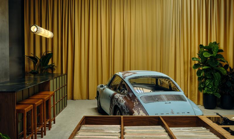
Car Part Time
BROOKLYN
A 2,000-square-foot concrete shell in Williamsburg is revived by Office of Tangible Space into both a classic car gallery and a hub for design, architecture, and culture. Vintage lighting and floor-to-ceiling linen curtains soften raw interiors populated with modern furniture. Custom millwork pieces flank a central lounge to form a bar and listening station.
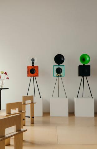
Silence Please NEW YORK
Sound, hospitality, and community create a clear visual rhythm in an environment designed for intentional listening on the Bowery. The linear gallery for the hi-fi company Silence Please is endowed with custom Baltic birch plywood furnishings by Graine Studio, including tables, chairs, and tripod speakers wrapped in a medley of materials. Low ceilings instill intimacy in the rear cafe, while a skylight enlivens the loft’s central axis, where a pair of darkly washed tables abut a listening area populated with black leather sofas and aluminum horn speakers.
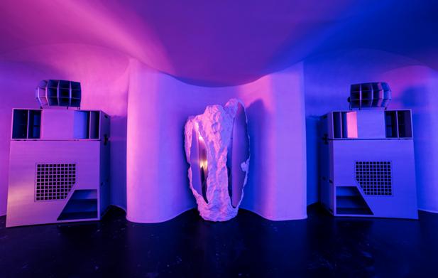
Redolent of post-WWII Tokyo jazz kissas, this 3,000-square-foot hi-fi bar spans subterranean bank vaults converted by 5G Studio Collaborative. Upon preserved raw concrete, cove lighting is cued to change color in sync with musical tempos generated by custom Ojas speakers, while an artwork by Lachlan Turczan composed of water and light also responds to sound waves in the air.
MIAMI
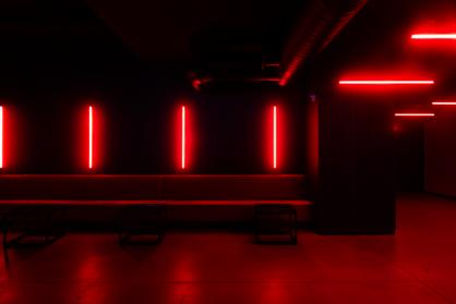
Sinclair Collective and Moyano Productions reposition a 2-story industrial space in Wynwood into an experiential nightlife escape. Molded-fiberglass grating panels and translucent acrylic sheets frame linear LEDs that line walls and ceilings, appearing to respond to the rhythm. Clubgoers animate the hypnotic light design as they dance.
NEW YORK
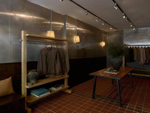
The downtown retail concept expands with a vinyl and wine bar touting a refined industrial flair designed by Of Enso. Custom pendants and sconces made from Colbo’s own deadstock fabrics infuse soft tactility across raw steel and concrete walls. Modular wood furnishings are accented by six bright-red custom speakers crafted in collaboration with hi-fi producer One-a-Way.
MINATO, JAPAN
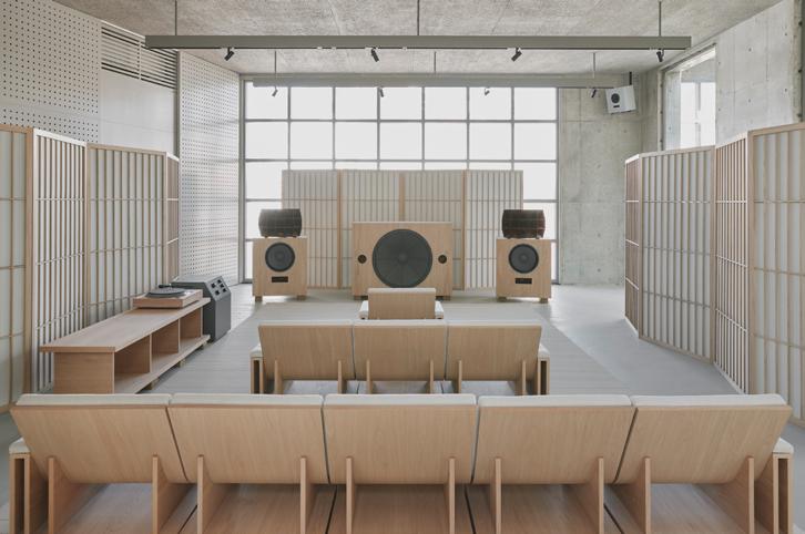
The Japanese cultural concept of ma, which explores distance and space across physical, temporal, and psychological realms, served as the inspiration for a new partnership between sound-system designer Devon Turnbull and Karimoku Furniture. The space features three new Ojas speakers and a minimalist seating design comprising curved tatami mats with or without a storage base showcased in a trio of transformed settings, including a tearoom as well as a listening room outfitted with wooden horn speakers and custom acoustic screens.
BROOKLYN
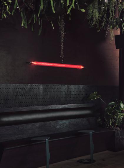
Discreet d&b audiotechnik speakers minimize the footprint of the sound system, allowing heaping greenery to become the visual anchor inside East Williamsburg’s newest club. Designed in collaboration with Jack Simonds, the space is wrapped in black leathered marble, and interiors place emphasis on unique tactility, with plywood, natural velvet, and calf leather enriching the sensory experience. Cloudlike glass bulbs and bent neon tubes imbue the space with an ethereal radiance and soft color as well.
Studio J.Jih adapts a dairy creamery into the headquarters for condom manufacturer Global Protection Corporation with a series of openings and scrims.
In 1987, in the midst of the AIDS epidemic, Davin Wedel, then a sophomore at Tufts University, sought to promote safe sex through a condom matchbook featuring the university’s mascot, Jumbo the Elephant. As it turned out, “Wrap your trunk” was an effective messaging campaign with college students. Shortly after this success, Wedel started Global Protection Corporation, a condom manufacturing company that uses cheeky marketing to advance public health. Today, Global Protection is responsible for supplying condoms to customers such as Planned Parenthood as well as the states of Massachusetts and Rhode Island. In addition to condoms, it offers customizable novelty wrappers. For the company’s new headquarters in Lynn, Massachusetts, Studio J.Jih, with Maugel DeStefano Architects as architect of record, aptly emphasized play and performance in equal measure.
This duality informed much of the project. Located in a 45,604-square-foot former industrial creamery, the company’s office and assembly and distribution site was conceived as a series of dueling ideas occurring at the same time. Studio J.Jih founder J. Roc Jih refers to this approach as “parallel play.” The resulting design balances a series of double imperatives: workplace necessities with a language of domestic and nightclub spaces; the company’s roots in safe sex and queer activism with its penchant for humor; and a language of openings set against a series of scrims.

PREVIOUS PAGE
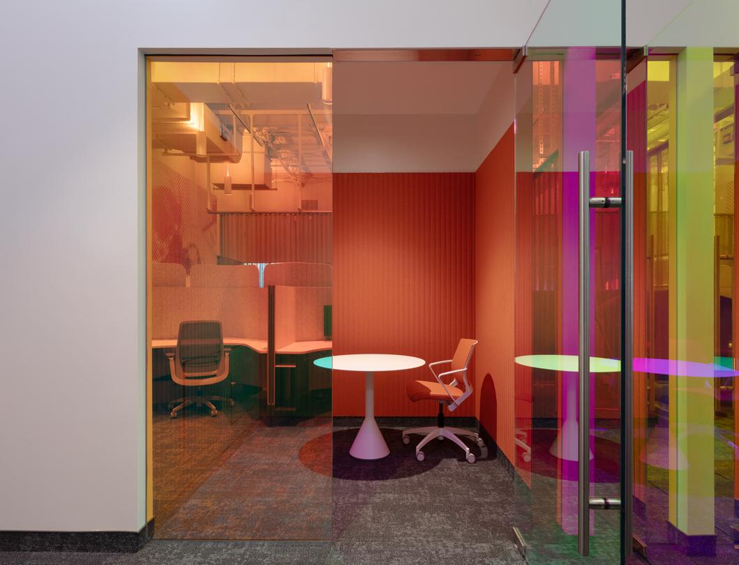
To create separation in the Global Protection Corporation’s offices, Studio J.Jih installed dichroic glass partitions, which infuse the space with multicolor hues while also offering privacy.
ABOVE
Entering the company’s headquarters, one is greeted with lighting fixtures constructed of recycled glass molds that were originally used to make condoms.
RIGHT
The space combines manufacturing with office spaces, and the first floor is dedicated to the company’s in-house factory.
BELOW
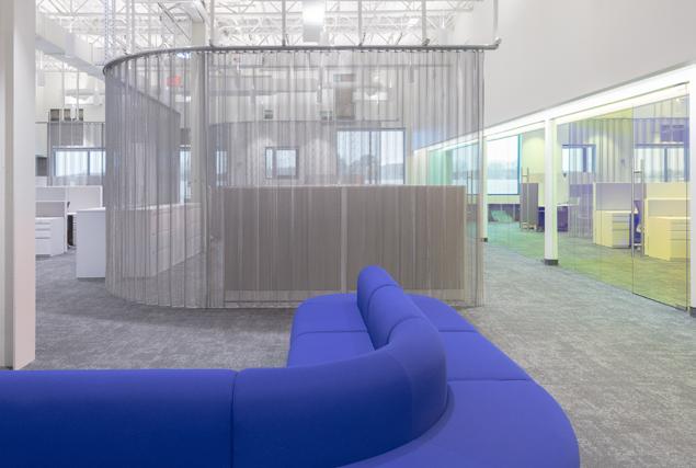
Chain-mail scrims snake through the office, offering flexible space solutions that can evolve with the company as it grows.
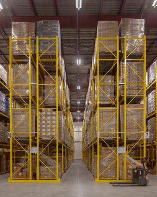
Entering the 2-story building, one is greeted with a playful sensibility—the entryway is lit by fixtures constructed of recycled glass molds that were originally used to make condoms. “They’re replaced after a certain period of time, so [Global Protection] has hundreds of these,” said Jih. The entry then leads into the warehouse, distribution room, and assembly room, all of which are housed within the first level.
Despite the industrial programmatic needs of this level, Studio J.Jih eschews the cold, traditional feeling of the factory floor. Instead, communal rooms and views between levels help soften the divide between the first-floor factory and second-floor offices. The design also prioritizes natural light over artificial. The white-walled floor is brightened by large windows placed high up to provide security and privacy while still enabling direct sky views.
This focus continues on the second floor, where window placements are optimized to bring light into the core. Offices situated along the perimeter of the floor get their own distinct aperture from a clerestory light to a ribbon window to a vertical aperture creating the scattering of openings on the building’s facade. Dichroic glass partitions the offices from the rest of the space, filtering the light throughout the interior and bringing in multicolor hues. This, perhaps, is also a nod to the company’s Night Light, the first FDA-cleared glow-in-the-dark condom.
The incandescence brightens the curvy gray workstations at the center of the floor. Weaving throughout the space are a variety of types of partitions. “We use a lot of these different scrims as a flexible and adaptable response to contemporary office needs,” Jih told AN Interior. “Chain mail, acoustic curtains, sheer curtains: They’re all used to control sight, scale, sound, and privacy, and they also make a kind of oblique reference to contemporary queer club environments.” This nod falls in line with Global Protection’s own branding, which has partnered with the Tom of Finland Foundation among other artists on condoms featuring artwork and advocacy initiatives.
The scrims snake throughout the space, softening the office environment and industrial shell with texture and tactility. As the company’s spatial needs continue to evolve, the partition enables the office to shrink or grow without requiring further intervention, a move that helps architects preserve as much of the original building as possible.
But more than anything, the textile layers are on brand. They filter and add a protective layer much like the company’s own products. The partitions “are thinking about domesticity in a slightly tongue-in-cheek way,” continued Jih. “It also appeals to experimenting with materials. For instance, [Global Protection] makes this graphene condom which is the thinnest in the world, so we wanted to be a little bit irreverent with materials, too.” Chain mail, dichroic glass, and glass condom molds recycled into lighting certainly refute traditional workplace typologies.
The textural layers and openings turn the creamery into a flexible and fun office and factory, ensuring that today and tomorrow, the site will remain a perfect fit. —Kelly Pau
Vipp’s guesthouse in Upstate New York, designed by Johnston Marklee, is its first in the United States.
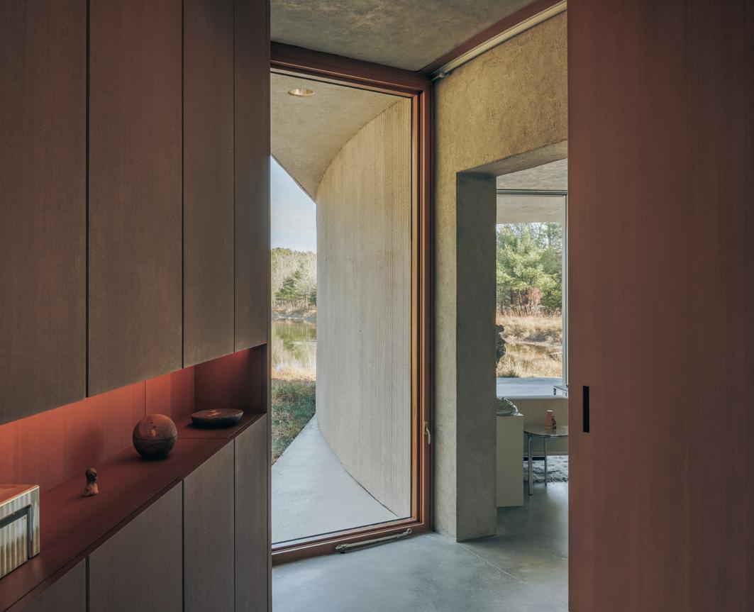
All too often, the pressures of life in New York City require a relief valve. This often takes the form of weekend trips: People rush out of the metropolis in all directions, eager to escape their laptops. Now, with Vipp’s newly unveiled guesthouse, there is a new high-design offering to consider. Set just north of the Delaware River in Sullivan County, it is the 15th guesthouse opened by the family-run Danish design company since 2014 and its first in the U.S.
Designed by the Los Angeles–based Johnston Marklee (JML), the getaway is stashed at the end of a 16-acre site. The property was just “pine trees, cattails, and deer” when the company bought it, Sofie Christensen Egelund told AN Interior. She is a third-generation co-owner of Vipp who runs the company’s U.S. operations with her husband, Frank. (Although Vipp owns some of its guesthouses, others are realized through partnerships.) While other guesthouses are in far-flung locales, this one was more personal—the couple live in Tribeca, and it will also be a weekend home for their family.
JML has a “distinct way of doing their architecture that resonated strongly with us,” Christensen Egelund said. For the commission, JML mined its back catalog for inspiration. It returned to Chile House, an unbuilt “monolithic bunker” from 2011, originally designed
PREVIOUS PAGE TOP
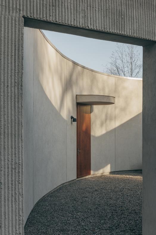
Two curves swoop through the residence to organize its rooms and windows.
PREVIOUS PAGE BOTTOM
The deep-brown hue used in bathroom stucco and millwork was pulled from its Duratherm windows, fabricated from Sapele mahogany.
ABOVE
Johnston Marklee referenced its past work for the commission, sourcing inspiration from an unbuilt gallery.
BOTTOM
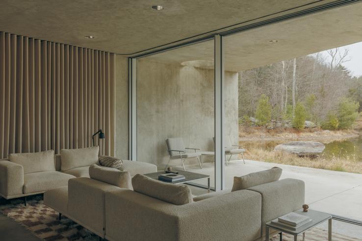
The living room and covered porch is furnished with Vipp’s seating and lighting.
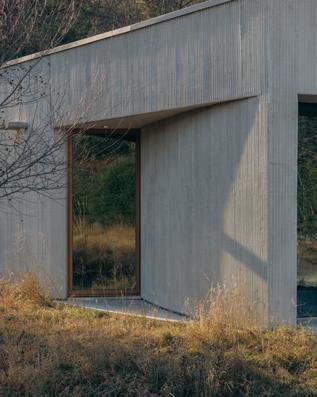
as a gallery. The idea pairs two parabolas that share a tangent point: One is an exterior courtyard, the other the main interior space, and other necessary rooms are packed between the curves. JML adapted the scheme to Upstate New York, resulting in a 1,200-square-foot, two-bedroom guesthouse finished in varieties of stucco: a raked, ribbed finish on the outside, a smooth version inside the courtyard, and a textured one on the interior.
Mark Lee, founding partner of JML, said the scenography of the house is important: One processes through the view, which is then hidden, only to be unveiled again. The entry meadow was planted by Larry Weaner Landscape Associates, which worked on the meadows for Glenstone.
The team avoided the trappings of typical residential projects, as seen in the mirrored can lights. The interior’s deep-brown supporting color, used in bathroom stucco and millwork throughout, was pulled from its Duratherm windows, fabricated from Sapele mahogany. Vipp’s owners ended up doing some of the work themselves, including spending ten satisfying days finishing the floors. The extruded flat box has a green roof, which deadens the sound of rain falling and lends the peaceful space a sense of “solidity and silence,” said Sharon Johnston, founding partner of JML.
The well-appointed interior allows up to four guests to discover the Vipp universe for themselves, from kitchens, vanities, and chairs down to lights, towels, and cleaning utensils. Christensen Egelund compared it with test-driving a car. A bespoke edition of Vipp’s swivel chair, which matches the monochromatic palette, was made for the property.
When I visited in February, the shades of gray blended with the winter weather. It was like relaxing inside a snow globe. A freestanding V3 kitchen in anodized aluminum, centrally placed at the focal point of the pond-pacing ellipse, is the hub of the interior. Here, there is two-way drama: When reclining on the Vipp sofa, the outside porch, seen through a panoramic three-panel slider, turns into an observational platform. But when cooking and washing up, I felt like I was onstage, a character in a play. This sense was heightened by the main room’s curtains, which, when closed, ring the perimeter and hide inhabitants from view. At night, paired with low lighting, the effect was that of a cocoon. My journey was complete: I was fully and pleasantly immersed in the stylish world of Vipp. —Jack Murphy
At SAINT, BOND offers a private sauna experience for busy New Yorkers.
For many New Yorkers, bathhouses offer a welcome reprieve from busy city living. But as a swell of social bathhouses have taken the city’s wellness landscape by storm, SAINT, a new sauna experience from Alex Feldman and Amanda Hensen, has emerged with a model that highlights the city’s most precious commodity: privacy. The duo, who met as colleagues at WeWork, imagined offering harried New Yorkers an escape from the city with sauna sessions in private suites. To make their vision a reality, they commissioned BOND, one of AN Interior ’s Top 50 Architects and Designers last year, to design their Chelsea location, which opened this spring.
From the street, SAINT is mysterious yet inviting. Warm, filtered light spills out, promising respite from behind a fluted glass window. BOND principal Daniel Rauchwerger told AN Interior that the glass motif was drawn from the material vernacular of a past New York: “As spatial designers, we wanted to create something that was almost like artwork that could act as a signifier, so that someone passing by in the street would recognize it from another location without needing a logo.” BOND created an exterior calling card for SAINT, which is already planning to open other New York locations.
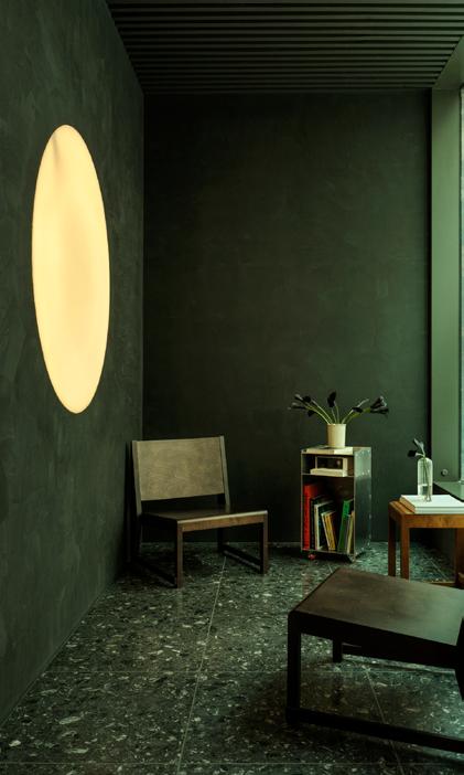
After entering, one is enveloped by the monastic lobby, which features a softly glowing circular light installation, a subtle homage to the works of James Turrell and Olafur Eliasson. An architectural model of the space is also on display. It’s only from this viewpoint that one can fully appreciate the jigsaw puzzle–like configuration of SAINT’s four private sauna suites. “Each pod was designed like a Tetris piece,”
LEFT
SAINT offers an escape from busy city life, beginning with its monastic entrance, featuring furniture from Frama and a James Turrell–inspired light installation.
RIGHT
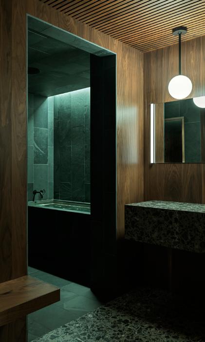
BOND placed its own spin on traditional sauna materials, like slate and cedar.
Rauchwerger said, explaining that the interlocking spaces devised by the firm were informed by the spatial constraints of SAINT’s narrow footprint and the programmatic demands of the sauna cycle.
A long, portal-like hallway branches out to connect the four rooms. It is color drenched in muted black limewash and illuminated by a low glow from thoughtful, hidden lighting interventions by lighting architects Emy After Dark. Designed to simulate the fading away of the city’s hustle and bustle, the dim passage encourages visitors to reconnect with their senses.
With SAINT, BOND referenced the traditional material language of saunas while placing its own unique spin on the space. Warm, wood-paneled walls in the vanity area create a natural sense of separation between the modestly sized unit’s wet and dry areas while also echoing the timber in the adjacent cedar-lined sauna. A sleek, stainless steel cold-plunge tub clad in cool gray slate lends a Brutalist undertone to the space. Understated yet playful design decisions like a black terrazzo counter and spoke-and-wheel faucet handles from Brooklyn-based company Watermark deliver visual intrigue.
“Of the different finishes in the space, it’s probably the most literal in its reference to water,” said Rauchwerger of the steampunk knobs. “But as with our other projects, our firm is sometimes not so afraid to be literal,” he continued, emphasizing that the studio’s approach is deeply rooted in its relationship with its greatest muse: New York City. “It’s a very literal city—what you see is what you get.” —Isabel Ling
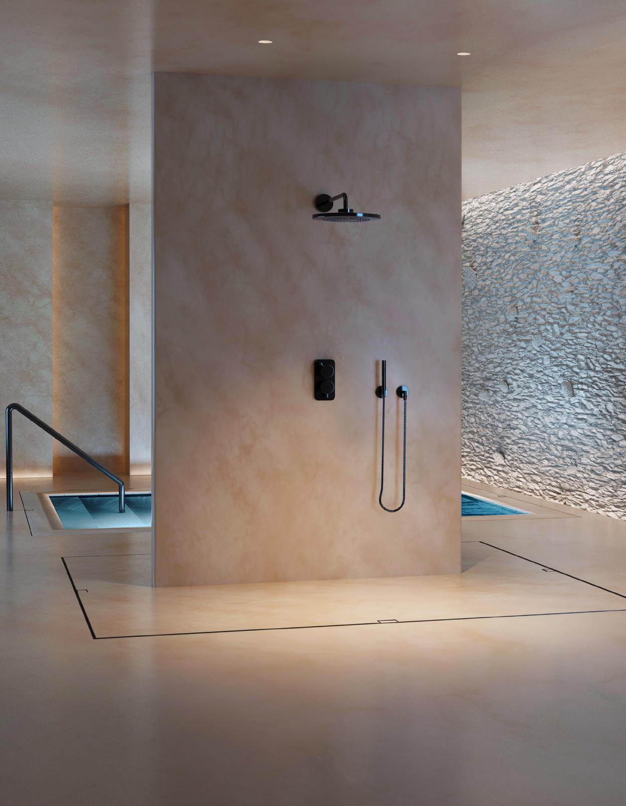
The Site Sizable® Slot Drain brings the clean, refined look of a slot drain to any project. Its field adjustable design allows installers to precisely cut and assemble the drain to exact site conditions, ensuring a perfect fit every time. Learn more about our
Ali McQuaid Mitchell of Futurestudio shares how she designs today’s trending bathhouses.
These days, the bathhouse feels like a site of improvisation. It offers a “yes, and…” attitude that pushes the traditional boundaries of the spa and sauna to include activities, performance venue, discotheque, or even a comedy club. This is due, in part, to a new crop of bathhouses, outfitted in moody atmospheric lighting and luxurious finishes amenable to flexible programming.
Behind many of these projects is the Toronto-based firm Futurestudio, helmed by Ali McQuaid Mitchell, which has quietly transformed how we think of collective bathing through its dynamic, nature-inspired designs for the bathhouse chain Othership. As the
At this point, you’ve designed and completed eight wellness projects, with more on the way. Tell me a little about your background and how you got started with this design typology.
Ali McQuaid Mitchell
My background is in restaurant and hotel design. About five years ago, I got an interesting email from the Othership team that said, “Hi, your name was given to us, and we’re planning this really interesting experience with sauna and ice baths.” At the time, they had a small sauna and an ice bath in the backyard of one of the founders, and they invited me to check it out. I had a strong appreciation for spa culture and wellness spaces, but I had never designed one. This was deep in the middle of the pandemic, so I had a Zoom call with the founders, who told me they wanted to create something totally new: to apply the concept of group classes to the context of the spa—essentially to create a more social spa culture. One of the founders, Robbie Bent, explained that when he was recovering from addiction, he visited Russian banyas as a way of having a nightlifelike activity that was alcohol free.
They shared early on that they didn’t want to create something that resembled anything they’d seen before. It was compelling, it created space to explore something entirely new. I visited their backyard and garage, where they walked me through a guided session that they envisioned they would create. I did my first ice bath. The music was great, the atmosphere was great, and it was just a small group at the time, but it clicked for me. I could feel this was something new, an experience people would be drawn to, and that it had the potential to shift the spa industry. That realization was really the starting point for Futurestudio in wellness design. We learned a lot together. We didn’t look at spas for inspiration. We looked more toward nature, hospitality, and even the cinematic worlds of atmospheric films; we brought in different precedents

wellness landscape continues to evolve—Othership and Futurestudio have collaborated on four locations across New York and Toronto, with a fifth on the Upper East Side expected to open in 2027—McQuaid Mitchell has also expanded the firm’s bathhouse portfolio to more international waters. Recently, Futurestudio completed Rē, a social wellness club in Dubai, Umvelt in Montana, and Sant Roch, France’s largest sauna to date.
McQuaid Mitchell spoke with AN Interior ’s managing editor, Isabel Ling, to reflect on the evolution of social bathing and imagine design’s role in shaping the future of wellness.
because Othership wanted something that looked different from what the consumer is used to seeing in the spa and wellness world. It has been an amazing learning experience. Whether it’s fitness or wellness, there are so many innovators and entrepreneurs pushing the boundaries of expectation; it’s an exciting time to be a designer in this space.
With Othership, you’re leading a larger design movement that has shaped other social bathhouse experiences. What sort of guiding design principles did you bring to the project?
Three things: materiality, lighting, and flow. For Othership, we wanted to break away from the use of only cold materials within bathhouses. The challenge is that the spaces are highly used and need to be hard-wearing. They’re cleaned constantly, there’s chemicals, there’s high humidity. Historically, I think that is why a lot of bathhouses have just been completely tiled. However, one of the important things for us was to use as many natural materials as possible. One of our initial material ideas with Othership was to explode the sauna: So, in the first location, we took cedar from inside the sauna and carried it through the entire reception area and most of the dry spaces. We also paid attention to the tactile feeling in your feet and used real river stones for the flooring that were taken out of a river and sliced to create a custom tile for us that is used across all the Othership locations. We wanted these barefoot spaces to feel like you are standing in a natural body of water. It also serves other technical purposes as well: It’s easy to slope, because it’s in a mosaic format, and it’s beautiful and dark, so when it gets wet, it looks even better.
The second thing is the lighting. We try to emulate candlelight or the light of a campfire. We wanted that feeling to carry through the entire
space, with lighting that quietly supports people. The lighting is designed to be gentle and flattering, helping people feel at ease, held, and confident. We don’t want your mind to be distracted by feeling insecure due to being overly lit. We don’t light people; we light tasks, we light your way, and we light the flow. Nobody wants to be sitting with a spotlight over their head. To get that perfect light temperature, we are thoughtful in our placement. But we also handpaint some of the filters that go over the light fixtures, because a lot of the lights don’t come in that low of light temperature, because no one in the market is looking for it.
And then the last thing is the flow. We pay attention to how people circulate through the space, and we understand that your journey starts at the front door. We pay attention to the number of steps we make you take.
IL
You were given the program of this space before you designed it. What is it like to design with a social ritual in mind?
AMM
New rituals are being developed all the time, and they are formed in these types of projects. You have to plan for things that no one has thought of yet. Will there be live music? Will there be dancing? For example, the Othership team continually creates new programs. Now they do standup comedy on site and other performances. It’s just amazing that there’s this endless creativity. In many ways, we’re creating performance space as much as we’re creating bathhouse space. We try to think ahead and listen to our clients when they’re telling us about any rituals or performative elements of their concept. Then we try to think about how people would want to encounter these actions: Can we transform the space using lighting or drapery? We’ve learned that you can break the mold of what a spa has been.
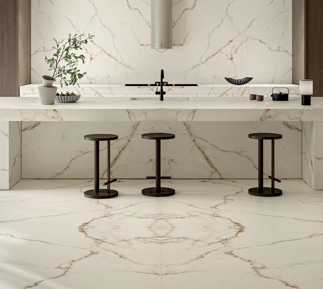
MASTER DISTRIBUTOR FOR
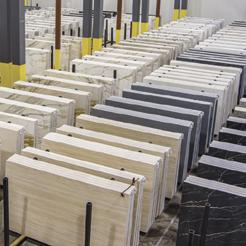


ACHIEVE EFFICIENCY AND QUALITY WITH EXTRA-LARGE PREMIUM PORCELAIN SLABS DESIGNED TO SAVE TIME, EFFORT, AND MATERIAL.

ALL 28 COLORS IN STOCK!



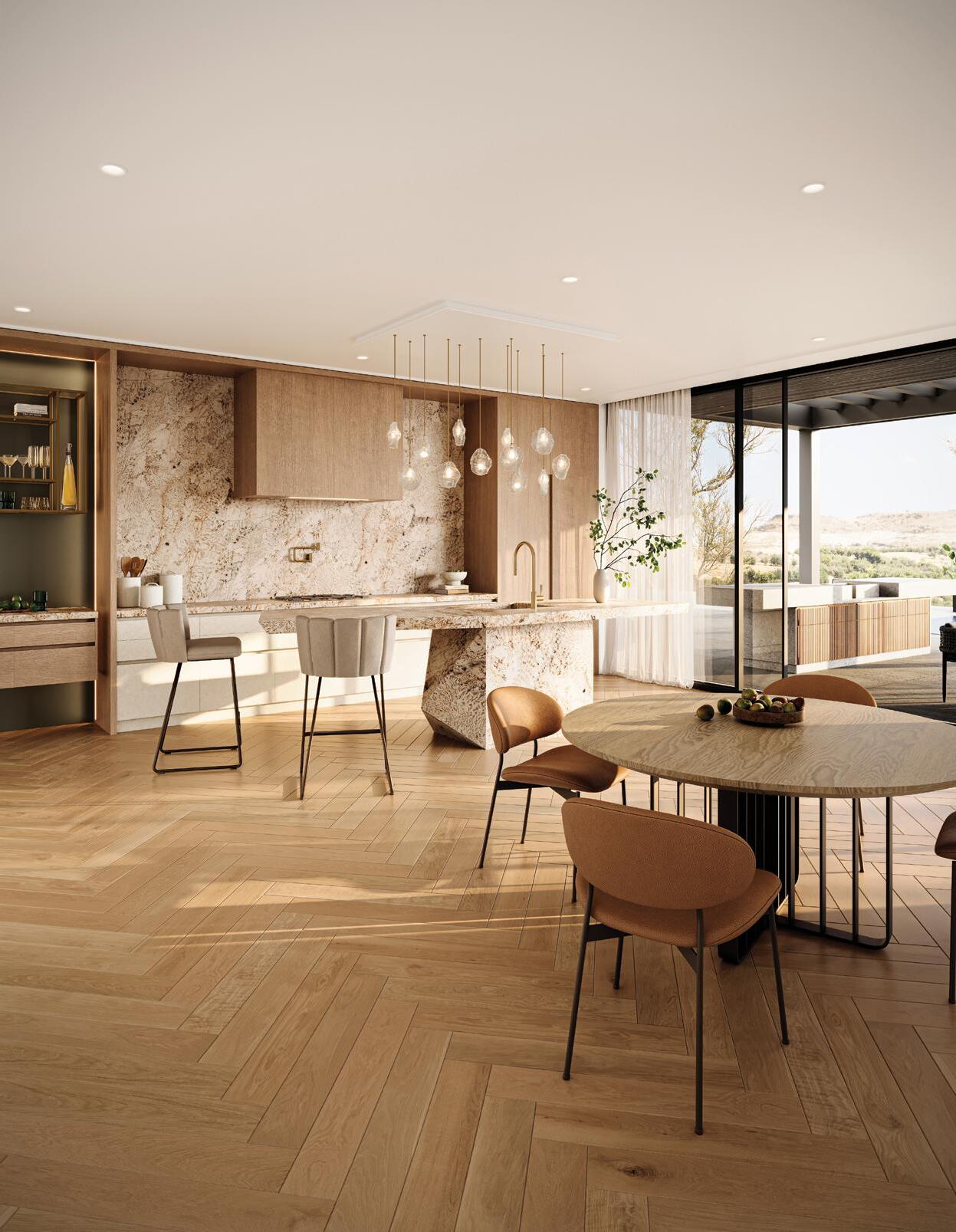

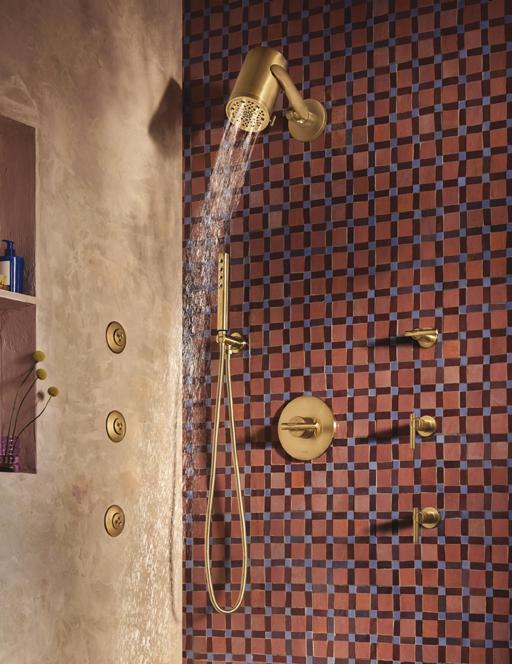
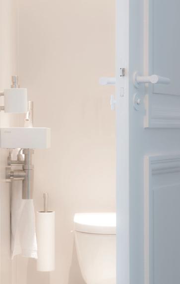
Spaces for cooking and bathing establish rhythmic rituals that structure our lives, both in our homes and in public spaces. Here, we check in on projects, products, and people leading the way.


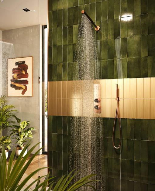


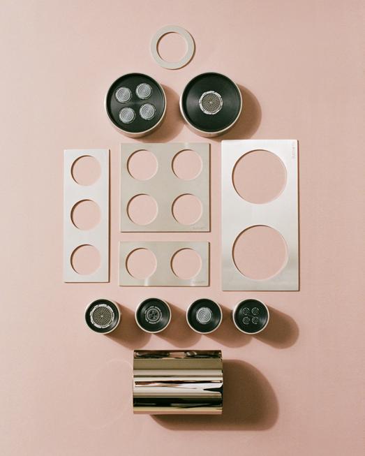

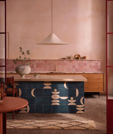
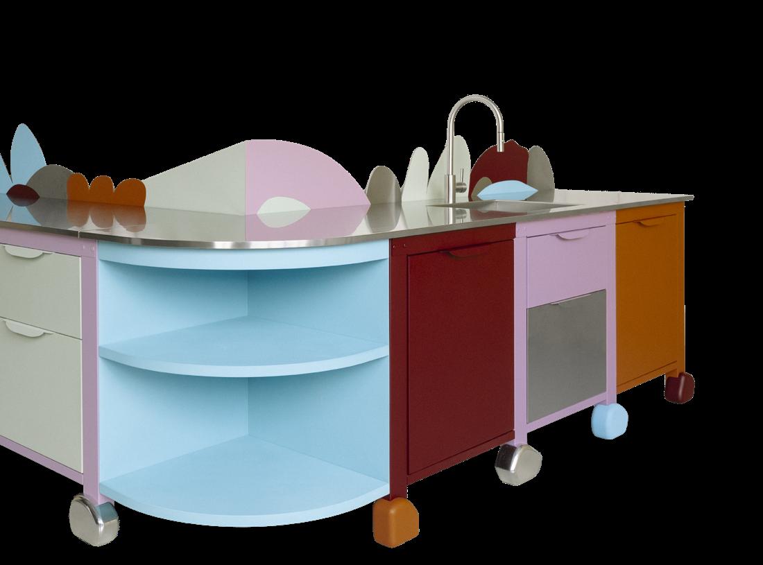
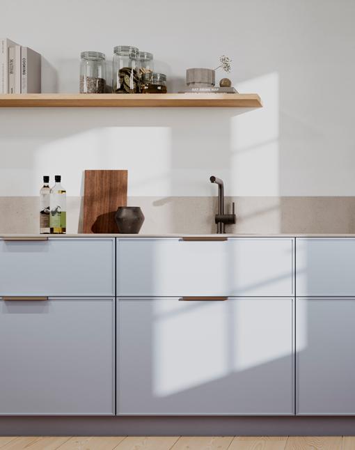
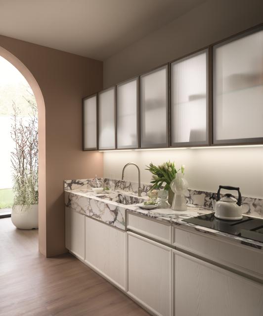
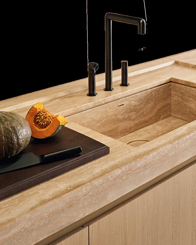
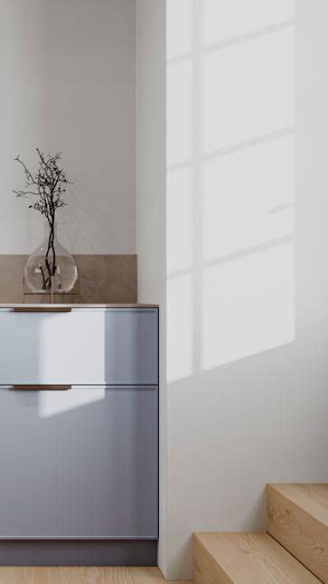
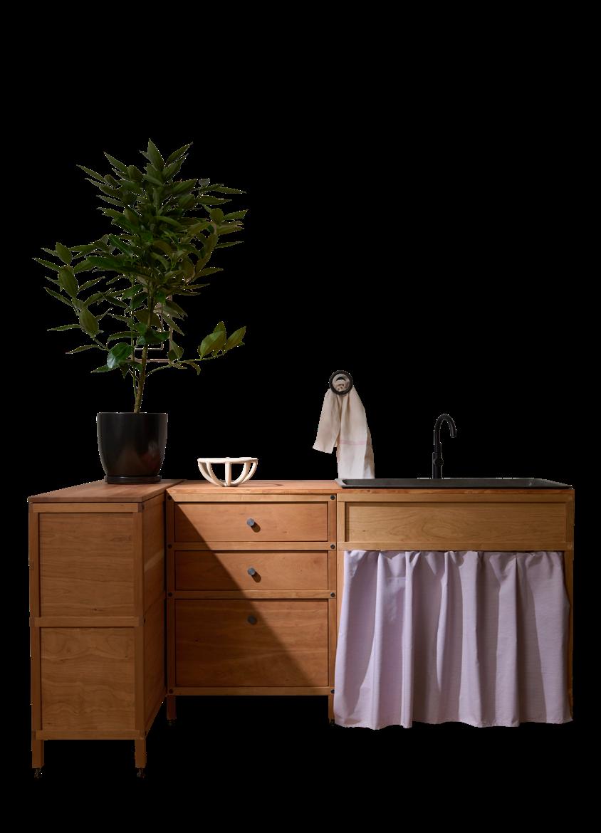
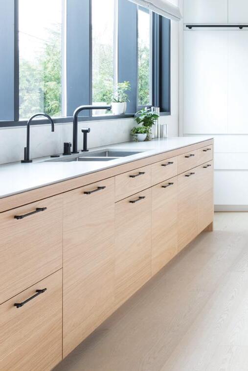
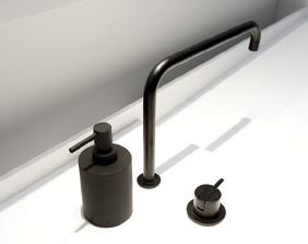
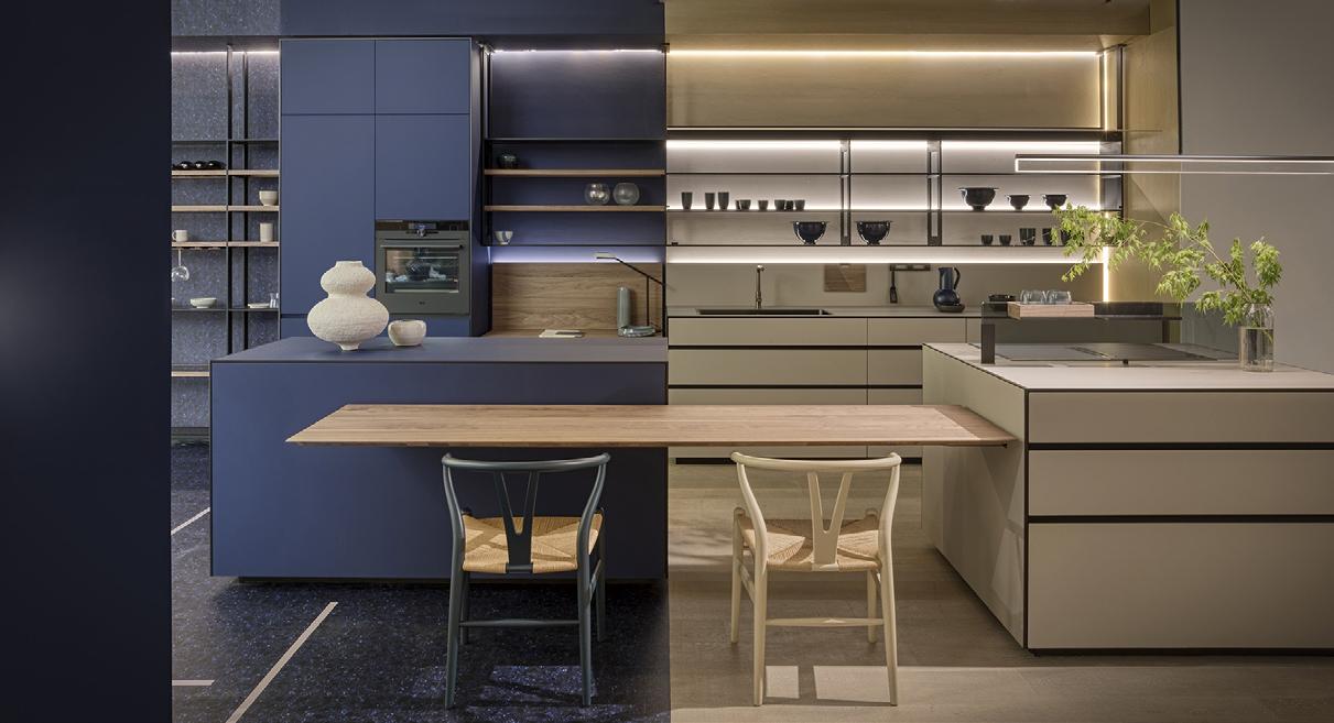
Although kitchens do a lot of heavy lifting in the home, they need not look bulky. Kitchen designers have increasingly slimmed down the massing and density, presenting lightweight systems with pastel hues, wood features, delicate textures, and modularity.

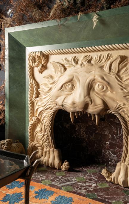
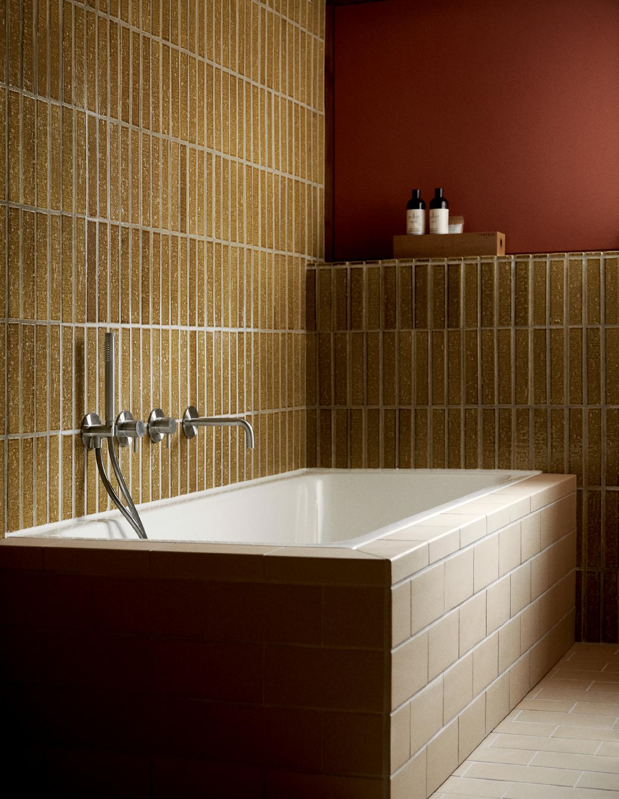
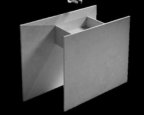
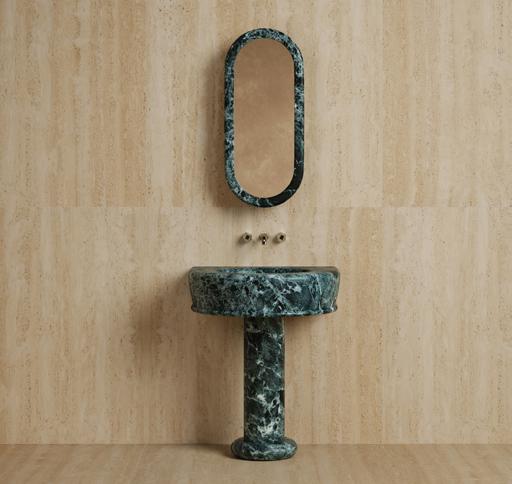
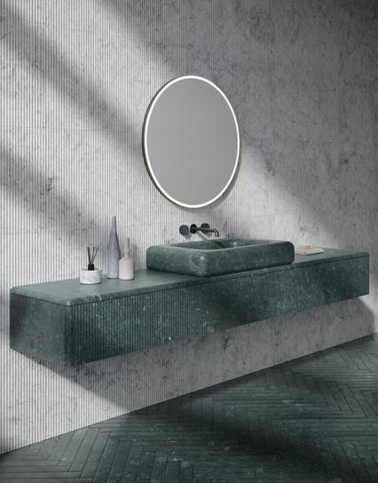
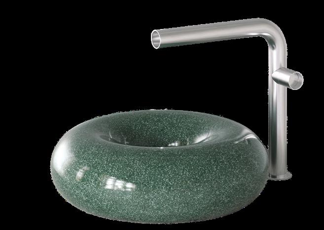
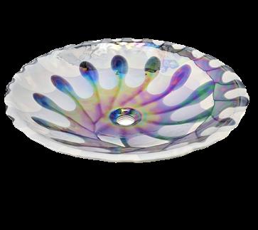

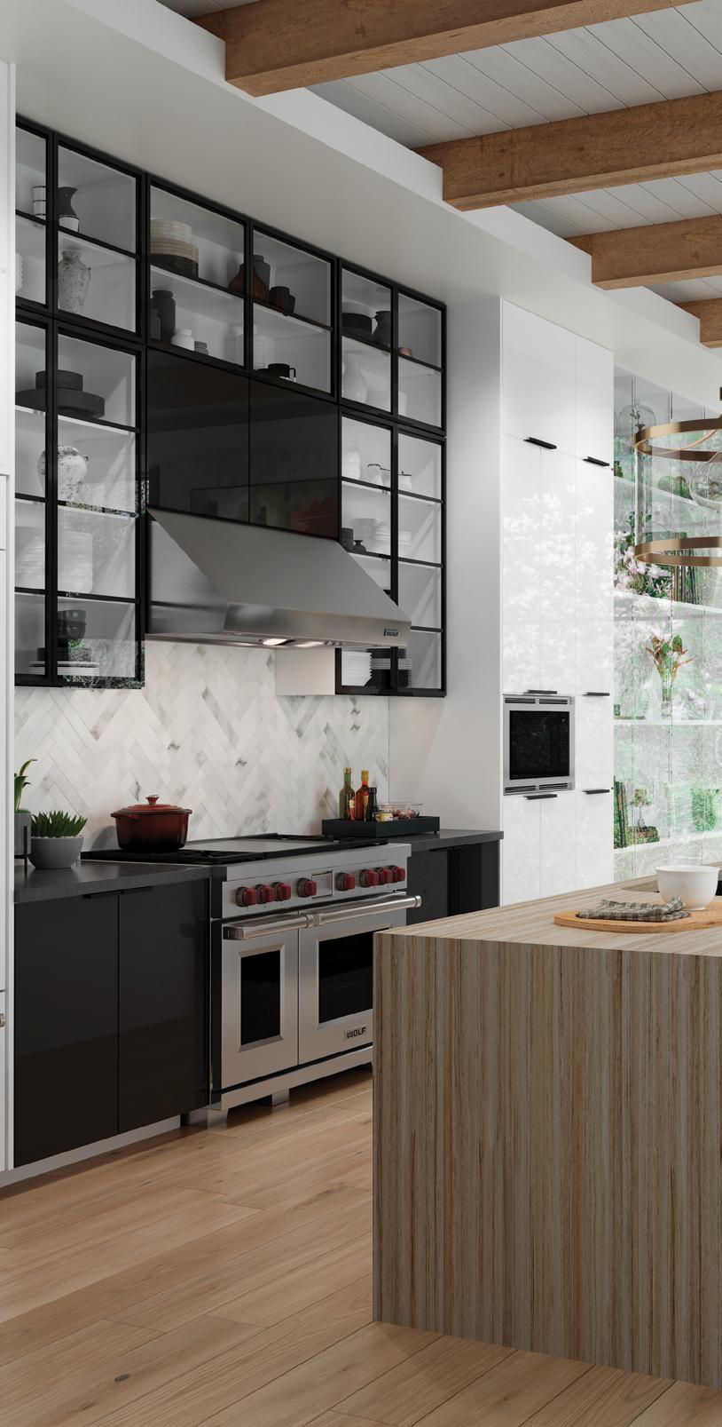




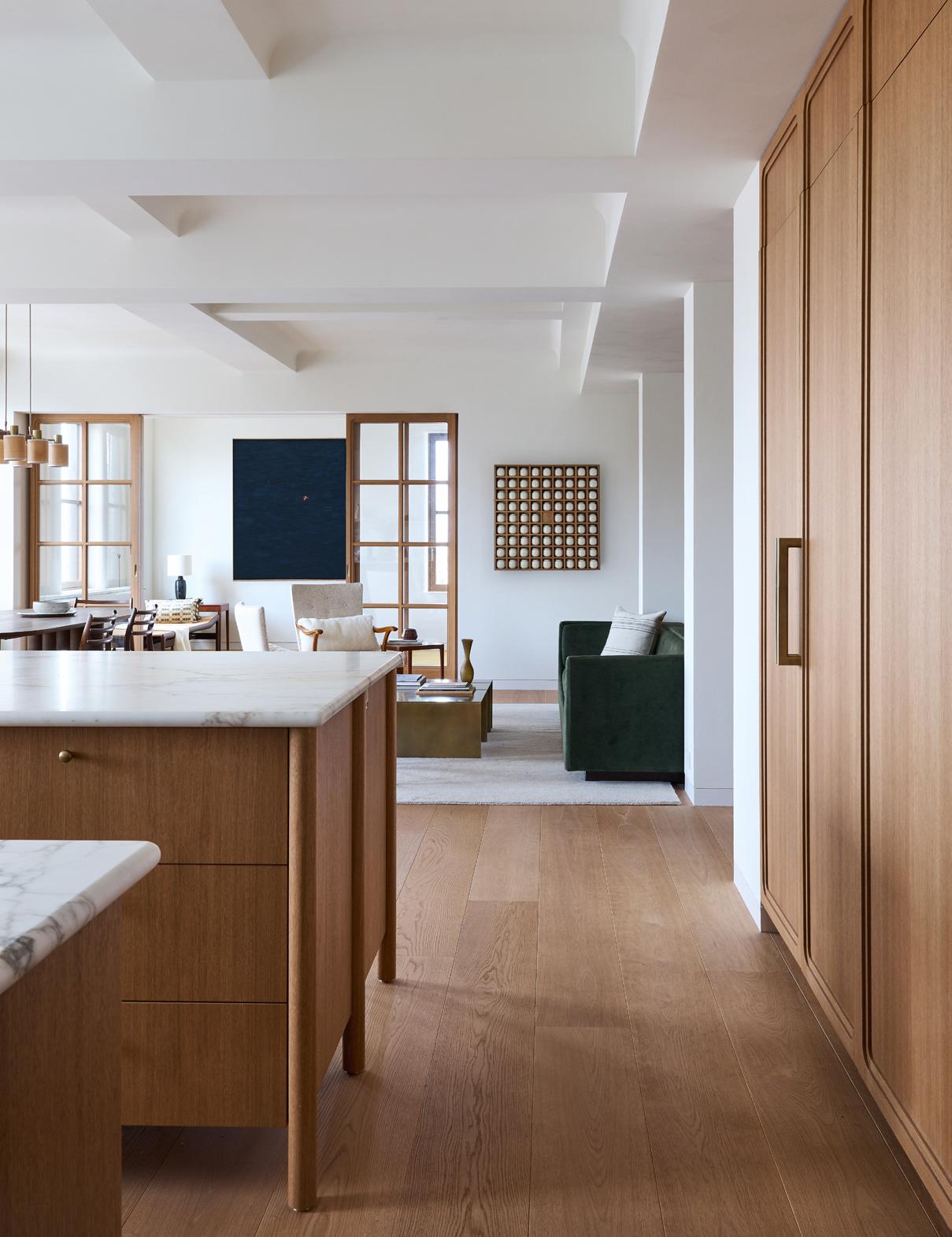
To combine apartments in a prewar midrise, Lang Architecture introduces a unified palette of noble materials and subtly curved flourishes.
PREVIOUS PAGE
Precision-rendered cove detailing ties everything in the living spaces together.
TOP LEFT
A curved motif was deployed on architectural features and built-in furnishings.
TOP RIGHT
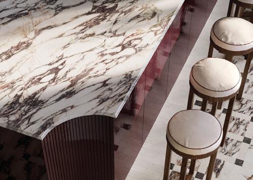
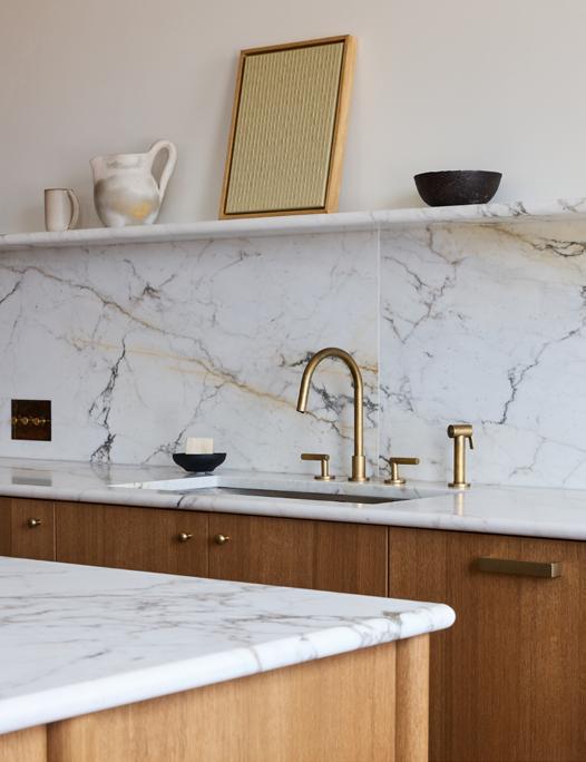
A Calacatta Paonazzo marble countertop and backsplash soften the material palette used in the kitchen.
BELOW
Mid-toned white oak extends throughout the space, appearing on the floorboards, the built-in armoires, kitchen cabinets, window frames, and French doors.
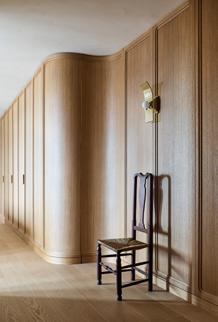
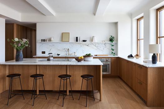
As a family residing in New York City’s East Village neighborhood grew, so did its need for square footage. Expanding into an adjoining unit in its prewar midrise required a renovation—one that would better unify the space and serve different functions. It was also a chance to bring the mechanical systems up to standard and gently call back the 1920s building’s oh-sosubtle deco style. With a stated mission of “creating generational sustainability through connected design,” Lang Architecture was the right partner to carry out the task. And with the homeowners closely involved in every step of the “deep and broad” process, the prolific New York City and Hudson Valley practice was truly a partner. So were general contractor Ravi Arps and Brooklyn furniture fabrication studio Elephants.
The cohesive result is defined by the deft deployment of limited natural materials and the introduction of a curved motif that carries across from architectural features to built-in furnishings. The space is infused with an implicit sense of longevity—something hard to come by in this city. This was largely due to the clients’ willingness to do things the right way. “They knew what they wanted but also gave us a degree of autonomy to realize their ambition,” said Drew Lang, Lang Architecture principal.
“They were interested in marrying the redesign of the apartment with its history,” he added. “They also wanted the space to become a borderline loft with lots of natural light.” The 16th-floor unit has large windows framing unencumbered views of Midtown Manhattan’s tiered skyline. “Completely tearing things apart and carefully building them back was tricky at times,” he explained. This is especially true considering Lang and his team had to reroute the electrical service and introduce surprisingly nonexistent window lintels to hold the existing brickwork facade in place.
Mid-toned white oak extends throughout the space, from the floorboards of the now open-plan kitchen and great room to custom floor-to-ceiling built-in armoires that contain concealed elements like a wet bar. It was also used in kitchen cabinets, newly installed window frames, and mirror-proportioned French doors, which segment off an adjoining den. Contrasting this sober consistency—whose only distinguishing point is slight variations in grain pattern—are the softening qualities of limewashed walls and Calacatta Paonazzo marble, used in the near-seamless kitchen countertop and backsplash. Brass taps and other fixtures introduce a worn-in quality that achieves the preengineered sense of longevity mentioned before. “There’s nice tension between things [that are] new and [things] meant to age,” said Lang.
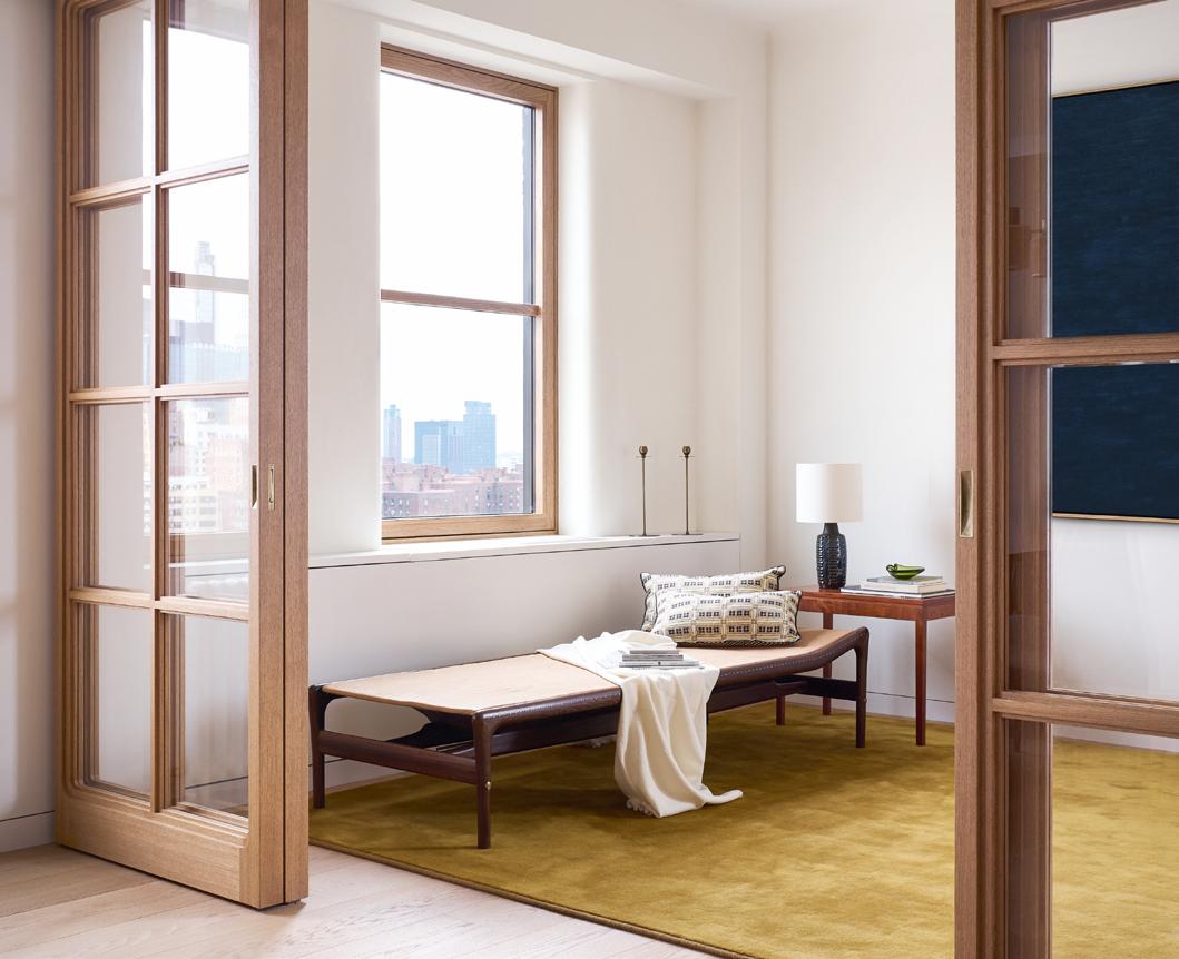
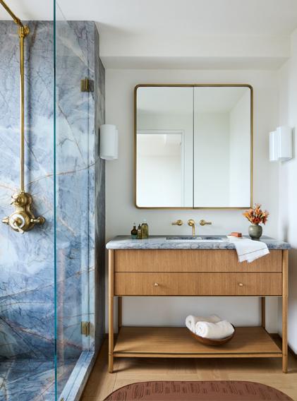
What ties everything together is precisionrendered cove detailing—that deco nod—found in everything from window bay recesses to the contour of the built-in armoires and the credenza-like kitchen island. Its formal articulation is repeated in bathroom vanities joined by rounded-edge medicine cabinets. It’s here where things take a bold if controlled turn. In one walk-in shower, checkerboard pattern baby-blue and white tiles play off a complementary toned marble. In the other en suite, it’s a more ultramarine International Klein Blue.
This renovation project stands testament to the power of close client collaboration but also to the unifying potential of carefully deployed natural materials and nuanced detailing. This is how longevity is achieved.



Vrtical’s Casa Gardenias creates a peaceful home and studio for a mother daughter duo.
PREVIOUS PAGE
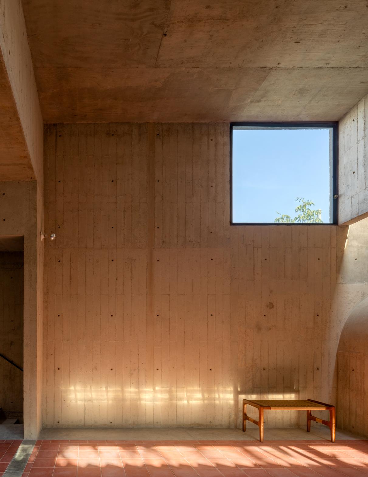
Skylights and cutout windows usher in sunrays that are reflected and modulated by the brute concrete of the interior’s rounded wall sections.
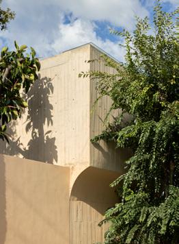
The building’s voluptuous massing was shaped by constraints like a public sidewalk that runs alongside one edge of the site’s perimeter.
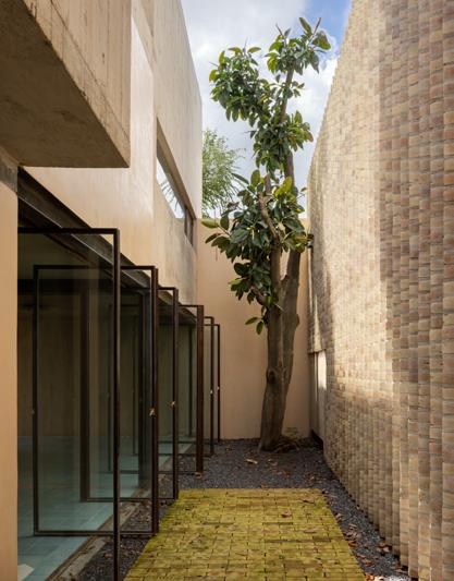
One side of the project’s ground floor was left unbuilt, carving out a rectangular courtyard enclosed by a tall brick wall.
BELOW
Mural-like aqua green tile creates a transitionary space in the project’s indooroutdoor configuration.
With its dense jumble of middle- and working-class neighborhoods, mixed commerce, and scattered factories, the somewhat hilly municipality of Naucalpan, just northwest of Mexico City, is a nondescript extension of the vast metropolis. Devoid of notable landmarks or hip restaurants, it receives few foreign visitors. It’s a shame, because the area is home to a standout example of recent local architecture: Casa Gardenias, a house designed by 12-year-old boutique firm Vrtical for a design-loving mother-and-daughter duo. Based in the booming capital, architects Luis Beltrán del Río and Andrew Sosa are the creative forces behind the smart, small- to medium-scale residential interventions that Vrtical specializes in. Their projects often incorporate existing structures, and in Naucalpan, too, elements of a residence that existed on site before were reutilized in the new design. “The preexisting house had no real architectural language or features worth preserving. Its value lay in reducing the need for new foundations and walls,” said Beltrán del Río Accordingly, Casa Gardenias neither restores nor nods to what came before, instead simply recycling the structural parts deemed useful.
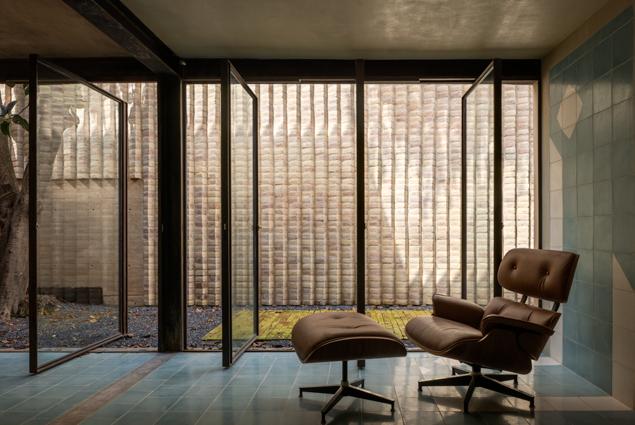
The brief was simple: to create an easily accessible studio for the daughter, a recent interior design graduate, that was connected to but also separate from living spaces the mother, a Chiapas-based smallbusiness owner, could use when in town. Vrtical delivered exactly that, dressed in a captivating package. Viewed from the outside, on its prominent corner site, the hermetic beige massing of Casa Gardenias’s stacked cubic volumes contrasts effectively with a chocolatehued gate in oxidized steel. The board-striated pigmented concrete used for all new additions gives the dwelling its singular character.
As is often the case in Mexican architecture, which has historically prized thoughtful sequencing over exterior spectacle, the generosity of Beltrán del Río and Sosa’s design reveals itself gradually behind the rusted metal gate. After you enter the house through the garage, a serene studio lies to the right, followed by a bedroom with an ample walk-in closet and adjacent bathroom. Crucially, the ground floor layout’s rear long side is left unbuilt, carving out a rectangular courtyard enclosed by a tall brick wall. In the mornings, light from this contained
outdoor room permeates the studio, as does the dynamic, earthy effect created by the syncopated arrangement of the clay bricks. Aqua-green cement tiles cover interior floors and occasionally climb, mural-like, up walls, further livening the space, which is also activated with elegantly emphasized joints wherever distinct surfaces collide.
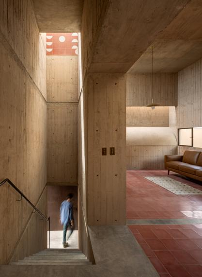
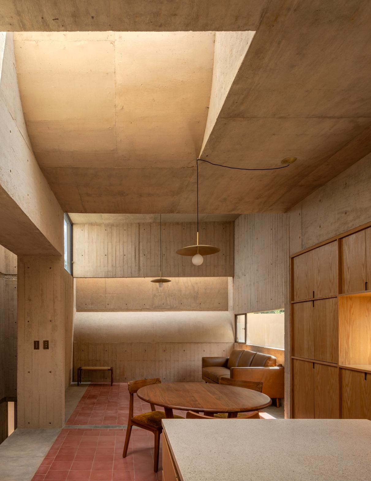
And yet, the downstairs serves merely as a restrained amuse-bouche for what comes next. From the main entrance, a somber staircase leads up to the primary apartment. The penumbra is deliberate, enhancing the wow effect as one first glimpses, nearing the top, Casa Gardenias’s luminous showpiece: a 420-square-foot salon that combines the living, dining, and kitchen areas. The space, at once compact and expansive, surprises with its enveloping warmth—all the more unexpected given the textural dominance, here as elsewhere in the house, of concrete—and skillful handling of light. Upstairs ceiling heights reach to 13 feet, magnifying the sensation of having entered a lofty, tranquil oasis. Juxtaposed with a coral-red cement tile floor, the kitchen’s oak fronts and raw, mochacolored wall expanses, complemented by the clients’ spare furniture—including pieces in tzalam wood paired with a burnt-gold fabric—complete an alluring sea of harmonious tones and shapes.
Skylights, a Vrtical trademark, are deployed with rounded wall sections to modulate how incoming sunrays reflect on the brute concrete. “Even though the house looks inward, the outside had to brighten its spaces in a controlled way. So, we crafted an intentional dialogue between how the home is lived in and how light streams into it in the most precise, agreeable manner,” explained Sosa. This is evident at one end of the living room, where a narrow, glazed roof opening is slotted between a dual wall, directing the zenithal light down to a curved segment that juts into the room like a baseboard on steroids. The aesthetic gesture adds depth to the living area and, by concealing the illuminating source, a sense of mystery. But the voluptuous conceit is also dictated by Casa Gardenias’s contours, facing an abutting street, where an inclined public sidewalk runs under the house’s protruding second-floor volume. Regardless, the result is radiant, as a gentle glow bathes the convent-like nook at all hours (at night, from incandescent bulbs tucked inside the double wall).
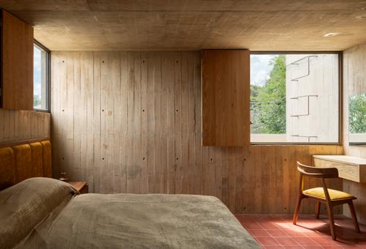
Another bedroom suite, with its own bath and dressing room, completes the second-floor parti and, with it, the home’s modest program. Here, too, considered choices—such as a folding timber screen that can be unfurled to cover a big, square window— enhance the sensorial experience while redoubling the home’s defining aim: affording glimpses of the sky and exterior world while shielding intimate moments inside. The resulting tension is the most compelling trait of Casa Gardenias, a decidedly unostentatious house full of gratifying details that belie its introspective, slightly forbidding outward appearance. To the passerby, the mother-and-daughter domain suggests an impenetrability, a zealous protection of the private sphere. But once you are within, the skylights, high horizontal openings, and that oblong patio, with its lone old hule tree, ensure one never feels too removed from the surrounding city and the elements.
LEFT
13-foot ceilings lend a loft feeling to the tranquil oasis.
BELOW
The firm created an independent studio for the daughter with access to living spaces shared with the mother.
FACING PAGE
In the building’s sculptural 420-squarefoot living, dining, and kitchen area, coral-red cement tile is juxtaposed with the kitchen’s oak fronts.
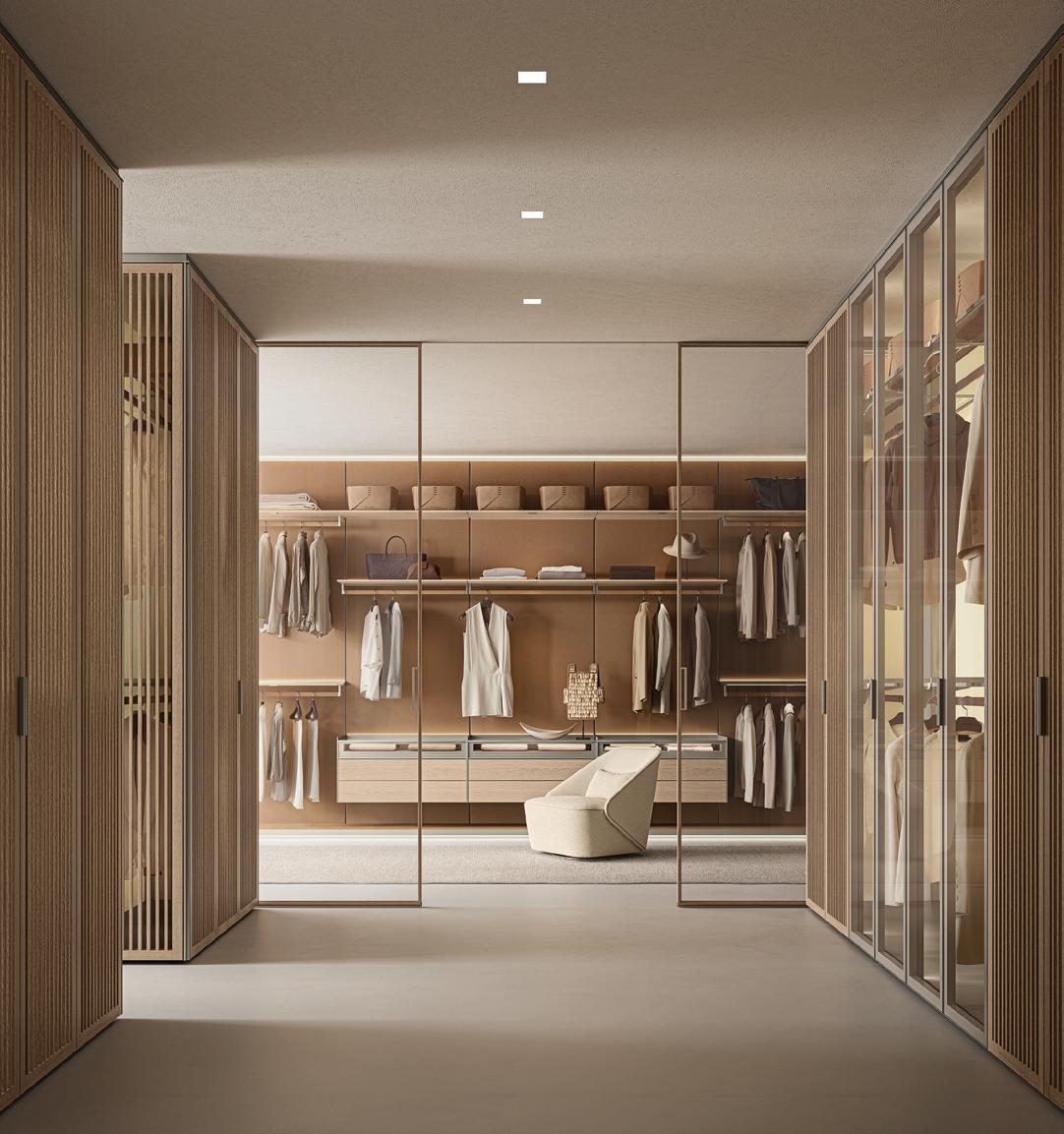
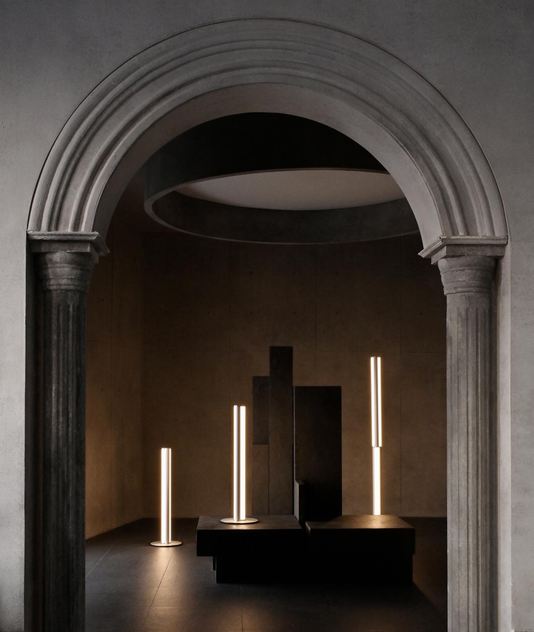
New York, Miami, Los Angeles, Chicago info.usa@rimadesio.us
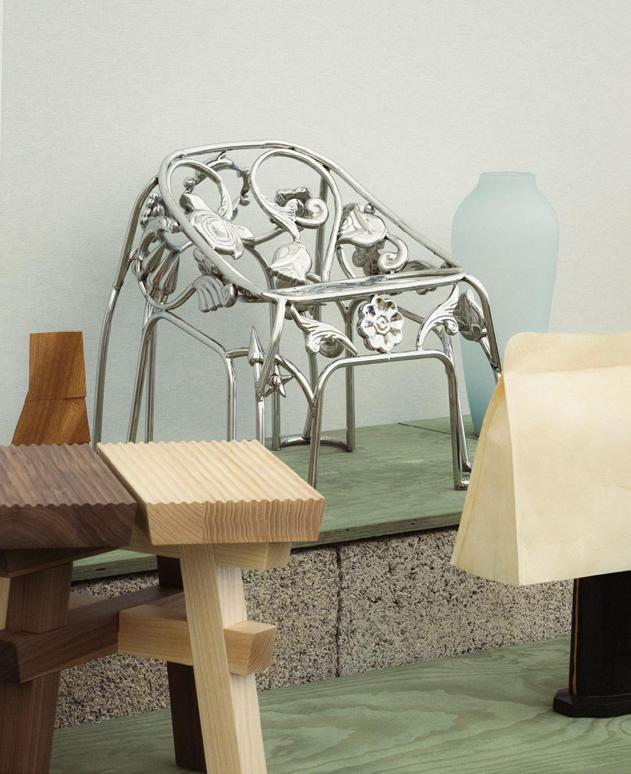
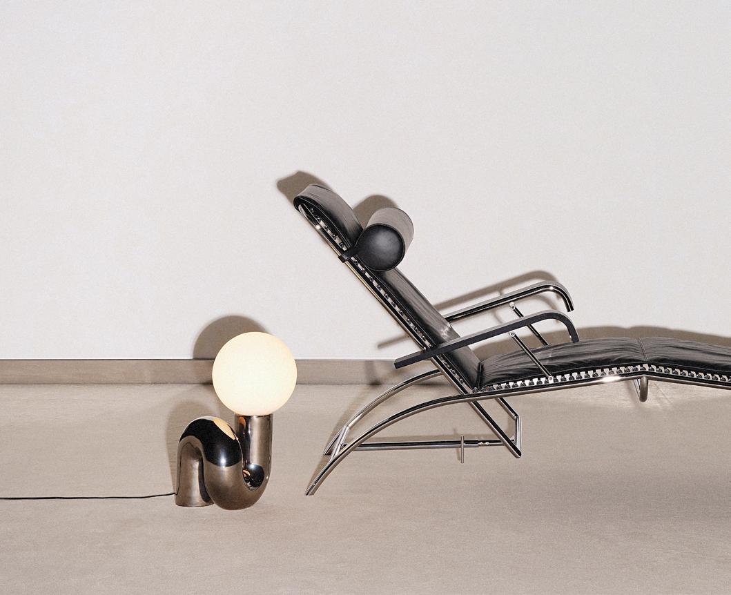
us.petitefriture.com
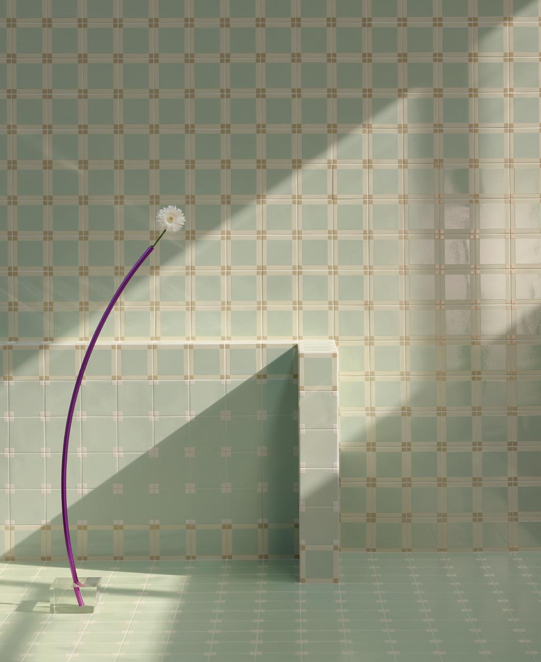
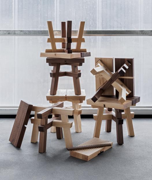
tongdesignstudio.com
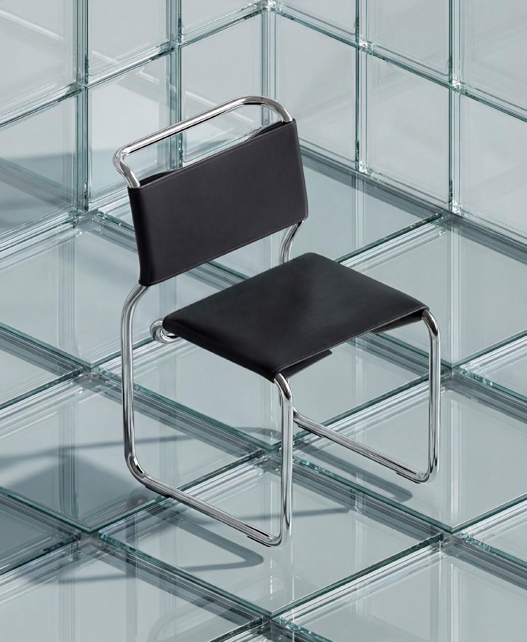
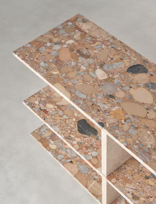
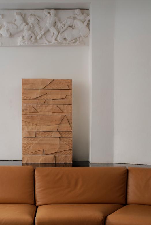
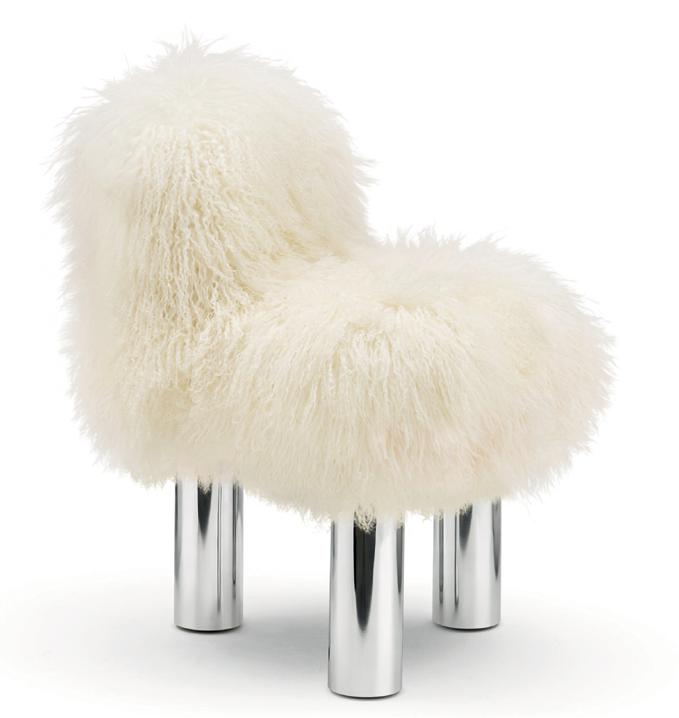
arflex.it
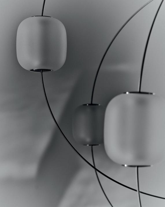
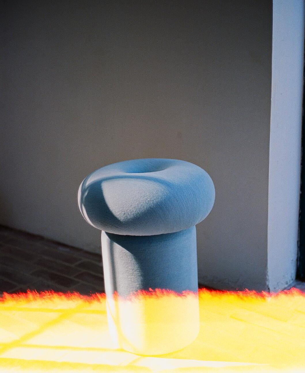
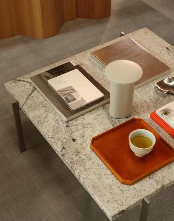
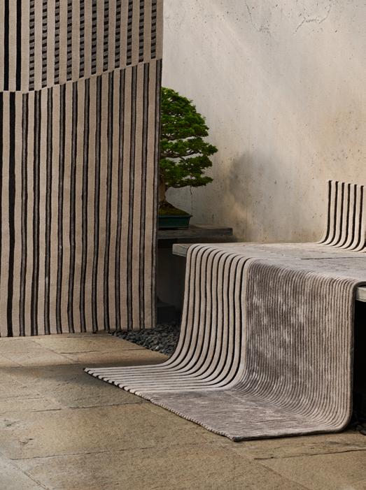
fritzhansen.com
jaipurrugs.com/us
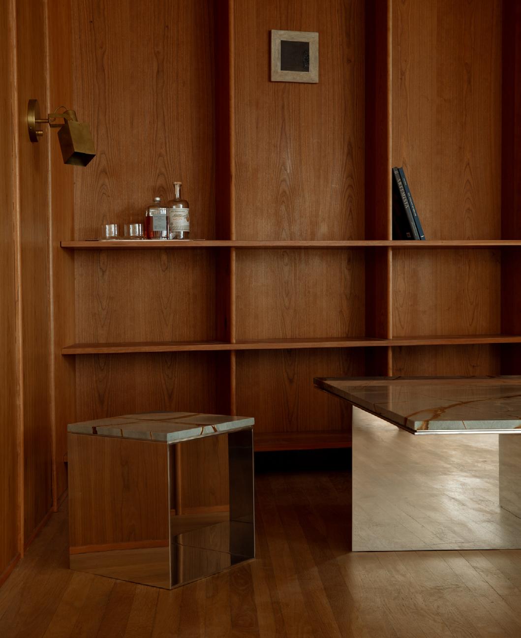
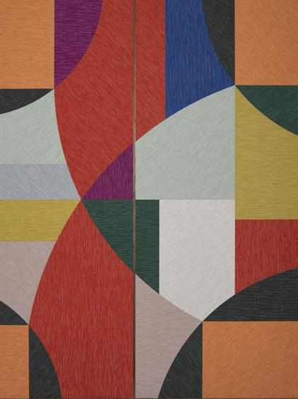

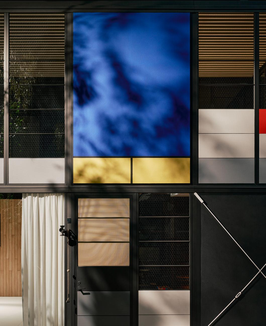
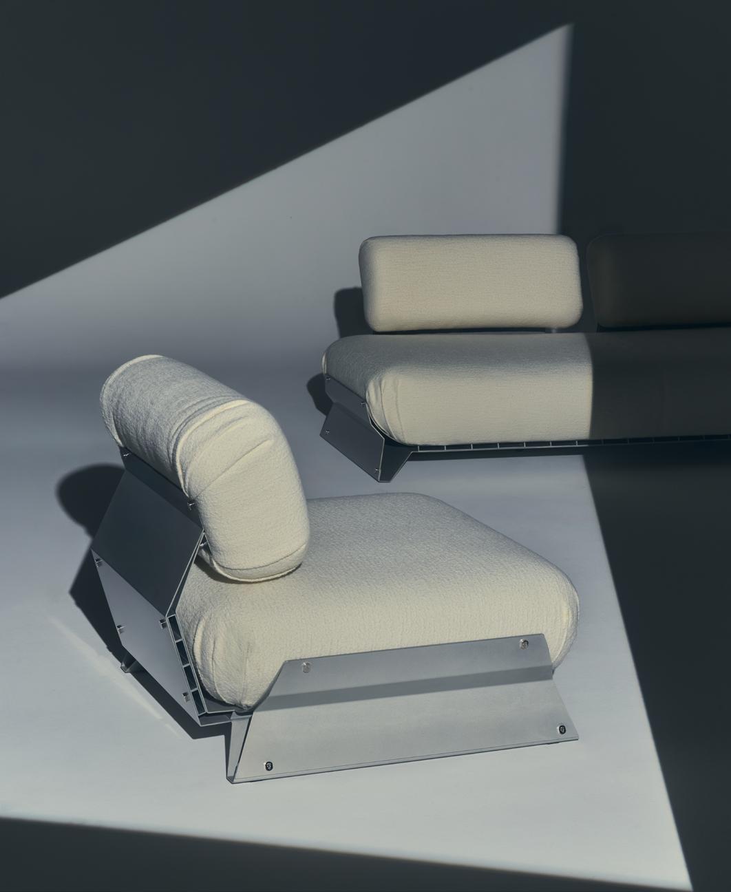
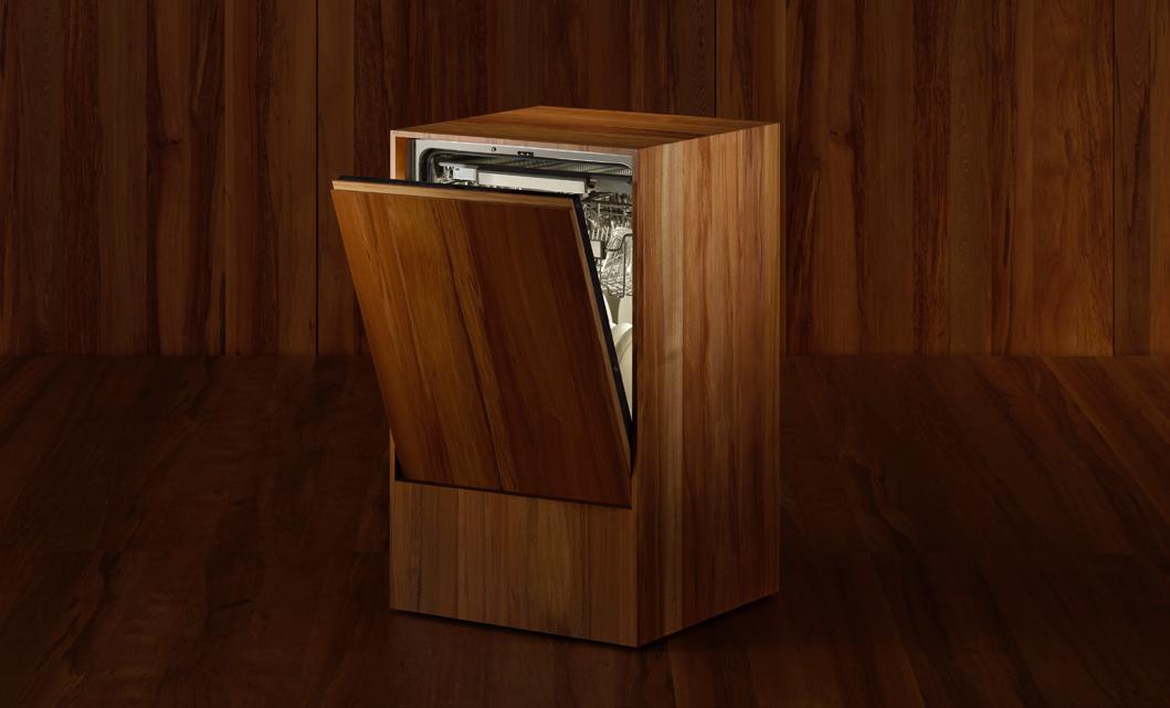
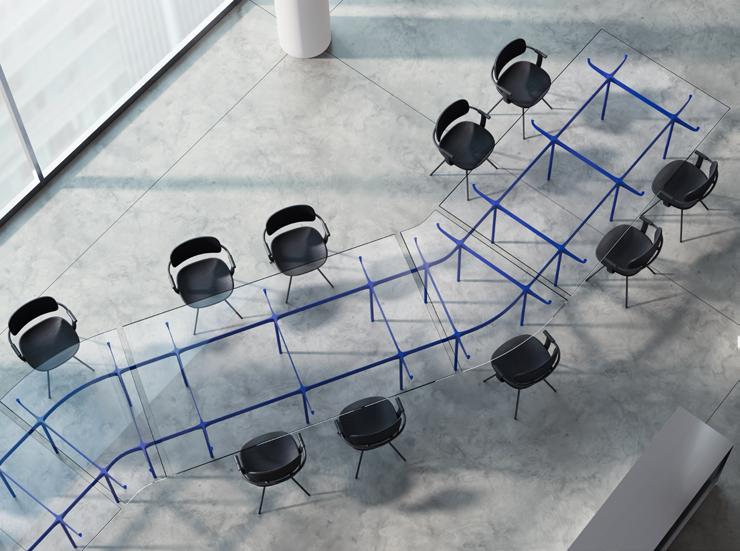
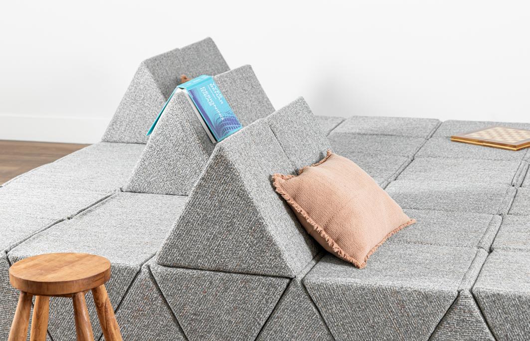
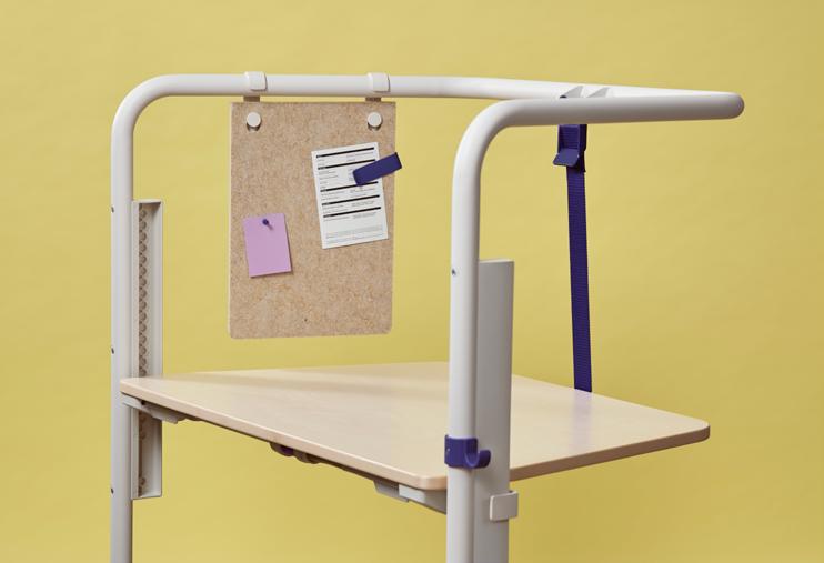
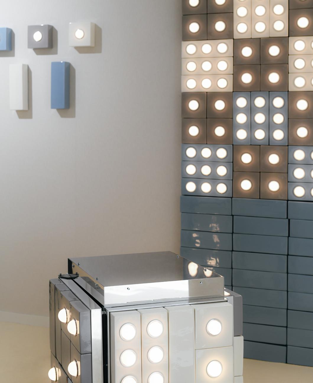
moooi.com
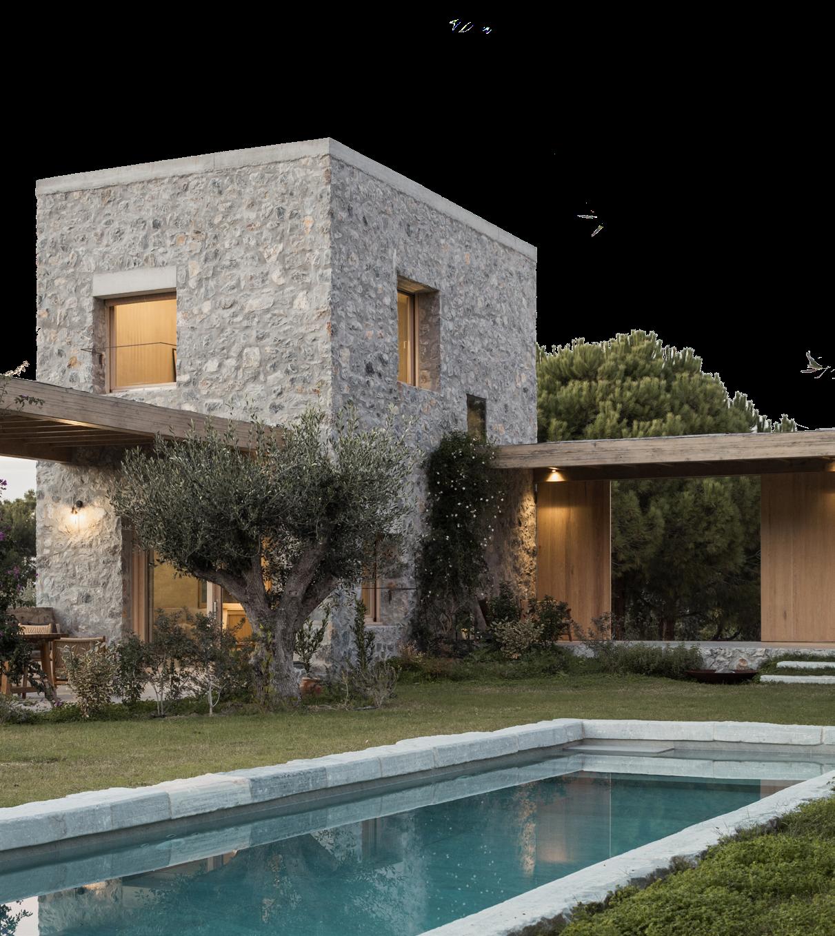
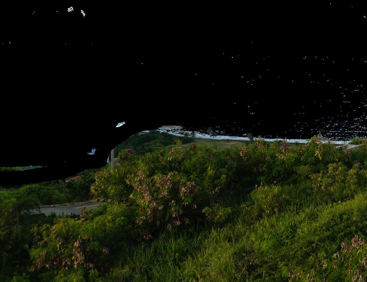
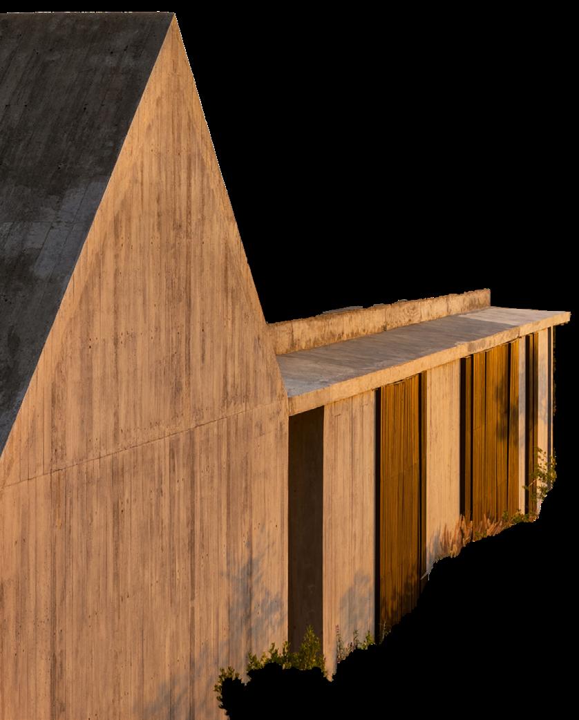
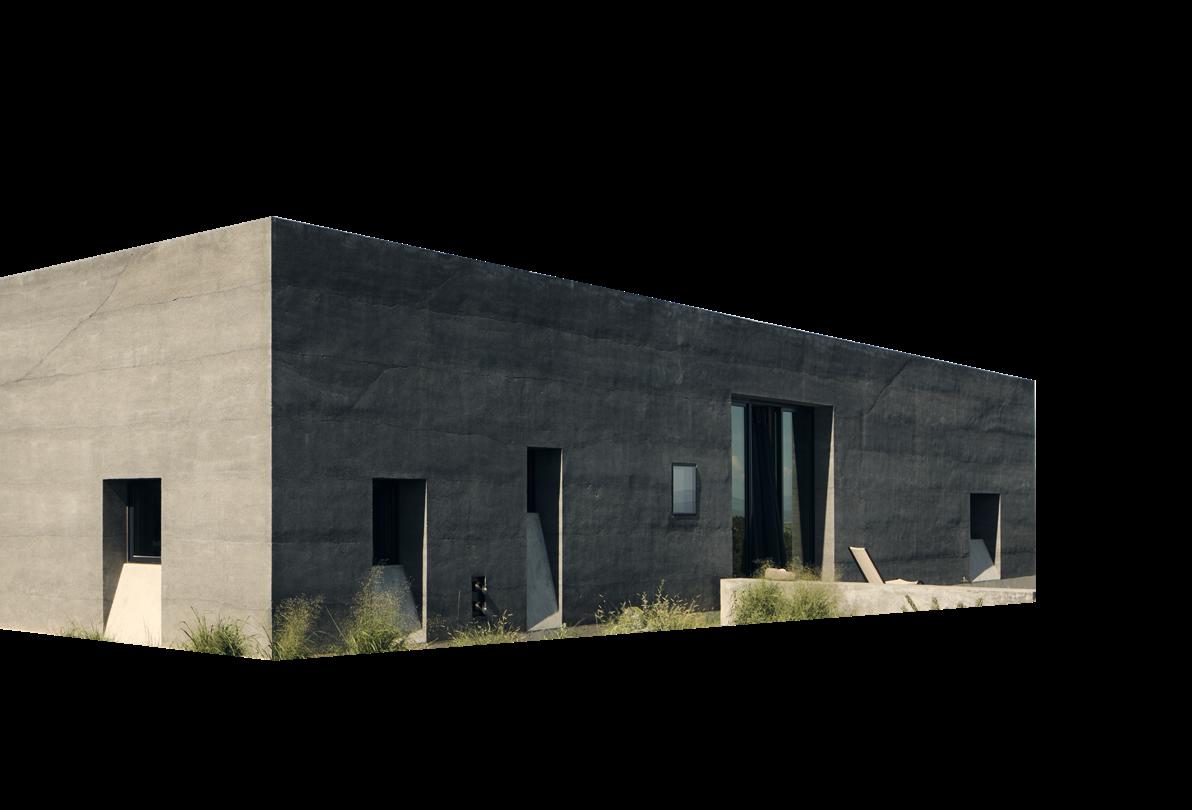
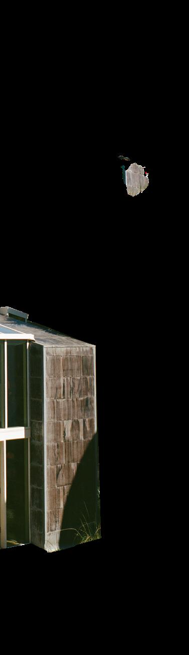

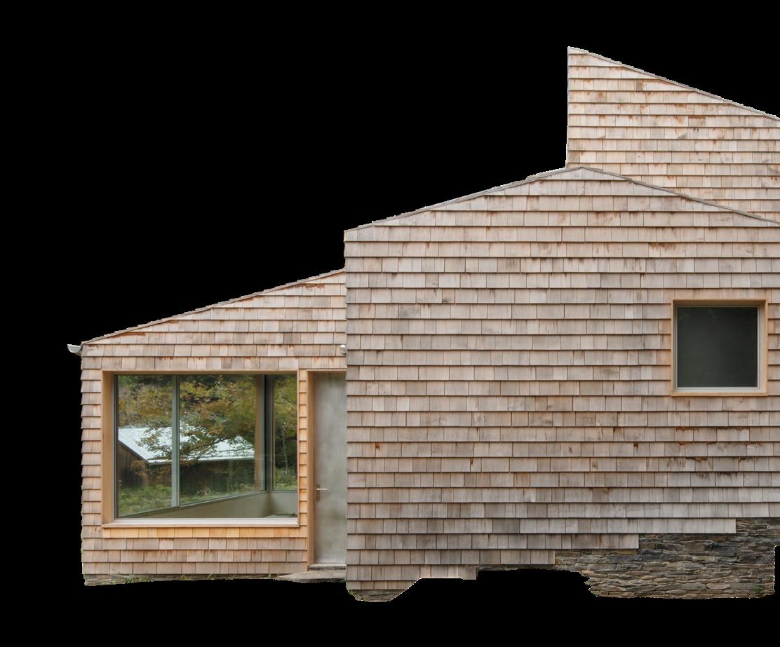
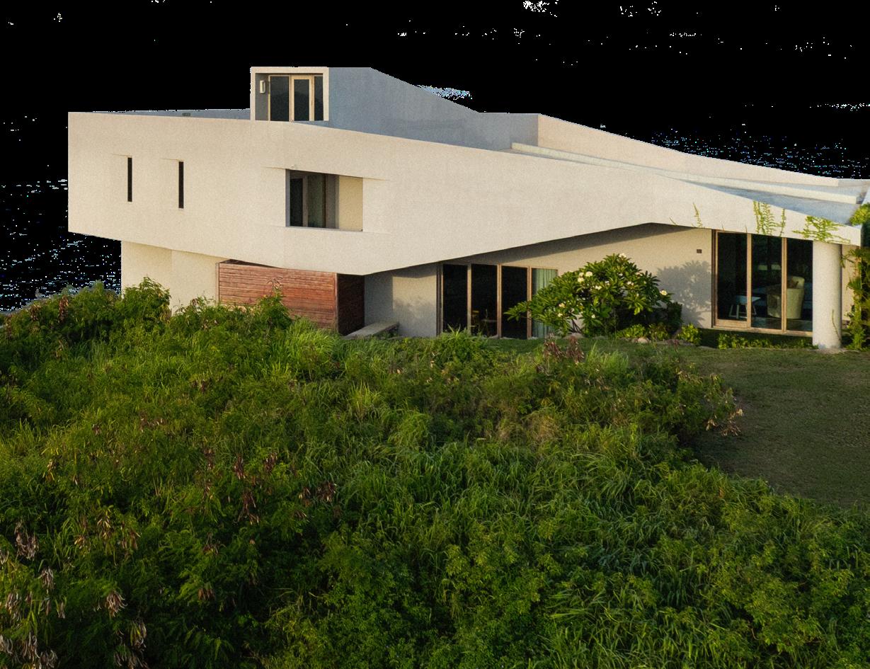
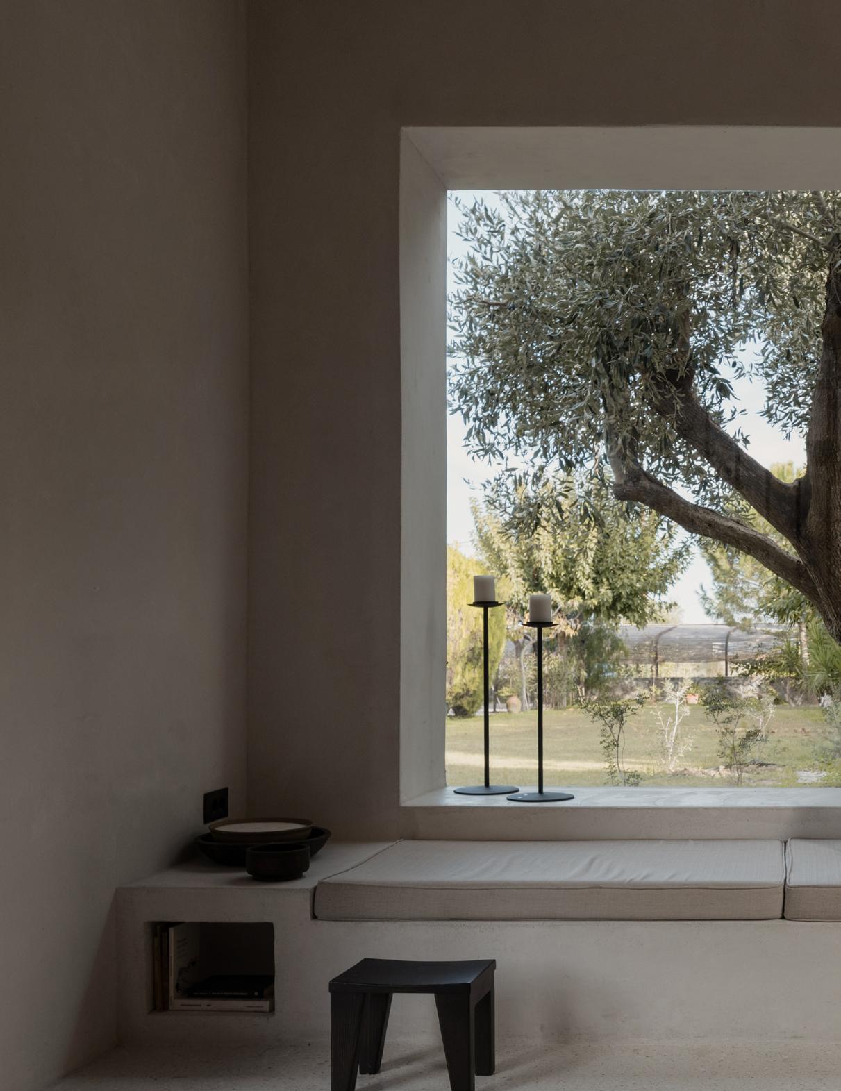
Not a Number Architects realizes a family summerhouse near Thessaloniki, Greece.
BY
Joann Plockova
PREVIOUS SPREAD
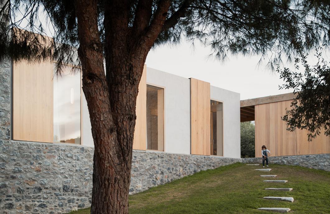
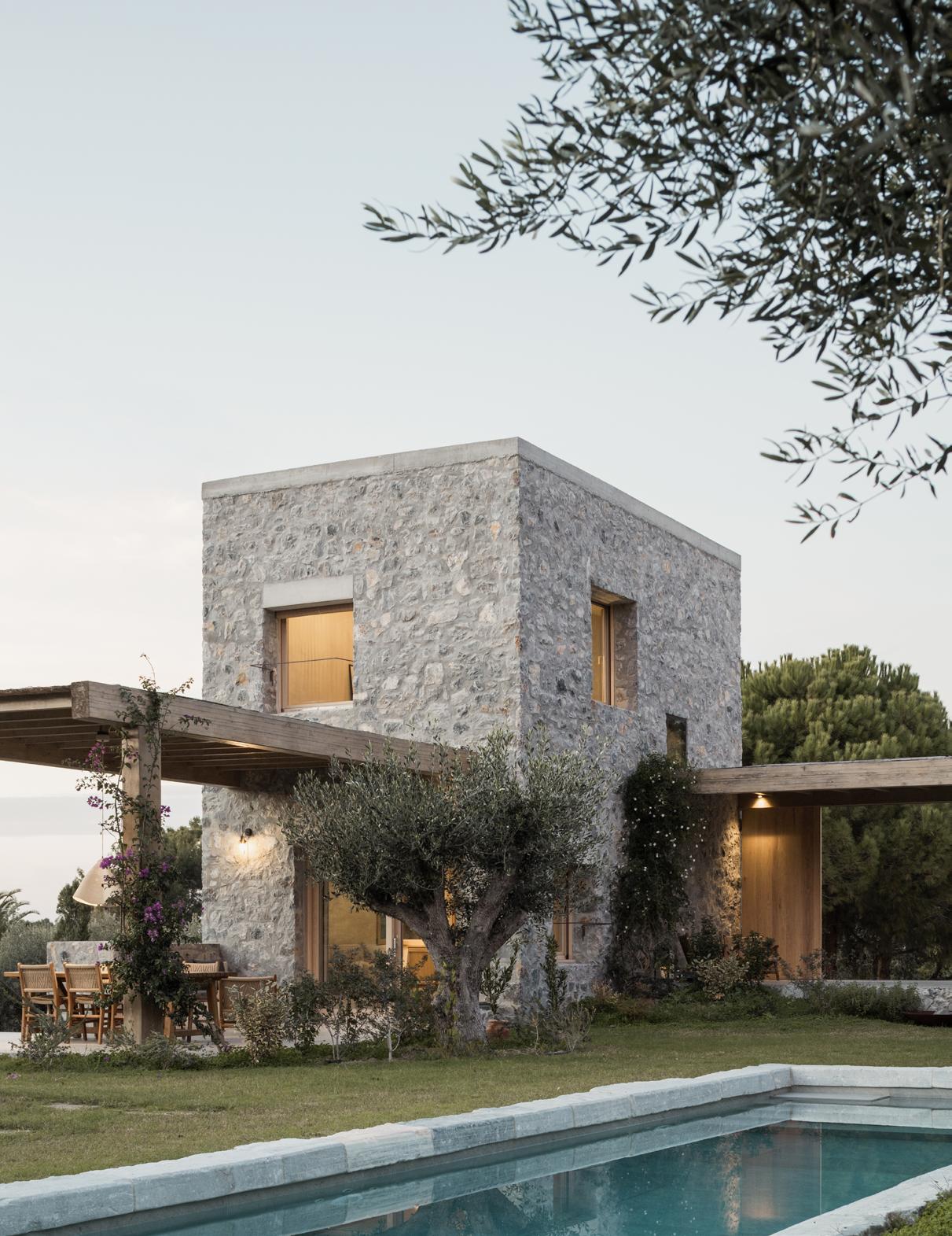
Architects Ermis Adamantidis and Dominiki Dadatsi of Not a Number Architects designed the serene vacation property for their family to enjoy.
ABOVE
The couple built a private summerhouse for themselves on the plot and also incorporated two additional dwellings into the building that are rented out.
RIGHT
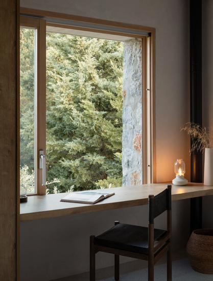
Large openings afford views of greenery.
FACING PAGE
Terraces provide ample space for outdoor living.
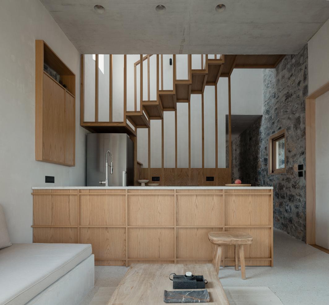
From a young age, architects Ermis Adamantidis and Dominiki Dadatsi spent summer holidays in Halkidiki, a forested coastal area in northern Greece about an hour’s drive from Thessaloniki, where they live and work together today as Not a Number Architects (NaNA). When presented with the opportunity to build on a tree-filled plot on Halkidiki owned by Adamantidis’s parents, the couple were eager to work on a project for themselves. Wanting to share their memories of the area with their own two children, the couple built a summerhouse on the plot. In addition to their private residence, the architects cleverly incorporated two additional dwellings into the building, which are rented to seasonal vacationers. “It’s our refuge,” Dadatsi told AN Interior
Spread across the narrow, 2,700square-foot plot in a linear “Z” shape that weaves between existing olive and pine trees, the threein-one holiday house combines two stone towers with a white horizontal volume partially in stone. Dubbed “Treelithon” in reference to its trilithon-inspired form, the holiday complex’s unique shape is an expression of the architects’ site-specific approach.
“The common case is that identical 2-story residences are attached side by side, creating the widely prevalent local phenomenon of the “centipede” building,” explained Adamantidis. “Our intention was to try and break this common practice.” To do this, NaNA wanted to make the single volume as long as possible to take advantage of the extended, narrow buildable zone that runs down the center of the site, all while preserving the mature trees on the plot. With these constraints, they also aimed to differentiate the three dwellings in materiality and posture. “Here is the loose connection with a trilithon as a three-part synthesis of verticality and horizontality,” Adamantidis said. “A gesture that creates a clear architectural identity while allowing each house to express its own internal logic.”
During the summer vacation as well as most weekends in the warmer months, the architects occupy the roughly 800-square-foot, three-bedroom, two-bathroom dwelling housed in the 2-story tower and the lower, stone portion of the central horizontal volume.
“The idea is to have a single-floor layout on the same level with the garden, which we very much enjoy most of the time during summer,” Adamantidis enthused. That includes two bedrooms with a bathroom in between that are positioned at the back and almost underground, as they are in the slope from the west side to naturally keep them cool during the
BELOW
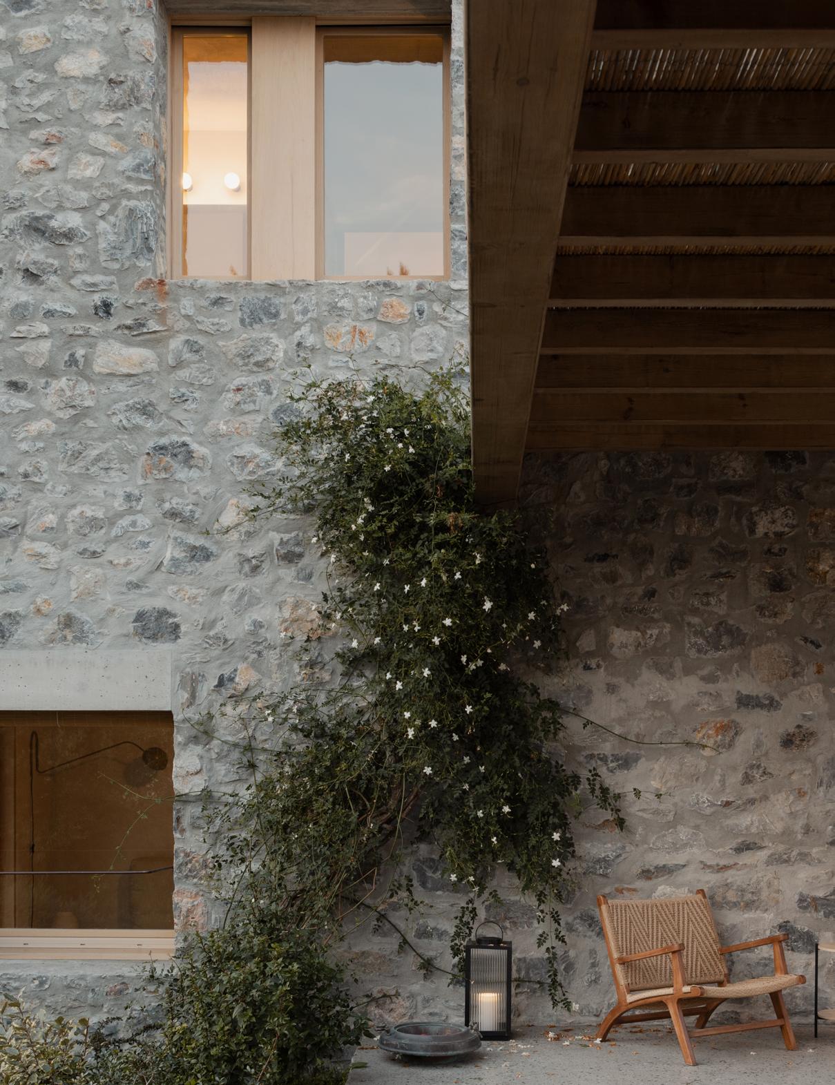
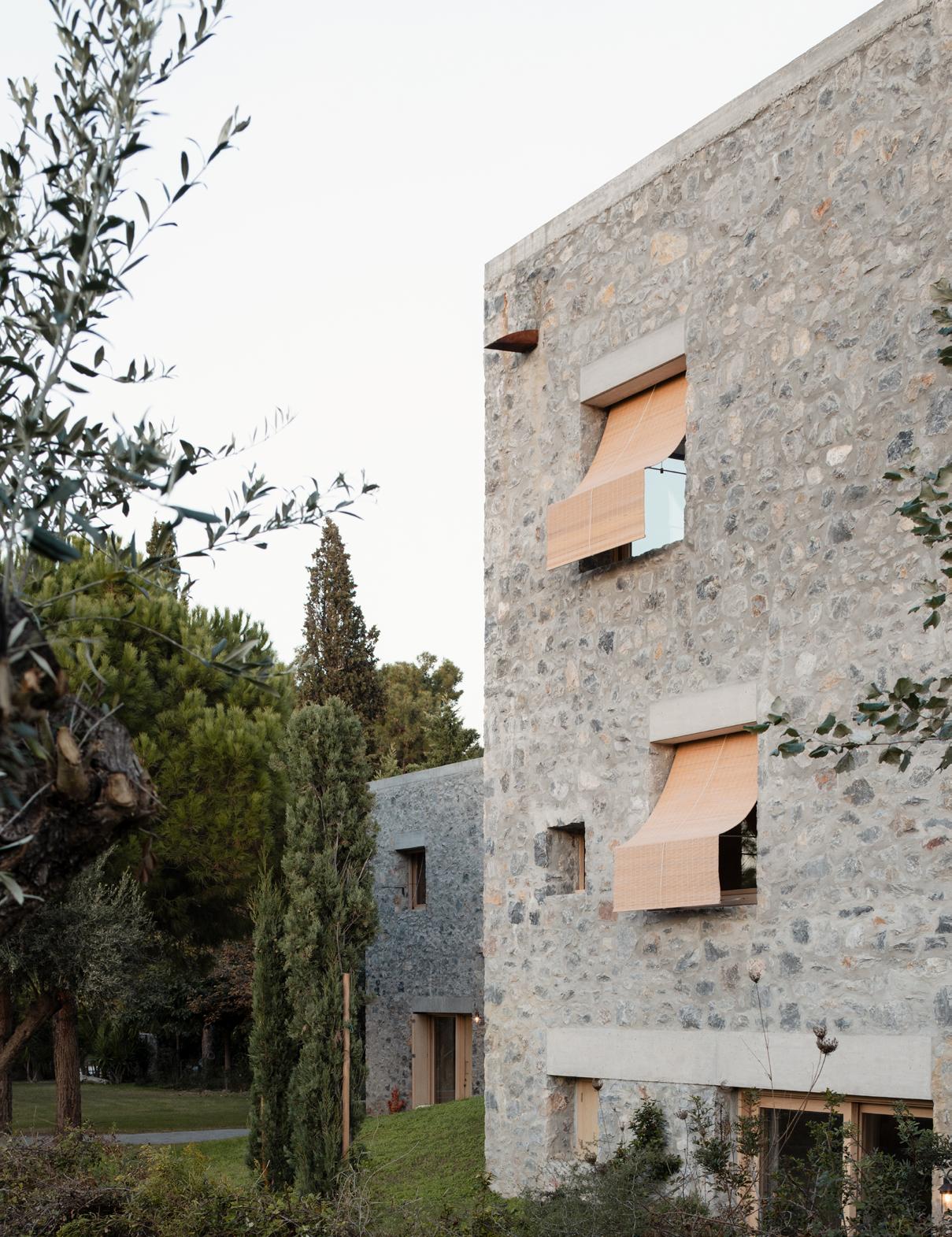
Material choice was influenced by the area’s rural stone architecture and remains of the Byzantine-era stone watchtowers.
FACING PAGE
Some openings are shaded with an exterior awning.
FOLLOWING SPREAD
LEFT
The plan view shows how the three residences are sited to afford privacy for each building.
FOLLOWING SPREAD
RIGHT
Guesthouse entrances open onto the shared pool.
hot season. And then there’s a small living room with a kitchen at the front with large openings to enjoy the views to the greenery. “But our actual living room is the terrace under the four pine trees, where we gather family and friends around a long table and in the coolness of the shade,” he said. An upper-level guest bedroom generously offers the best view to the architects’ friends and family.
To offer everyone privacy, their dwelling was designed to face away from the other two—the upper horizontal volume, which includes two bedrooms and measures 530 square feet, and the 3-story, three-bedroom tower, which, like their own, measures around 800 square feet and offers views to the sea. Both of the rental units face the pool, include spacious terraces, and are accessed through their own separate entrances (lockable sliding doors; the front door provides access to the architects’ abode).
Inspired by the area’s rural stone architecture and the neighboring remains of the Byzantine-era stone watchtowers, the holiday home is constructed of stone sourced from a
nearby quarry, embracing NaNA’s dedication to material experimentation, which the duo have explored since the firm’s founding.
“We always try to bring materiality into another context, [to] push the boundaries in a more playful way,” Dadatsi said. Here the stone walls are load-bearing. They are punctured with openings in various shapes and sizes to frame the view, modulate daylight, and foster passive cross ventilation. “It was an exploration for ourselves to learn the material in a special way,” Adamantidis said.
The “restrained yet tactile” interior palette includes stone walls left exposed or painted white, floors finished in terrazzo, and timber furniture, staircases, and doors. Adamantidis explained that they placed emphasis on “softening the mineral tones and reinforcing the project’s sensorial balance.”
“It’s nice to see how nature changes from spring [to] summer,” he said. “And the sounds are different. When you walk in spring, you listen to the sound of the birds and then, in the summer, the cicadas.”
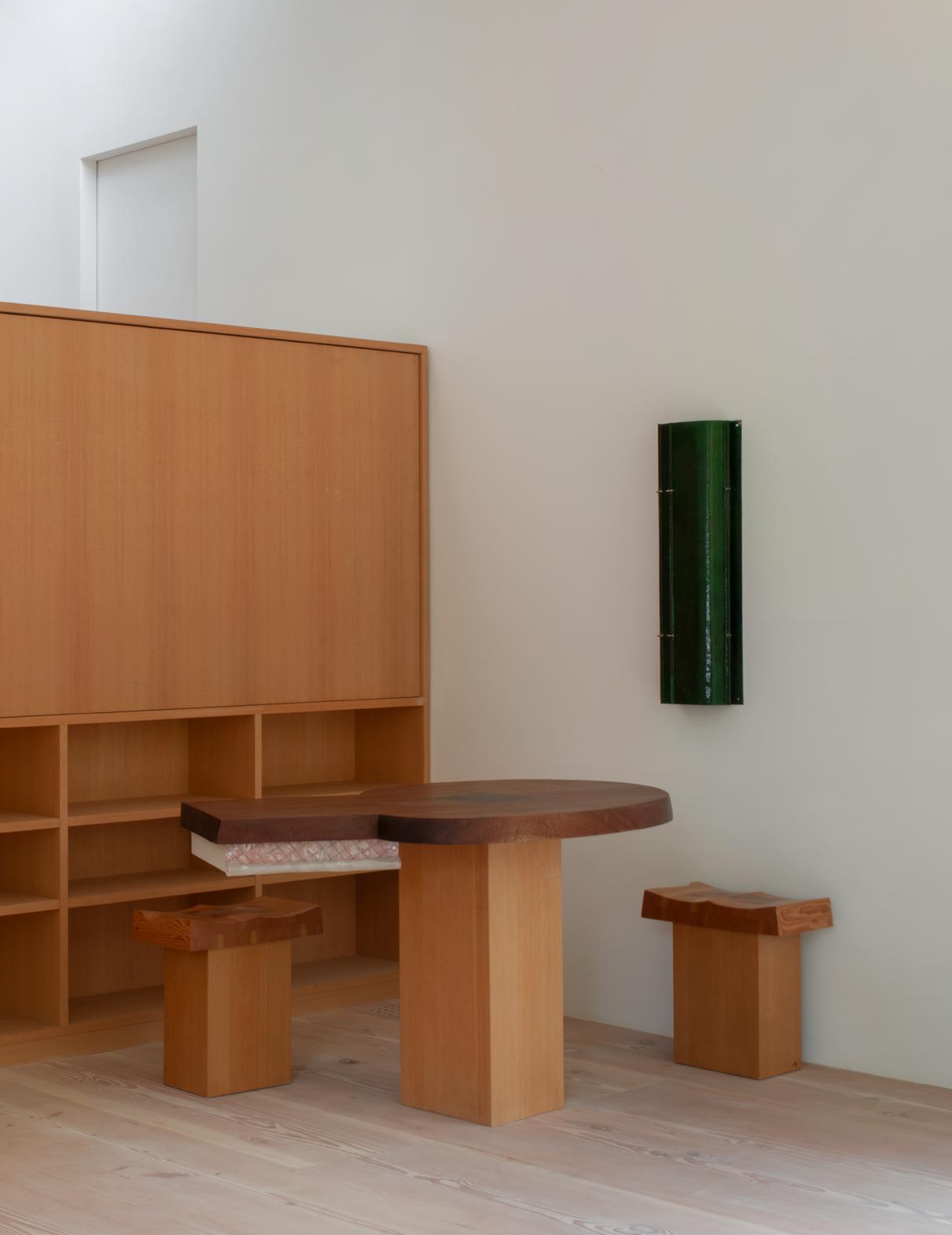
With a little help from Neil Logan, a Hudson Valley home settles into its landscape.
TEXT
BY Lila Allen
PREVIOUS SPREAD
FACING PAGE
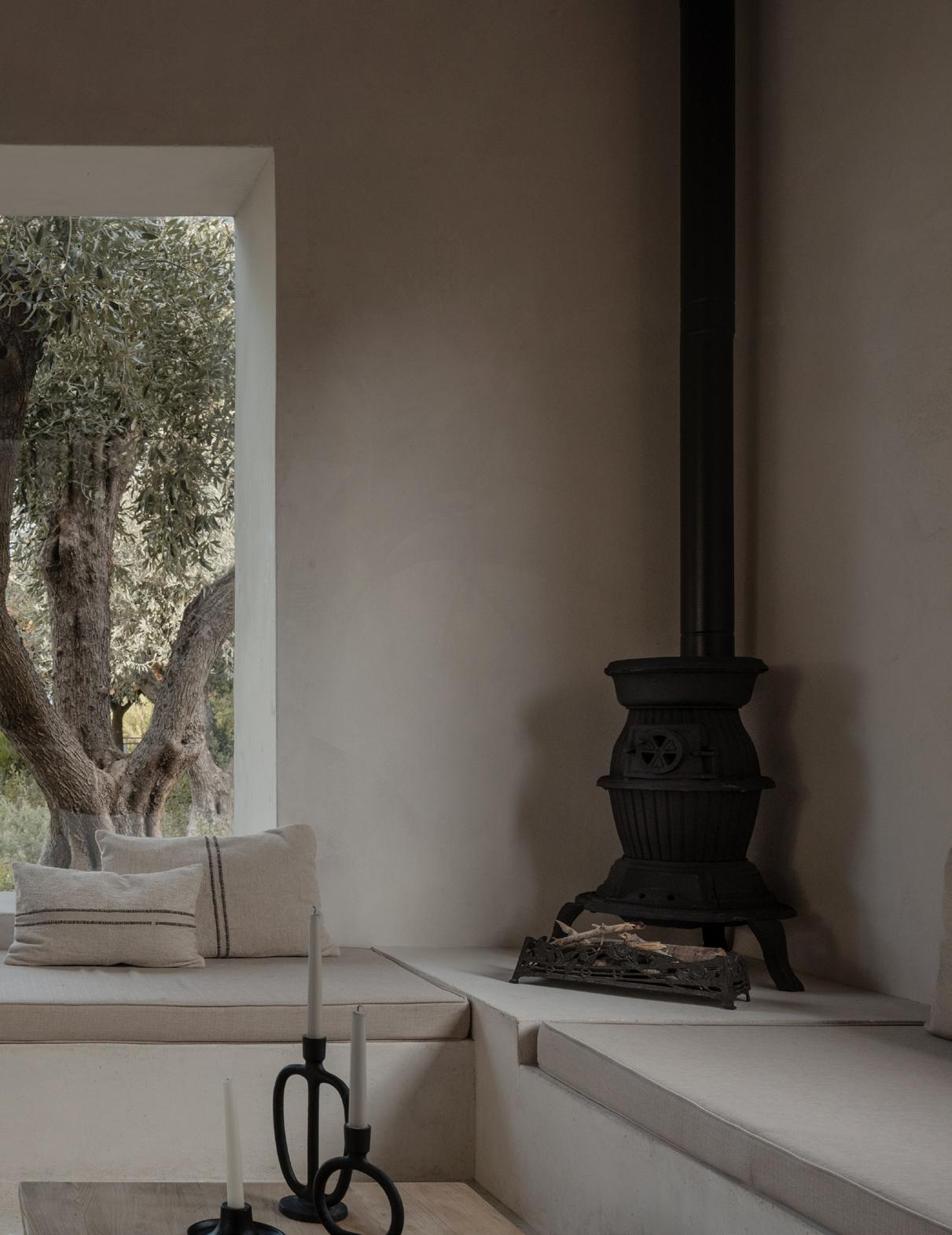
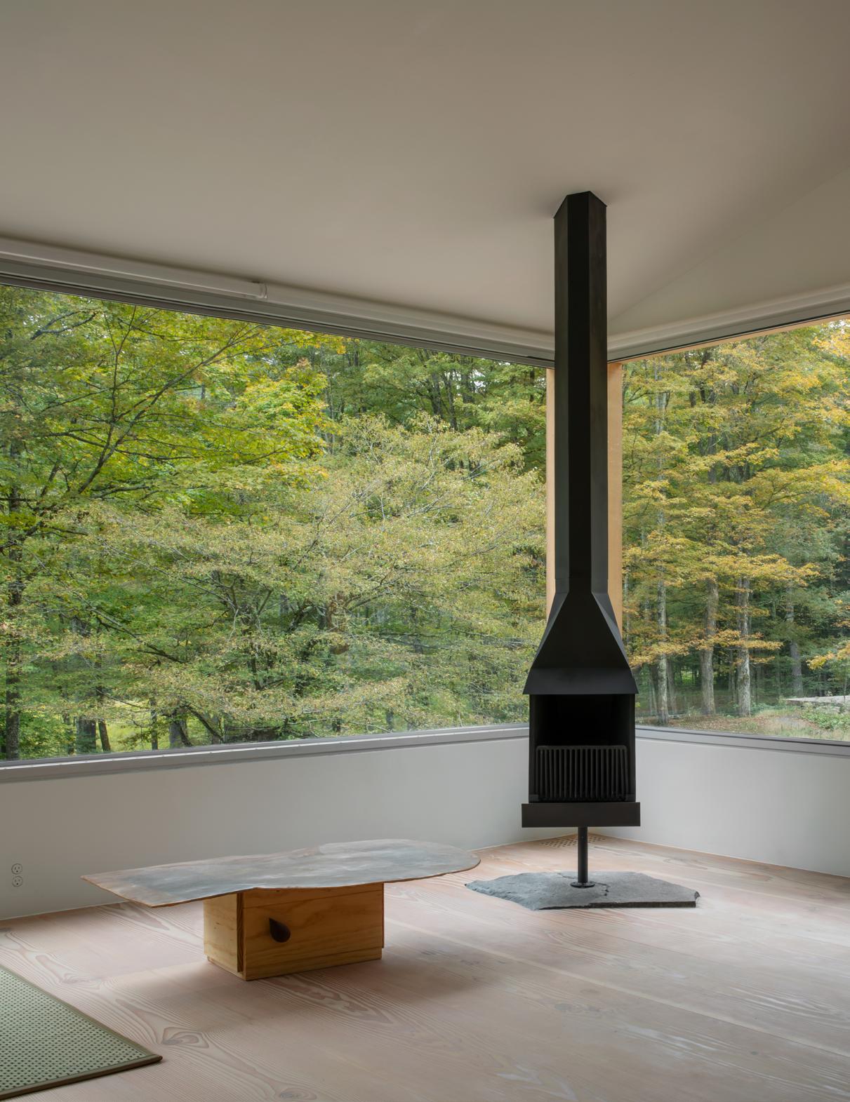
A petite woodburning stove with a unique triangular profile is a reissue by DAE of the José Antonio Coderch y de Sentmenat–designed original.
ABOVE
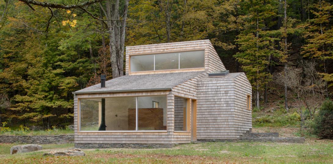
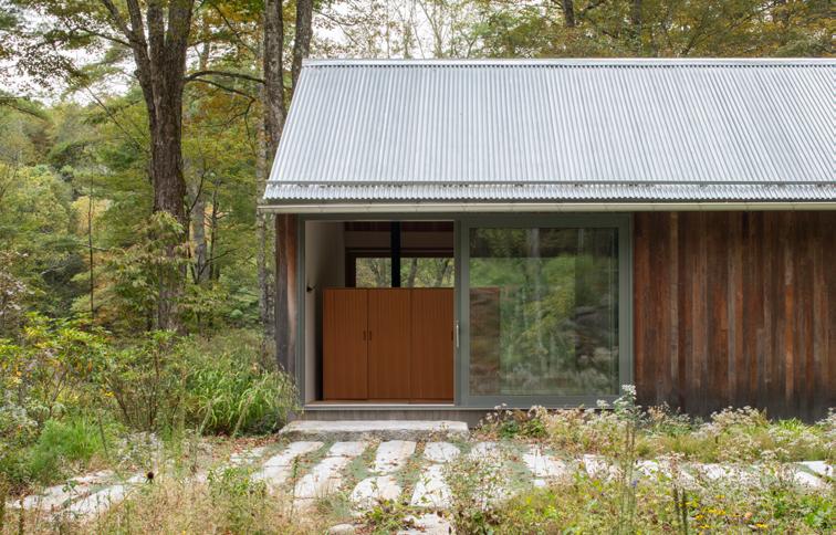
To maintain privacy, street-facing sides of both structures are shingled and monolithic, while the sides facing nature have generous glazing.
On a March afternoon in New York’s Hudson Valley, you might find yourself in a treacherous, liminal moment of thaw. The snowdrifts, long piled up over the winter, are finally beginning to recede. Grass is starting to poke its fingers through the slush. Things are muddy, slippery, and still very, very cold. But at one residence in Accord, New York, the thaw takes on the feel of a zen retreat—the melt drips from galvanized gutters down rain chains, which in this context appear more like Brutalist sculpture than a functional piece of hardware.
New York City–based architect Neil Logan is the visionary behind this monastic property. During the pandemic, he was approached by an existing client to create a small campus of residential structures on a newly acquired property in Accord, New York. The site already had two buildings, which would serve as the footprints for a rebuilt guesthouse and studio. And eventually, the site will feature a third house as well—envisioned as a more robust residence that would accommodate the homeowners and their family in the long term, as they spend weekends and summers there. “He liked the idea of spreading out buildings on the site,” said Logan, who is now designing the third building for the family. (He also picked up the project’s neighbor as another client during the process.) The two structures that have already been constructed—a 1,000-square-foot, one-bedroom guesthouse with a kitchen, living room, full bath, and office, and an 860-square-foot studio for piano practice and writing— divide uses across separate, purpose-built spaces, like a summer camp. The guesthouse is spartan but warm; the studio—a 30-second walk away, even in the slush—co-locates nonessential amenities.
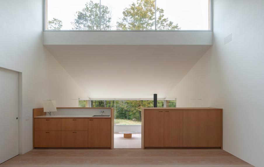
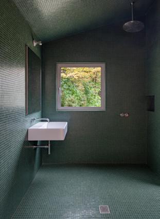
Sited on a hill near the road, the studio required a full spatial reconfiguration. Logan removed all of the interior partitions, opening the structure into a unified, light-filled volume. “The one feature of the existing house that was nice was that it had two levels that were defined by the grade change,” said Logan. He retained that element for the new design but moved the entrance to the side of the building, where it accesses a stone path to the guesthouse. Logan transformed the former entrance into a wet-room-style bath enveloped in green Bisazza glass tile, which
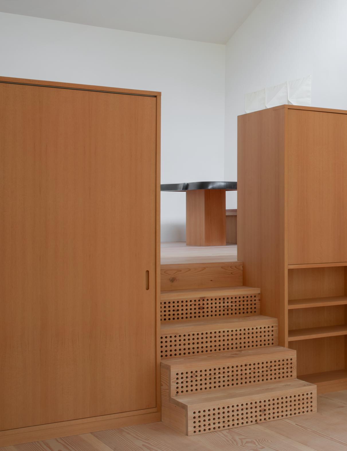
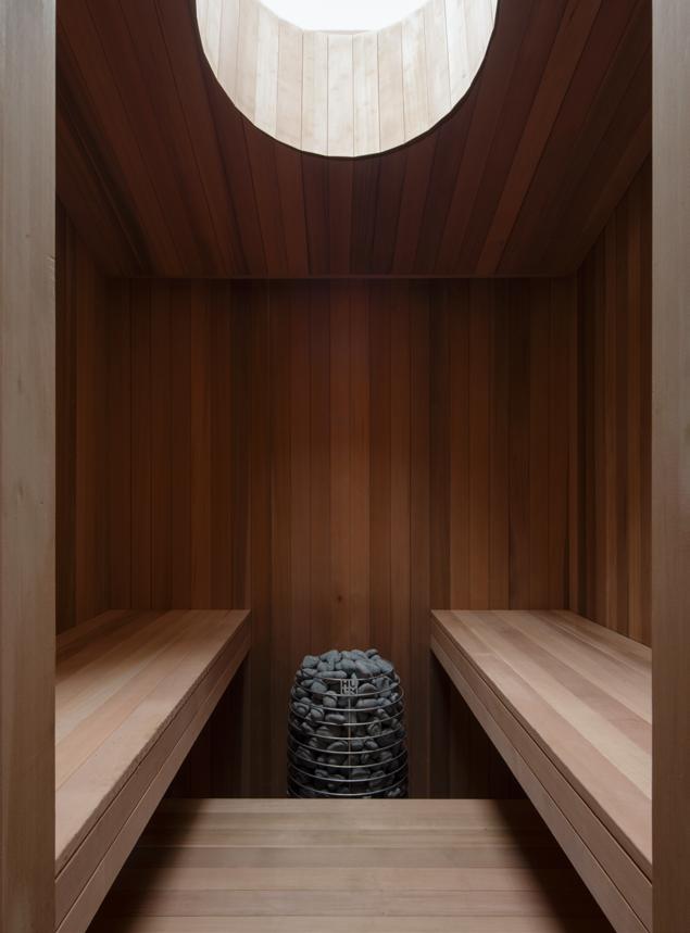
adjoins a sauna with a round, operable skylight. On an upper mezzanine, the husband can practice on his restored 1930 Steinway Model B surrounded by patchwork textiles custom-made for the space by textile artist Adam Pogue through Commune. Stair risers between the levels feature a Swiss-cheese puncture detail—a trademark of Logan’s—that also crops up on the floor and wall in place of a standard metal vent cover.
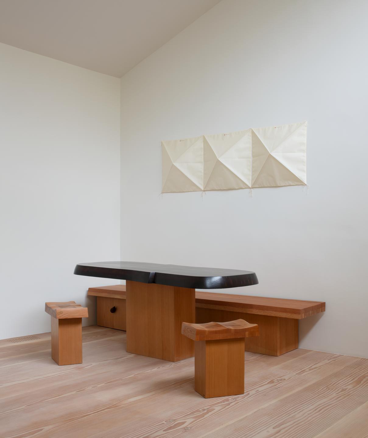
The husband, a former curator, was active in furnishing the project. “I have the good fortune of having clients that are quite educated about design,” noted Logan. In addition to commissioning the Pogue curtains, the homeowner hired New York artist Minjae Kim to create a chess table for the studio, along with a bench, stools, coffee table, and a small desk for his wife, a writer. Sculptural lighting by Florence Louisy from Aequo Gallery accents the wall nearest the desk. From the Nakashima love seat, a visitor can take in views through sizable aluminum-framed windows, which look onto the yard and forest.
Not far away, a petite wood-burning stove cuts an unusual, triangular profile: Initially spotted by Logan in a book, it’s a Spanish model designed by the architect José Antonio Coderch y de Sentmenat in the 1950s and now reissued by DAE. Rather than a traditional hearth, it sits atop a stone sourced from the property, which has been inlaid flush with the Dinesen Douglas fir floors. But not all of the furniture was sourced from galleries and collectors—Logan, too, played a role, designing a bed, desk, and dining table for the guesthouse.
Logan shared that for both buildings, a priority was opening the interior to the landscape while maintaining privacy from the road. “There’s no fence or much planting, so you can see into them,” he said, so the street-facing sides of both structures are shingled and monolithic, with limited views into the interiors, while the sides facing nature have generous glazing.
The property will reach its fullest expression in a few months, when the grounds—rewilded, with help from LWLA—grow lush with native mountain laurel, rhododendrons, and aster. Until then, the thaw will have to do.
TOP
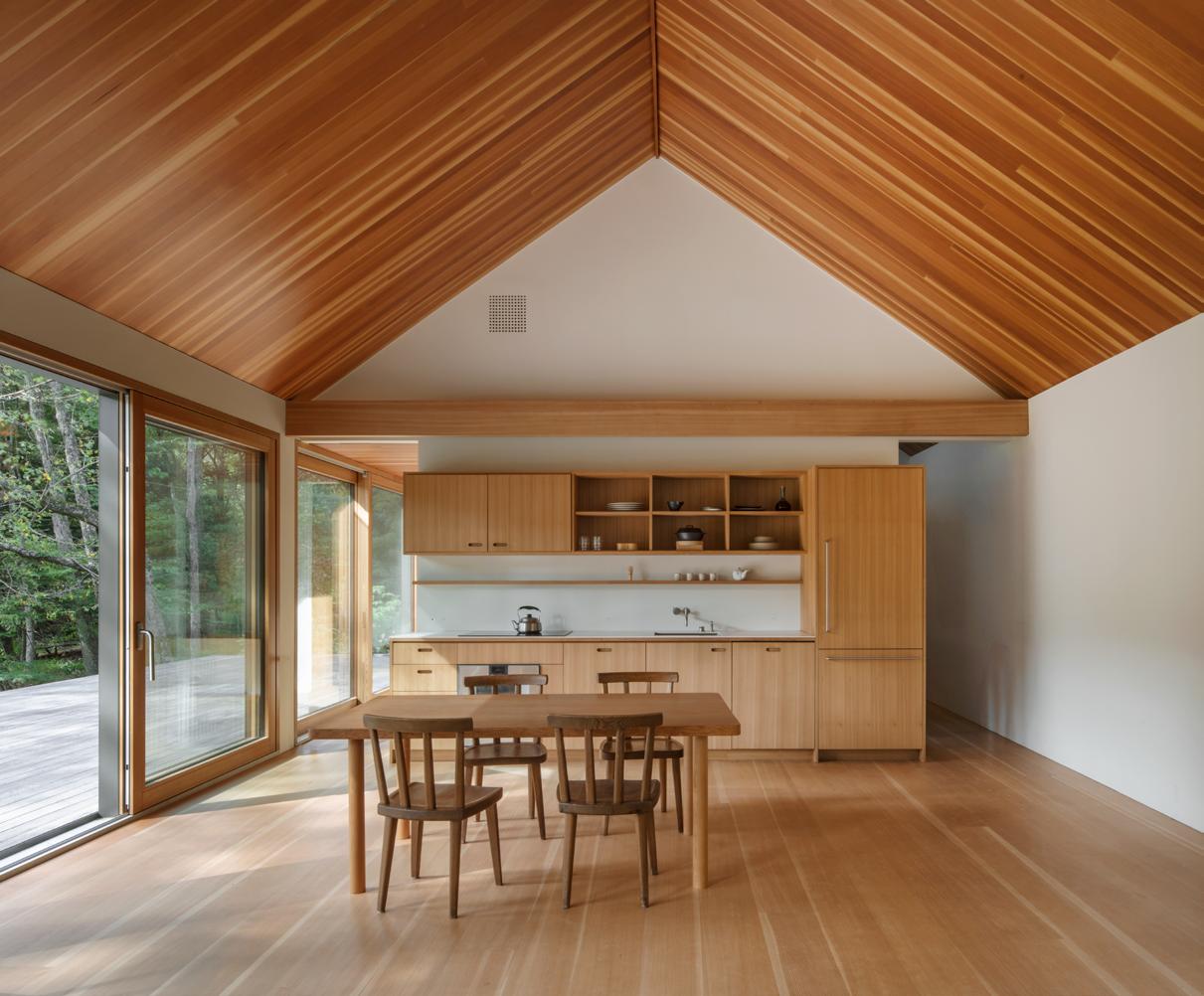
All of the guesthouse’s interior partitions were removed in order to create a large, light-filled main room.
BOTTOM LEFT
The sauna features a round, operable skylight.
BOTTOM RIGHT
The former entrance was transformed into a wet-room-inspired bathroom, with floorto-ceiling Bisazza tile.
FACING PAGE
The client, a former curator, took an active role in furnishing the project, including pieces from designers George Nakashima, Minjae Kim, and Florence Louisy.
TOP Uses are divided across the different buildings in a manner reminiscent of summer camps.
BOTTOM
The guesthouse holds the primary residence as well as an office.
FACING PAGE
A plan of the site, which currently features the footprint of two buildings. A third building is forthcoming on the property.
With Sombra de Santa Fe, DUST designs a geological dwelling with pierced apertures that frame the landscape, horizon, and sky.
TEXT BY Adrian
Madlener
PHOTOGRAPHY BY Joe Fletcher
PREVIOUS SPREAD
The interiors of the Sombra de Santa Fe home maintain a consistent connection with the surrounding landscape.
ABOVE
The architects considered how the living environment would be used at different times of the year.
BELOW
When natural light enters the interiors, its surfaces glimmer with blue and gold.
FACING PAGE
Porches were conceived as salas, traditional Mexican great rooms for hosting guests or sitting outside among the elements.
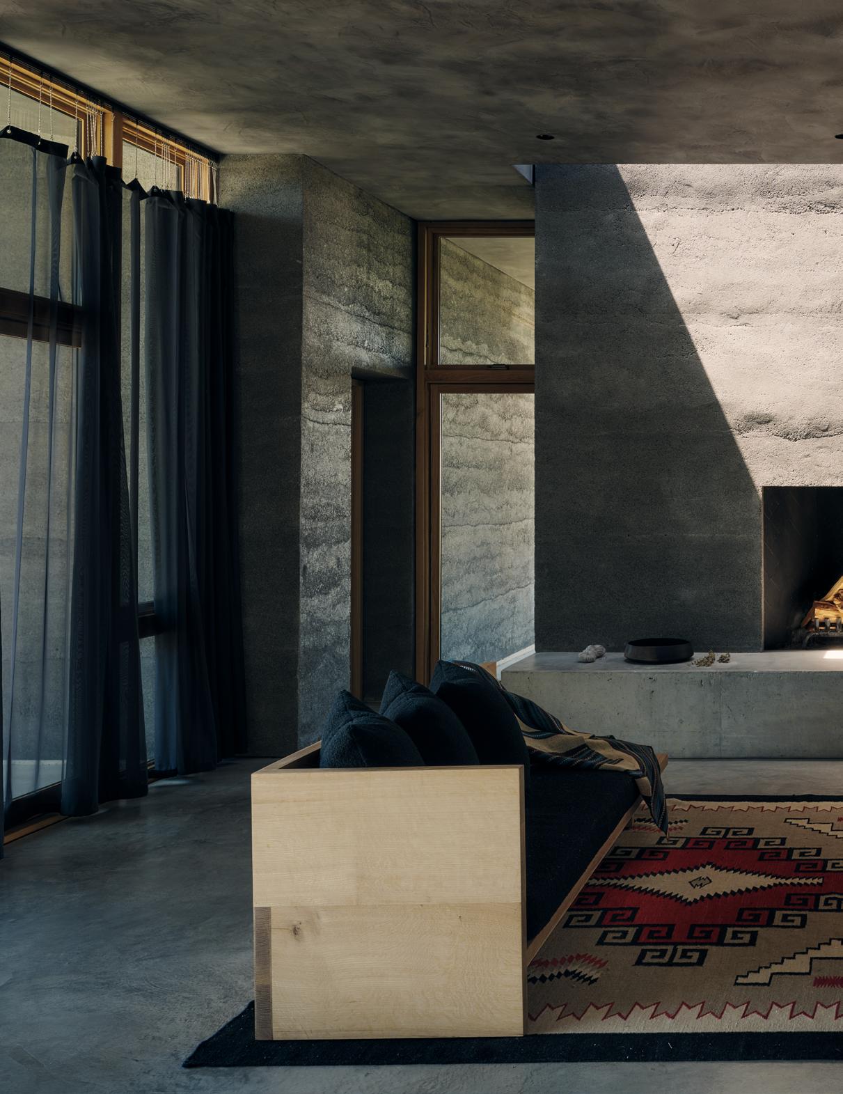
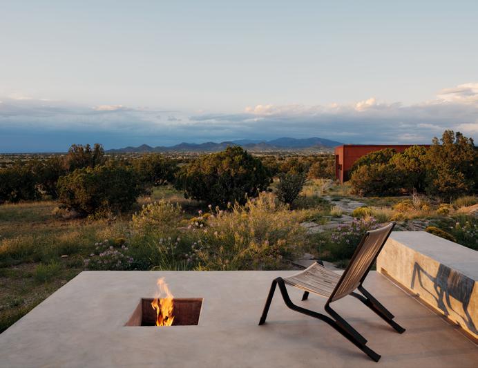
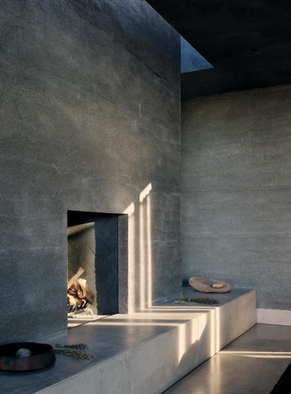
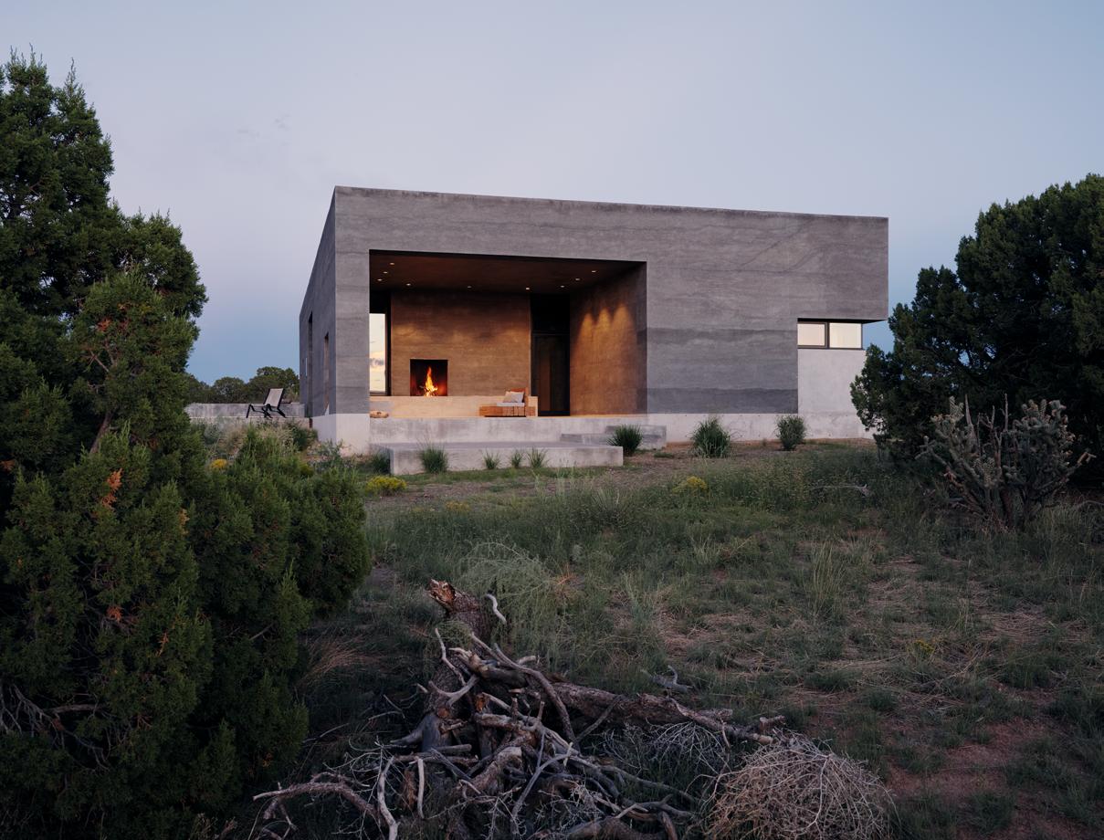
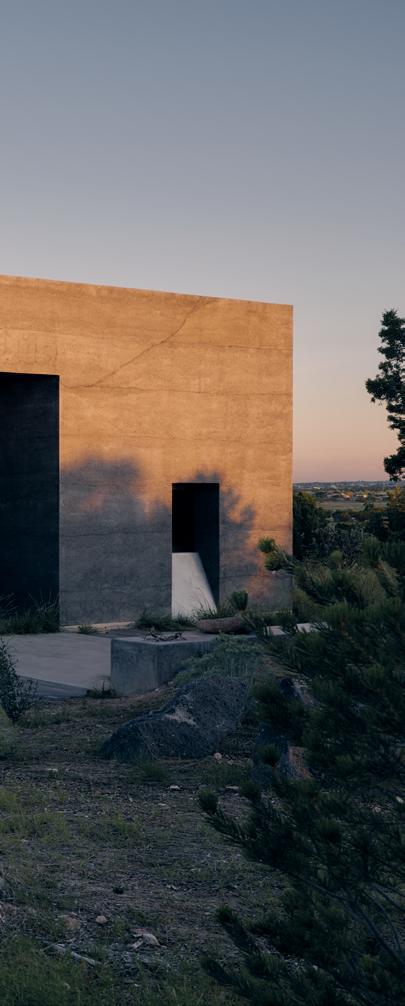
Strategically sited atop a mesa with 360-degree vistas of the northern New Mexico high desert, the Sombra de Santa Fe home, designed by DUST, is first and foremost a vessel for observation. The monolithic form is ancient yet futuristic and punctured by semi-enclosed porches, which cut away to cardinal point viewsheds of the setting’s jagged peaks and vast basins. Evocations of James Turrell’s Skyspace installations are intentional. “The darkness of these alcoves amplifies the mountain face shadows that change throughout the day,” said Jesús Edmundo Robles Jr., founding principal of DUST, the Tucson, Arizona–based practice that carried out all aspects of the project. “The house breathes with a quality of light emitting outward and filtering inward.”
The 2,100-square-foot home, which offers two bedrooms, plumbing hookups for RVs, and ample indoor/outdoor entertaining space, is a study in opening up to the elements while also shielding against them. “We needed to think about how this living environment would be used at different times of the year, all while helping to maintain a consistent connection with the landscape,” said Cade Manning Hayes, fellow founding principal at DUST. “Absorbing all the nature here has to offer, we conceived these porches as salas, traditional Mexican great rooms, where our clients could host guests but also sit on their own in the near silence of the wind and rain. In one [porch], the roof lifts, and it feels like the stars are at arm’s length, but one is still inside.”
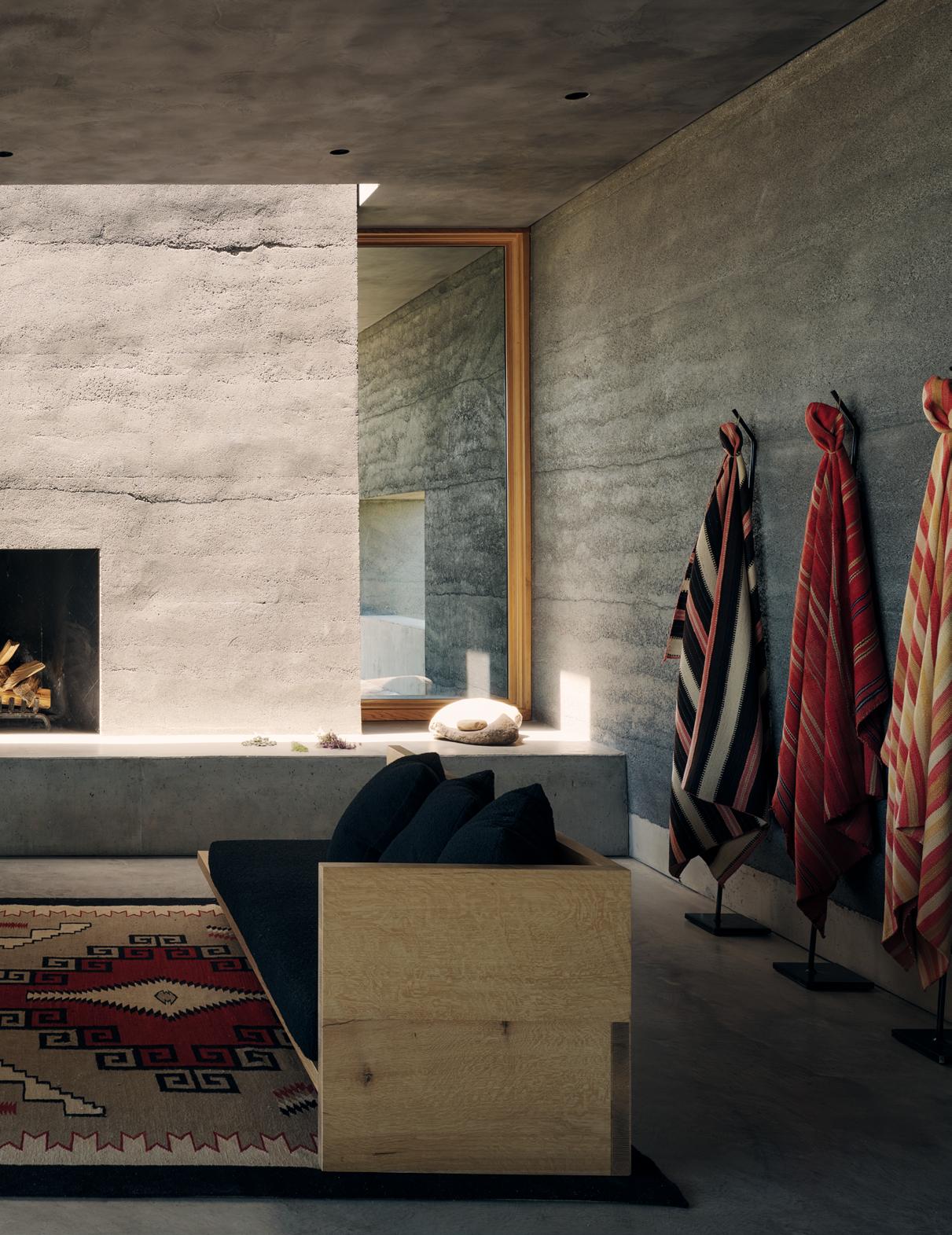
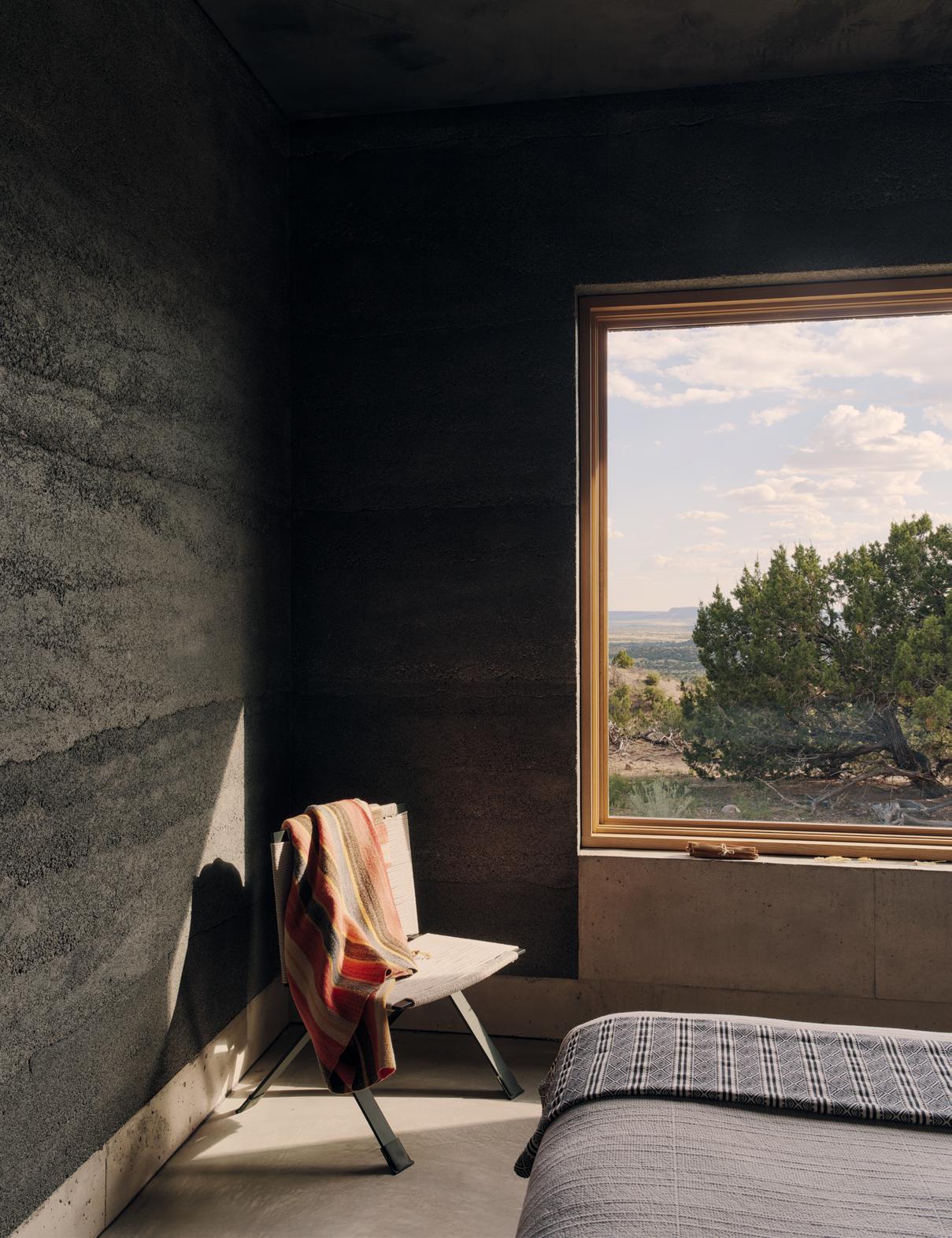
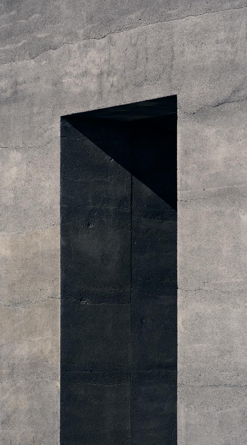
The home’s layout is essentially a sequenced facilitation, moving its inhabitants through dark, cave-like spaces before exposing them to carefully framed moments in the landscape. One enters through an obscure void before eventually uncovering these apertured verandas. This “shadow concept” is largely derived from the choice of material. Sourced in the region, black scoria (rammed lava cinder sand) is the material used for the home’s main, 2-foot-thick wall structure. Exhibiting the striated marks of the rock’s long-worn formation, the somewhat-reflective, dark coloration provides the contrast necessary to assist these encounters, contrasting the blues, greens, and reddish browns found in the landscape’s foreground and background. When natural light comes in, these surfaces glimmer with blue and gold, shifting in shade, not unlike the shadows that cast across the mountains in the distance.
“The material feeds the chameleonlike shadow quality we were after,” Robles said. “It reminds people of ancient structures found across the world and elicits the same sense of quiet reflection,” Manning Hayes added. “It performs well in terms of thermal mass. The house is volcanic geology cast as architecture.”
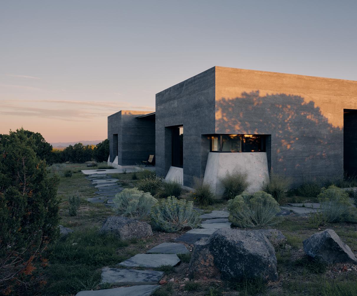
Rooting the scoria in place is concrete, used in the home’s foundation, and the striking angular stem walls that slope out below each distinctly proportioned window. To contrast this grayscale pairing, white oak carries across the interior from custom door- and window frames to cabinetry, millwork, and furnishings.
Manning Hayes and Robles work closely with Taos-based creative polymaths Maida Branch and Johnny Ortiz-Concha to stage the home. Together, they tapped Simrel Achenbach—founder of Brooklynbased Desciencelab and an early Donald Judd furniture fabricator—to develop a series of pared-back, multifunctional designs for the space. Sparingly assembled in white oak, these sofas, beds, stools, tables, and chairs reflect the same geometric composition of the structure but also its transcendent character. With nature outside the main source of decor, the walls are mostly left bare. There are a few exceptions, such as Branch’s ceramics. Sourced from local gallery Shiprock Santa Fe, hung textile artworks add warmth to the serene interiors. These woven compositions emulate the visual complexity of the brush forest and soft grass growing right at the perimeter of Sombra de Santa Fe’s footprint.
PREVIOUS SPREAD LEFT
The dark coloration contrasts with the blues, greens, and reddish browns found in the landscape.
PREVIOUS SPREAD RIGHT
A site plan shows the dogtrot-style house within the verdant desert landscape.
ABOVE Black scoria was used for the home’s main, 2-foot-thick wall structure.
FACING PAGE
Striking angular stem walls slope out below each distinctly proportioned window.
A Saint Kitts oasis by New York studio Architecture in Formation takes design cues from its site.
TEXT
BY Elizabeth
Fazzare
PHOTOGRAPHY BY Eric
Petschek
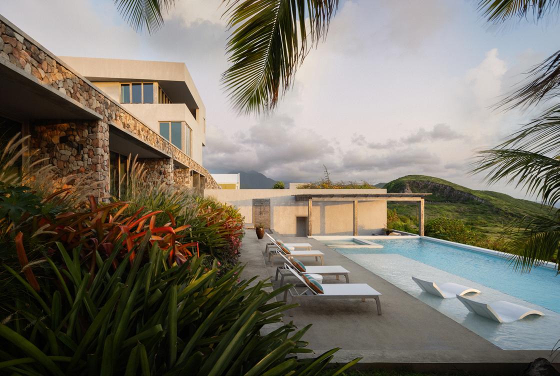
PREVIOUS SPREAD
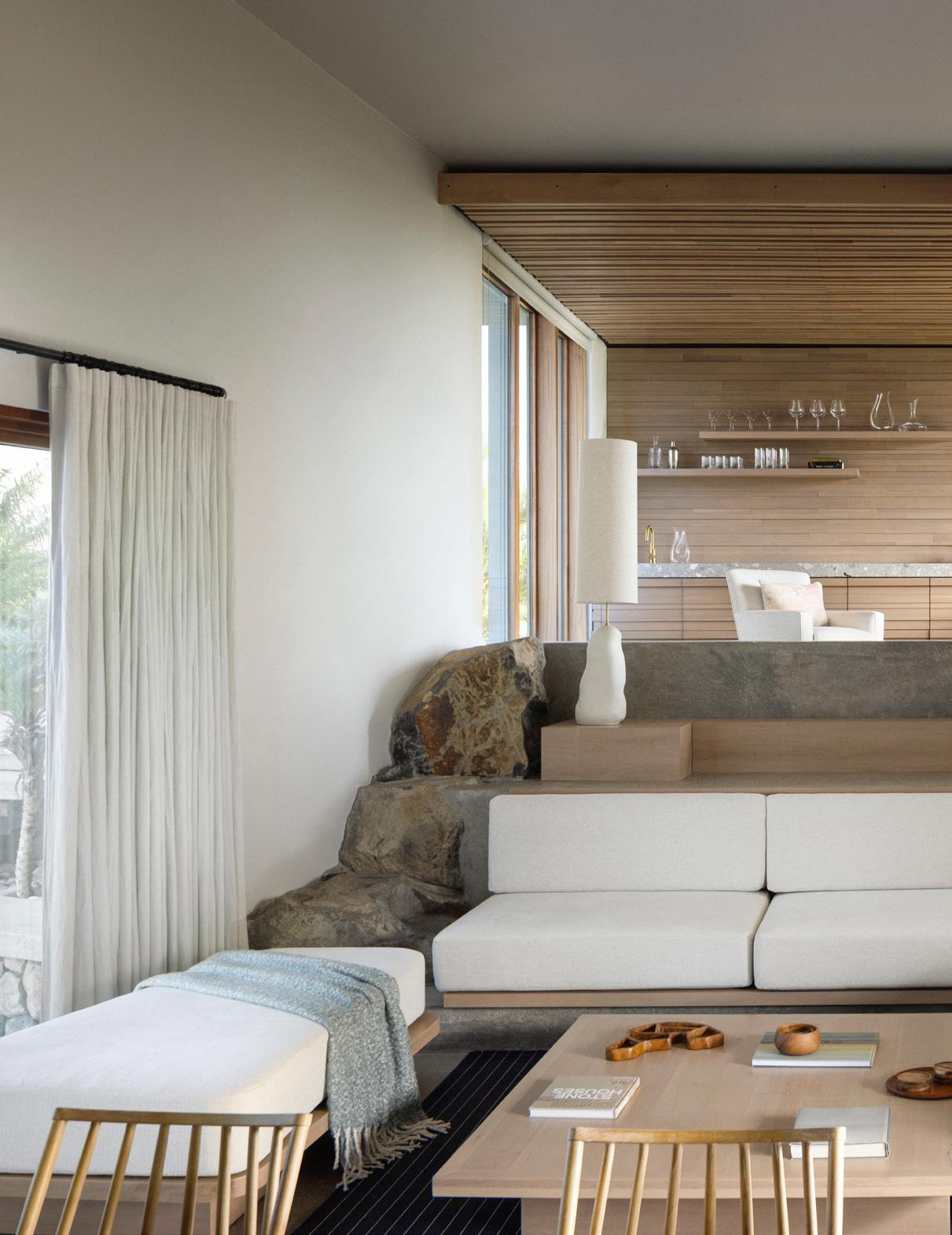
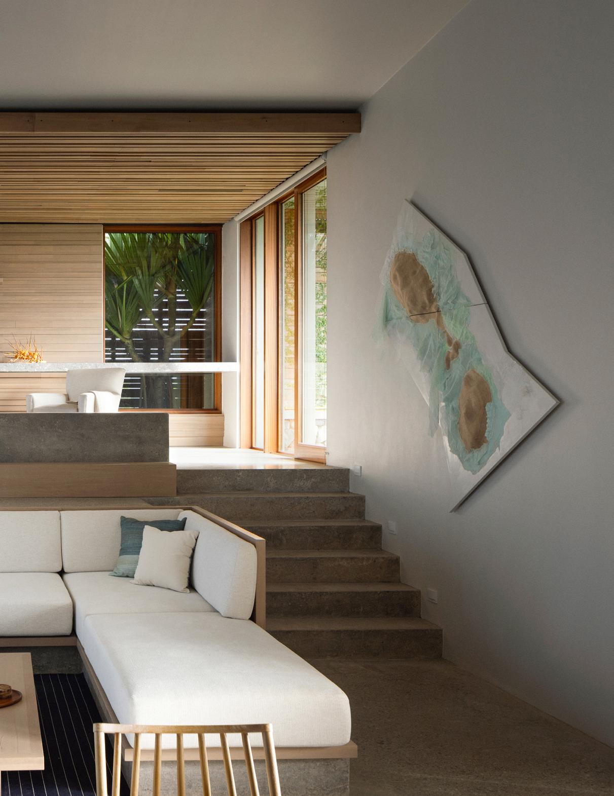
A modest living room featuring a built-in wet bar serves as a natural hub for the vacation home.
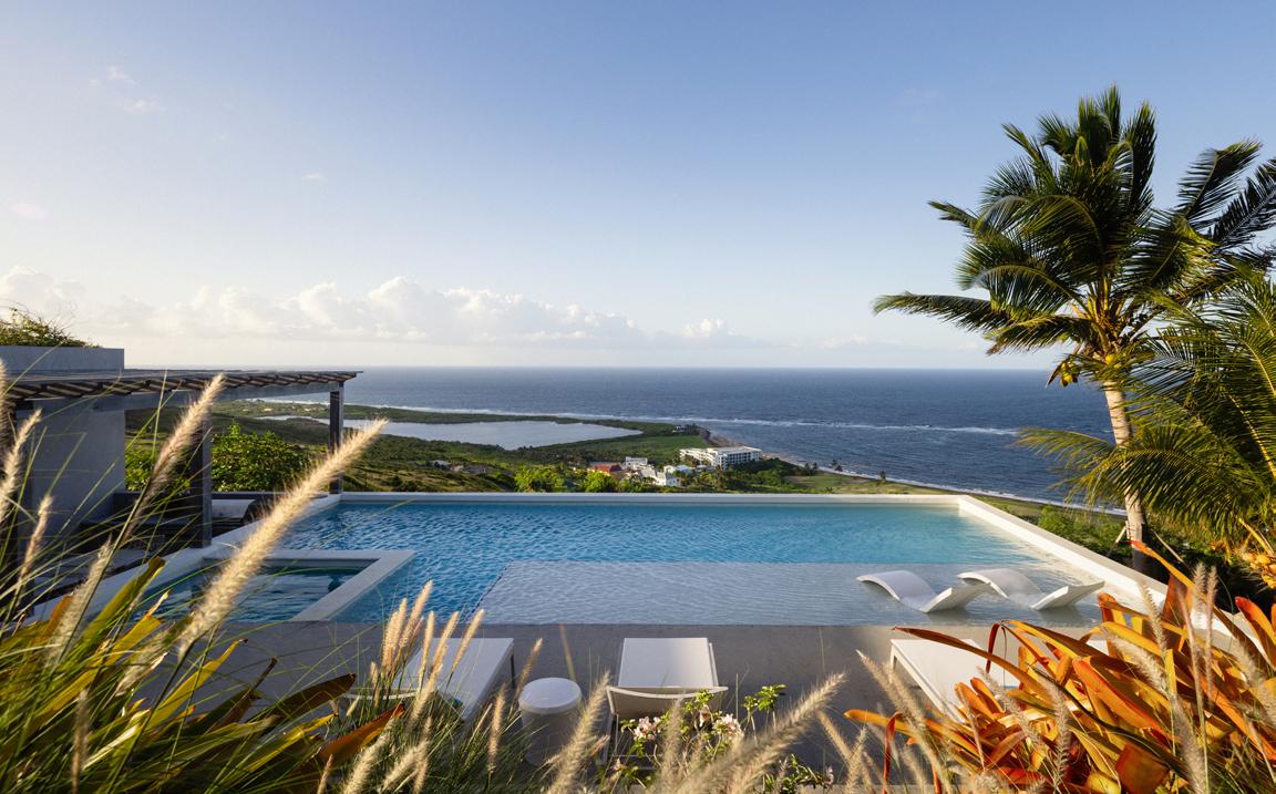
ABOVE
Each room in the house has access to a terrace, emphasizing access to the lush Saint Kitts scenery.
FACING PAGE
To accommodate for hurricane season, the walls are locally made structural concrete or cinder block, finished in plaster.
As a volcanic island, Saint Kitts has surprisingly varied terrain. Some regions within the 68square-mile Caribbean locale are lush with tropical plants. Others are more arid, with large boulders forming rocky outcroppings whose elevation provides spectacular views of the sea and surroundings.
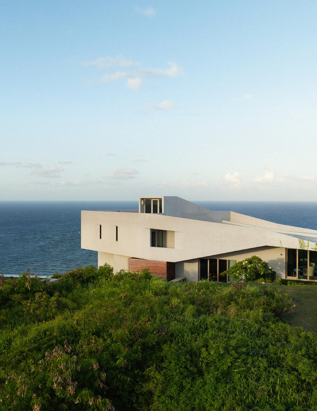
At the site of one of those natural hills, New York City–based studio Architecture in Formation designed a 7,000-square-foot villa that not only takes advantage of its topography but is constructed with the rock that forms it.
“We thought about that quote by Frank Lloyd Wright that you never build at the top of the mountain, you build into it,” said architect Matthew Bremer, the founder of Architecture in Formation and 2023 president of AIA New York. “We wanted the house to really feel of this very particular place.” Thus, its 3-story massing is shaped by the land, appearing to grow from it rather than sit above it— an effort that required quite a bit of excavation.
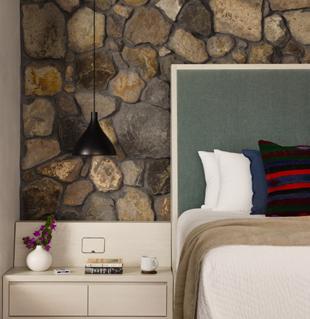
After 12 months of digging just to set the foundations, the construction team amassed a large collection of volcanic rocks. Some of these locally hewn stones remained on site and now clad the home’s lower-level facade, also making appearances on feature walls inside the three guest-suite bathroom showers as well as around the primary bedroom’s headboard. A trio of the site’s larger boulders flanks the living room sofa and marks a small level change, while others create retaining walls for the landscaping.
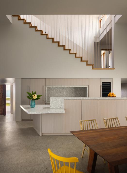
Beyond these homegrown accents, the villa’s interior materiality is kept “bone simple,” said Bremer. Like many homes in parts of the world where hurricanes can occur seasonally, the walls are locallymade structural concrete or cinder block, finished with an integral color plaster in a neutral shade. Mahoganyframed Duratherm windows and a custom front door add moments of luxurious contrast, as does the central
stair with white oak risers and a tensile rope railing. All the furnishings are bespoke, built in light-hued white oak to extend the serene scheme.
Used as a family getaway as well as a company retreat for members of the homeowner’s large New York City–based commercial construction firm, the villa is built around gathering, relaxing, and entertaining. Common areas include a dining table that can seat 12, a media room frequently used for afterdinner mah jong and card games, and a large pool deck with an outdoor kitchen. With pleasantly warm weather year-round in Saint Kitts, indoor-outdoor living is encouraged, and each room in the house has access to a terrace, most of them sun-shaded so that vistas can be enjoyed while one is protected from harsh rays. From its perch, the home certainly has some unbeatable views, which the architect framed strategically. “You get a view that is radically different every way you turn your head,” explained Bremer. “The Atlantic Ocean to the east, the Caribbean Sea to the west, the capital in the valley below, [the sister island] Nevis to the south, the dormant volcano Mount Liamuiga, and on a clear day [one can even see] north to Saint Martin and Sint Maarten.”
The best view, of course, is saved for the primary suite, which occupies the entire top floor and has a private roof deck with a 360-degree vantage point. This family-only zone remains peaceful even when visitors are wandering throughout the grounds. Its placement within the floorplan allows total separation from the common spaces and the detached guest wing, the latter of which is dug into the hillside berm overlooking the pool.
When a group does want to come together, the modest living room lounge with its built-in wet bar is a popular spot. “We call it the ‘five o’clock place,’” joked Bremer. “Actually, there are a lot of five o’clock places in the house. You can’t go wrong.”
FACING PAGE
The plan shows the building embedded into the mountainous terrain.
ABOVE
Outdoor spaces feature shade structures to promote outdoorindoor living.
BOTTOM LEFT
A white oak staircase with tensile rope railing adds luxurious detail.
BOTTOM RIGHT
In the primary bedroom the headboard is constructed with volcanic rocks.
TEXT BY Suleman Anaya
JSa completes Casa Marte, an off-grid compound in Mexico’s forested Valle de Bravo.
PREVIOUS SPREAD
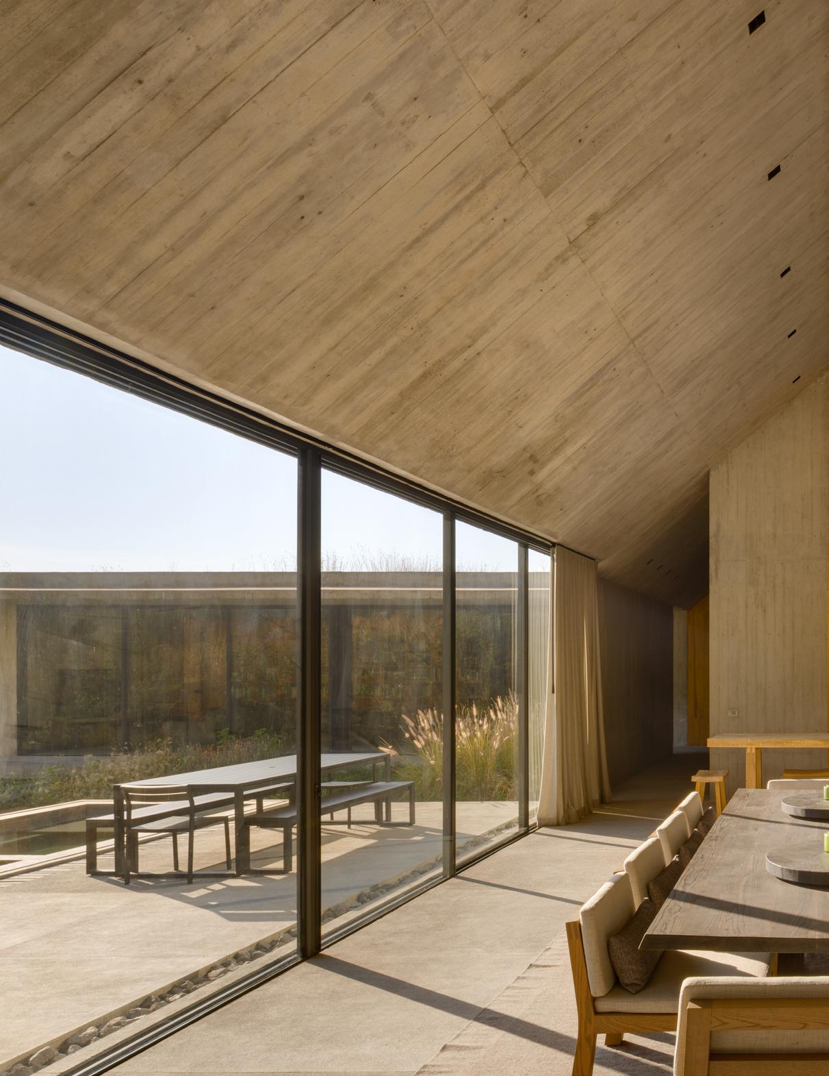
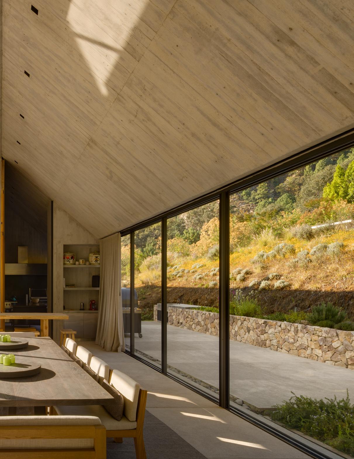
Large openings below the gabled concrete room establish a constant dialogue between architecture and environment.
ABOVE
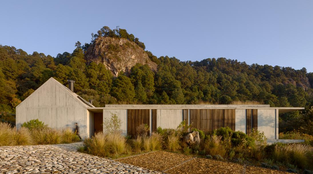
The house’s gabled silhouettes maximize its panoramic value.
BELOW
The walls bear traces of the formwork used to cast them.
FACING PAGE
The client sought a striking refuge in nature that was secluded without beingtoo remote.
Nominally a residential development and land regeneration project, the 200-hectare (494-acre) nature reserve known as Reserva Peñitas has, in recent years, emerged as something more exciting: a hotbed of contemporary Mexican architecture. Peñitas is located two hours west of Mexico City, near the lakeside town Valle de Bravo, itself a popular getaway for the capital’s well-to-do. There, exemplary water conservation practices are often paired with bold experimentation around domestic forms. The renowned architects Fernanda Canales, Hector Barroso, and Javier Sánchez (founding partner of the studio JSa), among others, have designed innovative weekend houses in the enclave.
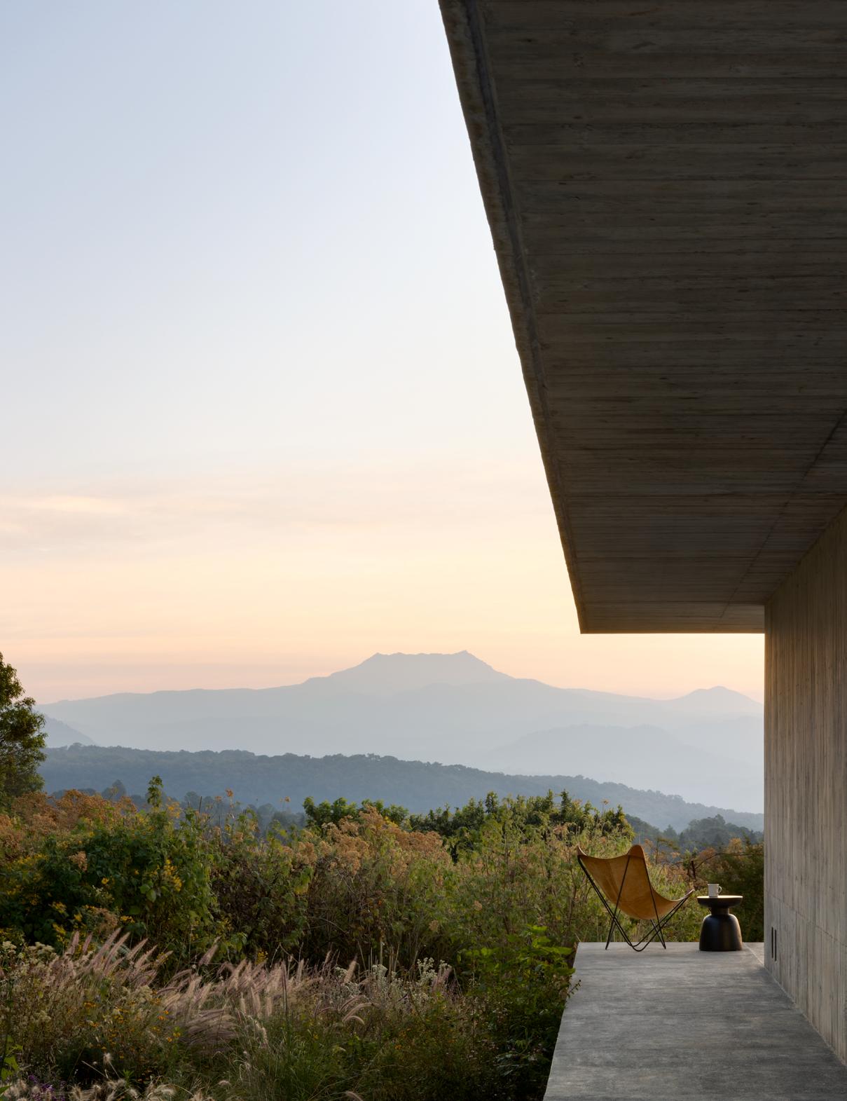
JSa’s latest addition to the area, a family retreat named Casa Marte, completed in 2024, plays with the idea of what a country home can look like. Casa Marte straddles seemingly paradoxical extremes: The design distills the dwelling down to its abstract essence (a physical manifestation of a child’s “A”-shaped drawing of a house), while also complicating it with three freestanding volumes in lieu of a single building. If that sounds gratuitously conceptual, in reality the resulting mini cluster is a sensible concession to the site, a large piece of land encompassing two distinct facets—a promontory offering long views of the valley and distant sierras and, past a ravine, a forested section. As quietly spectacular as the architecture is, Casa Marte’s forms defer fully to the awe-inducing scenery of the surrounding oak-covered boulders, serene creeks, and, most majestically, the quiescent Xinantécatl volcano— one of Mexico’s highest peaks. In a way, the house’s structures are promontories, too, their gabled silhouettes jutting out on platforms carefully inserted into the terrain to maximize the project’s panoramic value.
Casa Marte wasn’t always supposed to be split in three parts. The client, a businessman, gallerist, and architecture aficionado, approached JSa after seeing a Brutalist residence the studio designed in Peñitas in 2018. He felt that something similar might provide him, his historian wife, and their two sons with a striking refuge in nature that was secluded without being too remote. Since designing that blocky house, however, JSa had evolved toward a more
environmentally sensitive, less concrete-heavy approach. Moreover, the respected architecture workshop thought the varying character of the plot the client had purchased called for something unorthodox, something that was both freewheeling and rigorous. The proposal for the tripartite scheme was born, quickly winning over the family.
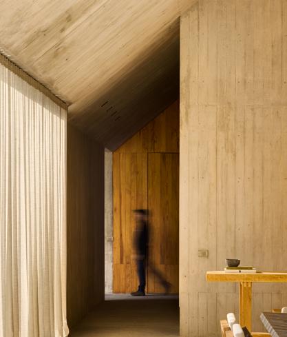
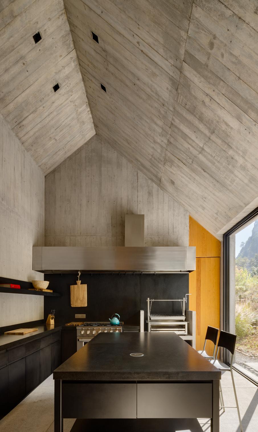
While the three structures vary in size and appearance, they share a common theme: dashingly pitched roofs, a frequent typology in a famously rainy region. The main house—which contains common areas, the parents’ rooms, a kitchen, and guest quarters—appears first, resembling a gray sculpture, simultaneously pristine and textured. “If we were going to use concrete, we had to do it in a new way, lighter and warmer than one is accustomed to,” said Sánchez. Indeed, thanks to the compelling tactility of the walls, which bear the trace of the formwork used to cast them, the family chose to leave
ABOVE
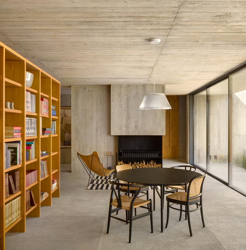
Wood shelving complements the concrete walls and flooring.
The primary bedroom was placed at the end of a cantilevered wing to provide views of the landscape.
A black countertop and backsplash make a statement in the concrete kitchen. JSa designed the space with Rallé, a Mexico City–based kitchen design studio.
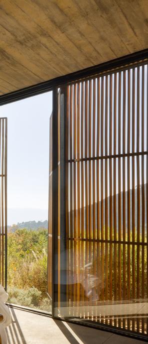
many surfaces exposed rather than hanging up all the art they originally intended for the space. “The quality of the concrete structure is extraordinary, evincing the skilled manual labor that went into making it,” added Sánchez. Though the material is often thought of as soulless, concrete’s refined application at Casa Marte lends the home’s rooms a human, inviting feeling. To highlight the views of the landscape—including a perfectly framed Xinantécatl from the primary bedroom at the end of a cantilevered wing—interiors throughout the house are kept sober. And yet, superior local craft is evident in details such as a huge, pivoting floorto-ceiling sheet of steel-framed glass that opens the living room to the greenery outside and, on the opposite side of the ample dining and living room—which spans almost 40 feet, column free—a tall pinewood blade inspired by traditional stable doors.
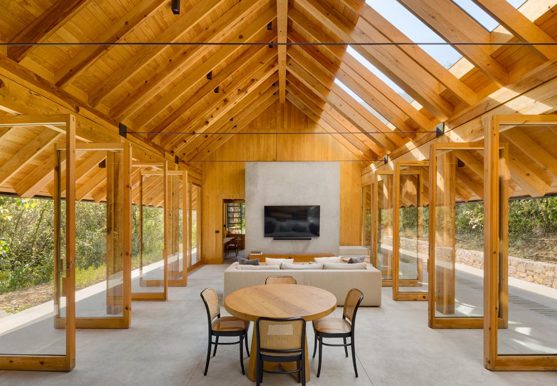
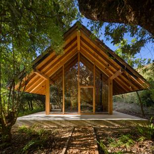
To reach the house’s second act, one walks out into the open, where an enchanting bark pathway connects the bluff where the concrete structure is perched on the parcel’s wooded section. After one traverses a small bridge, a second structure comes into view. It reprises Casa Marte’s defining “Haus” shape— the idea of shelter distilled to an elemental archetype— but translates it into timber. If, with its weightless solidity, the main volume strived to elevate concrete workmanship, the big pine module aims to recover material techniques nowadays more associated with Scandinavia than with Mexico’s heartland, where
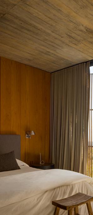
they, in fact, once thrived too. Nodding to trojes, an old timber building tradition from the nearby state of Michoacán, this space—the domain of the sons, both in their mid-20s—recalls a bright, cozy lodge. The design is characterized by a prominent overhang, a wraparound deck, and twin mezzanines perfect for when friends sleep over. “What you see is the actual wood structure, which is rare in Mexico, where vernacular construction methods have been lost over time,” said Sánchez.
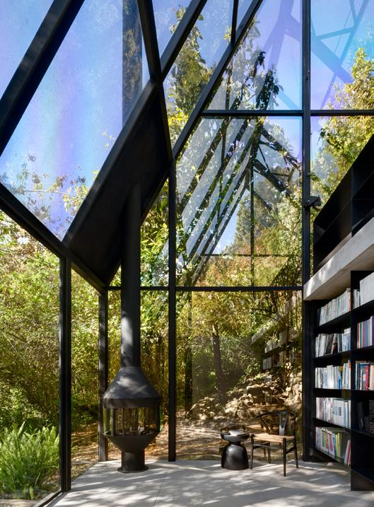
Further into the forest, the third building is a minimalist two-level studio made entirely of glass and slender steel profiles. Conceived for concentrated work, light exercise, or to enjoy music, the small pavilion contained little more than a library during a recent visit. But its versatile function struck me as incidental, as the structure seemed molded above all by the natural life around it, into which its transparent outlines almost disappear. The effect underscores what sets Casa Marte apart: a constant dialogue between architecture and environment. Regardless of where one is on the property, Peñitas’s sylvan ambience and massive rocks are always present. Not just because its harmonious components are a quick walk apart; in person, the rambling weekend sanctuary is experienced as continuous rather than fragmented. Above all, the delicately divided home feels remarkably attuned to the dynamics of a close-knit family that wants to give each other space—to play, rest, and enjoy the gasp-worthy setting.


FACING PAGE
A site plan shows the three freestanding volumes that comprise the residence.
ABOVE
Traditional stable doors line the open living room and dining space, all realized in wood.
BOTTOM LEFT
The second building recovers material techniques often more associated with Scandinavia than with Mexico.
BOTTOM RIGHT
The third building is a minimalist two-level studio made entirely of glass and slender steel profiles.
Thomas Safran updates Frank Gehry’s Schnabel House in Los Angeles.
BY
PHOTOGRAPHY BY Zara
PREVIOUS SPREAD LEFT
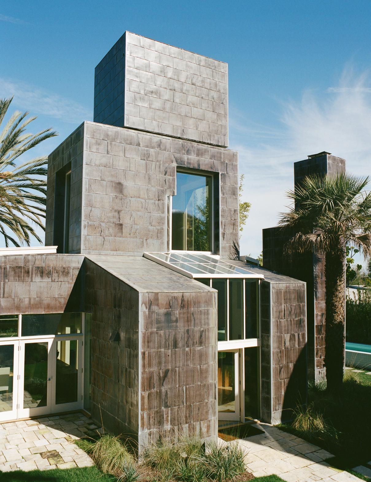
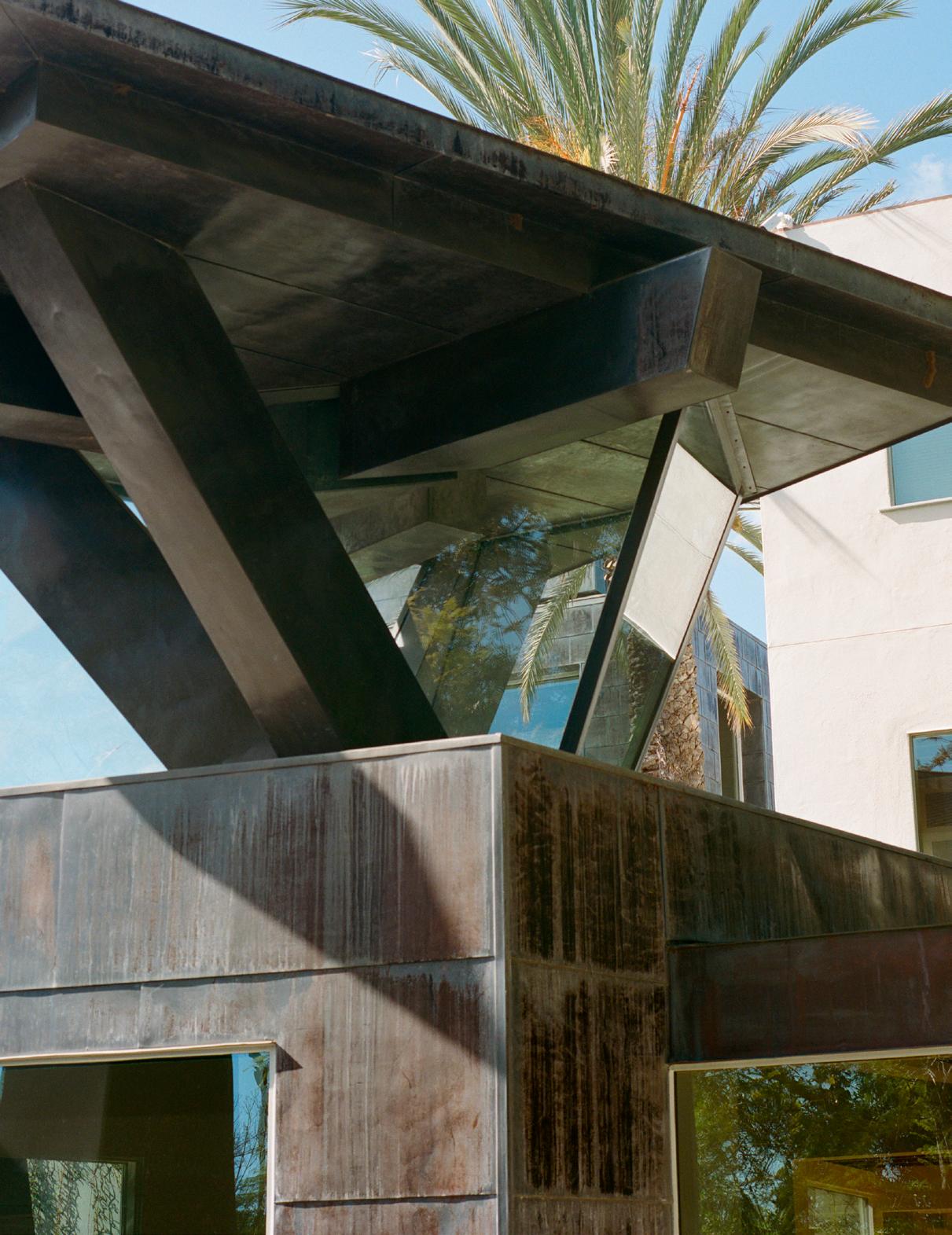
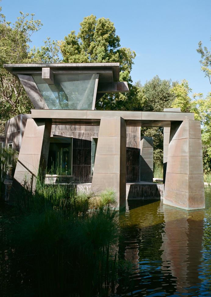
Originally constructed in the 1980s for Rockwell Schnabel, Frank Gehry helped new owner Thomas Safran renovate the building, which completed construction in 2025.
PREVIOUS SPREAD RIGHT
The building’s facade consists of stucco, glass, and copper.
ABOVE
The primary suite is capped with a sculptural roof and appears to float above a reflecting pool.
FACING PAGE
The rear of the house looks out over the pond in the project’s backyard.
In the late 1980s, Frank Gehry designed a unique residence for Rockwell “Rocky” Schnabel and his wife, Marna. The resulting Schnabel House was completed in 1989. Over the years, it passed through several owners and fell into disrepair. It was on the market for years. Potential buyers found fault with four things: the primary bedroom, the compound of unconnected buildings, the kitchen, and the garage. Neighbors in the posh Brentwood area of Los Angeles said it was “unlivable.” And it leaked.
In the early 2000s, Gehry met Thomas Safran, a real estate developer who, through this year, has built 9,000 affordable apartments in L.A. Safran hired Gehry to design his new office in Brentwood for Thomas Safran & Associates, and they became friends. Safran also collaborated with the architect on veterans’ housing for the Veterans Collective in West L.A. (Gehry served in the army in the 1950s.) The building was completed last year with help from architect Noah Riley and is occupied.
After discovering that the Gehrydesigned Schnabel House was on the market, Safran decided to buy it. With a deep respect for Gehry’s creativity and a desire to bring the project into the 21st century, Safran began to make improvements. It was a labor of love.
Safran and Gehry walked the property together multiple times. Safran would propose subtle and not-so-subtle changes, but he kept the architectural drama of Gehry’s vision. The architect told Safran, “I just want you to be happy.”
The renovation is now complete.
The Safran/Schnabel House is not really a house; it is a minicampus of individual pavilions that frame outdoor spaces linked by a colonnade, with a sculptural primary suite floating atop a reflecting pool.
The living and dining rooms are as beautiful as ever. Safran saved the dramatic spaces and spectacular views but transformed what had become a hot greenhouse into a wonderful, comfortable gathering place. You can’t tell how much work went into bringing today’s technology into this 37-yearold structure. Safran tore out some walls, installed new HVAC throughout, and added subtle new vents that harmoniously blend into the new walls. And, by the way, he fixed all the leaks.
All those years of dedication, Safran said, was like “the agony and the ecstasy.” Happily, he has arrived at the ecstasy part of the process.
Safran converted Rocky Schnabel’s private office pavilion into a charming guesthouse with a new bathroom. He kept the spherical rooftop and circular ceiling, inspired by Marna’s love of the Griffith Observatory. He updated the lap pool and fitted the garage with one large door in place of two small ones. Marna told Safran that previously they never parked a car in the garage because the doors were too narrow.
Most bathroom vanities, showers, and tubs were faced in Daltile and needed attention. Safran replaced them with granite slabs and installed nicer fixtures.
Much of the complex needed some TLC. Gehry was fond of employing what he called “cheapskate architecture”—Safran recalled Gehry saying that he had a mediocre contractor for the original project.
The kitchen was old and dated, so Safran gutted it, replacing the old millwork with Douglas fir cabinetry. (Previously, half of the fronts were painted white.) He selected the same pulls that Gehry loved and used in his last home. He also chose the same granite and details initially selected by Gehry. It’s new, it works, and it honors the original. Also, the long counter can now accommodate six diners, while previously there was no seating in the kitchen.
The most important transformation was the creation of the primary suite one level below the main floor and seemingly floating on a reflecting pool. With the help of Kevin Napoli of LENA Construction, Safran maintained the sculptural roof and theatrical natural light, but he shifted the sleeping room to be down the hall and opened up the prior bedroom to become a dynamic entertainment media space. It includes a table and chairs designed by Gehry, which offer views of the koi-filled pond. Safran also added an elevator for convenience.
Approaching the house from Carmelina Avenue is as exciting as ever. The mix of stucco, glass, and copper, framed by lush landscaping, designed by Jennifer Johnson of Native by Design, invites visitors to the front door. Inside, you are greeted by soaring spaces, multiple skylights, and views to the quiet backyard, which overlooks the pond.
Gehry’s architecture has been maintained, respected, enhanced, and celebrated by Safran. The renovation is a fitting tribute to Gehry’s legacy and the 20 years of friendship he shared with Safran.
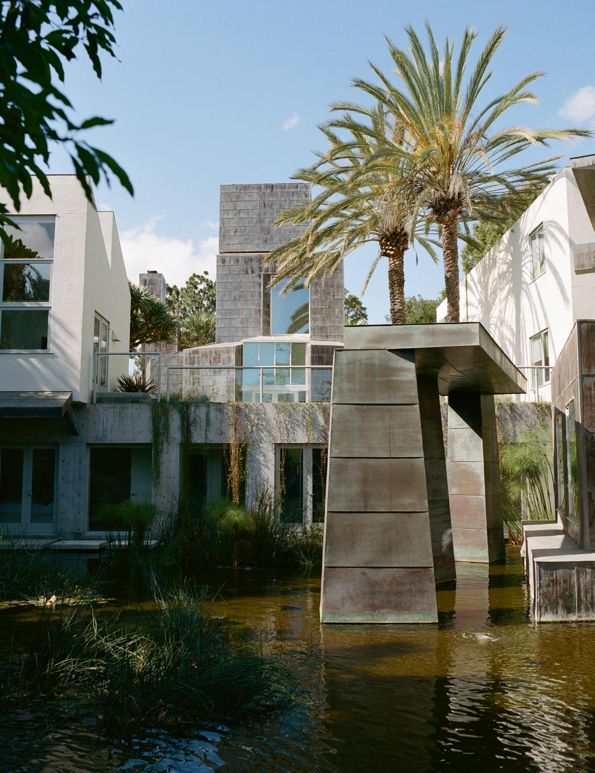
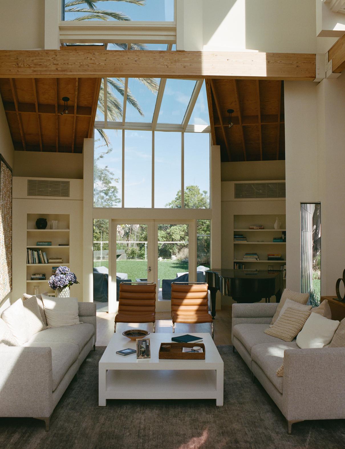
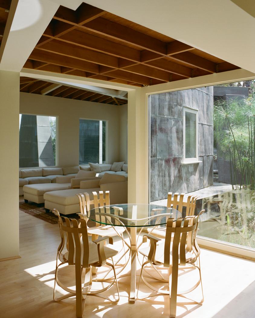
LEFT
The main living spaces preserve the original dramatic views. Gehry’s exposed wood ceilings are intact.
RIGHT
An updated HVAC system transformsed what used to be a hot greenhouse into a space for gathering. The seating area includes chairs designed by Gehry for Knoll.
NEXT SPREAD
Lush landscaping invites visitors to the residence entrance.
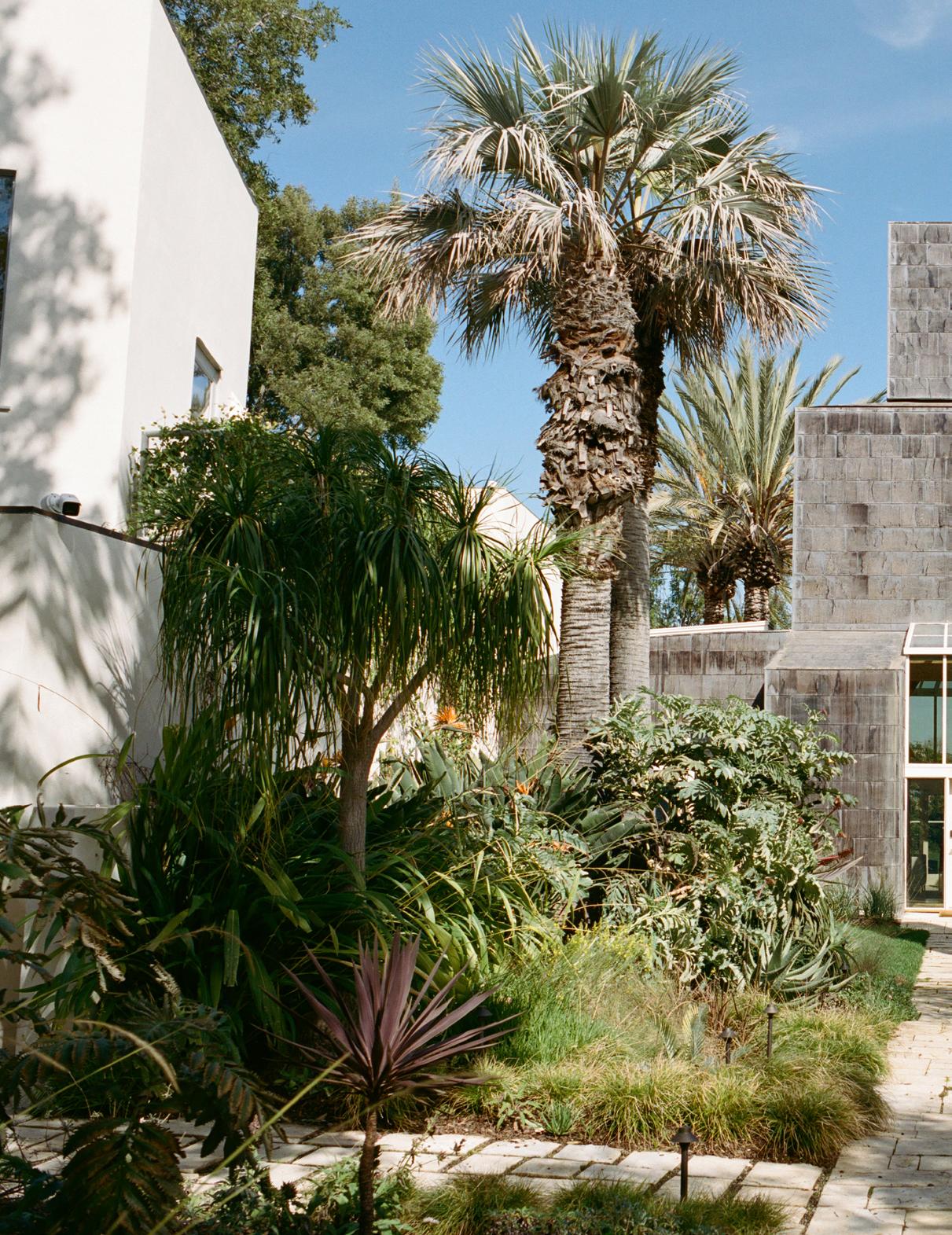
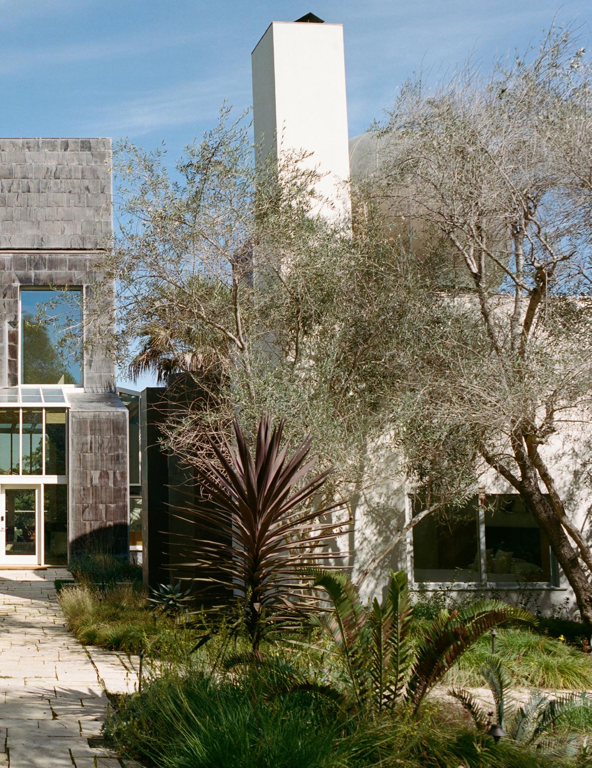
WRAPPED UP 20
Blu Dot bludot.com
Kawneer kawneer.com
MDD mdd.eu/us
Muuto muuto.com
Solatube solatube.com
Trueform trueformwear.com
Vescom vescom.com/en-us
Zaniboni Lighting zanibonilighting.com
A DRAMATIC ESCAPE 22
Duratherm durathermwindow.com
Wood Factory Sarl woodfactorysarl.com
Vipp vipp.com
SWEET SOLITUDE 24
Casambi casambi.com
Emy After Dark emyafterdark.com
Frama us.framacph.com
Meljac meljac.com/en
Prana pranaplunge.com
Symmetry symmetrysauna.com
Watermark watermark-designs.com
ROUNDING THE CORNER 40
De Troupe detroupe.com
dk3
dk3.dk
The Expert theexpert.com
Estudio Persona estudiopersona.com
Foscarini foscarini.com
The Future Perfect thefutureperfect.com
HUMANHOME humanhome.co
Studio Schalling schalling.se
CONCRETE CONCEIT 44
Nuumbra difane.com.mx/en/ collections/nuumbraestudio
Perch perch.mx
Watterbrass watterbrass.com
SERENITY OF STONE 68
ATHOS athoswin.gr/en
Bongio bongio.com/en
PORTA Impresa portaimpresa.gr
Masterwood masterwood.gr
PORTA Impresa portaimpresa.gr
WOW wowdesigneu.com
SLOW DRIP 76
Aequo aequo.in
Bocci bocci.com
Bisazza bisazza.com
Dinesen dinesen.com
Huum huumsauna.com
Lampas lampas.com
Minjae Kim minjae.kim Ottima otiima.com
Tecnoline tecnoline.de
SHADOWS & LIGHT 84
Baldwin baldwinhardware.com
Dacor dacor.com
Decospan decospan.com
Franke franke.com
GE geappliances.com
Grohe grohe.us
Kohler kohler.com
Kolbe kolbewindows.com
Solamente solamentenaturalplaster. com
Toto www.toto.com
Zia Tile ziatile.com
VOLCANIC RETREAT92
Astro us.astrolighting.com
Pitt pittcooking.com
Stitch NYC stitchnycinc.com
Visual Comfort visualcomfort.com
Vitro vitroglazings.com
HAUS, INTERRUPTED98
SMEG smeg.com
Taller AF talleraf.mx
Valvo valvo.com.mx
Venster en.venster.com.mx
Vimar vimar.com/en
ADVERTISER INDEX
Bridgeport - d Line 35
bridgeportworldwide.com/ our-manufacturers/dline
Bridgeport - Formani 22 bridgeportworldwide.com/ our-manufacturers/formani
DOM Interiors 43 dominteriors.com
eggersmann 28 eggersmannusa.com
Ferguson 37 ferguson.com
Fisher & Paykel 2-3 fisherpaykel.com/us
Gloster Back Cover gloster.com/en-us
Hanover Architectural 27 hanoverpavers.com
Infinity Drain 25 infinitydrain.com
Modular Arts 11 modulararts.com
Modulnova SRL 4-5 modulnova.com
Poliform 1 poliform.it/en-us Rimadesio 48 rimadesio.it/en
Tilebar 9 tilebar.com
Turf Design 7 turf.design
DOUBLESPACE PHOTOGRAPHY
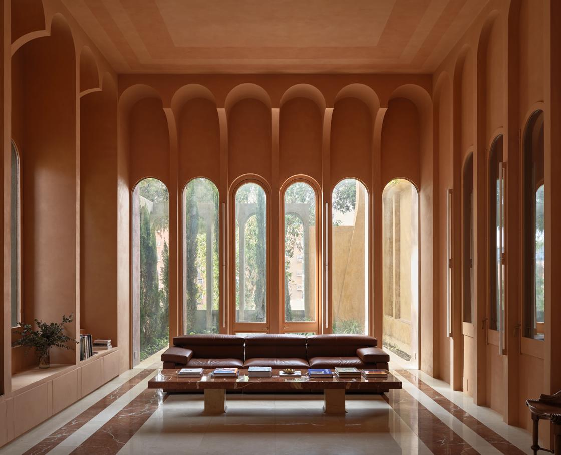
We visited Taller Bofill in March 2025. We were in Barcelona scouting locations for our photography workshop with RCR Arquitectes, which took place later in the year and will happen again this fall. We had reached out to the studio and were able to visit for a couple of hours. We had our two sons with us, so we parked them in the courtyard. The experience was quite chill; we were free to roam around. We mostly didn’t use tripods, so we were exploring with our cameras.
The office space was quiet, like a cathedral, though people were talking in teams. We didn’t move anything. This is how we would prefer to make photographs of architecture—less like a magazine and more about how you could live your life. We are looking to heighten that aspect, so there is a dramatic excess of reality; in an ideal world, we would like to make things more imperfect.
We shot one of their sitting rooms, but we needed to move because they had a meeting. This was one of our favorite spaces. The Spanish light really helped; it was moody, but so brilliant. It allows you to read the volumes and shapes. Everything is so tactile.
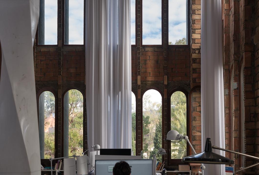
FACING PAGE
In a meeting room, light filters through arched windows, illuminating the curved forms.
TOP Taller Bofill set up their office in La Fábrica, a renovated historic cement factory.
BOTTOM
A staircase is set into the floor.
NEXT SPREAD LEFT
The space is quiet, like a cathedral despite the different workspaces where teams meet.
NEXT SPREAD RIGHT
Work can take place in adjacent areas beyond the desks.
LAST PAGE
La Fábrica’s colors seen against the facade of the nearby Walden 7 complex, designed by Taller Bofill.
Good architecture is transcendental; it gives you goose bumps. We love the architecture in Spain and Portugal because it is simple and humble, not so precious. We like to travel, so we love to do international shoots. For us, creatively, it’s always about exploring interesting new places. This also means we like seeing older stuff. For example, we’ve started a series in Canada where we’re revisiting buildings ten years after they opened. It’s a study of how buildings age. We’re also exploring a more photojournalistic way of documentation beyond the clean magazine shots you see from us. This is how we approached our afternoon at Taller Bofill.
Architecture is our obsession, so if you show us a nice building, we are all over it. As told to Jack Murphy
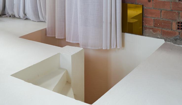
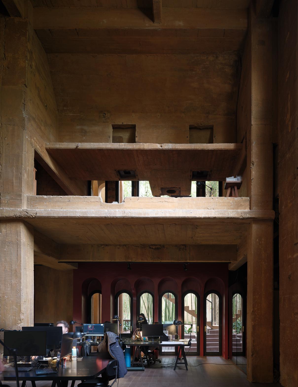
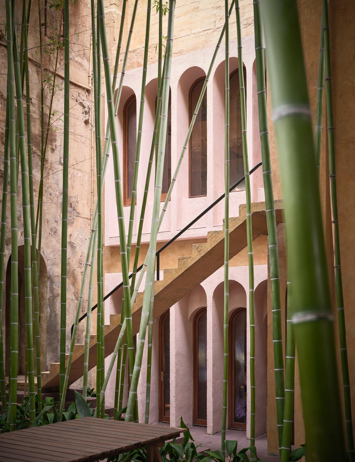
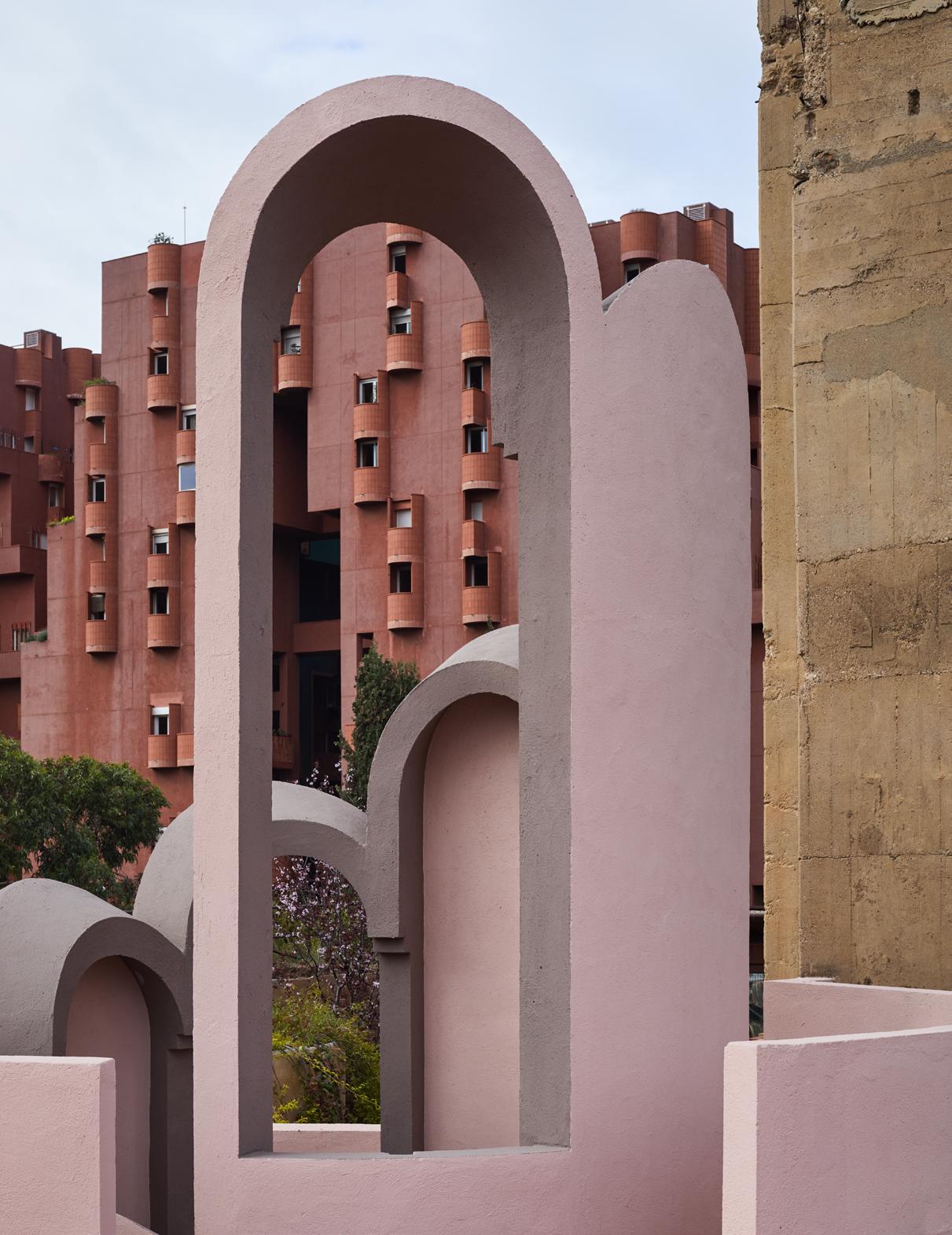

BRIDGET GOLDBERG
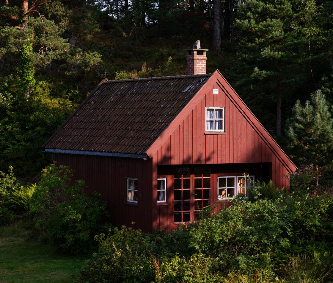
On a balmy summer night, on the shoreline of a small island in southern Norway, a woman is seen camping outside, taking notes on the direction of the wind. This rugged site will soon be built with a house, designed by this woman, one of the country’s leading female architects, Wenche Selmer. Wenche Selmer (1920–98) was one of the few women to gain prominence among Scandinavian architects in the 20th century. Deeply attuned to nature, Selmer often slept on the sites of her projects to understand factors like the quality of light of a setting sun or airflow. This collected data would then be incorporated into her designs, influencing where windows were placed for the best views or where a front door should be to avoid a chilly wind. Her portfolio comprises over 30 summerhouses or cabins, mostly on the southern coast of Norway, as well as numerous detached houses in Oslo. Selmer’s projects emphasize simplicity, oneness with nature, and a synthesis of modern architecture with Norway’s vernacular tradition of wooden cabins.
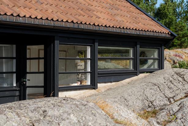
FACING PAGE
A summer house designed
TOP Selmer’s oeuvre falls into Norway’s hytte cabin typology, small second homes close to nature.
RIGHT Selmer’s work lay in the domestic realm and she often sketched at her own kitchen table.
BELOW Selmer at work on a cabin project
BELOW LEFT
The Selmers’ own home in Trosterudstein.
In May, a new exhibition at the National Museum in Oslo presents a selection of Selmer’s original drawings, personal items, and lecture notes from her time as a professor, as well as full-size building components. Wenche Selmer: What Can You Live Without, on view through October 4, 2026, is the museum’s first monographic series featuring a female architect. It is also the first retrospective of this scale on the architect.
Curated by Martin Braathen and Joakim Skajaa, the exhibit centers on her pedagogy and lectures from the 1970s to the 1990s, which explored her approach to creating modest houses embedded in nature. “The exhibition is framed through her lecture notes…the title ‘What can you live without?’ is the question she asked her students, her clients, and herself,” said Skajaa.
Her seasonal cabins fall within Norway’s hytte typology—second homes where Norwegians could escape urban life, embrace nature, and come together. Her work is in direct communication with how we build and how we live today and touches on modernism, vernacular architecture, local building materials, modest living, and being close to nature. She specialized in building rather compact holiday homes that, despite their small size and seasonality, are a good testing ground for understanding how simple a good life can be.
Born in 1920 in Paris to Norwegian parents, Selmer was an early widow who trained in Oslo during and just after World War II at the Norwegian National Academy of Craft and Art Industry (now the National College for Art & Design). There, she was deeply influenced by postwar scarcity. Selmer studied under eminent Norwegian architect Knut Knutsen, who had a profound impact on how she thought about vernacular forms, simplicity, and designing in harmony with the natural features of each site.
After graduating, Selmer spent a year training in Paris and apprenticed with and worked for architects in Oslo before starting her own architectural firm in 1954. Soon after, she married architect Jens Andreas Selmer, a Norwegian architect known for his extensive work in postwar reconstruction and housing. His projects ranged from cooperative housing blocks in Oslo to standardized homes in the north of the country and included revitalizing towns severely burned and destroyed by the Nazis during the Second World War. Across their careers, the two collaborated closely. Jens had a large architecture office, while Wenche completed most of her cabin designs at the kitchen table, mostly in small format rather than large drawings done on drafting tables. She never had an office, and worked mostly at home.
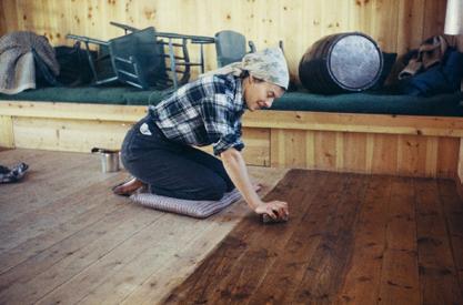
Selmer’s architectural legacy is closely intertwined with that of Jens. Their collaboration proved fruitful, and many drawings have been signed by both. And yet, the museum made the exhibit solely about Selmer rather than the two of them, to reframe the narrative of her work.
“He [Jens] brings the concept of architectural copies or serial production into Wenche’s house designs, with projects that are very site specific but also don’t mind being a copy with repeated design elements,” Skajaa said. “Wenche was not afraid of something being duplicated, but very, very concerned about how it would be situated on the site: It’s the same house, but if it fits right with its landscape, then it’s OK. This makes her very unique, and many other architects would not normally do that.”
From 1976 to 1987, Selmer would go on to teach at the Oslo School of Architecture and Design. All of these personal and historical contexts informed the small-format, domestic nature of her drawings, as shown in the exhibition.
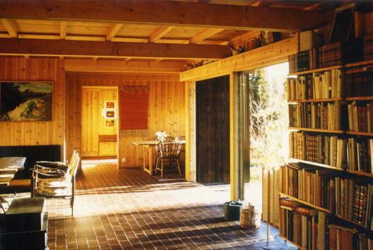
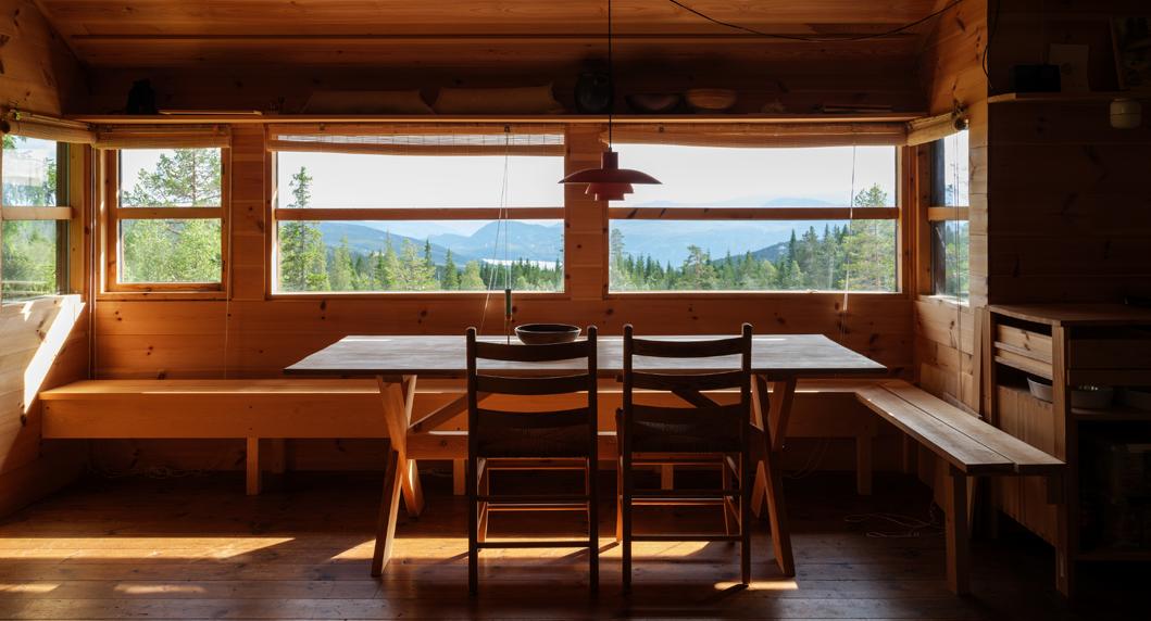
Selmer’s philosophy embodied her belief that a rich life is found in simple means and small details, like the placement of a window to create a view of a lake or fjord or the exact height of a fireplace. “In her cabins, there are always many different places to sit, based on the weather and wind conditions,” explained Skajaa. “She was really good at not just making spaces flow, but thinking about how they will use the home, how it will work, and many different situations. She had a natural sensibility to life.”
It may seem remarkable that during the postwar period, in which modernism was the prevailing ideal, a renowned Oslo architect designed houses that were a tribute to wooden cabins and tradition. However, Selmer developed projects with distinctly modern elements, including flat roofs and large sliding doors. Across her works, the architectural attitude remains the same: The buildings are designed with utmost care and in an intimate relationship with the terrain. She avoided blasting rocks and cutting trees, going so far as to design around natural features to avoid disturbing the site.
Characteristic design details by Selmer include generous entrances with storage for shoes, jackets, and gear. In many of Selmer’s cabins, the entry room is designed like a mudroom—a so-called vindfang—and is meant to “catch the wind,” with two doors between the outside and the living spaces inside to prevent drafts from impacting indoor living. Other details are large fireplaces next to communal kitchen tables, multiple sliding doors, and planned seating to support varied indoor–outdoor use, entry areas with large windows to the outside, ceramic tile or slate on the floor, wardrobes for coats, hats, and shoes, and cupboards built into the walls to define the spaces. These principles contribute to the effect of spaciousness and spatial harmony, despite the projects’ being compact. Her commissions involved small houses with limited budgets, and for this reason, she was especially attentive to spatial coherence.
Selmer’s resurgence at the National Museum seeks to reclaim her missing narrative, and it is part of a broader movement to bring women architects back into the conversation. As a hidden figure of 20th-century architecture, her cabin designs and lectures during her professorship are an integral piece of the puzzle of Scandinavian architecture and living. Her work offers profound lessons, ranging from spatial efficiency of living as a family in modest houses to larger debates about the climate crisis we face today, anticipating the current need for environmental empathy.
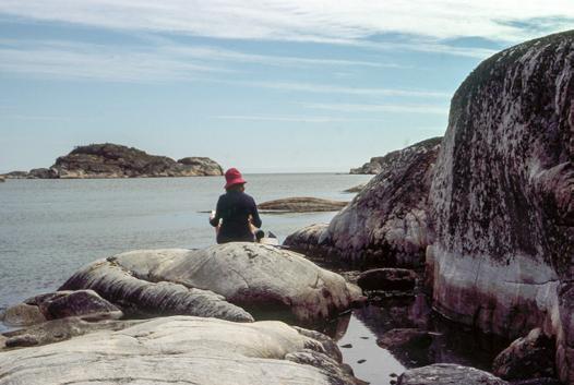
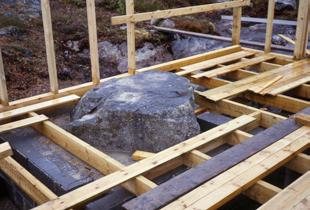
TOP
Selmer designed to the human scale, with special attention paid to windows and seating placements.
MIDDLE
To build an understanding of the project site, Selmer would often spend long periods of time outside, recording natural factors that might influence the building.
LEFT
Selmer’s siteattuned approach to architecture avoided removing rocks or trees.
FACING PAGE
A rock that was incorporated into one of Selmer’s cabin designs. From
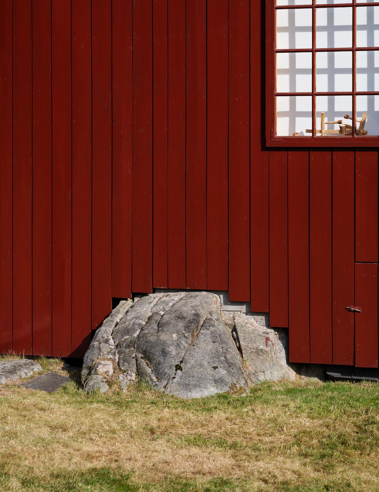
A new monograph brings refreshed context to modernist architect and painter Wassef Boutros-Ghali’s oeuvre.


Wassef Boutros-Ghali’s precise, emotional paintings possess a distinctly spatial logic. An architect by training, the Egyptian abstract painter’s experimentations with geometry and color often give way to structural compositions. In one, an emerald wedge cleaves into a viridian square like joinery; in another, which features an icy-white pyramid, a fulcrum motif is repeated, creating visual tension. Born in Cairo to an influential political family, Boutros-Ghali, who died in 2023, first fine-tuned his perception of light and space designing buildings, prime examples of the Egyptian modernist movement. His first completed project, Dar El Nil, was commissioned by his father and completed in 1951. Wassef Boutros-Ghali, Catalogue Raisonné, a new book published by SKIRA, documents his legacy alongside the artist’s interview with Glenn Adamson and an essay by Sumayya Vally. The written portion traces the evolution of his practice across a life spent in Cairo, Paris, and New York, which leaves his acrylic paintings and drawings to speak for themselves.


Carol is trying to buy furniture, but can she manage to describe her desires?
DAVID MICHON
Carol entered the showroom totally sure of what she wanted. Or rather, Carol entered the showroom totally sure of how what she wanted was to make her feel, which, as her analyst pointed out, is not quite the same thing.
To the salesperson, a young guy named Bruno, she started off with a vague sort of certainty: “I’m looking for a substantial piece, something that is really .” Bruno’s face rearranged itself into the expression of someone being paid to listen (as we all are, in some ways). Carol continued, “But not, like, aggressively , though. You know?”
overused decor adjective e.g., authentic
overused decor adjective, again
piece of furniture (specific) e.g., cantilevered chair
Bruno, of course, did not know. Who could? Bruno gestured toward a . “This has quite a feel, at least according to FOR SCALE.”
positive decor adjective—e.g., airy, refreshing, nuanced—whatever it might be for you!
abstract concept (vague)—e.g., energy, awareness abstract concept, again
overused word meaning presence e.g. substance
color that isn’t really a color e.g., something farrow & ball comes up with color that isn’t really a color, again
“That has ,” Carol said, tilting her head in that sort of Art Criticy way. “But it’s, like, the wrong type of . I need something with real .” She paused. “Actually, the isn’t even the issue. It’s the color.” She said the way other people say “justice,” as though it were both totally self-evident and also totally out of reach.
abstract concept, again
“It also comes in ,” said Bruno, pointing to a sad little swatch. “It’s got a real charm to it.”
another color that isn’t really a color
“OK…,” said Carol, rolling her eyes with pointed dismissiveness. (Rude, but chic!) She snaked her way deeper into the store.
What she needed, she explained to no one in particular, was something . Not literally, though, she clarified when Bruno asked if she meant the material. “Spiritually . Something that would with my space. Something with a to it, sort of.”
buzzword decor noun e.g., narrative, provenance
texture word (somewhat meaningless) e.g., organic texture word, again
verb meaning “to feel” (vaguely) e.g., resonate
“What about something ?” asked Bruno, who had now been trailing her for 11 minutes and was beginning to understand why Sartre said hell is other people.
aesthetic style (from the postwar era) e.g., midcentury, space age, et cetera
“That does have notes of ,” Carol said. She kept wandering. She examined a nearby that sort of had a look to it, but it was upholstered in
aesthetic style, again
upholstered piece of furniture (specific) e.g., Méridienne chaise
aesthetic style, again
brand name used as philosophy e.g., Restoration Hardware
trendy textile e.g., moire silk
She kicked it a little, nudging it. “This is very ,” she said, which she meant as a criticism. She was becoming distant.
“What about throw pillows?” Bruno offered, as a man might offer to adjust the deck chairs on the Titanic. This whole moment was sinking fast. He was desperate for at least some f*cking pennies of commission. He didn’t want to let Carol go.
number, 1 through 10
Carol was going cross-eyed. “I think I need pillows,” she said slowly, “but I need them to look like I only meant to have pillows. But that I’ve collected them over time, so there needs to be some friction. Very curated. Does that make sense?”
number, again
She looked at Bruno with genuine earnestness. “It’s about , Bruno. Everything is about .”
abstract concept, yet again
abstract concept, again
She tapped the once, as if making a point. “Even knows that.” Bruno was actually a fan of , so he nodded. He told Carol about their return policy.
trendy textile, again upholstered furniture, again
famous designer (furniture or interiors) e.g., Kelly Wearstler famous designer, again
Carol left without buying anything. She had, she felt, been very clear. She’d ask Claude about this all later, for sure. “What a -esque experience,” she said aloud to herself as she powerwalked away. She was late for lunch at Frenchette.
famous director’s surname (ideally abstruse) e.g., Lynch
Enter today at: archpaperawards.com/products26/