
2 minute read
Old Logo


– Audrey Hepburn, actress.
Advertisement
LOGO HISTORY
LOGO HISTORY
1930
Revlon is an iconic cosmetics brand, which was founded in the 1930s in the United States. The visual identity of one of the world’s most famous cosmetic labels has always been very consistent — based on the brand’s name it was redesigned just twice during the company’s history, but keeping its unique style and character.

1977 - 1989
Alan Peckolick, an influential designer who created several widely recognized images, including the corporate logos for Revlon, and who made the imaginative use of lettering the focus of his designs.

The Revlon logo, introduced in 1977, featured a stylish and elegant logotype, written in all capitals. The inscription was executed in a sleek serif typeface with distinctly pointed serifs. The triangular ends in the letters were balanced by the most recognizable element of the logo — the connected “L” and “O” letters. The horizontal bar of the “L” was elongated and merged into the bottom part of the “O”. This logo version was executed in black, which was the perfect choice for the company working in the cosmetics segment with bright colors and sparkling textures of the items and their packaging.
1989 - 2003
The logo was redesigned in 1989. The changes of this time period were mainly about the color palette, but the contours of the lettering were also cleaned and refined. This made the serifs look more distinct and the whole inscription — confident and professional.
The color palette now consisted of three shades, which were used separately. The logotype could be drawn in black, as before, or in scarlet red for some of the backgrounds, but there was something completely new — a three-dimensional version of the logotype, executed in gradient gold with a very thin and delicate gray outline and shadow.
Executed in gold, the Revlon logotype looked more sophisticated and tender, is a great representative for the brand, and an absolutely awesome eye-catcher.
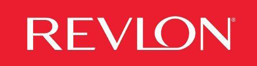
2003 — TODAY

In 2003 the brand decided to simplify the logotype by switching from serif typeface to a clean and modern sans-serif. This made the whole image lighter and edgier, showing the progress of the company and its willingness to change with the whole world and the interests of its audience.
The current Revlon logo is available in two variations — red and black, which both are very powerful colors, representing passion, style, and professionalism.
The inscription of the brand, written in all capitals, is executed in a simple yet sleek sans-serif typeface with neat lines and straight cuts of the letter-ends. The custom font is probably based on WT Volkolak Sans Display or Acme Gothic Wide Light.

