BRAND GUIDELINES
INTRODUCTION LOGO BRAND
COLORS TYPOGRAPHY APPLICATIONS
Brand Story
Mission Vision
Brand Values
Logo Exclusion zone
Logo usage Incorrect usage
Scale / Legibility
Logo Monocolor Color Color usage Type Type hierarchy
Brand Applications
INTRODUCTION LOGO BRAND
Brand Story
Mission Vision
Brand Values
Logo Exclusion zone
Logo usage Incorrect usage
Scale / Legibility
Logo Monocolor Color Color usage Type Type hierarchy
Brand Applications
"Gaia provides a safe haven for rescued wildlife while fostering human-animal connections. Through education and ethical care, we hope to provide conservation, awareness, and nature a second chance."
The Free logo comprises an abstract letter “F” mark, ingeniously duplicated to form a dynamic and interlinked symbol. This emblem embodies the principles of collaboration, freedom, and innovation within the design com- munity. It is imperative to maintain a uniform application of this logo across all brand-related contexts.
The Free Logo is composed of two fun- damental elements: the icon and the wordmark. Serving as a readily identifi- able brand element, it is crucial to pres- ent it consistently across our product and marketing endeavors.
Under no circumstances should the logo undergo modification, distortion, or redrawn, preserving its integrity and recognition.
We’ve defined an exclusion zone that stops other graphic elements interfering with the Free Logo and make sure the logo is easy to read.
Proportions, space and size relationships of all blocks have been carefully developed and must not be altered, re- drawn, embellished or recreated in any way. An important part of maintaining a consistent presentation is keeping a clear space around the logo from other text, graphics or illustrations. Crowding the logo detracts from its legibility and impact.

The color version of the Free logo features a combination of blue, black, and white.
The blue represents trust and stability, the black adds sophistication, and the white symbolizes creative freedom.
The monochrome version of the logo is to be used when color reproduction is limited.

Here’s what you shouldn’t do with our logo.
Remember that we convey an identity rooted in our values and the best way to preserve it, is to consistently and ac- curately present our brand and respect our brand guidelines
- Change the logo’s orientation or rotation.
- Disproportionately scale the logo.
- Change the logo’s colors.
- Display the logo with colour combina- tions not previously specified.
- Display the logo in a configuration not previously specified.
- Attempt to recreate the logo.
- Make alterations to the logo’s text.
- Add special effects to the logo.
- Add an outline to the logo or display the logo as an outline.
- Use the logo on top of busy photography.
- Crop the logo in any way.





Do not use drop shadows or any other e ects
Do not change the transparency of the Logo
Do not use external colors
Do not tilt or rotate the logo
Do not alter logo features
Do not change the transparency of the Logo
Incorporate responsive design principles by adjusting the logo size propor- tionally, ensuring a harmonious visual presence across diverse devices and screen dimensions.
Uphold uniformity in logo scaling throughout different brand assets to establish a coherent and easily recog- nizable brand identity.
Occasionally, production constraints may liit color options to a singular choice.wIn such instances, adhere to the following guidelines:
- The logo, mark, and wordmark should be employed with either light-colored typography on a dark background or dark-colored typography on a light background.
- Ensure clear distinction between the wordmark and symbol from the background color.
- Whenever possible, adhere to the Free color palette; however, use black or white when necessary.
Proxima Nova Sans Serif Font is a strong, versatile geometric sans with industrial quality. It’s designed and shared by Mark Simonson. The result is a hybrid that combines modern proportions with a geometric appearance.
Features
8 weights: Thin, Light, Regular, Medium, Semibold, Bold, Extrabold, and Black. Matching italics for all weights and widths.
Use the sample hierarchy and font weights to the right any time you are writing or designing copy.
These include corporate communications and signs.
It can be used for headlines or to lay emphasis in body copy.
The color palette for the Gaia brand consists of three primary colors: Mint (#cce8c7), Pine (#054840), Sienna (#f2791d), and Burnt Sienna (# 51220a).
These colors should be used consistently across all brand materials to maintain a cohesive and recognizable visual identity.
RGB : 204, 232, 199
CMYK:20,0,27,0
HEX : #cce8c7
RGB: 5, 72, 64
CMYK : 90, 48, 68, 46
HEX : #054840
RGB : 242, 121, 29
CMYK: 1, 64, 100, 0
HEX : #f2791d
RGB: 81, 34, 10
CMYK : 41, 80, 91, 61
HEX : #51220a
Logo Placement: The logo should be prominently placed at the top of the let- terhead, maintaining a clear space around it to ensure visibility and impact.
Typography: Utilize the specified typography hierarchy, ensuring uniformity in font styles, sizes, and spacing.
Color Application: The letterhead should feature the primary colors of our brand palette, creating a cohesive and recognizable visual identity.
Contact Information: Include relevant contact information in a clear and legi- ble font, aligned with the overall design aesthetic.

Join
Welcome to a community where every designer's story is waiting to be told.
Sincerely
Akintayo
Logo Integration: Place the logo in a prominent position on the business card, maintaining clear space for visual emphasis.
Typography Consistency: Employ the specified typography for all text elements on the business card, maintaining a harmonious and professional ap- pearance.

Color Palette Usage: Utilize the primary colors of our brand palette to ensure brand consistency and recognition.
Layout and Spacing: Follow a clean and organized layout, considering appropri- ate spacing between elements for a vi- sually appealing design.
Contact Details: Include essential con- tact details such as name, title, phone number, email, and any other relevant information.

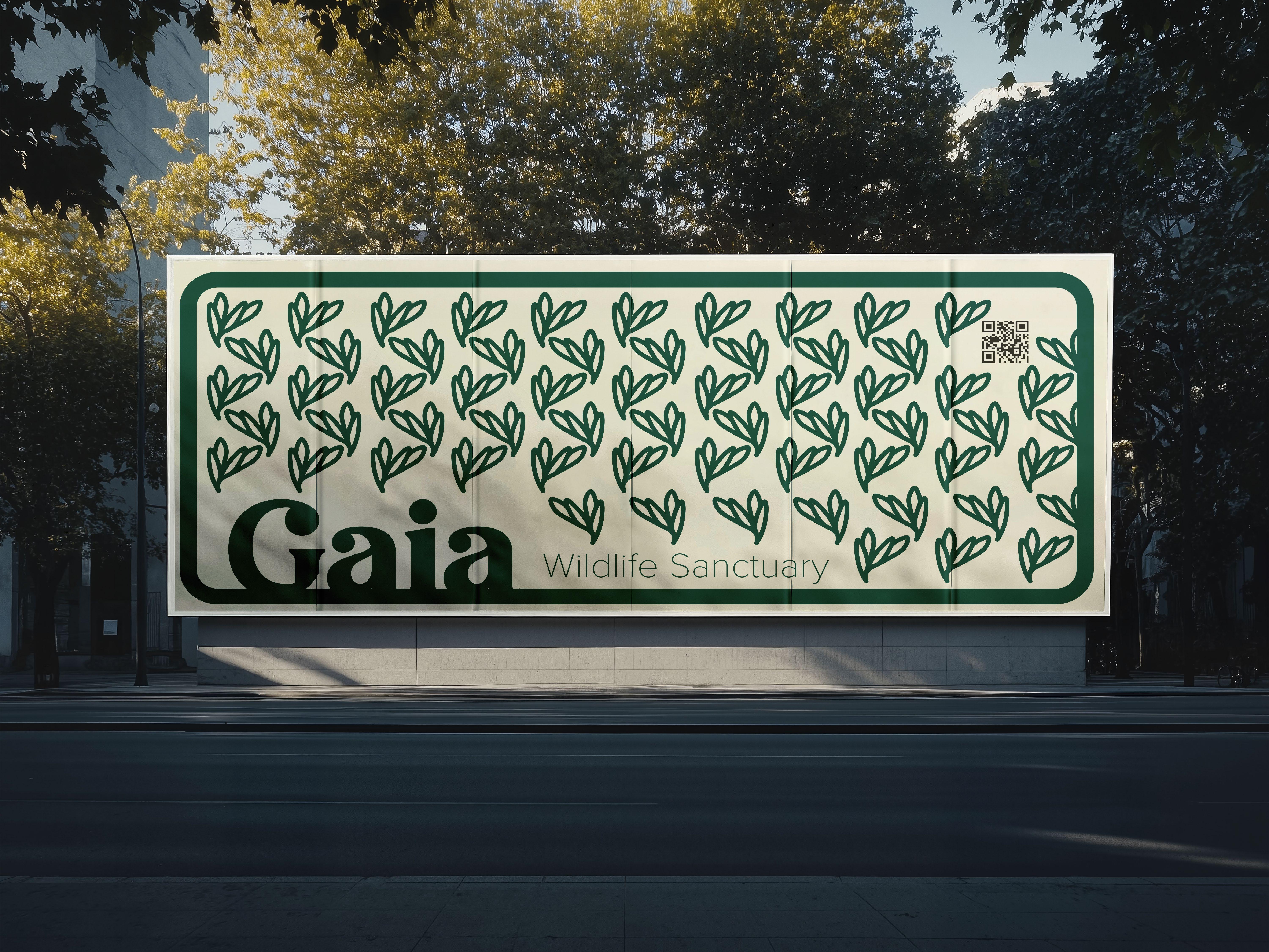
Patterns are a visual language that adds depth and character to our brand. This section outlines guidelines for the creation and application of patterns to enhance brand consistency and visual appeal.
Inspiration: Patterns should draw inspiration from the logo, symbol, or other brand elements to maintain a cohesive visual identity.
Simplicity: Keep patterns simple and versatile for ease of application across various mediums.
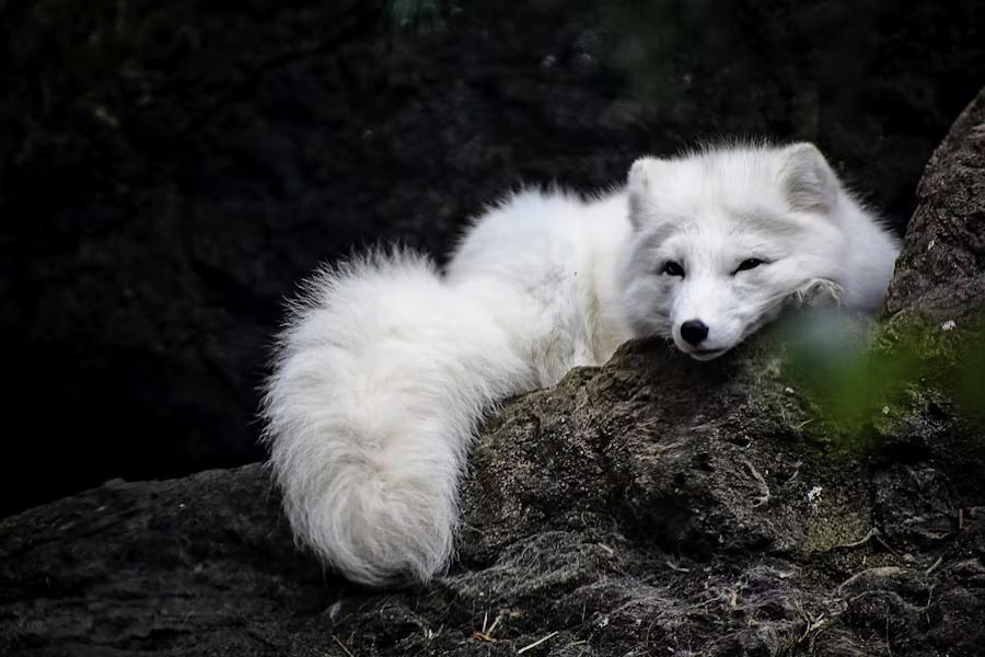
To provide a safe haven for rescued wildlife while fostering human-animal connections. Through education and ethical care, we hope to provide conservation, awareness, and nature a second chance.
Never shy from a chance to learn and educate yourself and your neighbor on the this green village we call our home!