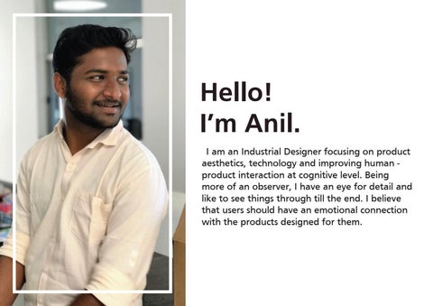
Hello! I’m Anil. “I am an Industrial Designer focusing on product aesthetics, technology and improving human product interaction at cognitive level. Being more of an observer, I have an eye for detail and like to see things through till the end. I believe that users should have an emotional connection with the products designed for them.”
Anilkumar Natekar Industrial Designer Personal Details: 14.06.1996 Mumbai, India English, Hindi, Marathi, Kannada
Contact Details: +91-9167537853 anilnatekar17@gmail.com linkedin.com/in/anilnatekar www.linkedin.com/in/anilnatekar behance.net/anilnatekar https://www.behance.net/anilnatekar issuu.com/anilnatekar17 https://issuu.com/anilnatekar17
Tools Known:
Education: M.V.M’s Educational Campus, Mumbai, Maharashtra 10+2 in Commerce D.J. Academy of design, Coimbatore, Tamil Nadu Undergraduate Diploma in Industrial Design
Experience: Freelancing and Design Consultant for Binary Labs, Mumbai, Maharashtra Industrial & Graphic Designer (December 2020 - Present) Develop concepts and make client presentations. Producing CAD model and providing vendors with the required documentation. Visiting the fabricator to ensure smooth functioning. Avishkaar, Delhi Industrial Designer (February 2018 - June 2020) Research the market and develop concepts. Producing CAD model and 3D prototypes for the selected concepts and user testing for the same. Presenting the concepts to the team while documenting the process. Mentoring the juniors in the team. Providing vendors with the required documentation and visiting them to ensure smooth functioning. All Time Plastics Pvt. Ltd., Mumbai, Maharashtra Industrial Design Intern (January - May 2017) Research the market and develop concepts. Producing CAD model and 3D prototypes for the selected concepts. Documenting the process while keeping seniors updated. Design Directions Pvt. Ltd., Pune, Maharashtra Industrial Design Intern (May - June 2016) Research the market and develop concepts. Producing CAD model and 3D prototypes for the selected concepts.
Nestaway: To design an outdoor kit that helps them feel at home by assisting them in their mealtime.The kit consists of a set of a large bowl, 4 small bowls, 4 sets of forks and knives, and 4 plates.
Maker Board: To design a development board which will act as a starter pack for the younger minds. To get themselves induldged in IOT projects.
ER Series: To Redesign the existing system of the current product line, so that it is accepted at an international level. And also help aid STEM education in children.
UV Rakshak: To design a UV Sanitization robot for public spaces such as offices, hospitals etc. With the available resources during the time of COVID-19.
TWEAK Packaging: To design a packaging for product called TWEAK. To be done limiting to soft materials like cardboard etc. for a target audience of 5 & above.
Discovery Zone: To plan and design the interaction between kids and the installations. Using sensors and making the process fun and learning oriented.
Design Brief The challenging pace is affecting lifestyles, families are finding it difficult to spend time to connect with each other. In UK, camping allows children and parents, or a group of friends to spend time together catching up and socializing. Thus mealtimes or having breakfast together becomes an important activity. The brief is to design an outdoor hamper/kit that helps them feel at home by assisting them in their mealtime. The kit consists of a set of a large bowl, 4 small bowls, 4 sets of forks and knives, and 4 plates. The role of design is to make the kit apt for travel, easy to use, extremely hygienic (abroad the concern on hygiene and details become more important), less space consuming (compact) and also stable as the conditions outdoors are quite different from home environments.
MoodBoard
Insights gained Cutlery used as props to calm down a crying kid. Using plates as chopping board while camping. Have to carry a garbage liner around to dispose the used disposable plates and glass. Tilting the plate to get the liquid in the chapati.
Problems identified Oil leak spoils the things kept around it in the bag and if not cleaned immediately after noticed then can turn out be difficult to clean later as Indian food is oily. Saving space while packing. People carry around 3 kg of food items for 4 to 5 people for a picnic and weight of the kit at that point matters if reduced will add upto the point. Handling issues. Food in the container doesn’t hold heat for long.
Points considered for further development of the product Usability (Cleanabilty) Space Consumption Aesthetics
Calm Connect Joy Caring
Concept Development
Colour Selection
Colours were selected on the basis of the place where the product will be used. In this case primary usage will be outdoors , so colours were picked from the nature such as green from the vegetation in the surroundings, white from a snowy surrounding and grey from the rocks and pebbles availabe on river fronts.
PANTONE 20-0126 TPM
PANTONE 20-0046 TPM
PANTONE 20-0081 TPM
Product Views and Senarios
Product in environment and senarios. To have a better idea of the size and scale of the product in actual. And how it will be perceived in the surrounding it is ment to be in.
Product views to give an idea of how the product will be seen in actual and with total number of parts. All show in exploded view and cross section view to give an idea of how everything will come together.
Design Brief STEM stands for Science, Technology, Engineering, Math, has been promoted in numerous ways all over the world. For Example: Fun and interactive games and building sets from LEGO. To get children indulged in STEM education at a younger age i.e. junior and middle school children being the primary target audience. Companies are striving to tap this market as it will promote kids to have a better sense of experties and interests, and are ready for the time when it arrives. The brief is to rethink and redesign the existing system of the current product line, so that it is accepted at an international level. And also help aid STEM education in childern from a very young age, by opening up to a wide number of options in explorations, and also make the process fun and enjoyable for them.
Existing Product Line
The existing product line up was missing a uniform visual identity and was not consumer focused it terms of an wholisitc experience. Hence making it difficult to identify as a brand from other generic products avaialbe in the market. Further development were made on the same ground as the company wanted to compete in international markets.
Insights gained Kit carried in shopping bags for better handling. Difficulty in joining parts as mounting points are not available at proper location each time. Poor quality of manufacturing which in turn affects the life of the product. Younger kids take a fun approach in building objects.
Problems identified Misplacement or loosing of small parts. Need of optimised packing. Difficulty in identifying the parts and locating the holes as mentioned by the instructor. Company needed a system design approach as the space provided by the schools were not optimised for robotic class. Combining two or more kits to make big robots. Kids struggle in bending the flexible strip as it is too hard for them to bend and achieve the desired shape.
Points considered for further development of the product Brand language across the kits. User-centric Design. Cross platform compatibilty.
Images from field visits
Concept Development
New punch pattern was developed with a visual identy of alphabet X. Which helped in differentiating it from the generic products availabe in the market and also increasing the level of flexibilty, as it was possible to attach the plates at 45 degree of angle (and many other) now which earlier was not possible. All while retaining a backwardcompatibility and also cross-compatibility with selected market major companies in similar lines.
Companies and their kit with whom avishkaar kits are cross-compatible.
Final Output
Final output was a punch hole design with combination of holes and slots, with a distinguishable visual identity. Which was then carried forward in all the parts developed in future.
Intro Chassis as the name suggests, it was developed for audience who were newly introduced to robotics. Robotics as the name considered very intimidating for the people who are new to the field. So the aim for developing this chassis was to get that initial fear out from kids, as the design consisted of the thought for a 3 wheel and 4 wheel based models, along with 1x plate space on top to build any function and get going in just few minutes. Idea was to build first robot in 5 minutes.
4 wheel base built with Intro Chassis
Four Wheel Base
Wheel Pack
D plate naming convention derived from the instrument ‘Protractor’ commonly used in geometry class, which is very well known as D among kids, does the exact same thing that of protractor. It gave a flexibilty of joining metal parts at 15 degree intervals. And if wanting to join at a desired angle which doesn’t fall under this intervals, a slot is provided to achieve the desired angle.
Cut or Break
Flexi Strip as the name suggests, would help to make organic shapes and achive the desired curves. Along with the flexibilty of breaking it into small parts to make small assemblies. The V groove on the sides were made to act as guide to bend or break the flexi strip, which also made the metal weak from that point and would help in breaking easily without any need of an extra tool.
Tyres were designed maintaing the uniformity in design language. Which was purposely made to look robust and aggressive which again had combination of slots and holes with a feature developed for future, which will let the user to remove the grip and replace it depending on the type of surface they want to run the robot on. The shown grip was designed to run on normal surface including surface with a lower level of uneveness.
Gears were designed keeping the design language uniform. By adapting the X pattern and forming the ribs for the gears which also acted as supporting structure, and made the gears hard enough to bear load of high torque while making gear trains.
Square and Circle Holes were provided to use the gear as off centered cam as well. Surface had a play with glossy and matte finish to show the branding as well as the number which mentioned the number of teeth the gear had.
We had an idea of a motor where the user can just change the gear box and get the desired RPM or Torque. So, we worked on a motor which had a changable gearbox where one will give a high RPM output and another will give a high torque output, based on the function it has to be used in. Started with an idea to make it as easy and less time consuming for the user, idea of a snapfit module was used but as we moved ahead screwing method was used to assemble. Design uniformity was maintained as the same pattern was debossed with a glossy finish at the back along with branding.
Motor mounting directions
Encoder is used to measure minute angles of rotations, which lets you have more control over the movement of your robot. Encoder needs to be connected on a rotational axis where you need control. For example - robotic arm, wheel base etc. Uniformitiy was bought in using the same pattern along with play of different finishes.
Internal Assembly of the Encoder
Mounting Directions for Encoder
This is render of a visual representation of the final outcome
Design Brief TWEAK was a product designed by a colleague as part of his graduation project. And the packaging for the same had to be done limiting to soft materials like paper, cardboard etc. Keeping in mind that its for a totally different target audience i.e. 5 & above. TWEAK being a product for such a younger age group had prominent features like soft while gripping, colourful etc. in its aesthetics. And the same was derived for its packaging as attributes. In further slides you can have a look at the progress of it at different stages and how the final outcome turned out to be.
Concept Sketches
Concept Development Selected concept was further altered to have chamfers on edges to match the visual language of the product itself. And a prototype was developed as to easy out the process for fabricators.
Process for a sample prototyping.
Final Product User manual with few projects in it, were also made along side.
The final packaging was divided in two compartments - upper and lower tray and were labeled with colourful graphics. And a pocket for the user maual which included few projects to get started and stickers was make on the upper lid. Everything was tried and fit in one compact box, of size which was roughly around 12x12 inches.
This is render of a visual representation of the final outcome
Design Brief IOT and circuit building has a great potential in future and is seen in various products these days. Hence attracing major chunk of the market, i.e. more students leaning in that direction. Taking this as an opportunity and not to loose the upcoming market potentional. The brief is to design a development board which will act as a getting started for the younger minds to get themselves induldged in IOT projects. As this is a totally new product form the company we are open to all the ideas, expecting it to be appealing to the users in terms of design and user experince.
Insights gained Already available development boards were for professional oriented. Had to buy additional modules separately. Available development boards had a huge data library and online support to help and guide people using their product. Price range was a big factor to invest for someone new.
Problems identified Available boards were more focused on older age group of people. Vast course plan to learn through online media. Additional modules to buy as extras to make basic level of projects.
Points considered for further development of the product Price Factor for new buyers. Development board to be made with target audience of younger age group. Basic modules to start with basic projects.
Market Benchmark
Concept Sketches Concept explorations for the Development Board.
Concept explorations for packaging.
Final Product and Project Examples
Final outcome was a PCB designed as a wearable which accomodated two slots for the strap, along with standoff holes to mount it on any surface wanted which was compitable with the Robotronics series. Having an 8x8 LED Matrix, 4 push buttons all programmable. To get started with programming right out of the box.
Air Quality Indicator
Soil Moisture Indicator
Pollution Badge
IOT Door
This is render of a visual representation of the final outcome
Design Brief This was a self initiated project by the company and they made a team specifically to develop this product as soon as possible. Because this was just a thought converted to an idea by the team, to do our part and help other at the time of pandemic. COVID-19 was at its peak and there was lockdown announced all over India. So we at avishkaar thought as a company of robotics how we can help with the resources that we have. And we came up with the idea of UV Sterilization Robot. As this product was developed at the time of crunch. There were some constrains to it by itself. As there was no expert guidance and we ourself were doing it for the first time, we just knew that we wanted to deliever a quality product in the market. And not make the constrains as an excuse.Constrains by itself being the lock down and it was difficult to source the materials we needed, hence we tried to make it in the resources available locally.
Points considered for further development of the product Simple design which can be manufactured easily, limiting the process only to cutting and bending. Sheet metal was laser cut and then bent in desired angle to get the form. The whole casing was made in just two parts to ease the assembling unit and also for its reparability. Bluetooth Casing designed to go with the overall aesthetics which would be 3D printed. Bluetooth enabled so that it can be controlled with the mobile app designed for it. Slots at the sides pre cut in the laser cutting to enable better handeling. PIR sensors at each side to detect object around. Branding done on a clear surface for it to be legible. Kill switch in an easy accessable place in case of an emergency. LCD Display to show some data displayed on the screen. Power socket for charging which runs the robot for about hour and a half. Power switch to switch the machine on and off.
Concept Development
Final Product With an idea of what we wanted, the team went ahead on finalising the hardware. And after getting the list, I went on to model all of them and further on form exploration with an idea that it should be simple yet appealing, and can be maufactured easily with the local vendors.
This is render of a visual representation of the final outcome
Design Brief Discovery Zone was an idea brought to reality for the school named Euro School, Kharadi, Pune. The intention behind making this space was to engage kids of younger age group in some activities as the zone developed was in the reception area of the school and inturn helps them get new students joining in. And sitting idly at the reception area for kids was an impossible task. So we pitched in an idea for this space which lets children fidget around and interact with the installations all along while they learn something new with each installations. Thought was to introduce kid to the term STEM (Science, Technology, Engineering & Math). So each installations designed had atleast one term explained to them all while they have fun and take back some new learning with them back home. Also the space designed was one of a kind and first even Interactive area with these kind of installations done in India.
Final Colour Palette
Colours from the logo of the school itself was used (which can be seen on the left), with addition of offwhite colour to match with the floor as the flooring was finalized and we wanted everything to blend in with the surrounding it is kept in. While also keeping it exclusively for Euro School.
#184A8C
#87829A
#F7DBA7
#FAEBD0
#FFFFFF
RGB 24, 74, 140 HSV 214, 83, 55 CMYK 83, 47, 0, 45 LAB 32, 9, -41
RGB 135, 130, 154 HSV 253, 16, 60 CMYK 12, 16, 0, 40 LAB 56, 7, -12
RGB 247, 219, 167 HSV 39, 32, 97 CMYK 0, 11, 32, 3 LAB 89, 2, 29
RGB 250, 235, 208 HSV 39, 17, 98 CMYK 0, 6, 17, 2 LAB 94, 1, 15
RGB 255, 255, 255 HSV 0, 0, 100 CMYK 0, 0, 0, 0 LAB 100, 0, 0
PANTONE
PANTONE
PANTONE
PANTONE
PANTONE
20-0155 TPM
20-0005 TPM
20-0043 TPM
20-0103 TPM
20-0081 TPM
Graphic Style
HEADING This is a sample paragharph typed out only to give an idea of how the overall graphics will have an impact in the space where they’ll be used.
USAGE IN SPACE Basic design element that is a line will be used overall,while there will be a play with the thickness of the lines along with elements to give emphasis or, just to reduce the visual weight around the area. Along with the colour difference to to make gradiations and make it appealing to the users.
INSPIRATION Inspiration for the graphic style was derived, from the logo itself. Where the graphics will be made using straight lines, with visible corners.
Final Output
Layout of the Discovery Zone was planned in such a way that once a person enters then he/she will have a good view of all the installations and would most likely try out all the installations. Hence, spreading the footfall evenly around the space.
This is render of a visual representation of the final outcome
THANK YOU
For your time!